Interactive map pinpoints the polluters next door

Wondering where all the petroleum refineries are located in California? Curious about which industries in your area emit the most greenhouse gases? Or which counties have the most big industrial polluters, and which don’t have any at all?
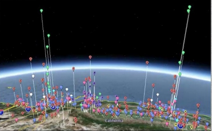
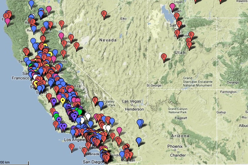
A new interactive map from the California Air Resources Board taps the versatility of Google Earth software to transform eye-glazing spreadsheet data into a visual, if wonky, feast.
The map shows the locations and greenhouse gas emissions of about 625 facilities — the largest industrial greenhouse gas emitters in the state. The graphical tool can filter by type of facility (cement plant, refinery, electricity generation), by county or air district. You can use the satellite view to see a facility’s physical footprint, then switch over to Google Earth to see how its carbon footprint stacks up against other emitters. The EPA released a similar map earlier this year, but without all the Google Earth bells and whistles.
Say you’re in Santa Clara County. There are 17 sites that pop up on the map. Eight generate electricity. The rest are a grab bag: a sewage treatment plant, a cement factory, a few manufacturing facilities. Toggle over to Google Earth to see how they all compare to each other, and it’s easy to identify the two biggest industrial greenhouse gas emitters in the county: Calpine – Metcalf Energy Center, LLC, a power plant in San Jose that released more than a million metric tons of greenhouse gases in 2010; and Lehigh Southwest Cement Company in Cupertino, which released nearly 600,000 metric tons in 2010. But these are far from being the worst in the Bay Area. The Chevron Refinery in Richmond released 4.5 million metric tons of greenhouse gases in 2010.
The Air Board requires facilities that emit 25,000 metric tons of carbon dioxide a year — comparable to the emissions of about 5,000 cars over the same time period — to report their emissions every year. The information was already public, but as the Air Board’s Stanley Young points out, “Not everybody has a lot of fun playing with an Excel spreadsheet.”

Some out-of-state locations are included: plants in other states that sell power inside of California (check out those big emitters in Wyoming). And there’s one category that doesn’t appear on the map: electricity traders who buy power from out-of-state, then re-sell it in-state. As Young explains it, the traders do report emissions, but there’s no one carbon-emitting spot where it would make sense to locate them on a map.
All of the companies on this map are participating in California’s cap-and-trade program. The first auction of carbon pollution permits is scheduled for November 14.
