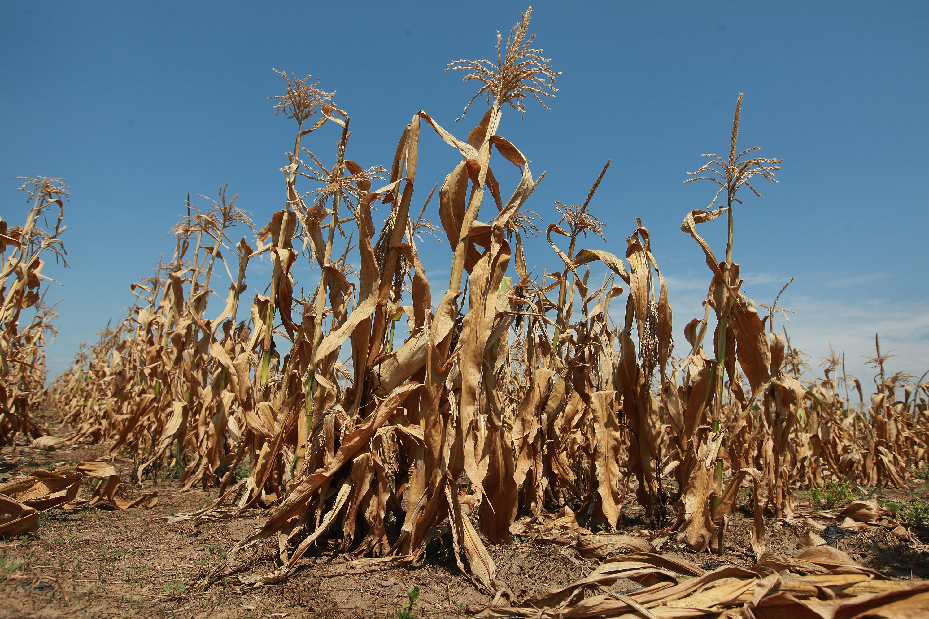
As the drought drags on, these graphics and interactives explain what’s happening

1. “Drought’s Footprint” — The New York Times
In June, more than half of the U.S. was experiencing moderate to extreme drought. How does that compare to other years? The Times’ graphic lays it out.
2. “Dried Out: Confronting the Texas Drought” — NPR, KUT and KUHF
The drought began in Texas in October of last year. Watch it grow over time, and explore a timeline that explains the root causes of the drought and how communities are responding.
3. “Flash Drought in U.S. Explained in 14 Seconds” — Climate Central
Watch an animation showing the spread of the drought, from Texas and Georgia in March, to most of the Midwest and West by June.
4. Drought Impact Reporter — The National Drought Mitigation Center
This is “the nation’s first comprehensive database of drought impacts.” Submit reports of how the drought affects you, and search for drought impacts by state, whether they’re to agriculture, industry, public health or wildlife.
5. “Historic heat wave in hindsight: Hottest on record in Washington D.C., hotter than 1930” — Washington Post
From the Post’s weather blog, a local, numbers-heavy analysis of the heatwave that hit Washington. With stats like “Longest period at or above 100: 7 hours on July 7 (tie with July 6, 2010 and July 21, 1930),” it’s like a Guinness Book of World Records for D.C.’s summer, and holds my usually California-focused attention.
One thought on “Understanding the U.S. Drought and Heatwave: Five Good Visuals”
Comments are closed.

again and again… I write to ask if anyone is paying attention to the sky — chem trails, weather modification, aerosol sprays, etc. those long grid lines of chemicals coming out of unmarked planes… there is a conference to address this in LA August 17-19 and a new film coming out “Why in the World Are They Spraying.” See the You Tube Trailer. How much are the commodities traders making at this time!!! housing all over again. First it was our homes,. now our food -manipulated by man…. let’s connect some dots here.