The term “PDO” is coming up more often in climate discussions. What it is and why it’s being bandied about are explained in this post from our content partners, Climate Central.

Did Someone Say “PDO”?
By Heidi Cullen, Phil Duffy and Claudia Tebaldi
Earlier this month, The New York Times ran a page-one story looking into why climatologists and TV meteorologists are at odds over global warming.
The article, which quoted one of the authors of this post, pointed out that while climate scientists almost universally agree that human activities, such as the burning of fossil fuels, are warming up the planet, a significant percentage of TV meteorologists do not. In fact, a recent study from George Mason University and the University of Texas at Austin showed that out of 571 TV meteorologists surveyed, only about half believed that global warming was happening and fewer than a third accepted the proposition that climate change was “caused mostly by human activities.” The survey also suggested that TV meteorologists view climate change as mostly a natural phenomenon.
Joe Bastardi, a senior meteorologist at AccuWeather, stands squarely in the natural causes camp, and he offered up his own explanation recently on Comedy Central’s The Colbert Report. On the comedy show, Bastardi said the global warming trend is just temporary and caused by a mix of volcanic activity, solar cycles, warmer ocean temperatures and specifically a natural climate pattern known as the “PDO” or Pacific Decadal Oscillation.
Bastardi has provided a great opportunity to educate the public about climate change. And as climate scientists, we’d like to take a moment to talk about natural climate variability specifically.
The solar cycle and volcano arguments Bastardi gravitates toward are fascinating. But when it comes to climate change, these natural sources of climate variability are incapable of doing the heavy lifting. In fact, they’ve been raised, tested, and solidly laid to rest by the climate science community. Variations in solar output are too weak, and in any case repeat every 11 years, and so cannot explain a steady warming trend over 40+ years. As for the volcano argument, eruptions are also too puny. Globally,volcanoes, like Iceland’s Eyjafjallajokull volcano as well as those under the sea release a total of about 200 million tonnes (metric tons) of CO2 annually.
That may sound like a lot, but it’s trivial when compared to human activity. According to the U.S. Department of Energy’s Carbon Dioxide Information Analysis Center (CDIAC), global fossil fuel CO2 emissions for 2003 tipped the scales at 26.8 billion tonnes—over 100 times more. Let’s just say human activity can bench press a whole lot more warming than the sun’s variations and volcanoes combined.
Before we move on to the role of the Pacific, we want to first thank Bastardi for daring to mention the phrase P-D-O on television. While geeks like us find the Pacific Decadal Oscillation fascinating, alphabet soup has a tendency to make the public’s eyes glaze over.
The PDO is just one of many natural oscillations in the climate system. It is characterized by a positive or “warm” phase, and a negative or “cool” phase, which refer to the pattern of anomalies in sea surface temperatures and air pressure between the north central Pacific Ocean and the northeastern Pacific. The El Niño/La Nina cycle, for example, is another natural oscillation. Its period, about three-to-seven years, is shorter than the PDO’s, but in fact, the PDO is often thought of a slower version of El Niño, as some of the manifestations are similar.

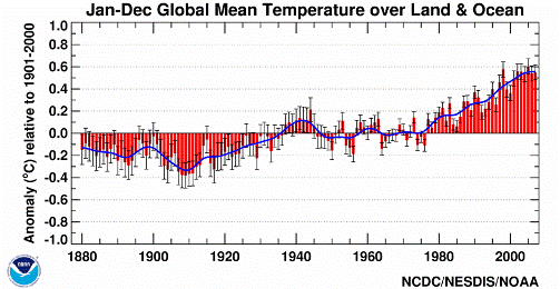
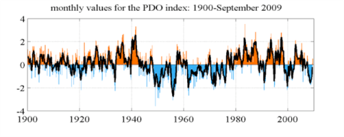
For example, in the warm phase of the PDO, temperatures in the northwest region of North America tend to be warmer than average, while the southeastern U.S. tends to be cooler than average. Bastardi believes the warming trend (shown below) is only temporary because the phase in which the PDO has predominantly been at the same time, with its warmer than average tropical Pacific Ocean temperatures, is temporarily juicing the system. He forecasts the global temperature trend will dip back down once the PDO shifts back.
 Here’s the problem. First and foremost, while the PDO is important in driving regional climate variations, it has no clear effect on global temperatures. And although the PDO was in its warm phase during the majority of the time from the mid 1970s to the present, it also shifted sharply in multiple instances (see chart), which is inconsistent with the steady global warming trend during the same period. For example, the decade from 2000 to 2009 was the warmest on record globally, but the PDO was not positive throughout that period.
It has been said that the truth is stubborn. This idea gives climate scientists a small sense of relief in that eventually, the stubborn truth will be recognized; that the recent global warming trend is real and caused mostly by human activities.
References for this article are shown in the original post at Climate Central.
6 thoughts on “A (PDQ) PDO Primer”
Comments are closed.

Oh my, what bunch of …..
“For example, the decade from 2000 to 2009 was the warmest on record globally, but the PDO was not positive throughout that period.2 3.”
Well, I guess that depends on where you take temperatures, who is taking them and what the embedded errors are. Here is an example:
http://wattsupwiththat.com/2010/04/17/giss-metar-dial-m-for-missing-minus-signs-its-worse-than-we-thought/
Here is another example reader might want to check out before believing this …. it demonstrated there is more to the story.
http://wattsupwiththat.com/2010/01/22/flashback-bob-tisdales-november-prediction-on-giss-exploiting-the-warmest-decade-on-record/
“It has been said that the truth is stubborn. This idea gives climate scientists a small sense of relief in that eventually, the stubborn truth will be recognized – that the recent global warming trend is real and caused mostly by human activities.”
Well, I have shown my proof, where is the author proof that it was caused by human activity, it seem to be missing?
Here is some more information on who is making the measurements and whey it matters:
http://2.bp.blogspot.com/_nOY5jaKJXHM/S9Tg2PHzlsI/AAAAAAAABGE/-YCAklyARXE/s1600/ScreenShot1636.jpg
GISS land based records it is getting warmer, RSS Satellite data slight cooling.
Consider adding a “skywatch” photo every day to track the grid lines of spray and clear days. The meteriologists are not doing that — cloudy, hazy, foggy vocabulary does not include aerosol spraying, weather modification, geoengineering, solar radiation management days — people need to wake up “toxic sky travesty.” The meteriologists are not doing their jobs!!!
Predictions Of Global Mean Temperatures & IPCC Projections
Girma Orssengo, B. Tech, MASc, PhD
The Intergovernmental Panel on Climate Change (IPCC) claims that human emission of CO2 causes catastrophic global warming. When such extraordinary claim is made, every one with background in science has to look at the data and verify whether the claim is justified or not. In this article, a mathematical model was developed that agrees with observed Global Mean Temperature Anomaly (GMTA), and its prediction shows global cooling by about 0.42 deg C until 2030. Also, comparison of observed increase in human emission of CO2 with increase in GMTA during the 20th century shows no relationship between the two. As a result, the claim by the IPCC of climate catastrophe is not supported by the data.
http://wattsupwiththat.files.wordpress.com/2010/04/predictions-of-gmt.pdf
NOAA claimed recently that this March was the hottest March in recorded history.
They presented a world map that was first pulled down because keen eyed observers in Finland called bs on the NOAA portrayal of Scandinavia as 6 degrees or more above average. Normally NOAA sticks their big fat thumb n the temp scale by cleverly relocating temp stations of the Global Historical Climate Network (GHCN), discontinuing records from remote rural and high elevation areas to big cities (the bigger the better – especially in Calif.
Link – excerpt below.
Our climate network has been pared down to just four stations; SF, LA, SD, and Santa Maria, over the last decade. This enhanced the UHI signature for California, but inspite of this the four grid boxes covering our state NOAA still show an average temperature drop for California.
Link – with commentary.
Even in Los Angeles. Even in San Francisco. Even in San Diego, the temperature according to NOAA GHCN has been dropping for twenty years or more. Now why would that be?
Well they are all coastal stations whose climates are subject to the whims of the sea.
Heidi Cullen claims there was a steady global warming trend right through the PDO negative shift, but the evidence shows that where the PDO left off NOAA surface station manipulations started, and the temp record is currupted from 1990 on.
Here’s more on the warmest March ever.
Warmer Arctic temperature brings more Arctic ice, so NOAA claims.
Notice that version of the map was updated to reflect the reality in Scandinavia (the original was pulled down).
Note also that NOAA claims that California was 2 degrees celsius hotter then normal – which they didn’t correct (Sacto was a degree and a half colder then average – you can check the temps yourself at weather underground).
I already mentioned the cooling trends along the coast.
The mountains are still getting snow today, and skiing could go on right through to June if the resorts don’t close down due to government edict.
But California’s situation is secondary to the main point, NOAA HAS THE ENTIRE ARCTIC REGION as RED HOT, and yet the ice pack kept on expanding right on through to the end of March.