The U.S. Drought Monitor's maps have become a staple of California drought coverage. (U.S. Drought Monitor)
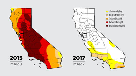
If tracking California’s epic drought has become an obsession for you, as it has around here, you’ve no doubt spent some time poring over the multi-colored maps known as the U.S. Drought Monitor.
The maps have vividly portrayed the dry times according to how parts of the state were classified; blood-red for “exceptional drought,” bright crimson for “extreme drought.” Recently and rapidly, the weekly maps have retreated to less alarming tones of beige and yellow, for “moderate drought,” or just “abnormally dry.” But who are the artists behind this parched palette — and what are they basing it on?
Simeral says authors look at more than 100 indicators, ranging from precipitation data and snowpack levels, to soil moisture, stream flows and “vegetative health” (including satellite data that looks at “greenness”). They then plot out conditions on the map along contour lines, using GIS software (for Geographical Information System).
Sponsored
The Drought Monitor’s home, if it can be said to have one, is the National Drought Mitigation Center at the University of Nebraska-Lincoln, though there appears to be a battalion of cooks in this kitchen. Apart from the rotating authors, there are about 450 contributors from various government agencies, who collaborate on the weekly maps.
To help come up with the California map, the National Weather Service leads a bi-weekly conference call with regional experts who can weigh in on factors that might change the status of different parts of the state. That group makes recommendations to the weekly author for potential changes.
“In the end it’s my judgment call as an author whether to make the changes or not, on the map.” The next week, it’ll be up to the next author in the rotation.
Critics Abound
The Drought Monitor has its critics, including Jay Lund, co-founder of the Center for Watershed Sciences at UC Davis, who has called it “misleading.” In his California Water Blog, he writes:
The US Drought Monitor is a common drought indicator, based mostly on soil moisture – designed mostly to indicate drought for rain-fed agriculture. This index is most useful for stress to forests and un-irrigated pasture and crops, which are not California’s biggest drought issues. California relies much more on large reservoirs and aquifers, which allow crops and cities to survive California’s otherwise beautiful and devastatingly dry summers. The US Drought Monitor, while a convenient general public service, is misleading for California’s most common drought issues. National statistics often have such regional problems.
Asked about these critiques, Simeral is unruffled.
“We hear them all the time,” he says, and counters that Lund’s assertion that the Monitor is “based mostly on soil moisture,” is simply incorrect. Simeral adds that drought can often be in the eye of the beholder, as there are several types of drought:
Meteorological: based primarily on recent shortfalls in precipitation
Hydrologic: considering storage modes such as snowpack, groundwater, and reservoirs
Agricultural: when water is scarce enough to stress crops
Ecological: when lack of water begins to have adverse impacts on natural ecosystems, such as the mass die-off of trees during California’s 5-year drought.
Simeral says the authors take all types of drought into account.
“I think we use a real comprehensive approach,” he says.
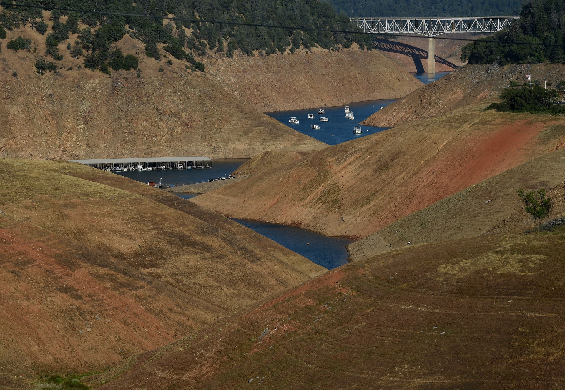
Lake Oroville, reduced to a relative puddle in 2015. This year it overflowed. Reservoir levels are one of more than 100 indicators considered by the U.S. Drought Monitor. (MarkRalston/AFP/Getty Images)
The California Challenge
“California poses a challenge for a single map such as the drought monitor,” admits state climatologist Micheal Anderson, who is part of the regional focus group that advises the national authors.
“We have more natural variability than anywhere else in the continental U.S.” That, he says, combined with an elaborate system of storage and distribution that acts as a buffer against wild swings in precipitation, “make it very hard to get all the nuance of that into a single map that has to accommodate the whole country.” (Some of that nuance is contained in a written summary that accompanies each weekly map, and that Simeral says he wishes more people would read.)
Consequently, Anderson says the California map could lag behind conditions going into a drought. On the flip side, others have criticized the Monitor for backing out of the drought too quickly, not taking adequate account of long-term groundwater depletion. This week’s map shows little more than one percent of California still in severe drought (vs. more than 60 percent just three months ago), though many of the state’s aquifers will take years to refill.
Simeral says the authors and consultants absolutely put groundwater levels into the mix.
“We’re able to verify the data with individuals on the ground who are seeing impacts, whether it be to agriculture or wells running dry — things like that.”
Those observed impacts matter, as officials use the Drought Monitor to guide them in meting out billions of dollars in federal drought relief to farmers and ranchers around the country.
The maps can be politically charged. Simeral says the authors hear from many with perceived stakes in the map, such as local water agencies that don’t want to alarm customers. On the other hand, the State Water Resources Control Board has fretted that too much easing of conditions on the map could undermine its pleas for continued water conservation. Simeral says that none of these political concerns influence the authors.
“We stay out of the political end of things, period,” he says.
Sponsored
While experts can debate its technical merits, in this age of “data visualization” (which often means compulsively mapping everything), the Drought Monitor — while it may not tell the whole story — has caught on, as people search for simple tools to keep up with the roller coaster ride that climate is fast becoming.
lower waypoint
Get the best of KQED’s science coverage in your inbox weekly.
To learn more about how we use your information, please read our privacy policy.
window.__IS_SSR__=true
window.__INITIAL_STATE__={"attachmentsReducer":{"audio_0":{"type":"attachments","id":"audio_0","imgSizes":{"kqedFullSize":{"file":"https://ww2.kqed.org/news/wp-content/themes/KQED-unified/img/audio_bgs/background0.jpg"}}},"audio_1":{"type":"attachments","id":"audio_1","imgSizes":{"kqedFullSize":{"file":"https://ww2.kqed.org/news/wp-content/themes/KQED-unified/img/audio_bgs/background1.jpg"}}},"audio_2":{"type":"attachments","id":"audio_2","imgSizes":{"kqedFullSize":{"file":"https://ww2.kqed.org/news/wp-content/themes/KQED-unified/img/audio_bgs/background2.jpg"}}},"audio_3":{"type":"attachments","id":"audio_3","imgSizes":{"kqedFullSize":{"file":"https://ww2.kqed.org/news/wp-content/themes/KQED-unified/img/audio_bgs/background3.jpg"}}},"audio_4":{"type":"attachments","id":"audio_4","imgSizes":{"kqedFullSize":{"file":"https://ww2.kqed.org/news/wp-content/themes/KQED-unified/img/audio_bgs/background4.jpg"}}},"placeholder":{"type":"attachments","id":"placeholder","imgSizes":{"thumbnail":{"file":"https://ww2.kqed.org/wp-content/uploads/sites/10/2018/01/GettyImages-896326950-160x96.jpg","width":160,"height":96,"mimeType":"image/jpeg"},"medium":{"file":"https://ww2.kqed.org/wp-content/uploads/sites/10/2018/01/GettyImages-896326950-800x478.jpg","width":800,"height":478,"mimeType":"image/jpeg"},"large":{"file":"https://ww2.kqed.org/wp-content/uploads/sites/10/2018/01/GettyImages-896326950-1020x610.jpg","width":1020,"height":610,"mimeType":"image/jpeg"},"fd-lrg":{"file":"https://ww2.kqed.org/wp-content/uploads/sites/10/2018/01/GettyImages-896326950-1920x1148.jpg","width":1920,"height":1148,"mimeType":"image/jpeg"},"fd-med":{"file":"https://ww2.kqed.org/wp-content/uploads/sites/10/2018/01/GettyImages-896326950-1180x705.jpg","width":1180,"height":705,"mimeType":"image/jpeg"},"fd-sm":{"file":"https://ww2.kqed.org/wp-content/uploads/sites/10/2018/01/GettyImages-896326950-960x574.jpg","width":960,"height":574,"mimeType":"image/jpeg"},"post-thumbnail":{"file":"https://ww2.kqed.org/wp-content/uploads/sites/10/2018/01/GettyImages-896326950-672x372.jpg","width":672,"height":372,"mimeType":"image/jpeg"},"twentyfourteen-full-width":{"file":"https://ww2.kqed.org/wp-content/uploads/sites/10/2018/01/GettyImages-896326950-1038x576.jpg","width":1038,"height":576,"mimeType":"image/jpeg"},"xxsmall":{"file":"https://ww2.kqed.org/wp-content/uploads/sites/10/2018/01/GettyImages-896326950-240x143.jpg","width":240,"height":143,"mimeType":"image/jpeg"},"xsmall":{"file":"https://ww2.kqed.org/wp-content/uploads/sites/10/2018/01/GettyImages-896326950-375x224.jpg","width":375,"height":224,"mimeType":"image/jpeg"},"small":{"file":"https://ww2.kqed.org/wp-content/uploads/sites/10/2018/01/GettyImages-896326950-520x311.jpg","width":520,"height":311,"mimeType":"image/jpeg"},"xlarge":{"file":"https://ww2.kqed.org/wp-content/uploads/sites/10/2018/01/GettyImages-896326950-1180x705.jpg","width":1180,"height":705,"mimeType":"image/jpeg"},"full-width":{"file":"https://ww2.kqed.org/wp-content/uploads/sites/10/2018/01/GettyImages-896326950-1920x1148.jpg","width":1920,"height":1148,"mimeType":"image/jpeg"},"guest-author-32":{"file":"https://ww2.kqed.org/wp-content/uploads/sites/10/2018/01/GettyImages-896326950-32x32.jpg","width":32,"height":32,"mimeType":"image/jpeg"},"guest-author-50":{"file":"https://ww2.kqed.org/wp-content/uploads/sites/10/2018/01/GettyImages-896326950-50x50.jpg","width":50,"height":50,"mimeType":"image/jpeg"},"guest-author-64":{"file":"https://ww2.kqed.org/wp-content/uploads/sites/10/2018/01/GettyImages-896326950-64x64.jpg","width":64,"height":64,"mimeType":"image/jpeg"},"guest-author-96":{"file":"https://ww2.kqed.org/wp-content/uploads/sites/10/2018/01/GettyImages-896326950-96x96.jpg","width":96,"height":96,"mimeType":"image/jpeg"},"guest-author-128":{"file":"https://ww2.kqed.org/wp-content/uploads/sites/10/2018/01/GettyImages-896326950-128x128.jpg","width":128,"height":128,"mimeType":"image/jpeg"},"detail":{"file":"https://ww2.kqed.org/wp-content/uploads/sites/10/2018/01/GettyImages-896326950-150x150.jpg","width":150,"height":150,"mimeType":"image/jpeg"},"kqedFullSize":{"file":"https://ww2.kqed.org/wp-content/uploads/sites/10/2018/01/GettyImages-896326950-e1514998105161.jpg","width":1920,"height":1148}}},"science_1992343":{"type":"attachments","id":"science_1992343","meta":{"index":"attachments_1591205162","site":"science","id":"1992343","found":true},"title":"DSC_0117","publishDate":1712809912,"status":"inherit","parent":1992309,"modified":1712810045,"caption":"Empty docks at Fisherman's Warf on April 10, 2024. ","credit":"Beth LaBerge/KQED","altTag":"Boats and docks as the sun sets.","description":null,"imgSizes":{"medium":{"file":"https://cdn.kqed.org/wp-content/uploads/sites/35/2024/04/DSC_0117-800x533.jpg","width":800,"height":533,"mimeType":"image/jpeg"},"large":{"file":"https://cdn.kqed.org/wp-content/uploads/sites/35/2024/04/DSC_0117-1020x680.jpg","width":1020,"height":680,"mimeType":"image/jpeg"},"thumbnail":{"file":"https://cdn.kqed.org/wp-content/uploads/sites/35/2024/04/DSC_0117-160x107.jpg","width":160,"height":107,"mimeType":"image/jpeg"},"medium_large":{"file":"https://cdn.kqed.org/wp-content/uploads/sites/35/2024/04/DSC_0117-768x512.jpg","width":768,"height":512,"mimeType":"image/jpeg"},"1536x1536":{"file":"https://cdn.kqed.org/wp-content/uploads/sites/35/2024/04/DSC_0117-1536x1024.jpg","width":1536,"height":1024,"mimeType":"image/jpeg"},"post-thumbnail":{"file":"https://cdn.kqed.org/wp-content/uploads/sites/35/2024/04/DSC_0117-672x372.jpg","width":672,"height":372,"mimeType":"image/jpeg"},"twentyfourteen-full-width":{"file":"https://cdn.kqed.org/wp-content/uploads/sites/35/2024/04/DSC_0117-1038x576.jpg","width":1038,"height":576,"mimeType":"image/jpeg"},"kqedFullSize":{"file":"https://cdn.kqed.org/wp-content/uploads/sites/35/2024/04/DSC_0117.jpg","width":1620,"height":1080}},"fetchFailed":false,"isLoading":false},"science_1992374":{"type":"attachments","id":"science_1992374","meta":{"index":"attachments_1591205162","site":"science","id":"1992374","found":true},"title":"Dried Psilocybe Mushrooms","publishDate":1712950323,"status":"inherit","parent":1992363,"modified":1712950359,"caption":"Dried psilocybe mushrooms on a glass plate.","credit":"James MacDonald/Bloomberg via Getty Images","altTag":null,"description":null,"imgSizes":{"medium":{"file":"https://cdn.kqed.org/wp-content/uploads/sites/35/2024/04/GettyImages-1449327777-800x533.jpg","width":800,"height":533,"mimeType":"image/jpeg"},"large":{"file":"https://cdn.kqed.org/wp-content/uploads/sites/35/2024/04/GettyImages-1449327777-1020x680.jpg","width":1020,"height":680,"mimeType":"image/jpeg"},"thumbnail":{"file":"https://cdn.kqed.org/wp-content/uploads/sites/35/2024/04/GettyImages-1449327777-160x107.jpg","width":160,"height":107,"mimeType":"image/jpeg"},"medium_large":{"file":"https://cdn.kqed.org/wp-content/uploads/sites/35/2024/04/GettyImages-1449327777-768x512.jpg","width":768,"height":512,"mimeType":"image/jpeg"},"1536x1536":{"file":"https://cdn.kqed.org/wp-content/uploads/sites/35/2024/04/GettyImages-1449327777-1536x1024.jpg","width":1536,"height":1024,"mimeType":"image/jpeg"},"2048x2048":{"file":"https://cdn.kqed.org/wp-content/uploads/sites/35/2024/04/GettyImages-1449327777-2048x1365.jpg","width":2048,"height":1365,"mimeType":"image/jpeg"},"post-thumbnail":{"file":"https://cdn.kqed.org/wp-content/uploads/sites/35/2024/04/GettyImages-1449327777-672x372.jpg","width":672,"height":372,"mimeType":"image/jpeg"},"twentyfourteen-full-width":{"file":"https://cdn.kqed.org/wp-content/uploads/sites/35/2024/04/GettyImages-1449327777-1038x576.jpg","width":1038,"height":576,"mimeType":"image/jpeg"},"full-width":{"file":"https://cdn.kqed.org/wp-content/uploads/sites/35/2024/04/GettyImages-1449327777-1920x1280.jpg","width":1920,"height":1280,"mimeType":"image/jpeg"},"kqedFullSize":{"file":"https://cdn.kqed.org/wp-content/uploads/sites/35/2024/04/GettyImages-1449327777.jpg","width":2121,"height":1414}},"fetchFailed":false,"isLoading":false},"science_1992354":{"type":"attachments","id":"science_1992354","meta":{"index":"attachments_1591205162","site":"science","id":"1992354","found":true},"title":"240411-GAS METERS-MD-01-KQED","publishDate":1712873175,"status":"inherit","parent":0,"modified":1712877766,"caption":"A PG&E SmartMeter in Oakland on Apr. 11, 2024.","credit":"Martin do Nascimento/KQED","altTag":"A gas meter outside a home.","description":null,"imgSizes":{"medium":{"file":"https://cdn.kqed.org/wp-content/uploads/sites/35/2024/04/240411-GAS-METERS-MD-01-KQED-800x533.jpg","width":800,"height":533,"mimeType":"image/jpeg"},"large":{"file":"https://cdn.kqed.org/wp-content/uploads/sites/35/2024/04/240411-GAS-METERS-MD-01-KQED-1020x680.jpg","width":1020,"height":680,"mimeType":"image/jpeg"},"thumbnail":{"file":"https://cdn.kqed.org/wp-content/uploads/sites/35/2024/04/240411-GAS-METERS-MD-01-KQED-160x107.jpg","width":160,"height":107,"mimeType":"image/jpeg"},"medium_large":{"file":"https://cdn.kqed.org/wp-content/uploads/sites/35/2024/04/240411-GAS-METERS-MD-01-KQED-768x512.jpg","width":768,"height":512,"mimeType":"image/jpeg"},"1536x1536":{"file":"https://cdn.kqed.org/wp-content/uploads/sites/35/2024/04/240411-GAS-METERS-MD-01-KQED-1536x1024.jpg","width":1536,"height":1024,"mimeType":"image/jpeg"},"post-thumbnail":{"file":"https://cdn.kqed.org/wp-content/uploads/sites/35/2024/04/240411-GAS-METERS-MD-01-KQED-672x372.jpg","width":672,"height":372,"mimeType":"image/jpeg"},"twentyfourteen-full-width":{"file":"https://cdn.kqed.org/wp-content/uploads/sites/35/2024/04/240411-GAS-METERS-MD-01-KQED-1038x576.jpg","width":1038,"height":576,"mimeType":"image/jpeg"},"full-width":{"file":"https://cdn.kqed.org/wp-content/uploads/sites/35/2024/04/240411-GAS-METERS-MD-01-KQED-1920x1280.jpg","width":1920,"height":1280,"mimeType":"image/jpeg"},"kqedFullSize":{"file":"https://cdn.kqed.org/wp-content/uploads/sites/35/2024/04/240411-GAS-METERS-MD-01-KQED.jpg","width":2000,"height":1333}},"fetchFailed":false,"isLoading":false},"science_1991798":{"type":"attachments","id":"science_1991798","meta":{"index":"attachments_1591205162","site":"science","id":"1991798","found":true},"title":"Wildflowers","publishDate":1709912473,"status":"inherit","parent":1991791,"modified":1709912514,"caption":"Wildflowers atop Mount Davidson, San Francisco","credit":"@TheRealWBTC via Twitter","altTag":null,"description":null,"imgSizes":{"medium":{"file":"https://cdn.kqed.org/wp-content/uploads/sites/35/2024/03/RS36031_Image-from-iOS-14-qut-800x600.jpg","width":800,"height":600,"mimeType":"image/jpeg"},"large":{"file":"https://cdn.kqed.org/wp-content/uploads/sites/35/2024/03/RS36031_Image-from-iOS-14-qut-1020x765.jpg","width":1020,"height":765,"mimeType":"image/jpeg"},"thumbnail":{"file":"https://cdn.kqed.org/wp-content/uploads/sites/35/2024/03/RS36031_Image-from-iOS-14-qut-160x120.jpg","width":160,"height":120,"mimeType":"image/jpeg"},"medium_large":{"file":"https://cdn.kqed.org/wp-content/uploads/sites/35/2024/03/RS36031_Image-from-iOS-14-qut-768x576.jpg","width":768,"height":576,"mimeType":"image/jpeg"},"1536x1536":{"file":"https://cdn.kqed.org/wp-content/uploads/sites/35/2024/03/RS36031_Image-from-iOS-14-qut-1536x1152.jpg","width":1536,"height":1152,"mimeType":"image/jpeg"},"post-thumbnail":{"file":"https://cdn.kqed.org/wp-content/uploads/sites/35/2024/03/RS36031_Image-from-iOS-14-qut-672x372.jpg","width":672,"height":372,"mimeType":"image/jpeg"},"twentyfourteen-full-width":{"file":"https://cdn.kqed.org/wp-content/uploads/sites/35/2024/03/RS36031_Image-from-iOS-14-qut-1038x576.jpg","width":1038,"height":576,"mimeType":"image/jpeg"},"kqedFullSize":{"file":"https://cdn.kqed.org/wp-content/uploads/sites/35/2024/03/RS36031_Image-from-iOS-14-qut.jpg","width":1920,"height":1440}},"fetchFailed":false,"isLoading":false},"science_1992299":{"type":"attachments","id":"science_1992299","meta":{"index":"attachments_1591205162","site":"science","id":"1992299","found":true},"title":"001_SanFrancisco_TLLinkageCenter_02082022_qut","publishDate":1712775173,"status":"inherit","parent":1992298,"modified":1712783002,"caption":"Keith Thompson waits to get into the Tenderloin Linkage Center in San Francisco on Feb. 8, 2022.","credit":"Beth LaBerge/KQED","altTag":"A close-up view of a man wearing a red beanie hat and a face mask with a dark jacket who is sitting next to other people on the sidewalk.","description":null,"imgSizes":{"medium":{"file":"https://cdn.kqed.org/wp-content/uploads/sites/35/2024/04/001_SanFrancisco_TLLinkageCenter_02082022_qut-800x533.jpg","width":800,"height":533,"mimeType":"image/jpeg"},"large":{"file":"https://cdn.kqed.org/wp-content/uploads/sites/35/2024/04/001_SanFrancisco_TLLinkageCenter_02082022_qut-1020x680.jpg","width":1020,"height":680,"mimeType":"image/jpeg"},"thumbnail":{"file":"https://cdn.kqed.org/wp-content/uploads/sites/35/2024/04/001_SanFrancisco_TLLinkageCenter_02082022_qut-160x107.jpg","width":160,"height":107,"mimeType":"image/jpeg"},"medium_large":{"file":"https://cdn.kqed.org/wp-content/uploads/sites/35/2024/04/001_SanFrancisco_TLLinkageCenter_02082022_qut-768x512.jpg","width":768,"height":512,"mimeType":"image/jpeg"},"1536x1536":{"file":"https://cdn.kqed.org/wp-content/uploads/sites/35/2024/04/001_SanFrancisco_TLLinkageCenter_02082022_qut-1536x1024.jpg","width":1536,"height":1024,"mimeType":"image/jpeg"},"post-thumbnail":{"file":"https://cdn.kqed.org/wp-content/uploads/sites/35/2024/04/001_SanFrancisco_TLLinkageCenter_02082022_qut-672x372.jpg","width":672,"height":372,"mimeType":"image/jpeg"},"twentyfourteen-full-width":{"file":"https://cdn.kqed.org/wp-content/uploads/sites/35/2024/04/001_SanFrancisco_TLLinkageCenter_02082022_qut-1038x576.jpg","width":1038,"height":576,"mimeType":"image/jpeg"},"kqedFullSize":{"file":"https://cdn.kqed.org/wp-content/uploads/sites/35/2024/04/001_SanFrancisco_TLLinkageCenter_02082022_qut.jpg","width":1920,"height":1280}},"fetchFailed":false,"isLoading":false},"science_1940725":{"type":"attachments","id":"science_1940725","meta":{"index":"attachments_1591205162","site":"science","id":"1940725","found":true},"title":"nighmare","publishDate":1556212098,"status":"inherit","parent":1940697,"modified":1556212483,"caption":"'The Nightmare,' by Henry Fuseli, 1781. ","credit":"Detroit Institute of Arts","description":null,"imgSizes":{"thumbnail":{"file":"https://ww2.kqed.org/app/uploads/sites/35/2029/04/nighmare-160x130.jpeg","width":160,"height":130,"mimeType":"image/jpeg"},"medium":{"file":"https://ww2.kqed.org/app/uploads/sites/35/2029/04/nighmare-800x648.jpeg","width":800,"height":648,"mimeType":"image/jpeg"},"medium_large":{"file":"https://ww2.kqed.org/app/uploads/sites/35/2029/04/nighmare-768x622.jpeg","width":768,"height":622,"mimeType":"image/jpeg"},"large":{"file":"https://ww2.kqed.org/app/uploads/sites/35/2029/04/nighmare-1020x826.jpeg","width":1020,"height":826,"mimeType":"image/jpeg"},"complete_open_graph":{"file":"https://ww2.kqed.org/app/uploads/sites/35/2029/04/nighmare-1200x972.jpeg","width":1200,"height":972,"mimeType":"image/jpeg"},"post-thumbnail":{"file":"https://ww2.kqed.org/app/uploads/sites/35/2029/04/nighmare-672x372.jpeg","width":672,"height":372,"mimeType":"image/jpeg"},"twentyfourteen-full-width":{"file":"https://ww2.kqed.org/app/uploads/sites/35/2029/04/nighmare-1038x576.jpeg","width":1038,"height":576,"mimeType":"image/jpeg"},"kqedFullSize":{"file":"https://ww2.kqed.org/app/uploads/sites/35/2029/04/nighmare.jpeg","width":1200,"height":972}},"fetchFailed":false,"isLoading":false},"science_1467862":{"type":"attachments","id":"science_1467862","meta":{"index":"attachments_1591205162","site":"science","id":"1467862","found":true},"title":"DL406 phead FINAL","publishDate":1489173635,"status":"inherit","parent":1446777,"modified":1489173635,"caption":null,"credit":null,"description":null,"imgSizes":{"thumbnail":{"file":"https://ww2.kqed.org/app/uploads/sites/35/2017/03/DL406-phead-FINAL-1-160x90.jpg","width":160,"height":90,"mimeType":"image/jpeg"},"medium":{"file":"https://ww2.kqed.org/app/uploads/sites/35/2017/03/DL406-phead-FINAL-1-800x450.jpg","width":800,"height":450,"mimeType":"image/jpeg"},"medium_large":{"file":"https://ww2.kqed.org/app/uploads/sites/35/2017/03/DL406-phead-FINAL-1-768x432.jpg","width":768,"height":432,"mimeType":"image/jpeg"},"large":{"file":"https://ww2.kqed.org/app/uploads/sites/35/2017/03/DL406-phead-FINAL-1-1020x574.jpg","width":1020,"height":574,"mimeType":"image/jpeg"},"fd-lrg":{"file":"https://ww2.kqed.org/app/uploads/sites/35/2017/03/DL406-phead-FINAL-1-1920x1080.jpg","width":1920,"height":1080,"mimeType":"image/jpeg"},"fd-med":{"file":"https://ww2.kqed.org/app/uploads/sites/35/2017/03/DL406-phead-FINAL-1-1180x664.jpg","width":1180,"height":664,"mimeType":"image/jpeg"},"fd-sm":{"file":"https://ww2.kqed.org/app/uploads/sites/35/2017/03/DL406-phead-FINAL-1-960x540.jpg","width":960,"height":540,"mimeType":"image/jpeg"},"post-thumbnail":{"file":"https://ww2.kqed.org/app/uploads/sites/35/2017/03/DL406-phead-FINAL-1-672x372.jpg","width":672,"height":372,"mimeType":"image/jpeg"},"twentyfourteen-full-width":{"file":"https://ww2.kqed.org/app/uploads/sites/35/2017/03/DL406-phead-FINAL-1-1038x576.jpg","width":1038,"height":576,"mimeType":"image/jpeg"},"xxsmall":{"file":"https://ww2.kqed.org/app/uploads/sites/35/2017/03/DL406-phead-FINAL-1-240x135.jpg","width":240,"height":135,"mimeType":"image/jpeg"},"xsmall":{"file":"https://ww2.kqed.org/app/uploads/sites/35/2017/03/DL406-phead-FINAL-1-375x211.jpg","width":375,"height":211,"mimeType":"image/jpeg"},"small":{"file":"https://ww2.kqed.org/app/uploads/sites/35/2017/03/DL406-phead-FINAL-1-520x293.jpg","width":520,"height":293,"mimeType":"image/jpeg"},"xlarge":{"file":"https://ww2.kqed.org/app/uploads/sites/35/2017/03/DL406-phead-FINAL-1-1180x664.jpg","width":1180,"height":664,"mimeType":"image/jpeg"},"full-width":{"file":"https://ww2.kqed.org/app/uploads/sites/35/2017/03/DL406-phead-FINAL-1-1920x1080.jpg","width":1920,"height":1080,"mimeType":"image/jpeg"},"guest-author-32":{"file":"https://ww2.kqed.org/app/uploads/sites/35/2017/03/DL406-phead-FINAL-1-32x32.jpg","width":32,"height":32,"mimeType":"image/jpeg"},"guest-author-50":{"file":"https://ww2.kqed.org/app/uploads/sites/35/2017/03/DL406-phead-FINAL-1-50x50.jpg","width":50,"height":50,"mimeType":"image/jpeg"},"guest-author-64":{"file":"https://ww2.kqed.org/app/uploads/sites/35/2017/03/DL406-phead-FINAL-1-64x64.jpg","width":64,"height":64,"mimeType":"image/jpeg"},"guest-author-96":{"file":"https://ww2.kqed.org/app/uploads/sites/35/2017/03/DL406-phead-FINAL-1-96x96.jpg","width":96,"height":96,"mimeType":"image/jpeg"},"guest-author-128":{"file":"https://ww2.kqed.org/app/uploads/sites/35/2017/03/DL406-phead-FINAL-1-128x128.jpg","width":128,"height":128,"mimeType":"image/jpeg"},"detail":{"file":"https://ww2.kqed.org/app/uploads/sites/35/2017/03/DL406-phead-FINAL-1-150x150.jpg","width":150,"height":150,"mimeType":"image/jpeg"},"kqedFullSize":{"file":"https://ww2.kqed.org/app/uploads/sites/35/2017/03/DL406-phead-FINAL-1.jpg","width":1920,"height":1080}},"fetchFailed":false,"isLoading":false},"science_1992041":{"type":"attachments","id":"science_1992041","meta":{"index":"attachments_1591205162","site":"science","id":"1992041","found":true},"title":"Sakura Blossoms","publishDate":1711055789,"status":"inherit","parent":1992036,"modified":1711059590,"caption":"Sakura blossoms from the SF Japantown during the Cherry Blossom Festival.","credit":"afimages/Getty Images","altTag":null,"description":null,"imgSizes":{"medium":{"file":"https://cdn.kqed.org/wp-content/uploads/sites/35/2024/03/iStock-501441083-800x533.jpg","width":800,"height":533,"mimeType":"image/jpeg"},"large":{"file":"https://cdn.kqed.org/wp-content/uploads/sites/35/2024/03/iStock-501441083-1020x680.jpg","width":1020,"height":680,"mimeType":"image/jpeg"},"thumbnail":{"file":"https://cdn.kqed.org/wp-content/uploads/sites/35/2024/03/iStock-501441083-160x107.jpg","width":160,"height":107,"mimeType":"image/jpeg"},"medium_large":{"file":"https://cdn.kqed.org/wp-content/uploads/sites/35/2024/03/iStock-501441083-768x512.jpg","width":768,"height":512,"mimeType":"image/jpeg"},"1536x1536":{"file":"https://cdn.kqed.org/wp-content/uploads/sites/35/2024/03/iStock-501441083-1536x1024.jpg","width":1536,"height":1024,"mimeType":"image/jpeg"},"2048x2048":{"file":"https://cdn.kqed.org/wp-content/uploads/sites/35/2024/03/iStock-501441083-2048x1366.jpg","width":2048,"height":1366,"mimeType":"image/jpeg"},"post-thumbnail":{"file":"https://cdn.kqed.org/wp-content/uploads/sites/35/2024/03/iStock-501441083-672x372.jpg","width":672,"height":372,"mimeType":"image/jpeg"},"twentyfourteen-full-width":{"file":"https://cdn.kqed.org/wp-content/uploads/sites/35/2024/03/iStock-501441083-1038x576.jpg","width":1038,"height":576,"mimeType":"image/jpeg"},"full-width":{"file":"https://cdn.kqed.org/wp-content/uploads/sites/35/2024/03/iStock-501441083-1920x1280.jpg","width":1920,"height":1280,"mimeType":"image/jpeg"},"kqedFullSize":{"file":"https://cdn.kqed.org/wp-content/uploads/sites/35/2024/03/iStock-501441083.jpg","width":2080,"height":1387}},"fetchFailed":false,"isLoading":false},"science_1942008":{"type":"attachments","id":"science_1942008","meta":{"index":"attachments_1591205162","site":"science","id":"1942008","found":true},"title":"DL610-face-mites-marquee","publishDate":1558391474,"status":"inherit","parent":1941506,"modified":1558391517,"caption":null,"credit":null,"description":null,"imgSizes":{"thumbnail":{"file":"https://ww2.kqed.org/app/uploads/sites/35/2019/05/DL610-face-mites-marquee-160x90.jpg","width":160,"height":90,"mimeType":"image/jpeg"},"medium":{"file":"https://ww2.kqed.org/app/uploads/sites/35/2019/05/DL610-face-mites-marquee-800x450.jpg","width":800,"height":450,"mimeType":"image/jpeg"},"medium_large":{"file":"https://ww2.kqed.org/app/uploads/sites/35/2019/05/DL610-face-mites-marquee-768x432.jpg","width":768,"height":432,"mimeType":"image/jpeg"},"large":{"file":"https://ww2.kqed.org/app/uploads/sites/35/2019/05/DL610-face-mites-marquee-1020x574.jpg","width":1020,"height":574,"mimeType":"image/jpeg"},"complete_open_graph":{"file":"https://ww2.kqed.org/app/uploads/sites/35/2019/05/DL610-face-mites-marquee-1200x675.jpg","width":1200,"height":675,"mimeType":"image/jpeg"},"post-thumbnail":{"file":"https://ww2.kqed.org/app/uploads/sites/35/2019/05/DL610-face-mites-marquee-672x372.jpg","width":672,"height":372,"mimeType":"image/jpeg"},"twentyfourteen-full-width":{"file":"https://ww2.kqed.org/app/uploads/sites/35/2019/05/DL610-face-mites-marquee-1038x576.jpg","width":1038,"height":576,"mimeType":"image/jpeg"},"kqedFullSize":{"file":"https://ww2.kqed.org/app/uploads/sites/35/2019/05/DL610-face-mites-marquee.jpg","width":1280,"height":720}},"fetchFailed":false,"isLoading":false},"science_1969217":{"type":"attachments","id":"science_1969217","meta":{"index":"attachments_1591205162","site":"science","id":"1969217","found":true},"title":"DEEP_713_This-is-Not-a-Dandelion_shield_KQED","publishDate":1599158632,"status":"inherit","parent":1969214,"modified":1599158681,"caption":"No, this isn't a dandelion. It's a catsear.","credit":"Josh Cassidy/KQED","description":null,"imgSizes":{"medium":{"file":"https://ww2.kqed.org/app/uploads/sites/35/2020/09/DEEP_713_This-is-Not-a-Dandelion_shield_KQED-800x450.jpg","width":800,"height":450,"mimeType":"image/jpeg"},"large":{"file":"https://ww2.kqed.org/app/uploads/sites/35/2020/09/DEEP_713_This-is-Not-a-Dandelion_shield_KQED-1020x574.jpg","width":1020,"height":574,"mimeType":"image/jpeg"},"thumbnail":{"file":"https://ww2.kqed.org/app/uploads/sites/35/2020/09/DEEP_713_This-is-Not-a-Dandelion_shield_KQED-160x90.jpg","width":160,"height":90,"mimeType":"image/jpeg"},"medium_large":{"file":"https://ww2.kqed.org/app/uploads/sites/35/2020/09/DEEP_713_This-is-Not-a-Dandelion_shield_KQED-768x432.jpg","width":768,"height":432,"mimeType":"image/jpeg"},"1536x1536":{"file":"https://ww2.kqed.org/app/uploads/sites/35/2020/09/DEEP_713_This-is-Not-a-Dandelion_shield_KQED-1536x864.jpg","width":1536,"height":864,"mimeType":"image/jpeg"},"post-thumbnail":{"file":"https://ww2.kqed.org/app/uploads/sites/35/2020/09/DEEP_713_This-is-Not-a-Dandelion_shield_KQED-672x372.jpg","width":672,"height":372,"mimeType":"image/jpeg"},"twentyfourteen-full-width":{"file":"https://ww2.kqed.org/app/uploads/sites/35/2020/09/DEEP_713_This-is-Not-a-Dandelion_shield_KQED-1038x576.jpg","width":1038,"height":576,"mimeType":"image/jpeg"},"kqedFullSize":{"file":"https://ww2.kqed.org/app/uploads/sites/35/2020/09/DEEP_713_This-is-Not-a-Dandelion_shield_KQED.jpg","width":1921,"height":1081}},"fetchFailed":false,"isLoading":false},"science_1465093":{"type":"attachments","id":"science_1465093","meta":{"index":"attachments_1591205162","site":"science","id":"1465093","found":true},"title":"KQED_CADrought_170307B_FI","publishDate":1489085085,"status":"inherit","parent":1441706,"modified":1489085184,"caption":"The U.S. Drought Monitor's maps have become a staple of California drought coverage. ","credit":"U.S. Drought Monitor","description":"The U.S. Drought Monitor's maps have become a staple of California drought coverage. ","imgSizes":{"thumbnail":{"file":"https://ww2.kqed.org/app/uploads/sites/35/2017/03/KQED_CADrought_170307B_FI-160x90.jpeg","width":160,"height":90,"mimeType":"image/jpeg"},"medium":{"file":"https://ww2.kqed.org/app/uploads/sites/35/2017/03/KQED_CADrought_170307B_FI-800x450.jpeg","width":800,"height":450,"mimeType":"image/jpeg"},"medium_large":{"file":"https://ww2.kqed.org/app/uploads/sites/35/2017/03/KQED_CADrought_170307B_FI-768x432.jpeg","width":768,"height":432,"mimeType":"image/jpeg"},"large":{"file":"https://ww2.kqed.org/app/uploads/sites/35/2017/03/KQED_CADrought_170307B_FI-1020x574.jpeg","width":1020,"height":574,"mimeType":"image/jpeg"},"fd-lrg":{"file":"https://ww2.kqed.org/app/uploads/sites/35/2017/03/KQED_CADrought_170307B_FI-1920x1080.jpeg","width":1920,"height":1080,"mimeType":"image/jpeg"},"fd-med":{"file":"https://ww2.kqed.org/app/uploads/sites/35/2017/03/KQED_CADrought_170307B_FI-1180x664.jpeg","width":1180,"height":664,"mimeType":"image/jpeg"},"fd-sm":{"file":"https://ww2.kqed.org/app/uploads/sites/35/2017/03/KQED_CADrought_170307B_FI-960x540.jpeg","width":960,"height":540,"mimeType":"image/jpeg"},"post-thumbnail":{"file":"https://ww2.kqed.org/app/uploads/sites/35/2017/03/KQED_CADrought_170307B_FI-672x372.jpeg","width":672,"height":372,"mimeType":"image/jpeg"},"twentyfourteen-full-width":{"file":"https://ww2.kqed.org/app/uploads/sites/35/2017/03/KQED_CADrought_170307B_FI-1038x576.jpeg","width":1038,"height":576,"mimeType":"image/jpeg"},"xxsmall":{"file":"https://ww2.kqed.org/app/uploads/sites/35/2017/03/KQED_CADrought_170307B_FI-240x135.jpeg","width":240,"height":135,"mimeType":"image/jpeg"},"xsmall":{"file":"https://ww2.kqed.org/app/uploads/sites/35/2017/03/KQED_CADrought_170307B_FI-375x211.jpeg","width":375,"height":211,"mimeType":"image/jpeg"},"small":{"file":"https://ww2.kqed.org/app/uploads/sites/35/2017/03/KQED_CADrought_170307B_FI-520x293.jpeg","width":520,"height":293,"mimeType":"image/jpeg"},"xlarge":{"file":"https://ww2.kqed.org/app/uploads/sites/35/2017/03/KQED_CADrought_170307B_FI-1180x664.jpeg","width":1180,"height":664,"mimeType":"image/jpeg"},"full-width":{"file":"https://ww2.kqed.org/app/uploads/sites/35/2017/03/KQED_CADrought_170307B_FI-1920x1080.jpeg","width":1920,"height":1080,"mimeType":"image/jpeg"},"guest-author-32":{"file":"https://ww2.kqed.org/app/uploads/sites/35/2017/03/KQED_CADrought_170307B_FI-32x32.jpeg","width":32,"height":32,"mimeType":"image/jpeg"},"guest-author-50":{"file":"https://ww2.kqed.org/app/uploads/sites/35/2017/03/KQED_CADrought_170307B_FI-50x50.jpeg","width":50,"height":50,"mimeType":"image/jpeg"},"guest-author-64":{"file":"https://ww2.kqed.org/app/uploads/sites/35/2017/03/KQED_CADrought_170307B_FI-64x64.jpeg","width":64,"height":64,"mimeType":"image/jpeg"},"guest-author-96":{"file":"https://ww2.kqed.org/app/uploads/sites/35/2017/03/KQED_CADrought_170307B_FI-96x96.jpeg","width":96,"height":96,"mimeType":"image/jpeg"},"guest-author-128":{"file":"https://ww2.kqed.org/app/uploads/sites/35/2017/03/KQED_CADrought_170307B_FI-128x128.jpeg","width":128,"height":128,"mimeType":"image/jpeg"},"detail":{"file":"https://ww2.kqed.org/app/uploads/sites/35/2017/03/KQED_CADrought_170307B_FI-150x150.jpeg","width":150,"height":150,"mimeType":"image/jpeg"},"kqedFullSize":{"file":"https://ww2.kqed.org/app/uploads/sites/35/2017/03/KQED_CADrought_170307B_FI.jpeg","width":1920,"height":1080}},"fetchFailed":false,"isLoading":false}},"audioPlayerReducer":{"postId":"stream_live"},"authorsReducer":{"byline_science_1940697":{"type":"authors","id":"byline_science_1940697","meta":{"override":true},"slug":"byline_science_1940697","name":"\u003cstrong>Nayeli Peña, Evelyn Mendoza and Yvette Villicaña\u003cbr>Richmond High School\u003c/strong>","isLoading":false},"gabriela-quiros":{"type":"authors","id":"6186","meta":{"index":"authors_1591205172","id":"6186","found":true},"name":"Gabriela Quirós","firstName":"Gabriela","lastName":"Quirós","slug":"gabriela-quiros","email":"gquiros@kqed.org","display_author_email":false,"staff_mastheads":["science"],"title":"Video Producer and Reporter","bio":"Gabriela Quirós is a \u003cstrong>video producer and the coordinating producer for KQED's web science video series \u003ca href=\"https://www.kqed.org/deeplook\">Deep Look\u003c/a>\u003c/strong>. She joined KQED as a TV producer when its science series QUEST started in 2006 and has covered everything from Alzheimer’s to bee die-offs to dark energy.\r\n\r\nShe won a 2022 AAAS Kavli Science Journalism Award with a team of her Deep Look colleagues. She has won five regional Emmys as a video producer and has shared seven more as the coordinating producer of Deep Look. The episode she produced about \u003ca href=\"https://www.kqed.org/science/728086/how-mosquitoes-use-six-needles-to-suck-your-blood\">How Mosquitoes Use Six Needles to Suck Your Blood\u003c/a> won a Webby \"People's Voice\" award. She has also earned awards from the Jackson Hole Wildlife Film Festival, the Society of Professional Journalists and the Society of Environmental Journalists.\r\n\r\nHer videos for KQED have also aired on NOVA scienceNOW and the PBS NewsHour, and appeared on NPR.org.\r\n\r\nAs an independent filmmaker, she produced and directed the hour-long documentary \u003ca href=\"http://lpbp.org/beautiful-sin-qa-with-producer-gabriela-quiros/\">\u003cem>Beautiful Sin\u003c/em>\u003c/a>, about the surprising story of how Costa Rica became the only country in the world to outlaw in vitro fertilization. The film aired in 2015 on public television stations throughout the U.S., and in Costa Rica.\r\n\r\nShe started her journalism career as a newspaper reporter in Costa Rica, where she grew up. She won the National Science Journalism Award there for a series of articles about organic agriculture, and developed a life-long interest in health reporting. She moved to the Bay Area in 1996 to study documentary filmmaking at the University of California, Berkeley, where she received master’s degrees in journalism and Latin American studies.","avatar":"https://secure.gravatar.com/avatar/6d82c20152affd1b434c31a904c40809?s=600&d=blank&r=g","twitter":"gabrielaquirosr","facebook":null,"instagram":null,"linkedin":null,"sites":[{"site":"science","roles":["editor"]},{"site":"quest","roles":["editor","ef_view_calendar","ef_view_story_budget"]}],"headData":{"title":"Gabriela Quirós | KQED","description":"Video Producer and Reporter","ogImgSrc":"https://secure.gravatar.com/avatar/6d82c20152affd1b434c31a904c40809?s=600&d=blank&r=g","twImgSrc":"https://secure.gravatar.com/avatar/6d82c20152affd1b434c31a904c40809?s=600&d=blank&r=g"},"isLoading":false,"link":"/author/gabriela-quiros"},"joshua-cassidy":{"type":"authors","id":"6219","meta":{"index":"authors_1591205172","id":"6219","found":true},"name":"Josh Cassidy","firstName":"Josh","lastName":"Cassidy","slug":"joshua-cassidy","email":"jcassidy@kqed.org","display_author_email":false,"staff_mastheads":["science"],"title":"Digital Video Producer","bio":"Josh is a Senior Video Producer for KQED Science, and the Lead Producer and Cinematographer for Deep Look. After receiving his BS in Wildlife Biology from Ohio University, he went on to participate in marine mammal research for NOAA, USGS and the Intersea Foundation. He also served as the president of The Pacific Cetacean Group, a nonprofit organization dedicated to teaching students K-6 about whales. Josh studied science and natural history filmmaking at San Francisco State University and Montana State University.","avatar":"https://secure.gravatar.com/avatar/f2582a0801a35af53b734d56bcac2bbe?s=600&d=blank&r=g","twitter":null,"facebook":null,"instagram":null,"linkedin":null,"sites":[{"site":"science","roles":["editor"]},{"site":"quest","roles":["author","edit_others_posts"]}],"headData":{"title":"Josh Cassidy | KQED","description":"Digital Video Producer","ogImgSrc":"https://secure.gravatar.com/avatar/f2582a0801a35af53b734d56bcac2bbe?s=600&d=blank&r=g","twImgSrc":"https://secure.gravatar.com/avatar/f2582a0801a35af53b734d56bcac2bbe?s=600&d=blank&r=g"},"isLoading":false,"link":"/author/joshua-cassidy"},"lklivans":{"type":"authors","id":"8648","meta":{"index":"authors_1591205172","id":"8648","found":true},"name":"Laura Klivans","firstName":"Laura","lastName":"Klivans","slug":"lklivans","email":"lklivans@kqed.org","display_author_email":true,"staff_mastheads":["news","science"],"title":"Reporter and Host","bio":"Laura Klivans is a science reporter and the host of KQED's video series about tiny, amazing animals, \u003cem>Deep Look\u003c/em>. Her work can also be heard on NPR, \u003cem>Here & Now, \u003c/em>and PRI. Before working in audio, she taught, leading groups of students abroad. One of her favorite jobs was teaching on the Thai-Burmese border, working with immigrants and refugees.\r\n\r\nLaura has won three Northern California Area Emmys along with her Deep Look colleagues. She's won the North Gate Award for Excellence in Audio Reporting and the Gobind Behari Lal Award for a radio documentary about adults with imaginary friends. She's a fellowship junkie, completing the USC Center for Health Journalism's California Fellowship, UC Berkeley's Human Rights Fellowship and the Coro Fellowship in Public Affairs. Laura has a master’s in journalism from UC Berkeley and a master’s in education from Harvard.\r\n\r\nShe likes to eat chocolate for breakfast. She's also open to eating it all day long.","avatar":"https://secure.gravatar.com/avatar/af8e757bb8ce7b7fee6160ba66e37327?s=600&d=blank&r=g","twitter":"lauraklivans","facebook":null,"instagram":null,"linkedin":null,"sites":[{"site":"news","roles":["editor"]},{"site":"stateofhealth","roles":["contributor","editor"]},{"site":"science","roles":["editor"]},{"site":"forum","roles":["editor"]}],"headData":{"title":"Laura Klivans | KQED","description":"Reporter and Host","ogImgSrc":"https://secure.gravatar.com/avatar/af8e757bb8ce7b7fee6160ba66e37327?s=600&d=blank&r=g","twImgSrc":"https://secure.gravatar.com/avatar/af8e757bb8ce7b7fee6160ba66e37327?s=600&d=blank&r=g"},"isLoading":false,"link":"/author/lklivans"},"ekennerson":{"type":"authors","id":"11090","meta":{"index":"authors_1591205172","id":"11090","found":true},"name":"Elliott Kennerson","firstName":"Elliott","lastName":"Kennerson","slug":"ekennerson","email":"ekennerson@kqed.org","display_author_email":false,"staff_mastheads":[],"title":null,"bio":"Elliott Kennerson joined KQED Science as a Digital Media Producer in 2015. Before joining KQED, he produced the Kickstarter-funded series “Animal R&R” for KPBS in San Diego. Elliott received his M.F.A. training in wildlife documentary at Montana State in Bozeman and holds a B.A. from Yale in archaeology. In his former life as an actor, he was an associate artist with LightBox Theater Company in New York. Elliott is the recipient of a 2017 Regional Emmy for his work as a producer on “Deep Look.\"","avatar":"https://secure.gravatar.com/avatar/90ebfa58055409e54c8f8a4c120ecf91?s=600&d=blank&r=g","twitter":"edorank","facebook":null,"instagram":null,"linkedin":null,"sites":[{"site":"science","roles":["editor"]}],"headData":{"title":"Elliott Kennerson | KQED","description":null,"ogImgSrc":"https://secure.gravatar.com/avatar/90ebfa58055409e54c8f8a4c120ecf91?s=600&d=blank&r=g","twImgSrc":"https://secure.gravatar.com/avatar/90ebfa58055409e54c8f8a4c120ecf91?s=600&d=blank&r=g"},"isLoading":false,"link":"/author/ekennerson"},"lesleymcclurg":{"type":"authors","id":"11229","meta":{"index":"authors_1591205172","id":"11229","found":true},"name":"Lesley McClurg","firstName":"Lesley","lastName":"McClurg","slug":"lesleymcclurg","email":"lmcclurg@KQED.org","display_author_email":false,"staff_mastheads":["news","science"],"title":"KQED Health Correspondent","bio":"\u003cspan style=\"font-weight: 400;\">Lesley McClurg is a health correspondent and fill-in host. \u003c/span>\u003cspan style=\"font-weight: 400;\">Her work is regularly rebroadcast on numerous NPR and PBS shows. She has won several regional Emmy awards, a regional and a national Edward R. Murrow award. The Association for Health Journalists awarded Lesley best beat coverage. The Society of Professional Journalists has recognized her reporting several times. The Society of Environmental Journalists spotlighted her ongoing coverage of California's historic drought. \u003c/span>\u003cspan style=\"font-weight: 400;\">Before joining KQED in 2016, she covered food and sustainability for Capital Public Radio, the environment for Colorado Public Radio, and reported for both KUOW and KCTS9 in Seattle. \u003c/span>\u003cspan style=\"font-weight: 400;\">When not hunched over her laptop Lesley enjoys skiing with her toddler, surfing with her husband or scheming their next globetrotting adventure. Before motherhood she relished dancing tango till sunrise. When on deadline she fuels herself almost exclusively on chocolate chips.\u003c/span>\r\n\r\n\u003cspan style=\"font-weight: 400;\"> \u003c/span>","avatar":"https://secure.gravatar.com/avatar/3fb78e873af3312f34d0bc1d60a07c7f?s=600&d=blank&r=g","twitter":"lesleywmcclurg","facebook":null,"instagram":null,"linkedin":null,"sites":[{"site":"arts","roles":["author"]},{"site":"news","roles":["editor"]},{"site":"futureofyou","roles":["editor"]},{"site":"stateofhealth","roles":["author"]},{"site":"science","roles":["editor"]}],"headData":{"title":"Lesley McClurg | KQED","description":"KQED Health Correspondent","ogImgSrc":"https://secure.gravatar.com/avatar/3fb78e873af3312f34d0bc1d60a07c7f?s=600&d=blank&r=g","twImgSrc":"https://secure.gravatar.com/avatar/3fb78e873af3312f34d0bc1d60a07c7f?s=600&d=blank&r=g"},"isLoading":false,"link":"/author/lesleymcclurg"},"smohamad":{"type":"authors","id":"11631","meta":{"index":"authors_1591205172","id":"11631","found":true},"name":"Sarah Mohamad","firstName":"Sarah","lastName":"Mohamad","slug":"smohamad","email":"smohamad@KQED.org","display_author_email":true,"staff_mastheads":[],"title":"Engagement Producer and Reporter, KQED Science","bio":"Sarah Mohamad is an engagement producer and reporter for KQED's digital engagement team. She leads social media, newsletter, and engagement efforts for KQED Science content. Prior to this role, she played a key role as project manager for NSF's \u003ca href=\"https://www.kqed.org/crackingthecode\">\u003cem>Cracking the Code: Influencing Millennial Science Engagement\u003c/em> \u003c/a>audience research. Prior to joining KQED Science, Sarah worked in a brand new role as Digital Marketing Strategist at WPSU Penn State.","avatar":"https://secure.gravatar.com/avatar/085f65bb82616965f87e3d12f8550931?s=600&d=blank&r=g","twitter":"sarahkmohamad","facebook":null,"instagram":null,"linkedin":null,"sites":[{"site":"arts","roles":["editor"]},{"site":"news","roles":["editor"]},{"site":"about","roles":["editor"]},{"site":"science","roles":["editor"]}],"headData":{"title":"Sarah Mohamad | KQED","description":"Engagement Producer and Reporter, KQED Science","ogImgSrc":"https://secure.gravatar.com/avatar/085f65bb82616965f87e3d12f8550931?s=600&d=blank&r=g","twImgSrc":"https://secure.gravatar.com/avatar/085f65bb82616965f87e3d12f8550931?s=600&d=blank&r=g"},"isLoading":false,"link":"/author/smohamad"},"eromero":{"type":"authors","id":"11746","meta":{"index":"authors_1591205172","id":"11746","found":true},"name":"Ezra David Romero","firstName":"Ezra David","lastName":"Romero","slug":"eromero","email":"eromero@kqed.org","display_author_email":true,"staff_mastheads":["news","science"],"title":"Climate Reporter","bio":"Ezra David Romero is a climate reporter for KQED News. He covers the absence and excess of water in the Bay Area — think sea level rise, flooding and drought. For nearly a decade he’s covered how warming temperatures are altering the lives of Californians. He’s reported on farmers worried their pistachio trees aren’t getting enough sleep, families desperate for water, scientists studying dying giant sequoias, and alongside firefighters containing wildfires. His work has appeared on local stations across California and nationally on public radio shows like Morning Edition, Here and Now, All Things Considered and Science Friday. ","avatar":"https://secure.gravatar.com/avatar/9c15bb8bab267e058708a9eeaeef16bf?s=600&d=blank&r=g","twitter":"ezraromero","facebook":null,"instagram":null,"linkedin":null,"sites":[{"site":"news","roles":["editor"]},{"site":"science","roles":["editor"]}],"headData":{"title":"Ezra David Romero | KQED","description":"Climate Reporter","ogImgSrc":"https://secure.gravatar.com/avatar/9c15bb8bab267e058708a9eeaeef16bf?s=600&d=blank&r=g","twImgSrc":"https://secure.gravatar.com/avatar/9c15bb8bab267e058708a9eeaeef16bf?s=600&d=blank&r=g"},"isLoading":false,"link":"/author/eromero"},"sjohnson":{"type":"authors","id":"11840","meta":{"index":"authors_1591205172","id":"11840","found":true},"name":"Sydney Johnson","firstName":"Sydney","lastName":"Johnson","slug":"sjohnson","email":"sjohnson@kqed.org","display_author_email":false,"staff_mastheads":["news"],"title":"KQED Reporter","bio":"Sydney Johnson is a general assignment reporter at KQED. She previously reported on public health and city government at the San Francisco Examiner, and before that, she covered statewide education policy for EdSource. Her reporting has won multiple local, state and national awards. Sydney is a graduate of the University of California, Berkeley and lives in San Francisco.","avatar":"https://secure.gravatar.com/avatar/97855f2719b72ad6190b7c535fe642c8?s=600&d=blank&r=g","twitter":"sydneyfjohnson","facebook":null,"instagram":null,"linkedin":null,"sites":[{"site":"news","roles":["editor"]}],"headData":{"title":"Sydney Johnson | KQED","description":"KQED Reporter","ogImgSrc":"https://secure.gravatar.com/avatar/97855f2719b72ad6190b7c535fe642c8?s=600&d=blank&r=g","twImgSrc":"https://secure.gravatar.com/avatar/97855f2719b72ad6190b7c535fe642c8?s=600&d=blank&r=g"},"isLoading":false,"link":"/author/sjohnson"},"cmiller":{"type":"authors","id":"221","meta":{"index":"authors_1591205172","id":"221","found":true},"name":"Craig Miller","firstName":"Craig","lastName":"Miller","slug":"cmiller","email":"craig@voxterra.net","display_author_email":false,"staff_mastheads":["science"],"title":"Editor Emeritus, Science","bio":"Craig is a former KQED Science editor, specializing in weather, climate, water & energy issues, with a little seismology thrown in just to shake things up. Prior to that, he launched and led the station's award-winning multimedia project, Climate Watch. Craig is also an accomplished writer/producer of television documentaries, with a focus on natural resource issues.","avatar":"https://secure.gravatar.com/avatar/b91661df645e001a9cafe0861fa685f9?s=600&d=blank&r=g","twitter":"voxterra","facebook":null,"instagram":null,"linkedin":null,"sites":[{"site":"news","roles":["author"]},{"site":"futureofyou","roles":["editor"]},{"site":"stateofhealth","roles":["author"]},{"site":"science","roles":["editor"]},{"site":"quest","roles":["editor"]}],"headData":{"title":"Craig Miller | KQED","description":"Editor Emeritus, Science","ogImgSrc":"https://secure.gravatar.com/avatar/b91661df645e001a9cafe0861fa685f9?s=600&d=blank&r=g","twImgSrc":"https://secure.gravatar.com/avatar/b91661df645e001a9cafe0861fa685f9?s=600&d=blank&r=g"},"isLoading":false,"link":"/author/cmiller"}},"breakingNewsReducer":{},"campaignFinanceReducer":{},"firebase":{"requesting":{},"requested":{},"timestamps":{},"data":{},"ordered":{},"auth":{"isLoaded":false,"isEmpty":true},"authError":null,"profile":{"isLoaded":false,"isEmpty":true},"listeners":{"byId":{},"allIds":[]},"isInitializing":false,"errors":[]},"navBarReducer":{"navBarId":"news","fullView":true,"showPlayer":false},"navMenuReducer":{"menus":[{"key":"menu1","items":[{"name":"News","link":"/","type":"title"},{"name":"Politics","link":"/politics"},{"name":"Science","link":"/science"},{"name":"Education","link":"/educationnews"},{"name":"Housing","link":"/housing"},{"name":"Immigration","link":"/immigration"},{"name":"Criminal Justice","link":"/criminaljustice"},{"name":"Silicon Valley","link":"/siliconvalley"},{"name":"Forum","link":"/forum"},{"name":"The California Report","link":"/californiareport"}]},{"key":"menu2","items":[{"name":"Arts & Culture","link":"/arts","type":"title"},{"name":"Critics’ Picks","link":"/thedolist"},{"name":"Cultural Commentary","link":"/artscommentary"},{"name":"Food & Drink","link":"/food"},{"name":"Bay Area Hip-Hop","link":"/bayareahiphop"},{"name":"Rebel Girls","link":"/rebelgirls"},{"name":"Arts Video","link":"/artsvideos"}]},{"key":"menu3","items":[{"name":"Podcasts","link":"/podcasts","type":"title"},{"name":"Bay Curious","link":"/podcasts/baycurious"},{"name":"Rightnowish","link":"/podcasts/rightnowish"},{"name":"The Bay","link":"/podcasts/thebay"},{"name":"On Our Watch","link":"/podcasts/onourwatch"},{"name":"Mindshift","link":"/podcasts/mindshift"},{"name":"Consider This","link":"/podcasts/considerthis"},{"name":"Political Breakdown","link":"/podcasts/politicalbreakdown"}]},{"key":"menu4","items":[{"name":"Live Radio","link":"/radio","type":"title"},{"name":"TV","link":"/tv","type":"title"},{"name":"Events","link":"/events","type":"title"},{"name":"For Educators","link":"/education","type":"title"},{"name":"Support KQED","link":"/support","type":"title"},{"name":"About","link":"/about","type":"title"},{"name":"Help Center","link":"https://kqed-helpcenter.kqed.org/s","type":"title"}]}]},"pagesReducer":{},"postsReducer":{"stream_live":{"type":"live","id":"stream_live","audioUrl":"https://streams.kqed.org/kqedradio","title":"Live Stream","excerpt":"Live Stream information currently unavailable.","link":"/radio","featImg":"","label":{"name":"KQED Live","link":"/"}},"stream_kqedNewscast":{"type":"posts","id":"stream_kqedNewscast","audioUrl":"https://www.kqed.org/.stream/anon/radio/RDnews/newscast.mp3?_=1","title":"KQED Newscast","featImg":"","label":{"name":"88.5 FM","link":"/"}},"science_1992309":{"type":"posts","id":"science_1992309","meta":{"index":"posts_1591205157","site":"science","id":"1992309","found":true},"guestAuthors":[],"slug":"californias-commercial-salmon-season-is-closed-again-this-year","title":"California’s Commercial Salmon Season Is Closed Again This Year","publishDate":1712801467,"format":"standard","headTitle":"California’s Commercial Salmon Season Is Closed Again This Year | KQED","labelTerm":{},"content":"\u003cp>Not enough salmon will swim up the state’s rivers to spawn this year to make a commercial salmon season viable, the Pacific Fishery Management Council announced late Wednesday.\u003c/p>\n\u003cp>\u003cspan style=\"font-weight: 400\">“The number of fish that could be available for harvest was so small there was risk that we wouldn’t be able to conduct a fishery and stay within our limitations,” Robin Ehlke, a staff officer with the Salmon and Pacific Halibut Pacific Fishery Management Council, told KQED. \u003c/span>\u003c/p>\n\u003cp>[pullquote size=\"medium\" align=\"right\" citation=\"Matt Juanes, Bay Area fisher\"]‘I’d rather see the fish go back up the river.’[/pullquote]\u003c/p>\n\u003cp>This is the second year in a row that the council voted to close the season, which hundreds of commercial fishers and tribes rely on for their livelihoods and food supplies. This year’s scarcity of Chinook salmon is tied to California’s last drought. The fish have a three-year lifecycle, so the returning fish were born when there wasn’t enough water to thrive. The issues threatening the species extend well beyond the recent dry years.\u003c/p>\n\u003cp>[ad fullwidth]\u003c/p>\n\u003cp>\u003cspan style=\"font-weight: 400\">“We hope the decision gives the benefit to the fish so they can rebuild themselves and be available for fisheries in future years,” Ehlke said.\u003c/span>\u003c/p>\n\u003cp>California’s water management decisions have played a significant role in the species’ decline over the years — cutting off the fish from spawning grounds and decreasing the cold water the salmon need.\u003c/p>\n\u003cp>\u003ca href=\"https://www.kqed.org/science/1984149/as-klamath-dams-come-down-a-once-in-a-generation-river-restoration-begins\">State leaders unveiled a blueprint to boost salmon populations\u003c/a> in January, including tearing down dams that block salmon from spawning grounds and restoring some river flows. However, scientists and environmental groups argue that the pace of the work is too slow and that some salmon runs may not exist by the time the state completes the projects.\u003c/p>\n\u003ch2>‘It comes down to water’\u003c/h2>\n\u003cp>The closing of the salmon season will force Matt Juanes, who docks his green and white 36-foot-long boat, Plumeria, at San Francisco’s Fisherman’s Wharf, to diversify his income this year. Juanes said he will likely lose nearly half his income. “This year is going to be very difficult,” he said.\u003c/p>\n\u003cfigure id=\"attachment_1992315\" class=\"wp-caption aligncenter\" style=\"max-width: 1920px\">\u003ca href=\"https://ww2.kqed.org/science/2024/04/10/californias-commercial-salmon-season-is-closed-again-this-year/230607-salmon-closures-02-ks_qut-2/\" rel=\"attachment wp-att-1992315\">\u003cimg loading=\"lazy\" decoding=\"async\" class=\"wp-image-1992315 size-full\" src=\"https://cdn.kqed.org/wp-content/uploads/sites/35/2024/04/230607-salmon-closures-02-ks_qut-1.jpg\" alt=\"A man dressed in black jacket and a black beanie stands on a boat surrounded by orange and white boating supplies. The sky behind him is purple and pink\" width=\"1920\" height=\"1277\" srcset=\"https://cdn.kqed.org/wp-content/uploads/sites/35/2024/04/230607-salmon-closures-02-ks_qut-1.jpg 1920w, https://cdn.kqed.org/wp-content/uploads/sites/35/2024/04/230607-salmon-closures-02-ks_qut-1-800x532.jpg 800w, https://cdn.kqed.org/wp-content/uploads/sites/35/2024/04/230607-salmon-closures-02-ks_qut-1-1020x678.jpg 1020w, https://cdn.kqed.org/wp-content/uploads/sites/35/2024/04/230607-salmon-closures-02-ks_qut-1-160x106.jpg 160w, https://cdn.kqed.org/wp-content/uploads/sites/35/2024/04/230607-salmon-closures-02-ks_qut-1-768x511.jpg 768w, https://cdn.kqed.org/wp-content/uploads/sites/35/2024/04/230607-salmon-closures-02-ks_qut-1-1536x1022.jpg 1536w\" sizes=\"(max-width: 1920px) 100vw, 1920px\">\u003c/a>\u003cfigcaption class=\"wp-caption-text\">Commercial salmon fisher Matt Juanes prepares to set sail at Pier 47 in San Francisco on June 7, 2023. With California’s salmon season shut down this year, Juanes is pivoting to fish for crab and using his boat to charter tourists. (Kori Suzuki/KQED)\u003c/figcaption>\u003c/figure>\n\u003cp>He’s fished salmon for six years, and the numbers seem to dwindle each season, he said. The closure of the fishery was a gut punch, but he agreed that it was a necessary step for the species to rebound.\u003c/p>\n\u003cp>“I’d rather see the fish go back up the river,” he said. “It comes down to water. If it had rained, we probably wouldn’t be in this predicament.”\u003c/p>\n\u003cp>Drought isn’t the only factor contributing to the demise of California’s salmon.[pullquote size=\"medium\" align=\"right\" citation=\"Robert Lusardi, UC Davis wetlands professor\"]‘That’s a beacon of hope for the future, but it has to happen at a faster rate. We need these habitats like yesterday.’[/pullquote]Also to blame is a \u003ca href=\"https://oehha.ca.gov/climate-change/epic-2022/impacts-vegetation-and-wildlife/chinook-salmon-abundance#:~:text=California%20Chinook%20salmon%20populations%20are,dramatically%20declined%20in%20recent%20years.\">warming and acidifying ocean\u003c/a>, \u003ca href=\"https://www.kqed.org/science/1992122/toxic-dust-threatens-california-salmon-population-lawmaker-seeks-solution\">toxic dust from tires that kills the fish in hours\u003c/a>, dams blocking migration paths, managers diverting water flows for storage and climate-fueled storms complicating river systems.\u003c/p>\n\u003cp>With all these challenges, \u003ca href=\"https://caltrout.org/wp-content/uploads/2017/05/SOS-II-Fish-in-Hot-Water-Report.pdf\">the state could lose nearly half of its native salmon and trout species\u003c/a> within 50 years, according to a study co-authored by UC Davis professor Robert Lusardi.\u003c/p>\n\u003cp>Lusardi, who studies freshwater ecology and wetlands, said the closure of the salmon season is a direct result of humans’ alteration of the salmon habitat. Nearly 2 million salmon historically swam up rivers within the Central Valley. This year, Lusardi expects just over 200,000 to spawn.\u003c/p>\n\u003cp>“What we have left are small populations that I would argue are not diverse, which means they are incapable of acclimating to changing environments,” he said.\u003c/p>\n\u003ch2>‘We need these habitats like yesterday’\u003c/h2>\n\u003cp>In January, \u003ca href=\"https://www.gov.ca.gov/2024/01/30/governor-newsom-launches-californias-salmon-strategy-for-a-hotter-drier-future/\">Gov. Gavin Newsom outlined his administration’s strategy to restore salmon populations\u003c/a> “amidst hotter and drier weather exacerbated by climate change.” The sprawling plan includes improving salmon migration pathways, tearing down dams that block fish from spawning, updating hatcheries and restoring flows in some waterways.\u003c/p>\n\u003cp>California — alongside environmental groups, tribes and scientists — has started to restore floodplains where juvenile fish can grow into what conservationists call “\u003ca href=\"https://www.capradio.org/articles/2018/01/23/a-floating-fillet-rice-farmers-grow-bugs-to-help-restore-californias-salmon/\">floodplain fatties\u003c/a>\u003ca href=\"https://www.capradio.org/articles/2018/01/23/a-floating-fillet-rice-farmers-grow-bugs-to-help-restore-californias-salmon/\">,\u003c/a>” a nickname for the well-fed salmon that feed off bugs in flooded areas. The state is \u003ca href=\"https://www.kqed.org/science/1984149/as-klamath-dams-come-down-a-once-in-a-generation-river-restoration-begins\">removing four hydroelectric dams on the Klamath River partly so fish have more room to spawn\u003c/a>.\u003c/p>\n\u003cp>“That’s a beacon of hope for the future, but it has to happen at a faster rate,” Lusardi said. “We need these habitats like yesterday.”\u003c/p>\n\u003cp>State scientists, including Colin Purdy, environmental program manager for the California Department of Fish and Wildlife, are tasked with implementing the governor’s plan. They have a considerable feat ahead of them. While some of the actions outlined in the state’s new blueprint are already underway, Purdy said changing how fisheries operate “takes years of doing pilot studies to flesh out the details” before hatchery managers can reintroduce the fish into habitats.\u003c/p>\n\u003cp>“The sooner we can get started on that stuff, the better,” he said.\u003c/p>\n\u003cp>The Golden State Salmon Association and other groups critiqued the governor’s plan. They argue that while it has some suitable components, California is also pursuing projects — a new reservoir and a 45-mile water tunnel beneath the Sacramento-San Joaquin River Delta to divert more water south — that could decrease the amount of cold water in rivers where salmon need to live.\u003c/p>\n\u003cp>“We’re being distracted by this smoke and mirrors scenario,” said Scott Artis, the association’s executive director. “If we don’t address the water diversions, we’re going to continue to see salmon numbers decline, and we’re going to continue to be in a situation where there are closures.”\u003c/p>\n\u003cp>\u003c/p>\n","blocks":[],"excerpt":"Fishery managers announced a closure of the state’s commercial salmon fishing season for the second year in a row due to low fish populations.","status":"publish","parent":0,"modified":1712857008,"stats":{"hasAudio":false,"hasVideo":false,"hasChartOrMap":false,"iframeSrcs":[],"hasGoogleForm":false,"hasGallery":false,"hasHearkenModule":false,"hasPolis":false,"paragraphCount":23,"wordCount":1066},"headData":{"title":"California’s Commercial Salmon Season Is Closed Again This Year | KQED","description":"Fishery managers announced a closure of the state’s commercial salmon fishing season for the second year in a row due to low fish populations.","ogTitle":"","ogDescription":"","ogImgId":"","twTitle":"","twDescription":"","twImgId":""},"source":"Salmon","sticky":false,"excludeFromSiteSearch":"Include","articleAge":"0","path":"/science/1992309/californias-commercial-salmon-season-is-closed-again-this-year","audioTrackLength":null,"parsedContent":[{"type":"contentString","content":"\u003cdiv class=\"post-body\">\u003cp>\u003cp>Not enough salmon will swim up the state’s rivers to spawn this year to make a commercial salmon season viable, the Pacific Fishery Management Council announced late Wednesday.\u003c/p>\n\u003cp>\u003cspan style=\"font-weight: 400\">“The number of fish that could be available for harvest was so small there was risk that we wouldn’t be able to conduct a fishery and stay within our limitations,” Robin Ehlke, a staff officer with the Salmon and Pacific Halibut Pacific Fishery Management Council, told KQED. \u003c/span>\u003c/p>\n\u003cp>\u003c/p>\u003c/div>","attributes":{"named":{},"numeric":[]}},{"type":"component","content":"‘I’d rather see the fish go back up the river.’","name":"pullquote","attributes":{"named":{"size":"medium","align":"right","citation":"Matt Juanes, Bay Area fisher","label":""},"numeric":[]}},{"type":"contentString","content":"\u003cdiv class=\"post-body\">\u003cp>\u003c/p>\n\u003cp>This is the second year in a row that the council voted to close the season, which hundreds of commercial fishers and tribes rely on for their livelihoods and food supplies. This year’s scarcity of Chinook salmon is tied to California’s last drought. The fish have a three-year lifecycle, so the returning fish were born when there wasn’t enough water to thrive. The issues threatening the species extend well beyond the recent dry years.\u003c/p>\n\u003cp>\u003c/p>\u003c/div>","attributes":{"named":{},"numeric":[]}},{"type":"component","content":"","name":"ad","attributes":{"named":{"label":"fullwidth"},"numeric":["fullwidth"]}},{"type":"contentString","content":"\u003cdiv class=\"post-body\">\u003cp>\u003c/p>\n\u003cp>\u003cspan style=\"font-weight: 400\">“We hope the decision gives the benefit to the fish so they can rebuild themselves and be available for fisheries in future years,” Ehlke said.\u003c/span>\u003c/p>\n\u003cp>California’s water management decisions have played a significant role in the species’ decline over the years — cutting off the fish from spawning grounds and decreasing the cold water the salmon need.\u003c/p>\n\u003cp>\u003ca href=\"https://www.kqed.org/science/1984149/as-klamath-dams-come-down-a-once-in-a-generation-river-restoration-begins\">State leaders unveiled a blueprint to boost salmon populations\u003c/a> in January, including tearing down dams that block salmon from spawning grounds and restoring some river flows. However, scientists and environmental groups argue that the pace of the work is too slow and that some salmon runs may not exist by the time the state completes the projects.\u003c/p>\n\u003ch2>‘It comes down to water’\u003c/h2>\n\u003cp>The closing of the salmon season will force Matt Juanes, who docks his green and white 36-foot-long boat, Plumeria, at San Francisco’s Fisherman’s Wharf, to diversify his income this year. Juanes said he will likely lose nearly half his income. “This year is going to be very difficult,” he said.\u003c/p>\n\u003cfigure id=\"attachment_1992315\" class=\"wp-caption aligncenter\" style=\"max-width: 1920px\">\u003ca href=\"https://ww2.kqed.org/science/2024/04/10/californias-commercial-salmon-season-is-closed-again-this-year/230607-salmon-closures-02-ks_qut-2/\" rel=\"attachment wp-att-1992315\">\u003cimg loading=\"lazy\" decoding=\"async\" class=\"wp-image-1992315 size-full\" src=\"https://cdn.kqed.org/wp-content/uploads/sites/35/2024/04/230607-salmon-closures-02-ks_qut-1.jpg\" alt=\"A man dressed in black jacket and a black beanie stands on a boat surrounded by orange and white boating supplies. The sky behind him is purple and pink\" width=\"1920\" height=\"1277\" srcset=\"https://cdn.kqed.org/wp-content/uploads/sites/35/2024/04/230607-salmon-closures-02-ks_qut-1.jpg 1920w, https://cdn.kqed.org/wp-content/uploads/sites/35/2024/04/230607-salmon-closures-02-ks_qut-1-800x532.jpg 800w, https://cdn.kqed.org/wp-content/uploads/sites/35/2024/04/230607-salmon-closures-02-ks_qut-1-1020x678.jpg 1020w, https://cdn.kqed.org/wp-content/uploads/sites/35/2024/04/230607-salmon-closures-02-ks_qut-1-160x106.jpg 160w, https://cdn.kqed.org/wp-content/uploads/sites/35/2024/04/230607-salmon-closures-02-ks_qut-1-768x511.jpg 768w, https://cdn.kqed.org/wp-content/uploads/sites/35/2024/04/230607-salmon-closures-02-ks_qut-1-1536x1022.jpg 1536w\" sizes=\"(max-width: 1920px) 100vw, 1920px\">\u003c/a>\u003cfigcaption class=\"wp-caption-text\">Commercial salmon fisher Matt Juanes prepares to set sail at Pier 47 in San Francisco on June 7, 2023. With California’s salmon season shut down this year, Juanes is pivoting to fish for crab and using his boat to charter tourists. (Kori Suzuki/KQED)\u003c/figcaption>\u003c/figure>\n\u003cp>He’s fished salmon for six years, and the numbers seem to dwindle each season, he said. The closure of the fishery was a gut punch, but he agreed that it was a necessary step for the species to rebound.\u003c/p>\n\u003cp>“I’d rather see the fish go back up the river,” he said. “It comes down to water. If it had rained, we probably wouldn’t be in this predicament.”\u003c/p>\n\u003cp>Drought isn’t the only factor contributing to the demise of California’s salmon.\u003c/p>\u003c/div>","attributes":{"named":{},"numeric":[]}},{"type":"component","content":"‘That’s a beacon of hope for the future, but it has to happen at a faster rate. We need these habitats like yesterday.’","name":"pullquote","attributes":{"named":{"size":"medium","align":"right","citation":"Robert Lusardi, UC Davis wetlands professor","label":""},"numeric":[]}},{"type":"contentString","content":"\u003cdiv class=\"post-body\">\u003cp>Also to blame is a \u003ca href=\"https://oehha.ca.gov/climate-change/epic-2022/impacts-vegetation-and-wildlife/chinook-salmon-abundance#:~:text=California%20Chinook%20salmon%20populations%20are,dramatically%20declined%20in%20recent%20years.\">warming and acidifying ocean\u003c/a>, \u003ca href=\"https://www.kqed.org/science/1992122/toxic-dust-threatens-california-salmon-population-lawmaker-seeks-solution\">toxic dust from tires that kills the fish in hours\u003c/a>, dams blocking migration paths, managers diverting water flows for storage and climate-fueled storms complicating river systems.\u003c/p>\n\u003cp>With all these challenges, \u003ca href=\"https://caltrout.org/wp-content/uploads/2017/05/SOS-II-Fish-in-Hot-Water-Report.pdf\">the state could lose nearly half of its native salmon and trout species\u003c/a> within 50 years, according to a study co-authored by UC Davis professor Robert Lusardi.\u003c/p>\n\u003cp>Lusardi, who studies freshwater ecology and wetlands, said the closure of the salmon season is a direct result of humans’ alteration of the salmon habitat. Nearly 2 million salmon historically swam up rivers within the Central Valley. This year, Lusardi expects just over 200,000 to spawn.\u003c/p>\n\u003cp>“What we have left are small populations that I would argue are not diverse, which means they are incapable of acclimating to changing environments,” he said.\u003c/p>\n\u003ch2>‘We need these habitats like yesterday’\u003c/h2>\n\u003cp>In January, \u003ca href=\"https://www.gov.ca.gov/2024/01/30/governor-newsom-launches-californias-salmon-strategy-for-a-hotter-drier-future/\">Gov. Gavin Newsom outlined his administration’s strategy to restore salmon populations\u003c/a> “amidst hotter and drier weather exacerbated by climate change.” The sprawling plan includes improving salmon migration pathways, tearing down dams that block fish from spawning, updating hatcheries and restoring flows in some waterways.\u003c/p>\n\u003cp>California — alongside environmental groups, tribes and scientists — has started to restore floodplains where juvenile fish can grow into what conservationists call “\u003ca href=\"https://www.capradio.org/articles/2018/01/23/a-floating-fillet-rice-farmers-grow-bugs-to-help-restore-californias-salmon/\">floodplain fatties\u003c/a>\u003ca href=\"https://www.capradio.org/articles/2018/01/23/a-floating-fillet-rice-farmers-grow-bugs-to-help-restore-californias-salmon/\">,\u003c/a>” a nickname for the well-fed salmon that feed off bugs in flooded areas. The state is \u003ca href=\"https://www.kqed.org/science/1984149/as-klamath-dams-come-down-a-once-in-a-generation-river-restoration-begins\">removing four hydroelectric dams on the Klamath River partly so fish have more room to spawn\u003c/a>.\u003c/p>\n\u003cp>“That’s a beacon of hope for the future, but it has to happen at a faster rate,” Lusardi said. “We need these habitats like yesterday.”\u003c/p>\n\u003cp>State scientists, including Colin Purdy, environmental program manager for the California Department of Fish and Wildlife, are tasked with implementing the governor’s plan. They have a considerable feat ahead of them. While some of the actions outlined in the state’s new blueprint are already underway, Purdy said changing how fisheries operate “takes years of doing pilot studies to flesh out the details” before hatchery managers can reintroduce the fish into habitats.\u003c/p>\n\u003cp>“The sooner we can get started on that stuff, the better,” he said.\u003c/p>\n\u003cp>The Golden State Salmon Association and other groups critiqued the governor’s plan. They argue that while it has some suitable components, California is also pursuing projects — a new reservoir and a 45-mile water tunnel beneath the Sacramento-San Joaquin River Delta to divert more water south — that could decrease the amount of cold water in rivers where salmon need to live.\u003c/p>\n\u003cp>“We’re being distracted by this smoke and mirrors scenario,” said Scott Artis, the association’s executive director. “If we don’t address the water diversions, we’re going to continue to see salmon numbers decline, and we’re going to continue to be in a situation where there are closures.”\u003c/p>\n\u003cp>\u003c/p>\n\u003c/div>\u003c/p>","attributes":{"named":{},"numeric":[]}}],"link":"/science/1992309/californias-commercial-salmon-season-is-closed-again-this-year","authors":["11746"],"categories":["science_2874","science_31","science_35","science_36","science_4550","science_40","science_2873","science_4450","science_98"],"tags":["science_572","science_4417","science_4414","science_804"],"featImg":"science_1992343","label":"source_science_1992309"},"science_1992363":{"type":"posts","id":"science_1992363","meta":{"index":"posts_1591205157","site":"science","id":"1992363","found":true},"guestAuthors":[],"slug":"as-california-seeks-to-legalize-psychedelics-for-therapeutic-use-oregon-provides-key-lessons","title":"As California Seeks to Legalize Psychedelics for Therapy, Oregon Provides Key Lessons","publishDate":1712955643,"format":"standard","headTitle":"As California Seeks to Legalize Psychedelics for Therapy, Oregon Provides Key Lessons | KQED","labelTerm":{"site":"science"},"content":"\u003cp>California has an opportunity to massively expand places where people can use psychedelic drugs under supervision, according to a \u003ca href=\"https://leginfo.legislature.ca.gov/faces/billTextClient.xhtml?bill_id=202320240SB1012\">new bill proposing to legalize substances\u003c/a> in approved service centers, including psilocybin, MDMA and mescaline for therapeutic use.\u003c/p>\n\u003cp>It’s a model similar to Oregon’s Psilocybin Services Act — the first law in the United States to establish a regulatory framework for receiving psilocybin, or psychedelic mushrooms — which went into effect in 2023.\u003c/p>\n\u003cp>Now, as California lawmakers look to legalize the therapeutic use of psychedelics, uneven outcomes of that legal experiment in Oregon are surfacing.\u003c/p>\n\u003cp>“It was billed by a lot of people as a solution to Oregon’s mental health problems, as a new option for mental health treatment,” said Mason Marks, a visiting professor of law at Harvard Law School who served on the advisory board for Oregon’s new psychedelics law. “Now, some years later, you have evidence to suggest the system is largely serving a psychedelic tourism of people flying in from out of state to pay very high prices.”\u003c/p>\n\u003cp>[ad fullwidth]\u003c/p>\n\u003cp>If passed in California, \u003ca href=\"https://leginfo.legislature.ca.gov/faces/billTextClient.xhtml?bill_id=202320240SB1012\">SB 1012\u003c/a> would create a professional licensing board to train facilitators, develop guidelines and regulate the therapeutic use of psychedelics. People could then use regulated psychedelic substances like magic mushrooms under the supervision of a facilitator.\u003c/p>\n\u003cp>The bill passed a critical and tense state committee hearing Monday afternoon. But only after lawmakers added an amendment that said facilitators must also hold at least one medical license, such as psychologists, psychiatrists, therapists, social workers and nurse practitioners.\u003c/p>\n\u003cp>In California, the program would be overseen by a new department called the Division of Regulated Psychedelic Substances Control that would adopt rules over the coming years for the approved substances.\u003c/p>\n\u003cp>“We know psychedelic therapy saves lives, and safe and controlled access to these innovative treatments will be transformative for so many Californians seeking relief from mental health and addiction challenges,” San Francisco state Sen. Scott Wiener said upon announcing the bill. “When paired with therapeutic support, psychedelics show amazing promise for treating conditions that resist other forms of treatment.”\u003c/p>\n\u003cp>Last year, Wiener pursued a different bill that would have broadly decriminalized personal use and possession of psychedelic substances. But Gov. Gavin Newsom vetoed it and asked for a bill that focused on psychedelic therapy instead.\u003c/p>\n\u003cp>[aside label=\"Related Stories\" postID=\"news_11974814,science_1982857,arts_13898354\"]“Both peer-reviewed science and powerful personal anecdotes lead me to support new opportunities to address mental health through psychedelic medicines like those addressed in this bill,” Newsom said in his veto message last year. “I urge the legislature to send me legislation next year that includes therapeutic guidelines.”\u003c/p>\n\u003cp>\u003ca href=\"https://www.nature.com/articles/s41591-021-01336-3\">Studies\u003c/a> have shown that MDMA-assisted therapy can help mitigate symptoms of post-traumatic stress disorder and depression. Other \u003ca href=\"https://www.ncbi.nlm.nih.gov/pmc/articles/PMC8901083/\">studies\u003c/a> have also linked psilocybin as a tool for treating depression and LSD as an option for generalized anxiety disorder. However, a small portion of people have negative experiences using psychedelics, including anxiety, aggression and suicidal thoughts, particularly with recreational use outside of controlled studies where dosage is tightly controlled.\u003c/p>\n\u003cp>The research literature points out the importance of a person’s mindset heading into a psychedelic experience, as well as their immediate environment, to preventing these negative outcomes, what Timothy Leary and his colleagues in the 1960s coined the “set and setting.”\u003c/p>\n\u003cp>Today, clinical trials are underway at the Food and Drug Administration to approve several treatment courses with psychedelics, and an MDMA treatment course could be approved as early as August.\u003c/p>\n\u003ch2>\u003cstrong>A trip to the mushroom doctor\u003c/strong>\u003c/h2>\n\u003cp>For ages, psychedelic substances have been used across cultures and societies for healing and medicinal purposes, as well as for recreational use. And unlike daily medications or weekly counseling, treatment with psychedelics usually takes a day or two, typically followed by counseling, according to Jennifer Mitchell, the chief of staff for research at the San Francisco Veterans Affairs and professor of psychiatry at UCSF.\u003c/p>\n\u003cp>That different approach to treatment attracted Tobias Shea, a veteran who participated in one of Oregon’s programs in 2023 who was struggling with post-traumatic stress symptoms after two tours in Afghanistan.\u003c/p>\n\u003cp>[pullquote align=\"right\" size=\"medium\" citation=\"State Sen. Scott Wiener (D-San Francisco)\"]‘We know psychedelic therapy saves lives, and safe and controlled access to these innovative treatments will be transformative for so many Californians seeking relief from mental health and addiction challenges.’[/pullquote]“I went through a big bout of depression in 2012 that I just couldn’t navigate,” he said. “I just suffered through it.”\u003c/p>\n\u003cp>Before he went through with the therapy session in Oregon last fall, he had phone calls with a facilitator who asked him about his background and mental health to see if he would be a good candidate for the program.\u003c/p>\n\u003cp>On the day of his appointment, he arrived at the service center, which he described as a relaxed environment, similar to a massage parlor or spa. In a small, enclosed room, someone was assigned to give him the appropriate dosage. A different facilitator then entered the room, and the two went over his intentions for the session, which lasted seven hours.\u003c/p>\n\u003cp>For his first session, Shea said he sought to reflect on some of his experiences in the military and the grief he had struggled with following his father’s death.\u003c/p>\n\u003cp>“I don’t want to sound cliche here when I say this, but it opened my mind again to the bigger picture of, like, not just being a soldier anymore and not being involved with the military,” he said. “It brought me back into what it means to be a human.”\u003c/p>\n\u003ch2>Setbacks in Oregon, teachings for California\u003c/h2>\n\u003cp>Shea’s success story comes alongside mixed perceptions about issues with Oregon’s program. It’s still in its infancy, so advocates say there’s still time for things to sort out. But already, the state had to bail out the program using tax dollars because it hadn’t made enough money from service fees and revenues.\u003c/p>\n\u003cp>Educating and training new facilitators — who work directly with individuals with mental challenges and who could need emergency help — has also been a hurdle. Organizations like the Synthesis Institute, which trained people to deliver psilocybin therapy, promised to revolutionize psychedelic-assisted therapy in Oregon. However, the school abruptly closed down in 2023 after going bankrupt.\u003c/p>\n\u003cp>“An issue there with Oregon that I think has come up is how well-trained the guides are and what they’re being used for,” said Mitchell of UCSF.\u003c/p>\n\u003cp>Marks, who served on the Oregon Psilocybin Advisory Board for a year, is also critical of how centers brand their services as “therapy” when, in fact, they are not yet FDA-approved. Instead of psychedelic-assisted therapy as it’s often branded, he said Oregon legalized “supported adult use of psilocybin” and points out that providers can’t diagnose medication conditions or make medical claims.\u003c/p>\n\u003cp>It’s also proven to be unaffordable for many people who can’t pay out of pocket, reserving the new treatment approach for people who can pay for and travel to it. Several service centers have reported that the majority of their clients are \u003ca href=\"https://www.opb.org/article/2023/11/29/psilocybin-mushrooms-oregon-service-centers-price/\">visitors from out of state\u003c/a>.\u003c/p>\n\u003cp>“My estimation of the average cost of a psilocybin treatment course in Oregon is from about $1,500 to $3,500, and that’s for a single dose,” Marks said. “That obviously could get pretty expensive pretty quickly and is not affordable for a lot of people.”\u003c/p>\n\u003cp>Sen. Wiener’s bill incorporates some of the critiques from Oregon’s model. It also creates a new public-private fund that will promote education and safety around psychedelic substances, as well as guardrails against conflicts of interest among officials crafting psychedelic laws.\u003c/p>\n\u003cp>According to the legislation, board members cannot have any immediate family with ownership or economic interest in any institution that’s engaged in psychedelic-assisted therapy education.\u003c/p>\n\u003cp>As states roll out psilocybin decriminalization policies unevenly around the country, there’s increasingly room for inequitable opportunities and treatment outcomes, as well as drug enforcement challenges. But, believers say the inevitable kinks of the new policy will be worked out.\u003c/p>\n\u003cp>“Hindsight’s 2020, so we can use Oregon as the beta tester and say, ‘Oh, that didn’t work. Oh, that works really well,’” Mitchell said. “I want to laud them for trying it first.”\u003c/p>\n\u003cp>[ad floatright]\u003c/p>\n","blocks":[],"excerpt":"Following Gov. Gavin Newsom’s veto last year, lawmakers hope SB 1012 can finally regulate supervised use of psychedelics in California. ","status":"publish","parent":0,"modified":1713225945,"stats":{"hasAudio":false,"hasVideo":false,"hasChartOrMap":false,"iframeSrcs":[],"hasGoogleForm":false,"hasGallery":false,"hasHearkenModule":false,"hasPolis":false,"paragraphCount":32,"wordCount":1457},"headData":{"title":"As California Seeks to Legalize Psychedelics for Therapy, Oregon Provides Key Lessons | KQED","description":"Following Gov. Gavin Newsom’s veto last year, lawmakers hope SB 1012 can finally regulate supervised use of psychedelics in California. ","ogTitle":"","ogDescription":"","ogImgId":"","twTitle":"","twDescription":"","twImgId":""},"sticky":false,"excludeFromSiteSearch":"Include","articleAge":"0","path":"/science/1992363/as-california-seeks-to-legalize-psychedelics-for-therapeutic-use-oregon-provides-key-lessons","audioTrackLength":null,"parsedContent":[{"type":"contentString","content":"\u003cdiv class=\"post-body\">\u003cp>\u003cp>California has an opportunity to massively expand places where people can use psychedelic drugs under supervision, according to a \u003ca href=\"https://leginfo.legislature.ca.gov/faces/billTextClient.xhtml?bill_id=202320240SB1012\">new bill proposing to legalize substances\u003c/a> in approved service centers, including psilocybin, MDMA and mescaline for therapeutic use.\u003c/p>\n\u003cp>It’s a model similar to Oregon’s Psilocybin Services Act — the first law in the United States to establish a regulatory framework for receiving psilocybin, or psychedelic mushrooms — which went into effect in 2023.\u003c/p>\n\u003cp>Now, as California lawmakers look to legalize the therapeutic use of psychedelics, uneven outcomes of that legal experiment in Oregon are surfacing.\u003c/p>\n\u003cp>“It was billed by a lot of people as a solution to Oregon’s mental health problems, as a new option for mental health treatment,” said Mason Marks, a visiting professor of law at Harvard Law School who served on the advisory board for Oregon’s new psychedelics law. “Now, some years later, you have evidence to suggest the system is largely serving a psychedelic tourism of people flying in from out of state to pay very high prices.”\u003c/p>\n\u003cp>\u003c/p>\u003c/div>","attributes":{"named":{},"numeric":[]}},{"type":"component","content":"","name":"ad","attributes":{"named":{"label":"fullwidth"},"numeric":["fullwidth"]}},{"type":"contentString","content":"\u003cdiv class=\"post-body\">\u003cp>\u003c/p>\n\u003cp>If passed in California, \u003ca href=\"https://leginfo.legislature.ca.gov/faces/billTextClient.xhtml?bill_id=202320240SB1012\">SB 1012\u003c/a> would create a professional licensing board to train facilitators, develop guidelines and regulate the therapeutic use of psychedelics. People could then use regulated psychedelic substances like magic mushrooms under the supervision of a facilitator.\u003c/p>\n\u003cp>The bill passed a critical and tense state committee hearing Monday afternoon. But only after lawmakers added an amendment that said facilitators must also hold at least one medical license, such as psychologists, psychiatrists, therapists, social workers and nurse practitioners.\u003c/p>\n\u003cp>In California, the program would be overseen by a new department called the Division of Regulated Psychedelic Substances Control that would adopt rules over the coming years for the approved substances.\u003c/p>\n\u003cp>“We know psychedelic therapy saves lives, and safe and controlled access to these innovative treatments will be transformative for so many Californians seeking relief from mental health and addiction challenges,” San Francisco state Sen. Scott Wiener said upon announcing the bill. “When paired with therapeutic support, psychedelics show amazing promise for treating conditions that resist other forms of treatment.”\u003c/p>\n\u003cp>Last year, Wiener pursued a different bill that would have broadly decriminalized personal use and possession of psychedelic substances. But Gov. Gavin Newsom vetoed it and asked for a bill that focused on psychedelic therapy instead.\u003c/p>\n\u003cp>\u003c/p>\u003c/div>","attributes":{"named":{},"numeric":[]}},{"type":"component","content":"","name":"aside","attributes":{"named":{"label":"Related Stories ","postid":"news_11974814,science_1982857,arts_13898354"},"numeric":[]}},{"type":"contentString","content":"\u003cdiv class=\"post-body\">\u003cp>“Both peer-reviewed science and powerful personal anecdotes lead me to support new opportunities to address mental health through psychedelic medicines like those addressed in this bill,” Newsom said in his veto message last year. “I urge the legislature to send me legislation next year that includes therapeutic guidelines.”\u003c/p>\n\u003cp>\u003ca href=\"https://www.nature.com/articles/s41591-021-01336-3\">Studies\u003c/a> have shown that MDMA-assisted therapy can help mitigate symptoms of post-traumatic stress disorder and depression. Other \u003ca href=\"https://www.ncbi.nlm.nih.gov/pmc/articles/PMC8901083/\">studies\u003c/a> have also linked psilocybin as a tool for treating depression and LSD as an option for generalized anxiety disorder. However, a small portion of people have negative experiences using psychedelics, including anxiety, aggression and suicidal thoughts, particularly with recreational use outside of controlled studies where dosage is tightly controlled.\u003c/p>\n\u003cp>The research literature points out the importance of a person’s mindset heading into a psychedelic experience, as well as their immediate environment, to preventing these negative outcomes, what Timothy Leary and his colleagues in the 1960s coined the “set and setting.”\u003c/p>\n\u003cp>Today, clinical trials are underway at the Food and Drug Administration to approve several treatment courses with psychedelics, and an MDMA treatment course could be approved as early as August.\u003c/p>\n\u003ch2>\u003cstrong>A trip to the mushroom doctor\u003c/strong>\u003c/h2>\n\u003cp>For ages, psychedelic substances have been used across cultures and societies for healing and medicinal purposes, as well as for recreational use. And unlike daily medications or weekly counseling, treatment with psychedelics usually takes a day or two, typically followed by counseling, according to Jennifer Mitchell, the chief of staff for research at the San Francisco Veterans Affairs and professor of psychiatry at UCSF.\u003c/p>\n\u003cp>That different approach to treatment attracted Tobias Shea, a veteran who participated in one of Oregon’s programs in 2023 who was struggling with post-traumatic stress symptoms after two tours in Afghanistan.\u003c/p>\n\u003cp>\u003c/p>\u003c/div>","attributes":{"named":{},"numeric":[]}},{"type":"component","content":"‘We know psychedelic therapy saves lives, and safe and controlled access to these innovative treatments will be transformative for so many Californians seeking relief from mental health and addiction challenges.’","name":"pullquote","attributes":{"named":{"align":"right","size":"medium","citation":"State Sen. Scott Wiener (D-San Francisco)","label":""},"numeric":[]}},{"type":"contentString","content":"\u003cdiv class=\"post-body\">\u003cp>“I went through a big bout of depression in 2012 that I just couldn’t navigate,” he said. “I just suffered through it.”\u003c/p>\n\u003cp>Before he went through with the therapy session in Oregon last fall, he had phone calls with a facilitator who asked him about his background and mental health to see if he would be a good candidate for the program.\u003c/p>\n\u003cp>On the day of his appointment, he arrived at the service center, which he described as a relaxed environment, similar to a massage parlor or spa. In a small, enclosed room, someone was assigned to give him the appropriate dosage. A different facilitator then entered the room, and the two went over his intentions for the session, which lasted seven hours.\u003c/p>\n\u003cp>For his first session, Shea said he sought to reflect on some of his experiences in the military and the grief he had struggled with following his father’s death.\u003c/p>\n\u003cp>“I don’t want to sound cliche here when I say this, but it opened my mind again to the bigger picture of, like, not just being a soldier anymore and not being involved with the military,” he said. “It brought me back into what it means to be a human.”\u003c/p>\n\u003ch2>Setbacks in Oregon, teachings for California\u003c/h2>\n\u003cp>Shea’s success story comes alongside mixed perceptions about issues with Oregon’s program. It’s still in its infancy, so advocates say there’s still time for things to sort out. But already, the state had to bail out the program using tax dollars because it hadn’t made enough money from service fees and revenues.\u003c/p>\n\u003cp>Educating and training new facilitators — who work directly with individuals with mental challenges and who could need emergency help — has also been a hurdle. Organizations like the Synthesis Institute, which trained people to deliver psilocybin therapy, promised to revolutionize psychedelic-assisted therapy in Oregon. However, the school abruptly closed down in 2023 after going bankrupt.\u003c/p>\n\u003cp>“An issue there with Oregon that I think has come up is how well-trained the guides are and what they’re being used for,” said Mitchell of UCSF.\u003c/p>\n\u003cp>Marks, who served on the Oregon Psilocybin Advisory Board for a year, is also critical of how centers brand their services as “therapy” when, in fact, they are not yet FDA-approved. Instead of psychedelic-assisted therapy as it’s often branded, he said Oregon legalized “supported adult use of psilocybin” and points out that providers can’t diagnose medication conditions or make medical claims.\u003c/p>\n\u003cp>It’s also proven to be unaffordable for many people who can’t pay out of pocket, reserving the new treatment approach for people who can pay for and travel to it. Several service centers have reported that the majority of their clients are \u003ca href=\"https://www.opb.org/article/2023/11/29/psilocybin-mushrooms-oregon-service-centers-price/\">visitors from out of state\u003c/a>.\u003c/p>\n\u003cp>“My estimation of the average cost of a psilocybin treatment course in Oregon is from about $1,500 to $3,500, and that’s for a single dose,” Marks said. “That obviously could get pretty expensive pretty quickly and is not affordable for a lot of people.”\u003c/p>\n\u003cp>Sen. Wiener’s bill incorporates some of the critiques from Oregon’s model. It also creates a new public-private fund that will promote education and safety around psychedelic substances, as well as guardrails against conflicts of interest among officials crafting psychedelic laws.\u003c/p>\n\u003cp>According to the legislation, board members cannot have any immediate family with ownership or economic interest in any institution that’s engaged in psychedelic-assisted therapy education.\u003c/p>\n\u003cp>As states roll out psilocybin decriminalization policies unevenly around the country, there’s increasingly room for inequitable opportunities and treatment outcomes, as well as drug enforcement challenges. But, believers say the inevitable kinks of the new policy will be worked out.\u003c/p>\n\u003cp>“Hindsight’s 2020, so we can use Oregon as the beta tester and say, ‘Oh, that didn’t work. Oh, that works really well,’” Mitchell said. “I want to laud them for trying it first.”\u003c/p>\n\u003cp>\u003c/p>\u003c/div>","attributes":{"named":{},"numeric":[]}},{"type":"component","content":"","name":"ad","attributes":{"named":{"label":"floatright"},"numeric":["floatright"]}},{"type":"contentString","content":"\u003cdiv class=\"post-body\">\u003cp>\u003c/p>\n\u003c/div>\u003c/p>","attributes":{"named":{},"numeric":[]}}],"link":"/science/1992363/as-california-seeks-to-legalize-psychedelics-for-therapeutic-use-oregon-provides-key-lessons","authors":["11840"],"categories":["science_39","science_3890","science_40","science_4450"],"tags":["science_4417","science_4414","science_4008","science_5269"],"featImg":"science_1992374","label":"science"},"science_1992348":{"type":"posts","id":"science_1992348","meta":{"index":"posts_1591205157","site":"science","id":"1992348","found":true},"guestAuthors":[],"slug":"is-it-time-for-an-essential-california-energy-code-to-get-a-climate-edit","title":"Is It Time for an Essential California Energy Code to Get a Climate Edit?","publishDate":1712878384,"format":"standard","headTitle":"Is It Time for an Essential California Energy Code to Get a Climate Edit? | KQED","labelTerm":{"site":"science"},"content":"\u003cp>Reducing gas use in buildings is tricky for lots of reasons. One of them is a California public utility code that you’ve probably never given much thought to. It’s referred to as the “\u003ca href=\"https://law.justia.com/codes/california/2022/code-puc/division-1/part-1/chapter-3/article-1/section-451/\">obligation to serve.\u003c/a>”\u003c/p>\n\u003cp>California requires that its public utilities provide service — whether that’s gas or electricity — to every customer who wants it at rates regulated by the California Public Utilities Commission.\u003c/p>\n\u003cp>The crux of the code is only a few words: “Every public utility shall furnish and maintain such adequate, efficient, just, and reasonable service.”\u003c/p>\n\u003cp>[pullquote size=\"medium\" align=\"right\" citation=\"Sen. Dave Min (D-Irvine)\"]‘It allows utilities, when reasonable, to phase out natural gas provision and switch over to all-electric when that makes economic sense when most of the residents want that.’[/pullquote]But it’s important because even if you live far from other homes, in a high-wildfire-risk area, for example, utilities must serve you, despite how much it will cost them. In turn, the state grants utilities a monopoly in a specific region.\u003c/p>\n\u003cp>But as the state races to cut greenhouse gas emissions from homes and commercial buildings, this code — born of good intention — has become a roadblock.\u003c/p>\n\u003cp>[ad fullwidth]\u003c/p>\n\u003cp>For the simple reason of the holdout, if nearly an entire neighborhood wants to go electric and swap their gas appliances for equivalent electric ones, but one person does not, utilities will maintain the entire gas line for this community.\u003c/p>\n\u003cp>[aside postID=\"science_1991664,science_1992085,forum_2010101894437\" label=\"Related Stories\"]That’s because utilities worry courts will interpret the obligation to serve to mean that they must offer both gas and electricity.\u003c/p>\n\u003cp>\u003ca href=\"https://law.stanford.edu/publications/removing-legal-barriers-to-building-electrification/\">Stanford legal scholars wrote, \u003c/a>“Precedent in California has not precisely outlined whether and how utilities can substitute electricity service for natural gas service.”\u003c/p>\n\u003cp>“[The obligation to serve] is a major impediment to electrification, or at least trying to do it in an orderly way that avoids unneeded new investments in gas pipelines,” Matt Vespa, senior attorney at Earthjustice, told KQED in an email.\u003c/p>\n\u003ch2>How do we address this challenge?\u003c/h2>\n\u003cp>“The legislature probably needs to pass a law to clarify it,” said lawyer Michael Wara, Director of the Climate and Energy Policy Program at Stanford, “to create the kind of certainty that you’re going to need for companies to be okay abandoning [gas] infrastructure in the way that they’re going to have to.”\u003c/p>\n\u003cfigure id=\"attachment_1992352\" class=\"wp-caption aligncenter\" style=\"max-width: 683px\">\u003ca href=\"https://cdn.kqed.org/wp-content/uploads/sites/35/2024/04/GettyImages-1495707498.jpg\">\u003cimg loading=\"lazy\" decoding=\"async\" class=\"size-full wp-image-1992352\" src=\"https://cdn.kqed.org/wp-content/uploads/sites/35/2024/04/GettyImages-1495707498.jpg\" alt=\"An aerial view of gas and oil pipelines by a small body of water and grassy landscape.\" width=\"683\" height=\"1024\" srcset=\"https://cdn.kqed.org/wp-content/uploads/sites/35/2024/04/GettyImages-1495707498.jpg 683w, https://cdn.kqed.org/wp-content/uploads/sites/35/2024/04/GettyImages-1495707498-160x240.jpg 160w\" sizes=\"(max-width: 683px) 100vw, 683px\">\u003c/a>\u003cfigcaption class=\"wp-caption-text\">Oil and gas pipelines run through the Delta near the confluence of the Sacramento and San Joaquin Rivers as viewed from the air on May 22, 2023, near Rio Vista. \u003ccite>(George Rose/Getty Images)\u003c/cite>\u003c/figcaption>\u003c/figure>\n\u003cp>For the past two years, Senator Dave Min (D-Irvine) has introduced \u003ca href=\"https://leginfo.legislature.ca.gov/faces/billTextClient.xhtml?bill_id=202320240SB1221\">legislation \u003c/a>to do just that. The bill he introduced last year started broadly but narrowed its scope as it went through the legislature and ultimately died.\u003c/p>\n\u003cp>\u003ca href=\"https://leginfo.legislature.ca.gov/faces/billTextClient.xhtml?bill_id=202320240SB1221\">This year’s newly introduced bill\u003c/a>, in its current form, would add a specific line to the state’s public utility code saying that a gas corporation could “cease providing service if adequate substitute energy service is reasonably available” that would support the end use the customer wants, like heating or cooling their home or cooking.\u003c/p>\n\u003cp>“It phases out some of the regulatory obstacles of switching to all-electric,” Min said.\u003c/p>\n\u003cp>“This basically allows us to start shifting over,” Min said. “It allows utilities, when reasonable, to phase out natural gas provision and switch over to all-electric when that makes economic sense when most of the residents want that. But it addresses the holdout problem.”\u003c/p>\n\u003ch2>The background\u003c/h2>\n\u003cp>California homes and buildings are typically powered in two ways: by electricity and gas.\u003c/p>\n\u003cp>But those systems are increasingly duplicative. Electric heat pumps can replace gas-powered space and water heaters. Electric clothes dryers can do the job of gas-powered ones. And electric and induction stoves, though wrapped up in the whirlwind of a culture war, are an alternative to their gas counterparts.\u003c/p>\n\u003cp>\u003ca href=\"https://ww2.arb.ca.gov/our-work/programs/building-decarbonization\">A quarter of California’s carbon emissions come from homes\u003c/a>, businesses and the energy used to power them.\u003c/p>\n\u003cp>As the state moves towards its goal of \u003ca href=\"https://www.gov.ca.gov/2022/11/16/california-releases-worlds-first-plan-to-achieve-net-zero-carbon-pollution/\">carbon neutrality by 2045\u003c/a>, researchers and advocates are advising policymakers, regulators and utilities to facilitate significant reductions in the use of gas to power buildings.\u003c/p>\n\u003ch2>A haphazard approach to electrification will lead to higher gas bills… mostly for low-income people\u003c/h2>\n\u003cp>Building electrification is mostly happening disjointedly right now. It’s based on the desires and finances of building owners. There have been a few projects where \u003ca href=\"https://www.kqed.org/science/1984963/electric-avenue-one-oakland-blocks-improbable-journey-to-ditch-gas\">communities have tried to ditch gas altogether\u003c/a>, but these efforts are nascent.\u003c/p>\n\u003cp>As more people electrify, fewer people use the gas system, which operates at a high, fixed cost that consumers pay. A high cost spread across fewer people means more enormous bills, largely for low-income people who rent or cannot afford to electrify their homes.\u003c/p>\n\u003cp>One approach to managing costs for ratepayers on the gas system is to strategically retire gas lines.\u003c/p>\n\u003cp>“If every other home in California is electrified, you would still have to have the same size gas system,” said Mike Florio, former CPUC Commissioner and current energy consultant.\u003c/p>\n\u003cp>“But if you can electrify an entire neighborhood or community, then those pipes can be retired and you shrink the system and lower the cost of the system,” he said.\u003c/p>\n\u003cp>Each year, hundreds of miles of gas pipelines must be replaced for safety. And in some cases, it would be cheaper for the utility to pay the full cost of electrifying homes along that line rather than spend millions to replace it.\u003c/p>\n\u003cp>\u003c/p>\n\u003cp>Sound like something that will never happen? PG&E has quietly executed more than a hundred of these projects since 2018. The idea is called “targeted electrification” and has been mostly limited to a small number of homes or businesses in rural locations at the end of long gas lines in need of repair. In most cases, it is cheaper for PG&E, and therefore their ratepayers, if the company pays to fully electrify customers on these lines and retire rather than replace them.\u003c/p>\n\n","blocks":[],"excerpt":"California’s 'obligation to serve' requires utilities to supply people with energy. However, in its current form, some think this code stands in the way of rapid, equitable and cost-effective decarbonization. New legislation may be the answer.","status":"publish","parent":0,"modified":1712937464,"stats":{"hasAudio":false,"hasVideo":false,"hasChartOrMap":false,"iframeSrcs":[],"hasGoogleForm":false,"hasGallery":false,"hasHearkenModule":false,"hasPolis":false,"paragraphCount":27,"wordCount":1049},"headData":{"title":"Is It Time for an Essential California Energy Code to Get a Climate Edit? | KQED","description":"California’s 'obligation to serve' requires utilities to supply people with energy. However, in its current form, some think this code stands in the way of rapid, equitable and cost-effective decarbonization. New legislation may be the answer.","ogTitle":"","ogDescription":"","ogImgId":"","twTitle":"","twDescription":"","twImgId":""},"sticky":false,"excludeFromSiteSearch":"Include","articleAge":"0","path":"/science/1992348/is-it-time-for-an-essential-california-energy-code-to-get-a-climate-edit","audioTrackLength":null,"parsedContent":[{"type":"contentString","content":"\u003cdiv class=\"post-body\">\u003cp>\u003cp>Reducing gas use in buildings is tricky for lots of reasons. One of them is a California public utility code that you’ve probably never given much thought to. It’s referred to as the “\u003ca href=\"https://law.justia.com/codes/california/2022/code-puc/division-1/part-1/chapter-3/article-1/section-451/\">obligation to serve.\u003c/a>”\u003c/p>\n\u003cp>California requires that its public utilities provide service — whether that’s gas or electricity — to every customer who wants it at rates regulated by the California Public Utilities Commission.\u003c/p>\n\u003cp>The crux of the code is only a few words: “Every public utility shall furnish and maintain such adequate, efficient, just, and reasonable service.”\u003c/p>\n\u003cp>\u003c/p>\u003c/div>","attributes":{"named":{},"numeric":[]}},{"type":"component","content":"‘It allows utilities, when reasonable, to phase out natural gas provision and switch over to all-electric when that makes economic sense when most of the residents want that.’","name":"pullquote","attributes":{"named":{"size":"medium","align":"right","citation":"Sen. Dave Min (D-Irvine)","label":""},"numeric":[]}},{"type":"contentString","content":"\u003cdiv class=\"post-body\">\u003cp>But it’s important because even if you live far from other homes, in a high-wildfire-risk area, for example, utilities must serve you, despite how much it will cost them. In turn, the state grants utilities a monopoly in a specific region.\u003c/p>\n\u003cp>But as the state races to cut greenhouse gas emissions from homes and commercial buildings, this code — born of good intention — has become a roadblock.\u003c/p>\n\u003cp>\u003c/p>\u003c/div>","attributes":{"named":{},"numeric":[]}},{"type":"component","content":"","name":"ad","attributes":{"named":{"label":"fullwidth"},"numeric":["fullwidth"]}},{"type":"contentString","content":"\u003cdiv class=\"post-body\">\u003cp>\u003c/p>\n\u003cp>For the simple reason of the holdout, if nearly an entire neighborhood wants to go electric and swap their gas appliances for equivalent electric ones, but one person does not, utilities will maintain the entire gas line for this community.\u003c/p>\n\u003cp>\u003c/p>\u003c/div>","attributes":{"named":{},"numeric":[]}},{"type":"component","content":"","name":"aside","attributes":{"named":{"postid":"science_1991664,science_1992085,forum_2010101894437","label":"Related Stories "},"numeric":[]}},{"type":"contentString","content":"\u003cdiv class=\"post-body\">\u003cp>That’s because utilities worry courts will interpret the obligation to serve to mean that they must offer both gas and electricity.\u003c/p>\n\u003cp>\u003ca href=\"https://law.stanford.edu/publications/removing-legal-barriers-to-building-electrification/\">Stanford legal scholars wrote, \u003c/a>“Precedent in California has not precisely outlined whether and how utilities can substitute electricity service for natural gas service.”\u003c/p>\n\u003cp>“[The obligation to serve] is a major impediment to electrification, or at least trying to do it in an orderly way that avoids unneeded new investments in gas pipelines,” Matt Vespa, senior attorney at Earthjustice, told KQED in an email.\u003c/p>\n\u003ch2>How do we address this challenge?\u003c/h2>\n\u003cp>“The legislature probably needs to pass a law to clarify it,” said lawyer Michael Wara, Director of the Climate and Energy Policy Program at Stanford, “to create the kind of certainty that you’re going to need for companies to be okay abandoning [gas] infrastructure in the way that they’re going to have to.”\u003c/p>\n\u003cfigure id=\"attachment_1992352\" class=\"wp-caption aligncenter\" style=\"max-width: 683px\">\u003ca href=\"https://cdn.kqed.org/wp-content/uploads/sites/35/2024/04/GettyImages-1495707498.jpg\">\u003cimg loading=\"lazy\" decoding=\"async\" class=\"size-full wp-image-1992352\" src=\"https://cdn.kqed.org/wp-content/uploads/sites/35/2024/04/GettyImages-1495707498.jpg\" alt=\"An aerial view of gas and oil pipelines by a small body of water and grassy landscape.\" width=\"683\" height=\"1024\" srcset=\"https://cdn.kqed.org/wp-content/uploads/sites/35/2024/04/GettyImages-1495707498.jpg 683w, https://cdn.kqed.org/wp-content/uploads/sites/35/2024/04/GettyImages-1495707498-160x240.jpg 160w\" sizes=\"(max-width: 683px) 100vw, 683px\">\u003c/a>\u003cfigcaption class=\"wp-caption-text\">Oil and gas pipelines run through the Delta near the confluence of the Sacramento and San Joaquin Rivers as viewed from the air on May 22, 2023, near Rio Vista. \u003ccite>(George Rose/Getty Images)\u003c/cite>\u003c/figcaption>\u003c/figure>\n\u003cp>For the past two years, Senator Dave Min (D-Irvine) has introduced \u003ca href=\"https://leginfo.legislature.ca.gov/faces/billTextClient.xhtml?bill_id=202320240SB1221\">legislation \u003c/a>to do just that. The bill he introduced last year started broadly but narrowed its scope as it went through the legislature and ultimately died.\u003c/p>\n\u003cp>\u003ca href=\"https://leginfo.legislature.ca.gov/faces/billTextClient.xhtml?bill_id=202320240SB1221\">This year’s newly introduced bill\u003c/a>, in its current form, would add a specific line to the state’s public utility code saying that a gas corporation could “cease providing service if adequate substitute energy service is reasonably available” that would support the end use the customer wants, like heating or cooling their home or cooking.\u003c/p>\n\u003cp>“It phases out some of the regulatory obstacles of switching to all-electric,” Min said.\u003c/p>\n\u003cp>“This basically allows us to start shifting over,” Min said. “It allows utilities, when reasonable, to phase out natural gas provision and switch over to all-electric when that makes economic sense when most of the residents want that. But it addresses the holdout problem.”\u003c/p>\n\u003ch2>The background\u003c/h2>\n\u003cp>California homes and buildings are typically powered in two ways: by electricity and gas.\u003c/p>\n\u003cp>But those systems are increasingly duplicative. Electric heat pumps can replace gas-powered space and water heaters. Electric clothes dryers can do the job of gas-powered ones. And electric and induction stoves, though wrapped up in the whirlwind of a culture war, are an alternative to their gas counterparts.\u003c/p>\n\u003cp>\u003ca href=\"https://ww2.arb.ca.gov/our-work/programs/building-decarbonization\">A quarter of California’s carbon emissions come from homes\u003c/a>, businesses and the energy used to power them.\u003c/p>\n\u003cp>As the state moves towards its goal of \u003ca href=\"https://www.gov.ca.gov/2022/11/16/california-releases-worlds-first-plan-to-achieve-net-zero-carbon-pollution/\">carbon neutrality by 2045\u003c/a>, researchers and advocates are advising policymakers, regulators and utilities to facilitate significant reductions in the use of gas to power buildings.\u003c/p>\n\u003ch2>A haphazard approach to electrification will lead to higher gas bills… mostly for low-income people\u003c/h2>\n\u003cp>Building electrification is mostly happening disjointedly right now. It’s based on the desires and finances of building owners. There have been a few projects where \u003ca href=\"https://www.kqed.org/science/1984963/electric-avenue-one-oakland-blocks-improbable-journey-to-ditch-gas\">communities have tried to ditch gas altogether\u003c/a>, but these efforts are nascent.\u003c/p>\n\u003cp>As more people electrify, fewer people use the gas system, which operates at a high, fixed cost that consumers pay. A high cost spread across fewer people means more enormous bills, largely for low-income people who rent or cannot afford to electrify their homes.\u003c/p>\n\u003cp>One approach to managing costs for ratepayers on the gas system is to strategically retire gas lines.\u003c/p>\n\u003cp>“If every other home in California is electrified, you would still have to have the same size gas system,” said Mike Florio, former CPUC Commissioner and current energy consultant.\u003c/p>\n\u003cp>“But if you can electrify an entire neighborhood or community, then those pipes can be retired and you shrink the system and lower the cost of the system,” he said.\u003c/p>\n\u003cp>Each year, hundreds of miles of gas pipelines must be replaced for safety. And in some cases, it would be cheaper for the utility to pay the full cost of electrifying homes along that line rather than spend millions to replace it.\u003c/p>\n\u003cp>\u003c/p>\n\u003cp>Sound like something that will never happen? PG&E has quietly executed more than a hundred of these projects since 2018. The idea is called “targeted electrification” and has been mostly limited to a small number of homes or businesses in rural locations at the end of long gas lines in need of repair. In most cases, it is cheaper for PG&E, and therefore their ratepayers, if the company pays to fully electrify customers on these lines and retire rather than replace them.\u003c/p>\n\n\u003c/div>\u003c/p>","attributes":{"named":{},"numeric":[]}}],"link":"/science/1992348/is-it-time-for-an-essential-california-energy-code-to-get-a-climate-edit","authors":["8648"],"categories":["science_33","science_35","science_40","science_4450"],"tags":["science_135","science_4417","science_4414","science_2164","science_1041"],"featImg":"science_1992354","label":"science"},"science_1991791":{"type":"posts","id":"science_1991791","meta":{"index":"posts_1591205157","site":"science","id":"1991791","found":true},"guestAuthors":[],"slug":"hoping-for-a-2024-super-bloom-where-to-see-wildflowers-in-the-bay-area","title":"Hoping for a 2024 'Super Bloom'? Where to See Wildflowers in the Bay Area","publishDate":1710154846,"format":"image","headTitle":"Hoping for a 2024 ‘Super Bloom’? Where to See Wildflowers in the Bay Area | KQED","labelTerm":{"site":"science"},"content":"\u003cp>Spring is almost here. And with over 8,000 species of plants in California — more than half of them native to the state — it’s going to be an exciting place to experience the burst of colors from thousands of species of wildflowers the region has to offer.\u003c/p>\n\u003cp>[aside postID='science_1981882,news_11733926,science_1982256' label='More guides from kqed']California’s biodiversity is thanks to our unique Mediterranean climate, geology, and geography. With a crescent of mountains, California is geographically isolated from the rest of North America.\u003c/p>\n\u003cp>“We have the Cascade Mountains up in the north, the Sierra running along the east, and the transverse range in the south. And then, of course, bound by the ocean on the west,” said Lewis Reed, rangeland ecologist and botanist at Midpeninsula Regional Open Space District.\u003c/p>\n\u003cp>This geographic isolation, Reed explained, essentially limits the dispersal of organisms and, more importantly, gene flow between related organisms.\u003c/p>\n\u003cp>“This means that over evolutionary history, we’ve ended up with a lot of unique things in California that are different than their ancestors elsewhere in North America,” Reed said, referring to the thousands of species of native plants in the state, including wildflowers.\u003c/p>\n\u003ch2>Will we get a 2024 ‘super bloom’?\u003c/h2>\n\u003cp>In 2023, nature lovers were thrilled by \u003ca href=\"https://www.sfchronicle.com/outdoors/article/california-super-blooms-satellite-images-17891517.php\">images of Southern California’s “super blooms” visible from space\u003c/a>. But “super bloom” is not actually a scientific term, as Cameron Barrows, conservation ecologist at the Center for Conservation Biology at UC Riverside, told KQED.\u003c/p>\n\u003cp>Instead, it’s used — mainly by the media — to describe incredible and uncommon bloom events, when many different species of wildflowers bloom at the same time. “There might be anywhere [between] 50 to 100 different species in bloom during a super bloom event,” Barrows said.\u003c/p>\n\u003cp>While it’s still too early to tell if the Bay Area will be blessed in 2024 with \u003ca href=\"https://www.kqed.org/science/1981882/where-to-see-wildflowers-near-you-in-the-bay-area-plus-the-science-behind-the-super-bloom\">the same amount of beautiful blooms we had in previous years\u003c/a>, the amount of rain and how that rain is distributed relative to temperatures are factors to consider when forecasting the intensity of wildflower blooms, Reed said.\u003c/p>\n\u003cfigure id=\"attachment_1984535\" class=\"wp-caption alignnone\" style=\"max-width: 1920px\">\u003cimg loading=\"lazy\" decoding=\"async\" class=\"size-full wp-image-1984535\" src=\"https://cdn.kqed.org/wp-content/uploads/sites/35/2023/10/04262023_ksuzuki_warmweather-103-qut.jpg\" alt=\"Purple wildflowers blossom.\" width=\"1920\" height=\"1277\" srcset=\"https://cdn.kqed.org/wp-content/uploads/sites/35/2023/10/04262023_ksuzuki_warmweather-103-qut.jpg 1920w, https://cdn.kqed.org/wp-content/uploads/sites/35/2023/10/04262023_ksuzuki_warmweather-103-qut-800x532.jpg 800w, https://cdn.kqed.org/wp-content/uploads/sites/35/2023/10/04262023_ksuzuki_warmweather-103-qut-1020x678.jpg 1020w, https://cdn.kqed.org/wp-content/uploads/sites/35/2023/10/04262023_ksuzuki_warmweather-103-qut-160x106.jpg 160w, https://cdn.kqed.org/wp-content/uploads/sites/35/2023/10/04262023_ksuzuki_warmweather-103-qut-768x511.jpg 768w, https://cdn.kqed.org/wp-content/uploads/sites/35/2023/10/04262023_ksuzuki_warmweather-103-qut-1536x1022.jpg 1536w\" sizes=\"(max-width: 1920px) 100vw, 1920px\">\u003cfigcaption class=\"wp-caption-text\">Stems of purple lupine blossom along Grizzly Peak Boulevard in Berkeley on April 26, 2023. \u003ccite>(Kori Suzuki/KQED)\u003c/cite>\u003c/figcaption>\u003c/figure>\n\u003cp>One way to look for signs of a big bloom is to go out early in the season once flowers start to germinate. \u003ca href=\"https://calscape.org/loc-California/Lupine%20(all)/vw-list/np-0\">Lupines,\u003c/a> a common wildflower in our region, for example, have very distinctive leaves that develop as the plant grows and are easy to recognize.\u003c/p>\n\u003cp>“If you learn your habitat of the areas that you’d like to explore and learn what to look for, you can get some hints well before those plants are going to bloom,” Reed said.\u003c/p>\n\u003cp>\u003ca href=\"https://www.openspace.org/stories/plants-not-seen-over-century-found-coastal-preserves\">Reed recently discovered a clustered tarweed (Deinandra fasciculata)\u003c/a> in the Peninsula — a yellow-flowered plant not seen in San Mateo County for over a century.\u003c/p>\n\u003cp>“It’s one of the neat things about living and working in our area,” Reed said. “There’s always discovery to be made. It’s never the same from year to year.”\u003c/p>\n\u003cp>[ad fullwidth]\u003c/p>\n\u003ch2>Where and when can you see blooms in the Bay Area?\u003c/h2>\n\u003cp>When you’re heading out to enjoy the sight of these wildflower blooms, remember to respect the environment by staying on marked paths. Avoid picking any flowers or trampling on them — even accidentally. And remember to pack out anything you pack in on the trail.\u003c/p>\n\u003cp>“We want to encourage folks to feel welcome, and to come out to the preserve to see this beautiful gift of biodiversity that we have,” said Ryan McCauley, public affairs specialist at Midpeninsula Regional Open Space District. “But we also really want to encourage folks to be respectful.“\u003c/p>\n\u003cp>McCauley also encouraged people to try to avoid visiting a bloom at peak times — like on the weekends. This way, you’ll be able to enjoy observing the different species of wildflowers without the large crowds, which could also raise the risk of accidentally stepping on the bright flowers.\u003c/p>\n\u003cfigure id=\"attachment_1981883\" class=\"wp-caption alignnone\" style=\"max-width: 2121px\">\u003cimg loading=\"lazy\" decoding=\"async\" class=\"size-full wp-image-1981883\" src=\"https://cdn.kqed.org/wp-content/uploads/sites/35/2023/03/GettyImages-1141101456.jpg\" alt=\"Yellow and white wildflower blooms seen in a meadow.\" width=\"2121\" height=\"1414\" srcset=\"https://cdn.kqed.org/wp-content/uploads/sites/35/2023/03/GettyImages-1141101456.jpg 2121w, https://cdn.kqed.org/wp-content/uploads/sites/35/2023/03/GettyImages-1141101456-800x533.jpg 800w, https://cdn.kqed.org/wp-content/uploads/sites/35/2023/03/GettyImages-1141101456-1020x680.jpg 1020w, https://cdn.kqed.org/wp-content/uploads/sites/35/2023/03/GettyImages-1141101456-160x107.jpg 160w, https://cdn.kqed.org/wp-content/uploads/sites/35/2023/03/GettyImages-1141101456-768x512.jpg 768w, https://cdn.kqed.org/wp-content/uploads/sites/35/2023/03/GettyImages-1141101456-1536x1024.jpg 1536w, https://cdn.kqed.org/wp-content/uploads/sites/35/2023/03/GettyImages-1141101456-2048x1365.jpg 2048w, https://cdn.kqed.org/wp-content/uploads/sites/35/2023/03/GettyImages-1141101456-1920x1280.jpg 1920w\" sizes=\"(max-width: 2121px) 100vw, 2121px\">\u003cfigcaption class=\"wp-caption-text\">California poppy (Eschscholzia californica) and various other wildflowers blooming in a meadow in San José. \u003ccite>(Sundry Photography/Getty Images)\u003c/cite>\u003c/figcaption>\u003c/figure>\n\u003cp>While out enjoying the wildflower blooms, Reed said visitors should slow down. “We’re sometimes really eager to get out and find the big showy, super bloom,” he said, but you’ll see there’s so much going on around us if you’re able to slow down and look closely. “I think almost anyone who does that will find it to be rewarding.”\u003c/p>\n\u003cp>Some parks require advanced booking for tickets, so be sure to visit the park’s website to get the most updated information. For safety purposes, stay informed about park closures and weather conditions. For those with allergies, don’t forget to bring medicine and take preventative measures before you leave home.\u003c/p>\n\u003cp>You can share your \u003ca href=\"https://www.inaturalist.org/\">sightings on the iNaturalist app\u003c/a>. This data will help experts in the field of \u003ca href=\"https://www.kqed.org/science/1981882/where-to-see-wildflowers-near-you-in-the-bay-area-plus-the-science-behind-the-super-bloom#phenology\">phenology\u003c/a> to track invasive species or animals in places where they weren’t seen before.\u003c/p>\n\u003cp>Some of the spots listed below will bloom during the spring and summer months, and the number of flowers that actually bloom will vary every year, depending on how much rain and dry weather we get. So, if you can’t make it out into nature soon, don’t worry: You’ve got time to spot some beautiful blooms over the next months.\u003c/p>\n\u003cp>\u003cstrong>Wildflower guided tours and events:\u003c/strong>\u003c/p>\n\u003cul>\n\u003cli>\u003ca href=\"https://www.ebparks.org/calendar/month?terms=wildflower\">Wildflower events at East Bay Regional Parks\u003c/a>\u003c/li>\n\u003cli>\u003ca href=\"https://www.parks.ca.gov/?page_id=30077\">Spring flower bloom updates by California State Parks\u003c/a>\u003c/li>\n\u003cli>\u003ca href=\"https://www.cnps-scv.org/events/wildflower-shows\">Wildflower shows at California Native Plant Society, Santa Clara Valley Chapter\u003c/a>\u003c/li>\n\u003c/ul>\n\u003cp>\u003cstrong>San Francisco:\u003c/strong>\u003c/p>\n\u003cul>\n\u003cli>\u003ca href=\"https://sfrecpark.org/facilities/facility/details/Bernal-Heights-Park-151\">Bernal Heights\u003c/a>\u003c/li>\n\u003cli>\u003ca href=\"https://sfrecpark.org/facilities/facility/details/coronaheightspark-328\">Corona Heights\u003c/a>\u003c/li>\n\u003cli>\u003ca href=\"https://sfrecpark.org/facilities/facility/details/Grandview-Park-Trail-400\">Grandview Park\u003c/a>\u003c/li>\n\u003cli>\u003ca href=\"https://www.sfparksalliance.org/our-parks/parks/tank-hill\">Tank Hill\u003c/a>\u003c/li>\n\u003cli>\u003ca href=\"https://sfrecpark.org/716/McLaren-Park\">McLaren Park\u003c/a>\u003c/li>\n\u003cli>\u003ca href=\"https://www.nps.gov/goga/planyourvisit/landsend.htm\">Land’s End\u003c/a>\u003c/li>\n\u003cli>\u003ca href=\"https://presidio.gov/explore/attractions/batteries-to-bluffs-trail\">Batteries to Bluff Trail in Presidio\u003c/a>\u003c/li>\n\u003cli>\u003ca href=\"https://sfrecpark.org/511/Glen-Canyon-Park\">Glen Canyon Park\u003c/a>\u003c/li>\n\u003cli>\u003ca href=\"https://sfrecpark.org/facilities/facility/details/Balboa-Natural-Area-325\">Balboa Natural Area\u003c/a>\u003c/li>\n\u003cli>\u003ca href=\"https://sfrecpark.org/facilities/facility/details/Mt-Davidson-Park-190\">Mount Davidson\u003c/a>\u003c/li>\n\u003c/ul>\n\u003cp>\u003cstrong>North Bay:\u003c/strong>\u003c/p>\n\u003cul>\n\u003cli>\u003ca href=\"https://www.nps.gov/pore/\">Point Reyes National Seashore\u003c/a>\u003c/li>\n\u003c/ul>\n\u003cp>\u003cstrong>East Bay:\u003c/strong>\u003c/p>\n\u003cul>\n\u003cli>\u003ca href=\"https://en.wikipedia.org/wiki/Berkeley_Hills\">Berkeley Hills\u003c/a>\u003c/li>\n\u003cli>\u003ca href=\"https://www.ebparks.org/parks/tilden\">Tilden Regional Park\u003c/a>\u003c/li>\n\u003cli>\u003ca href=\"https://www.ebparks.org/parks/coyote-hills\">Coyote Hills Regional Park\u003c/a>\u003c/li>\n\u003cli>\u003ca href=\"https://www.ebparks.org/parks/sunol\">Sunol Wilderness Regional Preserve\u003c/a>\u003c/li>\n\u003c/ul>\n\u003cp>\u003cstrong>South Bay:\u003c/strong>\u003c/p>\n\u003cul>\n\u003cli>\u003ca href=\"https://parks.sccgov.org/santa-clara-county-parks/santa-teresa-county-park\">Stile Ranch Trail at Santa Teresa County Park\u003c/a>\u003c/li>\n\u003cli>\u003ca href=\"https://parks.sccgov.org/santa-clara-county-parks/calero-county-park\">Calero County Park\u003c/a>\u003c/li>\n\u003cli>\u003ca href=\"https://parks.sccgov.org/santa-clara-county-parks/coyote-lake-harvey-bear-ranch-park\">Coyote Lake Harvey Bear County Park\u003c/a>\u003c/li>\n\u003cli>\u003ca href=\"https://parks.sccgov.org/santa-clara-county-parks/almaden-quicksilver-county-park\">Almaden Quicksilver County Park\u003c/a>\u003c/li>\n\u003cli>\u003ca href=\"https://parks.sccgov.org/santa-clara-county-parks/joseph-d-grant-county-park\">Joseph D. Grant County Park\u003c/a>\u003c/li>\n\u003cli>\u003ca href=\"https://parks.sccgov.org/santa-clara-county-parks/uvas-canyon-county-park\">Uvas Canyon County Park\u003c/a>\u003c/li>\n\u003cli>\u003ca href=\"http://parks.ca.gov/henrycoe/\">Henry W. Coe State Park\u003c/a>\u003c/li>\n\u003cli>\u003ca href=\"https://www.parks.ca.gov/?page_id=517\">Mount Hamilton\u003c/a>\u003c/li>\n\u003cli>\u003ca href=\"https://www.openspaceauthority.org/preserves/rancho.html\">Rancho Cañada del Oro Open Space Preserve\u003c/a>\u003c/li>\n\u003cli>\u003ca href=\"https://www.openspaceauthority.org/preserves/coyotevalley.html\">Coyote Valley Open Space Preserve\u003c/a>\u003c/li>\n\u003cli>\u003ca href=\"https://www.openspace.org/preserves/sierra-azul\">Mount Umunhum, Sierra Azul Preserve\u003c/a>\u003c/li>\n\u003cli>\u003ca href=\"https://www.openspace.org/preserves/st-josephs-hill\">Manzanita Trail, St. Joseph’s Hill Preserve\u003c/a>\u003c/li>\n\u003cli>\u003ca href=\"https://www.sanjoseca.gov/Home/Components/FacilityDirectory/FacilityDirectory/2088/2028\">Alum Rock Park\u003c/a>\u003c/li>\n\u003c/ul>\n\u003cp>\u003cstrong>Peninsula:\u003c/strong>\u003c/p>\n\u003cul>\n\u003cli>\u003ca href=\"https://www.nps.gov/goga/planyourvisit/moripoint.htm\">Mori Point, Pacifica\u003c/a>\u003c/li>\n\u003cli>\u003ca href=\"https://www.smcgov.org/parks/san-bruno-mountain-state-county-park\">San Bruno Mountain Park\u003c/a>\u003c/li>\n\u003cli>\u003ca href=\"https://www.smcgov.org/parks/edgewood-park-natural-preserve\">Edgewood Park and Natural Preserve\u003c/a>\u003c/li>\n\u003cli>\u003ca href=\"https://www.openspace.org/preserves/pulgas-ridge\">Pulgas Ridge Reserve\u003c/a>\u003c/li>\n\u003cli>\u003ca href=\"https://www.openspace.org/preserves/russian-ridge\">Russian Ridge Preserve\u003c/a>\u003c/li>\n\u003c/ul>\n\u003cp>\u003cstrong>Further from the Bay Area:\u003c/strong>\u003c/p>\n\u003cul>\n\u003cli>\u003ca href=\"https://www.nps.gov/pinn/\">Pinnacles National Park\u003c/a>\u003c/li>\n\u003c/ul>\n\u003cp>[ad floatright]\u003c/p>\n","blocks":[],"excerpt":"While it's too soon know if California will get a 'super bloom' this year, there are still many options for beautiful wildflower hikes near you in the Bay Area. Here's where to find them, and what causes these seasonal blooms.","status":"publish","parent":0,"modified":1710189648,"stats":{"hasAudio":false,"hasVideo":false,"hasChartOrMap":false,"iframeSrcs":[],"hasGoogleForm":false,"hasGallery":false,"hasHearkenModule":false,"hasPolis":false,"paragraphCount":28,"wordCount":1123},"headData":{"title":"Hoping for a 2024 'Super Bloom'? Where to See Wildflowers in the Bay Area | KQED","description":"While it's too soon know if California will get a 'super bloom' this year, there are still many options for beautiful wildflower hikes near you in the Bay Area. Here's where to find them, and what causes these seasonal blooms.","ogTitle":"","ogDescription":"","ogImgId":"","twTitle":"","twDescription":"","twImgId":""},"sticky":false,"excludeFromSiteSearch":"Include","articleAge":"0","path":"/science/1991791/hoping-for-a-2024-super-bloom-where-to-see-wildflowers-in-the-bay-area","audioTrackLength":null,"parsedContent":[{"type":"contentString","content":"\u003cdiv class=\"post-body\">\u003cp>\u003cp>Spring is almost here. And with over 8,000 species of plants in California — more than half of them native to the state — it’s going to be an exciting place to experience the burst of colors from thousands of species of wildflowers the region has to offer.\u003c/p>\n\u003cp>\u003c/p>\u003c/div>","attributes":{"named":{},"numeric":[]}},{"type":"component","content":"","name":"aside","attributes":{"named":{"postid":"science_1981882,news_11733926,science_1982256","label":"More guides from kqed "},"numeric":[]}},{"type":"contentString","content":"\u003cdiv class=\"post-body\">\u003cp>California’s biodiversity is thanks to our unique Mediterranean climate, geology, and geography. With a crescent of mountains, California is geographically isolated from the rest of North America.\u003c/p>\n\u003cp>“We have the Cascade Mountains up in the north, the Sierra running along the east, and the transverse range in the south. And then, of course, bound by the ocean on the west,” said Lewis Reed, rangeland ecologist and botanist at Midpeninsula Regional Open Space District.\u003c/p>\n\u003cp>This geographic isolation, Reed explained, essentially limits the dispersal of organisms and, more importantly, gene flow between related organisms.\u003c/p>\n\u003cp>“This means that over evolutionary history, we’ve ended up with a lot of unique things in California that are different than their ancestors elsewhere in North America,” Reed said, referring to the thousands of species of native plants in the state, including wildflowers.\u003c/p>\n\u003ch2>Will we get a 2024 ‘super bloom’?\u003c/h2>\n\u003cp>In 2023, nature lovers were thrilled by \u003ca href=\"https://www.sfchronicle.com/outdoors/article/california-super-blooms-satellite-images-17891517.php\">images of Southern California’s “super blooms” visible from space\u003c/a>. But “super bloom” is not actually a scientific term, as Cameron Barrows, conservation ecologist at the Center for Conservation Biology at UC Riverside, told KQED.\u003c/p>\n\u003cp>Instead, it’s used — mainly by the media — to describe incredible and uncommon bloom events, when many different species of wildflowers bloom at the same time. “There might be anywhere [between] 50 to 100 different species in bloom during a super bloom event,” Barrows said.\u003c/p>\n\u003cp>While it’s still too early to tell if the Bay Area will be blessed in 2024 with \u003ca href=\"https://www.kqed.org/science/1981882/where-to-see-wildflowers-near-you-in-the-bay-area-plus-the-science-behind-the-super-bloom\">the same amount of beautiful blooms we had in previous years\u003c/a>, the amount of rain and how that rain is distributed relative to temperatures are factors to consider when forecasting the intensity of wildflower blooms, Reed said.\u003c/p>\n\u003cfigure id=\"attachment_1984535\" class=\"wp-caption alignnone\" style=\"max-width: 1920px\">\u003cimg loading=\"lazy\" decoding=\"async\" class=\"size-full wp-image-1984535\" src=\"https://cdn.kqed.org/wp-content/uploads/sites/35/2023/10/04262023_ksuzuki_warmweather-103-qut.jpg\" alt=\"Purple wildflowers blossom.\" width=\"1920\" height=\"1277\" srcset=\"https://cdn.kqed.org/wp-content/uploads/sites/35/2023/10/04262023_ksuzuki_warmweather-103-qut.jpg 1920w, https://cdn.kqed.org/wp-content/uploads/sites/35/2023/10/04262023_ksuzuki_warmweather-103-qut-800x532.jpg 800w, https://cdn.kqed.org/wp-content/uploads/sites/35/2023/10/04262023_ksuzuki_warmweather-103-qut-1020x678.jpg 1020w, https://cdn.kqed.org/wp-content/uploads/sites/35/2023/10/04262023_ksuzuki_warmweather-103-qut-160x106.jpg 160w, https://cdn.kqed.org/wp-content/uploads/sites/35/2023/10/04262023_ksuzuki_warmweather-103-qut-768x511.jpg 768w, https://cdn.kqed.org/wp-content/uploads/sites/35/2023/10/04262023_ksuzuki_warmweather-103-qut-1536x1022.jpg 1536w\" sizes=\"(max-width: 1920px) 100vw, 1920px\">\u003cfigcaption class=\"wp-caption-text\">Stems of purple lupine blossom along Grizzly Peak Boulevard in Berkeley on April 26, 2023. \u003ccite>(Kori Suzuki/KQED)\u003c/cite>\u003c/figcaption>\u003c/figure>\n\u003cp>One way to look for signs of a big bloom is to go out early in the season once flowers start to germinate. \u003ca href=\"https://calscape.org/loc-California/Lupine%20(all)/vw-list/np-0\">Lupines,\u003c/a> a common wildflower in our region, for example, have very distinctive leaves that develop as the plant grows and are easy to recognize.\u003c/p>\n\u003cp>“If you learn your habitat of the areas that you’d like to explore and learn what to look for, you can get some hints well before those plants are going to bloom,” Reed said.\u003c/p>\n\u003cp>\u003ca href=\"https://www.openspace.org/stories/plants-not-seen-over-century-found-coastal-preserves\">Reed recently discovered a clustered tarweed (Deinandra fasciculata)\u003c/a> in the Peninsula — a yellow-flowered plant not seen in San Mateo County for over a century.\u003c/p>\n\u003cp>“It’s one of the neat things about living and working in our area,” Reed said. “There’s always discovery to be made. It’s never the same from year to year.”\u003c/p>\n\u003cp>\u003c/p>\u003c/div>","attributes":{"named":{},"numeric":[]}},{"type":"component","content":"","name":"ad","attributes":{"named":{"label":"fullwidth"},"numeric":["fullwidth"]}},{"type":"contentString","content":"\u003cdiv class=\"post-body\">\u003cp>\u003c/p>\n\u003ch2>Where and when can you see blooms in the Bay Area?\u003c/h2>\n\u003cp>When you’re heading out to enjoy the sight of these wildflower blooms, remember to respect the environment by staying on marked paths. Avoid picking any flowers or trampling on them — even accidentally. And remember to pack out anything you pack in on the trail.\u003c/p>\n\u003cp>“We want to encourage folks to feel welcome, and to come out to the preserve to see this beautiful gift of biodiversity that we have,” said Ryan McCauley, public affairs specialist at Midpeninsula Regional Open Space District. “But we also really want to encourage folks to be respectful.“\u003c/p>\n\u003cp>McCauley also encouraged people to try to avoid visiting a bloom at peak times — like on the weekends. This way, you’ll be able to enjoy observing the different species of wildflowers without the large crowds, which could also raise the risk of accidentally stepping on the bright flowers.\u003c/p>\n\u003cfigure id=\"attachment_1981883\" class=\"wp-caption alignnone\" style=\"max-width: 2121px\">\u003cimg loading=\"lazy\" decoding=\"async\" class=\"size-full wp-image-1981883\" src=\"https://cdn.kqed.org/wp-content/uploads/sites/35/2023/03/GettyImages-1141101456.jpg\" alt=\"Yellow and white wildflower blooms seen in a meadow.\" width=\"2121\" height=\"1414\" srcset=\"https://cdn.kqed.org/wp-content/uploads/sites/35/2023/03/GettyImages-1141101456.jpg 2121w, https://cdn.kqed.org/wp-content/uploads/sites/35/2023/03/GettyImages-1141101456-800x533.jpg 800w, https://cdn.kqed.org/wp-content/uploads/sites/35/2023/03/GettyImages-1141101456-1020x680.jpg 1020w, https://cdn.kqed.org/wp-content/uploads/sites/35/2023/03/GettyImages-1141101456-160x107.jpg 160w, https://cdn.kqed.org/wp-content/uploads/sites/35/2023/03/GettyImages-1141101456-768x512.jpg 768w, https://cdn.kqed.org/wp-content/uploads/sites/35/2023/03/GettyImages-1141101456-1536x1024.jpg 1536w, https://cdn.kqed.org/wp-content/uploads/sites/35/2023/03/GettyImages-1141101456-2048x1365.jpg 2048w, https://cdn.kqed.org/wp-content/uploads/sites/35/2023/03/GettyImages-1141101456-1920x1280.jpg 1920w\" sizes=\"(max-width: 2121px) 100vw, 2121px\">\u003cfigcaption class=\"wp-caption-text\">California poppy (Eschscholzia californica) and various other wildflowers blooming in a meadow in San José. \u003ccite>(Sundry Photography/Getty Images)\u003c/cite>\u003c/figcaption>\u003c/figure>\n\u003cp>While out enjoying the wildflower blooms, Reed said visitors should slow down. “We’re sometimes really eager to get out and find the big showy, super bloom,” he said, but you’ll see there’s so much going on around us if you’re able to slow down and look closely. “I think almost anyone who does that will find it to be rewarding.”\u003c/p>\n\u003cp>Some parks require advanced booking for tickets, so be sure to visit the park’s website to get the most updated information. For safety purposes, stay informed about park closures and weather conditions. For those with allergies, don’t forget to bring medicine and take preventative measures before you leave home.\u003c/p>\n\u003cp>You can share your \u003ca href=\"https://www.inaturalist.org/\">sightings on the iNaturalist app\u003c/a>. This data will help experts in the field of \u003ca href=\"https://www.kqed.org/science/1981882/where-to-see-wildflowers-near-you-in-the-bay-area-plus-the-science-behind-the-super-bloom#phenology\">phenology\u003c/a> to track invasive species or animals in places where they weren’t seen before.\u003c/p>\n\u003cp>Some of the spots listed below will bloom during the spring and summer months, and the number of flowers that actually bloom will vary every year, depending on how much rain and dry weather we get. So, if you can’t make it out into nature soon, don’t worry: You’ve got time to spot some beautiful blooms over the next months.\u003c/p>\n\u003cp>\u003cstrong>Wildflower guided tours and events:\u003c/strong>\u003c/p>\n\u003cul>\n\u003cli>\u003ca href=\"https://www.ebparks.org/calendar/month?terms=wildflower\">Wildflower events at East Bay Regional Parks\u003c/a>\u003c/li>\n\u003cli>\u003ca href=\"https://www.parks.ca.gov/?page_id=30077\">Spring flower bloom updates by California State Parks\u003c/a>\u003c/li>\n\u003cli>\u003ca href=\"https://www.cnps-scv.org/events/wildflower-shows\">Wildflower shows at California Native Plant Society, Santa Clara Valley Chapter\u003c/a>\u003c/li>\n\u003c/ul>\n\u003cp>\u003cstrong>San Francisco:\u003c/strong>\u003c/p>\n\u003cul>\n\u003cli>\u003ca href=\"https://sfrecpark.org/facilities/facility/details/Bernal-Heights-Park-151\">Bernal Heights\u003c/a>\u003c/li>\n\u003cli>\u003ca href=\"https://sfrecpark.org/facilities/facility/details/coronaheightspark-328\">Corona Heights\u003c/a>\u003c/li>\n\u003cli>\u003ca href=\"https://sfrecpark.org/facilities/facility/details/Grandview-Park-Trail-400\">Grandview Park\u003c/a>\u003c/li>\n\u003cli>\u003ca href=\"https://www.sfparksalliance.org/our-parks/parks/tank-hill\">Tank Hill\u003c/a>\u003c/li>\n\u003cli>\u003ca href=\"https://sfrecpark.org/716/McLaren-Park\">McLaren Park\u003c/a>\u003c/li>\n\u003cli>\u003ca href=\"https://www.nps.gov/goga/planyourvisit/landsend.htm\">Land’s End\u003c/a>\u003c/li>\n\u003cli>\u003ca href=\"https://presidio.gov/explore/attractions/batteries-to-bluffs-trail\">Batteries to Bluff Trail in Presidio\u003c/a>\u003c/li>\n\u003cli>\u003ca href=\"https://sfrecpark.org/511/Glen-Canyon-Park\">Glen Canyon Park\u003c/a>\u003c/li>\n\u003cli>\u003ca href=\"https://sfrecpark.org/facilities/facility/details/Balboa-Natural-Area-325\">Balboa Natural Area\u003c/a>\u003c/li>\n\u003cli>\u003ca href=\"https://sfrecpark.org/facilities/facility/details/Mt-Davidson-Park-190\">Mount Davidson\u003c/a>\u003c/li>\n\u003c/ul>\n\u003cp>\u003cstrong>North Bay:\u003c/strong>\u003c/p>\n\u003cul>\n\u003cli>\u003ca href=\"https://www.nps.gov/pore/\">Point Reyes National Seashore\u003c/a>\u003c/li>\n\u003c/ul>\n\u003cp>\u003cstrong>East Bay:\u003c/strong>\u003c/p>\n\u003cul>\n\u003cli>\u003ca href=\"https://en.wikipedia.org/wiki/Berkeley_Hills\">Berkeley Hills\u003c/a>\u003c/li>\n\u003cli>\u003ca href=\"https://www.ebparks.org/parks/tilden\">Tilden Regional Park\u003c/a>\u003c/li>\n\u003cli>\u003ca href=\"https://www.ebparks.org/parks/coyote-hills\">Coyote Hills Regional Park\u003c/a>\u003c/li>\n\u003cli>\u003ca href=\"https://www.ebparks.org/parks/sunol\">Sunol Wilderness Regional Preserve\u003c/a>\u003c/li>\n\u003c/ul>\n\u003cp>\u003cstrong>South Bay:\u003c/strong>\u003c/p>\n\u003cul>\n\u003cli>\u003ca href=\"https://parks.sccgov.org/santa-clara-county-parks/santa-teresa-county-park\">Stile Ranch Trail at Santa Teresa County Park\u003c/a>\u003c/li>\n\u003cli>\u003ca href=\"https://parks.sccgov.org/santa-clara-county-parks/calero-county-park\">Calero County Park\u003c/a>\u003c/li>\n\u003cli>\u003ca href=\"https://parks.sccgov.org/santa-clara-county-parks/coyote-lake-harvey-bear-ranch-park\">Coyote Lake Harvey Bear County Park\u003c/a>\u003c/li>\n\u003cli>\u003ca href=\"https://parks.sccgov.org/santa-clara-county-parks/almaden-quicksilver-county-park\">Almaden Quicksilver County Park\u003c/a>\u003c/li>\n\u003cli>\u003ca href=\"https://parks.sccgov.org/santa-clara-county-parks/joseph-d-grant-county-park\">Joseph D. Grant County Park\u003c/a>\u003c/li>\n\u003cli>\u003ca href=\"https://parks.sccgov.org/santa-clara-county-parks/uvas-canyon-county-park\">Uvas Canyon County Park\u003c/a>\u003c/li>\n\u003cli>\u003ca href=\"http://parks.ca.gov/henrycoe/\">Henry W. Coe State Park\u003c/a>\u003c/li>\n\u003cli>\u003ca href=\"https://www.parks.ca.gov/?page_id=517\">Mount Hamilton\u003c/a>\u003c/li>\n\u003cli>\u003ca href=\"https://www.openspaceauthority.org/preserves/rancho.html\">Rancho Cañada del Oro Open Space Preserve\u003c/a>\u003c/li>\n\u003cli>\u003ca href=\"https://www.openspaceauthority.org/preserves/coyotevalley.html\">Coyote Valley Open Space Preserve\u003c/a>\u003c/li>\n\u003cli>\u003ca href=\"https://www.openspace.org/preserves/sierra-azul\">Mount Umunhum, Sierra Azul Preserve\u003c/a>\u003c/li>\n\u003cli>\u003ca href=\"https://www.openspace.org/preserves/st-josephs-hill\">Manzanita Trail, St. Joseph’s Hill Preserve\u003c/a>\u003c/li>\n\u003cli>\u003ca href=\"https://www.sanjoseca.gov/Home/Components/FacilityDirectory/FacilityDirectory/2088/2028\">Alum Rock Park\u003c/a>\u003c/li>\n\u003c/ul>\n\u003cp>\u003cstrong>Peninsula:\u003c/strong>\u003c/p>\n\u003cul>\n\u003cli>\u003ca href=\"https://www.nps.gov/goga/planyourvisit/moripoint.htm\">Mori Point, Pacifica\u003c/a>\u003c/li>\n\u003cli>\u003ca href=\"https://www.smcgov.org/parks/san-bruno-mountain-state-county-park\">San Bruno Mountain Park\u003c/a>\u003c/li>\n\u003cli>\u003ca href=\"https://www.smcgov.org/parks/edgewood-park-natural-preserve\">Edgewood Park and Natural Preserve\u003c/a>\u003c/li>\n\u003cli>\u003ca href=\"https://www.openspace.org/preserves/pulgas-ridge\">Pulgas Ridge Reserve\u003c/a>\u003c/li>\n\u003cli>\u003ca href=\"https://www.openspace.org/preserves/russian-ridge\">Russian Ridge Preserve\u003c/a>\u003c/li>\n\u003c/ul>\n\u003cp>\u003cstrong>Further from the Bay Area:\u003c/strong>\u003c/p>\n\u003cul>\n\u003cli>\u003ca href=\"https://www.nps.gov/pinn/\">Pinnacles National Park\u003c/a>\u003c/li>\n\u003c/ul>\n\u003cp>\u003c/p>\u003c/div>","attributes":{"named":{},"numeric":[]}},{"type":"component","content":"","name":"ad","attributes":{"named":{"label":"floatright"},"numeric":["floatright"]}},{"type":"contentString","content":"\u003cdiv class=\"post-body\">\u003cp>\u003c/p>\n\u003c/div>\u003c/p>","attributes":{"named":{},"numeric":[]}}],"link":"/science/1991791/hoping-for-a-2024-super-bloom-where-to-see-wildflowers-in-the-bay-area","authors":["11631"],"categories":["science_40","science_4450"],"tags":["science_4992","science_4417","science_4414","science_179","science_3338","science_2371"],"featImg":"science_1991798","label":"science"},"science_1992298":{"type":"posts","id":"science_1992298","meta":{"index":"posts_1591205157","site":"science","id":"1992298","found":true},"guestAuthors":[],"slug":"a-bay-area-lawmaker-pushes-to-expand-access-to-methadone","title":"A Bay Area Lawmaker Pushes to Expand Access to Methadone","publishDate":1712782817,"format":"audio","headTitle":"A Bay Area Lawmaker Pushes to Expand Access to Methadone | KQED","labelTerm":{"site":"science"},"content":"\u003cp>Jen Jeffries was arrested on drug charges back in 2007. She was 21 years old, living on the streets in San Francisco at that time, and injecting heroin several times a day. She no longer wanted to get high but needed the drug to avoid going into withdrawal.\u003c/p>\n\u003cp>“You have a runny nose, watery eyes, yawning, sneezing, diarrhea, and horrible stomach cramps,” Jeffries said.\u003c/p>\n\u003cp>[pullquote size=\"medium\" align=\"right\" citation=\"Assemblymember Matt Haney\"]‘It is infuriating and mind-boggling that during the worst drug crisis in history, as thousands of Californians die every year, that we would keep one of the most effective treatments for addiction locked away where people can’t access it.’[/pullquote]Jeffries landed in jail, where a doctor offered her \u003ca href=\"https://www.samhsa.gov/medications-substance-use-disorders/medications-counseling-related-conditions/methadone\">methadone\u003c/a>. The medication reduces opioid craving and withdrawal and blunts the effects of opioids. But, after she was released, Jeffries had a hard time staying on the daily medication. California state law mandates that new patients can only get a single dose at a time and only from a licensed clinic. That remains true today.\u003c/p>\n\u003cp>State law has allowed these clinics, formally known as opioid treatment programs, to maintain exclusive rights to distribute methadone since the drug’s approval in the early 1970s during the Vietnam War. Today, primary care physicians are still prohibited from prescribing the medication.\u003c/p>\n\u003cp>Patients often find themselves having to conform to the clinics’ dosing schedules, and they are required to engage in regular counseling and drug screenings.\u003c/p>\n\u003cp>[ad fullwidth]\u003c/p>\n\u003cp>[aside postID=\"news_11979144,news_11975973,news_11972898\" label=\"Related Stories\"]On good days, Jeffries slept on the sidewalk near the clinic’s front door so she could take methadone in the morning, but she said most of the time her life was too chaotic to plan ahead.\u003c/p>\n\u003cp>“When you’re on the streets, and you don’t know when you’re going to sleep,” Jeffries said. “You don’t know when you’re waking up. It’s not feasible to be at a specific place at a specific time.”\u003c/p>\n\u003cp>Jeffries yo-yoed between heroin and methadone for years while she struggled to stabilize her life.\u003c/p>\n\u003ch2>Addressing methadone access in California\u003c/h2>\n\u003cp>With more and more Americans dying from opioid overdoses, the federal government updated its methadone regulations this year for the first time in two decades and is now allowing people to \u003ca href=\"https://www.npr.org/sections/health-shots/2024/02/02/1228349518/opioid-overdose-addiction-methadone#:~:text=Under%20the%20revised%20rules%2C%20methadone,treatment%20programs%20(OTPs)%20nationwide.\">receive more take-home doses of the medication\u003c/a>.\u003c/p>\n\u003cp>However, California has not followed the federal example. A new bill introduced by Assemblymember Matt Haney would align the state with the new federal guidance.\u003c/p>\n\u003cp>“It is infuriating and mind-boggling that during the worst drug crisis in history, as thousands of Californians die every year, that we would keep one of the most effective treatments for addiction locked away where people can’t access it,” Haney said.\u003c/p>\n\u003cp>The state has one of the most restrictive methadone policies in the world, according to Dr. Leslie Suen, an addiction medicine physician at UCSF. She is not allowed to prescribe take-home doses of methadone to patients discharged from the emergency department. The same rules restrict family doctors in California.\u003c/p>\n\u003cp>“In other countries like Canada, the United Kingdom, Australia, methadone is widely available in primary care settings,” she said. “So anybody walking into their primary care doctor’s office is able to enroll into methadone treatment.”\u003c/p>\n\u003cp>Suen said more flexible policies would save lives. “When someone is on methadone, they are able to stabilize their lives, they are able to get jobs, they are able to reconnect their families, and that chaotic addiction cycle goes away.”\u003c/p>\n\u003cfigure id=\"attachment_1992181\" class=\"wp-caption aligncenter\" style=\"max-width: 2000px\">\u003cimg loading=\"lazy\" decoding=\"async\" class=\"wp-image-1992181 size-full\" src=\"https://cdn.kqed.org/wp-content/uploads/sites/35/2024/04/240328-METHADONE-BILL-MD-02-KQED.jpg\" alt=\"A woman in a black shirt and stands in front of a green wall. \" width=\"2000\" height=\"1333\" srcset=\"https://cdn.kqed.org/wp-content/uploads/sites/35/2024/04/240328-METHADONE-BILL-MD-02-KQED.jpg 2000w, https://cdn.kqed.org/wp-content/uploads/sites/35/2024/04/240328-METHADONE-BILL-MD-02-KQED-800x533.jpg 800w, https://cdn.kqed.org/wp-content/uploads/sites/35/2024/04/240328-METHADONE-BILL-MD-02-KQED-1020x680.jpg 1020w, https://cdn.kqed.org/wp-content/uploads/sites/35/2024/04/240328-METHADONE-BILL-MD-02-KQED-160x107.jpg 160w, https://cdn.kqed.org/wp-content/uploads/sites/35/2024/04/240328-METHADONE-BILL-MD-02-KQED-768x512.jpg 768w, https://cdn.kqed.org/wp-content/uploads/sites/35/2024/04/240328-METHADONE-BILL-MD-02-KQED-1536x1024.jpg 1536w, https://cdn.kqed.org/wp-content/uploads/sites/35/2024/04/240328-METHADONE-BILL-MD-02-KQED-1920x1280.jpg 1920w\" sizes=\"(max-width: 2000px) 100vw, 2000px\">\u003cfigcaption class=\"wp-caption-text\">Jen Jeffries in San Francisco on March 27, 2024. \u003ccite>(Martin do Nascimento/KQED)\u003c/cite>\u003c/figcaption>\u003c/figure>\n\u003ch2>A healthy baby\u003c/h2>\n\u003cp>In 2015, Jeffries was still living on the streets and panhandling to support her drug habit when she discovered she was pregnant at 29 years old.\u003c/p>\n\u003cp>“Thankfully, when I found out I was pregnant, I was able to stop injecting heroin and just stayed on the methadone,” she said. “Because if you’re in withdrawal when you’re pregnant, the baby’s in withdrawal before you are, and it’s a very good way to lose your child.”\u003c/p>\n\u003cp>California’s restrictions are lighter for patients carrying a baby. For the time, Jeffries could take several doses of methadone home from the clinic, and she said it was much easier to kick her habit.\u003c/p>\n\u003cp>“It was the hardest thing I’ve ever done,” Jeffries said. “I was on the streets until I was six months pregnant.”\u003c/p>\n\u003cp>But she managed, and eventually, she gave birth to a healthy newborn.\u003c/p>\n\u003cp>“Today he is nine years old,” Jeffries said. “He is amazing. He is just the best little boy in the world.”\u003c/p>\n\u003cp>Jeffries still takes methadone each day, and she said it keeps her family’s life stable. She attends regular drug counseling and passes her drug tests — both enable her to pick up her medication every 27 days rather than attend the clinic daily.\u003c/p>\n\u003cp>“It helps me get to work,” she said. “It helps me take care of my son. It helps me get through the day. I don’t have to worry about being sick.”\u003c/p>\n\u003cp>But she said there needs to be fewer barriers to recovery. “A lot of our folks on the streets change their minds really quickly. You have to catch them and then keep them, not make it hard for them. Most can’t go every day.”\u003c/p>\n\u003ch2>Challenges and opposition: safeguards vs. accessibility\u003c/h2>\n\u003cp>Assemblymember Haney’s new proposal would expand methadone access in California in the following ways:\u003c/p>\n\u003cul>\n\u003cli style=\"font-weight: 400\">It allows doctors in a hospital to prescribe patients up to 72 hours’ worth of take-home doses of methadone.\u003c/li>\n\u003cli style=\"font-weight: 400\">It increases the amount of methadone a patient can take home from a specialized clinic.\u003c/li>\n\u003cli style=\"font-weight: 400\">Expedites entry into a treatment program.\u003c/li>\n\u003cli style=\"font-weight: 400\">Patients no longer need to show at least one year of recorded opioid usage before receiving treatment or participating in frequent counseling services.\u003c/li>\n\u003cli style=\"font-weight: 400\">Allows physicians greater discretion to determine the appropriate dosage of methadone to administer for a patient.\u003c/li>\n\u003c/ul>\n\u003cp>However, opponents to the proposal have suggested numerous amendments to these new recommendations, pointing out that a person can overdose on methadone if improperly used.\u003c/p>\n\u003cp>“We’re concerned that this bill doesn’t have reasonable safeguards that will prevent people from misusing the medication or prevent them from selling the medication to people and resulting in more overdose and death,” said Jason Kletter, president of California Opioid Maintenance Providers — a group of 120 treatment centers in the state.\u003c/p>\n\u003cp>He said specialized clinics prioritize comprehensive care to patients, including counseling, drug testing, and monitoring for potential drug interactions. He said that expanded access could compromise quality care by reducing the frequency of patient interactions and oversight.\u003c/p>\n\u003cfigure id=\"attachment_1992182\" class=\"wp-caption aligncenter\" style=\"max-width: 2000px\">\u003cimg loading=\"lazy\" decoding=\"async\" class=\"wp-image-1992182 size-full\" src=\"https://cdn.kqed.org/wp-content/uploads/sites/35/2024/04/240328-METHADONE-BILL-MD-03-KQED.jpg\" alt=\"A woman with tattoos holds a box of narcan. \" width=\"2000\" height=\"1333\" srcset=\"https://cdn.kqed.org/wp-content/uploads/sites/35/2024/04/240328-METHADONE-BILL-MD-03-KQED.jpg 2000w, https://cdn.kqed.org/wp-content/uploads/sites/35/2024/04/240328-METHADONE-BILL-MD-03-KQED-800x533.jpg 800w, https://cdn.kqed.org/wp-content/uploads/sites/35/2024/04/240328-METHADONE-BILL-MD-03-KQED-1020x680.jpg 1020w, https://cdn.kqed.org/wp-content/uploads/sites/35/2024/04/240328-METHADONE-BILL-MD-03-KQED-160x107.jpg 160w, https://cdn.kqed.org/wp-content/uploads/sites/35/2024/04/240328-METHADONE-BILL-MD-03-KQED-768x512.jpg 768w, https://cdn.kqed.org/wp-content/uploads/sites/35/2024/04/240328-METHADONE-BILL-MD-03-KQED-1536x1024.jpg 1536w, https://cdn.kqed.org/wp-content/uploads/sites/35/2024/04/240328-METHADONE-BILL-MD-03-KQED-1920x1280.jpg 1920w\" sizes=\"(max-width: 2000px) 100vw, 2000px\">\u003cfigcaption class=\"wp-caption-text\">Jen Jeffries holds a box of Narcan in San Francisco on March 27, 2024. \u003ccite>(Martin do Nascimento/KQED)\u003c/cite>\u003c/figcaption>\u003c/figure>\n\u003ch2>A rare success story\u003c/h2>\n\u003cp>Today, Jeffries works full-time for the San Francisco Department of Public Health as a peer counselor for the city’s post-overdose engagement team.\u003c/p>\n\u003cp>On a blustery Wednesday morning this year, she wandered through the Tenderloin neighborhood in San Francisco, approaching folks on the street holding fentanyl pipes. She kneeled down to stroke a man’s large black and white shepherd dog. She offered the group fentanyl test strips, clean needles and other harm-reduction supplies.\u003c/p>\n\u003cp>A man with stringy blond hair, a thin blue flannel shirt, and bloodshot eyes took a box of \u003ca href=\"https://www.cdc.gov/stopoverdose/naloxone/index.html#:~:text=What%20is%20naloxone%3F,use%20and%20small%20to%20carry.\">naloxone\u003c/a> or Narcan out of her hand, thanking her. She explained how to use the medication to reverse an overdose.\u003c/p>\n\u003cp>[ad floatright]\u003c/p>\n\u003cp>“My name’s Jen. I work over there,” she said. “If you ever need anything, you can come ask for me. Have a nice day. Love your doggy.”\u003c/p>\n\n","blocks":[],"excerpt":"A new proposal would increase flexibility and accessibility to methadone. Assemblymember Matt Haney thinks this will address the state's opioid crisis.","status":"publish","parent":0,"modified":1712882985,"stats":{"hasAudio":false,"hasVideo":false,"hasChartOrMap":false,"iframeSrcs":[],"hasGoogleForm":false,"hasGallery":false,"hasHearkenModule":false,"hasPolis":false,"paragraphCount":33,"wordCount":1346},"headData":{"title":"A Bay Area Lawmaker Pushes to Expand Access to Methadone | KQED","description":"A new proposal would increase flexibility and accessibility to methadone. Assemblymember Matt Haney thinks this will address the state's opioid crisis.","ogTitle":"","ogDescription":"","ogImgId":"","twTitle":"","twDescription":"","twImgId":""},"audioUrl":"https://traffic.omny.fm/d/clips/0af137ef-751e-4b19-a055-aaef00d2d578/ffca7e9f-6831-4[…]f-aaef00f5a073/079febb6-f8f3-4d41-b522-b14800ffeecd/audio.mp3","sticky":false,"excludeFromSiteSearch":"Include","articleAge":"0","path":"/science/1992298/a-bay-area-lawmaker-pushes-to-expand-access-to-methadone","audioTrackLength":null,"parsedContent":[{"type":"contentString","content":"\u003cdiv class=\"post-body\">\u003cp>\u003cp>Jen Jeffries was arrested on drug charges back in 2007. She was 21 years old, living on the streets in San Francisco at that time, and injecting heroin several times a day. She no longer wanted to get high but needed the drug to avoid going into withdrawal.\u003c/p>\n\u003cp>“You have a runny nose, watery eyes, yawning, sneezing, diarrhea, and horrible stomach cramps,” Jeffries said.\u003c/p>\n\u003cp>\u003c/p>\u003c/div>","attributes":{"named":{},"numeric":[]}},{"type":"component","content":"‘It is infuriating and mind-boggling that during the worst drug crisis in history, as thousands of Californians die every year, that we would keep one of the most effective treatments for addiction locked away where people can’t access it.’","name":"pullquote","attributes":{"named":{"size":"medium","align":"right","citation":"Assemblymember Matt Haney","label":""},"numeric":[]}},{"type":"contentString","content":"\u003cdiv class=\"post-body\">\u003cp>Jeffries landed in jail, where a doctor offered her \u003ca href=\"https://www.samhsa.gov/medications-substance-use-disorders/medications-counseling-related-conditions/methadone\">methadone\u003c/a>. The medication reduces opioid craving and withdrawal and blunts the effects of opioids. But, after she was released, Jeffries had a hard time staying on the daily medication. California state law mandates that new patients can only get a single dose at a time and only from a licensed clinic. That remains true today.\u003c/p>\n\u003cp>State law has allowed these clinics, formally known as opioid treatment programs, to maintain exclusive rights to distribute methadone since the drug’s approval in the early 1970s during the Vietnam War. Today, primary care physicians are still prohibited from prescribing the medication.\u003c/p>\n\u003cp>Patients often find themselves having to conform to the clinics’ dosing schedules, and they are required to engage in regular counseling and drug screenings.\u003c/p>\n\u003cp>\u003c/p>\u003c/div>","attributes":{"named":{},"numeric":[]}},{"type":"component","content":"","name":"ad","attributes":{"named":{"label":"fullwidth"},"numeric":["fullwidth"]}},{"type":"contentString","content":"\u003cdiv class=\"post-body\">\u003cp>\u003c/p>\n\u003cp>\u003c/p>\u003c/div>","attributes":{"named":{},"numeric":[]}},{"type":"component","content":"","name":"aside","attributes":{"named":{"postid":"news_11979144,news_11975973,news_11972898","label":"Related Stories "},"numeric":[]}},{"type":"contentString","content":"\u003cdiv class=\"post-body\">\u003cp>On good days, Jeffries slept on the sidewalk near the clinic’s front door so she could take methadone in the morning, but she said most of the time her life was too chaotic to plan ahead.\u003c/p>\n\u003cp>“When you’re on the streets, and you don’t know when you’re going to sleep,” Jeffries said. “You don’t know when you’re waking up. It’s not feasible to be at a specific place at a specific time.”\u003c/p>\n\u003cp>Jeffries yo-yoed between heroin and methadone for years while she struggled to stabilize her life.\u003c/p>\n\u003ch2>Addressing methadone access in California\u003c/h2>\n\u003cp>With more and more Americans dying from opioid overdoses, the federal government updated its methadone regulations this year for the first time in two decades and is now allowing people to \u003ca href=\"https://www.npr.org/sections/health-shots/2024/02/02/1228349518/opioid-overdose-addiction-methadone#:~:text=Under%20the%20revised%20rules%2C%20methadone,treatment%20programs%20(OTPs)%20nationwide.\">receive more take-home doses of the medication\u003c/a>.\u003c/p>\n\u003cp>However, California has not followed the federal example. A new bill introduced by Assemblymember Matt Haney would align the state with the new federal guidance.\u003c/p>\n\u003cp>“It is infuriating and mind-boggling that during the worst drug crisis in history, as thousands of Californians die every year, that we would keep one of the most effective treatments for addiction locked away where people can’t access it,” Haney said.\u003c/p>\n\u003cp>The state has one of the most restrictive methadone policies in the world, according to Dr. Leslie Suen, an addiction medicine physician at UCSF. She is not allowed to prescribe take-home doses of methadone to patients discharged from the emergency department. The same rules restrict family doctors in California.\u003c/p>\n\u003cp>“In other countries like Canada, the United Kingdom, Australia, methadone is widely available in primary care settings,” she said. “So anybody walking into their primary care doctor’s office is able to enroll into methadone treatment.”\u003c/p>\n\u003cp>Suen said more flexible policies would save lives. “When someone is on methadone, they are able to stabilize their lives, they are able to get jobs, they are able to reconnect their families, and that chaotic addiction cycle goes away.”\u003c/p>\n\u003cfigure id=\"attachment_1992181\" class=\"wp-caption aligncenter\" style=\"max-width: 2000px\">\u003cimg loading=\"lazy\" decoding=\"async\" class=\"wp-image-1992181 size-full\" src=\"https://cdn.kqed.org/wp-content/uploads/sites/35/2024/04/240328-METHADONE-BILL-MD-02-KQED.jpg\" alt=\"A woman in a black shirt and stands in front of a green wall. \" width=\"2000\" height=\"1333\" srcset=\"https://cdn.kqed.org/wp-content/uploads/sites/35/2024/04/240328-METHADONE-BILL-MD-02-KQED.jpg 2000w, https://cdn.kqed.org/wp-content/uploads/sites/35/2024/04/240328-METHADONE-BILL-MD-02-KQED-800x533.jpg 800w, https://cdn.kqed.org/wp-content/uploads/sites/35/2024/04/240328-METHADONE-BILL-MD-02-KQED-1020x680.jpg 1020w, https://cdn.kqed.org/wp-content/uploads/sites/35/2024/04/240328-METHADONE-BILL-MD-02-KQED-160x107.jpg 160w, https://cdn.kqed.org/wp-content/uploads/sites/35/2024/04/240328-METHADONE-BILL-MD-02-KQED-768x512.jpg 768w, https://cdn.kqed.org/wp-content/uploads/sites/35/2024/04/240328-METHADONE-BILL-MD-02-KQED-1536x1024.jpg 1536w, https://cdn.kqed.org/wp-content/uploads/sites/35/2024/04/240328-METHADONE-BILL-MD-02-KQED-1920x1280.jpg 1920w\" sizes=\"(max-width: 2000px) 100vw, 2000px\">\u003cfigcaption class=\"wp-caption-text\">Jen Jeffries in San Francisco on March 27, 2024. \u003ccite>(Martin do Nascimento/KQED)\u003c/cite>\u003c/figcaption>\u003c/figure>\n\u003ch2>A healthy baby\u003c/h2>\n\u003cp>In 2015, Jeffries was still living on the streets and panhandling to support her drug habit when she discovered she was pregnant at 29 years old.\u003c/p>\n\u003cp>“Thankfully, when I found out I was pregnant, I was able to stop injecting heroin and just stayed on the methadone,” she said. “Because if you’re in withdrawal when you’re pregnant, the baby’s in withdrawal before you are, and it’s a very good way to lose your child.”\u003c/p>\n\u003cp>California’s restrictions are lighter for patients carrying a baby. For the time, Jeffries could take several doses of methadone home from the clinic, and she said it was much easier to kick her habit.\u003c/p>\n\u003cp>“It was the hardest thing I’ve ever done,” Jeffries said. “I was on the streets until I was six months pregnant.”\u003c/p>\n\u003cp>But she managed, and eventually, she gave birth to a healthy newborn.\u003c/p>\n\u003cp>“Today he is nine years old,” Jeffries said. “He is amazing. He is just the best little boy in the world.”\u003c/p>\n\u003cp>Jeffries still takes methadone each day, and she said it keeps her family’s life stable. She attends regular drug counseling and passes her drug tests — both enable her to pick up her medication every 27 days rather than attend the clinic daily.\u003c/p>\n\u003cp>“It helps me get to work,” she said. “It helps me take care of my son. It helps me get through the day. I don’t have to worry about being sick.”\u003c/p>\n\u003cp>But she said there needs to be fewer barriers to recovery. “A lot of our folks on the streets change their minds really quickly. You have to catch them and then keep them, not make it hard for them. Most can’t go every day.”\u003c/p>\n\u003ch2>Challenges and opposition: safeguards vs. accessibility\u003c/h2>\n\u003cp>Assemblymember Haney’s new proposal would expand methadone access in California in the following ways:\u003c/p>\n\u003cul>\n\u003cli style=\"font-weight: 400\">It allows doctors in a hospital to prescribe patients up to 72 hours’ worth of take-home doses of methadone.\u003c/li>\n\u003cli style=\"font-weight: 400\">It increases the amount of methadone a patient can take home from a specialized clinic.\u003c/li>\n\u003cli style=\"font-weight: 400\">Expedites entry into a treatment program.\u003c/li>\n\u003cli style=\"font-weight: 400\">Patients no longer need to show at least one year of recorded opioid usage before receiving treatment or participating in frequent counseling services.\u003c/li>\n\u003cli style=\"font-weight: 400\">Allows physicians greater discretion to determine the appropriate dosage of methadone to administer for a patient.\u003c/li>\n\u003c/ul>\n\u003cp>However, opponents to the proposal have suggested numerous amendments to these new recommendations, pointing out that a person can overdose on methadone if improperly used.\u003c/p>\n\u003cp>“We’re concerned that this bill doesn’t have reasonable safeguards that will prevent people from misusing the medication or prevent them from selling the medication to people and resulting in more overdose and death,” said Jason Kletter, president of California Opioid Maintenance Providers — a group of 120 treatment centers in the state.\u003c/p>\n\u003cp>He said specialized clinics prioritize comprehensive care to patients, including counseling, drug testing, and monitoring for potential drug interactions. He said that expanded access could compromise quality care by reducing the frequency of patient interactions and oversight.\u003c/p>\n\u003cfigure id=\"attachment_1992182\" class=\"wp-caption aligncenter\" style=\"max-width: 2000px\">\u003cimg loading=\"lazy\" decoding=\"async\" class=\"wp-image-1992182 size-full\" src=\"https://cdn.kqed.org/wp-content/uploads/sites/35/2024/04/240328-METHADONE-BILL-MD-03-KQED.jpg\" alt=\"A woman with tattoos holds a box of narcan. \" width=\"2000\" height=\"1333\" srcset=\"https://cdn.kqed.org/wp-content/uploads/sites/35/2024/04/240328-METHADONE-BILL-MD-03-KQED.jpg 2000w, https://cdn.kqed.org/wp-content/uploads/sites/35/2024/04/240328-METHADONE-BILL-MD-03-KQED-800x533.jpg 800w, https://cdn.kqed.org/wp-content/uploads/sites/35/2024/04/240328-METHADONE-BILL-MD-03-KQED-1020x680.jpg 1020w, https://cdn.kqed.org/wp-content/uploads/sites/35/2024/04/240328-METHADONE-BILL-MD-03-KQED-160x107.jpg 160w, https://cdn.kqed.org/wp-content/uploads/sites/35/2024/04/240328-METHADONE-BILL-MD-03-KQED-768x512.jpg 768w, https://cdn.kqed.org/wp-content/uploads/sites/35/2024/04/240328-METHADONE-BILL-MD-03-KQED-1536x1024.jpg 1536w, https://cdn.kqed.org/wp-content/uploads/sites/35/2024/04/240328-METHADONE-BILL-MD-03-KQED-1920x1280.jpg 1920w\" sizes=\"(max-width: 2000px) 100vw, 2000px\">\u003cfigcaption class=\"wp-caption-text\">Jen Jeffries holds a box of Narcan in San Francisco on March 27, 2024. \u003ccite>(Martin do Nascimento/KQED)\u003c/cite>\u003c/figcaption>\u003c/figure>\n\u003ch2>A rare success story\u003c/h2>\n\u003cp>Today, Jeffries works full-time for the San Francisco Department of Public Health as a peer counselor for the city’s post-overdose engagement team.\u003c/p>\n\u003cp>On a blustery Wednesday morning this year, she wandered through the Tenderloin neighborhood in San Francisco, approaching folks on the street holding fentanyl pipes. She kneeled down to stroke a man’s large black and white shepherd dog. She offered the group fentanyl test strips, clean needles and other harm-reduction supplies.\u003c/p>\n\u003cp>A man with stringy blond hair, a thin blue flannel shirt, and bloodshot eyes took a box of \u003ca href=\"https://www.cdc.gov/stopoverdose/naloxone/index.html#:~:text=What%20is%20naloxone%3F,use%20and%20small%20to%20carry.\">naloxone\u003c/a> or Narcan out of her hand, thanking her. She explained how to use the medication to reverse an overdose.\u003c/p>\n\u003cp>\u003c/p>\u003c/div>","attributes":{"named":{},"numeric":[]}},{"type":"component","content":"","name":"ad","attributes":{"named":{"label":"floatright"},"numeric":["floatright"]}},{"type":"contentString","content":"\u003cdiv class=\"post-body\">\u003cp>\u003c/p>\n\u003cp>“My name’s Jen. I work over there,” she said. “If you ever need anything, you can come ask for me. Have a nice day. Love your doggy.”\u003c/p>\n\n\u003c/div>\u003c/p>","attributes":{"named":{},"numeric":[]}}],"link":"/science/1992298/a-bay-area-lawmaker-pushes-to-expand-access-to-methadone","authors":["11229"],"categories":["science_39","science_4450"],"tags":["science_3541","science_4414","science_5264","science_3072"],"featImg":"science_1992299","label":"science"},"science_1940697":{"type":"posts","id":"science_1940697","meta":{"index":"posts_1591205157","site":"science","id":"1940697","found":true},"guestAuthors":[],"slug":"ever-wake-up-frozen-in-the-middle-of-the-night-with-a-shadowy-figure-in-the-room-thats-sleep-paralysis","title":"Ever Wake Up Frozen in the Middle of the Night, With a Shadowy Figure in the Room?","publishDate":1556541014,"format":"audio","headTitle":"Ever Wake Up Frozen in the Middle of the Night, With a Shadowy Figure in the Room? | KQED","labelTerm":{},"content":"\u003cp>\u003cem>Editor’s note: The following story was produced by Richmond High School students for \u003ca href=\"https://ww2.kqed.org/education/2018/04/18/youth-takeover-of-kqed-news-starts-april-23/\" target=\"_blank\" rel=\"noopener\">\u003cspan style=\"font-weight: 400\">Youth Takeover\u003c/span>\u003c/a> week at KQED.\u003c/em>\u003c/p>\n\u003cp>Imagine you’re asleep and you suddenly open your eyes. You try to reposition yourself, but something’s wrong. Your body won’t move, and it’s as if something is holding you down. You hear scratching in the corner of the room, then see a pitch-black figure. You think it’s just your mind playing tricks, until the figure starts moving, slowly. It’s getting closer. You shut your eyes, but you can hear it shuffling toward you.\u003c/p>\n\u003cp>This is what sleep paralysis is like.\u003c/p>\n\u003cp>\u003cspan style=\"font-weight: 400\">Sleep paralysis usually occurs when you’re, well, asleep, says Allen Jenkins, a psychology teacher at Richmond High School.\u003c/span>\u003c/p>\n\u003cp>\u003cspan style=\"font-weight: 400\">“Your brain is telling you to go to sleep and to not move, because when you walk around in your sleep, that’s not good,” he said. “But some people have a problem with that not turning off. So when they wake up, they still can’t move.” \u003c/span>\u003c/p>\n\u003cp>[ad fullwidth]\u003c/p>\n\u003cp>\u003cspan style=\"font-weight: 400\">People undergoing sleep paralysis might also feel pressure on their chest, a sense of dread and difficulty taking a breath. Some people also report experiencing hallucinations, like a shadowy figure in the darkness. \u003c/span>\u003c/p>\n\u003cp>\u003cspan style=\"font-weight: 400\">Even if a person experiences stimulation that doesn’t come from their environment, it can still happen within their brain. \u003c/span>\u003c/p>\n\u003cp>\u003cspan style=\"font-weight: 400\">“Everything you experience is perception. Your processing in your brain can be overactive,” Jenkins said. \u003c/span>\u003cspan style=\"font-weight: 400\">“You can think of it like dreaming when you’re wide awake. It seems real to you, but it just doesn’t happen to be occurring.” \u003c/span>\u003c/p>\n\u003cp>\u003cspan style=\"font-weight: 400\">Leslie Saechao, a student at Richmond High School, has experienced sleep paralysis. “I felt like I saw something in the dark. It was like a figure,” she said.\u003c/span>\u003c/p>\n\u003cfigure id=\"attachment_1940747\" class=\"wp-caption alignright\" style=\"max-width: 756px\">\u003cimg loading=\"lazy\" decoding=\"async\" class=\"wp-image-1940747 size-full\" src=\"https://ww2.kqed.org/science/wp-content/uploads/sites/35/2029/04/sleep-paralysis.jpeg\" alt=\"\" width=\"756\" height=\"933\" srcset=\"https://cdn.kqed.org/wp-content/uploads/sites/35/2029/04/sleep-paralysis.jpeg 1512w, https://cdn.kqed.org/wp-content/uploads/sites/35/2029/04/sleep-paralysis-160x197.jpeg 160w, https://cdn.kqed.org/wp-content/uploads/sites/35/2029/04/sleep-paralysis-800x987.jpeg 800w, https://cdn.kqed.org/wp-content/uploads/sites/35/2029/04/sleep-paralysis-768x948.jpeg 768w, https://cdn.kqed.org/wp-content/uploads/sites/35/2029/04/sleep-paralysis-1020x1259.jpeg 1020w, https://cdn.kqed.org/wp-content/uploads/sites/35/2029/04/sleep-paralysis-972x1200.jpeg 972w\" sizes=\"(max-width: 756px) 100vw, 756px\">\u003cfigcaption class=\"wp-caption-text\">Nayeli Pena, Yvette Villicana and Evelyn Mendoza, Richmond High School students.\u003c/figcaption>\u003c/figure>\n\u003cp>Saechao recalls lying in bed awake past midnight, feeling “paralyzed,” and seeing a blurry figure.\u003c/p>\n\u003cp>The incident has made her “paranoid” about sleeping, so she covers her face at night.\u003c/p>\n\u003cp>“I sleep next to the wall so I won’t see anything,” she said.\u003c/p>\n\u003cp>Sleep paralysis can occur as you fall asleep or as you wake up. It goes away by itself after a few seconds or a few minutes. People who experience this are usually in their teens, 20s and 30s.\u003c/p>\n\u003cp>Researchers believe sleep paralysis happens when someone’s sleep cycle is disrupted, and especially when they’re in a dream state. This occurs in the rapid eye movement or REM stage of sleep, and can be caused by anxiety and stress.\u003c/p>\n\u003cp>Yvette Villicaña first experienced sleep paralysis when she was in middle school.\u003c/p>\n\u003cp>“It’s not as overwhelming for me as other people, because I don’t see shadowy figures,” she said. “I try to move, but sometimes I can’t. And after some time, it does go away. I used to think I was the only \u003cspan style=\"font-weight: 400\">one who experienced this.”\u003c/span>\u003c/p>\n\u003cp>\u003cspan style=\"font-weight: 400\"> After working on this story for KQED’s “\u003ca href=\"https://ww2.kqed.org/education/2018/04/18/youth-takeover-of-kqed-news-starts-april-23/\">Youth Takeover\u003c/a>,” Villicaña says it’s good to know she’s not alone, but it’s tough to realize other people have more traumatic experiences because of their hallucinations.\u003c/span>\u003c/p>\n\u003cp>Sleep paralysis is harmless by itself but can lead to insomnia or narcolepsy, a more serious condition that causes uncontrollable sleepiness during the day.\u003c/p>\n\u003cp>\u003c/p>\n\u003cp>\u003cspan style=\"font-weight: 400\">You can try to stop sleep paralysis by avoiding naps and not sleeping on your back, because it makes you feel vulnerable. Consult a mental health professional for stress or anxiety. And if it doesn’t go away, seek help from a sleep specialist. \u003c/span>\u003c/p>\n\n","blocks":[],"excerpt":"You wake up in the middle of the night and see a pitch-black figure. It must be your mind playing tricks. But then the figure starts moving toward you, and you feel frozen. What's going on, here? ","status":"publish","parent":0,"modified":1704848716,"stats":{"hasAudio":false,"hasVideo":false,"hasChartOrMap":false,"iframeSrcs":[],"hasGoogleForm":false,"hasGallery":false,"hasHearkenModule":false,"hasPolis":false,"paragraphCount":21,"wordCount":653},"headData":{"title":"Ever Wake Up Frozen in the Middle of the Night, With a Shadowy Figure in the Room? | KQED","description":"You wake up in the middle of the night and see a pitch-black figure. It must be your mind playing tricks. But then the figure starts moving toward you, and you feel frozen. What's going on, here? ","ogTitle":"","ogDescription":"","ogImgId":"","twTitle":"","twDescription":"","twImgId":""},"source":"KQED Youth Takeover","audioUrl":"https://www.kqed.org/.stream/anon/radio/science/2019/04/YTOSleepParalysis.mp3","sticky":false,"nprByline":"\u003cstrong>Nayeli Peña, Evelyn Mendoza and Yvette Villicaña\u003cbr>Richmond High School\u003c/strong>","audioTrackLength":286,"path":"/science/1940697/ever-wake-up-frozen-in-the-middle-of-the-night-with-a-shadowy-figure-in-the-room-thats-sleep-paralysis","parsedContent":[{"type":"contentString","content":"\u003cdiv class=\"post-body\">\u003cp>\u003cp>\u003cem>Editor’s note: The following story was produced by Richmond High School students for \u003ca href=\"https://ww2.kqed.org/education/2018/04/18/youth-takeover-of-kqed-news-starts-april-23/\" target=\"_blank\" rel=\"noopener\">\u003cspan style=\"font-weight: 400\">Youth Takeover\u003c/span>\u003c/a> week at KQED.\u003c/em>\u003c/p>\n\u003cp>Imagine you’re asleep and you suddenly open your eyes. You try to reposition yourself, but something’s wrong. Your body won’t move, and it’s as if something is holding you down. You hear scratching in the corner of the room, then see a pitch-black figure. You think it’s just your mind playing tricks, until the figure starts moving, slowly. It’s getting closer. You shut your eyes, but you can hear it shuffling toward you.\u003c/p>\n\u003cp>This is what sleep paralysis is like.\u003c/p>\n\u003cp>\u003cspan style=\"font-weight: 400\">Sleep paralysis usually occurs when you’re, well, asleep, says Allen Jenkins, a psychology teacher at Richmond High School.\u003c/span>\u003c/p>\n\u003cp>\u003cspan style=\"font-weight: 400\">“Your brain is telling you to go to sleep and to not move, because when you walk around in your sleep, that’s not good,” he said. “But some people have a problem with that not turning off. So when they wake up, they still can’t move.” \u003c/span>\u003c/p>\n\u003cp>\u003c/p>\u003c/div>","attributes":{"named":{},"numeric":[]}},{"type":"component","content":"","name":"ad","attributes":{"named":{"label":"fullwidth"},"numeric":["fullwidth"]}},{"type":"contentString","content":"\u003cdiv class=\"post-body\">\u003cp>\u003c/p>\n\u003cp>\u003cspan style=\"font-weight: 400\">People undergoing sleep paralysis might also feel pressure on their chest, a sense of dread and difficulty taking a breath. Some people also report experiencing hallucinations, like a shadowy figure in the darkness. \u003c/span>\u003c/p>\n\u003cp>\u003cspan style=\"font-weight: 400\">Even if a person experiences stimulation that doesn’t come from their environment, it can still happen within their brain. \u003c/span>\u003c/p>\n\u003cp>\u003cspan style=\"font-weight: 400\">“Everything you experience is perception. Your processing in your brain can be overactive,” Jenkins said. \u003c/span>\u003cspan style=\"font-weight: 400\">“You can think of it like dreaming when you’re wide awake. It seems real to you, but it just doesn’t happen to be occurring.” \u003c/span>\u003c/p>\n\u003cp>\u003cspan style=\"font-weight: 400\">Leslie Saechao, a student at Richmond High School, has experienced sleep paralysis. “I felt like I saw something in the dark. It was like a figure,” she said.\u003c/span>\u003c/p>\n\u003cfigure id=\"attachment_1940747\" class=\"wp-caption alignright\" style=\"max-width: 756px\">\u003cimg loading=\"lazy\" decoding=\"async\" class=\"wp-image-1940747 size-full\" src=\"https://ww2.kqed.org/science/wp-content/uploads/sites/35/2029/04/sleep-paralysis.jpeg\" alt=\"\" width=\"756\" height=\"933\" srcset=\"https://cdn.kqed.org/wp-content/uploads/sites/35/2029/04/sleep-paralysis.jpeg 1512w, https://cdn.kqed.org/wp-content/uploads/sites/35/2029/04/sleep-paralysis-160x197.jpeg 160w, https://cdn.kqed.org/wp-content/uploads/sites/35/2029/04/sleep-paralysis-800x987.jpeg 800w, https://cdn.kqed.org/wp-content/uploads/sites/35/2029/04/sleep-paralysis-768x948.jpeg 768w, https://cdn.kqed.org/wp-content/uploads/sites/35/2029/04/sleep-paralysis-1020x1259.jpeg 1020w, https://cdn.kqed.org/wp-content/uploads/sites/35/2029/04/sleep-paralysis-972x1200.jpeg 972w\" sizes=\"(max-width: 756px) 100vw, 756px\">\u003cfigcaption class=\"wp-caption-text\">Nayeli Pena, Yvette Villicana and Evelyn Mendoza, Richmond High School students.\u003c/figcaption>\u003c/figure>\n\u003cp>Saechao recalls lying in bed awake past midnight, feeling “paralyzed,” and seeing a blurry figure.\u003c/p>\n\u003cp>The incident has made her “paranoid” about sleeping, so she covers her face at night.\u003c/p>\n\u003cp>“I sleep next to the wall so I won’t see anything,” she said.\u003c/p>\n\u003cp>Sleep paralysis can occur as you fall asleep or as you wake up. It goes away by itself after a few seconds or a few minutes. People who experience this are usually in their teens, 20s and 30s.\u003c/p>\n\u003cp>Researchers believe sleep paralysis happens when someone’s sleep cycle is disrupted, and especially when they’re in a dream state. This occurs in the rapid eye movement or REM stage of sleep, and can be caused by anxiety and stress.\u003c/p>\n\u003cp>Yvette Villicaña first experienced sleep paralysis when she was in middle school.\u003c/p>\n\u003cp>“It’s not as overwhelming for me as other people, because I don’t see shadowy figures,” she said. “I try to move, but sometimes I can’t. And after some time, it does go away. I used to think I was the only \u003cspan style=\"font-weight: 400\">one who experienced this.”\u003c/span>\u003c/p>\n\u003cp>\u003cspan style=\"font-weight: 400\"> After working on this story for KQED’s “\u003ca href=\"https://ww2.kqed.org/education/2018/04/18/youth-takeover-of-kqed-news-starts-april-23/\">Youth Takeover\u003c/a>,” Villicaña says it’s good to know she’s not alone, but it’s tough to realize other people have more traumatic experiences because of their hallucinations.\u003c/span>\u003c/p>\n\u003cp>Sleep paralysis is harmless by itself but can lead to insomnia or narcolepsy, a more serious condition that causes uncontrollable sleepiness during the day.\u003c/p>\n\u003cp>\u003c/p>\n\u003cp>\u003cspan style=\"font-weight: 400\">You can try to stop sleep paralysis by avoiding naps and not sleeping on your back, because it makes you feel vulnerable. Consult a mental health professional for stress or anxiety. And if it doesn’t go away, seek help from a sleep specialist. \u003c/span>\u003c/p>\n\n\u003c/div>\u003c/p>","attributes":{"named":{},"numeric":[]}}],"link":"/science/1940697/ever-wake-up-frozen-in-the-middle-of-the-night-with-a-shadowy-figure-in-the-room-thats-sleep-paralysis","authors":["byline_science_1940697"],"categories":["science_3890","science_40"],"tags":["science_3370","science_3833","science_3834"],"featImg":"science_1940725","label":"source_science_1940697"},"science_1446777":{"type":"posts","id":"science_1446777","meta":{"index":"posts_1591205157","site":"science","id":"1446777","found":true},"guestAuthors":[],"slug":"everything-you-never-wanted-to-know-about-snail-sex","title":"Everything You Never Wanted to Know About Snail Sex","publishDate":1489496402,"format":"video","headTitle":"Everything You Never Wanted to Know About Snail Sex | KQED","labelTerm":{"term":1935,"site":"science"},"content":"\u003cp>[dl_subscribe]The recent heavy rains in California have been good for the drought. But it’s not just people who are celebrating.\u003c/p>\n\u003cp>Brown garden snails, which originated in the Mediterranean where the climate resembles much of California’s, thrive in moist places. If it’s too cold or too dry, they hunker down in their shells and wait for a wet spell.\u003c/p>\n\u003cp>After the rain, when everything’s nice and damp, like it is now, snails re-emerge. That’s when love is in the air. But the sex life of these common snails is anything but ordinary.\u003c/p>\n\u003cp>First, they’re hermaphrodites, fitted with both male and female reproductive plumbing, and can mate with any member of their species they want.\u003c/p>\n\u003cp>Sounds easy, but the battle of the sexes is alive and well in gastropods.\u003c/p>\n\u003cfigure id=\"attachment_1447017\" class=\"wp-caption aligncenter\" style=\"max-width: 800px\">\u003ca href=\"https://ww2.kqed.org/science/wp-content/uploads/sites/35/2017/03/DL406-two-snails-getting-close-CC.jpg\">\u003cimg loading=\"lazy\" decoding=\"async\" class=\"size-medium wp-image-1447017\" src=\"https://ww2.kqed.org/science/wp-content/uploads/sites/35/2017/03/DL406-two-snails-getting-close-CC-800x450.jpg\" alt=\"Snails find reproductive partners by following their slime trails.\" width=\"800\" height=\"450\" srcset=\"https://cdn.kqed.org/wp-content/uploads/sites/35/2017/03/DL406-two-snails-getting-close-CC-800x450.jpg 800w, https://cdn.kqed.org/wp-content/uploads/sites/35/2017/03/DL406-two-snails-getting-close-CC-160x90.jpg 160w, https://cdn.kqed.org/wp-content/uploads/sites/35/2017/03/DL406-two-snails-getting-close-CC-768x432.jpg 768w, https://cdn.kqed.org/wp-content/uploads/sites/35/2017/03/DL406-two-snails-getting-close-CC-1020x574.jpg 1020w, https://cdn.kqed.org/wp-content/uploads/sites/35/2017/03/DL406-two-snails-getting-close-CC-1920x1080.jpg 1920w, https://cdn.kqed.org/wp-content/uploads/sites/35/2017/03/DL406-two-snails-getting-close-CC-1180x664.jpg 1180w, https://cdn.kqed.org/wp-content/uploads/sites/35/2017/03/DL406-two-snails-getting-close-CC-960x540.jpg 960w, https://cdn.kqed.org/wp-content/uploads/sites/35/2017/03/DL406-two-snails-getting-close-CC-240x135.jpg 240w, https://cdn.kqed.org/wp-content/uploads/sites/35/2017/03/DL406-two-snails-getting-close-CC-375x211.jpg 375w, https://cdn.kqed.org/wp-content/uploads/sites/35/2017/03/DL406-two-snails-getting-close-CC-520x293.jpg 520w\" sizes=\"(max-width: 800px) 100vw, 800px\">\u003c/a>\u003cfigcaption class=\"wp-caption-text\">Snails find reproductive partners by following their slime trails. \u003ccite>(Elliott Kennerson / KQED)\u003c/cite>\u003c/figcaption>\u003c/figure>\n\u003cp>“The fundamental problem for snails, who are both male and female at the same time, is how you optimize both your male function and your female function,” said \u003ca href=\"https://www.researchgate.net/profile/Barry_Roth2/publications\" target=\"_blank\" rel=\"noopener\">Barry Roth, \u003c/a>a former collections manager at the \u003ca href=\"http://www.calacademy.org/?gclid=CM_Omev1utICFQmIfgodVAkI3g\" target=\"_blank\" rel=\"noopener\">California Academy of Sciences\u003c/a> who’s now an independent snail and slug consultant in San Francisco.\u003c/p>\n\u003cp>[ad fullwidth]\u003c/p>\n\u003cp>In nature, fatherhood is easier. It’s the quickest, cheapest way to pass on your genes. Motherhood requires a much greater investment of time, energy, and resources.\u003c/p>\n\u003cp>“Courtship is how they sort that out,” Roth said. “Who’s going to be male? Who’s going to be female? Or is it going to be shared?”\u003c/p>\n\u003cp>With garden snails, “courtship” is somewhat euphemistic. Their idea of foreplay is to stab each other with a tiny spike called a love dart.\u003c/p>\n\u003cp>Here’s the play-by-play. Snails find mates using taste and smell. By waving their upper tentacles in the air—smelling—and tapping their lower ones on the ground—tasting—they pick up on the gooey trails of potential partners.\u003c/p>\n\u003cp>Then they follow the slime.\u003c/p>\n\u003cp>(For a detailed look at the many uses of slime, checkout this episode of Deep Look, \u003ca href=\"https://www.youtube.com/watch?v=mHvCQSGanJg&list=PLdKlciEDdCQBpNSC7BIONruffF_ab4cqK\" target=\"_blank\" rel=\"noopener\">Banana Slugs: Secret of the Slime.\u003c/a>)\u003c/p>\n\u003cfigure id=\"attachment_1447013\" class=\"wp-caption aligncenter\" style=\"max-width: 720px\">\u003ca href=\"https://ww2.kqed.org/science/wp-content/uploads/sites/35/2017/03/DL406_snails_foreplay_720.gif\">\u003cimg loading=\"lazy\" decoding=\"async\" class=\"size-full wp-image-1447013\" src=\"https://ww2.kqed.org/science/wp-content/uploads/sites/35/2017/03/DL406_snails_foreplay_720.gif\" alt=\"Snails spend hours smelling and tasting a potential mate.\" width=\"720\" height=\"404\">\u003c/a>\u003cfigcaption class=\"wp-caption-text\">Snails spend hours smelling and tasting a potential mate. \u003ccite>(Elliott Kennerson / KQED)\u003c/cite>\u003c/figcaption>\u003c/figure>\n\u003cp>When snails meet, the tasting and smelling continue, this time with full-body contact, sometimes for hours. Call it heavy petting or extreme vetting, snails take the time to get to know their partners.\u003c/p>\n\u003cp>Everything in this courtship is wine and roses at first—then comes the love dart.\u003c/p>\n\u003cp>Technically called a gypsobelum, the love dart is a nail-clipping-sized needle that stays hidden in an internal sac until about half an hour before copulation begins, when the sac inverts and it’s fired, or stabbed, indiscriminately into the partner’s body.\u003c/p>\n\u003cp>“Being stabbed by the male dart makes you more of a female-oriented partner in that courtship,” said Roth.\u003c/p>\n\u003cfigure id=\"attachment_1447011\" class=\"wp-caption aligncenter\" style=\"max-width: 800px\">\u003ca href=\"https://ww2.kqed.org/science/wp-content/uploads/sites/35/2017/03/DL406-garden-snail-dart.jpg\">\u003cimg loading=\"lazy\" decoding=\"async\" class=\"size-medium wp-image-1447011\" src=\"https://ww2.kqed.org/science/wp-content/uploads/sites/35/2017/03/DL406-garden-snail-dart-800x450.jpg\" alt='Garden snails stab each other with \"love darts\" before copulation.' width=\"800\" height=\"450\" srcset=\"https://cdn.kqed.org/wp-content/uploads/sites/35/2017/03/DL406-garden-snail-dart-800x450.jpg 800w, https://cdn.kqed.org/wp-content/uploads/sites/35/2017/03/DL406-garden-snail-dart-160x90.jpg 160w, https://cdn.kqed.org/wp-content/uploads/sites/35/2017/03/DL406-garden-snail-dart-768x432.jpg 768w, https://cdn.kqed.org/wp-content/uploads/sites/35/2017/03/DL406-garden-snail-dart-1020x574.jpg 1020w, https://cdn.kqed.org/wp-content/uploads/sites/35/2017/03/DL406-garden-snail-dart-1920x1080.jpg 1920w, https://cdn.kqed.org/wp-content/uploads/sites/35/2017/03/DL406-garden-snail-dart-1180x664.jpg 1180w, https://cdn.kqed.org/wp-content/uploads/sites/35/2017/03/DL406-garden-snail-dart-960x540.jpg 960w, https://cdn.kqed.org/wp-content/uploads/sites/35/2017/03/DL406-garden-snail-dart-240x135.jpg 240w, https://cdn.kqed.org/wp-content/uploads/sites/35/2017/03/DL406-garden-snail-dart-375x211.jpg 375w, https://cdn.kqed.org/wp-content/uploads/sites/35/2017/03/DL406-garden-snail-dart-520x293.jpg 520w\" sizes=\"(max-width: 800px) 100vw, 800px\">\u003c/a>\u003cfigcaption class=\"wp-caption-text\">Garden snails stab each other with “love darts” before copulation. \u003ccite>(Koene & Schulenburg 2005 BMC Evol. Biol.)\u003c/cite>\u003c/figcaption>\u003c/figure>\n\u003cp>The love dart is the snails’ tool for maximizing their male side. It injects hormones to prevent the other snail’s body from killing newly introduced sperm once copulation begins.\u003c/p>\n\u003cp>When snails copulate, two penises enter two vaginal tracts. Both snails in a pairing transfer sperm, but whichever snail got in the best shot with the dart has a better chance of ultimately fertilizing eggs.\u003c/p>\n\u003cp>In some species, only one snail fires a love dart, but in others, like the garden snail, both do.\u003c/p>\n\u003cp>“The whole reproductive system is a quite a maze,” said \u003ca href=\"http://www.joriskoene.com/\" target=\"_blank\" rel=\"noopener\">Joris Koene,\u003c/a> a gastropod researcher at Vrije Universiteit in Amsterdam.\u003c/p>\n\u003cfigure id=\"attachment_1447014\" class=\"wp-caption aligncenter\" style=\"max-width: 800px\">\u003ca href=\"https://ww2.kqed.org/science/wp-content/uploads/sites/35/2017/03/DL406-snail-copulation-CC.jpg\">\u003cimg loading=\"lazy\" decoding=\"async\" class=\"size-medium wp-image-1447014\" src=\"https://ww2.kqed.org/science/wp-content/uploads/sites/35/2017/03/DL406-snail-copulation-CC-800x450.jpg\" alt=\"When snails copulate, two penises enter two vaginas, and they exchange sperm. \" width=\"800\" height=\"450\" srcset=\"https://cdn.kqed.org/wp-content/uploads/sites/35/2017/03/DL406-snail-copulation-CC-800x450.jpg 800w, https://cdn.kqed.org/wp-content/uploads/sites/35/2017/03/DL406-snail-copulation-CC-160x90.jpg 160w, https://cdn.kqed.org/wp-content/uploads/sites/35/2017/03/DL406-snail-copulation-CC-768x432.jpg 768w, https://cdn.kqed.org/wp-content/uploads/sites/35/2017/03/DL406-snail-copulation-CC-1020x574.jpg 1020w, https://cdn.kqed.org/wp-content/uploads/sites/35/2017/03/DL406-snail-copulation-CC-1920x1080.jpg 1920w, https://cdn.kqed.org/wp-content/uploads/sites/35/2017/03/DL406-snail-copulation-CC-1180x664.jpg 1180w, https://cdn.kqed.org/wp-content/uploads/sites/35/2017/03/DL406-snail-copulation-CC-960x540.jpg 960w, https://cdn.kqed.org/wp-content/uploads/sites/35/2017/03/DL406-snail-copulation-CC-240x135.jpg 240w, https://cdn.kqed.org/wp-content/uploads/sites/35/2017/03/DL406-snail-copulation-CC-375x211.jpg 375w, https://cdn.kqed.org/wp-content/uploads/sites/35/2017/03/DL406-snail-copulation-CC-520x293.jpg 520w\" sizes=\"(max-width: 800px) 100vw, 800px\">\u003c/a>\u003cfigcaption class=\"wp-caption-text\">When snails copulate, two penises enter two vaginas, and they exchange sperm. \u003ccite>(Elliott Kennerson / KQED)\u003c/cite>\u003c/figcaption>\u003c/figure>\n\u003cp>You can spot love darts sticking out of snails in mid-courtship, and even find them abandoned in slime puddles where mating has been happening.\u003c/p>\n\u003cp>Scale it up to human size and the love dart would be the equivalent of a 15-inch knife, according to Koene. Nonetheless, he’s only seen one snail die by dart.\u003c/p>\n\u003cp>\u003c/p>\n\u003cp>“It does make a pretty decent-sized hole in the body,” he said, “but in general, they are fine. They’re used to this, I guess.”\u003c/p>\n\u003cfigure id=\"attachment_1447072\" class=\"wp-caption aligncenter\" style=\"max-width: 800px\">\u003ca href=\"https://ww2.kqed.org/science/wp-content/uploads/sites/35/2017/03/DL406_snail-garden.jpg\">\u003cimg loading=\"lazy\" decoding=\"async\" class=\"size-medium wp-image-1447072\" src=\"https://ww2.kqed.org/science/wp-content/uploads/sites/35/2017/03/DL406_snail-garden-800x600.jpg\" alt=\"To film snails copulating, the Deep Look team built a tabletop snail love garden.\" width=\"800\" height=\"600\" srcset=\"https://cdn.kqed.org/wp-content/uploads/sites/35/2017/03/DL406_snail-garden-800x600.jpg 800w, https://cdn.kqed.org/wp-content/uploads/sites/35/2017/03/DL406_snail-garden-160x120.jpg 160w, https://cdn.kqed.org/wp-content/uploads/sites/35/2017/03/DL406_snail-garden-768x576.jpg 768w, https://cdn.kqed.org/wp-content/uploads/sites/35/2017/03/DL406_snail-garden-1020x765.jpg 1020w, https://cdn.kqed.org/wp-content/uploads/sites/35/2017/03/DL406_snail-garden-1920x1440.jpg 1920w, https://cdn.kqed.org/wp-content/uploads/sites/35/2017/03/DL406_snail-garden-1180x885.jpg 1180w, https://cdn.kqed.org/wp-content/uploads/sites/35/2017/03/DL406_snail-garden-960x720.jpg 960w, https://cdn.kqed.org/wp-content/uploads/sites/35/2017/03/DL406_snail-garden-240x180.jpg 240w, https://cdn.kqed.org/wp-content/uploads/sites/35/2017/03/DL406_snail-garden-375x281.jpg 375w, https://cdn.kqed.org/wp-content/uploads/sites/35/2017/03/DL406_snail-garden-520x390.jpg 520w\" sizes=\"(max-width: 800px) 100vw, 800px\">\u003c/a>\u003cfigcaption class=\"wp-caption-text\">To film snails copulating, the Deep Look team built a tabletop snail love garden. \u003ccite>(Jen Brady / KQED)\u003c/cite>\u003c/figcaption>\u003c/figure>\n\n","blocks":[],"excerpt":"Besides having both boy and girl parts, they stab each other with “love darts” as a kind of foreplay.","status":"publish","parent":0,"modified":1704928992,"stats":{"hasAudio":false,"hasVideo":false,"hasChartOrMap":false,"iframeSrcs":[],"hasGoogleForm":false,"hasGallery":false,"hasHearkenModule":false,"hasPolis":false,"paragraphCount":25,"wordCount":748},"headData":{"title":"Everything You Never Wanted to Know About Snail Sex | KQED","description":"Besides having both boy and girl parts, they stab each other with “love darts” as a kind of foreplay.","ogTitle":"","ogDescription":"","ogImgId":"","twTitle":"","twDescription":"","twImgId":""},"videoEmbed":"https://youtu.be/UOcLaI44TXA","sticky":false,"path":"/science/1446777/everything-you-never-wanted-to-know-about-snail-sex","audioTrackLength":null,"parsedContent":[{"type":"contentString","content":"\u003cdiv class=\"post-body\">\u003cp>\u003cp>\u003c/p>\u003c/div>","attributes":{"named":{},"numeric":[]}},{"type":"component","content":"","name":"dl_subscribe","attributes":{"named":{"label":""},"numeric":[]}},{"type":"contentString","content":"\u003cdiv class=\"post-body\">\u003cp>The recent heavy rains in California have been good for the drought. But it’s not just people who are celebrating.\u003c/p>\n\u003cp>Brown garden snails, which originated in the Mediterranean where the climate resembles much of California’s, thrive in moist places. If it’s too cold or too dry, they hunker down in their shells and wait for a wet spell.\u003c/p>\n\u003cp>After the rain, when everything’s nice and damp, like it is now, snails re-emerge. That’s when love is in the air. But the sex life of these common snails is anything but ordinary.\u003c/p>\n\u003cp>First, they’re hermaphrodites, fitted with both male and female reproductive plumbing, and can mate with any member of their species they want.\u003c/p>\n\u003cp>Sounds easy, but the battle of the sexes is alive and well in gastropods.\u003c/p>\n\u003cfigure id=\"attachment_1447017\" class=\"wp-caption aligncenter\" style=\"max-width: 800px\">\u003ca href=\"https://ww2.kqed.org/science/wp-content/uploads/sites/35/2017/03/DL406-two-snails-getting-close-CC.jpg\">\u003cimg loading=\"lazy\" decoding=\"async\" class=\"size-medium wp-image-1447017\" src=\"https://ww2.kqed.org/science/wp-content/uploads/sites/35/2017/03/DL406-two-snails-getting-close-CC-800x450.jpg\" alt=\"Snails find reproductive partners by following their slime trails.\" width=\"800\" height=\"450\" srcset=\"https://cdn.kqed.org/wp-content/uploads/sites/35/2017/03/DL406-two-snails-getting-close-CC-800x450.jpg 800w, https://cdn.kqed.org/wp-content/uploads/sites/35/2017/03/DL406-two-snails-getting-close-CC-160x90.jpg 160w, https://cdn.kqed.org/wp-content/uploads/sites/35/2017/03/DL406-two-snails-getting-close-CC-768x432.jpg 768w, https://cdn.kqed.org/wp-content/uploads/sites/35/2017/03/DL406-two-snails-getting-close-CC-1020x574.jpg 1020w, https://cdn.kqed.org/wp-content/uploads/sites/35/2017/03/DL406-two-snails-getting-close-CC-1920x1080.jpg 1920w, https://cdn.kqed.org/wp-content/uploads/sites/35/2017/03/DL406-two-snails-getting-close-CC-1180x664.jpg 1180w, https://cdn.kqed.org/wp-content/uploads/sites/35/2017/03/DL406-two-snails-getting-close-CC-960x540.jpg 960w, https://cdn.kqed.org/wp-content/uploads/sites/35/2017/03/DL406-two-snails-getting-close-CC-240x135.jpg 240w, https://cdn.kqed.org/wp-content/uploads/sites/35/2017/03/DL406-two-snails-getting-close-CC-375x211.jpg 375w, https://cdn.kqed.org/wp-content/uploads/sites/35/2017/03/DL406-two-snails-getting-close-CC-520x293.jpg 520w\" sizes=\"(max-width: 800px) 100vw, 800px\">\u003c/a>\u003cfigcaption class=\"wp-caption-text\">Snails find reproductive partners by following their slime trails. \u003ccite>(Elliott Kennerson / KQED)\u003c/cite>\u003c/figcaption>\u003c/figure>\n\u003cp>“The fundamental problem for snails, who are both male and female at the same time, is how you optimize both your male function and your female function,” said \u003ca href=\"https://www.researchgate.net/profile/Barry_Roth2/publications\" target=\"_blank\" rel=\"noopener\">Barry Roth, \u003c/a>a former collections manager at the \u003ca href=\"http://www.calacademy.org/?gclid=CM_Omev1utICFQmIfgodVAkI3g\" target=\"_blank\" rel=\"noopener\">California Academy of Sciences\u003c/a> who’s now an independent snail and slug consultant in San Francisco.\u003c/p>\n\u003cp>\u003c/p>\u003c/div>","attributes":{"named":{},"numeric":[]}},{"type":"component","content":"","name":"ad","attributes":{"named":{"label":"fullwidth"},"numeric":["fullwidth"]}},{"type":"contentString","content":"\u003cdiv class=\"post-body\">\u003cp>\u003c/p>\n\u003cp>In nature, fatherhood is easier. It’s the quickest, cheapest way to pass on your genes. Motherhood requires a much greater investment of time, energy, and resources.\u003c/p>\n\u003cp>“Courtship is how they sort that out,” Roth said. “Who’s going to be male? Who’s going to be female? Or is it going to be shared?”\u003c/p>\n\u003cp>With garden snails, “courtship” is somewhat euphemistic. Their idea of foreplay is to stab each other with a tiny spike called a love dart.\u003c/p>\n\u003cp>Here’s the play-by-play. Snails find mates using taste and smell. By waving their upper tentacles in the air—smelling—and tapping their lower ones on the ground—tasting—they pick up on the gooey trails of potential partners.\u003c/p>\n\u003cp>Then they follow the slime.\u003c/p>\n\u003cp>(For a detailed look at the many uses of slime, checkout this episode of Deep Look, \u003ca href=\"https://www.youtube.com/watch?v=mHvCQSGanJg&list=PLdKlciEDdCQBpNSC7BIONruffF_ab4cqK\" target=\"_blank\" rel=\"noopener\">Banana Slugs: Secret of the Slime.\u003c/a>)\u003c/p>\n\u003cfigure id=\"attachment_1447013\" class=\"wp-caption aligncenter\" style=\"max-width: 720px\">\u003ca href=\"https://ww2.kqed.org/science/wp-content/uploads/sites/35/2017/03/DL406_snails_foreplay_720.gif\">\u003cimg loading=\"lazy\" decoding=\"async\" class=\"size-full wp-image-1447013\" src=\"https://ww2.kqed.org/science/wp-content/uploads/sites/35/2017/03/DL406_snails_foreplay_720.gif\" alt=\"Snails spend hours smelling and tasting a potential mate.\" width=\"720\" height=\"404\">\u003c/a>\u003cfigcaption class=\"wp-caption-text\">Snails spend hours smelling and tasting a potential mate. \u003ccite>(Elliott Kennerson / KQED)\u003c/cite>\u003c/figcaption>\u003c/figure>\n\u003cp>When snails meet, the tasting and smelling continue, this time with full-body contact, sometimes for hours. Call it heavy petting or extreme vetting, snails take the time to get to know their partners.\u003c/p>\n\u003cp>Everything in this courtship is wine and roses at first—then comes the love dart.\u003c/p>\n\u003cp>Technically called a gypsobelum, the love dart is a nail-clipping-sized needle that stays hidden in an internal sac until about half an hour before copulation begins, when the sac inverts and it’s fired, or stabbed, indiscriminately into the partner’s body.\u003c/p>\n\u003cp>“Being stabbed by the male dart makes you more of a female-oriented partner in that courtship,” said Roth.\u003c/p>\n\u003cfigure id=\"attachment_1447011\" class=\"wp-caption aligncenter\" style=\"max-width: 800px\">\u003ca href=\"https://ww2.kqed.org/science/wp-content/uploads/sites/35/2017/03/DL406-garden-snail-dart.jpg\">\u003cimg loading=\"lazy\" decoding=\"async\" class=\"size-medium wp-image-1447011\" src=\"https://ww2.kqed.org/science/wp-content/uploads/sites/35/2017/03/DL406-garden-snail-dart-800x450.jpg\" alt='Garden snails stab each other with \"love darts\" before copulation.' width=\"800\" height=\"450\" srcset=\"https://cdn.kqed.org/wp-content/uploads/sites/35/2017/03/DL406-garden-snail-dart-800x450.jpg 800w, https://cdn.kqed.org/wp-content/uploads/sites/35/2017/03/DL406-garden-snail-dart-160x90.jpg 160w, https://cdn.kqed.org/wp-content/uploads/sites/35/2017/03/DL406-garden-snail-dart-768x432.jpg 768w, https://cdn.kqed.org/wp-content/uploads/sites/35/2017/03/DL406-garden-snail-dart-1020x574.jpg 1020w, https://cdn.kqed.org/wp-content/uploads/sites/35/2017/03/DL406-garden-snail-dart-1920x1080.jpg 1920w, https://cdn.kqed.org/wp-content/uploads/sites/35/2017/03/DL406-garden-snail-dart-1180x664.jpg 1180w, https://cdn.kqed.org/wp-content/uploads/sites/35/2017/03/DL406-garden-snail-dart-960x540.jpg 960w, https://cdn.kqed.org/wp-content/uploads/sites/35/2017/03/DL406-garden-snail-dart-240x135.jpg 240w, https://cdn.kqed.org/wp-content/uploads/sites/35/2017/03/DL406-garden-snail-dart-375x211.jpg 375w, https://cdn.kqed.org/wp-content/uploads/sites/35/2017/03/DL406-garden-snail-dart-520x293.jpg 520w\" sizes=\"(max-width: 800px) 100vw, 800px\">\u003c/a>\u003cfigcaption class=\"wp-caption-text\">Garden snails stab each other with “love darts” before copulation. \u003ccite>(Koene & Schulenburg 2005 BMC Evol. Biol.)\u003c/cite>\u003c/figcaption>\u003c/figure>\n\u003cp>The love dart is the snails’ tool for maximizing their male side. It injects hormones to prevent the other snail’s body from killing newly introduced sperm once copulation begins.\u003c/p>\n\u003cp>When snails copulate, two penises enter two vaginal tracts. Both snails in a pairing transfer sperm, but whichever snail got in the best shot with the dart has a better chance of ultimately fertilizing eggs.\u003c/p>\n\u003cp>In some species, only one snail fires a love dart, but in others, like the garden snail, both do.\u003c/p>\n\u003cp>“The whole reproductive system is a quite a maze,” said \u003ca href=\"http://www.joriskoene.com/\" target=\"_blank\" rel=\"noopener\">Joris Koene,\u003c/a> a gastropod researcher at Vrije Universiteit in Amsterdam.\u003c/p>\n\u003cfigure id=\"attachment_1447014\" class=\"wp-caption aligncenter\" style=\"max-width: 800px\">\u003ca href=\"https://ww2.kqed.org/science/wp-content/uploads/sites/35/2017/03/DL406-snail-copulation-CC.jpg\">\u003cimg loading=\"lazy\" decoding=\"async\" class=\"size-medium wp-image-1447014\" src=\"https://ww2.kqed.org/science/wp-content/uploads/sites/35/2017/03/DL406-snail-copulation-CC-800x450.jpg\" alt=\"When snails copulate, two penises enter two vaginas, and they exchange sperm. \" width=\"800\" height=\"450\" srcset=\"https://cdn.kqed.org/wp-content/uploads/sites/35/2017/03/DL406-snail-copulation-CC-800x450.jpg 800w, https://cdn.kqed.org/wp-content/uploads/sites/35/2017/03/DL406-snail-copulation-CC-160x90.jpg 160w, https://cdn.kqed.org/wp-content/uploads/sites/35/2017/03/DL406-snail-copulation-CC-768x432.jpg 768w, https://cdn.kqed.org/wp-content/uploads/sites/35/2017/03/DL406-snail-copulation-CC-1020x574.jpg 1020w, https://cdn.kqed.org/wp-content/uploads/sites/35/2017/03/DL406-snail-copulation-CC-1920x1080.jpg 1920w, https://cdn.kqed.org/wp-content/uploads/sites/35/2017/03/DL406-snail-copulation-CC-1180x664.jpg 1180w, https://cdn.kqed.org/wp-content/uploads/sites/35/2017/03/DL406-snail-copulation-CC-960x540.jpg 960w, https://cdn.kqed.org/wp-content/uploads/sites/35/2017/03/DL406-snail-copulation-CC-240x135.jpg 240w, https://cdn.kqed.org/wp-content/uploads/sites/35/2017/03/DL406-snail-copulation-CC-375x211.jpg 375w, https://cdn.kqed.org/wp-content/uploads/sites/35/2017/03/DL406-snail-copulation-CC-520x293.jpg 520w\" sizes=\"(max-width: 800px) 100vw, 800px\">\u003c/a>\u003cfigcaption class=\"wp-caption-text\">When snails copulate, two penises enter two vaginas, and they exchange sperm. \u003ccite>(Elliott Kennerson / KQED)\u003c/cite>\u003c/figcaption>\u003c/figure>\n\u003cp>You can spot love darts sticking out of snails in mid-courtship, and even find them abandoned in slime puddles where mating has been happening.\u003c/p>\n\u003cp>Scale it up to human size and the love dart would be the equivalent of a 15-inch knife, according to Koene. Nonetheless, he’s only seen one snail die by dart.\u003c/p>\n\u003cp>\u003c/p>\n\u003cp>“It does make a pretty decent-sized hole in the body,” he said, “but in general, they are fine. They’re used to this, I guess.”\u003c/p>\n\u003cfigure id=\"attachment_1447072\" class=\"wp-caption aligncenter\" style=\"max-width: 800px\">\u003ca href=\"https://ww2.kqed.org/science/wp-content/uploads/sites/35/2017/03/DL406_snail-garden.jpg\">\u003cimg loading=\"lazy\" decoding=\"async\" class=\"size-medium wp-image-1447072\" src=\"https://ww2.kqed.org/science/wp-content/uploads/sites/35/2017/03/DL406_snail-garden-800x600.jpg\" alt=\"To film snails copulating, the Deep Look team built a tabletop snail love garden.\" width=\"800\" height=\"600\" srcset=\"https://cdn.kqed.org/wp-content/uploads/sites/35/2017/03/DL406_snail-garden-800x600.jpg 800w, https://cdn.kqed.org/wp-content/uploads/sites/35/2017/03/DL406_snail-garden-160x120.jpg 160w, https://cdn.kqed.org/wp-content/uploads/sites/35/2017/03/DL406_snail-garden-768x576.jpg 768w, https://cdn.kqed.org/wp-content/uploads/sites/35/2017/03/DL406_snail-garden-1020x765.jpg 1020w, https://cdn.kqed.org/wp-content/uploads/sites/35/2017/03/DL406_snail-garden-1920x1440.jpg 1920w, https://cdn.kqed.org/wp-content/uploads/sites/35/2017/03/DL406_snail-garden-1180x885.jpg 1180w, https://cdn.kqed.org/wp-content/uploads/sites/35/2017/03/DL406_snail-garden-960x720.jpg 960w, https://cdn.kqed.org/wp-content/uploads/sites/35/2017/03/DL406_snail-garden-240x180.jpg 240w, https://cdn.kqed.org/wp-content/uploads/sites/35/2017/03/DL406_snail-garden-375x281.jpg 375w, https://cdn.kqed.org/wp-content/uploads/sites/35/2017/03/DL406_snail-garden-520x390.jpg 520w\" sizes=\"(max-width: 800px) 100vw, 800px\">\u003c/a>\u003cfigcaption class=\"wp-caption-text\">To film snails copulating, the Deep Look team built a tabletop snail love garden. \u003ccite>(Jen Brady / KQED)\u003c/cite>\u003c/figcaption>\u003c/figure>\n\n\u003c/div>\u003c/p>","attributes":{"named":{},"numeric":[]}}],"link":"/science/1446777/everything-you-never-wanted-to-know-about-snail-sex","authors":["11090"],"series":["science_1935"],"categories":["science_2874","science_30","science_35","science_40","science_86"],"tags":["science_179"],"featImg":"science_1467862","label":"science_1935"},"science_1992036":{"type":"posts","id":"science_1992036","meta":{"index":"posts_1591205157","site":"science","id":"1992036","found":true},"guestAuthors":[],"slug":"where-to-see-cherry-blossoms-in-the-bay-area-this-spring","title":"Where to See Cherry Blossoms in the Bay Area This Spring","publishDate":1711105229,"format":"standard","headTitle":"Where to See Cherry Blossoms in the Bay Area This Spring | KQED","labelTerm":{"site":"science"},"content":"\u003cp>In Japan, sakura — cherry blossoms — have been celebrated for more than a thousand years. And \u003ca href=\"https://www.nps.gov/articles/hanami.htm\">hanami, or flower-viewing celebrations, date back to the 9th century in Japan\u003c/a> and were made popular among the aristocracy.\u003c/p>\n\u003cp>Today, the arrival of cherry blossoms is celebrated not only in Japan but worldwide, including in U.S. cities like Washington, D.C. and San Francisco.\u003c/p>\n\u003cp>“It marks not just the coming of spring, but also the start of something new,” said Yuki Nishimura, co-chair of the \u003ca href=\"https://sfcherryblossom.org/\">Northern California Cherry Blossom Festival (NCCBF)\u003c/a> — a volunteer-run annual event in San Francisco’s Japantown taking place on April 13–14 and April 20–21.\u003c/p>\n\u003cp>\u003cstrong>Jump to:\u003c/strong>\u003c/p>\n\u003cul>\n\u003cli>\u003cstrong>\u003ca href=\"#cherryblossombayarea\">Where to see cherry blossoms in the Bay Area\u003c/a>\u003c/strong>\u003c/li>\n\u003cli>\u003cstrong>\u003ca href=\"#sciencecherryblossom\">How climate change has impacted cherry blossoms\u003c/a>\u003c/strong>\u003c/li>\n\u003c/ul>\n\u003ch2>What to know about the Northern California Cherry Blossom Festival\u003c/h2>\n\u003cp>The NCCBF is the largest festival of its kind on the West Coast, and organizers say that since 1968, it’s served as a way to celebrate the alliance between Japan and the U.S. “This festival is also our way of really celebrating and reclaiming our cultural identity,” Nishimura said.[aside postID='science_1991791,news_11979339,science_1991709' label='More guides from kqed']\u003c/p>\n\u003cp>Throughout \u003ca href=\"https://sfcherryblossom.org/\">those two weekends in April\u003c/a>, there will be cultural performances taking place on the Peace Plaza stage and across Japantown, as well as arts and craft vendors, nonprofit food booths and a children’s area offering games and activities. The Cherry Blossom Festival’s \u003ca href=\"https://sfcherryblossom.org/grand-parade/\">grand parade will close out the festival on Sunday, April 21\u003c/a>.\u003c/p>\n\u003cp>Nishimura encourages people to take public transportation, walk, bike, or take an Uber/taxi to the event, as parking spots around Japantown will be limited during those weekends. \u003ca href=\"https://sfcherryblossom.org/participate/volunteering-at-the-festival/\">Volunteers for the festival are also welcome\u003c/a>.\u003c/p>\n\u003cp>“It is all about community. It’s all about bringing people together,” Nishimura said. “Anybody can find a place here, and we welcome everybody to come out.”\u003c/p>\n\u003ch2>\u003ca id=\"cherryblossombayarea\">\u003c/a>Other places to see cherry blossoms in the Bay Area\u003c/h2>\n\u003cp>Spring is the best time to admire the blushing pink flowers of cherry blossoms that adorn our streets and parks in the Bay Area.\u003c/p>\n\u003cp>As for timing, March and April are the best moments to go looking for cherry blossoms in the region, as they bloom for a limited time during these months.\u003c/p>\n\u003cp>Here are a few places you can spot cherry blossoms around the Bay Area:\u003c/p>\n\u003cp>\u003cstrong>San Francisco\u003c/strong>\u003c/p>\n\u003cul>\n\u003cli>\u003ca href=\"https://www.instagram.com/japaneseteagardensf/\">Japanese Tea Garden\u003c/a>, Golden Gate Park\u003c/li>\n\u003cli>\u003ca href=\"https://sfrecpark.org/927/GGP---Lindley-Meadow-Picnic-Area\">Lindley Meadow\u003c/a>, Golden Gate Park\u003c/li>\n\u003cli>\u003ca href=\"https://sfrecpark.org/881/Japantown-Peace-Plaza\">Japantown Peace Plaza\u003c/a>\u003c/li>\n\u003cli>\u003ca href=\"https://sfrecpark.org/Facilities/Facility/Details/Palace-of-Fine-Arts-423\">Palace of Fine Arts\u003c/a>, Presidio\u003c/li>\n\u003cli>\u003ca href=\"https://gggp.org/san-francisco-botanical-garden/\">San Francisco Botanical Gardens\u003c/a>, Golden Gate Park\u003c/li>\n\u003c/ul>\n\u003cp>\u003cstrong>South Bay\u003c/strong>\u003c/p>\n\u003cul>\n\u003cli>\u003ca href=\"https://www.sanjoseca.gov/Home/Components/FacilityDirectory/FacilityDirectory/2835/2053\">Japanese Friendship Garden\u003c/a>, San Jose\u003c/li>\n\u003cli>\u003ca href=\"https://www.eventbrite.com/e/hanami-at-hakone-night-viewing-presented-by-netgear-tickets-796961191377\">Hanami at Hakone\u003c/a> on March 20, 2024–April 12, 2024 (Saratoga)\u003c/li>\n\u003cli>\u003ca href=\"https://www.cupertinocherryblossomfestival.org/\">Cupertino Cherry Blossom Festival\u003c/a> on April 27 and 28, 2024 (Cupertino)\u003c/li>\n\u003cli>\u003ca href=\"https://secretsanfrancisco.com/filoli-country-estate-gardens/\">Filoli Estate & Gardens\u003c/a>, Woodside\u003c/li>\n\u003cli>\u003ca href=\"https://www.gamblegarden.org/trees-of-gamble-garden/\">Gamble Garden\u003c/a>, Palo Alto\u003c/li>\n\u003c/ul>\n\u003cp>\u003cstrong>East Bay\u003c/strong>\u003c/p>\n\u003cul>\n\u003cli>\u003ca href=\"https://www.sanramon.ca.gov/our_city/departments_and_divisions/parks_community_services/parks_facilities/parks/rancho_san_ramon_community_park\">Rancho San Ramon Community Park\u003c/a>, San Ramon\u003c/li>\n\u003cli>\u003ca href=\"https://www.eastbaytimes.com/2016/03/01/tri-valleys-blooms-breathtaking/\">Bollinger Canyon Road\u003c/a>, San Ramon\u003c/li>\n\u003cli>\u003ca href=\"https://ccclib.org/locations/60/\">Dougherty Station Library Parking Lot\u003c/a>, San Ramon\u003c/li>\n\u003cli>\u003ca href=\"https://secretsanfrancisco.com/berkeley-guide/\">UC Berkeley campus west entrance\u003c/a>, Berkeley\u003c/li>\n\u003cli>\u003ca href=\"https://www.haywardrec.org/facilities/facility/details/japanese-gardens-100\">Hayward Japanese Gardens\u003c/a>, Hayward\u003c/li>\n\u003cli>\u003ca href=\"https://maps.app.goo.gl/Juxc9i1ErhNGkBBo8\">Piedmont Park\u003c/a>, Piedmont\u003c/li>\n\u003cli>\u003ca href=\"https://www.fremont.gov/government/departments/parks-recreation/parks/central-park\">Central Park\u003c/a>, Fremont\u003c/li>\n\u003c/ul>\n\u003cp>\u003cstrong>North Bay:\u003c/strong>\u003c/p>\n\u003cul>\n\u003cli>\u003ca href=\"https://patch.com/california/petaluma/cherry-blossoms-bloom-srjc-petaluma-photos-week\">Santa Rosa Junior College\u003c/a>, Petaluma\u003c/li>\n\u003cli>\u003ca href=\"https://www.flickr.com/photos/goatlockerguns/25909840854/in/photostream/\">Fairfield\u003c/a>, Solano County\u003c/li>\n\u003c/ul>\n\u003cp>[ad fullwidth]\u003c/p>\n\u003ch2>\u003ca id=\"sciencecherryblossom\">\u003c/a>How climate change has impacted cherry blossoms\u003c/h2>\n\u003cp>If you’ve noticed cherry blossoms beginning to bloom earlier than usual, you’re not alone.\u003c/p>\n\u003cp>Springtime temperature plays a big role in how early trees bloom and “is consistent with the increased heat of climate change,” said Patrick Gonzalez, climate change scientist and forest ecologist at UC Berkeley.\u003c/p>\n\u003cp>Cherry trees blossom for a very short period, making the peak flowering stage a critical data point in understanding the physiological stage of the tree. It’s also the most well-documented data in phenology: The timing of life events in plants and animals.\u003c/p>\n\u003cp>Studies have shown that cherry blossoms in both Washington, D.C. and Kyoto, Japan, have been blooming earlier than in previous years due to climate change. With increased global temperatures, “cherry trees blooming in the center of Washington, D.C. could advance by up to a month by 2100,” Gonzalez said, referring to \u003ca href=\"https://journals.plos.org/plosone/article?id=10.1371/journal.pone.0027439\">a study from 2011\u003c/a>. And more than a thousand years of past data indicate that this will also be the case with \u003ca href=\"https://www.washingtonpost.com/news/capital-weather-gang/wp/2017/04/04/japans-cherry-blossoms-signal-warmest-climate-in-over-1000-years/\">peak blooms in Japan\u003c/a>, Gonzalez said.\u003c/p>\n\u003cp>But why might earlier blooms become an issue? Gonzalez said that rising global temperatures could inadvertently cause a “phenology mismatch” between when a tree blooms and when pollinators like bees and butterflies mature.\u003c/p>\n\u003cp>While many of the cherry trees we see in the Bay Area are more ornamental and, therefore, may not be a cause of concern with earlier blooms, “the phenology mismatch is important ecologically for food crops, especially like almonds and cherries that we eat here [in California],” Gonzalez said.\u003c/p>\n\u003cp>\u003cem>KQED’s Janelle Hessig and Adrienne Lee contributed to this story.\u003c/em>\u003c/p>\n\u003cp>\u003c/p>\n","blocks":[],"excerpt":"With the North California Cherry Blossom Festival just around the corner, March and April are the best times to admire the blushing pink cherry blossoms in the Bay Area.","status":"publish","parent":0,"modified":1711137815,"stats":{"hasAudio":false,"hasVideo":false,"hasChartOrMap":false,"iframeSrcs":[],"hasGoogleForm":false,"hasGallery":false,"hasHearkenModule":false,"hasPolis":false,"paragraphCount":24,"wordCount":813},"headData":{"title":"Where to See Cherry Blossoms in the Bay Area This Spring | KQED","description":"With the North California Cherry Blossom Festival just around the corner, March and April are the best times to admire the blushing pink cherry blossoms in the Bay Area.","ogTitle":"","ogDescription":"","ogImgId":"","twTitle":"","twDescription":"","twImgId":""},"sticky":false,"excludeFromSiteSearch":"Include","articleAge":"0","path":"/science/1992036/where-to-see-cherry-blossoms-in-the-bay-area-this-spring","audioTrackLength":null,"parsedContent":[{"type":"contentString","content":"\u003cdiv class=\"post-body\">\u003cp>\u003cp>In Japan, sakura — cherry blossoms — have been celebrated for more than a thousand years. And \u003ca href=\"https://www.nps.gov/articles/hanami.htm\">hanami, or flower-viewing celebrations, date back to the 9th century in Japan\u003c/a> and were made popular among the aristocracy.\u003c/p>\n\u003cp>Today, the arrival of cherry blossoms is celebrated not only in Japan but worldwide, including in U.S. cities like Washington, D.C. and San Francisco.\u003c/p>\n\u003cp>“It marks not just the coming of spring, but also the start of something new,” said Yuki Nishimura, co-chair of the \u003ca href=\"https://sfcherryblossom.org/\">Northern California Cherry Blossom Festival (NCCBF)\u003c/a> — a volunteer-run annual event in San Francisco’s Japantown taking place on April 13–14 and April 20–21.\u003c/p>\n\u003cp>\u003cstrong>Jump to:\u003c/strong>\u003c/p>\n\u003cul>\n\u003cli>\u003cstrong>\u003ca href=\"#cherryblossombayarea\">Where to see cherry blossoms in the Bay Area\u003c/a>\u003c/strong>\u003c/li>\n\u003cli>\u003cstrong>\u003ca href=\"#sciencecherryblossom\">How climate change has impacted cherry blossoms\u003c/a>\u003c/strong>\u003c/li>\n\u003c/ul>\n\u003ch2>What to know about the Northern California Cherry Blossom Festival\u003c/h2>\n\u003cp>The NCCBF is the largest festival of its kind on the West Coast, and organizers say that since 1968, it’s served as a way to celebrate the alliance between Japan and the U.S. “This festival is also our way of really celebrating and reclaiming our cultural identity,” Nishimura said.\u003c/p>\u003c/div>","attributes":{"named":{},"numeric":[]}},{"type":"component","content":"","name":"aside","attributes":{"named":{"postid":"science_1991791,news_11979339,science_1991709","label":"More guides from kqed "},"numeric":[]}},{"type":"contentString","content":"\u003cdiv class=\"post-body\">\u003cp>\u003c/p>\n\u003cp>Throughout \u003ca href=\"https://sfcherryblossom.org/\">those two weekends in April\u003c/a>, there will be cultural performances taking place on the Peace Plaza stage and across Japantown, as well as arts and craft vendors, nonprofit food booths and a children’s area offering games and activities. The Cherry Blossom Festival’s \u003ca href=\"https://sfcherryblossom.org/grand-parade/\">grand parade will close out the festival on Sunday, April 21\u003c/a>.\u003c/p>\n\u003cp>Nishimura encourages people to take public transportation, walk, bike, or take an Uber/taxi to the event, as parking spots around Japantown will be limited during those weekends. \u003ca href=\"https://sfcherryblossom.org/participate/volunteering-at-the-festival/\">Volunteers for the festival are also welcome\u003c/a>.\u003c/p>\n\u003cp>“It is all about community. It’s all about bringing people together,” Nishimura said. “Anybody can find a place here, and we welcome everybody to come out.”\u003c/p>\n\u003ch2>\u003ca id=\"cherryblossombayarea\">\u003c/a>Other places to see cherry blossoms in the Bay Area\u003c/h2>\n\u003cp>Spring is the best time to admire the blushing pink flowers of cherry blossoms that adorn our streets and parks in the Bay Area.\u003c/p>\n\u003cp>As for timing, March and April are the best moments to go looking for cherry blossoms in the region, as they bloom for a limited time during these months.\u003c/p>\n\u003cp>Here are a few places you can spot cherry blossoms around the Bay Area:\u003c/p>\n\u003cp>\u003cstrong>San Francisco\u003c/strong>\u003c/p>\n\u003cul>\n\u003cli>\u003ca href=\"https://www.instagram.com/japaneseteagardensf/\">Japanese Tea Garden\u003c/a>, Golden Gate Park\u003c/li>\n\u003cli>\u003ca href=\"https://sfrecpark.org/927/GGP---Lindley-Meadow-Picnic-Area\">Lindley Meadow\u003c/a>, Golden Gate Park\u003c/li>\n\u003cli>\u003ca href=\"https://sfrecpark.org/881/Japantown-Peace-Plaza\">Japantown Peace Plaza\u003c/a>\u003c/li>\n\u003cli>\u003ca href=\"https://sfrecpark.org/Facilities/Facility/Details/Palace-of-Fine-Arts-423\">Palace of Fine Arts\u003c/a>, Presidio\u003c/li>\n\u003cli>\u003ca href=\"https://gggp.org/san-francisco-botanical-garden/\">San Francisco Botanical Gardens\u003c/a>, Golden Gate Park\u003c/li>\n\u003c/ul>\n\u003cp>\u003cstrong>South Bay\u003c/strong>\u003c/p>\n\u003cul>\n\u003cli>\u003ca href=\"https://www.sanjoseca.gov/Home/Components/FacilityDirectory/FacilityDirectory/2835/2053\">Japanese Friendship Garden\u003c/a>, San Jose\u003c/li>\n\u003cli>\u003ca href=\"https://www.eventbrite.com/e/hanami-at-hakone-night-viewing-presented-by-netgear-tickets-796961191377\">Hanami at Hakone\u003c/a> on March 20, 2024–April 12, 2024 (Saratoga)\u003c/li>\n\u003cli>\u003ca href=\"https://www.cupertinocherryblossomfestival.org/\">Cupertino Cherry Blossom Festival\u003c/a> on April 27 and 28, 2024 (Cupertino)\u003c/li>\n\u003cli>\u003ca href=\"https://secretsanfrancisco.com/filoli-country-estate-gardens/\">Filoli Estate & Gardens\u003c/a>, Woodside\u003c/li>\n\u003cli>\u003ca href=\"https://www.gamblegarden.org/trees-of-gamble-garden/\">Gamble Garden\u003c/a>, Palo Alto\u003c/li>\n\u003c/ul>\n\u003cp>\u003cstrong>East Bay\u003c/strong>\u003c/p>\n\u003cul>\n\u003cli>\u003ca href=\"https://www.sanramon.ca.gov/our_city/departments_and_divisions/parks_community_services/parks_facilities/parks/rancho_san_ramon_community_park\">Rancho San Ramon Community Park\u003c/a>, San Ramon\u003c/li>\n\u003cli>\u003ca href=\"https://www.eastbaytimes.com/2016/03/01/tri-valleys-blooms-breathtaking/\">Bollinger Canyon Road\u003c/a>, San Ramon\u003c/li>\n\u003cli>\u003ca href=\"https://ccclib.org/locations/60/\">Dougherty Station Library Parking Lot\u003c/a>, San Ramon\u003c/li>\n\u003cli>\u003ca href=\"https://secretsanfrancisco.com/berkeley-guide/\">UC Berkeley campus west entrance\u003c/a>, Berkeley\u003c/li>\n\u003cli>\u003ca href=\"https://www.haywardrec.org/facilities/facility/details/japanese-gardens-100\">Hayward Japanese Gardens\u003c/a>, Hayward\u003c/li>\n\u003cli>\u003ca href=\"https://maps.app.goo.gl/Juxc9i1ErhNGkBBo8\">Piedmont Park\u003c/a>, Piedmont\u003c/li>\n\u003cli>\u003ca href=\"https://www.fremont.gov/government/departments/parks-recreation/parks/central-park\">Central Park\u003c/a>, Fremont\u003c/li>\n\u003c/ul>\n\u003cp>\u003cstrong>North Bay:\u003c/strong>\u003c/p>\n\u003cul>\n\u003cli>\u003ca href=\"https://patch.com/california/petaluma/cherry-blossoms-bloom-srjc-petaluma-photos-week\">Santa Rosa Junior College\u003c/a>, Petaluma\u003c/li>\n\u003cli>\u003ca href=\"https://www.flickr.com/photos/goatlockerguns/25909840854/in/photostream/\">Fairfield\u003c/a>, Solano County\u003c/li>\n\u003c/ul>\n\u003cp>\u003c/p>\u003c/div>","attributes":{"named":{},"numeric":[]}},{"type":"component","content":"","name":"ad","attributes":{"named":{"label":"fullwidth"},"numeric":["fullwidth"]}},{"type":"contentString","content":"\u003cdiv class=\"post-body\">\u003cp>\u003c/p>\n\u003ch2>\u003ca id=\"sciencecherryblossom\">\u003c/a>How climate change has impacted cherry blossoms\u003c/h2>\n\u003cp>If you’ve noticed cherry blossoms beginning to bloom earlier than usual, you’re not alone.\u003c/p>\n\u003cp>Springtime temperature plays a big role in how early trees bloom and “is consistent with the increased heat of climate change,” said Patrick Gonzalez, climate change scientist and forest ecologist at UC Berkeley.\u003c/p>\n\u003cp>Cherry trees blossom for a very short period, making the peak flowering stage a critical data point in understanding the physiological stage of the tree. It’s also the most well-documented data in phenology: The timing of life events in plants and animals.\u003c/p>\n\u003cp>Studies have shown that cherry blossoms in both Washington, D.C. and Kyoto, Japan, have been blooming earlier than in previous years due to climate change. With increased global temperatures, “cherry trees blooming in the center of Washington, D.C. could advance by up to a month by 2100,” Gonzalez said, referring to \u003ca href=\"https://journals.plos.org/plosone/article?id=10.1371/journal.pone.0027439\">a study from 2011\u003c/a>. And more than a thousand years of past data indicate that this will also be the case with \u003ca href=\"https://www.washingtonpost.com/news/capital-weather-gang/wp/2017/04/04/japans-cherry-blossoms-signal-warmest-climate-in-over-1000-years/\">peak blooms in Japan\u003c/a>, Gonzalez said.\u003c/p>\n\u003cp>But why might earlier blooms become an issue? Gonzalez said that rising global temperatures could inadvertently cause a “phenology mismatch” between when a tree blooms and when pollinators like bees and butterflies mature.\u003c/p>\n\u003cp>While many of the cherry trees we see in the Bay Area are more ornamental and, therefore, may not be a cause of concern with earlier blooms, “the phenology mismatch is important ecologically for food crops, especially like almonds and cherries that we eat here [in California],” Gonzalez said.\u003c/p>\n\u003cp>\u003cem>KQED’s Janelle Hessig and Adrienne Lee contributed to this story.\u003c/em>\u003c/p>\n\u003cp>\u003c/p>\n\u003c/div>\u003c/p>","attributes":{"named":{},"numeric":[]}}],"link":"/science/1992036/where-to-see-cherry-blossoms-in-the-bay-area-this-spring","authors":["11631"],"categories":["science_40","science_4450"],"tags":["science_4992","science_856","science_2377","science_5244"],"featImg":"science_1992041","label":"science"},"science_1941506":{"type":"posts","id":"science_1941506","meta":{"index":"posts_1591205157","site":"science","id":"1941506","found":true},"guestAuthors":[],"slug":"these-face-mites-really-grow-on-you","title":"These Face Mites Really Grow on You","publishDate":1558443627,"format":"video","headTitle":"These Face Mites Really Grow on You | KQED","labelTerm":{"term":1935,"site":"science"},"content":"\u003cp>[dl_subscribe]I hate to break this to you, but you almost certainly have tiny mites living in the pores in your face right now.\u003c/p>\n\u003cp>They’re called Demodex. And pretty much every adult human alive has a population of these mites living on them.\u003c/p>\n\u003cp>Also called eyelash mites, they’re too small to see with the naked eye. They’re mostly transparent, and at about .3 millimeters long, it would take about five face adult mites laid end to end to stretch across the head of a pin.\u003c/p>\n\u003cp>“They look like kind of like stubby little worms,” said Michelle Trautwein, an entomologist at the California Academy of Sciences in San Francisco.\u003c/p>\n\u003cp>Trautwein studies our relationship with these microscopic stowaways by looking at their DNA. Her findings so far show that people in different parts of the world have different face mites living in the skin.\u003c/p>\n\u003cp>[ad fullwidth]\u003c/p>\n\u003cp>“They tell a story of your own ancestry and also a story of more ancient human history and migration,” said Trautwein.\u003c/p>\n\u003cfigure id=\"attachment_1941539\" class=\"wp-caption aligncenter\" style=\"max-width: 500px\">\u003ca href=\"https://ww2.kqed.org/science/wp-content/uploads/sites/35/2019/05/DL610_FaceMites_MichelleTrautwein_microscope.gif\">\u003cimg loading=\"lazy\" decoding=\"async\" class=\"size-full wp-image-1941539\" src=\"https://ww2.kqed.org/science/wp-content/uploads/sites/35/2019/05/DL610_FaceMites_MichelleTrautwein_microscope.gif\" alt=\"\" width=\"500\" height=\"281\">\u003c/a>\u003cfigcaption class=\"wp-caption-text\">Michelle Trautwein of the California Academy of Sciences studies face mites using microscopes and genetic testing. \u003ccite>(Josh Cassidy/KQED)\u003c/cite>\u003c/figcaption>\u003c/figure>\n\u003cp>“We use a little spoon and scrape it across the kind of greasier parts of someone’s face — which isn’t as bad as it sounds,” said Trautwein.\u003c/p>\n\u003cp>Once she has collected the samples, she takes them back to the lab to look at the genetics.\u003c/p>\n\u003cp>Trautwein has found DNA evidence of face mites on every one of more than 2,000 people she has tested, including tourists from all around the world who make their way to the California Academy of Sciences.\u003c/p>\n\u003cp>“No one is thrilled at the initial notion that they have arachnids on their face,” Trautwein said. “But people are often curious — even in their revulsion.”\u003c/p>\n\u003cp>But how could these creatures live on so many people and still go unnoticed?\u003c/p>\n\u003cfigure id=\"attachment_1941533\" class=\"wp-caption aligncenter\" style=\"max-width: 640px\">\u003ca href=\"https://ww2.kqed.org/science/wp-content/uploads/sites/35/2019/05/DL610_FaceMites_PeachFuzz_male.jpg\">\u003cimg loading=\"lazy\" decoding=\"async\" class=\"wp-image-1941533 size-large\" src=\"https://ww2.kqed.org/science/wp-content/uploads/sites/35/2019/05/DL610_FaceMites_PeachFuzz_male-1020x574.jpg\" alt=\"\" width=\"640\" height=\"360\" srcset=\"https://cdn.kqed.org/wp-content/uploads/sites/35/2019/05/DL610_FaceMites_PeachFuzz_male-1020x574.jpg 1020w, https://cdn.kqed.org/wp-content/uploads/sites/35/2019/05/DL610_FaceMites_PeachFuzz_male-160x90.jpg 160w, https://cdn.kqed.org/wp-content/uploads/sites/35/2019/05/DL610_FaceMites_PeachFuzz_male-800x450.jpg 800w, https://cdn.kqed.org/wp-content/uploads/sites/35/2019/05/DL610_FaceMites_PeachFuzz_male-768x432.jpg 768w, https://cdn.kqed.org/wp-content/uploads/sites/35/2019/05/DL610_FaceMites_PeachFuzz_male-1200x675.jpg 1200w, https://cdn.kqed.org/wp-content/uploads/sites/35/2019/05/DL610_FaceMites_PeachFuzz_male-1920x1080.jpg 1920w, https://cdn.kqed.org/wp-content/uploads/sites/35/2019/05/DL610_FaceMites_PeachFuzz_male.jpg 2048w\" sizes=\"(max-width: 640px) 100vw, 640px\">\u003c/a>\u003cfigcaption class=\"wp-caption-text\">Face mites make their home in the follicles found at the root of the peach fuzz that covers most human skin. \u003ccite>(Josh Cassidy/KQED)\u003c/cite>\u003c/figcaption>\u003c/figure>\n\u003cp>Look closely and you’ll see that in addition to the more obvious body and head hair, human skin is covered in a thin, barely visible layer of peach fuzz called vellus hairs. There are a few notable exceptions, such as the palms of our hands and soles of our feet, but other than that our entire bodies are covered in that fuzz. The shaft of each one of those tiny hairs grows out of its own follicle.\u003c/p>\n\u003cp>Face mites spend their days face-down inside your hair follicles nestled up against the hair shaft.\u003c/p>\n\u003cp>They eat sebum, that greasy oil your skin makes to protect itself and keep it from drying out. The sebum is produced in sebaceous glands, which empty into the hair follicles, coating both the hair shaft and face mites.\u003c/p>\n\u003cp>That’s why the greasiest parts of your body — like around the eyes, nose and mouth — likely harbor a higher concentration of mites than other areas.\u003c/p>\n\u003cp>They live about two weeks. They spend most of their time tucked inside our pores. But while we’re sleeping, they crawl out onto the surface of our skin to mate before crawling back into our pores to lay their eggs. Fun!\u003c/p>\n\u003cp>Since they live inside your pores, you can’t scrub them off by washing. It’s basically impossible to get rid of all of your face mites.\u003c/p>\n\u003cp>So how does Trautwein study them? With glue.\u003c/p>\n\u003cfigure id=\"attachment_1941540\" class=\"wp-caption aligncenter\" style=\"max-width: 500px\">\u003ca href=\"https://ww2.kqed.org/science/wp-content/uploads/sites/35/2019/05/DL610_FaceMites_SlideCollection_LindsayPalaima.gif\">\u003cimg loading=\"lazy\" decoding=\"async\" class=\"size-full wp-image-1941540\" src=\"https://ww2.kqed.org/science/wp-content/uploads/sites/35/2019/05/DL610_FaceMites_SlideCollection_LindsayPalaima.gif\" alt=\"\" width=\"500\" height=\"281\">\u003c/a>\u003cfigcaption class=\"wp-caption-text\">Lindsay Palaima bravely volunteers to have a slide covered in glue stuck to her forehead in order to capture face mites growing in her pores. \u003ccite>(Josh Cassidy/KQED)\u003c/cite>\u003c/figcaption>\u003c/figure>\n\u003cp>“I actually put glue on a glass microscope slide and stick it onto a person’s forehead,” she said. “Then I slowly peel it off. I look under a microscope for mites that are stuck in the follicles that stick up from the thin layer of skin that got peeled off.”\u003c/p>\n\u003cp>“It can be pretty addictive and exciting,” she added. “It’s sort of a meditative process of looking through this microforest of follicles and hairs, and looking for just the right potential movement or shape.”\u003c/p>\n\u003cfigure id=\"attachment_1941538\" class=\"wp-caption aligncenter\" style=\"max-width: 500px\">\u003ca href=\"https://ww2.kqed.org/science/wp-content/uploads/sites/35/2019/05/DL610_FaceMites_InFollicle.gif\">\u003cimg loading=\"lazy\" decoding=\"async\" class=\"wp-image-1941538 size-full\" src=\"https://ww2.kqed.org/science/wp-content/uploads/sites/35/2019/05/DL610_FaceMites_InFollicle.gif\" alt=\"\" width=\"500\" height=\"281\">\u003c/a>\u003cfigcaption class=\"wp-caption-text\">Demodex face mite seen writhing around in the root of a human hair follicle, observed under a microscope. \u003ccite>(Josh Cassidy/KQED)\u003c/cite>\u003c/figcaption>\u003c/figure>\n\u003cp>These Demodex face mites got their name from the Greek words for “fat” and “boring worm,” but they’re not really worms at all. They’re actually arachnids — related to ticks — and more distantly to spiders.\u003c/p>\n\u003cp>Most people have face mites on them and never notice. It seems that our immune system is able to keep their numbers in check. But some people can experience problems with them.\u003c/p>\n\u003cp>“When you tell patients that they have face mites, first of all, they freak out,” said Dr. Kanade Shinkai, a dermatologist at UCSF.\u003c/p>\n\u003cp>Shinkai occasionally treats patients who have an overload of face mites, which results in a condition called demodicosis.\u003c/p>\n\u003cp>“There is a very particular look to people suffering from demodicosis. We call it the Demodex frost,” she said. “It’s sort of a white sheen on the skin. And if you look really closely, you can see coming out of every pore. If you scrape those pores, you can see it frothing with little Demodex face mites.”\u003c/p>\n\u003cp>It’s a pretty rare condition and it’s often connected to a change in someone’s immune system, such as receiving immunosuppressive drugs after transplant surgery, chemotherapy or immunodeficiency diseases like HIV.\u003c/p>\n\u003cp>Demodicosis can also be triggered by local suppression of the immune system, like when itch-relieving hydrocortisone cream is used on the face.\u003c/p>\n\u003cp>When it does happen, demodicosis usually comes on fast.\u003c/p>\n\u003cp>“Patients almost universally describe this explosive development of pustules like whiteheads on their face. It’s really dramatic,” Shinkai said. “And what’s really dramatic about it is that they’re often fine the day before, and then they develop it, overnight.”\u003c/p>\n\u003cp>But for the vast majority of people, face mites are nothing to worry about. While some studies have found loose connections between Demodex and diseases like rosacea, the evidence hasn’t shown a strong link.\u003c/p>\n\u003cp>“What’s really confusing is that if you go into your office and scrape everyone’s face, you would find Demodex probably on everybody,” Shinkai said. “And people who have low burden of Demodex may have no or very severe disease and vice versa.”\u003c/p>\n\u003cp>Trautwein also sees face mites as more of a source of interest than fear.\u003c/p>\n\u003cp>“They’re not dangerous in a broad sense because we all have them and most of us seem to be cohabiting quite well with them,” Trautwein said. “We mostly share them within family units and it seems like you are probably initially colonized soon after birth, most likely by your mother, traditionally speaking in human history.”\u003c/p>\n\u003cp>Looking at these mites, researchers like Trautwein can usually tell something about your geographical ancestry — what part of the world your ancestors came from.\u003c/p>\n\u003cfigure id=\"attachment_1941715\" class=\"wp-caption aligncenter\" style=\"max-width: 640px\">\u003ca href=\"https://ww2.kqed.org/science/wp-content/uploads/sites/35/2019/05/Map_Follic_migration_nonumbers.jpg\">\u003cimg loading=\"lazy\" decoding=\"async\" class=\"wp-image-1941715 size-large\" src=\"https://ww2.kqed.org/science/wp-content/uploads/sites/35/2019/05/Map_Follic_migration_nonumbers-1020x496.jpg\" alt=\"\" width=\"640\" height=\"311\" srcset=\"https://cdn.kqed.org/wp-content/uploads/sites/35/2019/05/Map_Follic_migration_nonumbers-1020x496.jpg 1020w, https://cdn.kqed.org/wp-content/uploads/sites/35/2019/05/Map_Follic_migration_nonumbers-160x78.jpg 160w, https://cdn.kqed.org/wp-content/uploads/sites/35/2019/05/Map_Follic_migration_nonumbers-800x389.jpg 800w, https://cdn.kqed.org/wp-content/uploads/sites/35/2019/05/Map_Follic_migration_nonumbers-768x374.jpg 768w, https://cdn.kqed.org/wp-content/uploads/sites/35/2019/05/Map_Follic_migration_nonumbers-1200x584.jpg 1200w, https://cdn.kqed.org/wp-content/uploads/sites/35/2019/05/Map_Follic_migration_nonumbers.jpg 1285w\" sizes=\"(max-width: 640px) 100vw, 640px\">\u003c/a>\u003cfigcaption class=\"wp-caption-text\">Michelle Trautwein has found that several genetically distinct groups of Demodex face mites (represented by different colors on this map) exist in different geographic areas. \u003ccite>(Michelle Trautwein/California Academy of Sciences)\u003c/cite>\u003c/figcaption>\u003c/figure>\n\u003cp>[ad floatright]\u003c/p>\n\u003cp>“Face mites are definitely the species of animal that we have the closest connection with as humans, even though most of us don’t know about them or ever see one in our lifetime,” she said. “We still have this very ancient and intimate relationship, and it seems clear that we’ve had these face mite species with us for all of our history. So they are as old as our species, as old as homo sapiens.”\u003c/p>\n\n","blocks":[],"excerpt":"Yep, you probably have Demodex mites living on your face. These tiny arachnids feast on sebum, the greasy oil in your pores. But should you be worried about your eight-legged guests? ","status":"publish","parent":0,"modified":1704848665,"stats":{"hasAudio":false,"hasVideo":false,"hasChartOrMap":false,"iframeSrcs":[],"hasGoogleForm":false,"hasGallery":false,"hasHearkenModule":false,"hasPolis":false,"paragraphCount":37,"wordCount":1341},"headData":{"title":"These Face Mites Really Grow on You | KQED","description":"Yep, you probably have Demodex mites living on your face. These tiny arachnids feast on sebum, the greasy oil in your pores. But should you be worried about your eight-legged guests? ","ogTitle":"","ogDescription":"","ogImgId":"","twTitle":"","twDescription":"","twImgId":""},"videoEmbed":"https://youtu.be/YW2eGaUzq7E","sticky":false,"path":"/science/1941506/these-face-mites-really-grow-on-you","audioTrackLength":null,"parsedContent":[{"type":"contentString","content":"\u003cdiv class=\"post-body\">\u003cp>\u003cp>\u003c/p>\u003c/div>","attributes":{"named":{},"numeric":[]}},{"type":"component","content":"","name":"dl_subscribe","attributes":{"named":{"label":""},"numeric":[]}},{"type":"contentString","content":"\u003cdiv class=\"post-body\">\u003cp>I hate to break this to you, but you almost certainly have tiny mites living in the pores in your face right now.\u003c/p>\n\u003cp>They’re called Demodex. And pretty much every adult human alive has a population of these mites living on them.\u003c/p>\n\u003cp>Also called eyelash mites, they’re too small to see with the naked eye. They’re mostly transparent, and at about .3 millimeters long, it would take about five face adult mites laid end to end to stretch across the head of a pin.\u003c/p>\n\u003cp>“They look like kind of like stubby little worms,” said Michelle Trautwein, an entomologist at the California Academy of Sciences in San Francisco.\u003c/p>\n\u003cp>Trautwein studies our relationship with these microscopic stowaways by looking at their DNA. Her findings so far show that people in different parts of the world have different face mites living in the skin.\u003c/p>\n\u003cp>\u003c/p>\u003c/div>","attributes":{"named":{},"numeric":[]}},{"type":"component","content":"","name":"ad","attributes":{"named":{"label":"fullwidth"},"numeric":["fullwidth"]}},{"type":"contentString","content":"\u003cdiv class=\"post-body\">\u003cp>\u003c/p>\n\u003cp>“They tell a story of your own ancestry and also a story of more ancient human history and migration,” said Trautwein.\u003c/p>\n\u003cfigure id=\"attachment_1941539\" class=\"wp-caption aligncenter\" style=\"max-width: 500px\">\u003ca href=\"https://ww2.kqed.org/science/wp-content/uploads/sites/35/2019/05/DL610_FaceMites_MichelleTrautwein_microscope.gif\">\u003cimg loading=\"lazy\" decoding=\"async\" class=\"size-full wp-image-1941539\" src=\"https://ww2.kqed.org/science/wp-content/uploads/sites/35/2019/05/DL610_FaceMites_MichelleTrautwein_microscope.gif\" alt=\"\" width=\"500\" height=\"281\">\u003c/a>\u003cfigcaption class=\"wp-caption-text\">Michelle Trautwein of the California Academy of Sciences studies face mites using microscopes and genetic testing. \u003ccite>(Josh Cassidy/KQED)\u003c/cite>\u003c/figcaption>\u003c/figure>\n\u003cp>“We use a little spoon and scrape it across the kind of greasier parts of someone’s face — which isn’t as bad as it sounds,” said Trautwein.\u003c/p>\n\u003cp>Once she has collected the samples, she takes them back to the lab to look at the genetics.\u003c/p>\n\u003cp>Trautwein has found DNA evidence of face mites on every one of more than 2,000 people she has tested, including tourists from all around the world who make their way to the California Academy of Sciences.\u003c/p>\n\u003cp>“No one is thrilled at the initial notion that they have arachnids on their face,” Trautwein said. “But people are often curious — even in their revulsion.”\u003c/p>\n\u003cp>But how could these creatures live on so many people and still go unnoticed?\u003c/p>\n\u003cfigure id=\"attachment_1941533\" class=\"wp-caption aligncenter\" style=\"max-width: 640px\">\u003ca href=\"https://ww2.kqed.org/science/wp-content/uploads/sites/35/2019/05/DL610_FaceMites_PeachFuzz_male.jpg\">\u003cimg loading=\"lazy\" decoding=\"async\" class=\"wp-image-1941533 size-large\" src=\"https://ww2.kqed.org/science/wp-content/uploads/sites/35/2019/05/DL610_FaceMites_PeachFuzz_male-1020x574.jpg\" alt=\"\" width=\"640\" height=\"360\" srcset=\"https://cdn.kqed.org/wp-content/uploads/sites/35/2019/05/DL610_FaceMites_PeachFuzz_male-1020x574.jpg 1020w, https://cdn.kqed.org/wp-content/uploads/sites/35/2019/05/DL610_FaceMites_PeachFuzz_male-160x90.jpg 160w, https://cdn.kqed.org/wp-content/uploads/sites/35/2019/05/DL610_FaceMites_PeachFuzz_male-800x450.jpg 800w, https://cdn.kqed.org/wp-content/uploads/sites/35/2019/05/DL610_FaceMites_PeachFuzz_male-768x432.jpg 768w, https://cdn.kqed.org/wp-content/uploads/sites/35/2019/05/DL610_FaceMites_PeachFuzz_male-1200x675.jpg 1200w, https://cdn.kqed.org/wp-content/uploads/sites/35/2019/05/DL610_FaceMites_PeachFuzz_male-1920x1080.jpg 1920w, https://cdn.kqed.org/wp-content/uploads/sites/35/2019/05/DL610_FaceMites_PeachFuzz_male.jpg 2048w\" sizes=\"(max-width: 640px) 100vw, 640px\">\u003c/a>\u003cfigcaption class=\"wp-caption-text\">Face mites make their home in the follicles found at the root of the peach fuzz that covers most human skin. \u003ccite>(Josh Cassidy/KQED)\u003c/cite>\u003c/figcaption>\u003c/figure>\n\u003cp>Look closely and you’ll see that in addition to the more obvious body and head hair, human skin is covered in a thin, barely visible layer of peach fuzz called vellus hairs. There are a few notable exceptions, such as the palms of our hands and soles of our feet, but other than that our entire bodies are covered in that fuzz. The shaft of each one of those tiny hairs grows out of its own follicle.\u003c/p>\n\u003cp>Face mites spend their days face-down inside your hair follicles nestled up against the hair shaft.\u003c/p>\n\u003cp>They eat sebum, that greasy oil your skin makes to protect itself and keep it from drying out. The sebum is produced in sebaceous glands, which empty into the hair follicles, coating both the hair shaft and face mites.\u003c/p>\n\u003cp>That’s why the greasiest parts of your body — like around the eyes, nose and mouth — likely harbor a higher concentration of mites than other areas.\u003c/p>\n\u003cp>They live about two weeks. They spend most of their time tucked inside our pores. But while we’re sleeping, they crawl out onto the surface of our skin to mate before crawling back into our pores to lay their eggs. Fun!\u003c/p>\n\u003cp>Since they live inside your pores, you can’t scrub them off by washing. It’s basically impossible to get rid of all of your face mites.\u003c/p>\n\u003cp>So how does Trautwein study them? With glue.\u003c/p>\n\u003cfigure id=\"attachment_1941540\" class=\"wp-caption aligncenter\" style=\"max-width: 500px\">\u003ca href=\"https://ww2.kqed.org/science/wp-content/uploads/sites/35/2019/05/DL610_FaceMites_SlideCollection_LindsayPalaima.gif\">\u003cimg loading=\"lazy\" decoding=\"async\" class=\"size-full wp-image-1941540\" src=\"https://ww2.kqed.org/science/wp-content/uploads/sites/35/2019/05/DL610_FaceMites_SlideCollection_LindsayPalaima.gif\" alt=\"\" width=\"500\" height=\"281\">\u003c/a>\u003cfigcaption class=\"wp-caption-text\">Lindsay Palaima bravely volunteers to have a slide covered in glue stuck to her forehead in order to capture face mites growing in her pores. \u003ccite>(Josh Cassidy/KQED)\u003c/cite>\u003c/figcaption>\u003c/figure>\n\u003cp>“I actually put glue on a glass microscope slide and stick it onto a person’s forehead,” she said. “Then I slowly peel it off. I look under a microscope for mites that are stuck in the follicles that stick up from the thin layer of skin that got peeled off.”\u003c/p>\n\u003cp>“It can be pretty addictive and exciting,” she added. “It’s sort of a meditative process of looking through this microforest of follicles and hairs, and looking for just the right potential movement or shape.”\u003c/p>\n\u003cfigure id=\"attachment_1941538\" class=\"wp-caption aligncenter\" style=\"max-width: 500px\">\u003ca href=\"https://ww2.kqed.org/science/wp-content/uploads/sites/35/2019/05/DL610_FaceMites_InFollicle.gif\">\u003cimg loading=\"lazy\" decoding=\"async\" class=\"wp-image-1941538 size-full\" src=\"https://ww2.kqed.org/science/wp-content/uploads/sites/35/2019/05/DL610_FaceMites_InFollicle.gif\" alt=\"\" width=\"500\" height=\"281\">\u003c/a>\u003cfigcaption class=\"wp-caption-text\">Demodex face mite seen writhing around in the root of a human hair follicle, observed under a microscope. \u003ccite>(Josh Cassidy/KQED)\u003c/cite>\u003c/figcaption>\u003c/figure>\n\u003cp>These Demodex face mites got their name from the Greek words for “fat” and “boring worm,” but they’re not really worms at all. They’re actually arachnids — related to ticks — and more distantly to spiders.\u003c/p>\n\u003cp>Most people have face mites on them and never notice. It seems that our immune system is able to keep their numbers in check. But some people can experience problems with them.\u003c/p>\n\u003cp>“When you tell patients that they have face mites, first of all, they freak out,” said Dr. Kanade Shinkai, a dermatologist at UCSF.\u003c/p>\n\u003cp>Shinkai occasionally treats patients who have an overload of face mites, which results in a condition called demodicosis.\u003c/p>\n\u003cp>“There is a very particular look to people suffering from demodicosis. We call it the Demodex frost,” she said. “It’s sort of a white sheen on the skin. And if you look really closely, you can see coming out of every pore. If you scrape those pores, you can see it frothing with little Demodex face mites.”\u003c/p>\n\u003cp>It’s a pretty rare condition and it’s often connected to a change in someone’s immune system, such as receiving immunosuppressive drugs after transplant surgery, chemotherapy or immunodeficiency diseases like HIV.\u003c/p>\n\u003cp>Demodicosis can also be triggered by local suppression of the immune system, like when itch-relieving hydrocortisone cream is used on the face.\u003c/p>\n\u003cp>When it does happen, demodicosis usually comes on fast.\u003c/p>\n\u003cp>“Patients almost universally describe this explosive development of pustules like whiteheads on their face. It’s really dramatic,” Shinkai said. “And what’s really dramatic about it is that they’re often fine the day before, and then they develop it, overnight.”\u003c/p>\n\u003cp>But for the vast majority of people, face mites are nothing to worry about. While some studies have found loose connections between Demodex and diseases like rosacea, the evidence hasn’t shown a strong link.\u003c/p>\n\u003cp>“What’s really confusing is that if you go into your office and scrape everyone’s face, you would find Demodex probably on everybody,” Shinkai said. “And people who have low burden of Demodex may have no or very severe disease and vice versa.”\u003c/p>\n\u003cp>Trautwein also sees face mites as more of a source of interest than fear.\u003c/p>\n\u003cp>“They’re not dangerous in a broad sense because we all have them and most of us seem to be cohabiting quite well with them,” Trautwein said. “We mostly share them within family units and it seems like you are probably initially colonized soon after birth, most likely by your mother, traditionally speaking in human history.”\u003c/p>\n\u003cp>Looking at these mites, researchers like Trautwein can usually tell something about your geographical ancestry — what part of the world your ancestors came from.\u003c/p>\n\u003cfigure id=\"attachment_1941715\" class=\"wp-caption aligncenter\" style=\"max-width: 640px\">\u003ca href=\"https://ww2.kqed.org/science/wp-content/uploads/sites/35/2019/05/Map_Follic_migration_nonumbers.jpg\">\u003cimg loading=\"lazy\" decoding=\"async\" class=\"wp-image-1941715 size-large\" src=\"https://ww2.kqed.org/science/wp-content/uploads/sites/35/2019/05/Map_Follic_migration_nonumbers-1020x496.jpg\" alt=\"\" width=\"640\" height=\"311\" srcset=\"https://cdn.kqed.org/wp-content/uploads/sites/35/2019/05/Map_Follic_migration_nonumbers-1020x496.jpg 1020w, https://cdn.kqed.org/wp-content/uploads/sites/35/2019/05/Map_Follic_migration_nonumbers-160x78.jpg 160w, https://cdn.kqed.org/wp-content/uploads/sites/35/2019/05/Map_Follic_migration_nonumbers-800x389.jpg 800w, https://cdn.kqed.org/wp-content/uploads/sites/35/2019/05/Map_Follic_migration_nonumbers-768x374.jpg 768w, https://cdn.kqed.org/wp-content/uploads/sites/35/2019/05/Map_Follic_migration_nonumbers-1200x584.jpg 1200w, https://cdn.kqed.org/wp-content/uploads/sites/35/2019/05/Map_Follic_migration_nonumbers.jpg 1285w\" sizes=\"(max-width: 640px) 100vw, 640px\">\u003c/a>\u003cfigcaption class=\"wp-caption-text\">Michelle Trautwein has found that several genetically distinct groups of Demodex face mites (represented by different colors on this map) exist in different geographic areas. \u003ccite>(Michelle Trautwein/California Academy of Sciences)\u003c/cite>\u003c/figcaption>\u003c/figure>\n\u003cp>\u003c/p>\u003c/div>","attributes":{"named":{},"numeric":[]}},{"type":"component","content":"","name":"ad","attributes":{"named":{"label":"floatright"},"numeric":["floatright"]}},{"type":"contentString","content":"\u003cdiv class=\"post-body\">\u003cp>\u003c/p>\n\u003cp>“Face mites are definitely the species of animal that we have the closest connection with as humans, even though most of us don’t know about them or ever see one in our lifetime,” she said. “We still have this very ancient and intimate relationship, and it seems clear that we’ve had these face mite species with us for all of our history. So they are as old as our species, as old as homo sapiens.”\u003c/p>\n\n\u003c/div>\u003c/p>","attributes":{"named":{},"numeric":[]}}],"link":"/science/1941506/these-face-mites-really-grow-on-you","authors":["6219"],"series":["science_1935"],"categories":["science_2874","science_30","science_3890","science_86"],"tags":["science_3370"],"featImg":"science_1942008","label":"science_1935"},"science_1969214":{"type":"posts","id":"science_1969214","meta":{"index":"posts_1591205157","site":"science","id":"1969214","found":true},"guestAuthors":[],"slug":"this-is-not-a-dandelion","title":"This is NOT a Dandelion.","publishDate":1599570045,"format":"video","headTitle":"This is NOT a Dandelion. | KQED","labelTerm":{"term":1935,"site":"science"},"content":"\u003cp>[dl_subscribe]Gardeners cursing as they yank out yellow blooms from the ground might be misplacing their anger. Not everything that looks like a dandelion is one.\u003c/p>\n\u003cfigure id=\"attachment_1969312\" class=\"wp-caption aligncenter\" style=\"max-width: 1920px\">\u003ca href=\"https://ww2.kqed.org/app/uploads/sites/35/2020/09/DEEP_713_This-is-Not_a-Dandelion_1920.jpg\">\u003cimg loading=\"lazy\" decoding=\"async\" class=\"size-full wp-image-1969312\" src=\"https://ww2.kqed.org/app/uploads/sites/35/2020/09/DEEP_713_This-is-Not_a-Dandelion_1920.jpg\" alt=\"\" width=\"1920\" height=\"1080\" srcset=\"https://cdn.kqed.org/wp-content/uploads/sites/35/2020/09/DEEP_713_This-is-Not_a-Dandelion_1920.jpg 1920w, https://cdn.kqed.org/wp-content/uploads/sites/35/2020/09/DEEP_713_This-is-Not_a-Dandelion_1920-800x450.jpg 800w, https://cdn.kqed.org/wp-content/uploads/sites/35/2020/09/DEEP_713_This-is-Not_a-Dandelion_1920-1020x574.jpg 1020w, https://cdn.kqed.org/wp-content/uploads/sites/35/2020/09/DEEP_713_This-is-Not_a-Dandelion_1920-160x90.jpg 160w, https://cdn.kqed.org/wp-content/uploads/sites/35/2020/09/DEEP_713_This-is-Not_a-Dandelion_1920-768x432.jpg 768w, https://cdn.kqed.org/wp-content/uploads/sites/35/2020/09/DEEP_713_This-is-Not_a-Dandelion_1920-1536x864.jpg 1536w\" sizes=\"(max-width: 1920px) 100vw, 1920px\">\u003c/a>\u003cfigcaption class=\"wp-caption-text\">This is not a dandelion. To tell this catsear from its better-known relative you need to look under its petals. \u003ccite>(Josh Cassidy/KQED)\u003c/cite>\u003c/figcaption>\u003c/figure>\n\u003cp>Dandelions have many doppelgangers, among them the most successful plant you’ve never heard of: catsears. Their claim to fame is that they were recently \u003ca href=\"https://nytimesanswers.com/dandelion-look-alike-crossword-clue-2/\">a clue in the New York Times crossword puzzle\u003c/a> (“Dandelion look-alike”), but the plant is so prolific — it has spread from its native Morocco all around the world — that it doesn’t really need any press.\u003c/p>\n\u003cp>Chances are you’ll run across both dandelions and catsears in your backyard or at the park this fall, especially if they’re getting watered. Catsears also proliferate in pastures, where cows keep the grasses that compete with them at bay.\u003c/p>\n\u003cfigure id=\"attachment_1969310\" class=\"wp-caption aligncenter\" style=\"max-width: 500px\">\u003ca href=\"https://ww2.kqed.org/app/uploads/sites/35/2020/09/DL713_Lesser_goldfinch_eats_catsear_seeds.gif\">\u003cimg loading=\"lazy\" decoding=\"async\" class=\"wp-image-1969310 size-full\" src=\"https://ww2.kqed.org/app/uploads/sites/35/2020/09/DL713_Lesser_goldfinch_eats_catsear_seeds.gif\" alt=\"\" width=\"500\" height=\"281\">\u003c/a>\u003cfigcaption class=\"wp-caption-text\">A lesser goldfinch munches on catsear seeds in Berkeley.\u003c/figcaption>\u003c/figure>\n\u003cp>Bees and butterflies love the nectar and pollen provided by dandelions and catsears, and little songbirds like lesser goldfinches feed on their seeds. But it’s hard to convince some gardeners of their virtues.\u003c/p>\n\u003cp>“Most people who have a nice turf want only grasses,” said \u003ca href=\"https://www.plantsciences.ucdavis.edu/people/joseph-ditomaso\">Joe DiTomaso\u003c/a>, a weed researcher who retired from UC Davis.\u003c/p>\n\u003cfigure id=\"attachment_1969317\" class=\"wp-caption aligncenter\" style=\"max-width: 1921px\">\u003ca href=\"https://ww2.kqed.org/app/uploads/sites/35/2020/09/DL713_Catsears_many_in_backyard_1920.jpg\">\u003cimg loading=\"lazy\" decoding=\"async\" class=\"size-full wp-image-1969317\" src=\"https://ww2.kqed.org/app/uploads/sites/35/2020/09/DL713_Catsears_many_in_backyard_1920.jpg\" alt=\"\" width=\"1921\" height=\"1080\" srcset=\"https://cdn.kqed.org/wp-content/uploads/sites/35/2020/09/DL713_Catsears_many_in_backyard_1920.jpg 1921w, https://cdn.kqed.org/wp-content/uploads/sites/35/2020/09/DL713_Catsears_many_in_backyard_1920-800x450.jpg 800w, https://cdn.kqed.org/wp-content/uploads/sites/35/2020/09/DL713_Catsears_many_in_backyard_1920-1020x573.jpg 1020w, https://cdn.kqed.org/wp-content/uploads/sites/35/2020/09/DL713_Catsears_many_in_backyard_1920-160x90.jpg 160w, https://cdn.kqed.org/wp-content/uploads/sites/35/2020/09/DL713_Catsears_many_in_backyard_1920-768x432.jpg 768w, https://cdn.kqed.org/wp-content/uploads/sites/35/2020/09/DL713_Catsears_many_in_backyard_1920-1536x864.jpg 1536w\" sizes=\"(max-width: 1921px) 100vw, 1921px\">\u003c/a>\u003cfigcaption class=\"wp-caption-text\">Catsears in bloom in a backyard in Berkeley in June. \u003ccite>(Josh Cassidy/KQED)\u003c/cite>\u003c/figcaption>\u003c/figure>\n\u003cp>Frustratingly for lawn lovers, efforts to keep the turf looking good sometimes help dandelions and catsears. Their leaves grow close to the ground, so when the lawnmower chops down any blades of grass towering over them, they can more easily soak up the rays they need to grow.\u003c/p>\n\u003cp>[ad fullwidth]\u003c/p>\n\u003cp>Whether you’re a friend or a foe, telling dandelions and catsears apart could be useful — if only to know thine enemy — and a fun way to ponder what makes these yellow blooms so successful.\u003c/p>\n\u003cp>If you’re looking down at them, you’ll miss their differences. You need to get on your knees and take a close look.\u003c/p>\n\u003cp>Below their petals you’ll see green structures that hold the bloom. They’re called phyllaries. In catsears, they all point up. In dandelions, some phyllaries curl down.\u003c/p>\n\u003cfigure id=\"attachment_1969316\" class=\"wp-caption aligncenter\" style=\"max-width: 1920px\">\u003ca href=\"https://ww2.kqed.org/app/uploads/sites/35/2020/09/DL713_Catsear_inflorescence_fm_below_1920.jpg\">\u003cimg loading=\"lazy\" decoding=\"async\" class=\"size-full wp-image-1969316\" src=\"https://ww2.kqed.org/app/uploads/sites/35/2020/09/DL713_Catsear_inflorescence_fm_below_1920.jpg\" alt=\"\" width=\"1920\" height=\"1080\" srcset=\"https://cdn.kqed.org/wp-content/uploads/sites/35/2020/09/DL713_Catsear_inflorescence_fm_below_1920.jpg 1920w, https://cdn.kqed.org/wp-content/uploads/sites/35/2020/09/DL713_Catsear_inflorescence_fm_below_1920-800x450.jpg 800w, https://cdn.kqed.org/wp-content/uploads/sites/35/2020/09/DL713_Catsear_inflorescence_fm_below_1920-1020x574.jpg 1020w, https://cdn.kqed.org/wp-content/uploads/sites/35/2020/09/DL713_Catsear_inflorescence_fm_below_1920-160x90.jpg 160w, https://cdn.kqed.org/wp-content/uploads/sites/35/2020/09/DL713_Catsear_inflorescence_fm_below_1920-768x432.jpg 768w, https://cdn.kqed.org/wp-content/uploads/sites/35/2020/09/DL713_Catsear_inflorescence_fm_below_1920-1536x864.jpg 1536w\" sizes=\"(max-width: 1920px) 100vw, 1920px\">\u003c/a>\u003cfigcaption class=\"wp-caption-text\">Catsear or dandelion? The green structures called phyllaries that hug the bloom all point up in catsears. \u003ccite>(Josh Cassidy/KQED)\u003c/cite>\u003c/figcaption>\u003c/figure>\n\u003cfigure id=\"attachment_1969318\" class=\"wp-caption aligncenter\" style=\"max-width: 1920px\">\u003ca href=\"https://ww2.kqed.org/app/uploads/sites/35/2020/09/DL713_Dandelion_phyllaries_no_label_1920.jpg\">\u003cimg loading=\"lazy\" decoding=\"async\" class=\"size-full wp-image-1969318\" src=\"https://ww2.kqed.org/app/uploads/sites/35/2020/09/DL713_Dandelion_phyllaries_no_label_1920.jpg\" alt=\"\" width=\"1920\" height=\"1080\" srcset=\"https://cdn.kqed.org/wp-content/uploads/sites/35/2020/09/DL713_Dandelion_phyllaries_no_label_1920.jpg 1920w, https://cdn.kqed.org/wp-content/uploads/sites/35/2020/09/DL713_Dandelion_phyllaries_no_label_1920-800x450.jpg 800w, https://cdn.kqed.org/wp-content/uploads/sites/35/2020/09/DL713_Dandelion_phyllaries_no_label_1920-1020x574.jpg 1020w, https://cdn.kqed.org/wp-content/uploads/sites/35/2020/09/DL713_Dandelion_phyllaries_no_label_1920-160x90.jpg 160w, https://cdn.kqed.org/wp-content/uploads/sites/35/2020/09/DL713_Dandelion_phyllaries_no_label_1920-768x432.jpg 768w, https://cdn.kqed.org/wp-content/uploads/sites/35/2020/09/DL713_Dandelion_phyllaries_no_label_1920-1536x864.jpg 1536w\" sizes=\"(max-width: 1920px) 100vw, 1920px\">\u003c/a>\u003cfigcaption class=\"wp-caption-text\">Dandelions’ curly phyllaries are one way to tell them apart from catsears. \u003ccite>(Josh Cassidy/KQED)\u003c/cite>\u003c/figcaption>\u003c/figure>\n\u003cp>Dandelion and catsear leaves have a similar shape, with toothed edges that give dandelions their name — an adaptation from the French dent-de-lion, or lion’s tooth. The leaves of the common catsear are more lobed than pointy and they’re furry, while dandelions’ are smooth. Both leaves are edible, prepared in salads or sauteed.\u003c/p>\n\u003cfigure id=\"attachment_1969315\" class=\"wp-caption aligncenter\" style=\"max-width: 1920px\">\u003ca href=\"https://ww2.kqed.org/app/uploads/sites/35/2020/09/DL713_Catsear_dandelion_leaves_no_label_1920.jpg\">\u003cimg loading=\"lazy\" decoding=\"async\" class=\"size-full wp-image-1969315\" src=\"https://ww2.kqed.org/app/uploads/sites/35/2020/09/DL713_Catsear_dandelion_leaves_no_label_1920.jpg\" alt=\"\" width=\"1920\" height=\"1080\" srcset=\"https://cdn.kqed.org/wp-content/uploads/sites/35/2020/09/DL713_Catsear_dandelion_leaves_no_label_1920.jpg 1920w, https://cdn.kqed.org/wp-content/uploads/sites/35/2020/09/DL713_Catsear_dandelion_leaves_no_label_1920-800x450.jpg 800w, https://cdn.kqed.org/wp-content/uploads/sites/35/2020/09/DL713_Catsear_dandelion_leaves_no_label_1920-1020x574.jpg 1020w, https://cdn.kqed.org/wp-content/uploads/sites/35/2020/09/DL713_Catsear_dandelion_leaves_no_label_1920-160x90.jpg 160w, https://cdn.kqed.org/wp-content/uploads/sites/35/2020/09/DL713_Catsear_dandelion_leaves_no_label_1920-768x432.jpg 768w, https://cdn.kqed.org/wp-content/uploads/sites/35/2020/09/DL713_Catsear_dandelion_leaves_no_label_1920-1536x864.jpg 1536w\" sizes=\"(max-width: 1920px) 100vw, 1920px\">\u003c/a>\u003cfigcaption class=\"wp-caption-text\">Catsears’ leaves are furry (left); dandelions’ are smooth. Both are edible. \u003ccite>(Josh Cassidy/KQED)\u003c/cite>\u003c/figcaption>\u003c/figure>\n\u003cp>“If you eat an old dandelion leaf, it’s going to be extremely bitter,” said \u003ca href=\"https://eggert.biology.missouri.edu/visiting-scholars/austin-lynn/\">Austin Lynn\u003c/a>, who studied the plants for his recently completed doctoral studies at the University of Missouri. “But if you eat a younger one, it’s much more pleasant.”\u003c/p>\n\u003cp>In a taste test he carried out, Lynn said dandelion leaves were described as similar to romaine lettuce or arugula.\u003c/p>\n\u003cp>Both dandelion and catsear blooms transform into fluffy globes called “clocks,” full of seeds. The dandelion’s clock is like a head of wispy gray hairs that just came from the salon, while the catsear’s featherlike globe looks like a dandelion that let its mane dry in the wind.\u003c/p>\n\u003cfigure id=\"attachment_1969313\" class=\"wp-caption aligncenter\" style=\"max-width: 1920px\">\u003ca href=\"https://ww2.kqed.org/app/uploads/sites/35/2020/09/DL713_Catsear_and_dandelion_clocks_1920.jpg\">\u003cimg loading=\"lazy\" decoding=\"async\" class=\"size-full wp-image-1969313\" src=\"https://ww2.kqed.org/app/uploads/sites/35/2020/09/DL713_Catsear_and_dandelion_clocks_1920.jpg\" alt=\"\" width=\"1920\" height=\"1080\" srcset=\"https://cdn.kqed.org/wp-content/uploads/sites/35/2020/09/DL713_Catsear_and_dandelion_clocks_1920.jpg 1920w, https://cdn.kqed.org/wp-content/uploads/sites/35/2020/09/DL713_Catsear_and_dandelion_clocks_1920-800x450.jpg 800w, https://cdn.kqed.org/wp-content/uploads/sites/35/2020/09/DL713_Catsear_and_dandelion_clocks_1920-1020x574.jpg 1020w, https://cdn.kqed.org/wp-content/uploads/sites/35/2020/09/DL713_Catsear_and_dandelion_clocks_1920-160x90.jpg 160w, https://cdn.kqed.org/wp-content/uploads/sites/35/2020/09/DL713_Catsear_and_dandelion_clocks_1920-768x432.jpg 768w, https://cdn.kqed.org/wp-content/uploads/sites/35/2020/09/DL713_Catsear_and_dandelion_clocks_1920-1536x864.jpg 1536w\" sizes=\"(max-width: 1920px) 100vw, 1920px\">\u003c/a>\u003cfigcaption class=\"wp-caption-text\">Both catsears and dandelions create globes full of seeds, called “clocks.” Catsears’ clocks (left) look like a messier version of dandelions’. \u003ccite>(Josh Cassidy/KQED)\u003c/cite>\u003c/figcaption>\u003c/figure>\n\u003cfigure id=\"attachment_1969321\" class=\"wp-caption aligncenter\" style=\"max-width: 2560px\">\u003ca href=\"https://ww2.kqed.org/app/uploads/sites/35/2020/09/DL713_Catsear_dandelion_fruits_no_label-scaled.jpg\">\u003cimg loading=\"lazy\" decoding=\"async\" class=\"size-full wp-image-1969321\" src=\"https://ww2.kqed.org/app/uploads/sites/35/2020/09/DL713_Catsear_dandelion_fruits_no_label-scaled.jpg\" alt=\"\" width=\"2560\" height=\"1440\" srcset=\"https://cdn.kqed.org/wp-content/uploads/sites/35/2020/09/DL713_Catsear_dandelion_fruits_no_label-scaled.jpg 2560w, https://cdn.kqed.org/wp-content/uploads/sites/35/2020/09/DL713_Catsear_dandelion_fruits_no_label-800x450.jpg 800w, https://cdn.kqed.org/wp-content/uploads/sites/35/2020/09/DL713_Catsear_dandelion_fruits_no_label-1020x574.jpg 1020w, https://cdn.kqed.org/wp-content/uploads/sites/35/2020/09/DL713_Catsear_dandelion_fruits_no_label-160x90.jpg 160w, https://cdn.kqed.org/wp-content/uploads/sites/35/2020/09/DL713_Catsear_dandelion_fruits_no_label-768x432.jpg 768w, https://cdn.kqed.org/wp-content/uploads/sites/35/2020/09/DL713_Catsear_dandelion_fruits_no_label-1536x864.jpg 1536w, https://cdn.kqed.org/wp-content/uploads/sites/35/2020/09/DL713_Catsear_dandelion_fruits_no_label-2048x1152.jpg 2048w, https://cdn.kqed.org/wp-content/uploads/sites/35/2020/09/DL713_Catsear_dandelion_fruits_no_label-1920x1080.jpg 1920w\" sizes=\"(max-width: 2560px) 100vw, 2560px\">\u003c/a>\u003cfigcaption class=\"wp-caption-text\">Catsear (left) and dandelion dried, ribbed fruits waiting to be carried away by the wind. A tiny seed is hiding inside each fruit. \u003ccite>(Josh Cassidy/KQED)\u003c/cite>\u003c/figcaption>\u003c/figure>\n\u003cp>One other way to tell them apart is that each stem of catsears branches into multiple blooms, while dandelions have only one bloom per stem.\u003c/p>\n\u003cp>But for all their differences, dandelions and catsears are closely related and pollinator favorites. That’s because of a tiny secret up in their petals: What we think of as a dandelion or a catsear flower is actually a cluster of dozens of tiny flowers called ray florets. Each floret makes its own pollen and nectar, which attract a host of different bees, butterflies and other insects. \u003c/p>\n\u003cp>Catsears serve all customers.\u003c/p>\n\u003cp>“They have generalists as their pollinators,” said DiTomaso. “There are not specific insects that are required to pollinate them.”\u003c/p>\n\u003cfigure id=\"attachment_1969311\" class=\"wp-caption aligncenter\" style=\"max-width: 500px\">\u003ca href=\"https://ww2.kqed.org/app/uploads/sites/35/2020/09/DL713_Umber_skipper_butterfly_on_catsear.gif\">\u003cimg loading=\"lazy\" decoding=\"async\" class=\"size-full wp-image-1969311\" src=\"https://ww2.kqed.org/app/uploads/sites/35/2020/09/DL713_Umber_skipper_butterfly_on_catsear.gif\" alt=\"\" width=\"500\" height=\"281\">\u003c/a>\u003cfigcaption class=\"wp-caption-text\">An umber skipper butterfly sips nectar from a catsear in Berkeley. \u003ccite>(Josh Cassidy/KQED)\u003c/cite>\u003c/figcaption>\u003c/figure>\n\u003cp>The dandelions in your backyard, called common dandelions and hailing from Europe, don’t even need pollinators to reproduce — they just clone themselves.\u003c/p>\n\u003cp>“If one dandelion makes it to a new habitat, it can colonize that new habitat with just one individual,” said Lynn. “These dandelions don’t need to have a mate; that’s one of the big advantages.”\u003c/p>\n\u003cfigure id=\"attachment_1969308\" class=\"wp-caption aligncenter\" style=\"max-width: 500px\">\u003ca href=\"https://ww2.kqed.org/app/uploads/sites/35/2020/09/DL713_Dandelion_pappi_fly_off_wide-shot.gif\">\u003cimg loading=\"lazy\" decoding=\"async\" class=\"size-full wp-image-1969308\" src=\"https://ww2.kqed.org/app/uploads/sites/35/2020/09/DL713_Dandelion_pappi_fly_off_wide-shot.gif\" alt=\"\" width=\"500\" height=\"281\">\u003c/a>\u003cfigcaption class=\"wp-caption-text\">Make a wish! Dandelion pappi fly away. \u003ccite>(Josh Cassidy/KQED)\u003c/cite>\u003c/figcaption>\u003c/figure>\n\u003cp>Wind disperses both dandelions’ and catsears’ seeds, another reason for their success. Each floret produces a fruit with a tiny seed inside, and each fruit floats away hanging from an umbrella-shaped structure called a pappus. These tiny pappi (PAP-eye) are what children blow on after making a wish.\u003c/p>\n\u003cp>“They’re very good at catching wind to detach,” said \u003ca href=\"https://www.imperial.ac.uk/people/n.nakayama\">Naomi Nakayama\u003c/a>, a researcher at Imperial College London who has studied dandelion flight.\u003c/p>\n\u003cfigure id=\"attachment_1969309\" class=\"wp-caption aligncenter\" style=\"max-width: 500px\">\u003ca href=\"https://ww2.kqed.org/app/uploads/sites/35/2020/09/DL713_Dandelion_pappus_flies_off.gif\">\u003cimg loading=\"lazy\" decoding=\"async\" class=\"size-full wp-image-1969309\" src=\"https://ww2.kqed.org/app/uploads/sites/35/2020/09/DL713_Dandelion_pappus_flies_off.gif\" alt=\"\" width=\"500\" height=\"281\">\u003c/a>\u003cfigcaption class=\"wp-caption-text\">A dandelion pappus catches the wind and carries away a dry, ribbed fruit. A tiny seed is nestled inside the fruit. \u003ccite>(Josh Cassidy/KQED)\u003c/cite>\u003c/figcaption>\u003c/figure>\n\u003cp>The pappus acts very much like an open umbrella that lifts easily on the wind, even though it’s mainly empty space. Because of its small size, a trick of physics makes it so that the air in between the bristles of the pappi behaves like a solid — sort of like a viscous honey.\u003c/p>\n\u003cp>“They have an invisible wall they create,” said Nakayama. This helps pappi lift off when the wind hits them. The wall effect also helps the pappus stay adrift. Some air sifts through the bristles and a lot of air swirls around and above the pappus, forming a whirlwind that sucks the pappus up and keeps it afloat.\u003c/p>\n\u003cp>The vast majority of pappi don’t carry their seed very far — just enough for it to germinate in your backyard. How far they can travel is an open question, Nakayama said, since attaching a GPS onto them would impede their flight.\u003c/p>\n\u003cfigure id=\"attachment_1969324\" class=\"wp-caption aligncenter\" style=\"max-width: 500px\">\u003ca href=\"https://ww2.kqed.org/app/uploads/sites/35/2020/09/DL713_Pappi_fly_off_dandelion.gif\">\u003cimg loading=\"lazy\" decoding=\"async\" class=\"size-full wp-image-1969324\" src=\"https://ww2.kqed.org/app/uploads/sites/35/2020/09/DL713_Pappi_fly_off_dandelion.gif\" alt=\"\" width=\"500\" height=\"281\">\u003c/a>\u003cfigcaption class=\"wp-caption-text\">Most dandelion fruit will likely fall to the ground nearby. \u003ccite>(Josh Cassidy/KQED)\u003c/cite>\u003c/figcaption>\u003c/figure>\n\u003cp>“A lot of people feel comfortable saying they can travel a couple of miles,” she said.\u003c/p>\n\u003cp>[ad floatright]\u003c/p>\n\u003cp>And if most pappi end up landing right in your backyard, at least you might be able to get a good salad or some bee-watching out of the next generation.\u003c/p>\n\n","blocks":[],"excerpt":"Not every yellow bloom — or fluffy white globe — taking over your backyard is a dandelion. Some of them are the most prolific plant you've never heard of: catsears.","status":"publish","parent":0,"modified":1704847060,"stats":{"hasAudio":false,"hasVideo":false,"hasChartOrMap":false,"iframeSrcs":[],"hasGoogleForm":false,"hasGallery":false,"hasHearkenModule":false,"hasPolis":false,"paragraphCount":28,"wordCount":1212},"headData":{"title":"This is NOT a Dandelion. | KQED","description":"Not every yellow bloom — or fluffy white globe — taking over your backyard is a dandelion. Some of them are the most prolific plant you've never heard of: catsears.","ogTitle":"","ogDescription":"","ogImgId":"","twTitle":"","twDescription":"","twImgId":""},"videoEmbed":"https://youtu.be/_7SIHtWu2hw","sticky":false,"path":"/science/1969214/this-is-not-a-dandelion","audioTrackLength":null,"parsedContent":[{"type":"contentString","content":"\u003cdiv class=\"post-body\">\u003cp>\u003cp>\u003c/p>\u003c/div>","attributes":{"named":{},"numeric":[]}},{"type":"component","content":"","name":"dl_subscribe","attributes":{"named":{"label":""},"numeric":[]}},{"type":"contentString","content":"\u003cdiv class=\"post-body\">\u003cp>Gardeners cursing as they yank out yellow blooms from the ground might be misplacing their anger. Not everything that looks like a dandelion is one.\u003c/p>\n\u003cfigure id=\"attachment_1969312\" class=\"wp-caption aligncenter\" style=\"max-width: 1920px\">\u003ca href=\"https://ww2.kqed.org/app/uploads/sites/35/2020/09/DEEP_713_This-is-Not_a-Dandelion_1920.jpg\">\u003cimg loading=\"lazy\" decoding=\"async\" class=\"size-full wp-image-1969312\" src=\"https://ww2.kqed.org/app/uploads/sites/35/2020/09/DEEP_713_This-is-Not_a-Dandelion_1920.jpg\" alt=\"\" width=\"1920\" height=\"1080\" srcset=\"https://cdn.kqed.org/wp-content/uploads/sites/35/2020/09/DEEP_713_This-is-Not_a-Dandelion_1920.jpg 1920w, https://cdn.kqed.org/wp-content/uploads/sites/35/2020/09/DEEP_713_This-is-Not_a-Dandelion_1920-800x450.jpg 800w, https://cdn.kqed.org/wp-content/uploads/sites/35/2020/09/DEEP_713_This-is-Not_a-Dandelion_1920-1020x574.jpg 1020w, https://cdn.kqed.org/wp-content/uploads/sites/35/2020/09/DEEP_713_This-is-Not_a-Dandelion_1920-160x90.jpg 160w, https://cdn.kqed.org/wp-content/uploads/sites/35/2020/09/DEEP_713_This-is-Not_a-Dandelion_1920-768x432.jpg 768w, https://cdn.kqed.org/wp-content/uploads/sites/35/2020/09/DEEP_713_This-is-Not_a-Dandelion_1920-1536x864.jpg 1536w\" sizes=\"(max-width: 1920px) 100vw, 1920px\">\u003c/a>\u003cfigcaption class=\"wp-caption-text\">This is not a dandelion. To tell this catsear from its better-known relative you need to look under its petals. \u003ccite>(Josh Cassidy/KQED)\u003c/cite>\u003c/figcaption>\u003c/figure>\n\u003cp>Dandelions have many doppelgangers, among them the most successful plant you’ve never heard of: catsears. Their claim to fame is that they were recently \u003ca href=\"https://nytimesanswers.com/dandelion-look-alike-crossword-clue-2/\">a clue in the New York Times crossword puzzle\u003c/a> (“Dandelion look-alike”), but the plant is so prolific — it has spread from its native Morocco all around the world — that it doesn’t really need any press.\u003c/p>\n\u003cp>Chances are you’ll run across both dandelions and catsears in your backyard or at the park this fall, especially if they’re getting watered. Catsears also proliferate in pastures, where cows keep the grasses that compete with them at bay.\u003c/p>\n\u003cfigure id=\"attachment_1969310\" class=\"wp-caption aligncenter\" style=\"max-width: 500px\">\u003ca href=\"https://ww2.kqed.org/app/uploads/sites/35/2020/09/DL713_Lesser_goldfinch_eats_catsear_seeds.gif\">\u003cimg loading=\"lazy\" decoding=\"async\" class=\"wp-image-1969310 size-full\" src=\"https://ww2.kqed.org/app/uploads/sites/35/2020/09/DL713_Lesser_goldfinch_eats_catsear_seeds.gif\" alt=\"\" width=\"500\" height=\"281\">\u003c/a>\u003cfigcaption class=\"wp-caption-text\">A lesser goldfinch munches on catsear seeds in Berkeley.\u003c/figcaption>\u003c/figure>\n\u003cp>Bees and butterflies love the nectar and pollen provided by dandelions and catsears, and little songbirds like lesser goldfinches feed on their seeds. But it’s hard to convince some gardeners of their virtues.\u003c/p>\n\u003cp>“Most people who have a nice turf want only grasses,” said \u003ca href=\"https://www.plantsciences.ucdavis.edu/people/joseph-ditomaso\">Joe DiTomaso\u003c/a>, a weed researcher who retired from UC Davis.\u003c/p>\n\u003cfigure id=\"attachment_1969317\" class=\"wp-caption aligncenter\" style=\"max-width: 1921px\">\u003ca href=\"https://ww2.kqed.org/app/uploads/sites/35/2020/09/DL713_Catsears_many_in_backyard_1920.jpg\">\u003cimg loading=\"lazy\" decoding=\"async\" class=\"size-full wp-image-1969317\" src=\"https://ww2.kqed.org/app/uploads/sites/35/2020/09/DL713_Catsears_many_in_backyard_1920.jpg\" alt=\"\" width=\"1921\" height=\"1080\" srcset=\"https://cdn.kqed.org/wp-content/uploads/sites/35/2020/09/DL713_Catsears_many_in_backyard_1920.jpg 1921w, https://cdn.kqed.org/wp-content/uploads/sites/35/2020/09/DL713_Catsears_many_in_backyard_1920-800x450.jpg 800w, https://cdn.kqed.org/wp-content/uploads/sites/35/2020/09/DL713_Catsears_many_in_backyard_1920-1020x573.jpg 1020w, https://cdn.kqed.org/wp-content/uploads/sites/35/2020/09/DL713_Catsears_many_in_backyard_1920-160x90.jpg 160w, https://cdn.kqed.org/wp-content/uploads/sites/35/2020/09/DL713_Catsears_many_in_backyard_1920-768x432.jpg 768w, https://cdn.kqed.org/wp-content/uploads/sites/35/2020/09/DL713_Catsears_many_in_backyard_1920-1536x864.jpg 1536w\" sizes=\"(max-width: 1921px) 100vw, 1921px\">\u003c/a>\u003cfigcaption class=\"wp-caption-text\">Catsears in bloom in a backyard in Berkeley in June. \u003ccite>(Josh Cassidy/KQED)\u003c/cite>\u003c/figcaption>\u003c/figure>\n\u003cp>Frustratingly for lawn lovers, efforts to keep the turf looking good sometimes help dandelions and catsears. Their leaves grow close to the ground, so when the lawnmower chops down any blades of grass towering over them, they can more easily soak up the rays they need to grow.\u003c/p>\n\u003cp>\u003c/p>\u003c/div>","attributes":{"named":{},"numeric":[]}},{"type":"component","content":"","name":"ad","attributes":{"named":{"label":"fullwidth"},"numeric":["fullwidth"]}},{"type":"contentString","content":"\u003cdiv class=\"post-body\">\u003cp>\u003c/p>\n\u003cp>Whether you’re a friend or a foe, telling dandelions and catsears apart could be useful — if only to know thine enemy — and a fun way to ponder what makes these yellow blooms so successful.\u003c/p>\n\u003cp>If you’re looking down at them, you’ll miss their differences. You need to get on your knees and take a close look.\u003c/p>\n\u003cp>Below their petals you’ll see green structures that hold the bloom. They’re called phyllaries. In catsears, they all point up. In dandelions, some phyllaries curl down.\u003c/p>\n\u003cfigure id=\"attachment_1969316\" class=\"wp-caption aligncenter\" style=\"max-width: 1920px\">\u003ca href=\"https://ww2.kqed.org/app/uploads/sites/35/2020/09/DL713_Catsear_inflorescence_fm_below_1920.jpg\">\u003cimg loading=\"lazy\" decoding=\"async\" class=\"size-full wp-image-1969316\" src=\"https://ww2.kqed.org/app/uploads/sites/35/2020/09/DL713_Catsear_inflorescence_fm_below_1920.jpg\" alt=\"\" width=\"1920\" height=\"1080\" srcset=\"https://cdn.kqed.org/wp-content/uploads/sites/35/2020/09/DL713_Catsear_inflorescence_fm_below_1920.jpg 1920w, https://cdn.kqed.org/wp-content/uploads/sites/35/2020/09/DL713_Catsear_inflorescence_fm_below_1920-800x450.jpg 800w, https://cdn.kqed.org/wp-content/uploads/sites/35/2020/09/DL713_Catsear_inflorescence_fm_below_1920-1020x574.jpg 1020w, https://cdn.kqed.org/wp-content/uploads/sites/35/2020/09/DL713_Catsear_inflorescence_fm_below_1920-160x90.jpg 160w, https://cdn.kqed.org/wp-content/uploads/sites/35/2020/09/DL713_Catsear_inflorescence_fm_below_1920-768x432.jpg 768w, https://cdn.kqed.org/wp-content/uploads/sites/35/2020/09/DL713_Catsear_inflorescence_fm_below_1920-1536x864.jpg 1536w\" sizes=\"(max-width: 1920px) 100vw, 1920px\">\u003c/a>\u003cfigcaption class=\"wp-caption-text\">Catsear or dandelion? The green structures called phyllaries that hug the bloom all point up in catsears. \u003ccite>(Josh Cassidy/KQED)\u003c/cite>\u003c/figcaption>\u003c/figure>\n\u003cfigure id=\"attachment_1969318\" class=\"wp-caption aligncenter\" style=\"max-width: 1920px\">\u003ca href=\"https://ww2.kqed.org/app/uploads/sites/35/2020/09/DL713_Dandelion_phyllaries_no_label_1920.jpg\">\u003cimg loading=\"lazy\" decoding=\"async\" class=\"size-full wp-image-1969318\" src=\"https://ww2.kqed.org/app/uploads/sites/35/2020/09/DL713_Dandelion_phyllaries_no_label_1920.jpg\" alt=\"\" width=\"1920\" height=\"1080\" srcset=\"https://cdn.kqed.org/wp-content/uploads/sites/35/2020/09/DL713_Dandelion_phyllaries_no_label_1920.jpg 1920w, https://cdn.kqed.org/wp-content/uploads/sites/35/2020/09/DL713_Dandelion_phyllaries_no_label_1920-800x450.jpg 800w, https://cdn.kqed.org/wp-content/uploads/sites/35/2020/09/DL713_Dandelion_phyllaries_no_label_1920-1020x574.jpg 1020w, https://cdn.kqed.org/wp-content/uploads/sites/35/2020/09/DL713_Dandelion_phyllaries_no_label_1920-160x90.jpg 160w, https://cdn.kqed.org/wp-content/uploads/sites/35/2020/09/DL713_Dandelion_phyllaries_no_label_1920-768x432.jpg 768w, https://cdn.kqed.org/wp-content/uploads/sites/35/2020/09/DL713_Dandelion_phyllaries_no_label_1920-1536x864.jpg 1536w\" sizes=\"(max-width: 1920px) 100vw, 1920px\">\u003c/a>\u003cfigcaption class=\"wp-caption-text\">Dandelions’ curly phyllaries are one way to tell them apart from catsears. \u003ccite>(Josh Cassidy/KQED)\u003c/cite>\u003c/figcaption>\u003c/figure>\n\u003cp>Dandelion and catsear leaves have a similar shape, with toothed edges that give dandelions their name — an adaptation from the French dent-de-lion, or lion’s tooth. The leaves of the common catsear are more lobed than pointy and they’re furry, while dandelions’ are smooth. Both leaves are edible, prepared in salads or sauteed.\u003c/p>\n\u003cfigure id=\"attachment_1969315\" class=\"wp-caption aligncenter\" style=\"max-width: 1920px\">\u003ca href=\"https://ww2.kqed.org/app/uploads/sites/35/2020/09/DL713_Catsear_dandelion_leaves_no_label_1920.jpg\">\u003cimg loading=\"lazy\" decoding=\"async\" class=\"size-full wp-image-1969315\" src=\"https://ww2.kqed.org/app/uploads/sites/35/2020/09/DL713_Catsear_dandelion_leaves_no_label_1920.jpg\" alt=\"\" width=\"1920\" height=\"1080\" srcset=\"https://cdn.kqed.org/wp-content/uploads/sites/35/2020/09/DL713_Catsear_dandelion_leaves_no_label_1920.jpg 1920w, https://cdn.kqed.org/wp-content/uploads/sites/35/2020/09/DL713_Catsear_dandelion_leaves_no_label_1920-800x450.jpg 800w, https://cdn.kqed.org/wp-content/uploads/sites/35/2020/09/DL713_Catsear_dandelion_leaves_no_label_1920-1020x574.jpg 1020w, https://cdn.kqed.org/wp-content/uploads/sites/35/2020/09/DL713_Catsear_dandelion_leaves_no_label_1920-160x90.jpg 160w, https://cdn.kqed.org/wp-content/uploads/sites/35/2020/09/DL713_Catsear_dandelion_leaves_no_label_1920-768x432.jpg 768w, https://cdn.kqed.org/wp-content/uploads/sites/35/2020/09/DL713_Catsear_dandelion_leaves_no_label_1920-1536x864.jpg 1536w\" sizes=\"(max-width: 1920px) 100vw, 1920px\">\u003c/a>\u003cfigcaption class=\"wp-caption-text\">Catsears’ leaves are furry (left); dandelions’ are smooth. Both are edible. \u003ccite>(Josh Cassidy/KQED)\u003c/cite>\u003c/figcaption>\u003c/figure>\n\u003cp>“If you eat an old dandelion leaf, it’s going to be extremely bitter,” said \u003ca href=\"https://eggert.biology.missouri.edu/visiting-scholars/austin-lynn/\">Austin Lynn\u003c/a>, who studied the plants for his recently completed doctoral studies at the University of Missouri. “But if you eat a younger one, it’s much more pleasant.”\u003c/p>\n\u003cp>In a taste test he carried out, Lynn said dandelion leaves were described as similar to romaine lettuce or arugula.\u003c/p>\n\u003cp>Both dandelion and catsear blooms transform into fluffy globes called “clocks,” full of seeds. The dandelion’s clock is like a head of wispy gray hairs that just came from the salon, while the catsear’s featherlike globe looks like a dandelion that let its mane dry in the wind.\u003c/p>\n\u003cfigure id=\"attachment_1969313\" class=\"wp-caption aligncenter\" style=\"max-width: 1920px\">\u003ca href=\"https://ww2.kqed.org/app/uploads/sites/35/2020/09/DL713_Catsear_and_dandelion_clocks_1920.jpg\">\u003cimg loading=\"lazy\" decoding=\"async\" class=\"size-full wp-image-1969313\" src=\"https://ww2.kqed.org/app/uploads/sites/35/2020/09/DL713_Catsear_and_dandelion_clocks_1920.jpg\" alt=\"\" width=\"1920\" height=\"1080\" srcset=\"https://cdn.kqed.org/wp-content/uploads/sites/35/2020/09/DL713_Catsear_and_dandelion_clocks_1920.jpg 1920w, https://cdn.kqed.org/wp-content/uploads/sites/35/2020/09/DL713_Catsear_and_dandelion_clocks_1920-800x450.jpg 800w, https://cdn.kqed.org/wp-content/uploads/sites/35/2020/09/DL713_Catsear_and_dandelion_clocks_1920-1020x574.jpg 1020w, https://cdn.kqed.org/wp-content/uploads/sites/35/2020/09/DL713_Catsear_and_dandelion_clocks_1920-160x90.jpg 160w, https://cdn.kqed.org/wp-content/uploads/sites/35/2020/09/DL713_Catsear_and_dandelion_clocks_1920-768x432.jpg 768w, https://cdn.kqed.org/wp-content/uploads/sites/35/2020/09/DL713_Catsear_and_dandelion_clocks_1920-1536x864.jpg 1536w\" sizes=\"(max-width: 1920px) 100vw, 1920px\">\u003c/a>\u003cfigcaption class=\"wp-caption-text\">Both catsears and dandelions create globes full of seeds, called “clocks.” Catsears’ clocks (left) look like a messier version of dandelions’. \u003ccite>(Josh Cassidy/KQED)\u003c/cite>\u003c/figcaption>\u003c/figure>\n\u003cfigure id=\"attachment_1969321\" class=\"wp-caption aligncenter\" style=\"max-width: 2560px\">\u003ca href=\"https://ww2.kqed.org/app/uploads/sites/35/2020/09/DL713_Catsear_dandelion_fruits_no_label-scaled.jpg\">\u003cimg loading=\"lazy\" decoding=\"async\" class=\"size-full wp-image-1969321\" src=\"https://ww2.kqed.org/app/uploads/sites/35/2020/09/DL713_Catsear_dandelion_fruits_no_label-scaled.jpg\" alt=\"\" width=\"2560\" height=\"1440\" srcset=\"https://cdn.kqed.org/wp-content/uploads/sites/35/2020/09/DL713_Catsear_dandelion_fruits_no_label-scaled.jpg 2560w, https://cdn.kqed.org/wp-content/uploads/sites/35/2020/09/DL713_Catsear_dandelion_fruits_no_label-800x450.jpg 800w, https://cdn.kqed.org/wp-content/uploads/sites/35/2020/09/DL713_Catsear_dandelion_fruits_no_label-1020x574.jpg 1020w, https://cdn.kqed.org/wp-content/uploads/sites/35/2020/09/DL713_Catsear_dandelion_fruits_no_label-160x90.jpg 160w, https://cdn.kqed.org/wp-content/uploads/sites/35/2020/09/DL713_Catsear_dandelion_fruits_no_label-768x432.jpg 768w, https://cdn.kqed.org/wp-content/uploads/sites/35/2020/09/DL713_Catsear_dandelion_fruits_no_label-1536x864.jpg 1536w, https://cdn.kqed.org/wp-content/uploads/sites/35/2020/09/DL713_Catsear_dandelion_fruits_no_label-2048x1152.jpg 2048w, https://cdn.kqed.org/wp-content/uploads/sites/35/2020/09/DL713_Catsear_dandelion_fruits_no_label-1920x1080.jpg 1920w\" sizes=\"(max-width: 2560px) 100vw, 2560px\">\u003c/a>\u003cfigcaption class=\"wp-caption-text\">Catsear (left) and dandelion dried, ribbed fruits waiting to be carried away by the wind. A tiny seed is hiding inside each fruit. \u003ccite>(Josh Cassidy/KQED)\u003c/cite>\u003c/figcaption>\u003c/figure>\n\u003cp>One other way to tell them apart is that each stem of catsears branches into multiple blooms, while dandelions have only one bloom per stem.\u003c/p>\n\u003cp>But for all their differences, dandelions and catsears are closely related and pollinator favorites. That’s because of a tiny secret up in their petals: What we think of as a dandelion or a catsear flower is actually a cluster of dozens of tiny flowers called ray florets. Each floret makes its own pollen and nectar, which attract a host of different bees, butterflies and other insects. \u003c/p>\n\u003cp>Catsears serve all customers.\u003c/p>\n\u003cp>“They have generalists as their pollinators,” said DiTomaso. “There are not specific insects that are required to pollinate them.”\u003c/p>\n\u003cfigure id=\"attachment_1969311\" class=\"wp-caption aligncenter\" style=\"max-width: 500px\">\u003ca href=\"https://ww2.kqed.org/app/uploads/sites/35/2020/09/DL713_Umber_skipper_butterfly_on_catsear.gif\">\u003cimg loading=\"lazy\" decoding=\"async\" class=\"size-full wp-image-1969311\" src=\"https://ww2.kqed.org/app/uploads/sites/35/2020/09/DL713_Umber_skipper_butterfly_on_catsear.gif\" alt=\"\" width=\"500\" height=\"281\">\u003c/a>\u003cfigcaption class=\"wp-caption-text\">An umber skipper butterfly sips nectar from a catsear in Berkeley. \u003ccite>(Josh Cassidy/KQED)\u003c/cite>\u003c/figcaption>\u003c/figure>\n\u003cp>The dandelions in your backyard, called common dandelions and hailing from Europe, don’t even need pollinators to reproduce — they just clone themselves.\u003c/p>\n\u003cp>“If one dandelion makes it to a new habitat, it can colonize that new habitat with just one individual,” said Lynn. “These dandelions don’t need to have a mate; that’s one of the big advantages.”\u003c/p>\n\u003cfigure id=\"attachment_1969308\" class=\"wp-caption aligncenter\" style=\"max-width: 500px\">\u003ca href=\"https://ww2.kqed.org/app/uploads/sites/35/2020/09/DL713_Dandelion_pappi_fly_off_wide-shot.gif\">\u003cimg loading=\"lazy\" decoding=\"async\" class=\"size-full wp-image-1969308\" src=\"https://ww2.kqed.org/app/uploads/sites/35/2020/09/DL713_Dandelion_pappi_fly_off_wide-shot.gif\" alt=\"\" width=\"500\" height=\"281\">\u003c/a>\u003cfigcaption class=\"wp-caption-text\">Make a wish! Dandelion pappi fly away. \u003ccite>(Josh Cassidy/KQED)\u003c/cite>\u003c/figcaption>\u003c/figure>\n\u003cp>Wind disperses both dandelions’ and catsears’ seeds, another reason for their success. Each floret produces a fruit with a tiny seed inside, and each fruit floats away hanging from an umbrella-shaped structure called a pappus. These tiny pappi (PAP-eye) are what children blow on after making a wish.\u003c/p>\n\u003cp>“They’re very good at catching wind to detach,” said \u003ca href=\"https://www.imperial.ac.uk/people/n.nakayama\">Naomi Nakayama\u003c/a>, a researcher at Imperial College London who has studied dandelion flight.\u003c/p>\n\u003cfigure id=\"attachment_1969309\" class=\"wp-caption aligncenter\" style=\"max-width: 500px\">\u003ca href=\"https://ww2.kqed.org/app/uploads/sites/35/2020/09/DL713_Dandelion_pappus_flies_off.gif\">\u003cimg loading=\"lazy\" decoding=\"async\" class=\"size-full wp-image-1969309\" src=\"https://ww2.kqed.org/app/uploads/sites/35/2020/09/DL713_Dandelion_pappus_flies_off.gif\" alt=\"\" width=\"500\" height=\"281\">\u003c/a>\u003cfigcaption class=\"wp-caption-text\">A dandelion pappus catches the wind and carries away a dry, ribbed fruit. A tiny seed is nestled inside the fruit. \u003ccite>(Josh Cassidy/KQED)\u003c/cite>\u003c/figcaption>\u003c/figure>\n\u003cp>The pappus acts very much like an open umbrella that lifts easily on the wind, even though it’s mainly empty space. Because of its small size, a trick of physics makes it so that the air in between the bristles of the pappi behaves like a solid — sort of like a viscous honey.\u003c/p>\n\u003cp>“They have an invisible wall they create,” said Nakayama. This helps pappi lift off when the wind hits them. The wall effect also helps the pappus stay adrift. Some air sifts through the bristles and a lot of air swirls around and above the pappus, forming a whirlwind that sucks the pappus up and keeps it afloat.\u003c/p>\n\u003cp>The vast majority of pappi don’t carry their seed very far — just enough for it to germinate in your backyard. How far they can travel is an open question, Nakayama said, since attaching a GPS onto them would impede their flight.\u003c/p>\n\u003cfigure id=\"attachment_1969324\" class=\"wp-caption aligncenter\" style=\"max-width: 500px\">\u003ca href=\"https://ww2.kqed.org/app/uploads/sites/35/2020/09/DL713_Pappi_fly_off_dandelion.gif\">\u003cimg loading=\"lazy\" decoding=\"async\" class=\"size-full wp-image-1969324\" src=\"https://ww2.kqed.org/app/uploads/sites/35/2020/09/DL713_Pappi_fly_off_dandelion.gif\" alt=\"\" width=\"500\" height=\"281\">\u003c/a>\u003cfigcaption class=\"wp-caption-text\">Most dandelion fruit will likely fall to the ground nearby. \u003ccite>(Josh Cassidy/KQED)\u003c/cite>\u003c/figcaption>\u003c/figure>\n\u003cp>“A lot of people feel comfortable saying they can travel a couple of miles,” she said.\u003c/p>\n\u003cp>\u003c/p>\u003c/div>","attributes":{"named":{},"numeric":[]}},{"type":"component","content":"","name":"ad","attributes":{"named":{"label":"floatright"},"numeric":["floatright"]}},{"type":"contentString","content":"\u003cdiv class=\"post-body\">\u003cp>\u003c/p>\n\u003cp>And if most pappi end up landing right in your backyard, at least you might be able to get a good salad or some bee-watching out of the next generation.\u003c/p>\n\n\u003c/div>\u003c/p>","attributes":{"named":{},"numeric":[]}}],"link":"/science/1969214/this-is-not-a-dandelion","authors":["6186"],"series":["science_1935"],"categories":["science_40","science_4450","science_86"],"tags":["science_1970","science_2377"],"featImg":"science_1969217","label":"science_1935"},"science_1441706":{"type":"posts","id":"science_1441706","meta":{"index":"posts_1591205157","site":"science","id":"1441706","found":true},"guestAuthors":[],"slug":"color-me-dry-drought-maps-blend-art-and-science-but-no-politics","title":"Color Me Dry: Drought Maps Blend Art and Science -- But No Politics","publishDate":1489159818,"format":"standard","headTitle":"Color Me Dry: Drought Maps Blend Art and Science — But No Politics | KQED","labelTerm":{"term":1151,"site":"science"},"content":"\u003cp>If tracking California’s epic drought has become an obsession for you, as it has around here, you’ve no doubt spent some time poring over the multi-colored maps known as the \u003ca href=\"http://droughtmonitor.unl.edu/Home.aspx\">U.S. Drought Monitor\u003c/a>.\u003c/p>\n\u003cp>The maps \u003ca href=\"https://ww2.kqed.org/science/2017/02/24/watch-how-fast-a-five-year-drought-can-disappear/\">have vividly portrayed\u003c/a> the dry times according to how parts of the state were classified; blood-red for “exceptional drought,” bright crimson for “extreme drought.” Recently and rapidly, the weekly maps have retreated to less alarming tones of beige and yellow, for “moderate drought,” or just “abnormally dry.” But who are the artists behind this parched palette — and what are they basing it on?\u003c/p>\n\u003cp>“It’s a judgment call based on a lot of data,” says David Simeral, an associate research scientist at the \u003ca href=\"http://www.wrcc.dri.edu/\">Western Regional Climate Center\u003c/a> in Reno. He’s one of \u003ca href=\"http://droughtmonitor.unl.edu/AboutUSDM/ContactUs.aspx\">about a dozen “national authors”\u003c/a> who take turns doing the maps on a rotating schedule.\u003c/p>\n\u003cp>\u003cstrong>100+ Indicators\u003c/strong>\u003c/p>\n\u003cp>Simeral says authors look at more than 100 indicators, ranging from precipitation data and snowpack levels, to soil moisture, stream flows and “vegetative health” (including satellite data that looks at “greenness”). They then plot out conditions on the map along contour lines, using GIS software (for Geographical Information System).\u003c/p>\n\u003cp>[ad fullwidth]\u003c/p>\n\u003cp>The Drought Monitor’s home, if it can be said to have one, is the \u003ca href=\"http://drought.unl.edu/\">National Drought Mitigation Center\u003c/a> at the University of Nebraska-Lincoln, though there appears to be a battalion of cooks in this kitchen. Apart from the rotating authors, there are about 450 contributors from various government agencies, who collaborate on the weekly maps.\u003c/p>\n\u003cp>[youtube https://www.youtube.com/watch?v=DYql9U8R6sg&w=640&h=360]\u003cbr>\nTo help come up with \u003ca href=\"http://droughtmonitor.unl.edu/Home/StateDroughtMonitor.aspx?CA\">the California map\u003c/a>, the National Weather Service leads a bi-weekly conference call with regional experts who can weigh in on factors that might change the status of different parts of the state. That group makes recommendations to the weekly author for potential changes.\u003c/p>\n\u003cp>“In the end it’s my judgment call as an author whether to make the changes or not, on the map.” The next week, it’ll be up to the next author in the rotation.\u003c/p>\n\u003cp>\u003cstrong>Critics Abound\u003c/strong>\u003c/p>\n\u003cp>The Drought Monitor has its critics, including Jay Lund, co-founder of the Center for Watershed Sciences at UC Davis, who has called it “misleading.” In his \u003ca href=\"https://californiawaterblog.com/2017/02/05/californias-wettest-drought-2017/\">California Water Blog\u003c/a>, he writes:\u003cstrong>\u003cbr>\n\u003c/strong>\u003c/p>\n\u003cblockquote>\u003cp>The \u003ca href=\"http://droughtmonitor.unl.edu/AboutUs/ClassificationScheme.aspx\">US Drought Monitor\u003c/a> is a common drought indicator, based mostly on soil moisture – designed mostly to indicate drought for rain-fed agriculture. This index is most useful for stress to forests and un-irrigated pasture and crops, which are not California’s biggest drought issues. California relies much more on large reservoirs and aquifers, which allow crops and cities to survive California’s otherwise beautiful and devastatingly dry summers. The US Drought Monitor, while a convenient general public service, is misleading for California’s most common drought issues. National statistics often have such regional problems.\u003c/p>\u003c/blockquote>\n\u003cp>Asked about these critiques, Simeral is unruffled.\u003c/p>\n\u003cp>“We hear them all the time,” he says, and counters that Lund’s assertion that the Monitor is “based mostly on soil moisture,” is simply incorrect. Simeral adds that drought can often be in the eye of the beholder, as there are several types of drought:\u003c/p>\n\u003cul>\n\u003cli>\u003cstrong>Meteorological:\u003c/strong> based primarily on recent shortfalls in precipitation\u003c/li>\n\u003cli>\u003cstrong>Hydrologic:\u003c/strong> considering storage modes such as snowpack, groundwater, and reservoirs\u003c/li>\n\u003cli>\u003cstrong>Agricultural:\u003c/strong> when water is scarce enough to stress crops\u003c/li>\n\u003cli>\u003cstrong>Ecological:\u003c/strong> when lack of water begins to have adverse impacts on natural ecosystems, such as the mass die-off of trees during California’s 5-year drought.\u003c/li>\n\u003c/ul>\n\u003cp>Simeral says the authors take all types of drought into account.\u003c/p>\n\u003cp>“I think we use a real comprehensive approach,” he says.\u003c/p>\n\u003cfigure id=\"attachment_1465670\" class=\"wp-caption aligncenter\" style=\"max-width: 1920px\">\u003cimg loading=\"lazy\" decoding=\"async\" class=\"size-full wp-image-1465670\" src=\"https://ww2.kqed.org/science/wp-content/uploads/sites/35/2017/03/RS15374_GettyImages-475039512-qut.jpg\" alt=\"Lake Oroville, reduced to a relative puddle in 2015. This year it overflowed. Reservoir levels are one of more than 100 indicators considered by the U.S. Drought Monitor.\" width=\"1920\" height=\"1325\" srcset=\"https://cdn.kqed.org/wp-content/uploads/sites/35/2017/03/RS15374_GettyImages-475039512-qut.jpg 1920w, https://cdn.kqed.org/wp-content/uploads/sites/35/2017/03/RS15374_GettyImages-475039512-qut-160x110.jpg 160w, https://cdn.kqed.org/wp-content/uploads/sites/35/2017/03/RS15374_GettyImages-475039512-qut-800x552.jpg 800w, https://cdn.kqed.org/wp-content/uploads/sites/35/2017/03/RS15374_GettyImages-475039512-qut-768x530.jpg 768w, https://cdn.kqed.org/wp-content/uploads/sites/35/2017/03/RS15374_GettyImages-475039512-qut-1020x704.jpg 1020w, https://cdn.kqed.org/wp-content/uploads/sites/35/2017/03/RS15374_GettyImages-475039512-qut-1180x814.jpg 1180w, https://cdn.kqed.org/wp-content/uploads/sites/35/2017/03/RS15374_GettyImages-475039512-qut-960x663.jpg 960w, https://cdn.kqed.org/wp-content/uploads/sites/35/2017/03/RS15374_GettyImages-475039512-qut-240x166.jpg 240w, https://cdn.kqed.org/wp-content/uploads/sites/35/2017/03/RS15374_GettyImages-475039512-qut-375x259.jpg 375w, https://cdn.kqed.org/wp-content/uploads/sites/35/2017/03/RS15374_GettyImages-475039512-qut-520x359.jpg 520w\" sizes=\"(max-width: 1920px) 100vw, 1920px\">\u003cfigcaption class=\"wp-caption-text\">Lake Oroville, reduced to a relative puddle in 2015. This year it overflowed. Reservoir levels are one of more than 100 indicators considered by the U.S. Drought Monitor. \u003ccite>(MarkRalston/AFP/Getty Images)\u003c/cite>\u003c/figcaption>\u003c/figure>\n\u003cp>\u003cstrong>The California Challenge\u003c/strong>\u003c/p>\n\u003cp>“California poses a challenge for a single map such as the drought monitor,” admits state climatologist Micheal Anderson, who is part of the regional focus group that advises the national authors.\u003c/p>\n\u003cp>“We have more natural variability than anywhere else in the continental U.S.” That, he says, combined with an elaborate system of storage and distribution that acts as a buffer against wild swings in precipitation, “make it very hard to get all the nuance of that into a single map that has to accommodate the whole country.” (Some of that nuance is contained in a \u003ca href=\"http://droughtmonitor.unl.edu/Home/Narrative.aspx\">written summary\u003c/a> that accompanies each weekly map, and that Simeral says he wishes more people would read.)\u003c/p>\n\u003caside class=\"pullquote alignright\">‘We stay out of the political end of things, period.’\u003ccite>David Simeral, Drought Monitor author\u003c/cite>\u003c/aside>\n\u003cp>Consequently, Anderson says the California map could lag behind conditions going into a drought. On the flip side, others have criticized the Monitor for backing out of the drought too quickly, not taking adequate account of long-term groundwater depletion. \u003ca href=\"http://droughtmonitor.unl.edu/Home/StateDroughtMonitor.aspx?CA\">This week’s map\u003c/a> shows little more than one percent of California still in severe drought (vs. more than 60 percent just three months ago), though many of the state’s aquifers will take years to refill.\u003c/p>\n\u003cp>Simeral says the authors and consultants absolutely put groundwater levels into the mix.\u003c/p>\n\u003cp>“We’re able to verify the data with individuals on the ground who are seeing impacts, whether it be to agriculture or wells running dry — things like that.”\u003c/p>\n\u003cp>Those observed impacts matter, as officials use the Drought Monitor to guide them in meting out billions of dollars in federal drought relief to farmers and ranchers around the country.\u003c/p>\n\u003cp>The maps can be politically charged. Simeral says the authors hear from many with perceived stakes in the map, such as local water agencies that don’t want to alarm customers. On the other hand, the State Water Resources Control Board has fretted that too much easing of conditions on the map could undermine its pleas for continued water conservation. Simeral says that none of these political concerns influence the authors.\u003c/p>\n\u003cp>“We stay out of the political end of things, period,” he says.\u003c/p>\n\u003cp>[ad floatright]\u003c/p>\n\u003cp>While experts can debate its technical merits, in this age of “data visualization” (which often means compulsively mapping everything), the Drought Monitor — while it may not tell the whole story — has caught on, as people search for simple tools to keep up with the roller coaster ride that climate is fast becoming.\u003c/p>\n\n","blocks":[],"excerpt":"Those colorful weekly maps from the U.S. Drought Monitor are a handy one-stop visual for drought conditions -- but do they tell the whole story?","status":"publish","parent":0,"modified":1704929001,"stats":{"hasAudio":false,"hasVideo":true,"hasChartOrMap":false,"iframeSrcs":[],"hasGoogleForm":false,"hasGallery":false,"hasHearkenModule":false,"hasPolis":false,"paragraphCount":27,"wordCount":1128},"headData":{"title":"Color Me Dry: Drought Maps Blend Art and Science -- But No Politics | KQED","description":"Those colorful weekly maps from the U.S. Drought Monitor are a handy one-stop visual for drought conditions -- but do they tell the whole story?","ogTitle":"","ogDescription":"","ogImgId":"","twTitle":"","twDescription":"","twImgId":"","authorsData":[{"type":"authors","id":"221","meta":{"index":"authors_1591205172","id":"221","found":true},"name":"Craig Miller","firstName":"Craig","lastName":"Miller","slug":"cmiller","email":"craig@voxterra.net","display_author_email":false,"staff_mastheads":["science"],"title":"Editor Emeritus, Science","bio":"Craig is a former KQED Science editor, specializing in weather, climate, water & energy issues, with a little seismology thrown in just to shake things up. Prior to that, he launched and led the station's award-winning multimedia project, Climate Watch. Craig is also an accomplished writer/producer of television documentaries, with a focus on natural resource issues.","avatar":"https://secure.gravatar.com/avatar/b91661df645e001a9cafe0861fa685f9?s=600&d=blank&r=g","twitter":"voxterra","facebook":null,"instagram":null,"linkedin":null,"sites":[{"site":"news","roles":["author"]},{"site":"futureofyou","roles":["editor"]},{"site":"stateofhealth","roles":["author"]},{"site":"science","roles":["editor"]},{"site":"quest","roles":["editor"]}],"headData":{"title":"Craig Miller | KQED","description":"Editor Emeritus, Science","ogImgSrc":"https://secure.gravatar.com/avatar/b91661df645e001a9cafe0861fa685f9?s=600&d=blank&r=g","twImgSrc":"https://secure.gravatar.com/avatar/b91661df645e001a9cafe0861fa685f9?s=600&d=blank&r=g"},"isLoading":false,"link":"/author/cmiller"}],"imageData":{"ogImageSize":{"file":"https://ww2.kqed.org/app/uploads/sites/35/2017/03/KQED_CADrought_170307B_FI-1020x574.jpeg","width":1020,"height":574,"mimeType":"image/jpeg"},"twImageSize":{"file":"https://ww2.kqed.org/app/uploads/sites/35/2017/03/KQED_CADrought_170307B_FI-1020x574.jpeg","width":1020,"height":574,"mimeType":"image/jpeg"},"twitterCard":"summary_large_image"},"tagData":{"tags":["California drought"]}},"sticky":false,"path":"/science/1441706/color-me-dry-drought-maps-blend-art-and-science-but-no-politics","audioTrackLength":null,"parsedContent":[{"type":"contentString","content":"\u003cdiv class=\"post-body\">\u003cp>\u003cp>If tracking California’s epic drought has become an obsession for you, as it has around here, you’ve no doubt spent some time poring over the multi-colored maps known as the \u003ca href=\"http://droughtmonitor.unl.edu/Home.aspx\">U.S. Drought Monitor\u003c/a>.\u003c/p>\n\u003cp>The maps \u003ca href=\"https://ww2.kqed.org/science/2017/02/24/watch-how-fast-a-five-year-drought-can-disappear/\">have vividly portrayed\u003c/a> the dry times according to how parts of the state were classified; blood-red for “exceptional drought,” bright crimson for “extreme drought.” Recently and rapidly, the weekly maps have retreated to less alarming tones of beige and yellow, for “moderate drought,” or just “abnormally dry.” But who are the artists behind this parched palette — and what are they basing it on?\u003c/p>\n\u003cp>“It’s a judgment call based on a lot of data,” says David Simeral, an associate research scientist at the \u003ca href=\"http://www.wrcc.dri.edu/\">Western Regional Climate Center\u003c/a> in Reno. He’s one of \u003ca href=\"http://droughtmonitor.unl.edu/AboutUSDM/ContactUs.aspx\">about a dozen “national authors”\u003c/a> who take turns doing the maps on a rotating schedule.\u003c/p>\n\u003cp>\u003cstrong>100+ Indicators\u003c/strong>\u003c/p>\n\u003cp>Simeral says authors look at more than 100 indicators, ranging from precipitation data and snowpack levels, to soil moisture, stream flows and “vegetative health” (including satellite data that looks at “greenness”). They then plot out conditions on the map along contour lines, using GIS software (for Geographical Information System).\u003c/p>\n\u003cp>\u003c/p>\u003c/div>","attributes":{"named":{},"numeric":[]}},{"type":"component","content":"","name":"ad","attributes":{"named":{"label":"fullwidth"},"numeric":["fullwidth"]}},{"type":"contentString","content":"\u003cdiv class=\"post-body\">\u003cp>\u003c/p>\n\u003cp>The Drought Monitor’s home, if it can be said to have one, is the \u003ca href=\"http://drought.unl.edu/\">National Drought Mitigation Center\u003c/a> at the University of Nebraska-Lincoln, though there appears to be a battalion of cooks in this kitchen. Apart from the rotating authors, there are about 450 contributors from various government agencies, who collaborate on the weekly maps.\u003c/p>\n\u003cp>\u003c/p>\u003cp>\u003cspan class='utils-parseShortcode-shortcodes-__youtubeShortcode__embedYoutube'>\n \u003cspan class='utils-parseShortcode-shortcodes-__youtubeShortcode__embedYoutubeInside'>\n \u003ciframe\n loading='lazy'\n class='utils-parseShortcode-shortcodes-__youtubeShortcode__youtubePlayer'\n type='text/html'\n src='//www.youtube.com/embed/DYql9U8R6sg'\n title='//www.youtube.com/embed/DYql9U8R6sg'\n allowfullscreen='true'\n style='border:0;'>\u003c/iframe>\n \u003c/span>\n \u003c/span>\u003c/p>\u003cp>\u003cbr>\nTo help come up with \u003ca href=\"http://droughtmonitor.unl.edu/Home/StateDroughtMonitor.aspx?CA\">the California map\u003c/a>, the National Weather Service leads a bi-weekly conference call with regional experts who can weigh in on factors that might change the status of different parts of the state. That group makes recommendations to the weekly author for potential changes.\u003c/p>\n\u003cp>“In the end it’s my judgment call as an author whether to make the changes or not, on the map.” The next week, it’ll be up to the next author in the rotation.\u003c/p>\n\u003cp>\u003cstrong>Critics Abound\u003c/strong>\u003c/p>\n\u003cp>The Drought Monitor has its critics, including Jay Lund, co-founder of the Center for Watershed Sciences at UC Davis, who has called it “misleading.” In his \u003ca href=\"https://californiawaterblog.com/2017/02/05/californias-wettest-drought-2017/\">California Water Blog\u003c/a>, he writes:\u003cstrong>\u003cbr>\n\u003c/strong>\u003c/p>\n\u003cblockquote>\u003cp>The \u003ca href=\"http://droughtmonitor.unl.edu/AboutUs/ClassificationScheme.aspx\">US Drought Monitor\u003c/a> is a common drought indicator, based mostly on soil moisture – designed mostly to indicate drought for rain-fed agriculture. This index is most useful for stress to forests and un-irrigated pasture and crops, which are not California’s biggest drought issues. California relies much more on large reservoirs and aquifers, which allow crops and cities to survive California’s otherwise beautiful and devastatingly dry summers. The US Drought Monitor, while a convenient general public service, is misleading for California’s most common drought issues. National statistics often have such regional problems.\u003c/p>\u003c/blockquote>\n\u003cp>Asked about these critiques, Simeral is unruffled.\u003c/p>\n\u003cp>“We hear them all the time,” he says, and counters that Lund’s assertion that the Monitor is “based mostly on soil moisture,” is simply incorrect. Simeral adds that drought can often be in the eye of the beholder, as there are several types of drought:\u003c/p>\n\u003cul>\n\u003cli>\u003cstrong>Meteorological:\u003c/strong> based primarily on recent shortfalls in precipitation\u003c/li>\n\u003cli>\u003cstrong>Hydrologic:\u003c/strong> considering storage modes such as snowpack, groundwater, and reservoirs\u003c/li>\n\u003cli>\u003cstrong>Agricultural:\u003c/strong> when water is scarce enough to stress crops\u003c/li>\n\u003cli>\u003cstrong>Ecological:\u003c/strong> when lack of water begins to have adverse impacts on natural ecosystems, such as the mass die-off of trees during California’s 5-year drought.\u003c/li>\n\u003c/ul>\n\u003cp>Simeral says the authors take all types of drought into account.\u003c/p>\n\u003cp>“I think we use a real comprehensive approach,” he says.\u003c/p>\n\u003cfigure id=\"attachment_1465670\" class=\"wp-caption aligncenter\" style=\"max-width: 1920px\">\u003cimg loading=\"lazy\" decoding=\"async\" class=\"size-full wp-image-1465670\" src=\"https://ww2.kqed.org/science/wp-content/uploads/sites/35/2017/03/RS15374_GettyImages-475039512-qut.jpg\" alt=\"Lake Oroville, reduced to a relative puddle in 2015. This year it overflowed. Reservoir levels are one of more than 100 indicators considered by the U.S. Drought Monitor.\" width=\"1920\" height=\"1325\" srcset=\"https://cdn.kqed.org/wp-content/uploads/sites/35/2017/03/RS15374_GettyImages-475039512-qut.jpg 1920w, https://cdn.kqed.org/wp-content/uploads/sites/35/2017/03/RS15374_GettyImages-475039512-qut-160x110.jpg 160w, https://cdn.kqed.org/wp-content/uploads/sites/35/2017/03/RS15374_GettyImages-475039512-qut-800x552.jpg 800w, https://cdn.kqed.org/wp-content/uploads/sites/35/2017/03/RS15374_GettyImages-475039512-qut-768x530.jpg 768w, https://cdn.kqed.org/wp-content/uploads/sites/35/2017/03/RS15374_GettyImages-475039512-qut-1020x704.jpg 1020w, https://cdn.kqed.org/wp-content/uploads/sites/35/2017/03/RS15374_GettyImages-475039512-qut-1180x814.jpg 1180w, https://cdn.kqed.org/wp-content/uploads/sites/35/2017/03/RS15374_GettyImages-475039512-qut-960x663.jpg 960w, https://cdn.kqed.org/wp-content/uploads/sites/35/2017/03/RS15374_GettyImages-475039512-qut-240x166.jpg 240w, https://cdn.kqed.org/wp-content/uploads/sites/35/2017/03/RS15374_GettyImages-475039512-qut-375x259.jpg 375w, https://cdn.kqed.org/wp-content/uploads/sites/35/2017/03/RS15374_GettyImages-475039512-qut-520x359.jpg 520w\" sizes=\"(max-width: 1920px) 100vw, 1920px\">\u003cfigcaption class=\"wp-caption-text\">Lake Oroville, reduced to a relative puddle in 2015. This year it overflowed. Reservoir levels are one of more than 100 indicators considered by the U.S. Drought Monitor. \u003ccite>(MarkRalston/AFP/Getty Images)\u003c/cite>\u003c/figcaption>\u003c/figure>\n\u003cp>\u003cstrong>The California Challenge\u003c/strong>\u003c/p>\n\u003cp>“California poses a challenge for a single map such as the drought monitor,” admits state climatologist Micheal Anderson, who is part of the regional focus group that advises the national authors.\u003c/p>\n\u003cp>“We have more natural variability than anywhere else in the continental U.S.” That, he says, combined with an elaborate system of storage and distribution that acts as a buffer against wild swings in precipitation, “make it very hard to get all the nuance of that into a single map that has to accommodate the whole country.” (Some of that nuance is contained in a \u003ca href=\"http://droughtmonitor.unl.edu/Home/Narrative.aspx\">written summary\u003c/a> that accompanies each weekly map, and that Simeral says he wishes more people would read.)\u003c/p>\n\u003caside class=\"pullquote alignright\">‘We stay out of the political end of things, period.’\u003ccite>David Simeral, Drought Monitor author\u003c/cite>\u003c/aside>\n\u003cp>Consequently, Anderson says the California map could lag behind conditions going into a drought. On the flip side, others have criticized the Monitor for backing out of the drought too quickly, not taking adequate account of long-term groundwater depletion. \u003ca href=\"http://droughtmonitor.unl.edu/Home/StateDroughtMonitor.aspx?CA\">This week’s map\u003c/a> shows little more than one percent of California still in severe drought (vs. more than 60 percent just three months ago), though many of the state’s aquifers will take years to refill.\u003c/p>\n\u003cp>Simeral says the authors and consultants absolutely put groundwater levels into the mix.\u003c/p>\n\u003cp>“We’re able to verify the data with individuals on the ground who are seeing impacts, whether it be to agriculture or wells running dry — things like that.”\u003c/p>\n\u003cp>Those observed impacts matter, as officials use the Drought Monitor to guide them in meting out billions of dollars in federal drought relief to farmers and ranchers around the country.\u003c/p>\n\u003cp>The maps can be politically charged. Simeral says the authors hear from many with perceived stakes in the map, such as local water agencies that don’t want to alarm customers. On the other hand, the State Water Resources Control Board has fretted that too much easing of conditions on the map could undermine its pleas for continued water conservation. Simeral says that none of these political concerns influence the authors.\u003c/p>\n\u003cp>“We stay out of the political end of things, period,” he says.\u003c/p>\n\u003cp>\u003c/p>\u003c/div>","attributes":{"named":{},"numeric":[]}},{"type":"component","content":"","name":"ad","attributes":{"named":{"label":"floatright"},"numeric":["floatright"]}},{"type":"contentString","content":"\u003cdiv class=\"post-body\">\u003cp>\u003c/p>\n\u003cp>While experts can debate its technical merits, in this age of “data visualization” (which often means compulsively mapping everything), the Drought Monitor — while it may not tell the whole story — has caught on, as people search for simple tools to keep up with the roller coaster ride that climate is fast becoming.\u003c/p>\n\n\u003c/div>\u003c/p>","attributes":{"named":{},"numeric":[]}}],"link":"/science/1441706/color-me-dry-drought-maps-blend-art-and-science-but-no-politics","authors":["221"],"series":["science_1151"],"categories":["science_31","science_32","science_40","science_98"],"tags":["science_1622"],"featImg":"science_1465093","label":"science_1151","isLoading":false,"hasAllInfo":true}},"programsReducer":{"possible":{"id":"possible","title":"Possible","info":"Possible is hosted by entrepreneur Reid Hoffman and writer Aria Finger. Together in Possible, Hoffman and Finger lead enlightening discussions about building a brighter collective future. The show features interviews with visionary guests like Trevor Noah, Sam Altman and Janette Sadik-Khan. Possible paints an optimistic portrait of the world we can create through science, policy, business, art and our shared humanity. It asks: What if everything goes right for once? How can we get there? Each episode also includes a short fiction story generated by advanced AI GPT-4, serving as a thought-provoking springboard to speculate how humanity could leverage technology for good.","airtime":"SUN 2pm","imageSrc":"https://cdn.kqed.org/wp-content/uploads/2023/08/possible-5gxfizEbKOJ-pbF5ASgxrs_.1400x1400.jpg","officialWebsiteLink":"https://www.possible.fm/","meta":{"site":"news","source":"Possible"},"link":"/radio/program/possible","subscribe":{"apple":"https://podcasts.apple.com/us/podcast/possible/id1677184070","spotify":"https://open.spotify.com/show/730YpdUSNlMyPQwNnyjp4k"}},"1a":{"id":"1a","title":"1A","info":"1A is home to the national conversation. 1A brings on great guests and frames the best debate in ways that make you think, share and engage.","airtime":"MON-THU 11pm-12am","imageSrc":"https://ww2.kqed.org/radio/wp-content/uploads/sites/50/2018/04/1a.jpg","officialWebsiteLink":"https://the1a.org/","meta":{"site":"news","source":"npr"},"link":"/radio/program/1a","subscribe":{"npr":"https://rpb3r.app.goo.gl/RBrW","apple":"https://itunes.apple.com/WebObjects/MZStore.woa/wa/viewPodcast?s=143441&mt=2&id=1188724250&at=11l79Y&ct=nprdirectory","tuneIn":"https://tunein.com/radio/1A-p947376/","rss":"https://feeds.npr.org/510316/podcast.xml"}},"all-things-considered":{"id":"all-things-considered","title":"All Things Considered","info":"Every weekday, \u003cem>All Things Considered\u003c/em> hosts Robert Siegel, Audie Cornish, Ari Shapiro, and Kelly McEvers present the program's trademark mix of news, interviews, commentaries, reviews, and offbeat features. Michel Martin hosts on the weekends.","airtime":"MON-FRI 1pm-2pm, 4:30pm-6:30pm\u003cbr />SAT-SUN 5pm-6pm","imageSrc":"https://cdn.kqed.org/wp-content/uploads/2021/10/ATC_1400.jpg","officialWebsiteLink":"https://www.npr.org/programs/all-things-considered/","meta":{"site":"news","source":"npr"},"link":"/radio/program/all-things-considered"},"american-suburb-podcast":{"id":"american-suburb-podcast","title":"American Suburb: The Podcast","tagline":"The flip side of gentrification, told through one town","info":"Gentrification is changing cities across America, forcing people from neighborhoods they have long called home. Call them the displaced. Now those priced out of the Bay Area are looking for a better life in an unlikely place. American Suburb follows this migration to one California town along the Delta, 45 miles from San Francisco. But is this once sleepy suburb ready for them?","imageSrc":"https://ww2.kqed.org/news/wp-content/uploads/sites/10/powerpress/1440_0018_AmericanSuburb_iTunesTile_01.jpg","officialWebsiteLink":"/news/series/american-suburb-podcast","meta":{"site":"news","source":"kqed","order":"13"},"link":"/news/series/american-suburb-podcast/","subscribe":{"npr":"https://rpb3r.app.goo.gl/RBrW","apple":"https://itunes.apple.com/WebObjects/MZStore.woa/wa/viewPodcast?mt=2&id=1287748328","tuneIn":"https://tunein.com/radio/American-Suburb-p1086805/","rss":"https://ww2.kqed.org/news/series/american-suburb-podcast/feed/podcast","google":"https://podcasts.google.com/feed/aHR0cHM6Ly9mZWVkcy5tZWdhcGhvbmUuZm0vS1FJTkMzMDExODgxNjA5"}},"baycurious":{"id":"baycurious","title":"Bay Curious","tagline":"Exploring the Bay Area, one question at a time","info":"KQED’s new podcast, Bay Curious, gets to the bottom of the mysteries — both profound and peculiar — that give the Bay Area its unique identity. And we’ll do it with your help! You ask the questions. You decide what Bay Curious investigates. And you join us on the journey to find the answers.","imageSrc":"https://ww2.kqed.org/news/wp-content/uploads/sites/10/powerpress/1440_0017_BayCurious_iTunesTile_01.jpg","imageAlt":"\"KQED Bay Curious","officialWebsiteLink":"/news/series/baycurious","meta":{"site":"news","source":"kqed","order":"4"},"link":"/podcasts/baycurious","subscribe":{"apple":"https://podcasts.apple.com/us/podcast/bay-curious/id1172473406","npr":"https://www.npr.org/podcasts/500557090/bay-curious","rss":"https://ww2.kqed.org/news/category/bay-curious-podcast/feed/podcast","google":"https://podcasts.google.com/feed/aHR0cHM6Ly93dzIua3FlZC5vcmcvbmV3cy9jYXRlZ29yeS9iYXktY3VyaW91cy1wb2RjYXN0L2ZlZWQvcG9kY2FzdA","stitcher":"https://www.stitcher.com/podcast/kqed/bay-curious","spotify":"https://open.spotify.com/show/6O76IdmhixfijmhTZLIJ8k"}},"bbc-world-service":{"id":"bbc-world-service","title":"BBC World Service","info":"The day's top stories from BBC News compiled twice daily in the week, once at weekends.","airtime":"MON-FRI 9pm-10pm, TUE-FRI 1am-2am","imageSrc":"https://ww2.kqed.org/app/uploads/2021/10/BBC_1400.jpg","officialWebsiteLink":"https://www.bbc.co.uk/sounds/play/live:bbc_world_service","meta":{"site":"news","source":"BBC World Service"},"link":"/radio/program/bbc-world-service","subscribe":{"apple":"https://itunes.apple.com/us/podcast/global-news-podcast/id135067274?mt=2","tuneIn":"https://tunein.com/radio/BBC-World-Service-p455581/","rss":"https://podcasts.files.bbci.co.uk/p02nq0gn.rss"}},"code-switch-life-kit":{"id":"code-switch-life-kit","title":"Code Switch / Life Kit","info":"\u003cem>Code Switch\u003c/em>, which listeners will hear in the first part of the hour, has fearless and much-needed conversations about race. Hosted by journalists of color, the show tackles the subject of race head-on, exploring how it impacts every part of society — from politics and pop culture to history, sports and more.\u003cbr />\u003cbr />\u003cem>Life Kit\u003c/em>, which will be in the second part of the hour, guides you through spaces and feelings no one prepares you for — from finances to mental health, from workplace microaggressions to imposter syndrome, from relationships to parenting. The show features experts with real world experience and shares their knowledge. Because everyone needs a little help being human.\u003cbr />\u003cbr />\u003ca href=\"https://www.npr.org/podcasts/510312/codeswitch\">\u003cem>Code Switch\u003c/em> offical site and podcast\u003c/a>\u003cbr />\u003ca href=\"https://www.npr.org/lifekit\">\u003cem>Life Kit\u003c/em> offical site and podcast\u003c/a>\u003cbr />","airtime":"SUN 9pm-10pm","imageSrc":"https://cdn.kqed.org/wp-content/uploads/2021/12/CodeSwitchLifeKit_StationGraphics_300x300EmailGraphic.png","meta":{"site":"radio","source":"npr"},"link":"/radio/program/code-switch-life-kit","subscribe":{"apple":"https://podcasts.apple.com/podcast/1112190608?mt=2&at=11l79Y&ct=nprdirectory","google":"https://podcasts.google.com/feed/aHR0cHM6Ly93d3cubnByLm9yZy9yc3MvcG9kY2FzdC5waHA_aWQ9NTEwMzEy","spotify":"https://open.spotify.com/show/3bExJ9JQpkwNhoHvaIIuyV","rss":"https://feeds.npr.org/510312/podcast.xml"}},"commonwealth-club":{"id":"commonwealth-club","title":"Commonwealth Club of California Podcast","info":"The Commonwealth Club of California is the nation's oldest and largest public affairs forum. As a non-partisan forum, The Club brings to the public airwaves diverse viewpoints on important topics. The Club's weekly radio broadcast - the oldest in the U.S., dating back to 1924 - is carried across the nation on public radio stations and is now podcasting. Our website archive features audio of our recent programs, as well as selected speeches from our long and distinguished history. This podcast feed is usually updated twice a week and is always un-edited.","airtime":"THU 10pm, FRI 1am","imageSrc":"https://ww2.kqed.org/radio/wp-content/uploads/sites/50/2019/07/commonwealthclub.jpg","officialWebsiteLink":"https://www.commonwealthclub.org/podcasts","meta":{"site":"news","source":"Commonwealth Club of California"},"link":"/radio/program/commonwealth-club","subscribe":{"apple":"https://itunes.apple.com/us/podcast/commonwealth-club-of-california-podcast/id976334034?mt=2","google":"https://podcasts.google.com/feed/aHR0cDovL3d3dy5jb21tb253ZWFsdGhjbHViLm9yZy9hdWRpby9wb2RjYXN0L3dlZWtseS54bWw","tuneIn":"https://tunein.com/radio/Commonwealth-Club-of-California-p1060/"}},"considerthis":{"id":"considerthis","title":"Consider This","tagline":"Make sense of the day","info":"Make sense of the day. Every weekday afternoon, Consider This helps you consider the major stories of the day in less than 15 minutes, featuring the reporting and storytelling resources of NPR. Plus, KQED’s Bianca Taylor brings you the local KQED news you need to know.","imageSrc":"https://cdn.kqed.org/wp-content/uploads/2022/02/Consider-This_3000_V3-copy-scaled-1.jpg","imageAlt":"Consider This from NPR and KQED","officialWebsiteLink":"/podcasts/considerthis","meta":{"site":"news","source":"kqed","order":"7"},"link":"/podcasts/considerthis","subscribe":{"apple":"https://podcasts.apple.com/podcast/id1503226625?mt=2&at=11l79Y&ct=nprdirectory","npr":"https://rpb3r.app.goo.gl/coronavirusdaily","google":"https://podcasts.google.com/feed/aHR0cHM6Ly9mZWVkcy5ucHIub3JnLzUxMDM1NS9wb2RjYXN0LnhtbA","spotify":"https://open.spotify.com/show/3Z6JdCS2d0eFEpXHKI6WqH"}},"forum":{"id":"forum","title":"Forum","tagline":"The conversation starts here","info":"KQED’s live call-in program discussing local, state, national and international issues, as well as in-depth interviews.","airtime":"MON-FRI 9am-11am, 10pm-11pm","imageSrc":"https://ww2.kqed.org/app/uploads/2022/06/forum-logo-900x900tile-1.gif","imageAlt":"KQED Forum with Mina Kim and Alexis Madrigal","officialWebsiteLink":"/forum","meta":{"site":"news","source":"kqed","order":"8"},"link":"/forum","subscribe":{"apple":"https://podcasts.apple.com/us/podcast/kqeds-forum/id73329719","google":"https://podcasts.google.com/feed/aHR0cHM6Ly9mZWVkcy5tZWdhcGhvbmUuZm0vS1FJTkM5NTU3MzgxNjMz","npr":"https://www.npr.org/podcasts/432307980/forum","stitcher":"https://www.stitcher.com/podcast/kqedfm-kqeds-forum-podcast","rss":"https://feeds.megaphone.fm/KQINC9557381633"}},"freakonomics-radio":{"id":"freakonomics-radio","title":"Freakonomics Radio","info":"Freakonomics Radio is a one-hour award-winning podcast and public-radio project hosted by Stephen Dubner, with co-author Steve Levitt as a regular guest. It is produced in partnership with WNYC.","imageSrc":"https://ww2.kqed.org/news/wp-content/uploads/sites/10/2018/05/freakonomicsRadio.png","officialWebsiteLink":"http://freakonomics.com/","airtime":"SUN 1am-2am, SAT 3pm-4pm","meta":{"site":"radio","source":"WNYC"},"link":"/radio/program/freakonomics-radio","subscribe":{"npr":"https://rpb3r.app.goo.gl/4s8b","apple":"https://itunes.apple.com/us/podcast/freakonomics-radio/id354668519","tuneIn":"https://tunein.com/podcasts/WNYC-Podcasts/Freakonomics-Radio-p272293/","rss":"https://feeds.feedburner.com/freakonomicsradio"}},"fresh-air":{"id":"fresh-air","title":"Fresh Air","info":"Hosted by Terry Gross, \u003cem>Fresh Air from WHYY\u003c/em> is the Peabody Award-winning weekday magazine of contemporary arts and issues. One of public radio's most popular programs, Fresh Air features intimate conversations with today's biggest luminaries.","airtime":"MON-FRI 7pm-8pm","imageSrc":"https://ww2.kqed.org/app/uploads/2021/10/FreshAir_1400.jpg","officialWebsiteLink":"https://www.npr.org/programs/fresh-air/","meta":{"site":"radio","source":"npr"},"link":"/radio/program/fresh-air","subscribe":{"npr":"https://rpb3r.app.goo.gl/4s8b","apple":"https://itunes.apple.com/WebObjects/MZStore.woa/wa/viewPodcast?s=143441&mt=2&id=214089682&at=11l79Y&ct=nprdirectory","tuneIn":"https://tunein.com/radio/Fresh-Air-p17/","rss":"https://feeds.npr.org/381444908/podcast.xml"}},"here-and-now":{"id":"here-and-now","title":"Here & Now","info":"A live production of NPR and WBUR Boston, in collaboration with stations across the country, Here & Now reflects the fluid world of news as it's happening in the middle of the day, with timely, in-depth news, interviews and conversation. Hosted by Robin Young, Jeremy Hobson and Tonya Mosley.","airtime":"MON-THU 11am-12pm","imageSrc":"https://ww2.kqed.org/app/uploads/2021/10/HereNow_1400.jpg","officialWebsiteLink":"http://www.wbur.org/hereandnow","meta":{"site":"news","source":"npr"},"link":"/radio/program/here-and-now","subsdcribe":{"apple":"https://itunes.apple.com/WebObjects/MZStore.woa/wa/viewPodcast?mt=2&id=426698661","tuneIn":"https://tunein.com/radio/Here--Now-p211/","rss":"https://feeds.npr.org/510051/podcast.xml"}},"how-i-built-this":{"id":"how-i-built-this","title":"How I Built This with Guy Raz","info":"Guy Raz dives into the stories behind some of the world's best known companies. How I Built This weaves a narrative journey about innovators, entrepreneurs and idealists—and the movements they built.","imageSrc":"https://ww2.kqed.org/news/wp-content/uploads/sites/10/2018/05/howIBuiltThis.png","officialWebsiteLink":"https://www.npr.org/podcasts/510313/how-i-built-this","airtime":"SUN 7:30pm-8pm","meta":{"site":"news","source":"npr"},"link":"/radio/program/how-i-built-this","subscribe":{"npr":"https://rpb3r.app.goo.gl/3zxy","apple":"https://itunes.apple.com/us/podcast/how-i-built-this-with-guy-raz/id1150510297?mt=2","tuneIn":"https://tunein.com/podcasts/Arts--Culture-Podcasts/How-I-Built-This-p910896/","rss":"https://feeds.npr.org/510313/podcast.xml"}},"inside-europe":{"id":"inside-europe","title":"Inside Europe","info":"Inside Europe, a one-hour weekly news magazine hosted by Helen Seeney and Keith Walker, explores the topical issues shaping the continent. No other part of the globe has experienced such dynamic political and social change in recent years.","airtime":"SAT 3am-4am","imageSrc":"https://ww2.kqed.org/radio/wp-content/uploads/sites/50/2018/04/insideEurope.jpg","meta":{"site":"news","source":"Deutsche Welle"},"link":"/radio/program/inside-europe","subscribe":{"apple":"https://itunes.apple.com/us/podcast/inside-europe/id80106806?mt=2","tuneIn":"https://tunein.com/radio/Inside-Europe-p731/","rss":"https://partner.dw.com/xml/podcast_inside-europe"}},"latino-usa":{"id":"latino-usa","title":"Latino USA","airtime":"MON 1am-2am, SUN 6pm-7pm","info":"Latino USA, the radio journal of news and culture, is the only national, English-language radio program produced from a Latino perspective.","imageSrc":"https://ww2.kqed.org/radio/wp-content/uploads/sites/50/2018/04/latinoUsa.jpg","officialWebsiteLink":"http://latinousa.org/","meta":{"site":"news","source":"npr"},"link":"/radio/program/latino-usa","subscribe":{"npr":"https://rpb3r.app.goo.gl/xtTd","apple":"https://itunes.apple.com/WebObjects/MZStore.woa/wa/viewPodcast?s=143441&mt=2&id=79681317&at=11l79Y&ct=nprdirectory","tuneIn":"https://tunein.com/radio/Latino-USA-p621/","rss":"https://feeds.npr.org/510016/podcast.xml"}},"live-from-here-highlights":{"id":"live-from-here-highlights","title":"Live from Here Highlights","info":"Chris Thile steps to the mic as the host of Live from Here (formerly A Prairie Home Companion), a live public radio variety show. Download Chris’s Song of the Week plus other highlights from the broadcast. Produced by American Public Media.","airtime":"SAT 6pm-8pm, SUN 11am-1pm","imageSrc":"https://ww2.kqed.org/radio/wp-content/uploads/sites/50/2018/04/liveFromHere.png","officialWebsiteLink":"https://www.livefromhere.org/","meta":{"site":"arts","source":"american public media"},"link":"/radio/program/live-from-here-highlights","subscribe":{"apple":"https://itunes.apple.com/us/podcast/id1167173941","tuneIn":"https://tunein.com/radio/Live-from-Here-Highlights-p921744/","rss":"https://feeds.publicradio.org/public_feeds/a-prairie-home-companion-highlights/rss/rss"}},"marketplace":{"id":"marketplace","title":"Marketplace","info":"Our flagship program, helmed by Kai Ryssdal, examines what the day in money delivered, through stories, conversations, newsworthy numbers and more. Updated Monday through Friday at about 3:30 p.m. PT.","airtime":"MON-FRI 4pm-4:30pm, MON-WED 6:30pm-7pm","imageSrc":"https://ww2.kqed.org/app/uploads/2021/10/Marketplace_1400.jpg","officialWebsiteLink":"https://www.marketplace.org/","meta":{"site":"news","source":"American Public Media"},"link":"/radio/program/marketplace","subscribe":{"apple":"https://itunes.apple.com/WebObjects/MZStore.woa/wa/viewPodcast?s=143441&mt=2&id=201853034&at=11l79Y&ct=nprdirectory","tuneIn":"https://tunein.com/radio/APM-Marketplace-p88/","rss":"https://feeds.publicradio.org/public_feeds/marketplace-pm/rss/rss"}},"mindshift":{"id":"mindshift","title":"MindShift","tagline":"A podcast about the future of learning and how we raise our kids","info":"The MindShift podcast explores the innovations in education that are shaping how kids learn. Hosts Ki Sung and Katrina Schwartz introduce listeners to educators, researchers, parents and students who are developing effective ways to improve how kids learn. We cover topics like how fed-up administrators are developing surprising tactics to deal with classroom disruptions; how listening to podcasts are helping kids develop reading skills; the consequences of overparenting; and why interdisciplinary learning can engage students on all ends of the traditional achievement spectrum. This podcast is part of the MindShift education site, a division of KQED News. KQED is an NPR/PBS member station based in San Francisco. You can also visit the MindShift website for episodes and supplemental blog posts or tweet us \u003ca href=\"https://twitter.com/MindShiftKQED\">@MindShiftKQED\u003c/a> or visit us at \u003ca href=\"/mindshift\">MindShift.KQED.org\u003c/a>","imageSrc":"https://cdn.kqed.org/wp-content/uploads/2022/02/mindshift2021-tile-3000x3000-1-scaled-1.jpg","imageAlt":"KQED MindShift: How We Will Learn","officialWebsiteLink":"/mindshift/","meta":{"site":"news","source":"kqed","order":"2"},"link":"/podcasts/mindshift","subscribe":{"apple":"https://podcasts.apple.com/us/podcast/mindshift-podcast/id1078765985","google":"https://podcasts.google.com/feed/aHR0cHM6Ly9mZWVkcy5tZWdhcGhvbmUuZm0vS1FJTkM1NzY0NjAwNDI5","npr":"https://www.npr.org/podcasts/464615685/mind-shift-podcast","stitcher":"https://www.stitcher.com/podcast/kqed/stories-teachers-share","spotify":"https://open.spotify.com/show/0MxSpNYZKNprFLCl7eEtyx"}},"morning-edition":{"id":"morning-edition","title":"Morning Edition","info":"\u003cem>Morning Edition\u003c/em> takes listeners around the country and the world with multi-faceted stories and commentaries every weekday. Hosts Steve Inskeep, David Greene and Rachel Martin bring you the latest breaking news and features to prepare you for the day.","airtime":"MON-FRI 3am-9am","imageSrc":"https://ww2.kqed.org/app/uploads/2021/10/ME_1400.jpg","officialWebsiteLink":"https://www.npr.org/programs/morning-edition/","meta":{"site":"news","source":"npr"},"link":"/radio/program/morning-edition"},"onourwatch":{"id":"onourwatch","title":"On Our Watch","tagline":"Police secrets, unsealed","info":"For decades, the process for how police police themselves has been inconsistent – if not opaque. In some states, like California, these proceedings were completely hidden. After a new police transparency law unsealed scores of internal affairs files, our reporters set out to examine these cases and the shadow world of police discipline. On Our Watch brings listeners into the rooms where officers are questioned and witnesses are interrogated to find out who this system is really protecting. Is it the officers, or the public they've sworn to serve?","imageSrc":"https://cdn.kqed.org/wp-content/uploads/2024/01/OOW_Tile_Final.png","imageAlt":"On Our Watch from NPR and KQED","officialWebsiteLink":"/podcasts/onourwatch","meta":{"site":"news","source":"kqed","order":"1"},"link":"/podcasts/onourwatch","subscribe":{"apple":"https://podcasts.apple.com/podcast/id1567098962","google":"https://podcasts.google.com/feed/aHR0cHM6Ly9mZWVkcy5ucHIub3JnLzUxMDM2MC9wb2RjYXN0LnhtbD9zYz1nb29nbGVwb2RjYXN0cw","npr":"https://rpb3r.app.goo.gl/onourwatch","spotify":"https://open.spotify.com/show/0OLWoyizopu6tY1XiuX70x","tuneIn":"https://tunein.com/radio/On-Our-Watch-p1436229/","stitcher":"https://www.stitcher.com/show/on-our-watch","rss":"https://feeds.npr.org/510360/podcast.xml"}},"on-the-media":{"id":"on-the-media","title":"On The Media","info":"Our weekly podcast explores how the media 'sausage' is made, casts an incisive eye on fluctuations in the marketplace of ideas, and examines threats to the freedom of information and expression in America and abroad. For one hour a week, the show tries to lift the veil from the process of \"making media,\" especially news media, because it's through that lens that we see the world and the world sees us","airtime":"SUN 2pm-3pm, MON 12am-1am","imageSrc":"https://ww2.kqed.org/radio/wp-content/uploads/sites/50/2018/04/onTheMedia.png","officialWebsiteLink":"https://www.wnycstudios.org/shows/otm","meta":{"site":"news","source":"wnyc"},"link":"/radio/program/on-the-media","subscribe":{"apple":"https://itunes.apple.com/us/podcast/on-the-media/id73330715?mt=2","tuneIn":"https://tunein.com/radio/On-the-Media-p69/","rss":"http://feeds.wnyc.org/onthemedia"}},"our-body-politic":{"id":"our-body-politic","title":"Our Body Politic","info":"Presented by KQED, KCRW and KPCC, and created and hosted by award-winning journalist Farai Chideya, Our Body Politic is unapologetically centered on reporting on not just how women of color experience the major political events of today, but how they’re impacting those very issues.","airtime":"SAT 6pm-7pm, SUN 1am-2am","imageSrc":"https://cdn.kqed.org/wp-content/uploads/sites/77/2020/10/Our-Body-Politic_1600.jpg","officialWebsiteLink":"https://our-body-politic.simplecast.com/","meta":{"site":"news","source":"kcrw"},"link":"/radio/program/our-body-politic","subscribe":{"apple":"https://podcasts.apple.com/us/podcast/our-body-politic/id1533069868","google":"https://podcasts.google.com/feed/aHR0cHM6Ly9mZWVkcy5zaW1wbGVjYXN0LmNvbS9feGFQaHMxcw","spotify":"https://open.spotify.com/show/4ApAiLT1kV153TttWAmqmc","rss":"https://feeds.simplecast.com/_xaPhs1s","tuneIn":"https://tunein.com/podcasts/News--Politics-Podcasts/Our-Body-Politic-p1369211/"}},"pbs-newshour":{"id":"pbs-newshour","title":"PBS NewsHour","info":"Analysis, background reports and updates from the PBS NewsHour putting today's news in context.","airtime":"MON-FRI 3pm-4pm","imageSrc":"https://ww2.kqed.org/app/uploads/2021/10/PBS_1400.jpg","officialWebsiteLink":"https://www.pbs.org/newshour/","meta":{"site":"news","source":"pbs"},"link":"/radio/program/pbs-newshour","subscribe":{"apple":"https://itunes.apple.com/us/podcast/pbs-newshour-full-show/id394432287?mt=2","tuneIn":"https://tunein.com/radio/PBS-NewsHour---Full-Show-p425698/","rss":"https://www.pbs.org/newshour/feeds/rss/podcasts/show"}},"perspectives":{"id":"perspectives","title":"Perspectives","tagline":"KQED's series of of daily listener commentaries since 1991","info":"KQED's series of of daily listener commentaries since 1991.","imageSrc":"https://ww2.kqed.org/perspectives/wp-content/uploads/sites/44/powerpress/1440_0010_Perspectives_iTunesTile_01.jpg","officialWebsiteLink":"/perspectives/","meta":{"site":"radio","source":"kqed","order":"15"},"link":"/perspectives","subscribe":{"apple":"https://podcasts.apple.com/us/podcast/id73801135","npr":"https://www.npr.org/podcasts/432309616/perspectives","rss":"https://ww2.kqed.org/perspectives/category/perspectives/feed/","google":"https://podcasts.google.com/feed/aHR0cHM6Ly93dzIua3FlZC5vcmcvcGVyc3BlY3RpdmVzL2NhdGVnb3J5L3BlcnNwZWN0aXZlcy9mZWVkLw"}},"planet-money":{"id":"planet-money","title":"Planet Money","info":"The economy explained. Imagine you could call up a friend and say, Meet me at the bar and tell me what's going on with the economy. Now imagine that's actually a fun evening.","airtime":"SUN 3pm-4pm","imageSrc":"https://ww2.kqed.org/radio/wp-content/uploads/sites/50/2018/04/planetmoney.jpg","officialWebsiteLink":"https://www.npr.org/sections/money/","meta":{"site":"news","source":"npr"},"link":"/radio/program/planet-money","subscribe":{"npr":"https://rpb3r.app.goo.gl/M4f5","apple":"https://itunes.apple.com/us/podcast/planet-money/id290783428?mt=2","tuneIn":"https://tunein.com/podcasts/Business--Economics-Podcasts/Planet-Money-p164680/","rss":"https://feeds.npr.org/510289/podcast.xml"}},"politicalbreakdown":{"id":"politicalbreakdown","title":"Political Breakdown","tagline":"Politics from a personal perspective","info":"Political Breakdown is a new series that explores the political intersection of California and the nation. Each week hosts Scott Shafer and Marisa Lagos are joined with a new special guest to unpack politics -- with personality — and offer an insider’s glimpse at how politics happens.","airtime":"THU 6:30pm-7pm","imageSrc":"https://cdn.kqed.org/wp-content/uploads/2024/01/PB24_Final-scaled.jpg","imageAlt":"KQED Political Breakdown","officialWebsiteLink":"/podcasts/politicalbreakdown","meta":{"site":"radio","source":"kqed","order":"11"},"link":"/podcasts/politicalbreakdown","subscribe":{"apple":"https://podcasts.apple.com/us/podcast/political-breakdown/id1327641087","google":"https://podcasts.google.com/feed/aHR0cHM6Ly9mZWVkcy5tZWdhcGhvbmUuZm0vS1FJTkM5Nzk2MzI2MTEx","npr":"https://www.npr.org/podcasts/572155894/political-breakdown","stitcher":"https://www.stitcher.com/podcast/kqed/political-breakdown","spotify":"https://open.spotify.com/show/07RVyIjIdk2WDuVehvBMoN","rss":"https://ww2.kqed.org/news/tag/political-breakdown/feed/podcast"}},"pri-the-world":{"id":"pri-the-world","title":"PRI's The World: Latest Edition","info":"Each weekday, host Marco Werman and his team of producers bring you the world's most interesting stories in an hour of radio that reminds us just how small our planet really is.","airtime":"MON-FRI 2pm-3pm","imageSrc":"https://ww2.kqed.org/app/uploads/2021/10/TheWorld_1400.jpg","officialWebsiteLink":"https://www.pri.org/programs/the-world","meta":{"site":"news","source":"PRI"},"link":"/radio/program/pri-the-world","subscribe":{"apple":"https://itunes.apple.com/us/podcast/pris-the-world-latest-edition/id278196007?mt=2","tuneIn":"https://tunein.com/podcasts/News--Politics-Podcasts/PRIs-The-World-p24/","rss":"http://feeds.feedburner.com/pri/theworld"}},"radiolab":{"id":"radiolab","title":"Radiolab","info":"A two-time Peabody Award-winner, Radiolab is an investigation told through sounds and stories, and centered around one big idea. In the Radiolab world, information sounds like music and science and culture collide. Hosted by Jad Abumrad and Robert Krulwich, the show is designed for listeners who demand skepticism, but appreciate wonder. WNYC Studios is the producer of other leading podcasts including Freakonomics Radio, Death, Sex & Money, On the Media and many more.","airtime":"SUN 12am-1am, SAT 2pm-3pm","imageSrc":"https://ww2.kqed.org/radio/wp-content/uploads/sites/50/2018/04/radiolab1400.png","officialWebsiteLink":"https://www.wnycstudios.org/shows/radiolab/","meta":{"site":"science","source":"WNYC"},"link":"/radio/program/radiolab","subscribe":{"apple":"https://itunes.apple.com/us/podcast/radiolab/id152249110?mt=2","tuneIn":"https://tunein.com/radio/RadioLab-p68032/","rss":"https://feeds.wnyc.org/radiolab"}},"reveal":{"id":"reveal","title":"Reveal","info":"Created by The Center for Investigative Reporting and PRX, Reveal is public radios first one-hour weekly radio show and podcast dedicated to investigative reporting. Credible, fact based and without a partisan agenda, Reveal combines the power and artistry of driveway moment storytelling with data-rich reporting on critically important issues. The result is stories that inform and inspire, arming our listeners with information to right injustices, hold the powerful accountable and improve lives.Reveal is hosted by Al Letson and showcases the award-winning work of CIR and newsrooms large and small across the nation. In a radio and podcast market crowded with choices, Reveal focuses on important and often surprising stories that illuminate the world for our listeners.","airtime":"SAT 4pm-5pm","imageSrc":"https://ww2.kqed.org/radio/wp-content/uploads/sites/50/2018/04/reveal300px.png","officialWebsiteLink":"https://www.revealnews.org/episodes/","meta":{"site":"news","source":"npr"},"link":"/radio/program/reveal","subscribe":{"apple":"https://itunes.apple.com/us/podcast/reveal/id886009669","tuneIn":"https://tunein.com/radio/Reveal-p679597/","rss":"http://feeds.revealradio.org/revealpodcast"}},"says-you":{"id":"says-you","title":"Says You!","info":"Public radio's game show of bluff and bluster, words and whimsy. The warmest, wittiest cocktail party - it's spirited and civil, brainy and boisterous, peppered with musical interludes. Fast paced and playful, it's the most fun you can have with language without getting your mouth washed out with soap. Our motto: It's not important to know the answers, it's important to like the answers!","airtime":"SUN 4pm-5pm","imageSrc":"https://ww2.kqed.org/radio/wp-content/uploads/sites/50/2018/04/saysYou.jpg","officialWebsiteLink":"http://www.saysyouradio.com/","meta":{"site":"comedy","source":"Pipit and Finch"},"link":"/radio/program/says-you","subscribe":{"apple":"https://itunes.apple.com/us/podcast/says-you!/id1050199826","tuneIn":"https://tunein.com/radio/Says-You-p480/","rss":"https://saysyou.libsyn.com/rss"}},"science-friday":{"id":"science-friday","title":"Science Friday","info":"Science Friday is a weekly science talk show, broadcast live over public radio stations nationwide. Each week, the show focuses on science topics that are in the news and tries to bring an educated, balanced discussion to bear on the scientific issues at hand. Panels of expert guests join host Ira Flatow, a veteran science journalist, to discuss science and to take questions from listeners during the call-in portion of the program.","airtime":"FRI 11am-1pm","imageSrc":"https://ww2.kqed.org/radio/wp-content/uploads/sites/50/2018/04/scienceFriday.jpg","officialWebsiteLink":"https://www.wnycstudios.org/shows/science-friday","meta":{"site":"news","source":"npr"},"link":"/radio/program/science-friday","subscribe":{"apple":"https://itunes.apple.com/WebObjects/MZStore.woa/wa/viewPodcast?s=143441&mt=2&id=73329284&at=11l79Y&ct=nprdirectory","tuneIn":"https://tunein.com/radio/Science-Friday-p394/","rss":"http://feeds.wnyc.org/science-friday"}},"science-podcast":{"id":"science-podcast","title":"KQED Science News","tagline":"From the lab, to your ears","info":"KQED Science explores science and environment news, trends, and events from the Bay Area and beyond.","imageSrc":"https://ww2.kqed.org/science/wp-content/uploads/sites/35/powerpress/1440_0006_SciNews_iTunesTile_01.jpg","officialWebsiteLink":"https://ww2.kqed.org/science/category/science-podcast/","meta":{"site":"science","source":"kqed","order":"17"},"link":"/science/category/science-podcast","subscribe":{"apple":"https://podcasts.apple.com/us/podcast/kqed-science-news/id214663465","google":"https://podcasts.google.com/feed/aHR0cDovL2Jsb2dzLmtxZWQub3JnL3NjaWVuY2UvZmVlZC8","stitcher":"https://www.stitcher.com/podcast/kqed-science-news","rss":"https://ww2.kqed.org/science/category/science-podcast/feed/podcast"}},"selected-shorts":{"id":"selected-shorts","title":"Selected Shorts","info":"Spellbinding short stories by established and emerging writers take on a new life when they are performed by stars of the stage and screen.","airtime":"SAT 8pm-9pm","imageSrc":"https://ww2.kqed.org/radio/wp-content/uploads/sites/50/2018/04/selectedShorts.jpg","officialWebsiteLink":"https://www.pri.org/programs/selected-shorts","meta":{"site":"arts","source":"pri"},"link":"/radio/program/selected-shorts","subscribe":{"apple":"https://itunes.apple.com/WebObjects/MZStore.woa/wa/viewPodcast?s=143441&mt=2&id=253191824&at=11l79Y&ct=nprdirectory","tuneIn":"https://tunein.com/radio/Selected-Shorts-p31792/","rss":"https://feeds.megaphone.fm/selectedshorts"}},"snap-judgment":{"id":"snap-judgment","title":"Snap Judgment","info":"Snap Judgment (Storytelling, with a BEAT) mixes real stories with killer beats to produce cinematic, dramatic, kick-ass radio. Snap’s raw, musical brand of storytelling dares listeners to see the world through the eyes of another. WNYC studios is the producer of leading podcasts including Radiolab, Freakonomics Radio, Note To Self, Here’s The Thing With Alec Baldwin, and more.","airtime":"SAT 1pm-2pm, 9pm-10pm","imageSrc":"https://ww2.kqed.org/radio/wp-content/uploads/sites/50/2018/04/snapJudgement.jpg","officialWebsiteLink":"https://snapjudgment.org","meta":{"site":"arts","source":"WNYC"},"link":"/radio/program/snap-judgment","subscribe":{"apple":"https://itunes.apple.com/WebObjects/MZStore.woa/wa/viewPodcast?s=143441&mt=2&id=283657561&at=11l79Y&ct=nprdirectory","tuneIn":"https://tunein.com/radio/Snap-Judgment-p243817/","rss":"https://feeds.feedburner.com/snapjudgment-wnyc"}},"soldout":{"id":"soldout","title":"SOLD OUT: Rethinking Housing in America","tagline":"A new future for housing","info":"Sold Out: Rethinking Housing in America","imageSrc":"https://cdn.kqed.org/wp-content/uploads/2023/10/Final-Tile-Design.png","imageAlt":"KQED Sold Out: Rethinking Housing in America","officialWebsiteLink":"/podcasts/soldout","meta":{"site":"news","source":"kqed","order":3},"link":"/podcasts/soldout","subscribe":{"npr":"https://www.npr.org/podcasts/911586047/s-o-l-d-o-u-t-a-new-future-for-housing","apple":"https://podcasts.apple.com/us/podcast/introducing-sold-out-rethinking-housing-in-america/id1531354937","rss":"https://feeds.megaphone.fm/soldout","spotify":"https://open.spotify.com/show/38dTBSk2ISFoPiyYNoKn1X","stitcher":"https://www.stitcher.com/podcast/kqed/sold-out-rethinking-housing-in-america","tunein":"https://tunein.com/radio/SOLD-OUT-Rethinking-Housing-in-America-p1365871/","google":"https://podcasts.google.com/feed/aHR0cHM6Ly9mZWVkcy5tZWdhcGhvbmUuZm0vc29sZG91dA"}},"ted-radio-hour":{"id":"ted-radio-hour","title":"TED Radio Hour","info":"The TED Radio Hour is a journey through fascinating ideas, astonishing inventions, fresh approaches to old problems, and new ways to think and create.","airtime":"SUN 3pm-4pm, SAT 10pm-11pm","imageSrc":"https://ww2.kqed.org/radio/wp-content/uploads/sites/50/2018/04/tedRadioHour.jpg","officialWebsiteLink":"https://www.npr.org/programs/ted-radio-hour/?showDate=2018-06-22","meta":{"site":"news","source":"npr"},"link":"/radio/program/ted-radio-hour","subscribe":{"npr":"https://rpb3r.app.goo.gl/8vsS","apple":"https://itunes.apple.com/WebObjects/MZStore.woa/wa/viewPodcast?s=143441&mt=2&id=523121474&at=11l79Y&ct=nprdirectory","tuneIn":"https://tunein.com/radio/TED-Radio-Hour-p418021/","rss":"https://feeds.npr.org/510298/podcast.xml"}},"tech-nation":{"id":"tech-nation","title":"Tech Nation Radio Podcast","info":"Tech Nation is a weekly public radio program, hosted by Dr. Moira Gunn. Founded in 1993, it has grown from a simple interview show to a multi-faceted production, featuring conversations with noted technology and science leaders, and a weekly science and technology-related commentary.","airtime":"FRI 10pm","imageSrc":"https://ww2.kqed.org/radio/wp-content/uploads/sites/50/2018/04/techNation.jpg","officialWebsiteLink":"http://technation.podomatic.com/","meta":{"site":"science","source":"Tech Nation Media"},"link":"/radio/program/tech-nation","subscribe":{"rss":"https://technation.podomatic.com/rss2.xml"}},"thebay":{"id":"thebay","title":"The Bay","tagline":"Local news to keep you rooted","info":"Host Devin Katayama walks you through the biggest story of the day with reporters and newsmakers.","imageSrc":"https://cdn.kqed.org/wp-content/uploads/2022/02/1440_0002_TheBay_iTunesTile_01.jpg","imageAlt":"\"KQED The Bay","officialWebsiteLink":"/podcasts/thebay","meta":{"site":"radio","source":"kqed","order":"6"},"link":"/podcasts/thebay","subscribe":{"apple":"https://podcasts.apple.com/us/podcast/the-bay/id1350043452","google":"https://podcasts.google.com/feed/aHR0cHM6Ly9mZWVkcy5tZWdhcGhvbmUuZm0vS1FJTkM4MjU5Nzg2MzI3","npr":"https://www.npr.org/podcasts/586725995/the-bay","stitcher":"https://www.stitcher.com/podcast/kqed/the-bay","spotify":"https://open.spotify.com/show/4BIKBKIujizLHlIlBNaAqQ","rss":"https://feeds.megaphone.fm/KQINC8259786327"}},"californiareport":{"id":"californiareport","title":"The California Report","tagline":"California, day by day","info":"KQED’s statewide radio news program providing daily coverage of issues, trends and public policy decisions.","imageSrc":"https://cdn.kqed.org/wp-content/uploads/sites/77/2020/12/TCR-scaled.jpg","imageAlt":"KQED The California Report","officialWebsiteLink":"/californiareport","meta":{"site":"news","source":"kqed","order":"9"},"link":"/californiareport","subscribe":{"apple":"https://podcasts.apple.com/us/podcast/kqeds-the-california-report/id79681292","google":"https://podcasts.google.com/feed/aHR0cHM6Ly9mZWVkcy5tZWdhcGhvbmUuZm0vS1FJTkM1MDAyODE4NTgz","npr":"https://www.npr.org/podcasts/432285393/the-california-report","stitcher":"https://www.stitcher.com/podcast/kqedfm-kqeds-the-california-report-podcast-8838","rss":"https://ww2.kqed.org/news/tag/tcram/feed/podcast"}},"californiareportmagazine":{"id":"californiareportmagazine","title":"The California Report Magazine","tagline":"Your state, your stories","info":"Every week, The California Report Magazine takes you on a road trip for the ears: to visit the places and meet the people who make California unique. The in-depth storytelling podcast from the California Report.","airtime":"FRI 4:30pm-5pm, 6:30pm-7pm, 11pm-11:30pm","imageSrc":"https://cdn.kqed.org/wp-content/uploads/sites/77/2020/12/TCRmag-scaled.jpg","officialWebsiteLink":"/californiareportmagazine","meta":{"site":"news","source":"kqed","order":"10"},"link":"/californiareportmagazine","subscribe":{"apple":"https://podcasts.apple.com/us/podcast/the-california-report-magazine/id1314750545","google":"https://podcasts.google.com/feed/aHR0cHM6Ly9mZWVkcy5tZWdhcGhvbmUuZm0vS1FJTkM3NjkwNjk1OTAz","npr":"https://www.npr.org/podcasts/564733126/the-california-report-magazine","stitcher":"https://www.stitcher.com/podcast/kqed/the-california-report-magazine","rss":"https://ww2.kqed.org/news/tag/tcrmag/feed/podcast"}},"theleap":{"id":"theleap","title":"The Leap","tagline":"What if you closed your eyes, and jumped?","info":"Stories about people making dramatic, risky changes, told by award-winning public radio reporter Judy Campbell.","imageSrc":"https://ww2.kqed.org/news/wp-content/uploads/sites/10/powerpress/1440_0000_TheLeap_iTunestile_01.jpg","imageAlt":"KQED The Leap","officialWebsiteLink":"/podcasts/theleap","meta":{"site":"news","source":"kqed","order":"14"},"link":"/podcasts/theleap","subscribe":{"apple":"https://podcasts.apple.com/us/podcast/the-leap/id1046668171","google":"https://podcasts.google.com/feed/aHR0cHM6Ly9mZWVkcy5tZWdhcGhvbmUuZm0vS1FJTkM0NTcwODQ2MjY2","npr":"https://www.npr.org/podcasts/447248267/the-leap","stitcher":"https://www.stitcher.com/podcast/kqed/the-leap","spotify":"https://open.spotify.com/show/3sSlVHHzU0ytLwuGs1SD1U","rss":"https://ww2.kqed.org/news/programs/the-leap/feed/podcast"}},"masters-of-scale":{"id":"masters-of-scale","title":"Masters of Scale","info":"Masters of Scale is an original podcast in which LinkedIn co-founder and Greylock Partner Reid Hoffman sets out to describe and prove theories that explain how great entrepreneurs take their companies from zero to a gazillion in ingenious fashion.","airtime":"Every other Wednesday June 12 through October 16 at 8pm (repeats Thursdays at 2am)","imageSrc":"https://ww2.kqed.org/radio/wp-content/uploads/sites/50/2019/06/mastersofscale.jpeg","officialWebsiteLink":"https://mastersofscale.com/","meta":{"site":"radio","source":"WaitWhat"},"link":"/radio/program/masters-of-scale","subscribe":{"apple":"http://mastersofscale.app.link/","rss":"https://rss.art19.com/masters-of-scale"}},"the-moth-radio-hour":{"id":"the-moth-radio-hour","title":"The Moth Radio Hour","info":"Since its launch in 1997, The Moth has presented thousands of true stories, told live and without notes, to standing-room-only crowds worldwide. Moth storytellers stand alone, under a spotlight, with only a microphone and a roomful of strangers. The storyteller and the audience embark on a high-wire act of shared experience which is both terrifying and exhilarating. Since 2008, The Moth podcast has featured many of our favorite stories told live on Moth stages around the country. For information on all of our programs and live events, visit themoth.org.","airtime":"SAT 8pm-9pm and SUN 11am-12pm","imageSrc":"https://ww2.kqed.org/radio/wp-content/uploads/sites/50/2018/04/theMoth.jpg","officialWebsiteLink":"https://themoth.org/","meta":{"site":"arts","source":"prx"},"link":"/radio/program/the-moth-radio-hour","subscribe":{"apple":"https://itunes.apple.com/us/podcast/the-moth-podcast/id275699983?mt=2","tuneIn":"https://tunein.com/radio/The-Moth-p273888/","rss":"http://feeds.themoth.org/themothpodcast"}},"the-new-yorker-radio-hour":{"id":"the-new-yorker-radio-hour","title":"The New Yorker Radio Hour","info":"The New Yorker Radio Hour is a weekly program presented by the magazine's editor, David Remnick, and produced by WNYC Studios and The New Yorker. Each episode features a diverse mix of interviews, profiles, storytelling, and an occasional burst of humor inspired by the magazine, and shaped by its writers, artists, and editors. This isn't a radio version of a magazine, but something all its own, reflecting the rich possibilities of audio storytelling and conversation. Theme music for the show was composed and performed by Merrill Garbus of tUnE-YArDs.","airtime":"SAT 10am-11am","imageSrc":"https://ww2.kqed.org/radio/wp-content/uploads/sites/50/2018/04/theNewYorker.png","officialWebsiteLink":"https://www.wnycstudios.org/shows/tnyradiohour","meta":{"site":"arts","source":"WNYC"},"link":"/radio/program/the-new-yorker-radio-hour","subscribe":{"apple":"https://itunes.apple.com/us/podcast/id1050430296","tuneIn":"https://tunein.com/podcasts/WNYC-Podcasts/New-Yorker-Radio-Hour-p803804/","rss":"https://feeds.feedburner.com/newyorkerradiohour"}},"the-takeaway":{"id":"the-takeaway","title":"The Takeaway","info":"The Takeaway is produced in partnership with its national audience. It delivers perspective and analysis to help us better understand the day’s news. Be a part of the American conversation on-air and online.","airtime":"MON-THU 12pm-1pm","imageSrc":"https://ww2.kqed.org/app/uploads/2021/10/TheTakeaway_1400.jpg","officialWebsiteLink":"https://www.wnycstudios.org/shows/takeaway","meta":{"site":"news","source":"WNYC"},"link":"/radio/program/the-takeaway","subscribe":{"apple":"https://itunes.apple.com/us/podcast/the-takeaway/id363143310?mt=2","tuneIn":"http://tunein.com/radio/The-Takeaway-p150731/","rss":"https://feeds.feedburner.com/takeawaypodcast"}},"this-american-life":{"id":"this-american-life","title":"This American Life","info":"This American Life is a weekly public radio show, heard by 2.2 million people on more than 500 stations. Another 2.5 million people download the weekly podcast. It is hosted by Ira Glass, produced in collaboration with Chicago Public Media, delivered to stations by PRX The Public Radio Exchange, and has won all of the major broadcasting awards.","airtime":"SAT 12pm-1pm, 7pm-8pm","imageSrc":"https://ww2.kqed.org/radio/wp-content/uploads/sites/50/2018/04/thisAmericanLife.png","officialWebsiteLink":"https://www.thisamericanlife.org/","meta":{"site":"news","source":"wbez"},"link":"/radio/program/this-american-life","subscribe":{"apple":"https://itunes.apple.com/WebObjects/MZStore.woa/wa/viewPodcast?s=143441&mt=2&id=201671138&at=11l79Y&ct=nprdirectory","rss":"https://www.thisamericanlife.org/podcast/rss.xml"}},"truthbetold":{"id":"truthbetold","title":"Truth Be Told","tagline":"Advice by and for people of color","info":"We’re the friend you call after a long day, the one who gets it. Through wisdom from some of the greatest thinkers of our time, host Tonya Mosley explores what it means to grow and thrive as a Black person in America, while discovering new ways of being that serve as a portal to more love, more healing, and more joy.","airtime":"","imageSrc":"https://ww2.kqed.org/app/uploads/sites/10/2020/08/TBT_2020tile_3000x3000-scaled.jpg","imageAlt":"KQED Truth Be Told with Tonya Mosley","officialWebsiteLink":"https://www.kqed.ord/podcasts/truthbetold","meta":{"site":"news","source":"npr","order":"12"},"link":"/podcasts/truthbetold","subscribe":{"apple":"https://podcasts.apple.com/us/podcast/truth-be-told/id1462216572","google":"https://podcasts.google.com/feed/aHR0cHM6Ly93dzIua3FlZC5vcmcvbmV3cy9jYXRlZ29yeS90cnV0aC1iZS10b2xkLXBvZGNhc3QvZmVlZA","npr":"https://www.npr.org/podcasts/719210818/truth-be-told","stitcher":"https://www.stitcher.com/s?fid=398170&refid=stpr","spotify":"https://open.spotify.com/show/587DhwTBxke6uvfwDfaV5N"}},"wait-wait-dont-tell-me":{"id":"wait-wait-dont-tell-me","title":"Wait Wait... Don't Tell Me!","info":"Peter Sagal and Bill Kurtis host the weekly NPR News quiz show alongside some of the best and brightest news and entertainment personalities.","airtime":"SUN 10am-11am, SAT 11am-12pm, SAT 6pm-7pm","imageSrc":"https://ww2.kqed.org/radio/wp-content/uploads/sites/50/2018/04/waitWait.jpg","officialWebsiteLink":"https://www.npr.org/programs/wait-wait-dont-tell-me/","meta":{"site":"news","source":"npr"},"link":"/radio/program/wait-wait-dont-tell-me","subscribe":{"npr":"https://rpb3r.app.goo.gl/Xogv","apple":"https://itunes.apple.com/WebObjects/MZStore.woa/wa/viewPodcast?s=143441&mt=2&id=121493804&at=11l79Y&ct=nprdirectory","tuneIn":"https://tunein.com/radio/Wait-Wait-Dont-Tell-Me-p46/","rss":"https://feeds.npr.org/344098539/podcast.xml"}},"washington-week":{"id":"washington-week","title":"Washington Week","info":"For 50 years, Washington Week has been the most intelligent and up to date conversation about the most important news stories of the week. Washington Week is the longest-running news and public affairs program on PBS and features journalists -- not pundits -- lending insight and perspective to the week's important news stories.","airtime":"SAT 1:30am-2am","imageSrc":"https://ww2.kqed.org/radio/wp-content/uploads/sites/50/2018/04/washington-week.jpg","officialWebsiteLink":"http://www.pbs.org/weta/washingtonweek/","meta":{"site":"news","source":"pbs"},"link":"/radio/program/washington-week","subscribe":{"apple":"https://itunes.apple.com/us/podcast/washington-week-audio-pbs/id83324702?mt=2","tuneIn":"https://tunein.com/podcasts/Current-Affairs/Washington-Week-p693/","rss":"http://feeds.pbs.org/pbs/weta/washingtonweek-audio"}},"weekend-edition-saturday":{"id":"weekend-edition-saturday","title":"Weekend Edition Saturday","info":"Weekend Edition Saturday wraps up the week's news and offers a mix of analysis and features on a wide range of topics, including arts, sports, entertainment, and human interest stories. The two-hour program is hosted by NPR's Peabody Award-winning Scott Simon.","airtime":"SAT 5am-10am","imageSrc":"https://ww2.kqed.org/app/uploads/2021/10/WE_1400.jpg","officialWebsiteLink":"https://www.npr.org/programs/weekend-edition-saturday/","meta":{"site":"news","source":"npr"},"link":"/radio/program/weekend-edition-saturday"},"weekend-edition-sunday":{"id":"weekend-edition-sunday","title":"Weekend Edition Sunday","info":"Weekend Edition Sunday features interviews with newsmakers, artists, scientists, politicians, musicians, writers, theologians and historians. The program has covered news events from Nelson Mandela's 1990 release from a South African prison to the capture of Saddam Hussein.","airtime":"SUN 5am-10am","imageSrc":"https://ww2.kqed.org/app/uploads/2021/10/WE_1400.jpg","officialWebsiteLink":"https://www.npr.org/programs/weekend-edition-sunday/","meta":{"site":"news","source":"npr"},"link":"/radio/program/weekend-edition-sunday"},"world-affairs":{"id":"world-affairs","title":"World Affairs","info":"The world as we knew it is undergoing a rapid transformation…so what's next? Welcome to WorldAffairs, your guide to a changing world. We give you the context you need to navigate across borders and ideologies. Through sound-rich stories and in-depth interviews, we break down what it means to be a global citizen on a hot, crowded planet. Our hosts, Ray Suarez, Teresa Cotsirilos and Philip Yun help you make sense of an uncertain world, one story at a time.","airtime":"MON 10pm, TUE 1am, SAT 3am","imageSrc":"https://cdn.kqed.org/wp-content/uploads/2021/09/worldaffairs-podcastlogo2021-scaled.jpg","officialWebsiteLink":"https://www.worldaffairs.org/","meta":{"site":"news","source":"World Affairs"},"link":"/radio/program/world-affairs","subscribe":{"apple":"https://itunes.apple.com/us/podcast/world-affairs/id101215657?mt=2","tuneIn":"https://tunein.com/radio/WorldAffairs-p1665/","rss":"https://worldaffairs.libsyn.com/rss"}},"on-shifting-ground":{"id":"on-shifting-ground","title":"On Shifting Ground with Ray Suarez","info":"Geopolitical turmoil. A warming planet. Authoritarians on the rise. We live in a chaotic world that’s rapidly shifting around us. “On Shifting Ground with Ray Suarez” explores international fault lines and how they impact us all. Each week, NPR veteran Ray Suarez hosts conversations with journalists, leaders and policy experts to help us read between the headlines – and give us hope for human resilience.","airtime":"MON 10pm, TUE 1am, SAT 3am","imageSrc":"https://ww2.kqed.org/app/uploads/2022/12/onshiftingground-600x600-1.png","officialWebsiteLink":"https://worldaffairs.org/radio-podcast/","meta":{"site":"news","source":"On Shifting Ground"},"link":"/radio/program/on-shifting-ground","subscribe":{"apple":"https://podcasts.apple.com/ie/podcast/on-shifting-ground/id101215657","rss":"https://feeds.libsyn.com/36668/rss"}},"hidden-brain":{"id":"hidden-brain","title":"Hidden Brain","info":"Shankar Vedantam uses science and storytelling to reveal the unconscious patterns that drive human behavior, shape our choices and direct our relationships.","imageSrc":"https://ww2.kqed.org/radio/wp-content/uploads/sites/50/2018/05/hiddenbrain.jpg","officialWebsiteLink":"https://www.npr.org/series/423302056/hidden-brain","airtime":"SUN 7pm-8pm","meta":{"site":"news","source":"NPR"},"link":"/radio/program/hidden-brain","subscribe":{"apple":"https://itunes.apple.com/us/podcast/hidden-brain/id1028908750?mt=2","tuneIn":"https://tunein.com/podcasts/Science-Podcasts/Hidden-Brain-p787503/","rss":"https://feeds.npr.org/510308/podcast.xml"}},"city-arts":{"id":"city-arts","title":"City Arts & Lectures","info":"A one-hour radio program to hear celebrated writers, artists and thinkers address contemporary ideas and values, often discussing the creative process. Please note: tapes or transcripts are not available","imageSrc":"https://ww2.kqed.org/radio/wp-content/uploads/sites/50/2018/05/cityartsandlecture-300x300.jpg","officialWebsiteLink":"https://www.cityarts.net/","airtime":"SUN 1pm-2pm, TUE 10pm, WED 1am","meta":{"site":"news","source":"City Arts & Lectures"},"link":"https://www.cityarts.net","subscribe":{"tuneIn":"https://tunein.com/radio/City-Arts-and-Lectures-p692/","rss":"https://www.cityarts.net/feed/"}},"white-lies":{"id":"white-lies","title":"White Lies","info":"In 1965, Rev. James Reeb was murdered in Selma, Alabama. Three men were tried and acquitted, but no one was ever held to account. Fifty years later, two journalists from Alabama return to the city where it happened, expose the lies that kept the murder from being solved and uncover a story about guilt and memory that says as much about America today as it does about the past.","imageSrc":"https://media.npr.org/assets/img/2019/04/16/white-lies_final_sq-b1391789cfa7562bf3a4cd0c9cdae27fc4fa01b9.jpg?s=800","officialWebsiteLink":"https://www.npr.org/podcasts/510343/white-lies","meta":{"site":"news","source":"npr"},"link":"/radio/program/white-lies","subscribe":{"npr":"https://rpb3r.app.goo.gl/whitelies","apple":"https://podcasts.apple.com/podcast/id1462650519?mt=2&at=11l79Y&ct=nprdirectory","google":"https://podcasts.google.com/feed/aHR0cHM6Ly9mZWVkcy5ucHIub3JnLzUxMDM0My9wb2RjYXN0LnhtbA","spotify":"https://open.spotify.com/show/12yZ2j8vxqhc0QZyRES3ft?si=LfWYEK6URA63hueKVxRLAw","rss":"https://feeds.npr.org/510343/podcast.xml"}},"rightnowish":{"id":"rightnowish","title":"Rightnowish","tagline":"Art is where you find it","info":"Rightnowish digs into life in the Bay Area right now… ish. Journalist Pendarvis Harshaw takes us to galleries painted on the sides of liquor stores in West Oakland. We'll dance in warehouses in the Bayview, make smoothies with kids in South Berkeley, and listen to classical music in a 1984 Cutlass Supreme in Richmond. Every week, Pen talks to movers and shakers about how the Bay Area shapes what they create, and how they shape the place we call home.","imageSrc":"https://cdn.kqed.org/wp-content/uploads/2022/02/Rightnowish_tile2021.jpg","imageAlt":"KQED Rightnowish with Pendarvis Harshaw","officialWebsiteLink":"/podcasts/rightnowish","meta":{"site":"arts","source":"kqed","order":"5"},"link":"/podcasts/rightnowish","subscribe":{"npr":"https://www.npr.org/podcasts/721590300/rightnowish","rss":"https://ww2.kqed.org/arts/programs/rightnowish/feed/podcast","apple":"https://podcasts.apple.com/us/podcast/rightnowish/id1482187648","stitcher":"https://www.stitcher.com/podcast/kqed/rightnowish","google":"https://podcasts.google.com/feed/aHR0cHM6Ly9mZWVkcy5tZWdhcGhvbmUuZm0vS1FJTkMxMjU5MTY3NDc4","spotify":"https://open.spotify.com/show/7kEJuafTzTVan7B78ttz1I"}},"jerrybrown":{"id":"jerrybrown","title":"The Political Mind of Jerry Brown","tagline":"Lessons from a lifetime in politics","info":"The Political Mind of Jerry Brown brings listeners the wisdom of the former Governor, Mayor, and presidential candidate. Scott Shafer interviewed Brown for more than 40 hours, covering the former governor's life and half-century in the political game – and Brown has some lessons he'd like to share. ","imageSrc":"https://ww2.kqed.org/app/uploads/sites/10/powerpress/jerrybrownpodcast.jpg","imageAlt":"KQED The Political Mind of Jerry Brown","officialWebsiteLink":"/podcasts/jerrybrown","meta":{"site":"news","source":"kqed","order":"16"},"link":"/podcasts/jerrybrown","subscribe":{"npr":"https://www.npr.org/podcasts/790253322/the-political-mind-of-jerry-brown","apple":"https://itunes.apple.com/us/podcast/id1492194549","rss":"https://ww2.kqed.org/news/series/jerrybrown/feed/podcast/","tuneIn":"http://tun.in/pjGcK","stitcher":"https://www.stitcher.com/podcast/kqed/the-political-mind-of-jerry-brown","spotify":"https://open.spotify.com/show/54C1dmuyFyKMFttY6X2j6r?si=K8SgRCoISNK6ZbjpXrX5-w","google":"https://podcasts.google.com/feed/aHR0cHM6Ly93dzIua3FlZC5vcmcvbmV3cy9zZXJpZXMvamVycnlicm93bi9mZWVkL3BvZGNhc3Qv"}},"the-splendid-table":{"id":"the-splendid-table","title":"The Splendid Table","info":"\u003cem>The Splendid Table\u003c/em> hosts our nation's conversations about cooking, sustainability and food culture.","imageSrc":"https://cdn.kqed.org/wp-content/uploads/sites/10/2022/08/splendidtable-logo.jpeg","officialWebsiteLink":"https://www.splendidtable.org/","airtime":"SUN 10-11 pm","meta":{"site":"radio","source":"npr"},"link":"/radio/program/the-splendid-table"}},"racesReducer":{"5921":{"id":"5921","type":"apRace","location":"State of California","raceName":"U.S. House of Representatives, District 7","raceDescription":"Top candidate wins seat.","raceType":"top2","totalVotes":158422,"precinctsReportPercentage":98.97,"eevp":99,"tabulationStatus":"Tabulation Paused","dateUpdated":"March 22, 2024","timeUpdated":"4:48 PM","source":"AP","candidates":[{"candidateName":"Doris Matsui","candidateIncumbent":true,"candidateParty":"D","voteCount":89456,"isWinner":true},{"candidateName":"Tom Silva","candidateIncumbent":false,"candidateParty":"R","voteCount":48920,"isWinner":true},{"candidateName":"David Mandel","candidateIncumbent":false,"candidateParty":"D","voteCount":20046,"isWinner":false}],"winnerDateTime":"2024-03-09T01:00:38.194Z"},"5922":{"id":"5922","type":"apRace","location":"State of California","raceName":"U.S. House of Representatives, District 8","raceDescription":"Top candidate wins seat.","raceType":"top2","totalVotes":0,"uncontested":true,"precinctsReportPercentage":0,"eevp":0,"tabulationStatus":"Tabulation Paused","dateUpdated":"March 22, 2024","timeUpdated":"4:20 PM","source":"AP","candidates":[{"candidateName":"Rudy Recile","candidateIncumbent":false,"candidateParty":"R","voteCount":0,"isWinner":true},{"candidateName":"John Garamendi","candidateIncumbent":true,"candidateParty":"D","voteCount":0,"isWinner":true}],"winnerDateTime":"2024-03-06T04:00:30.000Z"},"5924":{"id":"5924","type":"apRace","location":"State of California","raceName":"U.S. House of Representatives, District 10","raceDescription":"Top candidate wins seat.","raceType":"top2","totalVotes":185034,"precinctsReportPercentage":99.07,"eevp":99,"tabulationStatus":"Tabulation Paused","dateUpdated":"March 22, 2024","timeUpdated":"4:48 PM","source":"AP","candidates":[{"candidateName":"Mark DeSaulnier","candidateIncumbent":true,"candidateParty":"D","voteCount":121265,"isWinner":true},{"candidateName":"Katherine Piccinini","candidateIncumbent":false,"candidateParty":"R","voteCount":34883,"isWinner":true},{"candidateName":"Nolan Chen","candidateIncumbent":false,"candidateParty":"R","voteCount":19459,"isWinner":false},{"candidateName":"Joe Sweeney","candidateIncumbent":false,"candidateParty":"NPP","voteCount":7606,"isWinner":false},{"candidateName":"Mohamed Elsherbini","candidateIncumbent":false,"candidateParty":"NPP","voteCount":1821,"isWinner":false}],"winnerDateTime":"2024-03-09T01:02:32.415Z"},"5926":{"id":"5926","type":"apRace","location":"State of California","raceName":"U.S. House of Representatives, District 12","raceDescription":"Top candidate wins seat.","raceType":"top2","totalVotes":153801,"precinctsReportPercentage":98.88,"eevp":99,"tabulationStatus":"Tabulation Paused","dateUpdated":"March 20, 2024","timeUpdated":"4:41 PM","source":"AP","candidates":[{"candidateName":"Lateefah Simon","candidateIncumbent":false,"candidateParty":"D","voteCount":85905,"isWinner":true},{"candidateName":"Jennifer Tran","candidateIncumbent":false,"candidateParty":"D","voteCount":22964,"isWinner":true},{"candidateName":"Tony Daysog","candidateIncumbent":false,"candidateParty":"D","voteCount":17197,"isWinner":false},{"candidateName":"Stephen Slauson","candidateIncumbent":false,"candidateParty":"R","voteCount":9699,"isWinner":false},{"candidateName":"Glenn Kaplan","candidateIncumbent":false,"candidateParty":"D","voteCount":6785,"isWinner":false},{"candidateName":"Eric Wilson","candidateIncumbent":false,"candidateParty":"D","voteCount":4243,"isWinner":false},{"candidateName":"Abdur Sikder","candidateIncumbent":false,"candidateParty":"D","voteCount":2847,"isWinner":false},{"candidateName":"Ned Nuerge","candidateIncumbent":false,"candidateParty":"R","voteCount":2532,"isWinner":false},{"candidateName":"Andre Todd","candidateIncumbent":false,"candidateParty":"D","voteCount":1629,"isWinner":false}],"winnerDateTime":"2024-03-16T00:22:36.062Z"},"5928":{"id":"5928","type":"apRace","location":"State of California","raceName":"U.S. House of Representatives, District 14","raceDescription":"Top candidate wins seat.","raceType":"top2","totalVotes":125831,"precinctsReportPercentage":99.14,"eevp":99,"tabulationStatus":"Tabulation Paused","dateUpdated":"March 20, 2024","timeUpdated":"4:41 PM","source":"AP","candidates":[{"candidateName":"Eric Swalwell","candidateIncumbent":true,"candidateParty":"D","voteCount":83989,"isWinner":true},{"candidateName":"Vin Kruttiventi","candidateIncumbent":false,"candidateParty":"R","voteCount":22106,"isWinner":true},{"candidateName":"Alison Hayden","candidateIncumbent":false,"candidateParty":"R","voteCount":11928,"isWinner":false},{"candidateName":"Luis Reynoso","candidateIncumbent":false,"candidateParty":"R","voteCount":7808,"isWinner":false}],"winnerDateTime":"2024-03-12T00:51:36.366Z"},"5930":{"id":"5930","type":"apRace","location":"State of California","raceName":"U.S. House of Representatives, District 16","raceDescription":"Top candidate wins seat.","raceType":"top2","totalVotes":182135,"precinctsReportPercentage":98.91,"eevp":99,"tabulationStatus":"Tabulation Paused","dateUpdated":"April 3, 2024","timeUpdated":"3:04 PM","source":"AP","candidates":[{"candidateName":"Sam Liccardo","candidateIncumbent":false,"candidateParty":"D","voteCount":38489,"isWinner":true},{"candidateName":"Evan Low","candidateIncumbent":false,"candidateParty":"D","voteCount":30249,"isWinner":false},{"candidateName":"Joe Simitian","candidateIncumbent":false,"candidateParty":"D","voteCount":30249,"isWinner":false},{"candidateName":"Peter Ohtaki","candidateIncumbent":false,"candidateParty":"R","voteCount":23275,"isWinner":false},{"candidateName":"Peter Dixon","candidateIncumbent":false,"candidateParty":"D","voteCount":14673,"isWinner":false},{"candidateName":"Rishi Kumar","candidateIncumbent":false,"candidateParty":"D","voteCount":12377,"isWinner":false},{"candidateName":"Karl Ryan","candidateIncumbent":false,"candidateParty":"R","voteCount":11557,"isWinner":false},{"candidateName":"Julie Lythcott-Haims","candidateIncumbent":false,"candidateParty":"D","voteCount":11383,"isWinner":false},{"candidateName":"Ahmed Mostafa","candidateIncumbent":false,"candidateParty":"D","voteCount":5811,"isWinner":false},{"candidateName":"Greg Tanaka","candidateIncumbent":false,"candidateParty":"D","voteCount":2421,"isWinner":false},{"candidateName":"Joby Bernstein","candidateIncumbent":false,"candidateParty":"D","voteCount":1651,"isWinner":false}],"winnerDateTime":"2024-03-12T00:32:05.002Z"},"5931":{"id":"5931","type":"apRace","location":"State of California","raceName":"U.S. House of Representatives, District 17","raceDescription":"Top candidate wins seat.","raceType":"top2","totalVotes":117534,"precinctsReportPercentage":98.92,"eevp":99,"tabulationStatus":"Tabulation Paused","dateUpdated":"March 22, 2024","timeUpdated":"4:20 PM","source":"AP","candidates":[{"candidateName":"Ro Khanna","candidateIncumbent":true,"candidateParty":"D","voteCount":73941,"isWinner":true},{"candidateName":"Anita Chen","candidateIncumbent":false,"candidateParty":"R","voteCount":31539,"isWinner":true},{"candidateName":"Ritesh Tandon","candidateIncumbent":false,"candidateParty":"D","voteCount":5728,"isWinner":false},{"candidateName":"Mario Ramirez","candidateIncumbent":false,"candidateParty":"D","voteCount":4491,"isWinner":false},{"candidateName":"Joe Dehn","candidateIncumbent":false,"candidateParty":"Lib","voteCount":1835,"isWinner":false}],"winnerDateTime":"2024-03-08T01:50:53.956Z"},"5932":{"id":"5932","type":"apRace","location":"State of California","raceName":"U.S. House of Representatives, District 18","raceDescription":"Top candidate wins seat.","raceType":"top2","totalVotes":96302,"precinctsReportPercentage":98.93,"eevp":98.83,"tabulationStatus":"Tabulation Paused","dateUpdated":"March 25, 2024","timeUpdated":"5:47 AM","source":"AP","candidates":[{"candidateName":"Zoe Lofgren","candidateIncumbent":true,"candidateParty":"D","voteCount":49323,"isWinner":true},{"candidateName":"Peter Hernandez","candidateIncumbent":false,"candidateParty":"R","voteCount":31622,"isWinner":true},{"candidateName":"Charlene Nijmeh","candidateIncumbent":false,"candidateParty":"D","voteCount":10614,"isWinner":false},{"candidateName":"Lawrence Milan","candidateIncumbent":false,"candidateParty":"D","voteCount":2712,"isWinner":false},{"candidateName":"Luele Kifle","candidateIncumbent":false,"candidateParty":"D","voteCount":2031,"isWinner":false}],"winnerDateTime":"2024-03-12T00:26:02.706Z"},"5963":{"id":"5963","type":"apRace","location":"State of California","raceName":"State House, District 2","raceDescription":"Top candidate wins seat.","raceType":"top2","totalVotes":139085,"precinctsReportPercentage":98.62,"eevp":98.6,"tabulationStatus":"Tabulation Paused","dateUpdated":"March 22, 2024","timeUpdated":"4:20 PM","source":"AP","candidates":[{"candidateName":"Michael Greer","candidateIncumbent":false,"candidateParty":"R","voteCount":38079,"isWinner":true},{"candidateName":"Chris Rogers","candidateIncumbent":false,"candidateParty":"D","voteCount":27126,"isWinner":true},{"candidateName":"Rusty Hicks","candidateIncumbent":false,"candidateParty":"D","voteCount":25615,"isWinner":false},{"candidateName":"Ariel Kelley","candidateIncumbent":false,"candidateParty":"D","voteCount":19483,"isWinner":false},{"candidateName":"Frankie Myers","candidateIncumbent":false,"candidateParty":"D","voteCount":17694,"isWinner":false},{"candidateName":"Ted Williams","candidateIncumbent":false,"candidateParty":"D","voteCount":9550,"isWinner":false},{"candidateName":"Cynthia Click","candidateIncumbent":false,"candidateParty":"D","voteCount":1538,"isWinner":false}],"winnerDateTime":"2024-03-22T21:38:36.711Z"},"5972":{"id":"5972","type":"apRace","location":"State of California","raceName":"State House, District 11","raceDescription":"Top candidate wins seat.","raceType":"top2","totalVotes":99775,"precinctsReportPercentage":99,"eevp":99,"tabulationStatus":"Tabulation Paused","dateUpdated":"March 22, 2024","timeUpdated":"4:48 PM","source":"AP","candidates":[{"candidateName":"Lori Wilson","candidateIncumbent":true,"candidateParty":"D","voteCount":50085,"isWinner":true},{"candidateName":"Dave Ennis","candidateIncumbent":false,"candidateParty":"R","voteCount":26074,"isWinner":true},{"candidateName":"Wanda Wallis","candidateIncumbent":false,"candidateParty":"R","voteCount":14638,"isWinner":false},{"candidateName":"Jeffrey Flack","candidateIncumbent":false,"candidateParty":"D","voteCount":8978,"isWinner":false}],"winnerDateTime":"2024-03-08T02:01:24.524Z"},"5973":{"id":"5973","type":"apRace","location":"State of California","raceName":"State House, District 12","raceDescription":"Top candidate wins seat.","raceType":"top2","totalVotes":143532,"precinctsReportPercentage":99.19,"eevp":99,"tabulationStatus":"Tabulation Paused","dateUpdated":"March 22, 2024","timeUpdated":"4:38 PM","source":"AP","candidates":[{"candidateName":"Damon Connolly","candidateIncumbent":true,"candidateParty":"D","voteCount":111275,"isWinner":true},{"candidateName":"Andy Podshadley","candidateIncumbent":false,"candidateParty":"R","voteCount":17240,"isWinner":true},{"candidateName":"Eryn Cervantes","candidateIncumbent":false,"candidateParty":"R","voteCount":15017,"isWinner":false}],"winnerDateTime":"2024-03-21T00:25:32.262Z"},"5975":{"id":"5975","type":"apRace","location":"State of California","raceName":"State House, District 14","raceDescription":"Top candidate wins seat.","raceType":"top2","totalVotes":106997,"precinctsReportPercentage":99.06,"eevp":99,"tabulationStatus":"Tabulation Paused","dateUpdated":"March 22, 2024","timeUpdated":"4:48 PM","source":"AP","candidates":[{"candidateName":"Buffy Wicks","candidateIncumbent":true,"candidateParty":"D","voteCount":78678,"isWinner":true},{"candidateName":"Margot Smith","candidateIncumbent":false,"candidateParty":"D","voteCount":18251,"isWinner":true},{"candidateName":"Utkarsh Jain","candidateIncumbent":false,"candidateParty":"R","voteCount":10068,"isWinner":false}],"winnerDateTime":"2024-03-15T01:30:34.539Z"},"5976":{"id":"5976","type":"apRace","location":"State of California","raceName":"State House, District 15","raceDescription":"Top candidate wins seat.","raceType":"top2","totalVotes":97144,"precinctsReportPercentage":98.98,"eevp":99,"tabulationStatus":"Tabulation Paused","dateUpdated":"March 22, 2024","timeUpdated":"4:48 PM","source":"AP","candidates":[{"candidateName":"Sonia Ledo","candidateIncumbent":false,"candidateParty":"R","voteCount":30946,"isWinner":true},{"candidateName":"Anamarie Farias","candidateIncumbent":false,"candidateParty":"D","voteCount":29512,"isWinner":true},{"candidateName":"Monica Wilson","candidateIncumbent":false,"candidateParty":"D","voteCount":24775,"isWinner":false},{"candidateName":"Karen Mitchoff","candidateIncumbent":false,"candidateParty":"D","voteCount":11911,"isWinner":false}],"winnerDateTime":"2024-03-14T00:19:38.858Z"},"5977":{"id":"5977","type":"apRace","location":"State of California","raceName":"State House, District 16","raceDescription":"Top candidate wins seat.","raceType":"top2","totalVotes":0,"uncontested":true,"precinctsReportPercentage":0,"eevp":0,"tabulationStatus":"Tabulation Paused","dateUpdated":"March 22, 2024","timeUpdated":"4:20 PM","source":"AP","candidates":[{"candidateName":"Joseph Rubay","candidateIncumbent":false,"candidateParty":"R","voteCount":0,"isWinner":true},{"candidateName":"Rebecca Bauer-Kahan","candidateIncumbent":true,"candidateParty":"D","voteCount":0,"isWinner":true}],"winnerDateTime":"2024-03-06T04:00:30.000Z"},"5978":{"id":"5978","type":"apRace","location":"State of California","raceName":"State House, District 17","raceDescription":"Top candidate wins seat.","raceType":"top2","totalVotes":111003,"precinctsReportPercentage":98.99,"eevp":99,"tabulationStatus":"Tabulation Paused","dateUpdated":"March 22, 2024","timeUpdated":"8:25 AM","source":"AP","candidates":[{"candidateName":"Matt Haney","candidateIncumbent":true,"candidateParty":"D","voteCount":90915,"isWinner":true},{"candidateName":"Manuel Noris-Barrera","candidateIncumbent":false,"candidateParty":"R","voteCount":13843,"isWinner":true},{"candidateName":"Otto Duke","candidateIncumbent":false,"candidateParty":"D","voteCount":6245,"isWinner":false}],"winnerDateTime":"2024-03-12T00:36:19.697Z"},"5979":{"id":"5979","type":"apRace","location":"State of California","raceName":"State House, District 18","raceDescription":"Top candidate wins seat.","raceType":"top2","totalVotes":86008,"precinctsReportPercentage":99.1,"eevp":99,"tabulationStatus":"Tabulation Paused","dateUpdated":"March 20, 2024","timeUpdated":"4:41 PM","source":"AP","candidates":[{"candidateName":"Mia Bonta","candidateIncumbent":true,"candidateParty":"D","voteCount":73040,"isWinner":true},{"candidateName":"Andre Sandford","candidateIncumbent":false,"candidateParty":"AIP","voteCount":4575,"isWinner":false},{"candidateName":"Mindy Pechenuk","candidateIncumbent":false,"candidateParty":"R","voteCount":4389,"isWinner":false},{"candidateName":"Cheyenne Kenney","candidateIncumbent":false,"candidateParty":"R","voteCount":4004,"isWinner":false}],"winnerDateTime":"2024-03-06T08:03:23.729Z"},"5980":{"id":"5980","type":"apRace","location":"State of California","raceName":"State House, District 19","raceDescription":"Top candidate wins seat.","raceType":"top2","totalVotes":113959,"precinctsReportPercentage":98.8,"eevp":99,"tabulationStatus":"Tabulation Paused","dateUpdated":"March 22, 2024","timeUpdated":"4:20 PM","source":"AP","candidates":[{"candidateName":"Catherine Stefani","candidateIncumbent":false,"candidateParty":"D","voteCount":64960,"isWinner":true},{"candidateName":"David Lee","candidateIncumbent":false,"candidateParty":"D","voteCount":33035,"isWinner":true},{"candidateName":"Nadia Flamenco","candidateIncumbent":false,"candidateParty":"R","voteCount":8335,"isWinner":false},{"candidateName":"Arjun Sodhani","candidateIncumbent":false,"candidateParty":"R","voteCount":7629,"isWinner":false}],"winnerDateTime":"2024-03-11T23:50:23.109Z"},"5981":{"id":"5981","type":"apRace","location":"State of California","raceName":"State House, District 20","raceDescription":"Top candidate wins seat.","raceType":"top2","totalVotes":0,"uncontested":true,"precinctsReportPercentage":0,"eevp":0,"tabulationStatus":"Tabulation Paused","dateUpdated":"March 20, 2024","timeUpdated":"4:36 PM","source":"AP","candidates":[{"candidateName":"Liz Ortega","candidateIncumbent":true,"candidateParty":"D","voteCount":0,"isWinner":true}],"winnerDateTime":"2024-03-06T04:00:30.000Z"},"5982":{"id":"5982","type":"apRace","location":"State of California","raceName":"State House, District 21","raceDescription":"Top candidate wins seat.","raceType":"top2","totalVotes":0,"uncontested":true,"precinctsReportPercentage":0,"eevp":0,"tabulationStatus":"Tabulation Paused","dateUpdated":"March 22, 2024","timeUpdated":"4:20 PM","source":"AP","candidates":[{"candidateName":"Mark Gilham","candidateIncumbent":false,"candidateParty":"R","voteCount":0,"isWinner":true},{"candidateName":"Diane Papan","candidateIncumbent":true,"candidateParty":"D","voteCount":0,"isWinner":true}],"winnerDateTime":"2024-03-06T04:00:30.000Z"},"5984":{"id":"5984","type":"apRace","location":"State of California","raceName":"State House, District 23","raceDescription":"Top candidate wins seat.","raceType":"top2","totalVotes":116963,"precinctsReportPercentage":98.91,"eevp":99,"tabulationStatus":"Tabulation Paused","dateUpdated":"March 22, 2024","timeUpdated":"4:20 PM","source":"AP","candidates":[{"candidateName":"Marc Berman","candidateIncumbent":true,"candidateParty":"D","voteCount":67106,"isWinner":true},{"candidateName":"Lydia Kou","candidateIncumbent":false,"candidateParty":"D","voteCount":23699,"isWinner":true},{"candidateName":"Gus Mattammal","candidateIncumbent":false,"candidateParty":"R","voteCount":13277,"isWinner":false},{"candidateName":"Allan Marson","candidateIncumbent":false,"candidateParty":"R","voteCount":12881,"isWinner":false}],"winnerDateTime":"2024-03-12T01:13:06.280Z"},"5987":{"id":"5987","type":"apRace","location":"State of California","raceName":"State House, District 26","raceDescription":"Top candidate wins seat.","raceType":"top2","totalVotes":72753,"precinctsReportPercentage":99.19,"eevp":99,"tabulationStatus":"Tabulation Paused","dateUpdated":"March 22, 2024","timeUpdated":"4:20 PM","source":"AP","candidates":[{"candidateName":"Patrick Ahrens","candidateIncumbent":false,"candidateParty":"D","voteCount":25036,"isWinner":true},{"candidateName":"Tara Sreekrishnan","candidateIncumbent":false,"candidateParty":"D","voteCount":19600,"isWinner":true},{"candidateName":"Sophie Song","candidateIncumbent":false,"candidateParty":"R","voteCount":15954,"isWinner":false},{"candidateName":"Omar Din","candidateIncumbent":false,"candidateParty":"D","voteCount":8772,"isWinner":false},{"candidateName":"Bob Goodwyn","candidateIncumbent":false,"candidateParty":"Lib","voteCount":2170,"isWinner":false},{"candidateName":"Ashish Garg","candidateIncumbent":false,"candidateParty":"NPP","voteCount":1221,"isWinner":false}],"winnerDateTime":"2024-03-13T21:06:29.070Z"},"5989":{"id":"5989","type":"apRace","location":"State of California","raceName":"State House, District 28","raceDescription":"Top candidate wins seat.","raceType":"top2","totalVotes":0,"uncontested":true,"precinctsReportPercentage":0,"eevp":0,"tabulationStatus":"Tabulation Paused","dateUpdated":"March 22, 2024","timeUpdated":"5:10 PM","source":"AP","candidates":[{"candidateName":"Gail Pellerin","candidateIncumbent":true,"candidateParty":"D","voteCount":0,"isWinner":true},{"candidateName":"Liz Lawler","candidateIncumbent":false,"candidateParty":"R","voteCount":0,"isWinner":true}],"winnerDateTime":"2024-03-06T04:00:30.000Z"},"6010":{"id":"6010","type":"apRace","location":"State of California","raceName":"State House, District 49","raceDescription":"Top candidate wins seat.","raceType":"top2","totalVotes":0,"uncontested":true,"precinctsReportPercentage":0,"eevp":0,"tabulationStatus":"Tabulation Paused","dateUpdated":"March 22, 2024","timeUpdated":"4:36 PM","source":"AP","candidates":[{"candidateName":"Mike Fong","candidateIncumbent":true,"candidateParty":"D","voteCount":0,"isWinner":true},{"candidateName":"Long Liu","candidateIncumbent":false,"candidateParty":"R","voteCount":0,"isWinner":true}],"winnerDateTime":"2024-03-06T04:00:30.000Z"},"6018":{"id":"6018","type":"apRace","location":"State of California","raceName":"U.S. House of Representatives, District 2","raceDescription":"Top candidate wins seat.","raceType":"top2","totalVotes":229348,"precinctsReportPercentage":99.05,"eevp":99,"tabulationStatus":"Tabulation Paused","dateUpdated":"March 22, 2024","timeUpdated":"4:38 PM","source":"AP","candidates":[{"candidateName":"Jared Huffman","candidateIncumbent":true,"candidateParty":"D","voteCount":169005,"isWinner":true},{"candidateName":"Chris Coulombe","candidateIncumbent":false,"candidateParty":"R","voteCount":37372,"isWinner":true},{"candidateName":"Tief Gibbs","candidateIncumbent":false,"candidateParty":"R","voteCount":18437,"isWinner":false},{"candidateName":"Jolian Kangas","candidateIncumbent":false,"candidateParty":"NPP","voteCount":3166,"isWinner":false},{"candidateName":"Jason Brisendine","candidateIncumbent":false,"candidateParty":"NPP","voteCount":1368,"isWinner":false}],"winnerDateTime":"2024-03-12T00:46:10.103Z"},"6020":{"id":"6020","type":"apRace","location":"State of California","raceName":"U.S. House of Representatives, District 4","raceDescription":"Top candidate wins seat.","raceType":"top2","totalVotes":187640,"precinctsReportPercentage":96.32,"eevp":96.36,"tabulationStatus":"Tabulation Paused","dateUpdated":"March 22, 2024","timeUpdated":"4:20 PM","source":"AP","candidates":[{"candidateName":"Mike Thompson","candidateIncumbent":true,"candidateParty":"D","voteCount":118147,"isWinner":true},{"candidateName":"John Munn","candidateIncumbent":false,"candidateParty":"R","voteCount":56232,"isWinner":true},{"candidateName":"Andrew Engdahl","candidateIncumbent":false,"candidateParty":"D","voteCount":11202,"isWinner":false},{"candidateName":"Niket Patwardhan","candidateIncumbent":false,"candidateParty":"NPP","voteCount":2059,"isWinner":false}],"winnerDateTime":"2024-03-07T00:30:57.980Z"},"6025":{"id":"6025","type":"apRace","location":"State of California","raceName":"U.S. House of Representatives, District 9","raceDescription":"Top candidate wins seat.","raceType":"top2","totalVotes":121271,"precinctsReportPercentage":99.17,"eevp":99,"tabulationStatus":"Tabulation Paused","dateUpdated":"March 22, 2024","timeUpdated":"5:10 PM","source":"AP","candidates":[{"candidateName":"Josh Harder","candidateIncumbent":true,"candidateParty":"D","voteCount":60396,"isWinner":true},{"candidateName":"Kevin Lincoln","candidateIncumbent":false,"candidateParty":"R","voteCount":36346,"isWinner":true},{"candidateName":"John McBride","candidateIncumbent":false,"candidateParty":"R","voteCount":15525,"isWinner":false},{"candidateName":"Khalid Jafri","candidateIncumbent":false,"candidateParty":"R","voteCount":9004,"isWinner":false}],"winnerDateTime":"2024-03-12T00:49:44.113Z"},"6031":{"id":"6031","type":"apRace","location":"State of California","raceName":"U.S. House of Representatives, District 15","raceDescription":"Top candidate wins seat.","raceType":"top2","totalVotes":0,"uncontested":true,"precinctsReportPercentage":0,"eevp":0,"tabulationStatus":"Tabulation Paused","dateUpdated":"March 22, 2024","timeUpdated":"4:20 PM","source":"AP","candidates":[{"candidateName":"Anna Kramer","candidateIncumbent":false,"candidateParty":"R","voteCount":0,"isWinner":true},{"candidateName":"Kevin Mullin","candidateIncumbent":true,"candidateParty":"D","voteCount":0,"isWinner":true}],"winnerDateTime":"2024-03-06T04:00:30.000Z"},"6035":{"id":"6035","type":"apRace","location":"State of California","raceName":"U.S. House of Representatives, District 19","raceDescription":"Top candidate wins seat.","raceType":"top2","totalVotes":203670,"precinctsReportPercentage":99.11,"eevp":99,"tabulationStatus":"Tabulation Paused","dateUpdated":"March 25, 2024","timeUpdated":"5:47 AM","source":"AP","candidates":[{"candidateName":"Jimmy Panetta","candidateIncumbent":true,"candidateParty":"D","voteCount":132540,"isWinner":true},{"candidateName":"Jason Anderson","candidateIncumbent":false,"candidateParty":"R","voteCount":58120,"isWinner":true},{"candidateName":"Sean Dougherty","candidateIncumbent":false,"candidateParty":"Grn","voteCount":13010,"isWinner":false}],"winnerDateTime":"2024-03-07T00:23:46.779Z"},"6066":{"id":"6066","type":"apRace","location":"State of California","raceName":"State House, District 3","raceDescription":"Top candidate wins seat.","raceType":"top2","totalVotes":0,"uncontested":true,"precinctsReportPercentage":0,"eevp":0,"tabulationStatus":"Tabulation Paused","dateUpdated":"March 22, 2024","timeUpdated":"5:10 PM","source":"AP","candidates":[{"candidateName":"Jamie Gallagher","candidateIncumbent":true,"candidateParty":"R","voteCount":0,"isWinner":true},{"candidateName":"Aaron Draper","candidateIncumbent":false,"candidateParty":"D","voteCount":0,"isWinner":true}],"winnerDateTime":"2024-03-06T04:00:30.000Z"},"6067":{"id":"6067","type":"apRace","location":"State of California","raceName":"State House, District 4","raceDescription":"Top candidate wins seat.","raceType":"top2","totalVotes":0,"uncontested":true,"precinctsReportPercentage":0,"eevp":0,"tabulationStatus":"Tabulation Paused","dateUpdated":"March 22, 2024","timeUpdated":"4:20 PM","source":"AP","candidates":[{"candidateName":"Cecilia Aguiar-Curry","candidateIncumbent":true,"candidateParty":"D","voteCount":0,"isWinner":true}],"winnerDateTime":"2024-03-06T04:00:30.000Z"},"6087":{"id":"6087","type":"apRace","location":"State of California","raceName":"State House, District 24","raceDescription":"Top candidate wins seat.","raceType":"top2","totalVotes":66643,"precinctsReportPercentage":99.19,"eevp":99,"tabulationStatus":"Tabulation Paused","dateUpdated":"March 22, 2024","timeUpdated":"4:20 PM","source":"AP","candidates":[{"candidateName":"Alex Lee","candidateIncumbent":true,"candidateParty":"D","voteCount":45544,"isWinner":true},{"candidateName":"Bob Brunton","candidateIncumbent":false,"candidateParty":"R","voteCount":14951,"isWinner":true},{"candidateName":"Marti Souza","candidateIncumbent":false,"candidateParty":"R","voteCount":6148,"isWinner":false}],"winnerDateTime":"2024-03-14T23:23:49.770Z"},"6088":{"id":"6088","type":"apRace","location":"State of California","raceName":"State House, District 25","raceDescription":"Top candidate wins seat.","raceType":"top2","totalVotes":69560,"precinctsReportPercentage":99.31,"eevp":99,"tabulationStatus":"Tabulation Paused","dateUpdated":"March 22, 2024","timeUpdated":"4:20 PM","source":"AP","candidates":[{"candidateName":"Ash Kalra","candidateIncumbent":true,"candidateParty":"D","voteCount":35821,"isWinner":true},{"candidateName":"Ted Stroll","candidateIncumbent":false,"candidateParty":"R","voteCount":18255,"isWinner":true},{"candidateName":"Lan Ngo","candidateIncumbent":false,"candidateParty":"D","voteCount":15484,"isWinner":false}],"winnerDateTime":"2024-03-14T02:40:57.200Z"},"6092":{"id":"6092","type":"apRace","location":"State of California","raceName":"State House, District 29","raceDescription":"Top candidate wins seat.","raceType":"top2","totalVotes":0,"uncontested":true,"precinctsReportPercentage":0,"eevp":0,"tabulationStatus":"Tabulation Paused","dateUpdated":"March 25, 2024","timeUpdated":"5:47 AM","source":"AP","candidates":[{"candidateName":"Robert Rivas","candidateIncumbent":true,"candidateParty":"D","voteCount":0,"isWinner":true},{"candidateName":"J.W. Paine","candidateIncumbent":false,"candidateParty":"R","voteCount":0,"isWinner":true}],"winnerDateTime":"2024-03-06T04:00:30.000Z"},"6223":{"id":"6223","type":"apRace","location":"State of California","raceName":"U.S. House of Representatives, District 46","raceDescription":"Top candidate wins seat.","raceType":"top2","totalVotes":0,"uncontested":true,"precinctsReportPercentage":0,"eevp":0,"tabulationStatus":"Tabulation Paused","dateUpdated":"March 22, 2024","timeUpdated":"5:16 PM","source":"AP","candidates":[{"candidateName":"Lou Correa","candidateIncumbent":true,"candidateParty":"D","voteCount":0,"isWinner":true},{"candidateName":"David Pan","candidateIncumbent":false,"candidateParty":"R","voteCount":0,"isWinner":true}],"winnerDateTime":"2024-03-06T04:00:30.000Z"},"6530":{"id":"6530","type":"apRace","location":"State of California","raceName":"State Senate, District 3","raceDescription":"Top candidate wins seat.","raceType":"top2","totalVotes":222193,"precinctsReportPercentage":98.99,"eevp":99,"tabulationStatus":"Tabulation Paused","dateUpdated":"March 22, 2024","timeUpdated":"4:48 PM","source":"AP","candidates":[{"candidateName":"Thom Bogue","candidateIncumbent":false,"candidateParty":"R","voteCount":61776,"isWinner":true},{"candidateName":"Christopher Cabaldon","candidateIncumbent":false,"candidateParty":"D","voteCount":59041,"isWinner":true},{"candidateName":"Rozzana Verder-Aliga","candidateIncumbent":false,"candidateParty":"D","voteCount":45546,"isWinner":false},{"candidateName":"Jackie Elward","candidateIncumbent":false,"candidateParty":"D","voteCount":41127,"isWinner":false},{"candidateName":"Jimih Jones","candidateIncumbent":false,"candidateParty":"R","voteCount":14703,"isWinner":false}],"winnerDateTime":"2024-03-15T01:24:31.539Z"},"6531":{"id":"6531","type":"apRace","location":"State of California","raceName":"State Senate, District 5","raceDescription":"Top candidate wins seat.","raceType":"top2","totalVotes":171623,"precinctsReportPercentage":99.09,"eevp":99,"tabulationStatus":"Tabulation Paused","dateUpdated":"March 22, 2024","timeUpdated":"5:10 PM","source":"AP","candidates":[{"candidateName":"Jim Shoemaker","candidateIncumbent":false,"candidateParty":"R","voteCount":74935,"isWinner":true},{"candidateName":"Jerry McNerney","candidateIncumbent":false,"candidateParty":"D","voteCount":57040,"isWinner":true},{"candidateName":"Carlos Villapudua","candidateIncumbent":false,"candidateParty":"D","voteCount":39648,"isWinner":false}],"winnerDateTime":"2024-03-13T20:07:46.382Z"},"6532":{"id":"6532","type":"apRace","location":"State of California","raceName":"State Senate, District 7","raceDescription":"Top candidate wins seat.","raceType":"top2","totalVotes":192446,"precinctsReportPercentage":98.72,"eevp":98.78,"tabulationStatus":"Tabulation Paused","dateUpdated":"March 22, 2024","timeUpdated":"4:48 PM","source":"AP","candidates":[{"candidateName":"Jesse Arreguín","candidateIncumbent":false,"candidateParty":"D","voteCount":61837,"isWinner":true},{"candidateName":"Jovanka Beckles","candidateIncumbent":false,"candidateParty":"D","voteCount":34025,"isWinner":true},{"candidateName":"Dan Kalb","candidateIncumbent":false,"candidateParty":"D","voteCount":28842,"isWinner":false},{"candidateName":"Kathryn Lybarger","candidateIncumbent":false,"candidateParty":"D","voteCount":28041,"isWinner":false},{"candidateName":"Sandre Swanson","candidateIncumbent":false,"candidateParty":"D","voteCount":22862,"isWinner":false},{"candidateName":"Jeanne Solnordal","candidateIncumbent":false,"candidateParty":"R","voteCount":16839,"isWinner":false}],"winnerDateTime":"2024-03-16T00:58:11.533Z"},"6533":{"id":"6533","type":"apRace","location":"State of California","raceName":"State Senate, District 9","raceDescription":"Top candidate wins seat.","raceType":"top2","totalVotes":0,"uncontested":true,"precinctsReportPercentage":0,"eevp":0,"tabulationStatus":"Tabulation Paused","dateUpdated":"March 22, 2024","timeUpdated":"4:20 PM","source":"AP","candidates":[{"candidateName":"Tim Grayson","candidateIncumbent":false,"candidateParty":"D","voteCount":0,"isWinner":true},{"candidateName":"Marisol Rubio","candidateIncumbent":false,"candidateParty":"D","voteCount":0,"isWinner":true}],"winnerDateTime":"2024-03-06T04:00:30.000Z"},"6534":{"id":"6534","type":"apRace","location":"State of California","raceName":"State Senate, District 11","raceDescription":"Top candidate wins seat.","raceType":"top2","totalVotes":228260,"precinctsReportPercentage":99.09,"eevp":99,"tabulationStatus":"Tabulation Paused","dateUpdated":"March 22, 2024","timeUpdated":"4:20 PM","source":"AP","candidates":[{"candidateName":"Scott Wiener","candidateIncumbent":true,"candidateParty":"D","voteCount":166592,"isWinner":true},{"candidateName":"Yvette Corkrean","candidateIncumbent":false,"candidateParty":"R","voteCount":34438,"isWinner":true},{"candidateName":"Cynthia Cravens","candidateIncumbent":false,"candidateParty":"D","voteCount":18513,"isWinner":false},{"candidateName":"Jing Xiong","candidateIncumbent":false,"candidateParty":"NPP","voteCount":8717,"isWinner":false}],"winnerDateTime":"2024-03-12T02:01:51.597Z"},"6535":{"id":"6535","type":"apRace","location":"State of California","raceName":"State Senate, District 13","raceDescription":"Top candidate wins seat.","raceType":"top2","totalVotes":227191,"precinctsReportPercentage":98.88,"eevp":99,"tabulationStatus":"Tabulation Paused","dateUpdated":"March 22, 2024","timeUpdated":"4:20 PM","source":"AP","candidates":[{"candidateName":"Josh Becker","candidateIncumbent":true,"candidateParty":"D","voteCount":167127,"isWinner":true},{"candidateName":"Alexander Glew","candidateIncumbent":false,"candidateParty":"R","voteCount":42788,"isWinner":true},{"candidateName":"Christina Laskowski","candidateIncumbent":false,"candidateParty":"R","voteCount":17276,"isWinner":false}],"winnerDateTime":"2024-03-12T01:56:24.964Z"},"6536":{"id":"6536","type":"apRace","location":"State of California","raceName":"State Senate, District 15","raceDescription":"Top candidate wins seat.","raceType":"top2","totalVotes":180231,"precinctsReportPercentage":98.81,"eevp":98.95,"tabulationStatus":"Tabulation Paused","dateUpdated":"March 22, 2024","timeUpdated":"4:20 PM","source":"AP","candidates":[{"candidateName":"Dave Cortese","candidateIncumbent":true,"candidateParty":"D","voteCount":124440,"isWinner":true},{"candidateName":"Robert Howell","candidateIncumbent":false,"candidateParty":"R","voteCount":34173,"isWinner":true},{"candidateName":"Tony Loaiza","candidateIncumbent":false,"candidateParty":"R","voteCount":21618,"isWinner":false}],"winnerDateTime":"2024-03-13T01:15:45.365Z"},"6548":{"id":"6548","type":"apRace","location":"State of California","raceName":"State Senate, District 39","raceDescription":"Top candidate wins seat.","raceType":"top2","totalVotes":0,"uncontested":true,"precinctsReportPercentage":0,"eevp":0,"tabulationStatus":"Tabulation Paused","dateUpdated":"March 20, 2024","timeUpdated":"4:55 PM","source":"AP","candidates":[{"candidateName":"Akilah Weber","candidateIncumbent":false,"candidateParty":"D","voteCount":0,"isWinner":true},{"candidateName":"Bob Divine","candidateIncumbent":false,"candidateParty":"R","voteCount":0,"isWinner":true}],"winnerDateTime":"2024-03-06T04:00:30.000Z"},"6611":{"id":"6611","type":"apRace","location":"State of California","raceName":"U.S. House of Representatives, District 11","raceDescription":"Top candidate wins seat.","raceType":"top2","totalVotes":188732,"precinctsReportPercentage":98.89,"eevp":99,"tabulationStatus":"Tabulation Paused","dateUpdated":"March 22, 2024","timeUpdated":"8:25 AM","source":"AP","candidates":[{"candidateName":"Nancy Pelosi","candidateIncumbent":true,"candidateParty":"D","voteCount":138285,"isWinner":true},{"candidateName":"Bruce Lou","candidateIncumbent":false,"candidateParty":"R","voteCount":16285,"isWinner":true},{"candidateName":"Marjorie Mikels","candidateIncumbent":false,"candidateParty":"D","voteCount":9363,"isWinner":false},{"candidateName":"Bianca Von Krieg","candidateIncumbent":false,"candidateParty":"D","voteCount":7634,"isWinner":false},{"candidateName":"Jason Zeng","candidateIncumbent":false,"candidateParty":"R","voteCount":6607,"isWinner":false},{"candidateName":"Jason Boyce","candidateIncumbent":false,"candidateParty":"D","voteCount":4325,"isWinner":false},{"candidateName":"Larry Nichelson","candidateIncumbent":false,"candidateParty":"R","voteCount":3482,"isWinner":false},{"candidateName":"Eve Del Castello","candidateIncumbent":false,"candidateParty":"R","voteCount":2751,"isWinner":false}],"winnerDateTime":"2024-03-12T00:31:55.445Z"},"8589":{"id":"8589","type":"apRace","location":"State of California","raceName":"U.S. Senate, Class I","raceDescription":"Top candidate wins seat.","raceType":"top2","totalVotes":7276537,"precinctsReportPercentage":99,"eevp":99,"tabulationStatus":"Tabulation Paused","dateUpdated":"March 25, 2024","timeUpdated":"5:47 AM","source":"AP","candidates":[{"candidateName":"Adam Schiff","candidateIncumbent":false,"candidateParty":"D","voteCount":2299507,"isWinner":true},{"candidateName":"Steve Garvey","candidateIncumbent":false,"candidateParty":"R","voteCount":2292414,"isWinner":true},{"candidateName":"Katie Porter","candidateIncumbent":false,"candidateParty":"D","voteCount":1115606,"isWinner":false},{"candidateName":"Barbara Lee","candidateIncumbent":false,"candidateParty":"D","voteCount":714408,"isWinner":false},{"candidateName":"Eric Early","candidateIncumbent":false,"candidateParty":"R","voteCount":240723,"isWinner":false},{"candidateName":"James Bradley","candidateIncumbent":false,"candidateParty":"R","voteCount":98180,"isWinner":false},{"candidateName":"Christina Pascucci","candidateIncumbent":false,"candidateParty":"D","voteCount":61755,"isWinner":false},{"candidateName":"Sharleta Bassett","candidateIncumbent":false,"candidateParty":"R","voteCount":54422,"isWinner":false},{"candidateName":"Sarah Liew","candidateIncumbent":false,"candidateParty":"R","voteCount":38483,"isWinner":false},{"candidateName":"Laura Garza ","candidateIncumbent":false,"candidateParty":"NPP","voteCount":34320,"isWinner":false},{"candidateName":"Jonathan Reiss","candidateIncumbent":false,"candidateParty":"R","voteCount":34283,"isWinner":false},{"candidateName":"Sepi Gilani","candidateIncumbent":false,"candidateParty":"D","voteCount":34056,"isWinner":false},{"candidateName":"Gail Lightfoot","candidateIncumbent":false,"candidateParty":"Lib","voteCount":33046,"isWinner":false},{"candidateName":"Denice Gary-Pandol","candidateIncumbent":false,"candidateParty":"R","voteCount":25494,"isWinner":false},{"candidateName":"James Macauley","candidateIncumbent":false,"candidateParty":"R","voteCount":23168,"isWinner":false},{"candidateName":"Harmesh Kumar","candidateIncumbent":false,"candidateParty":"D","voteCount":21522,"isWinner":false},{"candidateName":"David Peterson","candidateIncumbent":false,"candidateParty":"D","voteCount":21076,"isWinner":false},{"candidateName":"Douglas Pierce","candidateIncumbent":false,"candidateParty":"D","voteCount":19371,"isWinner":false},{"candidateName":"Major Singh","candidateIncumbent":false,"candidateParty":"NPP","voteCount":16965,"isWinner":false},{"candidateName":"John Rose","candidateIncumbent":false,"candidateParty":"D","voteCount":14577,"isWinner":false},{"candidateName":"Perry Pound","candidateIncumbent":false,"candidateParty":"D","voteCount":14134,"isWinner":false},{"candidateName":"Raji Rab","candidateIncumbent":false,"candidateParty":"D","voteCount":13558,"isWinner":false},{"candidateName":"Mark Ruzon","candidateIncumbent":false,"candidateParty":"NPP","voteCount":13429,"isWinner":false},{"candidateName":"Forrest Jones","candidateIncumbent":false,"candidateParty":"AIP","voteCount":13027,"isWinner":false},{"candidateName":"Stefan Simchowitz","candidateIncumbent":false,"candidateParty":"R","voteCount":12717,"isWinner":false},{"candidateName":"Martin Veprauskas","candidateIncumbent":false,"candidateParty":"R","voteCount":9714,"isWinner":false},{"candidateName":"Don Grundmann","candidateIncumbent":false,"candidateParty":"NPP","voteCount":6582,"isWinner":false}],"winnerDateTime":"2024-03-06T05:01:46.589Z"},"8686":{"id":"8686","type":"apRace","location":"State of California","raceName":"President,","raceDescription":"Top candidate wins seat.","raceType":"top1","totalVotes":3589127,"precinctsReportPercentage":99,"eevp":99,"tabulationStatus":"Tabulation Paused","dateUpdated":"March 25, 2024","timeUpdated":"5:48 AM","source":"AP","candidates":[{"candidateName":"Joe Biden","candidateIncumbent":true,"candidateParty":"D","voteCount":3200188,"isWinner":true},{"candidateName":"Marianne Williamson","candidateIncumbent":false,"candidateParty":"D","voteCount":145690,"isWinner":false},{"candidateName":"Dean Phillips","candidateIncumbent":false,"candidateParty":"D","voteCount":99981,"isWinner":false},{"candidateName":"Armando Perez-Serrato","candidateIncumbent":false,"candidateParty":"D","voteCount":42925,"isWinner":false},{"candidateName":"Gabriel Cornejo","candidateIncumbent":false,"candidateParty":"D","voteCount":41261,"isWinner":false},{"candidateName":"President Boddie","candidateIncumbent":false,"candidateParty":"D","voteCount":25373,"isWinner":false},{"candidateName":"Stephen Lyons","candidateIncumbent":false,"candidateParty":"D","voteCount":21008,"isWinner":false},{"candidateName":"Eban Cambridge","candidateIncumbent":false,"candidateParty":"D","voteCount":12701,"isWinner":false}],"winnerDateTime":"2024-03-06T04:12:27.559Z"},"8688":{"id":"8688","type":"apRace","location":"State of California","raceName":"President,","raceDescription":"Top candidate wins seat.","raceType":"top1","totalVotes":2466569,"precinctsReportPercentage":99,"eevp":99,"tabulationStatus":"Tabulation Paused","dateUpdated":"March 25, 2024","timeUpdated":"5:47 AM","source":"AP","candidates":[{"candidateName":"Donald Trump","candidateIncumbent":false,"candidateParty":"R","voteCount":1953947,"isWinner":true},{"candidateName":"Nikki Haley","candidateIncumbent":false,"candidateParty":"R","voteCount":430792,"isWinner":false},{"candidateName":"Ron DeSantis","candidateIncumbent":false,"candidateParty":"R","voteCount":35581,"isWinner":false},{"candidateName":"Chris Christie","candidateIncumbent":false,"candidateParty":"R","voteCount":20164,"isWinner":false},{"candidateName":"Vivek Ramaswamy","candidateIncumbent":false,"candidateParty":"R","voteCount":11069,"isWinner":false},{"candidateName":"Rachel Swift","candidateIncumbent":false,"candidateParty":"R","voteCount":4231,"isWinner":false},{"candidateName":"David Stuckenberg","candidateIncumbent":false,"candidateParty":"R","voteCount":3895,"isWinner":false},{"candidateName":"Ryan Binkley","candidateIncumbent":false,"candidateParty":"R","voteCount":3563,"isWinner":false},{"candidateName":"Asa Hutchinson","candidateIncumbent":false,"candidateParty":"R","voteCount":3327,"isWinner":false}],"winnerDateTime":"2024-03-06T04:13:19.766Z"},"81993":{"id":"81993","type":"apRace","location":"State of California","raceName":"U.S. Senate, Class I Unexpired Term","raceDescription":"Top candidate wins seat.","raceType":"top2","totalVotes":7358837,"precinctsReportPercentage":99,"eevp":99,"tabulationStatus":"Tabulation Paused","dateUpdated":"March 25, 2024","timeUpdated":"5:47 AM","source":"AP","candidates":[{"candidateName":"Steve Garvey","candidateIncumbent":false,"candidateParty":"R","voteCount":2444940,"isWinner":true},{"candidateName":"Adam Schiff","candidateIncumbent":false,"candidateParty":"D","voteCount":2155146,"isWinner":true},{"candidateName":"Katie Porter","candidateIncumbent":false,"candidateParty":"D","voteCount":1269194,"isWinner":false},{"candidateName":"Barbara Lee","candidateIncumbent":false,"candidateParty":"D","voteCount":863278,"isWinner":false},{"candidateName":"Eric Early","candidateIncumbent":false,"candidateParty":"R","voteCount":448788,"isWinner":false},{"candidateName":"Christina Pascucci","candidateIncumbent":false,"candidateParty":"D","voteCount":109421,"isWinner":false},{"candidateName":"Sepi Gilani","candidateIncumbent":false,"candidateParty":"D","voteCount":68070,"isWinner":false}],"winnerDateTime":"2024-03-06T04:31:08.186Z"},"82014":{"id":"82014","type":"apRace","location":"State of California","raceName":"Proposition, 1 - Behavioral Health Services Program","raceDescription":"Top candidate wins seat.","raceType":"top1","totalVotes":7221972,"precinctsReportPercentage":99,"eevp":99,"tabulationStatus":"Tabulation Paused","dateUpdated":"March 25, 2024","timeUpdated":"5:47 AM","source":"AP","candidates":[{"candidateName":"Yes","candidateIncumbent":false,"candidateParty":null,"voteCount":3624998,"isWinner":true},{"candidateName":"No","candidateIncumbent":false,"candidateParty":null,"voteCount":3596974,"isWinner":false}],"winnerDateTime":"2024-03-21T00:11:06.265Z"},"timeLoaded":"April 15, 2024 10:47 PM","nationalRacesLoaded":true,"localRacesLoaded":true,"overrides":[{"id":"5921","raceName":"U.S. House of Representatives, District 7","raceDescription":"Top two candidates advance to general election.","raceReadTheStory":""},{"id":"5922","raceName":"U.S. House of Representatives, District 8","raceDescription":"Top two candidates advance to general election.","raceReadTheStory":""},{"id":"5924","raceName":"U.S. House of Representatives, District 10","raceDescription":"Top two candidates advance to general election.","raceReadTheStory":""},{"id":"5926","raceName":"U.S. House of Representatives, District 12","raceDescription":"Top two candidates advance to general election.","raceReadTheStory":"https://www.kqed.org/elections/results/alameda/congress-12th-district"},{"id":"5928","raceName":"U.S. House of Representatives, District 14","raceDescription":"Top two candidates advance to general election.","raceReadTheStory":""},{"id":"5930","raceName":"U.S. House of Representatives, District 16","raceDescription":"Top two candidates advance to general election.","raceReadTheStory":"https://www.kqed.org/elections/results/california/congress-16th-district"},{"id":"5931","raceName":"U.S. House of Representatives, District 17","raceDescription":"Top two candidates advance to general election.","raceReadTheStory":""},{"id":"5932","raceName":"U.S. House of Representatives, District 18","raceDescription":"Top two candidates advance to general election.","raceReadTheStory":""},{"id":"5963","raceName":"State Assembly, District 2","raceDescription":"Top two candidates advance to general election.","raceReadTheStory":""},{"id":"5972","raceName":"State Assembly, District 11","raceDescription":"Top two candidates advance to general election.","raceReadTheStory":""},{"id":"5973","raceName":"State Assembly, District 12","raceDescription":"Top two candidates advance to general election.","raceReadTheStory":""},{"id":"5975","raceName":"State Assembly, District 14","raceDescription":"Top two candidates advance to general election.","raceReadTheStory":""},{"id":"5976","raceName":"State Assembly, District 15","raceDescription":"Top two candidates advance to general election.","raceReadTheStory":"https://www.kqed.org/elections/results/contracosta/state-assembly"},{"id":"5977","raceName":"State Assembly, District 16","raceDescription":"Top two candidates advance to general election.","raceReadTheStory":""},{"id":"5978","raceName":"State Assembly, District 17","raceDescription":"Top two candidates advance to general election.","raceReadTheStory":""},{"id":"5979","raceName":"State Assembly, District 18","raceDescription":"Top two candidates advance to general election.","raceReadTheStory":""},{"id":"5980","raceName":"State Assembly, District 19","raceDescription":"Top two candidates advance to general election.","raceReadTheStory":""},{"id":"5981","raceName":"State Assembly, District 20","raceDescription":"Top two candidates advance to general election.","raceReadTheStory":""},{"id":"5982","raceName":"State Assembly, District 21","raceDescription":"Top two candidates advance to general election.","raceReadTheStory":""},{"id":"5984","raceName":"State Assembly, District 23","raceDescription":"Top two candidates advance to general election.","raceReadTheStory":"https://www.kqed.org/elections/results/california/state-assembly-23rd-district"},{"id":"5987","raceName":"State Assembly, District 26","raceDescription":"Top two candidates advance to general election.","raceReadTheStory":"https://www.kqed.org/elections/results/santaclara/state-assembly-26th-district"},{"id":"5989","raceName":"State Assembly, District 28","raceDescription":"Top two candidates advance to general election.","raceReadTheStory":""},{"id":"6010","raceName":"State Assembly, District 4","raceDescription":"Top two candidates advance to general election.","raceReadTheStory":""},{"id":"6018","raceName":"U.S. House of Representatives, District 2","raceDescription":"Top two candidates advance to general election.","raceReadTheStory":""},{"id":"6020","raceName":"U.S. House of Representatives, District 4","raceDescription":"Top two candidates advance to general election.","raceReadTheStory":""},{"id":"6025","raceName":"U.S. House of Representatives, District 9","raceDescription":"Top two candidates advance to general election.","raceReadTheStory":""},{"id":"6031","raceName":"U.S. House of Representatives, District 15","raceDescription":"Top two candidates advance to general election.","raceReadTheStory":""},{"id":"6035","raceName":"U.S. House of Representatives, District 19","raceDescription":"Top two candidates advance to general election.","raceReadTheStory":""},{"id":"6067","raceName":"State Assembly, District 4","raceDescription":"Top two candidates advance to general election.","raceReadTheStory":""},{"id":"6087","raceName":"State Assembly, District 24","raceDescription":"Top two candidates advance to general election.","raceReadTheStory":""},{"id":"6088","raceName":"State Assembly, District 25","raceDescription":"Top two candidates advance to general election.","raceReadTheStory":""},{"id":"6092","raceName":"State Assembly, District 29","raceDescription":"Top two candidates advance to general election.","raceReadTheStory":""},{"id":"6223","raceName":"U.S. House of Representatives, District 4","raceDescription":"Top two candidates advance to general election.","raceReadTheStory":""},{"id":"6530","raceName":"State Senate, District 3","raceDescription":"Top two candidates advance to general election.","raceReadTheStory":"https://www.kqed.org/elections/results/california/state-senate-3rd-district"},{"id":"6531","raceName":"State Senate, District 5","raceDescription":"Top two candidates advance to general election.","raceReadTheStory":""},{"id":"6532","raceName":"State Senate, District 7","raceDescription":"Top two candidates advance to general election.","raceReadTheStory":"https://www.kqed.org/elections/results/california/state-senate-7th-district"},{"id":"6533","raceName":"State Senate, District 9","raceDescription":"Top two candidates advance to general election.","raceReadTheStory":""},{"id":"6534","raceName":"State Senate, District 11","raceDescription":"Top two candidates advance to general election.","raceReadTheStory":""},{"id":"6535","raceName":"State Senate, District 13","raceDescription":"Top two candidates advance to general election.","raceReadTheStory":""},{"id":"6536","raceName":"State Senate, District 15","raceDescription":"Top two candidates advance to general election.","raceReadTheStory":""},{"id":"6611","raceName":"U.S. House of Representatives, District 11","raceDescription":"Top two candidates advance to general election.","raceReadTheStory":""},{"id":"8589","raceName":"U.S. Senate (Full Term)","raceDescription":"Top two candidates advance to general election.","raceReadTheStory":"https://www.kqed.org/elections/results/california/senator"},{"id":"8686","raceName":"California Democratic Presidential Primary","raceDescription":"Candidates are competing for 496 delegates.","raceReadTheStory":"https://www.kqed.org/elections/results/president/democrat"},{"id":"8688","raceName":"California Republican Presidential Primary","raceDescription":"Candidates are competing for 169 delegates.","raceReadTheStory":"https://kqed.org/elections/results/president/republican"},{"id":"81993","raceName":"U.S. Senate (Partial/Unexpired Term)","raceDescription":"Top two candidates advance to general election."},{"id":"82014","raceName":"Proposition 1","raceDescription":"Bond and mental health reforms. Passes with majority vote.","raceReadTheStory":"https://www.kqed.org/elections/results/california/proposition-1"}],"AlamedaJudge5":{"id":"AlamedaJudge5","type":"localRace","location":"Alameda","raceName":"Superior Court Judge, Office 5","raceDescription":"Top candidate wins seat.","raceReadTheStory":"","raceType":"top1","timeUpdated":"7:02 PM","dateUpdated":"April 1, 2024","totalVotes":200601,"candidates":[{"candidateName":"Terry Wiley","candidateIncumbent":true,"candidateParty":"","voteCount":200601}]},"AlamedaJudge12":{"id":"AlamedaJudge12","type":"localRace","location":"Alameda","raceName":"Superior Court Judge, Office 12","raceDescription":"Top candidate wins seat.","raceReadTheStory":"","raceType":"top1","timeUpdated":"7:02 PM","dateUpdated":"April 1, 2024","totalVotes":240853,"candidates":[{"candidateName":"Mark Fickes","candidateIncumbent":false,"candidateParty":"","voteCount":133009},{"candidateName":"Michael P. Johnson","candidateIncumbent":false,"candidateParty":"","voteCount":107844}]},"AlamedaBoard2":{"id":"AlamedaBoard2","type":"localRace","location":"Alameda","raceName":"Board of Education, Trustee Area 2","raceDescription":"Top candidate wins seat.","raceReadTheStory":"","raceType":"top1","timeUpdated":"7:02 PM","dateUpdated":"April 1, 2024","totalVotes":33580,"candidates":[{"candidateName":"John Lewis","candidateIncumbent":false,"candidateParty":"","voteCount":6943},{"candidateName":"Angela Normand","candidateIncumbent":true,"candidateParty":"","voteCount":26637}]},"AlamedaBoard5":{"id":"AlamedaBoard5","type":"localRace","location":"Alameda","raceName":"Board of Education, Trustee Area 5","raceDescription":"Top candidate wins seat.","raceReadTheStory":"","raceType":"top1","timeUpdated":"7:02 PM","dateUpdated":"April 1, 2024","totalVotes":26072,"candidates":[{"candidateName":"Guadalupe \"Lupe\" Angulo","candidateIncumbent":false,"candidateParty":"","voteCount":7521},{"candidateName":"Janevette Cole","candidateIncumbent":true,"candidateParty":"","voteCount":13338},{"candidateName":"Joe Orlando Ramos","candidateIncumbent":false,"candidateParty":"","voteCount":5213}]},"AlamedaBoard6":{"id":"AlamedaBoard6","type":"localRace","location":"Alameda","raceName":"Board of Education, Trustee Area 6","raceDescription":"Top candidate wins seat.","raceReadTheStory":"","raceType":"top1","timeUpdated":"7:02 PM","dateUpdated":"April 1, 2024","totalVotes":30864,"candidates":[{"candidateName":"John Guerrero","candidateIncumbent":false,"candidateParty":"","voteCount":9989},{"candidateName":"Eileen McDonald","candidateIncumbent":true,"candidateParty":"","voteCount":20875}]},"AlamedaSup1":{"id":"AlamedaSup1","type":"localRace","location":"Alameda","raceName":"Board of Supervisors, District 1","raceDescription":"Candidate with majority vote wins seat. If no candidate reaches majority, top two candidates advance to runoff in general election.","raceReadTheStory":"","raceType":"top1","timeUpdated":"7:02 PM","dateUpdated":"April 1, 2024","totalVotes":41038,"candidates":[{"candidateName":"David Haubert","candidateIncumbent":true,"candidateParty":"","voteCount":41038}]},"AlamedaSup2":{"id":"AlamedaSup2","type":"localRace","location":"Alameda","raceName":"Board of Supervisors, District 2","raceDescription":"Candidate with majority vote wins seat. If no candidate reaches majority, top two candidates advance to runoff in general election.","raceReadTheStory":"","raceType":"top2","timeUpdated":"7:02 PM","dateUpdated":"April 1, 2024","totalVotes":31034,"candidates":[{"candidateName":"Elisa Márquez","candidateIncumbent":true,"candidateParty":"","voteCount":31034}]},"AlamedaSup4":{"id":"AlamedaSup4","type":"localRace","location":"Alameda","raceName":"Board of Supervisors, District 4","raceDescription":"Candidate with majority vote wins seat. If no candidate reaches majority, top two candidates advance to runoff in general election.","raceReadTheStory":"https://www.kqed.org/elections/results/alameda/supervisor-4th-district","raceType":"top2","timeUpdated":"7:02 PM","dateUpdated":"April 1, 2024","totalVotes":57007,"candidates":[{"candidateName":"Jennifer Esteen","candidateIncumbent":false,"candidateParty":"","voteCount":22400},{"candidateName":"Nate Miley","candidateIncumbent":true,"candidateParty":"","voteCount":34607}]},"AlamedaSup5":{"id":"AlamedaSup5","type":"localRace","location":"Alameda","raceName":"Board of Supervisors, District 5","raceDescription":"Candidate with majority vote wins seat. If no candidate reaches majority, top two candidates advance to runoff in general election.","raceReadTheStory":"https://www.kqed.org/elections/results/alameda/supervisor-5th-district","raceType":"top2","timeUpdated":"7:02 PM","dateUpdated":"April 1, 2024","totalVotes":81059,"candidates":[{"candidateName":"Ben Bartlett","candidateIncumbent":false,"candidateParty":"","voteCount":13518},{"candidateName":"Nikki Fortunato Bas","candidateIncumbent":false,"candidateParty":"","voteCount":27597},{"candidateName":"John J. Bauters","candidateIncumbent":false,"candidateParty":"","voteCount":16783},{"candidateName":"Ken Berrick","candidateIncumbent":false,"candidateParty":"","voteCount":7520},{"candidateName":"Omar Farmer","candidateIncumbent":false,"candidateParty":"","voteCount":1240},{"candidateName":"Gregory Hodge","candidateIncumbent":false,"candidateParty":"","voteCount":3419},{"candidateName":"Chris Moore","candidateIncumbent":false,"candidateParty":"","voteCount":7428},{"candidateName":"Gerald Pechenuk","candidateIncumbent":false,"candidateParty":"","voteCount":305},{"candidateName":"Lorrel Plimier","candidateIncumbent":false,"candidateParty":"","voteCount":3249}]},"AlamedaBoard7":{"id":"AlamedaBoard7","type":"localRace","location":"Alameda","raceName":"Flood Control & Water Conservation District Director, Zone 7, Full Term","raceDescription":"Top three candidates win seat.","raceReadTheStory":"","raceType":"top3","timeUpdated":"7:02 PM","dateUpdated":"April 1, 2024","totalVotes":134340,"candidates":[{"candidateName":"Alan Burnham","candidateIncumbent":false,"candidateParty":"","voteCount":15723},{"candidateName":"Sandy Figuers","candidateIncumbent":false,"candidateParty":"","voteCount":22454},{"candidateName":"Laurene K. Green","candidateIncumbent":false,"candidateParty":"","voteCount":30343},{"candidateName":"Kathy Narum","candidateIncumbent":true,"candidateParty":"","voteCount":23833},{"candidateName":"Seema Badar","candidateIncumbent":false,"candidateParty":"","voteCount":7468},{"candidateName":"Catherine Brown","candidateIncumbent":false,"candidateParty":"","voteCount":34519}]},"AlamedaAuditor":{"id":"AlamedaAuditor","type":"localRace","location":"Alameda","raceName":"Oakland Auditor","raceDescription":"Top candidate wins seat.","raceReadTheStory":"","raceType":"top1","timeUpdated":"7:02 PM","dateUpdated":"April 1, 2024","totalVotes":59227,"candidates":[{"candidateName":"Michael Houston","candidateIncumbent":true,"candidateParty":"","voteCount":59227}]},"AlamedaMeasureA":{"id":"AlamedaMeasureA","type":"localRace","location":"Alameda","raceName":"Measure A","raceDescription":"Alameda County. Civil service. Passes with majority vote.","raceReadTheStory":"","raceType":"yesNo","timeUpdated":"7:02 PM","dateUpdated":"April 1, 2024","totalVotes":282335,"candidates":[{"candidateName":"Yes","candidateIncumbent":false,"candidateParty":"","voteCount":167903},{"candidateName":"No","candidateIncumbent":false,"candidateParty":"","voteCount":114432}]},"AlamedaMeasureB":{"id":"AlamedaMeasureB","type":"localRace","location":"Alameda","raceName":"Measure B","raceDescription":"Alameda County. Recall rules. Passes with majority vote.","raceReadTheStory":"https://www.kqed.org/elections/results/alameda/measure-b","raceType":"yesNo","timeUpdated":"7:02 PM","dateUpdated":"April 1, 2024","totalVotes":282683,"candidates":[{"candidateName":"Yes","candidateIncumbent":false,"candidateParty":"","voteCount":182200},{"candidateName":"No","candidateIncumbent":false,"candidateParty":"","voteCount":100483}]},"AlamedaMeasureD":{"id":"AlamedaMeasureD","type":"localRace","location":"Alameda","raceName":"Measure D","raceDescription":"Oakland. Appropriations limit. Passes with majority vote.","raceReadTheStory":"","raceType":"yesNo","timeUpdated":"7:02 PM","dateUpdated":"April 1, 2024","totalVotes":79797,"candidates":[{"candidateName":"Yes","candidateIncumbent":false,"candidateParty":"","voteCount":59852},{"candidateName":"No","candidateIncumbent":false,"candidateParty":"","voteCount":19945}]},"AlamedaMeasureE":{"id":"AlamedaMeasureE","type":"localRace","location":"Alameda","raceName":"Measure E","raceDescription":"Alameda Unified School District. Parcel tax. Passes with 2/3 vote.","raceReadTheStory":"","raceType":"yesNo","timeUpdated":"7:02 PM","dateUpdated":"April 1, 2024","totalVotes":22692,"candidates":[{"candidateName":"Yes","candidateIncumbent":false,"candidateParty":"","voteCount":17280},{"candidateName":"No","candidateIncumbent":false,"candidateParty":"","voteCount":5412}]},"AlamedaMeasureF":{"id":"AlamedaMeasureF","type":"localRace","location":"Alameda","raceName":"Measure F","raceDescription":"Piedmont. Parcel tax. Passes with 2/3 vote.","raceReadTheStory":"","raceType":"yesNo","timeUpdated":"7:02 PM","dateUpdated":"April 1, 2024","totalVotes":4855,"candidates":[{"candidateName":"Yes","candidateIncumbent":false,"candidateParty":"","voteCount":3673},{"candidateName":"No","candidateIncumbent":false,"candidateParty":"","voteCount":1182}]},"AlamedaMeasureG":{"id":"AlamedaMeasureG","type":"localRace","location":"Alameda","raceName":"Measure G","raceDescription":"Albany Unified School District. Parcel tax. Passes with 2/3 vote. ","raceReadTheStory":"","raceType":"yesNo","timeUpdated":"7:02 PM","dateUpdated":"April 1, 2024","totalVotes":5898,"candidates":[{"candidateName":"Yes","candidateIncumbent":false,"candidateParty":"","voteCount":4651},{"candidateName":"No","candidateIncumbent":false,"candidateParty":"","voteCount":1247}]},"AlamedaMeasureH":{"id":"AlamedaMeasureH","type":"localRace","location":"Alameda","raceName":"Measure H","raceDescription":"Berkeley Unified School District. Parcel tax. Passes with 2/3 vote.","raceReadTheStory":"","raceType":"yesNo","timeUpdated":"7:02 PM","dateUpdated":"April 1, 2024","totalVotes":33331,"candidates":[{"candidateName":"Yes","candidateIncumbent":false,"candidateParty":"","voteCount":29418},{"candidateName":"No","candidateIncumbent":false,"candidateParty":"","voteCount":3913}]},"AlamedaMeasureI":{"id":"AlamedaMeasureI","type":"localRace","location":"Alameda","raceName":"Measure I","raceDescription":"Hayward Unified School District. School bond. Passes with 55% vote.","raceReadTheStory":"","raceType":"yesNo","timeUpdated":"7:02 PM","dateUpdated":"April 1, 2024","totalVotes":21929,"candidates":[{"candidateName":"Yes","candidateIncumbent":false,"candidateParty":"","voteCount":14151},{"candidateName":"No","candidateIncumbent":false,"candidateParty":"","voteCount":7778}]},"AlamedaMeasureJ":{"id":"AlamedaMeasureJ","type":"localRace","location":"Alameda","raceName":"Measure J","raceDescription":"San Leandro Unified School District. School bond. Passes with 55% vote.","raceReadTheStory":"","raceType":"yesNo","timeUpdated":"7:02 PM","dateUpdated":"April 1, 2024","totalVotes":12338,"candidates":[{"candidateName":"Yes","candidateIncumbent":false,"candidateParty":"","voteCount":7784},{"candidateName":"No","candidateIncumbent":false,"candidateParty":"","voteCount":4554}]},"CCD2":{"id":"CCD2","type":"localRace","location":"Contra Costa","raceName":"Board of Supervisors, District 2","raceDescription":"Candidate with majority vote wins seat. If no candidate reaches majority, top two candidates advance to runoff in general election.","raceReadTheStory":"","raceType":"yesNo","timeUpdated":"6:45 PM","dateUpdated":"March 28, 2024","totalVotes":45776,"candidates":[{"candidateName":"Candace Andersen","candidateIncumbent":true,"candidateParty":"","voteCount":45776}]},"CCD3":{"id":"CCD3","type":"localRace","location":"Contra Costa","raceName":"Board of Supervisors, District 3","raceDescription":"Candidate with majority vote wins seat. If no candidate reaches majority, top two candidates advance to runoff in general election.","raceReadTheStory":"","raceType":"top1","timeUpdated":"6:45 PM","dateUpdated":"March 28, 2024","totalVotes":25120,"candidates":[{"candidateName":"Diane Burgis","candidateIncumbent":true,"candidateParty":"","voteCount":25120}]},"CCD5":{"id":"CCD5","type":"localRace","location":"Contra Costa","raceName":"Board of Supervisors, District 5","raceDescription":"Candidate with majority vote wins seat. If no candidate reaches majority, top two candidates advance to runoff in general election.","raceReadTheStory":"https://www.kqed.org/elections/results/contracosta/supervisor-5th-district","raceType":"top2","timeUpdated":"6:45 PM","dateUpdated":"March 28, 2024","totalVotes":37045,"candidates":[{"candidateName":"Mike Barbanica","candidateIncumbent":false,"candidateParty":"","voteCount":14338},{"candidateName":"Jelani Killings","candidateIncumbent":false,"candidateParty":"","voteCount":5683},{"candidateName":"Shanelle Scales-Preston","candidateIncumbent":false,"candidateParty":"","voteCount":12993},{"candidateName":"Iztaccuauhtli Hector Gonzalez","candidateIncumbent":false,"candidateParty":"","voteCount":4031}]},"CCMeasureA":{"id":"CCMeasureA","type":"localRace","location":"Contra Costa","raceName":"Measure A","raceDescription":"Martinez. Appoint City Clerk. Passes with a majority vote.","raceReadTheStory":"","raceType":"yesNo","timeUpdated":"6:45 PM","dateUpdated":"March 28, 2024","totalVotes":11513,"candidates":[{"candidateName":"Yes","candidateIncumbent":false,"candidateParty":"","voteCount":7554},{"candidateName":"No","candidateIncumbent":false,"candidateParty":"","voteCount":3959}]},"CCMeasureB":{"id":"CCMeasureB","type":"localRace","location":"Contra Costa","raceName":"Measure B","raceDescription":"Antioch Unified School District. School bond. Passes with 55% vote.","raceReadTheStory":"","raceType":"yesNo","timeUpdated":"6:45 PM","dateUpdated":"March 28, 2024","totalVotes":17971,"candidates":[{"candidateName":"Yes","candidateIncumbent":false,"candidateParty":"","voteCount":10397},{"candidateName":"No","candidateIncumbent":false,"candidateParty":"","voteCount":7574}]},"CCMeasureC":{"id":"CCMeasureC","type":"localRace","location":"Contra Costa","raceName":"Measure C","raceDescription":"Martinez Unified School District. Parcel tax. Passes with 2/3 vote.","raceReadTheStory":"","raceType":"yesNo","timeUpdated":"6:45 PM","dateUpdated":"March 28, 2024","totalVotes":9230,"candidates":[{"candidateName":"Yes","candidateIncumbent":false,"candidateParty":"","voteCount":6917},{"candidateName":"No","candidateIncumbent":false,"candidateParty":"","voteCount":2313}]},"CCMeasureD":{"id":"CCMeasureD","type":"localRace","location":"Contra Costa","raceName":"Measure D","raceDescription":"Moraga School District. School bond. Passes with 55% vote.","raceReadTheStory":"","raceType":"yesNo","timeUpdated":"6:45 PM","dateUpdated":"March 28, 2024","totalVotes":6007,"candidates":[{"candidateName":"Yes","candidateIncumbent":false,"candidateParty":"","voteCount":4052},{"candidateName":"No","candidateIncumbent":false,"candidateParty":"","voteCount":1955}]},"MarinD2":{"id":"MarinD2","type":"localRace","location":"Marin","raceName":"Board of Supervisors, District 2","raceDescription":"Candidate with majority vote wins seat. If no candidate reaches majority, top two candidates advance to runoff in general election.","raceReadTheStory":"https://www.kqed.org/elections/results/marin/supervisor-2nd-district","raceType":"top2","timeUpdated":"6:54 PM","dateUpdated":"March 27, 2024","totalVotes":18466,"candidates":[{"candidateName":"Brian Colbert","candidateIncumbent":false,"candidateParty":"","voteCount":7971},{"candidateName":"Heather McPhail Sridharan","candidateIncumbent":false,"candidateParty":"","voteCount":4851},{"candidateName":"Ryan O'Neil","candidateIncumbent":false,"candidateParty":"","voteCount":2647},{"candidateName":"Gabe Paulson","candidateIncumbent":false,"candidateParty":"","voteCount":2997}]},"MarinD3":{"id":"MarinD3","type":"localRace","location":"Marin","raceName":"Board of Supervisors, District 3","raceDescription":"Candidate with majority vote wins seat. If no candidate reaches majority, top two candidates advance to runoff in general election.","raceReadTheStory":"","raceType":"top1","timeUpdated":"6:54 PM","dateUpdated":"March 27, 2024","totalVotes":13274,"candidates":[{"candidateName":"Stephanie Moulton-Peters","candidateIncumbent":true,"candidateParty":"","voteCount":13274}]},"MarinD4":{"id":"MarinD4","type":"localRace","location":"Marin","raceName":"Board of Supervisors, District 4","raceDescription":"Candidate with majority vote wins seat. If no candidate reaches majority, top two candidates advance to runoff in general election.","raceReadTheStory":"","raceType":"top1","timeUpdated":"6:54 PM","dateUpdated":"March 27, 2024","totalVotes":12986,"candidates":[{"candidateName":"Dennis Rodoni","candidateIncumbent":true,"candidateParty":"","voteCount":10086},{"candidateName":"Francis Drouillard","candidateIncumbent":false,"candidateParty":"","voteCount":2900}]},"MarinLarkspurCC":{"id":"MarinLarkspurCC","type":"localRace","location":"Marin","raceName":"Larkspur City Council (Short Term)","raceDescription":"Top candidate wins seat.","raceReadTheStory":"","raceType":"top1","timeUpdated":"6:54 PM","dateUpdated":"March 27, 2024","totalVotes":4176,"candidates":[{"candidateName":"Stephanie Andre","candidateIncumbent":false,"candidateParty":"","voteCount":2514},{"candidateName":"Claire Paquette","candidateIncumbent":false,"candidateParty":"","voteCount":1008},{"candidateName":"Lana Scott","candidateIncumbent":false,"candidateParty":"","voteCount":654}]},"MarinRossCouncil":{"id":"MarinRossCouncil","type":"localRace","location":"Marin","raceName":"Ross Town Council","raceDescription":"Top three candidates win seat.","raceReadTheStory":"","raceType":"top3","timeUpdated":"6:54 PM","dateUpdated":"March 27, 2024","totalVotes":1740,"candidates":[{"candidateName":"Charles William \"Bill\" Kircher, Jr.","candidateIncumbent":false,"candidateParty":"","voteCount":536},{"candidateName":"Mathew Salter","candidateIncumbent":false,"candidateParty":"","voteCount":502},{"candidateName":"Shadi Aboukhater","candidateIncumbent":false,"candidateParty":"","voteCount":187},{"candidateName":"Teri Dowling","candidateIncumbent":false,"candidateParty":"","voteCount":515}]},"MarinMeasureA":{"id":"MarinMeasureA","type":"localRace","location":"Marin","raceName":"Measure A","raceDescription":"Tamalpais Union High School District. School bond. Passes with 55% vote.","raceReadTheStory":"","raceType":"yesNo","timeUpdated":"6:54 PM","dateUpdated":"March 27, 2024","totalVotes":45345,"candidates":[{"candidateName":"Yes","candidateIncumbent":false,"candidateParty":"","voteCount":24376},{"candidateName":"No","candidateIncumbent":false,"candidateParty":"","voteCount":20969}]},"MarinMeasureB":{"id":"MarinMeasureB","type":"localRace","location":"Marin","raceName":"Measure B","raceDescription":"Petaluma Joint Union High School District. Parcel tax. Passes with 2/3 vote.","raceReadTheStory":"","raceType":"yesNo","timeUpdated":"6:54 PM","dateUpdated":"March 27, 2024","totalVotes":132,"candidates":[{"candidateName":"Yes","candidateIncumbent":false,"candidateParty":"","voteCount":62},{"candidateName":"No","candidateIncumbent":false,"candidateParty":"","voteCount":70}]},"MarinMeasureC":{"id":"MarinMeasureC","type":"localRace","location":"Marin","raceName":"Measure C","raceDescription":"Belvedere. Appropriation limit. Passes with majority vote.","raceReadTheStory":"","raceType":"yesNo","timeUpdated":"6:54 PM","dateUpdated":"March 27, 2024","totalVotes":870,"candidates":[{"candidateName":"Yes","candidateIncumbent":false,"candidateParty":"","voteCount":679},{"candidateName":"No","candidateIncumbent":false,"candidateParty":"","voteCount":191}]},"MarinMeasureD":{"id":"MarinMeasureD","type":"localRace","location":"Marin","raceName":"Measure D","raceDescription":"Larkspur. Rent stabilization. Passes with majority vote.","raceReadTheStory":"https://www.kqed.org/elections/results/marin/measure-d","raceType":"yesNo","timeUpdated":"6:54 PM","dateUpdated":"March 27, 2024","totalVotes":4955,"candidates":[{"candidateName":"Yes","candidateIncumbent":false,"candidateParty":"","voteCount":2573},{"candidateName":"No","candidateIncumbent":false,"candidateParty":"","voteCount":2382}]},"MarinMeasureE":{"id":"MarinMeasureE","type":"localRace","location":"Marin","raceName":"Measure E","raceDescription":"Ross. Special tax. Passes with 2/3 vote.","raceReadTheStory":"https://www.kqed.org/elections/results/marin/measure-e","raceType":"yesNo","timeUpdated":"6:54 PM","dateUpdated":"March 27, 2024","totalVotes":874,"candidates":[{"candidateName":"Yes","candidateIncumbent":false,"candidateParty":"","voteCount":683},{"candidateName":"No","candidateIncumbent":false,"candidateParty":"","voteCount":191}]},"MarinMeasureF":{"id":"MarinMeasureF","type":"localRace","location":"Marin","raceName":"Measure F","raceDescription":"San Anselmo. Flood Control and Water Conservation District. Passes with majority vote.","raceReadTheStory":"","raceType":"yesNo","timeUpdated":"6:54 PM","dateUpdated":"March 27, 2024","totalVotes":5193,"candidates":[{"candidateName":"Yes","candidateIncumbent":false,"candidateParty":"","voteCount":3083},{"candidateName":"No","candidateIncumbent":false,"candidateParty":"","voteCount":2110}]},"MarinMeasureG":{"id":"MarinMeasureG","type":"localRace","location":"Marin","raceName":"Measure G","raceDescription":"Bel Marin Keys Community Services District. Special tax. Passes with 2/3 vote.","raceReadTheStory":"","raceType":"yesNo","timeUpdated":"6:54 PM","dateUpdated":"March 27, 2024","totalVotes":830,"candidates":[{"candidateName":"Yes","candidateIncumbent":false,"candidateParty":"","voteCount":661},{"candidateName":"No","candidateIncumbent":false,"candidateParty":"","voteCount":169}]},"MarinMeasureH":{"id":"MarinMeasureH","type":"localRace","location":"Marin","raceName":"Measure H","raceDescription":"Marinwood Community Services District. Appropriations limit, fire protection. Passes with a majority vote.","raceReadTheStory":"","raceType":"yesNo","timeUpdated":"6:54 PM","dateUpdated":"March 27, 2024","totalVotes":1738,"candidates":[{"candidateName":"Yes","candidateIncumbent":false,"candidateParty":"","voteCount":1369},{"candidateName":"No","candidateIncumbent":false,"candidateParty":"","voteCount":369}]},"MarinMeasureI":{"id":"MarinMeasureI","type":"localRace","location":"Marin","raceName":"Measure I","raceDescription":"Marinwood Community Services District. Appropriations limit, parks. Passes with a majority vote.","raceReadTheStory":"","raceType":"yesNo","timeUpdated":"6:54 PM","dateUpdated":"March 27, 2024","totalVotes":1735,"candidates":[{"candidateName":"Yes","candidateIncumbent":false,"candidateParty":"","voteCount":1336},{"candidateName":"No","candidateIncumbent":false,"candidateParty":"","voteCount":399}]},"NapaD2":{"id":"NapaD2","type":"localRace","location":"Napa","raceName":"Board of Supervisors, District 2","raceDescription":"Candidate with majority vote wins seat. If no candidate reaches majority, top two candidates advance to runoff in general election.","raceReadTheStory":"","raceType":"top1","timeUpdated":"6:50 PM","dateUpdated":"April 3, 2024","totalVotes":8351,"candidates":[{"candidateName":"Liz Alessio","candidateIncumbent":false,"candidateParty":"","voteCount":6340},{"candidateName":"Doris Gentry","candidateIncumbent":false,"candidateParty":"","voteCount":2011}]},"NapaD4":{"id":"NapaD4","type":"localRace","location":"Napa","raceName":"Board of Supervisors, District 4","raceDescription":"Candidate with majority vote wins seat. If no candidate reaches majority, top two candidates advance to runoff in general election.","raceReadTheStory":"https://www.kqed.org/elections/results/napa/supervisor-4th-district","raceType":"top1","timeUpdated":"6:50 PM","dateUpdated":"April 3, 2024","totalVotes":7306,"candidates":[{"candidateName":"Amber Manfree","candidateIncumbent":false,"candidateParty":"","voteCount":3913},{"candidateName":"Pete Mott","candidateIncumbent":false,"candidateParty":"","voteCount":3393}]},"NapaD5":{"id":"NapaD5","type":"localRace","location":"Napa","raceName":"Board of Supervisors, District 5","raceDescription":"Candidate with majority vote wins seat. If no candidate reaches majority, top two candidates advance to runoff in general election.","raceReadTheStory":"https://www.kqed.org/elections/results/napa/supervisor-5th-district","raceType":"top1","timeUpdated":"6:50 PM","dateUpdated":"April 3, 2024","totalVotes":5356,"candidates":[{"candidateName":"Mariam Aboudamous","candidateIncumbent":false,"candidateParty":"","voteCount":2379},{"candidateName":"Belia Ramos","candidateIncumbent":true,"candidateParty":"","voteCount":2977}]},"NapaMeasureD":{"id":"NapaMeasureD","type":"localRace","location":"Napa","raceName":"Measure D","raceDescription":"Howell Mountain Elementary School District. School bond. Passes with 55% vote.","raceReadTheStory":"","raceType":"yesNo","timeUpdated":"6:50 PM","dateUpdated":"April 3, 2024","totalVotes":741,"candidates":[{"candidateName":"Yes","candidateIncumbent":false,"candidateParty":"","voteCount":367},{"candidateName":"No","candidateIncumbent":false,"candidateParty":"","voteCount":374}]},"NapaMeasureU":{"id":"NapaMeasureU","type":"localRace","location":"Napa","raceName":"Measure U","raceDescription":"Lake Berryessa Resort Improvement District. Appropriations limit. Passes with majority vote. ","raceReadTheStory":"","raceType":"yesNo","timeUpdated":"6:50 PM","dateUpdated":"April 3, 2024","totalVotes":86,"candidates":[{"candidateName":"Yes","candidateIncumbent":false,"candidateParty":"","voteCount":63},{"candidateName":"No","candidateIncumbent":false,"candidateParty":"","voteCount":23}]},"NapaMeasureU1":{"id":"NapaMeasureU1","type":"localRace","location":"Napa","raceName":"Measure U","raceDescription":"Yountville. Appropriations limit. Passes with majority vote. ","raceReadTheStory":"","raceType":"yesNo","timeUpdated":"6:50 PM","dateUpdated":"April 3, 2024","totalVotes":925,"candidates":[{"candidateName":"Yes","candidateIncumbent":false,"candidateParty":"","voteCount":793},{"candidateName":"No","candidateIncumbent":false,"candidateParty":"","voteCount":132}]},"SFJudge1":{"id":"SFJudge1","type":"localRace","location":"San Francisco","raceName":"Superior Court Judge, Seat 1","raceDescription":"Candidate with majority vote wins seat. If no candidate reaches majority, top two candidates advance to runoff in general election.","raceReadTheStory":"https://www.kqed.org/elections/results/sanfrancisco/superior-court-seat-1","raceType":"top1","timeUpdated":"6:50 PM","dateUpdated":"March 21, 2024","totalVotes":202960,"candidates":[{"candidateName":"Michael Begert","candidateIncumbent":true,"candidateParty":"","voteCount":124943},{"candidateName":"Chip Zecher","candidateIncumbent":false,"candidateParty":"","voteCount":78017}]},"SFJudge13":{"id":"SFJudge13","type":"localRace","location":"San Francisco","raceName":"Superior Court Judge, Seat 13","raceDescription":"Candidate with majority vote wins seat. If no candidate reaches majority, top two candidates advance to runoff in general election.","raceReadTheStory":"https://www.kqed.org/elections/results/sanfrancisco/superior-court-seat-13","raceType":"top1","timeUpdated":"6:50 PM","dateUpdated":"March 21, 2024","totalVotes":202386,"candidates":[{"candidateName":"Jean Myungjin Roland","candidateIncumbent":false,"candidateParty":"","voteCount":90012},{"candidateName":"Patrick S. Thompson","candidateIncumbent":true,"candidateParty":"","voteCount":112374}]},"SFPropA":{"id":"SFPropA","type":"localRace","location":"San Francisco","raceName":"Proposition A","raceDescription":"Housing bond. Passes with 2/3 vote.","raceReadTheStory":"https://www.kqed.org/elections/results/sanfrancisco/proposition-a","raceType":"yesNo","timeUpdated":"6:50 PM","dateUpdated":"March 21, 2024","totalVotes":225187,"candidates":[{"candidateName":"Yes","candidateIncumbent":false,"candidateParty":"","voteCount":158497},{"candidateName":"No","candidateIncumbent":false,"candidateParty":"","voteCount":66690}]},"SFPropB":{"id":"SFPropB","type":"localRace","location":"San Francisco","raceName":"Proposition B","raceDescription":"Police staffing. Passes with majority vote.","raceReadTheStory":"","raceType":"yesNo","timeUpdated":"6:50 PM","dateUpdated":"March 21, 2024","totalVotes":222954,"candidates":[{"candidateName":"Yes","candidateIncumbent":false,"candidateParty":"","voteCount":61580},{"candidateName":"No","candidateIncumbent":false,"candidateParty":"","voteCount":161374}]},"SFPropC":{"id":"SFPropC","type":"localRace","location":"San Francisco","raceName":"Proposition C","raceDescription":"Transfer tax exemption. Passes with majority vote.","raceReadTheStory":"","raceType":"yesNo","timeUpdated":"6:50 PM","dateUpdated":"March 21, 2024","totalVotes":220349,"candidates":[{"candidateName":"Yes","candidateIncumbent":false,"candidateParty":"","voteCount":116311},{"candidateName":"No","candidateIncumbent":false,"candidateParty":"","voteCount":104038}]},"SFPropD":{"id":"SFPropD","type":"localRace","location":"San Francisco","raceName":"Proposition D","raceDescription":"Ethics laws. Passes with majority vote.","raceReadTheStory":"","raceType":"yesNo","timeUpdated":"6:50 PM","dateUpdated":"March 21, 2024","totalVotes":222615,"candidates":[{"candidateName":"Yes","candidateIncumbent":false,"candidateParty":"","voteCount":198584},{"candidateName":"No","candidateIncumbent":false,"candidateParty":"","voteCount":24031}]},"SFPropE":{"id":"SFPropE","type":"localRace","location":"San Francisco","raceName":"Proposition E","raceDescription":"Police policies. Passes with majority vote.","raceReadTheStory":"https://www.kqed.org/elections/results/sanfrancisco/proposition-e","raceType":"yesNo","timeUpdated":"6:50 PM","dateUpdated":"March 21, 2024","totalVotes":222817,"candidates":[{"candidateName":"Yes","candidateIncumbent":false,"candidateParty":"","voteCount":120529},{"candidateName":"No","candidateIncumbent":false,"candidateParty":"","voteCount":102288}]},"SFPropF":{"id":"SFPropF","type":"localRace","location":"San Francisco","raceName":"Proposition F","raceDescription":"Drug screening. Passes with majority vote.","raceReadTheStory":"https://www.kqed.org/elections/results/sanfrancisco/proposition-f","raceType":"yesNo","timeUpdated":"6:50 PM","dateUpdated":"March 21, 2024","totalVotes":224004,"candidates":[{"candidateName":"Yes","candidateIncumbent":false,"candidateParty":"","voteCount":130214},{"candidateName":"No","candidateIncumbent":false,"candidateParty":"","voteCount":93790}]},"SFPropG":{"id":"SFPropG","type":"localRace","location":"San Francisco","raceName":"Proposition G","raceDescription":"Eighth-grade algebra. Passes with majority vote.","raceReadTheStory":"","raceType":"yesNo","timeUpdated":"6:50 PM","dateUpdated":"March 21, 2024","totalVotes":222704,"candidates":[{"candidateName":"Yes","candidateIncumbent":false,"candidateParty":"","voteCount":182066},{"candidateName":"No","candidateIncumbent":false,"candidateParty":"","voteCount":40638}]},"SMJudge4":{"id":"SMJudge4","type":"localRace","location":"San Mateo","raceName":"Superior Court Judge, Office 4","raceDescription":"Candidate with majority vote wins seat. If no candidate reaches majority, top two candidates advance to runoff in general election.","raceReadTheStory":"","raceType":"top1","timeUpdated":"6:56 PM","dateUpdated":"April 4, 2024","totalVotes":108919,"candidates":[{"candidateName":"Sarah Burdick","candidateIncumbent":false,"candidateParty":"","voteCount":108919}]},"SMD1":{"id":"SMD1","type":"localRace","location":"San Mateo","raceName":"Board of Supervisors, District 1","raceDescription":"Candidate with majority vote wins seat. If no candidate reaches majority, top two candidates advance to runoff in general election.","raceReadTheStory":"https://www.kqed.org/elections/results/sanmateo/supervisor-1st-district","raceType":"top1","timeUpdated":"6:56 PM","dateUpdated":"April 4, 2024","totalVotes":29650,"candidates":[{"candidateName":"Jackie Speier","candidateIncumbent":false,"candidateParty":"","voteCount":20353},{"candidateName":"Ann Schneider","candidateIncumbent":false,"candidateParty":"","voteCount":9297}]},"SMD4":{"id":"SMD4","type":"localRace","location":"San Mateo","raceName":"Board of Supervisors, District 4","raceDescription":"Candidate with majority vote wins seat. If no candidate reaches majority, top two candidates advance to runoff in general election.","raceReadTheStory":"https://www.kqed.org/elections/results/sanmateo/supervisor-4th-district","raceType":"top2","timeUpdated":"6:56 PM","dateUpdated":"April 4, 2024","totalVotes":22725,"candidates":[{"candidateName":"Antonio Lopez","candidateIncumbent":false,"candidateParty":"","voteCount":5730},{"candidateName":"Lisa Gauthier","candidateIncumbent":false,"candidateParty":"","voteCount":10358},{"candidateName":"Celeste Brevard","candidateIncumbent":false,"candidateParty":"","voteCount":1268},{"candidateName":"Paul Bocanegra","candidateIncumbent":false,"candidateParty":"","voteCount":1909},{"candidateName":"Maggie Cornejo","candidateIncumbent":false,"candidateParty":"","voteCount":3460}]},"SMD5":{"id":"SMD5","type":"localRace","location":"San Mateo","raceName":"Board of Supervisors, District 5","raceDescription":"Candidate with majority vote wins seat. If no candidate reaches majority, top two candidates advance to runoff in general election.","raceReadTheStory":"","raceType":"top1","timeUpdated":"6:56 PM","dateUpdated":"April 4, 2024","totalVotes":19937,"candidates":[{"candidateName":"David Canepa","candidateIncumbent":true,"candidateParty":"","voteCount":19937}]},"SMMeasureB":{"id":"SMMeasureB","type":"localRace","location":"San Mateo","raceName":"Measure B","raceDescription":"County Service Area #1 (Highlands). Special tax. Passes with 2/3 vote.","raceReadTheStory":"","raceType":"yesNo","timeUpdated":"6:56 PM","dateUpdated":"April 4, 2024","totalVotes":1549,"candidates":[{"candidateName":"Yes","candidateIncumbent":false,"candidateParty":"","voteCount":1360},{"candidateName":"No","candidateIncumbent":false,"candidateParty":"","voteCount":189}]},"SMMeasureC":{"id":"SMMeasureC","type":"localRace","location":"San Mateo","raceName":"Measure C","raceDescription":"Jefferson Elementary School District. Parcel tax. Passes with 2/3 vote","raceReadTheStory":"","raceType":"yesNo","timeUpdated":"6:56 PM","dateUpdated":"April 4, 2024","totalVotes":12234,"candidates":[{"candidateName":"Yes","candidateIncumbent":false,"candidateParty":"","voteCount":8543},{"candidateName":"No","candidateIncumbent":false,"candidateParty":"","voteCount":3691}]},"SMMeasureE":{"id":"SMMeasureE","type":"localRace","location":"San Mateo","raceName":"Measure E","raceDescription":"Woodside Elementary School District. School bond. Passes with 55% vote.","raceReadTheStory":"","raceType":"yesNo","timeUpdated":"6:56 PM","dateUpdated":"April 4, 2024","totalVotes":1392,"candidates":[{"candidateName":"Yes","candidateIncumbent":false,"candidateParty":"","voteCount":910},{"candidateName":"No","candidateIncumbent":false,"candidateParty":"","voteCount":482}]},"SMMeasureG":{"id":"SMMeasureG","type":"localRace","location":"San Mateo","raceName":"Measure G","raceDescription":"Pacifica School District. School bond. Passes with 55% vote.","raceReadTheStory":"","raceType":"yesNo","timeUpdated":"6:56 PM","dateUpdated":"April 4, 2024","totalVotes":11548,"candidates":[{"candidateName":"Yes","candidateIncumbent":false,"candidateParty":"","voteCount":7067},{"candidateName":"No","candidateIncumbent":false,"candidateParty":"","voteCount":4481}]},"SMMeasureH":{"id":"SMMeasureH","type":"localRace","location":"San Mateo","raceName":"Measure H","raceDescription":"San Carlos School District. School bond. Passes with 55% vote.","raceReadTheStory":"","raceType":"yesNo","timeUpdated":"6:56 PM","dateUpdated":"April 4, 2024","totalVotes":9938,"candidates":[{"candidateName":"Yes","candidateIncumbent":false,"candidateParty":"","voteCount":6283},{"candidateName":"No","candidateIncumbent":false,"candidateParty":"","voteCount":3655}]},"SCJudge5":{"id":"SCJudge5","type":"localRace","location":"Santa Clara","raceName":"Superior Court Judge, Office 5","raceDescription":"Candidate with majority vote wins seat. If no candidate reaches majority, top two candidates advance to runoff in general election.","raceReadTheStory":"","raceType":"top1","timeUpdated":"7:05 PM","dateUpdated":"April 4, 2024","totalVotes":301953,"candidates":[{"candidateName":"Jay Boyarsky","candidateIncumbent":false,"candidateParty":"","voteCount":142549},{"candidateName":"Nicole M. Ford","candidateIncumbent":false,"candidateParty":"","voteCount":52147},{"candidateName":"Johnene Linda Stebbins","candidateIncumbent":false,"candidateParty":"","voteCount":107257}]},"SCD2":{"id":"SCD2","type":"localRace","location":"Santa Clara","raceName":"Board of Supervisors, District 2","raceDescription":"Candidate with majority vote wins seat. If no candidate reaches majority, top two candidates advance to runoff in general election.","raceReadTheStory":"https://www.kqed.org/elections/results/santaclara/supervisor-2nd-district","raceType":"top2","timeUpdated":"7:05 PM","dateUpdated":"April 4, 2024","totalVotes":44059,"candidates":[{"candidateName":"Corina Herrera-Loera","candidateIncumbent":false,"candidateParty":"","voteCount":10519},{"candidateName":"Jennifer Margaret Celaya","candidateIncumbent":false,"candidateParty":"","voteCount":2394},{"candidateName":"Madison Nguyen","candidateIncumbent":false,"candidateParty":"","voteCount":12794},{"candidateName":"Betty Duong","candidateIncumbent":false,"candidateParty":"","voteCount":14031},{"candidateName":"Nelson McElmurry","candidateIncumbent":false,"candidateParty":"","voteCount":4321}]},"SCD3":{"id":"SCD3","type":"localRace","location":"Santa Clara","raceName":"Board of Supervisors, District 3","raceDescription":"Candidate with majority vote wins seat. If no candidate reaches majority, top two candidates advance to runoff in general election.","raceReadTheStory":"","raceType":"top1","timeUpdated":"7:05 PM","dateUpdated":"April 4, 2024","totalVotes":42549,"candidates":[{"candidateName":"Otto Lee","candidateIncumbent":true,"candidateParty":"","voteCount":42549}]},"SCD5":{"id":"SCD5","type":"localRace","location":"Santa Clara","raceName":"Board of Supervisors, District 5","raceDescription":"Candidate with majority vote wins seat. If no candidate reaches majority, top two candidates advance to runoff in general election.","raceReadTheStory":"https://www.kqed.org/elections/results/santaclara/supervisor-5th-district","raceType":"top2","timeUpdated":"7:05 PM","dateUpdated":"April 4, 2024","totalVotes":88712,"candidates":[{"candidateName":"Margaret Abe-Koga","candidateIncumbent":false,"candidateParty":"","voteCount":37172},{"candidateName":"Sally J. Lieber","candidateIncumbent":false,"candidateParty":"","voteCount":21962},{"candidateName":"Barry Chang","candidateIncumbent":false,"candidateParty":"","voteCount":6164},{"candidateName":"Peter C. Fung","candidateIncumbent":false,"candidateParty":"","voteCount":17892},{"candidateName":"Sandy Sans","candidateIncumbent":false,"candidateParty":"","voteCount":5522}]},"SCSJMayor":{"id":"SCSJMayor","type":"localRace","location":"Santa Clara","raceName":"San José Mayor","raceDescription":"Candidate with majority vote wins seat. If no candidate reaches majority, top two candidates advance to runoff in general election.","raceReadTheStory":"","raceType":"top1","timeUpdated":"7:05 PM","dateUpdated":"April 4, 2024","totalVotes":167064,"candidates":[{"candidateName":"Matt Mahan","candidateIncumbent":true,"candidateParty":"","voteCount":144701},{"candidateName":"Tyrone Wade","candidateIncumbent":false,"candidateParty":"","voteCount":22363}]},"SCSJD2":{"id":"SCSJD2","type":"localRace","location":"Santa Clara","raceName":"San José City Council, District 2","raceDescription":"Candidate with majority vote wins seat. If no candidate reaches majority, top two candidates advance to runoff in general election.","raceReadTheStory":"","raceType":"top2","timeUpdated":"7:05 PM","dateUpdated":"April 4, 2024","totalVotes":14131,"candidates":[{"candidateName":"Joe Lopez","candidateIncumbent":false,"candidateParty":"","voteCount":4950},{"candidateName":"Pamela Campos","candidateIncumbent":false,"candidateParty":"","voteCount":3436},{"candidateName":"Vanessa Sandoval","candidateIncumbent":false,"candidateParty":"","voteCount":2719},{"candidateName":"Babu Prasad","candidateIncumbent":false,"candidateParty":"","voteCount":3026}]},"SCSJD4":{"id":"SCSJD4","type":"localRace","location":"Santa Clara","raceName":"San José City Council, District 4","raceDescription":"Candidate with majority vote wins seat. If no candidate reaches majority, top two candidates advance to runoff in general election.","raceReadTheStory":"","raceType":"top1","timeUpdated":"7:05 PM","dateUpdated":"April 4, 2024","totalVotes":14322,"candidates":[{"candidateName":"Kansen Chu","candidateIncumbent":false,"candidateParty":"","voteCount":5931},{"candidateName":"David Cohen","candidateIncumbent":true,"candidateParty":"","voteCount":8391}]},"SCSJD6":{"id":"SCSJD6","type":"localRace","location":"Santa Clara","raceName":"San José City Council, District 6","raceDescription":"Candidate with majority vote wins seat. If no candidate reaches majority, top two candidates advance to runoff in general election.","raceReadTheStory":"","raceType":"top2","timeUpdated":"7:05 PM","dateUpdated":"April 4, 2024","totalVotes":25108,"candidates":[{"candidateName":"David Cohen","candidateIncumbent":false,"candidateParty":"","voteCount":9875},{"candidateName":"Alex Shoor","candidateIncumbent":false,"candidateParty":"","voteCount":3850},{"candidateName":"Angelo \"A.J.\" Pasciuti","candidateIncumbent":false,"candidateParty":"","voteCount":2688},{"candidateName":"Michael Mulcahy","candidateIncumbent":false,"candidateParty":"","voteCount":8695}]},"SCSJD8":{"id":"SCSJD8","type":"localRace","location":"Santa Clara","raceName":"San José City Council, District 8","raceDescription":"Candidate with majority vote wins seat. If no candidate reaches majority, top two candidates advance to runoff in general election.","raceReadTheStory":"","raceType":"top2","timeUpdated":"7:05 PM","dateUpdated":"April 4, 2024","totalVotes":21462,"candidates":[{"candidateName":"Tam Truong","candidateIncumbent":false,"candidateParty":"","voteCount":6982},{"candidateName":"Domingo Candelas","candidateIncumbent":true,"candidateParty":"","voteCount":8466},{"candidateName":"Sukhdev Singh Bainiwal","candidateIncumbent":false,"candidateParty":"","voteCount":5513},{"candidateName":"Surinder Kaur Dhaliwal","candidateIncumbent":false,"candidateParty":"","voteCount":501}]},"SCSJD10":{"id":"SCSJD10","type":"localRace","location":"Santa Clara","raceName":"San José City Council, District 10","raceDescription":"Candidate with majority vote wins seat. If no candidate reaches majority, top two candidates advance to runoff in general election.","raceReadTheStory":"","raceType":"top2","timeUpdated":"7:05 PM","dateUpdated":"April 4, 2024","totalVotes":22799,"candidates":[{"candidateName":"George Casey","candidateIncumbent":false,"candidateParty":"","voteCount":8805},{"candidateName":"Arjun Batra","candidateIncumbent":true,"candidateParty":"","voteCount":8354},{"candidateName":"Lenka Wright","candidateIncumbent":false,"candidateParty":"","voteCount":5640}]},"SCMeasureA":{"id":"SCMeasureA","type":"localRace","location":"Santa Clara","raceName":"Measure A","raceDescription":"Santa Clara. Appointed city clerk. Passes with majority vote.","raceReadTheStory":"","raceType":"yesNo","timeUpdated":"7:05 PM","dateUpdated":"April 4, 2024","totalVotes":20315,"candidates":[{"candidateName":"Yes","candidateIncumbent":false,"candidateParty":"","voteCount":6580},{"candidateName":"No","candidateIncumbent":false,"candidateParty":"","voteCount":13735}]},"SCMeasureB":{"id":"SCMeasureB","type":"localRace","location":"Santa Clara","raceName":"Measure B","raceDescription":"Santa Clara. Appointed police chief. Passes with majority vote.","raceReadTheStory":"","raceType":"yesNo","timeUpdated":"7:05 PM","dateUpdated":"April 4, 2024","totalVotes":20567,"candidates":[{"candidateName":"Yes","candidateIncumbent":false,"candidateParty":"","voteCount":5680},{"candidateName":"No","candidateIncumbent":false,"candidateParty":"","voteCount":14887}]},"SCMeasureC":{"id":"SCMeasureC","type":"localRace","location":"Santa Clara","raceName":"Measure C","raceDescription":"Sunnyvale School District. School bond. Passes with 55% vote.","raceReadTheStory":"","raceType":"yesNo","timeUpdated":"7:05 PM","dateUpdated":"April 4, 2024","totalVotes":14656,"candidates":[{"candidateName":"Yes","candidateIncumbent":false,"candidateParty":"","voteCount":10261},{"candidateName":"No","candidateIncumbent":false,"candidateParty":"","voteCount":4395}]},"SolanoD15":{"id":"SolanoD15","type":"localRace","location":"Solano","raceName":"Superior Court Judge, Department 15","raceDescription":"Candidate with majority vote wins seat. If no candidate reaches majority, top two candidates advance to runoff in general election.","raceReadTheStory":"","raceType":"","timeUpdated":"7:08 PM","dateUpdated":"March 28, 2024","totalVotes":81709,"candidates":[{"candidateName":"Mike Thompson","candidateIncumbent":false,"candidateParty":"","voteCount":36844},{"candidateName":"Bryan J. Kim","candidateIncumbent":false,"candidateParty":"","voteCount":44865}]},"SolanoD1":{"id":"SolanoD1","type":"localRace","location":"Solano","raceName":"Board of Supervisors, District 1","raceDescription":"Candidate with majority vote wins seat. If no candidate reaches majority, top two candidates advance to runoff in general election.","raceReadTheStory":"https://www.kqed.org/elections/results/solano/supervisor-1st-district","raceType":"","timeUpdated":"7:08 PM","dateUpdated":"March 28, 2024","totalVotes":13786,"candidates":[{"candidateName":"Michael Wilson","candidateIncumbent":false,"candidateParty":"","voteCount":6401},{"candidateName":"Cassandra James","candidateIncumbent":false,"candidateParty":"","voteCount":7385}]},"SolanoD2":{"id":"SolanoD2","type":"localRace","location":"Solano","raceName":"Board of Supervisors, District 2","raceDescription":"Candidate with majority vote wins seat. If no candidate reaches majority, top two candidates advance to runoff in general election.","raceReadTheStory":"","raceType":"","timeUpdated":"7:08 PM","dateUpdated":"March 28, 2024","totalVotes":19903,"candidates":[{"candidateName":"Monica Brown","candidateIncumbent":true,"candidateParty":"","voteCount":10951},{"candidateName":"Nora Dizon","candidateIncumbent":false,"candidateParty":"","voteCount":3135},{"candidateName":"Rochelle Sherlock","candidateIncumbent":false,"candidateParty":"","voteCount":5817}]},"SolanoD5":{"id":"SolanoD5","type":"localRace","location":"Solano","raceName":"Board of Supervisors, District 5","raceDescription":"Candidate with majority vote wins seat. If no candidate reaches majority, top two candidates advance to runoff in general election.","raceReadTheStory":"","raceType":"","timeUpdated":"7:08 PM","dateUpdated":"March 28, 2024","totalVotes":17888,"candidates":[{"candidateName":"Mitch Mashburn","candidateIncumbent":true,"candidateParty":"","voteCount":11210},{"candidateName":"Chadwick J. Ledoux","candidateIncumbent":false,"candidateParty":"","voteCount":6678}]},"SolanoEducation":{"id":"SolanoEducation","type":"localRace","location":"Solano","raceName":"Sacramento County Board of Education","raceDescription":"Candidate with majority vote wins seat. If no candidate reaches majority, top two candidates advance to runoff in general election.","raceReadTheStory":"","raceType":"","timeUpdated":"7:08 PM","dateUpdated":"March 28, 2024","totalVotes":3650,"candidates":[{"candidateName":"Heather Davis","candidateIncumbent":true,"candidateParty":"","voteCount":2960},{"candidateName":"Shazleen Khan","candidateIncumbent":false,"candidateParty":"","voteCount":690}]},"SolanoMeasureA":{"id":"SolanoMeasureA","type":"localRace","location":"Solano","raceName":"Measure A","raceDescription":"Benicia. Hotel tax. Passes with majority vote.","raceReadTheStory":"https://www.kqed.org/elections/results/solano/measure-a","raceType":"yesNo","timeUpdated":"7:08 PM","dateUpdated":"March 28, 2024","totalVotes":10136,"candidates":[{"candidateName":"Yes","candidateIncumbent":false,"candidateParty":"","voteCount":7869},{"candidateName":"No","candidateIncumbent":false,"candidateParty":"","voteCount":2267}]},"SolanoMeasureB":{"id":"SolanoMeasureB","type":"localRace","location":"Solano","raceName":"Measure B","raceDescription":"Benicia. Sales tax. Passes with majority vote.","raceReadTheStory":"https://www.kqed.org/elections/results/solano/measure-b","raceType":"yesNo","timeUpdated":"7:08 PM","dateUpdated":"March 28, 2024","totalVotes":10164,"candidates":[{"candidateName":"Yes","candidateIncumbent":false,"candidateParty":"","voteCount":7335},{"candidateName":"No","candidateIncumbent":false,"candidateParty":"","voteCount":2829}]},"SolanoMeasureC":{"id":"SolanoMeasureC","type":"localRace","location":"Solano","raceName":"Measure C","raceDescription":"Benicia Unified School District. School bond. Passes with 55% vote.","raceReadTheStory":"","raceType":"yesNo","timeUpdated":"7:08 PM","dateUpdated":"March 28, 2024","totalVotes":10112,"candidates":[{"candidateName":"Yes","candidateIncumbent":false,"candidateParty":"","voteCount":6316},{"candidateName":"No","candidateIncumbent":false,"candidateParty":"","voteCount":3796}]},"SolanoMeasureN":{"id":"SolanoMeasureN","type":"localRace","location":"Solano","raceName":"Measure N","raceDescription":"Davis Joint Unified School District. Parcel tax. Passes with 2/3 vote.","raceReadTheStory":"","raceType":"yesNo","timeUpdated":"7:08 PM","dateUpdated":"March 28, 2024","totalVotes":15,"candidates":[{"candidateName":"Yes","candidateIncumbent":false,"candidateParty":"","voteCount":5},{"candidateName":"No","candidateIncumbent":false,"candidateParty":"","voteCount":10}]},"SonomaJudge3":{"id":"SonomaJudge3","type":"localRace","location":"Sonoma","raceName":"Superior Court Judge, Office 3","raceDescription":"Candidate with majority vote wins seat. If no candidate reaches majority, top two candidates advance to runoff in general election.","raceReadTheStory":"","raceType":"top1","timeUpdated":"6:51 PM","dateUpdated":"March 29, 2024","totalVotes":115405,"candidates":[{"candidateName":"Kristine M. Burk","candidateIncumbent":false,"candidateParty":"","voteCount":79498},{"candidateName":"Beki Berrey","candidateIncumbent":false,"candidateParty":"","voteCount":35907}]},"SonomaJudge4":{"id":"SonomaJudge4","type":"localRace","location":"Sonoma","raceName":"Superior Court Judge, Office 4","raceDescription":"Candidate with majority vote wins seat. If no candidate reaches majority, top two candidates advance to runoff in general election.","raceReadTheStory":"","raceType":"top1","timeUpdated":"6:51 PM","dateUpdated":"March 29, 2024","totalVotes":86789,"candidates":[{"candidateName":"Paul J. Lozada","candidateIncumbent":false,"candidateParty":"","voteCount":86789}]},"SonomaJudge6":{"id":"SonomaJudge6","type":"localRace","location":"Sonoma","raceName":"Superior Court Judge, Office 6","raceDescription":"Candidate with majority vote wins seat. If no candidate reaches majority, top two candidates advance to runoff in general election.","raceReadTheStory":"","raceType":"top1","timeUpdated":"6:51 PM","dateUpdated":"March 29, 2024","totalVotes":117990,"candidates":[{"candidateName":"Omar Figueroa","candidateIncumbent":false,"candidateParty":"","voteCount":42236},{"candidateName":"Kenneth English","candidateIncumbent":false,"candidateParty":"","voteCount":75754}]},"SonomaD1":{"id":"SonomaD1","type":"localRace","location":"Sonoma","raceName":"Board of Supervisors, District 1","raceDescription":"Candidate with majority vote wins seat. If no candidate reaches majority, top two candidates advance to runoff in general election.","raceReadTheStory":"","raceType":"top1","timeUpdated":"6:51 PM","dateUpdated":"March 29, 2024","totalVotes":30348,"candidates":[{"candidateName":"Rebecca Hermosillo","candidateIncumbent":false,"candidateParty":"","voteCount":23958},{"candidateName":"Jonathan Mathieu","candidateIncumbent":false,"candidateParty":"","voteCount":6390}]},"SonomaD3":{"id":"SonomaD3","type":"localRace","location":"Sonoma","raceName":"Board of Supervisors, District 3","raceDescription":"Candidate with majority vote wins seat. If no candidate reaches majority, top two candidates advance to runoff in general election.","raceReadTheStory":"https://www.kqed.org/elections/results/sonoma/supervisor-3rd-district","raceType":"top1","timeUpdated":"6:51 PM","dateUpdated":"March 29, 2024","totalVotes":16312,"candidates":[{"candidateName":"Chris Coursey","candidateIncumbent":true,"candidateParty":"","voteCount":11346},{"candidateName":"Omar Medina","candidateIncumbent":false,"candidateParty":"","voteCount":4966}]},"SonomaD5":{"id":"SonomaD5","type":"localRace","location":"Sonoma","raceName":"Board of Supervisors, District 5","raceDescription":"Candidate with majority vote wins seat. If no candidate reaches majority, top two candidates advance to runoff in general election.","raceReadTheStory":"","raceType":"top1","timeUpdated":"6:51 PM","dateUpdated":"March 29, 2024","totalVotes":23356,"candidates":[{"candidateName":"Lynda Hopkins","candidateIncumbent":true,"candidateParty":"","voteCount":23356}]},"SonomaMeasureA":{"id":"SonomaMeasureA","type":"localRace","location":"Sonoma","raceName":"Measure A","raceDescription":"Cotati-Rohnert Park Unified School District. Parcel tax. Passes with 2/3 vote.","raceReadTheStory":"","raceType":"yesNo","timeUpdated":"6:51 PM","dateUpdated":"March 29, 2024","totalVotes":13756,"candidates":[{"candidateName":"Yes","candidateIncumbent":false,"candidateParty":"","voteCount":10320},{"candidateName":"No","candidateIncumbent":false,"candidateParty":"","voteCount":3436}]},"SonomaMeasureB":{"id":"SonomaMeasureB","type":"localRace","location":"Sonoma","raceName":"Measure B","raceDescription":"Petaluma Joint Union High School District. Parcel tax. Passes with 2/3 vote.","raceReadTheStory":"","raceType":"yesNo","timeUpdated":"6:51 PM","dateUpdated":"March 29, 2024","totalVotes":24877,"candidates":[{"candidateName":"Yes","candidateIncumbent":false,"candidateParty":"","voteCount":15795},{"candidateName":"No","candidateIncumbent":false,"candidateParty":"","voteCount":9082}]},"SonomaMeasureC":{"id":"SonomaMeasureC","type":"localRace","location":"Sonoma","raceName":"Measure C","raceDescription":"Fort Ross School District. School bond. Passes with 55% vote.","raceReadTheStory":"","raceType":"yesNo","timeUpdated":"6:51 PM","dateUpdated":"March 29, 2024","totalVotes":286,"candidates":[{"candidateName":"Yes","candidateIncumbent":false,"candidateParty":"","voteCount":159},{"candidateName":"No","candidateIncumbent":false,"candidateParty":"","voteCount":127}]},"SonomaMeasureD":{"id":"SonomaMeasureD","type":"localRace","location":"Sonoma","raceName":"Measure D","raceDescription":"Harmony Union School District. School bond. Passes with 55% vote.","raceReadTheStory":"","raceType":"yesNo","timeUpdated":"6:51 PM","dateUpdated":"March 29, 2024","totalVotes":1925,"candidates":[{"candidateName":"Yes","candidateIncumbent":false,"candidateParty":"","voteCount":1089},{"candidateName":"No","candidateIncumbent":false,"candidateParty":"","voteCount":836}]},"SonomaMeasureE":{"id":"SonomaMeasureE","type":"localRace","location":"Sonoma","raceName":"Measure E","raceDescription":"Petaluma City (Elementary) School District. Parcel tax. Passes with 2/3 vote.","raceReadTheStory":"","raceType":"yesNo","timeUpdated":"6:51 PM","dateUpdated":"March 29, 2024","totalVotes":11133,"candidates":[{"candidateName":"Yes","candidateIncumbent":false,"candidateParty":"","voteCount":7622},{"candidateName":"No","candidateIncumbent":false,"candidateParty":"","voteCount":3511}]},"SonomaMeasureG":{"id":"SonomaMeasureG","type":"localRace","location":"Sonoma","raceName":"Measure G","raceDescription":"Rincon Valley Union School District. School bond. Passes with 55% vote.","raceReadTheStory":"","raceType":"yesNo","timeUpdated":"6:51 PM","dateUpdated":"March 29, 2024","totalVotes":14577,"candidates":[{"candidateName":"Yes","candidateIncumbent":false,"candidateParty":"","voteCount":8668},{"candidateName":"No","candidateIncumbent":false,"candidateParty":"","voteCount":5909}]},"SonomaMeasureH":{"id":"SonomaMeasureH","type":"localRace","location":"Sonoma","raceName":"Measure H","raceDescription":"Sonoma County. Sales tax. Passes with majority vote.","raceReadTheStory":"https://www.kqed.org/elections/results/sonoma/measure-h","raceType":"yesNo","timeUpdated":"6:51 PM","dateUpdated":"March 29, 2024","totalVotes":145261,"candidates":[{"candidateName":"Yes","candidateIncumbent":false,"candidateParty":"","voteCount":89646},{"candidateName":"No","candidateIncumbent":false,"candidateParty":"","voteCount":55615}]}},"radioSchedulesReducer":{},"listsReducer":{"trending/science,futureofyou":{"isFetching":false,"latestQuery":{"from":0,"postsToRender":10},"tag":null,"vitalsOnly":true,"totalRequested":10,"isLoading":false,"isLoadingMore":false,"total":10,"items":["science_1992309","science_1992363","science_1992348","science_1991791","science_1992298","science_1940697","science_1446777","science_1992036","science_1941506","science_1969214"]}},"recallGuideReducer":{"intros":{},"policy":{},"candidates":{}},"savedPostsReducer":{},"sessionReducer":{},"siteSettingsReducer":{},"subscriptionsReducer":{},"termsReducer":{"about":{"name":"About","type":"terms","id":"about","slug":"about","link":"/about","taxonomy":"site"},"arts":{"name":"Arts & Culture","grouping":["arts","pop","trulyca"],"description":"KQED Arts provides daily in-depth coverage of the Bay Area's music, art, film, performing arts, literature and arts news, as well as cultural commentary and criticism.","type":"terms","id":"arts","slug":"arts","link":"/arts","taxonomy":"site"},"artschool":{"name":"Art School","parent":"arts","type":"terms","id":"artschool","slug":"artschool","link":"/artschool","taxonomy":"site"},"bayareabites":{"name":"KQED food","grouping":["food","bayareabites","checkplease"],"parent":"food","type":"terms","id":"bayareabites","slug":"bayareabites","link":"/food","taxonomy":"site"},"bayareahiphop":{"name":"Bay Area Hiphop","type":"terms","id":"bayareahiphop","slug":"bayareahiphop","link":"/bayareahiphop","taxonomy":"site"},"campaign21":{"name":"Campaign 21","type":"terms","id":"campaign21","slug":"campaign21","link":"/campaign21","taxonomy":"site"},"checkplease":{"name":"KQED food","grouping":["food","bayareabites","checkplease"],"parent":"food","type":"terms","id":"checkplease","slug":"checkplease","link":"/food","taxonomy":"site"},"education":{"name":"Education","grouping":["education"],"type":"terms","id":"education","slug":"education","link":"/education","taxonomy":"site"},"elections":{"name":"Elections","type":"terms","id":"elections","slug":"elections","link":"/elections","taxonomy":"site"},"events":{"name":"Events","type":"terms","id":"events","slug":"events","link":"/events","taxonomy":"site"},"event":{"name":"Event","alias":"events","type":"terms","id":"event","slug":"event","link":"/event","taxonomy":"site"},"filmschoolshorts":{"name":"Film School Shorts","type":"terms","id":"filmschoolshorts","slug":"filmschoolshorts","link":"/filmschoolshorts","taxonomy":"site"},"food":{"name":"KQED food","grouping":["food","bayareabites","checkplease"],"type":"terms","id":"food","slug":"food","link":"/food","taxonomy":"site"},"forum":{"name":"Forum","relatedContentQuery":"posts/forum?","parent":"news","type":"terms","id":"forum","slug":"forum","link":"/forum","taxonomy":"site"},"futureofyou":{"name":"Future of You","grouping":["science","futureofyou"],"parent":"science","type":"terms","id":"futureofyou","slug":"futureofyou","link":"/futureofyou","taxonomy":"site"},"jpepinheart":{"name":"KQED food","relatedContentQuery":"trending/food,bayareabites,checkplease","parent":"food","type":"terms","id":"jpepinheart","slug":"jpepinheart","link":"/food","taxonomy":"site"},"liveblog":{"name":"Live Blog","type":"terms","id":"liveblog","slug":"liveblog","link":"/liveblog","taxonomy":"site"},"livetv":{"name":"Live TV","parent":"tv","type":"terms","id":"livetv","slug":"livetv","link":"/livetv","taxonomy":"site"},"lowdown":{"name":"The Lowdown","relatedContentQuery":"posts/lowdown?","parent":"news","type":"terms","id":"lowdown","slug":"lowdown","link":"/lowdown","taxonomy":"site"},"mindshift":{"name":"Mindshift","parent":"news","description":"MindShift explores the future of education by highlighting the innovative – and sometimes counterintuitive – ways educators and parents are helping all children succeed.","type":"terms","id":"mindshift","slug":"mindshift","link":"/mindshift","taxonomy":"site"},"news":{"name":"News","grouping":["news","forum"],"type":"terms","id":"news","slug":"news","link":"/news","taxonomy":"site"},"perspectives":{"name":"Perspectives","parent":"radio","type":"terms","id":"perspectives","slug":"perspectives","link":"/perspectives","taxonomy":"site"},"podcasts":{"name":"Podcasts","type":"terms","id":"podcasts","slug":"podcasts","link":"/podcasts","taxonomy":"site"},"pop":{"name":"Pop","parent":"arts","type":"terms","id":"pop","slug":"pop","link":"/pop","taxonomy":"site"},"pressroom":{"name":"Pressroom","type":"terms","id":"pressroom","slug":"pressroom","link":"/pressroom","taxonomy":"site"},"quest":{"name":"Quest","parent":"science","type":"terms","id":"quest","slug":"quest","link":"/quest","taxonomy":"site"},"radio":{"name":"Radio","grouping":["forum","perspectives"],"description":"Listen to KQED Public Radio – home of Forum and The California Report – on 88.5 FM in San Francisco, 89.3 FM in Sacramento, 88.3 FM in Santa Rosa and 88.1 FM in Martinez.","type":"terms","id":"radio","slug":"radio","link":"/radio","taxonomy":"site"},"root":{"name":"KQED","image":"https://ww2.kqed.org/app/uploads/2020/02/KQED-OG-Image@1x.png","imageWidth":1200,"imageHeight":630,"headData":{"title":"KQED | News, Radio, Podcasts, TV | Public Media for Northern California","description":"KQED provides public radio, television, and independent reporting on issues that matter to the Bay Area. We’re the NPR and PBS member station for Northern California."},"type":"terms","id":"root","slug":"root","link":"/root","taxonomy":"site"},"science":{"name":"Science","grouping":["science","futureofyou"],"description":"KQED Science brings you award-winning science and environment coverage from the Bay Area and beyond.","type":"terms","id":"science","slug":"science","link":"/science","taxonomy":"site"},"stateofhealth":{"name":"State of Health","parent":"science","type":"terms","id":"stateofhealth","slug":"stateofhealth","link":"/stateofhealth","taxonomy":"site"},"support":{"name":"Support","type":"terms","id":"support","slug":"support","link":"/support","taxonomy":"site"},"thedolist":{"name":"The Do List","parent":"arts","type":"terms","id":"thedolist","slug":"thedolist","link":"/thedolist","taxonomy":"site"},"trulyca":{"name":"Truly CA","grouping":["arts","pop","trulyca"],"parent":"arts","type":"terms","id":"trulyca","slug":"trulyca","link":"/trulyca","taxonomy":"site"},"tv":{"name":"TV","type":"terms","id":"tv","slug":"tv","link":"/tv","taxonomy":"site"},"voterguide":{"name":"Voter Guide","parent":"elections","alias":"elections","type":"terms","id":"voterguide","slug":"voterguide","link":"/voterguide","taxonomy":"site"},"source_science_1992309":{"type":"terms","id":"source_science_1992309","meta":{"override":true},"name":"Salmon","isLoading":false},"source_science_1940697":{"type":"terms","id":"source_science_1940697","meta":{"override":true},"name":"KQED Youth Takeover","isLoading":false},"science_2874":{"type":"terms","id":"science_2874","meta":{"index":"terms_1591234321","site":"science","id":"2874","found":true},"relationships":{},"included":{},"name":"Animals","slug":"animals","taxonomy":"category","description":null,"featImg":null,"headData":{"title":"Animals Archives | KQED Science","description":null,"ogTitle":null,"ogDescription":null,"ogImgId":null,"twTitle":null,"twDescription":null,"twImgId":null},"ttid":2874,"isLoading":false,"link":"/science/category/animals"},"science_31":{"type":"terms","id":"science_31","meta":{"index":"terms_1591234321","site":"science","id":"31","found":true},"relationships":{},"included":{},"name":"Climate","slug":"climate","taxonomy":"category","description":null,"featImg":null,"headData":{"title":"Climate Archives | KQED Science","description":null,"ogTitle":null,"ogDescription":null,"ogImgId":null,"twTitle":null,"twDescription":null,"twImgId":null},"ttid":33,"isLoading":false,"link":"/science/category/climate"},"science_35":{"type":"terms","id":"science_35","meta":{"index":"terms_1591234321","site":"science","id":"35","found":true},"relationships":{},"included":{},"name":"Environment","slug":"environment","taxonomy":"category","description":null,"featImg":null,"headData":{"title":"Environment Archives | KQED Science","description":null,"ogTitle":null,"ogDescription":null,"ogImgId":null,"twTitle":null,"twDescription":null,"twImgId":null},"ttid":37,"isLoading":false,"link":"/science/category/environment"},"science_36":{"type":"terms","id":"science_36","meta":{"index":"terms_1591234321","site":"science","id":"36","found":true},"relationships":{},"included":{},"name":"Food","slug":"food","taxonomy":"category","description":null,"featImg":null,"headData":{"title":"Food Archives | KQED Science","description":null,"ogTitle":null,"ogDescription":null,"ogImgId":null,"twTitle":null,"twDescription":null,"twImgId":null},"ttid":38,"isLoading":false,"link":"/science/category/food"},"science_4550":{"type":"terms","id":"science_4550","meta":{"index":"terms_1591234321","site":"science","id":"4550","found":true},"relationships":{},"included":{},"name":"Local","slug":"local","taxonomy":"category","description":null,"featImg":null,"headData":{"title":"Local Archives | KQED Science","description":null,"ogTitle":null,"ogDescription":null,"ogImgId":null,"twTitle":null,"twDescription":null,"twImgId":null},"ttid":4550,"isLoading":false,"link":"/science/category/local"},"science_40":{"type":"terms","id":"science_40","meta":{"index":"terms_1591234321","site":"science","id":"40","found":true},"relationships":{},"included":{},"name":"News","slug":"news","taxonomy":"category","description":null,"featImg":null,"headData":{"title":"News Archives | KQED Science","description":null,"ogTitle":null,"ogDescription":null,"ogImgId":null,"twTitle":null,"twDescription":null,"twImgId":null},"ttid":42,"isLoading":false,"link":"/science/category/news"},"science_2873":{"type":"terms","id":"science_2873","meta":{"index":"terms_1591234321","site":"science","id":"2873","found":true},"relationships":{},"included":{},"name":"Oceans","slug":"oceans","taxonomy":"category","description":null,"featImg":null,"headData":{"title":"Oceans Archives | KQED Science","description":null,"ogTitle":null,"ogDescription":null,"ogImgId":null,"twTitle":null,"twDescription":null,"twImgId":null},"ttid":2873,"isLoading":false,"link":"/science/category/oceans"},"science_4450":{"type":"terms","id":"science_4450","meta":{"index":"terms_1591234321","site":"science","id":"4450","found":true},"relationships":{},"included":{},"name":"Science","slug":"science","taxonomy":"category","description":null,"featImg":null,"headData":{"title":"Science Archives | KQED Science","description":null,"ogTitle":null,"ogDescription":null,"ogImgId":null,"twTitle":null,"twDescription":null,"twImgId":null},"ttid":4450,"isLoading":false,"link":"/science/category/science"},"science_98":{"type":"terms","id":"science_98","meta":{"index":"terms_1591234321","site":"science","id":"98","found":true},"relationships":{},"included":{},"name":"Water","slug":"water","taxonomy":"category","description":null,"featImg":null,"headData":{"title":"Water Archives | KQED Science","description":null,"ogTitle":null,"ogDescription":null,"ogImgId":null,"twTitle":null,"twDescription":null,"twImgId":null},"ttid":102,"isLoading":false,"link":"/science/category/water"},"science_572":{"type":"terms","id":"science_572","meta":{"index":"terms_1591234321","site":"science","id":"572","found":true},"relationships":{},"included":{},"name":"drought","slug":"drought","taxonomy":"tag","description":null,"featImg":null,"headData":{"title":"drought Archives | KQED Science","description":null,"ogTitle":null,"ogDescription":null,"ogImgId":null,"twTitle":null,"twDescription":null,"twImgId":null},"ttid":578,"isLoading":false,"link":"/science/tag/drought"},"science_4417":{"type":"terms","id":"science_4417","meta":{"index":"terms_1591234321","site":"science","id":"4417","found":true},"relationships":{},"included":{},"name":"featured-news","slug":"featured-news","taxonomy":"tag","description":null,"featImg":null,"headData":{"title":"featured-news Archives | KQED Science","description":null,"ogTitle":null,"ogDescription":null,"ogImgId":null,"twTitle":null,"twDescription":null,"twImgId":null},"ttid":4417,"isLoading":false,"link":"/science/tag/featured-news"},"science_4414":{"type":"terms","id":"science_4414","meta":{"index":"terms_1591234321","site":"science","id":"4414","found":true},"relationships":{},"included":{},"name":"featured-science","slug":"featured-science","taxonomy":"tag","description":null,"featImg":null,"headData":{"title":"featured-science Archives | KQED Science","description":null,"ogTitle":null,"ogDescription":null,"ogImgId":null,"twTitle":null,"twDescription":null,"twImgId":null},"ttid":4414,"isLoading":false,"link":"/science/tag/featured-science"},"science_804":{"type":"terms","id":"science_804","meta":{"index":"terms_1591234321","site":"science","id":"804","found":true},"relationships":{},"included":{},"name":"wildlife","slug":"wildlife","taxonomy":"tag","description":null,"featImg":null,"headData":{"title":"wildlife Archives | KQED Science","description":null,"ogTitle":null,"ogDescription":null,"ogImgId":null,"twTitle":null,"twDescription":null,"twImgId":null},"ttid":811,"isLoading":false,"link":"/science/tag/wildlife"},"science_39":{"type":"terms","id":"science_39","meta":{"index":"terms_1591234321","site":"science","id":"39","found":true},"relationships":{},"included":{},"name":"Health","slug":"health","taxonomy":"category","description":null,"featImg":null,"headData":{"title":"Health Archives | KQED Science","description":null,"ogTitle":null,"ogDescription":null,"ogImgId":null,"twTitle":null,"twDescription":null,"twImgId":null},"ttid":41,"isLoading":false,"link":"/science/category/health"},"science_3890":{"type":"terms","id":"science_3890","meta":{"index":"terms_1591234321","site":"science","id":"3890","found":true},"relationships":{},"included":{},"name":"Medical Science","slug":"medical-science","taxonomy":"category","description":null,"featImg":null,"headData":{"title":"Medical Science Archives | KQED Science","description":null,"ogTitle":null,"ogDescription":null,"ogImgId":null,"twTitle":null,"twDescription":null,"twImgId":null},"ttid":3890,"isLoading":false,"link":"/science/category/medical-science"},"science_4008":{"type":"terms","id":"science_4008","meta":{"index":"terms_1591234321","site":"science","id":"4008","found":true},"relationships":{},"included":{},"name":"Gov. Gavin Newsom","slug":"gov-gavin-newsom","taxonomy":"tag","description":null,"featImg":null,"headData":{"title":"Gov. Gavin Newsom Archives | KQED Science","description":null,"ogTitle":null,"ogDescription":null,"ogImgId":null,"twTitle":null,"twDescription":null,"twImgId":null},"ttid":4008,"isLoading":false,"link":"/science/tag/gov-gavin-newsom"},"science_5269":{"type":"terms","id":"science_5269","meta":{"index":"terms_1591234321","site":"science","id":"5269","found":true},"relationships":{},"included":{},"name":"psychedelics","slug":"psychedelics","taxonomy":"tag","description":null,"featImg":null,"headData":{"title":"psychedelics Archives | KQED Science","description":null,"ogTitle":null,"ogDescription":null,"ogImgId":null,"twTitle":null,"twDescription":null,"twImgId":null},"ttid":5269,"isLoading":false,"link":"/science/tag/psychedelics"},"science_5217":{"type":"terms","id":"science_5217","meta":{"index":"terms_1591234321","site":"science","id":"5217","found":true},"relationships":{},"included":{},"name":"California","slug":"california","taxonomy":"interest","description":null,"featImg":null,"headData":{"title":"California Archives | KQED Science","description":null,"ogTitle":null,"ogDescription":null,"ogImgId":null,"twTitle":null,"twDescription":null,"twImgId":null},"ttid":5217,"isLoading":false,"link":"/science/interest/california"},"science_5226":{"type":"terms","id":"science_5226","meta":{"index":"terms_1591234321","site":"science","id":"5226","found":true},"relationships":{},"included":{},"name":"Health","slug":"health","taxonomy":"interest","description":null,"featImg":null,"headData":{"title":"Health Archives | KQED Science","description":null,"ogTitle":null,"ogDescription":null,"ogImgId":null,"twTitle":null,"twDescription":null,"twImgId":null},"ttid":5226,"isLoading":false,"link":"/science/interest/health"},"science_5212":{"type":"terms","id":"science_5212","meta":{"index":"terms_1591234321","site":"science","id":"5212","found":true},"relationships":{},"included":{},"name":"News","slug":"news","taxonomy":"interest","description":null,"featImg":null,"headData":{"title":"News Archives | KQED Science","description":null,"ogTitle":null,"ogDescription":null,"ogImgId":null,"twTitle":null,"twDescription":null,"twImgId":null},"ttid":5212,"isLoading":false,"link":"/science/interest/news"},"science_5216":{"type":"terms","id":"science_5216","meta":{"index":"terms_1591234321","site":"science","id":"5216","found":true},"relationships":{},"included":{},"name":"Science","slug":"science","taxonomy":"interest","description":null,"featImg":null,"headData":{"title":"Science Archives | KQED Science","description":null,"ogTitle":null,"ogDescription":null,"ogImgId":null,"twTitle":null,"twDescription":null,"twImgId":null},"ttid":5216,"isLoading":false,"link":"/science/interest/science"},"science_33":{"type":"terms","id":"science_33","meta":{"index":"terms_1591234321","site":"science","id":"33","found":true},"relationships":{},"included":{},"name":"Energy","slug":"energy","taxonomy":"category","description":null,"featImg":null,"headData":{"title":"Energy Archives | KQED Science","description":null,"ogTitle":null,"ogDescription":null,"ogImgId":null,"twTitle":null,"twDescription":null,"twImgId":null},"ttid":35,"isLoading":false,"link":"/science/category/energy"},"science_135":{"type":"terms","id":"science_135","meta":{"index":"terms_1591234321","site":"science","id":"135","found":true},"relationships":{},"included":{},"name":"electricity","slug":"electricity","taxonomy":"tag","description":null,"featImg":null,"headData":{"title":"electricity Archives | KQED Science","description":null,"ogTitle":null,"ogDescription":null,"ogImgId":null,"twTitle":null,"twDescription":null,"twImgId":null},"ttid":139,"isLoading":false,"link":"/science/tag/electricity"},"science_2164":{"type":"terms","id":"science_2164","meta":{"index":"terms_1591234321","site":"science","id":"2164","found":true},"relationships":{},"included":{},"name":"greenhouse gas emissions","slug":"greenhouse-gas-emissions","taxonomy":"tag","description":null,"featImg":null,"headData":{"title":"greenhouse gas emissions Archives | KQED Science","description":null,"ogTitle":null,"ogDescription":null,"ogImgId":null,"twTitle":null,"twDescription":null,"twImgId":null},"ttid":2175,"isLoading":false,"link":"/science/tag/greenhouse-gas-emissions"},"science_1041":{"type":"terms","id":"science_1041","meta":{"index":"terms_1591234321","site":"science","id":"1041","found":true},"relationships":{},"included":{},"name":"natural gas","slug":"natural-gas","taxonomy":"tag","description":null,"featImg":null,"headData":{"title":"natural gas Archives | KQED Science","description":null,"ogTitle":null,"ogDescription":null,"ogImgId":null,"twTitle":null,"twDescription":null,"twImgId":null},"ttid":1049,"isLoading":false,"link":"/science/tag/natural-gas"},"science_5229":{"type":"terms","id":"science_5229","meta":{"index":"terms_1591234321","site":"science","id":"5229","found":true},"relationships":{},"included":{},"name":"Climate","slug":"climate","taxonomy":"interest","description":null,"featImg":null,"headData":{"title":"Climate Archives | KQED Science","description":null,"ogTitle":null,"ogDescription":null,"ogImgId":null,"twTitle":null,"twDescription":null,"twImgId":null},"ttid":5229,"isLoading":false,"link":"/science/interest/climate"},"science_4992":{"type":"terms","id":"science_4992","meta":{"index":"terms_1591234321","site":"science","id":"4992","found":true},"relationships":{},"included":{},"name":"audience-news","slug":"audience-news","taxonomy":"tag","description":null,"featImg":null,"headData":{"title":"audience-news Archives | KQED Science","description":null,"ogTitle":null,"ogDescription":null,"ogImgId":null,"twTitle":null,"twDescription":null,"twImgId":null},"ttid":4992,"isLoading":false,"link":"/science/tag/audience-news"},"science_179":{"type":"terms","id":"science_179","meta":{"index":"terms_1591234321","site":"science","id":"179","found":true},"relationships":{},"included":{},"name":"nature","slug":"nature","taxonomy":"tag","description":null,"featImg":null,"headData":{"title":"nature Archives | KQED Science","description":null,"ogTitle":null,"ogDescription":null,"ogImgId":null,"twTitle":null,"twDescription":null,"twImgId":null},"ttid":183,"isLoading":false,"link":"/science/tag/nature"},"science_3338":{"type":"terms","id":"science_3338","meta":{"index":"terms_1591234321","site":"science","id":"3338","found":true},"relationships":{},"included":{},"name":"superbloom","slug":"superbloom","taxonomy":"tag","description":null,"featImg":null,"headData":{"title":"superbloom Archives | KQED Science","description":null,"ogTitle":null,"ogDescription":null,"ogImgId":null,"twTitle":null,"twDescription":null,"twImgId":null},"ttid":3338,"isLoading":false,"link":"/science/tag/superbloom"},"science_2371":{"type":"terms","id":"science_2371","meta":{"index":"terms_1591234321","site":"science","id":"2371","found":true},"relationships":{},"included":{},"name":"wildflowers","slug":"wildflowers","taxonomy":"tag","description":null,"featImg":null,"headData":{"title":"wildflowers Archives | KQED Science","description":null,"ogTitle":null,"ogDescription":null,"ogImgId":null,"twTitle":null,"twDescription":null,"twImgId":null},"ttid":2383,"isLoading":false,"link":"/science/tag/wildflowers"},"science_3541":{"type":"terms","id":"science_3541","meta":{"index":"terms_1591234321","site":"science","id":"3541","found":true},"relationships":{},"included":{},"name":"drugs","slug":"drugs","taxonomy":"tag","description":null,"featImg":null,"headData":{"title":"drugs Archives | KQED Science","description":null,"ogTitle":null,"ogDescription":null,"ogImgId":null,"twTitle":null,"twDescription":null,"twImgId":null},"ttid":3541,"isLoading":false,"link":"/science/tag/drugs"},"science_5264":{"type":"terms","id":"science_5264","meta":{"index":"terms_1591234321","site":"science","id":"5264","found":true},"relationships":{},"included":{},"name":"methadone","slug":"methadone","taxonomy":"tag","description":null,"featImg":null,"headData":{"title":"methadone Archives | KQED Science","description":null,"ogTitle":null,"ogDescription":null,"ogImgId":null,"twTitle":null,"twDescription":null,"twImgId":null},"ttid":5264,"isLoading":false,"link":"/science/tag/methadone"},"science_3072":{"type":"terms","id":"science_3072","meta":{"index":"terms_1591234321","site":"science","id":"3072","found":true},"relationships":{},"included":{},"name":"opioid addiction","slug":"opioid-addiction","taxonomy":"tag","description":null,"featImg":null,"headData":{"title":"opioid addiction Archives | KQED Science","description":null,"ogTitle":null,"ogDescription":null,"ogImgId":null,"twTitle":null,"twDescription":null,"twImgId":null},"ttid":3072,"isLoading":false,"link":"/science/tag/opioid-addiction"},"science_3370":{"type":"terms","id":"science_3370","meta":{"index":"terms_1591234321","site":"science","id":"3370","found":true},"relationships":{},"included":{},"name":"featured","slug":"featured","taxonomy":"tag","description":null,"featImg":null,"headData":{"title":"featured Archives | KQED Science","description":null,"ogTitle":null,"ogDescription":null,"ogImgId":null,"twTitle":null,"twDescription":null,"twImgId":null},"ttid":3370,"isLoading":false,"link":"/science/tag/featured"},"science_3833":{"type":"terms","id":"science_3833","meta":{"index":"terms_1591234321","site":"science","id":"3833","found":true},"relationships":{},"included":{},"name":"FeatureRadio","slug":"featureradio","taxonomy":"tag","description":null,"featImg":null,"headData":{"title":"FeatureRadio Archives | KQED Science","description":null,"ogTitle":null,"ogDescription":null,"ogImgId":null,"twTitle":null,"twDescription":null,"twImgId":null},"ttid":3833,"isLoading":false,"link":"/science/tag/featureradio"},"science_3834":{"type":"terms","id":"science_3834","meta":{"index":"terms_1591234321","site":"science","id":"3834","found":true},"relationships":{},"included":{},"name":"Freelance","slug":"freelance","taxonomy":"tag","description":null,"featImg":null,"headData":{"title":"Freelance Archives | KQED Science","description":null,"ogTitle":null,"ogDescription":null,"ogImgId":null,"twTitle":null,"twDescription":null,"twImgId":null},"ttid":3834,"isLoading":false,"link":"/science/tag/freelance"},"science_1935":{"type":"terms","id":"science_1935","meta":{"index":"terms_1591234321","site":"science","id":"1935","found":true},"relationships":{},"included":{},"name":"Deep Look","slug":"deep-look","taxonomy":"series","description":"[youtube https://www.youtube.com/watch?v=mpAc7SyETD4?rel=0&w=640&h=360]\r\n\r\n\u003cbr/>\r\n\r\n\u003ch2>About Deep Look\u003c/h2>\r\n\r\n[dl_subscribe]\r\n\r\n\u003cp>See the unseen at the very edge of our visible world. Get a new perspective on our place in the universe and meet extraordinary new friends. Explore big scientific mysteries by going incredibly small with Deep Look, a new ultra-HD (4K) short video series created by KQED San Francisco and presented by PBS Digital Studios.\u003c/p>\r\n\r\n\u003cp>Don't miss an episode! \u003ca href=\"http://goo.gl/8NwXqt\">SUBSCRIBE to Deep Look on YouTube.\u003c/a>\u003c/p>\r\n","featImg":null,"headData":{"title":"Deep Look Archives | KQED Science","description":"[youtube https://www.youtube.com/watch?v=mpAc7SyETD4?rel=0&w=640&h=360] About Deep Look [dl_subscribe] See the unseen at the very edge of our visible world. Get a new perspective on our place in the universe and meet extraordinary new friends. Explore big scientific mysteries by going incredibly small with Deep Look, a new ultra-HD (4K) short video series created by KQED San Francisco and presented by PBS Digital Studios. Don't miss an episode! SUBSCRIBE to Deep Look on YouTube.","ogTitle":null,"ogDescription":null,"ogImgId":null,"twTitle":null,"twDescription":null,"twImgId":null},"ttid":1946,"isLoading":false,"link":"/science/series/deep-look"},"science_30":{"type":"terms","id":"science_30","meta":{"index":"terms_1591234321","site":"science","id":"30","found":true},"relationships":{},"included":{},"name":"Biology","slug":"biology","taxonomy":"category","description":null,"featImg":null,"headData":{"title":"Biology Archives | KQED Science","description":null,"ogTitle":null,"ogDescription":null,"ogImgId":null,"twTitle":null,"twDescription":null,"twImgId":null},"ttid":32,"isLoading":false,"link":"/science/category/biology"},"science_86":{"type":"terms","id":"science_86","meta":{"index":"terms_1591234321","site":"science","id":"86","found":true},"relationships":{},"included":{},"name":"Video","slug":"video","taxonomy":"category","description":null,"featImg":null,"headData":{"title":"Video Archives | KQED Science","description":null,"ogTitle":null,"ogDescription":null,"ogImgId":null,"twTitle":null,"twDescription":null,"twImgId":null},"ttid":89,"isLoading":false,"link":"/science/category/video"},"science_856":{"type":"terms","id":"science_856","meta":{"index":"terms_1591234321","site":"science","id":"856","found":true},"relationships":{},"included":{},"name":"bay area","slug":"bay-area","taxonomy":"tag","description":null,"featImg":null,"headData":{"title":"bay area Archives | KQED Science","description":null,"ogTitle":null,"ogDescription":null,"ogImgId":null,"twTitle":null,"twDescription":null,"twImgId":null},"ttid":862,"isLoading":false,"link":"/science/tag/bay-area"},"science_2377":{"type":"terms","id":"science_2377","meta":{"index":"terms_1591234321","site":"science","id":"2377","found":true},"relationships":{},"included":{},"name":"flowers","slug":"flowers","taxonomy":"tag","description":null,"featImg":null,"headData":{"title":"flowers Archives | KQED Science","description":null,"ogTitle":null,"ogDescription":null,"ogImgId":null,"twTitle":null,"twDescription":null,"twImgId":null},"ttid":2389,"isLoading":false,"link":"/science/tag/flowers"},"science_5244":{"type":"terms","id":"science_5244","meta":{"index":"terms_1591234321","site":"science","id":"5244","found":true},"relationships":{},"included":{},"name":"spring","slug":"spring","taxonomy":"tag","description":null,"featImg":null,"headData":{"title":"spring Archives | KQED Science","description":null,"ogTitle":null,"ogDescription":null,"ogImgId":null,"twTitle":null,"twDescription":null,"twImgId":null},"ttid":5244,"isLoading":false,"link":"/science/tag/spring"},"science_1970":{"type":"terms","id":"science_1970","meta":{"index":"terms_1591234321","site":"science","id":"1970","found":true},"relationships":{},"included":{},"name":"deep look","slug":"deep-look-2","taxonomy":"tag","description":null,"featImg":null,"headData":{"title":"deep look Archives | KQED Science","description":null,"ogTitle":null,"ogDescription":null,"ogImgId":null,"twTitle":null,"twDescription":null,"twImgId":null},"ttid":1981,"isLoading":false,"link":"/science/tag/deep-look-2"},"science_1151":{"type":"terms","id":"science_1151","meta":{"index":"terms_1591234321","site":"science","id":"1151","found":true},"relationships":{},"included":{},"name":"Drought Watch","slug":"california-drought-watch","taxonomy":"series","description":"\u003cem>What California's reservoirs look like right now (From KQED's \u003ca href=\"http://ww2.kqed.org/lowdown/\">The Lowdown\u003c/a>)\u003c/em>\r\n\r\n[iframe src=\"http://kroodsma.com/KQED/water-supply-master/public/map.html\" width=\"640\" height=\"720\" frameborder=\"0\" scrolling=\"no\"]\r\n\r\n\u003cem>We’re collecting all of our California drought coverage here, starting with the current state of the drought, then providing the \u003ca href=\"#background\">background\u003c/a> and rounding up \u003ca href=\"#river\">all the stories\u003c/a> we’ve produced.\u003c/em>\r\n\r\n\u003cstrong>Relief at Last\r\n\u003c/strong>\r\n\r\nIn early April, after more than five years of the most withering drought on record, California Governor Jerry Brown finally lifted the emergency drought order he issued in January of 2014. By that time, the record-setting winter of 2016-17 had removed all doubt that the drought was over, though concerns over depleted groundwater levels still remain. According to the \u003ca href=\"http://droughtmonitor.unl.edu/\" target=\"_blank\">U.S. Drought Monitor\u003c/a>, less than 10 percent of California remains in “moderate drought” — compared to nearly 100 percent of the state a year ago.\r\n\r\n[http_redir]","featImg":null,"headData":{"title":"Drought Watch Archives | KQED Science","description":"What California's reservoirs look like right now (From KQED's The Lowdown) [iframe src=\"http://kroodsma.com/KQED/water-supply-master/public/map.html\" width=\"640\" height=\"720\" frameborder=\"0\" scrolling=\"no\"] We’re collecting all of our California drought coverage here, starting with the current state of the drought, then providing the background and rounding up all the stories we’ve produced. Relief at Last In early April, after more than five years of the most withering drought on record, California Governor Jerry Brown finally lifted the emergency drought order he issued in January of 2014. By that time, the record-setting winter of 2016-17 had removed all doubt that the drought was over, though concerns over depleted groundwater levels still remain. According to the U.S. Drought Monitor, less than 10 percent of California remains in “moderate drought” — compared to nearly 100 percent of the state a year ago. [http_redir]","ogTitle":null,"ogDescription":null,"ogImgId":null,"twTitle":null,"twDescription":null,"twImgId":null},"ttid":1160,"isLoading":false,"link":"/science/series/california-drought-watch"},"science_32":{"type":"terms","id":"science_32","meta":{"index":"terms_1591234321","site":"science","id":"32","found":true},"relationships":{},"included":{},"name":"Education","slug":"education","taxonomy":"category","description":null,"featImg":null,"headData":{"title":"Education Archives | KQED Science","description":null,"ogTitle":null,"ogDescription":null,"ogImgId":null,"twTitle":null,"twDescription":null,"twImgId":null},"ttid":34,"isLoading":false,"link":"/science/category/education"},"science_1622":{"type":"terms","id":"science_1622","meta":{"index":"terms_1591234321","site":"science","id":"1622","found":true},"relationships":{},"included":{},"name":"California drought","slug":"california-drought","taxonomy":"tag","description":null,"featImg":null,"headData":{"title":"California drought Archives | KQED Science","description":null,"ogTitle":null,"ogDescription":null,"ogImgId":null,"twTitle":null,"twDescription":null,"twImgId":null},"ttid":1631,"isLoading":false,"link":"/science/tag/california-drought"}},"userAgentReducer":{"userAgent":"claudebot","isBot":true},"userPermissionsReducer":{"wpLoggedIn":false},"localStorageReducer":{},"browserHistoryReducer":[],"eventsReducer":{},"fssReducer":{},"tvDailyScheduleReducer":{},"tvWeeklyScheduleReducer":{},"tvPrimetimeScheduleReducer":{},"tvMonthlyScheduleReducer":{},"userAccountReducer":{"routeTo":"","showDeleteConfirmModal":false,"user":{"userId":"","isFound":false,"firstName":"","lastName":"","phoneNumber":"","email":"","articles":[]}},"youthMediaReducer":{},"checkPleaseReducer":{"filterData":{},"restaurantData":[]},"location":{"pathname":"/science/1441706/color-me-dry-drought-maps-blend-art-and-science-but-no-politics","previousPathname":"/"}}