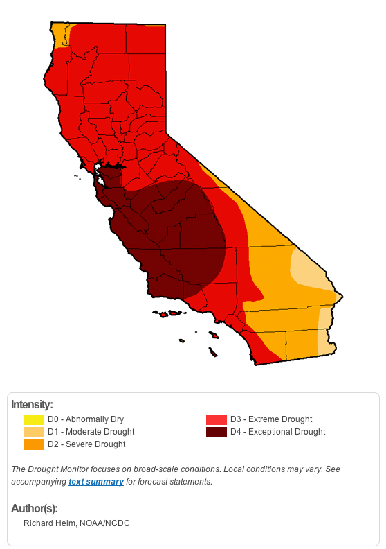
Here's what California's drought map looks like this week:
A Brief History of Drought Tracking
In 1965, meteorologist Wayne Palmer came up with the Palmer Drought Index, which used precipitation, temperature and soil moisture numbers to quantify the state of drought at any given location. Where the number came out negative there was drought, and where the number was positive there was not.
While groundbreaking, the Palmer Index has several problems. For one, it didn't factor in snowpack, which is a key component of natural water storage in California.
A host of other tools popped up over the next few decades, and each used a different suite of measurements to quantify drought.
"We had all these gazillion different indices, and some were saying one thing and some were saying other things," Heim says. "A group decided at the end of the 1990s to coordinate all this stuff and make sense of it."
The Drought Monitor was born as a partnership between the National Drought Mitigation Center at the University of Nebraska-Lincoln, the U.S. Department of Agriculture and the National Oceanographic and Atmospheric Administration.
A small team works each week to create a map and report on the state of drought across the United States. Their composite drought indicator uses the Palmer Index along with a suite of other tools to apply a drought severity scale to geographic regions.
Today it is the most widely used gauge of drought.
Decoding the Scale
The Drought Monitor scale was built to be similar to those used to track tornadoes and hurricanes. Each of these categories are based on historical percentiles if you look at 100-year records.
D0 - Abnormally Dry
D1 - Moderate Drought (11-20% of the time)
D2 - Severe Drought (6%-10% of the time)
D3 - Extreme Drought (3%-5% of the time)
D4 - Exceptional Drought (2% of the time or less)
About a quarter of California is currently classified as D4. Droughts in this category are thought of as "50-year droughts," and they are exceptionally rare.