upper waypoint

Map: How Integrated is the Bay Area (and the Rest of the U.S.)?

Save ArticleSave Article
Failed to save article

Please try again

A map produced by demographic researchers at the Weldon Cooper Center for Public Service shows geographical distribution, population density and racial diversity in the U.S.
A map produced by demographic researchers at the Weldon Cooper Center for Public Service shows geographical distribution, population density and racial diversity in the U.S. This snapshot of the Bay Area shows its diversity.

Just how racially integrated is the Bay Area, a region that many of us like to think and talk about as one of the most diverse in the United States?

The short answer: the Bay Area is more integrated than many other parts of the country, but neighborhoods here definitely break down along racial lines.

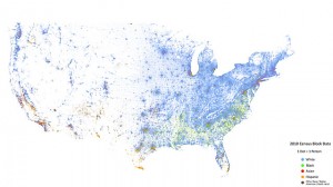
The long answer: Demographic researcher Dustin Cable at University of Virginia’s Weldon Cooper Center for Public Service has created an incredible map showing the 308,745,538 people counted in the 2010 census as dots. The dots are color-coded by race and ethnicity as reported in the 2010 census: Whites are coded as blue; African-Americans, green; Asians, red; Hispanics, orange; and all other racial categories are coded as brown.

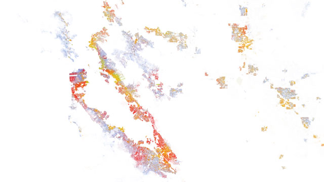
The result is a map that gives a dramatic idea how communities break down along racial lines and conversely where more integration has taken place. The Bay Area looks like a rainbow from afar, but zoom in on any particular city and racial and ethnic lines emerge.

A close up of San Francisco.

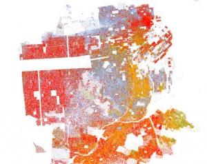
San Francisco's western neighborhoods, the Richmond and Sunset districts, are largely red, representing a high Asian population, with a sprinkling of blue, for white people. While it may feel that white hipsters have taken over the Mission, the map still shows a significant Latino population, especially on the eastern edge of the neighborhood. And, while Bayview and Hunters Point are still neighborhoods with a significant African-American population, those areas are changing as the Asian and Latino populations increase.

Sponsored

From farther away some areas look purple, teal or other hybrid colors. That's because individual dots are smaller than pixels at most zoom levels, and pixels are filled in with a proportionate number of dots in that area. So hybrid colors often mean greater levels of integration. However, Cable cautions that sometimes a city can look happily purple from far away, but at a closer zoom level neighborhoods within the city are still segregated — like Minneapolis/St. Paul, for example.

Take a look at the methodology for the study, which includes interesting information about the data and details on how it was made.

A zoomed out view of the United States reveals population density clearly.
A zoomed out view of the United States clearly reveals population density.

Aside from race, the national map looks as if a line were drawn down the middle from north to south when it comes to population density. The West has a lot more open space, but densely populated cities. The Midwest and East Coast look more densely populated, but also more segregated.

Check out the full interactive map to compare and contrast different parts of the U.S.

lower waypoint
next waypoint
State Prisons Offset New Inmate Wage Hikes by Cutting Hours for Some WorkersAlameda: The Island That Almost Wasn’tFresno's Chinatown Neighborhood To See Big Changes From High Speed RailErik Aadahl on the Power of Sound in FilmCecil Williams, Legendary Pastor of Glide Church, Dies at 94Rainn Wilson from ‘The Office’ on Why We Need a Spiritual RevolutionKQED Youth Takeover: How Can San Jose Schools Create Safer Campuses?How to Attend a Rally Safely in the Bay Area: Your Rights, Protections and the PoliceIn Fresno’s Chinatown, High-Speed Rail Sparks Hope and Debate Within ResidentsWill Less Homework Stress Make California Students Happier?