upper waypoint

Like Yahoo's New Logo, or Prefer the Old One?

Save ArticleSave Article
Failed to save article

Please try again

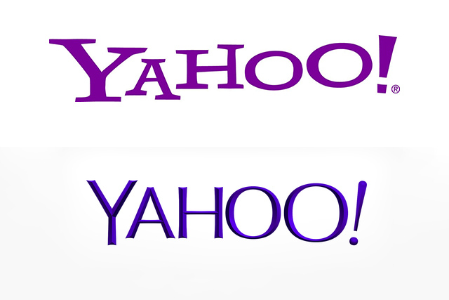
Before and after: Yahoo's old logo, top, and new logo below.

After 30 days of tease, Yahoo unveiled its new look. Perhaps fittingly for a logo that hadn't been changed for 18 years, the look is more sophisticated and modern, with elegantly chiseled letters. Even the purple color seems more mature. The exclamation mark is intact, though playfully tilted; the final "O" is slightly bigger, referencing the Yahoo yodel.

Marissa Meyer herself helped design the logo; her explanation on a Tumblr post discusses how she wanted the logo to look and feel "human."

"We didn’t want to have any straight lines in the logo. Straight lines don’t exist in the human form and are extremely rare in nature, so the human touch in the logo is that all the lines and forms all have at least a slight curve."

Love it? Hate it?

Sponsored

lower waypoint
next waypoint
Stunning Archival Photos of the 1906 Earthquake and FireCould Protesters Who Shut Down Golden Gate Bridge Be Charged With False Imprisonment?Why Nearly 50 California Hospitals Were Forced to End Maternity Ward ServicesSan Francisco Sues Oakland Over Plan to Change Airport NameDemocrats Again Vote Down California Ban on Unhoused EncampmentsFederal Bureau of Prisons Challenges Judge’s Order Delaying Inmate Transfers from FCI DublinFirst Trump Criminal Trial Underway in New YorkDespite Progress, Black Californians Still Face Major Challenges In Closing Equality GapJail Deaths Prompt Calls To Separate Coroner And Sheriff's Departments In Riverside CountyThe Beauty in Finding ‘Other People’s Words’ in Your Own