Over the next three years, the federal agency refinanced more than a million homes. It issued low-interest, long-term loans to scores of new homeowners across the nation, spurring a dramatic uptick in home-ownership over the proceeding decades.
But only for some.
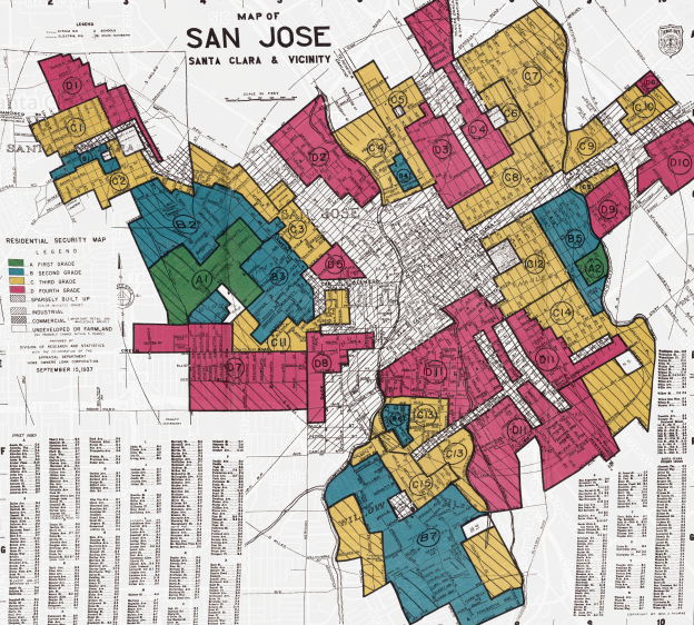
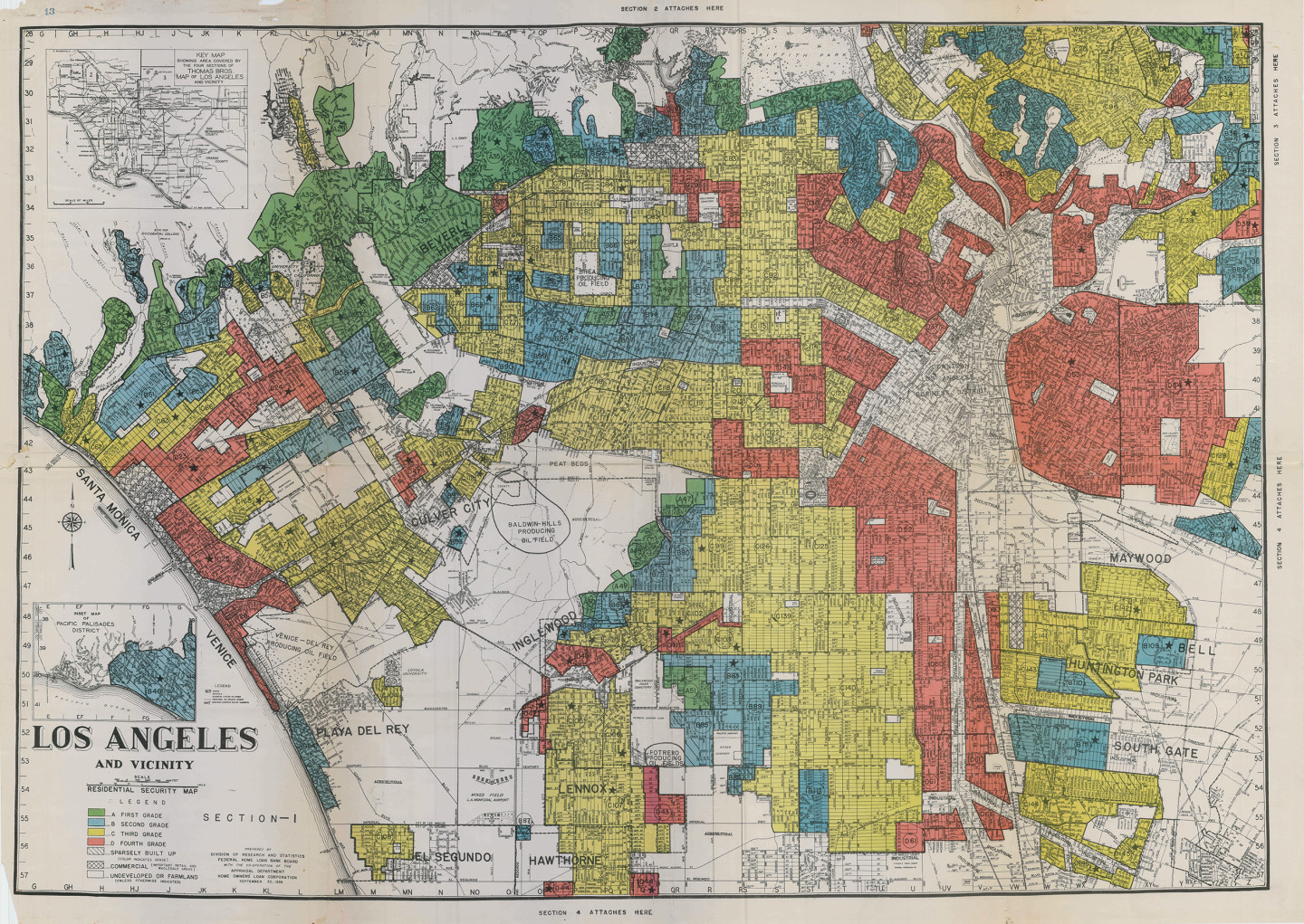
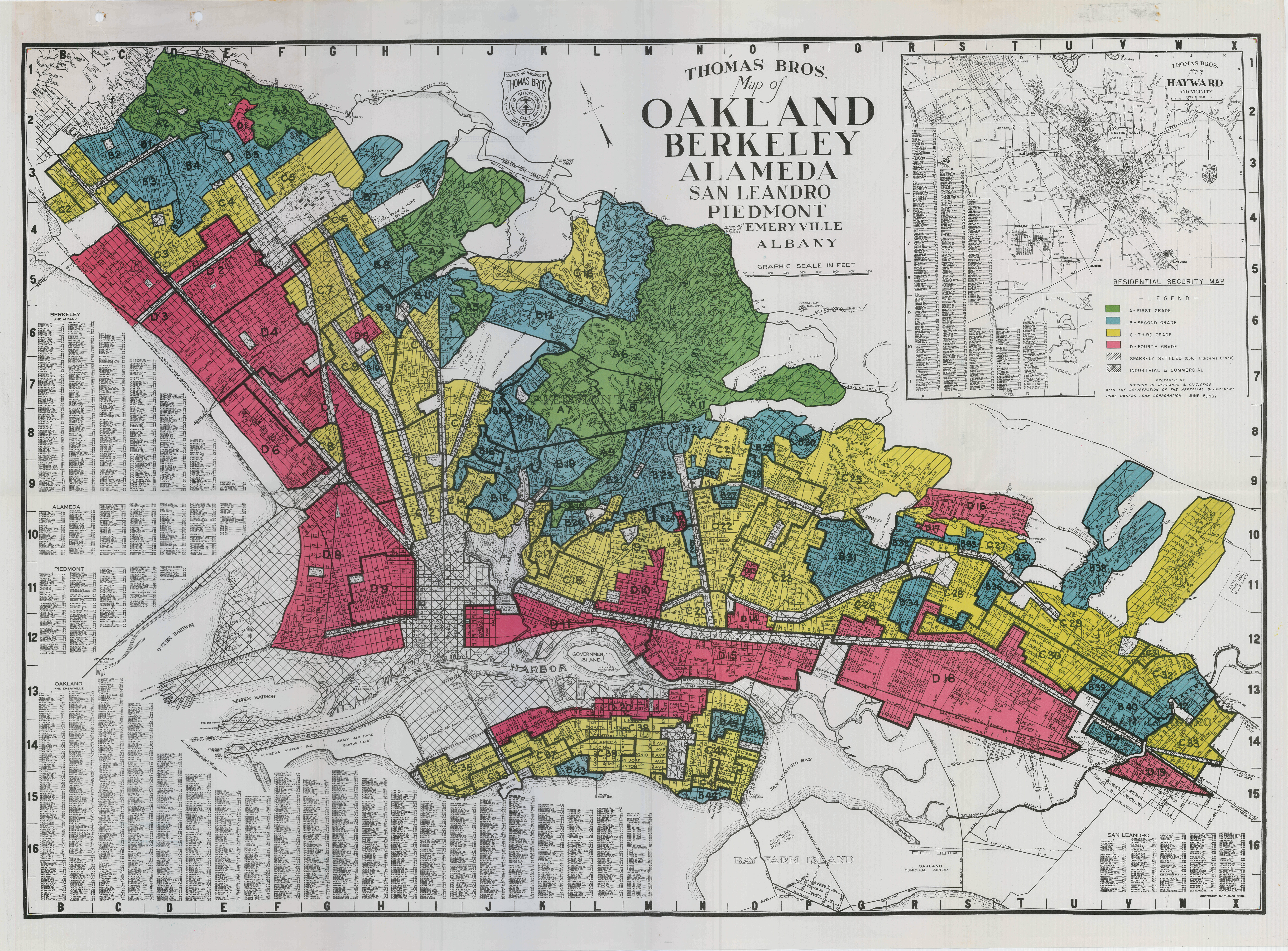
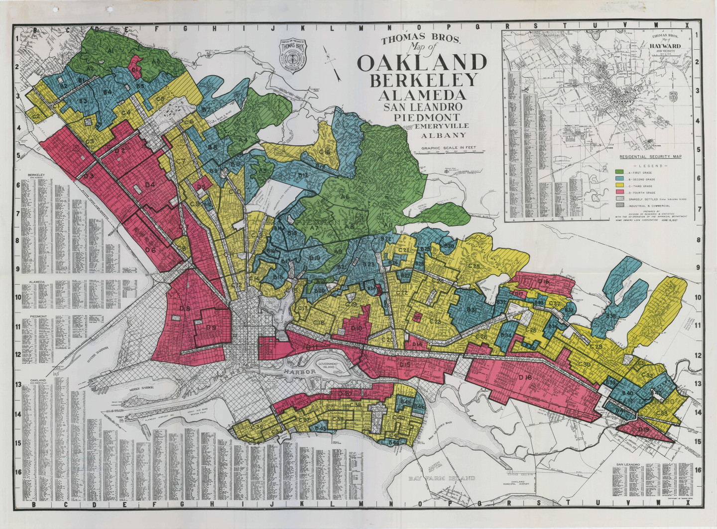
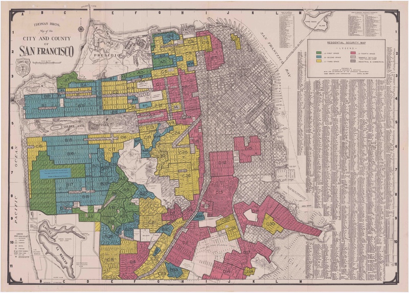
To show which areas were safe investments, HOLC gathered reams of local data to draw up “residential safety maps" of cities across the nation. Neighborhoods were classified into one of four categories based on "favorable" and "detrimental" influences. Factors included terrain and type and age of buildings, as well as the "threat of infiltration of foreign-born, negro, or lower grade population."
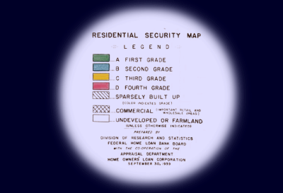 "A" areas, in green, were considered "hot spots," where good mortgage lenders ... are willing to make their maximum loans." "B" areas, in blue, were deemed not as desirable, but "still good." "C" areas, in yellow, were considered in decline. And finally, "D" areas, in red, were considered to be in full decline, areas lenders should steer clear of.
Not surprisingly, HOLC's classification method was heavily influenced by a neighborhood's racial and economic demographics.
Private banks quickly adopted the government's identification system, commonly denying home loans to residents in neighborhoods considered risky. The color-coding of maps became a verb: to redline a community was to mark it as undesirable and not worthy of investment.
Below are some of the original HOLC maps and re-created interactive versions, which use data collected by the University of Maryland's T-Races project. Created in the late 1930s, they illustrate HOLC's neighborhood classification system for mid-to-large cities in the Bay Area and elsewhere in California. For the interactive maps, click on each neighborhood to see copies of the HOLC's original assessment surveys. Find additional maps for San Jose, Los Angeles, San Diego and Stockton at the end of this post.
University of Richmond Historian Robert K. Nelson, who runs the Redlining Richmond project describes the methodology:
Neighborhoods inexorably declined as housing stock decayed and housing styles went out of fashion, lowering values to the point that a "lower grade population" began "infiltrating" the neighborhood. This was bad enough when those infiltrators were working-class or foreign-born whites. Their presence compromised the neighborhood's social homogeneity and accelerated the decline of both housing values and neighborhood desirability.
The movement of African Americans into a neighborhood was far worse according to this model, precipitating the final demise of its desirability and "residential security." Thus while HOLC grades were assigned by weighing a variety of factors, including the age of houses and the fashionability of particular architectural styles, it is clear that race trumped all others ...
Although officially prohibited by the Fair Housing Act of 1968, the practice of neighborhood delineation based on race and class had a lasting impact, depriving certain neighborhoods of essential resources. And that many argue, helped determine the demographic and economic makeup of the neighborhoods we live in today.
More subtle forms of redlining continue however, as evidenced by recent discriminatory loan practice settlements and issues of "retail redlining," wherein businesses avoid setting up shop in neighborhoods deemed undesirable.
View HOLC maps of additional cities at the Urban Oasis project.