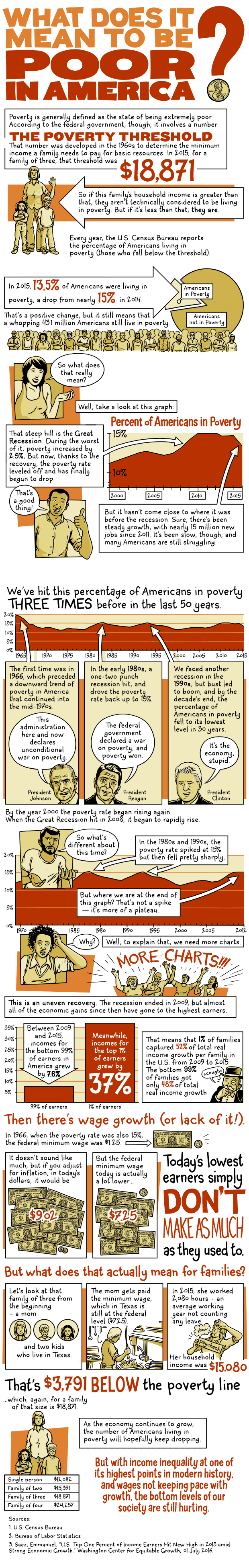
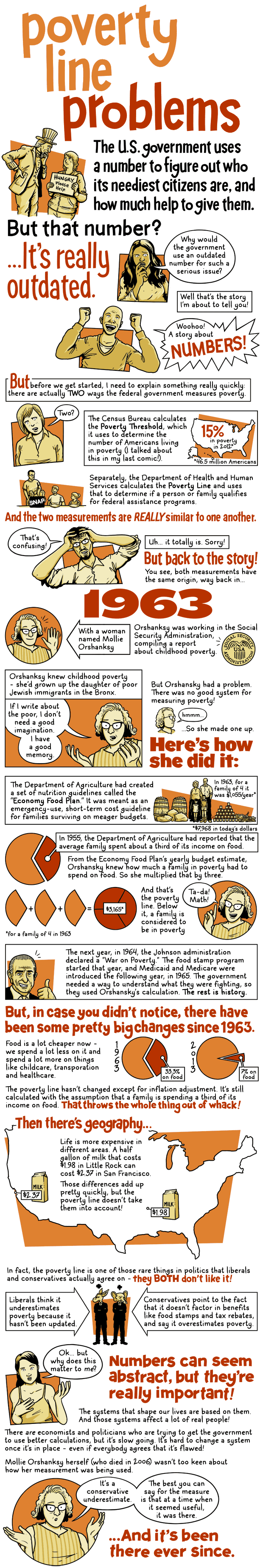
During his State of the Union Address delivered 50 years ago on January 8, 1964, President Lyndon B. Johnson declared "unconditional war on poverty in America." At the time, roughly 19 percent of Americans were living below the newly developed federal poverty line. Johnson's declaration ushered in a wave of social welfare legislation -- part of a set of domestic reforms that became known as "The Great Society." It led to the creation of health and education safety net programs like Medicare, Medicaid, Head Start and food stamps. By 1969, when he left office, the poverty rate had dropped by more than a third, to about 12 percent.
Today, following decades of disinvestment in many of the programs Johnson helped create, the poverty rate is a good deal lower than it was 50 years ago, but still remains stubbornly high. About 15 percent of Americans -- nearly 50 million people, including 13 million children -- still live below the federal poverty line. That rate towers above poverty levels in nearly every other industrialized country in the world. Meanwhile, economic inequality in the country has skyrocketed, resulting in a decimated middle class and a huge, widening gap between the wealthiest and poorest Americans.
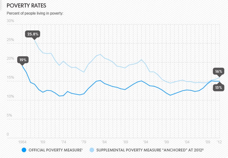
A growing contingent of government economists argue that the poverty line does not accurately measure the beneficial impacts of federal safety net programs. In response, the Census Bureau recently started using an alternate calculation called the supplemental poverty measure, which factors in the benefits of these social programs while also adjusting for disparities in geography-based living costs. While this revised measurement offers a somewhat rosier picture of progress (a drop of about eight percentage points in the last 50 years), today's poverty figures are still pretty bleak no matter how you spin them.
The following two cartoons by Andy Warner -- first featured on the Lowdown several months ago -- help explain how the government measures poverty rates and who it considers poor. Click on the images to view them in slideshow format.