upper waypoint

Life Expectancy Gap in U.S. Grows: Find the Numbers in Every U.S. County

Save ArticleSave Article
Failed to save article

Please try again

On Monday an analysis was published in JAMA Internal Medicine that showed a growing gap between counties with the highest and lowest life expectancy.

The paper, from researchers at the Institute for Health Metrics and Evaluation, revealed that 13 counties have shorter expected lifespans than their parents did.

Citizens of Aglala Lakota County, South Dakota who were born in 2014 have an average life expectancy of 66.8 years, the lowest in the nation. That's lower than the life expectancy in Sudan, India and Iraq, IHME said. The county includes the Pine Ridge Native American reservation.

Various counties in Appalachia, parts of the southeast and other counties in South Dakota also fared poorly.

Parts of central Colorado had the highest life expectancy.

From 1980 to 2014, these counties had the greatest increase in life expectancy:

  • Aleutians East Borough, Aleutians West Census Area, Alaska (+18.3%)
  • North Slope Borough, Alaska (+17.9%)
  • New York County, New York (+15.2%)
  • Sumter County, Florida (+13.8%)
  • San Francisco County, California (+13.5%)
  • Kings County, New York (+13.2%)
  • Kodiak Island Borough, Alaska (+13.2%)
  • Northwest Arctic Borough, Alaska (+12.8%)
  • District of Columbia, District of Columbia (+12.8%)
  • Loudoun County, Virginia (+12.4%)

And the worst decreases:

  • Owsley County, Kentucky (-3%)
  • Lee County, Kentucky (-2%)
  • Leslie County, Kentucky (-1.9%)
  • Breathitt County, Kentucky (-1.4%)
  • Clay County, Kentucky (-1.3%)
  • Powell County, Kentucky (-1.1%)
  • Estill County, Kentucky (-1%)
  • Perry County, Kentucky (-0.8%)
  • Kiowa County, Oklahoma (-0.7%)
  • Perry County, Alabama (-0.6%)

In January a study published in JAMA highlighted the geographical disparities within the U.S. regarding cancer death rates. Researchers at the Institute for Health Metrics and Evaluation looked at the country's more than 19.5 million cancer deaths in every one of 3,144 U.S. counties from 1980-2014. The study found that while the overall cancer mortality rate decreased by about 20 percent, in 160 counties the rate actually increased.

All of the data from the latest studies and more are incorporated into IHME's U.S. Health Map, launched in 2013 with a look at mortality rates by county. Since then the institute has supplemented the map with additional data as more research has been conducted. Big data geeks, health researchers, and those with a morbid propensity to delve into who-dies-where-from-what have been parsing the data, which includes live expectancy, mortality rates and different risk factors, ever since.

Click on the image for the map. Not a great experience on mobile, so you may want to bookmark or send to yourself for later viewing.mapgraphic


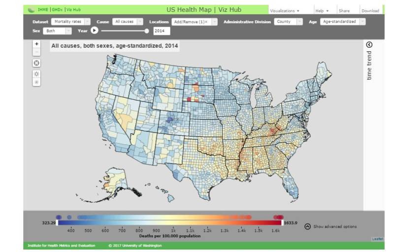
The Institute for Health Metrics and Evaluation on Monday released another in a series of its big-data analyses of who-dies-where-from-what, and like so much else in the country, the news is good or bad depending on where you live.

The analysis, published in JAMA Internal Medicine, showed a growing gap between counties with the highest and lowest life expectancy.

Interactive map: Mortality rates, life expectancy and risk factors by every U.S. county, 1980-2014


The study from IHME researchers revealed that in 13 counties, residents have shorter expected lifespans than their parents did.

Citizens of Aglala Lakota County, South Dakota who were born in 2014 have an average life expectancy of 66.8 years, the lowest in the nation. That's worse than the life expectancy in Sudan, India and Iraq, IHME said. The county includes the Pine Ridge Native American reservation.

Sponsored

Various counties in Appalachia, parts of the southeast and other counties in South Dakota also fared poorly.

Parts of central Colorado had the highest life expectancy.

From 1980 to 2014, these counties had the greatest increase in life expectancy:

  1. Aleutians East Borough, Aleutians West Census Area, Alaska (+18.3%)
  2. North Slope Borough, Alaska (+17.9%)
  3. New York County, New York (+15.2%)
  4. Sumter County, Florida (+13.8%)
  5. San Francisco County, California (+13.5%)
  6. Kings County, New York (+13.2%)
  7. Kodiak Island Borough, Alaska (+13.2%)
  8. Northwest Arctic Borough, Alaska (+12.8%)
  9. District of Columbia, District of Columbia (+12.8%)
  10. Loudoun County, Virginia (+12.4%)

And the worst decreases:

  1. Owsley County, Kentucky (-3%)
  2. Lee County, Kentucky (-2%)
  3. Leslie County, Kentucky (-1.9%)
  4. Breathitt County, Kentucky (-1.4%)
  5. Clay County, Kentucky (-1.3%)
  6. Powell County, Kentucky (-1.1%)
  7. Estill County, Kentucky (-1%)
  8. Perry County, Kentucky (-0.8%)
  9. Kiowa County, Oklahoma (-0.7%)
  10. Perry County, Alabama (-0.6%)

From our friends at NPR Shots:

There's no sign of the gap closing. In fact, it appears to be widening. Between 1980 and 2014, the gap between the highest and lowest life spans increased by about two years.

"With every passing year, inequality — however you measure it — has been widening over the last 34 years," [IHME's Christopher} Murray says. "And so next year, we can reliably expect it'll be even more than 20."

"That is probably the most alarming part of the analysis," he adds.

The reasons for the gap are complicated. But it looks as if the counties with the lowest life spans haven't made much progress fighting significant health problems such as smoking and obesity.

"It's this steady process where many parts of the country have been steadily getting better, and then there's a segment of America where things have not progressed in a generation and a half," Murray says.

In January a study published in JAMA highlighted the geographical disparities within the U.S. regarding cancer death rates. Researchers at IHME looked at the country's more than 19.5 million cancer deaths in every one of 3,144 U.S. counties from 1980-2014. The study found that while the overall cancer mortality rate decreased by about 20 percent, in 160 counties the rate actually increased.

All of the data from the latest studies and more are incorporated into IHME's U.S. Health Map, which you can peruse at your leisure above. Launched in 2013 with a look at mortality rates by county, the IHME has supplemented the map with additional data as more research has been conducted. Big data geeks, health researchers, and those with morbid propensities have been parsing the data ever since.

The IHME is funded in large part by the Bill & Melinda Gates Foundation and the state of Washington. The website will give you access to more data visualizations, research papers and how the institute's data is being used internationally.

lower waypoint
next waypoint
Homeowners Insurance Market Stretched Even Thinner as 2 More Companies Leave CaliforniaAs California Seeks to Legalize Psychedelics for Therapy, Oregon Provides Key LessonsWatch Ferns Get FreakyCalifornia’s Commercial Salmon Season Is Closed Again This YearHoping for a 2024 'Super Bloom'? Where to See Wildflowers in the Bay AreaInsurance In California Is Changing. Here's How It May Affect YouWhere to See Cherry Blossoms in the Bay Area This SpringEverything You Never Wanted to Know About Snail SexThese Face Mites Really Grow on YouSchizophrenia: What It's Like to Hear Voices