With these problems in mind, I started asking what I could do to provide my students with the tools to read and understand graphs, as well as how to question them. I knew this needed to be more than a one-time deal. In order to really help them become better consumers of information, they would need lots and lots of practice.
While looking for resources, I came across The New York Times “What’s Going On in This Graph?” series. In this weekly publication, I found not only a collection of graphs, maps and charts that are recent and relevant, but also a discussion framework (“Notice and Wonder”), an invitation for students to write a title for the graphs featured (more critical thinking practice), and even an invitation for students to discuss them live. It was almost as if The New York Times had read my mind!
The New York Times activity offers two ways to participate:
- For students 13 and older, through the comment section on the weekly activity (where comments are moderated for civility).
- For younger students, commenting through Desmos, a “closed classroom” environment.
For my students, neither of these options were “just right” at the time. On one hand, I relished the thought of the public commentary, but worried about privacy. On the other, the closed classroom environment of Desmos seemed too restrictive and would be new to us–I wanted to roll the activity out without introducing another login and platform. So, I decided to simply publish the activity using Formative, a tool where I could post the graph with links, ask students the “Notice and Wonder” questions, and follow them with the “propose a catchy title” prompt. I liked the idea of using this tool since I could use it to share students’ answers with the whole class without displaying their names, and we could then have a class discussion about their noticings, wonderings and titles.
This process worked the first few times, and while their noticings and wonderings started to strengthen with each discussion, their titles quickly became uninspiring, a simple restatement of what the graph was saying.
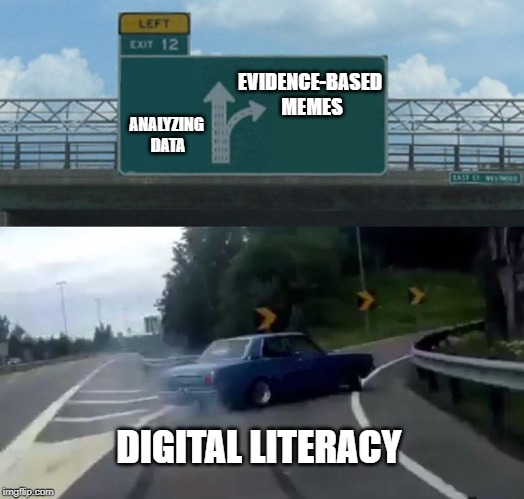
In one of those moments of inspiration-while-driving, I remembered the “Making Memes and GIFs” course I had taken on KQED Teach a few months back. I wondered if using memes instead of titles would be more engaging, while still hitting the learning objective of providing a critical summary and analysis of the graph’s message. When I arrived at school that day, I quickly substituted the “Write a catchy title” prompt with “Create a meme, using Google draw or any meme creation platform of your choice, that is supported by the evidence presented in the graph.”
Now, this class already had some experience with creating memes since we had done that as part of a different assignment (Organelle Wars). We discussed the idea that while their memes could be funny, satirical or ironic, for this assignment they needed to also be based specifically on the evidence provided in the graph. Through their meme, they needed to call attention to the information in such a way that would make people want to share their meme. The rule of thumb was the question, “Would this go viral?”
As they started creating their memes for that first assignment, they asked an obvious question: “How can this go viral if no one sees it but us?” The point was valid. I needed three things:
- A way to share their posts with a wider audience, other than my own social media accounts.
- A way for my students who were not comfortable with posting publicly to opt out of sharing.
- A way for my students who don’t have social media accounts to provide votes or likes.
The answer to these three needs came from Padlet, an online bulletin board that can be set with different privacy options and that can easily be shared on a myriad of platforms.
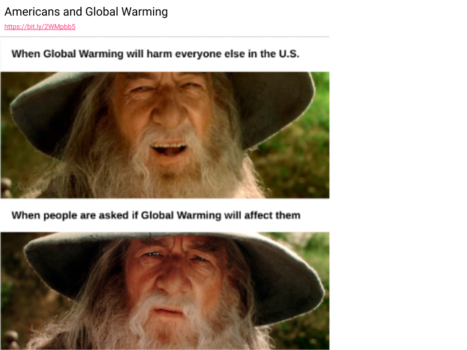
I created our “What’s Going on in This Graph?” meme Padlet, showed it to students and invited them to share their memes there without making it mandatory. For the last few weeks, our in-class assignment has morphed into a discussion of whether or not the memes shared are really supported by the data in the graph being analyzed. This adds yet another level of depth to the original intent of providing students with the skills and practice necessary to read, interpret and question graphs, maps and charts. Little by little, our collection of evidence-based memes has grown, and I am very proud of what my students have decided to share. I invite you to take a look at our Padlet and vote on your favorites. These are mine.

Editor’s Note: