[media-credit name="Julianna Cecere | KQED" align="alignleft" width="640"] [/media-credit]
Don’t worry if you need more time to explore these activities. At Camp KQED Teach, we only have three rules: 1) Learn, 2) Experiment, and 3) Have fun!
A Summer of Online Learning Fun
Data visualization is all about transforming raw data into visual forms that communicate the same information beautifully and effectively. (And, yes, what we learn from text counts as data as much as numbers do!) Say goodbye to spreadsheets and big blocks of text, and use data visualizations like infographics, interactive timelines and maps to bring learning to life.
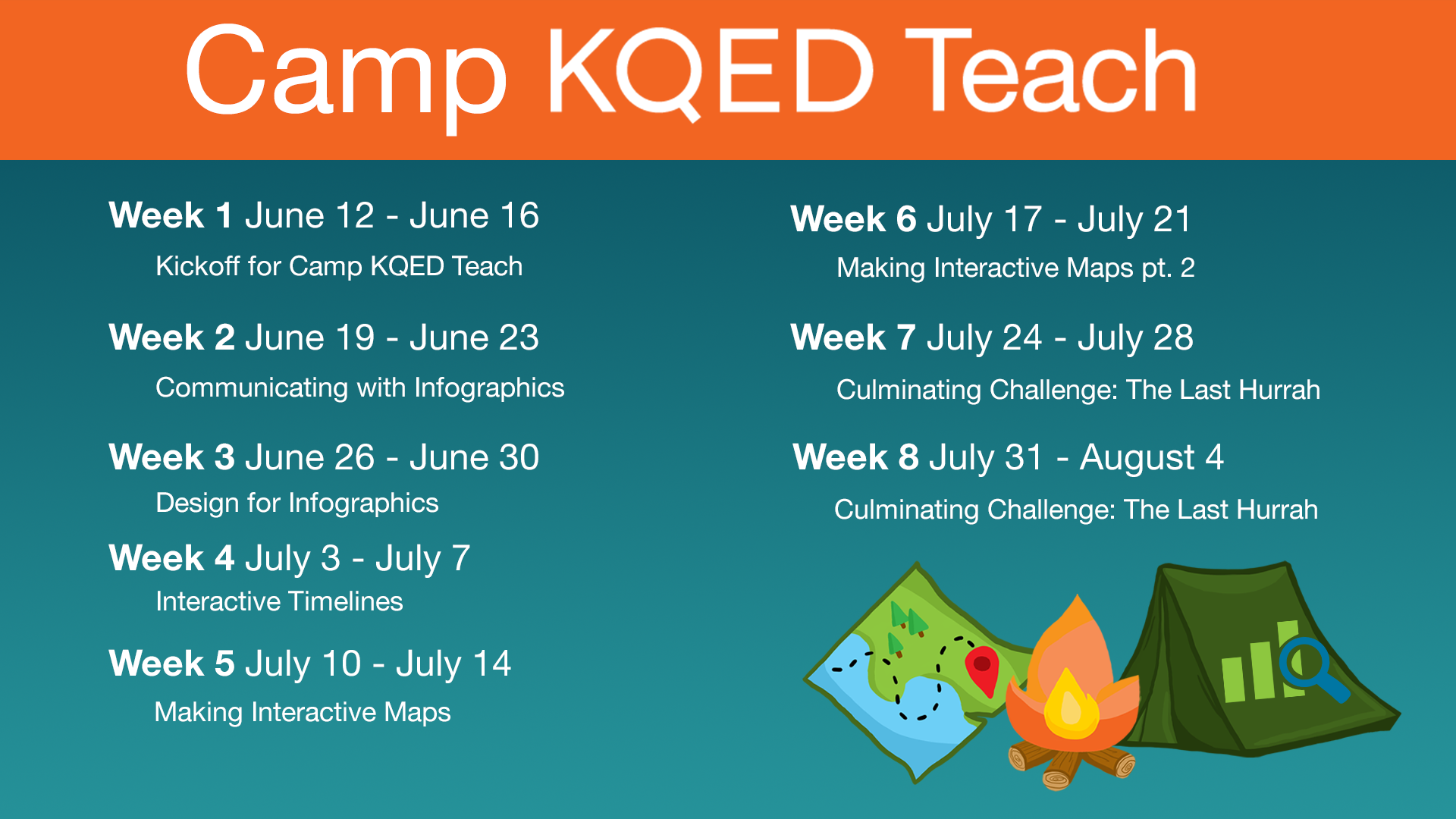
Camp KQED Teach starts with Making Infographics for a good reason. This course explores design basics that can apply to any data visualization you create. After that, dive into how to make amazing infographics in any subject area.
Check out this video for a sneak preview of what’s in store:
After practicing with infographics, it’s time to move onto Interactive Timelines. Turning this time-honored (get it?) instructional tool into a visually appealing story has never been easier! After building your technical skills and design savvy with infographics, timelines will feel like a stroll through the woods on a warm afternoon. Be sure to have lots of fun finding images and videos to bring your timeline to life.
But don’t take our word for it. Check out the preview video for the Interactive Timelines course.
From timelines we move to Making Interactive Maps, another fun and student-friendly way to bring data to life. Want to follow in the footsteps of Charles Darwin, Marco Polo or Ibn Battuta? Track butterfly migrations? Explore faraway islands? Measure the distance from Tulsa to Timbuktu? Interactive maps make it possible to uncover the secrets of a city block or visualize world-changing journeys by land or sea.
But first, explore the video to see if this trip is for you.
Finally, Camp KQED Teach wants you to leave with something to remember us by. Not a cheesy souvenir but a project or assignment you create and use during the school year. Take what you’ve learned about data visualization and apply it. Offer your students a choice of data visualizations methods to use. Check out the final challenge called the Last Hurrah.
Don’t forget to share your project with your fellow educators around the virtual campfire. We’re all in this together!
As we go our separate ways at the end of the summer, we’ll have so many memories–and useful resources–to usher us into the school year.