Academics and trendwatchers agree: in terms of mass communication, we live in a period of transition between words and images. Nobody can predict what the next few decades (centuries?) will look like with any certainty, but there is greater pressure than ever to visualize large amounts of complicated data in ways that are more and more interactive and time-based, rather than just to describe it with text or a single graph.
Enter Infosthetics, a blog maintained by Andrew Vande Moere, which is dedicated to tracking projects that combine design and information visualization in interesting ways, and a great site to get a sense of the breadth of the field of information aesthetics.
While my favorite projects are whimsical in nature, such as Rosemarie Fiore’s huge-scale scrambler drawings, created Spirograph-style using carnival rides, there are other projects represented that ask more serious questions, such as a piece posted on Wallstats that analyzes charts and graphs produced by different sections of the “Pentagon graphics machine” and asks questions about discrepancies in quality and format between departments, as well as their overall clarity and usefulness. I mean, if senators and representatives are voting to spend our tax dollars based on Powerpoint presentations that contain these images, they should be accurate, right?
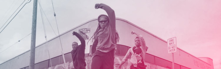
There’s also a trend towards the visualization of online information, from declarations made on personal blogs (Jonathan Harris’s We Feel Fine) to tracking news stories and images (Marcos Weskamp’s Google newsmap). What many of these have in common is the attempt to represent not just multiplicity but multitude, as well as to place information geographically, or sometimes demographically.
It’s an easy site to get lost in, and it’s even easier to begin to feel like too many projects do nothing but communicate sheer mass, but for every project like Torrent Raider’s Bit Torrent visualization game, there’s a project like Twistori’s Twitter message filter, which plucks sentences from Twitter that start with phrases such as “I love” or “I hate” and sends them padding across your screen in real time. You can even download the screen saver, which is how I know that somebody on a train in India feels a little less geeky now that four other people have whipped out their Blackberries.