The Bay Area is a magnet for both artistic spirits and data freaks. So, although the inaugural "Information is Beautiful" competition drew entries from around the world, perhaps it isn't too surprising that the ultimate prize was snagged by San Francisco design company Stamen.
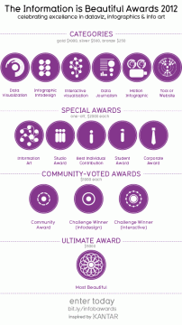
The competition is the brainchild of David McCandless, author of the Information is Beautiful book and blog. Funded by UK-based market research company Kantar and judged by a panel of experts including Brian Eno and Maria Popova, the competition's results were announced at the end of September. Gold, silver, and bronze awards were given in six categories, along with a handful of special prizes.
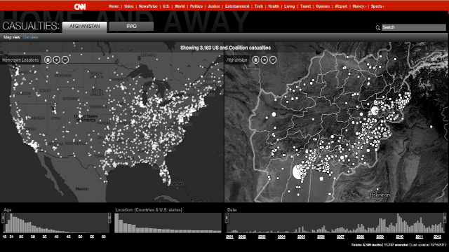
Stamen's design, CNN Home and Away, won the gold in Data Journalism as well as the overall Most Beautiful award. The interactive infographic pairs a map of Afghanistan or Iraq with a map of the United States (which can zoom out to the world) to illustrate the beginnings (hometowns) and ends (casualty locations) of US and Coalition soldiers since 2001. You can click on a location for more information and an opportunity to share memories of each veteran. It is beautiful--and heartbreaking.

A small company with a staff of thirteen, Stamen's tagline is "big ideas worth pursuing." Reminiscent of TED's "ideas worth spreading," it may sound too ambitious for a design company. But data visualization is about more than aesthetics--it's about research, education, and perhaps even morality.
