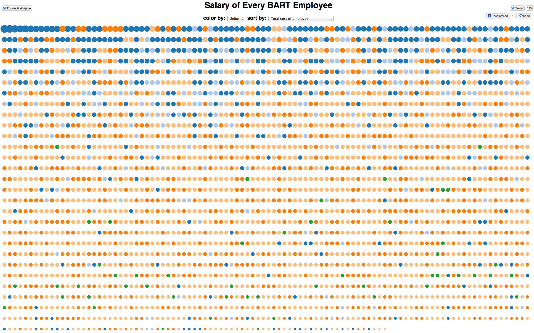
A visualization of the total cost of BART employees lays out each individual's salary with colored dots — dark blue represents management, orange and light orange are the two unions currently negotiating their contracts, and other colors are other unions and other positions. The bigger the dot, the more money.
With the BART dispute entering its fourth month and the BART strike watch becoming a nightly Bay Area activity, nearly every commuter has opinions about how much the transit workers and management are paid, how much they deserve to be paid and how much BART costs or benefits the region.
Ian Johnson does data visualization for Lever, a web app company based in San Francisco. During the first BART strike, he struggled with his commute from Berkeley into the city and started to think about how he could find public data and use it to make sense of an issue that was affecting him personally.
Sponsored
Johnson enlisted some of his friends to help craft rough sketches. Those sketches caught the attention of Lewis Lehe, a Ph.D. student at Cal and one of the founders of VUDlab. Lehe invited them to co-host a hackathon at Berkeley's Skydeck startup accelerator. Twenty-five people showed up to work on projects and source data (and eat pizza). They followed up a few days later with a second event.
"As the days went on and the strike was delayed again and again, we were able to pull together the projects into one page, and everyone refined their individual projects too," said Johnson. Now, all the projects using numbers being referenced in the BART strike talks are grouped together.
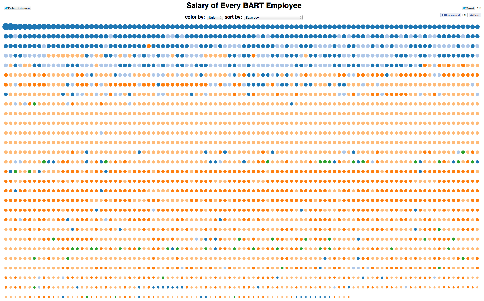
The most popular of the Hack the BART Strike visualizations is a tool that allows you to sort the salaries of all BART workers — union, management, unions not involved in the disputes — by total cost, base pay, overtime or pension contributions. In the visualization, the orange and light orange dots represent the two unions negotiating their contracts, while the dark blue dots represent management. The other colors are other unions and positions. The bigger the dot, the more money. These are all the employees by base pay — the top dot is General Manager Grace Crunican at $312,461:
Employee salaries organized by base pay.
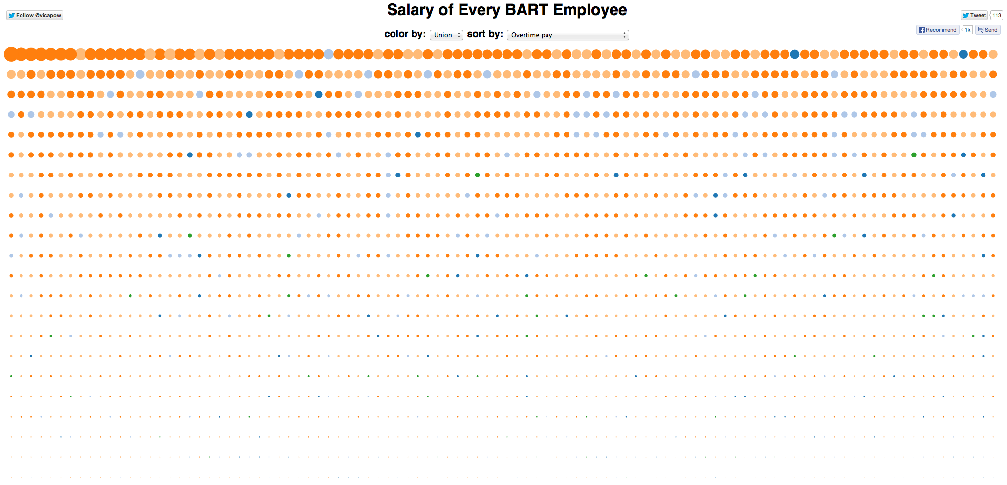
These are all the employees by overtime pay — the biggest dot is Senior Operations Foreworker Carl Oliver, who made $121,452 in overtime:
Employees sorted by overtime pay.
The visualization was created by Victor Powell, a 24-year-old freelance developer who is part of the d3 group.
Powell says that he didn't start with a particular goal or motivation, but just "played around with" the data set of salary information. He was a little surprised with what he ended up with, though. He expected the variation in salaries would be more pronounced visually and he didn't realize overtime would play such a big role in total compensation.
"It was eye-opening to see it like that," he said.
Some people, he said, have criticized his choice to leave the names of employees in his visualization. But he criticizes media reports that have dealt just in base salaries to compare numbers, or condense everything into an average.
"There's no reason to compress it all into one number," he said — not when we can see it all in one graphic.
window.__IS_SSR__=true
window.__INITIAL_STATE__={"attachmentsReducer":{"audio_0":{"type":"attachments","id":"audio_0","imgSizes":{"kqedFullSize":{"file":"https://ww2.kqed.org/news/wp-content/themes/KQED-unified/img/audio_bgs/background0.jpg"}}},"audio_1":{"type":"attachments","id":"audio_1","imgSizes":{"kqedFullSize":{"file":"https://ww2.kqed.org/news/wp-content/themes/KQED-unified/img/audio_bgs/background1.jpg"}}},"audio_2":{"type":"attachments","id":"audio_2","imgSizes":{"kqedFullSize":{"file":"https://ww2.kqed.org/news/wp-content/themes/KQED-unified/img/audio_bgs/background2.jpg"}}},"audio_3":{"type":"attachments","id":"audio_3","imgSizes":{"kqedFullSize":{"file":"https://ww2.kqed.org/news/wp-content/themes/KQED-unified/img/audio_bgs/background3.jpg"}}},"audio_4":{"type":"attachments","id":"audio_4","imgSizes":{"kqedFullSize":{"file":"https://ww2.kqed.org/news/wp-content/themes/KQED-unified/img/audio_bgs/background4.jpg"}}},"placeholder":{"type":"attachments","id":"placeholder","imgSizes":{"thumbnail":{"file":"https://ww2.kqed.org/wp-content/uploads/sites/10/2018/01/GettyImages-896326950-160x96.jpg","width":160,"height":96,"mimeType":"image/jpeg"},"medium":{"file":"https://ww2.kqed.org/wp-content/uploads/sites/10/2018/01/GettyImages-896326950-800x478.jpg","width":800,"height":478,"mimeType":"image/jpeg"},"large":{"file":"https://ww2.kqed.org/wp-content/uploads/sites/10/2018/01/GettyImages-896326950-1020x610.jpg","width":1020,"height":610,"mimeType":"image/jpeg"},"fd-lrg":{"file":"https://ww2.kqed.org/wp-content/uploads/sites/10/2018/01/GettyImages-896326950-1920x1148.jpg","width":1920,"height":1148,"mimeType":"image/jpeg"},"fd-med":{"file":"https://ww2.kqed.org/wp-content/uploads/sites/10/2018/01/GettyImages-896326950-1180x705.jpg","width":1180,"height":705,"mimeType":"image/jpeg"},"fd-sm":{"file":"https://ww2.kqed.org/wp-content/uploads/sites/10/2018/01/GettyImages-896326950-960x574.jpg","width":960,"height":574,"mimeType":"image/jpeg"},"post-thumbnail":{"file":"https://ww2.kqed.org/wp-content/uploads/sites/10/2018/01/GettyImages-896326950-672x372.jpg","width":672,"height":372,"mimeType":"image/jpeg"},"twentyfourteen-full-width":{"file":"https://ww2.kqed.org/wp-content/uploads/sites/10/2018/01/GettyImages-896326950-1038x576.jpg","width":1038,"height":576,"mimeType":"image/jpeg"},"xxsmall":{"file":"https://ww2.kqed.org/wp-content/uploads/sites/10/2018/01/GettyImages-896326950-240x143.jpg","width":240,"height":143,"mimeType":"image/jpeg"},"xsmall":{"file":"https://ww2.kqed.org/wp-content/uploads/sites/10/2018/01/GettyImages-896326950-375x224.jpg","width":375,"height":224,"mimeType":"image/jpeg"},"small":{"file":"https://ww2.kqed.org/wp-content/uploads/sites/10/2018/01/GettyImages-896326950-520x311.jpg","width":520,"height":311,"mimeType":"image/jpeg"},"xlarge":{"file":"https://ww2.kqed.org/wp-content/uploads/sites/10/2018/01/GettyImages-896326950-1180x705.jpg","width":1180,"height":705,"mimeType":"image/jpeg"},"full-width":{"file":"https://ww2.kqed.org/wp-content/uploads/sites/10/2018/01/GettyImages-896326950-1920x1148.jpg","width":1920,"height":1148,"mimeType":"image/jpeg"},"guest-author-32":{"file":"https://ww2.kqed.org/wp-content/uploads/sites/10/2018/01/GettyImages-896326950-32x32.jpg","width":32,"height":32,"mimeType":"image/jpeg"},"guest-author-50":{"file":"https://ww2.kqed.org/wp-content/uploads/sites/10/2018/01/GettyImages-896326950-50x50.jpg","width":50,"height":50,"mimeType":"image/jpeg"},"guest-author-64":{"file":"https://ww2.kqed.org/wp-content/uploads/sites/10/2018/01/GettyImages-896326950-64x64.jpg","width":64,"height":64,"mimeType":"image/jpeg"},"guest-author-96":{"file":"https://ww2.kqed.org/wp-content/uploads/sites/10/2018/01/GettyImages-896326950-96x96.jpg","width":96,"height":96,"mimeType":"image/jpeg"},"guest-author-128":{"file":"https://ww2.kqed.org/wp-content/uploads/sites/10/2018/01/GettyImages-896326950-128x128.jpg","width":128,"height":128,"mimeType":"image/jpeg"},"detail":{"file":"https://ww2.kqed.org/wp-content/uploads/sites/10/2018/01/GettyImages-896326950-150x150.jpg","width":150,"height":150,"mimeType":"image/jpeg"},"kqedFullSize":{"file":"https://ww2.kqed.org/wp-content/uploads/sites/10/2018/01/GettyImages-896326950-e1514998105161.jpg","width":1920,"height":1148}}},"news_11983202":{"type":"attachments","id":"news_11983202","meta":{"index":"attachments_1591205162","site":"news","id":"11983202","found":true},"title":"Crowds-flee","publishDate":1713314335,"status":"inherit","parent":11983182,"modified":1713387599,"caption":"People flee the fire that started after the earthquake on April 18, 1906.","credit":"\u003ca href=\"https://digitalsf.org/islandora/object/islandora%3A133324?solr_nav%5Bid%5D=2a1aaa750d80593cd80a&solr_nav%5Bpage%5D=1&solr_nav%5Boffset%5D=11\">San Francisco History Center/San Francisco Public Library\u003c/a>","altTag":"A black-and-white photo shows people running away from what looks like a massive fire.","description":null,"imgSizes":{"thumbnail":{"file":"https://cdn.kqed.org/wp-content/uploads/sites/10/2024/04/Crowds-flee-160x95.jpg","width":160,"height":95,"mimeType":"image/jpeg"},"kqedFullSize":{"file":"https://cdn.kqed.org/wp-content/uploads/sites/10/2024/04/Crowds-flee.jpg","width":600,"height":355}},"fetchFailed":false,"isLoading":false},"news_11983218":{"type":"attachments","id":"news_11983218","meta":{"index":"attachments_1591205162","site":"news","id":"11983218","found":true},"title":"CMHospitals01","publishDate":1713372118,"status":"inherit","parent":11983217,"modified":1713380198,"caption":"A newborn baby at Martin Luther King Community Hospital in Los Angeles on March 22, 2024.","credit":"Jules Hotz/CalMatters","altTag":null,"description":null,"imgSizes":{"medium":{"file":"https://cdn.kqed.org/wp-content/uploads/sites/10/2024/04/CMHospitals01-800x533.jpg","width":800,"height":533,"mimeType":"image/jpeg"},"large":{"file":"https://cdn.kqed.org/wp-content/uploads/sites/10/2024/04/CMHospitals01-1020x680.jpg","width":1020,"height":680,"mimeType":"image/jpeg"},"thumbnail":{"file":"https://cdn.kqed.org/wp-content/uploads/sites/10/2024/04/CMHospitals01-160x107.jpg","width":160,"height":107,"mimeType":"image/jpeg"},"1536x1536":{"file":"https://cdn.kqed.org/wp-content/uploads/sites/10/2024/04/CMHospitals01-1536x1024.jpg","width":1536,"height":1024,"mimeType":"image/jpeg"},"post-thumbnail":{"file":"https://cdn.kqed.org/wp-content/uploads/sites/10/2024/04/CMHospitals01-672x372.jpg","width":672,"height":372,"mimeType":"image/jpeg"},"twentyfourteen-full-width":{"file":"https://cdn.kqed.org/wp-content/uploads/sites/10/2024/04/CMHospitals01-1038x576.jpg","width":1038,"height":576,"mimeType":"image/jpeg"},"full-width":{"file":"https://cdn.kqed.org/wp-content/uploads/sites/10/2024/04/CMHospitals01-1920x1280.jpg","width":1920,"height":1280,"mimeType":"image/jpeg"},"kqedFullSize":{"file":"https://cdn.kqed.org/wp-content/uploads/sites/10/2024/04/CMHospitals01.jpg","width":2000,"height":1333}},"fetchFailed":false,"isLoading":false},"news_11983385":{"type":"attachments","id":"news_11983385","meta":{"index":"attachments_1591205162","site":"news","id":"11983385","found":true},"title":"Oakland International Airport on April 14, 2020.","publishDate":1713473411,"status":"inherit","parent":11983384,"modified":1713473500,"caption":"Oakland International Airport on April 14, 2020.","credit":"Beth LaBerge/KQED","altTag":"An airport terminal with line dividers and luggage check with a sign that reads \"Oakland International.\"","description":null,"imgSizes":{"medium":{"file":"https://cdn.kqed.org/wp-content/uploads/sites/10/2024/04/007_KQED_Oakland_Airport_04142020_qut-800x533.jpg","width":800,"height":533,"mimeType":"image/jpeg"},"large":{"file":"https://cdn.kqed.org/wp-content/uploads/sites/10/2024/04/007_KQED_Oakland_Airport_04142020_qut-1020x680.jpg","width":1020,"height":680,"mimeType":"image/jpeg"},"thumbnail":{"file":"https://cdn.kqed.org/wp-content/uploads/sites/10/2024/04/007_KQED_Oakland_Airport_04142020_qut-160x107.jpg","width":160,"height":107,"mimeType":"image/jpeg"},"1536x1536":{"file":"https://cdn.kqed.org/wp-content/uploads/sites/10/2024/04/007_KQED_Oakland_Airport_04142020_qut-1536x1024.jpg","width":1536,"height":1024,"mimeType":"image/jpeg"},"post-thumbnail":{"file":"https://cdn.kqed.org/wp-content/uploads/sites/10/2024/04/007_KQED_Oakland_Airport_04142020_qut-672x372.jpg","width":672,"height":372,"mimeType":"image/jpeg"},"twentyfourteen-full-width":{"file":"https://cdn.kqed.org/wp-content/uploads/sites/10/2024/04/007_KQED_Oakland_Airport_04142020_qut-1038x576.jpg","width":1038,"height":576,"mimeType":"image/jpeg"},"kqedFullSize":{"file":"https://cdn.kqed.org/wp-content/uploads/sites/10/2024/04/007_KQED_Oakland_Airport_04142020_qut.jpg","width":1920,"height":1280}},"fetchFailed":false,"isLoading":false},"news_11983184":{"type":"attachments","id":"news_11983184","meta":{"index":"attachments_1591205162","site":"news","id":"11983184","found":true},"title":"CMEncampmentBan01","publishDate":1713311401,"status":"inherit","parent":11983180,"modified":1713311436,"caption":"An encampment is seen on the sidewalk near a freeway entrance in downtown San Diego on March 22, 2024. Unhoused individuals moved their belongings across the street and later came back after cleaning finished.","credit":"Kristian Carreon/CalMatters","altTag":null,"description":null,"imgSizes":{"medium":{"file":"https://cdn.kqed.org/wp-content/uploads/sites/10/2024/04/CMEncampmentBan01-800x533.jpg","width":800,"height":533,"mimeType":"image/jpeg"},"large":{"file":"https://cdn.kqed.org/wp-content/uploads/sites/10/2024/04/CMEncampmentBan01-1020x680.jpg","width":1020,"height":680,"mimeType":"image/jpeg"},"thumbnail":{"file":"https://cdn.kqed.org/wp-content/uploads/sites/10/2024/04/CMEncampmentBan01-160x107.jpg","width":160,"height":107,"mimeType":"image/jpeg"},"1536x1536":{"file":"https://cdn.kqed.org/wp-content/uploads/sites/10/2024/04/CMEncampmentBan01-1536x1024.jpg","width":1536,"height":1024,"mimeType":"image/jpeg"},"post-thumbnail":{"file":"https://cdn.kqed.org/wp-content/uploads/sites/10/2024/04/CMEncampmentBan01-672x372.jpg","width":672,"height":372,"mimeType":"image/jpeg"},"twentyfourteen-full-width":{"file":"https://cdn.kqed.org/wp-content/uploads/sites/10/2024/04/CMEncampmentBan01-1038x576.jpg","width":1038,"height":576,"mimeType":"image/jpeg"},"full-width":{"file":"https://cdn.kqed.org/wp-content/uploads/sites/10/2024/04/CMEncampmentBan01-1920x1280.jpg","width":1920,"height":1280,"mimeType":"image/jpeg"},"kqedFullSize":{"file":"https://cdn.kqed.org/wp-content/uploads/sites/10/2024/04/CMEncampmentBan01.jpg","width":2000,"height":1333}},"fetchFailed":false,"isLoading":false},"news_11983294":{"type":"attachments","id":"news_11983294","meta":{"index":"attachments_1591205162","site":"news","id":"11983294","found":true},"title":"240408-FCIDublin-018-BL_qut","publishDate":1713395313,"status":"inherit","parent":11983285,"modified":1713398577,"caption":"The Federal Correctional Institution, Dublin, a prison for women on April 8, 2024.","credit":"Beth LaBerge/KQED","altTag":"A photo of a large prison behind a fence.","description":null,"imgSizes":{"medium":{"file":"https://cdn.kqed.org/wp-content/uploads/sites/10/2024/04/240408-FCIDublin-018-BL_qut-800x533.jpg","width":800,"height":533,"mimeType":"image/jpeg"},"large":{"file":"https://cdn.kqed.org/wp-content/uploads/sites/10/2024/04/240408-FCIDublin-018-BL_qut-1020x680.jpg","width":1020,"height":680,"mimeType":"image/jpeg"},"thumbnail":{"file":"https://cdn.kqed.org/wp-content/uploads/sites/10/2024/04/240408-FCIDublin-018-BL_qut-160x107.jpg","width":160,"height":107,"mimeType":"image/jpeg"},"1536x1536":{"file":"https://cdn.kqed.org/wp-content/uploads/sites/10/2024/04/240408-FCIDublin-018-BL_qut-1536x1024.jpg","width":1536,"height":1024,"mimeType":"image/jpeg"},"post-thumbnail":{"file":"https://cdn.kqed.org/wp-content/uploads/sites/10/2024/04/240408-FCIDublin-018-BL_qut-672x372.jpg","width":672,"height":372,"mimeType":"image/jpeg"},"twentyfourteen-full-width":{"file":"https://cdn.kqed.org/wp-content/uploads/sites/10/2024/04/240408-FCIDublin-018-BL_qut-1038x576.jpg","width":1038,"height":576,"mimeType":"image/jpeg"},"kqedFullSize":{"file":"https://cdn.kqed.org/wp-content/uploads/sites/10/2024/04/240408-FCIDublin-018-BL_qut.jpg","width":1920,"height":1280}},"fetchFailed":false,"isLoading":false},"forum_2010101905434":{"type":"attachments","id":"forum_2010101905434","meta":{"index":"attachments_1591205162","site":"forum","id":"2010101905434","found":true},"title":"GettyImages-2147864614 trump crinimal case nyc crop","publishDate":1713393229,"status":"inherit","parent":2010101905427,"modified":1713393261,"caption":"Former US President Donald Trump speaks as he prepares to leave Manhattan Criminal Court at the second day of his trial for allegedly covering up hush money payments linked to extramarital affairs, in New York City on April 16, 2024.","credit":"Michael M. Santiago / POOL / AFP via Getty Images","altTag":null,"description":null,"imgSizes":{"medium":{"file":"https://cdn.kqed.org/wp-content/uploads/sites/43/2024/04/GettyImages-2147864614-trump-crinimal-case-nyc-crop-800x450.jpg","width":800,"height":450,"mimeType":"image/jpeg"},"large":{"file":"https://cdn.kqed.org/wp-content/uploads/sites/43/2024/04/GettyImages-2147864614-trump-crinimal-case-nyc-crop-1020x574.jpg","width":1020,"height":574,"mimeType":"image/jpeg"},"thumbnail":{"file":"https://cdn.kqed.org/wp-content/uploads/sites/43/2024/04/GettyImages-2147864614-trump-crinimal-case-nyc-crop-160x90.jpg","width":160,"height":90,"mimeType":"image/jpeg"},"medium_large":{"file":"https://cdn.kqed.org/wp-content/uploads/sites/43/2024/04/GettyImages-2147864614-trump-crinimal-case-nyc-crop-768x432.jpg","width":768,"height":432,"mimeType":"image/jpeg"},"1536x1536":{"file":"https://cdn.kqed.org/wp-content/uploads/sites/43/2024/04/GettyImages-2147864614-trump-crinimal-case-nyc-crop-1536x864.jpg","width":1536,"height":864,"mimeType":"image/jpeg"},"post-thumbnail":{"file":"https://cdn.kqed.org/wp-content/uploads/sites/43/2024/04/GettyImages-2147864614-trump-crinimal-case-nyc-crop-672x372.jpg","width":672,"height":372,"mimeType":"image/jpeg"},"twentyfourteen-full-width":{"file":"https://cdn.kqed.org/wp-content/uploads/sites/43/2024/04/GettyImages-2147864614-trump-crinimal-case-nyc-crop-1038x576.jpg","width":1038,"height":576,"mimeType":"image/jpeg"},"kqedFullSize":{"file":"https://cdn.kqed.org/wp-content/uploads/sites/43/2024/04/GettyImages-2147864614-trump-crinimal-case-nyc-crop.jpg","width":1920,"height":1080}},"fetchFailed":false,"isLoading":false},"news_11982969":{"type":"attachments","id":"news_11982969","meta":{"index":"attachments_1591205162","site":"news","id":"11982969","found":true},"title":"DSC_0201","publishDate":1713197211,"status":"inherit","parent":11982940,"modified":1713197315,"caption":"Protesters stand on the roadway of southbound I-880 in West Oakland Monday morning. ","credit":"Beth LaBerge/KQED","altTag":null,"description":null,"imgSizes":{"medium":{"file":"https://cdn.kqed.org/wp-content/uploads/sites/10/2024/04/DSC_0201-800x533.jpg","width":800,"height":533,"mimeType":"image/jpeg"},"large":{"file":"https://cdn.kqed.org/wp-content/uploads/sites/10/2024/04/DSC_0201-1020x680.jpg","width":1020,"height":680,"mimeType":"image/jpeg"},"thumbnail":{"file":"https://cdn.kqed.org/wp-content/uploads/sites/10/2024/04/DSC_0201-160x107.jpg","width":160,"height":107,"mimeType":"image/jpeg"},"1536x1536":{"file":"https://cdn.kqed.org/wp-content/uploads/sites/10/2024/04/DSC_0201-1536x1024.jpg","width":1536,"height":1024,"mimeType":"image/jpeg"},"post-thumbnail":{"file":"https://cdn.kqed.org/wp-content/uploads/sites/10/2024/04/DSC_0201-672x372.jpg","width":672,"height":372,"mimeType":"image/jpeg"},"twentyfourteen-full-width":{"file":"https://cdn.kqed.org/wp-content/uploads/sites/10/2024/04/DSC_0201-1038x576.jpg","width":1038,"height":576,"mimeType":"image/jpeg"},"kqedFullSize":{"file":"https://cdn.kqed.org/wp-content/uploads/sites/10/2024/04/DSC_0201.jpg","width":1620,"height":1080}},"fetchFailed":false,"isLoading":false},"news_11983214":{"type":"attachments","id":"news_11983214","meta":{"index":"attachments_1591205162","site":"news","id":"11983214","found":true},"title":"riverside-county-661fd0e65ff86","publishDate":1713361159,"status":"inherit","parent":11983211,"modified":1713361256,"caption":"Lisa Matus speaks at a news conference on in-custody jail deaths in Riverside County.","credit":"Madison Aument/KVCR","altTag":"Riverside County Jail Deaths","description":null,"imgSizes":{"medium":{"file":"https://cdn.kqed.org/wp-content/uploads/sites/10/2024/04/riverside-county-661fd0e65ff86-800x572.jpg","width":800,"height":572,"mimeType":"image/jpeg"},"large":{"file":"https://cdn.kqed.org/wp-content/uploads/sites/10/2024/04/riverside-county-661fd0e65ff86-1020x729.jpg","width":1020,"height":729,"mimeType":"image/jpeg"},"thumbnail":{"file":"https://cdn.kqed.org/wp-content/uploads/sites/10/2024/04/riverside-county-661fd0e65ff86-160x114.jpg","width":160,"height":114,"mimeType":"image/jpeg"},"1536x1536":{"file":"https://cdn.kqed.org/wp-content/uploads/sites/10/2024/04/riverside-county-661fd0e65ff86-1536x1098.jpg","width":1536,"height":1098,"mimeType":"image/jpeg"},"post-thumbnail":{"file":"https://cdn.kqed.org/wp-content/uploads/sites/10/2024/04/riverside-county-661fd0e65ff86-672x372.jpg","width":672,"height":372,"mimeType":"image/jpeg"},"twentyfourteen-full-width":{"file":"https://cdn.kqed.org/wp-content/uploads/sites/10/2024/04/riverside-county-661fd0e65ff86-1038x576.jpg","width":1038,"height":576,"mimeType":"image/jpeg"},"kqedFullSize":{"file":"https://cdn.kqed.org/wp-content/uploads/sites/10/2024/04/riverside-county-661fd0e65ff86.jpg","width":1760,"height":1258}},"fetchFailed":false,"isLoading":false},"news_11983324":{"type":"attachments","id":"news_11983324","meta":{"index":"attachments_1591205162","site":"news","id":"11983324","found":true},"title":"Dr. Huey P. Newton Way Dedication","publishDate":1713449266,"status":"inherit","parent":11983323,"modified":1713449405,"caption":"People hold their hands on their hearts as a prayer is read during the dedication of a section of 9th Street as \"u201cDr. Huey P. Newton Way\"u201d in West Oakland, Calif., on Wednesday, February 17, 2021. Newton, cofounder of the Black Panther Party, was shot and killed on the street in 1989.","credit":"Jane Tyska/Digital First Media/East Bay Times via Getty Images","altTag":null,"description":null,"imgSizes":{"medium":{"file":"https://cdn.kqed.org/wp-content/uploads/sites/10/2024/04/GettyImages-1302886066-800x550.jpg","width":800,"height":550,"mimeType":"image/jpeg"},"large":{"file":"https://cdn.kqed.org/wp-content/uploads/sites/10/2024/04/GettyImages-1302886066-1020x701.jpg","width":1020,"height":701,"mimeType":"image/jpeg"},"thumbnail":{"file":"https://cdn.kqed.org/wp-content/uploads/sites/10/2024/04/GettyImages-1302886066-160x110.jpg","width":160,"height":110,"mimeType":"image/jpeg"},"1536x1536":{"file":"https://cdn.kqed.org/wp-content/uploads/sites/10/2024/04/GettyImages-1302886066-1536x1056.jpg","width":1536,"height":1056,"mimeType":"image/jpeg"},"2048x2048":{"file":"https://cdn.kqed.org/wp-content/uploads/sites/10/2024/04/GettyImages-1302886066-2048x1408.jpg","width":2048,"height":1408,"mimeType":"image/jpeg"},"post-thumbnail":{"file":"https://cdn.kqed.org/wp-content/uploads/sites/10/2024/04/GettyImages-1302886066-672x372.jpg","width":672,"height":372,"mimeType":"image/jpeg"},"twentyfourteen-full-width":{"file":"https://cdn.kqed.org/wp-content/uploads/sites/10/2024/04/GettyImages-1302886066-1038x576.jpg","width":1038,"height":576,"mimeType":"image/jpeg"},"full-width":{"file":"https://cdn.kqed.org/wp-content/uploads/sites/10/2024/04/GettyImages-1302886066-1920x1320.jpg","width":1920,"height":1320,"mimeType":"image/jpeg"},"kqedFullSize":{"file":"https://cdn.kqed.org/wp-content/uploads/sites/10/2024/04/GettyImages-1302886066-scaled.jpg","width":2560,"height":1760}},"fetchFailed":false,"isLoading":false},"forum_2010101905438":{"type":"attachments","id":"forum_2010101905438","meta":{"index":"attachments_1591205162","site":"forum","id":"2010101905438","found":true},"title":"Soep - Photo - Forum resize crop","publishDate":1713396113,"status":"inherit","parent":2010101905425,"modified":1713396160,"caption":"Lissa Soep's new book is \"Other People's Words.\"","credit":"Photo Courtesy of Lissa Soep","altTag":null,"description":null,"imgSizes":{"medium":{"file":"https://cdn.kqed.org/wp-content/uploads/sites/43/2024/04/Soep-Photo-Forum-resize-crop-800x450.jpg","width":800,"height":450,"mimeType":"image/jpeg"},"large":{"file":"https://cdn.kqed.org/wp-content/uploads/sites/43/2024/04/Soep-Photo-Forum-resize-crop-1020x574.jpg","width":1020,"height":574,"mimeType":"image/jpeg"},"thumbnail":{"file":"https://cdn.kqed.org/wp-content/uploads/sites/43/2024/04/Soep-Photo-Forum-resize-crop-160x90.jpg","width":160,"height":90,"mimeType":"image/jpeg"},"medium_large":{"file":"https://cdn.kqed.org/wp-content/uploads/sites/43/2024/04/Soep-Photo-Forum-resize-crop-768x432.jpg","width":768,"height":432,"mimeType":"image/jpeg"},"1536x1536":{"file":"https://cdn.kqed.org/wp-content/uploads/sites/43/2024/04/Soep-Photo-Forum-resize-crop-1536x864.jpg","width":1536,"height":864,"mimeType":"image/jpeg"},"post-thumbnail":{"file":"https://cdn.kqed.org/wp-content/uploads/sites/43/2024/04/Soep-Photo-Forum-resize-crop-672x372.jpg","width":672,"height":372,"mimeType":"image/jpeg"},"twentyfourteen-full-width":{"file":"https://cdn.kqed.org/wp-content/uploads/sites/43/2024/04/Soep-Photo-Forum-resize-crop-1038x576.jpg","width":1038,"height":576,"mimeType":"image/jpeg"},"kqedFullSize":{"file":"https://cdn.kqed.org/wp-content/uploads/sites/43/2024/04/Soep-Photo-Forum-resize-crop.jpg","width":1920,"height":1080}},"fetchFailed":false,"isLoading":false},"news_111413":{"type":"attachments","id":"news_111413","meta":{"index":"attachments_1591205162","site":"news","id":"111413","found":true},"title":"BART Labor Talk ","publishDate":1379366809,"status":"inherit","parent":111412,"modified":1379366809,"caption":"A BART train idled during strike in early July. (Justin Sullivan/Getty Images)","credit":null,"description":null,"imgSizes":{"kqedFullSize":{"file":"https://ww2.kqed.org/app/uploads/sites/10/2013/09/RS6027_bart-strike20130804-scr-e1379366884127.jpg","width":640,"height":431}},"fetchFailed":false,"isLoading":false}},"audioPlayerReducer":{"postId":"stream_live"},"authorsReducer":{"byline_news_11983217":{"type":"authors","id":"byline_news_11983217","meta":{"override":true},"slug":"byline_news_11983217","name":"Kristen Hwang, CalMatters","isLoading":false},"byline_news_11983180":{"type":"authors","id":"byline_news_11983180","meta":{"override":true},"slug":"byline_news_11983180","name":"Marisa Kendall, CalMatters","isLoading":false},"katrinaschwartz":{"type":"authors","id":"234","meta":{"index":"authors_1591205172","id":"234","found":true},"name":"Katrina Schwartz","firstName":"Katrina","lastName":"Schwartz","slug":"katrinaschwartz","email":"kschwartz@kqed.org","display_author_email":false,"staff_mastheads":["news"],"title":"Producer","bio":"Katrina Schwartz is a journalist based in San Francisco. She's worked at KPCC public radio in LA and has reported on air and online for KQED since 2010. She covered how teaching and learning is changing for MindShift between 2012 and 2020. She is the co-host of the MindShift podcast and now produces KQED's Bay Curious podcast.","avatar":"https://secure.gravatar.com/avatar/a6a567574dafefa959593925eead665c?s=600&d=blank&r=g","twitter":"kschwart","facebook":null,"instagram":null,"linkedin":null,"sites":[{"site":"news","roles":["editor"]},{"site":"mindshift","roles":["administrator"]},{"site":"stateofhealth","roles":["author"]},{"site":"science","roles":["editor"]}],"headData":{"title":"Katrina Schwartz | KQED","description":"Producer","ogImgSrc":"https://secure.gravatar.com/avatar/a6a567574dafefa959593925eead665c?s=600&d=blank&r=g","twImgSrc":"https://secure.gravatar.com/avatar/a6a567574dafefa959593925eead665c?s=600&d=blank&r=g"},"isLoading":false,"link":"/author/katrinaschwartz"},"kqed":{"type":"authors","id":"236","meta":{"index":"authors_1591205172","id":"236","found":true},"name":"KQED News Staff","firstName":"KQED News Staff","lastName":null,"slug":"kqed","email":"faq@kqed.org","display_author_email":false,"staff_mastheads":[],"title":null,"bio":null,"avatar":"https://secure.gravatar.com/avatar/ef0e801a68c4c54afa9180db14084167?s=600&d=blank&r=g","twitter":null,"facebook":null,"instagram":null,"linkedin":null,"sites":[{"site":"arts","roles":["contributor"]},{"site":"news","roles":["editor"]},{"site":"futureofyou","roles":["author"]}],"headData":{"title":"KQED News Staff | KQED","description":null,"ogImgSrc":"https://secure.gravatar.com/avatar/ef0e801a68c4c54afa9180db14084167?s=600&d=blank&r=g","twImgSrc":"https://secure.gravatar.com/avatar/ef0e801a68c4c54afa9180db14084167?s=600&d=blank&r=g"},"isLoading":false,"link":"/author/kqed"},"minakim":{"type":"authors","id":"243","meta":{"index":"authors_1591205172","id":"243","found":true},"name":"Mina Kim","firstName":"Mina","lastName":"Kim","slug":"minakim","email":"mkim@kqed.org","display_author_email":false,"staff_mastheads":["news"],"title":"Host, Forum","bio":"Mina Kim is host of the 10 a.m. statewide hour of Forum; a live daily talk show for curious Californians on issues that matter to the state and nation, with a particular emphasis on race and equity.\r\n\r\nBefore joining the Forum team, Mina was KQED’s evening news anchor, and health reporter for The California Report. Her award-winning work has included natural disasters in Napa and gun violence in Oakland. Mina grew up in St. John’s, Newfoundland.","avatar":"https://secure.gravatar.com/avatar/145ce657a2d08cb86d93686beb958982?s=600&d=blank&r=g","twitter":"mkimreporter","facebook":null,"instagram":null,"linkedin":null,"sites":[{"site":"news","roles":["contributor"]},{"site":"stateofhealth","roles":["author"]},{"site":"forum","roles":["editor"]}],"headData":{"title":"Mina Kim | KQED","description":"Host, Forum","ogImgSrc":"https://secure.gravatar.com/avatar/145ce657a2d08cb86d93686beb958982?s=600&d=blank&r=g","twImgSrc":"https://secure.gravatar.com/avatar/145ce657a2d08cb86d93686beb958982?s=600&d=blank&r=g"},"isLoading":false,"link":"/author/minakim"},"matthewgreen":{"type":"authors","id":"1263","meta":{"index":"authors_1591205172","id":"1263","found":true},"name":"Matthew Green","firstName":"Matthew","lastName":"Green","slug":"matthewgreen","email":"mgreen@kqed.org","display_author_email":false,"staff_mastheads":["news"],"title":"KQED Contributor","bio":"Matthew Green is a digital media producer for KQED News. He previously produced \u003ca href=\"http://www.kqed.org/lowdown\">The Lowdown\u003c/a>, KQED’s multimedia news education blog. Matthew's written for numerous Bay Area publications, including the Oakland Tribune and San Francisco Chronicle. He also taught journalism classes at Fremont High School in East Oakland.\r\n\r\nEmail: mgreen@kqed.org; Twitter: @MGreenKQED","avatar":"https://secure.gravatar.com/avatar/3bf498d1267ca02c8494f33d8cfc575e?s=600&d=mm&r=g","twitter":"MGreenKQED","facebook":null,"instagram":null,"linkedin":null,"sites":[{"site":"news","roles":["administrator"]},{"site":"lowdown","roles":["administrator"]},{"site":"stateofhealth","roles":["author"]},{"site":"science","roles":["administrator"]},{"site":"education","roles":["editor"]},{"site":"quest","roles":["editor"]},{"site":"forum","roles":["administrator"]},{"site":"elections","roles":["editor"]},{"site":"liveblog","roles":["editor"]}],"headData":{"title":"Matthew Green | KQED","description":"KQED Contributor","ogImgSrc":"https://secure.gravatar.com/avatar/3bf498d1267ca02c8494f33d8cfc575e?s=600&d=mm&r=g","twImgSrc":"https://secure.gravatar.com/avatar/3bf498d1267ca02c8494f33d8cfc575e?s=600&d=mm&r=g"},"isLoading":false,"link":"/author/matthewgreen"},"ahall":{"type":"authors","id":"11490","meta":{"index":"authors_1591205172","id":"11490","found":true},"name":"Alex Hall","firstName":"Alex","lastName":"Hall","slug":"ahall","email":"ahall@kqed.org","display_author_email":false,"staff_mastheads":["news"],"title":"KQED Enterprise & Accountability Reporter","bio":"Alex Hall is KQED's Enterprise and Accountability Reporter. She previously covered the Central Valley for five years from KQED's bureau in Fresno. Before joining KQED, Alex was an investigative reporting fellow at Wisconsin Public Radio and the Wisconsin Center for Investigative Journalism. She has also worked as a bilingual producer for NPR's investigative unit and freelance video producer for Reuters TV on the Latin America desk. She got her start in journalism in South America, where she worked as a radio producer and Spanish-English translator for CNN Chile. Her documentary and investigation into the series of deadly COVID-19 outbreaks at Foster Farms won a national Edward R. Murrow award and was named an Investigative Reporters & Editors award finalist. Alex's reporting for Reveal on the Wisconsin dairy industry's reliance on undocumented immigrant labor was made into a film, Los Lecheros, which won a regional Edward R. Murrow award for best news documentary.","avatar":"https://secure.gravatar.com/avatar/defcbeb88b0bf591ff9af41f22644051?s=600&d=blank&r=g","twitter":"@chalexhall","facebook":null,"instagram":null,"linkedin":null,"sites":[{"site":"news","roles":["editor"]}],"headData":{"title":"Alex Hall | KQED","description":"KQED Enterprise & Accountability Reporter","ogImgSrc":"https://secure.gravatar.com/avatar/defcbeb88b0bf591ff9af41f22644051?s=600&d=blank&r=g","twImgSrc":"https://secure.gravatar.com/avatar/defcbeb88b0bf591ff9af41f22644051?s=600&d=blank&r=g"},"isLoading":false,"link":"/author/ahall"},"amadrigal":{"type":"authors","id":"11757","meta":{"index":"authors_1591205172","id":"11757","found":true},"name":"Alexis Madrigal","firstName":"Alexis","lastName":"Madrigal","slug":"amadrigal","email":"amadrigal@kqed.org","display_author_email":true,"staff_mastheads":[],"title":"Co-Host Forum","bio":"Alexis Madrigal is the co-host of Forum. He is also a contributing writer at \u003cem>The Atlantic \u003c/em>and the co-founder of the COVID Tracking Project. He's the creator of the podcast, \u003cem>Containers\u003c/em>, and has been a staff writer at \u003cem>Wired. \u003c/em>He was a visiting scholar at UC Berkeley's Information School, and is working on a book about Oakland and the Bay Area's revolutionary ideas.","avatar":"https://secure.gravatar.com/avatar/200d13dd6cebef55bf04327dec901b3d?s=600&d=blank&r=g","twitter":"alexismadrigal","facebook":null,"instagram":null,"linkedin":null,"sites":[{"site":"news","roles":["editor"]},{"site":"forum","roles":["editor"]}],"headData":{"title":"Alexis Madrigal | KQED","description":"Co-Host Forum","ogImgSrc":"https://secure.gravatar.com/avatar/200d13dd6cebef55bf04327dec901b3d?s=600&d=blank&r=g","twImgSrc":"https://secure.gravatar.com/avatar/200d13dd6cebef55bf04327dec901b3d?s=600&d=blank&r=g"},"isLoading":false,"link":"/author/amadrigal"},"nkhan":{"type":"authors","id":"11867","meta":{"index":"authors_1591205172","id":"11867","found":true},"name":"Nisa Khan","firstName":"Nisa","lastName":"Khan","slug":"nkhan","email":"nkhan@kqed.org","display_author_email":false,"staff_mastheads":[],"title":"KQED Contributor","bio":"Nisa Khan is a reporter for KQED's Audience News Desk. She was formerly a data reporter at Michigan Radio. She earned a Bachelor of Science in Information from the University of Michigan and a Master of Arts in Communication from Stanford University.","avatar":"https://secure.gravatar.com/avatar/a3bf1efcfbe7658d13a434cc54d0b2e3?s=600&d=blank&r=g","twitter":"mnisakhan","facebook":null,"instagram":null,"linkedin":null,"sites":[{"site":"arts","roles":["editor"]},{"site":"news","roles":["editor"]},{"site":"forum","roles":["editor"]}],"headData":{"title":"Nisa Khan | KQED","description":"KQED Contributor","ogImgSrc":"https://secure.gravatar.com/avatar/a3bf1efcfbe7658d13a434cc54d0b2e3?s=600&d=blank&r=g","twImgSrc":"https://secure.gravatar.com/avatar/a3bf1efcfbe7658d13a434cc54d0b2e3?s=600&d=blank&r=g"},"isLoading":false,"link":"/author/nkhan"},"kdomara":{"type":"authors","id":"1459","meta":{"index":"authors_1591205172","id":"1459","found":true},"name":"Kelly O'Mara","firstName":"Kelly","lastName":"O'Mara","slug":"kdomara","email":"komara@kqed.org","display_author_email":false,"staff_mastheads":["news"],"title":"KQED Contributor","bio":"Kelly O'Mara is a writer and reporter in the San Francisco Bay Area. She writes about food, health, sports, travel, business and California news. Her work has appeared on KQED, online for Outside Magazine, epsnW, VICE and in Competitor Magazine, among others. Follow Kelly on Twitter \u003ca href=\"https://twitter.com/kellydomara\">@kellydomara\u003c/a>.","avatar":"https://secure.gravatar.com/avatar/768fec7412028b72f13bdd0f5f9d8186?s=600&d=blank&r=g","twitter":null,"facebook":null,"instagram":null,"linkedin":null,"sites":[{"site":"arts","roles":["author"]},{"site":"news","roles":["editor"]},{"site":"futureofyou","roles":["editor"]},{"site":"bayareabites","roles":["administrator"]},{"site":"stateofhealth","roles":["editor"]},{"site":"science","roles":["editor"]},{"site":"checkplease","roles":["editor"]},{"site":"food","roles":["administrator"]},{"site":"forum","roles":["editor"]},{"site":"liveblog","roles":["editor"]}],"headData":{"title":"Kelly O'Mara | KQED","description":"KQED Contributor","ogImgSrc":"https://secure.gravatar.com/avatar/768fec7412028b72f13bdd0f5f9d8186?s=600&d=blank&r=g","twImgSrc":"https://secure.gravatar.com/avatar/768fec7412028b72f13bdd0f5f9d8186?s=600&d=blank&r=g"},"isLoading":false,"link":"/author/kdomara"}},"breakingNewsReducer":{},"campaignFinanceReducer":{},"firebase":{"requesting":{},"requested":{},"timestamps":{},"data":{},"ordered":{},"auth":{"isLoaded":false,"isEmpty":true},"authError":null,"profile":{"isLoaded":false,"isEmpty":true},"listeners":{"byId":{},"allIds":[]},"isInitializing":false,"errors":[]},"navBarReducer":{"navBarId":"news","fullView":true,"showPlayer":false},"navMenuReducer":{"menus":[{"key":"menu1","items":[{"name":"News","link":"/","type":"title"},{"name":"Politics","link":"/politics"},{"name":"Science","link":"/science"},{"name":"Education","link":"/educationnews"},{"name":"Housing","link":"/housing"},{"name":"Immigration","link":"/immigration"},{"name":"Criminal Justice","link":"/criminaljustice"},{"name":"Silicon Valley","link":"/siliconvalley"},{"name":"Forum","link":"/forum"},{"name":"The California Report","link":"/californiareport"}]},{"key":"menu2","items":[{"name":"Arts & Culture","link":"/arts","type":"title"},{"name":"Critics’ Picks","link":"/thedolist"},{"name":"Cultural Commentary","link":"/artscommentary"},{"name":"Food & Drink","link":"/food"},{"name":"Bay Area Hip-Hop","link":"/bayareahiphop"},{"name":"Rebel Girls","link":"/rebelgirls"},{"name":"Arts Video","link":"/artsvideos"}]},{"key":"menu3","items":[{"name":"Podcasts","link":"/podcasts","type":"title"},{"name":"Bay Curious","link":"/podcasts/baycurious"},{"name":"Rightnowish","link":"/podcasts/rightnowish"},{"name":"The Bay","link":"/podcasts/thebay"},{"name":"On Our Watch","link":"/podcasts/onourwatch"},{"name":"Mindshift","link":"/podcasts/mindshift"},{"name":"Consider This","link":"/podcasts/considerthis"},{"name":"Political Breakdown","link":"/podcasts/politicalbreakdown"}]},{"key":"menu4","items":[{"name":"Live Radio","link":"/radio","type":"title"},{"name":"TV","link":"/tv","type":"title"},{"name":"Events","link":"/events","type":"title"},{"name":"For Educators","link":"/education","type":"title"},{"name":"Support KQED","link":"/support","type":"title"},{"name":"About","link":"/about","type":"title"},{"name":"Help Center","link":"https://kqed-helpcenter.kqed.org/s","type":"title"}]}]},"pagesReducer":{},"postsReducer":{"stream_live":{"type":"live","id":"stream_live","audioUrl":"https://streams.kqed.org/kqedradio","title":"Live Stream","excerpt":"Live Stream information currently unavailable.","link":"/radio","featImg":"","label":{"name":"KQED Live","link":"/"}},"stream_kqedNewscast":{"type":"posts","id":"stream_kqedNewscast","audioUrl":"https://www.kqed.org/.stream/anon/radio/RDnews/newscast.mp3?_=1","title":"KQED Newscast","featImg":"","label":{"name":"88.5 FM","link":"/"}},"news_11983182":{"type":"posts","id":"news_11983182","meta":{"index":"posts_1591205157","site":"news","id":"11983182","found":true},"guestAuthors":[],"slug":"stunning-archival-photos-of-the-1906-earthquake-and-fire","title":"Stunning Archival Photos of the 1906 Earthquake and Fire","publishDate":1713434446,"format":"standard","headTitle":"Stunning Archival Photos of the 1906 Earthquake and Fire | KQED","labelTerm":{"term":33523,"site":"news"},"content":"\u003cp>\u003ca href=\"#episode-transcript\">View the full episode transcript.\u003c/a>\u003c/p>\n\u003cp>On April 18, 1906, many San Franciscans awoke at 5:13 a.m. to feel the earth shaking. An estimated 7.9 earthquake rocked the San Andreas fault, causing the immediate collapse of many buildings in San Francisco’s downtown. That, in turn, began a fire that quickly spread throughout the city. It was a momentous day in the history of the Bay Area. Crucial records were lost in the blaze, and the event marked a dividing line in the historical record — pre- and post-quake.\u003c/p>\n\u003cp>[baycuriouspodcastinfo]\u003c/p>\n\u003cp>Every year, San Franciscans gather early in the morning at the corner of Kearny and Market streets to commemorate the event. People dress up in period costumes, trying to embody the historic moment. City leaders use the anniversary as an opportunity to remind citizens about earthquake preparedness and to celebrate first responders.\u003c/p>\n\u003cp>Bay Curious listener Allison Pennell grew up in Berkeley and learned all the lore around the 1906 earthquake, so she was surprised to see something \u003cem>new\u003c/em> while perusing a catalog from the Legion of Honor Museum. Staring back at her from the page was a photo of a group of African Americans dressed in turn-of-the-century clothing, watching from atop a hill as San Francisco burned.\u003c/p>\n\u003cfigure id=\"attachment_11983185\" class=\"wp-caption aligncenter\" style=\"max-width: 465px\">\u003ca href=\"https://oac.cdlib.org/ark:/13030/hb087004q7/?brand=oac4\">\u003cimg loading=\"lazy\" decoding=\"async\" class=\"size-full wp-image-11983185\" src=\"https://cdn.kqed.org/wp-content/uploads/sites/10/2024/04/Black-San-Franciscans-Clay-St-cropped.jpg\" alt=\"Black and white photo of early San Francisco. A small group of African Americans turn to the camera as huge smoke plumes rise behind them.\" width=\"465\" height=\"649\" srcset=\"https://cdn.kqed.org/wp-content/uploads/sites/10/2024/04/Black-San-Franciscans-Clay-St-cropped.jpg 465w, https://cdn.kqed.org/wp-content/uploads/sites/10/2024/04/Black-San-Franciscans-Clay-St-cropped-160x223.jpg 160w\" sizes=\"(max-width: 465px) 100vw, 465px\">\u003c/a>\u003cfigcaption class=\"wp-caption-text\">A group of African American San Franciscans watch the fire advance from Clay Street in 1906. \u003ccite>(\u003ca href=\"https://oac.cdlib.org/ark:/13030/hb087004q7/?brand=oac4\">UC Berkeley Bancroft Library\u003c/a>/Photographer: Arnold Genthe )\u003c/cite>\u003c/figcaption>\u003c/figure>\n\u003cp>“I just started to think about that photograph and what would have happened after the earthquake,” Allison said. “I know many people came over to the East Bay to set up an emergency situation over here. And so I thought, how did that work? Because you couldn’t probably, as a nonwhite person, go to the Claremont Hotel and say, ‘I’d like a suite,’ at that time. The discrimination was deep.”\u003c/p>\n\u003cp>[ad fullwidth]\u003c/p>\n\u003cp>She knew that Black people had been settling in San Francisco since before the Gold Rush but had never before given much thought to how the discrimination common at the time might have affected the community’s ability to recover, access aid and rebuild after the 1906 quake.\u003c/p>\n\u003cp>“I’m interested to know what Black San Franciscans did to survive after the 1906 San Francisco earthquake and how they reestablished themselves either in the East Bay or back in San Francisco,” she said.\u003c/p>\n\u003ch2>Before the Quake\u003c/h2>\n\u003cfigure id=\"attachment_11983203\" class=\"wp-caption aligncenter\" style=\"max-width: 600px\">\u003ca href=\"https://digitalsf.org/islandora/object/islandora%3A133093?solr_nav%5Bid%5D=e7446cdca8edd82a35cf&solr_nav%5Bpage%5D=46&solr_nav%5Boffset%5D=9\">\u003cimg loading=\"lazy\" decoding=\"async\" class=\"size-full wp-image-11983203\" src=\"https://cdn.kqed.org/wp-content/uploads/sites/10/2024/04/Devestation-featured.jpg\" alt=\"Sepia toned photo of a nearly flattened San Francisco from 1906.\" width=\"600\" height=\"454\" srcset=\"https://cdn.kqed.org/wp-content/uploads/sites/10/2024/04/Devestation-featured.jpg 600w, https://cdn.kqed.org/wp-content/uploads/sites/10/2024/04/Devestation-featured-160x121.jpg 160w\" sizes=\"(max-width: 600px) 100vw, 600px\">\u003c/a>\u003cfigcaption class=\"wp-caption-text\">View looking down California Street after the earthquake and fire of 1906. \u003ccite>(San Francisco History Center/San Francisco Public Library)\u003c/cite>\u003c/figcaption>\u003c/figure>\n\u003cp>By 1906, many Black San Franciscans had already begun moving to the East Bay in search of more space, fewer restrictions and less expensive housing. Those who stayed in San Francisco lived in neighborhoods all over the city. Like other groups that immigrated to California during the Gold Rush, early Black settlers here were mostly single men who tended to live in hotels downtown.\u003c/p>\n\u003cp>And while societal norms were a bit looser in the fledgling city, there was still plenty of racism, especially when it came to employment. The best, most skilled jobs were reserved for white people, while Black residents struggled to find the most menial work. Accounts from the time describe jobs like errand runners, elevator operators, valets and hotel workers.\u003c/p>\n\u003cfigure id=\"attachment_11983189\" class=\"wp-caption aligncenter\" style=\"max-width: 600px\">\u003ca href=\"https://digitalsf.org/islandora/object/islandora%3A217449?solr_nav%5Bid%5D=8b7fbf8474525807d377&solr_nav%5Bpage%5D=1&solr_nav%5Boffset%5D=1#birds_eye_container\">\u003cimg loading=\"lazy\" decoding=\"async\" class=\"size-full wp-image-11983189\" src=\"https://cdn.kqed.org/wp-content/uploads/sites/10/2024/04/palace-hotel-1906.jpg\" alt=\"Black and white photo of two grand buildings collapsing.\" width=\"600\" height=\"482\" srcset=\"https://cdn.kqed.org/wp-content/uploads/sites/10/2024/04/palace-hotel-1906.jpg 600w, https://cdn.kqed.org/wp-content/uploads/sites/10/2024/04/palace-hotel-1906-160x129.jpg 160w\" sizes=\"(max-width: 600px) 100vw, 600px\">\u003c/a>\u003cfigcaption class=\"wp-caption-text\">Grand Hotel (left) and Palace Hotel on fire as carriages go by. Some of the better jobs Black San Franciscans could find at the turn of the 20th century were in hotels like these, where they could earn tips. \u003ccite>(San Francisco History Center/The San Francisco Public Library)\u003c/cite>\u003c/figcaption>\u003c/figure>\n\u003cp>When the Trans-Pacific Railroad was built and the \u003ca href=\"https://www.kqed.org/news/11910890/how-oaklands-16th-street-train-station-helped-build-west-oakland-and-the-modern-civil-rights-movement\">Southern Pacific Railroad opened a terminus in Oakland,\u003c/a> more jobs for Black people became available working on the trains and in the station. That was another reason many families chose to relocate to Oakland. A community had started to thrive in West Oakland.\u003c/p>\n\u003ch2>Life Immediately After\u003c/h2>\n\u003cp>The 1906 earthquake and fire were catastrophic for all San Franciscans. And, as often happens in a crisis, people pulled together in the aftermath to help one another and to rebuild the city. It’s estimated that 80% of San Francisco was destroyed in the fire, and 200,000 people — rich and poor alike — were made homeless overnight. People of all backgrounds waited in long lines for basic supplies and sustenance, which added to the equalizing effect immediately after the earthquake.\u003c/p>\n\u003cfigure id=\"attachment_11983192\" class=\"wp-caption aligncenter\" style=\"max-width: 600px\">\u003ca href=\"https://digitalsf.org/islandora/object/islandora%3A133547?solr_nav%5Bid%5D=6e0cba7e67868ea50c84&solr_nav%5Bpage%5D=43&solr_nav%5Boffset%5D=0\">\u003cimg loading=\"lazy\" decoding=\"async\" class=\"size-full wp-image-11983192\" src=\"https://cdn.kqed.org/wp-content/uploads/sites/10/2024/04/food-lines.jpg\" alt=\"Black and white photo of weary people waiting in line with empty containers.\" width=\"600\" height=\"448\" srcset=\"https://cdn.kqed.org/wp-content/uploads/sites/10/2024/04/food-lines.jpg 600w, https://cdn.kqed.org/wp-content/uploads/sites/10/2024/04/food-lines-160x119.jpg 160w\" sizes=\"(max-width: 600px) 100vw, 600px\">\u003c/a>\u003cfigcaption class=\"wp-caption-text\">After the 1906 earthquake, San Franciscans of all types had to wait in lines for basic necessities. \u003ccite>(San Francisco HIstory Center/The San Francisco Public LIbrary)\u003c/cite>\u003c/figcaption>\u003c/figure>\n\u003cp>Artist-in-residence at the San Francisco Public Library, tanea lunsford lynx, discovered \u003ca href=\"https://digitalsf.org/islandora/object/islandora%3A48483\">a trove of oral histories from African Americans at the turn of the 20th century\u003c/a> and a few photos depicting Black San Franciscans during the earthquake and fire. tanea is a fourth-generation San Franciscan, so their roots go deep here, but they’d never seen or heard anything like this before.\u003c/p>\n\u003cp>“So even though my family has a deep history here, and even though we knew we were here, there hadn’t been photo proof that I’d seen,” they said. “And there certainly hadn’t been stories in our own voices about the experience of being here in 1906 and prior to that.”\u003c/p>\n\u003cp>tanea was inspired to create an exhibit that looks at how the oral history of one man, Aurelious Alberga, speaks to San Francisco’s present moment. Her poetry and interpretation are up on \u003ca href=\"https://www.tanealunsfordlynx.com/wewerehere\">a website she created called “We Were Here.”\u003c/a>\u003c/p>\n\u003cp>Below are excerpts of first-person accounts from Black San Franciscans who lived through the 1906 earthquake and fire. Their oral histories are archived at the San Francisco Public Library’s History Center in a collection entitled “\u003ca href=\"https://url.us.m.mimecastprotect.com/s/qqXrCJ6PLruKXKK8FVA8XA?domain=oac.cdlib.org\">Afro-Americans in San Francisco prior to World War II Oral history project records\u003c/a>.” The histories were recorded in 1978 by Dr. Albert Broussard, author of \u003cem>Black San Francisco: The Struggle for Racial Equality in the West, 1900–1954\u003c/em>. The work was co-sponsored by the \u003ca href=\"http://www.sfaahcs.org/\">San Francisco African-American Historical and Cultural Society\u003c/a>.\u003c/p>\n\u003cfigure id=\"attachment_11983193\" class=\"wp-caption aligncenter\" style=\"max-width: 1170px\">\u003ca href=\"https://www.tanealunsfordlynx.com/wewerehere\">\u003cimg loading=\"lazy\" decoding=\"async\" class=\"size-full wp-image-11983193\" src=\"https://cdn.kqed.org/wp-content/uploads/sites/10/2024/04/youngaurelious.jpg\" alt=\"Black and white portrait of a young black man.\" width=\"1170\" height=\"1186\" srcset=\"https://cdn.kqed.org/wp-content/uploads/sites/10/2024/04/youngaurelious.jpg 1170w, https://cdn.kqed.org/wp-content/uploads/sites/10/2024/04/youngaurelious-800x811.jpg 800w, https://cdn.kqed.org/wp-content/uploads/sites/10/2024/04/youngaurelious-1020x1034.jpg 1020w, https://cdn.kqed.org/wp-content/uploads/sites/10/2024/04/youngaurelious-160x162.jpg 160w\" sizes=\"(max-width: 1170px) 100vw, 1170px\">\u003c/a>\u003cfigcaption class=\"wp-caption-text\">A young Aurelious Alberga (1884–1988)\u003c/figcaption>\u003c/figure>\n\u003cp>Aurelious Alberga was born in San Francisco in 1884. He was a young man when the earthquake hit, renting a room in a hotel at the corner of Commercial and Kearny streets. His father rented a separate room on the floor above him.\u003c/p>\n\u003cblockquote>\u003cp>“The Quake loosened one side of the building and it collapsed. Outside the building were big windows, which years ago had iron shutters that pulled in and closed over a little balcony. When the bricks fell down, they forced the shutters closed. The doors in those days used to open out, and the door to my room was jammed shut — I couldn’t open it, you see. So I made enough noise and yelled out for my father. And he came down the best way he could and pulled away the rocks from the hallways to make the door wide enough so I could come out.” — Aurelious Alberga\u003c/p>\u003c/blockquote>\n\u003cfigure id=\"attachment_11983195\" class=\"wp-caption aligncenter\" style=\"max-width: 600px\">\u003ca href=\"https://digitalsf.org/islandora/object/islandora%3A217420?solr_nav%5Bid%5D=d274b845e2f43463a2a6&solr_nav%5Bpage%5D=2&solr_nav%5Boffset%5D=10\">\u003cimg loading=\"lazy\" decoding=\"async\" class=\"size-full wp-image-11983195\" src=\"https://cdn.kqed.org/wp-content/uploads/sites/10/2024/04/buildings-fall-down.jpg\" alt=\"Black and white photo of nearly flattened buildings, with people walking by on the street.\" width=\"600\" height=\"413\" srcset=\"https://cdn.kqed.org/wp-content/uploads/sites/10/2024/04/buildings-fall-down.jpg 600w, https://cdn.kqed.org/wp-content/uploads/sites/10/2024/04/buildings-fall-down-160x110.jpg 160w\" sizes=\"(max-width: 600px) 100vw, 600px\">\u003c/a>\u003cfigcaption class=\"wp-caption-text\">People walk down the street, stopping to look at buildings that have been nearly flattened in the 1906 earthquake. \u003ccite>(San Francisco History Center/San Francisco Public Library)\u003c/cite>\u003c/figcaption>\u003c/figure>\n\u003cblockquote>\u003cp>“In the meantime, the city had started on fire. The water mains had broken, and they had no water, and no hoses long enough to draw water from the Bay. There’s nothing that could stop it. It just went ahead.” — Aurelious Alberga\u003c/p>\u003c/blockquote>\n\u003cfigure id=\"attachment_11983197\" class=\"wp-caption aligncenter\" style=\"max-width: 600px\">\u003ca href=\"https://digitalsf.org/islandora/object/islandora%3A209339?solr_nav%5Bid%5D=168622d42efe2632415f&solr_nav%5Bpage%5D=4&solr_nav%5Boffset%5D=19\">\u003cimg loading=\"lazy\" decoding=\"async\" class=\"size-full wp-image-11983197\" src=\"https://cdn.kqed.org/wp-content/uploads/sites/10/2024/04/dramatic-fire-1906.jpg\" alt=\"Dramatic black and white photo of a fierce fire burning behind the remains of a building.\" width=\"600\" height=\"435\" srcset=\"https://cdn.kqed.org/wp-content/uploads/sites/10/2024/04/dramatic-fire-1906.jpg 600w, https://cdn.kqed.org/wp-content/uploads/sites/10/2024/04/dramatic-fire-1906-160x116.jpg 160w\" sizes=\"(max-width: 600px) 100vw, 600px\">\u003c/a>\u003cfigcaption class=\"wp-caption-text\">Buildings burning on Market Street after the 1906 earthquake. \u003ccite>(San Francisco History Center/San Francisco Public Library)\u003c/cite>\u003c/figcaption>\u003c/figure>\n\u003cp>Elizabeth Fisher Gordon was a little girl when the earthquake hit. Her family lived in a two-story flat on Jones Street at Broadway. She remembers that the week the quake hit was Easter vacation from school, so she and her mother and siblings had taken the ferry across the Bay to stay with her grandparents in Oakland for the week.\u003c/p>\n\u003cblockquote>\u003cp>“My father came over on the last boat before the earthquake hit, to my grandmother’s… I was so sure it was my fault because I didn’t kneel that night before I said prayers. I got into bed and then said my prayers because it was so cold. But I didn’t tell anyone that it was my fault the earthquake came.” —Elizabeth Fisher Gordon\u003c/p>\u003c/blockquote>\n\u003cp>When the aftershocks subsided, Elizabeth’s father wanted to go back to San Francisco to check on their house, but authorities were not letting people on the ferries back to the city. He had to get special permission to return to the devastated city.\u003c/p>\n\u003cblockquote>\u003cp>“And when he went over, he found out there was a whole lot of damage. But he was able to get a suitcase and put some things in it, never dreaming the fire would reach there, you know. And some of the things he brought were so insignificant my mother thought. I’ll never forget her repeating, “he brought \u003ci>that\u003c/i> book.” — Elizabeth Fisher Gordon\u003c/p>\u003c/blockquote>\n\u003cp>Elizabeth’s family stayed with her grandparents for several months after the earthquake until her father bought a plot of land in the Mission and built them a new house. She remembers many people in the Black community relying on friends and family for help during this time.\u003c/p>\n\u003cfigure id=\"attachment_11983198\" class=\"wp-caption aligncenter\" style=\"max-width: 600px\">\u003ca href=\"https://digitalsf.org/islandora/object/islandora%3A217433?solr_nav%5Bid%5D=8b7fbf8474525807d377&solr_nav%5Bpage%5D=1&solr_nav%5Boffset%5D=17\">\u003cimg loading=\"lazy\" decoding=\"async\" class=\"size-full wp-image-11983198\" src=\"https://cdn.kqed.org/wp-content/uploads/sites/10/2024/04/cooking-street.jpg\" alt=\"Black and white photo of of a woman cooking on a cast iron stove in the street.\" width=\"600\" height=\"428\" srcset=\"https://cdn.kqed.org/wp-content/uploads/sites/10/2024/04/cooking-street.jpg 600w, https://cdn.kqed.org/wp-content/uploads/sites/10/2024/04/cooking-street-160x114.jpg 160w\" sizes=\"(max-width: 600px) 100vw, 600px\">\u003c/a>\u003cfigcaption class=\"wp-caption-text\">People cooked in the streets or in their backyards after the quake because chimneys had fallen down, and it wasn’t safe to cook inside. \u003ccite>(San Francisco History Center/San Francisco Public Library)\u003c/cite>\u003c/figcaption>\u003c/figure>\n\u003cp>Alfred Butler was a teenager living in Oakland when the quake struck. His father worked on the railroad and had more access to goods than most people in the area.\u003c/p>\n\u003cblockquote>\u003cp>“He brought a lot of food out from Chicago to feed these people, White people all around the neighborhood. And the people all knew the Butlers. We had to eat in the backyard; we built a stove out of bricks to cook the meals on, because they wouldn’t allow you to cook in the house. The Earthquake had knocked all the chimneys down, so we had to eat in the backyard, fry and cook as best we could. People were thankful for that food too.” — Alfred Butler\u003c/p>\u003c/blockquote>\n\u003cfigure id=\"attachment_11983199\" class=\"wp-caption aligncenter\" style=\"max-width: 600px\">\u003ca href=\"https://digitalsf.org/islandora/object/islandora%3A132890?solr_nav%5Bid%5D=f31fecf33ee6f0edcd0d&solr_nav%5Bpage%5D=5&solr_nav%5Boffset%5D=14\">\u003cimg loading=\"lazy\" decoding=\"async\" class=\"size-full wp-image-11983199\" src=\"https://cdn.kqed.org/wp-content/uploads/sites/10/2024/04/refugee-camp-GGP.jpg\" alt=\"Rows of white tent set up in Golden Gate Park to house refugees from the 1906 earthquake.\" width=\"600\" height=\"345\" srcset=\"https://cdn.kqed.org/wp-content/uploads/sites/10/2024/04/refugee-camp-GGP.jpg 600w, https://cdn.kqed.org/wp-content/uploads/sites/10/2024/04/refugee-camp-GGP-160x92.jpg 160w\" sizes=\"(max-width: 600px) 100vw, 600px\">\u003c/a>\u003cfigcaption class=\"wp-caption-text\">Refugee camps like this one in Golden Gate Park were set up in parks throughout San Francisco to house the nearly 200,000 people who had become homeless overnight. The military managed the camps. \u003ccite>(San Francisco History Center/San Francisco Public Library)\u003c/cite>\u003c/figcaption>\u003c/figure>\n\u003cp>Butler visited San Francisco right after the earthquake and described it as mostly rubble. All the tall buildings had fallen down. But he said people were already cleaning up, and within a year, they’d started to rebuild. Many Black San Franciscans moved to the Western Addition after the earthquake, including his brother.\u003c/p>\n\u003cfigure id=\"attachment_11983201\" class=\"wp-caption aligncenter\" style=\"max-width: 600px\">\u003ca href=\"https://digitalsf.org/islandora/object/islandora%3A134029?solr_nav%5Bid%5D=d11fd6bd47c32fd8a6e1&solr_nav%5Bpage%5D=8&solr_nav%5Boffset%5D=17\">\u003cimg loading=\"lazy\" decoding=\"async\" class=\"size-full wp-image-11983201\" src=\"https://cdn.kqed.org/wp-content/uploads/sites/10/2024/04/rebuilding.jpg\" alt=\"Black and white photo of two men shoveling debris in front of burned out buildings.\" width=\"600\" height=\"486\" srcset=\"https://cdn.kqed.org/wp-content/uploads/sites/10/2024/04/rebuilding.jpg 600w, https://cdn.kqed.org/wp-content/uploads/sites/10/2024/04/rebuilding-160x130.jpg 160w\" sizes=\"(max-width: 600px) 100vw, 600px\">\u003c/a>\u003cfigcaption class=\"wp-caption-text\">It is said that the bricks weren’t even cool before San Franciscans started rebuilding their city. \u003ccite>(San Francisco History Center/The San Francisco Public Library)\u003c/cite>\u003c/figcaption>\u003c/figure>\n\u003cblockquote>\u003cp>“My brother, right after the earthquake, he rented a place on Post near Fillmore. He got a place. He was just lucky. After the Earthquake, everybody moved on Fillmore Street. Businesses moved down Fillmore Street. All the business on Fillmore Street started booming. That’s where all the life was.” — Albert Butler\u003c/p>\u003c/blockquote>\n\u003cp>By 1915, just nine years after the devastating quake, San Francisco had largely been rebuilt. City leaders hosted the Panama-Pacific International Exposition to show the world it had recovered. While many people left San Francisco immediately after the quake, not too long after the 1915 World’s Fair, World War I began. A wave of new migrants came to the Bay Area then and again during World War II. The Black community in the Bay Area continued to grow in the East Bay, especially as ferry service to San Francisco improved so people could easily commute to the city for work.\u003c/p>\n\u003cp>https://www.youtube.com/watch?v=aB0eK5KO8k8\u003c/p>\n\u003cp>[baycuriousquestion]\u003c/p>\n\u003ch2 id=\"episode-transcript\">Episode Transcript\u003c/h2>\n\u003cp>\u003cb>Olivia Allen-Price:\u003c/b> Every year on April 18th… at 5:13 in the morning…. San Franciscans gather at the corner of Market and Kearny Streets to remember.\u003c/p>\n\u003cp>\u003cb>Bob Sarlatte: \u003c/b>Once again, you crazy folks have come together at this ungodly hour to remember and honor the memories of those hearty San Franciscans who survived being tossed from their beds 117 years ago this morning.\u003c/p>\n\u003cp>\u003cb>Olivia Allen-Price: \u003c/b>People come dressed up in period costumes…trying to inhabit the moment in 1906 when an earthquake with an estimated magnitude of 7.9 brought devastation to the city.\u003c/p>\n\u003cp>\u003cb>Bob Sarlatte: \u003c/b>Wednesday, April 18th, 1906 5:12 a.m. A great foreshock is felt throughout the San Francisco Bay area.\u003c/p>\n\u003cp>\u003cb>Olivia Allen-Price: \u003c/b>San Franciscans startled awake …only to see their city burning.\u003c/p>\n\u003cp>\u003cb>Bob Sarlatte: \u003c/b>Fires rage and spread throughout the city. They are not stopped until 74 hours later. Many of San Francisco’s finest buildings collapse under the firestorms. Firefighters begin dynamiting buildings to create firebreaks.\u003c/p>\n\u003cp>\u003cb>Olivia Allen-Price: \u003c/b>But the fire kept leaping over the lines, traveling further west.\u003c/p>\n\u003cp>\u003cb>Bob Sarlatte: \u003c/b>The Great Fire reaches Van Ness Avenue, which is 125ft wide, facing the decision to blow his city to pieces or watch it burn, Mayor Schmitz finally agrees to let the army create a massive firebreak in the hopes that it can stop the raging inferno. Friday, April 20th, 1906 5 a.m. The fire break at Venice finally holds and the westward progression of the inferno was halted.\u003c/p>\n\u003cp>\u003cb>Olivia Allen-Price:\u003c/b> It took more than three days to fully put the fire out. And then San Franciscans took stock. Nearly 80-percent of the city had burned.\u003c/p>\n\u003cp>\u003cb>Bob Sarlatte: \u003c/b>So if we can just have a moment of silence for those who died and those who helped with the city after the earthquake. (Silence) Let’s hear those sirens go. Here we are.\u003c/p>\n\u003cp>\u003cb>Olivia Allen-Price:\u003c/b> The Great Earthquake and fire of 1906 were devastating to everyone living in San Francisco at the time, including its several thousand Black residents.\u003c/p>\n\u003cp>Bay Curious listener Allison Pennell started wondering about how this community fared after the earthquake when she saw an old photo in a museum booklet. It showed a group of Black San Franciscans standing at the top of Clay Street, watching the fire burn.\u003c/p>\n\u003cp>\u003cb>Allison Pennell: \u003c/b>And I just started to think about that photograph and what would have happened after the earthquake. I know many people came over to the East Bay, and they simply got into boats and got over here, to try to set up an emergency situation over here. And so I thought, how did that work? Because, you couldn’t just probably as a nonwhite person go to the Claremont Hotel and say, I’d like a suite. At that time, the discrimination was deep.\u003c/p>\n\u003cp>\u003cb>Olivia Allen-Price: \u003c/b>She wanted to know more.\u003c/p>\n\u003cp>\u003cb>Allison Pennell: \u003c/b>I’m interested to know what Black San Franciscans did to survive after the 1906 San Francisco earthquake and how they re-established themselves either in the East Bay or back in San Francisco.\u003c/p>\n\u003cp>\u003cb>Olivia Allen-Price: \u003c/b>Today on Bay Curious, on the anniversary of the Big One, we’ll hear some first person accounts from those who survived the 1906 earthquake and fire. And we’ll learn how their stories are still inspiring Black San Franciscans generations later. I’m Olivia Allen-Price. Stay with us.\u003c/p>\n\u003cp>SPONSOR\u003c/p>\n\u003cp>\u003cb>Olivia Allen-Price: \u003c/b>Stories and photos of the devastation wrought by the 1906 earthquake and fire are all around us in San Francisco. But it’s less common to see or hear explicit references to how the Black community fared after the quake. Bay Curious editor and producer Katrina Schwartz set out to learn more.\u003c/p>\n\u003cp>\u003ci>Sound of elevators at the library\u003c/i>\u003c/p>\n\u003cp>\u003cb>Katrina Schwartz:\u003c/b> You can find all kinds of cool stuff at the public library.\u003c/p>\n\u003cp>\u003cb>tanea lunsford lynx: \u003c/b>I was thinking like, where do where does the ephemera live? Where do the things live that we can’t touch? What are the less visited things of the library?\u003c/p>\n\u003cp>\u003cb>Katrina Schwartz: \u003c/b>tanea lunsford lynx was recently an artist in residence at the San Francisco Public Library,\u003c/p>\n\u003cp>\u003cb>tanea lunsford lynx: \u003c/b>And then I found that there was an oral history project that had over 25, recorded oral histories.\u003c/p>\n\u003cp>\u003cb>Katrina Schwartz: \u003c/b>She was \u003ci>transfixed\u003c/i> by the voices of Black Americans describing life in San Francisco at the turn of the 20th century.\u003c/p>\n\u003cp>\u003cb>tanea lunsford lynx: yea, we were here.\u003c/b>\u003c/p>\n\u003cp>\u003cb>Katrina Schwartz:\u003c/b> Now, tanea and I are standing in front of a display case on the third floor of the main branch …busy library life bustling around us.\u003c/p>\n\u003cp>\u003cb>tanea lunsford lynx: \u003c/b>I wanted folks to kind of happen upon it outside of the elevator. So when folks kind of get out there, struck by the photos that many of us have never seen. Of the 1906 earthquake.\u003c/p>\n\u003cp>\u003cb>Katrina Schwartz in scene: \u003c/b>Yeah. Some people have seen some of the photos, like of the fire and stuff like that. What’s different about these ones?\u003c/p>\n\u003cp>\u003cb>tanea lunsford lynx: \u003c/b>These photos are different because they’re featuring black American folks who were here in San Francisco at the time of the 1906 earthquake. So you not only see the plume of the fires, the smoke in the back of the photos, but you also see, black San Franciscans at the forefront of the photos who are, like, dressed very beautifully.\u003c/p>\n\u003cp>\u003cb>tanea lunsford lynx: \u003c/b>My name is tanea lunsford lynx. I’m a writer and artist and educator. And fourth generation, like San Franciscan on both sides.\u003c/p>\n\u003cp>\u003cb>Katrina Schwartz: \u003c/b>For Tanea, these photos were a revelation.\u003c/p>\n\u003cp>\u003cb>tanea lunsford lynx: \u003c/b>So even though my family has a deep history here, and even though we knew we were here, there hadn’t been like photo proof that I’d seen a lot.\u003c/p>\n\u003cp>\u003cb>Katrina Schwartz: \u003c/b>As part of her residency at the library she began digging into the archives kept here and stumbled across an oral history recorded in 1978… of a man named Aurelius Alberga. A black man and a survivor of the 1906 earthquake.\u003c/p>\n\u003cp>\u003cb>tanea lunsford lynx: \u003c/b>And there certainly hadn’t been stories in our own voices about the experience of being here in 1906 and prior to that.\u003c/p>\n\u003cp>\u003ci>Music \u003c/i>\u003c/p>\n\u003cp>\u003cb>tanea lunsford lynx: \u003c/b>I felt a kinship pretty quickly. Because something about. Alberga’s tone reminded me of my grandfather’s voice and something about the quality of the audio is…Very appropriate for the time that it was recorded. And so you can, like hear the hum of the machine. You can hear like background noises, like I was I was automatically seated in someone’s house, like listening to them tell their stories. And it was that kinship, that closeness, that sense of intimacy that I was looking for.\u003c/p>\n\u003cp>\u003cb>Aurelius Alberga: \u003c/b>October 22, 1884.\u003c/p>\n\u003cp>\u003cb>Dr. Albert Broussard: \u003c/b>Where were you born?\u003c/p>\n\u003cp>\u003cb>Aurelius Alberga: \u003c/b>San Francisco\u003c/p>\n\u003cp>\u003cb>Dr. Albert Broussard: \u003c/b>What about you parents. Where were they born?\u003c/p>\n\u003cp>\u003cb>Aurelius Alberga: \u003c/b>My father was born in Kingston, Jamaica. May mother was born in San Francisco.\u003c/p>\n\u003cp>\u003cb>tanea lunsford lynx: \u003c/b>He was very chill, for lack of a better word, about surviving that earthquake.\u003c/p>\n\u003cp>\u003cb>Katrina Schwartz:\u003c/b> Historian Dr. Albert Broussard recorded this oral history when Alberga was in his 90s. On the day of the Great Earthquake, Alberga was in his early 20s, sleeping in a room he rented at the corner of Commercial and Kearny Streets.\u003c/p>\n\u003cp>\u003cb>tanea lunsford lynx: \u003c/b>Aurelius Alberga is asleep in his apartment, which most likely was an SRO, single room occupancy. And he lived there, and his father lived in the apartment above him.\u003c/p>\n\u003cp>\u003cb>Aurelius Alberga:\u003c/b> My father was living there too. He had a room right upstairs directly over me. The Quake loosened and one side of the building collapsed. The doors in those days used to open out, and the door to my room was jammed shut — I couldn’t open it, you see.\u003c/p>\n\u003cp>\u003cb>tanea lunsford lynx:\u003c/b> He, like, yells for his father to know where he is, and his father comes down and helps him get out.\u003c/p>\n\u003cp>\u003cb>Katrina Schwartz:\u003c/b> After escaping his small room, Alberga and his father go their separate ways. Alberga is worried about the man he works for who is blind.\u003c/p>\n\u003cp>\u003cb>tanea lunsford lynx:\u003c/b> Alberga’s job at that time is being a chauffeur for a man he calls old Metzger, who’s a man that he works for, who’s, like, wealthy, who’s a blind man. And, he develops this relationship with kind of like, caring for him in different ways.\u003c/p>\n\u003cp>\u003cb>Aurelius Alberga:\u003c/b> He lived on O’Farrell Street between Stockton and Powell. The whole front side of the hotel had fallen out into the streets and left exposed the rooms on that end. He was right there.\u003c/p>\n\u003cp>\u003cb>tanea lunsford lynx:\u003c/b> And so Alberga is like, oh my gosh, I hope he’s okay. And he gets up to Metzger’s apartment. And this man is sleeping.\u003c/p>\n\u003cp>\u003cb>Aurelius Alberga:\u003c/b> He slept through it all, which was a blessing.\u003c/p>\n\u003cp>\u003cb>Katrina Schwartz:\u003c/b> After heroically saving Metzger’s life, he takes the old man to his mother’s house. Old Metzger is worried about savings he’s got stored in a safe downtown so he sends Alberga to retrieve the money. That errand takes Alberga all over the town and he watches as the city is destroyed. He recalls how the water mains were broken and firefighters struggled to contain the blaze.\u003c/p>\n\u003cp>\u003cb>Aurelius Alberga:\u003c/b> They had no water, and no hoses long enough to draw water from the Bay. There’s nothing that could stop it. It just went ahead.\u003c/p>\n\u003cp>\u003cb>tanea lunsford lynx:\u003c/b> It blew my mind that he could recall with precision the exact intersections of where things happened in San Francisco, particularly as a man of, like, more than 90 years old. Because I’m also aware of, like, yes, this was a trauma that he survived. And he was able to recall with such clarity where these things happened.\u003c/p>\n\u003cp>\u003cb>Katrina Schwartz: \u003c/b>Alberga had lost everything in the earthquake and fire, his home, all his possessions. He bounced around the city, staying with friends.\u003c/p>\n\u003cp>\u003cb>tanea lunsford lynx:\u003c/b> One of the things he did say was that folks across like, race and ethnicity were really welcoming to each other as far as, like, inviting folks to literally stay in their homes.\u003c/p>\n\u003cp>\u003cb>Aurelius Alberga:\u003c/b> I don’t think there were any people as friendly as the ole San Franciscans.\u003c/p>\n\u003cp>\u003cb>Katrina Schwartz:\u003c/b> No one as friendly as ‘ole San Franciscans. People were dragging their trunks down the road, nowhere to sleep…\u003c/p>\n\u003cp>\u003cb>Aurelius Alberga:\u003c/b> People were dragging their trunks along the street and someone would come along and help them. They’d take someone in their house they had never seen before in your life.\u003c/p>\n\u003cp>\u003cb>Katrina Schwartz: \u003c/b>Folks opened up their homes to people they’d never seen before in their lives.\u003c/p>\n\u003cp>\u003cb>tanea lunsford lynx: \u003c/b>So that mutual aid and that care was something that Alberga named as something that was distinctly San Franciscan at the time, that it was a very friendly place at that time, particularly after this moment of crisis. And so that really stood out to me, too.\u003c/p>\n\u003cp>\u003ci>Music transition\u003c/i>\u003c/p>\n\u003cp>\u003cb>Katrina Schwartz: \u003c/b>Elizabeth Fisher Gordon was just a little girl of nine-years-old when the earthquake struck. Her family lived in a flat in downtown San Francisco. But by 1906 many Black San Franciscans had relocated to the East Bay in search of more space and less expensive housing. Her grandmother lived in Oakland and Elizabeth had gone to stay with her for the Easter holidays, just before the quake.\u003c/p>\n\u003cp>\u003cb>Elizabeth Fisher Gordon: \u003c/b>And my mother came over later in the week and brought the rest of the children. My father came over on the last boat before the earthquake hit, to my grandmother’s. I was so sure it was my fault because I didn’t kneel that night before I said prayers. I got into bed and then said my prayers because it was so cold. But I didn’t tell anyone that it was my fault the earthquake came.\u003c/p>\n\u003cp>\u003cb>Katrina Schwartz: \u003c/b>Elizabeth remembers all the chimneys in Oakland falling down during the earthquake. As morning dawned, chaos reigned and authorities would not let Elizabeth’s father return to San Francisco on the ferry. He had to get special permission to go check on their house.\u003c/p>\n\u003cp>\u003cb>Elizabeth Fisher Gordon: \u003c/b>And when he went over, he found out there was a whole lot of damage. But he was able to get a suitcase and put some things in it, never dreaming the fire would reach there, you know. And some of the things he brought were so insignificant my mother thought. I’ll never forget her repeating, “he brought that book.” (chuckles).\u003c/p>\n\u003cp>\u003cb>Katrina Schwartz: \u003c/b>Her father returned to Oakland where his family was — and their home on Jones street was consumed by the fire. Elizabeth says the family was lucky to be able to stay with her grandparents in Oakland until her father purchased a plot of land in the Mission to build them a new house. She says many Black San Franciscans tapped into networks of friends and family in Oakland.\u003c/p>\n\u003cp>\u003cb>Elizabeth Fisher Gordon: \u003c/b>The people from San Francisco came over here when their houses burned down and they took care of them over here. Red Cross, and they set up temporary housing and what have you for the people.\u003c/p>\n\u003cp>\u003cb>Katrina Schwartz: \u003c/b>Tent cities sprang up in parks around San Francisco…housing 200-thousand people who had become homeless overnight. People set up outdoor kitchens and cooked together. Tanea lunsford lynx documented Black San Franciscans among these scenes in her exhibit.\u003c/p>\n\u003cp>\u003cb>tanea lunsford lynx: \u003c/b>The first photo that we see is a photo of two young black people, children who are sitting in the grass and you see tents and you see a clothing line up behind them, and you see a little stove for cooking as well. And this is a campsite that was set up in Golden Gate Park, because folks had lost everything.\u003c/p>\n\u003cp>\u003cb>Katrina Schwartz: \u003c/b>A PBS documentary called The Great 1906 San Francisco Earthquake paints a desolate picture of life in the aftermath.\u003c/p>\n\u003cp>\u003cb>The Great 1906 San Francisco Earthquake Narration: \u003c/b>Standing in bread lines, meat lines, soup lines, any kind of a line became the central activity of life. Everyone had to do it. Soldiers made sure nobody cheated.\u003c/p>\n\u003cp>\u003cb>Katrina Schwartz: \u003c/b>And anybody not standing in line, was put to work rebuilding the city.\u003c/p>\n\u003cp>\u003cb>The Great 1906 San Francisco Earthquake Narration: \u003c/b>It was said that in many places, the debris was not even allowed to cool, and bricks were pitched from lots when still as warm as muffins. Volunteers on the cleanup crews took up the refrain in the damnedest, finest ruins I’d rather be a brick than live anywhere else but San Francisco. The great cleanup had begun. Thousands of standing walls were torn down. An estimated 6.5 billion bricks were carted away or cleaned of mortar to be reused in new buildings.\u003c/p>\n\u003cp>\u003cb>Katrina Schwartz: \u003c/b>People who lived through these times remember it as a swift recovery. Alfred Butler was a Black teenager living in Oakland at the time of the earthquake. He took a mule and cart all the way down to San Jose and around the Bay in order to see what had happened to San Francisco for himself.\u003c/p>\n\u003cp>He recalls seeing a lot of rubble, and the biggest buildings knocked down. But over the following months the recovery progressed quickly.\u003c/p>\n\u003cp>\u003cb>Alfred Butler: \u003c/b>They built it up right away. In a year’s time, things were pretty well cleaned up. And then they started to build.\u003c/p>\n\u003cp>\u003cb>Katrina Schwartz: \u003c/b>At the turn of the 20th century, Black San Franciscans lived in neighborhoods scattered throughout San Francisco, but many single men were concentrated in hotels downtown…like Aurelius Alberga who we heard from earlier. Alfred Butler says after the earthquake, the Western Addition became the hub of Black life. That’s where his brother moved.\u003c/p>\n\u003cp>\u003cb>Alfred Butler: \u003c/b>After the earthquake, everybody moved on Fillmore Street. All the businesses on Fillmore Street started booming.\u003c/p>\n\u003cp>\u003cb>Katrina Schwartz: \u003c/b>San Franciscans came together after the quake and people from all walks of life helped one another in that moment of crises. But the oral histories of these Black Americans who survived it show that as the city rebuilt, it went back to the de facto racism that ruled it. Butler says good jobs were still reserved for white people, while Black people struggled to find menial ones.\u003c/p>\n\u003cp>\u003cb>Albert Butler: \u003c/b>It was hard to get a job. Negroes, we had a tough time getting a job. A menial job like washing windows or running errands or something like that. Running an elevator or something like that. It was hard to get a job.\u003c/p>\n\u003cp>\u003ci>Music transition\u003c/i>\u003c/p>\n\u003cp>\u003cb>Katrina Schwartz: \u003c/b>For Tanea, the photos of San Franciscans living in tents, cooking outdoors, waiting in line for basic necessities are eerily similar to scenes on the streets of the city today.\u003c/p>\n\u003cp>\u003cb>tanea lunsford lynx: \u003c/b>When looking at these photos, I began to see the past, speaking to the future and the future, speaking to the past.\u003c/p>\n\u003cp>\u003cb>Katrina Schwartz: \u003c/b>And as a Black person, tanea sees echoes of \u003ci>her San Francisco\u003c/i> in the oral histories she combed through. A small Black community fighting to stay in a changing city. The devastation of displacement and loss. But also the love of this place and the tenacity to survive. It’s all too familiar. Her poem “We Were Here” is an ode to the Black community in San Francisco, which stretches from the Gold Rush to now. Here’s an excerpt.\u003c/p>\n\u003cp>\u003cb>tanea lunsford lynx:\u003c/b> We were here already, living fantastical lives, already saving the best for the present, already studying the contours of the city. The bay knew us. This ocean was salted with our knowing already. We knew the feeling of firm ground. Before the shaking. We knew stability. The ground knew the planting and rising of our feet like a dance. We were already sending for each other, extending a fishing hook south and pulling each other up with calloused hands. We were already spinning tales about this mass of fog. We were already making home here. \u003ci>(fades under)\u003c/i>\u003c/p>\n\u003cp>\u003cb>Olivia Allen-Price: \u003c/b>That story was brought to us by Bay Curious editor and producer, Katrina Schwartz.\u003c/p>\n\u003cp>\u003cb>tanea lunsford lynx:\u003c/b> But of course, we were here, living in our signature ways. Of course, when the earth shifted, we went looking for who could be lost in the cracks. Of course it made for lore. Of course we were doing the fantastical feat like a dance. The earth cracked open and we kept time, an offering of our survival. We kept on living.\u003c/p>\n\u003cp>\u003ci>Music fades out\u003c/i>\u003c/p>\n\u003cp>\u003cb>Olivia Allen-Price:\u003c/b> tanea’s exhibit is no longer on display at the library, but you can see all the photos she used and \u003ca href=\"https://www.tanealunsfordlynx.com/wewerehere\">read her writing on the project’s website\u003c/a>. You can find a link in our show notes or on baycurious.org.\u003c/p>\n\u003cp>Special thanks to the San Francisco History Center, part of the San Francisco Public Library for letting us use the oral histories in their archive. And to the San Francisco African-American Historical and Cultural Society who co-sponsored the original oral history project.\u003c/p>\n\u003cp>There’s still time to vote in our April voting round. Here are your choices.\u003c/p>\n\u003cp>\u003cb>Voice 1:\u003c/b> I was recently at the Morcom Rose Garden in Oakland and saw three different official Oakland signs that read, “No glitter.” I would love to know what happened at the rose garden to warrant so many signs.\u003c/p>\n\u003cp>\u003cb>Voice 2:\u003c/b> Yesterday, I walked with a fellow science teacher on the Great Hwy. We commented on the blackish sand, made of iron filings. Where does the iron come from?\u003c/p>\n\u003cp>\u003cb>Voice 3:\u003c/b> Who are the de Youngs? I think they have some crazy stories!\u003c/p>\n\u003cp>\u003cb>Olivia Allen-Price: \u003c/b>Vote for which question you think we should tackle next at baycurious.org. While you’re there, sign up for our monthly newsletter, ask your own question, or get lost listening through the Bay Curious archive.\u003c/p>\n\u003cp>Bay Curious is made in San Francisco at member-supported KQED.\u003c/p>\n\u003cp>\u003cb>Olivia Allen-Price: \u003c/b>Our show is made by:\u003cbr>\n\u003cb>Katrina Schwartz: \u003c/b>Katrina Schwartz\u003c/p>\n\u003cp>\u003cb>Christopher Beale: \u003c/b>Christopher Beale\u003c/p>\n\u003cp>\u003cb>Katherine Monahan:\u003c/b> Katherine Monahan\u003c/p>\n\u003cp>\u003cb>Olivia Allen-Price: \u003c/b>and me, Olivia Allen Price. Additional support from:\u003cbr>\n\u003cb>Jen Chien: \u003c/b>Jen Chien\u003c/p>\n\u003cp>\u003cb>Katie Springer: \u003c/b>Katie Springer\u003c/p>\n\u003cp>\u003cb>Cesar Saldana: \u003c/b>Cesar Saldana\u003c/p>\n\u003cp>\u003cb>Maha Sanad: \u003c/b>Maha Sanad\u003c/p>\n\u003cp>\u003cb>Holly Kernan:\u003c/b> Holly Kernan\u003c/p>\n\u003cp>\u003cb>Crowd:\u003c/b> And the whole KQED family.\u003c/p>\n\u003cp>[ad floatright]\u003c/p>\n\u003cp>\u003cb>Olivia Allen-Price: \u003c/b>I’m Olivia Allen-Price. We’ll be back next week.\u003c/p>\n\n","blocks":[],"excerpt":"On the anniversary of San Francisco’s 1906 Earthquake and Fire, African Americans who lived through the catastrophe share their experiences.","status":"publish","parent":0,"modified":1713397394,"stats":{"hasAudio":false,"hasVideo":true,"hasChartOrMap":false,"iframeSrcs":[],"hasGoogleForm":false,"hasGallery":false,"hasHearkenModule":true,"hasPolis":false,"paragraphCount":139,"wordCount":5543},"headData":{"title":"Stunning Archival Photos of the 1906 Earthquake and Fire | KQED","description":"On the anniversary of San Francisco’s 1906 Earthquake and Fire, African Americans who lived through the catastrophe share their experiences.","ogTitle":"","ogDescription":"","ogImgId":"","twTitle":"","twDescription":"","twImgId":""},"audioUrl":"https://www.podtrac.com/pts/redirect.mp3/pdst.fm/e/chrt.fm/track/G6C7C3/traffic.megaphone.fm/KQINC2571744994.mp3?updated=1713397061","sticky":false,"excludeFromSiteSearch":"Include","articleAge":"0","path":"/news/11983182/stunning-archival-photos-of-the-1906-earthquake-and-fire","audioTrackLength":null,"parsedContent":[{"type":"contentString","content":"\u003cdiv class=\"post-body\">\u003cp>\u003cp>\u003ca href=\"#episode-transcript\">View the full episode transcript.\u003c/a>\u003c/p>\n\u003cp>On April 18, 1906, many San Franciscans awoke at 5:13 a.m. to feel the earth shaking. An estimated 7.9 earthquake rocked the San Andreas fault, causing the immediate collapse of many buildings in San Francisco’s downtown. That, in turn, began a fire that quickly spread throughout the city. It was a momentous day in the history of the Bay Area. Crucial records were lost in the blaze, and the event marked a dividing line in the historical record — pre- and post-quake.\u003c/p>\n\u003cp>\u003c/p>\u003cp>\u003caside class=\"alignleft utils-parseShortcode-shortcodes-__bayCuriousPodcastShortcode__bayCurious\">\u003cimg src=https://cdn.kqed.org/wp-content/uploads/2023/02/bayCuriousLogo.png alt=\"Bay Curious Podcast\" />\n \u003ca href=\"/news/series/baycurious\">Bay Curious\u003c/a> is a podcast that answers your questions about the Bay Area.\n Subscribe on \u003ca href=\"https://itunes.apple.com/us/podcast/bay-curious/id1172473406\" target=\"_blank\" rel=\"noopener noreferrer\">Apple Podcasts\u003c/a>,\n \u003ca href=\"http://www.npr.org/podcasts/500557090/bay-curious\" target=\"_blank\" rel=\"noopener noreferrer\">NPR One\u003c/a> or your favorite podcast platform.\u003c/aside>\u003c/p>\u003cp>\u003c/p>\n\u003cp>Every year, San Franciscans gather early in the morning at the corner of Kearny and Market streets to commemorate the event. People dress up in period costumes, trying to embody the historic moment. City leaders use the anniversary as an opportunity to remind citizens about earthquake preparedness and to celebrate first responders.\u003c/p>\n\u003cp>Bay Curious listener Allison Pennell grew up in Berkeley and learned all the lore around the 1906 earthquake, so she was surprised to see something \u003cem>new\u003c/em> while perusing a catalog from the Legion of Honor Museum. Staring back at her from the page was a photo of a group of African Americans dressed in turn-of-the-century clothing, watching from atop a hill as San Francisco burned.\u003c/p>\n\u003cfigure id=\"attachment_11983185\" class=\"wp-caption aligncenter\" style=\"max-width: 465px\">\u003ca href=\"https://oac.cdlib.org/ark:/13030/hb087004q7/?brand=oac4\">\u003cimg loading=\"lazy\" decoding=\"async\" class=\"size-full wp-image-11983185\" src=\"https://cdn.kqed.org/wp-content/uploads/sites/10/2024/04/Black-San-Franciscans-Clay-St-cropped.jpg\" alt=\"Black and white photo of early San Francisco. A small group of African Americans turn to the camera as huge smoke plumes rise behind them.\" width=\"465\" height=\"649\" srcset=\"https://cdn.kqed.org/wp-content/uploads/sites/10/2024/04/Black-San-Franciscans-Clay-St-cropped.jpg 465w, https://cdn.kqed.org/wp-content/uploads/sites/10/2024/04/Black-San-Franciscans-Clay-St-cropped-160x223.jpg 160w\" sizes=\"(max-width: 465px) 100vw, 465px\">\u003c/a>\u003cfigcaption class=\"wp-caption-text\">A group of African American San Franciscans watch the fire advance from Clay Street in 1906. \u003ccite>(\u003ca href=\"https://oac.cdlib.org/ark:/13030/hb087004q7/?brand=oac4\">UC Berkeley Bancroft Library\u003c/a>/Photographer: Arnold Genthe )\u003c/cite>\u003c/figcaption>\u003c/figure>\n\u003cp>“I just started to think about that photograph and what would have happened after the earthquake,” Allison said. “I know many people came over to the East Bay to set up an emergency situation over here. And so I thought, how did that work? Because you couldn’t probably, as a nonwhite person, go to the Claremont Hotel and say, ‘I’d like a suite,’ at that time. The discrimination was deep.”\u003c/p>\n\u003cp>\u003c/p>\u003c/div>","attributes":{"named":{},"numeric":[]}},{"type":"component","content":"","name":"ad","attributes":{"named":{"label":"fullwidth"},"numeric":["fullwidth"]}},{"type":"contentString","content":"\u003cdiv class=\"post-body\">\u003cp>\u003c/p>\n\u003cp>She knew that Black people had been settling in San Francisco since before the Gold Rush but had never before given much thought to how the discrimination common at the time might have affected the community’s ability to recover, access aid and rebuild after the 1906 quake.\u003c/p>\n\u003cp>“I’m interested to know what Black San Franciscans did to survive after the 1906 San Francisco earthquake and how they reestablished themselves either in the East Bay or back in San Francisco,” she said.\u003c/p>\n\u003ch2>Before the Quake\u003c/h2>\n\u003cfigure id=\"attachment_11983203\" class=\"wp-caption aligncenter\" style=\"max-width: 600px\">\u003ca href=\"https://digitalsf.org/islandora/object/islandora%3A133093?solr_nav%5Bid%5D=e7446cdca8edd82a35cf&solr_nav%5Bpage%5D=46&solr_nav%5Boffset%5D=9\">\u003cimg loading=\"lazy\" decoding=\"async\" class=\"size-full wp-image-11983203\" src=\"https://cdn.kqed.org/wp-content/uploads/sites/10/2024/04/Devestation-featured.jpg\" alt=\"Sepia toned photo of a nearly flattened San Francisco from 1906.\" width=\"600\" height=\"454\" srcset=\"https://cdn.kqed.org/wp-content/uploads/sites/10/2024/04/Devestation-featured.jpg 600w, https://cdn.kqed.org/wp-content/uploads/sites/10/2024/04/Devestation-featured-160x121.jpg 160w\" sizes=\"(max-width: 600px) 100vw, 600px\">\u003c/a>\u003cfigcaption class=\"wp-caption-text\">View looking down California Street after the earthquake and fire of 1906. \u003ccite>(San Francisco History Center/San Francisco Public Library)\u003c/cite>\u003c/figcaption>\u003c/figure>\n\u003cp>By 1906, many Black San Franciscans had already begun moving to the East Bay in search of more space, fewer restrictions and less expensive housing. Those who stayed in San Francisco lived in neighborhoods all over the city. Like other groups that immigrated to California during the Gold Rush, early Black settlers here were mostly single men who tended to live in hotels downtown.\u003c/p>\n\u003cp>And while societal norms were a bit looser in the fledgling city, there was still plenty of racism, especially when it came to employment. The best, most skilled jobs were reserved for white people, while Black residents struggled to find the most menial work. Accounts from the time describe jobs like errand runners, elevator operators, valets and hotel workers.\u003c/p>\n\u003cfigure id=\"attachment_11983189\" class=\"wp-caption aligncenter\" style=\"max-width: 600px\">\u003ca href=\"https://digitalsf.org/islandora/object/islandora%3A217449?solr_nav%5Bid%5D=8b7fbf8474525807d377&solr_nav%5Bpage%5D=1&solr_nav%5Boffset%5D=1#birds_eye_container\">\u003cimg loading=\"lazy\" decoding=\"async\" class=\"size-full wp-image-11983189\" src=\"https://cdn.kqed.org/wp-content/uploads/sites/10/2024/04/palace-hotel-1906.jpg\" alt=\"Black and white photo of two grand buildings collapsing.\" width=\"600\" height=\"482\" srcset=\"https://cdn.kqed.org/wp-content/uploads/sites/10/2024/04/palace-hotel-1906.jpg 600w, https://cdn.kqed.org/wp-content/uploads/sites/10/2024/04/palace-hotel-1906-160x129.jpg 160w\" sizes=\"(max-width: 600px) 100vw, 600px\">\u003c/a>\u003cfigcaption class=\"wp-caption-text\">Grand Hotel (left) and Palace Hotel on fire as carriages go by. Some of the better jobs Black San Franciscans could find at the turn of the 20th century were in hotels like these, where they could earn tips. \u003ccite>(San Francisco History Center/The San Francisco Public Library)\u003c/cite>\u003c/figcaption>\u003c/figure>\n\u003cp>When the Trans-Pacific Railroad was built and the \u003ca href=\"https://www.kqed.org/news/11910890/how-oaklands-16th-street-train-station-helped-build-west-oakland-and-the-modern-civil-rights-movement\">Southern Pacific Railroad opened a terminus in Oakland,\u003c/a> more jobs for Black people became available working on the trains and in the station. That was another reason many families chose to relocate to Oakland. A community had started to thrive in West Oakland.\u003c/p>\n\u003ch2>Life Immediately After\u003c/h2>\n\u003cp>The 1906 earthquake and fire were catastrophic for all San Franciscans. And, as often happens in a crisis, people pulled together in the aftermath to help one another and to rebuild the city. It’s estimated that 80% of San Francisco was destroyed in the fire, and 200,000 people — rich and poor alike — were made homeless overnight. People of all backgrounds waited in long lines for basic supplies and sustenance, which added to the equalizing effect immediately after the earthquake.\u003c/p>\n\u003cfigure id=\"attachment_11983192\" class=\"wp-caption aligncenter\" style=\"max-width: 600px\">\u003ca href=\"https://digitalsf.org/islandora/object/islandora%3A133547?solr_nav%5Bid%5D=6e0cba7e67868ea50c84&solr_nav%5Bpage%5D=43&solr_nav%5Boffset%5D=0\">\u003cimg loading=\"lazy\" decoding=\"async\" class=\"size-full wp-image-11983192\" src=\"https://cdn.kqed.org/wp-content/uploads/sites/10/2024/04/food-lines.jpg\" alt=\"Black and white photo of weary people waiting in line with empty containers.\" width=\"600\" height=\"448\" srcset=\"https://cdn.kqed.org/wp-content/uploads/sites/10/2024/04/food-lines.jpg 600w, https://cdn.kqed.org/wp-content/uploads/sites/10/2024/04/food-lines-160x119.jpg 160w\" sizes=\"(max-width: 600px) 100vw, 600px\">\u003c/a>\u003cfigcaption class=\"wp-caption-text\">After the 1906 earthquake, San Franciscans of all types had to wait in lines for basic necessities. \u003ccite>(San Francisco HIstory Center/The San Francisco Public LIbrary)\u003c/cite>\u003c/figcaption>\u003c/figure>\n\u003cp>Artist-in-residence at the San Francisco Public Library, tanea lunsford lynx, discovered \u003ca href=\"https://digitalsf.org/islandora/object/islandora%3A48483\">a trove of oral histories from African Americans at the turn of the 20th century\u003c/a> and a few photos depicting Black San Franciscans during the earthquake and fire. tanea is a fourth-generation San Franciscan, so their roots go deep here, but they’d never seen or heard anything like this before.\u003c/p>\n\u003cp>“So even though my family has a deep history here, and even though we knew we were here, there hadn’t been photo proof that I’d seen,” they said. “And there certainly hadn’t been stories in our own voices about the experience of being here in 1906 and prior to that.”\u003c/p>\n\u003cp>tanea was inspired to create an exhibit that looks at how the oral history of one man, Aurelious Alberga, speaks to San Francisco’s present moment. Her poetry and interpretation are up on \u003ca href=\"https://www.tanealunsfordlynx.com/wewerehere\">a website she created called “We Were Here.”\u003c/a>\u003c/p>\n\u003cp>Below are excerpts of first-person accounts from Black San Franciscans who lived through the 1906 earthquake and fire. Their oral histories are archived at the San Francisco Public Library’s History Center in a collection entitled “\u003ca href=\"https://url.us.m.mimecastprotect.com/s/qqXrCJ6PLruKXKK8FVA8XA?domain=oac.cdlib.org\">Afro-Americans in San Francisco prior to World War II Oral history project records\u003c/a>.” The histories were recorded in 1978 by Dr. Albert Broussard, author of \u003cem>Black San Francisco: The Struggle for Racial Equality in the West, 1900–1954\u003c/em>. The work was co-sponsored by the \u003ca href=\"http://www.sfaahcs.org/\">San Francisco African-American Historical and Cultural Society\u003c/a>.\u003c/p>\n\u003cfigure id=\"attachment_11983193\" class=\"wp-caption aligncenter\" style=\"max-width: 1170px\">\u003ca href=\"https://www.tanealunsfordlynx.com/wewerehere\">\u003cimg loading=\"lazy\" decoding=\"async\" class=\"size-full wp-image-11983193\" src=\"https://cdn.kqed.org/wp-content/uploads/sites/10/2024/04/youngaurelious.jpg\" alt=\"Black and white portrait of a young black man.\" width=\"1170\" height=\"1186\" srcset=\"https://cdn.kqed.org/wp-content/uploads/sites/10/2024/04/youngaurelious.jpg 1170w, https://cdn.kqed.org/wp-content/uploads/sites/10/2024/04/youngaurelious-800x811.jpg 800w, https://cdn.kqed.org/wp-content/uploads/sites/10/2024/04/youngaurelious-1020x1034.jpg 1020w, https://cdn.kqed.org/wp-content/uploads/sites/10/2024/04/youngaurelious-160x162.jpg 160w\" sizes=\"(max-width: 1170px) 100vw, 1170px\">\u003c/a>\u003cfigcaption class=\"wp-caption-text\">A young Aurelious Alberga (1884–1988)\u003c/figcaption>\u003c/figure>\n\u003cp>Aurelious Alberga was born in San Francisco in 1884. He was a young man when the earthquake hit, renting a room in a hotel at the corner of Commercial and Kearny streets. His father rented a separate room on the floor above him.\u003c/p>\n\u003cblockquote>\u003cp>“The Quake loosened one side of the building and it collapsed. Outside the building were big windows, which years ago had iron shutters that pulled in and closed over a little balcony. When the bricks fell down, they forced the shutters closed. The doors in those days used to open out, and the door to my room was jammed shut — I couldn’t open it, you see. So I made enough noise and yelled out for my father. And he came down the best way he could and pulled away the rocks from the hallways to make the door wide enough so I could come out.” — Aurelious Alberga\u003c/p>\u003c/blockquote>\n\u003cfigure id=\"attachment_11983195\" class=\"wp-caption aligncenter\" style=\"max-width: 600px\">\u003ca href=\"https://digitalsf.org/islandora/object/islandora%3A217420?solr_nav%5Bid%5D=d274b845e2f43463a2a6&solr_nav%5Bpage%5D=2&solr_nav%5Boffset%5D=10\">\u003cimg loading=\"lazy\" decoding=\"async\" class=\"size-full wp-image-11983195\" src=\"https://cdn.kqed.org/wp-content/uploads/sites/10/2024/04/buildings-fall-down.jpg\" alt=\"Black and white photo of nearly flattened buildings, with people walking by on the street.\" width=\"600\" height=\"413\" srcset=\"https://cdn.kqed.org/wp-content/uploads/sites/10/2024/04/buildings-fall-down.jpg 600w, https://cdn.kqed.org/wp-content/uploads/sites/10/2024/04/buildings-fall-down-160x110.jpg 160w\" sizes=\"(max-width: 600px) 100vw, 600px\">\u003c/a>\u003cfigcaption class=\"wp-caption-text\">People walk down the street, stopping to look at buildings that have been nearly flattened in the 1906 earthquake. \u003ccite>(San Francisco History Center/San Francisco Public Library)\u003c/cite>\u003c/figcaption>\u003c/figure>\n\u003cblockquote>\u003cp>“In the meantime, the city had started on fire. The water mains had broken, and they had no water, and no hoses long enough to draw water from the Bay. There’s nothing that could stop it. It just went ahead.” — Aurelious Alberga\u003c/p>\u003c/blockquote>\n\u003cfigure id=\"attachment_11983197\" class=\"wp-caption aligncenter\" style=\"max-width: 600px\">\u003ca href=\"https://digitalsf.org/islandora/object/islandora%3A209339?solr_nav%5Bid%5D=168622d42efe2632415f&solr_nav%5Bpage%5D=4&solr_nav%5Boffset%5D=19\">\u003cimg loading=\"lazy\" decoding=\"async\" class=\"size-full wp-image-11983197\" src=\"https://cdn.kqed.org/wp-content/uploads/sites/10/2024/04/dramatic-fire-1906.jpg\" alt=\"Dramatic black and white photo of a fierce fire burning behind the remains of a building.\" width=\"600\" height=\"435\" srcset=\"https://cdn.kqed.org/wp-content/uploads/sites/10/2024/04/dramatic-fire-1906.jpg 600w, https://cdn.kqed.org/wp-content/uploads/sites/10/2024/04/dramatic-fire-1906-160x116.jpg 160w\" sizes=\"(max-width: 600px) 100vw, 600px\">\u003c/a>\u003cfigcaption class=\"wp-caption-text\">Buildings burning on Market Street after the 1906 earthquake. \u003ccite>(San Francisco History Center/San Francisco Public Library)\u003c/cite>\u003c/figcaption>\u003c/figure>\n\u003cp>Elizabeth Fisher Gordon was a little girl when the earthquake hit. Her family lived in a two-story flat on Jones Street at Broadway. She remembers that the week the quake hit was Easter vacation from school, so she and her mother and siblings had taken the ferry across the Bay to stay with her grandparents in Oakland for the week.\u003c/p>\n\u003cblockquote>\u003cp>“My father came over on the last boat before the earthquake hit, to my grandmother’s… I was so sure it was my fault because I didn’t kneel that night before I said prayers. I got into bed and then said my prayers because it was so cold. But I didn’t tell anyone that it was my fault the earthquake came.” —Elizabeth Fisher Gordon\u003c/p>\u003c/blockquote>\n\u003cp>When the aftershocks subsided, Elizabeth’s father wanted to go back to San Francisco to check on their house, but authorities were not letting people on the ferries back to the city. He had to get special permission to return to the devastated city.\u003c/p>\n\u003cblockquote>\u003cp>“And when he went over, he found out there was a whole lot of damage. But he was able to get a suitcase and put some things in it, never dreaming the fire would reach there, you know. And some of the things he brought were so insignificant my mother thought. I’ll never forget her repeating, “he brought \u003ci>that\u003c/i> book.” — Elizabeth Fisher Gordon\u003c/p>\u003c/blockquote>\n\u003cp>Elizabeth’s family stayed with her grandparents for several months after the earthquake until her father bought a plot of land in the Mission and built them a new house. She remembers many people in the Black community relying on friends and family for help during this time.\u003c/p>\n\u003cfigure id=\"attachment_11983198\" class=\"wp-caption aligncenter\" style=\"max-width: 600px\">\u003ca href=\"https://digitalsf.org/islandora/object/islandora%3A217433?solr_nav%5Bid%5D=8b7fbf8474525807d377&solr_nav%5Bpage%5D=1&solr_nav%5Boffset%5D=17\">\u003cimg loading=\"lazy\" decoding=\"async\" class=\"size-full wp-image-11983198\" src=\"https://cdn.kqed.org/wp-content/uploads/sites/10/2024/04/cooking-street.jpg\" alt=\"Black and white photo of of a woman cooking on a cast iron stove in the street.\" width=\"600\" height=\"428\" srcset=\"https://cdn.kqed.org/wp-content/uploads/sites/10/2024/04/cooking-street.jpg 600w, https://cdn.kqed.org/wp-content/uploads/sites/10/2024/04/cooking-street-160x114.jpg 160w\" sizes=\"(max-width: 600px) 100vw, 600px\">\u003c/a>\u003cfigcaption class=\"wp-caption-text\">People cooked in the streets or in their backyards after the quake because chimneys had fallen down, and it wasn’t safe to cook inside. \u003ccite>(San Francisco History Center/San Francisco Public Library)\u003c/cite>\u003c/figcaption>\u003c/figure>\n\u003cp>Alfred Butler was a teenager living in Oakland when the quake struck. His father worked on the railroad and had more access to goods than most people in the area.\u003c/p>\n\u003cblockquote>\u003cp>“He brought a lot of food out from Chicago to feed these people, White people all around the neighborhood. And the people all knew the Butlers. We had to eat in the backyard; we built a stove out of bricks to cook the meals on, because they wouldn’t allow you to cook in the house. The Earthquake had knocked all the chimneys down, so we had to eat in the backyard, fry and cook as best we could. People were thankful for that food too.” — Alfred Butler\u003c/p>\u003c/blockquote>\n\u003cfigure id=\"attachment_11983199\" class=\"wp-caption aligncenter\" style=\"max-width: 600px\">\u003ca href=\"https://digitalsf.org/islandora/object/islandora%3A132890?solr_nav%5Bid%5D=f31fecf33ee6f0edcd0d&solr_nav%5Bpage%5D=5&solr_nav%5Boffset%5D=14\">\u003cimg loading=\"lazy\" decoding=\"async\" class=\"size-full wp-image-11983199\" src=\"https://cdn.kqed.org/wp-content/uploads/sites/10/2024/04/refugee-camp-GGP.jpg\" alt=\"Rows of white tent set up in Golden Gate Park to house refugees from the 1906 earthquake.\" width=\"600\" height=\"345\" srcset=\"https://cdn.kqed.org/wp-content/uploads/sites/10/2024/04/refugee-camp-GGP.jpg 600w, https://cdn.kqed.org/wp-content/uploads/sites/10/2024/04/refugee-camp-GGP-160x92.jpg 160w\" sizes=\"(max-width: 600px) 100vw, 600px\">\u003c/a>\u003cfigcaption class=\"wp-caption-text\">Refugee camps like this one in Golden Gate Park were set up in parks throughout San Francisco to house the nearly 200,000 people who had become homeless overnight. The military managed the camps. \u003ccite>(San Francisco History Center/San Francisco Public Library)\u003c/cite>\u003c/figcaption>\u003c/figure>\n\u003cp>Butler visited San Francisco right after the earthquake and described it as mostly rubble. All the tall buildings had fallen down. But he said people were already cleaning up, and within a year, they’d started to rebuild. Many Black San Franciscans moved to the Western Addition after the earthquake, including his brother.\u003c/p>\n\u003cfigure id=\"attachment_11983201\" class=\"wp-caption aligncenter\" style=\"max-width: 600px\">\u003ca href=\"https://digitalsf.org/islandora/object/islandora%3A134029?solr_nav%5Bid%5D=d11fd6bd47c32fd8a6e1&solr_nav%5Bpage%5D=8&solr_nav%5Boffset%5D=17\">\u003cimg loading=\"lazy\" decoding=\"async\" class=\"size-full wp-image-11983201\" src=\"https://cdn.kqed.org/wp-content/uploads/sites/10/2024/04/rebuilding.jpg\" alt=\"Black and white photo of two men shoveling debris in front of burned out buildings.\" width=\"600\" height=\"486\" srcset=\"https://cdn.kqed.org/wp-content/uploads/sites/10/2024/04/rebuilding.jpg 600w, https://cdn.kqed.org/wp-content/uploads/sites/10/2024/04/rebuilding-160x130.jpg 160w\" sizes=\"(max-width: 600px) 100vw, 600px\">\u003c/a>\u003cfigcaption class=\"wp-caption-text\">It is said that the bricks weren’t even cool before San Franciscans started rebuilding their city. \u003ccite>(San Francisco History Center/The San Francisco Public Library)\u003c/cite>\u003c/figcaption>\u003c/figure>\n\u003cblockquote>\u003cp>“My brother, right after the earthquake, he rented a place on Post near Fillmore. He got a place. He was just lucky. After the Earthquake, everybody moved on Fillmore Street. Businesses moved down Fillmore Street. All the business on Fillmore Street started booming. That’s where all the life was.” — Albert Butler\u003c/p>\u003c/blockquote>\n\u003cp>By 1915, just nine years after the devastating quake, San Francisco had largely been rebuilt. City leaders hosted the Panama-Pacific International Exposition to show the world it had recovered. While many people left San Francisco immediately after the quake, not too long after the 1915 World’s Fair, World War I began. A wave of new migrants came to the Bay Area then and again during World War II. The Black community in the Bay Area continued to grow in the East Bay, especially as ferry service to San Francisco improved so people could easily commute to the city for work.\u003c/p>\u003c/p>\u003cp>\u003cspan class='utils-parseShortcode-shortcodes-__youtubeShortcode__embedYoutube'>\n \u003cspan class='utils-parseShortcode-shortcodes-__youtubeShortcode__embedYoutubeInside'>\n \u003ciframe\n loading='lazy'\n class='utils-parseShortcode-shortcodes-__youtubeShortcode__youtubePlayer'\n type='text/html'\n src='//www.youtube.com/embed/aB0eK5KO8k8'\n title='//www.youtube.com/embed/aB0eK5KO8k8'\n allowfullscreen='true'\n style='border:0;'>\u003c/iframe>\n \u003c/span>\n \u003c/span>\u003c/p>\u003cp>\u003cp>\u003c/p>\u003c/div>","attributes":{"named":{},"numeric":[]}},{"type":"component","content":"","name":"baycuriousquestion","attributes":{"named":{"label":""},"numeric":[]}},{"type":"contentString","content":"\u003cdiv class=\"post-body\">\u003cp>\u003c/p>\n\u003ch2 id=\"episode-transcript\">Episode Transcript\u003c/h2>\n\u003cp>\u003cb>Olivia Allen-Price:\u003c/b> Every year on April 18th… at 5:13 in the morning…. San Franciscans gather at the corner of Market and Kearny Streets to remember.\u003c/p>\n\u003cp>\u003cb>Bob Sarlatte: \u003c/b>Once again, you crazy folks have come together at this ungodly hour to remember and honor the memories of those hearty San Franciscans who survived being tossed from their beds 117 years ago this morning.\u003c/p>\n\u003cp>\u003cb>Olivia Allen-Price: \u003c/b>People come dressed up in period costumes…trying to inhabit the moment in 1906 when an earthquake with an estimated magnitude of 7.9 brought devastation to the city.\u003c/p>\n\u003cp>\u003cb>Bob Sarlatte: \u003c/b>Wednesday, April 18th, 1906 5:12 a.m. A great foreshock is felt throughout the San Francisco Bay area.\u003c/p>\n\u003cp>\u003cb>Olivia Allen-Price: \u003c/b>San Franciscans startled awake …only to see their city burning.\u003c/p>\n\u003cp>\u003cb>Bob Sarlatte: \u003c/b>Fires rage and spread throughout the city. They are not stopped until 74 hours later. Many of San Francisco’s finest buildings collapse under the firestorms. Firefighters begin dynamiting buildings to create firebreaks.\u003c/p>\n\u003cp>\u003cb>Olivia Allen-Price: \u003c/b>But the fire kept leaping over the lines, traveling further west.\u003c/p>\n\u003cp>\u003cb>Bob Sarlatte: \u003c/b>The Great Fire reaches Van Ness Avenue, which is 125ft wide, facing the decision to blow his city to pieces or watch it burn, Mayor Schmitz finally agrees to let the army create a massive firebreak in the hopes that it can stop the raging inferno. Friday, April 20th, 1906 5 a.m. The fire break at Venice finally holds and the westward progression of the inferno was halted.\u003c/p>\n\u003cp>\u003cb>Olivia Allen-Price:\u003c/b> It took more than three days to fully put the fire out. And then San Franciscans took stock. Nearly 80-percent of the city had burned.\u003c/p>\n\u003cp>\u003cb>Bob Sarlatte: \u003c/b>So if we can just have a moment of silence for those who died and those who helped with the city after the earthquake. (Silence) Let’s hear those sirens go. Here we are.\u003c/p>\n\u003cp>\u003cb>Olivia Allen-Price:\u003c/b> The Great Earthquake and fire of 1906 were devastating to everyone living in San Francisco at the time, including its several thousand Black residents.\u003c/p>\n\u003cp>Bay Curious listener Allison Pennell started wondering about how this community fared after the earthquake when she saw an old photo in a museum booklet. It showed a group of Black San Franciscans standing at the top of Clay Street, watching the fire burn.\u003c/p>\n\u003cp>\u003cb>Allison Pennell: \u003c/b>And I just started to think about that photograph and what would have happened after the earthquake. I know many people came over to the East Bay, and they simply got into boats and got over here, to try to set up an emergency situation over here. And so I thought, how did that work? Because, you couldn’t just probably as a nonwhite person go to the Claremont Hotel and say, I’d like a suite. At that time, the discrimination was deep.\u003c/p>\n\u003cp>\u003cb>Olivia Allen-Price: \u003c/b>She wanted to know more.\u003c/p>\n\u003cp>\u003cb>Allison Pennell: \u003c/b>I’m interested to know what Black San Franciscans did to survive after the 1906 San Francisco earthquake and how they re-established themselves either in the East Bay or back in San Francisco.\u003c/p>\n\u003cp>\u003cb>Olivia Allen-Price: \u003c/b>Today on Bay Curious, on the anniversary of the Big One, we’ll hear some first person accounts from those who survived the 1906 earthquake and fire. And we’ll learn how their stories are still inspiring Black San Franciscans generations later. I’m Olivia Allen-Price. Stay with us.\u003c/p>\n\u003cp>SPONSOR\u003c/p>\n\u003cp>\u003cb>Olivia Allen-Price: \u003c/b>Stories and photos of the devastation wrought by the 1906 earthquake and fire are all around us in San Francisco. But it’s less common to see or hear explicit references to how the Black community fared after the quake. Bay Curious editor and producer Katrina Schwartz set out to learn more.\u003c/p>\n\u003cp>\u003ci>Sound of elevators at the library\u003c/i>\u003c/p>\n\u003cp>\u003cb>Katrina Schwartz:\u003c/b> You can find all kinds of cool stuff at the public library.\u003c/p>\n\u003cp>\u003cb>tanea lunsford lynx: \u003c/b>I was thinking like, where do where does the ephemera live? Where do the things live that we can’t touch? What are the less visited things of the library?\u003c/p>\n\u003cp>\u003cb>Katrina Schwartz: \u003c/b>tanea lunsford lynx was recently an artist in residence at the San Francisco Public Library,\u003c/p>\n\u003cp>\u003cb>tanea lunsford lynx: \u003c/b>And then I found that there was an oral history project that had over 25, recorded oral histories.\u003c/p>\n\u003cp>\u003cb>Katrina Schwartz: \u003c/b>She was \u003ci>transfixed\u003c/i> by the voices of Black Americans describing life in San Francisco at the turn of the 20th century.\u003c/p>\n\u003cp>\u003cb>tanea lunsford lynx: yea, we were here.\u003c/b>\u003c/p>\n\u003cp>\u003cb>Katrina Schwartz:\u003c/b> Now, tanea and I are standing in front of a display case on the third floor of the main branch …busy library life bustling around us.\u003c/p>\n\u003cp>\u003cb>tanea lunsford lynx: \u003c/b>I wanted folks to kind of happen upon it outside of the elevator. So when folks kind of get out there, struck by the photos that many of us have never seen. Of the 1906 earthquake.\u003c/p>\n\u003cp>\u003cb>Katrina Schwartz in scene: \u003c/b>Yeah. Some people have seen some of the photos, like of the fire and stuff like that. What’s different about these ones?\u003c/p>\n\u003cp>\u003cb>tanea lunsford lynx: \u003c/b>These photos are different because they’re featuring black American folks who were here in San Francisco at the time of the 1906 earthquake. So you not only see the plume of the fires, the smoke in the back of the photos, but you also see, black San Franciscans at the forefront of the photos who are, like, dressed very beautifully.\u003c/p>\n\u003cp>\u003cb>tanea lunsford lynx: \u003c/b>My name is tanea lunsford lynx. I’m a writer and artist and educator. And fourth generation, like San Franciscan on both sides.\u003c/p>\n\u003cp>\u003cb>Katrina Schwartz: \u003c/b>For Tanea, these photos were a revelation.\u003c/p>\n\u003cp>\u003cb>tanea lunsford lynx: \u003c/b>So even though my family has a deep history here, and even though we knew we were here, there hadn’t been like photo proof that I’d seen a lot.\u003c/p>\n\u003cp>\u003cb>Katrina Schwartz: \u003c/b>As part of her residency at the library she began digging into the archives kept here and stumbled across an oral history recorded in 1978… of a man named Aurelius Alberga. A black man and a survivor of the 1906 earthquake.\u003c/p>\n\u003cp>\u003cb>tanea lunsford lynx: \u003c/b>And there certainly hadn’t been stories in our own voices about the experience of being here in 1906 and prior to that.\u003c/p>\n\u003cp>\u003ci>Music \u003c/i>\u003c/p>\n\u003cp>\u003cb>tanea lunsford lynx: \u003c/b>I felt a kinship pretty quickly. Because something about. Alberga’s tone reminded me of my grandfather’s voice and something about the quality of the audio is…Very appropriate for the time that it was recorded. And so you can, like hear the hum of the machine. You can hear like background noises, like I was I was automatically seated in someone’s house, like listening to them tell their stories. And it was that kinship, that closeness, that sense of intimacy that I was looking for.\u003c/p>\n\u003cp>\u003cb>Aurelius Alberga: \u003c/b>October 22, 1884.\u003c/p>\n\u003cp>\u003cb>Dr. Albert Broussard: \u003c/b>Where were you born?\u003c/p>\n\u003cp>\u003cb>Aurelius Alberga: \u003c/b>San Francisco\u003c/p>\n\u003cp>\u003cb>Dr. Albert Broussard: \u003c/b>What about you parents. Where were they born?\u003c/p>\n\u003cp>\u003cb>Aurelius Alberga: \u003c/b>My father was born in Kingston, Jamaica. May mother was born in San Francisco.\u003c/p>\n\u003cp>\u003cb>tanea lunsford lynx: \u003c/b>He was very chill, for lack of a better word, about surviving that earthquake.\u003c/p>\n\u003cp>\u003cb>Katrina Schwartz:\u003c/b> Historian Dr. Albert Broussard recorded this oral history when Alberga was in his 90s. On the day of the Great Earthquake, Alberga was in his early 20s, sleeping in a room he rented at the corner of Commercial and Kearny Streets.\u003c/p>\n\u003cp>\u003cb>tanea lunsford lynx: \u003c/b>Aurelius Alberga is asleep in his apartment, which most likely was an SRO, single room occupancy. And he lived there, and his father lived in the apartment above him.\u003c/p>\n\u003cp>\u003cb>Aurelius Alberga:\u003c/b> My father was living there too. He had a room right upstairs directly over me. The Quake loosened and one side of the building collapsed. The doors in those days used to open out, and the door to my room was jammed shut — I couldn’t open it, you see.\u003c/p>\n\u003cp>\u003cb>tanea lunsford lynx:\u003c/b> He, like, yells for his father to know where he is, and his father comes down and helps him get out.\u003c/p>\n\u003cp>\u003cb>Katrina Schwartz:\u003c/b> After escaping his small room, Alberga and his father go their separate ways. Alberga is worried about the man he works for who is blind.\u003c/p>\n\u003cp>\u003cb>tanea lunsford lynx:\u003c/b> Alberga’s job at that time is being a chauffeur for a man he calls old Metzger, who’s a man that he works for, who’s, like, wealthy, who’s a blind man. And, he develops this relationship with kind of like, caring for him in different ways.\u003c/p>\n\u003cp>\u003cb>Aurelius Alberga:\u003c/b> He lived on O’Farrell Street between Stockton and Powell. The whole front side of the hotel had fallen out into the streets and left exposed the rooms on that end. He was right there.\u003c/p>\n\u003cp>\u003cb>tanea lunsford lynx:\u003c/b> And so Alberga is like, oh my gosh, I hope he’s okay. And he gets up to Metzger’s apartment. And this man is sleeping.\u003c/p>\n\u003cp>\u003cb>Aurelius Alberga:\u003c/b> He slept through it all, which was a blessing.\u003c/p>\n\u003cp>\u003cb>Katrina Schwartz:\u003c/b> After heroically saving Metzger’s life, he takes the old man to his mother’s house. Old Metzger is worried about savings he’s got stored in a safe downtown so he sends Alberga to retrieve the money. That errand takes Alberga all over the town and he watches as the city is destroyed. He recalls how the water mains were broken and firefighters struggled to contain the blaze.\u003c/p>\n\u003cp>\u003cb>Aurelius Alberga:\u003c/b> They had no water, and no hoses long enough to draw water from the Bay. There’s nothing that could stop it. It just went ahead.\u003c/p>\n\u003cp>\u003cb>tanea lunsford lynx:\u003c/b> It blew my mind that he could recall with precision the exact intersections of where things happened in San Francisco, particularly as a man of, like, more than 90 years old. Because I’m also aware of, like, yes, this was a trauma that he survived. And he was able to recall with such clarity where these things happened.\u003c/p>\n\u003cp>\u003cb>Katrina Schwartz: \u003c/b>Alberga had lost everything in the earthquake and fire, his home, all his possessions. He bounced around the city, staying with friends.\u003c/p>\n\u003cp>\u003cb>tanea lunsford lynx:\u003c/b> One of the things he did say was that folks across like, race and ethnicity were really welcoming to each other as far as, like, inviting folks to literally stay in their homes.\u003c/p>\n\u003cp>\u003cb>Aurelius Alberga:\u003c/b> I don’t think there were any people as friendly as the ole San Franciscans.\u003c/p>\n\u003cp>\u003cb>Katrina Schwartz:\u003c/b> No one as friendly as ‘ole San Franciscans. People were dragging their trunks down the road, nowhere to sleep…\u003c/p>\n\u003cp>\u003cb>Aurelius Alberga:\u003c/b> People were dragging their trunks along the street and someone would come along and help them. They’d take someone in their house they had never seen before in your life.\u003c/p>\n\u003cp>\u003cb>Katrina Schwartz: \u003c/b>Folks opened up their homes to people they’d never seen before in their lives.\u003c/p>\n\u003cp>\u003cb>tanea lunsford lynx: \u003c/b>So that mutual aid and that care was something that Alberga named as something that was distinctly San Franciscan at the time, that it was a very friendly place at that time, particularly after this moment of crisis. And so that really stood out to me, too.\u003c/p>\n\u003cp>\u003ci>Music transition\u003c/i>\u003c/p>\n\u003cp>\u003cb>Katrina Schwartz: \u003c/b>Elizabeth Fisher Gordon was just a little girl of nine-years-old when the earthquake struck. Her family lived in a flat in downtown San Francisco. But by 1906 many Black San Franciscans had relocated to the East Bay in search of more space and less expensive housing. Her grandmother lived in Oakland and Elizabeth had gone to stay with her for the Easter holidays, just before the quake.\u003c/p>\n\u003cp>\u003cb>Elizabeth Fisher Gordon: \u003c/b>And my mother came over later in the week and brought the rest of the children. My father came over on the last boat before the earthquake hit, to my grandmother’s. I was so sure it was my fault because I didn’t kneel that night before I said prayers. I got into bed and then said my prayers because it was so cold. But I didn’t tell anyone that it was my fault the earthquake came.\u003c/p>\n\u003cp>\u003cb>Katrina Schwartz: \u003c/b>Elizabeth remembers all the chimneys in Oakland falling down during the earthquake. As morning dawned, chaos reigned and authorities would not let Elizabeth’s father return to San Francisco on the ferry. He had to get special permission to go check on their house.\u003c/p>\n\u003cp>\u003cb>Elizabeth Fisher Gordon: \u003c/b>And when he went over, he found out there was a whole lot of damage. But he was able to get a suitcase and put some things in it, never dreaming the fire would reach there, you know. And some of the things he brought were so insignificant my mother thought. I’ll never forget her repeating, “he brought that book.” (chuckles).\u003c/p>\n\u003cp>\u003cb>Katrina Schwartz: \u003c/b>Her father returned to Oakland where his family was — and their home on Jones street was consumed by the fire. Elizabeth says the family was lucky to be able to stay with her grandparents in Oakland until her father purchased a plot of land in the Mission to build them a new house. She says many Black San Franciscans tapped into networks of friends and family in Oakland.\u003c/p>\n\u003cp>\u003cb>Elizabeth Fisher Gordon: \u003c/b>The people from San Francisco came over here when their houses burned down and they took care of them over here. Red Cross, and they set up temporary housing and what have you for the people.\u003c/p>\n\u003cp>\u003cb>Katrina Schwartz: \u003c/b>Tent cities sprang up in parks around San Francisco…housing 200-thousand people who had become homeless overnight. People set up outdoor kitchens and cooked together. Tanea lunsford lynx documented Black San Franciscans among these scenes in her exhibit.\u003c/p>\n\u003cp>\u003cb>tanea lunsford lynx: \u003c/b>The first photo that we see is a photo of two young black people, children who are sitting in the grass and you see tents and you see a clothing line up behind them, and you see a little stove for cooking as well. And this is a campsite that was set up in Golden Gate Park, because folks had lost everything.\u003c/p>\n\u003cp>\u003cb>Katrina Schwartz: \u003c/b>A PBS documentary called The Great 1906 San Francisco Earthquake paints a desolate picture of life in the aftermath.\u003c/p>\n\u003cp>\u003cb>The Great 1906 San Francisco Earthquake Narration: \u003c/b>Standing in bread lines, meat lines, soup lines, any kind of a line became the central activity of life. Everyone had to do it. Soldiers made sure nobody cheated.\u003c/p>\n\u003cp>\u003cb>Katrina Schwartz: \u003c/b>And anybody not standing in line, was put to work rebuilding the city.\u003c/p>\n\u003cp>\u003cb>The Great 1906 San Francisco Earthquake Narration: \u003c/b>It was said that in many places, the debris was not even allowed to cool, and bricks were pitched from lots when still as warm as muffins. Volunteers on the cleanup crews took up the refrain in the damnedest, finest ruins I’d rather be a brick than live anywhere else but San Francisco. The great cleanup had begun. Thousands of standing walls were torn down. An estimated 6.5 billion bricks were carted away or cleaned of mortar to be reused in new buildings.\u003c/p>\n\u003cp>\u003cb>Katrina Schwartz: \u003c/b>People who lived through these times remember it as a swift recovery. Alfred Butler was a Black teenager living in Oakland at the time of the earthquake. He took a mule and cart all the way down to San Jose and around the Bay in order to see what had happened to San Francisco for himself.\u003c/p>\n\u003cp>He recalls seeing a lot of rubble, and the biggest buildings knocked down. But over the following months the recovery progressed quickly.\u003c/p>\n\u003cp>\u003cb>Alfred Butler: \u003c/b>They built it up right away. In a year’s time, things were pretty well cleaned up. And then they started to build.\u003c/p>\n\u003cp>\u003cb>Katrina Schwartz: \u003c/b>At the turn of the 20th century, Black San Franciscans lived in neighborhoods scattered throughout San Francisco, but many single men were concentrated in hotels downtown…like Aurelius Alberga who we heard from earlier. Alfred Butler says after the earthquake, the Western Addition became the hub of Black life. That’s where his brother moved.\u003c/p>\n\u003cp>\u003cb>Alfred Butler: \u003c/b>After the earthquake, everybody moved on Fillmore Street. All the businesses on Fillmore Street started booming.\u003c/p>\n\u003cp>\u003cb>Katrina Schwartz: \u003c/b>San Franciscans came together after the quake and people from all walks of life helped one another in that moment of crises. But the oral histories of these Black Americans who survived it show that as the city rebuilt, it went back to the de facto racism that ruled it. Butler says good jobs were still reserved for white people, while Black people struggled to find menial ones.\u003c/p>\n\u003cp>\u003cb>Albert Butler: \u003c/b>It was hard to get a job. Negroes, we had a tough time getting a job. A menial job like washing windows or running errands or something like that. Running an elevator or something like that. It was hard to get a job.\u003c/p>\n\u003cp>\u003ci>Music transition\u003c/i>\u003c/p>\n\u003cp>\u003cb>Katrina Schwartz: \u003c/b>For Tanea, the photos of San Franciscans living in tents, cooking outdoors, waiting in line for basic necessities are eerily similar to scenes on the streets of the city today.\u003c/p>\n\u003cp>\u003cb>tanea lunsford lynx: \u003c/b>When looking at these photos, I began to see the past, speaking to the future and the future, speaking to the past.\u003c/p>\n\u003cp>\u003cb>Katrina Schwartz: \u003c/b>And as a Black person, tanea sees echoes of \u003ci>her San Francisco\u003c/i> in the oral histories she combed through. A small Black community fighting to stay in a changing city. The devastation of displacement and loss. But also the love of this place and the tenacity to survive. It’s all too familiar. Her poem “We Were Here” is an ode to the Black community in San Francisco, which stretches from the Gold Rush to now. Here’s an excerpt.\u003c/p>\n\u003cp>\u003cb>tanea lunsford lynx:\u003c/b> We were here already, living fantastical lives, already saving the best for the present, already studying the contours of the city. The bay knew us. This ocean was salted with our knowing already. We knew the feeling of firm ground. Before the shaking. We knew stability. The ground knew the planting and rising of our feet like a dance. We were already sending for each other, extending a fishing hook south and pulling each other up with calloused hands. We were already spinning tales about this mass of fog. We were already making home here. \u003ci>(fades under)\u003c/i>\u003c/p>\n\u003cp>\u003cb>Olivia Allen-Price: \u003c/b>That story was brought to us by Bay Curious editor and producer, Katrina Schwartz.\u003c/p>\n\u003cp>\u003cb>tanea lunsford lynx:\u003c/b> But of course, we were here, living in our signature ways. Of course, when the earth shifted, we went looking for who could be lost in the cracks. Of course it made for lore. Of course we were doing the fantastical feat like a dance. The earth cracked open and we kept time, an offering of our survival. We kept on living.\u003c/p>\n\u003cp>\u003ci>Music fades out\u003c/i>\u003c/p>\n\u003cp>\u003cb>Olivia Allen-Price:\u003c/b> tanea’s exhibit is no longer on display at the library, but you can see all the photos she used and \u003ca href=\"https://www.tanealunsfordlynx.com/wewerehere\">read her writing on the project’s website\u003c/a>. You can find a link in our show notes or on baycurious.org.\u003c/p>\n\u003cp>Special thanks to the San Francisco History Center, part of the San Francisco Public Library for letting us use the oral histories in their archive. And to the San Francisco African-American Historical and Cultural Society who co-sponsored the original oral history project.\u003c/p>\n\u003cp>There’s still time to vote in our April voting round. Here are your choices.\u003c/p>\n\u003cp>\u003cb>Voice 1:\u003c/b> I was recently at the Morcom Rose Garden in Oakland and saw three different official Oakland signs that read, “No glitter.” I would love to know what happened at the rose garden to warrant so many signs.\u003c/p>\n\u003cp>\u003cb>Voice 2:\u003c/b> Yesterday, I walked with a fellow science teacher on the Great Hwy. We commented on the blackish sand, made of iron filings. Where does the iron come from?\u003c/p>\n\u003cp>\u003cb>Voice 3:\u003c/b> Who are the de Youngs? I think they have some crazy stories!\u003c/p>\n\u003cp>\u003cb>Olivia Allen-Price: \u003c/b>Vote for which question you think we should tackle next at baycurious.org. While you’re there, sign up for our monthly newsletter, ask your own question, or get lost listening through the Bay Curious archive.\u003c/p>\n\u003cp>Bay Curious is made in San Francisco at member-supported KQED.\u003c/p>\n\u003cp>\u003cb>Olivia Allen-Price: \u003c/b>Our show is made by:\u003cbr>\n\u003cb>Katrina Schwartz: \u003c/b>Katrina Schwartz\u003c/p>\n\u003cp>\u003cb>Christopher Beale: \u003c/b>Christopher Beale\u003c/p>\n\u003cp>\u003cb>Katherine Monahan:\u003c/b> Katherine Monahan\u003c/p>\n\u003cp>\u003cb>Olivia Allen-Price: \u003c/b>and me, Olivia Allen Price. Additional support from:\u003cbr>\n\u003cb>Jen Chien: \u003c/b>Jen Chien\u003c/p>\n\u003cp>\u003cb>Katie Springer: \u003c/b>Katie Springer\u003c/p>\n\u003cp>\u003cb>Cesar Saldana: \u003c/b>Cesar Saldana\u003c/p>\n\u003cp>\u003cb>Maha Sanad: \u003c/b>Maha Sanad\u003c/p>\n\u003cp>\u003cb>Holly Kernan:\u003c/b> Holly Kernan\u003c/p>\n\u003cp>\u003cb>Crowd:\u003c/b> And the whole KQED family.\u003c/p>\n\u003cp>\u003c/p>\u003c/div>","attributes":{"named":{},"numeric":[]}},{"type":"component","content":"","name":"ad","attributes":{"named":{"label":"floatright"},"numeric":["floatright"]}},{"type":"contentString","content":"\u003cdiv class=\"post-body\">\u003cp>\u003c/p>\n\u003cp>\u003cb>Olivia Allen-Price: \u003c/b>I’m Olivia Allen-Price. We’ll be back next week.\u003c/p>\n\n\u003c/div>\u003c/p>","attributes":{"named":{},"numeric":[]}}],"link":"/news/11983182/stunning-archival-photos-of-the-1906-earthquake-and-fire","authors":["234"],"programs":["news_33523"],"series":["news_17986"],"categories":["news_8"],"tags":["news_993","news_5241","news_6627"],"featImg":"news_11983202","label":"news_33523"},"news_11983217":{"type":"posts","id":"news_11983217","meta":{"index":"posts_1591205157","site":"news","id":"11983217","found":true},"guestAuthors":[],"slug":"why-nearly-50-california-hospitals-were-forced-to-end-maternity-ward-services","title":"Why Nearly 50 California Hospitals Were Forced to End Maternity Ward Services","publishDate":1713380414,"format":"standard","headTitle":"Why Nearly 50 California Hospitals Were Forced to End Maternity Ward Services | KQED","labelTerm":{"term":18481,"site":"news"},"content":"\u003cp>In just the first few months of 2024, four California hospitals have closed or announced plans to close their maternity wards.\u003c/p>\n\u003cp>The closures are part of an accelerating trend unfolding across the state, creating maternity care deserts and decreasing access to prenatal care. In the past three years, 29 hospitals stopped delivering babies, according to a \u003ca href=\"https://calmatters.org/health/2023/11/california-hospitals-close-maternity-wards/\">CalMatters investigation on maternity ward closures\u003c/a>. Nearly 50 obstetrics departments have closed over the past decade.\u003c/p>\n\u003cp>Now, California lawmakers are trying to slow the trend.\u003c/p>\n\u003cp>Assemblymember \u003ca href=\"https://digitaldemocracy.calmatters.org/legislators/akilah-weber-165432\">Akilah Weber\u003c/a> and Sen. \u003ca href=\"https://digitaldemocracy.calmatters.org/legislators/dave-cortese-164699\">Dave Cortese\u003c/a> are pursuing legislation to increase transparency around planned maternity ward closures, potentially giving counties and the state time to intervene.\u003c/p>\n\u003cp>[ad fullwidth]\u003c/p>\n\u003cp>Weber, a Democrat from La Mesa, wants hospitals to notify the state a year in advance if labor and delivery services are at risk of ending. The measure would also require the state to conduct a community impact report when a hospital indicates that it may lose maternity care.\u003c/p>\n\u003cp>Cortese, a Democrat from Campbell, wants to increase the public notification requirement of an impending closure from 90 days to 120 days and require the hospital to analyze how a closure could increase costs for the county health system, where the next-closest maternity wards are located and who is most likely to be affected.\u003c/p>\n\u003cp>Cortese’s bill would also require increased notification for planned closures of inpatient psychiatric services.\u003c/p>\n\u003cp>“We cannot continue to just discuss these issues and not implement policies to prevent or mitigate the harms and the continued disparities,” Weber said during an Assembly Health Committee hearing on Tuesday.\u003c/p>\n\u003cp>Groups representing doctors and reproductive health advocates support the measure. Nurses and consumer health advocates support Cortese’s bill.\u003c/p>\n\u003ch2>Why are California maternity wards closing?\u003c/h2>\n\u003cp>Ryan Spencer, a lobbyist for the regional chapter of the American College of Obstetricians and Gynecologists who testified in support of Weber’s measure, said there are often situations during birth where “every minute can be the difference between life and death.”\u003c/p>\n\u003cp>“What if you are a patient like this and literally had nowhere to go, who had to drive hours upon hours to get care? We have to find a way to end this crisis,” Spencer said during his testimony.[aside postID=news_11968835 hero='https://ww2.kqed.org/app/uploads/sites/10/2023/12/20231108-Alameda-Black-Maternal-Health-021-JY-qut-1020x680.jpg']Maternity wards are closing for several reasons, according to hospital administrators. They cite labor shortages, increasing costs, low reimbursements and declining birth rates.\u003c/p>\n\u003cp>The California Hospital Association opposes Cortese’s bill and has registered “concerns” about Weber’s. The group argues that neither bill will address the underlying reasons for maternity ward closures and may cause hospitals to terminate services sooner as employees leave and patients look elsewhere for care, said Kirsten Barlow, vice president of policy with the hospital association, during a Senate hearing earlier this month.\u003c/p>\n\u003cp>Current law requires hospitals to notify the public 90 days before a proposed service cut but doesn’t require the state to receive additional notification. Weber said that 90 days is “clearly not sufficient for the state to be able to intervene.”\u003c/p>\n\u003ch2>Maternity care deserts emerge\u003c/h2>\n\u003cp>CalMatters found that 12 counties have no hospital delivering babies, including Madera County, where the sudden closure of the county’s only hospital in 2022 spurred a flurry of emergency legislation supporting \u003ca href=\"https://calmatters.org/health/2023/08/california-hospitals-bailout-loans/\">distressed hospitals\u003c/a>.\u003c/p>\n\u003cp>\u003ca href=\"https://calmatters.org/health/2024/02/madera-hospital-reopen/\">Madera Community Hospital\u003c/a> is now on track to reopen but without a maternity ward. The company reopening the hospital, American Advanced Management, has indicated that low insurance reimbursement rates factored into its decision to open without labor and delivery.[aside postID=news_11976372 hero='https://cdn.kqed.org/wp-content/uploads/sites/10/2024/02/010423-MaderaCommunityHospital-LV_CM_07-copy-1020x680.jpg']“Reopening maternity would be like reopening two hospitals at the same time,” Matthew Beehler, chief strategy officer at American Advanced Management, previously told CalMatters.\u003c/p>\n\u003cp>Still, the bill authors and advocates are adamant that access to maternity care is a necessity. National studies indicate that \u003ca href=\"https://www.ncbi.nlm.nih.gov/pmc/articles/PMC5885848/\">rates of preterm birth increase,\u003c/a> and \u003ca href=\"https://corey-white.com/assets/docs/frw_reduced_form_manuscript_AEJ_R1.pdf\">women receive less prenatal care\u003c/a> when labor and delivery units shut down, particularly in rural areas. CalMatters found that maternity closures in California disproportionately impact low-income and Latino communities.\u003c/p>\n\u003cp>“This is really a very simple bill. It doesn’t do much. It creates a public hearing opportunity at the local level to deal with issues that are …absolutely vital to the survival of our constituents,” Cortese said during a Senate Health Committee hearing on his measure.\u003c/p>\n\u003cp>\u003c/p>\n","blocks":[],"excerpt":"Two California lawmakers introduced bills intended to slow maternity ward closures after an investigation found nearly 50 hospitals had ended labor and delivery services between 2012 and 2023.","status":"publish","parent":0,"modified":1713380834,"stats":{"hasAudio":false,"hasVideo":false,"hasChartOrMap":false,"iframeSrcs":[],"hasGoogleForm":false,"hasGallery":false,"hasHearkenModule":false,"hasPolis":false,"paragraphCount":19,"wordCount":778},"headData":{"title":"Why Nearly 50 California Hospitals Were Forced to End Maternity Ward Services | KQED","description":"Two California lawmakers introduced bills intended to slow maternity ward closures after an investigation found nearly 50 hospitals had ended labor and delivery services between 2012 and 2023.","ogTitle":"","ogDescription":"","ogImgId":"","twTitle":"","twDescription":"","twImgId":""},"sticky":false,"nprByline":"Kristen Hwang, CalMatters","excludeFromSiteSearch":"Include","showOnAuthorArchivePages":"No","articleAge":"0","path":"/news/11983217/why-nearly-50-california-hospitals-were-forced-to-end-maternity-ward-services","audioTrackLength":null,"parsedContent":[{"type":"contentString","content":"\u003cdiv class=\"post-body\">\u003cp>\u003cp>In just the first few months of 2024, four California hospitals have closed or announced plans to close their maternity wards.\u003c/p>\n\u003cp>The closures are part of an accelerating trend unfolding across the state, creating maternity care deserts and decreasing access to prenatal care. In the past three years, 29 hospitals stopped delivering babies, according to a \u003ca href=\"https://calmatters.org/health/2023/11/california-hospitals-close-maternity-wards/\">CalMatters investigation on maternity ward closures\u003c/a>. Nearly 50 obstetrics departments have closed over the past decade.\u003c/p>\n\u003cp>Now, California lawmakers are trying to slow the trend.\u003c/p>\n\u003cp>Assemblymember \u003ca href=\"https://digitaldemocracy.calmatters.org/legislators/akilah-weber-165432\">Akilah Weber\u003c/a> and Sen. \u003ca href=\"https://digitaldemocracy.calmatters.org/legislators/dave-cortese-164699\">Dave Cortese\u003c/a> are pursuing legislation to increase transparency around planned maternity ward closures, potentially giving counties and the state time to intervene.\u003c/p>\n\u003cp>\u003c/p>\u003c/div>","attributes":{"named":{},"numeric":[]}},{"type":"component","content":"","name":"ad","attributes":{"named":{"label":"fullwidth"},"numeric":["fullwidth"]}},{"type":"contentString","content":"\u003cdiv class=\"post-body\">\u003cp>\u003c/p>\n\u003cp>Weber, a Democrat from La Mesa, wants hospitals to notify the state a year in advance if labor and delivery services are at risk of ending. The measure would also require the state to conduct a community impact report when a hospital indicates that it may lose maternity care.\u003c/p>\n\u003cp>Cortese, a Democrat from Campbell, wants to increase the public notification requirement of an impending closure from 90 days to 120 days and require the hospital to analyze how a closure could increase costs for the county health system, where the next-closest maternity wards are located and who is most likely to be affected.\u003c/p>\n\u003cp>Cortese’s bill would also require increased notification for planned closures of inpatient psychiatric services.\u003c/p>\n\u003cp>“We cannot continue to just discuss these issues and not implement policies to prevent or mitigate the harms and the continued disparities,” Weber said during an Assembly Health Committee hearing on Tuesday.\u003c/p>\n\u003cp>Groups representing doctors and reproductive health advocates support the measure. Nurses and consumer health advocates support Cortese’s bill.\u003c/p>\n\u003ch2>Why are California maternity wards closing?\u003c/h2>\n\u003cp>Ryan Spencer, a lobbyist for the regional chapter of the American College of Obstetricians and Gynecologists who testified in support of Weber’s measure, said there are often situations during birth where “every minute can be the difference between life and death.”\u003c/p>\n\u003cp>“What if you are a patient like this and literally had nowhere to go, who had to drive hours upon hours to get care? We have to find a way to end this crisis,” Spencer said during his testimony.\u003c/p>\u003c/div>","attributes":{"named":{},"numeric":[]}},{"type":"component","content":"","name":"aside","attributes":{"named":{"postid":"news_11968835","hero":"https://ww2.kqed.org/app/uploads/sites/10/2023/12/20231108-Alameda-Black-Maternal-Health-021-JY-qut-1020x680.jpg","label":""},"numeric":[]}},{"type":"contentString","content":"\u003cdiv class=\"post-body\">\u003cp>Maternity wards are closing for several reasons, according to hospital administrators. They cite labor shortages, increasing costs, low reimbursements and declining birth rates.\u003c/p>\n\u003cp>The California Hospital Association opposes Cortese’s bill and has registered “concerns” about Weber’s. The group argues that neither bill will address the underlying reasons for maternity ward closures and may cause hospitals to terminate services sooner as employees leave and patients look elsewhere for care, said Kirsten Barlow, vice president of policy with the hospital association, during a Senate hearing earlier this month.\u003c/p>\n\u003cp>Current law requires hospitals to notify the public 90 days before a proposed service cut but doesn’t require the state to receive additional notification. Weber said that 90 days is “clearly not sufficient for the state to be able to intervene.”\u003c/p>\n\u003ch2>Maternity care deserts emerge\u003c/h2>\n\u003cp>CalMatters found that 12 counties have no hospital delivering babies, including Madera County, where the sudden closure of the county’s only hospital in 2022 spurred a flurry of emergency legislation supporting \u003ca href=\"https://calmatters.org/health/2023/08/california-hospitals-bailout-loans/\">distressed hospitals\u003c/a>.\u003c/p>\n\u003cp>\u003ca href=\"https://calmatters.org/health/2024/02/madera-hospital-reopen/\">Madera Community Hospital\u003c/a> is now on track to reopen but without a maternity ward. The company reopening the hospital, American Advanced Management, has indicated that low insurance reimbursement rates factored into its decision to open without labor and delivery.\u003c/p>\u003c/div>","attributes":{"named":{},"numeric":[]}},{"type":"component","content":"","name":"aside","attributes":{"named":{"postid":"news_11976372","hero":"https://cdn.kqed.org/wp-content/uploads/sites/10/2024/02/010423-MaderaCommunityHospital-LV_CM_07-copy-1020x680.jpg","label":""},"numeric":[]}},{"type":"contentString","content":"\u003cdiv class=\"post-body\">\u003cp>“Reopening maternity would be like reopening two hospitals at the same time,” Matthew Beehler, chief strategy officer at American Advanced Management, previously told CalMatters.\u003c/p>\n\u003cp>Still, the bill authors and advocates are adamant that access to maternity care is a necessity. National studies indicate that \u003ca href=\"https://www.ncbi.nlm.nih.gov/pmc/articles/PMC5885848/\">rates of preterm birth increase,\u003c/a> and \u003ca href=\"https://corey-white.com/assets/docs/frw_reduced_form_manuscript_AEJ_R1.pdf\">women receive less prenatal care\u003c/a> when labor and delivery units shut down, particularly in rural areas. CalMatters found that maternity closures in California disproportionately impact low-income and Latino communities.\u003c/p>\n\u003cp>“This is really a very simple bill. It doesn’t do much. It creates a public hearing opportunity at the local level to deal with issues that are …absolutely vital to the survival of our constituents,” Cortese said during a Senate Health Committee hearing on his measure.\u003c/p>\n\u003cp>\u003c/p>\n\u003c/div>\u003c/p>","attributes":{"named":{},"numeric":[]}}],"link":"/news/11983217/why-nearly-50-california-hospitals-were-forced-to-end-maternity-ward-services","authors":["byline_news_11983217"],"categories":["news_457","news_8"],"tags":["news_18538","news_18543","news_18659","news_33578","news_21771","news_33583"],"affiliates":["news_18481"],"featImg":"news_11983218","label":"news_18481"},"news_11983384":{"type":"posts","id":"news_11983384","meta":{"index":"posts_1591205157","site":"news","id":"11983384","found":true},"guestAuthors":[],"slug":"san-francisco-sues-oakland-over-plan-to-change-airport-name","title":"San Francisco Sues Oakland Over Plan to Change Airport Name","publishDate":1713473845,"format":"standard","headTitle":"San Francisco Sues Oakland Over Plan to Change Airport Name | KQED","labelTerm":{"site":"news"},"content":"\u003cp>Ready for another Battle of the Bay?\u003c/p>\n\u003cp>San Francisco on Thursday sued Oakland to block the city from renaming Oakland International Airport to “San Francisco Bay Oakland International Airport.”\u003c/p>\n\u003cp>Filed in U.S. district court, the suit accuses Oakland of infringing on San Francisco International Airport’s (SFO) trademark. It comes a week after the Port of Oakland’s board of commissioners \u003ca href=\"https://www.kqed.org/news/11982744/oakland-officials-to-proceed-with-controversial-move-to-rename-airport\">voted unanimously\u003c/a> to move forward with the name change in a bid to draw more traffic to the airport.\u003c/p>\n\u003cp>But San Francisco City Attorney David Chiu said the renaming would lead to widespread confusion and chaos for travelers, particularly non-English speakers. He noted that at least one international airline — Portugal’s \u003ca href=\"https://www.azoresairlines.pt/\">Azores Airlines\u003c/a> — has already started using the new name on its flight reservations system.\u003c/p>\n\u003cp>“We believe that Oakland intentionally designed their new rename to divert those who were unfamiliar with Bay Area geography, and also is trying to mislead the public in suggesting that Oakland might have a business relationship with SFO, which it does not,” Chiu told KQED.\u003c/p>\n\u003cp>[ad fullwidth]\u003c/p>\n\u003cp>He said the name change would likely cause many travelers to go to the wrong airport and miss their flights and could result in major economic losses and damage to the regional travel industry.\u003c/p>\n\u003cp>Chiu added that his office only learned about the proposed name change about a half hour before the Oakland Port \u003ca href=\"https://www.youtube.com/watch?v=W7IDRj5KUF4\">publicly announced it last month\u003c/a>. Since then, he said, Oakland has rebuffed his repeated attempts to work with the city to come up with a more reasonable alternative.\u003c/p>\n\u003cp>“Litigation, from our perspective, is a last resort,” he said, “but given that Oakland has refused to engage with us, we’re forced to move forward with a lawsuit today.”\u003c/p>\n\u003cp>The suit seeks to force Oakland to stop using the new name, destroy all physical and digital materials that display it, and to pay any related damages and fees.\u003c/p>\n\u003cp>[aside postID=\"news_11982744\" label=\"Related Story\"]In a statement on Thursday, Port of Oakland Attorney Mary Richardson dismissed the notion that the proposed renaming in any way violated SFO’s trademark and said the port would “take all reasonable measures to ensure clarity for travelers.”\u003c/p>\n\u003cp>“SFO cannot lay claim to the geographically descriptive term ‘San Francisco,’ let alone claim exclusive rights to the San Francisco Bay,” she said. “The Port trusts that travelers understand that the San Francisco Bay — like virtually every other major metropolitan area throughout the world — can contain more than one airport.”\u003c/p>\n\u003cp>In its late March video announcement, Oakland Board of Port Commissioners President Barbara Leslie said increasing the public’s awareness of the airport’s central geographic location in the Bay Area was key to increasing the number of available flights and destinations.\u003c/p>\n\u003cp>“We’ve found that over half of frequent international travelers and nearly a third of domestic travelers are unaware of OAK’s amazing location in the heart of Northern California and the San Francisco Bay Area,” she said in the video.\u003c/p>\n\u003cp>Leslie added that the lack of awareness has meant flights haven’t performed as well as they could, leading to a loss of existing routes and a reluctance among airlines to add new routes.\u003c/p>\n\u003cp>Port officials last week also released the results of two surveys asking residents of Oakland and the broader East Bay region to weigh in on the proposed name change. Initially, only a slim majority said they were comfortable with the change. But after the rationale for the change was explained to them, roughly two-thirds of respondents said they approved of it.\u003c/p>\n\u003cp>But Chiu argued that there are many other ways for Oakland’s airport to reference its geographic location without infringing on SFO’s trademark and confusing countless travelers.\u003c/p>\n\u003cp>“Oakland is trying to profit off of the fact that SFO has invested billions of dollars over decades in the reputation of the name San Francisco International Airport, the services at San Francisco International Airport,” he said. “And that’s not fair.”\u003c/p>\n\u003cp>\u003c/p>\n\u003cp>\u003cem>This story includes reporting from KQED’s Juan Carlos Lara.\u003c/em>\u003c/p>\n\n","blocks":[],"excerpt":"The federal lawsuit argues that Oakland is intentionally trying to confuse passengers and divert traffic from SFO by renaming its airport ‘San Francisco Bay Oakland International Airport.’","status":"publish","parent":0,"modified":1713504925,"stats":{"hasAudio":false,"hasVideo":false,"hasChartOrMap":false,"iframeSrcs":[],"hasGoogleForm":false,"hasGallery":false,"hasHearkenModule":false,"hasPolis":false,"paragraphCount":20,"wordCount":710},"headData":{"title":"San Francisco Sues Oakland Over Plan to Change Airport Name | KQED","description":"The federal lawsuit argues that Oakland is intentionally trying to confuse passengers and divert traffic from SFO by renaming its airport ‘San Francisco Bay Oakland International Airport.’","ogTitle":"","ogDescription":"","ogImgId":"","twTitle":"","twDescription":"","twImgId":""},"sticky":false,"excludeFromSiteSearch":"Include","articleAge":"0","path":"/news/11983384/san-francisco-sues-oakland-over-plan-to-change-airport-name","audioTrackLength":null,"parsedContent":[{"type":"contentString","content":"\u003cdiv class=\"post-body\">\u003cp>\u003cp>Ready for another Battle of the Bay?\u003c/p>\n\u003cp>San Francisco on Thursday sued Oakland to block the city from renaming Oakland International Airport to “San Francisco Bay Oakland International Airport.”\u003c/p>\n\u003cp>Filed in U.S. district court, the suit accuses Oakland of infringing on San Francisco International Airport’s (SFO) trademark. It comes a week after the Port of Oakland’s board of commissioners \u003ca href=\"https://www.kqed.org/news/11982744/oakland-officials-to-proceed-with-controversial-move-to-rename-airport\">voted unanimously\u003c/a> to move forward with the name change in a bid to draw more traffic to the airport.\u003c/p>\n\u003cp>But San Francisco City Attorney David Chiu said the renaming would lead to widespread confusion and chaos for travelers, particularly non-English speakers. He noted that at least one international airline — Portugal’s \u003ca href=\"https://www.azoresairlines.pt/\">Azores Airlines\u003c/a> — has already started using the new name on its flight reservations system.\u003c/p>\n\u003cp>“We believe that Oakland intentionally designed their new rename to divert those who were unfamiliar with Bay Area geography, and also is trying to mislead the public in suggesting that Oakland might have a business relationship with SFO, which it does not,” Chiu told KQED.\u003c/p>\n\u003cp>\u003c/p>\u003c/div>","attributes":{"named":{},"numeric":[]}},{"type":"component","content":"","name":"ad","attributes":{"named":{"label":"fullwidth"},"numeric":["fullwidth"]}},{"type":"contentString","content":"\u003cdiv class=\"post-body\">\u003cp>\u003c/p>\n\u003cp>He said the name change would likely cause many travelers to go to the wrong airport and miss their flights and could result in major economic losses and damage to the regional travel industry.\u003c/p>\n\u003cp>Chiu added that his office only learned about the proposed name change about a half hour before the Oakland Port \u003ca href=\"https://www.youtube.com/watch?v=W7IDRj5KUF4\">publicly announced it last month\u003c/a>. Since then, he said, Oakland has rebuffed his repeated attempts to work with the city to come up with a more reasonable alternative.\u003c/p>\n\u003cp>“Litigation, from our perspective, is a last resort,” he said, “but given that Oakland has refused to engage with us, we’re forced to move forward with a lawsuit today.”\u003c/p>\n\u003cp>The suit seeks to force Oakland to stop using the new name, destroy all physical and digital materials that display it, and to pay any related damages and fees.\u003c/p>\n\u003cp>\u003c/p>\u003c/div>","attributes":{"named":{},"numeric":[]}},{"type":"component","content":"","name":"aside","attributes":{"named":{"postid":"news_11982744","label":"Related Story "},"numeric":[]}},{"type":"contentString","content":"\u003cdiv class=\"post-body\">\u003cp>In a statement on Thursday, Port of Oakland Attorney Mary Richardson dismissed the notion that the proposed renaming in any way violated SFO’s trademark and said the port would “take all reasonable measures to ensure clarity for travelers.”\u003c/p>\n\u003cp>“SFO cannot lay claim to the geographically descriptive term ‘San Francisco,’ let alone claim exclusive rights to the San Francisco Bay,” she said. “The Port trusts that travelers understand that the San Francisco Bay — like virtually every other major metropolitan area throughout the world — can contain more than one airport.”\u003c/p>\n\u003cp>In its late March video announcement, Oakland Board of Port Commissioners President Barbara Leslie said increasing the public’s awareness of the airport’s central geographic location in the Bay Area was key to increasing the number of available flights and destinations.\u003c/p>\n\u003cp>“We’ve found that over half of frequent international travelers and nearly a third of domestic travelers are unaware of OAK’s amazing location in the heart of Northern California and the San Francisco Bay Area,” she said in the video.\u003c/p>\n\u003cp>Leslie added that the lack of awareness has meant flights haven’t performed as well as they could, leading to a loss of existing routes and a reluctance among airlines to add new routes.\u003c/p>\n\u003cp>Port officials last week also released the results of two surveys asking residents of Oakland and the broader East Bay region to weigh in on the proposed name change. Initially, only a slim majority said they were comfortable with the change. But after the rationale for the change was explained to them, roughly two-thirds of respondents said they approved of it.\u003c/p>\n\u003cp>But Chiu argued that there are many other ways for Oakland’s airport to reference its geographic location without infringing on SFO’s trademark and confusing countless travelers.\u003c/p>\n\u003cp>“Oakland is trying to profit off of the fact that SFO has invested billions of dollars over decades in the reputation of the name San Francisco International Airport, the services at San Francisco International Airport,” he said. “And that’s not fair.”\u003c/p>\n\u003cp>\u003c/p>\n\u003cp>\u003cem>This story includes reporting from KQED’s Juan Carlos Lara.\u003c/em>\u003c/p>\n\n\u003c/div>\u003c/p>","attributes":{"named":{},"numeric":[]}}],"link":"/news/11983384/san-francisco-sues-oakland-over-plan-to-change-airport-name","authors":["1263"],"categories":["news_8","news_1397"],"tags":["news_25200","news_167","news_27626","news_33915","news_2767","news_20517"],"featImg":"news_11983385","label":"news"},"news_11983180":{"type":"posts","id":"news_11983180","meta":{"index":"posts_1591205157","site":"news","id":"11983180","found":true},"guestAuthors":[],"slug":"democrats-kill-california-homeless-camp-ban-again","title":"Democrats Again Vote Down California Ban on Unhoused Encampments","publishDate":1713351657,"format":"standard","headTitle":"Democrats Again Vote Down California Ban on Unhoused Encampments | KQED","labelTerm":{"term":18481,"site":"news"},"content":"\u003cp>For the second year in a row, Democrats voted down a bill on Tuesday that sought to ban homeless encampments near schools, transit stops and other areas throughout California.\u003c/p>\n\u003cp>Even though cities up and down the state are grappling with a proliferation of homeless camps, legislators said they oppose penalizing down-and-out residents who sleep on public property.[aside postID=news_11983000 hero='https://cdn.kqed.org/wp-content/uploads/sites/10/2024/04/GettyImages-623874284_qut-1020x705.jpg']“Just because individuals that are unhoused make people uncomfortable does not mean that it should be criminalized. And this bill does that,” said Sen. \u003ca href=\"https://digitaldemocracy.calmatters.org/legislators/aisha-wahab-165437\">Aisha Wahab\u003c/a>, a Democrat from Fremont and chairperson of the Senate Public Safety Committee. “The penalties will just be added to their already difficult situation of paying for things.”\u003c/p>\n\u003cp>\u003ca href=\"https://digitaldemocracy.calmatters.org/bills/ca_202320240sb1011?slug=CA_202320240SB1011&_gl=1*12wezuh*_ga*Nzc5MjE5NDU2LjE2ODQ1MTA1NDg.*_ga_5TKXNLE5NK*MTcxMzI5MTE2MC4zNTAuMS4xNzEzMjk2OTk3LjYwLjAuMA..*_ga_GNY4L81DZE*MTcxMzI5MTE2MC4yOTYuMS4xNzEzMjk1NjgwLjAuMC4w\">Senate Bill 1011\u003c/a> stumbled in its first committee hearing, stalling in the Public Safety Committee on a 1–3 vote. The measure by Senate GOP leader \u003ca href=\"https://calmatters.org/legislator-tracker/brian-jones-1968/?utm_source=CalMatters%20Newsletters&utm_campaign=5df65efca8-WHATMATTERS&utm_medium=email&utm_term=0_faa7be558d-5df65efca8-151973523&mc_cid=5df65efca8&mc_eid=df84c5373c\">Brian Jones\u003c/a> and Democratic Sen. \u003ca href=\"https://digitaldemocracy.calmatters.org/legislators/catherine-blakespear-21275\">Catherine Blakespear\u003c/a>, both of the San Diego area, would have made camping within 500 feet of a school, open space or major transit stop a misdemeanor or infraction. It also would have banned camping on public sidewalks if beds were available in local homeless shelters.\u003c/p>\n\u003cp>“I’m disappointed in the closed-minded opposition from the majority party members of the Senate Public Safety Committee to new approaches and their knee-jerk support of just throwing more money at the problem with no real plan,” Jones said in a statement. “Today’s continued rejection of real solutions during this health and safety crisis is immoral and irresponsible.”\u003c/p>\n\u003cp>[ad fullwidth]\u003c/p>\n\u003cp>After today’s defeat, Jones will continue speaking with committee members to see if there is any way to negotiate a path forward for his bill, spokesperson Nina Krishel said in an email.\u003c/p>\n\u003cp>Sen. \u003ca href=\"https://digitaldemocracy.calmatters.org/legislators/nancy-skinner-34364\">Nancy Skinner\u003c/a>, a Democrat from Oakland, said while she appreciates that Californians don’t want to see encampments, she couldn’t support the bill.\u003c/p>\n\u003cp>“It’s kind of like trying to make a problem invisible versus addressing the core of the problem,” said Skinner, who joined Wahab and Sen. \u003ca href=\"https://digitaldemocracy.calmatters.org/legislators/scott-wiener-100936\">Scott Wiener\u003c/a>, a Democrat from San Francisco, in voting “no.”\u003c/p>\n\u003cp>More than three dozen people voiced their opposition to the bill during today’s hearing, speaking on behalf of organizations such as the Ella Baker Center for Human Rights and the American Civil Liberties Union California Action.[aside postID=news_11982817 hero='https://cdn.kqed.org/wp-content/uploads/sites/10/2024/04/240410-HMB-Farmworkers-TH-01-KQED-1020x680.jpg']The bill’s supporters, who numbered far fewer, included the mayor of Vista and a representative from the city of Carlsbad.\u003c/p>\n\u003cp>The lone “yes” vote came from the committee’s only Republican, Sen. \u003ca href=\"https://digitaldemocracy.calmatters.org/legislators/kelly-seyarto-165446\">Kelly Seyarto\u003c/a> of Murrieta.\u003c/p>\n\u003cp>“We had a slew of people that came forward to tell us about what we shouldn’t be doing,” he said. “But what the hell should we be doing? Because right now, we’re not doing anything.”\u003c/p>\n\u003cp>Sen. \u003ca href=\"https://digitaldemocracy.calmatters.org/legislators/steven-bradford-100945\">Steven Bradford\u003c/a>, a Democrat from Inglewood, abstained.\u003c/p>\n\u003cp>Wahab granted reconsideration, which means the committee could hear the bill again later this session. But last year, a nearly identical bill \u003ca href=\"https://calmatters.org/newsletters/whatmatters/2023/03/california-homeless-encampments/\">met the same fate\u003c/a>. SB 31, also introduced by Jones, died in the Senate Public Safety Committee with one “yes” vote, one “no” vote and three abstentions. It also received reconsideration but was never revived.\u003c/p>\n\u003cp>This year’s version of the encampment ban had more going for it. Jones found a Democratic co-author and narrowed the bill’s scope. Instead of banning people from camping within 1,000 feet of schools and other locations, the new bill would have banned people from camping within 500 feet.\u003c/p>\n\u003cp>Jones also was leaning heavily on a new camping ban in San Diego, upon which he said he modeled his bill. The San Diego ordinance, which took effect at the end of July 2023, bans camps near schools, shelters and transit hubs, in parks, and — if shelter beds are available — on public sidewalks. Jones called the ordinance a “success,” a sentiment echoed by San Diego Mayor Todd Gloria.\u003c/p>\n\u003cp>But a \u003ca href=\"https://calmatters.org/housing/homelessness/2024/04/homeless-encampment-ban/\">CalMatters investigation\u003c/a> paints a more complicated picture. While encampments have drastically decreased in some areas, such as downtown and around certain schools, they are still just as prevalent — in some cases much more so — along the city’s freeways and the banks of its river. Opponents of the ordinance say it displaces people instead of housing them.\u003c/p>\n\u003cp>And Jones’ bill failed to copy a key piece of San Diego’s approach. When the city started enforcing its encampment ban, it also opened two massive “safe sleeping” sites where about 500 people camp on vacant lots in tents purchased by the city.\u003c/p>\n\u003cp>Jones’ bill would not have forced cities to set up accommodations for people displaced from encampments because, he said, there’s no state funding for that.\u003c/p>\n\u003cp>\u003c/p>\n","blocks":[],"excerpt":"A bill to ban unhoused encampments statewide near parks, schools and transit hubs failed to get out of the same legislative committee as last year.","status":"publish","parent":0,"modified":1713314219,"stats":{"hasAudio":false,"hasVideo":false,"hasChartOrMap":false,"iframeSrcs":[],"hasGoogleForm":false,"hasGallery":false,"hasHearkenModule":false,"hasPolis":false,"paragraphCount":19,"wordCount":871},"headData":{"title":"Democrats Again Vote Down California Ban on Unhoused Encampments | KQED","description":"A bill to ban unhoused encampments statewide near parks, schools and transit hubs failed to get out of the same legislative committee as last year.","ogTitle":"","ogDescription":"","ogImgId":"","twTitle":"","twDescription":"","twImgId":""},"sticky":false,"nprByline":"Marisa Kendall, CalMatters","excludeFromSiteSearch":"Include","showOnAuthorArchivePages":"No","articleAge":"0","path":"/news/11983180/democrats-kill-california-homeless-camp-ban-again","audioTrackLength":null,"parsedContent":[{"type":"contentString","content":"\u003cdiv class=\"post-body\">\u003cp>\u003cp>For the second year in a row, Democrats voted down a bill on Tuesday that sought to ban homeless encampments near schools, transit stops and other areas throughout California.\u003c/p>\n\u003cp>Even though cities up and down the state are grappling with a proliferation of homeless camps, legislators said they oppose penalizing down-and-out residents who sleep on public property.\u003c/p>\u003c/div>","attributes":{"named":{},"numeric":[]}},{"type":"component","content":"","name":"aside","attributes":{"named":{"postid":"news_11983000","hero":"https://cdn.kqed.org/wp-content/uploads/sites/10/2024/04/GettyImages-623874284_qut-1020x705.jpg","label":""},"numeric":[]}},{"type":"contentString","content":"\u003cdiv class=\"post-body\">\u003cp>“Just because individuals that are unhoused make people uncomfortable does not mean that it should be criminalized. And this bill does that,” said Sen. \u003ca href=\"https://digitaldemocracy.calmatters.org/legislators/aisha-wahab-165437\">Aisha Wahab\u003c/a>, a Democrat from Fremont and chairperson of the Senate Public Safety Committee. “The penalties will just be added to their already difficult situation of paying for things.”\u003c/p>\n\u003cp>\u003ca href=\"https://digitaldemocracy.calmatters.org/bills/ca_202320240sb1011?slug=CA_202320240SB1011&_gl=1*12wezuh*_ga*Nzc5MjE5NDU2LjE2ODQ1MTA1NDg.*_ga_5TKXNLE5NK*MTcxMzI5MTE2MC4zNTAuMS4xNzEzMjk2OTk3LjYwLjAuMA..*_ga_GNY4L81DZE*MTcxMzI5MTE2MC4yOTYuMS4xNzEzMjk1NjgwLjAuMC4w\">Senate Bill 1011\u003c/a> stumbled in its first committee hearing, stalling in the Public Safety Committee on a 1–3 vote. The measure by Senate GOP leader \u003ca href=\"https://calmatters.org/legislator-tracker/brian-jones-1968/?utm_source=CalMatters%20Newsletters&utm_campaign=5df65efca8-WHATMATTERS&utm_medium=email&utm_term=0_faa7be558d-5df65efca8-151973523&mc_cid=5df65efca8&mc_eid=df84c5373c\">Brian Jones\u003c/a> and Democratic Sen. \u003ca href=\"https://digitaldemocracy.calmatters.org/legislators/catherine-blakespear-21275\">Catherine Blakespear\u003c/a>, both of the San Diego area, would have made camping within 500 feet of a school, open space or major transit stop a misdemeanor or infraction. It also would have banned camping on public sidewalks if beds were available in local homeless shelters.\u003c/p>\n\u003cp>“I’m disappointed in the closed-minded opposition from the majority party members of the Senate Public Safety Committee to new approaches and their knee-jerk support of just throwing more money at the problem with no real plan,” Jones said in a statement. “Today’s continued rejection of real solutions during this health and safety crisis is immoral and irresponsible.”\u003c/p>\n\u003cp>\u003c/p>\u003c/div>","attributes":{"named":{},"numeric":[]}},{"type":"component","content":"","name":"ad","attributes":{"named":{"label":"fullwidth"},"numeric":["fullwidth"]}},{"type":"contentString","content":"\u003cdiv class=\"post-body\">\u003cp>\u003c/p>\n\u003cp>After today’s defeat, Jones will continue speaking with committee members to see if there is any way to negotiate a path forward for his bill, spokesperson Nina Krishel said in an email.\u003c/p>\n\u003cp>Sen. \u003ca href=\"https://digitaldemocracy.calmatters.org/legislators/nancy-skinner-34364\">Nancy Skinner\u003c/a>, a Democrat from Oakland, said while she appreciates that Californians don’t want to see encampments, she couldn’t support the bill.\u003c/p>\n\u003cp>“It’s kind of like trying to make a problem invisible versus addressing the core of the problem,” said Skinner, who joined Wahab and Sen. \u003ca href=\"https://digitaldemocracy.calmatters.org/legislators/scott-wiener-100936\">Scott Wiener\u003c/a>, a Democrat from San Francisco, in voting “no.”\u003c/p>\n\u003cp>More than three dozen people voiced their opposition to the bill during today’s hearing, speaking on behalf of organizations such as the Ella Baker Center for Human Rights and the American Civil Liberties Union California Action.\u003c/p>\u003c/div>","attributes":{"named":{},"numeric":[]}},{"type":"component","content":"","name":"aside","attributes":{"named":{"postid":"news_11982817","hero":"https://cdn.kqed.org/wp-content/uploads/sites/10/2024/04/240410-HMB-Farmworkers-TH-01-KQED-1020x680.jpg","label":""},"numeric":[]}},{"type":"contentString","content":"\u003cdiv class=\"post-body\">\u003cp>The bill’s supporters, who numbered far fewer, included the mayor of Vista and a representative from the city of Carlsbad.\u003c/p>\n\u003cp>The lone “yes” vote came from the committee’s only Republican, Sen. \u003ca href=\"https://digitaldemocracy.calmatters.org/legislators/kelly-seyarto-165446\">Kelly Seyarto\u003c/a> of Murrieta.\u003c/p>\n\u003cp>“We had a slew of people that came forward to tell us about what we shouldn’t be doing,” he said. “But what the hell should we be doing? Because right now, we’re not doing anything.”\u003c/p>\n\u003cp>Sen. \u003ca href=\"https://digitaldemocracy.calmatters.org/legislators/steven-bradford-100945\">Steven Bradford\u003c/a>, a Democrat from Inglewood, abstained.\u003c/p>\n\u003cp>Wahab granted reconsideration, which means the committee could hear the bill again later this session. But last year, a nearly identical bill \u003ca href=\"https://calmatters.org/newsletters/whatmatters/2023/03/california-homeless-encampments/\">met the same fate\u003c/a>. SB 31, also introduced by Jones, died in the Senate Public Safety Committee with one “yes” vote, one “no” vote and three abstentions. It also received reconsideration but was never revived.\u003c/p>\n\u003cp>This year’s version of the encampment ban had more going for it. Jones found a Democratic co-author and narrowed the bill’s scope. Instead of banning people from camping within 1,000 feet of schools and other locations, the new bill would have banned people from camping within 500 feet.\u003c/p>\n\u003cp>Jones also was leaning heavily on a new camping ban in San Diego, upon which he said he modeled his bill. The San Diego ordinance, which took effect at the end of July 2023, bans camps near schools, shelters and transit hubs, in parks, and — if shelter beds are available — on public sidewalks. Jones called the ordinance a “success,” a sentiment echoed by San Diego Mayor Todd Gloria.\u003c/p>\n\u003cp>But a \u003ca href=\"https://calmatters.org/housing/homelessness/2024/04/homeless-encampment-ban/\">CalMatters investigation\u003c/a> paints a more complicated picture. While encampments have drastically decreased in some areas, such as downtown and around certain schools, they are still just as prevalent — in some cases much more so — along the city’s freeways and the banks of its river. Opponents of the ordinance say it displaces people instead of housing them.\u003c/p>\n\u003cp>And Jones’ bill failed to copy a key piece of San Diego’s approach. When the city started enforcing its encampment ban, it also opened two massive “safe sleeping” sites where about 500 people camp on vacant lots in tents purchased by the city.\u003c/p>\n\u003cp>Jones’ bill would not have forced cities to set up accommodations for people displaced from encampments because, he said, there’s no state funding for that.\u003c/p>\n\u003cp>\u003c/p>\n\u003c/div>\u003c/p>","attributes":{"named":{},"numeric":[]}}],"link":"/news/11983180/democrats-kill-california-homeless-camp-ban-again","authors":["byline_news_11983180"],"categories":["news_6266","news_8"],"tags":["news_18538","news_22307","news_33966","news_27626","news_21214","news_4020","news_1775"],"affiliates":["news_18481"],"featImg":"news_11983184","label":"news_18481"},"news_11983285":{"type":"posts","id":"news_11983285","meta":{"index":"posts_1591205157","site":"news","id":"11983285","found":true},"guestAuthors":[],"slug":"federal-bureau-of-prisons-challenges-judges-decision-to-delay-inmate-transfers-from-fci-dublin","title":"Federal Bureau of Prisons Challenges Judge’s Order Delaying Inmate Transfers from FCI Dublin","publishDate":1713396565,"format":"standard","headTitle":"Federal Bureau of Prisons Challenges Judge’s Order Delaying Inmate Transfers from FCI Dublin | KQED","labelTerm":{"site":"news"},"content":"\u003cp>The Federal Bureau of Prisons is pushing back on a judge’s order delaying the mass transfer of hundreds of incarcerated women at FCI Dublin, days after the agency’s director publicly announced it was shutting down the prison.\u003c/p>\n\u003cp>In a brief filed Tuesday, government attorneys said the court’s order, as well as the interpretation of that order by the recently appointed special master, have significantly delayed the transfer of women to other facilities.\u003c/p>\n\u003cp>“The logistical details involved with the mass transfer of all [incarcerated people] at a particular facility cannot be changed on the fly,” the government’s brief reads. “Extensive resources and employee hours have already been invested in the move.”\u003c/p>\n\u003cp>\u003cb>Catch up fast: \u003c/b>\u003ca href=\"https://www.kqed.org/news/11983151/infamous-womens-prison-plagued-by-sex-abuse-closes\">The federal Bureau of Prisons announced Monday it would close FCI Dublin\u003c/a> after years of staff sexual misconduct allegations, multiple criminal indictments and dozens of lawsuits alleging sexual assault, harassment and retaliation.\u003c/p>\n\u003cp>In a statement, BOP Director Colette S. Peters said that the agency had provided tremendous resources to address the culture at FCI Dublin. “Despite these steps and resources, we have determined that FCI Dublin is not meeting expected standards and that the best course of action is to close the facility,” she added.\u003c/p>\n\u003cp>[ad fullwidth]\u003c/p>\n\u003cp>[aside postID=\"news_11979936,news_11980960,news_11978878\" label=\"Related Stories\"]Within hours of the announcement, U.S. District Judge Yvonne Gonzalez Rogers issued an order requiring prison officials to update casework for all inmates to ensure they are sent to the correct location — another BOP facility, home confinement or a halfway house, or if they should be granted compassionate release. “The result of these case reviews and transfer designations shall be reviewed with the Special Master prior to transfer,” the order reads. Another document detailing additional guidance to BOP on the transfers was filed under seal.\u003c/p>\n\u003cp>In the Tuesday brief, government attorneys wrote that the special master, Wendy Still, had told FCI Dublin’s interim warden, Nancy McKinney, that she interpreted the court’s order as authorizing her to have each incarcerated person medically reviewed by her staff and a BOP doctor before approving the transfer. “These procedures — above what BOP requires — are significantly delaying the transfer process,” attorneys wrote, arguing that the court does not have the authority to decide when inmates in its custody should be transferred.\u003c/p>\n\u003cp>“It is beyond question that transfer of inmates falls within the exclusive authority of the BOP, and it is not subject to judicial review,” the brief reads.\u003c/p>\n\u003cp>\u003cb>How many people have been transferred so far?\u003c/b> It’s unclear. A BOP spokesperson declined to comment beyond Peters’ initial statement on the closure — which said the timing of transfers would not be shared — citing “safety and security reasons.”\u003c/p>\n\u003cp>In an interview with KQED on Tuesday, an incarcerated woman described a chaotic scene at the prison as officials attempted to transfer roughly 600 or so people.\u003c/p>\n\u003cp>Ashley Castillo said she and other prisoners learned about the closure on Monday morning through news reports. They were subsequently told 100 people would be transferred per day, with the first group of prisoners — including Castillo — leaving that same day. As the women were given a green bag to fill with their belongings, they noticed officers from other BOP facilities had replaced the prison’s usual staff, Castillo said. Some women got on a bus to leave but ultimately returned to the prison, she added.\u003c/p>\n\u003cp>“They packed people out and they even dressed them out, and they let them board the bus,” Castillo said. “And then at the end, like around three o’clock, they brought them back. They dressed them out again, gave them their uniforms again, and they said you guys are not going nowhere.”\u003c/p>\n\u003cp>Still, who Gonzalez Rogers appointed barely a week and a half ago, and is tasked with overseeing a series of reforms at FCI Dublin, was at the prison on Monday and Tuesday communicating with prisoners, according to Castillo.\u003c/p>\n\u003cp>“We were all going crazy not knowing what was going on. [Still] said, ‘Don’t worry, I’m talking to the judge right now, and I’m trying to put a stop to it because you guys are not medically cleared to go anywhere,’” Castillo recalled, adding that the uncertainty of the announcement had created confusion and distress among women at the prison who were frantically trying to get ahold of their families.\u003c/p>\n\u003cp>\u003cb>The latest: \u003c/b>Two hearings were held this morning that were closed to the public. Shortly after, Gonzalez Rogers issued another order, under seal, with further guidance on the transfers. Attorneys representing women in the class-action lawsuit did not respond to a request for comment on hearings held this morning.\u003c/p>\n\u003cp>Castillo’s attorney, Alana McMains, told KQED she received emails from both of her clients at FCI Dublin saying they expected to be transferred on Wednesday.\u003c/p>\n\u003cp>“I have no idea if they actually got a chance to meet the special master and inquire about compassionate release,” McMains said.\u003c/p>\n\u003cp>\u003cb>How did we get here?: \u003c/b>In March, FBI agents raided FCI Dublin. BOP announced it was replacing core members of the prison’s leadership staff hours later.\u003c/p>\n\u003cul>\n\u003cli style=\"font-weight: 400\">Several days later, Gonzalez Rogers ordered the appointment of a special master, an independent third party, to oversee immediate changes at the facility.\u003c/li>\n\u003cli style=\"font-weight: 400\">Still, the former chief probation officer for Alameda and San Francisco counties was appointed special master on April 5. Still and her staff were given full access to the prison and its records.\u003c/li>\n\u003cli style=\"font-weight: 400\">According to an attorney representing incarcerated women in a class action lawsuit, Still was at FCI Dublin the following April 8 and at least one other time that week.\u003c/li>\n\u003cli style=\"font-weight: 400\">On April 15, BOP announced it was closing FCI Dublin.\u003c/li>\n\u003c/ul>\n\u003cp>\u003cb>What’s next: \u003c/b>On Thursday, Darrell Wayne Smith, the last FCI Dublin officer facing criminal charges for alleged sex abuse, is scheduled for a status conference.\u003c/p>\n\u003cp>Smith was arrested in May 2023 and charged with five counts of sexual abuse of a prisoner, six counts of abusive sexual contact and one count of aggravated sexual abuse. An indictment describes 12 incidents between May 2019 and May 2021, during which Smith allegedly had sexual contact with three women incarcerated at the prison.\u003c/p>\n\u003cp>[ad floatright]\u003c/p>\n\u003cp>Earlier this month, Smith’s attorneys filed a motion to withdraw themselves from his case, saying that his financial circumstances had significantly changed and that he could no longer afford private counsel.\u003c/p>\n\n","blocks":[],"excerpt":"The Federal Bureau of Prisons is pushing back on a judge’s order delaying the mass transfer of hundreds of incarcerated women at FCI Dublin, days after the agency’s director publicly announced it was shutting down the prison. ","status":"publish","parent":0,"modified":1713398589,"stats":{"hasAudio":false,"hasVideo":false,"hasChartOrMap":false,"iframeSrcs":[],"hasGoogleForm":false,"hasGallery":false,"hasHearkenModule":false,"hasPolis":false,"paragraphCount":23,"wordCount":1105},"headData":{"title":"Federal Bureau of Prisons Challenges Judge’s Order Delaying Inmate Transfers from FCI Dublin | KQED","description":"The Federal Bureau of Prisons is pushing back on a judge’s order delaying the mass transfer of hundreds of incarcerated women at FCI Dublin, days after the agency’s director publicly announced it was shutting down the prison. ","ogTitle":"","ogDescription":"","ogImgId":"","twTitle":"","twDescription":"","twImgId":""},"sticky":false,"excludeFromSiteSearch":"Include","articleAge":"0","path":"/news/11983285/federal-bureau-of-prisons-challenges-judges-decision-to-delay-inmate-transfers-from-fci-dublin","audioTrackLength":null,"parsedContent":[{"type":"contentString","content":"\u003cdiv class=\"post-body\">\u003cp>\u003cp>The Federal Bureau of Prisons is pushing back on a judge’s order delaying the mass transfer of hundreds of incarcerated women at FCI Dublin, days after the agency’s director publicly announced it was shutting down the prison.\u003c/p>\n\u003cp>In a brief filed Tuesday, government attorneys said the court’s order, as well as the interpretation of that order by the recently appointed special master, have significantly delayed the transfer of women to other facilities.\u003c/p>\n\u003cp>“The logistical details involved with the mass transfer of all [incarcerated people] at a particular facility cannot be changed on the fly,” the government’s brief reads. “Extensive resources and employee hours have already been invested in the move.”\u003c/p>\n\u003cp>\u003cb>Catch up fast: \u003c/b>\u003ca href=\"https://www.kqed.org/news/11983151/infamous-womens-prison-plagued-by-sex-abuse-closes\">The federal Bureau of Prisons announced Monday it would close FCI Dublin\u003c/a> after years of staff sexual misconduct allegations, multiple criminal indictments and dozens of lawsuits alleging sexual assault, harassment and retaliation.\u003c/p>\n\u003cp>In a statement, BOP Director Colette S. Peters said that the agency had provided tremendous resources to address the culture at FCI Dublin. “Despite these steps and resources, we have determined that FCI Dublin is not meeting expected standards and that the best course of action is to close the facility,” she added.\u003c/p>\n\u003cp>\u003c/p>\u003c/div>","attributes":{"named":{},"numeric":[]}},{"type":"component","content":"","name":"ad","attributes":{"named":{"label":"fullwidth"},"numeric":["fullwidth"]}},{"type":"contentString","content":"\u003cdiv class=\"post-body\">\u003cp>\u003c/p>\n\u003cp>\u003c/p>\u003c/div>","attributes":{"named":{},"numeric":[]}},{"type":"component","content":"","name":"aside","attributes":{"named":{"postid":"news_11979936,news_11980960,news_11978878","label":"Related Stories "},"numeric":[]}},{"type":"contentString","content":"\u003cdiv class=\"post-body\">\u003cp>Within hours of the announcement, U.S. District Judge Yvonne Gonzalez Rogers issued an order requiring prison officials to update casework for all inmates to ensure they are sent to the correct location — another BOP facility, home confinement or a halfway house, or if they should be granted compassionate release. “The result of these case reviews and transfer designations shall be reviewed with the Special Master prior to transfer,” the order reads. Another document detailing additional guidance to BOP on the transfers was filed under seal.\u003c/p>\n\u003cp>In the Tuesday brief, government attorneys wrote that the special master, Wendy Still, had told FCI Dublin’s interim warden, Nancy McKinney, that she interpreted the court’s order as authorizing her to have each incarcerated person medically reviewed by her staff and a BOP doctor before approving the transfer. “These procedures — above what BOP requires — are significantly delaying the transfer process,” attorneys wrote, arguing that the court does not have the authority to decide when inmates in its custody should be transferred.\u003c/p>\n\u003cp>“It is beyond question that transfer of inmates falls within the exclusive authority of the BOP, and it is not subject to judicial review,” the brief reads.\u003c/p>\n\u003cp>\u003cb>How many people have been transferred so far?\u003c/b> It’s unclear. A BOP spokesperson declined to comment beyond Peters’ initial statement on the closure — which said the timing of transfers would not be shared — citing “safety and security reasons.”\u003c/p>\n\u003cp>In an interview with KQED on Tuesday, an incarcerated woman described a chaotic scene at the prison as officials attempted to transfer roughly 600 or so people.\u003c/p>\n\u003cp>Ashley Castillo said she and other prisoners learned about the closure on Monday morning through news reports. They were subsequently told 100 people would be transferred per day, with the first group of prisoners — including Castillo — leaving that same day. As the women were given a green bag to fill with their belongings, they noticed officers from other BOP facilities had replaced the prison’s usual staff, Castillo said. Some women got on a bus to leave but ultimately returned to the prison, she added.\u003c/p>\n\u003cp>“They packed people out and they even dressed them out, and they let them board the bus,” Castillo said. “And then at the end, like around three o’clock, they brought them back. They dressed them out again, gave them their uniforms again, and they said you guys are not going nowhere.”\u003c/p>\n\u003cp>Still, who Gonzalez Rogers appointed barely a week and a half ago, and is tasked with overseeing a series of reforms at FCI Dublin, was at the prison on Monday and Tuesday communicating with prisoners, according to Castillo.\u003c/p>\n\u003cp>“We were all going crazy not knowing what was going on. [Still] said, ‘Don’t worry, I’m talking to the judge right now, and I’m trying to put a stop to it because you guys are not medically cleared to go anywhere,’” Castillo recalled, adding that the uncertainty of the announcement had created confusion and distress among women at the prison who were frantically trying to get ahold of their families.\u003c/p>\n\u003cp>\u003cb>The latest: \u003c/b>Two hearings were held this morning that were closed to the public. Shortly after, Gonzalez Rogers issued another order, under seal, with further guidance on the transfers. Attorneys representing women in the class-action lawsuit did not respond to a request for comment on hearings held this morning.\u003c/p>\n\u003cp>Castillo’s attorney, Alana McMains, told KQED she received emails from both of her clients at FCI Dublin saying they expected to be transferred on Wednesday.\u003c/p>\n\u003cp>“I have no idea if they actually got a chance to meet the special master and inquire about compassionate release,” McMains said.\u003c/p>\n\u003cp>\u003cb>How did we get here?: \u003c/b>In March, FBI agents raided FCI Dublin. BOP announced it was replacing core members of the prison’s leadership staff hours later.\u003c/p>\n\u003cul>\n\u003cli style=\"font-weight: 400\">Several days later, Gonzalez Rogers ordered the appointment of a special master, an independent third party, to oversee immediate changes at the facility.\u003c/li>\n\u003cli style=\"font-weight: 400\">Still, the former chief probation officer for Alameda and San Francisco counties was appointed special master on April 5. Still and her staff were given full access to the prison and its records.\u003c/li>\n\u003cli style=\"font-weight: 400\">According to an attorney representing incarcerated women in a class action lawsuit, Still was at FCI Dublin the following April 8 and at least one other time that week.\u003c/li>\n\u003cli style=\"font-weight: 400\">On April 15, BOP announced it was closing FCI Dublin.\u003c/li>\n\u003c/ul>\n\u003cp>\u003cb>What’s next: \u003c/b>On Thursday, Darrell Wayne Smith, the last FCI Dublin officer facing criminal charges for alleged sex abuse, is scheduled for a status conference.\u003c/p>\n\u003cp>Smith was arrested in May 2023 and charged with five counts of sexual abuse of a prisoner, six counts of abusive sexual contact and one count of aggravated sexual abuse. An indictment describes 12 incidents between May 2019 and May 2021, during which Smith allegedly had sexual contact with three women incarcerated at the prison.\u003c/p>\n\u003cp>\u003c/p>\u003c/div>","attributes":{"named":{},"numeric":[]}},{"type":"component","content":"","name":"ad","attributes":{"named":{"label":"floatright"},"numeric":["floatright"]}},{"type":"contentString","content":"\u003cdiv class=\"post-body\">\u003cp>\u003c/p>\n\u003cp>Earlier this month, Smith’s attorneys filed a motion to withdraw themselves from his case, saying that his financial circumstances had significantly changed and that he could no longer afford private counsel.\u003c/p>\n\n\u003c/div>\u003c/p>","attributes":{"named":{},"numeric":[]}}],"link":"/news/11983285/federal-bureau-of-prisons-challenges-judges-decision-to-delay-inmate-transfers-from-fci-dublin","authors":["11490"],"categories":["news_8"],"tags":["news_32222","news_27626","news_33888"],"featImg":"news_11983294","label":"news"},"forum_2010101905427":{"type":"posts","id":"forum_2010101905427","meta":{"index":"posts_1591205157","site":"forum","id":"2010101905427","found":true},"guestAuthors":[],"slug":"first-trump-criminal-trial-underway-in-new-york","title":"First Trump Criminal Trial Underway in New York","publishDate":1713393277,"format":"audio","headTitle":"First Trump Criminal Trial Underway in New York | KQED","labelTerm":{"site":"forum"},"content":"\u003cp>Opening arguments could take place as soon as next week in Donald Trump’s criminal trial in Manhattan, where he stands accused of covering up hush money payments he made to adult film actor Stormy Daniels. The trial, which is expected to last for more than a month, is one of four criminal prosecutions the former president faces. Delay has beset some of those cases, as courts consider a host of pre-trial motions and interim appeals filed by Trump’s defense team. We’ll take stock of where the criminal cases against the former president stand and their impact on November’s election.\u003c/p>\n\u003cp>[ad fullwidth]\u003c/p>\u003cp>\u003c/p>\n","blocks":[],"excerpt":null,"status":"publish","parent":0,"modified":1713468047,"stats":{"hasAudio":false,"hasVideo":false,"hasChartOrMap":false,"iframeSrcs":[],"hasGoogleForm":false,"hasGallery":false,"hasHearkenModule":false,"hasPolis":false,"paragraphCount":3,"wordCount":110},"headData":{"title":"First Trump Criminal Trial Underway in New York | KQED","description":"Opening arguments could take place as soon as next week in Donald Trump’s criminal trial in Manhattan, where he stands accused of covering up hush money payments he made to adult film actor Stormy Daniels. The trial, which is expected to last for more than a month, is one of four criminal prosecutions the former president faces. Delay has beset some of those cases, as courts consider a host of pre-trial motions and interim appeals filed by Trump’s defense team. We’ll take stock of where the criminal cases against the former president stand and their impact on November’s election.","ogTitle":"","ogDescription":"","ogImgId":"","twTitle":"","twDescription":"","twImgId":""},"audioUrl":"https://www.podtrac.com/pts/redirect.mp3/pdst.fm/e/chrt.fm/track/G6C7C3/traffic.megaphone.fm/KQINC8922365557.mp3?updated=1713468227","airdate":1713459600,"forumGuests":[{"name":"Alan Feuer","bio":"reporter covering extremism and political violence, New York Times\u003cbr />\r\n"}],"sticky":false,"excludeFromSiteSearch":"Include","articleAge":"0","path":"/forum/2010101905427/first-trump-criminal-trial-underway-in-new-york","audioTrackLength":null,"parsedContent":[{"type":"contentString","content":"\u003cdiv class=\"post-body\">\u003cp>\u003cp>Opening arguments could take place as soon as next week in Donald Trump’s criminal trial in Manhattan, where he stands accused of covering up hush money payments he made to adult film actor Stormy Daniels. The trial, which is expected to last for more than a month, is one of four criminal prosecutions the former president faces. Delay has beset some of those cases, as courts consider a host of pre-trial motions and interim appeals filed by Trump’s defense team. We’ll take stock of where the criminal cases against the former president stand and their impact on November’s election.\u003c/p>\n\u003cp>\u003c/p>\u003c/div>","attributes":{"named":{},"numeric":[]}},{"type":"component","content":"","name":"ad","attributes":{"named":{"label":"fullwidth"},"numeric":["fullwidth"]}},{"type":"contentString","content":"\u003cdiv class=\"post-body\">\u003cp>\u003c/p>\u003cp>\u003c/p>\n\u003c/div>\u003c/p>","attributes":{"named":{},"numeric":[]}}],"link":"/forum/2010101905427/first-trump-criminal-trial-underway-in-new-york","authors":["243"],"categories":["forum_165"],"featImg":"forum_2010101905434","label":"forum"},"news_11983413":{"type":"posts","id":"news_11983413","meta":{"index":"posts_1591205157","site":"news","id":"11983413","found":true},"guestAuthors":[],"slug":"could-protesters-who-shut-down-golden-gate-bridge-be-charged-with-false-imprisonment","title":"Could Protesters Who Shut Down Golden Gate Bridge Be Charged With False Imprisonment?","publishDate":1713486749,"format":"standard","headTitle":"Could Protesters Who Shut Down Golden Gate Bridge Be Charged With False Imprisonment? | KQED","labelTerm":{"site":"news"},"content":"\u003cp>\u003cem>Updated 6:30 p.m. Thursday\u003c/em>\u003c/p>\n\u003cp>An announcement from San Francisco District Attorney Brooke Jenkins that she is considering the possibility of charging a group of pro-Palestinian protesters with a felony for \u003ca href=\"https://www.kqed.org/news/11982940/protesters-shut-down-880-freeway-in-oakland-as-part-of-economic-blockade-for-gaza\">blocking the Golden Gate Bridge on Monday\u003c/a> has been met with concern by legal experts and civil rights advocates.\u003c/p>\n\u003cp>They have also pushed back against \u003ca href=\"https://twitter.com/BrookeJenkinsSF/status/1780616603954204930\">Jenkins’ suggestion\u003c/a> that people who were stuck in traffic during the protest may be eligible for restitution as possible victims “detained against their will” or “\u003ca href=\"https://x.com/brookejenkinssf/status/1780369591367340514?s=46&t=7BBzFwo6eYLzJIVfAlumEQ\">falsely imprisoned”\u003c/a> — and should reach out to California Highway Patrol.\u003c/p>\n\u003cp>These people, Jenkins wrote on X on Wednesday, “may be entitled to restitution + have other victim rights guaranteed under \u003ca href=\"https://www.cdcr.ca.gov/victim-services/marsys-law/\">Marsy’s law.\u003c/a>”\u003c/p>\n\u003cp>https://twitter.com/BrookeJenkinsSF/status/1780616603954204930\u003c/p>\n\u003cp>ACLU Northern California’s legal director Shilpi Agarwal called the idea — that anyone disrupted by a protest can seek financial payment from protesters — a “red flag.”\u003c/p>\n\u003cp>“Lawful protests are, by design, meant to be visible and inconvenient,” Agarwal said. “Lawful protests often create roadblocks or shut down streets or create traffic. … The idea that people who suffer that inconvenience are victims and should get money from the protesters is a very dangerous notion.”\u003c/p>\n\u003ch2>\u003cstrong>What happened after the Golden Gate Bridge protests?\u003c/strong>\u003c/h2>\n\u003cp>San Francisco and Alameda County prosecutors are still waiting to review evidence from CHP before announcing any charges against the protesters, who were part of an international “economic blockade” to oppose \u003ca href=\"https://www.kqed.org/news/tag/gaza/\">the United States’ financial support for Israel\u003c/a>.\u003c/p>\n\u003cp>[aside postID=news_11821950 hero='https://ww2.kqed.org/app/uploads/sites/10/2023/04/RS64575_022_KQED_AntiochPoliceRacistTextProtest_04182023-qut-1020x680.jpg']Israel’s monthslong siege of Gaza, in response to Hamas’ attack on Oct. 7 that killed some 1,200 Israelis according to Israel’s government, has caused \u003ca href=\"https://apnews.com/article/israel-hamas-gaza-war-statistics-95a6407fac94e9d589be234708cd5005\">widespread devastation:\u003c/a> 33,000 Palestinians — more than 13,000 of them children — have since been killed, according to Gaza health authorities.\u003c/p>\n\u003cp>Israel’s attacks have also displaced 70% of Gaza’s population, and the United Nations is warning that \u003ca href=\"https://apnews.com/article/israel-palestinians-un-humanitarian-famine-gaza-malnutrition-cf622f843fe531fb6dbd5657a39d6b49\">a famine is approaching\u003c/a>. Since the siege began more than six months ago, thousands in the Bay Area have joined \u003ca href=\"https://www.kqed.org/news/tag/gaza/\">rallies and protests demanding a cease-fire in Gaza\u003c/a>. (Read more about \u003ca href=\"https://www.npr.org/series/1205445976/middle-east-crisis\">the decades-long conflict from NPR’s “Middle East crisis — explained”\u003c/a> series.)\u003c/p>\n\u003cp>On Monday, the 12 protesters arrested in a separate protest on two different sections of Interstate 880 in Oakland were quickly released. However, most of the 26 arrested on the Golden Gate Bridge were booked and held in jail for more than 24 hours on suspicion of felony conspiracy.\u003c/p>\n\u003cp>The felony arrest charge gives Jenkins the opportunity to consider charging the Golden Gate Bridge protesters with a felony. Misdemeanors or infractions are more common charges for protesters, Agarwal said.\u003c/p>\n\u003cp>“While we must protect avenues for free speech, the exercise of free speech cannot compromise public safety,” Jenkins wrote in \u003ca href=\"https://twitter.com/BrookeJenkinsSF/status/1780369591367340514/photo/1\">a statement posted to X. \u003c/a>“I truly believe that there can be free expression while maintaining the safety of our communities.”\u003c/p>\n\u003cp>CHP spokesperson Andrew Barclay argued the protesters posed a serious threat to public safety.\u003c/p>\n\u003cp>“Everybody has a right to protest,” Barclay said. “People have a right to express their opinions. No one has the right to go on to a freeway and shut it down.”\u003c/p>\n\u003cp>In order for the charges to come to fruition, Barclay said CHP needs to speak to individuals “trapped on the bridge as this was happening” and needs “to actually show that there are specific individuals who were in this situation because of the actions of the protesters. And we need to do that in order to be able to meet those standards that will articulate that crime was committed.”\u003c/p>\n\u003cp>[ad fullwidth]\u003c/p>\n\u003cp>During an unrelated press conference on climate change on Tuesday, \u003ca href=\"https://www.politico.com/newsletters/california-playbook-pm/2024/04/16/dems-narrow-the-swing-district-gap-00152679\">Gov. Gavin Newsom also criticized Monday’s protests\u003c/a>: “I don’t think that’s helpful, and I don’t think that’s responsible.”\u003c/p>\n\u003cp>The governor said that he believed “there are better ways of protesting” and that “people need to be held to account for their actions.”\u003c/p>\n\u003ch2>\u003cstrong>What do legal experts say?\u003c/strong>\u003c/h2>\n\u003cp>The Center for Protest Law and Litigation — which is representing the freeway protesters — has blasted CHP and framed the possible allegations as trumped-up arrest charges meant to silence peaceful protest.\u003c/p>\n\u003cp>“It’s kind of a way of inflicting a preemptive punishment before charges have even been filed,” said Rachel Lederman, the group’s senior council. “We haven’t seen this in recent years in San Francisco or in the Bay Area.”\u003c/p>\n\u003cp>[aside label=\"Related Stories\" postID=\"news_11976328,news_11982940\"]Agarwal of the ACLU is concerned about the language Jenkins employed in the call out, which included \u003ca href=\"https://x.com/brookejenkinssf/status/1780369591367340514?s=46&t=7BBzFwo6eYLzJIVfAlumEQ\">“falsely imprisoned” and “restitution.” \u003c/a>\u003c/p>\n\u003cp>“The only kind of interpretation that I can glean from that is [that] she really wants to dissuade people from exercising their right to protest by sort of heaping on these protesters all kinds of unusual consequences, some of which are financial,” Agarwal said.\u003c/p>\n\u003cp>“Our concern is that’s really going to have a chilling effect on speech because lawful protesting is inconvenient,” she said. “It is how you draw attention to an issue.”\u003c/p>\n\u003cp>Lederman added that she thought “it’s a bit far-fetched to charge people with false imprisonment for blocking traffic” — although she said in her experience, restitution is common in criminal cases. She noted that \u003ca href=\"https://www.kqed.org/news/11967536/protesters-calling-for-gaza-ceasefire-block-bay-bridges-westbound-lanes\">78 pro-Palestinian protesters arrested after they blocked the Bay Bridge\u003c/a> are paying “a very small amount of restitution to one person who had a specific medical bill that they attributed to the traffic blockage.”\u003c/p>\n\u003cp>Jenkins previously filed charges against those \u003ca href=\"https://www.kqed.org/news/11967536/protesters-calling-for-gaza-ceasefire-block-bay-bridges-westbound-lanes\">Bay Bridge protesters\u003c/a>. However, a judge last month ordered them to pay the restitution and do community service instead of going to trial — a move Jenkins said she had to accept but did not support.\u003c/p>\n\u003cp>Agarwal said while she could not speak to the details of Monday’s actions, the government can place “reasonable limits on protest” in what is called \u003ca href=\"https://firstamendment.mtsu.edu/article/time-place-and-manner-restrictions/\">a “time, place, and manner restriction\u003c/a>,” by dictating certain parameters to try to ensure safety.\u003c/p>\n\u003cp>But “even in a situation where the protester does everything that they’re supposed to do, protests are inconvenient. They absolutely create traffic jams. They absolutely can create streets to shut down,” Agarwal said.\u003c/p>\n\u003cp>“That is a balance that we have struck in this country where we say we have a First Amendment right to voice our opinion on things, and we are willing to suffer some of the inconvenience that can come from that.”\u003c/p>\n\u003cp>\u003cem>KQED’s Sydney Johnson and David Marks contributed to this story.\u003c/em>\u003c/p>\n\u003cp>[ad floatright]\u003c/p>\n","blocks":[],"excerpt":"Advocates have expressed concern at San Francisco District Attorney Brooke Jenkins' announcement on possible charges for Monday's pro-Palestinian protesters.","status":"publish","parent":0,"modified":1713490219,"stats":{"hasAudio":false,"hasVideo":false,"hasChartOrMap":false,"iframeSrcs":[],"hasGoogleForm":false,"hasGallery":false,"hasHearkenModule":false,"hasPolis":false,"paragraphCount":30,"wordCount":1175},"headData":{"title":"Could Protesters Who Shut Down Golden Gate Bridge Be Charged With False Imprisonment? | KQED","description":"Advocates have expressed concern at San Francisco District Attorney Brooke Jenkins' announcement on possible charges for Monday's pro-Palestinian protesters.","ogTitle":"","ogDescription":"","ogImgId":"","twTitle":"","twDescription":"","twImgId":""},"sticky":false,"excludeFromSiteSearch":"Include","articleAge":"0","path":"/news/11983413/could-protesters-who-shut-down-golden-gate-bridge-be-charged-with-false-imprisonment","audioTrackLength":null,"parsedContent":[{"type":"contentString","content":"\u003cdiv class=\"post-body\">\u003cp>\u003cp>\u003cem>Updated 6:30 p.m. Thursday\u003c/em>\u003c/p>\n\u003cp>An announcement from San Francisco District Attorney Brooke Jenkins that she is considering the possibility of charging a group of pro-Palestinian protesters with a felony for \u003ca href=\"https://www.kqed.org/news/11982940/protesters-shut-down-880-freeway-in-oakland-as-part-of-economic-blockade-for-gaza\">blocking the Golden Gate Bridge on Monday\u003c/a> has been met with concern by legal experts and civil rights advocates.\u003c/p>\n\u003cp>They have also pushed back against \u003ca href=\"https://twitter.com/BrookeJenkinsSF/status/1780616603954204930\">Jenkins’ suggestion\u003c/a> that people who were stuck in traffic during the protest may be eligible for restitution as possible victims “detained against their will” or “\u003ca href=\"https://x.com/brookejenkinssf/status/1780369591367340514?s=46&t=7BBzFwo6eYLzJIVfAlumEQ\">falsely imprisoned”\u003c/a> — and should reach out to California Highway Patrol.\u003c/p>\n\u003cp>These people, Jenkins wrote on X on Wednesday, “may be entitled to restitution + have other victim rights guaranteed under \u003ca href=\"https://www.cdcr.ca.gov/victim-services/marsys-law/\">Marsy’s law.\u003c/a>”\u003c/p>\u003c/p>\u003c/div>","attributes":{"named":{},"numeric":[]}},{"type":"component","content":"","name":"singleTwitterStatus","attributes":{"named":{"id":"1780616603954204930"},"numeric":[]}},{"type":"contentString","content":"\u003cdiv class=\"post-body\">\u003cp>\n\u003cp>ACLU Northern California’s legal director Shilpi Agarwal called the idea — that anyone disrupted by a protest can seek financial payment from protesters — a “red flag.”\u003c/p>\n\u003cp>“Lawful protests are, by design, meant to be visible and inconvenient,” Agarwal said. “Lawful protests often create roadblocks or shut down streets or create traffic. … The idea that people who suffer that inconvenience are victims and should get money from the protesters is a very dangerous notion.”\u003c/p>\n\u003ch2>\u003cstrong>What happened after the Golden Gate Bridge protests?\u003c/strong>\u003c/h2>\n\u003cp>San Francisco and Alameda County prosecutors are still waiting to review evidence from CHP before announcing any charges against the protesters, who were part of an international “economic blockade” to oppose \u003ca href=\"https://www.kqed.org/news/tag/gaza/\">the United States’ financial support for Israel\u003c/a>.\u003c/p>\n\u003cp>\u003c/p>\u003c/div>","attributes":{"named":{},"numeric":[]}},{"type":"component","content":"","name":"aside","attributes":{"named":{"postid":"news_11821950","hero":"https://ww2.kqed.org/app/uploads/sites/10/2023/04/RS64575_022_KQED_AntiochPoliceRacistTextProtest_04182023-qut-1020x680.jpg","label":""},"numeric":[]}},{"type":"contentString","content":"\u003cdiv class=\"post-body\">\u003cp>Israel’s monthslong siege of Gaza, in response to Hamas’ attack on Oct. 7 that killed some 1,200 Israelis according to Israel’s government, has caused \u003ca href=\"https://apnews.com/article/israel-hamas-gaza-war-statistics-95a6407fac94e9d589be234708cd5005\">widespread devastation:\u003c/a> 33,000 Palestinians — more than 13,000 of them children — have since been killed, according to Gaza health authorities.\u003c/p>\n\u003cp>Israel’s attacks have also displaced 70% of Gaza’s population, and the United Nations is warning that \u003ca href=\"https://apnews.com/article/israel-palestinians-un-humanitarian-famine-gaza-malnutrition-cf622f843fe531fb6dbd5657a39d6b49\">a famine is approaching\u003c/a>. Since the siege began more than six months ago, thousands in the Bay Area have joined \u003ca href=\"https://www.kqed.org/news/tag/gaza/\">rallies and protests demanding a cease-fire in Gaza\u003c/a>. (Read more about \u003ca href=\"https://www.npr.org/series/1205445976/middle-east-crisis\">the decades-long conflict from NPR’s “Middle East crisis — explained”\u003c/a> series.)\u003c/p>\n\u003cp>On Monday, the 12 protesters arrested in a separate protest on two different sections of Interstate 880 in Oakland were quickly released. However, most of the 26 arrested on the Golden Gate Bridge were booked and held in jail for more than 24 hours on suspicion of felony conspiracy.\u003c/p>\n\u003cp>The felony arrest charge gives Jenkins the opportunity to consider charging the Golden Gate Bridge protesters with a felony. Misdemeanors or infractions are more common charges for protesters, Agarwal said.\u003c/p>\n\u003cp>“While we must protect avenues for free speech, the exercise of free speech cannot compromise public safety,” Jenkins wrote in \u003ca href=\"https://twitter.com/BrookeJenkinsSF/status/1780369591367340514/photo/1\">a statement posted to X. \u003c/a>“I truly believe that there can be free expression while maintaining the safety of our communities.”\u003c/p>\n\u003cp>CHP spokesperson Andrew Barclay argued the protesters posed a serious threat to public safety.\u003c/p>\n\u003cp>“Everybody has a right to protest,” Barclay said. “People have a right to express their opinions. No one has the right to go on to a freeway and shut it down.”\u003c/p>\n\u003cp>In order for the charges to come to fruition, Barclay said CHP needs to speak to individuals “trapped on the bridge as this was happening” and needs “to actually show that there are specific individuals who were in this situation because of the actions of the protesters. And we need to do that in order to be able to meet those standards that will articulate that crime was committed.”\u003c/p>\n\u003cp>\u003c/p>\u003c/div>","attributes":{"named":{},"numeric":[]}},{"type":"component","content":"","name":"ad","attributes":{"named":{"label":"fullwidth"},"numeric":["fullwidth"]}},{"type":"contentString","content":"\u003cdiv class=\"post-body\">\u003cp>\u003c/p>\n\u003cp>During an unrelated press conference on climate change on Tuesday, \u003ca href=\"https://www.politico.com/newsletters/california-playbook-pm/2024/04/16/dems-narrow-the-swing-district-gap-00152679\">Gov. Gavin Newsom also criticized Monday’s protests\u003c/a>: “I don’t think that’s helpful, and I don’t think that’s responsible.”\u003c/p>\n\u003cp>The governor said that he believed “there are better ways of protesting” and that “people need to be held to account for their actions.”\u003c/p>\n\u003ch2>\u003cstrong>What do legal experts say?\u003c/strong>\u003c/h2>\n\u003cp>The Center for Protest Law and Litigation — which is representing the freeway protesters — has blasted CHP and framed the possible allegations as trumped-up arrest charges meant to silence peaceful protest.\u003c/p>\n\u003cp>“It’s kind of a way of inflicting a preemptive punishment before charges have even been filed,” said Rachel Lederman, the group’s senior council. “We haven’t seen this in recent years in San Francisco or in the Bay Area.”\u003c/p>\n\u003cp>\u003c/p>\u003c/div>","attributes":{"named":{},"numeric":[]}},{"type":"component","content":"","name":"aside","attributes":{"named":{"label":"Related Stories ","postid":"news_11976328,news_11982940"},"numeric":[]}},{"type":"contentString","content":"\u003cdiv class=\"post-body\">\u003cp>Agarwal of the ACLU is concerned about the language Jenkins employed in the call out, which included \u003ca href=\"https://x.com/brookejenkinssf/status/1780369591367340514?s=46&t=7BBzFwo6eYLzJIVfAlumEQ\">“falsely imprisoned” and “restitution.” \u003c/a>\u003c/p>\n\u003cp>“The only kind of interpretation that I can glean from that is [that] she really wants to dissuade people from exercising their right to protest by sort of heaping on these protesters all kinds of unusual consequences, some of which are financial,” Agarwal said.\u003c/p>\n\u003cp>“Our concern is that’s really going to have a chilling effect on speech because lawful protesting is inconvenient,” she said. “It is how you draw attention to an issue.”\u003c/p>\n\u003cp>Lederman added that she thought “it’s a bit far-fetched to charge people with false imprisonment for blocking traffic” — although she said in her experience, restitution is common in criminal cases. She noted that \u003ca href=\"https://www.kqed.org/news/11967536/protesters-calling-for-gaza-ceasefire-block-bay-bridges-westbound-lanes\">78 pro-Palestinian protesters arrested after they blocked the Bay Bridge\u003c/a> are paying “a very small amount of restitution to one person who had a specific medical bill that they attributed to the traffic blockage.”\u003c/p>\n\u003cp>Jenkins previously filed charges against those \u003ca href=\"https://www.kqed.org/news/11967536/protesters-calling-for-gaza-ceasefire-block-bay-bridges-westbound-lanes\">Bay Bridge protesters\u003c/a>. However, a judge last month ordered them to pay the restitution and do community service instead of going to trial — a move Jenkins said she had to accept but did not support.\u003c/p>\n\u003cp>Agarwal said while she could not speak to the details of Monday’s actions, the government can place “reasonable limits on protest” in what is called \u003ca href=\"https://firstamendment.mtsu.edu/article/time-place-and-manner-restrictions/\">a “time, place, and manner restriction\u003c/a>,” by dictating certain parameters to try to ensure safety.\u003c/p>\n\u003cp>But “even in a situation where the protester does everything that they’re supposed to do, protests are inconvenient. They absolutely create traffic jams. They absolutely can create streets to shut down,” Agarwal said.\u003c/p>\n\u003cp>“That is a balance that we have struck in this country where we say we have a First Amendment right to voice our opinion on things, and we are willing to suffer some of the inconvenience that can come from that.”\u003c/p>\n\u003cp>\u003cem>KQED’s Sydney Johnson and David Marks contributed to this story.\u003c/em>\u003c/p>\n\u003cp>\u003c/p>\u003c/div>","attributes":{"named":{},"numeric":[]}},{"type":"component","content":"","name":"ad","attributes":{"named":{"label":"floatright"},"numeric":["floatright"]}},{"type":"contentString","content":"\u003cdiv class=\"post-body\">\u003cp>\u003c/p>\n\u003c/div>\u003c/p>","attributes":{"named":{},"numeric":[]}}],"link":"/news/11983413/could-protesters-who-shut-down-golden-gate-bridge-be-charged-with-false-imprisonment","authors":["11867","1263"],"categories":["news_8"],"tags":["news_32707","news_31298","news_33900","news_27626","news_33647","news_38"],"featImg":"news_11982969","label":"news"},"news_11983211":{"type":"posts","id":"news_11983211","meta":{"index":"posts_1591205157","site":"news","id":"11983211","found":true},"guestAuthors":[],"slug":"jail-deaths-prompt-calls-to-separate-coroner-and-sheriffs-departments-in-riverside-county","title":"Jail Deaths Prompt Calls To Separate Coroner And Sheriff's Departments In Riverside County","publishDate":1713362470,"format":"audio","headTitle":"Jail Deaths Prompt Calls To Separate Coroner And Sheriff’s Departments In Riverside County | KQED","labelTerm":{},"content":"\u003ch2>\u003cstrong>With Increase In In-Custody Deaths, Calls Grow For Sheriff To Separate From Coroner’s Job \u003c/strong>\u003c/h2>\n\u003cp>\u003cspan style=\"font-weight: 400\">In most California counties, the sheriff also oversees the coroner’s office. But in Riverside County, families whose loved ones have died in local jails say that’s a conflict of interest — and they want to change the system. \u003c/span>\u003cbr>\n\u003cem>\u003cspan style=\"font-weight: 400\">Reporter: Madison Aument, KVCR\u003c/span>\u003c/em>\u003c/p>\n\u003ch2>\u003cstrong>Momentum Building For National Monument Near Salton Sea\u003c/strong>\u003c/h2>\n\u003cp>\u003cspan style=\"font-weight: 400\">This week, US Senators Alex Padilla and Laphonza Butler announced legislation to create a new national monument on the north edge of the Salton Sea, east of Palm Springs. S\u003c/span>upporters say the land is especially important to communities of color.\u003cbr>\n\u003cem>\u003cspan style=\"font-weight: 400\">Reporter: Kori Suzuki, KPBS\u003c/span>\u003c/em>\u003c/p>\n\u003cp>[ad fullwidth]\u003c/p>\u003cp>\u003c/p>\n","blocks":[],"excerpt":null,"status":"publish","parent":0,"modified":1713362470,"stats":{"hasAudio":false,"hasVideo":false,"hasChartOrMap":false,"iframeSrcs":[],"hasGoogleForm":false,"hasGallery":false,"hasHearkenModule":false,"hasPolis":false,"paragraphCount":4,"wordCount":118},"headData":{"title":"Jail Deaths Prompt Calls To Separate Coroner And Sheriff's Departments In Riverside County | KQED","description":"With Increase In In-Custody Deaths, Calls Grow For Sheriff To Separate From Coroner's Job In most California counties, the sheriff also oversees the coroner’s office. But in Riverside County, families whose loved ones have died in local jails say that's a conflict of interest — and they want to change the system. Reporter: Madison Aument, KVCR Momentum Building For National Monument Near Salton Sea This week, US Senators Alex Padilla and Laphonza Butler announced legislation to create a new national monument on the north edge of the Salton Sea, east of Palm Springs. Supporters say the land is especially important","ogTitle":"","ogDescription":"","ogImgId":"","twTitle":"","twDescription":"","twImgId":""},"source":"Morning Report","sourceUrl":"https://www.kqed.org/news/tag/tcrarchive/","audioUrl":"https://www.podtrac.com/pts/redirect.mp3/chrt.fm/track/G6C7C3/traffic.megaphone.fm/KQINC1571397038.mp3?updated=1713362374","sticky":false,"excludeFromSiteSearch":"Include","articleAge":"0","path":"/news/11983211/jail-deaths-prompt-calls-to-separate-coroner-and-sheriffs-departments-in-riverside-county","audioTrackLength":null,"parsedContent":[{"type":"contentString","content":"\u003cdiv class=\"post-body\">\u003cp>\u003ch2>\u003cstrong>With Increase In In-Custody Deaths, Calls Grow For Sheriff To Separate From Coroner’s Job \u003c/strong>\u003c/h2>\n\u003cp>\u003cspan style=\"font-weight: 400\">In most California counties, the sheriff also oversees the coroner’s office. But in Riverside County, families whose loved ones have died in local jails say that’s a conflict of interest — and they want to change the system. \u003c/span>\u003cbr>\n\u003cem>\u003cspan style=\"font-weight: 400\">Reporter: Madison Aument, KVCR\u003c/span>\u003c/em>\u003c/p>\n\u003ch2>\u003cstrong>Momentum Building For National Monument Near Salton Sea\u003c/strong>\u003c/h2>\n\u003cp>\u003cspan style=\"font-weight: 400\">This week, US Senators Alex Padilla and Laphonza Butler announced legislation to create a new national monument on the north edge of the Salton Sea, east of Palm Springs. S\u003c/span>upporters say the land is especially important to communities of color.\u003cbr>\n\u003cem>\u003cspan style=\"font-weight: 400\">Reporter: Kori Suzuki, KPBS\u003c/span>\u003c/em>\u003c/p>\n\u003cp>\u003c/p>\u003c/div>","attributes":{"named":{},"numeric":[]}},{"type":"component","content":"","name":"ad","attributes":{"named":{"label":"fullwidth"},"numeric":["fullwidth"]}},{"type":"contentString","content":"\u003cdiv class=\"post-body\">\u003cp>\u003c/p>\u003cp>\u003c/p>\n\u003c/div>\u003c/p>","attributes":{"named":{},"numeric":[]}}],"link":"/news/11983211/jail-deaths-prompt-calls-to-separate-coroner-and-sheriffs-departments-in-riverside-county","authors":["236"],"programs":["news_72"],"categories":["news_21291"],"tags":["news_21998","news_21268"],"featImg":"news_11983214","label":"source_news_11983211"},"news_11983323":{"type":"posts","id":"news_11983323","meta":{"index":"posts_1591205157","site":"news","id":"11983323","found":true},"guestAuthors":[],"slug":"despite-progress-black-californians-still-face-major-challenges-in-closing-equality-gap","title":"Despite Progress, Black Californians Still Face Major Challenges In Closing Equality Gap","publishDate":1713450378,"format":"audio","headTitle":"Despite Progress, Black Californians Still Face Major Challenges In Closing Equality Gap | KQED","labelTerm":{},"content":"\u003ch2>\u003cstrong>Study Looks At Quality Of Life Improvements, Challenges Facing Black Californians\u003c/strong>\u003c/h2>\n\u003cp>There’s a new study out that takes a demographic and socioeconomic snapshot of African-Americans in the Golden State. It’s called the state of Black California. Despite gains in the quality of life for Black Californians over a 20-year period, the study found that racial inequality continues to persist compared to other racial and ethnic groups.\u003cbr>\n\u003cem>Guest: Michael Stoll, Professor of Public Policy, UCLA\u003c/em>\u003c/p>\n\u003ch2>\u003cstrong>Autonomous Taxi Bill Advances In Sacramento\u003c/strong>\u003c/h2>\n\u003cp>\u003cspan style=\"font-weight: 400\">A bill that would give California cities and counties the ability to regulate robotaxi services has passed its first test in the Legislature – despite doubts expressed by some lawmakers. \u003c/span>\u003cbr>\n\u003cem>\u003cspan style=\"font-weight: 400\">Reporter: Dan Brekke, KQED \u003c/span>\u003c/em>\u003c/p>\n\u003cp>[ad fullwidth]\u003c/p>\u003cp>\u003c/p>\n","blocks":[],"excerpt":null,"status":"publish","parent":0,"modified":1713452062,"stats":{"hasAudio":false,"hasVideo":false,"hasChartOrMap":false,"iframeSrcs":[],"hasGoogleForm":false,"hasGallery":false,"hasHearkenModule":false,"hasPolis":false,"paragraphCount":4,"wordCount":124},"headData":{"title":"Despite Progress, Black Californians Still Face Major Challenges In Closing Equality Gap | KQED","description":"Study Looks At Quality Of Life Improvements, Challenges Facing Black Californians There’s a new study out that takes a demographic and socioeconomic snapshot of African-Americans in the Golden State. It’s called the state of Black California. Despite gains in the quality of life for Black Californians over a 20-year period, the study found that racial inequality continues to persist compared to other racial and ethnic groups. Guest: Michael Stoll, Professor of Public Policy, UCLA Autonomous Taxi Bill Advances In Sacramento A bill that would give California cities and counties the ability to regulate robotaxi services has passed its first test","ogTitle":"","ogDescription":"","ogImgId":"","twTitle":"","twDescription":"","twImgId":""},"source":"Morning Report","sourceUrl":"https://www.kqed.org/news/tag/tcrarchive/","audioUrl":"https://www.podtrac.com/pts/redirect.mp3/chrt.fm/track/G6C7C3/traffic.megaphone.fm/KQINC2484021200.mp3?updated=1713452252","sticky":false,"excludeFromSiteSearch":"Include","articleAge":"0","path":"/news/11983323/despite-progress-black-californians-still-face-major-challenges-in-closing-equality-gap","audioTrackLength":null,"parsedContent":[{"type":"contentString","content":"\u003cdiv class=\"post-body\">\u003cp>\u003ch2>\u003cstrong>Study Looks At Quality Of Life Improvements, Challenges Facing Black Californians\u003c/strong>\u003c/h2>\n\u003cp>There’s a new study out that takes a demographic and socioeconomic snapshot of African-Americans in the Golden State. It’s called the state of Black California. Despite gains in the quality of life for Black Californians over a 20-year period, the study found that racial inequality continues to persist compared to other racial and ethnic groups.\u003cbr>\n\u003cem>Guest: Michael Stoll, Professor of Public Policy, UCLA\u003c/em>\u003c/p>\n\u003ch2>\u003cstrong>Autonomous Taxi Bill Advances In Sacramento\u003c/strong>\u003c/h2>\n\u003cp>\u003cspan style=\"font-weight: 400\">A bill that would give California cities and counties the ability to regulate robotaxi services has passed its first test in the Legislature – despite doubts expressed by some lawmakers. \u003c/span>\u003cbr>\n\u003cem>\u003cspan style=\"font-weight: 400\">Reporter: Dan Brekke, KQED \u003c/span>\u003c/em>\u003c/p>\n\u003cp>\u003c/p>\u003c/div>","attributes":{"named":{},"numeric":[]}},{"type":"component","content":"","name":"ad","attributes":{"named":{"label":"fullwidth"},"numeric":["fullwidth"]}},{"type":"contentString","content":"\u003cdiv class=\"post-body\">\u003cp>\u003c/p>\u003cp>\u003c/p>\n\u003c/div>\u003c/p>","attributes":{"named":{},"numeric":[]}}],"link":"/news/11983323/despite-progress-black-californians-still-face-major-challenges-in-closing-equality-gap","authors":["236"],"programs":["news_72"],"categories":["news_21291"],"tags":["news_21998","news_21268"],"featImg":"news_11983324","label":"source_news_11983323"},"forum_2010101905425":{"type":"posts","id":"forum_2010101905425","meta":{"index":"posts_1591205157","site":"forum","id":"2010101905425","found":true},"guestAuthors":[],"slug":"the-beauty-in-finding-other-peoples-words-in-your-own","title":"The Beauty in Finding ‘Other People’s Words’ in Your Own","publishDate":1713396360,"format":"audio","headTitle":"The Beauty in Finding ‘Other People’s Words’ in Your Own | KQED","labelTerm":{"site":"forum"},"content":"\u003cp>About ten years ago, two of journalist Lissa Soep’s closest friends died around the same time. In her grieving, she found consolation in the philosophy of a 20th century Russian literary theorist, Mikhail Bakhtin, and his theory of “double voicing” – the idea that our speech is “filled to overflowing with other people’s words”. Her friends had not disappeared, instead, they’d slipped into her own language, and that of the people around her. We talk to Soep about great friendships, the mysterious power of language to sustain conversations even with those who have died and her book, “Other People’s Words.”\u003c/p>\n\u003cp>[ad fullwidth]\u003c/p>\u003cp>\u003c/p>\n","blocks":[],"excerpt":null,"status":"publish","parent":0,"modified":1713467415,"stats":{"hasAudio":false,"hasVideo":false,"hasChartOrMap":false,"iframeSrcs":[],"hasGoogleForm":false,"hasGallery":false,"hasHearkenModule":false,"hasPolis":false,"paragraphCount":3,"wordCount":117},"headData":{"title":"The Beauty in Finding ‘Other People’s Words’ in Your Own | KQED","description":"About ten years ago, two of journalist Lissa Soep’s closest friends died around the same time. In her grieving, she found consolation in the philosophy of a 20th century Russian literary theorist, Mikhail Bakhtin, and his theory of “double voicing” – the idea that our speech is “filled to overflowing with other people’s words”. Her friends had not disappeared, instead, they’d slipped into her own language, and that of the people around her. We talk to Soep about great friendships, the mysterious power of language to sustain conversations even with those who have died and her book, “Other People’s Words."","ogTitle":"","ogDescription":"","ogImgId":"","twTitle":"","twDescription":"","twImgId":""},"audioUrl":"https://www.podtrac.com/pts/redirect.mp3/pdst.fm/e/chrt.fm/track/G6C7C3/traffic.megaphone.fm/KQINC1593543942.mp3?updated=1713467474","airdate":1713456000,"forumGuests":[{"name":"Lissa Soep","bio":"author, \"Other People's Words: Friendship, Loss and the Conversations that Never End.\" She is also senior editor for audio at Vox Media"}],"sticky":false,"excludeFromSiteSearch":"Include","articleAge":"0","path":"/forum/2010101905425/the-beauty-in-finding-other-peoples-words-in-your-own","audioTrackLength":null,"parsedContent":[{"type":"contentString","content":"\u003cdiv class=\"post-body\">\u003cp>\u003cp>About ten years ago, two of journalist Lissa Soep’s closest friends died around the same time. In her grieving, she found consolation in the philosophy of a 20th century Russian literary theorist, Mikhail Bakhtin, and his theory of “double voicing” – the idea that our speech is “filled to overflowing with other people’s words”. Her friends had not disappeared, instead, they’d slipped into her own language, and that of the people around her. We talk to Soep about great friendships, the mysterious power of language to sustain conversations even with those who have died and her book, “Other People’s Words.”\u003c/p>\n\u003cp>\u003c/p>\u003c/div>","attributes":{"named":{},"numeric":[]}},{"type":"component","content":"","name":"ad","attributes":{"named":{"label":"fullwidth"},"numeric":["fullwidth"]}},{"type":"contentString","content":"\u003cdiv class=\"post-body\">\u003cp>\u003c/p>\u003cp>\u003c/p>\n\u003c/div>\u003c/p>","attributes":{"named":{},"numeric":[]}}],"link":"/forum/2010101905425/the-beauty-in-finding-other-peoples-words-in-your-own","authors":["11757"],"categories":["forum_165"],"featImg":"forum_2010101905438","label":"forum"},"news_115261":{"type":"posts","id":"news_115261","meta":{"index":"posts_1591205157","site":"news","id":"115261","found":true},"guestAuthors":[],"slug":"visualizing-the-major-issues-at-the-heart-of-the-bart-dispute","title":"Visualizing the Major Issues at the Heart of the BART Dispute","publishDate":1382061029,"format":"aside","headTitle":"News Fix | KQED News","labelTerm":{"term":6944,"site":"news"},"content":"\u003cfigure id=\"attachment_115264\" class=\"wp-caption aligncenter\" style=\"max-width: 640px\">\u003ca href=\"http://ww2.kqed.org/news/wp-content/uploads/sites/10/2013/10/Screen-Shot-2013-10-17-at-11.09.05-AM.png\">\u003cimg class=\"size-large wp-image-115264 \" src=\"http://ww2.kqed.org/news/wp-content/uploads/sites/10/2013/10/Screen-Shot-2013-10-17-at-11.09.05-AM-1024x638.png\" alt=\"Victor Powell's visualization of the total cost of BART employees lays out each individual's salary with colored dots.\" width=\"640\" height=\"398\">\u003c/a>\u003cfigcaption class=\"wp-caption-text\">A visualization of the total cost of BART employees lays out each individual's salary with colored dots — dark blue represents management, orange and light orange are the two unions currently negotiating their contracts, and other colors are other unions and other positions. The bigger the dot, the more money.\u003c/figcaption>\u003c/figure>\n\u003cp> \u003c/p>\n\u003cp>With the BART dispute entering its fourth month and \u003ca href=\"http://ww2.kqed.org/news/2013/10/15/bart-strike-deadline-update-talks-continue\" target=\"_blank\">the BART strike watch\u003c/a> becoming a nightly Bay Area activity, nearly every commuter has opinions about how much the transit workers and management are paid, how much they deserve to be paid and how much BART costs or benefits the region.\u003c/p>\n\u003cp>But, how much do you really know?\u003c/p>\n\u003cp>A \u003ca href=\"http://www.meetup.com/Bay-Area-d3-User-Group/\" target=\"_blank\">group of software developers\u003c/a>, the Bay Area d3 User Group, teamed up with the \u003ca href=\"http://vudlab.com/#/\" target=\"_blank\">Visualizing Urban Data IdeaLab (VUDlab)\u003c/a> at UC Berkeley to create a number of handy visualizations of BART data, which they're calling \u003ca href=\"http://enjalot.github.io/bart/\" target=\"_blank\">Hack the BART Strike\u003c/a>.\u003c/p>\n\u003cp>Ian Johnson does data visualization for Lever, a web app company based in San Francisco. During the first BART strike, he struggled with his commute from Berkeley into the city and started to think about how he could find public data and use it to make sense of an issue that was affecting him personally.\u003c/p>\n\u003cp>[ad fullwidth]\u003c/p>\n\u003cp>Johnson enlisted some of his friends to help craft \u003ca href=\"https://github.com/enjalot/bart#sketches\" target=\"_blank\">rough sketches\u003c/a>. Those sketches caught the attention of Lewis Lehe, a Ph.D. student at Cal and one of the founders of VUDlab. Lehe invited them to co-host a hackathon at Berkeley's Skydeck startup accelerator. Twenty-five people showed up to work on projects and source data (and eat pizza). They followed up a few days later with a second event.\u003c/p>\n\u003cp>\"As the days went on and the strike was delayed again and again, we were able to pull together the projects into one page, and everyone refined their individual projects too,\" said Johnson. Now, all the projects using \u003ca href=\"http://enjalot.github.io/bart/\" target=\"_blank\">numbers being referenced in the BART strike talks are grouped together\u003c/a>.\u003c/p>\n\u003cp>The most popular of the Hack the BART Strike visualizations is a tool that allows you to sort the salaries of all BART workers — union, management, unions not involved in the disputes — by total cost, base pay, overtime or pension contributions. In the visualization, the orange and light orange dots represent the two unions negotiating their contracts, while the dark blue dots represent management. The other colors are other unions and positions. The bigger the dot, the more money. These are all the employees by base pay — the top dot is General Manager Grace Crunican at $312,461:\u003c/p>\n\u003cfigure id=\"attachment_115268\" class=\"wp-caption aligncenter\" style=\"max-width: 422px\">\u003ca href=\"http://ww2.kqed.org/news/wp-content/uploads/sites/10/2013/10/Screen-Shot-2013-10-17-at-11.33.51-AM.png\">\u003cimg class=\" wp-image-115268 \" src=\"http://ww2.kqed.org/news/wp-content/uploads/sites/10/2013/10/Screen-Shot-2013-10-17-at-11.33.51-AM-1024x637.png\" alt=\"Salaries organized by base pay.\" width=\"422\" height=\"263\">\u003c/a>\u003cfigcaption class=\"wp-caption-text\">Employee salaries organized by base pay.\u003c/figcaption>\u003c/figure>\n\u003cp>\u003c!--more-->\u003c/p>\n\u003cp>These are all the employees by overtime pay — the biggest dot is Senior Operations Foreworker Carl Oliver, who made $121,452 in overtime:\u003c/p>\n\u003cfigure id=\"attachment_115269\" class=\"wp-caption aligncenter\" style=\"max-width: 422px\">\u003ca href=\"http://ww2.kqed.org/news/wp-content/uploads/sites/10/2013/10/Screen-Shot-2013-10-17-at-11.46.34-AM.png\">\u003cimg class=\" wp-image-115269 \" src=\"http://ww2.kqed.org/news/wp-content/uploads/sites/10/2013/10/Screen-Shot-2013-10-17-at-11.46.34-AM-1024x493.png\" alt=\"Employees sorted by overtime pay.\" width=\"422\" height=\"204\">\u003c/a>\u003cfigcaption class=\"wp-caption-text\">Employees sorted by overtime pay.\u003c/figcaption>\u003c/figure>\n\u003cp>The visualization was created by \u003ca href=\"http://vctr.me/\" target=\"_blank\">Victor Powell\u003c/a>, a 24-year-old freelance developer who is part of the d3 group.\u003c/p>\n\u003cp>Powell says that he didn't start with a particular goal or motivation, but just \"played around with\" the data set of salary information. He was a little surprised with what he ended up with, though. He expected the variation in salaries would be more pronounced visually and he didn't realize overtime would play such a big role in total compensation.\u003c/p>\n\u003cp>\"It was eye-opening to see it like that,\" he said.\u003c/p>\n\u003cp>Some people, he said, have criticized his choice to leave the names of employees in his visualization. But he criticizes media reports that have dealt just in base salaries to compare numbers, or condense everything into an average.\u003c/p>\n\u003cp>\"There's no reason to compress it all into one number,\" he said — not when we can see it all in one graphic.\u003c/p>\n\u003cp>Check out the rest of \u003ca href=\"http://blog.vctr.me/bart/\" target=\"_blank\">his interactive visualization tool\u003c/a>.\u003c/p>\n\u003cp>While Powell's visualization has struck a nerve — money always does — the Hack the BART Strike group produced other projects. Lehe \u003ca href=\"http://vudlab.com/bart/\" target=\"_blank\">tracked and mapped the number of riders going to and from each station\u003c/a>. \u003ca href=\"http://athst.github.io/bart-ridership-one/\" target=\"_blank\">Another tool\u003c/a> shows that Embarcadero is the most popular station.\u003c/p>\n\u003cfigure id=\"attachment_115272\" class=\"wp-caption aligncenter\" style=\"max-width: 448px\">\u003ca href=\"http://ww2.kqed.org/news/wp-content/uploads/sites/10/2013/10/ridership.png\">\u003cimg class=\" wp-image-115272 \" src=\"http://ww2.kqed.org/news/wp-content/uploads/sites/10/2013/10/ridership-1024x591.png\" alt=\"The map measures destination and origins of trips.\" width=\"448\" height=\"258\">\u003c/a>\u003cfigcaption class=\"wp-caption-text\">The map measures destinations and origins of trips.\u003c/figcaption>\u003c/figure>\n\u003cp>The group sliced up the \u003ca href=\"http://imgur.com/a/jVpBt\" target=\"_blank\">salary data different ways\u003c/a> and tried to answer: \u003ca href=\"http://antonycourtney.github.io/bart-salaries/\" target=\"_blank\">How much does an employee cost\u003c/a>? They compared \u003ca href=\"http://sxywu.github.io/80k/#default/2P2C/SF/August/Station_Agent/1\" target=\"_blank\">cost of living to the contract proposals\u003c/a>. They even \u003ca href=\"http://enjalot.github.io/traffic/\" target=\"_blank\">measured traffic before, during and after the BART strike this summer\u003c/a>.\u003c/p>\n\u003cp>\"The interactive nature of the visualizations allows people to ask the questions they are interested in and dig as deep as they like,\" said Johnson.\u003c/p>\n\u003cp>\u003c/p>\n\u003cp>\u003c!--more-->Here are the hackers hard at work:\u003c/p>\n\u003cdiv>\n\u003cdiv class=\"embedly\">\n\u003cp>\u003ciframe src=\"http://www.youtube.com/embed/_D-7Wbrt0Ws?feature=oembed\" frameborder=\"0\" width=\"640\" height=\"480\">\u003c/iframe>\u003c/p>\n\u003cdiv class=\"embedly-clear\">\u003c/div>\n\u003cp>\u003cspan class=\"embedly-powered\" style=\"float: right\">\u003ca title=\"Powered by Embedly\" href=\"http://embed.ly?src=anywhere\" target=\"_blank\">\u003cimg src=\"http://static.embed.ly/images/logos/embedly-powered-small-light.png\" alt=\"Embedly Powered\">\u003c/a>\u003c/span>\u003c/p>\n\u003cdiv class=\"media-attribution\">\u003cspan>via \u003c/span>\u003ca class=\"media-attribution-link\" href=\"http://www.youtube.com/\" target=\"_blank\">YouTube\u003c/a>\u003c/div>\n\u003cdiv class=\"embedly-clear\">\u003c/div>\n\u003c/div>\n\u003c/div>\n\n","blocks":[],"excerpt":"Group of software developers create interactive tools to help people understand the negotiations.","status":"publish","parent":0,"modified":1382129258,"stats":{"hasAudio":false,"hasVideo":true,"hasChartOrMap":false,"iframeSrcs":[],"hasGoogleForm":false,"hasGallery":false,"hasHearkenModule":false,"hasPolis":false,"paragraphCount":23,"wordCount":760},"headData":{"title":"Visualizing the Major Issues at the Heart of the BART Dispute | KQED","description":"Group of software developers create interactive tools to help people understand the negotiations.","ogTitle":"","ogDescription":"","ogImgId":"","twTitle":"","twDescription":"","twImgId":"","authorsData":[{"type":"authors","id":"1459","meta":{"index":"authors_1591205172","id":"1459","found":true},"name":"Kelly O'Mara","firstName":"Kelly","lastName":"O'Mara","slug":"kdomara","email":"komara@kqed.org","display_author_email":false,"staff_mastheads":["news"],"title":"KQED Contributor","bio":"Kelly O'Mara is a writer and reporter in the San Francisco Bay Area. She writes about food, health, sports, travel, business and California news. Her work has appeared on KQED, online for Outside Magazine, epsnW, VICE and in Competitor Magazine, among others. Follow Kelly on Twitter \u003ca href=\"https://twitter.com/kellydomara\">@kellydomara\u003c/a>.","avatar":"https://secure.gravatar.com/avatar/768fec7412028b72f13bdd0f5f9d8186?s=600&d=blank&r=g","twitter":null,"facebook":null,"instagram":null,"linkedin":null,"sites":[{"site":"arts","roles":["author"]},{"site":"news","roles":["editor"]},{"site":"futureofyou","roles":["editor"]},{"site":"bayareabites","roles":["administrator"]},{"site":"stateofhealth","roles":["editor"]},{"site":"science","roles":["editor"]},{"site":"checkplease","roles":["editor"]},{"site":"food","roles":["administrator"]},{"site":"forum","roles":["editor"]},{"site":"liveblog","roles":["editor"]}],"headData":{"title":"Kelly O'Mara | KQED","description":"KQED Contributor","ogImgSrc":"https://secure.gravatar.com/avatar/768fec7412028b72f13bdd0f5f9d8186?s=600&d=blank&r=g","twImgSrc":"https://secure.gravatar.com/avatar/768fec7412028b72f13bdd0f5f9d8186?s=600&d=blank&r=g"},"isLoading":false,"link":"/author/kdomara"}],"imageData":{"ogImageSize":{"file":"https://ww2.kqed.org/app/uploads/sites/10/2013/09/RS6027_bart-strike20130804-scr-e1379366884127.jpg","width":640,"height":431},"twImageSize":{"file":"https://ww2.kqed.org/app/uploads/sites/10/2013/09/RS6027_bart-strike20130804-scr-e1379366884127.jpg","width":640,"height":431},"twitterCard":"summary_large_image"},"tagData":{"tags":["BART","labor","negotiations","unions"]}},"disqusIdentifier":"115261 http://ww2.kqed.org/news/?p=115261","disqusUrl":"https://ww2.kqed.org/news/2013/10/17/visualizing-the-major-issues-at-the-heart-of-the-bart-dispute/","disqusTitle":"Visualizing the Major Issues at the Heart of the BART Dispute","customPermalink":"2013/10/17/data-visualization-BART-strike/","path":"/news/115261/visualizing-the-major-issues-at-the-heart-of-the-bart-dispute","audioTrackLength":null,"parsedContent":[{"type":"contentString","content":"\u003cdiv class=\"post-body\">\u003cp>\u003cfigure id=\"attachment_115264\" class=\"wp-caption aligncenter\" style=\"max-width: 640px\">\u003ca href=\"http://ww2.kqed.org/news/wp-content/uploads/sites/10/2013/10/Screen-Shot-2013-10-17-at-11.09.05-AM.png\">\u003cimg class=\"size-large wp-image-115264 \" src=\"http://ww2.kqed.org/news/wp-content/uploads/sites/10/2013/10/Screen-Shot-2013-10-17-at-11.09.05-AM-1024x638.png\" alt=\"Victor Powell's visualization of the total cost of BART employees lays out each individual's salary with colored dots.\" width=\"640\" height=\"398\">\u003c/a>\u003cfigcaption class=\"wp-caption-text\">A visualization of the total cost of BART employees lays out each individual's salary with colored dots — dark blue represents management, orange and light orange are the two unions currently negotiating their contracts, and other colors are other unions and other positions. The bigger the dot, the more money.\u003c/figcaption>\u003c/figure>\n\u003cp> \u003c/p>\n\u003cp>With the BART dispute entering its fourth month and \u003ca href=\"http://ww2.kqed.org/news/2013/10/15/bart-strike-deadline-update-talks-continue\" target=\"_blank\">the BART strike watch\u003c/a> becoming a nightly Bay Area activity, nearly every commuter has opinions about how much the transit workers and management are paid, how much they deserve to be paid and how much BART costs or benefits the region.\u003c/p>\n\u003cp>But, how much do you really know?\u003c/p>\n\u003cp>A \u003ca href=\"http://www.meetup.com/Bay-Area-d3-User-Group/\" target=\"_blank\">group of software developers\u003c/a>, the Bay Area d3 User Group, teamed up with the \u003ca href=\"http://vudlab.com/#/\" target=\"_blank\">Visualizing Urban Data IdeaLab (VUDlab)\u003c/a> at UC Berkeley to create a number of handy visualizations of BART data, which they're calling \u003ca href=\"http://enjalot.github.io/bart/\" target=\"_blank\">Hack the BART Strike\u003c/a>.\u003c/p>\n\u003cp>Ian Johnson does data visualization for Lever, a web app company based in San Francisco. During the first BART strike, he struggled with his commute from Berkeley into the city and started to think about how he could find public data and use it to make sense of an issue that was affecting him personally.\u003c/p>\n\u003cp>\u003c/p>\u003c/div>","attributes":{"named":{},"numeric":[]}},{"type":"component","content":"","name":"ad","attributes":{"named":{"label":"fullwidth"},"numeric":["fullwidth"]}},{"type":"contentString","content":"\u003cdiv class=\"post-body\">\u003cp>\u003c/p>\n\u003cp>Johnson enlisted some of his friends to help craft \u003ca href=\"https://github.com/enjalot/bart#sketches\" target=\"_blank\">rough sketches\u003c/a>. Those sketches caught the attention of Lewis Lehe, a Ph.D. student at Cal and one of the founders of VUDlab. Lehe invited them to co-host a hackathon at Berkeley's Skydeck startup accelerator. Twenty-five people showed up to work on projects and source data (and eat pizza). They followed up a few days later with a second event.\u003c/p>\n\u003cp>\"As the days went on and the strike was delayed again and again, we were able to pull together the projects into one page, and everyone refined their individual projects too,\" said Johnson. Now, all the projects using \u003ca href=\"http://enjalot.github.io/bart/\" target=\"_blank\">numbers being referenced in the BART strike talks are grouped together\u003c/a>.\u003c/p>\n\u003cp>The most popular of the Hack the BART Strike visualizations is a tool that allows you to sort the salaries of all BART workers — union, management, unions not involved in the disputes — by total cost, base pay, overtime or pension contributions. In the visualization, the orange and light orange dots represent the two unions negotiating their contracts, while the dark blue dots represent management. The other colors are other unions and positions. The bigger the dot, the more money. These are all the employees by base pay — the top dot is General Manager Grace Crunican at $312,461:\u003c/p>\n\u003cfigure id=\"attachment_115268\" class=\"wp-caption aligncenter\" style=\"max-width: 422px\">\u003ca href=\"http://ww2.kqed.org/news/wp-content/uploads/sites/10/2013/10/Screen-Shot-2013-10-17-at-11.33.51-AM.png\">\u003cimg class=\" wp-image-115268 \" src=\"http://ww2.kqed.org/news/wp-content/uploads/sites/10/2013/10/Screen-Shot-2013-10-17-at-11.33.51-AM-1024x637.png\" alt=\"Salaries organized by base pay.\" width=\"422\" height=\"263\">\u003c/a>\u003cfigcaption class=\"wp-caption-text\">Employee salaries organized by base pay.\u003c/figcaption>\u003c/figure>\n\u003cp>\u003c!--more-->\u003c/p>\n\u003cp>These are all the employees by overtime pay — the biggest dot is Senior Operations Foreworker Carl Oliver, who made $121,452 in overtime:\u003c/p>\n\u003cfigure id=\"attachment_115269\" class=\"wp-caption aligncenter\" style=\"max-width: 422px\">\u003ca href=\"http://ww2.kqed.org/news/wp-content/uploads/sites/10/2013/10/Screen-Shot-2013-10-17-at-11.46.34-AM.png\">\u003cimg class=\" wp-image-115269 \" src=\"http://ww2.kqed.org/news/wp-content/uploads/sites/10/2013/10/Screen-Shot-2013-10-17-at-11.46.34-AM-1024x493.png\" alt=\"Employees sorted by overtime pay.\" width=\"422\" height=\"204\">\u003c/a>\u003cfigcaption class=\"wp-caption-text\">Employees sorted by overtime pay.\u003c/figcaption>\u003c/figure>\n\u003cp>The visualization was created by \u003ca href=\"http://vctr.me/\" target=\"_blank\">Victor Powell\u003c/a>, a 24-year-old freelance developer who is part of the d3 group.\u003c/p>\n\u003cp>Powell says that he didn't start with a particular goal or motivation, but just \"played around with\" the data set of salary information. He was a little surprised with what he ended up with, though. He expected the variation in salaries would be more pronounced visually and he didn't realize overtime would play such a big role in total compensation.\u003c/p>\n\u003cp>\"It was eye-opening to see it like that,\" he said.\u003c/p>\n\u003cp>Some people, he said, have criticized his choice to leave the names of employees in his visualization. But he criticizes media reports that have dealt just in base salaries to compare numbers, or condense everything into an average.\u003c/p>\n\u003cp>\"There's no reason to compress it all into one number,\" he said — not when we can see it all in one graphic.\u003c/p>\n\u003cp>Check out the rest of \u003ca href=\"http://blog.vctr.me/bart/\" target=\"_blank\">his interactive visualization tool\u003c/a>.\u003c/p>\n\u003cp>While Powell's visualization has struck a nerve — money always does — the Hack the BART Strike group produced other projects. Lehe \u003ca href=\"http://vudlab.com/bart/\" target=\"_blank\">tracked and mapped the number of riders going to and from each station\u003c/a>. \u003ca href=\"http://athst.github.io/bart-ridership-one/\" target=\"_blank\">Another tool\u003c/a> shows that Embarcadero is the most popular station.\u003c/p>\n\u003cfigure id=\"attachment_115272\" class=\"wp-caption aligncenter\" style=\"max-width: 448px\">\u003ca href=\"http://ww2.kqed.org/news/wp-content/uploads/sites/10/2013/10/ridership.png\">\u003cimg class=\" wp-image-115272 \" src=\"http://ww2.kqed.org/news/wp-content/uploads/sites/10/2013/10/ridership-1024x591.png\" alt=\"The map measures destination and origins of trips.\" width=\"448\" height=\"258\">\u003c/a>\u003cfigcaption class=\"wp-caption-text\">The map measures destinations and origins of trips.\u003c/figcaption>\u003c/figure>\n\u003cp>The group sliced up the \u003ca href=\"http://imgur.com/a/jVpBt\" target=\"_blank\">salary data different ways\u003c/a> and tried to answer: \u003ca href=\"http://antonycourtney.github.io/bart-salaries/\" target=\"_blank\">How much does an employee cost\u003c/a>? They compared \u003ca href=\"http://sxywu.github.io/80k/#default/2P2C/SF/August/Station_Agent/1\" target=\"_blank\">cost of living to the contract proposals\u003c/a>. They even \u003ca href=\"http://enjalot.github.io/traffic/\" target=\"_blank\">measured traffic before, during and after the BART strike this summer\u003c/a>.\u003c/p>\n\u003cp>\"The interactive nature of the visualizations allows people to ask the questions they are interested in and dig as deep as they like,\" said Johnson.\u003c/p>\n\u003cp>\u003c/p>\n\u003cp>\u003c!--more-->Here are the hackers hard at work:\u003c/p>\n\u003cdiv>\n\u003cdiv class=\"embedly\">\n\u003cp>\u003ciframe src=\"http://www.youtube.com/embed/_D-7Wbrt0Ws?feature=oembed\" frameborder=\"0\" width=\"640\" height=\"480\">\u003c/iframe>\u003c/p>\n\u003cdiv class=\"embedly-clear\">\u003c/div>\n\u003cp>\u003cspan class=\"embedly-powered\" style=\"float: right\">\u003ca title=\"Powered by Embedly\" href=\"http://embed.ly?src=anywhere\" target=\"_blank\">\u003cimg src=\"http://static.embed.ly/images/logos/embedly-powered-small-light.png\" alt=\"Embedly Powered\">\u003c/a>\u003c/span>\u003c/p>\n\u003cdiv class=\"media-attribution\">\u003cspan>via \u003c/span>\u003ca class=\"media-attribution-link\" href=\"http://www.youtube.com/\" target=\"_blank\">YouTube\u003c/a>\u003c/div>\n\u003cdiv class=\"embedly-clear\">\u003c/div>\n\u003c/div>\n\u003c/div>\n\n\u003c/div>\u003c/p>","attributes":{"named":{},"numeric":[]}}],"link":"/news/115261/visualizing-the-major-issues-at-the-heart-of-the-bart-dispute","authors":["1459"],"programs":["news_6944"],"categories":["news_8","news_1397"],"tags":["news_269","news_19904","news_4954","news_794"],"featImg":"news_111413","label":"news_6944","isLoading":false,"hasAllInfo":true}},"programsReducer":{"possible":{"id":"possible","title":"Possible","info":"Possible is hosted by entrepreneur Reid Hoffman and writer Aria Finger. Together in Possible, Hoffman and Finger lead enlightening discussions about building a brighter collective future. The show features interviews with visionary guests like Trevor Noah, Sam Altman and Janette Sadik-Khan. Possible paints an optimistic portrait of the world we can create through science, policy, business, art and our shared humanity. It asks: What if everything goes right for once? How can we get there? Each episode also includes a short fiction story generated by advanced AI GPT-4, serving as a thought-provoking springboard to speculate how humanity could leverage technology for good.","airtime":"SUN 2pm","imageSrc":"https://cdn.kqed.org/wp-content/uploads/2024/04/Possible-Podcast-Tile-360x360-1.jpg","officialWebsiteLink":"https://www.possible.fm/","meta":{"site":"news","source":"Possible"},"link":"/radio/program/possible","subscribe":{"apple":"https://podcasts.apple.com/us/podcast/possible/id1677184070","spotify":"https://open.spotify.com/show/730YpdUSNlMyPQwNnyjp4k"}},"1a":{"id":"1a","title":"1A","info":"1A is home to the national conversation. 1A brings on great guests and frames the best debate in ways that make you think, share and engage.","airtime":"MON-THU 11pm-12am","imageSrc":"https://ww2.kqed.org/radio/wp-content/uploads/sites/50/2018/04/1a.jpg","officialWebsiteLink":"https://the1a.org/","meta":{"site":"news","source":"npr"},"link":"/radio/program/1a","subscribe":{"npr":"https://rpb3r.app.goo.gl/RBrW","apple":"https://itunes.apple.com/WebObjects/MZStore.woa/wa/viewPodcast?s=143441&mt=2&id=1188724250&at=11l79Y&ct=nprdirectory","tuneIn":"https://tunein.com/radio/1A-p947376/","rss":"https://feeds.npr.org/510316/podcast.xml"}},"all-things-considered":{"id":"all-things-considered","title":"All Things Considered","info":"Every weekday, \u003cem>All Things Considered\u003c/em> hosts Robert Siegel, Audie Cornish, Ari Shapiro, and Kelly McEvers present the program's trademark mix of news, interviews, commentaries, reviews, and offbeat features. Michel Martin hosts on the weekends.","airtime":"MON-FRI 1pm-2pm, 4:30pm-6:30pm\u003cbr />SAT-SUN 5pm-6pm","imageSrc":"https://cdn.kqed.org/wp-content/uploads/2024/04/All-Things-Considered-Podcast-Tile-360x360-1.jpg","officialWebsiteLink":"https://www.npr.org/programs/all-things-considered/","meta":{"site":"news","source":"npr"},"link":"/radio/program/all-things-considered"},"american-suburb-podcast":{"id":"american-suburb-podcast","title":"American Suburb: The Podcast","tagline":"The flip side of gentrification, told through one town","info":"Gentrification is changing cities across America, forcing people from neighborhoods they have long called home. Call them the displaced. Now those priced out of the Bay Area are looking for a better life in an unlikely place. American Suburb follows this migration to one California town along the Delta, 45 miles from San Francisco. But is this once sleepy suburb ready for them?","imageSrc":"https://cdn.kqed.org/wp-content/uploads/2024/04/American-Suburb-Podcast-Tile-703x703-1.jpg","officialWebsiteLink":"/news/series/american-suburb-podcast","meta":{"site":"news","source":"kqed","order":"13"},"link":"/news/series/american-suburb-podcast/","subscribe":{"npr":"https://rpb3r.app.goo.gl/RBrW","apple":"https://itunes.apple.com/WebObjects/MZStore.woa/wa/viewPodcast?mt=2&id=1287748328","tuneIn":"https://tunein.com/radio/American-Suburb-p1086805/","rss":"https://ww2.kqed.org/news/series/american-suburb-podcast/feed/podcast","google":"https://podcasts.google.com/feed/aHR0cHM6Ly9mZWVkcy5tZWdhcGhvbmUuZm0vS1FJTkMzMDExODgxNjA5"}},"baycurious":{"id":"baycurious","title":"Bay Curious","tagline":"Exploring the Bay Area, one question at a time","info":"KQED’s new podcast, Bay Curious, gets to the bottom of the mysteries — both profound and peculiar — that give the Bay Area its unique identity. And we’ll do it with your help! You ask the questions. You decide what Bay Curious investigates. And you join us on the journey to find the answers.","imageSrc":"https://cdn.kqed.org/wp-content/uploads/2024/04/Bay-Curious-Podcast-Tile-703x703-1.jpg","imageAlt":"\"KQED Bay Curious","officialWebsiteLink":"/news/series/baycurious","meta":{"site":"news","source":"kqed","order":"4"},"link":"/podcasts/baycurious","subscribe":{"apple":"https://podcasts.apple.com/us/podcast/bay-curious/id1172473406","npr":"https://www.npr.org/podcasts/500557090/bay-curious","rss":"https://ww2.kqed.org/news/category/bay-curious-podcast/feed/podcast","google":"https://podcasts.google.com/feed/aHR0cHM6Ly93dzIua3FlZC5vcmcvbmV3cy9jYXRlZ29yeS9iYXktY3VyaW91cy1wb2RjYXN0L2ZlZWQvcG9kY2FzdA","stitcher":"https://www.stitcher.com/podcast/kqed/bay-curious","spotify":"https://open.spotify.com/show/6O76IdmhixfijmhTZLIJ8k"}},"bbc-world-service":{"id":"bbc-world-service","title":"BBC World Service","info":"The day's top stories from BBC News compiled twice daily in the week, once at weekends.","airtime":"MON-FRI 9pm-10pm, TUE-FRI 1am-2am","imageSrc":"https://cdn.kqed.org/wp-content/uploads/2024/04/BBC-World-Service-Podcast-Tile-360x360-1.jpg","officialWebsiteLink":"https://www.bbc.co.uk/sounds/play/live:bbc_world_service","meta":{"site":"news","source":"BBC World Service"},"link":"/radio/program/bbc-world-service","subscribe":{"apple":"https://itunes.apple.com/us/podcast/global-news-podcast/id135067274?mt=2","tuneIn":"https://tunein.com/radio/BBC-World-Service-p455581/","rss":"https://podcasts.files.bbci.co.uk/p02nq0gn.rss"}},"code-switch-life-kit":{"id":"code-switch-life-kit","title":"Code Switch / Life Kit","info":"\u003cem>Code Switch\u003c/em>, which listeners will hear in the first part of the hour, has fearless and much-needed conversations about race. Hosted by journalists of color, the show tackles the subject of race head-on, exploring how it impacts every part of society — from politics and pop culture to history, sports and more.\u003cbr />\u003cbr />\u003cem>Life Kit\u003c/em>, which will be in the second part of the hour, guides you through spaces and feelings no one prepares you for — from finances to mental health, from workplace microaggressions to imposter syndrome, from relationships to parenting. The show features experts with real world experience and shares their knowledge. Because everyone needs a little help being human.\u003cbr />\u003cbr />\u003ca href=\"https://www.npr.org/podcasts/510312/codeswitch\">\u003cem>Code Switch\u003c/em> offical site and podcast\u003c/a>\u003cbr />\u003ca href=\"https://www.npr.org/lifekit\">\u003cem>Life Kit\u003c/em> offical site and podcast\u003c/a>\u003cbr />","airtime":"SUN 9pm-10pm","imageSrc":"https://cdn.kqed.org/wp-content/uploads/2024/04/Code-Switch-Life-Kit-Podcast-Tile-360x360-1.jpg","meta":{"site":"radio","source":"npr"},"link":"/radio/program/code-switch-life-kit","subscribe":{"apple":"https://podcasts.apple.com/podcast/1112190608?mt=2&at=11l79Y&ct=nprdirectory","google":"https://podcasts.google.com/feed/aHR0cHM6Ly93d3cubnByLm9yZy9yc3MvcG9kY2FzdC5waHA_aWQ9NTEwMzEy","spotify":"https://open.spotify.com/show/3bExJ9JQpkwNhoHvaIIuyV","rss":"https://feeds.npr.org/510312/podcast.xml"}},"commonwealth-club":{"id":"commonwealth-club","title":"Commonwealth Club of California Podcast","info":"The Commonwealth Club of California is the nation's oldest and largest public affairs forum. As a non-partisan forum, The Club brings to the public airwaves diverse viewpoints on important topics. The Club's weekly radio broadcast - the oldest in the U.S., dating back to 1924 - is carried across the nation on public radio stations and is now podcasting. Our website archive features audio of our recent programs, as well as selected speeches from our long and distinguished history. This podcast feed is usually updated twice a week and is always un-edited.","airtime":"THU 10pm, FRI 1am","imageSrc":"https://cdn.kqed.org/wp-content/uploads/2024/04/Commonwealth-Club-Podcast-Tile-360x360-1.jpg","officialWebsiteLink":"https://www.commonwealthclub.org/podcasts","meta":{"site":"news","source":"Commonwealth Club of California"},"link":"/radio/program/commonwealth-club","subscribe":{"apple":"https://itunes.apple.com/us/podcast/commonwealth-club-of-california-podcast/id976334034?mt=2","google":"https://podcasts.google.com/feed/aHR0cDovL3d3dy5jb21tb253ZWFsdGhjbHViLm9yZy9hdWRpby9wb2RjYXN0L3dlZWtseS54bWw","tuneIn":"https://tunein.com/radio/Commonwealth-Club-of-California-p1060/"}},"considerthis":{"id":"considerthis","title":"Consider This","tagline":"Make sense of the day","info":"Make sense of the day. Every weekday afternoon, Consider This helps you consider the major stories of the day in less than 15 minutes, featuring the reporting and storytelling resources of NPR. Plus, KQED’s Bianca Taylor brings you the local KQED news you need to know.","imageSrc":"https://cdn.kqed.org/wp-content/uploads/2024/04/Consider-This-Podcast-Tile-703x703-1.jpg","imageAlt":"Consider This from NPR and KQED","officialWebsiteLink":"/podcasts/considerthis","meta":{"site":"news","source":"kqed","order":"7"},"link":"/podcasts/considerthis","subscribe":{"apple":"https://podcasts.apple.com/podcast/id1503226625?mt=2&at=11l79Y&ct=nprdirectory","npr":"https://rpb3r.app.goo.gl/coronavirusdaily","google":"https://podcasts.google.com/feed/aHR0cHM6Ly9mZWVkcy5ucHIub3JnLzUxMDM1NS9wb2RjYXN0LnhtbA","spotify":"https://open.spotify.com/show/3Z6JdCS2d0eFEpXHKI6WqH"}},"forum":{"id":"forum","title":"Forum","tagline":"The conversation starts here","info":"KQED’s live call-in program discussing local, state, national and international issues, as well as in-depth interviews.","airtime":"MON-FRI 9am-11am, 10pm-11pm","imageSrc":"https://cdn.kqed.org/wp-content/uploads/2024/04/Forum-Podcast-Tile-703x703-1.jpg","imageAlt":"KQED Forum with Mina Kim and Alexis Madrigal","officialWebsiteLink":"/forum","meta":{"site":"news","source":"kqed","order":"8"},"link":"/forum","subscribe":{"apple":"https://podcasts.apple.com/us/podcast/kqeds-forum/id73329719","google":"https://podcasts.google.com/feed/aHR0cHM6Ly9mZWVkcy5tZWdhcGhvbmUuZm0vS1FJTkM5NTU3MzgxNjMz","npr":"https://www.npr.org/podcasts/432307980/forum","stitcher":"https://www.stitcher.com/podcast/kqedfm-kqeds-forum-podcast","rss":"https://feeds.megaphone.fm/KQINC9557381633"}},"freakonomics-radio":{"id":"freakonomics-radio","title":"Freakonomics Radio","info":"Freakonomics Radio is a one-hour award-winning podcast and public-radio project hosted by Stephen Dubner, with co-author Steve Levitt as a regular guest. It is produced in partnership with WNYC.","imageSrc":"https://ww2.kqed.org/news/wp-content/uploads/sites/10/2018/05/freakonomicsRadio.png","officialWebsiteLink":"http://freakonomics.com/","airtime":"SUN 1am-2am, SAT 3pm-4pm","meta":{"site":"radio","source":"WNYC"},"link":"/radio/program/freakonomics-radio","subscribe":{"npr":"https://rpb3r.app.goo.gl/4s8b","apple":"https://itunes.apple.com/us/podcast/freakonomics-radio/id354668519","tuneIn":"https://tunein.com/podcasts/WNYC-Podcasts/Freakonomics-Radio-p272293/","rss":"https://feeds.feedburner.com/freakonomicsradio"}},"fresh-air":{"id":"fresh-air","title":"Fresh Air","info":"Hosted by Terry Gross, \u003cem>Fresh Air from WHYY\u003c/em> is the Peabody Award-winning weekday magazine of contemporary arts and issues. One of public radio's most popular programs, Fresh Air features intimate conversations with today's biggest luminaries.","airtime":"MON-FRI 7pm-8pm","imageSrc":"https://cdn.kqed.org/wp-content/uploads/2024/04/Fresh-Air-Podcast-Tile-360x360-1.jpg","officialWebsiteLink":"https://www.npr.org/programs/fresh-air/","meta":{"site":"radio","source":"npr"},"link":"/radio/program/fresh-air","subscribe":{"npr":"https://rpb3r.app.goo.gl/4s8b","apple":"https://itunes.apple.com/WebObjects/MZStore.woa/wa/viewPodcast?s=143441&mt=2&id=214089682&at=11l79Y&ct=nprdirectory","tuneIn":"https://tunein.com/radio/Fresh-Air-p17/","rss":"https://feeds.npr.org/381444908/podcast.xml"}},"here-and-now":{"id":"here-and-now","title":"Here & Now","info":"A live production of NPR and WBUR Boston, in collaboration with stations across the country, Here & Now reflects the fluid world of news as it's happening in the middle of the day, with timely, in-depth news, interviews and conversation. Hosted by Robin Young, Jeremy Hobson and Tonya Mosley.","airtime":"MON-THU 11am-12pm","imageSrc":"https://cdn.kqed.org/wp-content/uploads/2024/04/Here-And-Now-Podcast-Tile-360x360-1.jpg","officialWebsiteLink":"http://www.wbur.org/hereandnow","meta":{"site":"news","source":"npr"},"link":"/radio/program/here-and-now","subsdcribe":{"apple":"https://itunes.apple.com/WebObjects/MZStore.woa/wa/viewPodcast?mt=2&id=426698661","tuneIn":"https://tunein.com/radio/Here--Now-p211/","rss":"https://feeds.npr.org/510051/podcast.xml"}},"how-i-built-this":{"id":"how-i-built-this","title":"How I Built This with Guy Raz","info":"Guy Raz dives into the stories behind some of the world's best known companies. How I Built This weaves a narrative journey about innovators, entrepreneurs and idealists—and the movements they built.","imageSrc":"https://ww2.kqed.org/news/wp-content/uploads/sites/10/2018/05/howIBuiltThis.png","officialWebsiteLink":"https://www.npr.org/podcasts/510313/how-i-built-this","airtime":"SUN 7:30pm-8pm","meta":{"site":"news","source":"npr"},"link":"/radio/program/how-i-built-this","subscribe":{"npr":"https://rpb3r.app.goo.gl/3zxy","apple":"https://itunes.apple.com/us/podcast/how-i-built-this-with-guy-raz/id1150510297?mt=2","tuneIn":"https://tunein.com/podcasts/Arts--Culture-Podcasts/How-I-Built-This-p910896/","rss":"https://feeds.npr.org/510313/podcast.xml"}},"inside-europe":{"id":"inside-europe","title":"Inside Europe","info":"Inside Europe, a one-hour weekly news magazine hosted by Helen Seeney and Keith Walker, explores the topical issues shaping the continent. No other part of the globe has experienced such dynamic political and social change in recent years.","airtime":"SAT 3am-4am","imageSrc":"https://cdn.kqed.org/wp-content/uploads/2024/04/Inside-Europe-Podcast-Tile-300x300-1.jpg","meta":{"site":"news","source":"Deutsche Welle"},"link":"/radio/program/inside-europe","subscribe":{"apple":"https://itunes.apple.com/us/podcast/inside-europe/id80106806?mt=2","tuneIn":"https://tunein.com/radio/Inside-Europe-p731/","rss":"https://partner.dw.com/xml/podcast_inside-europe"}},"latino-usa":{"id":"latino-usa","title":"Latino USA","airtime":"MON 1am-2am, SUN 6pm-7pm","info":"Latino USA, the radio journal of news and culture, is the only national, English-language radio program produced from a Latino perspective.","imageSrc":"https://ww2.kqed.org/radio/wp-content/uploads/sites/50/2018/04/latinoUsa.jpg","officialWebsiteLink":"http://latinousa.org/","meta":{"site":"news","source":"npr"},"link":"/radio/program/latino-usa","subscribe":{"npr":"https://rpb3r.app.goo.gl/xtTd","apple":"https://itunes.apple.com/WebObjects/MZStore.woa/wa/viewPodcast?s=143441&mt=2&id=79681317&at=11l79Y&ct=nprdirectory","tuneIn":"https://tunein.com/radio/Latino-USA-p621/","rss":"https://feeds.npr.org/510016/podcast.xml"}},"live-from-here-highlights":{"id":"live-from-here-highlights","title":"Live from Here Highlights","info":"Chris Thile steps to the mic as the host of Live from Here (formerly A Prairie Home Companion), a live public radio variety show. Download Chris’s Song of the Week plus other highlights from the broadcast. Produced by American Public Media.","airtime":"SAT 6pm-8pm, SUN 11am-1pm","imageSrc":"https://cdn.kqed.org/wp-content/uploads/2024/04/Live-From-Here-Podcast-Tile-360x360-1.jpg","officialWebsiteLink":"https://www.livefromhere.org/","meta":{"site":"arts","source":"american public media"},"link":"/radio/program/live-from-here-highlights","subscribe":{"apple":"https://itunes.apple.com/us/podcast/id1167173941","tuneIn":"https://tunein.com/radio/Live-from-Here-Highlights-p921744/","rss":"https://feeds.publicradio.org/public_feeds/a-prairie-home-companion-highlights/rss/rss"}},"marketplace":{"id":"marketplace","title":"Marketplace","info":"Our flagship program, helmed by Kai Ryssdal, examines what the day in money delivered, through stories, conversations, newsworthy numbers and more. Updated Monday through Friday at about 3:30 p.m. PT.","airtime":"MON-FRI 4pm-4:30pm, MON-WED 6:30pm-7pm","imageSrc":"https://cdn.kqed.org/wp-content/uploads/2024/04/Marketplace-Podcast-Tile-360x360-1.jpg","officialWebsiteLink":"https://www.marketplace.org/","meta":{"site":"news","source":"American Public Media"},"link":"/radio/program/marketplace","subscribe":{"apple":"https://itunes.apple.com/WebObjects/MZStore.woa/wa/viewPodcast?s=143441&mt=2&id=201853034&at=11l79Y&ct=nprdirectory","tuneIn":"https://tunein.com/radio/APM-Marketplace-p88/","rss":"https://feeds.publicradio.org/public_feeds/marketplace-pm/rss/rss"}},"mindshift":{"id":"mindshift","title":"MindShift","tagline":"A podcast about the future of learning and how we raise our kids","info":"The MindShift podcast explores the innovations in education that are shaping how kids learn. Hosts Ki Sung and Katrina Schwartz introduce listeners to educators, researchers, parents and students who are developing effective ways to improve how kids learn. We cover topics like how fed-up administrators are developing surprising tactics to deal with classroom disruptions; how listening to podcasts are helping kids develop reading skills; the consequences of overparenting; and why interdisciplinary learning can engage students on all ends of the traditional achievement spectrum. This podcast is part of the MindShift education site, a division of KQED News. KQED is an NPR/PBS member station based in San Francisco. You can also visit the MindShift website for episodes and supplemental blog posts or tweet us \u003ca href=\"https://twitter.com/MindShiftKQED\">@MindShiftKQED\u003c/a> or visit us at \u003ca href=\"/mindshift\">MindShift.KQED.org\u003c/a>","imageSrc":"https://cdn.kqed.org/wp-content/uploads/2024/04/Mindshift-Podcast-Tile-703x703-1.jpg","imageAlt":"KQED MindShift: How We Will Learn","officialWebsiteLink":"/mindshift/","meta":{"site":"news","source":"kqed","order":"2"},"link":"/podcasts/mindshift","subscribe":{"apple":"https://podcasts.apple.com/us/podcast/mindshift-podcast/id1078765985","google":"https://podcasts.google.com/feed/aHR0cHM6Ly9mZWVkcy5tZWdhcGhvbmUuZm0vS1FJTkM1NzY0NjAwNDI5","npr":"https://www.npr.org/podcasts/464615685/mind-shift-podcast","stitcher":"https://www.stitcher.com/podcast/kqed/stories-teachers-share","spotify":"https://open.spotify.com/show/0MxSpNYZKNprFLCl7eEtyx"}},"morning-edition":{"id":"morning-edition","title":"Morning Edition","info":"\u003cem>Morning Edition\u003c/em> takes listeners around the country and the world with multi-faceted stories and commentaries every weekday. Hosts Steve Inskeep, David Greene and Rachel Martin bring you the latest breaking news and features to prepare you for the day.","airtime":"MON-FRI 3am-9am","imageSrc":"https://cdn.kqed.org/wp-content/uploads/2024/04/Morning-Edition-Podcast-Tile-360x360-1.jpg","officialWebsiteLink":"https://www.npr.org/programs/morning-edition/","meta":{"site":"news","source":"npr"},"link":"/radio/program/morning-edition"},"onourwatch":{"id":"onourwatch","title":"On Our Watch","tagline":"Police secrets, unsealed","info":"For decades, the process for how police police themselves has been inconsistent – if not opaque. In some states, like California, these proceedings were completely hidden. After a new police transparency law unsealed scores of internal affairs files, our reporters set out to examine these cases and the shadow world of police discipline. On Our Watch brings listeners into the rooms where officers are questioned and witnesses are interrogated to find out who this system is really protecting. Is it the officers, or the public they've sworn to serve?","imageSrc":"https://cdn.kqed.org/wp-content/uploads/2024/04/On-Our-Watch-Podcast-Tile-703x703-1.jpg","imageAlt":"On Our Watch from NPR and KQED","officialWebsiteLink":"/podcasts/onourwatch","meta":{"site":"news","source":"kqed","order":"1"},"link":"/podcasts/onourwatch","subscribe":{"apple":"https://podcasts.apple.com/podcast/id1567098962","google":"https://podcasts.google.com/feed/aHR0cHM6Ly9mZWVkcy5ucHIub3JnLzUxMDM2MC9wb2RjYXN0LnhtbD9zYz1nb29nbGVwb2RjYXN0cw","npr":"https://rpb3r.app.goo.gl/onourwatch","spotify":"https://open.spotify.com/show/0OLWoyizopu6tY1XiuX70x","tuneIn":"https://tunein.com/radio/On-Our-Watch-p1436229/","stitcher":"https://www.stitcher.com/show/on-our-watch","rss":"https://feeds.npr.org/510360/podcast.xml"}},"on-the-media":{"id":"on-the-media","title":"On The Media","info":"Our weekly podcast explores how the media 'sausage' is made, casts an incisive eye on fluctuations in the marketplace of ideas, and examines threats to the freedom of information and expression in America and abroad. For one hour a week, the show tries to lift the veil from the process of \"making media,\" especially news media, because it's through that lens that we see the world and the world sees us","airtime":"SUN 2pm-3pm, MON 12am-1am","imageSrc":"https://ww2.kqed.org/radio/wp-content/uploads/sites/50/2018/04/onTheMedia.png","officialWebsiteLink":"https://www.wnycstudios.org/shows/otm","meta":{"site":"news","source":"wnyc"},"link":"/radio/program/on-the-media","subscribe":{"apple":"https://itunes.apple.com/us/podcast/on-the-media/id73330715?mt=2","tuneIn":"https://tunein.com/radio/On-the-Media-p69/","rss":"http://feeds.wnyc.org/onthemedia"}},"our-body-politic":{"id":"our-body-politic","title":"Our Body Politic","info":"Presented by KQED, KCRW and KPCC, and created and hosted by award-winning journalist Farai Chideya, Our Body Politic is unapologetically centered on reporting on not just how women of color experience the major political events of today, but how they’re impacting those very issues.","airtime":"SAT 6pm-7pm, SUN 1am-2am","imageSrc":"https://cdn.kqed.org/wp-content/uploads/2024/04/Our-Body-Politic-Podcast-Tile-360x360-1.jpg","officialWebsiteLink":"https://our-body-politic.simplecast.com/","meta":{"site":"news","source":"kcrw"},"link":"/radio/program/our-body-politic","subscribe":{"apple":"https://podcasts.apple.com/us/podcast/our-body-politic/id1533069868","google":"https://podcasts.google.com/feed/aHR0cHM6Ly9mZWVkcy5zaW1wbGVjYXN0LmNvbS9feGFQaHMxcw","spotify":"https://open.spotify.com/show/4ApAiLT1kV153TttWAmqmc","rss":"https://feeds.simplecast.com/_xaPhs1s","tuneIn":"https://tunein.com/podcasts/News--Politics-Podcasts/Our-Body-Politic-p1369211/"}},"pbs-newshour":{"id":"pbs-newshour","title":"PBS NewsHour","info":"Analysis, background reports and updates from the PBS NewsHour putting today's news in context.","airtime":"MON-FRI 3pm-4pm","imageSrc":"https://cdn.kqed.org/wp-content/uploads/2024/04/PBS-News-Hour-Podcast-Tile-360x360-1.jpg","officialWebsiteLink":"https://www.pbs.org/newshour/","meta":{"site":"news","source":"pbs"},"link":"/radio/program/pbs-newshour","subscribe":{"apple":"https://itunes.apple.com/us/podcast/pbs-newshour-full-show/id394432287?mt=2","tuneIn":"https://tunein.com/radio/PBS-NewsHour---Full-Show-p425698/","rss":"https://www.pbs.org/newshour/feeds/rss/podcasts/show"}},"perspectives":{"id":"perspectives","title":"Perspectives","tagline":"KQED's series of of daily listener commentaries since 1991","info":"KQED's series of of daily listener commentaries since 1991.","imageSrc":"https://cdn.kqed.org/wp-content/uploads/2024/04/Perspectives-Podcast-Tile-703x703-1.jpg","officialWebsiteLink":"/perspectives/","meta":{"site":"radio","source":"kqed","order":"15"},"link":"/perspectives","subscribe":{"apple":"https://podcasts.apple.com/us/podcast/id73801135","npr":"https://www.npr.org/podcasts/432309616/perspectives","rss":"https://ww2.kqed.org/perspectives/category/perspectives/feed/","google":"https://podcasts.google.com/feed/aHR0cHM6Ly93dzIua3FlZC5vcmcvcGVyc3BlY3RpdmVzL2NhdGVnb3J5L3BlcnNwZWN0aXZlcy9mZWVkLw"}},"planet-money":{"id":"planet-money","title":"Planet Money","info":"The economy explained. Imagine you could call up a friend and say, Meet me at the bar and tell me what's going on with the economy. Now imagine that's actually a fun evening.","airtime":"SUN 3pm-4pm","imageSrc":"https://ww2.kqed.org/radio/wp-content/uploads/sites/50/2018/04/planetmoney.jpg","officialWebsiteLink":"https://www.npr.org/sections/money/","meta":{"site":"news","source":"npr"},"link":"/radio/program/planet-money","subscribe":{"npr":"https://rpb3r.app.goo.gl/M4f5","apple":"https://itunes.apple.com/us/podcast/planet-money/id290783428?mt=2","tuneIn":"https://tunein.com/podcasts/Business--Economics-Podcasts/Planet-Money-p164680/","rss":"https://feeds.npr.org/510289/podcast.xml"}},"politicalbreakdown":{"id":"politicalbreakdown","title":"Political Breakdown","tagline":"Politics from a personal perspective","info":"Political Breakdown is a new series that explores the political intersection of California and the nation. Each week hosts Scott Shafer and Marisa Lagos are joined with a new special guest to unpack politics -- with personality — and offer an insider’s glimpse at how politics happens.","airtime":"THU 6:30pm-7pm","imageSrc":"https://cdn.kqed.org/wp-content/uploads/2024/04/Political-Breakdown-2024-Podcast-Tile-703x703-1.jpg","imageAlt":"KQED Political Breakdown","officialWebsiteLink":"/podcasts/politicalbreakdown","meta":{"site":"radio","source":"kqed","order":"11"},"link":"/podcasts/politicalbreakdown","subscribe":{"apple":"https://podcasts.apple.com/us/podcast/political-breakdown/id1327641087","google":"https://podcasts.google.com/feed/aHR0cHM6Ly9mZWVkcy5tZWdhcGhvbmUuZm0vS1FJTkM5Nzk2MzI2MTEx","npr":"https://www.npr.org/podcasts/572155894/political-breakdown","stitcher":"https://www.stitcher.com/podcast/kqed/political-breakdown","spotify":"https://open.spotify.com/show/07RVyIjIdk2WDuVehvBMoN","rss":"https://ww2.kqed.org/news/tag/political-breakdown/feed/podcast"}},"pri-the-world":{"id":"pri-the-world","title":"PRI's The World: Latest Edition","info":"Each weekday, host Marco Werman and his team of producers bring you the world's most interesting stories in an hour of radio that reminds us just how small our planet really is.","airtime":"MON-FRI 2pm-3pm","imageSrc":"https://cdn.kqed.org/wp-content/uploads/2024/04/The-World-Podcast-Tile-360x360-1.jpg","officialWebsiteLink":"https://www.pri.org/programs/the-world","meta":{"site":"news","source":"PRI"},"link":"/radio/program/pri-the-world","subscribe":{"apple":"https://itunes.apple.com/us/podcast/pris-the-world-latest-edition/id278196007?mt=2","tuneIn":"https://tunein.com/podcasts/News--Politics-Podcasts/PRIs-The-World-p24/","rss":"http://feeds.feedburner.com/pri/theworld"}},"radiolab":{"id":"radiolab","title":"Radiolab","info":"A two-time Peabody Award-winner, Radiolab is an investigation told through sounds and stories, and centered around one big idea. In the Radiolab world, information sounds like music and science and culture collide. Hosted by Jad Abumrad and Robert Krulwich, the show is designed for listeners who demand skepticism, but appreciate wonder. WNYC Studios is the producer of other leading podcasts including Freakonomics Radio, Death, Sex & Money, On the Media and many more.","airtime":"SUN 12am-1am, SAT 2pm-3pm","imageSrc":"https://ww2.kqed.org/radio/wp-content/uploads/sites/50/2018/04/radiolab1400.png","officialWebsiteLink":"https://www.wnycstudios.org/shows/radiolab/","meta":{"site":"science","source":"WNYC"},"link":"/radio/program/radiolab","subscribe":{"apple":"https://itunes.apple.com/us/podcast/radiolab/id152249110?mt=2","tuneIn":"https://tunein.com/radio/RadioLab-p68032/","rss":"https://feeds.wnyc.org/radiolab"}},"reveal":{"id":"reveal","title":"Reveal","info":"Created by The Center for Investigative Reporting and PRX, Reveal is public radios first one-hour weekly radio show and podcast dedicated to investigative reporting. Credible, fact based and without a partisan agenda, Reveal combines the power and artistry of driveway moment storytelling with data-rich reporting on critically important issues. The result is stories that inform and inspire, arming our listeners with information to right injustices, hold the powerful accountable and improve lives.Reveal is hosted by Al Letson and showcases the award-winning work of CIR and newsrooms large and small across the nation. In a radio and podcast market crowded with choices, Reveal focuses on important and often surprising stories that illuminate the world for our listeners.","airtime":"SAT 4pm-5pm","imageSrc":"https://ww2.kqed.org/radio/wp-content/uploads/sites/50/2018/04/reveal300px.png","officialWebsiteLink":"https://www.revealnews.org/episodes/","meta":{"site":"news","source":"npr"},"link":"/radio/program/reveal","subscribe":{"apple":"https://itunes.apple.com/us/podcast/reveal/id886009669","tuneIn":"https://tunein.com/radio/Reveal-p679597/","rss":"http://feeds.revealradio.org/revealpodcast"}},"says-you":{"id":"says-you","title":"Says You!","info":"Public radio's game show of bluff and bluster, words and whimsy. The warmest, wittiest cocktail party - it's spirited and civil, brainy and boisterous, peppered with musical interludes. Fast paced and playful, it's the most fun you can have with language without getting your mouth washed out with soap. Our motto: It's not important to know the answers, it's important to like the answers!","airtime":"SUN 4pm-5pm","imageSrc":"https://cdn.kqed.org/wp-content/uploads/2024/04/Says-You-Podcast-Tile-360x360-1.jpg","officialWebsiteLink":"http://www.saysyouradio.com/","meta":{"site":"comedy","source":"Pipit and Finch"},"link":"/radio/program/says-you","subscribe":{"apple":"https://itunes.apple.com/us/podcast/says-you!/id1050199826","tuneIn":"https://tunein.com/radio/Says-You-p480/","rss":"https://saysyou.libsyn.com/rss"}},"science-friday":{"id":"science-friday","title":"Science Friday","info":"Science Friday is a weekly science talk show, broadcast live over public radio stations nationwide. Each week, the show focuses on science topics that are in the news and tries to bring an educated, balanced discussion to bear on the scientific issues at hand. Panels of expert guests join host Ira Flatow, a veteran science journalist, to discuss science and to take questions from listeners during the call-in portion of the program.","airtime":"FRI 11am-1pm","imageSrc":"https://cdn.kqed.org/wp-content/uploads/2024/04/Science-Friday-Podcast-Tile-360x360-1.jpg","officialWebsiteLink":"https://www.wnycstudios.org/shows/science-friday","meta":{"site":"news","source":"npr"},"link":"/radio/program/science-friday","subscribe":{"apple":"https://itunes.apple.com/WebObjects/MZStore.woa/wa/viewPodcast?s=143441&mt=2&id=73329284&at=11l79Y&ct=nprdirectory","tuneIn":"https://tunein.com/radio/Science-Friday-p394/","rss":"http://feeds.wnyc.org/science-friday"}},"science-podcast":{"id":"science-podcast","title":"KQED Science News","tagline":"From the lab, to your ears","info":"KQED Science explores science and environment news, trends, and events from the Bay Area and beyond.","imageSrc":"https://cdn.kqed.org/wp-content/uploads/2024/04/Science-News-Podcast-Tile-703x703-1.jpg","officialWebsiteLink":"https://ww2.kqed.org/science/category/science-podcast/","meta":{"site":"science","source":"kqed","order":"17"},"link":"/science/category/science-podcast","subscribe":{"apple":"https://podcasts.apple.com/us/podcast/kqed-science-news/id214663465","google":"https://podcasts.google.com/feed/aHR0cDovL2Jsb2dzLmtxZWQub3JnL3NjaWVuY2UvZmVlZC8","stitcher":"https://www.stitcher.com/podcast/kqed-science-news","rss":"https://ww2.kqed.org/science/category/science-podcast/feed/podcast"}},"selected-shorts":{"id":"selected-shorts","title":"Selected Shorts","info":"Spellbinding short stories by established and emerging writers take on a new life when they are performed by stars of the stage and screen.","airtime":"SAT 8pm-9pm","imageSrc":"https://cdn.kqed.org/wp-content/uploads/2024/04/Selected-Shorts-Podcast-Tile-360x360-1.jpg","officialWebsiteLink":"https://www.pri.org/programs/selected-shorts","meta":{"site":"arts","source":"pri"},"link":"/radio/program/selected-shorts","subscribe":{"apple":"https://itunes.apple.com/WebObjects/MZStore.woa/wa/viewPodcast?s=143441&mt=2&id=253191824&at=11l79Y&ct=nprdirectory","tuneIn":"https://tunein.com/radio/Selected-Shorts-p31792/","rss":"https://feeds.megaphone.fm/selectedshorts"}},"snap-judgment":{"id":"snap-judgment","title":"Snap Judgment","info":"Snap Judgment (Storytelling, with a BEAT) mixes real stories with killer beats to produce cinematic, dramatic, kick-ass radio. Snap’s raw, musical brand of storytelling dares listeners to see the world through the eyes of another. WNYC studios is the producer of leading podcasts including Radiolab, Freakonomics Radio, Note To Self, Here’s The Thing With Alec Baldwin, and more.","airtime":"SAT 1pm-2pm, 9pm-10pm","imageSrc":"https://ww2.kqed.org/radio/wp-content/uploads/sites/50/2018/04/snapJudgement.jpg","officialWebsiteLink":"https://snapjudgment.org","meta":{"site":"arts","source":"WNYC"},"link":"/radio/program/snap-judgment","subscribe":{"apple":"https://itunes.apple.com/WebObjects/MZStore.woa/wa/viewPodcast?s=143441&mt=2&id=283657561&at=11l79Y&ct=nprdirectory","tuneIn":"https://tunein.com/radio/Snap-Judgment-p243817/","rss":"https://feeds.feedburner.com/snapjudgment-wnyc"}},"soldout":{"id":"soldout","title":"SOLD OUT: Rethinking Housing in America","tagline":"A new future for housing","info":"Sold Out: Rethinking Housing in America","imageSrc":"https://cdn.kqed.org/wp-content/uploads/2024/04/Sold-Out-Podcast-Tile-703x703-1.jpg","imageAlt":"KQED Sold Out: Rethinking Housing in America","officialWebsiteLink":"/podcasts/soldout","meta":{"site":"news","source":"kqed","order":3},"link":"/podcasts/soldout","subscribe":{"npr":"https://www.npr.org/podcasts/911586047/s-o-l-d-o-u-t-a-new-future-for-housing","apple":"https://podcasts.apple.com/us/podcast/introducing-sold-out-rethinking-housing-in-america/id1531354937","rss":"https://feeds.megaphone.fm/soldout","spotify":"https://open.spotify.com/show/38dTBSk2ISFoPiyYNoKn1X","stitcher":"https://www.stitcher.com/podcast/kqed/sold-out-rethinking-housing-in-america","tunein":"https://tunein.com/radio/SOLD-OUT-Rethinking-Housing-in-America-p1365871/","google":"https://podcasts.google.com/feed/aHR0cHM6Ly9mZWVkcy5tZWdhcGhvbmUuZm0vc29sZG91dA"}},"ted-radio-hour":{"id":"ted-radio-hour","title":"TED Radio Hour","info":"The TED Radio Hour is a journey through fascinating ideas, astonishing inventions, fresh approaches to old problems, and new ways to think and create.","airtime":"SUN 3pm-4pm, SAT 10pm-11pm","imageSrc":"https://ww2.kqed.org/radio/wp-content/uploads/sites/50/2018/04/tedRadioHour.jpg","officialWebsiteLink":"https://www.npr.org/programs/ted-radio-hour/?showDate=2018-06-22","meta":{"site":"news","source":"npr"},"link":"/radio/program/ted-radio-hour","subscribe":{"npr":"https://rpb3r.app.goo.gl/8vsS","apple":"https://itunes.apple.com/WebObjects/MZStore.woa/wa/viewPodcast?s=143441&mt=2&id=523121474&at=11l79Y&ct=nprdirectory","tuneIn":"https://tunein.com/radio/TED-Radio-Hour-p418021/","rss":"https://feeds.npr.org/510298/podcast.xml"}},"tech-nation":{"id":"tech-nation","title":"Tech Nation Radio Podcast","info":"Tech Nation is a weekly public radio program, hosted by Dr. Moira Gunn. Founded in 1993, it has grown from a simple interview show to a multi-faceted production, featuring conversations with noted technology and science leaders, and a weekly science and technology-related commentary.","airtime":"FRI 10pm","imageSrc":"https://cdn.kqed.org/wp-content/uploads/2024/04/Tech-Nation-Radio-Podcast-Tile-360x360-1.jpg","officialWebsiteLink":"http://technation.podomatic.com/","meta":{"site":"science","source":"Tech Nation Media"},"link":"/radio/program/tech-nation","subscribe":{"rss":"https://technation.podomatic.com/rss2.xml"}},"thebay":{"id":"thebay","title":"The Bay","tagline":"Local news to keep you rooted","info":"Host Devin Katayama walks you through the biggest story of the day with reporters and newsmakers.","imageSrc":"https://cdn.kqed.org/wp-content/uploads/2024/04/The-Bay-Podcast-Tile-703x703-1.jpg","imageAlt":"\"KQED The Bay","officialWebsiteLink":"/podcasts/thebay","meta":{"site":"radio","source":"kqed","order":"6"},"link":"/podcasts/thebay","subscribe":{"apple":"https://podcasts.apple.com/us/podcast/the-bay/id1350043452","google":"https://podcasts.google.com/feed/aHR0cHM6Ly9mZWVkcy5tZWdhcGhvbmUuZm0vS1FJTkM4MjU5Nzg2MzI3","npr":"https://www.npr.org/podcasts/586725995/the-bay","stitcher":"https://www.stitcher.com/podcast/kqed/the-bay","spotify":"https://open.spotify.com/show/4BIKBKIujizLHlIlBNaAqQ","rss":"https://feeds.megaphone.fm/KQINC8259786327"}},"californiareport":{"id":"californiareport","title":"The California Report","tagline":"California, day by day","info":"KQED’s statewide radio news program providing daily coverage of issues, trends and public policy decisions.","imageSrc":"https://cdn.kqed.org/wp-content/uploads/2024/04/The-California-Report-Podcast-Tile-703x703-1.jpg","imageAlt":"KQED The California Report","officialWebsiteLink":"/californiareport","meta":{"site":"news","source":"kqed","order":"9"},"link":"/californiareport","subscribe":{"apple":"https://podcasts.apple.com/us/podcast/kqeds-the-california-report/id79681292","google":"https://podcasts.google.com/feed/aHR0cHM6Ly9mZWVkcy5tZWdhcGhvbmUuZm0vS1FJTkM1MDAyODE4NTgz","npr":"https://www.npr.org/podcasts/432285393/the-california-report","stitcher":"https://www.stitcher.com/podcast/kqedfm-kqeds-the-california-report-podcast-8838","rss":"https://ww2.kqed.org/news/tag/tcram/feed/podcast"}},"californiareportmagazine":{"id":"californiareportmagazine","title":"The California Report Magazine","tagline":"Your state, your stories","info":"Every week, The California Report Magazine takes you on a road trip for the ears: to visit the places and meet the people who make California unique. The in-depth storytelling podcast from the California Report.","airtime":"FRI 4:30pm-5pm, 6:30pm-7pm, 11pm-11:30pm","imageSrc":"https://cdn.kqed.org/wp-content/uploads/2024/04/The-California-Report-Magazine-Podcast-Tile-703x703-1.jpg","officialWebsiteLink":"/californiareportmagazine","meta":{"site":"news","source":"kqed","order":"10"},"link":"/californiareportmagazine","subscribe":{"apple":"https://podcasts.apple.com/us/podcast/the-california-report-magazine/id1314750545","google":"https://podcasts.google.com/feed/aHR0cHM6Ly9mZWVkcy5tZWdhcGhvbmUuZm0vS1FJTkM3NjkwNjk1OTAz","npr":"https://www.npr.org/podcasts/564733126/the-california-report-magazine","stitcher":"https://www.stitcher.com/podcast/kqed/the-california-report-magazine","rss":"https://ww2.kqed.org/news/tag/tcrmag/feed/podcast"}},"theleap":{"id":"theleap","title":"The Leap","tagline":"What if you closed your eyes, and jumped?","info":"Stories about people making dramatic, risky changes, told by award-winning public radio reporter Judy Campbell.","imageSrc":"https://cdn.kqed.org/wp-content/uploads/2024/04/The-Leap-Podcast-Tile-703x703-1.jpg","imageAlt":"KQED The Leap","officialWebsiteLink":"/podcasts/theleap","meta":{"site":"news","source":"kqed","order":"14"},"link":"/podcasts/theleap","subscribe":{"apple":"https://podcasts.apple.com/us/podcast/the-leap/id1046668171","google":"https://podcasts.google.com/feed/aHR0cHM6Ly9mZWVkcy5tZWdhcGhvbmUuZm0vS1FJTkM0NTcwODQ2MjY2","npr":"https://www.npr.org/podcasts/447248267/the-leap","stitcher":"https://www.stitcher.com/podcast/kqed/the-leap","spotify":"https://open.spotify.com/show/3sSlVHHzU0ytLwuGs1SD1U","rss":"https://ww2.kqed.org/news/programs/the-leap/feed/podcast"}},"masters-of-scale":{"id":"masters-of-scale","title":"Masters of Scale","info":"Masters of Scale is an original podcast in which LinkedIn co-founder and Greylock Partner Reid Hoffman sets out to describe and prove theories that explain how great entrepreneurs take their companies from zero to a gazillion in ingenious fashion.","airtime":"Every other Wednesday June 12 through October 16 at 8pm (repeats Thursdays at 2am)","imageSrc":"https://cdn.kqed.org/wp-content/uploads/2024/04/Masters-of-Scale-Podcast-Tile-360x360-1.jpg","officialWebsiteLink":"https://mastersofscale.com/","meta":{"site":"radio","source":"WaitWhat"},"link":"/radio/program/masters-of-scale","subscribe":{"apple":"http://mastersofscale.app.link/","rss":"https://rss.art19.com/masters-of-scale"}},"the-moth-radio-hour":{"id":"the-moth-radio-hour","title":"The Moth Radio Hour","info":"Since its launch in 1997, The Moth has presented thousands of true stories, told live and without notes, to standing-room-only crowds worldwide. Moth storytellers stand alone, under a spotlight, with only a microphone and a roomful of strangers. The storyteller and the audience embark on a high-wire act of shared experience which is both terrifying and exhilarating. Since 2008, The Moth podcast has featured many of our favorite stories told live on Moth stages around the country. For information on all of our programs and live events, visit themoth.org.","airtime":"SAT 8pm-9pm and SUN 11am-12pm","imageSrc":"https://ww2.kqed.org/radio/wp-content/uploads/sites/50/2018/04/theMoth.jpg","officialWebsiteLink":"https://themoth.org/","meta":{"site":"arts","source":"prx"},"link":"/radio/program/the-moth-radio-hour","subscribe":{"apple":"https://itunes.apple.com/us/podcast/the-moth-podcast/id275699983?mt=2","tuneIn":"https://tunein.com/radio/The-Moth-p273888/","rss":"http://feeds.themoth.org/themothpodcast"}},"the-new-yorker-radio-hour":{"id":"the-new-yorker-radio-hour","title":"The New Yorker Radio Hour","info":"The New Yorker Radio Hour is a weekly program presented by the magazine's editor, David Remnick, and produced by WNYC Studios and The New Yorker. Each episode features a diverse mix of interviews, profiles, storytelling, and an occasional burst of humor inspired by the magazine, and shaped by its writers, artists, and editors. This isn't a radio version of a magazine, but something all its own, reflecting the rich possibilities of audio storytelling and conversation. Theme music for the show was composed and performed by Merrill Garbus of tUnE-YArDs.","airtime":"SAT 10am-11am","imageSrc":"https://cdn.kqed.org/wp-content/uploads/2024/04/The-New-Yorker-Podcast-Tile-360x360-1.jpg","officialWebsiteLink":"https://www.wnycstudios.org/shows/tnyradiohour","meta":{"site":"arts","source":"WNYC"},"link":"/radio/program/the-new-yorker-radio-hour","subscribe":{"apple":"https://itunes.apple.com/us/podcast/id1050430296","tuneIn":"https://tunein.com/podcasts/WNYC-Podcasts/New-Yorker-Radio-Hour-p803804/","rss":"https://feeds.feedburner.com/newyorkerradiohour"}},"the-takeaway":{"id":"the-takeaway","title":"The Takeaway","info":"The Takeaway is produced in partnership with its national audience. It delivers perspective and analysis to help us better understand the day’s news. Be a part of the American conversation on-air and online.","airtime":"MON-THU 12pm-1pm","imageSrc":"https://cdn.kqed.org/wp-content/uploads/2024/04/The-Takeaway-Podcast-Tile-360x360-1.jpg","officialWebsiteLink":"https://www.wnycstudios.org/shows/takeaway","meta":{"site":"news","source":"WNYC"},"link":"/radio/program/the-takeaway","subscribe":{"apple":"https://itunes.apple.com/us/podcast/the-takeaway/id363143310?mt=2","tuneIn":"http://tunein.com/radio/The-Takeaway-p150731/","rss":"https://feeds.feedburner.com/takeawaypodcast"}},"this-american-life":{"id":"this-american-life","title":"This American Life","info":"This American Life is a weekly public radio show, heard by 2.2 million people on more than 500 stations. Another 2.5 million people download the weekly podcast. It is hosted by Ira Glass, produced in collaboration with Chicago Public Media, delivered to stations by PRX The Public Radio Exchange, and has won all of the major broadcasting awards.","airtime":"SAT 12pm-1pm, 7pm-8pm","imageSrc":"https://ww2.kqed.org/radio/wp-content/uploads/sites/50/2018/04/thisAmericanLife.png","officialWebsiteLink":"https://www.thisamericanlife.org/","meta":{"site":"news","source":"wbez"},"link":"/radio/program/this-american-life","subscribe":{"apple":"https://itunes.apple.com/WebObjects/MZStore.woa/wa/viewPodcast?s=143441&mt=2&id=201671138&at=11l79Y&ct=nprdirectory","rss":"https://www.thisamericanlife.org/podcast/rss.xml"}},"truthbetold":{"id":"truthbetold","title":"Truth Be Told","tagline":"Advice by and for people of color","info":"We’re the friend you call after a long day, the one who gets it. Through wisdom from some of the greatest thinkers of our time, host Tonya Mosley explores what it means to grow and thrive as a Black person in America, while discovering new ways of being that serve as a portal to more love, more healing, and more joy.","airtime":"","imageSrc":"https://cdn.kqed.org/wp-content/uploads/2024/04/Truth-Be-Told-Podcast-Tile-360x360-1.jpg","imageAlt":"KQED Truth Be Told with Tonya Mosley","officialWebsiteLink":"https://www.kqed.ord/podcasts/truthbetold","meta":{"site":"news","source":"npr","order":"12"},"link":"/podcasts/truthbetold","subscribe":{"apple":"https://podcasts.apple.com/us/podcast/truth-be-told/id1462216572","google":"https://podcasts.google.com/feed/aHR0cHM6Ly93dzIua3FlZC5vcmcvbmV3cy9jYXRlZ29yeS90cnV0aC1iZS10b2xkLXBvZGNhc3QvZmVlZA","npr":"https://www.npr.org/podcasts/719210818/truth-be-told","stitcher":"https://www.stitcher.com/s?fid=398170&refid=stpr","spotify":"https://open.spotify.com/show/587DhwTBxke6uvfwDfaV5N"}},"wait-wait-dont-tell-me":{"id":"wait-wait-dont-tell-me","title":"Wait Wait... Don't Tell Me!","info":"Peter Sagal and Bill Kurtis host the weekly NPR News quiz show alongside some of the best and brightest news and entertainment personalities.","airtime":"SUN 10am-11am, SAT 11am-12pm, SAT 6pm-7pm","imageSrc":"https://cdn.kqed.org/wp-content/uploads/2024/04/Wait-Wait-Podcast-Tile-300x300-1.jpg","officialWebsiteLink":"https://www.npr.org/programs/wait-wait-dont-tell-me/","meta":{"site":"news","source":"npr"},"link":"/radio/program/wait-wait-dont-tell-me","subscribe":{"npr":"https://rpb3r.app.goo.gl/Xogv","apple":"https://itunes.apple.com/WebObjects/MZStore.woa/wa/viewPodcast?s=143441&mt=2&id=121493804&at=11l79Y&ct=nprdirectory","tuneIn":"https://tunein.com/radio/Wait-Wait-Dont-Tell-Me-p46/","rss":"https://feeds.npr.org/344098539/podcast.xml"}},"washington-week":{"id":"washington-week","title":"Washington Week","info":"For 50 years, Washington Week has been the most intelligent and up to date conversation about the most important news stories of the week. Washington Week is the longest-running news and public affairs program on PBS and features journalists -- not pundits -- lending insight and perspective to the week's important news stories.","airtime":"SAT 1:30am-2am","imageSrc":"https://ww2.kqed.org/radio/wp-content/uploads/sites/50/2018/04/washington-week.jpg","officialWebsiteLink":"http://www.pbs.org/weta/washingtonweek/","meta":{"site":"news","source":"pbs"},"link":"/radio/program/washington-week","subscribe":{"apple":"https://itunes.apple.com/us/podcast/washington-week-audio-pbs/id83324702?mt=2","tuneIn":"https://tunein.com/podcasts/Current-Affairs/Washington-Week-p693/","rss":"http://feeds.pbs.org/pbs/weta/washingtonweek-audio"}},"weekend-edition-saturday":{"id":"weekend-edition-saturday","title":"Weekend Edition Saturday","info":"Weekend Edition Saturday wraps up the week's news and offers a mix of analysis and features on a wide range of topics, including arts, sports, entertainment, and human interest stories. The two-hour program is hosted by NPR's Peabody Award-winning Scott Simon.","airtime":"SAT 5am-10am","imageSrc":"https://cdn.kqed.org/wp-content/uploads/2024/04/Weekend-Edition-Podcast-Tile-360x360-1.jpg","officialWebsiteLink":"https://www.npr.org/programs/weekend-edition-saturday/","meta":{"site":"news","source":"npr"},"link":"/radio/program/weekend-edition-saturday"},"weekend-edition-sunday":{"id":"weekend-edition-sunday","title":"Weekend Edition Sunday","info":"Weekend Edition Sunday features interviews with newsmakers, artists, scientists, politicians, musicians, writers, theologians and historians. The program has covered news events from Nelson Mandela's 1990 release from a South African prison to the capture of Saddam Hussein.","airtime":"SUN 5am-10am","imageSrc":"https://cdn.kqed.org/wp-content/uploads/2024/04/Weekend-Edition-Podcast-Tile-360x360-1.jpg","officialWebsiteLink":"https://www.npr.org/programs/weekend-edition-sunday/","meta":{"site":"news","source":"npr"},"link":"/radio/program/weekend-edition-sunday"},"world-affairs":{"id":"world-affairs","title":"World Affairs","info":"The world as we knew it is undergoing a rapid transformation…so what's next? Welcome to WorldAffairs, your guide to a changing world. We give you the context you need to navigate across borders and ideologies. Through sound-rich stories and in-depth interviews, we break down what it means to be a global citizen on a hot, crowded planet. Our hosts, Ray Suarez, Teresa Cotsirilos and Philip Yun help you make sense of an uncertain world, one story at a time.","airtime":"MON 10pm, TUE 1am, SAT 3am","imageSrc":"https://cdn.kqed.org/wp-content/uploads/2024/04/World-Affairs-Podcast-Tile-360x360-1.jpg ","officialWebsiteLink":"https://www.worldaffairs.org/","meta":{"site":"news","source":"World Affairs"},"link":"/radio/program/world-affairs","subscribe":{"apple":"https://itunes.apple.com/us/podcast/world-affairs/id101215657?mt=2","tuneIn":"https://tunein.com/radio/WorldAffairs-p1665/","rss":"https://worldaffairs.libsyn.com/rss"}},"on-shifting-ground":{"id":"on-shifting-ground","title":"On Shifting Ground with Ray Suarez","info":"Geopolitical turmoil. A warming planet. Authoritarians on the rise. We live in a chaotic world that’s rapidly shifting around us. “On Shifting Ground with Ray Suarez” explores international fault lines and how they impact us all. Each week, NPR veteran Ray Suarez hosts conversations with journalists, leaders and policy experts to help us read between the headlines – and give us hope for human resilience.","airtime":"MON 10pm, TUE 1am, SAT 3am","imageSrc":"https://ww2.kqed.org/app/uploads/2022/12/onshiftingground-600x600-1.png","officialWebsiteLink":"https://worldaffairs.org/radio-podcast/","meta":{"site":"news","source":"On Shifting Ground"},"link":"/radio/program/on-shifting-ground","subscribe":{"apple":"https://podcasts.apple.com/ie/podcast/on-shifting-ground/id101215657","rss":"https://feeds.libsyn.com/36668/rss"}},"hidden-brain":{"id":"hidden-brain","title":"Hidden Brain","info":"Shankar Vedantam uses science and storytelling to reveal the unconscious patterns that drive human behavior, shape our choices and direct our relationships.","imageSrc":"https://ww2.kqed.org/radio/wp-content/uploads/sites/50/2018/05/hiddenbrain.jpg","officialWebsiteLink":"https://www.npr.org/series/423302056/hidden-brain","airtime":"SUN 7pm-8pm","meta":{"site":"news","source":"NPR"},"link":"/radio/program/hidden-brain","subscribe":{"apple":"https://itunes.apple.com/us/podcast/hidden-brain/id1028908750?mt=2","tuneIn":"https://tunein.com/podcasts/Science-Podcasts/Hidden-Brain-p787503/","rss":"https://feeds.npr.org/510308/podcast.xml"}},"city-arts":{"id":"city-arts","title":"City Arts & Lectures","info":"A one-hour radio program to hear celebrated writers, artists and thinkers address contemporary ideas and values, often discussing the creative process. Please note: tapes or transcripts are not available","imageSrc":"https://ww2.kqed.org/radio/wp-content/uploads/sites/50/2018/05/cityartsandlecture-300x300.jpg","officialWebsiteLink":"https://www.cityarts.net/","airtime":"SUN 1pm-2pm, TUE 10pm, WED 1am","meta":{"site":"news","source":"City Arts & Lectures"},"link":"https://www.cityarts.net","subscribe":{"tuneIn":"https://tunein.com/radio/City-Arts-and-Lectures-p692/","rss":"https://www.cityarts.net/feed/"}},"white-lies":{"id":"white-lies","title":"White Lies","info":"In 1965, Rev. James Reeb was murdered in Selma, Alabama. Three men were tried and acquitted, but no one was ever held to account. Fifty years later, two journalists from Alabama return to the city where it happened, expose the lies that kept the murder from being solved and uncover a story about guilt and memory that says as much about America today as it does about the past.","imageSrc":"https://cdn.kqed.org/wp-content/uploads/2024/04/White-Lies-Podcast-Tile-360x360-1.jpg","officialWebsiteLink":"https://www.npr.org/podcasts/510343/white-lies","meta":{"site":"news","source":"npr"},"link":"/radio/program/white-lies","subscribe":{"npr":"https://rpb3r.app.goo.gl/whitelies","apple":"https://podcasts.apple.com/podcast/id1462650519?mt=2&at=11l79Y&ct=nprdirectory","google":"https://podcasts.google.com/feed/aHR0cHM6Ly9mZWVkcy5ucHIub3JnLzUxMDM0My9wb2RjYXN0LnhtbA","spotify":"https://open.spotify.com/show/12yZ2j8vxqhc0QZyRES3ft?si=LfWYEK6URA63hueKVxRLAw","rss":"https://feeds.npr.org/510343/podcast.xml"}},"rightnowish":{"id":"rightnowish","title":"Rightnowish","tagline":"Art is where you find it","info":"Rightnowish digs into life in the Bay Area right now… ish. Journalist Pendarvis Harshaw takes us to galleries painted on the sides of liquor stores in West Oakland. We'll dance in warehouses in the Bayview, make smoothies with kids in South Berkeley, and listen to classical music in a 1984 Cutlass Supreme in Richmond. Every week, Pen talks to movers and shakers about how the Bay Area shapes what they create, and how they shape the place we call home.","imageSrc":"https://cdn.kqed.org/wp-content/uploads/2024/04/Rightnowish-Podcast-Tile-500x500-1.jpg","imageAlt":"KQED Rightnowish with Pendarvis Harshaw","officialWebsiteLink":"/podcasts/rightnowish","meta":{"site":"arts","source":"kqed","order":"5"},"link":"/podcasts/rightnowish","subscribe":{"npr":"https://www.npr.org/podcasts/721590300/rightnowish","rss":"https://ww2.kqed.org/arts/programs/rightnowish/feed/podcast","apple":"https://podcasts.apple.com/us/podcast/rightnowish/id1482187648","stitcher":"https://www.stitcher.com/podcast/kqed/rightnowish","google":"https://podcasts.google.com/feed/aHR0cHM6Ly9mZWVkcy5tZWdhcGhvbmUuZm0vS1FJTkMxMjU5MTY3NDc4","spotify":"https://open.spotify.com/show/7kEJuafTzTVan7B78ttz1I"}},"jerrybrown":{"id":"jerrybrown","title":"The Political Mind of Jerry Brown","tagline":"Lessons from a lifetime in politics","info":"The Political Mind of Jerry Brown brings listeners the wisdom of the former Governor, Mayor, and presidential candidate. Scott Shafer interviewed Brown for more than 40 hours, covering the former governor's life and half-century in the political game – and Brown has some lessons he'd like to share. ","imageSrc":"https://cdn.kqed.org/wp-content/uploads/2024/04/The-Political-Mind-of-Jerry-Brown-Podcast-Tile-703x703-1.jpg","imageAlt":"KQED The Political Mind of Jerry Brown","officialWebsiteLink":"/podcasts/jerrybrown","meta":{"site":"news","source":"kqed","order":"16"},"link":"/podcasts/jerrybrown","subscribe":{"npr":"https://www.npr.org/podcasts/790253322/the-political-mind-of-jerry-brown","apple":"https://itunes.apple.com/us/podcast/id1492194549","rss":"https://ww2.kqed.org/news/series/jerrybrown/feed/podcast/","tuneIn":"http://tun.in/pjGcK","stitcher":"https://www.stitcher.com/podcast/kqed/the-political-mind-of-jerry-brown","spotify":"https://open.spotify.com/show/54C1dmuyFyKMFttY6X2j6r?si=K8SgRCoISNK6ZbjpXrX5-w","google":"https://podcasts.google.com/feed/aHR0cHM6Ly93dzIua3FlZC5vcmcvbmV3cy9zZXJpZXMvamVycnlicm93bi9mZWVkL3BvZGNhc3Qv"}},"the-splendid-table":{"id":"the-splendid-table","title":"The Splendid Table","info":"\u003cem>The Splendid Table\u003c/em> hosts our nation's conversations about cooking, sustainability and food culture.","imageSrc":"https://cdn.kqed.org/wp-content/uploads/2024/04/The-Splendid-Table-Podcast-Tile-360x360-1.jpg","officialWebsiteLink":"https://www.splendidtable.org/","airtime":"SUN 10-11 pm","meta":{"site":"radio","source":"npr"},"link":"/radio/program/the-splendid-table"}},"racesReducer":{"5921":{"id":"5921","type":"apRace","location":"State of California","raceName":"U.S. House of Representatives, District 7","raceDescription":"Top candidate wins seat.","raceType":"top2","totalVotes":158422,"precinctsReportPercentage":98.97,"eevp":99,"tabulationStatus":"Tabulation Paused","dateUpdated":"March 22, 2024","timeUpdated":"4:48 PM","source":"AP","candidates":[{"candidateName":"Doris Matsui","candidateIncumbent":true,"candidateParty":"D","voteCount":89456,"isWinner":true},{"candidateName":"Tom Silva","candidateIncumbent":false,"candidateParty":"R","voteCount":48920,"isWinner":true},{"candidateName":"David Mandel","candidateIncumbent":false,"candidateParty":"D","voteCount":20046,"isWinner":false}],"winnerDateTime":"2024-03-09T01:00:38.194Z"},"5922":{"id":"5922","type":"apRace","location":"State of California","raceName":"U.S. House of Representatives, District 8","raceDescription":"Top candidate wins seat.","raceType":"top2","totalVotes":0,"uncontested":true,"precinctsReportPercentage":0,"eevp":0,"tabulationStatus":"Tabulation Paused","dateUpdated":"March 22, 2024","timeUpdated":"4:20 PM","source":"AP","candidates":[{"candidateName":"Rudy Recile","candidateIncumbent":false,"candidateParty":"R","voteCount":0,"isWinner":true},{"candidateName":"John Garamendi","candidateIncumbent":true,"candidateParty":"D","voteCount":0,"isWinner":true}],"winnerDateTime":"2024-03-06T04:00:30.000Z"},"5924":{"id":"5924","type":"apRace","location":"State of California","raceName":"U.S. House of Representatives, District 10","raceDescription":"Top candidate wins seat.","raceType":"top2","totalVotes":185034,"precinctsReportPercentage":99.07,"eevp":99,"tabulationStatus":"Tabulation Paused","dateUpdated":"March 22, 2024","timeUpdated":"4:48 PM","source":"AP","candidates":[{"candidateName":"Mark DeSaulnier","candidateIncumbent":true,"candidateParty":"D","voteCount":121265,"isWinner":true},{"candidateName":"Katherine Piccinini","candidateIncumbent":false,"candidateParty":"R","voteCount":34883,"isWinner":true},{"candidateName":"Nolan Chen","candidateIncumbent":false,"candidateParty":"R","voteCount":19459,"isWinner":false},{"candidateName":"Joe Sweeney","candidateIncumbent":false,"candidateParty":"NPP","voteCount":7606,"isWinner":false},{"candidateName":"Mohamed Elsherbini","candidateIncumbent":false,"candidateParty":"NPP","voteCount":1821,"isWinner":false}],"winnerDateTime":"2024-03-09T01:02:32.415Z"},"5926":{"id":"5926","type":"apRace","location":"State of California","raceName":"U.S. House of Representatives, District 12","raceDescription":"Top candidate wins seat.","raceType":"top2","totalVotes":153801,"precinctsReportPercentage":98.88,"eevp":99,"tabulationStatus":"Tabulation Paused","dateUpdated":"March 20, 2024","timeUpdated":"4:41 PM","source":"AP","candidates":[{"candidateName":"Lateefah Simon","candidateIncumbent":false,"candidateParty":"D","voteCount":85905,"isWinner":true},{"candidateName":"Jennifer Tran","candidateIncumbent":false,"candidateParty":"D","voteCount":22964,"isWinner":true},{"candidateName":"Tony Daysog","candidateIncumbent":false,"candidateParty":"D","voteCount":17197,"isWinner":false},{"candidateName":"Stephen Slauson","candidateIncumbent":false,"candidateParty":"R","voteCount":9699,"isWinner":false},{"candidateName":"Glenn Kaplan","candidateIncumbent":false,"candidateParty":"D","voteCount":6785,"isWinner":false},{"candidateName":"Eric Wilson","candidateIncumbent":false,"candidateParty":"D","voteCount":4243,"isWinner":false},{"candidateName":"Abdur Sikder","candidateIncumbent":false,"candidateParty":"D","voteCount":2847,"isWinner":false},{"candidateName":"Ned Nuerge","candidateIncumbent":false,"candidateParty":"R","voteCount":2532,"isWinner":false},{"candidateName":"Andre Todd","candidateIncumbent":false,"candidateParty":"D","voteCount":1629,"isWinner":false}],"winnerDateTime":"2024-03-16T00:22:36.062Z"},"5928":{"id":"5928","type":"apRace","location":"State of California","raceName":"U.S. House of Representatives, District 14","raceDescription":"Top candidate wins seat.","raceType":"top2","totalVotes":125831,"precinctsReportPercentage":99.14,"eevp":99,"tabulationStatus":"Tabulation Paused","dateUpdated":"March 20, 2024","timeUpdated":"4:41 PM","source":"AP","candidates":[{"candidateName":"Eric Swalwell","candidateIncumbent":true,"candidateParty":"D","voteCount":83989,"isWinner":true},{"candidateName":"Vin Kruttiventi","candidateIncumbent":false,"candidateParty":"R","voteCount":22106,"isWinner":true},{"candidateName":"Alison Hayden","candidateIncumbent":false,"candidateParty":"R","voteCount":11928,"isWinner":false},{"candidateName":"Luis Reynoso","candidateIncumbent":false,"candidateParty":"R","voteCount":7808,"isWinner":false}],"winnerDateTime":"2024-03-12T00:51:36.366Z"},"5930":{"id":"5930","type":"apRace","location":"State of California","raceName":"U.S. House of Representatives, District 16","raceDescription":"Top candidate wins seat.","raceType":"top2","totalVotes":182135,"precinctsReportPercentage":98.91,"eevp":99,"tabulationStatus":"Tabulation Paused","dateUpdated":"April 3, 2024","timeUpdated":"3:04 PM","source":"AP","candidates":[{"candidateName":"Sam Liccardo","candidateIncumbent":false,"candidateParty":"D","voteCount":38489,"isWinner":true},{"candidateName":"Evan Low","candidateIncumbent":false,"candidateParty":"D","voteCount":30249,"isWinner":false},{"candidateName":"Joe Simitian","candidateIncumbent":false,"candidateParty":"D","voteCount":30249,"isWinner":false},{"candidateName":"Peter Ohtaki","candidateIncumbent":false,"candidateParty":"R","voteCount":23275,"isWinner":false},{"candidateName":"Peter Dixon","candidateIncumbent":false,"candidateParty":"D","voteCount":14673,"isWinner":false},{"candidateName":"Rishi Kumar","candidateIncumbent":false,"candidateParty":"D","voteCount":12377,"isWinner":false},{"candidateName":"Karl Ryan","candidateIncumbent":false,"candidateParty":"R","voteCount":11557,"isWinner":false},{"candidateName":"Julie Lythcott-Haims","candidateIncumbent":false,"candidateParty":"D","voteCount":11383,"isWinner":false},{"candidateName":"Ahmed Mostafa","candidateIncumbent":false,"candidateParty":"D","voteCount":5811,"isWinner":false},{"candidateName":"Greg Tanaka","candidateIncumbent":false,"candidateParty":"D","voteCount":2421,"isWinner":false},{"candidateName":"Joby Bernstein","candidateIncumbent":false,"candidateParty":"D","voteCount":1651,"isWinner":false}],"winnerDateTime":"2024-03-12T00:32:05.002Z"},"5931":{"id":"5931","type":"apRace","location":"State of California","raceName":"U.S. House of Representatives, District 17","raceDescription":"Top candidate wins seat.","raceType":"top2","totalVotes":117534,"precinctsReportPercentage":98.92,"eevp":99,"tabulationStatus":"Tabulation Paused","dateUpdated":"March 22, 2024","timeUpdated":"4:20 PM","source":"AP","candidates":[{"candidateName":"Ro Khanna","candidateIncumbent":true,"candidateParty":"D","voteCount":73941,"isWinner":true},{"candidateName":"Anita Chen","candidateIncumbent":false,"candidateParty":"R","voteCount":31539,"isWinner":true},{"candidateName":"Ritesh Tandon","candidateIncumbent":false,"candidateParty":"D","voteCount":5728,"isWinner":false},{"candidateName":"Mario Ramirez","candidateIncumbent":false,"candidateParty":"D","voteCount":4491,"isWinner":false},{"candidateName":"Joe Dehn","candidateIncumbent":false,"candidateParty":"Lib","voteCount":1835,"isWinner":false}],"winnerDateTime":"2024-03-08T01:50:53.956Z"},"5932":{"id":"5932","type":"apRace","location":"State of California","raceName":"U.S. House of Representatives, District 18","raceDescription":"Top candidate wins seat.","raceType":"top2","totalVotes":96302,"precinctsReportPercentage":98.93,"eevp":98.83,"tabulationStatus":"Tabulation Paused","dateUpdated":"March 25, 2024","timeUpdated":"5:47 AM","source":"AP","candidates":[{"candidateName":"Zoe Lofgren","candidateIncumbent":true,"candidateParty":"D","voteCount":49323,"isWinner":true},{"candidateName":"Peter Hernandez","candidateIncumbent":false,"candidateParty":"R","voteCount":31622,"isWinner":true},{"candidateName":"Charlene Nijmeh","candidateIncumbent":false,"candidateParty":"D","voteCount":10614,"isWinner":false},{"candidateName":"Lawrence Milan","candidateIncumbent":false,"candidateParty":"D","voteCount":2712,"isWinner":false},{"candidateName":"Luele Kifle","candidateIncumbent":false,"candidateParty":"D","voteCount":2031,"isWinner":false}],"winnerDateTime":"2024-03-12T00:26:02.706Z"},"5963":{"id":"5963","type":"apRace","location":"State of California","raceName":"State House, District 2","raceDescription":"Top candidate wins seat.","raceType":"top2","totalVotes":139085,"precinctsReportPercentage":98.62,"eevp":98.6,"tabulationStatus":"Tabulation Paused","dateUpdated":"March 22, 2024","timeUpdated":"4:20 PM","source":"AP","candidates":[{"candidateName":"Michael Greer","candidateIncumbent":false,"candidateParty":"R","voteCount":38079,"isWinner":true},{"candidateName":"Chris Rogers","candidateIncumbent":false,"candidateParty":"D","voteCount":27126,"isWinner":true},{"candidateName":"Rusty Hicks","candidateIncumbent":false,"candidateParty":"D","voteCount":25615,"isWinner":false},{"candidateName":"Ariel Kelley","candidateIncumbent":false,"candidateParty":"D","voteCount":19483,"isWinner":false},{"candidateName":"Frankie Myers","candidateIncumbent":false,"candidateParty":"D","voteCount":17694,"isWinner":false},{"candidateName":"Ted Williams","candidateIncumbent":false,"candidateParty":"D","voteCount":9550,"isWinner":false},{"candidateName":"Cynthia Click","candidateIncumbent":false,"candidateParty":"D","voteCount":1538,"isWinner":false}],"winnerDateTime":"2024-03-22T21:38:36.711Z"},"5972":{"id":"5972","type":"apRace","location":"State of California","raceName":"State House, District 11","raceDescription":"Top candidate wins seat.","raceType":"top2","totalVotes":99775,"precinctsReportPercentage":99,"eevp":99,"tabulationStatus":"Tabulation Paused","dateUpdated":"March 22, 2024","timeUpdated":"4:48 PM","source":"AP","candidates":[{"candidateName":"Lori Wilson","candidateIncumbent":true,"candidateParty":"D","voteCount":50085,"isWinner":true},{"candidateName":"Dave Ennis","candidateIncumbent":false,"candidateParty":"R","voteCount":26074,"isWinner":true},{"candidateName":"Wanda Wallis","candidateIncumbent":false,"candidateParty":"R","voteCount":14638,"isWinner":false},{"candidateName":"Jeffrey Flack","candidateIncumbent":false,"candidateParty":"D","voteCount":8978,"isWinner":false}],"winnerDateTime":"2024-03-08T02:01:24.524Z"},"5973":{"id":"5973","type":"apRace","location":"State of California","raceName":"State House, District 12","raceDescription":"Top candidate wins seat.","raceType":"top2","totalVotes":143532,"precinctsReportPercentage":99.19,"eevp":99,"tabulationStatus":"Tabulation Paused","dateUpdated":"March 22, 2024","timeUpdated":"4:38 PM","source":"AP","candidates":[{"candidateName":"Damon Connolly","candidateIncumbent":true,"candidateParty":"D","voteCount":111275,"isWinner":true},{"candidateName":"Andy Podshadley","candidateIncumbent":false,"candidateParty":"R","voteCount":17240,"isWinner":true},{"candidateName":"Eryn Cervantes","candidateIncumbent":false,"candidateParty":"R","voteCount":15017,"isWinner":false}],"winnerDateTime":"2024-03-21T00:25:32.262Z"},"5975":{"id":"5975","type":"apRace","location":"State of California","raceName":"State House, District 14","raceDescription":"Top candidate wins seat.","raceType":"top2","totalVotes":106997,"precinctsReportPercentage":99.06,"eevp":99,"tabulationStatus":"Tabulation Paused","dateUpdated":"March 22, 2024","timeUpdated":"4:48 PM","source":"AP","candidates":[{"candidateName":"Buffy Wicks","candidateIncumbent":true,"candidateParty":"D","voteCount":78678,"isWinner":true},{"candidateName":"Margot Smith","candidateIncumbent":false,"candidateParty":"D","voteCount":18251,"isWinner":true},{"candidateName":"Utkarsh Jain","candidateIncumbent":false,"candidateParty":"R","voteCount":10068,"isWinner":false}],"winnerDateTime":"2024-03-15T01:30:34.539Z"},"5976":{"id":"5976","type":"apRace","location":"State of California","raceName":"State House, District 15","raceDescription":"Top candidate wins seat.","raceType":"top2","totalVotes":97144,"precinctsReportPercentage":98.98,"eevp":99,"tabulationStatus":"Tabulation Paused","dateUpdated":"March 22, 2024","timeUpdated":"4:48 PM","source":"AP","candidates":[{"candidateName":"Sonia Ledo","candidateIncumbent":false,"candidateParty":"R","voteCount":30946,"isWinner":true},{"candidateName":"Anamarie Farias","candidateIncumbent":false,"candidateParty":"D","voteCount":29512,"isWinner":true},{"candidateName":"Monica Wilson","candidateIncumbent":false,"candidateParty":"D","voteCount":24775,"isWinner":false},{"candidateName":"Karen Mitchoff","candidateIncumbent":false,"candidateParty":"D","voteCount":11911,"isWinner":false}],"winnerDateTime":"2024-03-14T00:19:38.858Z"},"5977":{"id":"5977","type":"apRace","location":"State of California","raceName":"State House, District 16","raceDescription":"Top candidate wins seat.","raceType":"top2","totalVotes":0,"uncontested":true,"precinctsReportPercentage":0,"eevp":0,"tabulationStatus":"Tabulation Paused","dateUpdated":"March 22, 2024","timeUpdated":"4:20 PM","source":"AP","candidates":[{"candidateName":"Joseph Rubay","candidateIncumbent":false,"candidateParty":"R","voteCount":0,"isWinner":true},{"candidateName":"Rebecca Bauer-Kahan","candidateIncumbent":true,"candidateParty":"D","voteCount":0,"isWinner":true}],"winnerDateTime":"2024-03-06T04:00:30.000Z"},"5978":{"id":"5978","type":"apRace","location":"State of California","raceName":"State House, District 17","raceDescription":"Top candidate wins seat.","raceType":"top2","totalVotes":111003,"precinctsReportPercentage":98.99,"eevp":99,"tabulationStatus":"Tabulation Paused","dateUpdated":"March 22, 2024","timeUpdated":"8:25 AM","source":"AP","candidates":[{"candidateName":"Matt Haney","candidateIncumbent":true,"candidateParty":"D","voteCount":90915,"isWinner":true},{"candidateName":"Manuel Noris-Barrera","candidateIncumbent":false,"candidateParty":"R","voteCount":13843,"isWinner":true},{"candidateName":"Otto Duke","candidateIncumbent":false,"candidateParty":"D","voteCount":6245,"isWinner":false}],"winnerDateTime":"2024-03-12T00:36:19.697Z"},"5979":{"id":"5979","type":"apRace","location":"State of California","raceName":"State House, District 18","raceDescription":"Top candidate wins seat.","raceType":"top2","totalVotes":86008,"precinctsReportPercentage":99.1,"eevp":99,"tabulationStatus":"Tabulation Paused","dateUpdated":"March 20, 2024","timeUpdated":"4:41 PM","source":"AP","candidates":[{"candidateName":"Mia Bonta","candidateIncumbent":true,"candidateParty":"D","voteCount":73040,"isWinner":true},{"candidateName":"Andre Sandford","candidateIncumbent":false,"candidateParty":"AIP","voteCount":4575,"isWinner":false},{"candidateName":"Mindy Pechenuk","candidateIncumbent":false,"candidateParty":"R","voteCount":4389,"isWinner":false},{"candidateName":"Cheyenne Kenney","candidateIncumbent":false,"candidateParty":"R","voteCount":4004,"isWinner":false}],"winnerDateTime":"2024-03-06T08:03:23.729Z"},"5980":{"id":"5980","type":"apRace","location":"State of California","raceName":"State House, District 19","raceDescription":"Top candidate wins seat.","raceType":"top2","totalVotes":113959,"precinctsReportPercentage":98.8,"eevp":99,"tabulationStatus":"Tabulation Paused","dateUpdated":"March 22, 2024","timeUpdated":"4:20 PM","source":"AP","candidates":[{"candidateName":"Catherine Stefani","candidateIncumbent":false,"candidateParty":"D","voteCount":64960,"isWinner":true},{"candidateName":"David Lee","candidateIncumbent":false,"candidateParty":"D","voteCount":33035,"isWinner":true},{"candidateName":"Nadia Flamenco","candidateIncumbent":false,"candidateParty":"R","voteCount":8335,"isWinner":false},{"candidateName":"Arjun Sodhani","candidateIncumbent":false,"candidateParty":"R","voteCount":7629,"isWinner":false}],"winnerDateTime":"2024-03-11T23:50:23.109Z"},"5981":{"id":"5981","type":"apRace","location":"State of California","raceName":"State House, District 20","raceDescription":"Top candidate wins seat.","raceType":"top2","totalVotes":0,"uncontested":true,"precinctsReportPercentage":0,"eevp":0,"tabulationStatus":"Tabulation Paused","dateUpdated":"March 20, 2024","timeUpdated":"4:36 PM","source":"AP","candidates":[{"candidateName":"Liz Ortega","candidateIncumbent":true,"candidateParty":"D","voteCount":0,"isWinner":true}],"winnerDateTime":"2024-03-06T04:00:30.000Z"},"5982":{"id":"5982","type":"apRace","location":"State of California","raceName":"State House, District 21","raceDescription":"Top candidate wins seat.","raceType":"top2","totalVotes":0,"uncontested":true,"precinctsReportPercentage":0,"eevp":0,"tabulationStatus":"Tabulation Paused","dateUpdated":"March 22, 2024","timeUpdated":"4:20 PM","source":"AP","candidates":[{"candidateName":"Mark Gilham","candidateIncumbent":false,"candidateParty":"R","voteCount":0,"isWinner":true},{"candidateName":"Diane Papan","candidateIncumbent":true,"candidateParty":"D","voteCount":0,"isWinner":true}],"winnerDateTime":"2024-03-06T04:00:30.000Z"},"5984":{"id":"5984","type":"apRace","location":"State of California","raceName":"State House, District 23","raceDescription":"Top candidate wins seat.","raceType":"top2","totalVotes":116963,"precinctsReportPercentage":98.91,"eevp":99,"tabulationStatus":"Tabulation Paused","dateUpdated":"March 22, 2024","timeUpdated":"4:20 PM","source":"AP","candidates":[{"candidateName":"Marc Berman","candidateIncumbent":true,"candidateParty":"D","voteCount":67106,"isWinner":true},{"candidateName":"Lydia Kou","candidateIncumbent":false,"candidateParty":"D","voteCount":23699,"isWinner":true},{"candidateName":"Gus Mattammal","candidateIncumbent":false,"candidateParty":"R","voteCount":13277,"isWinner":false},{"candidateName":"Allan Marson","candidateIncumbent":false,"candidateParty":"R","voteCount":12881,"isWinner":false}],"winnerDateTime":"2024-03-12T01:13:06.280Z"},"5987":{"id":"5987","type":"apRace","location":"State of California","raceName":"State House, District 26","raceDescription":"Top candidate wins seat.","raceType":"top2","totalVotes":72753,"precinctsReportPercentage":99.19,"eevp":99,"tabulationStatus":"Tabulation Paused","dateUpdated":"March 22, 2024","timeUpdated":"4:20 PM","source":"AP","candidates":[{"candidateName":"Patrick Ahrens","candidateIncumbent":false,"candidateParty":"D","voteCount":25036,"isWinner":true},{"candidateName":"Tara Sreekrishnan","candidateIncumbent":false,"candidateParty":"D","voteCount":19600,"isWinner":true},{"candidateName":"Sophie Song","candidateIncumbent":false,"candidateParty":"R","voteCount":15954,"isWinner":false},{"candidateName":"Omar Din","candidateIncumbent":false,"candidateParty":"D","voteCount":8772,"isWinner":false},{"candidateName":"Bob Goodwyn","candidateIncumbent":false,"candidateParty":"Lib","voteCount":2170,"isWinner":false},{"candidateName":"Ashish Garg","candidateIncumbent":false,"candidateParty":"NPP","voteCount":1221,"isWinner":false}],"winnerDateTime":"2024-03-13T21:06:29.070Z"},"5989":{"id":"5989","type":"apRace","location":"State of California","raceName":"State House, District 28","raceDescription":"Top candidate wins seat.","raceType":"top2","totalVotes":0,"uncontested":true,"precinctsReportPercentage":0,"eevp":0,"tabulationStatus":"Tabulation Paused","dateUpdated":"March 22, 2024","timeUpdated":"5:10 PM","source":"AP","candidates":[{"candidateName":"Gail Pellerin","candidateIncumbent":true,"candidateParty":"D","voteCount":0,"isWinner":true},{"candidateName":"Liz Lawler","candidateIncumbent":false,"candidateParty":"R","voteCount":0,"isWinner":true}],"winnerDateTime":"2024-03-06T04:00:30.000Z"},"6010":{"id":"6010","type":"apRace","location":"State of California","raceName":"State House, District 49","raceDescription":"Top candidate wins seat.","raceType":"top2","totalVotes":0,"uncontested":true,"precinctsReportPercentage":0,"eevp":0,"tabulationStatus":"Tabulation Paused","dateUpdated":"March 22, 2024","timeUpdated":"4:36 PM","source":"AP","candidates":[{"candidateName":"Mike Fong","candidateIncumbent":true,"candidateParty":"D","voteCount":0,"isWinner":true},{"candidateName":"Long Liu","candidateIncumbent":false,"candidateParty":"R","voteCount":0,"isWinner":true}],"winnerDateTime":"2024-03-06T04:00:30.000Z"},"6018":{"id":"6018","type":"apRace","location":"State of California","raceName":"U.S. House of Representatives, District 2","raceDescription":"Top candidate wins seat.","raceType":"top2","totalVotes":229348,"precinctsReportPercentage":99.05,"eevp":99,"tabulationStatus":"Tabulation Paused","dateUpdated":"March 22, 2024","timeUpdated":"4:38 PM","source":"AP","candidates":[{"candidateName":"Jared Huffman","candidateIncumbent":true,"candidateParty":"D","voteCount":169005,"isWinner":true},{"candidateName":"Chris Coulombe","candidateIncumbent":false,"candidateParty":"R","voteCount":37372,"isWinner":true},{"candidateName":"Tief Gibbs","candidateIncumbent":false,"candidateParty":"R","voteCount":18437,"isWinner":false},{"candidateName":"Jolian Kangas","candidateIncumbent":false,"candidateParty":"NPP","voteCount":3166,"isWinner":false},{"candidateName":"Jason Brisendine","candidateIncumbent":false,"candidateParty":"NPP","voteCount":1368,"isWinner":false}],"winnerDateTime":"2024-03-12T00:46:10.103Z"},"6020":{"id":"6020","type":"apRace","location":"State of California","raceName":"U.S. House of Representatives, District 4","raceDescription":"Top candidate wins seat.","raceType":"top2","totalVotes":187640,"precinctsReportPercentage":96.32,"eevp":96.36,"tabulationStatus":"Tabulation Paused","dateUpdated":"March 22, 2024","timeUpdated":"4:20 PM","source":"AP","candidates":[{"candidateName":"Mike Thompson","candidateIncumbent":true,"candidateParty":"D","voteCount":118147,"isWinner":true},{"candidateName":"John Munn","candidateIncumbent":false,"candidateParty":"R","voteCount":56232,"isWinner":true},{"candidateName":"Andrew Engdahl","candidateIncumbent":false,"candidateParty":"D","voteCount":11202,"isWinner":false},{"candidateName":"Niket Patwardhan","candidateIncumbent":false,"candidateParty":"NPP","voteCount":2059,"isWinner":false}],"winnerDateTime":"2024-03-07T00:30:57.980Z"},"6025":{"id":"6025","type":"apRace","location":"State of California","raceName":"U.S. House of Representatives, District 9","raceDescription":"Top candidate wins seat.","raceType":"top2","totalVotes":121271,"precinctsReportPercentage":99.17,"eevp":99,"tabulationStatus":"Tabulation Paused","dateUpdated":"March 22, 2024","timeUpdated":"5:10 PM","source":"AP","candidates":[{"candidateName":"Josh Harder","candidateIncumbent":true,"candidateParty":"D","voteCount":60396,"isWinner":true},{"candidateName":"Kevin Lincoln","candidateIncumbent":false,"candidateParty":"R","voteCount":36346,"isWinner":true},{"candidateName":"John McBride","candidateIncumbent":false,"candidateParty":"R","voteCount":15525,"isWinner":false},{"candidateName":"Khalid Jafri","candidateIncumbent":false,"candidateParty":"R","voteCount":9004,"isWinner":false}],"winnerDateTime":"2024-03-12T00:49:44.113Z"},"6031":{"id":"6031","type":"apRace","location":"State of California","raceName":"U.S. House of Representatives, District 15","raceDescription":"Top candidate wins seat.","raceType":"top2","totalVotes":0,"uncontested":true,"precinctsReportPercentage":0,"eevp":0,"tabulationStatus":"Tabulation Paused","dateUpdated":"March 22, 2024","timeUpdated":"4:20 PM","source":"AP","candidates":[{"candidateName":"Anna Kramer","candidateIncumbent":false,"candidateParty":"R","voteCount":0,"isWinner":true},{"candidateName":"Kevin Mullin","candidateIncumbent":true,"candidateParty":"D","voteCount":0,"isWinner":true}],"winnerDateTime":"2024-03-06T04:00:30.000Z"},"6035":{"id":"6035","type":"apRace","location":"State of California","raceName":"U.S. House of Representatives, District 19","raceDescription":"Top candidate wins seat.","raceType":"top2","totalVotes":203670,"precinctsReportPercentage":99.11,"eevp":99,"tabulationStatus":"Tabulation Paused","dateUpdated":"March 25, 2024","timeUpdated":"5:47 AM","source":"AP","candidates":[{"candidateName":"Jimmy Panetta","candidateIncumbent":true,"candidateParty":"D","voteCount":132540,"isWinner":true},{"candidateName":"Jason Anderson","candidateIncumbent":false,"candidateParty":"R","voteCount":58120,"isWinner":true},{"candidateName":"Sean Dougherty","candidateIncumbent":false,"candidateParty":"Grn","voteCount":13010,"isWinner":false}],"winnerDateTime":"2024-03-07T00:23:46.779Z"},"6066":{"id":"6066","type":"apRace","location":"State of California","raceName":"State House, District 3","raceDescription":"Top candidate wins seat.","raceType":"top2","totalVotes":0,"uncontested":true,"precinctsReportPercentage":0,"eevp":0,"tabulationStatus":"Tabulation Paused","dateUpdated":"March 22, 2024","timeUpdated":"5:10 PM","source":"AP","candidates":[{"candidateName":"Jamie Gallagher","candidateIncumbent":true,"candidateParty":"R","voteCount":0,"isWinner":true},{"candidateName":"Aaron Draper","candidateIncumbent":false,"candidateParty":"D","voteCount":0,"isWinner":true}],"winnerDateTime":"2024-03-06T04:00:30.000Z"},"6067":{"id":"6067","type":"apRace","location":"State of California","raceName":"State House, District 4","raceDescription":"Top candidate wins seat.","raceType":"top2","totalVotes":0,"uncontested":true,"precinctsReportPercentage":0,"eevp":0,"tabulationStatus":"Tabulation Paused","dateUpdated":"March 22, 2024","timeUpdated":"4:20 PM","source":"AP","candidates":[{"candidateName":"Cecilia Aguiar-Curry","candidateIncumbent":true,"candidateParty":"D","voteCount":0,"isWinner":true}],"winnerDateTime":"2024-03-06T04:00:30.000Z"},"6087":{"id":"6087","type":"apRace","location":"State of California","raceName":"State House, District 24","raceDescription":"Top candidate wins seat.","raceType":"top2","totalVotes":66643,"precinctsReportPercentage":99.19,"eevp":99,"tabulationStatus":"Tabulation Paused","dateUpdated":"March 22, 2024","timeUpdated":"4:20 PM","source":"AP","candidates":[{"candidateName":"Alex Lee","candidateIncumbent":true,"candidateParty":"D","voteCount":45544,"isWinner":true},{"candidateName":"Bob Brunton","candidateIncumbent":false,"candidateParty":"R","voteCount":14951,"isWinner":true},{"candidateName":"Marti Souza","candidateIncumbent":false,"candidateParty":"R","voteCount":6148,"isWinner":false}],"winnerDateTime":"2024-03-14T23:23:49.770Z"},"6088":{"id":"6088","type":"apRace","location":"State of California","raceName":"State House, District 25","raceDescription":"Top candidate wins seat.","raceType":"top2","totalVotes":69560,"precinctsReportPercentage":99.31,"eevp":99,"tabulationStatus":"Tabulation Paused","dateUpdated":"March 22, 2024","timeUpdated":"4:20 PM","source":"AP","candidates":[{"candidateName":"Ash Kalra","candidateIncumbent":true,"candidateParty":"D","voteCount":35821,"isWinner":true},{"candidateName":"Ted Stroll","candidateIncumbent":false,"candidateParty":"R","voteCount":18255,"isWinner":true},{"candidateName":"Lan Ngo","candidateIncumbent":false,"candidateParty":"D","voteCount":15484,"isWinner":false}],"winnerDateTime":"2024-03-14T02:40:57.200Z"},"6092":{"id":"6092","type":"apRace","location":"State of California","raceName":"State House, District 29","raceDescription":"Top candidate wins seat.","raceType":"top2","totalVotes":0,"uncontested":true,"precinctsReportPercentage":0,"eevp":0,"tabulationStatus":"Tabulation Paused","dateUpdated":"March 25, 2024","timeUpdated":"5:47 AM","source":"AP","candidates":[{"candidateName":"Robert Rivas","candidateIncumbent":true,"candidateParty":"D","voteCount":0,"isWinner":true},{"candidateName":"J.W. Paine","candidateIncumbent":false,"candidateParty":"R","voteCount":0,"isWinner":true}],"winnerDateTime":"2024-03-06T04:00:30.000Z"},"6223":{"id":"6223","type":"apRace","location":"State of California","raceName":"U.S. House of Representatives, District 46","raceDescription":"Top candidate wins seat.","raceType":"top2","totalVotes":0,"uncontested":true,"precinctsReportPercentage":0,"eevp":0,"tabulationStatus":"Tabulation Paused","dateUpdated":"March 22, 2024","timeUpdated":"5:16 PM","source":"AP","candidates":[{"candidateName":"Lou Correa","candidateIncumbent":true,"candidateParty":"D","voteCount":0,"isWinner":true},{"candidateName":"David Pan","candidateIncumbent":false,"candidateParty":"R","voteCount":0,"isWinner":true}],"winnerDateTime":"2024-03-06T04:00:30.000Z"},"6530":{"id":"6530","type":"apRace","location":"State of California","raceName":"State Senate, District 3","raceDescription":"Top candidate wins seat.","raceType":"top2","totalVotes":222193,"precinctsReportPercentage":98.99,"eevp":99,"tabulationStatus":"Tabulation Paused","dateUpdated":"March 22, 2024","timeUpdated":"4:48 PM","source":"AP","candidates":[{"candidateName":"Thom Bogue","candidateIncumbent":false,"candidateParty":"R","voteCount":61776,"isWinner":true},{"candidateName":"Christopher Cabaldon","candidateIncumbent":false,"candidateParty":"D","voteCount":59041,"isWinner":true},{"candidateName":"Rozzana Verder-Aliga","candidateIncumbent":false,"candidateParty":"D","voteCount":45546,"isWinner":false},{"candidateName":"Jackie Elward","candidateIncumbent":false,"candidateParty":"D","voteCount":41127,"isWinner":false},{"candidateName":"Jimih Jones","candidateIncumbent":false,"candidateParty":"R","voteCount":14703,"isWinner":false}],"winnerDateTime":"2024-03-15T01:24:31.539Z"},"6531":{"id":"6531","type":"apRace","location":"State of California","raceName":"State Senate, District 5","raceDescription":"Top candidate wins seat.","raceType":"top2","totalVotes":171623,"precinctsReportPercentage":99.09,"eevp":99,"tabulationStatus":"Tabulation Paused","dateUpdated":"March 22, 2024","timeUpdated":"5:10 PM","source":"AP","candidates":[{"candidateName":"Jim Shoemaker","candidateIncumbent":false,"candidateParty":"R","voteCount":74935,"isWinner":true},{"candidateName":"Jerry McNerney","candidateIncumbent":false,"candidateParty":"D","voteCount":57040,"isWinner":true},{"candidateName":"Carlos Villapudua","candidateIncumbent":false,"candidateParty":"D","voteCount":39648,"isWinner":false}],"winnerDateTime":"2024-03-13T20:07:46.382Z"},"6532":{"id":"6532","type":"apRace","location":"State of California","raceName":"State Senate, District 7","raceDescription":"Top candidate wins seat.","raceType":"top2","totalVotes":192446,"precinctsReportPercentage":98.72,"eevp":98.78,"tabulationStatus":"Tabulation Paused","dateUpdated":"March 22, 2024","timeUpdated":"4:48 PM","source":"AP","candidates":[{"candidateName":"Jesse Arreguín","candidateIncumbent":false,"candidateParty":"D","voteCount":61837,"isWinner":true},{"candidateName":"Jovanka Beckles","candidateIncumbent":false,"candidateParty":"D","voteCount":34025,"isWinner":true},{"candidateName":"Dan Kalb","candidateIncumbent":false,"candidateParty":"D","voteCount":28842,"isWinner":false},{"candidateName":"Kathryn Lybarger","candidateIncumbent":false,"candidateParty":"D","voteCount":28041,"isWinner":false},{"candidateName":"Sandre Swanson","candidateIncumbent":false,"candidateParty":"D","voteCount":22862,"isWinner":false},{"candidateName":"Jeanne Solnordal","candidateIncumbent":false,"candidateParty":"R","voteCount":16839,"isWinner":false}],"winnerDateTime":"2024-03-16T00:58:11.533Z"},"6533":{"id":"6533","type":"apRace","location":"State of California","raceName":"State Senate, District 9","raceDescription":"Top candidate wins seat.","raceType":"top2","totalVotes":0,"uncontested":true,"precinctsReportPercentage":0,"eevp":0,"tabulationStatus":"Tabulation Paused","dateUpdated":"March 22, 2024","timeUpdated":"4:20 PM","source":"AP","candidates":[{"candidateName":"Tim Grayson","candidateIncumbent":false,"candidateParty":"D","voteCount":0,"isWinner":true},{"candidateName":"Marisol Rubio","candidateIncumbent":false,"candidateParty":"D","voteCount":0,"isWinner":true}],"winnerDateTime":"2024-03-06T04:00:30.000Z"},"6534":{"id":"6534","type":"apRace","location":"State of California","raceName":"State Senate, District 11","raceDescription":"Top candidate wins seat.","raceType":"top2","totalVotes":228260,"precinctsReportPercentage":99.09,"eevp":99,"tabulationStatus":"Tabulation Paused","dateUpdated":"March 22, 2024","timeUpdated":"4:20 PM","source":"AP","candidates":[{"candidateName":"Scott Wiener","candidateIncumbent":true,"candidateParty":"D","voteCount":166592,"isWinner":true},{"candidateName":"Yvette Corkrean","candidateIncumbent":false,"candidateParty":"R","voteCount":34438,"isWinner":true},{"candidateName":"Cynthia Cravens","candidateIncumbent":false,"candidateParty":"D","voteCount":18513,"isWinner":false},{"candidateName":"Jing Xiong","candidateIncumbent":false,"candidateParty":"NPP","voteCount":8717,"isWinner":false}],"winnerDateTime":"2024-03-12T02:01:51.597Z"},"6535":{"id":"6535","type":"apRace","location":"State of California","raceName":"State Senate, District 13","raceDescription":"Top candidate wins seat.","raceType":"top2","totalVotes":227191,"precinctsReportPercentage":98.88,"eevp":99,"tabulationStatus":"Tabulation Paused","dateUpdated":"March 22, 2024","timeUpdated":"4:20 PM","source":"AP","candidates":[{"candidateName":"Josh Becker","candidateIncumbent":true,"candidateParty":"D","voteCount":167127,"isWinner":true},{"candidateName":"Alexander Glew","candidateIncumbent":false,"candidateParty":"R","voteCount":42788,"isWinner":true},{"candidateName":"Christina Laskowski","candidateIncumbent":false,"candidateParty":"R","voteCount":17276,"isWinner":false}],"winnerDateTime":"2024-03-12T01:56:24.964Z"},"6536":{"id":"6536","type":"apRace","location":"State of California","raceName":"State Senate, District 15","raceDescription":"Top candidate wins seat.","raceType":"top2","totalVotes":180231,"precinctsReportPercentage":98.81,"eevp":98.95,"tabulationStatus":"Tabulation Paused","dateUpdated":"March 22, 2024","timeUpdated":"4:20 PM","source":"AP","candidates":[{"candidateName":"Dave Cortese","candidateIncumbent":true,"candidateParty":"D","voteCount":124440,"isWinner":true},{"candidateName":"Robert Howell","candidateIncumbent":false,"candidateParty":"R","voteCount":34173,"isWinner":true},{"candidateName":"Tony Loaiza","candidateIncumbent":false,"candidateParty":"R","voteCount":21618,"isWinner":false}],"winnerDateTime":"2024-03-13T01:15:45.365Z"},"6548":{"id":"6548","type":"apRace","location":"State of California","raceName":"State Senate, District 39","raceDescription":"Top candidate wins seat.","raceType":"top2","totalVotes":0,"uncontested":true,"precinctsReportPercentage":0,"eevp":0,"tabulationStatus":"Tabulation Paused","dateUpdated":"March 20, 2024","timeUpdated":"4:55 PM","source":"AP","candidates":[{"candidateName":"Akilah Weber","candidateIncumbent":false,"candidateParty":"D","voteCount":0,"isWinner":true},{"candidateName":"Bob Divine","candidateIncumbent":false,"candidateParty":"R","voteCount":0,"isWinner":true}],"winnerDateTime":"2024-03-06T04:00:30.000Z"},"6611":{"id":"6611","type":"apRace","location":"State of California","raceName":"U.S. House of Representatives, District 11","raceDescription":"Top candidate wins seat.","raceType":"top2","totalVotes":188732,"precinctsReportPercentage":98.89,"eevp":99,"tabulationStatus":"Tabulation Paused","dateUpdated":"March 22, 2024","timeUpdated":"8:25 AM","source":"AP","candidates":[{"candidateName":"Nancy Pelosi","candidateIncumbent":true,"candidateParty":"D","voteCount":138285,"isWinner":true},{"candidateName":"Bruce Lou","candidateIncumbent":false,"candidateParty":"R","voteCount":16285,"isWinner":true},{"candidateName":"Marjorie Mikels","candidateIncumbent":false,"candidateParty":"D","voteCount":9363,"isWinner":false},{"candidateName":"Bianca Von Krieg","candidateIncumbent":false,"candidateParty":"D","voteCount":7634,"isWinner":false},{"candidateName":"Jason Zeng","candidateIncumbent":false,"candidateParty":"R","voteCount":6607,"isWinner":false},{"candidateName":"Jason Boyce","candidateIncumbent":false,"candidateParty":"D","voteCount":4325,"isWinner":false},{"candidateName":"Larry Nichelson","candidateIncumbent":false,"candidateParty":"R","voteCount":3482,"isWinner":false},{"candidateName":"Eve Del Castello","candidateIncumbent":false,"candidateParty":"R","voteCount":2751,"isWinner":false}],"winnerDateTime":"2024-03-12T00:31:55.445Z"},"8589":{"id":"8589","type":"apRace","location":"State of California","raceName":"U.S. Senate, Class I","raceDescription":"Top candidate wins seat.","raceType":"top2","totalVotes":7276537,"precinctsReportPercentage":99,"eevp":99,"tabulationStatus":"Tabulation Paused","dateUpdated":"March 25, 2024","timeUpdated":"5:47 AM","source":"AP","candidates":[{"candidateName":"Adam Schiff","candidateIncumbent":false,"candidateParty":"D","voteCount":2299507,"isWinner":true},{"candidateName":"Steve Garvey","candidateIncumbent":false,"candidateParty":"R","voteCount":2292414,"isWinner":true},{"candidateName":"Katie Porter","candidateIncumbent":false,"candidateParty":"D","voteCount":1115606,"isWinner":false},{"candidateName":"Barbara Lee","candidateIncumbent":false,"candidateParty":"D","voteCount":714408,"isWinner":false},{"candidateName":"Eric Early","candidateIncumbent":false,"candidateParty":"R","voteCount":240723,"isWinner":false},{"candidateName":"James Bradley","candidateIncumbent":false,"candidateParty":"R","voteCount":98180,"isWinner":false},{"candidateName":"Christina Pascucci","candidateIncumbent":false,"candidateParty":"D","voteCount":61755,"isWinner":false},{"candidateName":"Sharleta Bassett","candidateIncumbent":false,"candidateParty":"R","voteCount":54422,"isWinner":false},{"candidateName":"Sarah Liew","candidateIncumbent":false,"candidateParty":"R","voteCount":38483,"isWinner":false},{"candidateName":"Laura Garza ","candidateIncumbent":false,"candidateParty":"NPP","voteCount":34320,"isWinner":false},{"candidateName":"Jonathan Reiss","candidateIncumbent":false,"candidateParty":"R","voteCount":34283,"isWinner":false},{"candidateName":"Sepi Gilani","candidateIncumbent":false,"candidateParty":"D","voteCount":34056,"isWinner":false},{"candidateName":"Gail Lightfoot","candidateIncumbent":false,"candidateParty":"Lib","voteCount":33046,"isWinner":false},{"candidateName":"Denice Gary-Pandol","candidateIncumbent":false,"candidateParty":"R","voteCount":25494,"isWinner":false},{"candidateName":"James Macauley","candidateIncumbent":false,"candidateParty":"R","voteCount":23168,"isWinner":false},{"candidateName":"Harmesh Kumar","candidateIncumbent":false,"candidateParty":"D","voteCount":21522,"isWinner":false},{"candidateName":"David Peterson","candidateIncumbent":false,"candidateParty":"D","voteCount":21076,"isWinner":false},{"candidateName":"Douglas Pierce","candidateIncumbent":false,"candidateParty":"D","voteCount":19371,"isWinner":false},{"candidateName":"Major Singh","candidateIncumbent":false,"candidateParty":"NPP","voteCount":16965,"isWinner":false},{"candidateName":"John Rose","candidateIncumbent":false,"candidateParty":"D","voteCount":14577,"isWinner":false},{"candidateName":"Perry Pound","candidateIncumbent":false,"candidateParty":"D","voteCount":14134,"isWinner":false},{"candidateName":"Raji Rab","candidateIncumbent":false,"candidateParty":"D","voteCount":13558,"isWinner":false},{"candidateName":"Mark Ruzon","candidateIncumbent":false,"candidateParty":"NPP","voteCount":13429,"isWinner":false},{"candidateName":"Forrest Jones","candidateIncumbent":false,"candidateParty":"AIP","voteCount":13027,"isWinner":false},{"candidateName":"Stefan Simchowitz","candidateIncumbent":false,"candidateParty":"R","voteCount":12717,"isWinner":false},{"candidateName":"Martin Veprauskas","candidateIncumbent":false,"candidateParty":"R","voteCount":9714,"isWinner":false},{"candidateName":"Don Grundmann","candidateIncumbent":false,"candidateParty":"NPP","voteCount":6582,"isWinner":false}],"winnerDateTime":"2024-03-06T05:01:46.589Z"},"8686":{"id":"8686","type":"apRace","location":"State of California","raceName":"President,","raceDescription":"Top candidate wins seat.","raceType":"top1","totalVotes":3589127,"precinctsReportPercentage":99,"eevp":99,"tabulationStatus":"Tabulation Paused","dateUpdated":"March 25, 2024","timeUpdated":"5:48 AM","source":"AP","candidates":[{"candidateName":"Joe Biden","candidateIncumbent":true,"candidateParty":"D","voteCount":3200188,"isWinner":true},{"candidateName":"Marianne Williamson","candidateIncumbent":false,"candidateParty":"D","voteCount":145690,"isWinner":false},{"candidateName":"Dean Phillips","candidateIncumbent":false,"candidateParty":"D","voteCount":99981,"isWinner":false},{"candidateName":"Armando Perez-Serrato","candidateIncumbent":false,"candidateParty":"D","voteCount":42925,"isWinner":false},{"candidateName":"Gabriel Cornejo","candidateIncumbent":false,"candidateParty":"D","voteCount":41261,"isWinner":false},{"candidateName":"President Boddie","candidateIncumbent":false,"candidateParty":"D","voteCount":25373,"isWinner":false},{"candidateName":"Stephen Lyons","candidateIncumbent":false,"candidateParty":"D","voteCount":21008,"isWinner":false},{"candidateName":"Eban Cambridge","candidateIncumbent":false,"candidateParty":"D","voteCount":12701,"isWinner":false}],"winnerDateTime":"2024-03-06T04:12:27.559Z"},"8688":{"id":"8688","type":"apRace","location":"State of California","raceName":"President,","raceDescription":"Top candidate wins seat.","raceType":"top1","totalVotes":2466569,"precinctsReportPercentage":99,"eevp":99,"tabulationStatus":"Tabulation Paused","dateUpdated":"March 25, 2024","timeUpdated":"5:47 AM","source":"AP","candidates":[{"candidateName":"Donald Trump","candidateIncumbent":false,"candidateParty":"R","voteCount":1953947,"isWinner":true},{"candidateName":"Nikki Haley","candidateIncumbent":false,"candidateParty":"R","voteCount":430792,"isWinner":false},{"candidateName":"Ron DeSantis","candidateIncumbent":false,"candidateParty":"R","voteCount":35581,"isWinner":false},{"candidateName":"Chris Christie","candidateIncumbent":false,"candidateParty":"R","voteCount":20164,"isWinner":false},{"candidateName":"Vivek Ramaswamy","candidateIncumbent":false,"candidateParty":"R","voteCount":11069,"isWinner":false},{"candidateName":"Rachel Swift","candidateIncumbent":false,"candidateParty":"R","voteCount":4231,"isWinner":false},{"candidateName":"David Stuckenberg","candidateIncumbent":false,"candidateParty":"R","voteCount":3895,"isWinner":false},{"candidateName":"Ryan Binkley","candidateIncumbent":false,"candidateParty":"R","voteCount":3563,"isWinner":false},{"candidateName":"Asa Hutchinson","candidateIncumbent":false,"candidateParty":"R","voteCount":3327,"isWinner":false}],"winnerDateTime":"2024-03-06T04:13:19.766Z"},"81993":{"id":"81993","type":"apRace","location":"State of California","raceName":"U.S. Senate, Class I Unexpired Term","raceDescription":"Top candidate wins seat.","raceType":"top2","totalVotes":7358837,"precinctsReportPercentage":99,"eevp":99,"tabulationStatus":"Tabulation Paused","dateUpdated":"March 25, 2024","timeUpdated":"5:47 AM","source":"AP","candidates":[{"candidateName":"Steve Garvey","candidateIncumbent":false,"candidateParty":"R","voteCount":2444940,"isWinner":true},{"candidateName":"Adam Schiff","candidateIncumbent":false,"candidateParty":"D","voteCount":2155146,"isWinner":true},{"candidateName":"Katie Porter","candidateIncumbent":false,"candidateParty":"D","voteCount":1269194,"isWinner":false},{"candidateName":"Barbara Lee","candidateIncumbent":false,"candidateParty":"D","voteCount":863278,"isWinner":false},{"candidateName":"Eric Early","candidateIncumbent":false,"candidateParty":"R","voteCount":448788,"isWinner":false},{"candidateName":"Christina Pascucci","candidateIncumbent":false,"candidateParty":"D","voteCount":109421,"isWinner":false},{"candidateName":"Sepi Gilani","candidateIncumbent":false,"candidateParty":"D","voteCount":68070,"isWinner":false}],"winnerDateTime":"2024-03-06T04:31:08.186Z"},"82014":{"id":"82014","type":"apRace","location":"State of California","raceName":"Proposition, 1 - Behavioral Health Services Program","raceDescription":"Top candidate wins seat.","raceType":"top1","totalVotes":7221972,"precinctsReportPercentage":99,"eevp":99,"tabulationStatus":"Tabulation Paused","dateUpdated":"March 25, 2024","timeUpdated":"5:47 AM","source":"AP","candidates":[{"candidateName":"Yes","candidateIncumbent":false,"candidateParty":null,"voteCount":3624998,"isWinner":true},{"candidateName":"No","candidateIncumbent":false,"candidateParty":null,"voteCount":3596974,"isWinner":false}],"winnerDateTime":"2024-03-21T00:11:06.265Z"},"timeLoaded":"April 19, 2024 2:20 AM","nationalRacesLoaded":true,"localRacesLoaded":true,"overrides":[{"id":"5921","raceName":"U.S. House of Representatives, District 7","raceDescription":"Top two candidates advance to general election.","raceReadTheStory":""},{"id":"5922","raceName":"U.S. House of Representatives, District 8","raceDescription":"Top two candidates advance to general election.","raceReadTheStory":""},{"id":"5924","raceName":"U.S. House of Representatives, District 10","raceDescription":"Top two candidates advance to general election.","raceReadTheStory":""},{"id":"5926","raceName":"U.S. House of Representatives, District 12","raceDescription":"Top two candidates advance to general election.","raceReadTheStory":"https://www.kqed.org/elections/results/alameda/congress-12th-district"},{"id":"5928","raceName":"U.S. House of Representatives, District 14","raceDescription":"Top two candidates advance to general election.","raceReadTheStory":""},{"id":"5930","raceName":"U.S. House of Representatives, District 16","raceDescription":"Top two candidates advance to general election.","raceReadTheStory":"https://www.kqed.org/elections/results/california/congress-16th-district"},{"id":"5931","raceName":"U.S. House of Representatives, District 17","raceDescription":"Top two candidates advance to general election.","raceReadTheStory":""},{"id":"5932","raceName":"U.S. House of Representatives, District 18","raceDescription":"Top two candidates advance to general election.","raceReadTheStory":""},{"id":"5963","raceName":"State Assembly, District 2","raceDescription":"Top two candidates advance to general election.","raceReadTheStory":""},{"id":"5972","raceName":"State Assembly, District 11","raceDescription":"Top two candidates advance to general election.","raceReadTheStory":""},{"id":"5973","raceName":"State Assembly, District 12","raceDescription":"Top two candidates advance to general election.","raceReadTheStory":""},{"id":"5975","raceName":"State Assembly, District 14","raceDescription":"Top two candidates advance to general election.","raceReadTheStory":""},{"id":"5976","raceName":"State Assembly, District 15","raceDescription":"Top two candidates advance to general election.","raceReadTheStory":"https://www.kqed.org/elections/results/contracosta/state-assembly"},{"id":"5977","raceName":"State Assembly, District 16","raceDescription":"Top two candidates advance to general election.","raceReadTheStory":""},{"id":"5978","raceName":"State Assembly, District 17","raceDescription":"Top two candidates advance to general election.","raceReadTheStory":""},{"id":"5979","raceName":"State Assembly, District 18","raceDescription":"Top two candidates advance to general election.","raceReadTheStory":""},{"id":"5980","raceName":"State Assembly, District 19","raceDescription":"Top two candidates advance to general election.","raceReadTheStory":""},{"id":"5981","raceName":"State Assembly, District 20","raceDescription":"Top two candidates advance to general election.","raceReadTheStory":""},{"id":"5982","raceName":"State Assembly, District 21","raceDescription":"Top two candidates advance to general election.","raceReadTheStory":""},{"id":"5984","raceName":"State Assembly, District 23","raceDescription":"Top two candidates advance to general election.","raceReadTheStory":"https://www.kqed.org/elections/results/california/state-assembly-23rd-district"},{"id":"5987","raceName":"State Assembly, District 26","raceDescription":"Top two candidates advance to general election.","raceReadTheStory":"https://www.kqed.org/elections/results/santaclara/state-assembly-26th-district"},{"id":"5989","raceName":"State Assembly, District 28","raceDescription":"Top two candidates advance to general election.","raceReadTheStory":""},{"id":"6010","raceName":"State Assembly, District 4","raceDescription":"Top two candidates advance to general election.","raceReadTheStory":""},{"id":"6018","raceName":"U.S. House of Representatives, District 2","raceDescription":"Top two candidates advance to general election.","raceReadTheStory":""},{"id":"6020","raceName":"U.S. House of Representatives, District 4","raceDescription":"Top two candidates advance to general election.","raceReadTheStory":""},{"id":"6025","raceName":"U.S. House of Representatives, District 9","raceDescription":"Top two candidates advance to general election.","raceReadTheStory":""},{"id":"6031","raceName":"U.S. House of Representatives, District 15","raceDescription":"Top two candidates advance to general election.","raceReadTheStory":""},{"id":"6035","raceName":"U.S. House of Representatives, District 19","raceDescription":"Top two candidates advance to general election.","raceReadTheStory":""},{"id":"6067","raceName":"State Assembly, District 4","raceDescription":"Top two candidates advance to general election.","raceReadTheStory":""},{"id":"6087","raceName":"State Assembly, District 24","raceDescription":"Top two candidates advance to general election.","raceReadTheStory":""},{"id":"6088","raceName":"State Assembly, District 25","raceDescription":"Top two candidates advance to general election.","raceReadTheStory":""},{"id":"6092","raceName":"State Assembly, District 29","raceDescription":"Top two candidates advance to general election.","raceReadTheStory":""},{"id":"6223","raceName":"U.S. House of Representatives, District 4","raceDescription":"Top two candidates advance to general election.","raceReadTheStory":""},{"id":"6530","raceName":"State Senate, District 3","raceDescription":"Top two candidates advance to general election.","raceReadTheStory":"https://www.kqed.org/elections/results/california/state-senate-3rd-district"},{"id":"6531","raceName":"State Senate, District 5","raceDescription":"Top two candidates advance to general election.","raceReadTheStory":""},{"id":"6532","raceName":"State Senate, District 7","raceDescription":"Top two candidates advance to general election.","raceReadTheStory":"https://www.kqed.org/elections/results/california/state-senate-7th-district"},{"id":"6533","raceName":"State Senate, District 9","raceDescription":"Top two candidates advance to general election.","raceReadTheStory":""},{"id":"6534","raceName":"State Senate, District 11","raceDescription":"Top two candidates advance to general election.","raceReadTheStory":""},{"id":"6535","raceName":"State Senate, District 13","raceDescription":"Top two candidates advance to general election.","raceReadTheStory":""},{"id":"6536","raceName":"State Senate, District 15","raceDescription":"Top two candidates advance to general election.","raceReadTheStory":""},{"id":"6611","raceName":"U.S. House of Representatives, District 11","raceDescription":"Top two candidates advance to general election.","raceReadTheStory":""},{"id":"8589","raceName":"U.S. Senate (Full Term)","raceDescription":"Top two candidates advance to general election.","raceReadTheStory":"https://www.kqed.org/elections/results/california/senator"},{"id":"8686","raceName":"California Democratic Presidential Primary","raceDescription":"Candidates are competing for 496 delegates.","raceReadTheStory":"https://www.kqed.org/elections/results/president/democrat"},{"id":"8688","raceName":"California Republican Presidential Primary","raceDescription":"Candidates are competing for 169 delegates.","raceReadTheStory":"https://kqed.org/elections/results/president/republican"},{"id":"81993","raceName":"U.S. Senate (Partial/Unexpired Term)","raceDescription":"Top two candidates advance to general election."},{"id":"82014","raceName":"Proposition 1","raceDescription":"Bond and mental health reforms. Passes with majority vote.","raceReadTheStory":"https://www.kqed.org/elections/results/california/proposition-1"}],"AlamedaJudge5":{"id":"AlamedaJudge5","type":"localRace","location":"Alameda","raceName":"Superior Court Judge, Office 5","raceDescription":"Top candidate wins seat.","raceReadTheStory":"","raceType":"top1","timeUpdated":"7:02 PM","dateUpdated":"April 1, 2024","totalVotes":200601,"candidates":[{"candidateName":"Terry Wiley","candidateIncumbent":true,"candidateParty":"","voteCount":200601}]},"AlamedaJudge12":{"id":"AlamedaJudge12","type":"localRace","location":"Alameda","raceName":"Superior Court Judge, Office 12","raceDescription":"Top candidate wins seat.","raceReadTheStory":"","raceType":"top1","timeUpdated":"7:02 PM","dateUpdated":"April 1, 2024","totalVotes":240853,"candidates":[{"candidateName":"Mark Fickes","candidateIncumbent":false,"candidateParty":"","voteCount":133009},{"candidateName":"Michael P. Johnson","candidateIncumbent":false,"candidateParty":"","voteCount":107844}]},"AlamedaBoard2":{"id":"AlamedaBoard2","type":"localRace","location":"Alameda","raceName":"Board of Education, Trustee Area 2","raceDescription":"Top candidate wins seat.","raceReadTheStory":"","raceType":"top1","timeUpdated":"7:02 PM","dateUpdated":"April 1, 2024","totalVotes":33580,"candidates":[{"candidateName":"John Lewis","candidateIncumbent":false,"candidateParty":"","voteCount":6943},{"candidateName":"Angela Normand","candidateIncumbent":true,"candidateParty":"","voteCount":26637}]},"AlamedaBoard5":{"id":"AlamedaBoard5","type":"localRace","location":"Alameda","raceName":"Board of Education, Trustee Area 5","raceDescription":"Top candidate wins seat.","raceReadTheStory":"","raceType":"top1","timeUpdated":"7:02 PM","dateUpdated":"April 1, 2024","totalVotes":26072,"candidates":[{"candidateName":"Guadalupe \"Lupe\" Angulo","candidateIncumbent":false,"candidateParty":"","voteCount":7521},{"candidateName":"Janevette Cole","candidateIncumbent":true,"candidateParty":"","voteCount":13338},{"candidateName":"Joe Orlando Ramos","candidateIncumbent":false,"candidateParty":"","voteCount":5213}]},"AlamedaBoard6":{"id":"AlamedaBoard6","type":"localRace","location":"Alameda","raceName":"Board of Education, Trustee Area 6","raceDescription":"Top candidate wins seat.","raceReadTheStory":"","raceType":"top1","timeUpdated":"7:02 PM","dateUpdated":"April 1, 2024","totalVotes":30864,"candidates":[{"candidateName":"John Guerrero","candidateIncumbent":false,"candidateParty":"","voteCount":9989},{"candidateName":"Eileen McDonald","candidateIncumbent":true,"candidateParty":"","voteCount":20875}]},"AlamedaSup1":{"id":"AlamedaSup1","type":"localRace","location":"Alameda","raceName":"Board of Supervisors, District 1","raceDescription":"Candidate with majority vote wins seat. If no candidate reaches majority, top two candidates advance to runoff in general election.","raceReadTheStory":"","raceType":"top1","timeUpdated":"7:02 PM","dateUpdated":"April 1, 2024","totalVotes":41038,"candidates":[{"candidateName":"David Haubert","candidateIncumbent":true,"candidateParty":"","voteCount":41038}]},"AlamedaSup2":{"id":"AlamedaSup2","type":"localRace","location":"Alameda","raceName":"Board of Supervisors, District 2","raceDescription":"Candidate with majority vote wins seat. If no candidate reaches majority, top two candidates advance to runoff in general election.","raceReadTheStory":"","raceType":"top2","timeUpdated":"7:02 PM","dateUpdated":"April 1, 2024","totalVotes":31034,"candidates":[{"candidateName":"Elisa Márquez","candidateIncumbent":true,"candidateParty":"","voteCount":31034}]},"AlamedaSup4":{"id":"AlamedaSup4","type":"localRace","location":"Alameda","raceName":"Board of Supervisors, District 4","raceDescription":"Candidate with majority vote wins seat. If no candidate reaches majority, top two candidates advance to runoff in general election.","raceReadTheStory":"https://www.kqed.org/elections/results/alameda/supervisor-4th-district","raceType":"top2","timeUpdated":"7:02 PM","dateUpdated":"April 1, 2024","totalVotes":57007,"candidates":[{"candidateName":"Jennifer Esteen","candidateIncumbent":false,"candidateParty":"","voteCount":22400},{"candidateName":"Nate Miley","candidateIncumbent":true,"candidateParty":"","voteCount":34607}]},"AlamedaSup5":{"id":"AlamedaSup5","type":"localRace","location":"Alameda","raceName":"Board of Supervisors, District 5","raceDescription":"Candidate with majority vote wins seat. If no candidate reaches majority, top two candidates advance to runoff in general election.","raceReadTheStory":"https://www.kqed.org/elections/results/alameda/supervisor-5th-district","raceType":"top2","timeUpdated":"7:02 PM","dateUpdated":"April 1, 2024","totalVotes":81059,"candidates":[{"candidateName":"Ben Bartlett","candidateIncumbent":false,"candidateParty":"","voteCount":13518},{"candidateName":"Nikki Fortunato Bas","candidateIncumbent":false,"candidateParty":"","voteCount":27597},{"candidateName":"John J. Bauters","candidateIncumbent":false,"candidateParty":"","voteCount":16783},{"candidateName":"Ken Berrick","candidateIncumbent":false,"candidateParty":"","voteCount":7520},{"candidateName":"Omar Farmer","candidateIncumbent":false,"candidateParty":"","voteCount":1240},{"candidateName":"Gregory Hodge","candidateIncumbent":false,"candidateParty":"","voteCount":3419},{"candidateName":"Chris Moore","candidateIncumbent":false,"candidateParty":"","voteCount":7428},{"candidateName":"Gerald Pechenuk","candidateIncumbent":false,"candidateParty":"","voteCount":305},{"candidateName":"Lorrel Plimier","candidateIncumbent":false,"candidateParty":"","voteCount":3249}]},"AlamedaBoard7":{"id":"AlamedaBoard7","type":"localRace","location":"Alameda","raceName":"Flood Control & Water Conservation District Director, Zone 7, Full Term","raceDescription":"Top three candidates win seat.","raceReadTheStory":"","raceType":"top3","timeUpdated":"7:02 PM","dateUpdated":"April 1, 2024","totalVotes":134340,"candidates":[{"candidateName":"Alan Burnham","candidateIncumbent":false,"candidateParty":"","voteCount":15723},{"candidateName":"Sandy Figuers","candidateIncumbent":false,"candidateParty":"","voteCount":22454},{"candidateName":"Laurene K. Green","candidateIncumbent":false,"candidateParty":"","voteCount":30343},{"candidateName":"Kathy Narum","candidateIncumbent":true,"candidateParty":"","voteCount":23833},{"candidateName":"Seema Badar","candidateIncumbent":false,"candidateParty":"","voteCount":7468},{"candidateName":"Catherine Brown","candidateIncumbent":false,"candidateParty":"","voteCount":34519}]},"AlamedaAuditor":{"id":"AlamedaAuditor","type":"localRace","location":"Alameda","raceName":"Oakland Auditor","raceDescription":"Top candidate wins seat.","raceReadTheStory":"","raceType":"top1","timeUpdated":"7:02 PM","dateUpdated":"April 1, 2024","totalVotes":59227,"candidates":[{"candidateName":"Michael Houston","candidateIncumbent":true,"candidateParty":"","voteCount":59227}]},"AlamedaMeasureA":{"id":"AlamedaMeasureA","type":"localRace","location":"Alameda","raceName":"Measure A","raceDescription":"Alameda County. Civil service. Passes with majority vote.","raceReadTheStory":"","raceType":"yesNo","timeUpdated":"7:02 PM","dateUpdated":"April 1, 2024","totalVotes":282335,"candidates":[{"candidateName":"Yes","candidateIncumbent":false,"candidateParty":"","voteCount":167903},{"candidateName":"No","candidateIncumbent":false,"candidateParty":"","voteCount":114432}]},"AlamedaMeasureB":{"id":"AlamedaMeasureB","type":"localRace","location":"Alameda","raceName":"Measure B","raceDescription":"Alameda County. Recall rules. Passes with majority vote.","raceReadTheStory":"https://www.kqed.org/elections/results/alameda/measure-b","raceType":"yesNo","timeUpdated":"7:02 PM","dateUpdated":"April 1, 2024","totalVotes":282683,"candidates":[{"candidateName":"Yes","candidateIncumbent":false,"candidateParty":"","voteCount":182200},{"candidateName":"No","candidateIncumbent":false,"candidateParty":"","voteCount":100483}]},"AlamedaMeasureD":{"id":"AlamedaMeasureD","type":"localRace","location":"Alameda","raceName":"Measure D","raceDescription":"Oakland. Appropriations limit. Passes with majority vote.","raceReadTheStory":"","raceType":"yesNo","timeUpdated":"7:02 PM","dateUpdated":"April 1, 2024","totalVotes":79797,"candidates":[{"candidateName":"Yes","candidateIncumbent":false,"candidateParty":"","voteCount":59852},{"candidateName":"No","candidateIncumbent":false,"candidateParty":"","voteCount":19945}]},"AlamedaMeasureE":{"id":"AlamedaMeasureE","type":"localRace","location":"Alameda","raceName":"Measure E","raceDescription":"Alameda Unified School District. Parcel tax. Passes with 2/3 vote.","raceReadTheStory":"","raceType":"yesNo","timeUpdated":"7:02 PM","dateUpdated":"April 1, 2024","totalVotes":22692,"candidates":[{"candidateName":"Yes","candidateIncumbent":false,"candidateParty":"","voteCount":17280},{"candidateName":"No","candidateIncumbent":false,"candidateParty":"","voteCount":5412}]},"AlamedaMeasureF":{"id":"AlamedaMeasureF","type":"localRace","location":"Alameda","raceName":"Measure F","raceDescription":"Piedmont. Parcel tax. Passes with 2/3 vote.","raceReadTheStory":"","raceType":"yesNo","timeUpdated":"7:02 PM","dateUpdated":"April 1, 2024","totalVotes":4855,"candidates":[{"candidateName":"Yes","candidateIncumbent":false,"candidateParty":"","voteCount":3673},{"candidateName":"No","candidateIncumbent":false,"candidateParty":"","voteCount":1182}]},"AlamedaMeasureG":{"id":"AlamedaMeasureG","type":"localRace","location":"Alameda","raceName":"Measure G","raceDescription":"Albany Unified School District. Parcel tax. Passes with 2/3 vote. ","raceReadTheStory":"","raceType":"yesNo","timeUpdated":"7:02 PM","dateUpdated":"April 1, 2024","totalVotes":5898,"candidates":[{"candidateName":"Yes","candidateIncumbent":false,"candidateParty":"","voteCount":4651},{"candidateName":"No","candidateIncumbent":false,"candidateParty":"","voteCount":1247}]},"AlamedaMeasureH":{"id":"AlamedaMeasureH","type":"localRace","location":"Alameda","raceName":"Measure H","raceDescription":"Berkeley Unified School District. Parcel tax. Passes with 2/3 vote.","raceReadTheStory":"","raceType":"yesNo","timeUpdated":"7:02 PM","dateUpdated":"April 1, 2024","totalVotes":33331,"candidates":[{"candidateName":"Yes","candidateIncumbent":false,"candidateParty":"","voteCount":29418},{"candidateName":"No","candidateIncumbent":false,"candidateParty":"","voteCount":3913}]},"AlamedaMeasureI":{"id":"AlamedaMeasureI","type":"localRace","location":"Alameda","raceName":"Measure I","raceDescription":"Hayward Unified School District. School bond. Passes with 55% vote.","raceReadTheStory":"","raceType":"yesNo","timeUpdated":"7:02 PM","dateUpdated":"April 1, 2024","totalVotes":21929,"candidates":[{"candidateName":"Yes","candidateIncumbent":false,"candidateParty":"","voteCount":14151},{"candidateName":"No","candidateIncumbent":false,"candidateParty":"","voteCount":7778}]},"AlamedaMeasureJ":{"id":"AlamedaMeasureJ","type":"localRace","location":"Alameda","raceName":"Measure J","raceDescription":"San Leandro Unified School District. School bond. Passes with 55% vote.","raceReadTheStory":"","raceType":"yesNo","timeUpdated":"7:02 PM","dateUpdated":"April 1, 2024","totalVotes":12338,"candidates":[{"candidateName":"Yes","candidateIncumbent":false,"candidateParty":"","voteCount":7784},{"candidateName":"No","candidateIncumbent":false,"candidateParty":"","voteCount":4554}]},"CCD2":{"id":"CCD2","type":"localRace","location":"Contra Costa","raceName":"Board of Supervisors, District 2","raceDescription":"Candidate with majority vote wins seat. If no candidate reaches majority, top two candidates advance to runoff in general election.","raceReadTheStory":"","raceType":"yesNo","timeUpdated":"6:45 PM","dateUpdated":"March 28, 2024","totalVotes":45776,"candidates":[{"candidateName":"Candace Andersen","candidateIncumbent":true,"candidateParty":"","voteCount":45776}]},"CCD3":{"id":"CCD3","type":"localRace","location":"Contra Costa","raceName":"Board of Supervisors, District 3","raceDescription":"Candidate with majority vote wins seat. If no candidate reaches majority, top two candidates advance to runoff in general election.","raceReadTheStory":"","raceType":"top1","timeUpdated":"6:45 PM","dateUpdated":"March 28, 2024","totalVotes":25120,"candidates":[{"candidateName":"Diane Burgis","candidateIncumbent":true,"candidateParty":"","voteCount":25120}]},"CCD5":{"id":"CCD5","type":"localRace","location":"Contra Costa","raceName":"Board of Supervisors, District 5","raceDescription":"Candidate with majority vote wins seat. If no candidate reaches majority, top two candidates advance to runoff in general election.","raceReadTheStory":"https://www.kqed.org/elections/results/contracosta/supervisor-5th-district","raceType":"top2","timeUpdated":"6:45 PM","dateUpdated":"March 28, 2024","totalVotes":37045,"candidates":[{"candidateName":"Mike Barbanica","candidateIncumbent":false,"candidateParty":"","voteCount":14338},{"candidateName":"Jelani Killings","candidateIncumbent":false,"candidateParty":"","voteCount":5683},{"candidateName":"Shanelle Scales-Preston","candidateIncumbent":false,"candidateParty":"","voteCount":12993},{"candidateName":"Iztaccuauhtli Hector Gonzalez","candidateIncumbent":false,"candidateParty":"","voteCount":4031}]},"CCMeasureA":{"id":"CCMeasureA","type":"localRace","location":"Contra Costa","raceName":"Measure A","raceDescription":"Martinez. Appoint City Clerk. Passes with a majority vote.","raceReadTheStory":"","raceType":"yesNo","timeUpdated":"6:45 PM","dateUpdated":"March 28, 2024","totalVotes":11513,"candidates":[{"candidateName":"Yes","candidateIncumbent":false,"candidateParty":"","voteCount":7554},{"candidateName":"No","candidateIncumbent":false,"candidateParty":"","voteCount":3959}]},"CCMeasureB":{"id":"CCMeasureB","type":"localRace","location":"Contra Costa","raceName":"Measure B","raceDescription":"Antioch Unified School District. School bond. Passes with 55% vote.","raceReadTheStory":"","raceType":"yesNo","timeUpdated":"6:45 PM","dateUpdated":"March 28, 2024","totalVotes":17971,"candidates":[{"candidateName":"Yes","candidateIncumbent":false,"candidateParty":"","voteCount":10397},{"candidateName":"No","candidateIncumbent":false,"candidateParty":"","voteCount":7574}]},"CCMeasureC":{"id":"CCMeasureC","type":"localRace","location":"Contra Costa","raceName":"Measure C","raceDescription":"Martinez Unified School District. Parcel tax. Passes with 2/3 vote.","raceReadTheStory":"","raceType":"yesNo","timeUpdated":"6:45 PM","dateUpdated":"March 28, 2024","totalVotes":9230,"candidates":[{"candidateName":"Yes","candidateIncumbent":false,"candidateParty":"","voteCount":6917},{"candidateName":"No","candidateIncumbent":false,"candidateParty":"","voteCount":2313}]},"CCMeasureD":{"id":"CCMeasureD","type":"localRace","location":"Contra Costa","raceName":"Measure D","raceDescription":"Moraga School District. School bond. Passes with 55% vote.","raceReadTheStory":"","raceType":"yesNo","timeUpdated":"6:45 PM","dateUpdated":"March 28, 2024","totalVotes":6007,"candidates":[{"candidateName":"Yes","candidateIncumbent":false,"candidateParty":"","voteCount":4052},{"candidateName":"No","candidateIncumbent":false,"candidateParty":"","voteCount":1955}]},"MarinD2":{"id":"MarinD2","type":"localRace","location":"Marin","raceName":"Board of Supervisors, District 2","raceDescription":"Candidate with majority vote wins seat. If no candidate reaches majority, top two candidates advance to runoff in general election.","raceReadTheStory":"https://www.kqed.org/elections/results/marin/supervisor-2nd-district","raceType":"top2","timeUpdated":"6:54 PM","dateUpdated":"March 27, 2024","totalVotes":18466,"candidates":[{"candidateName":"Brian Colbert","candidateIncumbent":false,"candidateParty":"","voteCount":7971},{"candidateName":"Heather McPhail Sridharan","candidateIncumbent":false,"candidateParty":"","voteCount":4851},{"candidateName":"Ryan O'Neil","candidateIncumbent":false,"candidateParty":"","voteCount":2647},{"candidateName":"Gabe Paulson","candidateIncumbent":false,"candidateParty":"","voteCount":2997}]},"MarinD3":{"id":"MarinD3","type":"localRace","location":"Marin","raceName":"Board of Supervisors, District 3","raceDescription":"Candidate with majority vote wins seat. If no candidate reaches majority, top two candidates advance to runoff in general election.","raceReadTheStory":"","raceType":"top1","timeUpdated":"6:54 PM","dateUpdated":"March 27, 2024","totalVotes":13274,"candidates":[{"candidateName":"Stephanie Moulton-Peters","candidateIncumbent":true,"candidateParty":"","voteCount":13274}]},"MarinD4":{"id":"MarinD4","type":"localRace","location":"Marin","raceName":"Board of Supervisors, District 4","raceDescription":"Candidate with majority vote wins seat. If no candidate reaches majority, top two candidates advance to runoff in general election.","raceReadTheStory":"","raceType":"top1","timeUpdated":"6:54 PM","dateUpdated":"March 27, 2024","totalVotes":12986,"candidates":[{"candidateName":"Dennis Rodoni","candidateIncumbent":true,"candidateParty":"","voteCount":10086},{"candidateName":"Francis Drouillard","candidateIncumbent":false,"candidateParty":"","voteCount":2900}]},"MarinLarkspurCC":{"id":"MarinLarkspurCC","type":"localRace","location":"Marin","raceName":"Larkspur City Council (Short Term)","raceDescription":"Top candidate wins seat.","raceReadTheStory":"","raceType":"top1","timeUpdated":"6:54 PM","dateUpdated":"March 27, 2024","totalVotes":4176,"candidates":[{"candidateName":"Stephanie Andre","candidateIncumbent":false,"candidateParty":"","voteCount":2514},{"candidateName":"Claire Paquette","candidateIncumbent":false,"candidateParty":"","voteCount":1008},{"candidateName":"Lana Scott","candidateIncumbent":false,"candidateParty":"","voteCount":654}]},"MarinRossCouncil":{"id":"MarinRossCouncil","type":"localRace","location":"Marin","raceName":"Ross Town Council","raceDescription":"Top three candidates win seat.","raceReadTheStory":"","raceType":"top3","timeUpdated":"6:54 PM","dateUpdated":"March 27, 2024","totalVotes":1740,"candidates":[{"candidateName":"Charles William \"Bill\" Kircher, Jr.","candidateIncumbent":false,"candidateParty":"","voteCount":536},{"candidateName":"Mathew Salter","candidateIncumbent":false,"candidateParty":"","voteCount":502},{"candidateName":"Shadi Aboukhater","candidateIncumbent":false,"candidateParty":"","voteCount":187},{"candidateName":"Teri Dowling","candidateIncumbent":false,"candidateParty":"","voteCount":515}]},"MarinMeasureA":{"id":"MarinMeasureA","type":"localRace","location":"Marin","raceName":"Measure A","raceDescription":"Tamalpais Union High School District. School bond. Passes with 55% vote.","raceReadTheStory":"","raceType":"yesNo","timeUpdated":"6:54 PM","dateUpdated":"March 27, 2024","totalVotes":45345,"candidates":[{"candidateName":"Yes","candidateIncumbent":false,"candidateParty":"","voteCount":24376},{"candidateName":"No","candidateIncumbent":false,"candidateParty":"","voteCount":20969}]},"MarinMeasureB":{"id":"MarinMeasureB","type":"localRace","location":"Marin","raceName":"Measure B","raceDescription":"Petaluma Joint Union High School District. Parcel tax. Passes with 2/3 vote.","raceReadTheStory":"","raceType":"yesNo","timeUpdated":"6:54 PM","dateUpdated":"March 27, 2024","totalVotes":132,"candidates":[{"candidateName":"Yes","candidateIncumbent":false,"candidateParty":"","voteCount":62},{"candidateName":"No","candidateIncumbent":false,"candidateParty":"","voteCount":70}]},"MarinMeasureC":{"id":"MarinMeasureC","type":"localRace","location":"Marin","raceName":"Measure C","raceDescription":"Belvedere. Appropriation limit. Passes with majority vote.","raceReadTheStory":"","raceType":"yesNo","timeUpdated":"6:54 PM","dateUpdated":"March 27, 2024","totalVotes":870,"candidates":[{"candidateName":"Yes","candidateIncumbent":false,"candidateParty":"","voteCount":679},{"candidateName":"No","candidateIncumbent":false,"candidateParty":"","voteCount":191}]},"MarinMeasureD":{"id":"MarinMeasureD","type":"localRace","location":"Marin","raceName":"Measure D","raceDescription":"Larkspur. Rent stabilization. Passes with majority vote.","raceReadTheStory":"https://www.kqed.org/elections/results/marin/measure-d","raceType":"yesNo","timeUpdated":"6:54 PM","dateUpdated":"March 27, 2024","totalVotes":4955,"candidates":[{"candidateName":"Yes","candidateIncumbent":false,"candidateParty":"","voteCount":2573},{"candidateName":"No","candidateIncumbent":false,"candidateParty":"","voteCount":2382}]},"MarinMeasureE":{"id":"MarinMeasureE","type":"localRace","location":"Marin","raceName":"Measure E","raceDescription":"Ross. Special tax. Passes with 2/3 vote.","raceReadTheStory":"https://www.kqed.org/elections/results/marin/measure-e","raceType":"yesNo","timeUpdated":"6:54 PM","dateUpdated":"March 27, 2024","totalVotes":874,"candidates":[{"candidateName":"Yes","candidateIncumbent":false,"candidateParty":"","voteCount":683},{"candidateName":"No","candidateIncumbent":false,"candidateParty":"","voteCount":191}]},"MarinMeasureF":{"id":"MarinMeasureF","type":"localRace","location":"Marin","raceName":"Measure F","raceDescription":"San Anselmo. Flood Control and Water Conservation District. Passes with majority vote.","raceReadTheStory":"","raceType":"yesNo","timeUpdated":"6:54 PM","dateUpdated":"March 27, 2024","totalVotes":5193,"candidates":[{"candidateName":"Yes","candidateIncumbent":false,"candidateParty":"","voteCount":3083},{"candidateName":"No","candidateIncumbent":false,"candidateParty":"","voteCount":2110}]},"MarinMeasureG":{"id":"MarinMeasureG","type":"localRace","location":"Marin","raceName":"Measure G","raceDescription":"Bel Marin Keys Community Services District. Special tax. Passes with 2/3 vote.","raceReadTheStory":"","raceType":"yesNo","timeUpdated":"6:54 PM","dateUpdated":"March 27, 2024","totalVotes":830,"candidates":[{"candidateName":"Yes","candidateIncumbent":false,"candidateParty":"","voteCount":661},{"candidateName":"No","candidateIncumbent":false,"candidateParty":"","voteCount":169}]},"MarinMeasureH":{"id":"MarinMeasureH","type":"localRace","location":"Marin","raceName":"Measure H","raceDescription":"Marinwood Community Services District. Appropriations limit, fire protection. Passes with a majority vote.","raceReadTheStory":"","raceType":"yesNo","timeUpdated":"6:54 PM","dateUpdated":"March 27, 2024","totalVotes":1738,"candidates":[{"candidateName":"Yes","candidateIncumbent":false,"candidateParty":"","voteCount":1369},{"candidateName":"No","candidateIncumbent":false,"candidateParty":"","voteCount":369}]},"MarinMeasureI":{"id":"MarinMeasureI","type":"localRace","location":"Marin","raceName":"Measure I","raceDescription":"Marinwood Community Services District. Appropriations limit, parks. Passes with a majority vote.","raceReadTheStory":"","raceType":"yesNo","timeUpdated":"6:54 PM","dateUpdated":"March 27, 2024","totalVotes":1735,"candidates":[{"candidateName":"Yes","candidateIncumbent":false,"candidateParty":"","voteCount":1336},{"candidateName":"No","candidateIncumbent":false,"candidateParty":"","voteCount":399}]},"NapaD2":{"id":"NapaD2","type":"localRace","location":"Napa","raceName":"Board of Supervisors, District 2","raceDescription":"Candidate with majority vote wins seat. If no candidate reaches majority, top two candidates advance to runoff in general election.","raceReadTheStory":"","raceType":"top1","timeUpdated":"6:50 PM","dateUpdated":"April 3, 2024","totalVotes":8351,"candidates":[{"candidateName":"Liz Alessio","candidateIncumbent":false,"candidateParty":"","voteCount":6340},{"candidateName":"Doris Gentry","candidateIncumbent":false,"candidateParty":"","voteCount":2011}]},"NapaD4":{"id":"NapaD4","type":"localRace","location":"Napa","raceName":"Board of Supervisors, District 4","raceDescription":"Candidate with majority vote wins seat. If no candidate reaches majority, top two candidates advance to runoff in general election.","raceReadTheStory":"https://www.kqed.org/elections/results/napa/supervisor-4th-district","raceType":"top1","timeUpdated":"6:50 PM","dateUpdated":"April 3, 2024","totalVotes":7306,"candidates":[{"candidateName":"Amber Manfree","candidateIncumbent":false,"candidateParty":"","voteCount":3913},{"candidateName":"Pete Mott","candidateIncumbent":false,"candidateParty":"","voteCount":3393}]},"NapaD5":{"id":"NapaD5","type":"localRace","location":"Napa","raceName":"Board of Supervisors, District 5","raceDescription":"Candidate with majority vote wins seat. If no candidate reaches majority, top two candidates advance to runoff in general election.","raceReadTheStory":"https://www.kqed.org/elections/results/napa/supervisor-5th-district","raceType":"top1","timeUpdated":"6:50 PM","dateUpdated":"April 3, 2024","totalVotes":5356,"candidates":[{"candidateName":"Mariam Aboudamous","candidateIncumbent":false,"candidateParty":"","voteCount":2379},{"candidateName":"Belia Ramos","candidateIncumbent":true,"candidateParty":"","voteCount":2977}]},"NapaMeasureD":{"id":"NapaMeasureD","type":"localRace","location":"Napa","raceName":"Measure D","raceDescription":"Howell Mountain Elementary School District. School bond. Passes with 55% vote.","raceReadTheStory":"","raceType":"yesNo","timeUpdated":"6:50 PM","dateUpdated":"April 3, 2024","totalVotes":741,"candidates":[{"candidateName":"Yes","candidateIncumbent":false,"candidateParty":"","voteCount":367},{"candidateName":"No","candidateIncumbent":false,"candidateParty":"","voteCount":374}]},"NapaMeasureU":{"id":"NapaMeasureU","type":"localRace","location":"Napa","raceName":"Measure U","raceDescription":"Lake Berryessa Resort Improvement District. Appropriations limit. Passes with majority vote. ","raceReadTheStory":"","raceType":"yesNo","timeUpdated":"6:50 PM","dateUpdated":"April 3, 2024","totalVotes":86,"candidates":[{"candidateName":"Yes","candidateIncumbent":false,"candidateParty":"","voteCount":63},{"candidateName":"No","candidateIncumbent":false,"candidateParty":"","voteCount":23}]},"NapaMeasureU1":{"id":"NapaMeasureU1","type":"localRace","location":"Napa","raceName":"Measure U","raceDescription":"Yountville. Appropriations limit. Passes with majority vote. ","raceReadTheStory":"","raceType":"yesNo","timeUpdated":"6:50 PM","dateUpdated":"April 3, 2024","totalVotes":925,"candidates":[{"candidateName":"Yes","candidateIncumbent":false,"candidateParty":"","voteCount":793},{"candidateName":"No","candidateIncumbent":false,"candidateParty":"","voteCount":132}]},"SFJudge1":{"id":"SFJudge1","type":"localRace","location":"San Francisco","raceName":"Superior Court Judge, Seat 1","raceDescription":"Candidate with majority vote wins seat. If no candidate reaches majority, top two candidates advance to runoff in general election.","raceReadTheStory":"https://www.kqed.org/elections/results/sanfrancisco/superior-court-seat-1","raceType":"top1","timeUpdated":"6:50 PM","dateUpdated":"March 21, 2024","totalVotes":202960,"candidates":[{"candidateName":"Michael Begert","candidateIncumbent":true,"candidateParty":"","voteCount":124943},{"candidateName":"Chip Zecher","candidateIncumbent":false,"candidateParty":"","voteCount":78017}]},"SFJudge13":{"id":"SFJudge13","type":"localRace","location":"San Francisco","raceName":"Superior Court Judge, Seat 13","raceDescription":"Candidate with majority vote wins seat. If no candidate reaches majority, top two candidates advance to runoff in general election.","raceReadTheStory":"https://www.kqed.org/elections/results/sanfrancisco/superior-court-seat-13","raceType":"top1","timeUpdated":"6:50 PM","dateUpdated":"March 21, 2024","totalVotes":202386,"candidates":[{"candidateName":"Jean Myungjin Roland","candidateIncumbent":false,"candidateParty":"","voteCount":90012},{"candidateName":"Patrick S. Thompson","candidateIncumbent":true,"candidateParty":"","voteCount":112374}]},"SFPropA":{"id":"SFPropA","type":"localRace","location":"San Francisco","raceName":"Proposition A","raceDescription":"Housing bond. Passes with 2/3 vote.","raceReadTheStory":"https://www.kqed.org/elections/results/sanfrancisco/proposition-a","raceType":"yesNo","timeUpdated":"6:50 PM","dateUpdated":"March 21, 2024","totalVotes":225187,"candidates":[{"candidateName":"Yes","candidateIncumbent":false,"candidateParty":"","voteCount":158497},{"candidateName":"No","candidateIncumbent":false,"candidateParty":"","voteCount":66690}]},"SFPropB":{"id":"SFPropB","type":"localRace","location":"San Francisco","raceName":"Proposition B","raceDescription":"Police staffing. Passes with majority vote.","raceReadTheStory":"","raceType":"yesNo","timeUpdated":"6:50 PM","dateUpdated":"March 21, 2024","totalVotes":222954,"candidates":[{"candidateName":"Yes","candidateIncumbent":false,"candidateParty":"","voteCount":61580},{"candidateName":"No","candidateIncumbent":false,"candidateParty":"","voteCount":161374}]},"SFPropC":{"id":"SFPropC","type":"localRace","location":"San Francisco","raceName":"Proposition C","raceDescription":"Transfer tax exemption. Passes with majority vote.","raceReadTheStory":"","raceType":"yesNo","timeUpdated":"6:50 PM","dateUpdated":"March 21, 2024","totalVotes":220349,"candidates":[{"candidateName":"Yes","candidateIncumbent":false,"candidateParty":"","voteCount":116311},{"candidateName":"No","candidateIncumbent":false,"candidateParty":"","voteCount":104038}]},"SFPropD":{"id":"SFPropD","type":"localRace","location":"San Francisco","raceName":"Proposition D","raceDescription":"Ethics laws. Passes with majority vote.","raceReadTheStory":"","raceType":"yesNo","timeUpdated":"6:50 PM","dateUpdated":"March 21, 2024","totalVotes":222615,"candidates":[{"candidateName":"Yes","candidateIncumbent":false,"candidateParty":"","voteCount":198584},{"candidateName":"No","candidateIncumbent":false,"candidateParty":"","voteCount":24031}]},"SFPropE":{"id":"SFPropE","type":"localRace","location":"San Francisco","raceName":"Proposition E","raceDescription":"Police policies. Passes with majority vote.","raceReadTheStory":"https://www.kqed.org/elections/results/sanfrancisco/proposition-e","raceType":"yesNo","timeUpdated":"6:50 PM","dateUpdated":"March 21, 2024","totalVotes":222817,"candidates":[{"candidateName":"Yes","candidateIncumbent":false,"candidateParty":"","voteCount":120529},{"candidateName":"No","candidateIncumbent":false,"candidateParty":"","voteCount":102288}]},"SFPropF":{"id":"SFPropF","type":"localRace","location":"San Francisco","raceName":"Proposition F","raceDescription":"Drug screening. Passes with majority vote.","raceReadTheStory":"https://www.kqed.org/elections/results/sanfrancisco/proposition-f","raceType":"yesNo","timeUpdated":"6:50 PM","dateUpdated":"March 21, 2024","totalVotes":224004,"candidates":[{"candidateName":"Yes","candidateIncumbent":false,"candidateParty":"","voteCount":130214},{"candidateName":"No","candidateIncumbent":false,"candidateParty":"","voteCount":93790}]},"SFPropG":{"id":"SFPropG","type":"localRace","location":"San Francisco","raceName":"Proposition G","raceDescription":"Eighth-grade algebra. Passes with majority vote.","raceReadTheStory":"","raceType":"yesNo","timeUpdated":"6:50 PM","dateUpdated":"March 21, 2024","totalVotes":222704,"candidates":[{"candidateName":"Yes","candidateIncumbent":false,"candidateParty":"","voteCount":182066},{"candidateName":"No","candidateIncumbent":false,"candidateParty":"","voteCount":40638}]},"SMJudge4":{"id":"SMJudge4","type":"localRace","location":"San Mateo","raceName":"Superior Court Judge, Office 4","raceDescription":"Candidate with majority vote wins seat. If no candidate reaches majority, top two candidates advance to runoff in general election.","raceReadTheStory":"","raceType":"top1","timeUpdated":"6:56 PM","dateUpdated":"April 4, 2024","totalVotes":108919,"candidates":[{"candidateName":"Sarah Burdick","candidateIncumbent":false,"candidateParty":"","voteCount":108919}]},"SMD1":{"id":"SMD1","type":"localRace","location":"San Mateo","raceName":"Board of Supervisors, District 1","raceDescription":"Candidate with majority vote wins seat. If no candidate reaches majority, top two candidates advance to runoff in general election.","raceReadTheStory":"https://www.kqed.org/elections/results/sanmateo/supervisor-1st-district","raceType":"top1","timeUpdated":"6:56 PM","dateUpdated":"April 4, 2024","totalVotes":29650,"candidates":[{"candidateName":"Jackie Speier","candidateIncumbent":false,"candidateParty":"","voteCount":20353},{"candidateName":"Ann Schneider","candidateIncumbent":false,"candidateParty":"","voteCount":9297}]},"SMD4":{"id":"SMD4","type":"localRace","location":"San Mateo","raceName":"Board of Supervisors, District 4","raceDescription":"Candidate with majority vote wins seat. If no candidate reaches majority, top two candidates advance to runoff in general election.","raceReadTheStory":"https://www.kqed.org/elections/results/sanmateo/supervisor-4th-district","raceType":"top2","timeUpdated":"6:56 PM","dateUpdated":"April 4, 2024","totalVotes":22725,"candidates":[{"candidateName":"Antonio Lopez","candidateIncumbent":false,"candidateParty":"","voteCount":5730},{"candidateName":"Lisa Gauthier","candidateIncumbent":false,"candidateParty":"","voteCount":10358},{"candidateName":"Celeste Brevard","candidateIncumbent":false,"candidateParty":"","voteCount":1268},{"candidateName":"Paul Bocanegra","candidateIncumbent":false,"candidateParty":"","voteCount":1909},{"candidateName":"Maggie Cornejo","candidateIncumbent":false,"candidateParty":"","voteCount":3460}]},"SMD5":{"id":"SMD5","type":"localRace","location":"San Mateo","raceName":"Board of Supervisors, District 5","raceDescription":"Candidate with majority vote wins seat. If no candidate reaches majority, top two candidates advance to runoff in general election.","raceReadTheStory":"","raceType":"top1","timeUpdated":"6:56 PM","dateUpdated":"April 4, 2024","totalVotes":19937,"candidates":[{"candidateName":"David Canepa","candidateIncumbent":true,"candidateParty":"","voteCount":19937}]},"SMMeasureB":{"id":"SMMeasureB","type":"localRace","location":"San Mateo","raceName":"Measure B","raceDescription":"County Service Area #1 (Highlands). Special tax. Passes with 2/3 vote.","raceReadTheStory":"","raceType":"yesNo","timeUpdated":"6:56 PM","dateUpdated":"April 4, 2024","totalVotes":1549,"candidates":[{"candidateName":"Yes","candidateIncumbent":false,"candidateParty":"","voteCount":1360},{"candidateName":"No","candidateIncumbent":false,"candidateParty":"","voteCount":189}]},"SMMeasureC":{"id":"SMMeasureC","type":"localRace","location":"San Mateo","raceName":"Measure C","raceDescription":"Jefferson Elementary School District. Parcel tax. Passes with 2/3 vote","raceReadTheStory":"","raceType":"yesNo","timeUpdated":"6:56 PM","dateUpdated":"April 4, 2024","totalVotes":12234,"candidates":[{"candidateName":"Yes","candidateIncumbent":false,"candidateParty":"","voteCount":8543},{"candidateName":"No","candidateIncumbent":false,"candidateParty":"","voteCount":3691}]},"SMMeasureE":{"id":"SMMeasureE","type":"localRace","location":"San Mateo","raceName":"Measure E","raceDescription":"Woodside Elementary School District. School bond. Passes with 55% vote.","raceReadTheStory":"","raceType":"yesNo","timeUpdated":"6:56 PM","dateUpdated":"April 4, 2024","totalVotes":1392,"candidates":[{"candidateName":"Yes","candidateIncumbent":false,"candidateParty":"","voteCount":910},{"candidateName":"No","candidateIncumbent":false,"candidateParty":"","voteCount":482}]},"SMMeasureG":{"id":"SMMeasureG","type":"localRace","location":"San Mateo","raceName":"Measure G","raceDescription":"Pacifica School District. School bond. Passes with 55% vote.","raceReadTheStory":"","raceType":"yesNo","timeUpdated":"6:56 PM","dateUpdated":"April 4, 2024","totalVotes":11548,"candidates":[{"candidateName":"Yes","candidateIncumbent":false,"candidateParty":"","voteCount":7067},{"candidateName":"No","candidateIncumbent":false,"candidateParty":"","voteCount":4481}]},"SMMeasureH":{"id":"SMMeasureH","type":"localRace","location":"San Mateo","raceName":"Measure H","raceDescription":"San Carlos School District. School bond. Passes with 55% vote.","raceReadTheStory":"","raceType":"yesNo","timeUpdated":"6:56 PM","dateUpdated":"April 4, 2024","totalVotes":9938,"candidates":[{"candidateName":"Yes","candidateIncumbent":false,"candidateParty":"","voteCount":6283},{"candidateName":"No","candidateIncumbent":false,"candidateParty":"","voteCount":3655}]},"SCJudge5":{"id":"SCJudge5","type":"localRace","location":"Santa Clara","raceName":"Superior Court Judge, Office 5","raceDescription":"Candidate with majority vote wins seat. If no candidate reaches majority, top two candidates advance to runoff in general election.","raceReadTheStory":"","raceType":"top1","timeUpdated":"7:05 PM","dateUpdated":"April 4, 2024","totalVotes":301953,"candidates":[{"candidateName":"Jay Boyarsky","candidateIncumbent":false,"candidateParty":"","voteCount":142549},{"candidateName":"Nicole M. Ford","candidateIncumbent":false,"candidateParty":"","voteCount":52147},{"candidateName":"Johnene Linda Stebbins","candidateIncumbent":false,"candidateParty":"","voteCount":107257}]},"SCD2":{"id":"SCD2","type":"localRace","location":"Santa Clara","raceName":"Board of Supervisors, District 2","raceDescription":"Candidate with majority vote wins seat. If no candidate reaches majority, top two candidates advance to runoff in general election.","raceReadTheStory":"https://www.kqed.org/elections/results/santaclara/supervisor-2nd-district","raceType":"top2","timeUpdated":"7:05 PM","dateUpdated":"April 4, 2024","totalVotes":44059,"candidates":[{"candidateName":"Corina Herrera-Loera","candidateIncumbent":false,"candidateParty":"","voteCount":10519},{"candidateName":"Jennifer Margaret Celaya","candidateIncumbent":false,"candidateParty":"","voteCount":2394},{"candidateName":"Madison Nguyen","candidateIncumbent":false,"candidateParty":"","voteCount":12794},{"candidateName":"Betty Duong","candidateIncumbent":false,"candidateParty":"","voteCount":14031},{"candidateName":"Nelson McElmurry","candidateIncumbent":false,"candidateParty":"","voteCount":4321}]},"SCD3":{"id":"SCD3","type":"localRace","location":"Santa Clara","raceName":"Board of Supervisors, District 3","raceDescription":"Candidate with majority vote wins seat. If no candidate reaches majority, top two candidates advance to runoff in general election.","raceReadTheStory":"","raceType":"top1","timeUpdated":"7:05 PM","dateUpdated":"April 4, 2024","totalVotes":42549,"candidates":[{"candidateName":"Otto Lee","candidateIncumbent":true,"candidateParty":"","voteCount":42549}]},"SCD5":{"id":"SCD5","type":"localRace","location":"Santa Clara","raceName":"Board of Supervisors, District 5","raceDescription":"Candidate with majority vote wins seat. If no candidate reaches majority, top two candidates advance to runoff in general election.","raceReadTheStory":"https://www.kqed.org/elections/results/santaclara/supervisor-5th-district","raceType":"top2","timeUpdated":"7:05 PM","dateUpdated":"April 4, 2024","totalVotes":88712,"candidates":[{"candidateName":"Margaret Abe-Koga","candidateIncumbent":false,"candidateParty":"","voteCount":37172},{"candidateName":"Sally J. Lieber","candidateIncumbent":false,"candidateParty":"","voteCount":21962},{"candidateName":"Barry Chang","candidateIncumbent":false,"candidateParty":"","voteCount":6164},{"candidateName":"Peter C. Fung","candidateIncumbent":false,"candidateParty":"","voteCount":17892},{"candidateName":"Sandy Sans","candidateIncumbent":false,"candidateParty":"","voteCount":5522}]},"SCSJMayor":{"id":"SCSJMayor","type":"localRace","location":"Santa Clara","raceName":"San José Mayor","raceDescription":"Candidate with majority vote wins seat. If no candidate reaches majority, top two candidates advance to runoff in general election.","raceReadTheStory":"","raceType":"top1","timeUpdated":"7:05 PM","dateUpdated":"April 4, 2024","totalVotes":167064,"candidates":[{"candidateName":"Matt Mahan","candidateIncumbent":true,"candidateParty":"","voteCount":144701},{"candidateName":"Tyrone Wade","candidateIncumbent":false,"candidateParty":"","voteCount":22363}]},"SCSJD2":{"id":"SCSJD2","type":"localRace","location":"Santa Clara","raceName":"San José City Council, District 2","raceDescription":"Candidate with majority vote wins seat. If no candidate reaches majority, top two candidates advance to runoff in general election.","raceReadTheStory":"","raceType":"top2","timeUpdated":"7:05 PM","dateUpdated":"April 4, 2024","totalVotes":14131,"candidates":[{"candidateName":"Joe Lopez","candidateIncumbent":false,"candidateParty":"","voteCount":4950},{"candidateName":"Pamela Campos","candidateIncumbent":false,"candidateParty":"","voteCount":3436},{"candidateName":"Vanessa Sandoval","candidateIncumbent":false,"candidateParty":"","voteCount":2719},{"candidateName":"Babu Prasad","candidateIncumbent":false,"candidateParty":"","voteCount":3026}]},"SCSJD4":{"id":"SCSJD4","type":"localRace","location":"Santa Clara","raceName":"San José City Council, District 4","raceDescription":"Candidate with majority vote wins seat. If no candidate reaches majority, top two candidates advance to runoff in general election.","raceReadTheStory":"","raceType":"top1","timeUpdated":"7:05 PM","dateUpdated":"April 4, 2024","totalVotes":14322,"candidates":[{"candidateName":"Kansen Chu","candidateIncumbent":false,"candidateParty":"","voteCount":5931},{"candidateName":"David Cohen","candidateIncumbent":true,"candidateParty":"","voteCount":8391}]},"SCSJD6":{"id":"SCSJD6","type":"localRace","location":"Santa Clara","raceName":"San José City Council, District 6","raceDescription":"Candidate with majority vote wins seat. If no candidate reaches majority, top two candidates advance to runoff in general election.","raceReadTheStory":"","raceType":"top2","timeUpdated":"7:05 PM","dateUpdated":"April 4, 2024","totalVotes":25108,"candidates":[{"candidateName":"David Cohen","candidateIncumbent":false,"candidateParty":"","voteCount":9875},{"candidateName":"Alex Shoor","candidateIncumbent":false,"candidateParty":"","voteCount":3850},{"candidateName":"Angelo \"A.J.\" Pasciuti","candidateIncumbent":false,"candidateParty":"","voteCount":2688},{"candidateName":"Michael Mulcahy","candidateIncumbent":false,"candidateParty":"","voteCount":8695}]},"SCSJD8":{"id":"SCSJD8","type":"localRace","location":"Santa Clara","raceName":"San José City Council, District 8","raceDescription":"Candidate with majority vote wins seat. If no candidate reaches majority, top two candidates advance to runoff in general election.","raceReadTheStory":"","raceType":"top2","timeUpdated":"7:05 PM","dateUpdated":"April 4, 2024","totalVotes":21462,"candidates":[{"candidateName":"Tam Truong","candidateIncumbent":false,"candidateParty":"","voteCount":6982},{"candidateName":"Domingo Candelas","candidateIncumbent":true,"candidateParty":"","voteCount":8466},{"candidateName":"Sukhdev Singh Bainiwal","candidateIncumbent":false,"candidateParty":"","voteCount":5513},{"candidateName":"Surinder Kaur Dhaliwal","candidateIncumbent":false,"candidateParty":"","voteCount":501}]},"SCSJD10":{"id":"SCSJD10","type":"localRace","location":"Santa Clara","raceName":"San José City Council, District 10","raceDescription":"Candidate with majority vote wins seat. If no candidate reaches majority, top two candidates advance to runoff in general election.","raceReadTheStory":"","raceType":"top2","timeUpdated":"7:05 PM","dateUpdated":"April 4, 2024","totalVotes":22799,"candidates":[{"candidateName":"George Casey","candidateIncumbent":false,"candidateParty":"","voteCount":8805},{"candidateName":"Arjun Batra","candidateIncumbent":true,"candidateParty":"","voteCount":8354},{"candidateName":"Lenka Wright","candidateIncumbent":false,"candidateParty":"","voteCount":5640}]},"SCMeasureA":{"id":"SCMeasureA","type":"localRace","location":"Santa Clara","raceName":"Measure A","raceDescription":"Santa Clara. Appointed city clerk. Passes with majority vote.","raceReadTheStory":"","raceType":"yesNo","timeUpdated":"7:05 PM","dateUpdated":"April 4, 2024","totalVotes":20315,"candidates":[{"candidateName":"Yes","candidateIncumbent":false,"candidateParty":"","voteCount":6580},{"candidateName":"No","candidateIncumbent":false,"candidateParty":"","voteCount":13735}]},"SCMeasureB":{"id":"SCMeasureB","type":"localRace","location":"Santa Clara","raceName":"Measure B","raceDescription":"Santa Clara. Appointed police chief. Passes with majority vote.","raceReadTheStory":"","raceType":"yesNo","timeUpdated":"7:05 PM","dateUpdated":"April 4, 2024","totalVotes":20567,"candidates":[{"candidateName":"Yes","candidateIncumbent":false,"candidateParty":"","voteCount":5680},{"candidateName":"No","candidateIncumbent":false,"candidateParty":"","voteCount":14887}]},"SCMeasureC":{"id":"SCMeasureC","type":"localRace","location":"Santa Clara","raceName":"Measure C","raceDescription":"Sunnyvale School District. School bond. Passes with 55% vote.","raceReadTheStory":"","raceType":"yesNo","timeUpdated":"7:05 PM","dateUpdated":"April 4, 2024","totalVotes":14656,"candidates":[{"candidateName":"Yes","candidateIncumbent":false,"candidateParty":"","voteCount":10261},{"candidateName":"No","candidateIncumbent":false,"candidateParty":"","voteCount":4395}]},"SolanoD15":{"id":"SolanoD15","type":"localRace","location":"Solano","raceName":"Superior Court Judge, Department 15","raceDescription":"Candidate with majority vote wins seat. If no candidate reaches majority, top two candidates advance to runoff in general election.","raceReadTheStory":"","raceType":"","timeUpdated":"7:08 PM","dateUpdated":"March 28, 2024","totalVotes":81709,"candidates":[{"candidateName":"Mike Thompson","candidateIncumbent":false,"candidateParty":"","voteCount":36844},{"candidateName":"Bryan J. Kim","candidateIncumbent":false,"candidateParty":"","voteCount":44865}]},"SolanoD1":{"id":"SolanoD1","type":"localRace","location":"Solano","raceName":"Board of Supervisors, District 1","raceDescription":"Candidate with majority vote wins seat. If no candidate reaches majority, top two candidates advance to runoff in general election.","raceReadTheStory":"https://www.kqed.org/elections/results/solano/supervisor-1st-district","raceType":"","timeUpdated":"7:08 PM","dateUpdated":"March 28, 2024","totalVotes":13786,"candidates":[{"candidateName":"Michael Wilson","candidateIncumbent":false,"candidateParty":"","voteCount":6401},{"candidateName":"Cassandra James","candidateIncumbent":false,"candidateParty":"","voteCount":7385}]},"SolanoD2":{"id":"SolanoD2","type":"localRace","location":"Solano","raceName":"Board of Supervisors, District 2","raceDescription":"Candidate with majority vote wins seat. If no candidate reaches majority, top two candidates advance to runoff in general election.","raceReadTheStory":"","raceType":"","timeUpdated":"7:08 PM","dateUpdated":"March 28, 2024","totalVotes":19903,"candidates":[{"candidateName":"Monica Brown","candidateIncumbent":true,"candidateParty":"","voteCount":10951},{"candidateName":"Nora Dizon","candidateIncumbent":false,"candidateParty":"","voteCount":3135},{"candidateName":"Rochelle Sherlock","candidateIncumbent":false,"candidateParty":"","voteCount":5817}]},"SolanoD5":{"id":"SolanoD5","type":"localRace","location":"Solano","raceName":"Board of Supervisors, District 5","raceDescription":"Candidate with majority vote wins seat. If no candidate reaches majority, top two candidates advance to runoff in general election.","raceReadTheStory":"","raceType":"","timeUpdated":"7:08 PM","dateUpdated":"March 28, 2024","totalVotes":17888,"candidates":[{"candidateName":"Mitch Mashburn","candidateIncumbent":true,"candidateParty":"","voteCount":11210},{"candidateName":"Chadwick J. Ledoux","candidateIncumbent":false,"candidateParty":"","voteCount":6678}]},"SolanoEducation":{"id":"SolanoEducation","type":"localRace","location":"Solano","raceName":"Sacramento County Board of Education","raceDescription":"Candidate with majority vote wins seat. If no candidate reaches majority, top two candidates advance to runoff in general election.","raceReadTheStory":"","raceType":"","timeUpdated":"7:08 PM","dateUpdated":"March 28, 2024","totalVotes":3650,"candidates":[{"candidateName":"Heather Davis","candidateIncumbent":true,"candidateParty":"","voteCount":2960},{"candidateName":"Shazleen Khan","candidateIncumbent":false,"candidateParty":"","voteCount":690}]},"SolanoMeasureA":{"id":"SolanoMeasureA","type":"localRace","location":"Solano","raceName":"Measure A","raceDescription":"Benicia. Hotel tax. Passes with majority vote.","raceReadTheStory":"https://www.kqed.org/elections/results/solano/measure-a","raceType":"yesNo","timeUpdated":"7:08 PM","dateUpdated":"March 28, 2024","totalVotes":10136,"candidates":[{"candidateName":"Yes","candidateIncumbent":false,"candidateParty":"","voteCount":7869},{"candidateName":"No","candidateIncumbent":false,"candidateParty":"","voteCount":2267}]},"SolanoMeasureB":{"id":"SolanoMeasureB","type":"localRace","location":"Solano","raceName":"Measure B","raceDescription":"Benicia. Sales tax. Passes with majority vote.","raceReadTheStory":"https://www.kqed.org/elections/results/solano/measure-b","raceType":"yesNo","timeUpdated":"7:08 PM","dateUpdated":"March 28, 2024","totalVotes":10164,"candidates":[{"candidateName":"Yes","candidateIncumbent":false,"candidateParty":"","voteCount":7335},{"candidateName":"No","candidateIncumbent":false,"candidateParty":"","voteCount":2829}]},"SolanoMeasureC":{"id":"SolanoMeasureC","type":"localRace","location":"Solano","raceName":"Measure C","raceDescription":"Benicia Unified School District. School bond. Passes with 55% vote.","raceReadTheStory":"","raceType":"yesNo","timeUpdated":"7:08 PM","dateUpdated":"March 28, 2024","totalVotes":10112,"candidates":[{"candidateName":"Yes","candidateIncumbent":false,"candidateParty":"","voteCount":6316},{"candidateName":"No","candidateIncumbent":false,"candidateParty":"","voteCount":3796}]},"SolanoMeasureN":{"id":"SolanoMeasureN","type":"localRace","location":"Solano","raceName":"Measure N","raceDescription":"Davis Joint Unified School District. Parcel tax. Passes with 2/3 vote.","raceReadTheStory":"","raceType":"yesNo","timeUpdated":"7:08 PM","dateUpdated":"March 28, 2024","totalVotes":15,"candidates":[{"candidateName":"Yes","candidateIncumbent":false,"candidateParty":"","voteCount":5},{"candidateName":"No","candidateIncumbent":false,"candidateParty":"","voteCount":10}]},"SonomaJudge3":{"id":"SonomaJudge3","type":"localRace","location":"Sonoma","raceName":"Superior Court Judge, Office 3","raceDescription":"Candidate with majority vote wins seat. If no candidate reaches majority, top two candidates advance to runoff in general election.","raceReadTheStory":"","raceType":"top1","timeUpdated":"6:51 PM","dateUpdated":"March 29, 2024","totalVotes":115405,"candidates":[{"candidateName":"Kristine M. Burk","candidateIncumbent":false,"candidateParty":"","voteCount":79498},{"candidateName":"Beki Berrey","candidateIncumbent":false,"candidateParty":"","voteCount":35907}]},"SonomaJudge4":{"id":"SonomaJudge4","type":"localRace","location":"Sonoma","raceName":"Superior Court Judge, Office 4","raceDescription":"Candidate with majority vote wins seat. If no candidate reaches majority, top two candidates advance to runoff in general election.","raceReadTheStory":"","raceType":"top1","timeUpdated":"6:51 PM","dateUpdated":"March 29, 2024","totalVotes":86789,"candidates":[{"candidateName":"Paul J. Lozada","candidateIncumbent":false,"candidateParty":"","voteCount":86789}]},"SonomaJudge6":{"id":"SonomaJudge6","type":"localRace","location":"Sonoma","raceName":"Superior Court Judge, Office 6","raceDescription":"Candidate with majority vote wins seat. If no candidate reaches majority, top two candidates advance to runoff in general election.","raceReadTheStory":"","raceType":"top1","timeUpdated":"6:51 PM","dateUpdated":"March 29, 2024","totalVotes":117990,"candidates":[{"candidateName":"Omar Figueroa","candidateIncumbent":false,"candidateParty":"","voteCount":42236},{"candidateName":"Kenneth English","candidateIncumbent":false,"candidateParty":"","voteCount":75754}]},"SonomaD1":{"id":"SonomaD1","type":"localRace","location":"Sonoma","raceName":"Board of Supervisors, District 1","raceDescription":"Candidate with majority vote wins seat. If no candidate reaches majority, top two candidates advance to runoff in general election.","raceReadTheStory":"","raceType":"top1","timeUpdated":"6:51 PM","dateUpdated":"March 29, 2024","totalVotes":30348,"candidates":[{"candidateName":"Rebecca Hermosillo","candidateIncumbent":false,"candidateParty":"","voteCount":23958},{"candidateName":"Jonathan Mathieu","candidateIncumbent":false,"candidateParty":"","voteCount":6390}]},"SonomaD3":{"id":"SonomaD3","type":"localRace","location":"Sonoma","raceName":"Board of Supervisors, District 3","raceDescription":"Candidate with majority vote wins seat. If no candidate reaches majority, top two candidates advance to runoff in general election.","raceReadTheStory":"https://www.kqed.org/elections/results/sonoma/supervisor-3rd-district","raceType":"top1","timeUpdated":"6:51 PM","dateUpdated":"March 29, 2024","totalVotes":16312,"candidates":[{"candidateName":"Chris Coursey","candidateIncumbent":true,"candidateParty":"","voteCount":11346},{"candidateName":"Omar Medina","candidateIncumbent":false,"candidateParty":"","voteCount":4966}]},"SonomaD5":{"id":"SonomaD5","type":"localRace","location":"Sonoma","raceName":"Board of Supervisors, District 5","raceDescription":"Candidate with majority vote wins seat. If no candidate reaches majority, top two candidates advance to runoff in general election.","raceReadTheStory":"","raceType":"top1","timeUpdated":"6:51 PM","dateUpdated":"March 29, 2024","totalVotes":23356,"candidates":[{"candidateName":"Lynda Hopkins","candidateIncumbent":true,"candidateParty":"","voteCount":23356}]},"SonomaMeasureA":{"id":"SonomaMeasureA","type":"localRace","location":"Sonoma","raceName":"Measure A","raceDescription":"Cotati-Rohnert Park Unified School District. Parcel tax. Passes with 2/3 vote.","raceReadTheStory":"","raceType":"yesNo","timeUpdated":"6:51 PM","dateUpdated":"March 29, 2024","totalVotes":13756,"candidates":[{"candidateName":"Yes","candidateIncumbent":false,"candidateParty":"","voteCount":10320},{"candidateName":"No","candidateIncumbent":false,"candidateParty":"","voteCount":3436}]},"SonomaMeasureB":{"id":"SonomaMeasureB","type":"localRace","location":"Sonoma","raceName":"Measure B","raceDescription":"Petaluma Joint Union High School District. Parcel tax. Passes with 2/3 vote.","raceReadTheStory":"","raceType":"yesNo","timeUpdated":"6:51 PM","dateUpdated":"March 29, 2024","totalVotes":24877,"candidates":[{"candidateName":"Yes","candidateIncumbent":false,"candidateParty":"","voteCount":15795},{"candidateName":"No","candidateIncumbent":false,"candidateParty":"","voteCount":9082}]},"SonomaMeasureC":{"id":"SonomaMeasureC","type":"localRace","location":"Sonoma","raceName":"Measure C","raceDescription":"Fort Ross School District. School bond. Passes with 55% vote.","raceReadTheStory":"","raceType":"yesNo","timeUpdated":"6:51 PM","dateUpdated":"March 29, 2024","totalVotes":286,"candidates":[{"candidateName":"Yes","candidateIncumbent":false,"candidateParty":"","voteCount":159},{"candidateName":"No","candidateIncumbent":false,"candidateParty":"","voteCount":127}]},"SonomaMeasureD":{"id":"SonomaMeasureD","type":"localRace","location":"Sonoma","raceName":"Measure D","raceDescription":"Harmony Union School District. School bond. Passes with 55% vote.","raceReadTheStory":"","raceType":"yesNo","timeUpdated":"6:51 PM","dateUpdated":"March 29, 2024","totalVotes":1925,"candidates":[{"candidateName":"Yes","candidateIncumbent":false,"candidateParty":"","voteCount":1089},{"candidateName":"No","candidateIncumbent":false,"candidateParty":"","voteCount":836}]},"SonomaMeasureE":{"id":"SonomaMeasureE","type":"localRace","location":"Sonoma","raceName":"Measure E","raceDescription":"Petaluma City (Elementary) School District. Parcel tax. Passes with 2/3 vote.","raceReadTheStory":"","raceType":"yesNo","timeUpdated":"6:51 PM","dateUpdated":"March 29, 2024","totalVotes":11133,"candidates":[{"candidateName":"Yes","candidateIncumbent":false,"candidateParty":"","voteCount":7622},{"candidateName":"No","candidateIncumbent":false,"candidateParty":"","voteCount":3511}]},"SonomaMeasureG":{"id":"SonomaMeasureG","type":"localRace","location":"Sonoma","raceName":"Measure G","raceDescription":"Rincon Valley Union School District. School bond. Passes with 55% vote.","raceReadTheStory":"","raceType":"yesNo","timeUpdated":"6:51 PM","dateUpdated":"March 29, 2024","totalVotes":14577,"candidates":[{"candidateName":"Yes","candidateIncumbent":false,"candidateParty":"","voteCount":8668},{"candidateName":"No","candidateIncumbent":false,"candidateParty":"","voteCount":5909}]},"SonomaMeasureH":{"id":"SonomaMeasureH","type":"localRace","location":"Sonoma","raceName":"Measure H","raceDescription":"Sonoma County. Sales tax. Passes with majority vote.","raceReadTheStory":"https://www.kqed.org/elections/results/sonoma/measure-h","raceType":"yesNo","timeUpdated":"6:51 PM","dateUpdated":"March 29, 2024","totalVotes":145261,"candidates":[{"candidateName":"Yes","candidateIncumbent":false,"candidateParty":"","voteCount":89646},{"candidateName":"No","candidateIncumbent":false,"candidateParty":"","voteCount":55615}]}},"radioSchedulesReducer":{},"listsReducer":{"trending/news,forum?daysPublished=2":{"isFetching":false,"latestQuery":{"from":0,"postsToRender":10},"tag":null,"vitalsOnly":true,"totalRequested":10,"isLoading":false,"isLoadingMore":false,"total":10,"items":["news_11983182","news_11983217","news_11983384","news_11983180","news_11983285","forum_2010101905427","news_11983413","news_11983211","news_11983323","forum_2010101905425"]}},"recallGuideReducer":{"intros":{},"policy":{},"candidates":{}},"savedPostsReducer":{},"pfsSessionReducer":{},"siteSettingsReducer":{},"subscriptionsReducer":{},"termsReducer":{"about":{"name":"About","type":"terms","id":"about","slug":"about","link":"/about","taxonomy":"site"},"arts":{"name":"Arts & Culture","grouping":["arts","pop","trulyca"],"description":"KQED Arts provides daily in-depth coverage of the Bay Area's music, art, film, performing arts, literature and arts news, as well as cultural commentary and criticism.","type":"terms","id":"arts","slug":"arts","link":"/arts","taxonomy":"site"},"artschool":{"name":"Art School","parent":"arts","type":"terms","id":"artschool","slug":"artschool","link":"/artschool","taxonomy":"site"},"bayareabites":{"name":"KQED food","grouping":["food","bayareabites","checkplease"],"parent":"food","type":"terms","id":"bayareabites","slug":"bayareabites","link":"/food","taxonomy":"site"},"bayareahiphop":{"name":"Bay Area Hiphop","type":"terms","id":"bayareahiphop","slug":"bayareahiphop","link":"/bayareahiphop","taxonomy":"site"},"campaign21":{"name":"Campaign 21","type":"terms","id":"campaign21","slug":"campaign21","link":"/campaign21","taxonomy":"site"},"checkplease":{"name":"KQED food","grouping":["food","bayareabites","checkplease"],"parent":"food","type":"terms","id":"checkplease","slug":"checkplease","link":"/food","taxonomy":"site"},"education":{"name":"Education","grouping":["education"],"type":"terms","id":"education","slug":"education","link":"/education","taxonomy":"site"},"elections":{"name":"Elections","type":"terms","id":"elections","slug":"elections","link":"/elections","taxonomy":"site"},"events":{"name":"Events","type":"terms","id":"events","slug":"events","link":"/events","taxonomy":"site"},"event":{"name":"Event","alias":"events","type":"terms","id":"event","slug":"event","link":"/event","taxonomy":"site"},"filmschoolshorts":{"name":"Film School Shorts","type":"terms","id":"filmschoolshorts","slug":"filmschoolshorts","link":"/filmschoolshorts","taxonomy":"site"},"food":{"name":"KQED food","grouping":["food","bayareabites","checkplease"],"type":"terms","id":"food","slug":"food","link":"/food","taxonomy":"site"},"forum":{"name":"Forum","relatedContentQuery":"posts/forum?","parent":"news","type":"terms","id":"forum","slug":"forum","link":"/forum","taxonomy":"site"},"futureofyou":{"name":"Future of You","grouping":["science","futureofyou"],"parent":"science","type":"terms","id":"futureofyou","slug":"futureofyou","link":"/futureofyou","taxonomy":"site"},"jpepinheart":{"name":"KQED food","relatedContentQuery":"trending/food,bayareabites,checkplease","parent":"food","type":"terms","id":"jpepinheart","slug":"jpepinheart","link":"/food","taxonomy":"site"},"liveblog":{"name":"Live Blog","type":"terms","id":"liveblog","slug":"liveblog","link":"/liveblog","taxonomy":"site"},"livetv":{"name":"Live TV","parent":"tv","type":"terms","id":"livetv","slug":"livetv","link":"/livetv","taxonomy":"site"},"lowdown":{"name":"The Lowdown","relatedContentQuery":"posts/lowdown?","parent":"news","type":"terms","id":"lowdown","slug":"lowdown","link":"/lowdown","taxonomy":"site"},"mindshift":{"name":"Mindshift","parent":"news","description":"MindShift explores the future of education by highlighting the innovative – and sometimes counterintuitive – ways educators and parents are helping all children succeed.","type":"terms","id":"mindshift","slug":"mindshift","link":"/mindshift","taxonomy":"site"},"news":{"name":"News","grouping":["news","forum"],"type":"terms","id":"news","slug":"news","link":"/news","taxonomy":"site"},"perspectives":{"name":"Perspectives","parent":"radio","type":"terms","id":"perspectives","slug":"perspectives","link":"/perspectives","taxonomy":"site"},"podcasts":{"name":"Podcasts","type":"terms","id":"podcasts","slug":"podcasts","link":"/podcasts","taxonomy":"site"},"pop":{"name":"Pop","parent":"arts","type":"terms","id":"pop","slug":"pop","link":"/pop","taxonomy":"site"},"pressroom":{"name":"Pressroom","type":"terms","id":"pressroom","slug":"pressroom","link":"/pressroom","taxonomy":"site"},"quest":{"name":"Quest","parent":"science","type":"terms","id":"quest","slug":"quest","link":"/quest","taxonomy":"site"},"radio":{"name":"Radio","grouping":["forum","perspectives"],"description":"Listen to KQED Public Radio – home of Forum and The California Report – on 88.5 FM in San Francisco, 89.3 FM in Sacramento, 88.3 FM in Santa Rosa and 88.1 FM in Martinez.","type":"terms","id":"radio","slug":"radio","link":"/radio","taxonomy":"site"},"root":{"name":"KQED","image":"https://ww2.kqed.org/app/uploads/2020/02/KQED-OG-Image@1x.png","imageWidth":1200,"imageHeight":630,"headData":{"title":"KQED | News, Radio, Podcasts, TV | Public Media for Northern California","description":"KQED provides public radio, television, and independent reporting on issues that matter to the Bay Area. We’re the NPR and PBS member station for Northern California."},"type":"terms","id":"root","slug":"root","link":"/root","taxonomy":"site"},"science":{"name":"Science","grouping":["science","futureofyou"],"description":"KQED Science brings you award-winning science and environment coverage from the Bay Area and beyond.","type":"terms","id":"science","slug":"science","link":"/science","taxonomy":"site"},"stateofhealth":{"name":"State of Health","parent":"science","type":"terms","id":"stateofhealth","slug":"stateofhealth","link":"/stateofhealth","taxonomy":"site"},"support":{"name":"Support","type":"terms","id":"support","slug":"support","link":"/support","taxonomy":"site"},"thedolist":{"name":"The Do List","parent":"arts","type":"terms","id":"thedolist","slug":"thedolist","link":"/thedolist","taxonomy":"site"},"trulyca":{"name":"Truly CA","grouping":["arts","pop","trulyca"],"parent":"arts","type":"terms","id":"trulyca","slug":"trulyca","link":"/trulyca","taxonomy":"site"},"tv":{"name":"TV","type":"terms","id":"tv","slug":"tv","link":"/tv","taxonomy":"site"},"voterguide":{"name":"Voter Guide","parent":"elections","alias":"elections","type":"terms","id":"voterguide","slug":"voterguide","link":"/voterguide","taxonomy":"site"},"source_news_11983211":{"type":"terms","id":"source_news_11983211","meta":{"override":true},"name":"Morning Report","link":"https://www.kqed.org/news/tag/tcrarchive/","isLoading":false},"source_news_11983323":{"type":"terms","id":"source_news_11983323","meta":{"override":true},"name":"Morning Report","link":"https://www.kqed.org/news/tag/tcrarchive/","isLoading":false},"news_33523":{"type":"terms","id":"news_33523","meta":{"index":"terms_1591234321","site":"news","id":"33523","found":true},"relationships":{},"included":{},"name":"Bay Curious","slug":"bay-curious","taxonomy":"program","description":null,"featImg":null,"headData":{"title":"Bay Curious Archives | KQED News","description":null,"ogTitle":null,"ogDescription":null,"ogImgId":null,"twTitle":null,"twDescription":null,"twImgId":null},"ttid":33540,"isLoading":false,"link":"/news/program/bay-curious"},"news_17986":{"type":"terms","id":"news_17986","meta":{"index":"terms_1591234321","site":"news","id":"17986","found":true},"relationships":{},"included":{},"name":"Bay Curious","slug":"baycurious","taxonomy":"series","description":"\u003ch2>A podcast exploring the Bay Area one question at a time\u003c/h2>\r\n\r\n\u003caside>\r\n\u003cdiv style=\"width: 100%; padding-right: 20px;\">\r\n\r\nKQED’s \u003cstrong>Bay Curious\u003c/strong> gets to the bottom of the mysteries — both profound and peculiar — that give the Bay Area its unique identity. And we’ll do it with your help! You ask the questions. You decide what Bay Curious investigates. And you join us on the journey to find the answers.\r\n\u003cbr />\r\n\u003cspan class=\"alignleft\">\u003ca href=\"https://itunes.apple.com/us/podcast/id1172473406\">\u003cimg width=\"75px\" src=\"https://ww2.kqed.org/news/wp-content/uploads/sites/10/2016/11/DownloadOniTunes_100x100.png\">\u003c/a> \u003ca href=\"https://goo.gl/app/playmusic?ibi=com.google.PlayMusic&isi=691797987&ius=googleplaymusic&link=https://play.google.com/music/m/Ipi2mc5aqfen4nr2daayiziiyuy?t%3DBay_Curious\">\u003cimg width=\"75px\" src=\"https://ww2.kqed.org/news/wp-content/uploads/sites/10/2016/11/Google_Play_100x100.png\">\u003c/a>\u003c/span>\u003c/div>\r\n\u003c/aside> \r\n\u003ch2>What's your question?\u003c/h2>\r\n\u003cdiv id=\"huxq6\" class=\"curiosity-module\" data-pym-src=\"//modules.wearehearken.com/kqed/curiosity_modules/133\">\u003c/div>\r\n\u003cscript src=\"//assets.wearehearken.com/production/thirdparty/p.m.js\">\u003c/script>\r\n\u003ch2>Bay Curious monthly newsletter\u003c/h2>\r\nWe're launching it soon! \u003ca href=\"https://docs.google.com/forms/d/e/1FAIpQLSdEtzbyNbSQkRHCCAkKhoGiAl3Bd0zWxhk0ZseJ1KH_o_ZDjQ/viewform\" target=\"_blank\">Sign up\u003c/a> so you don't miss it when it drops.\r\n","featImg":"https://ww2.kqed.org/app/uploads/sites/10/2016/11/BayCuriousLogoFinal01-e1493662037229.png","headData":{"title":"Bay Curious Archives | KQED News","description":"A podcast exploring the Bay Area one question at a time KQED’s Bay Curious gets to the bottom of the mysteries — both profound and peculiar — that give the Bay Area its unique identity. And we’ll do it with your help! You ask the questions. You decide what Bay Curious investigates. And you join us on the journey to find the answers. What's your question? Bay Curious monthly newsletter We're launching it soon! Sign up so you don't miss it when it drops.","ogTitle":null,"ogDescription":null,"ogImgId":null,"twTitle":null,"twDescription":null,"twImgId":null},"ttid":18020,"isLoading":false,"link":"/news/series/baycurious"},"news_8":{"type":"terms","id":"news_8","meta":{"index":"terms_1591234321","site":"news","id":"8","found":true},"relationships":{},"included":{},"name":"News","slug":"news","taxonomy":"category","description":null,"featImg":null,"headData":{"title":"News Archives | KQED News","description":null,"ogTitle":null,"ogDescription":null,"ogImgId":null,"twTitle":null,"twDescription":null,"twImgId":null},"ttid":8,"isLoading":false,"link":"/news/category/news"},"news_993":{"type":"terms","id":"news_993","meta":{"index":"terms_1591234321","site":"news","id":"993","found":true},"relationships":{},"included":{},"name":"1906 earthquake","slug":"1906-earthquake","taxonomy":"tag","description":null,"featImg":null,"headData":{"title":"1906 earthquake Archives | KQED News","description":null,"ogTitle":null,"ogDescription":null,"ogImgId":null,"twTitle":null,"twDescription":null,"twImgId":null},"ttid":1003,"isLoading":false,"link":"/news/tag/1906-earthquake"},"news_5241":{"type":"terms","id":"news_5241","meta":{"index":"terms_1591234321","site":"news","id":"5241","found":true},"relationships":{},"included":{},"name":"African-American history","slug":"african-american-history","taxonomy":"tag","description":null,"featImg":null,"headData":{"title":"African-American history Archives | KQED News","description":null,"ogTitle":null,"ogDescription":null,"ogImgId":null,"twTitle":null,"twDescription":null,"twImgId":null},"ttid":5263,"isLoading":false,"link":"/news/tag/african-american-history"},"news_6627":{"type":"terms","id":"news_6627","meta":{"index":"terms_1591234321","site":"news","id":"6627","found":true},"relationships":{},"included":{},"name":"San Francisco history","slug":"san-francisco-history","taxonomy":"tag","description":null,"featImg":null,"headData":{"title":"San Francisco history Archives | KQED News","description":null,"ogTitle":null,"ogDescription":null,"ogImgId":null,"twTitle":null,"twDescription":null,"twImgId":null},"ttid":6651,"isLoading":false,"link":"/news/tag/san-francisco-history"},"news_457":{"type":"terms","id":"news_457","meta":{"index":"terms_1591234321","site":"news","id":"457","found":true},"relationships":{},"included":{},"name":"Health","slug":"health","taxonomy":"category","description":null,"featImg":null,"headData":{"title":"Health Archives | KQED News","description":null,"ogTitle":null,"ogDescription":null,"ogImgId":null,"twTitle":null,"twDescription":null,"twImgId":null},"ttid":16998,"isLoading":false,"link":"/news/category/health"},"news_18538":{"type":"terms","id":"news_18538","meta":{"index":"terms_1591234321","site":"news","id":"18538","found":true},"relationships":{},"included":{},"name":"California","slug":"california","taxonomy":"tag","description":null,"featImg":null,"headData":{"title":"California Archives | KQED News","description":null,"ogTitle":null,"ogDescription":null,"ogImgId":null,"twTitle":null,"twDescription":null,"twImgId":null},"ttid":31,"isLoading":false,"link":"/news/tag/california"},"news_18543":{"type":"terms","id":"news_18543","meta":{"index":"terms_1591234321","site":"news","id":"18543","found":true},"relationships":{},"included":{},"name":"Health","slug":"health","taxonomy":"tag","description":null,"featImg":null,"headData":{"title":"Health Archives | KQED News","description":null,"ogTitle":null,"ogDescription":null,"ogImgId":null,"twTitle":null,"twDescription":null,"twImgId":null},"ttid":466,"isLoading":false,"link":"/news/tag/health"},"news_18659":{"type":"terms","id":"news_18659","meta":{"index":"terms_1591234321","site":"news","id":"18659","found":true},"relationships":{},"included":{},"name":"hospitals","slug":"hospitals","taxonomy":"tag","description":null,"featImg":null,"headData":{"title":"hospitals Archives | KQED News","description":null,"ogTitle":null,"ogDescription":null,"ogImgId":null,"twTitle":null,"twDescription":null,"twImgId":null},"ttid":18676,"isLoading":false,"link":"/news/tag/hospitals"},"news_33578":{"type":"terms","id":"news_33578","meta":{"index":"terms_1591234321","site":"news","id":"33578","found":true},"relationships":{},"included":{},"name":"maternity care","slug":"maternity-care","taxonomy":"tag","description":null,"featImg":null,"headData":{"title":"maternity care Archives | KQED News","description":null,"ogTitle":null,"ogDescription":null,"ogImgId":null,"twTitle":null,"twDescription":null,"twImgId":null},"ttid":33595,"isLoading":false,"link":"/news/tag/maternity-care"},"news_21771":{"type":"terms","id":"news_21771","meta":{"index":"terms_1591234321","site":"news","id":"21771","found":true},"relationships":{},"included":{},"name":"pregnancy","slug":"pregnancy","taxonomy":"tag","description":null,"featImg":null,"headData":{"title":"pregnancy Archives | KQED News","description":null,"ogTitle":null,"ogDescription":null,"ogImgId":null,"twTitle":null,"twDescription":null,"twImgId":null},"ttid":21788,"isLoading":false,"link":"/news/tag/pregnancy"},"news_33583":{"type":"terms","id":"news_33583","meta":{"index":"terms_1591234321","site":"news","id":"33583","found":true},"relationships":{},"included":{},"name":"pregnancy-related deaths","slug":"pregnancy-related-deaths","taxonomy":"tag","description":null,"featImg":null,"headData":{"title":"pregnancy-related deaths Archives | KQED News","description":null,"ogTitle":null,"ogDescription":null,"ogImgId":null,"twTitle":null,"twDescription":null,"twImgId":null},"ttid":33600,"isLoading":false,"link":"/news/tag/pregnancy-related-deaths"},"news_18481":{"type":"terms","id":"news_18481","meta":{"index":"terms_1591234321","site":"news","id":"18481","found":true},"relationships":{},"included":{},"name":"CALmatters","slug":"calmatters","taxonomy":"affiliate","description":null,"featImg":null,"headData":{"title":"CALmatters Archives | KQED Arts","description":null,"ogTitle":null,"ogDescription":null,"ogImgId":null,"twTitle":null,"twDescription":null,"twImgId":null},"ttid":18515,"isLoading":false,"link":"/news/affiliate/calmatters"},"news_33747":{"type":"terms","id":"news_33747","meta":{"index":"terms_1591234321","site":"news","id":"33747","found":true},"relationships":{},"included":{},"name":"Health","slug":"health","taxonomy":"interest","description":null,"featImg":null,"headData":{"title":"Health Archives | KQED News","description":null,"ogTitle":null,"ogDescription":null,"ogImgId":null,"twTitle":null,"twDescription":null,"twImgId":null},"ttid":33764,"isLoading":false,"link":"/news/interest/health"},"news_33733":{"type":"terms","id":"news_33733","meta":{"index":"terms_1591234321","site":"news","id":"33733","found":true},"relationships":{},"included":{},"name":"News","slug":"news","taxonomy":"interest","description":null,"featImg":null,"headData":{"title":"News Archives | KQED News","description":null,"ogTitle":null,"ogDescription":null,"ogImgId":null,"twTitle":null,"twDescription":null,"twImgId":null},"ttid":33750,"isLoading":false,"link":"/news/interest/news"},"news_1397":{"type":"terms","id":"news_1397","meta":{"index":"terms_1591234321","site":"news","id":"1397","found":true},"relationships":{},"included":{},"name":"Transportation","slug":"transportation","taxonomy":"category","description":null,"featImg":null,"headData":{"title":"Transportation Archives | KQED News","description":null,"ogTitle":null,"ogDescription":null,"ogImgId":null,"twTitle":null,"twDescription":null,"twImgId":null},"ttid":1409,"isLoading":false,"link":"/news/category/transportation"},"news_25200":{"type":"terms","id":"news_25200","meta":{"index":"terms_1591234321","site":"news","id":"25200","found":true},"relationships":{},"included":{},"name":"airlines","slug":"airlines","taxonomy":"tag","description":null,"featImg":null,"headData":{"title":"airlines Archives | KQED News","description":null,"ogTitle":null,"ogDescription":null,"ogImgId":null,"twTitle":null,"twDescription":null,"twImgId":null},"ttid":25217,"isLoading":false,"link":"/news/tag/airlines"},"news_167":{"type":"terms","id":"news_167","meta":{"index":"terms_1591234321","site":"news","id":"167","found":true},"relationships":{},"included":{},"name":"David Chiu","slug":"david-chiu","taxonomy":"tag","description":null,"featImg":null,"headData":{"title":"David Chiu Archives | KQED News","description":null,"ogTitle":null,"ogDescription":null,"ogImgId":null,"twTitle":null,"twDescription":null,"twImgId":null},"ttid":174,"isLoading":false,"link":"/news/tag/david-chiu"},"news_27626":{"type":"terms","id":"news_27626","meta":{"index":"terms_1591234321","site":"news","id":"27626","found":true},"relationships":{},"included":{},"name":"featured-news","slug":"featured-news","taxonomy":"tag","description":null,"featImg":null,"headData":{"title":"featured-news Archives | KQED News","description":null,"ogTitle":null,"ogDescription":null,"ogImgId":null,"twTitle":null,"twDescription":null,"twImgId":null},"ttid":27643,"isLoading":false,"link":"/news/tag/featured-news"},"news_33915":{"type":"terms","id":"news_33915","meta":{"index":"terms_1591234321","site":"news","id":"33915","found":true},"relationships":{},"included":{},"name":"Oakland Airport","slug":"oakland-airport","taxonomy":"tag","description":null,"featImg":null,"headData":{"title":"Oakland Airport Archives | KQED News","description":null,"ogTitle":null,"ogDescription":null,"ogImgId":null,"twTitle":null,"twDescription":null,"twImgId":null},"ttid":33932,"isLoading":false,"link":"/news/tag/oakland-airport"},"news_2767":{"type":"terms","id":"news_2767","meta":{"index":"terms_1591234321","site":"news","id":"2767","found":true},"relationships":{},"included":{},"name":"San Francisco international Airport","slug":"san-francisco-international-airport","taxonomy":"tag","description":null,"featImg":null,"headData":{"title":"San Francisco international Airport Archives | KQED News","description":null,"ogTitle":null,"ogDescription":null,"ogImgId":null,"twTitle":null,"twDescription":null,"twImgId":null},"ttid":2785,"isLoading":false,"link":"/news/tag/san-francisco-international-airport"},"news_20517":{"type":"terms","id":"news_20517","meta":{"index":"terms_1591234321","site":"news","id":"20517","found":true},"relationships":{},"included":{},"name":"transportation","slug":"transportation","taxonomy":"tag","description":null,"featImg":null,"headData":{"title":"transportation Archives | KQED News","description":null,"ogTitle":null,"ogDescription":null,"ogImgId":null,"twTitle":null,"twDescription":null,"twImgId":null},"ttid":20534,"isLoading":false,"link":"/news/tag/transportation"},"news_33730":{"type":"terms","id":"news_33730","meta":{"index":"terms_1591234321","site":"news","id":"33730","found":true},"relationships":{},"included":{},"name":"Oakland","slug":"oakland","taxonomy":"interest","description":null,"featImg":null,"headData":{"title":"Oakland Archives | KQED News","description":null,"ogTitle":null,"ogDescription":null,"ogImgId":null,"twTitle":null,"twDescription":null,"twImgId":null},"ttid":33747,"isLoading":false,"link":"/news/interest/oakland"},"news_33729":{"type":"terms","id":"news_33729","meta":{"index":"terms_1591234321","site":"news","id":"33729","found":true},"relationships":{},"included":{},"name":"San Francisco","slug":"san-francisco","taxonomy":"interest","description":null,"featImg":null,"headData":{"title":"San Francisco Archives | KQED News","description":null,"ogTitle":null,"ogDescription":null,"ogImgId":null,"twTitle":null,"twDescription":null,"twImgId":null},"ttid":33746,"isLoading":false,"link":"/news/interest/san-francisco"},"news_6266":{"type":"terms","id":"news_6266","meta":{"index":"terms_1591234321","site":"news","id":"6266","found":true},"relationships":{},"included":{},"name":"Housing","slug":"housing","taxonomy":"category","description":null,"featImg":null,"headData":{"title":"Housing Archives | KQED News","description":null,"ogTitle":null,"ogDescription":null,"ogImgId":null,"twTitle":null,"twDescription":null,"twImgId":null},"ttid":6290,"isLoading":false,"link":"/news/category/housing"},"news_22307":{"type":"terms","id":"news_22307","meta":{"index":"terms_1591234321","site":"news","id":"22307","found":true},"relationships":{},"included":{},"name":"california laws","slug":"california-laws","taxonomy":"tag","description":null,"featImg":null,"headData":{"title":"california laws Archives | KQED News","description":null,"ogTitle":null,"ogDescription":null,"ogImgId":null,"twTitle":null,"twDescription":null,"twImgId":null},"ttid":22324,"isLoading":false,"link":"/news/tag/california-laws"},"news_33966":{"type":"terms","id":"news_33966","meta":{"index":"terms_1591234321","site":"news","id":"33966","found":true},"relationships":{},"included":{},"name":"encampment ban","slug":"encampment-ban","taxonomy":"tag","description":null,"featImg":null,"headData":{"title":"encampment ban Archives | KQED News","description":null,"ogTitle":null,"ogDescription":null,"ogImgId":null,"twTitle":null,"twDescription":null,"twImgId":null},"ttid":33983,"isLoading":false,"link":"/news/tag/encampment-ban"},"news_21214":{"type":"terms","id":"news_21214","meta":{"index":"terms_1591234321","site":"news","id":"21214","found":true},"relationships":{},"included":{},"name":"homeless encampments","slug":"homeless-encampments","taxonomy":"tag","description":null,"featImg":null,"headData":{"title":"homeless encampments Archives | KQED News","description":null,"ogTitle":null,"ogDescription":null,"ogImgId":null,"twTitle":null,"twDescription":null,"twImgId":null},"ttid":21231,"isLoading":false,"link":"/news/tag/homeless-encampments"},"news_4020":{"type":"terms","id":"news_4020","meta":{"index":"terms_1591234321","site":"news","id":"4020","found":true},"relationships":{},"included":{},"name":"homelessness","slug":"homelessness","taxonomy":"tag","description":null,"featImg":null,"headData":{"title":"homelessness Archives | KQED News","description":null,"ogTitle":null,"ogDescription":null,"ogImgId":null,"twTitle":null,"twDescription":null,"twImgId":null},"ttid":4039,"isLoading":false,"link":"/news/tag/homelessness"},"news_1775":{"type":"terms","id":"news_1775","meta":{"index":"terms_1591234321","site":"news","id":"1775","found":true},"relationships":{},"included":{},"name":"housing","slug":"housing","taxonomy":"tag","description":null,"featImg":null,"headData":{"title":"housing Archives | KQED News","description":null,"ogTitle":null,"ogDescription":null,"ogImgId":null,"twTitle":null,"twDescription":null,"twImgId":null},"ttid":1790,"isLoading":false,"link":"/news/tag/housing"},"news_33739":{"type":"terms","id":"news_33739","meta":{"index":"terms_1591234321","site":"news","id":"33739","found":true},"relationships":{},"included":{},"name":"Housing","slug":"housing","taxonomy":"interest","description":null,"featImg":null,"headData":{"title":"Housing Archives | KQED News","description":null,"ogTitle":null,"ogDescription":null,"ogImgId":null,"twTitle":null,"twDescription":null,"twImgId":null},"ttid":33756,"isLoading":false,"link":"/news/interest/housing"},"news_32222":{"type":"terms","id":"news_32222","meta":{"index":"terms_1591234321","site":"news","id":"32222","found":true},"relationships":{},"included":{},"name":"California prison","slug":"california-prison","taxonomy":"tag","description":null,"featImg":null,"headData":{"title":"California prison Archives | KQED News","description":null,"ogTitle":null,"ogDescription":null,"ogImgId":null,"twTitle":null,"twDescription":null,"twImgId":null},"ttid":32239,"isLoading":false,"link":"/news/tag/california-prison"},"news_33888":{"type":"terms","id":"news_33888","meta":{"index":"terms_1591234321","site":"news","id":"33888","found":true},"relationships":{},"included":{},"name":"Federal Correctional Institution in Dublin","slug":"federal-correctional-institution-in-dublin","taxonomy":"tag","description":null,"featImg":null,"headData":{"title":"Federal Correctional Institution in Dublin Archives | KQED News","description":null,"ogTitle":null,"ogDescription":null,"ogImgId":null,"twTitle":null,"twDescription":null,"twImgId":null},"ttid":33905,"isLoading":false,"link":"/news/tag/federal-correctional-institution-in-dublin"},"news_33745":{"type":"terms","id":"news_33745","meta":{"index":"terms_1591234321","site":"news","id":"33745","found":true},"relationships":{},"included":{},"name":"Criminal Justice","slug":"criminal-justice","taxonomy":"interest","description":null,"featImg":null,"headData":{"title":"Criminal Justice Archives | KQED News","description":null,"ogTitle":null,"ogDescription":null,"ogImgId":null,"twTitle":null,"twDescription":null,"twImgId":null},"ttid":33762,"isLoading":false,"link":"/news/interest/criminal-justice"},"forum_165":{"type":"terms","id":"forum_165","meta":{"index":"terms_1591234321","site":"forum","id":"165","found":true},"relationships":{},"included":{},"name":"Default","slug":"default","taxonomy":"category","description":null,"featImg":null,"headData":{"title":"Default Archives | KQED Forum","description":null,"ogTitle":null,"ogDescription":null,"ogImgId":null,"twTitle":null,"twDescription":null,"twImgId":null},"ttid":165,"isLoading":false,"link":"/forum/category/default"},"news_32707":{"type":"terms","id":"news_32707","meta":{"index":"terms_1591234321","site":"news","id":"32707","found":true},"relationships":{},"included":{},"name":"audience-news","slug":"audience-news","taxonomy":"tag","description":null,"featImg":null,"headData":{"title":"audience-news Archives | KQED News","description":null,"ogTitle":null,"ogDescription":null,"ogImgId":null,"twTitle":null,"twDescription":null,"twImgId":null},"ttid":32724,"isLoading":false,"link":"/news/tag/audience-news"},"news_31298":{"type":"terms","id":"news_31298","meta":{"index":"terms_1591234321","site":"news","id":"31298","found":true},"relationships":{},"included":{},"name":"brooke jenkins","slug":"brooke-jenkins","taxonomy":"tag","description":null,"featImg":null,"headData":{"title":"brooke jenkins Archives | KQED News","description":null,"ogTitle":null,"ogDescription":null,"ogImgId":null,"twTitle":null,"twDescription":null,"twImgId":null},"ttid":31315,"isLoading":false,"link":"/news/tag/brooke-jenkins"},"news_33900":{"type":"terms","id":"news_33900","meta":{"index":"terms_1591234321","site":"news","id":"33900","found":true},"relationships":{},"included":{},"name":"featured-audience","slug":"featured-audience","taxonomy":"tag","description":null,"featImg":null,"headData":{"title":"featured-audience Archives | KQED News","description":null,"ogTitle":null,"ogDescription":null,"ogImgId":null,"twTitle":null,"twDescription":null,"twImgId":null},"ttid":33917,"isLoading":false,"link":"/news/tag/featured-audience"},"news_33647":{"type":"terms","id":"news_33647","meta":{"index":"terms_1591234321","site":"news","id":"33647","found":true},"relationships":{},"included":{},"name":"pro-palestinian protest","slug":"pro-palestinian-protest","taxonomy":"tag","description":null,"featImg":null,"headData":{"title":"pro-palestinian protest Archives | KQED News","description":null,"ogTitle":null,"ogDescription":null,"ogImgId":null,"twTitle":null,"twDescription":null,"twImgId":null},"ttid":33664,"isLoading":false,"link":"/news/tag/pro-palestinian-protest"},"news_38":{"type":"terms","id":"news_38","meta":{"index":"terms_1591234321","site":"news","id":"38","found":true},"relationships":{},"included":{},"name":"San Francisco","slug":"san-francisco","taxonomy":"tag","description":null,"featImg":null,"headData":{"title":"San Francisco Archives | KQED News","description":null,"ogTitle":null,"ogDescription":null,"ogImgId":null,"twTitle":null,"twDescription":null,"twImgId":null},"ttid":58,"isLoading":false,"link":"/news/tag/san-francisco"},"news_72":{"type":"terms","id":"news_72","meta":{"index":"terms_1591234321","site":"news","id":"72","found":true},"relationships":{},"included":{},"name":"The California Report","slug":"the-california-report","taxonomy":"program","description":null,"featImg":"https://ww2.kqed.org/app/uploads/sites/10/2014/10/TCR-2-Logo-Web-Banners-03.png","headData":{"title":"The California Report Archives | KQED News","description":null,"ogTitle":null,"ogDescription":null,"ogImgId":null,"twTitle":null,"twDescription":null,"twImgId":null},"ttid":6969,"isLoading":false,"link":"/news/program/the-california-report"},"news_21291":{"type":"terms","id":"news_21291","meta":{"index":"terms_1591234321","site":"news","id":"21291","found":true},"relationships":{},"included":{},"name":"Uncategorized","slug":"uncategorized","taxonomy":"category","description":null,"featImg":null,"headData":{"title":"Uncategorized Archives | KQED News","description":null,"ogTitle":null,"ogDescription":null,"ogImgId":null,"twTitle":null,"twDescription":null,"twImgId":null},"ttid":21308,"isLoading":false,"link":"/news/category/uncategorized"},"news_21998":{"type":"terms","id":"news_21998","meta":{"index":"terms_1591234321","site":"news","id":"21998","found":true},"relationships":{},"included":{},"name":"TCRAM","slug":"tcram","taxonomy":"tag","description":null,"featImg":null,"headData":{"title":"TCRAM Archives | KQED News","description":null,"ogTitle":null,"ogDescription":null,"ogImgId":null,"twTitle":null,"twDescription":null,"twImgId":null},"ttid":22015,"isLoading":false,"link":"/news/tag/tcram"},"news_21268":{"type":"terms","id":"news_21268","meta":{"index":"terms_1591234321","site":"news","id":"21268","found":true},"relationships":{},"included":{},"name":"tcrarchive","slug":"tcrarchive","taxonomy":"tag","description":null,"featImg":null,"headData":{"title":"tcrarchive Archives | KQED News","description":null,"ogTitle":null,"ogDescription":null,"ogImgId":null,"twTitle":null,"twDescription":null,"twImgId":null},"ttid":21285,"isLoading":false,"link":"/news/tag/tcrarchive"},"news_6944":{"type":"terms","id":"news_6944","meta":{"index":"terms_1591234321","site":"news","id":"6944","found":true},"relationships":{},"included":{},"name":"News Fix","slug":"news-fix","taxonomy":"program","description":null,"featImg":"https://ww2.kqed.org/app/uploads/sites/10/2014/10/News-Fix-Logo-Web-Banners-04.png","headData":{"title":"News Fix - Daily Dose of Bay Area News | KQED","description":"The News Fix is a daily news podcast from KQED that breaks down the latest headlines and provides in-depth analysis of the stories that matter to the Bay Area.","ogTitle":null,"ogDescription":null,"ogImgId":null,"twTitle":null,"twDescription":null,"twImgId":null},"ttid":6968,"isLoading":false,"link":"/news/program/news-fix"},"news_269":{"type":"terms","id":"news_269","meta":{"index":"terms_1591234321","site":"news","id":"269","found":true},"relationships":{},"included":{},"name":"BART","slug":"bart","taxonomy":"tag","description":null,"featImg":null,"headData":{"title":"BART Archives | KQED News","description":null,"ogTitle":null,"ogDescription":null,"ogImgId":null,"twTitle":null,"twDescription":null,"twImgId":null},"ttid":277,"isLoading":false,"link":"/news/tag/bart"},"news_19904":{"type":"terms","id":"news_19904","meta":{"index":"terms_1591234321","site":"news","id":"19904","found":true},"relationships":{},"included":{},"name":"labor","slug":"labor","taxonomy":"tag","description":null,"featImg":null,"headData":{"title":"labor Archives | KQED News","description":null,"ogTitle":null,"ogDescription":null,"ogImgId":null,"twTitle":null,"twDescription":null,"twImgId":null},"ttid":19921,"isLoading":false,"link":"/news/tag/labor"},"news_4954":{"type":"terms","id":"news_4954","meta":{"index":"terms_1591234321","site":"news","id":"4954","found":true},"relationships":{},"included":{},"name":"negotiations","slug":"negotiations","taxonomy":"tag","description":null,"featImg":null,"headData":{"title":"negotiations Archives | KQED News","description":null,"ogTitle":null,"ogDescription":null,"ogImgId":null,"twTitle":null,"twDescription":null,"twImgId":null},"ttid":4973,"isLoading":false,"link":"/news/tag/negotiations"},"news_794":{"type":"terms","id":"news_794","meta":{"index":"terms_1591234321","site":"news","id":"794","found":true},"relationships":{},"included":{},"name":"unions","slug":"unions","taxonomy":"tag","description":null,"featImg":null,"headData":{"title":"unions Archives | KQED News","description":null,"ogTitle":null,"ogDescription":null,"ogImgId":null,"twTitle":null,"twDescription":null,"twImgId":null},"ttid":804,"isLoading":false,"link":"/news/tag/unions"}},"userAgentReducer":{"userAgent":"Mozilla/5.0 AppleWebKit/537.36 (KHTML, like Gecko; compatible; ClaudeBot/1.0; +claudebot@anthropic.com)","isBot":true},"userPermissionsReducer":{"wpLoggedIn":false},"localStorageReducer":{},"browserHistoryReducer":[],"eventsReducer":{},"fssReducer":{},"tvDailyScheduleReducer":{},"tvWeeklyScheduleReducer":{},"tvPrimetimeScheduleReducer":{},"tvMonthlyScheduleReducer":{},"userAccountReducer":{"routeTo":"","showDeleteConfirmModal":false,"user":{"userId":"","isFound":false,"firstName":"","lastName":"","phoneNumber":"","email":"","articles":[]}},"youthMediaReducer":{},"checkPleaseReducer":{"filterData":{},"restaurantData":[]},"reframeReducer":{"attendee":null},"location":{"pathname":"/news/115261/visualizing-the-major-issues-at-the-heart-of-the-bart-dispute","previousPathname":"/"}}