upper waypoint

Like Yahoo's New Logo, or Prefer the Old One?

Save ArticleSave Article
Failed to save article

Please try again

Before and after: Yahoo's old logo, top, and new logo below.

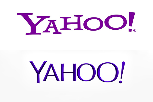
After 30 days of tease, Yahoo unveiled its new look. Perhaps fittingly for a logo that hadn't been changed for 18 years, the look is more sophisticated and modern, with elegantly chiseled letters. Even the purple color seems more mature. The exclamation mark is intact, though playfully tilted; the final "O" is slightly bigger, referencing the Yahoo yodel.

Marissa Meyer herself helped design the logo; her explanation on a Tumblr post discusses how she wanted the logo to look and feel "human."

"We didn’t want to have any straight lines in the logo. Straight lines don’t exist in the human form and are extremely rare in nature, so the human touch in the logo is that all the lines and forms all have at least a slight curve."

Love it? Hate it?

Sponsored

lower waypoint
next waypoint
California Housing Is Even Less Affordable Than You Think, UC Berkeley Study SaysCalifornia PUC Considers New Fixed Charge for ElectricityPro-Palestinian Protests on California College Campuses: What Are Students Demanding?Tunnels Under San Francisco? Inside the Dark, Dangerous World of the SewersUC’s President had a Plan to De-Escalate Protests. How did a Night of Violence Happen at UCLA?Know Your Rights: California Protesters' Legal Standing Under the First AmendmentWill the U.S. Really Ban TikTok?Oakland’s Leila Mottley on Her Debut Collection of Poetry ‘woke up no light’California Disability Workers’ Raises at Risk as Gov. Newsom Faces DeficitBiden Expands 2 National Monuments in California Significant to Tribal Nations