upper waypoint

Three Excellent Infographics On America's Abstract Electoral System

Save ArticleSave Article
Failed to save article

Please try again

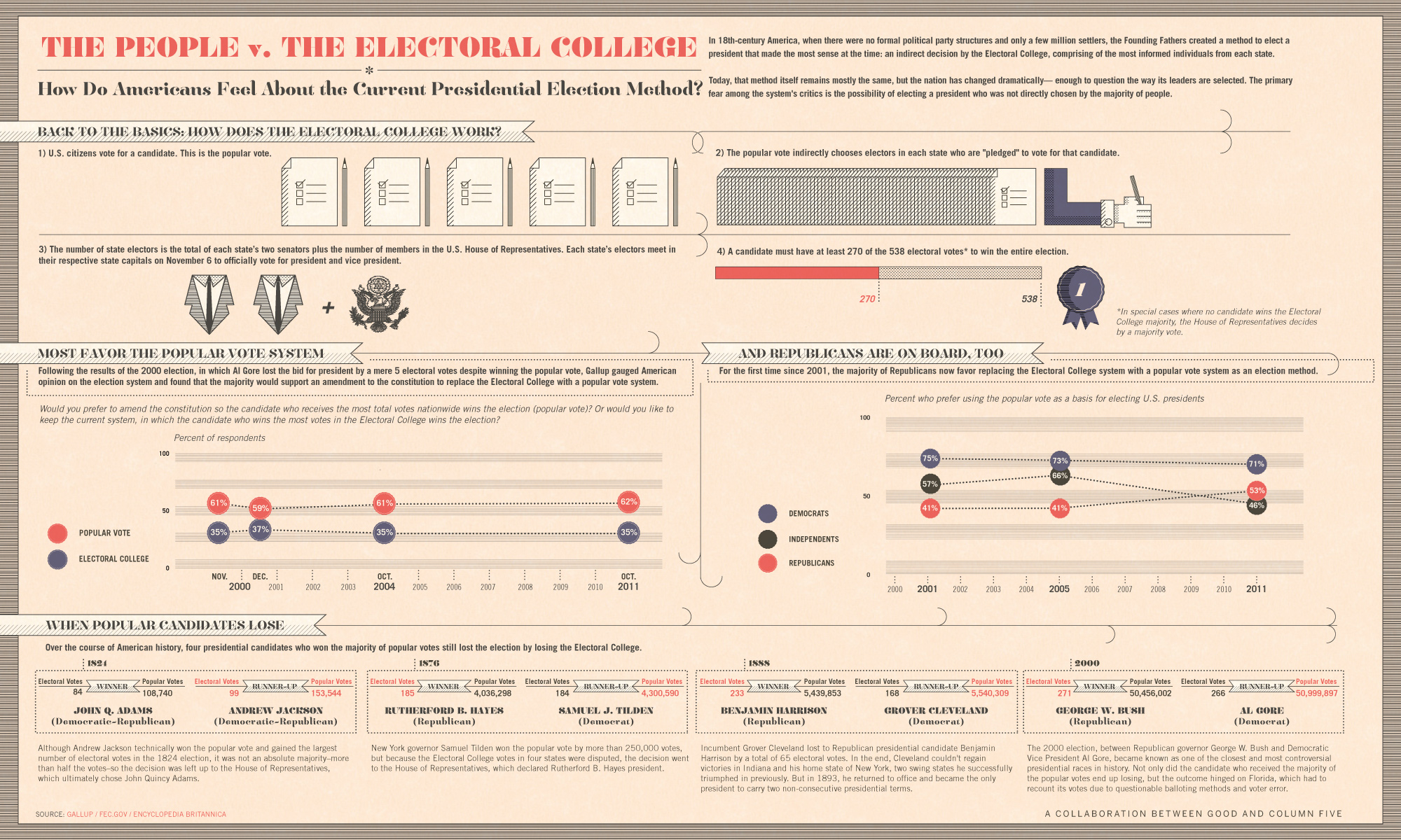
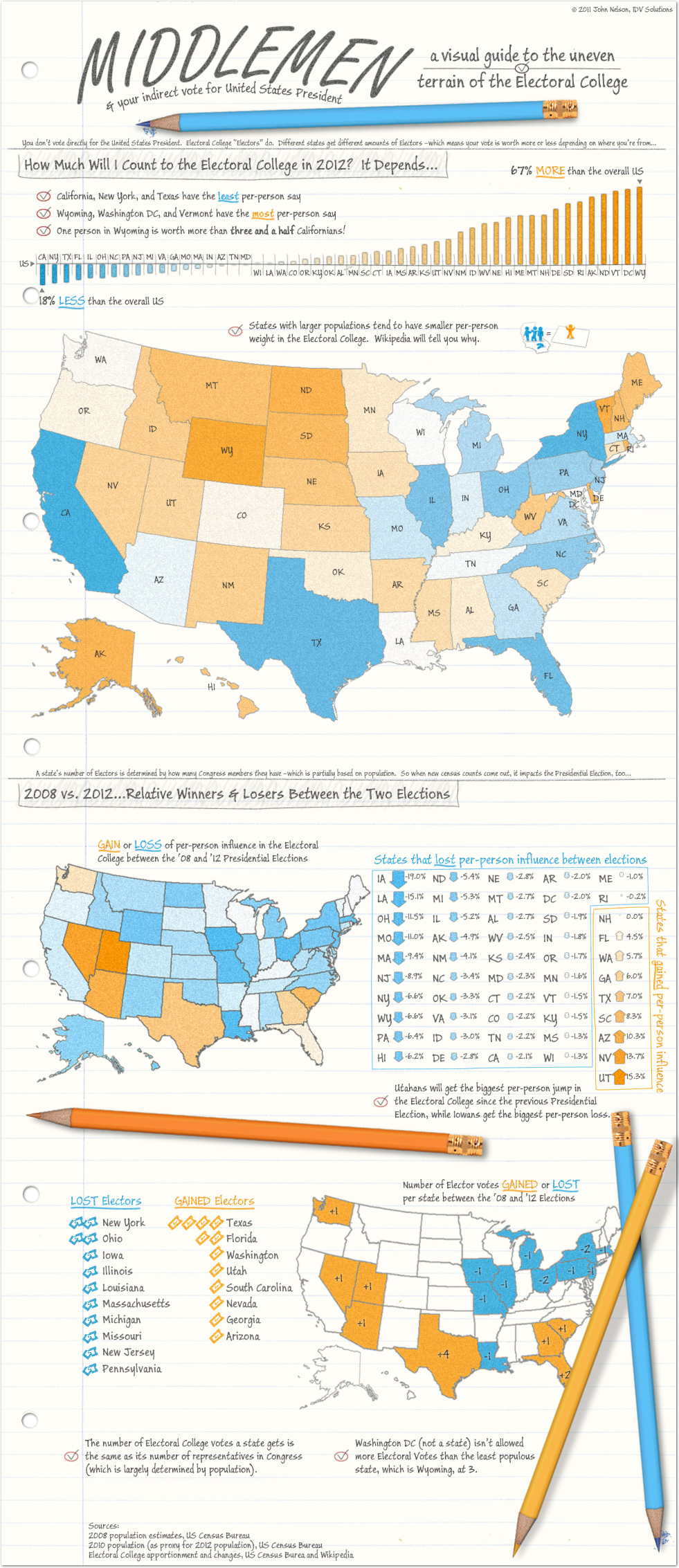
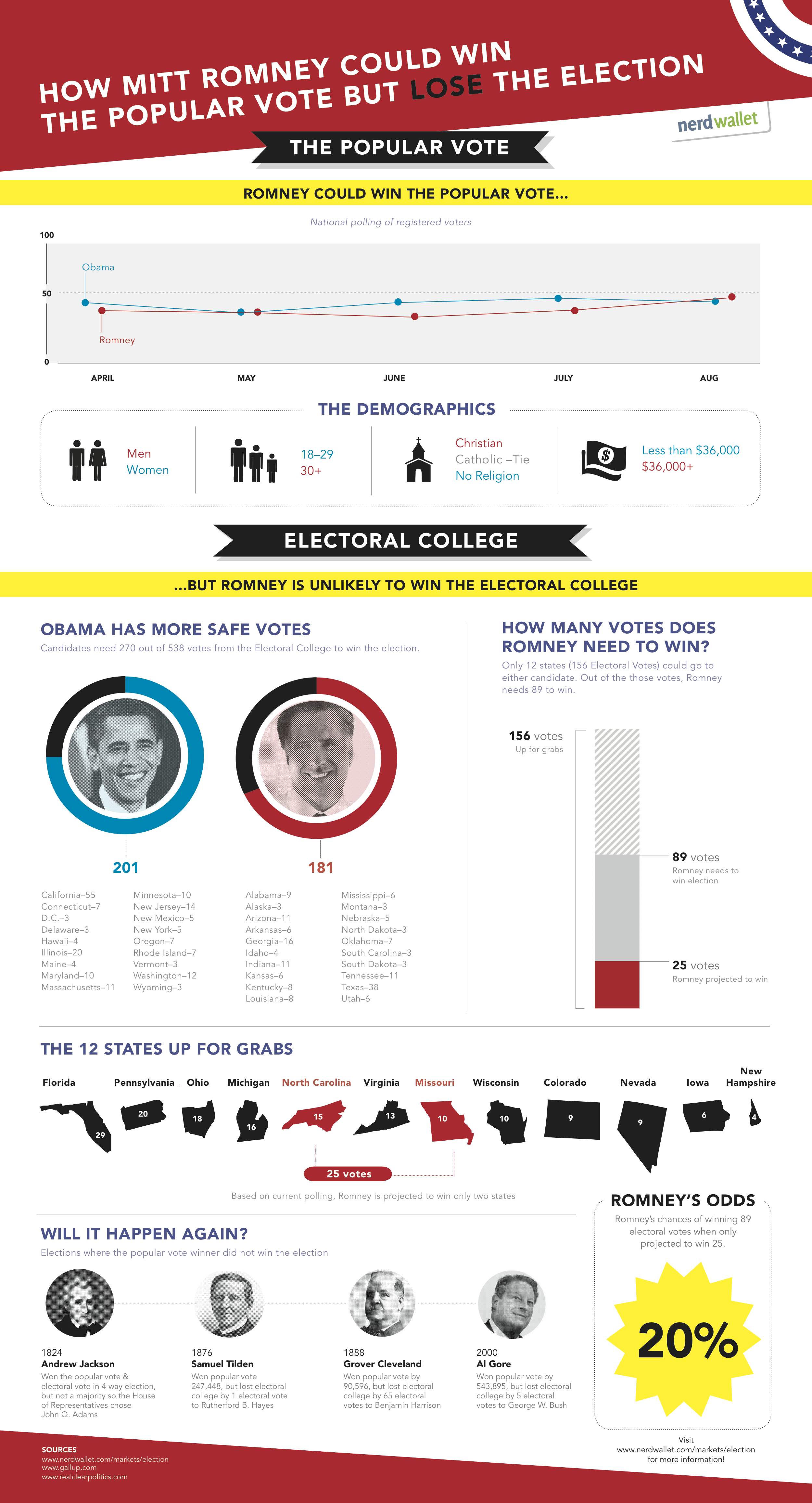
Elections aren't supposed to be super complicated. But they are. And if you feel like you still need a diagram to figure out our electoral process, here are two good ones to get you started (created independently and shared on the site visual.ly). Click on the first one to see it full size.

Americans Versus the Electoral College

by GOOD.Learn about infographic design.


Data Americana
by
johnmnelson.Browse more data visualization.


How Romney Could Win the Popular Vote, but Lose the Election


Sponsored

lower waypoint
next waypoint
Why So Many Central Americans Are Seeking Asylum in the U.S.Real-Time Interactive Earthquake Map: Get to Know Your Local FaultsIt's Really Happening! This Is What KQED's Youth Takeover Looks LikeWhen Rivers Caught Fire: A Brief History of Earth Day (with Lesson Plan)A Look Inside the Youth Vaping CrazeIt's Almost Tax Day. This Is How the Government Spends Your Hard-Earned CashIs the Endangered Species Act at Risk of Extinction?March Madness and the Money: Should College Athletes Get Paid?How to Stop a Nuclear War: The Non-Proliferation Treaty, ExplainedMAP: What Does the U.S.-Mexico Border Really Look Like?