I love numbers. A picture may be worth a thousand words, but I think a good bar graph can be worth a thousand pictures.
But three times in the past few days, I've come across statistics in reputable-looking publications that made me stop and say, "Huh?"
I did some investigating so you don't have to. And indeed, the numbers don't quite tell the story that they purport to tell.
So here goes: My skeptical inquiry into statistics on herbicide use, soil erosion, and the production of fruit and nut.
Sponsored
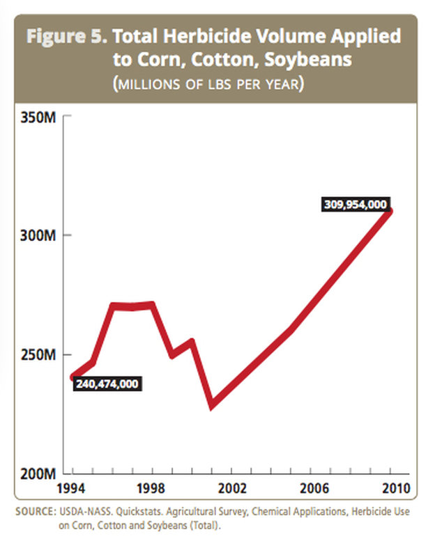
First, weedkillers (and GMOs). I was struck by this graph, which appeared in a report issued by Food and Water Watch, an environmentalist group.
Herbicide use data from Food and Water Watch. Graph: Food and Water Watch
Their report was published a while ago, but Tom Philpott re-used it recently in a post for the web site of Mother Jones magazine. The point of the chart is to show how increases in herbicide use on soybeans, corn, and cotton have gone hand-in-hand with the rise of genetically modified, herbicide-tolerant, versions of those crops.
That link seems logical, but still, farmers have been planting more corn and soybeans in recent years. How much of this soaring curve is simply because farmers have more acres to cover?
I dove into the USDA numbers, and discovered, first of all, that they're fragmentary. In recent years, the USDA didn't collect such numbers for all three crops in all years. The curve, in this case, is based on just two data points.
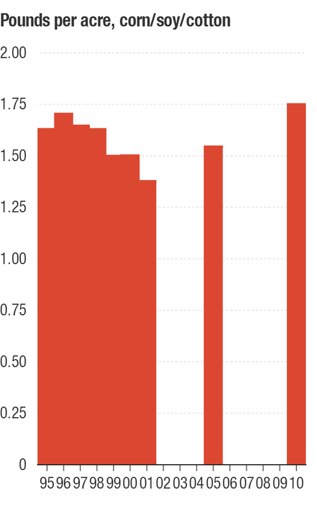
No matter. I took the numbers that were available and divided them by the number of acres planted. (I'm using a column chart to make clear for which years we have data.) Suddenly, the trend doesn't seem quite so dramatic.
Herbicide use on corn, soybeans and cotton — break it down per acre and it's not so dramatic. Graph: NPR using USDA data
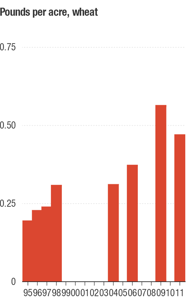
And how do we know if herbicide-tolerant GMOs are driving this increase? What if it's something else entirely? For comparison, I decided to look at herbicide use in wheat, since no GMO wheat is being planted. Here's a graph of herbicide use in wheat, per acre, over the same period of time.
Whoa. No GMOs here, and herbicide use went up at a faster rate. (In absolute amounts, farmers still use much less herbicide on wheat than on soybeans or corn.)
Herbicide use per acre on wheat has been going up a lot in recent years. Graph: NPR using USDA data
What could be driving this increase, if not herbicide-tolerant GMOs? I called a few wheat experts in Kansas and Oregon, who mentioned some possibilities.
First, farmers are reducing their use of tillage to control weeds, in part of conserve their soil. Many are relying more on chemical weedkillers instead. Second, with grain prices high, farmers are more inclined to spend more money on anything that will boost yields.
Both of these factors are probably influencing herbicide use in corn and soybeans, too. They may be more important than the popularity of GMOs.
One thing, though, is perfectly clear. The rise of glyphosate-tolerant GMOs did persuade farmers to use much more of that particular chemical. Some argue that a new generation of GMOs that are tolerant to other weedkillers will drive further increases in herbicide use.
Maybe they will. I'll wait for the numbers.
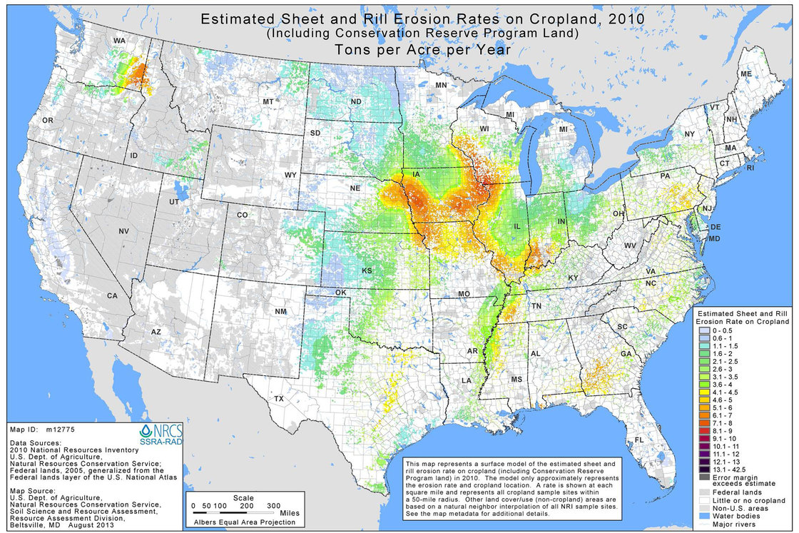
Next up, soil erosion. Here's are two maps that caught my attention. They're published in a report called the National Resources Inventory, released last week by the USDA's Natural Resources Conservation Service. (I should also tell you that the NRCS is one of my very favorite federal agencies; please don't hold this post against it.)
1982 Estimated Sheet and Rill Erosion on Cropland Map: U.S. Dept. of Agriculture/NRCS
The dramatic shrinkage of those red and orange botches along America's major rivers is terrific news. It shows that less topsoil is washing away today, compared to 1982.
2010 Estimated Sheet and Rill Erosion on Cropland Map: U.S. Dept. of Agriculture/NRCS
Intrigued by this apparent good-news story, I called Craig Cox, in the Iowa office of the Environmental Working Group.
Cox already knew about this map. He wasn't happy about it. In his view, it obscures more than it reveals.
According to Cox, the good news is old news. Practically all of the dramatic progress in fighting soil erosion occurred 15 years ago, between 1982 and 1997. At that time, "we were on a really solid pathway to finally getting on top of this ancient enemy," he says.
Since 1997, however, progress has stalled, so the map paints an overly cheerful picture. (In fairness to NRCS, there is another, less prominent, graph in the report that does show this stagnation in anti-erosion efforts.)
In addition, there's a basic problem with these data, Cox says: "They only capture one kind of erosion," called sheet and rill erosion. This is the erosion that happens evenly across a field, and can be predicted from the amount of rain, the field's slope, its soil type and whether it is bare or covered by grass. The NRCS data is based on such predictions, and the estimated improvements since 1982 happened mainly because farmers are tilling less, and protecting more of their land with vegetation.
By contrast, no models can predict when something more catastrophic will occur; when small rivulets of water combine into larger, fast-moving streams that cut deep ditches, or gullies, into a field. According to Cox, those gullies actually carry off more soil than the predictable kinds of erosion, and they were especially bad during the storms that hit the Midwest last spring and summer.
So my straightforward good-news story about soil erosion evaporated.
Finally, there was a second surprising statistic buried deep inside that NRCS report, and I only noticed it because of a press release that the USDA put out. According to that release, the NRCS's National Resources Inventory detected "a boom in land dedicated to growing fruits, nuts and flowers, increasing from 124,800 acres in 2007 to 273,800 in 2010."
Wow! I looked at the numbers again. In fact, the boom was only in a category of production called "cultivated" fruit and nut production. Turns out, that's a tiny category, barely worth counting. It apparently refers to orchards in which there's also some tillage going on in order to grow a second crop.
"Uncultivated" fruit, nut, and flower production, by contrast, went from 4.7 million acres in 2007 to 4.4 million acres in 2010.
window.__IS_SSR__=true
window.__INITIAL_STATE__={"attachmentsReducer":{"audio_0":{"type":"attachments","id":"audio_0","imgSizes":{"kqedFullSize":{"file":"https://ww2.kqed.org/news/wp-content/themes/KQED-unified/img/audio_bgs/background0.jpg"}}},"audio_1":{"type":"attachments","id":"audio_1","imgSizes":{"kqedFullSize":{"file":"https://ww2.kqed.org/news/wp-content/themes/KQED-unified/img/audio_bgs/background1.jpg"}}},"audio_2":{"type":"attachments","id":"audio_2","imgSizes":{"kqedFullSize":{"file":"https://ww2.kqed.org/news/wp-content/themes/KQED-unified/img/audio_bgs/background2.jpg"}}},"audio_3":{"type":"attachments","id":"audio_3","imgSizes":{"kqedFullSize":{"file":"https://ww2.kqed.org/news/wp-content/themes/KQED-unified/img/audio_bgs/background3.jpg"}}},"audio_4":{"type":"attachments","id":"audio_4","imgSizes":{"kqedFullSize":{"file":"https://ww2.kqed.org/news/wp-content/themes/KQED-unified/img/audio_bgs/background4.jpg"}}},"placeholder":{"type":"attachments","id":"placeholder","imgSizes":{"thumbnail":{"file":"https://ww2.kqed.org/wp-content/uploads/sites/10/2018/01/GettyImages-896326950-160x96.jpg","width":160,"height":96,"mimeType":"image/jpeg"},"medium":{"file":"https://ww2.kqed.org/wp-content/uploads/sites/10/2018/01/GettyImages-896326950-800x478.jpg","width":800,"height":478,"mimeType":"image/jpeg"},"large":{"file":"https://ww2.kqed.org/wp-content/uploads/sites/10/2018/01/GettyImages-896326950-1020x610.jpg","width":1020,"height":610,"mimeType":"image/jpeg"},"fd-lrg":{"file":"https://ww2.kqed.org/wp-content/uploads/sites/10/2018/01/GettyImages-896326950-1920x1148.jpg","width":1920,"height":1148,"mimeType":"image/jpeg"},"fd-med":{"file":"https://ww2.kqed.org/wp-content/uploads/sites/10/2018/01/GettyImages-896326950-1180x705.jpg","width":1180,"height":705,"mimeType":"image/jpeg"},"fd-sm":{"file":"https://ww2.kqed.org/wp-content/uploads/sites/10/2018/01/GettyImages-896326950-960x574.jpg","width":960,"height":574,"mimeType":"image/jpeg"},"post-thumbnail":{"file":"https://ww2.kqed.org/wp-content/uploads/sites/10/2018/01/GettyImages-896326950-672x372.jpg","width":672,"height":372,"mimeType":"image/jpeg"},"twentyfourteen-full-width":{"file":"https://ww2.kqed.org/wp-content/uploads/sites/10/2018/01/GettyImages-896326950-1038x576.jpg","width":1038,"height":576,"mimeType":"image/jpeg"},"xxsmall":{"file":"https://ww2.kqed.org/wp-content/uploads/sites/10/2018/01/GettyImages-896326950-240x143.jpg","width":240,"height":143,"mimeType":"image/jpeg"},"xsmall":{"file":"https://ww2.kqed.org/wp-content/uploads/sites/10/2018/01/GettyImages-896326950-375x224.jpg","width":375,"height":224,"mimeType":"image/jpeg"},"small":{"file":"https://ww2.kqed.org/wp-content/uploads/sites/10/2018/01/GettyImages-896326950-520x311.jpg","width":520,"height":311,"mimeType":"image/jpeg"},"xlarge":{"file":"https://ww2.kqed.org/wp-content/uploads/sites/10/2018/01/GettyImages-896326950-1180x705.jpg","width":1180,"height":705,"mimeType":"image/jpeg"},"full-width":{"file":"https://ww2.kqed.org/wp-content/uploads/sites/10/2018/01/GettyImages-896326950-1920x1148.jpg","width":1920,"height":1148,"mimeType":"image/jpeg"},"guest-author-32":{"file":"https://ww2.kqed.org/wp-content/uploads/sites/10/2018/01/GettyImages-896326950-32x32.jpg","width":32,"height":32,"mimeType":"image/jpeg"},"guest-author-50":{"file":"https://ww2.kqed.org/wp-content/uploads/sites/10/2018/01/GettyImages-896326950-50x50.jpg","width":50,"height":50,"mimeType":"image/jpeg"},"guest-author-64":{"file":"https://ww2.kqed.org/wp-content/uploads/sites/10/2018/01/GettyImages-896326950-64x64.jpg","width":64,"height":64,"mimeType":"image/jpeg"},"guest-author-96":{"file":"https://ww2.kqed.org/wp-content/uploads/sites/10/2018/01/GettyImages-896326950-96x96.jpg","width":96,"height":96,"mimeType":"image/jpeg"},"guest-author-128":{"file":"https://ww2.kqed.org/wp-content/uploads/sites/10/2018/01/GettyImages-896326950-128x128.jpg","width":128,"height":128,"mimeType":"image/jpeg"},"detail":{"file":"https://ww2.kqed.org/wp-content/uploads/sites/10/2018/01/GettyImages-896326950-150x150.jpg","width":150,"height":150,"mimeType":"image/jpeg"},"kqedFullSize":{"file":"https://ww2.kqed.org/wp-content/uploads/sites/10/2018/01/GettyImages-896326950-e1514998105161.jpg","width":1920,"height":1148}}},"food_1337580":{"type":"attachments","id":"food_1337580","meta":{"index":"attachments_1591205162","site":"food","id":"1337580","found":true},"title":"Samosas_Thumb_3","publishDate":1713200418,"status":"inherit","parent":1337576,"modified":1713200664,"caption":"Cecilia Phillips holding a bite-size Indian street food that is the samosa.","credit":"Matt Piniol","altTag":"A smiling woman holding a samosa is positioned against a backdrop that is a closeup of a bowl filled with crispy triangular samosas","description":"a bite-size Indian street food that is the samosa.","imgSizes":{"medium":{"file":"https://cdn.kqed.org/wp-content/uploads/sites/41/2024/04/Samosas_Thumb_3-800x450.jpg","width":800,"height":450,"mimeType":"image/jpeg"},"large":{"file":"https://cdn.kqed.org/wp-content/uploads/sites/41/2024/04/Samosas_Thumb_3-1020x574.jpg","width":1020,"height":574,"mimeType":"image/jpeg"},"thumbnail":{"file":"https://cdn.kqed.org/wp-content/uploads/sites/41/2024/04/Samosas_Thumb_3-160x90.jpg","width":160,"height":90,"mimeType":"image/jpeg"},"medium_large":{"file":"https://cdn.kqed.org/wp-content/uploads/sites/41/2024/04/Samosas_Thumb_3-768x432.jpg","width":768,"height":432,"mimeType":"image/jpeg"},"post-thumbnail":{"file":"https://cdn.kqed.org/wp-content/uploads/sites/41/2024/04/Samosas_Thumb_3-672x372.jpg","width":672,"height":372,"mimeType":"image/jpeg"},"twentyfourteen-full-width":{"file":"https://cdn.kqed.org/wp-content/uploads/sites/41/2024/04/Samosas_Thumb_3-1038x576.jpg","width":1038,"height":576,"mimeType":"image/jpeg"},"kqedFullSize":{"file":"https://cdn.kqed.org/wp-content/uploads/sites/41/2024/04/Samosas_Thumb_3.jpg","width":1280,"height":720}},"fetchFailed":false,"isLoading":false},"food_1337459":{"type":"attachments","id":"food_1337459","meta":{"index":"attachments_1591205162","site":"food","id":"1337459","found":true},"title":"No Crumbs - It's-It","publishDate":1691018088,"status":"inherit","parent":1337457,"modified":1691018240,"caption":"Josh Decolongon recreates the famous San Francisco It’s-It using homemade rocky road ice cream, a flavor that was invented in Oakland.","credit":"Josh Decolongon","altTag":"A triptych image with a close up of rocky road ice cream on the left, a tray of oatmeal cookies on the right, and a young bald Filipino man with glasses standing over a chocolate ice cream sandwich in the middle","description":null,"imgSizes":{"medium":{"file":"https://ww2.kqed.org/app/uploads/sites/41/2023/08/NoCrumbs_ItsIt_01-800x450.png","width":800,"height":450,"mimeType":"image/png"},"large":{"file":"https://ww2.kqed.org/app/uploads/sites/41/2023/08/NoCrumbs_ItsIt_01-1020x574.png","width":1020,"height":574,"mimeType":"image/png"},"thumbnail":{"file":"https://ww2.kqed.org/app/uploads/sites/41/2023/08/NoCrumbs_ItsIt_01-160x90.png","width":160,"height":90,"mimeType":"image/png"},"medium_large":{"file":"https://ww2.kqed.org/app/uploads/sites/41/2023/08/NoCrumbs_ItsIt_01-768x432.png","width":768,"height":432,"mimeType":"image/png"},"1536x1536":{"file":"https://ww2.kqed.org/app/uploads/sites/41/2023/08/NoCrumbs_ItsIt_01-1536x864.png","width":1536,"height":864,"mimeType":"image/png"},"post-thumbnail":{"file":"https://ww2.kqed.org/app/uploads/sites/41/2023/08/NoCrumbs_ItsIt_01-672x372.png","width":672,"height":372,"mimeType":"image/png"},"twentyfourteen-full-width":{"file":"https://ww2.kqed.org/app/uploads/sites/41/2023/08/NoCrumbs_ItsIt_01-1038x576.png","width":1038,"height":576,"mimeType":"image/png"},"kqedFullSize":{"file":"https://ww2.kqed.org/app/uploads/sites/41/2023/08/NoCrumbs_ItsIt_01.png","width":1920,"height":1080}},"fetchFailed":false,"isLoading":false},"bayareabites_96143":{"type":"attachments","id":"bayareabites_96143","meta":{"index":"attachments_1591205162","site":"bayareabites","id":"96143","found":true},"title":"Rhubarb Puff-Tart Pockets","publishDate":1431563469,"status":"inherit","parent":95128,"modified":1431721758,"caption":"Rhubarb Puff-Tart Pockets","credit":"Wendy Goodfriend","description":null,"imgSizes":{"thumbnail":{"file":"https://ww2.kqed.org/app/uploads/sites/24/2015/05/rhubarb-final-400x267.jpg","width":400,"height":267,"mimeType":"image/jpeg"},"medium":{"file":"https://ww2.kqed.org/app/uploads/sites/24/2015/05/rhubarb-final-800x533.jpg","width":800,"height":533,"mimeType":"image/jpeg"},"large":{"file":"https://ww2.kqed.org/app/uploads/sites/24/2015/05/rhubarb-final-1440x960.jpg","width":1440,"height":960,"mimeType":"image/jpeg"},"fd-med":{"file":"https://ww2.kqed.org/app/uploads/sites/24/2015/05/rhubarb-final-1180x787.jpg","width":1180,"height":787,"mimeType":"image/jpeg"},"fd-sm":{"file":"https://ww2.kqed.org/app/uploads/sites/24/2015/05/rhubarb-final-960x640.jpg","width":960,"height":640,"mimeType":"image/jpeg"},"post-thumbnail":{"file":"https://ww2.kqed.org/app/uploads/sites/24/2015/05/rhubarb-final-672x372.jpg","width":672,"height":372,"mimeType":"image/jpeg"},"twentyfourteen-full-width":{"file":"https://ww2.kqed.org/app/uploads/sites/24/2015/05/rhubarb-final-1038x576.jpg","width":1038,"height":576,"mimeType":"image/jpeg"},"guest-author-32":{"file":"https://ww2.kqed.org/app/uploads/sites/24/2015/05/rhubarb-final-32x32.jpg","width":32,"height":32,"mimeType":"image/jpeg"},"guest-author-64":{"file":"https://ww2.kqed.org/app/uploads/sites/24/2015/05/rhubarb-final-64x64.jpg","width":64,"height":64,"mimeType":"image/jpeg"},"guest-author-96":{"file":"https://ww2.kqed.org/app/uploads/sites/24/2015/05/rhubarb-final-96x96.jpg","width":96,"height":96,"mimeType":"image/jpeg"},"guest-author-128":{"file":"https://ww2.kqed.org/app/uploads/sites/24/2015/05/rhubarb-final-128x128.jpg","width":128,"height":128,"mimeType":"image/jpeg"},"cat_post_thumb_sizecategory-posts-2":{"file":"https://ww2.kqed.org/app/uploads/sites/24/2015/05/rhubarb-final-150x150.jpg","width":150,"height":150,"mimeType":"image/jpeg"},"detail":{"file":"https://ww2.kqed.org/app/uploads/sites/24/2015/05/rhubarb-final-75x75.jpg","width":75,"height":75,"mimeType":"image/jpeg"},"kqedFullSize":{"file":"https://ww2.kqed.org/app/uploads/sites/24/2015/05/rhubarb-final.jpg","width":1920,"height":1280}},"fetchFailed":false,"isLoading":false},"bayareabites_51594":{"type":"attachments","id":"bayareabites_51594","meta":{"index":"attachments_1591205162","site":"bayareabites","id":"51594","found":true},"title":"labeling400x300","publishDate":1353379736,"status":"inherit","parent":51586,"modified":1353379736,"caption":null,"credit":null,"description":null,"imgSizes":{"kqedFullSize":{"file":"https://ww2.kqed.org/app/uploads/sites/24/2012/11/labeling400x300.jpg","width":400,"height":300}},"fetchFailed":false,"isLoading":false},"bayareabites_29342":{"type":"attachments","id":"bayareabites_29342","meta":{"index":"attachments_1591205162","site":"bayareabites","id":"29342","found":true},"title":"Sharon Davenport and Joan Antonuccio at The Brick Hut Cafe","publishDate":1308638999,"status":"inherit","parent":29308,"modified":1308638999,"caption":null,"credit":null,"description":null,"imgSizes":{"kqedFullSize":{"file":"https://ww2.kqed.org/app/uploads/sites/24/2011/06/brickhut-sharon-joan500.jpg","width":500,"height":348}},"fetchFailed":false,"isLoading":false},"bayareabites_90020":{"type":"attachments","id":"bayareabites_90020","meta":{"index":"attachments_1591205162","site":"bayareabites","id":"90020","found":true},"title":"Assorted Yakitori","publishDate":1415772806,"status":"inherit","parent":82746,"modified":1415772806,"caption":"Assorted Yakitori: pork belly ($3.50); chicken breast tender ($4); chicken skin ($3); bacon-wrapped scallops ($4); shrimp ($3.50); quail eggs ($2.00)","credit":null,"description":null,"imgSizes":{"kqedFullSize":{"file":"https://ww2.kqed.org/app/uploads/sites/24/2014/11/kushido13.jpg","width":1000,"height":715}},"fetchFailed":false,"isLoading":false},"bayareabites_94351":{"type":"attachments","id":"bayareabites_94351","meta":{"index":"attachments_1591205162","site":"bayareabites","id":"94351","found":true},"title":"ch5-3types-final","publishDate":1427735900,"status":"inherit","parent":0,"modified":1427738267,"caption":"From left, charoset from Iraq, Libya and Iran. Photo: Alix Wall","credit":null,"description":null,"imgSizes":{"thumbnail":{"file":"https://ww2.kqed.org/app/uploads/sites/24/2015/03/ch5-3types-final-400x300.jpg","width":400,"height":300,"mimeType":"image/jpeg"},"medium":{"file":"https://ww2.kqed.org/app/uploads/sites/24/2015/03/ch5-3types-final-800x600.jpg","width":800,"height":600,"mimeType":"image/jpeg"},"fd-med":{"file":"https://ww2.kqed.org/app/uploads/sites/24/2015/03/ch5-3types-final-768x576.jpg","width":768,"height":576,"mimeType":"image/jpeg"},"fd-sm":{"file":"https://ww2.kqed.org/app/uploads/sites/24/2015/03/ch5-3types-final-320x240.jpg","width":320,"height":240,"mimeType":"image/jpeg"},"post-thumbnail":{"file":"https://ww2.kqed.org/app/uploads/sites/24/2015/03/ch5-3types-final-672x372.jpg","width":672,"height":372,"mimeType":"image/jpeg"},"twentyfourteen-full-width":{"file":"https://ww2.kqed.org/app/uploads/sites/24/2015/03/ch5-3types-final-800x576.jpg","width":800,"height":576,"mimeType":"image/jpeg"},"guest-author-32":{"file":"https://ww2.kqed.org/app/uploads/sites/24/2015/03/ch5-3types-final-32x32.jpg","width":32,"height":32,"mimeType":"image/jpeg"},"guest-author-64":{"file":"https://ww2.kqed.org/app/uploads/sites/24/2015/03/ch5-3types-final-64x64.jpg","width":64,"height":64,"mimeType":"image/jpeg"},"guest-author-96":{"file":"https://ww2.kqed.org/app/uploads/sites/24/2015/03/ch5-3types-final-96x96.jpg","width":96,"height":96,"mimeType":"image/jpeg"},"guest-author-128":{"file":"https://ww2.kqed.org/app/uploads/sites/24/2015/03/ch5-3types-final-128x128.jpg","width":128,"height":128,"mimeType":"image/jpeg"},"cat_post_thumb_sizecategory-posts-2":{"file":"https://ww2.kqed.org/app/uploads/sites/24/2015/03/ch5-3types-final-50x50.jpg","width":50,"height":50,"mimeType":"image/jpeg"},"detail":{"file":"https://ww2.kqed.org/app/uploads/sites/24/2015/03/ch5-3types-final-75x75.jpg","width":75,"height":75,"mimeType":"image/jpeg"},"kqedFullSize":{"file":"https://ww2.kqed.org/app/uploads/sites/24/2015/03/ch5-3types-final.jpg","width":800,"height":600}},"fetchFailed":false,"isLoading":false},"bayareabites_95145":{"type":"attachments","id":"bayareabites_95145","meta":{"index":"attachments_1591205162","site":"bayareabites","id":"95145","found":true},"title":"ba-le-grilled-chicken1920","publishDate":1429146499,"status":"inherit","parent":95133,"modified":1429146661,"caption":"Ba Le grilled chicken banh mi","credit":"Kim Westerman","description":null,"imgSizes":{"thumbnail":{"file":"https://ww2.kqed.org/app/uploads/sites/24/2015/04/ba-le-grilled-chicken1920-400x267.jpg","width":400,"height":267,"mimeType":"image/jpeg"},"medium":{"file":"https://ww2.kqed.org/app/uploads/sites/24/2015/04/ba-le-grilled-chicken1920-800x533.jpg","width":800,"height":533,"mimeType":"image/jpeg"},"large":{"file":"https://ww2.kqed.org/app/uploads/sites/24/2015/04/ba-le-grilled-chicken1920-1440x960.jpg","width":1440,"height":960,"mimeType":"image/jpeg"},"fd-lrg":{"file":"https://ww2.kqed.org/app/uploads/sites/24/2015/04/ba-le-grilled-chicken1920-1180x787.jpg","width":1180,"height":787,"mimeType":"image/jpeg"},"fd-med":{"file":"https://ww2.kqed.org/app/uploads/sites/24/2015/04/ba-le-grilled-chicken1920-768x512.jpg","width":768,"height":512,"mimeType":"image/jpeg"},"fd-sm":{"file":"https://ww2.kqed.org/app/uploads/sites/24/2015/04/ba-le-grilled-chicken1920-320x213.jpg","width":320,"height":213,"mimeType":"image/jpeg"},"post-thumbnail":{"file":"https://ww2.kqed.org/app/uploads/sites/24/2015/04/ba-le-grilled-chicken1920-672x372.jpg","width":672,"height":372,"mimeType":"image/jpeg"},"twentyfourteen-full-width":{"file":"https://ww2.kqed.org/app/uploads/sites/24/2015/04/ba-le-grilled-chicken1920-1038x576.jpg","width":1038,"height":576,"mimeType":"image/jpeg"},"guest-author-32":{"file":"https://ww2.kqed.org/app/uploads/sites/24/2015/04/ba-le-grilled-chicken1920-32x32.jpg","width":32,"height":32,"mimeType":"image/jpeg"},"guest-author-64":{"file":"https://ww2.kqed.org/app/uploads/sites/24/2015/04/ba-le-grilled-chicken1920-64x64.jpg","width":64,"height":64,"mimeType":"image/jpeg"},"guest-author-96":{"file":"https://ww2.kqed.org/app/uploads/sites/24/2015/04/ba-le-grilled-chicken1920-96x96.jpg","width":96,"height":96,"mimeType":"image/jpeg"},"guest-author-128":{"file":"https://ww2.kqed.org/app/uploads/sites/24/2015/04/ba-le-grilled-chicken1920-128x128.jpg","width":128,"height":128,"mimeType":"image/jpeg"},"cat_post_thumb_sizecategory-posts-2":{"file":"https://ww2.kqed.org/app/uploads/sites/24/2015/04/ba-le-grilled-chicken1920-150x150.jpg","width":150,"height":150,"mimeType":"image/jpeg"},"detail":{"file":"https://ww2.kqed.org/app/uploads/sites/24/2015/04/ba-le-grilled-chicken1920-75x75.jpg","width":75,"height":75,"mimeType":"image/jpeg"},"kqedFullSize":{"file":"https://ww2.kqed.org/app/uploads/sites/24/2015/04/ba-le-grilled-chicken1920.jpg","width":1920,"height":1280}},"fetchFailed":false,"isLoading":false},"bayareabites_39657":{"type":"attachments","id":"bayareabites_39657","meta":{"index":"attachments_1591205162","site":"bayareabites","id":"39657","found":true},"title":"ham toast","publishDate":1330685307,"status":"inherit","parent":39627,"modified":1330685307,"caption":null,"credit":null,"description":null,"imgSizes":{"kqedFullSize":{"file":"https://ww2.kqed.org/app/uploads/sites/24/2012/03/hamtoast.jpg","width":560,"height":420}},"fetchFailed":false,"isLoading":false},"bayareabites_77255":{"type":"attachments","id":"bayareabites_77255","meta":{"index":"attachments_1591205162","site":"bayareabites","id":"77255","found":true},"title":"farmingland","publishDate":1390849126,"status":"inherit","parent":77230,"modified":1390849126,"caption":null,"credit":null,"description":null,"imgSizes":{"kqedFullSize":{"file":"https://ww2.kqed.org/app/uploads/sites/24/2014/01/farmingland.jpg","width":624,"height":350}},"fetchFailed":false,"isLoading":false}},"audioPlayerReducer":{"postId":"stream_live"},"authorsReducer":{"byline_food_1337576":{"type":"authors","id":"byline_food_1337576","meta":{"override":true},"slug":"byline_food_1337576","name":"Manjula Varghese","isLoading":false},"jennyoh":{"type":"authors","id":"2100","meta":{"index":"authors_1591205172","id":"2100","found":true},"name":"Jenny Oh","firstName":"Jenny","lastName":"Oh","slug":"jennyoh","email":"joh@kqed.org","display_author_email":false,"staff_mastheads":["science"],"title":"Audience Engagement Producer, Deep Look","bio":"Jenny is an Emmy Award-winning producer and is currently the Audience Engagement Producer for KQED Science's \u003cem>Deep Look\u003c/em> online video series. She was also a long-time contributor to Bay Area Bites, KQED's popular food blog. Jenny graduated with honors from New York University’s Tisch School of the Arts Film and Television program and has worked for WNET/PBS, The Learning Channel, Sundance Channel, HBO and the University of California.","avatar":"https://secure.gravatar.com/avatar/7ddda0ed657e46dbe66083f569967752?s=600&d=blank&r=g","twitter":null,"facebook":null,"instagram":null,"linkedin":null,"sites":[{"site":"arts","roles":["editor"]},{"site":"pop","roles":["contributor"]},{"site":"futureofyou","roles":["editor"]},{"site":"jpepinheart","roles":["editor"]},{"site":"about","roles":["editor"]},{"site":"bayareabites","roles":["editor"]},{"site":"science","roles":["administrator"]},{"site":"education","roles":["author"]},{"site":"quest","roles":["editor"]},{"site":"food","roles":["administrator"]}],"headData":{"title":"Jenny Oh | KQED","description":"Audience Engagement Producer, Deep Look","ogImgSrc":"https://secure.gravatar.com/avatar/7ddda0ed657e46dbe66083f569967752?s=600&d=blank&r=g","twImgSrc":"https://secure.gravatar.com/avatar/7ddda0ed657e46dbe66083f569967752?s=600&d=blank&r=g"},"isLoading":false,"link":"/author/jennyoh"},"wendy-goodfriend":{"type":"authors","id":"5014","meta":{"index":"authors_1591205172","id":"5014","found":true},"name":"Wendy Goodfriend","firstName":"Wendy","lastName":"Goodfriend","slug":"wendy-goodfriend","email":"wendy@wendygoodfriend.com","display_author_email":false,"staff_mastheads":[],"title":null,"bio":"I was the Senior Digital Producer for KQED Food up until July, 2018. Since 2001, I designed, produced, managed and contributed to mostly food-related websites and blogs for KQED including: KQED.org; KQED Food; Bay Area Bites; Check, Please! Bay Area; Taste This; Celebrity Chefs; seven of Jacques Pepin's TV series websites; and Joanne Weir's Cooking in the City. I initiated the majority of KQED Food's social media feeds and maintained them up until 2017. As far as content creation, photography is my passion and I also shoot video and write stories. My photos have been used in articles for KQED Food, News, Arts, and Science as well as for promotional purposes in print and online. Professional education and training includes: clinical psychology, photography, commercial cooking, web design, information architecture and UX.","avatar":"https://secure.gravatar.com/avatar/dfba64372339cc34cf17e446e6f18fa8?s=600&d=blank&r=g","twitter":null,"facebook":"bayareabites","instagram":null,"linkedin":"wendygoodfriend","sites":[{"site":"jpepinheart","roles":["administrator"]},{"site":"about","roles":["editor"]},{"site":"bayareabites","roles":["subscriber"]},{"site":"science","roles":["administrator"]},{"site":"checkplease","roles":["subscriber"]},{"site":"food","roles":["author"]},{"site":"essentialpepin","roles":["administrator"]}],"headData":{"title":"Wendy Goodfriend | KQED","description":null,"ogImgSrc":"https://secure.gravatar.com/avatar/dfba64372339cc34cf17e446e6f18fa8?s=600&d=blank&r=g","twImgSrc":"https://secure.gravatar.com/avatar/dfba64372339cc34cf17e446e6f18fa8?s=600&d=blank&r=g"},"isLoading":false,"link":"/author/wendy-goodfriend"},"kim-laidlaw":{"type":"authors","id":"5015","meta":{"index":"authors_1591205172","id":"5015","found":true},"name":"Kim Laidlaw","firstName":"Kim","lastName":"Laidlaw","slug":"kim-laidlaw","email":"kim_laidlaw@yahoo.com","display_author_email":false,"staff_mastheads":[],"title":null,"bio":"Kim Laidlaw is a cookbook author, editor, food writer, producer, project manager, and baker who has been in the kitchen covered in flour since she was big enough to stir the biscuit dough. She has over 16 years of experience in book and online publishing, and a lifetime of experience in the kitchen. \r\n\r\nHer first cookbook, Home Baked Comfort, was published in 2011; her second cookbook, Baby & Toddler On the Go, was published in April 2013; and her third cookbook, Williams-Sonoma Dessert of the Day, was published in October 2013. \r\n\r\nShe was the first blogger on KQED’s Bay Area Bites blog, which launched in 2005, and previously worked as a professional baker at La Farine French Bakery in Oakland, CA. She lives in Petaluma with her husband and their child, whom she cooks for everyday. Find out more at \u003ca href=\"http://www.kimlaidlaw.com\">http://www.kimlaidlaw.com\u003c/a>.","avatar":"https://secure.gravatar.com/avatar/284503bc296b6f7822eb38b816292376?s=600&d=blank&r=g","twitter":null,"facebook":"kimilaw","instagram":null,"linkedin":"kimlaidlaw","sites":[{"site":"bayareabites","roles":["contributor"]},{"site":"food","roles":["contributor"]}],"headData":{"title":"Kim Laidlaw | KQED","description":null,"ogImgSrc":"https://secure.gravatar.com/avatar/284503bc296b6f7822eb38b816292376?s=600&d=blank&r=g","twImgSrc":"https://secure.gravatar.com/avatar/284503bc296b6f7822eb38b816292376?s=600&d=blank&r=g"},"isLoading":false,"link":"/author/kim-laidlaw"},"michael-procopio":{"type":"authors","id":"5017","meta":{"index":"authors_1591205172","id":"5017","found":true},"name":"Michael Procopio","firstName":"Michael","lastName":"Procopio","slug":"michael-procopio","email":"m_procopio@mac.com","display_author_email":false,"staff_mastheads":[],"title":null,"bio":"I am terribly fond of martinis, Edward Gorey, and sleeping with many pillows. \r\nYou are more than welcome to follow me on Twitter: \u003ca href=\"http://twitter.com/#!/procopster\">@procopster\u003c/a>","avatar":"https://secure.gravatar.com/avatar/2eb848aac69d701cf1e2c3e88199feb4?s=600&d=blank&r=g","twitter":"procopster","facebook":"foodforthethoughtless","instagram":null,"linkedin":null,"sites":[{"site":"bayareabites","roles":["contributor"]},{"site":"food","roles":["contributor"]}],"headData":{"title":"Michael Procopio | KQED","description":null,"ogImgSrc":"https://secure.gravatar.com/avatar/2eb848aac69d701cf1e2c3e88199feb4?s=600&d=blank&r=g","twImgSrc":"https://secure.gravatar.com/avatar/2eb848aac69d701cf1e2c3e88199feb4?s=600&d=blank&r=g"},"isLoading":false,"link":"/author/michael-procopio"},"stephanie-rosenbaum":{"type":"authors","id":"5038","meta":{"index":"authors_1591205172","id":"5038","found":true},"name":"Stephanie Rosenbaum Klassen","firstName":"Stephanie","lastName":"Rosenbaum Klassen","slug":"stephanie-rosenbaum","email":"dixieday@aol.com","display_author_email":false,"staff_mastheads":[],"title":null,"bio":"Stephanie Rosenbaum Klassen is a longtime local food writer, author, and cook. Her books include The Art of Vintage Cocktails (Egg & Dart Press), World of Doughnuts (Egg & Dart Press); Kids in the Kitchen: Fun Food (Williams Sonoma); Honey from Flower to Table (Chronicle Books) and The Astrology Cookbook: A Cosmic Guide to Feasts of Love (Manic D Press). She has studied organic farming at UCSC and holds a certificate in Ecological Horticulture from the Center for Agroecology and Sustainable Food Systems. She does frequent cooking demonstrations at local farmers’ markets and has taught food writing at Media Alliance in San Francisco and the Continuing Education program at Stanford University. She has been the lead restaurant critic for the San Francisco Bay Guardian as well as for San Francisco magazine. She has been an assistant chef at the Headlands Center for the Arts, an artists' residency program located in the Marin Headlands, and a production cook at the Marin Sun Farms Cafe in Pt Reyes Station. After some 20 years in San Francisco interspersed with stints in Oakland, Santa Cruz, Brooklyn, and Manhattan, she recently moved to Sonoma county but still writes in San Francisco several days a week.","avatar":"https://secure.gravatar.com/avatar/46bf004da7b42de11bfd2b1614ecadcf?s=600&d=blank&r=g","twitter":"sjrosenbaum","facebook":null,"instagram":null,"linkedin":null,"sites":[{"site":"bayareabites","roles":["author"]},{"site":"food","roles":["contributor"]}],"headData":{"title":"Stephanie Rosenbaum Klassen | KQED","description":null,"ogImgSrc":"https://secure.gravatar.com/avatar/46bf004da7b42de11bfd2b1614ecadcf?s=600&d=blank&r=g","twImgSrc":"https://secure.gravatar.com/avatar/46bf004da7b42de11bfd2b1614ecadcf?s=600&d=blank&r=g"},"isLoading":false,"link":"/author/stephanie-rosenbaum"},"sharondavenport":{"type":"authors","id":"5163","meta":{"index":"authors_1591205172","id":"5163","found":true},"name":"Sharon Davenport","firstName":"Sharon","lastName":"Davenport","slug":"sharondavenport","email":"sharon.davenport@gmail.com","display_author_email":false,"staff_mastheads":[],"title":null,"bio":"Sharon Davenport was a founding member of The Brick Hut Collective and continuously worked there through all three Brick Hut Cafe iterations from 1974 to 1997. Currently, she is an archivist-librarian living in Oakland. She is a poet-writer with two published books of poetry, \u003cem>Mountain Singing\u003c/em> (1986) and \u003cem>Between Us\u003c/em> (1989). Her website \u003ca href=\"http://www.davenportsharon.net/\">Archival Assistance\u003c/a> offers professional information and contact inquiries for research and archival assistance. She is currently the volunteer archivist for the \u003ca href=\"http://www.peraltahacienda.org/pages/main.php?pageid=1&pagecategory=1\">Peralta Hacienda Historical House\u003c/a> in the Fruitvale neighborhood of Oakland. She played a small role as a researcher and image cataloger for the current exhibit of Seeing Gertrude Stein: Five Stories at the \u003ca href=\"http://www.thecjm.org/index.php\">Contemporary Jewish Museum\u003c/a> in San Francisco. She believes that at this moment in history, it is manifestly important to speak for difference and polycultural diversity. The great poet, philosopher, and activist Audre Lorde said it well, \"It is not our differences that divide us. It is our inability to recognize, accept, and celebrate those differences.\"","avatar":"https://secure.gravatar.com/avatar/9bbb9fd9475e4ea53eebdbda5a76b4e5?s=600&d=blank&r=g","twitter":null,"facebook":null,"instagram":null,"linkedin":null,"sites":[{"site":"bayareabites","roles":["contributor"]}],"headData":{"title":"Sharon Davenport | KQED","description":null,"ogImgSrc":"https://secure.gravatar.com/avatar/9bbb9fd9475e4ea53eebdbda5a76b4e5?s=600&d=blank&r=g","twImgSrc":"https://secure.gravatar.com/avatar/9bbb9fd9475e4ea53eebdbda5a76b4e5?s=600&d=blank&r=g"},"isLoading":false,"link":"/author/sharondavenport"},"mkahn":{"type":"authors","id":"5397","meta":{"index":"authors_1591205172","id":"5397","found":true},"name":"Mike Kahn","firstName":"Mike","lastName":"Kahn","slug":"mkahn","email":"mike@kahncious.net","display_author_email":false,"staff_mastheads":[],"title":null,"bio":"Mike Kahn is proud to be a Project Supervisor for KQED Presents, helping independent film producers distribute their programs nationally to public television. He has the pleasure to help distribute programs like Food Forward and Joanne Weir's Cooking Confidence (examples hand picked for you foodies out there!). Mike holds degrees in Sociology (U.C. Berkeley) and Interactive Media Design (Art Institute of California - San Francisco). Mike loves to learn about environmental sustainability and to share that knowledge with others through photography and multimedia projects. He's a Bay Area native and has been a lacto-ovo vegetarian for 15 years. His personal claim to fame is riding his bicycle across the U.S. from California to Maine, alone.","avatar":"https://secure.gravatar.com/avatar/454e17cccf0292ff36315df14bc7837e?s=600&d=blank&r=g","twitter":null,"facebook":null,"instagram":null,"linkedin":null,"sites":[{"site":"bayareabites","roles":["contributor"]}],"headData":{"title":"Mike Kahn | KQED","description":null,"ogImgSrc":"https://secure.gravatar.com/avatar/454e17cccf0292ff36315df14bc7837e?s=600&d=blank&r=g","twImgSrc":"https://secure.gravatar.com/avatar/454e17cccf0292ff36315df14bc7837e?s=600&d=blank&r=g"},"isLoading":false,"link":"/author/mkahn"},"alexandrawall":{"type":"authors","id":"5567","meta":{"index":"authors_1591205172","id":"5567","found":true},"name":"Alix Wall","firstName":"Alix","lastName":"Wall","slug":"alexandrawall","email":"alixwall@sbcglobal.net","display_author_email":false,"staff_mastheads":[],"title":null,"bio":"Alix Wall appeared in her hometown paper in Riverside, California as “Chef of the Week” when she was 15 years old, and in high school, she founded “The Bon Appetit Club.” After working as a journalist for many years, Alix became a certified natural foods chef from Bauman College in Berkeley. While she cooks part-time healthy, organic meals for busy families, she is also a contributing editor of j. weekly, the Bay Area’s Jewish newspaper, in which she has a monthly food column. Her food writing can also be found on Berkeleyside’s NOSH and in Edible East Bay. In addition to food, she loves writing about how couples met and fell in love, which she does for The San Francisco Chronicle’s Style section and j. weekly. In 2016, she founded The Illuminoshi: The Not-So-Secret Society of Bay Area Jewish Food Professionals. She is also writer/producer for a documentary-in-progress called \u003ca href=\"https://www.lonelychildmovie.com/\">The Lonely Child\u003c/a>. Follow Alix on Twitter \u003ca href=\"https://twitter.com/WallAlix\">@WallAlix\u003c/a>.","avatar":"https://secure.gravatar.com/avatar/421a27f26a185be932f8d567b499b1f1?s=600&d=blank&r=g","twitter":null,"facebook":null,"instagram":null,"linkedin":null,"sites":[{"site":"bayareabites","roles":["contributor"]},{"site":"food","roles":["contributor"]}],"headData":{"title":"Alix Wall | KQED","description":null,"ogImgSrc":"https://secure.gravatar.com/avatar/421a27f26a185be932f8d567b499b1f1?s=600&d=blank&r=g","twImgSrc":"https://secure.gravatar.com/avatar/421a27f26a185be932f8d567b499b1f1?s=600&d=blank&r=g"},"isLoading":false,"link":"/author/alexandrawall"},"kimwesterman":{"type":"authors","id":"5575","meta":{"index":"authors_1591205172","id":"5575","found":true},"name":"Kim Westerman","firstName":"Kim","lastName":"Westerman","slug":"kimwesterman","email":"kim.westerman@gmail.com","display_author_email":false,"staff_mastheads":[],"title":null,"bio":"Kim Westerman has been writing about food and wine for most of her adult life. Originally from North Carolina, she moved to Berkeley in 2006 to pursue the California dream, which, it turns out, is all it’s cracked up to be. She’s a farmers' market junkie, a lover of all things tomato, and Champagne-obsessed. She loves to cook with her kids, eight and three, and she makes frequent pilgrimages to International Boulevard in search of her next favorite Mexican dish. She spends an inordinate amount of time thinking about food and wine pairing, often starting with the wine and working backwards when planning menus. She is a Level I Sommelier and a Licensed Q-Grader. Her work has appeared in KQED's Bay Area Bites, Forbes.com, the New York Times, the San Francisco Chronicle, Tasting Table, Fodor’s Travel Guides, and lots of other publications. You can follow Kim on Twitter and Instagram @throughtraveler.","avatar":"https://secure.gravatar.com/avatar/2eb7f890ab19ead33f77fd8554ac4c39?s=600&d=blank&r=g","twitter":null,"facebook":null,"instagram":null,"linkedin":null,"sites":[{"site":"bayareabites","roles":["contributor"]},{"site":"food","roles":["contributor"]}],"headData":{"title":"Kim Westerman | KQED","description":null,"ogImgSrc":"https://secure.gravatar.com/avatar/2eb7f890ab19ead33f77fd8554ac4c39?s=600&d=blank&r=g","twImgSrc":"https://secure.gravatar.com/avatar/2eb7f890ab19ead33f77fd8554ac4c39?s=600&d=blank&r=g"},"isLoading":false,"link":"/author/kimwesterman"},"jdecolongon":{"type":"authors","id":"11828","meta":{"index":"authors_1591205172","id":"11828","found":true},"name":"Josh Decolongon","firstName":"Josh","lastName":"Decolongon","slug":"jdecolongon","email":"jdecolongon@kqed.org","display_author_email":false,"staff_mastheads":[],"title":"KQED Contributor","bio":null,"avatar":"https://secure.gravatar.com/avatar/4fa7cfd9beceb2866723b319d5b427fe?s=600&d=blank&r=g","twitter":null,"facebook":null,"instagram":null,"linkedin":null,"sites":[{"site":"","roles":["editor"]},{"site":"arts","roles":["editor"]},{"site":"bayareabites","roles":["editor"]},{"site":"checkplease","roles":["editor"]},{"site":"food","roles":["editor"]}],"headData":{"title":"Josh Decolongon | KQED","description":"KQED Contributor","ogImgSrc":"https://secure.gravatar.com/avatar/4fa7cfd9beceb2866723b319d5b427fe?s=600&d=blank&r=g","twImgSrc":"https://secure.gravatar.com/avatar/4fa7cfd9beceb2866723b319d5b427fe?s=600&d=blank&r=g"},"isLoading":false,"link":"/author/jdecolongon"},"byline_bayareabites_77230":{"type":"authors","id":"byline_bayareabites_77230","meta":{"override":true},"slug":"byline_bayareabites_77230","name":"Dan Charles","isLoading":false}},"breakingNewsReducer":{},"campaignFinanceReducer":{},"firebase":{"requesting":{},"requested":{},"timestamps":{},"data":{},"ordered":{},"auth":{"isLoaded":false,"isEmpty":true},"authError":null,"profile":{"isLoaded":false,"isEmpty":true},"listeners":{"byId":{},"allIds":[]},"isInitializing":false,"errors":[]},"navBarReducer":{"navBarId":"arts","fullView":true,"showPlayer":false},"navMenuReducer":{"menus":[{"key":"menu1","items":[{"name":"News","link":"/","type":"title"},{"name":"Politics","link":"/politics"},{"name":"Science","link":"/science"},{"name":"Education","link":"/educationnews"},{"name":"Housing","link":"/housing"},{"name":"Immigration","link":"/immigration"},{"name":"Criminal Justice","link":"/criminaljustice"},{"name":"Silicon Valley","link":"/siliconvalley"},{"name":"Forum","link":"/forum"},{"name":"The California Report","link":"/californiareport"}]},{"key":"menu2","items":[{"name":"Arts & Culture","link":"/arts","type":"title"},{"name":"Critics’ Picks","link":"/thedolist"},{"name":"Cultural Commentary","link":"/artscommentary"},{"name":"Food & Drink","link":"/food"},{"name":"Bay Area Hip-Hop","link":"/bayareahiphop"},{"name":"Rebel Girls","link":"/rebelgirls"},{"name":"Arts Video","link":"/artsvideos"}]},{"key":"menu3","items":[{"name":"Podcasts","link":"/podcasts","type":"title"},{"name":"Bay Curious","link":"/podcasts/baycurious"},{"name":"Rightnowish","link":"/podcasts/rightnowish"},{"name":"The Bay","link":"/podcasts/thebay"},{"name":"On Our Watch","link":"/podcasts/onourwatch"},{"name":"Mindshift","link":"/podcasts/mindshift"},{"name":"Consider This","link":"/podcasts/considerthis"},{"name":"Political Breakdown","link":"/podcasts/politicalbreakdown"}]},{"key":"menu4","items":[{"name":"Live Radio","link":"/radio","type":"title"},{"name":"TV","link":"/tv","type":"title"},{"name":"Events","link":"/events","type":"title"},{"name":"For Educators","link":"/education","type":"title"},{"name":"Support KQED","link":"/support","type":"title"},{"name":"About","link":"/about","type":"title"},{"name":"Help Center","link":"https://kqed-helpcenter.kqed.org/s","type":"title"}]}]},"pagesReducer":{},"postsReducer":{"stream_live":{"type":"live","id":"stream_live","audioUrl":"https://streams.kqed.org/kqedradio","title":"Live Stream","excerpt":"Live Stream information currently unavailable.","link":"/radio","featImg":"","label":{"name":"KQED Live","link":"/"}},"stream_kqedNewscast":{"type":"posts","id":"stream_kqedNewscast","audioUrl":"https://www.kqed.org/.stream/anon/radio/RDnews/newscast.mp3?_=1","title":"KQED Newscast","featImg":"","label":{"name":"88.5 FM","link":"/"}},"food_1337576":{"type":"posts","id":"food_1337576","meta":{"index":"posts_1591205157","site":"food","id":"1337576","found":true},"guestAuthors":[],"slug":"samosa","title":"Samosas aren’t from India…Wait, what?","publishDate":1713200788,"format":"video","headTitle":"Samosas aren’t from India…Wait, what? | KQED","labelTerm":{},"content":"\u003cp>Have you ever wondered about the delicious samosa – the perfect starter to any Indian meal? We discovered that this bite-size street food has an epic history and it starts, not in India, but actually beyond the subcontinent. The samosas became such a crowd pleaser that even a famous Sultan/Emperor was enamored by them. The amazing thing about the samosa you enjoy today – is that it is only one of the many iterations that exists around the world.\u003c/p>\n\u003cp>Thanks to Hetal Vasavada, author of the cook book ‘Milk and Cardamom’ for sharing her story and showing us how to make Gujarati style samosas.\u003c/p>\n\u003cp>Subscribe to \u003ca href=\"https://www.youtube.com/@KQEDFood\" target=\"_blank\" rel=\"noopener\">KQED Food’s YouTube channel\u003c/a> to watch more Beyond The Menu videos.\u003c/p>\n\u003cp>Read more:\u003cbr>\n\u003ca href=\"https://www.baytalfann.com/post/the-story-of-the-samosa\" target=\"_blank\" rel=\"noopener\">The Story of the Samosa\u003c/a>\u003cbr>\n\u003ca href=\"https://recipes.timesofindia.com/articles/food-facts/this-story-about-samosas-origin-will-break-your-heart/pThe%20Story%20of%20the%20Samosahotostory/62220155.cms?picid=62220231\" target=\"_blank\" rel=\"noopener\">This story about samosa’s origin will break your heart\u003c/a>\u003cbr>\n\u003ca href=\"https://www.bbc.com/news/magazine-36548445\" target=\"_blank\" rel=\"noopener\">The story of India as told by a humble street snack\u003c/a>\u003cbr>\n\u003ca href=\"https://www.thebetterindia.com/80824/samosa-history-india/\" target=\"_blank\" rel=\"noopener\">TBI Food Secrets: Unravelling the Fascinating History of the Samosa, India’s Favourite Street Snack\u003c/a>\u003cbr>\n\u003ca href=\"https://milkandcardamom.com/\" target=\"_blank\" rel=\"noopener\">Hetal Vasavada\u003c/a>\u003cbr>\n\u003ca href=\"https://www.sheffield.ac.uk/history/people/research/neha-vermani\" target=\"_blank\" rel=\"noopener\">Dr. Neha Vermani\u003c/a>\u003cbr>\n\u003ca href=\"https://milkandcardamom.com/2020/05/14/samosa/\" target=\"_blank\" rel=\"noopener\">Hetal Vasavada’s samosa recipe\u003c/a>\u003c/p>\n\u003cp>\u003cstrong>About Beyond The Menu:\u003c/strong>\u003cbr>\nThe story of the food on your plate is more than just the recipe. Each ingredient and every cooking technique goes back hundreds if not thousands of years, traversing the globe on a wildly delicious cross-cultural adventure. In KQED’s new digital food series Beyond The Menu, host Cecilia Phillips interviews chefs, authors, and other experts to dig up surprising facts on the cultural pathways of today’s trendiest dishes. It’s a history show, it’s a mystery series, it’s a celebration of multicultural cuisine, sometimes it’s even a science program, all set against the backdrop of mouth-watering food cinematography.\u003c/p>\n\u003cp>[ad fullwidth]\u003c/p>\u003cp>\u003c/p>\n","blocks":[],"excerpt":null,"status":"publish","parent":0,"modified":1713200804,"stats":{"hasAudio":false,"hasVideo":false,"hasChartOrMap":false,"iframeSrcs":[],"hasGoogleForm":false,"hasGallery":false,"hasHearkenModule":false,"hasPolis":false,"paragraphCount":7,"wordCount":296},"headData":{"title":"Samosas aren’t from India…Wait, what? | KQED","description":"Have you ever wondered about the delicious samosa – the perfect starter to any Indian meal? We discovered that this bite-size street food has an epic history and it starts, not in India, but actually beyond the subcontinent. The samosas became such a crowd pleaser that even a famous Sultan/Emperor was enamored by them. The amazing thing about the samosa you enjoy today – is that it is only one of the many iterations that exists around the world. Thanks to Hetal Vasavada, author of the cook book ‘Milk and Cardamom’ for sharing her story and showing us how to","ogTitle":"","ogDescription":"","ogImgId":"","twTitle":"","twDescription":"","twImgId":""},"videoEmbed":"https://youtu.be/Hzye3hGNulQ?si=-GwUfo48P7IopX5C","source":"Food","sourceUrl":"https://www.kqed.org/food","sticky":false,"WpOldSlug":"samosas-arent-from-indiawait-what","nprByline":"Manjula Varghese","subhead":"The samosa, the bite-size Indian street food, is actually not from India","excludeFromSiteSearch":"Include","showOnAuthorArchivePages":"No","articleAge":"0","path":"/food/1337576/samosa","audioTrackLength":null,"parsedContent":[{"type":"contentString","content":"\u003cdiv class=\"post-body\">\u003cp>\u003cp>Have you ever wondered about the delicious samosa – the perfect starter to any Indian meal? We discovered that this bite-size street food has an epic history and it starts, not in India, but actually beyond the subcontinent. The samosas became such a crowd pleaser that even a famous Sultan/Emperor was enamored by them. The amazing thing about the samosa you enjoy today – is that it is only one of the many iterations that exists around the world.\u003c/p>\n\u003cp>Thanks to Hetal Vasavada, author of the cook book ‘Milk and Cardamom’ for sharing her story and showing us how to make Gujarati style samosas.\u003c/p>\n\u003cp>Subscribe to \u003ca href=\"https://www.youtube.com/@KQEDFood\" target=\"_blank\" rel=\"noopener\">KQED Food’s YouTube channel\u003c/a> to watch more Beyond The Menu videos.\u003c/p>\n\u003cp>Read more:\u003cbr>\n\u003ca href=\"https://www.baytalfann.com/post/the-story-of-the-samosa\" target=\"_blank\" rel=\"noopener\">The Story of the Samosa\u003c/a>\u003cbr>\n\u003ca href=\"https://recipes.timesofindia.com/articles/food-facts/this-story-about-samosas-origin-will-break-your-heart/pThe%20Story%20of%20the%20Samosahotostory/62220155.cms?picid=62220231\" target=\"_blank\" rel=\"noopener\">This story about samosa’s origin will break your heart\u003c/a>\u003cbr>\n\u003ca href=\"https://www.bbc.com/news/magazine-36548445\" target=\"_blank\" rel=\"noopener\">The story of India as told by a humble street snack\u003c/a>\u003cbr>\n\u003ca href=\"https://www.thebetterindia.com/80824/samosa-history-india/\" target=\"_blank\" rel=\"noopener\">TBI Food Secrets: Unravelling the Fascinating History of the Samosa, India’s Favourite Street Snack\u003c/a>\u003cbr>\n\u003ca href=\"https://milkandcardamom.com/\" target=\"_blank\" rel=\"noopener\">Hetal Vasavada\u003c/a>\u003cbr>\n\u003ca href=\"https://www.sheffield.ac.uk/history/people/research/neha-vermani\" target=\"_blank\" rel=\"noopener\">Dr. Neha Vermani\u003c/a>\u003cbr>\n\u003ca href=\"https://milkandcardamom.com/2020/05/14/samosa/\" target=\"_blank\" rel=\"noopener\">Hetal Vasavada’s samosa recipe\u003c/a>\u003c/p>\n\u003cp>\u003cstrong>About Beyond The Menu:\u003c/strong>\u003cbr>\nThe story of the food on your plate is more than just the recipe. Each ingredient and every cooking technique goes back hundreds if not thousands of years, traversing the globe on a wildly delicious cross-cultural adventure. In KQED’s new digital food series Beyond The Menu, host Cecilia Phillips interviews chefs, authors, and other experts to dig up surprising facts on the cultural pathways of today’s trendiest dishes. It’s a history show, it’s a mystery series, it’s a celebration of multicultural cuisine, sometimes it’s even a science program, all set against the backdrop of mouth-watering food cinematography.\u003c/p>\n\u003cp>\u003c/p>\u003c/div>","attributes":{"named":{},"numeric":[]}},{"type":"component","content":"","name":"ad","attributes":{"named":{"label":"fullwidth"},"numeric":["fullwidth"]}},{"type":"contentString","content":"\u003cdiv class=\"post-body\">\u003cp>\u003c/p>\u003cp>\u003c/p>\n\u003c/div>\u003c/p>","attributes":{"named":{},"numeric":[]}}],"link":"/food/1337576/samosa","authors":["byline_food_1337576"],"series":["food_311"],"categories":["food_1"],"tags":["food_114","food_313","food_312","food_143","food_328"],"featImg":"food_1337580","label":"source_food_1337576"},"food_1337457":{"type":"posts","id":"food_1337457","meta":{"index":"posts_1591205157","site":"food","id":"1337457","found":true},"guestAuthors":[],"slug":"we-recreated-an-its-it-ice-cream-sandwich-at-home-with-an-oakland-twist","title":"We Recreated an It's-It Ice Cream Sandwich at Home — With an Oakland Twist.","publishDate":1691020868,"format":"standard","headTitle":"We Recreated an It’s-It Ice Cream Sandwich at Home — With an Oakland Twist. | KQED","labelTerm":{},"content":"\u003cp>https://youtu.be/S4EHUfG3JAo?feature=shared\u003c/p>\n\u003cp> \u003c/p>\n\u003cp>A list of things that are very San Francisco are never complete without the It’s-It ice cream sandwich. Invented by Playland-at-the-Beach amusement park owner George Whitney in 1928, an It’s-It is a scoop of ice cream sandwiched by two oatmeal cookies and then dipped into chocolate. In my opinion, the key components are the oatmeal cookies (where there are raisins: I’ve checked!), which provide a soft snap that somehow lightens the load of a regular cookie while also giving me the comfort and warmth of my grandma’s oatmeal cookies — perhaps a reminder that San Francisco is never as warm as an American summer promises. But I’m okay with that.\u003c/p>\n\u003cp>Any recreation experiment begs the question: why make your own? We’re spoiled with choice and availability in the Bay, so I’d absolutely be able to run blindfolded in any direction for half an hour before bumping into the storied ice cream treat. But, aside from the fact that I like to give myself a challenge, I simply like to create new flavor combinations. It’s-Its come in vanilla, chocolate, mint, and cappuccino, along with seasonal strawberry and pumpkin flavors, but I went off-script to make a version that was even more of an ode to the Bay Area with rocky road ice cream, a flavor that was actually invented in Oakland. In the 1920s, ice cream entrepreneur William Dreyer wanted to raise people’s spirits during the Great Depression and decided the best way to do so was with a combination of chocolate ice cream, nuts, and marshmallows.\u003c/p>\n\u003cp>First of all, I’m not going to stop you from doing your own thing. You can find your own oatmeal cookie recipe (or buy them), your own ice cream recipe (or buy it), and your own chocolate shell recipe (or buy it) and call it a day, but this is what \u003cem>I\u003c/em> did. Many recipes veer fancy in order to get as close to an It’s-It as possible, but again: why recreate it when you can re-interpret it? If the Bay Area has taught me anything, it’s that there’s room for all flavors to exist here.\u003c/p>\n\u003cp>[ad fullwidth]\u003c/p>\n\u003cp>You can go up to a cup for each ingredient for the rocky road ice cream, but sometimes the dual textures of the hard almonds and soft marshmallows throws people off. I am not one of those people, obviously.\u003c/p>\n\u003cfigure id=\"attachment_1337463\" class=\"wp-caption alignnone\" style=\"max-width: 800px\">\u003ca href=\"https://ww2.kqed.org/app/uploads/sites/41/2023/08/NoCrumbs_ItsIt_02.png\">\u003cimg loading=\"lazy\" decoding=\"async\" class=\"size-medium wp-image-1337463\" src=\"https://ww2.kqed.org/app/uploads/sites/41/2023/08/NoCrumbs_ItsIt_02-800x450.png\" alt=\"A triptych image with a close up of rocky road ice cream on the left, a homemade It's-It's ice cream sandwiches on the right, and a a cross-section of both the homemade It's-It and real It's-It in the middle\" width=\"800\" height=\"450\" srcset=\"https://cdn.kqed.org/wp-content/uploads/sites/41/2023/08/NoCrumbs_ItsIt_02-800x450.png 800w, https://cdn.kqed.org/wp-content/uploads/sites/41/2023/08/NoCrumbs_ItsIt_02-1020x574.png 1020w, https://cdn.kqed.org/wp-content/uploads/sites/41/2023/08/NoCrumbs_ItsIt_02-160x90.png 160w, https://cdn.kqed.org/wp-content/uploads/sites/41/2023/08/NoCrumbs_ItsIt_02-768x432.png 768w, https://cdn.kqed.org/wp-content/uploads/sites/41/2023/08/NoCrumbs_ItsIt_02-1536x864.png 1536w, https://cdn.kqed.org/wp-content/uploads/sites/41/2023/08/NoCrumbs_ItsIt_02.png 1920w\" sizes=\"(max-width: 800px) 100vw, 800px\">\u003c/a>\u003cfigcaption class=\"wp-caption-text\">Recreating the storied It’s-It ice cream sandwich from scratch requires several stages: making the ice cream, making the oatmeal cookies, and dipping them in chocolate. \u003ccite>(Josh Decolongon)\u003c/cite>\u003c/figcaption>\u003c/figure>\n\u003cp>Ingredients for the oatmeal cookies:\u003c/p>\n\u003cul>\n\u003cli style=\"font-weight: 400;\">\u003cspan style=\"font-weight: 400;\">¾ cup all-purpose flour\u003c/span>\u003c/li>\n\u003cli style=\"font-weight: 400;\">\u003cspan style=\"font-weight: 400;\">½ teaspoon ground cinnamon (preferably Ceylon)\u003c/span>\u003c/li>\n\u003cli style=\"font-weight: 400;\">\u003cspan style=\"font-weight: 400;\">½ teaspoon baking soda\u003c/span>\u003c/li>\n\u003cli style=\"font-weight: 400;\">\u003cspan style=\"font-weight: 400;\">¼ teaspoon baking powder\u003c/span>\u003c/li>\n\u003cli style=\"font-weight: 400;\">\u003cspan style=\"font-weight: 400;\">¼ teaspoon salt\u003c/span>\u003c/li>\n\u003cli style=\"font-weight: 400;\">\u003cspan style=\"font-weight: 400;\">½ cup unsalted butter\u003c/span>\u003c/li>\n\u003cli style=\"font-weight: 400;\">\u003cspan style=\"font-weight: 400;\">¾ cup brown sugar\u003c/span>\u003c/li>\n\u003cli style=\"font-weight: 400;\">\u003cspan style=\"font-weight: 400;\">¼ cup white sugar\u003c/span>\u003c/li>\n\u003cli style=\"font-weight: 400;\">\u003cspan style=\"font-weight: 400;\">1 egg\u003c/span>\u003c/li>\n\u003cli style=\"font-weight: 400;\">\u003cspan style=\"font-weight: 400;\">½ tsp vanilla extract\u003c/span>\u003c/li>\n\u003cli style=\"font-weight: 400;\">\u003cspan style=\"font-weight: 400;\">1 ½ cups quick cook oats (e.g. Quaker Oats Quick 1-Minute Oats)\u003c/span>\u003c/li>\n\u003cli style=\"font-weight: 400;\">\u003cspan style=\"font-weight: 400;\">¼ cup chopped raisins\u003c/span>\u003c/li>\n\u003c/ul>\n\u003col>\n\u003cli style=\"font-weight: 400;\">\u003cspan style=\"font-weight: 400;\">Preheat oven to 350°F.\u003c/span>\u003c/li>\n\u003cli style=\"font-weight: 400;\">\u003cspan style=\"font-weight: 400;\">In a medium bowl, combine the flour, ground cinnamon, baking soda, baking powder, and salt. Combine well – it always takes longer than you think it does!\u003c/span>\u003c/li>\n\u003cli style=\"font-weight: 400;\">\u003cspan style=\"font-weight: 400;\">In a large bowl, cream together the butter, brown sugar, and white sugar for around 5 minutes. Along with the rising agents, creaming this mixture creates a fluffier and softer cookie — just make sure your butter isn’t too warm, because it’ll be harder to create these micro-pockets of air. Add the egg and vanilla, and continue to beat together until combined. With a spatula, gradually add the flour mixture to the creamed mixture.\u003c/span>\u003c/li>\n\u003cli style=\"font-weight: 400;\">\u003cspan style=\"font-weight: 400;\">Combine the oats and raisins, the latter which, again, are definitely there in the original.\u003c/span>\u003c/li>\n\u003cli style=\"font-weight: 400;\">\u003cspan style=\"font-weight: 400;\">Shape into balls around an inch or so in diameter — you should have roughly enough dough for 22 cookies. Bake for around 12 minutes, and then cool them on wire racks.\u003c/span>\u003c/li>\n\u003cli style=\"font-weight: 400;\">\u003cspan style=\"font-weight: 400;\">Optionally, you can flatten the cookies slightly with a flat kitchen utensil (like a flat spatula), but that’s totally up to you.\u003c/span>\u003c/li>\n\u003c/ol>\n\u003cp>Ingredients for the rocky road ice cream:\u003c/p>\n\u003cul>\n\u003cli style=\"font-weight: 400;\">\u003cspan style=\"font-weight: 400;\">1 pint (16oz / ~480mL) heavy cream, cold\u003c/span>\u003c/li>\n\u003cli style=\"font-weight: 400;\">\u003cspan style=\"font-weight: 400;\">1 can (14oz / ~400g) sweetened condensed Milk\u003c/span>\u003c/li>\n\u003cli style=\"font-weight: 400;\">\u003cspan style=\"font-weight: 400;\">½ cup cocoa powder\u003c/span>\u003c/li>\n\u003cli style=\"font-weight: 400;\">\u003cspan style=\"font-weight: 400;\">½ cup (or up to 1 cup) crushed almonds \u003c/span>\u003c/li>\n\u003cli style=\"font-weight: 400;\">\u003cspan style=\"font-weight: 400;\">½ cup (or up to 1 cup) mini marshmallows (or cut up large marshmallows)\u003c/span>\u003c/li>\n\u003c/ul>\n\u003col>\n\u003cli style=\"font-weight: 400;\">\u003cspan style=\"font-weight: 400;\">Whip heavy cream until there are stiff peaks.\u003c/span>\u003c/li>\n\u003cli style=\"font-weight: 400;\">\u003cspan style=\"font-weight: 400;\">Add sweetened condensed milk and cocoa powder. Beat on low speed until the mixture is homogeneous.\u003c/span>\u003c/li>\n\u003cli style=\"font-weight: 400;\">\u003cspan style=\"font-weight: 400;\">Add the crushed almonds (I like putting them in a ziplock bag and mashing them with the handle of my rolling pin) and mini marshmallows to the mixture. Gentle combine with spatula.\u003c/span>\u003c/li>\n\u003cli style=\"font-weight: 400;\">\u003cspan style=\"font-weight: 400;\">Add the mixture to a container and top with more crushed almonds and mini marshmallows, if you’d like.\u003c/span>\u003c/li>\n\u003cli style=\"font-weight: 400;\">\u003cspan style=\"font-weight: 400;\">Cover and freeze overnight.\u003c/span>\u003c/li>\n\u003cli style=\"font-weight: 400;\">\u003cspan style=\"font-weight: 400;\">Lick spatula.\u003c/span>\u003c/li>\n\u003c/ol>\n\u003cp>Ingredients for the chocolate shell:\u003c/p>\n\u003cul>\n\u003cli style=\"font-weight: 400;\">\u003cspan style=\"font-weight: 400;\">14 oz bittersweet chocolate (but you can vary the ratio with semisweet chocolate, which I did)\u003c/span>\u003c/li>\n\u003cli style=\"font-weight: 400;\">\u003cspan style=\"font-weight: 400;\">¼ cup coconut oil\u003c/span>\u003c/li>\n\u003c/ul>\n\u003col>\n\u003cli style=\"font-weight: 400;\">\u003cspan style=\"font-weight: 400;\">Heat up water in a saucepan or pot.\u003c/span>\u003c/li>\n\u003cli style=\"font-weight: 400;\">\u003cspan style=\"font-weight: 400;\">Place both the chocolate and oil into a metal bowl that can fit on top of a saucepan or pot without being able to fall in completely. The water should have contact with most of the bowl.\u003c/span>\u003c/li>\n\u003cli style=\"font-weight: 400;\">\u003cspan style=\"font-weight: 400;\">Stir the mixture occasionally until it is homogeneous.\u003c/span>\u003c/li>\n\u003cli style=\"font-weight: 400;\">\u003cspan style=\"font-weight: 400;\">Let the mixture cool for 20 minutes or so. We want it to be cool enough to coat our homemade It’s-Its without melting the ice cream, but warm enough so that it can cover them easily.\u003c/span>\u003c/li>\n\u003c/ol>\n\u003cp>To assemble:\u003c/p>\n\u003col>\n\u003cli style=\"font-weight: 400;\">\u003cspan style=\"font-weight: 400;\">Now that you have all your ingredients, remove the ice cream from the fridge and let it warm up for 10 minutes or so to soften it up slightly.\u003c/span>\u003c/li>\n\u003cli style=\"font-weight: 400;\">\u003cspan style=\"font-weight: 400;\">Scoop ice cream and press onto the flat side of the oatmeal cookie until your heart’s desire. You want around an inch of thickness of ice cream. Sandwich the ice cream with another cookie.\u003c/span>\u003c/li>\n\u003cli style=\"font-weight: 400;\">\u003cspan style=\"font-weight: 400;\">Using an ice cream spatula, or a spoon, take more ice cream and fill the sides of the ice cream sandwich, smoothing out bumps and filling the empty spaces as you rotate it. When you’re happy with it, immediately transfer them to the freezer for around an hour.\u003c/span>\u003c/li>\n\u003cli style=\"font-weight: 400;\">\u003cspan style=\"font-weight: 400;\">Using tongs, dip and flip your ice cream sandwich into the melted chocolate shell mixture and let it briefly rest on a wire rack. You can scrape excess chocolate off if you’d like a thinner shell.\u003c/span>\u003c/li>\n\u003cli style=\"font-weight: 400;\">\u003cspan style=\"font-weight: 400;\">When the chocolate has hardened and takes on a more matte texture, transfer immediately to the freezer.\u003c/span>\u003c/li>\n\u003c/ol>\n\u003cp>[ad floatright]\u003c/p>\n\u003cp>\u003cem>Josh Decolongon is a certified sommelier and holds the WSET Level 4 Diploma. He is the host and producer of “No Crumbs,” a new digital video series from KQED. Find it on Instagram \u003ca href=\"https://instagram.com/kqedfood\">@KQEDFood\u003c/a>. Follow Josh on Instagram at \u003ca href=\"https://www.instagram.com/sommeligay/\">@sommeligay\u003c/a>.\u003c/em>\u003c/p>\n\n","blocks":[],"excerpt":null,"status":"publish","parent":0,"modified":1702666153,"stats":{"hasAudio":false,"hasVideo":false,"hasChartOrMap":false,"iframeSrcs":[],"hasGoogleForm":false,"hasGallery":false,"hasHearkenModule":false,"hasPolis":false,"paragraphCount":11,"wordCount":1177},"headData":{"title":"We Recreated an It's-It Ice Cream Sandwich at Home — With an Oakland Twist. | KQED","description":"It’s-It ice cream sandwiches: they’re easy to eat and easy to love, but are they easy to make? KQED's Josh Decolongon finds out.","ogTitle":"","ogDescription":"","ogImgId":"","twTitle":"","twDescription":"","twImgId":"","socialDescription":"It’s-It ice cream sandwiches: they’re easy to eat and easy to love, but are they easy to make? KQED's Josh Decolongon finds out."},"source":"Food","sticky":false,"excludeFromSiteSearch":"Include","articleAge":"0","path":"/food/1337457/we-recreated-an-its-it-ice-cream-sandwich-at-home-with-an-oakland-twist","audioTrackLength":null,"parsedContent":[{"type":"contentString","content":"\u003cdiv class=\"post-body\">\u003cp>\u003c/p>\u003cp>\u003cspan class='utils-parseShortcode-shortcodes-__youtubeShortcode__embedYoutube'>\n \u003cspan class='utils-parseShortcode-shortcodes-__youtubeShortcode__embedYoutubeInside'>\n \u003ciframe\n loading='lazy'\n class='utils-parseShortcode-shortcodes-__youtubeShortcode__youtubePlayer'\n type='text/html'\n src='//www.youtube.com/embed/S4EHUfG3JAo'\n title='//www.youtube.com/embed/S4EHUfG3JAo'\n allowfullscreen='true'\n style='border:0;'>\u003c/iframe>\n \u003c/span>\n \u003c/span>\u003c/p>\u003cp>\u003cp> \u003c/p>\n\u003cp>A list of things that are very San Francisco are never complete without the It’s-It ice cream sandwich. Invented by Playland-at-the-Beach amusement park owner George Whitney in 1928, an It’s-It is a scoop of ice cream sandwiched by two oatmeal cookies and then dipped into chocolate. In my opinion, the key components are the oatmeal cookies (where there are raisins: I’ve checked!), which provide a soft snap that somehow lightens the load of a regular cookie while also giving me the comfort and warmth of my grandma’s oatmeal cookies — perhaps a reminder that San Francisco is never as warm as an American summer promises. But I’m okay with that.\u003c/p>\n\u003cp>Any recreation experiment begs the question: why make your own? We’re spoiled with choice and availability in the Bay, so I’d absolutely be able to run blindfolded in any direction for half an hour before bumping into the storied ice cream treat. But, aside from the fact that I like to give myself a challenge, I simply like to create new flavor combinations. It’s-Its come in vanilla, chocolate, mint, and cappuccino, along with seasonal strawberry and pumpkin flavors, but I went off-script to make a version that was even more of an ode to the Bay Area with rocky road ice cream, a flavor that was actually invented in Oakland. In the 1920s, ice cream entrepreneur William Dreyer wanted to raise people’s spirits during the Great Depression and decided the best way to do so was with a combination of chocolate ice cream, nuts, and marshmallows.\u003c/p>\n\u003cp>First of all, I’m not going to stop you from doing your own thing. You can find your own oatmeal cookie recipe (or buy them), your own ice cream recipe (or buy it), and your own chocolate shell recipe (or buy it) and call it a day, but this is what \u003cem>I\u003c/em> did. Many recipes veer fancy in order to get as close to an It’s-It as possible, but again: why recreate it when you can re-interpret it? If the Bay Area has taught me anything, it’s that there’s room for all flavors to exist here.\u003c/p>\n\u003cp>\u003c/p>\u003c/div>","attributes":{"named":{},"numeric":[]}},{"type":"component","content":"","name":"ad","attributes":{"named":{"label":"fullwidth"},"numeric":["fullwidth"]}},{"type":"contentString","content":"\u003cdiv class=\"post-body\">\u003cp>\u003c/p>\n\u003cp>You can go up to a cup for each ingredient for the rocky road ice cream, but sometimes the dual textures of the hard almonds and soft marshmallows throws people off. I am not one of those people, obviously.\u003c/p>\n\u003cfigure id=\"attachment_1337463\" class=\"wp-caption alignnone\" style=\"max-width: 800px\">\u003ca href=\"https://ww2.kqed.org/app/uploads/sites/41/2023/08/NoCrumbs_ItsIt_02.png\">\u003cimg loading=\"lazy\" decoding=\"async\" class=\"size-medium wp-image-1337463\" src=\"https://ww2.kqed.org/app/uploads/sites/41/2023/08/NoCrumbs_ItsIt_02-800x450.png\" alt=\"A triptych image with a close up of rocky road ice cream on the left, a homemade It's-It's ice cream sandwiches on the right, and a a cross-section of both the homemade It's-It and real It's-It in the middle\" width=\"800\" height=\"450\" srcset=\"https://cdn.kqed.org/wp-content/uploads/sites/41/2023/08/NoCrumbs_ItsIt_02-800x450.png 800w, https://cdn.kqed.org/wp-content/uploads/sites/41/2023/08/NoCrumbs_ItsIt_02-1020x574.png 1020w, https://cdn.kqed.org/wp-content/uploads/sites/41/2023/08/NoCrumbs_ItsIt_02-160x90.png 160w, https://cdn.kqed.org/wp-content/uploads/sites/41/2023/08/NoCrumbs_ItsIt_02-768x432.png 768w, https://cdn.kqed.org/wp-content/uploads/sites/41/2023/08/NoCrumbs_ItsIt_02-1536x864.png 1536w, https://cdn.kqed.org/wp-content/uploads/sites/41/2023/08/NoCrumbs_ItsIt_02.png 1920w\" sizes=\"(max-width: 800px) 100vw, 800px\">\u003c/a>\u003cfigcaption class=\"wp-caption-text\">Recreating the storied It’s-It ice cream sandwich from scratch requires several stages: making the ice cream, making the oatmeal cookies, and dipping them in chocolate. \u003ccite>(Josh Decolongon)\u003c/cite>\u003c/figcaption>\u003c/figure>\n\u003cp>Ingredients for the oatmeal cookies:\u003c/p>\n\u003cul>\n\u003cli style=\"font-weight: 400;\">\u003cspan style=\"font-weight: 400;\">¾ cup all-purpose flour\u003c/span>\u003c/li>\n\u003cli style=\"font-weight: 400;\">\u003cspan style=\"font-weight: 400;\">½ teaspoon ground cinnamon (preferably Ceylon)\u003c/span>\u003c/li>\n\u003cli style=\"font-weight: 400;\">\u003cspan style=\"font-weight: 400;\">½ teaspoon baking soda\u003c/span>\u003c/li>\n\u003cli style=\"font-weight: 400;\">\u003cspan style=\"font-weight: 400;\">¼ teaspoon baking powder\u003c/span>\u003c/li>\n\u003cli style=\"font-weight: 400;\">\u003cspan style=\"font-weight: 400;\">¼ teaspoon salt\u003c/span>\u003c/li>\n\u003cli style=\"font-weight: 400;\">\u003cspan style=\"font-weight: 400;\">½ cup unsalted butter\u003c/span>\u003c/li>\n\u003cli style=\"font-weight: 400;\">\u003cspan style=\"font-weight: 400;\">¾ cup brown sugar\u003c/span>\u003c/li>\n\u003cli style=\"font-weight: 400;\">\u003cspan style=\"font-weight: 400;\">¼ cup white sugar\u003c/span>\u003c/li>\n\u003cli style=\"font-weight: 400;\">\u003cspan style=\"font-weight: 400;\">1 egg\u003c/span>\u003c/li>\n\u003cli style=\"font-weight: 400;\">\u003cspan style=\"font-weight: 400;\">½ tsp vanilla extract\u003c/span>\u003c/li>\n\u003cli style=\"font-weight: 400;\">\u003cspan style=\"font-weight: 400;\">1 ½ cups quick cook oats (e.g. Quaker Oats Quick 1-Minute Oats)\u003c/span>\u003c/li>\n\u003cli style=\"font-weight: 400;\">\u003cspan style=\"font-weight: 400;\">¼ cup chopped raisins\u003c/span>\u003c/li>\n\u003c/ul>\n\u003col>\n\u003cli style=\"font-weight: 400;\">\u003cspan style=\"font-weight: 400;\">Preheat oven to 350°F.\u003c/span>\u003c/li>\n\u003cli style=\"font-weight: 400;\">\u003cspan style=\"font-weight: 400;\">In a medium bowl, combine the flour, ground cinnamon, baking soda, baking powder, and salt. Combine well – it always takes longer than you think it does!\u003c/span>\u003c/li>\n\u003cli style=\"font-weight: 400;\">\u003cspan style=\"font-weight: 400;\">In a large bowl, cream together the butter, brown sugar, and white sugar for around 5 minutes. Along with the rising agents, creaming this mixture creates a fluffier and softer cookie — just make sure your butter isn’t too warm, because it’ll be harder to create these micro-pockets of air. Add the egg and vanilla, and continue to beat together until combined. With a spatula, gradually add the flour mixture to the creamed mixture.\u003c/span>\u003c/li>\n\u003cli style=\"font-weight: 400;\">\u003cspan style=\"font-weight: 400;\">Combine the oats and raisins, the latter which, again, are definitely there in the original.\u003c/span>\u003c/li>\n\u003cli style=\"font-weight: 400;\">\u003cspan style=\"font-weight: 400;\">Shape into balls around an inch or so in diameter — you should have roughly enough dough for 22 cookies. Bake for around 12 minutes, and then cool them on wire racks.\u003c/span>\u003c/li>\n\u003cli style=\"font-weight: 400;\">\u003cspan style=\"font-weight: 400;\">Optionally, you can flatten the cookies slightly with a flat kitchen utensil (like a flat spatula), but that’s totally up to you.\u003c/span>\u003c/li>\n\u003c/ol>\n\u003cp>Ingredients for the rocky road ice cream:\u003c/p>\n\u003cul>\n\u003cli style=\"font-weight: 400;\">\u003cspan style=\"font-weight: 400;\">1 pint (16oz / ~480mL) heavy cream, cold\u003c/span>\u003c/li>\n\u003cli style=\"font-weight: 400;\">\u003cspan style=\"font-weight: 400;\">1 can (14oz / ~400g) sweetened condensed Milk\u003c/span>\u003c/li>\n\u003cli style=\"font-weight: 400;\">\u003cspan style=\"font-weight: 400;\">½ cup cocoa powder\u003c/span>\u003c/li>\n\u003cli style=\"font-weight: 400;\">\u003cspan style=\"font-weight: 400;\">½ cup (or up to 1 cup) crushed almonds \u003c/span>\u003c/li>\n\u003cli style=\"font-weight: 400;\">\u003cspan style=\"font-weight: 400;\">½ cup (or up to 1 cup) mini marshmallows (or cut up large marshmallows)\u003c/span>\u003c/li>\n\u003c/ul>\n\u003col>\n\u003cli style=\"font-weight: 400;\">\u003cspan style=\"font-weight: 400;\">Whip heavy cream until there are stiff peaks.\u003c/span>\u003c/li>\n\u003cli style=\"font-weight: 400;\">\u003cspan style=\"font-weight: 400;\">Add sweetened condensed milk and cocoa powder. Beat on low speed until the mixture is homogeneous.\u003c/span>\u003c/li>\n\u003cli style=\"font-weight: 400;\">\u003cspan style=\"font-weight: 400;\">Add the crushed almonds (I like putting them in a ziplock bag and mashing them with the handle of my rolling pin) and mini marshmallows to the mixture. Gentle combine with spatula.\u003c/span>\u003c/li>\n\u003cli style=\"font-weight: 400;\">\u003cspan style=\"font-weight: 400;\">Add the mixture to a container and top with more crushed almonds and mini marshmallows, if you’d like.\u003c/span>\u003c/li>\n\u003cli style=\"font-weight: 400;\">\u003cspan style=\"font-weight: 400;\">Cover and freeze overnight.\u003c/span>\u003c/li>\n\u003cli style=\"font-weight: 400;\">\u003cspan style=\"font-weight: 400;\">Lick spatula.\u003c/span>\u003c/li>\n\u003c/ol>\n\u003cp>Ingredients for the chocolate shell:\u003c/p>\n\u003cul>\n\u003cli style=\"font-weight: 400;\">\u003cspan style=\"font-weight: 400;\">14 oz bittersweet chocolate (but you can vary the ratio with semisweet chocolate, which I did)\u003c/span>\u003c/li>\n\u003cli style=\"font-weight: 400;\">\u003cspan style=\"font-weight: 400;\">¼ cup coconut oil\u003c/span>\u003c/li>\n\u003c/ul>\n\u003col>\n\u003cli style=\"font-weight: 400;\">\u003cspan style=\"font-weight: 400;\">Heat up water in a saucepan or pot.\u003c/span>\u003c/li>\n\u003cli style=\"font-weight: 400;\">\u003cspan style=\"font-weight: 400;\">Place both the chocolate and oil into a metal bowl that can fit on top of a saucepan or pot without being able to fall in completely. The water should have contact with most of the bowl.\u003c/span>\u003c/li>\n\u003cli style=\"font-weight: 400;\">\u003cspan style=\"font-weight: 400;\">Stir the mixture occasionally until it is homogeneous.\u003c/span>\u003c/li>\n\u003cli style=\"font-weight: 400;\">\u003cspan style=\"font-weight: 400;\">Let the mixture cool for 20 minutes or so. We want it to be cool enough to coat our homemade It’s-Its without melting the ice cream, but warm enough so that it can cover them easily.\u003c/span>\u003c/li>\n\u003c/ol>\n\u003cp>To assemble:\u003c/p>\n\u003col>\n\u003cli style=\"font-weight: 400;\">\u003cspan style=\"font-weight: 400;\">Now that you have all your ingredients, remove the ice cream from the fridge and let it warm up for 10 minutes or so to soften it up slightly.\u003c/span>\u003c/li>\n\u003cli style=\"font-weight: 400;\">\u003cspan style=\"font-weight: 400;\">Scoop ice cream and press onto the flat side of the oatmeal cookie until your heart’s desire. You want around an inch of thickness of ice cream. Sandwich the ice cream with another cookie.\u003c/span>\u003c/li>\n\u003cli style=\"font-weight: 400;\">\u003cspan style=\"font-weight: 400;\">Using an ice cream spatula, or a spoon, take more ice cream and fill the sides of the ice cream sandwich, smoothing out bumps and filling the empty spaces as you rotate it. When you’re happy with it, immediately transfer them to the freezer for around an hour.\u003c/span>\u003c/li>\n\u003cli style=\"font-weight: 400;\">\u003cspan style=\"font-weight: 400;\">Using tongs, dip and flip your ice cream sandwich into the melted chocolate shell mixture and let it briefly rest on a wire rack. You can scrape excess chocolate off if you’d like a thinner shell.\u003c/span>\u003c/li>\n\u003cli style=\"font-weight: 400;\">\u003cspan style=\"font-weight: 400;\">When the chocolate has hardened and takes on a more matte texture, transfer immediately to the freezer.\u003c/span>\u003c/li>\n\u003c/ol>\n\u003cp>\u003c/p>\u003c/div>","attributes":{"named":{},"numeric":[]}},{"type":"component","content":"","name":"ad","attributes":{"named":{"label":"floatright"},"numeric":["floatright"]}},{"type":"contentString","content":"\u003cdiv class=\"post-body\">\u003cp>\u003c/p>\n\u003cp>\u003cem>Josh Decolongon is a certified sommelier and holds the WSET Level 4 Diploma. He is the host and producer of “No Crumbs,” a new digital video series from KQED. Find it on Instagram \u003ca href=\"https://instagram.com/kqedfood\">@KQEDFood\u003c/a>. Follow Josh on Instagram at \u003ca href=\"https://www.instagram.com/sommeligay/\">@sommeligay\u003c/a>.\u003c/em>\u003c/p>\n\n\u003c/div>\u003c/p>","attributes":{"named":{},"numeric":[]}}],"link":"/food/1337457/we-recreated-an-its-it-ice-cream-sandwich-at-home-with-an-oakland-twist","authors":["11828"],"categories":["food_1"],"tags":["food_176","food_265","food_264","food_138","food_230"],"featImg":"food_1337459","label":"source_food_1337457"},"bayareabites_95128":{"type":"posts","id":"bayareabites_95128","meta":{"index":"posts_1591205157","site":"bayareabites","id":"95128","found":true},"guestAuthors":[],"slug":"springtime-delight-rhubarb-puff-tart-pockets","title":"Springtime Delight: Rhubarb Puff-Tart Pockets","publishDate":1432134035,"format":"standard","headTitle":"Bay Area Bites | KQED Food","labelTerm":{"site":"bayareabites"},"content":"\u003cp>\u003cem>Like a pop-tart, only way better, these light-as-air puff pastry tartlets are stuffed with vanilla-scented rhubarb compote.\u003c/em>\u003c/p>\n\u003cp>One of my all-time favorite fruits has to be rhubarb. (Yes, yes, it is botanically a vegetable but everyone uses it as a fruit.) And these puff tarts – kinda like pop-tarts only way better – have to be one of my all-time favorite ways to eat it. Gently simmered and perfumed with vanilla bean, the rhubarb compote is stuffed into flaky, buttery puff pastry then baked until the pastry is shatter-crisp and golden brown on the outside and the hidden tart-sweet fruit bubbles on the inside.\u003c/p>\n\u003cp>[contextly_sidebar id=\"PZakeBeS83KC8k8Pkmm643cXc8VpOYjg\"]\u003c/p>\n\u003cp>I recommend seeking out a great-quality, all-butter puff pastry such as \u003ca href=\"http://www.dufourpastrykitchens.com/products-puff.php\" target=\"_blank\" rel=\"noopener\">Dufour\u003c/a>, which you can typically find at Whole Foods or other upscale markets. Some bakeries will also sell it by the pound, such as \u003ca href=\"http://www.lafarine.com/\" target=\"_blank\" rel=\"noopener\">La Farine Bakery\u003c/a> in Rockridge.\u003c/p>\n\u003cp>You may end up with more rhubarb than you need but it’s great spooned over plain yogurt, pound cake, or vanilla ice cream. Use the juice to make rhubarb sodas or as a simple syrup in a cocktail.\u003c/p>\n\u003cp>[ad fullwidth]\u003c/p>\n\u003cp>Also, when it’s not in season, feel free to swap out the rhubarb for other fruits: berries, peaches, nectarines, apples, or pears all make superb puff tarts!\u003c/p>\n\u003cfigure id=\"attachment_96135\" class=\"wp-caption aligncenter\" style=\"max-width: 1920px\">\u003cimg class=\"size-full wp-image-96135\" src=\"http://ww2.kqed.org/bayareabites/wp-content/uploads/sites/24/2015/05/rhubarb-dice.jpg\" alt=\"Rhubarb, trimmed and cut into 1/2-inch pieces\" width=\"1920\" height=\"1280\" srcset=\"https://ww2.kqed.org/app/uploads/sites/24/2015/05/rhubarb-dice.jpg 1920w, https://ww2.kqed.org/app/uploads/sites/24/2015/05/rhubarb-dice-400x267.jpg 400w, https://ww2.kqed.org/app/uploads/sites/24/2015/05/rhubarb-dice-800x533.jpg 800w, https://ww2.kqed.org/app/uploads/sites/24/2015/05/rhubarb-dice-1440x960.jpg 1440w, https://ww2.kqed.org/app/uploads/sites/24/2015/05/rhubarb-dice-1180x787.jpg 1180w, https://ww2.kqed.org/app/uploads/sites/24/2015/05/rhubarb-dice-960x640.jpg 960w\" sizes=\"(max-width: 1920px) 100vw, 1920px\">\u003cfigcaption class=\"wp-caption-text\">Rhubarb, trimmed and cut into 1/2-inch pieces \u003ccite>(Wendy Goodfriend)\u003c/cite>\u003c/figcaption>\u003c/figure>\n\u003ch3>Recipe: Rhubarb Puff-Tart Pockets\u003c/h3>\n\u003cp>\u003cem>Makes 8 tarts\u003c/em>\u003c/p>\n\u003cp>\u003cstrong>Ingredients:\u003c/strong>\u003c/p>\n\u003cul>\n\u003cli>3/4 lbs (about 4–5 stalks) rhubarb, trimmed and cut into 1/2-inch pieces\u003c/li>\n\u003cli>About 1/3 cup sugar\u003c/li>\n\u003cli>1/2 vanilla bean\u003c/li>\n\u003cli>1 lb puff pastry\u003c/li>\n\u003cli>1 egg, beaten with 1 tablespoon water\u003c/li>\n\u003cli>Turbinado sugar, for sprinkling\u003c/li>\n\u003c/ul>\n\u003cp>\u003cstrong>Instructions:\u003c/strong>\u003c/p>\n\u003col>\n\u003cli style=\"list-style-type: none\">\n\u003col>\n\u003cli>Using a paring knife, split the vanilla bean lengthwise and scrape out the seeds with the back of the knife. Add the rhubarb, sugar, and vanilla bean seeds and pod to a saucepan. Bring to a simmer over medium heat, stirring occasionally, until the rhubarb releases its juices and becomes tender but still holds its shape, about 5 minutes. Remove from the heat and set aside to cool completely. (You may have more than you need; store any remaining in an airtight container for up to 1 week.)\u003c/li>\n\u003c/ol>\n\u003c/li>\n\u003c/ol>\n\u003cp>[gallery type=\"slideshow\" link=\"none\" size=\"full\" ids=\"96156,96145,96131,96132\"]\u003c/p>\n\u003col>\n\u003cli style=\"list-style-type: none\">\n\u003col>\n\u003cli>Line two baking sheets with parchment. On a lightly floured work surface roll out the puff to a rectangle just larger than 10-by-20-inches. Trim the edges to 10-by-20-inches. Cut out eight 5-inch squares (or, if you cut out 8 rectangles, that’s fine too). Place the squares on one baking sheet and refrigerate for 10 minutes.\u003c/li>\n\u003c/ol>\n\u003c/li>\n\u003c/ol>\n\u003cp>[gallery type=\"slideshow\" link=\"none\" size=\"full\" ids=\"96148,96134,96152\"]\u003c/p>\n\u003col>\n\u003cli style=\"list-style-type: none\">\n\u003col>\n\u003cli>Space the racks are equally in the middle of the oven and preheat the oven to 400F.\u003c/li>\n\u003cli>Moving quickly, remove the puff from the refrigerator. For each turnover, using a slotted spoon and letting the juices drain back into the bowl, place a few tablespoons rhubarb in the center of the square. Brush two sides of the dough with the egg wash and fold over into a rectangle (you can also fold it into a triangle if it’s a perfect square). Crimp the edge with a fork and place on the prepared baking sheet. Repeat with all 8 turnovers, placing 4 on each baking sheet. Refrigerate for about 10 minutes.\u003c/li>\n\u003c/ol>\n\u003c/li>\n\u003c/ol>\n\u003cp>[gallery type=\"slideshow\" link=\"none\" size=\"full\" ids=\"96151,96137,96139,96141,96144\"]\u003c/p>\n\u003col>\n\u003cli style=\"list-style-type: none\">\n\u003col>\n\u003cli>Brush with the egg wash, pierce the top a few times with a fork or make cuts with a knife, sprinkle with the turbinado sugar, and bake until nicely browned and puffy, about 25 minutes. Let cool for 5 minutes, then dig in!\u003c/li>\n\u003c/ol>\n\u003c/li>\n\u003c/ol>\n\u003cp>\u003c/p>\n\u003cp>[gallery type=\"slideshow\" link=\"none\" size=\"full\" ids=\"96130,96149,96154,96128,96133\"]\u003c/p>\n\u003cfigure id=\"attachment_96142\" class=\"wp-caption aligncenter\" style=\"max-width: 1920px\">\u003cimg class=\"size-full wp-image-96142\" src=\"http://ww2.kqed.org/bayareabites/wp-content/uploads/sites/24/2015/05/rhubarb-final-vertical.jpg\" alt=\"Rhubarb Puff-Tart Pockets\" width=\"1920\" height=\"2880\" srcset=\"https://ww2.kqed.org/app/uploads/sites/24/2015/05/rhubarb-final-vertical.jpg 1920w, https://ww2.kqed.org/app/uploads/sites/24/2015/05/rhubarb-final-vertical-400x600.jpg 400w, https://ww2.kqed.org/app/uploads/sites/24/2015/05/rhubarb-final-vertical-800x1200.jpg 800w, https://ww2.kqed.org/app/uploads/sites/24/2015/05/rhubarb-final-vertical-1440x2160.jpg 1440w, https://ww2.kqed.org/app/uploads/sites/24/2015/05/rhubarb-final-vertical-1180x1770.jpg 1180w, https://ww2.kqed.org/app/uploads/sites/24/2015/05/rhubarb-final-vertical-960x1440.jpg 960w\" sizes=\"(max-width: 1920px) 100vw, 1920px\">\u003cfigcaption class=\"wp-caption-text\">Rhubarb Puff-Tart Pockets \u003ccite>(Wendy Goodfriend)\u003c/cite>\u003c/figcaption>\u003c/figure>\n\n","blocks":[],"excerpt":"Like a pop-tart, only way better, these light-as-air puff pastry tartlets are stuffed with vanilla-scented rhubarb compote.","status":"publish","parent":0,"modified":1556744711,"stats":{"hasAudio":false,"hasVideo":false,"hasChartOrMap":false,"iframeSrcs":[],"hasGoogleForm":false,"hasGallery":true,"hasHearkenModule":false,"hasPolis":false,"paragraphCount":15,"wordCount":653},"headData":{"title":"Springtime Delight: Rhubarb Puff-Tart Pockets | KQED","description":"Like a pop-tart, only way better, these light-as-air puff pastry tartlets are stuffed with vanilla-scented rhubarb compote.","ogTitle":"","ogDescription":"","ogImgId":"","twTitle":"","twDescription":"","twImgId":""},"disqusIdentifier":"95128 http://ww2.kqed.org/bayareabites/?p=95128","disqusUrl":"https://ww2.kqed.org/bayareabites/2015/05/20/springtime-delight-rhubarb-puff-tart-pockets/","disqusTitle":"Springtime Delight: Rhubarb Puff-Tart Pockets","path":"/bayareabites/95128/springtime-delight-rhubarb-puff-tart-pockets","audioTrackLength":null,"parsedContent":[{"type":"contentString","content":"\u003cdiv class=\"post-body\">\u003cp>\u003cp>\u003cem>Like a pop-tart, only way better, these light-as-air puff pastry tartlets are stuffed with vanilla-scented rhubarb compote.\u003c/em>\u003c/p>\n\u003cp>One of my all-time favorite fruits has to be rhubarb. (Yes, yes, it is botanically a vegetable but everyone uses it as a fruit.) And these puff tarts – kinda like pop-tarts only way better – have to be one of my all-time favorite ways to eat it. Gently simmered and perfumed with vanilla bean, the rhubarb compote is stuffed into flaky, buttery puff pastry then baked until the pastry is shatter-crisp and golden brown on the outside and the hidden tart-sweet fruit bubbles on the inside.\u003c/p>\n\u003cp>\u003c/p>\u003cp>\u003c/p>\u003cp>\u003c/p>\n\u003cp>I recommend seeking out a great-quality, all-butter puff pastry such as \u003ca href=\"http://www.dufourpastrykitchens.com/products-puff.php\" target=\"_blank\" rel=\"noopener\">Dufour\u003c/a>, which you can typically find at Whole Foods or other upscale markets. Some bakeries will also sell it by the pound, such as \u003ca href=\"http://www.lafarine.com/\" target=\"_blank\" rel=\"noopener\">La Farine Bakery\u003c/a> in Rockridge.\u003c/p>\n\u003cp>You may end up with more rhubarb than you need but it’s great spooned over plain yogurt, pound cake, or vanilla ice cream. Use the juice to make rhubarb sodas or as a simple syrup in a cocktail.\u003c/p>\n\u003cp>\u003c/p>\u003c/div>","attributes":{"named":{},"numeric":[]}},{"type":"component","content":"","name":"ad","attributes":{"named":{"label":"fullwidth"},"numeric":["fullwidth"]}},{"type":"contentString","content":"\u003cdiv class=\"post-body\">\u003cp>\u003c/p>\n\u003cp>Also, when it’s not in season, feel free to swap out the rhubarb for other fruits: berries, peaches, nectarines, apples, or pears all make superb puff tarts!\u003c/p>\n\u003cfigure id=\"attachment_96135\" class=\"wp-caption aligncenter\" style=\"max-width: 1920px\">\u003cimg class=\"size-full wp-image-96135\" src=\"http://ww2.kqed.org/bayareabites/wp-content/uploads/sites/24/2015/05/rhubarb-dice.jpg\" alt=\"Rhubarb, trimmed and cut into 1/2-inch pieces\" width=\"1920\" height=\"1280\" srcset=\"https://ww2.kqed.org/app/uploads/sites/24/2015/05/rhubarb-dice.jpg 1920w, https://ww2.kqed.org/app/uploads/sites/24/2015/05/rhubarb-dice-400x267.jpg 400w, https://ww2.kqed.org/app/uploads/sites/24/2015/05/rhubarb-dice-800x533.jpg 800w, https://ww2.kqed.org/app/uploads/sites/24/2015/05/rhubarb-dice-1440x960.jpg 1440w, https://ww2.kqed.org/app/uploads/sites/24/2015/05/rhubarb-dice-1180x787.jpg 1180w, https://ww2.kqed.org/app/uploads/sites/24/2015/05/rhubarb-dice-960x640.jpg 960w\" sizes=\"(max-width: 1920px) 100vw, 1920px\">\u003cfigcaption class=\"wp-caption-text\">Rhubarb, trimmed and cut into 1/2-inch pieces \u003ccite>(Wendy Goodfriend)\u003c/cite>\u003c/figcaption>\u003c/figure>\n\u003ch3>Recipe: Rhubarb Puff-Tart Pockets\u003c/h3>\n\u003cp>\u003cem>Makes 8 tarts\u003c/em>\u003c/p>\n\u003cp>\u003cstrong>Ingredients:\u003c/strong>\u003c/p>\n\u003cul>\n\u003cli>3/4 lbs (about 4–5 stalks) rhubarb, trimmed and cut into 1/2-inch pieces\u003c/li>\n\u003cli>About 1/3 cup sugar\u003c/li>\n\u003cli>1/2 vanilla bean\u003c/li>\n\u003cli>1 lb puff pastry\u003c/li>\n\u003cli>1 egg, beaten with 1 tablespoon water\u003c/li>\n\u003cli>Turbinado sugar, for sprinkling\u003c/li>\n\u003c/ul>\n\u003cp>\u003cstrong>Instructions:\u003c/strong>\u003c/p>\n\u003col>\n\u003cli style=\"list-style-type: none\">\n\u003col>\n\u003cli>Using a paring knife, split the vanilla bean lengthwise and scrape out the seeds with the back of the knife. Add the rhubarb, sugar, and vanilla bean seeds and pod to a saucepan. Bring to a simmer over medium heat, stirring occasionally, until the rhubarb releases its juices and becomes tender but still holds its shape, about 5 minutes. Remove from the heat and set aside to cool completely. (You may have more than you need; store any remaining in an airtight container for up to 1 week.)\u003c/li>\n\u003c/ol>\n\u003c/li>\n\u003c/ol>\n\u003cp>\u003c/p>\u003c/div>","attributes":{"named":{},"numeric":[]}},{"type":"component","content":"","name":"gallery","attributes":{"named":{"type":"slideshow","link":"none","size":"full","ids":"96156,96145,96131,96132","label":""},"numeric":[]}},{"type":"contentString","content":"\u003cdiv class=\"post-body\">\u003cp>\u003c/p>\n\u003col>\n\u003cli style=\"list-style-type: none\">\n\u003col>\n\u003cli>Line two baking sheets with parchment. On a lightly floured work surface roll out the puff to a rectangle just larger than 10-by-20-inches. Trim the edges to 10-by-20-inches. Cut out eight 5-inch squares (or, if you cut out 8 rectangles, that’s fine too). Place the squares on one baking sheet and refrigerate for 10 minutes.\u003c/li>\n\u003c/ol>\n\u003c/li>\n\u003c/ol>\n\u003cp>\u003c/p>\u003c/div>","attributes":{"named":{},"numeric":[]}},{"type":"component","content":"","name":"gallery","attributes":{"named":{"type":"slideshow","link":"none","size":"full","ids":"96148,96134,96152","label":""},"numeric":[]}},{"type":"contentString","content":"\u003cdiv class=\"post-body\">\u003cp>\u003c/p>\n\u003col>\n\u003cli style=\"list-style-type: none\">\n\u003col>\n\u003cli>Space the racks are equally in the middle of the oven and preheat the oven to 400F.\u003c/li>\n\u003cli>Moving quickly, remove the puff from the refrigerator. For each turnover, using a slotted spoon and letting the juices drain back into the bowl, place a few tablespoons rhubarb in the center of the square. Brush two sides of the dough with the egg wash and fold over into a rectangle (you can also fold it into a triangle if it’s a perfect square). Crimp the edge with a fork and place on the prepared baking sheet. Repeat with all 8 turnovers, placing 4 on each baking sheet. Refrigerate for about 10 minutes.\u003c/li>\n\u003c/ol>\n\u003c/li>\n\u003c/ol>\n\u003cp>\u003c/p>\u003c/div>","attributes":{"named":{},"numeric":[]}},{"type":"component","content":"","name":"gallery","attributes":{"named":{"type":"slideshow","link":"none","size":"full","ids":"96151,96137,96139,96141,96144","label":""},"numeric":[]}},{"type":"contentString","content":"\u003cdiv class=\"post-body\">\u003cp>\u003c/p>\n\u003col>\n\u003cli style=\"list-style-type: none\">\n\u003col>\n\u003cli>Brush with the egg wash, pierce the top a few times with a fork or make cuts with a knife, sprinkle with the turbinado sugar, and bake until nicely browned and puffy, about 25 minutes. Let cool for 5 minutes, then dig in!\u003c/li>\n\u003c/ol>\n\u003c/li>\n\u003c/ol>\n\u003cp>\u003c/p>\n\u003cp>\u003c/p>\u003c/div>","attributes":{"named":{},"numeric":[]}},{"type":"component","content":"","name":"gallery","attributes":{"named":{"type":"slideshow","link":"none","size":"full","ids":"96130,96149,96154,96128,96133","label":""},"numeric":[]}},{"type":"contentString","content":"\u003cdiv class=\"post-body\">\u003cp>\u003c/p>\n\u003cfigure id=\"attachment_96142\" class=\"wp-caption aligncenter\" style=\"max-width: 1920px\">\u003cimg class=\"size-full wp-image-96142\" src=\"http://ww2.kqed.org/bayareabites/wp-content/uploads/sites/24/2015/05/rhubarb-final-vertical.jpg\" alt=\"Rhubarb Puff-Tart Pockets\" width=\"1920\" height=\"2880\" srcset=\"https://ww2.kqed.org/app/uploads/sites/24/2015/05/rhubarb-final-vertical.jpg 1920w, https://ww2.kqed.org/app/uploads/sites/24/2015/05/rhubarb-final-vertical-400x600.jpg 400w, https://ww2.kqed.org/app/uploads/sites/24/2015/05/rhubarb-final-vertical-800x1200.jpg 800w, https://ww2.kqed.org/app/uploads/sites/24/2015/05/rhubarb-final-vertical-1440x2160.jpg 1440w, https://ww2.kqed.org/app/uploads/sites/24/2015/05/rhubarb-final-vertical-1180x1770.jpg 1180w, https://ww2.kqed.org/app/uploads/sites/24/2015/05/rhubarb-final-vertical-960x1440.jpg 960w\" sizes=\"(max-width: 1920px) 100vw, 1920px\">\u003cfigcaption class=\"wp-caption-text\">Rhubarb Puff-Tart Pockets \u003ccite>(Wendy Goodfriend)\u003c/cite>\u003c/figcaption>\u003c/figure>\n\n\u003c/div>\u003c/p>","attributes":{"named":{},"numeric":[]}}],"link":"/bayareabites/95128/springtime-delight-rhubarb-puff-tart-pockets","authors":["5015","5014"],"categories":["bayareabites_1516","bayareabites_12550","bayareabites_12","bayareabites_14362","bayareabites_1873"],"tags":["bayareabites_16291","bayareabites_14738","bayareabites_2139","bayareabites_8986"],"featImg":"bayareabites_96143","label":"bayareabites"},"bayareabites_51586":{"type":"posts","id":"bayareabites_51586","meta":{"index":"posts_1591205157","site":"bayareabites","id":"51586","found":true},"guestAuthors":[],"slug":"food-labeling-how-to-identify-conventional-organic-and-gmo-produce","title":"Food Labeling: How to Identify Conventional, Organic and GMO Produce","publishDate":1353400487,"format":"video","headTitle":"Bay Area Bites | KQED Food","labelTerm":{"site":"bayareabites"},"content":"\u003cp>\u003cstrong>What can you tell from those numbers on fruit and vegetable stickers?\u003c/strong>\u003c/p>\n\u003cp>The price look-up (PLU) code system used by most produce distributors has the side benefit of allowing consumers to identify conventional and organic produce at the grocery store. Even though the defeat of \u003ca href=\"http://blogs.kqed.org/election2012/2012/11/07/voters-defeat-effort-to-require-gmo-labels-on-foods-proponents-say-they-will-fight-on/\">Proposition 37\u003c/a> means that genetically engineered information will not be added to labels at this time, PLU codes do have the potential to identify genetically engineered produce. This video shows you how to read PLU codes to unlock the information that is already right at your fingertips.\u003c/p>\n\u003cp>\u003ca href=\"http://ww2.kqed.org/bayareabites/wp-content/uploads/sites/24/2012/11/labeling560.jpg\">\u003cimg src=\"http://ww2.kqed.org/bayareabites/wp-content/uploads/sites/24/2012/11/labeling560.jpg\" alt=\"How to Use Price Look-Up Codes on Produce\" title=\"How to Use Price Look-Up Codes on Produce\" width=\"560\" height=\"314\" class=\"alignnone size-full wp-image-51595\">\u003c/a>\u003c/p>\n\u003cul>\n\u003cstrong>Using Price Look-up Codes (PLUs), the Nutshell:\u003c/strong>\n\u003cli>PLU codes are four digit numbers that identify different types of produce. For example, #4011 is the code for a standard yellow banana.\u003c/li>\n\u003cli>The number 9 prefix added to a PLU signifies that an item is organic. For example, #94011 is the code for an organic yellow banana.\u003c/li>\n\u003cli>A number 8 prefix added to a PLU signifies that an item is genetically engineered (GE). For example, #84011 is the code for a genetically engineered yellow banana.\u003c/li>\n\u003cli>PLU codes and their organic prefixes are in wide use but GE codes are rare at best.\u003c/li>\n\u003c/ul>\n\u003cul>\n\u003cstrong>More info:\u003c/strong>\n\u003cli>\u003ca href=\"http://plucodes.com\">Price Look-up Codes\u003c/a> (International Federation for Produce Standards)\u003c/li>\n\u003cli>\u003ca href=\"http://www.fda.gov/Food/GuidanceComplianceRegulatoryInformation/GuidanceDocuments/Biotechnology/default.htm\">U.S. FDA Biotechnology Safety Assessments\u003c/a>\u003c/li>\n\u003cli>\u003ca href=\"http://www.nongmoshoppingguide.com\">Non-GMO Shopping Guide\u003c/a>\u003c/li>\n\u003c/ul>\n\u003cp>[ad fullwidth]\u003c/p>\u003cp>\u003c/p>\n","blocks":[],"excerpt":"What can you tell from those numbers on fruit and vegetable stickers? The price look-up (PLU) code system used by most produce distributors has the side benefit of allowing consumers to identify conventional and organic produce at the grocery store.","status":"publish","parent":0,"modified":1502454171,"stats":{"hasAudio":false,"hasVideo":false,"hasChartOrMap":false,"iframeSrcs":[],"hasGoogleForm":false,"hasGallery":false,"hasHearkenModule":false,"hasPolis":false,"paragraphCount":5,"wordCount":217},"headData":{"title":"Food Labeling: How to Identify Conventional, Organic and GMO Produce | KQED","description":"What can you tell from those numbers on fruit and vegetable stickers? The price look-up (PLU) code system used by most produce distributors has the side benefit of allowing consumers to identify conventional and organic produce at the grocery store.","ogTitle":"","ogDescription":"","ogImgId":"","twTitle":"","twDescription":"","twImgId":""},"disqusIdentifier":"51586 http://blogs.kqed.org/bayareabites/?p=51586","disqusUrl":"https://ww2.kqed.org/bayareabites/2012/11/20/food-labeling-how-to-identify-conventional-organic-and-gmo-produce/","disqusTitle":"Food Labeling: How to Identify Conventional, Organic and GMO Produce","videoEmbed":"https://youtu.be/0eL_W48yGP0","path":"/bayareabites/51586/food-labeling-how-to-identify-conventional-organic-and-gmo-produce","audioTrackLength":null,"parsedContent":[{"type":"contentString","content":"\u003cdiv class=\"post-body\">\u003cp>\u003cp>\u003cstrong>What can you tell from those numbers on fruit and vegetable stickers?\u003c/strong>\u003c/p>\n\u003cp>The price look-up (PLU) code system used by most produce distributors has the side benefit of allowing consumers to identify conventional and organic produce at the grocery store. Even though the defeat of \u003ca href=\"http://blogs.kqed.org/election2012/2012/11/07/voters-defeat-effort-to-require-gmo-labels-on-foods-proponents-say-they-will-fight-on/\">Proposition 37\u003c/a> means that genetically engineered information will not be added to labels at this time, PLU codes do have the potential to identify genetically engineered produce. This video shows you how to read PLU codes to unlock the information that is already right at your fingertips.\u003c/p>\n\u003cp>\u003ca href=\"http://ww2.kqed.org/bayareabites/wp-content/uploads/sites/24/2012/11/labeling560.jpg\">\u003cimg src=\"http://ww2.kqed.org/bayareabites/wp-content/uploads/sites/24/2012/11/labeling560.jpg\" alt=\"How to Use Price Look-Up Codes on Produce\" title=\"How to Use Price Look-Up Codes on Produce\" width=\"560\" height=\"314\" class=\"alignnone size-full wp-image-51595\">\u003c/a>\u003c/p>\n\u003cul>\n\u003cstrong>Using Price Look-up Codes (PLUs), the Nutshell:\u003c/strong>\n\u003cli>PLU codes are four digit numbers that identify different types of produce. For example, #4011 is the code for a standard yellow banana.\u003c/li>\n\u003cli>The number 9 prefix added to a PLU signifies that an item is organic. For example, #94011 is the code for an organic yellow banana.\u003c/li>\n\u003cli>A number 8 prefix added to a PLU signifies that an item is genetically engineered (GE). For example, #84011 is the code for a genetically engineered yellow banana.\u003c/li>\n\u003cli>PLU codes and their organic prefixes are in wide use but GE codes are rare at best.\u003c/li>\n\u003c/ul>\n\u003cul>\n\u003cstrong>More info:\u003c/strong>\n\u003cli>\u003ca href=\"http://plucodes.com\">Price Look-up Codes\u003c/a> (International Federation for Produce Standards)\u003c/li>\n\u003cli>\u003ca href=\"http://www.fda.gov/Food/GuidanceComplianceRegulatoryInformation/GuidanceDocuments/Biotechnology/default.htm\">U.S. FDA Biotechnology Safety Assessments\u003c/a>\u003c/li>\n\u003cli>\u003ca href=\"http://www.nongmoshoppingguide.com\">Non-GMO Shopping Guide\u003c/a>\u003c/li>\n\u003c/ul>\n\u003cp>\u003c/p>\u003c/div>","attributes":{"named":{},"numeric":[]}},{"type":"component","content":"","name":"ad","attributes":{"named":{"label":"fullwidth"},"numeric":["fullwidth"]}},{"type":"contentString","content":"\u003cdiv class=\"post-body\">\u003cp>\u003c/p>\u003cp>\u003c/p>\n\u003c/div>\u003c/p>","attributes":{"named":{},"numeric":[]}}],"link":"/bayareabites/51586/food-labeling-how-to-identify-conventional-organic-and-gmo-produce","authors":["5397"],"categories":["bayareabites_752","bayareabites_4084","bayareabites_1245","bayareabites_2035","bayareabites_1593","bayareabites_316"],"tags":["bayareabites_10802","bayareabites_10772","bayareabites_10882","bayareabites_10787","bayareabites_10774","bayareabites_65"],"featImg":"bayareabites_51594","label":"bayareabites"},"bayareabites_29308":{"type":"posts","id":"bayareabites_29308","meta":{"index":"posts_1591205157","site":"bayareabites","id":"29308","found":true},"guestAuthors":[],"slug":"lgbt-pride-remembering-the-brick-hut-cafe-part-1","title":"LGBT Pride: Remembering The Brick Hut Cafe - Part 1","publishDate":1308846602,"format":"aside","headTitle":"Bay Area Bites | KQED Food","labelTerm":{"site":"bayareabites"},"content":"\u003cp>\u003ca href=\"http://ww2.kqed.org/bayareabites/wp-content/uploads/sites/24/2011/06/brickhut-sharon-joan500.jpg\">\u003cimg src=\"http://ww2.kqed.org/bayareabites/wp-content/uploads/sites/24/2011/06/brickhut-sharon-joan500.jpg\" alt=\"Sharon Davenport and Joan Antonuccio at The Brick Hut Cafe. Photo: Ace Morgan\" title=\"Sharon Davenport and Joan Antonuccio at The Brick Hut Cafe. Photo: Ace Morgan\" width=\"500\" height=\"348\" class=\"alignnone size-full wp-image-29342\">\u003c/a>\u003cbr>\n\u003cem>Sharon Davenport and Joan Antonuccio at The Brick Hut Cafe (3). Photo: \u003ca href=\"http://acemorganphoto.com/home.html\" target=\"_blank\">Ace Morgan\u003c/a>\u003c/em>\u003c/p>\n\u003cp>\u003cstrong>Part 1: The Story...\u003c/strong> (Part 2: \u003ca href=\"http://ww2.kqed.org/bayareabites/2011/06/23/lgbt-pride-remembering-the-brick-hut-cafe-part-2/\">The Food\u003c/a>)\u003cbr>\nFor nearly 22 years, from 1975 to 1997, The Brick Hut Café was a popular destination for the LGBT community in the East Bay and beyond. It was for most of its life a lesbian-feminist owned and operated community café. I was one of the founding members.\u003c/p>\n\u003cp>\u003cstrong>BRICK HUT 1\u003c/strong>\u003cbr>\nIn February of 1975, the Brick Hut Café Collective was a worker-owned, feminist collective located at 3017 Adeline Street in Berkeley, CA across the street from the Berkeley Flea Market. The original members of the collective were Cheryl Jones, Claudia Hartley, Helen McKinley, \u003ca href=\"http://www.karenripley.com/\">Karen Ripley\u003c/a>, Marshall Berzon (left in 1977 to open the Homemade Café), Randi Hepner, Sharon Davenport, and Wendy Welsh. By 1976, the collective included Joan Antonuccio, Cynthia La Mana, and Teresa Chandler.\u003c/p>\n\u003cp>The first Brick Hut was small: three booths and nine counter seats. We welcomed everyone who was an ally in our common cause of social justice and inclusion. The weekend crowds spilled out into the street even after we built a backyard patio where we served a limited menu of blueberry muffins, coffee, and tea. \u003c/p>\n\u003cp>We were a haven for lesbians and gay men, an information center for LGBT activists, an anchor for a diverse community that included working girls, bad-boys, suburban queens, transmen and transwomen. We were the Dyke Diner: the Lesbian Luncheonette: the Chick Hut: the Brick Hug. When AIDS hit a group of customers affectionately named the Shattuck Street Fairies (SSF) we became a refuge and an information outlet for AIDS awareness. Sometimes we were the last stop: as when Ron, one of the SSF housemates, was lovingly carried in on the arms of his friends for his last Brick Hut meal.\u003c/p>\n\u003cp>[ad fullwidth]\u003c/p>\n\u003cp>\u003ca href=\"http://ww2.kqed.org/bayareabites/wp-content/uploads/sites/24/2011/06/brickhut-pride500.jpg\">\u003cimg src=\"http://ww2.kqed.org/bayareabites/wp-content/uploads/sites/24/2011/06/brickhut-pride500.jpg\" alt=\"The Brick Hut Cafe contingent at the 1984 San Francisco Pride parade\" title=\"The Brick Hut Cafe contingent at the 1984 San Francisco Pride parade\" width=\"500\" height=\"341\" class=\"alignnone size-full wp-image-29550\">\u003c/a>\u003cbr>\n\u003cem>The Brick Hut Cafe contingent at the 1984 San Francisco Pride parade. Enjoy Life...Eat Out More Often!\u003c/em>\u003c/p>\n\u003cp>We always closed on what was then called Gay Day and we closed to attend political demonstrations and rallies. We left a sign on the door, JOIN US AT the parade, rally, or demonstration. We supported through contributions of food and energy to anti-nuclear demonstrations, anti-war rallies, and the feminist causes of \u003ca href=\"http://www.womenprisoners.org/fire/000127.html\">Inez Garcia\u003c/a>, \u003ca href=\"http://www.womenprisoners.org/fire/000134.html\">Norma Jean Croy\u003c/a>, \u003ca href=\"http://www.msmagazine.com/spring2002/davis.asp\">Joan Little\u003c/a>, and \u003ca href=\"http://ccrjustice.org/ourcases/past-cases/state-washington-v.-wanrow\">Yvonne Wanrow\u003c/a>. We closed and attended the vigil for the assassinations of \u003ca href=\"http://en.wikipedia.org/wiki/Moscone%E2%80%93Milk_assassinations\">Harvey Milk and George Moscone\u003c/a>. We closed to protest the \u003ca href=\"http://thecastro.net/milk/soledadpage.html\">Dan White\u003c/a> verdict. \u003c/p>\n\u003cp>We worked to maintain the Brick Hut as a viable business in spite of threats and intimidations. We invited all our customers to cross the demoralizing barriers of class, race, and gender differences, and join us at the community table. We had our share of broken windows, vandalism, and public harassment. In one instance, we placed a poster in our window announcing we were boycotting Florida orange juice because of the \u003ca href=\"http://thecastro.net/bryant.html\">Anita Bryant Campaign\u003c/a> to repeal the anti-gay discrimination law in Dade County and our windows were broken. \u003c/p>\n\u003cp>These were politically active times for lesbians. “We are the women that men have warned us about” (Robin Morgan, 1970, \u003ca href=\"http://faculty.atu.edu/cbrucker/Amst2003/Texts/Goodbye.pdf\">\u003cem>Goodbye to All That\u003c/em>\u003c/a> (pdf)). \u003c/p>\n\u003cul>\nThere were other women-owned and operated collectives and businesses:\n\u003cli>The \u003ca href=\"http://en.wikipedia.org/wiki/Olivia_Records\">Olivia Records\u003c/a> collective located around the corner from the Hut. The \u003cem>Brick Hut\u003c/em> song with words by \u003ca href=\"http://en.wikipedia.org/wiki/Pat_Parker\">Pat Parker\u003c/a> and music by Mary Watkins was part of Mary Watkins first album with Olivia, \u003ca href=\"http://www.queermusicheritage.us/olivia-mw.html\">\u003cem>Something Moving\u003c/em>\u003c/a>, which featured the enormous talents of \u003ca href=\"https://en.wikipedia.org/wiki/Vicki_Randle\">Vicki Randle\u003c/a> and \u003ca href=\"http://www.culturalheritagechoir.com/\">Linda Tillery\u003c/a>. We fed some of these musicians and cultural activists and were sometimes repaid with a song. Customers still remember the day Linda T. spontaneously sang a cappella for the masses. The women of \u003ca href=\"http://en.wikipedia.org/wiki/BeBe_K%27Roche\">BeBe K'Roche\u003c/a>, an all woman electric rock band worked at the Brick Hut from time to time.\u003cbr>\n\u003cstrong>Listen to \u003cem>Brick Hut\u003c/em>:\u003c/strong>\u003cbr>\n [audio src=\"http://www.kqed.org/.stream/anon/blogs/bayareabites/mary-watkins-brick-hut.mp3\"]\n\u003c/li>\n\u003cli>\u003ca href=\"http://books.google.com/books?id=19v4w8UA1j4C&pg=RA1-PA277&lpg=RA1-PA277&dq=7+sisters+construction+berkeley+ca&source=bl&ots=Wt-30fcY2P&sig=11z1d9yrEl3nX_gBO2JOGEMoZkA&hl=en&ei=u5jiTfHTF5HTiALSiZG1Bg&sa=X&oi=book_result&ct=result&resnum=8&sqi=2&ved=0CEYQ6A#v=onepage&q&f=false\">Seven Sisters Construction\u003c/a>, a feminist collective, would help us with carpentry projects -- sometimes in exchange for breakfast.\u003c/li>\n\u003cli>\u003ca href=\"http://www.outhistory.org/wiki/ICI:_woman%27s_place_bookstore\">A Woman’s Place Bookstore\u003c/a> and the Women's Press Collective were sources for books, publishing, and networking with artists and writers like \u003ca href=\"http://www.judygrahn.org/bio.html\">Judy Grahn\u003c/a>, \u003ca href=\"http://www.cla.purdue.edu/waaw/Corinne/fig8.html\">Wendy Cadden\u003c/a>, \u003ca href=\"http://www.cla.purdue.edu/waaw/corinne/Kim.htm\">Willyce Kim\u003c/a>, and Pat Parker to name only a few of our customers and allies.\u003c/li>\n\u003cli>There were the bars: \u003ca href=\"http://www.cappellettidesigns.com/tellherstory/Bars.htm\">Ollie's Bar, the Bacchanal, and the Jubilee\u003c/a> and across the street from Mama Bear's Bookstore, Thursday nights at the White Horse.\u003c/li>\n\u003c/ul>\n\u003cp>There was a brief appearance of the Night Hut, with Chef Amy Shaw making her culinary debut cooking and serving dinner.\u003c/p>\n\u003cp>Between 1976 and 1983, Brick Hut collective members Karen, Helen, Randi, Cheryl, Teresa, and Wendy left to pursue other careers and interests as cultural activists, healers, and educators. Marie Della Camera joined the collective around 1983.\u003c/p>\n\u003cp>\u003ca href=\"https://flic.kr/s/aHsjv2N3Ar\" target=\"_blank\">\u003cstrong>View Brick Hut Cafe Photos!\u003c/strong>\u003c/a>\u003c/p>\n\u003cp>\u003cstrong>BRICK HUT 2\u003c/strong>\u003cbr>\nIn 1983, with the financial help of the \u003ca href=\"http://cheeseboardcollective.coop/\">Cheese Board Collective\u003c/a>, and the efforts of customers and friends, the Brick Hut moved to a new location at 3222 Adeline Street. Seven Sisters Construction, a feminist collective helped remodel the new space. The Brick Hut became a community gathering spot for local merchants, Berkeley City Council members, writers, musicians, and artists. We also continued to support feminist and queer causes and activities like the \u003ca href=\"http://www.lyon-martin.org/aboutUs.php\">Lyon-Martin Clinic\u003c/a>, \u003ca href=\"http://www.glbtqarchive.com/ssh/queer_nation_S.pdf\">Queer Nation\u003c/a>, and \u003ca href=\"http://en.wikipedia.org/wiki/AIDS_Coalition_to_Unleash_Power\">East Bay Act Up\u003c/a>. KPFA Radio broadcasted their International Women’s Day program directly from the Brick Hut. With our larger wall space, we featured community artists' work. \u003ca href=\"http://amanajohnson.net/\">Amana Johnson\u003c/a>, \u003ca href=\"http://www.graceharwood.com/\">Grace Harwood\u003c/a>, Barbara Sandidge, Kyos Featherdancing, Cathy Cade, and Wendy Cadden were some of the artists who filled our walls. Once a year, we featured the work of the children of \u003ca href=\"http://www.berkwood.org/\">Berkwood-Hedge School\u003c/a> to benefit their program.\u003c/p>\n\u003cp>In subsequent years, Cynthia, Claudia, and Marie left the collective to pursue other careers. At the second location, the Brick Hut was robbed and vandalized over 17 times in eleven years. With the ownership of the Hut left to Joan and Sharon and the neighborhood falling to the ravages of crack, we initiated plans to move the Hut to a safer location.\u003c/p>\n\u003cp>\u003cstrong>BRICK HUT 3\u003c/strong>\u003cbr>\nIn 1995, the Brick Hut moved to a new, expanded location at 2512 San Pablo Avenue. The new space was constructed primarily by O’Malley and Latimer Construction (formerly members of Seven Sisters) and included a performance, meeting, and gallery space. We also opened for dinner. Our first salon featured writer \u003ca href=\"http://www.queerculturalcenter.org/Pages/Allison/Allisonbio.html\">Dorothy Allison\u003c/a> and singer/songwriter \u003ca href=\"http://en.wikipedia.org/wiki/Alix_Dobkin\">Alix Dobkin\u003c/a> hosted a regular open mike night. Women artists once again filled our walls: \u003ca href=\"http://frannalusson.com/index2.php#/home/\">Franna Lusson\u003c/a>, \u003ca href=\"http://www.marieladelapaz.com/Welcome.html\">Mariella de la Paz\u003c/a>, and Grace Harwood to name a few. We wanted the new, larger Brick Hut to be an attractive and active space for our community. Other women-owned businesses opened on the same block: Good Vibrations, West Berkeley Women's Books, and It's Her Business. Collectively we were known as Girl Town. \u003c/p>\n\u003cp>In 1996, the Brick Hut fell into serious financial difficulties; we filed for Chapter 11 status. In 1997, we filed for Chapter 7 bankruptcy and closed our doors for the last time at 2pm on March 24, 1997. We had a big, crowded, raucous party. \u003c/p>\n\u003cp>At the Brick Hut, I believe we celebrated difference. We were visibly different, we forefronted difference, we encouraged difference, we hosted difference. We did not try to assimilate, disappear into conformity, or become mainstream. We did not build The Brick Hut Cafe so we could have jobs, although that was good. We did not build it to have careers, or support career-moves, although that was a possibility. We did not build it only to make money for ourselves, although we wanted to maintain a viable business that supported our friends, our fellow workers, our causes, and ourselves. We built it to create the possibility of a workplace and a community where no one's politics or cultural affiliations were left at the front door. We built the Hut to celebrate difference, to celebrate YOU. It was a home for a while and we still mourn its passing. Thanks to everyone who contributed to and supported the Brick Hut (1975-1997).\u003c/p>\n\u003cp>Join the \u003ca href=\"http://www.facebook.com/home.php?sk=group_51172942840\">Remembering The Brick Hut Cafe group\u003c/a> on Facebook. Share your memories, thoughts and photos.\u003c/p>\n\u003cp>[ad floatright]\u003c/p>\n\u003cp>\u003ca href=\"http://ww2.kqed.org/bayareabites/wp-content/uploads/sites/24/2011/06/brickhut-sharon-joan500a.jpg\">\u003cimg src=\"http://ww2.kqed.org/bayareabites/wp-content/uploads/sites/24/2011/06/brickhut-sharon-joan500a.jpg\" alt=\"Joan Antonuccio and Sharon Davenport. Photo by Wendy Goodfriend\" title=\"Joan Antonuccio and Sharon Davenport. Photo by Wendy Goodfriend\" width=\"500\" height=\"375\" class=\"alignnone size-full wp-image-29353\">\u003c/a>\u003cbr>\n\u003cem>Joan Antonuccio and Sharon Davenport remembering The Brick Hut Cafe. Photo: Wendy Goodfriend\u003c/em>\u003c/p>\n\n","blocks":[],"excerpt":"The Brick Hut Cafe was a haven for lesbians and gay men, an information center for LGBT activists, an anchor for a diverse community that included working girls, bad-boys, suburban queens, transmen and transwomen. We were the Dyke Diner: the Lesbian Luncheonette: the Chick Hut: the Brick Hug. ","status":"publish","parent":0,"modified":1466733845,"stats":{"hasAudio":true,"hasVideo":false,"hasChartOrMap":false,"iframeSrcs":[],"hasGoogleForm":false,"hasGallery":false,"hasHearkenModule":false,"hasPolis":false,"paragraphCount":21,"wordCount":1391},"headData":{"title":"LGBT Pride: Remembering The Brick Hut Cafe - Part 1 | KQED","description":"The Brick Hut Cafe was a haven for lesbians and gay men, an information center for LGBT activists, an anchor for a diverse community that included working girls, bad-boys, suburban queens, transmen and transwomen. We were the Dyke Diner: the Lesbian Luncheonette: the Chick Hut: the Brick Hug. ","ogTitle":"","ogDescription":"","ogImgId":"","twTitle":"","twDescription":"","twImgId":""},"disqusIdentifier":"29308 http://blogs.kqed.org/bayareabites/?p=29308","disqusUrl":"https://ww2.kqed.org/bayareabites/2011/06/23/lgbt-pride-remembering-the-brick-hut-cafe-part-1/","disqusTitle":"LGBT Pride: Remembering The Brick Hut Cafe - Part 1","path":"/bayareabites/29308/lgbt-pride-remembering-the-brick-hut-cafe-part-1","audioUrl":"http://www.kqed.org/.stream/anon/blogs/bayareabites/mary-watkins-brick-hut.mp3","audioDuration":null,"audioTrackLength":null,"parsedContent":[{"type":"contentString","content":"\u003cdiv class=\"post-body\">\u003cp>\u003cp>\u003ca href=\"http://ww2.kqed.org/bayareabites/wp-content/uploads/sites/24/2011/06/brickhut-sharon-joan500.jpg\">\u003cimg src=\"http://ww2.kqed.org/bayareabites/wp-content/uploads/sites/24/2011/06/brickhut-sharon-joan500.jpg\" alt=\"Sharon Davenport and Joan Antonuccio at The Brick Hut Cafe. Photo: Ace Morgan\" title=\"Sharon Davenport and Joan Antonuccio at The Brick Hut Cafe. Photo: Ace Morgan\" width=\"500\" height=\"348\" class=\"alignnone size-full wp-image-29342\">\u003c/a>\u003cbr>\n\u003cem>Sharon Davenport and Joan Antonuccio at The Brick Hut Cafe (3). Photo: \u003ca href=\"http://acemorganphoto.com/home.html\" target=\"_blank\">Ace Morgan\u003c/a>\u003c/em>\u003c/p>\n\u003cp>\u003cstrong>Part 1: The Story...\u003c/strong> (Part 2: \u003ca href=\"http://ww2.kqed.org/bayareabites/2011/06/23/lgbt-pride-remembering-the-brick-hut-cafe-part-2/\">The Food\u003c/a>)\u003cbr>\nFor nearly 22 years, from 1975 to 1997, The Brick Hut Café was a popular destination for the LGBT community in the East Bay and beyond. It was for most of its life a lesbian-feminist owned and operated community café. I was one of the founding members.\u003c/p>\n\u003cp>\u003cstrong>BRICK HUT 1\u003c/strong>\u003cbr>\nIn February of 1975, the Brick Hut Café Collective was a worker-owned, feminist collective located at 3017 Adeline Street in Berkeley, CA across the street from the Berkeley Flea Market. The original members of the collective were Cheryl Jones, Claudia Hartley, Helen McKinley, \u003ca href=\"http://www.karenripley.com/\">Karen Ripley\u003c/a>, Marshall Berzon (left in 1977 to open the Homemade Café), Randi Hepner, Sharon Davenport, and Wendy Welsh. By 1976, the collective included Joan Antonuccio, Cynthia La Mana, and Teresa Chandler.\u003c/p>\n\u003cp>The first Brick Hut was small: three booths and nine counter seats. We welcomed everyone who was an ally in our common cause of social justice and inclusion. The weekend crowds spilled out into the street even after we built a backyard patio where we served a limited menu of blueberry muffins, coffee, and tea. \u003c/p>\n\u003cp>We were a haven for lesbians and gay men, an information center for LGBT activists, an anchor for a diverse community that included working girls, bad-boys, suburban queens, transmen and transwomen. We were the Dyke Diner: the Lesbian Luncheonette: the Chick Hut: the Brick Hug. When AIDS hit a group of customers affectionately named the Shattuck Street Fairies (SSF) we became a refuge and an information outlet for AIDS awareness. Sometimes we were the last stop: as when Ron, one of the SSF housemates, was lovingly carried in on the arms of his friends for his last Brick Hut meal.\u003c/p>\n\u003cp>\u003c/p>\u003c/div>","attributes":{"named":{},"numeric":[]}},{"type":"component","content":"","name":"ad","attributes":{"named":{"label":"fullwidth"},"numeric":["fullwidth"]}},{"type":"contentString","content":"\u003cdiv class=\"post-body\">\u003cp>\u003c/p>\n\u003cp>\u003ca href=\"http://ww2.kqed.org/bayareabites/wp-content/uploads/sites/24/2011/06/brickhut-pride500.jpg\">\u003cimg src=\"http://ww2.kqed.org/bayareabites/wp-content/uploads/sites/24/2011/06/brickhut-pride500.jpg\" alt=\"The Brick Hut Cafe contingent at the 1984 San Francisco Pride parade\" title=\"The Brick Hut Cafe contingent at the 1984 San Francisco Pride parade\" width=\"500\" height=\"341\" class=\"alignnone size-full wp-image-29550\">\u003c/a>\u003cbr>\n\u003cem>The Brick Hut Cafe contingent at the 1984 San Francisco Pride parade. Enjoy Life...Eat Out More Often!\u003c/em>\u003c/p>\n\u003cp>We always closed on what was then called Gay Day and we closed to attend political demonstrations and rallies. We left a sign on the door, JOIN US AT the parade, rally, or demonstration. We supported through contributions of food and energy to anti-nuclear demonstrations, anti-war rallies, and the feminist causes of \u003ca href=\"http://www.womenprisoners.org/fire/000127.html\">Inez Garcia\u003c/a>, \u003ca href=\"http://www.womenprisoners.org/fire/000134.html\">Norma Jean Croy\u003c/a>, \u003ca href=\"http://www.msmagazine.com/spring2002/davis.asp\">Joan Little\u003c/a>, and \u003ca href=\"http://ccrjustice.org/ourcases/past-cases/state-washington-v.-wanrow\">Yvonne Wanrow\u003c/a>. We closed and attended the vigil for the assassinations of \u003ca href=\"http://en.wikipedia.org/wiki/Moscone%E2%80%93Milk_assassinations\">Harvey Milk and George Moscone\u003c/a>. We closed to protest the \u003ca href=\"http://thecastro.net/milk/soledadpage.html\">Dan White\u003c/a> verdict. \u003c/p>\n\u003cp>We worked to maintain the Brick Hut as a viable business in spite of threats and intimidations. We invited all our customers to cross the demoralizing barriers of class, race, and gender differences, and join us at the community table. We had our share of broken windows, vandalism, and public harassment. In one instance, we placed a poster in our window announcing we were boycotting Florida orange juice because of the \u003ca href=\"http://thecastro.net/bryant.html\">Anita Bryant Campaign\u003c/a> to repeal the anti-gay discrimination law in Dade County and our windows were broken. \u003c/p>\n\u003cp>These were politically active times for lesbians. “We are the women that men have warned us about” (Robin Morgan, 1970, \u003ca href=\"http://faculty.atu.edu/cbrucker/Amst2003/Texts/Goodbye.pdf\">\u003cem>Goodbye to All That\u003c/em>\u003c/a> (pdf)). \u003c/p>\n\u003cul>\nThere were other women-owned and operated collectives and businesses:\n\u003cli>The \u003ca href=\"http://en.wikipedia.org/wiki/Olivia_Records\">Olivia Records\u003c/a> collective located around the corner from the Hut. The \u003cem>Brick Hut\u003c/em> song with words by \u003ca href=\"http://en.wikipedia.org/wiki/Pat_Parker\">Pat Parker\u003c/a> and music by Mary Watkins was part of Mary Watkins first album with Olivia, \u003ca href=\"http://www.queermusicheritage.us/olivia-mw.html\">\u003cem>Something Moving\u003c/em>\u003c/a>, which featured the enormous talents of \u003ca href=\"https://en.wikipedia.org/wiki/Vicki_Randle\">Vicki Randle\u003c/a> and \u003ca href=\"http://www.culturalheritagechoir.com/\">Linda Tillery\u003c/a>. We fed some of these musicians and cultural activists and were sometimes repaid with a song. Customers still remember the day Linda T. spontaneously sang a cappella for the masses. The women of \u003ca href=\"http://en.wikipedia.org/wiki/BeBe_K%27Roche\">BeBe K'Roche\u003c/a>, an all woman electric rock band worked at the Brick Hut from time to time.\u003cbr>\n\u003cstrong>Listen to \u003cem>Brick Hut\u003c/em>:\u003c/strong>\u003cbr>\n \u003c/p>\u003c/div>","attributes":{"named":{},"numeric":[]}},{"type":"component","content":"","name":"audio","attributes":{"named":{"src":"http://www.kqed.org/.stream/anon/blogs/bayareabites/mary-watkins-brick-hut.mp3","label":""},"numeric":[]}},{"type":"contentString","content":"\u003cdiv class=\"post-body\">\u003cp>\n\u003c/li>\n\u003cli>\u003ca href=\"http://books.google.com/books?id=19v4w8UA1j4C&pg=RA1-PA277&lpg=RA1-PA277&dq=7+sisters+construction+berkeley+ca&source=bl&ots=Wt-30fcY2P&sig=11z1d9yrEl3nX_gBO2JOGEMoZkA&hl=en&ei=u5jiTfHTF5HTiALSiZG1Bg&sa=X&oi=book_result&ct=result&resnum=8&sqi=2&ved=0CEYQ6A#v=onepage&q&f=false\">Seven Sisters Construction\u003c/a>, a feminist collective, would help us with carpentry projects -- sometimes in exchange for breakfast.\u003c/li>\n\u003cli>\u003ca href=\"http://www.outhistory.org/wiki/ICI:_woman%27s_place_bookstore\">A Woman’s Place Bookstore\u003c/a> and the Women's Press Collective were sources for books, publishing, and networking with artists and writers like \u003ca href=\"http://www.judygrahn.org/bio.html\">Judy Grahn\u003c/a>, \u003ca href=\"http://www.cla.purdue.edu/waaw/Corinne/fig8.html\">Wendy Cadden\u003c/a>, \u003ca href=\"http://www.cla.purdue.edu/waaw/corinne/Kim.htm\">Willyce Kim\u003c/a>, and Pat Parker to name only a few of our customers and allies.\u003c/li>\n\u003cli>There were the bars: \u003ca href=\"http://www.cappellettidesigns.com/tellherstory/Bars.htm\">Ollie's Bar, the Bacchanal, and the Jubilee\u003c/a> and across the street from Mama Bear's Bookstore, Thursday nights at the White Horse.\u003c/li>\n\u003c/ul>\n\u003cp>There was a brief appearance of the Night Hut, with Chef Amy Shaw making her culinary debut cooking and serving dinner.\u003c/p>\n\u003cp>Between 1976 and 1983, Brick Hut collective members Karen, Helen, Randi, Cheryl, Teresa, and Wendy left to pursue other careers and interests as cultural activists, healers, and educators. Marie Della Camera joined the collective around 1983.\u003c/p>\n\u003cp>\u003ca href=\"https://flic.kr/s/aHsjv2N3Ar\" target=\"_blank\">\u003cstrong>View Brick Hut Cafe Photos!\u003c/strong>\u003c/a>\u003c/p>\n\u003cp>\u003cstrong>BRICK HUT 2\u003c/strong>\u003cbr>\nIn 1983, with the financial help of the \u003ca href=\"http://cheeseboardcollective.coop/\">Cheese Board Collective\u003c/a>, and the efforts of customers and friends, the Brick Hut moved to a new location at 3222 Adeline Street. Seven Sisters Construction, a feminist collective helped remodel the new space. The Brick Hut became a community gathering spot for local merchants, Berkeley City Council members, writers, musicians, and artists. We also continued to support feminist and queer causes and activities like the \u003ca href=\"http://www.lyon-martin.org/aboutUs.php\">Lyon-Martin Clinic\u003c/a>, \u003ca href=\"http://www.glbtqarchive.com/ssh/queer_nation_S.pdf\">Queer Nation\u003c/a>, and \u003ca href=\"http://en.wikipedia.org/wiki/AIDS_Coalition_to_Unleash_Power\">East Bay Act Up\u003c/a>. KPFA Radio broadcasted their International Women’s Day program directly from the Brick Hut. With our larger wall space, we featured community artists' work. \u003ca href=\"http://amanajohnson.net/\">Amana Johnson\u003c/a>, \u003ca href=\"http://www.graceharwood.com/\">Grace Harwood\u003c/a>, Barbara Sandidge, Kyos Featherdancing, Cathy Cade, and Wendy Cadden were some of the artists who filled our walls. Once a year, we featured the work of the children of \u003ca href=\"http://www.berkwood.org/\">Berkwood-Hedge School\u003c/a> to benefit their program.\u003c/p>\n\u003cp>In subsequent years, Cynthia, Claudia, and Marie left the collective to pursue other careers. At the second location, the Brick Hut was robbed and vandalized over 17 times in eleven years. With the ownership of the Hut left to Joan and Sharon and the neighborhood falling to the ravages of crack, we initiated plans to move the Hut to a safer location.\u003c/p>\n\u003cp>\u003cstrong>BRICK HUT 3\u003c/strong>\u003cbr>\nIn 1995, the Brick Hut moved to a new, expanded location at 2512 San Pablo Avenue. The new space was constructed primarily by O’Malley and Latimer Construction (formerly members of Seven Sisters) and included a performance, meeting, and gallery space. We also opened for dinner. Our first salon featured writer \u003ca href=\"http://www.queerculturalcenter.org/Pages/Allison/Allisonbio.html\">Dorothy Allison\u003c/a> and singer/songwriter \u003ca href=\"http://en.wikipedia.org/wiki/Alix_Dobkin\">Alix Dobkin\u003c/a> hosted a regular open mike night. Women artists once again filled our walls: \u003ca href=\"http://frannalusson.com/index2.php#/home/\">Franna Lusson\u003c/a>, \u003ca href=\"http://www.marieladelapaz.com/Welcome.html\">Mariella de la Paz\u003c/a>, and Grace Harwood to name a few. We wanted the new, larger Brick Hut to be an attractive and active space for our community. Other women-owned businesses opened on the same block: Good Vibrations, West Berkeley Women's Books, and It's Her Business. Collectively we were known as Girl Town. \u003c/p>\n\u003cp>In 1996, the Brick Hut fell into serious financial difficulties; we filed for Chapter 11 status. In 1997, we filed for Chapter 7 bankruptcy and closed our doors for the last time at 2pm on March 24, 1997. We had a big, crowded, raucous party. \u003c/p>\n\u003cp>At the Brick Hut, I believe we celebrated difference. We were visibly different, we forefronted difference, we encouraged difference, we hosted difference. We did not try to assimilate, disappear into conformity, or become mainstream. We did not build The Brick Hut Cafe so we could have jobs, although that was good. We did not build it to have careers, or support career-moves, although that was a possibility. We did not build it only to make money for ourselves, although we wanted to maintain a viable business that supported our friends, our fellow workers, our causes, and ourselves. We built it to create the possibility of a workplace and a community where no one's politics or cultural affiliations were left at the front door. We built the Hut to celebrate difference, to celebrate YOU. It was a home for a while and we still mourn its passing. Thanks to everyone who contributed to and supported the Brick Hut (1975-1997).\u003c/p>\n\u003cp>Join the \u003ca href=\"http://www.facebook.com/home.php?sk=group_51172942840\">Remembering The Brick Hut Cafe group\u003c/a> on Facebook. Share your memories, thoughts and photos.\u003c/p>\n\u003cp>\u003c/p>\u003c/div>","attributes":{"named":{},"numeric":[]}},{"type":"component","content":"","name":"ad","attributes":{"named":{"label":"floatright"},"numeric":["floatright"]}},{"type":"contentString","content":"\u003cdiv class=\"post-body\">\u003cp>\u003c/p>\n\u003cp>\u003ca href=\"http://ww2.kqed.org/bayareabites/wp-content/uploads/sites/24/2011/06/brickhut-sharon-joan500a.jpg\">\u003cimg src=\"http://ww2.kqed.org/bayareabites/wp-content/uploads/sites/24/2011/06/brickhut-sharon-joan500a.jpg\" alt=\"Joan Antonuccio and Sharon Davenport. Photo by Wendy Goodfriend\" title=\"Joan Antonuccio and Sharon Davenport. Photo by Wendy Goodfriend\" width=\"500\" height=\"375\" class=\"alignnone size-full wp-image-29353\">\u003c/a>\u003cbr>\n\u003cem>Joan Antonuccio and Sharon Davenport remembering The Brick Hut Cafe. Photo: Wendy Goodfriend\u003c/em>\u003c/p>\n\n\u003c/div>\u003c/p>","attributes":{"named":{},"numeric":[]}}],"link":"/bayareabites/29308/lgbt-pride-remembering-the-brick-hut-cafe-part-1","authors":["5163"],"categories":["bayareabites_109","bayareabites_2090","bayareabites_2035","bayareabites_1807"],"tags":["bayareabites_14751","bayareabites_9433","bayareabites_9284","bayareabites_14773","bayareabites_9431","bayareabites_1104","bayareabites_2321","bayareabites_8485","bayareabites_2329","bayareabites_9445","bayareabites_2327","bayareabites_9430","bayareabites_9432"],"featImg":"bayareabites_29342","label":"bayareabites"},"bayareabites_82746":{"type":"posts","id":"bayareabites_82746","meta":{"index":"posts_1591205157","site":"bayareabites","id":"82746","found":true},"guestAuthors":[],"slug":"bay-area-bites-guide-to-8-exceptional-east-bay-japanese-izakayas","title":"Bay Area Bites Guide to 7 Exceptional Japanese Izakayas in the East Bay","publishDate":1416293428,"format":"aside","headTitle":"Bay Area Bites | KQED Food","labelTerm":{"site":"bayareabites"},"content":"\u003cfigure id=\"attachment_90020\" class=\"wp-caption aligncenter\" style=\"max-width: 1000px\">\u003ca href=\"http://ww2.kqed.org/bayareabites/wp-content/uploads/sites/24/2014/11/kushido13.jpg\">\u003cimg class=\"size-full wp-image-90020\" src=\"http://ww2.kqed.org/bayareabites/wp-content/uploads/sites/24/2014/11/kushido13.jpg\" alt=\"Assorted Yakitori\" width=\"1000\" height=\"715\">\u003c/a>\u003cfigcaption class=\"wp-caption-text\">Assorted Yakitori: pork belly; chicken breast tender; chicken skin; bacon-wrapped scallops; shrimp; quail eggs from Kushido in Oakland.\u003c/figcaption>\u003c/figure>\n\u003cp>It's 5 o'clock, and perhaps you're leaving the office in search of some post-work libations and snacks before dinner. You could go the traditional happy hour route -- where you're limited to a few drink and appetizer specials within a short window of time -- or you could up the ante and visit an \u003ca href=\"http://en.wikipedia.org/wiki/Izakaya\" target=\"_blank\" rel=\"noopener\">\u003cem>izakaya\u003c/em>\u003c/a>. These special Japanese establishments are known for the quality of their food, their extensive selection of \u003cem>sake\u003c/em>, beer and other alcoholic beverages and a leisurely pace of drinking and dining is encouraged. Whet your appetite with their small plates or make a meal of grilled meat, \u003cem>sashimi\u003c/em>, fried tofu and other traditional dishes. Here's our a list of our favorites in the East Bay; let us know yours in the comments.\u003c/p>\n\u003cp>[slideshow ids=\"90124,90125,90126,90127,90128,90129,90130,90131,90132,90133,90134,90135,90136,90137,90138,90139,90140,90141,90142,90143,90144,90145,90146\" exclude=\"89925,89924,89926,89932,89930,89929,89928,89927,90082,90083,90084,90085,90086,90087,90088,90089,90090,90091,90092,90093,90094,90095,90096,90097,90098,90099,90008,90009,90010,90011,90030,90015,90016,90017,90018,90019,90020,90021,90022,90023,90024,90025,90026,90027,90028,90013,90012,90014,90029,90082,90083,90084,90085,90086,90087,90088,90089,90090,90091,90092,90093,90094,90095,90096,90097,90098,90099,90186,90173,90174,90175,90176,90178,90180,90182,90181,90184,90185,90183,90179,90191,90192,90197,90201,90202,90194,90195,90196,90198,90199,90200,90193,90203,90204,90225,90226,90227,90228,90229,90230,90231,90235,90238,90232,90236,90233,90237,90234,90239,90240,90283,90284,90285,90286,90287,90288,90289,90290,90291,90292,90293,90294,90295,90296,90297,90298\"]\u003c/p>\n\u003cp>Unless you make a reservation (which requires a minimum of $30 per person, not including alcohol), add your name to the list and get ready to wait for a coveted spot at Kiraku: a lively, popular spot in Berkeley, it's not unusual to see many flushed, smiling faces of diners as they shakily exit the small restaurant. If you're lucky enough to score a table, wipe your hands with the courtesy warm towel given to you as you study the wealth of options on their menu. Definitely choose some items from their daily specials; on a recent Thursday evening, the lush snow crab and avocado dip, a generous portion of delicately fried \u003cem>anago\u003c/em> (conger eel) \u003cem>tempura\u003c/em> and maitake mushroom \u003cem>tempura\u003c/em> with \u003cem>kabosu\u003c/em> citrus and Japanese pepper salt were fantastic dishes. And if you're craving more deep-fried delights, go for the \u003cem>tempura\u003c/em> rock shrimp with mayonnaise or the chewy, crispy chicken cartilage. For lighter tastes, their tsunami sampler ---- where you choose items from the starter section -- pickled \u003ca href=\"http://en.wikipedia.org/wiki/Brassica_juncea\" target=\"_blank\" rel=\"noopener\">takana\u003c/a> leaves, octopus marinated with \u003cem>wasabi\u003c/em> and seasoned seaweed make a great trio. There's also silky homemade tofu covered in a waterfall of shaved bonito flakes, blanched spinach, roasted broccoli with anchovy flakes, pine nuts and garlic in a mini-cast iron pan, albacore \u003cem>\u003ca href=\"http://en.wikipedia.org/wiki/Tataki\" target=\"_blank\" rel=\"noopener\">tataki\u003c/a>\u003c/em> and albacore \u003cem>yuzu\u003c/em> ceviche. For the ultimate in \u003cem>umami\u003c/em> flavors, try the \u003cem>nasu miso\u003c/em>, or globe eggplant thickly lacquered in dark, rich miso glaze, the black pork belly skewer with housemade spicy miso and the fusion noodle dish of \u003cem>yaki udon\u003c/em> with mushrooms, baby octopus and basil pesto. And don't neglect the \u003cem>sake\u003c/em>; if you order it hot, you'll get to choose your cup from the collection of homemade ceramics.\u003c/p>\n\u003cp>\u003cstrong>\u003ca href=\"http://www.kirakuberkeley.com/\" target=\"_blank\" rel=\"noopener\">Kiraku\u003c/a>\u003c/strong>\u003cbr>\n2566B Telegraph Ave. [\u003ca href=\"https://goo.gl/maps/zUeIn\" target=\"_blank\" rel=\"noopener\">Map\u003c/a>]\u003cbr>\nBerkeley, CA 94707\u003cbr>\nPh: (510) 848-2758\u003cbr>\nHours: Wed-Thu 5:30-10pm; Fri-Sat 5:30-11pm; Sun 5:30-9pm; Closed Mon-Tue\u003cbr>\nFacebook: \u003ca href=\"https://www.facebook.com/pages/Kiraku-Restaurant/112425408849689\" target=\"_blank\" rel=\"noopener\">Kiraku Restaurant\u003c/a>\u003cbr>\nPrice range: $$ Entrees ($11-$17)\u003c/p>\n\u003cp>[slideshow ids=\"90082,90083,90084,90085,90086,90087,90088,90089,90090,90091,90092,90093,90094,90095,90096,90097,90098,90099\" exclude=\"89925,89924,89926,89932,89930,89929,89928,89927,90008,90009,90010,90011,90030,90015,90016,90017,90018,90019,90020,90021,90022,90023,90024,90025,90026,90027,90028,90013,90012,90014,90029,90124,90125,90126,90127,90128,90129,90130,90131,90132,90133,90134,90135,90136,90137,90138,90139,90140,90141,90142,90143,90144,90145,90146,90186,90173,90174,90175,90176,90178,90180,90182,90181,90184,90185,90183,90179,90191,90192,90197,90201,90202,90194,90195,90196,90198,90199,90200,90193,90203,90204,90225,90226,90227,90228,90229,90230,90231,90235,90238,90232,90236,90233,90237,90234,90239,90240,90283,90284,90285,90286,90287,90288,90289,90290,90291,90292,90293,90294,90295,90296,90297,90298\"]\u003c/p>\n\u003cp>Ippuku, a \u003ca href=\"http://www.michelintravel.com/selections/2015-san-francisco-michelin-selections/\" target=\"_blank\" rel=\"noopener\">Michelin Gourmand Bib-restaurant\u003c/a> expertly overseen by chef Christian Geideman, is worth the hour-long wait you might face if you don't make a reservation. Hungry customers crowd the entrance as they bide their time, hovering by the bar or squeezing in together on wooden benches. There's cocktails, beer, whiskey and \u003cem>sake\u003c/em> that will appeal to a wide range of tastes and budgets from under $10 to upwards of $300. If you're lucky, you'll score one of the traditional \u003cem>\u003ca href=\"http://en.wikipedia.org/wiki/Tatami\" target=\"_blank\" rel=\"noopener\">tatami\u003c/a>\u003c/em> mat-lined rooms with low tables, or \u003cem>zashiki\u003c/em>, with a sunken floor -- be sure to remove your shoes before you slide onto the cushions. The menu is organized by the suggested sequence you should order your food; after the complimentary dish of raw cabbage with mayonnaise dressing, the \u003cem>jidori gyoza\u003c/em> (housemade pan-fried chicken dumplings) chicken \u003cem>\u003ca href=\"http://en.wikipedia.org/wiki/Karaage\" target=\"_blank\" rel=\"noopener\">karage\u003c/a>\u003c/em> and \u003cem>dashi maki\u003c/em>, or sweet egg omelette, are mouthwatering starters for your meal. If you're uncertain which of the \u003cem>\u003ca href=\"http://en.wikipedia.org/wiki/Yakitori\" target=\"_blank\" rel=\"noopener\">yakitori\u003c/a>\u003c/em>, or skewered meats and vegetables, you should order, defer to the chef's choice: \u003cem>omakase gushi\u003c/em>. Then move onto their signature dishes, such as the creamy, bechamel sauced-Dungeness crab croquettes, the sublime \u003cem>uni-pon\u003c/em>, or sea urchin with \u003cem>\u003ca href=\"http://en.wikipedia.org/wiki/Ponzu\" target=\"_blank\" rel=\"noopener\">ponzu\u003c/a>\u003c/em> sauce, \u003cem>ikasumi chahan\u003c/em> (squid ink fried rice) and \u003cem>yaki onigiri\u003c/em> (grilled rice balls). They also serve \u003ca href=\"http://www.dailycal.org/2013/09/19/soba-noodles-at-ippuku/\" target=\"_blank\" rel=\"noopener\">housemade soba\u003c/a> on Monday and Tuesday evenings from 5-10PM.\u003c/p>\n\u003cp>[ad fullwidth]\u003c/p>\n\u003cp>\u003cstrong>\u003ca href=\"http://www.ippukuberkeley.com/\" target=\"_blank\" rel=\"noopener\">Ippuku\u003c/a>\u003c/strong>\u003cbr>\n2130 Center St. [\u003ca href=\"https://goo.gl/maps/dkQdi\" target=\"_blank\" rel=\"noopener\">Map\u003c/a>]\u003cbr>\nBerkeley, CA 94704\u003cbr>\nPh: (510) 665-1969\u003cbr>\nHours: Wed-Thu, Sun 5-10pm; Fri-Sat 5-11pm\u003cbr>\nPrice range: $$$$ (Entrees more than $25)\u003c/p>\n\u003cp>[slideshow ids=\"89925,89924,89926,89932,89930,89929,89928,89927\" exclude=\"90008,90009,90010,90011,90030,90015,90016,90017,90018,90019,90020,90021,90022,90023,90024,90025,90026,90027,90028,90013,90012,90014,90029,90082,90083,90084,90085,90086,90087,90088,90089,90090,90091,90092,90093,90094,90095,90096,90097,90098,90099,90124,90125,90126,90127,90128,90129,90130,90131,90132,90133,90134,90135,90136,90137,90138,90139,90140,90141,90142,90143,90144,90145,90146,90186,90173,90174,90175,90176,90178,90180,90182,90181,90184,90185,90183,90179,90191,90192,90197,90201,90202,90194,90195,90196,90198,90199,90200,90193,90203,90204,90225,90226,90227,90228,90229,90230,90231,90235,90238,90232,90236,90233,90237,90234,90239,90240,90283,90284,90285,90286,90287,90288,90289,90290,90291,90292,90293,90294,90295,90296,90297,90298\"]\u003c/p>\n\u003cp>Chef-owner Chikara Ono recently relocated his homey B-Dama \u003cem>izakaya\u003c/em> from Piedmont Avenue to roomier digs in downtown Oakland's Swan's Market (and renamed it AS B-Dama using the initials of two of his chefs.) There's plenty of communal seating in the shared space (\u003ca href=\"http://www.cosechacafe.com/\" target=\"_blank\" rel=\"noopener\">Cosecha\u003c/a> and Taylor's Sausage are neighbors) either at wooden tables or at the counter. Although their previous offerings have been pared down, there's still quite a few of the familiar favorites included on its revamped menus; be sure to check out the bulletin board that announces rotating daily specials. The lunch menu features \u003cem>bento\u003c/em>-style sets and \u003cem>sushi\u003c/em> rolls, while there's more elegant entrees for dinner like fresh \u003cem>sashimi\u003c/em> platters and broiled fish. Their substantial portions are perfect for sharing between 3-4 diners and, of course, there's a number of \u003cem>sake\u003c/em> and beer options to choose from to wash down your chicken \u003cem>karage\u003c/em> or \u003cem>\u003ca href=\"http://en.wikipedia.org/wiki/Agedashi_tofu\" target=\"_blank\" rel=\"noopener\">agedashi\u003cbr>\ntofu\u003c/a>\u003c/em>.\u003c/p>\n\u003cp>\u003cstrong>\u003ca href=\"http://www.asbdama.com/\" target=\"_blank\" rel=\"noopener\">AS B-Dama\u003c/a>\u003c/strong>\u003cbr>\nSwan's Market, 907 Washington St. [\u003ca href=\"https://goo.gl/maps/dUXlu\" target=\"_blank\" rel=\"noopener\">Map\u003c/a>]\u003cbr>\nOakland, CA 94607\u003cbr>\nPh: (510) 251-1113\u003cbr>\nHours: 11:30am-2pm; 5:30-10pm; Closed Sunday\u003cbr>\nFacebook: \u003ca href=\"https://www.facebook.com/asbdama\" target=\"_blank\" rel=\"noopener\">AS B-Dama\u003c/a>\u003cbr>\nPrice range: $$ Entrees ($11-$17)\u003c/p>\n\u003cp>[slideshow ids=\"90283,90284,90285,90286,90287,90288,90289,90290,90291,90292,90293,90294,90295,90296,90297,90298\" exclude=\"89925,89924,89926,89932,89930,89929,89928,89927,90082,90083,90084,90085,90086,90087,90088,90089,90090,90091,90092,90093,90094,90095,90096,90097,90098,90099,90124,90125,90126,90127,90128,90129,90130,90131,90132,90133,90134,90135,90136,90137,90138,90139,90140,90141,90142,90143,90144,90145,90146,90008,90009,90010,90011,90030,90015,90016,90017,90018,90019,90020,90021,90022,90023,90024,90025,90026,90027,90028,90013,90012,90014,90029,90191,90192,90197,90201,90202,90194,90195,90196,90198,90199,90200,90193,90203,90204,90186,90173,90174,90175,90176,90178,90180,90182,90181,90184,90185,90183,90179,90225,90226,90227,90228,90229,90230,90231,90235,90238,90232,90236,90233,90237,90234,90239,90240\"]\u003c/p>\n\u003cp>A perennial favorite of Berkeley residents for over 15 years -- the evening crowds frequently lined up for a table are a testament to its revered status -- Kirala serves up marvelous \u003cem>sushi\u003c/em> and other traditional Japanese dishes. As you can only order items from its sizable list of \u003cem>yakitori\u003c/em> at night, try and sit front and center to the \u003cem>\u003ca href=\"http://en.wikipedia.org/wiki/Robatayaki\" target=\"_blank\" rel=\"noopener\">robatayaki\u003c/a>\u003c/em> setup so you can get your skewers piping hot off the grill. Ground chicken wrapped in \u003cem>shiso\u003c/em> leaves, a juicy lamb chop , ground chicken stuffed in bell peppers, grilled mackerel and salmon are absolutely delectable, while the grilled \u003cem>shishito\u003c/em> (Japanese bell peppers) topped with shredded dried \u003cem>bonito\u003c/em> flakes will give you a subtly spicy kick. For raw dishes, the ocean trout \u003cem>sushi\u003c/em>, as well as the eel and avocado roll are superb, and the \u003cem>ikura\u003c/em> (salmon roe) \u003cem>sushi\u003c/em> and \u003cem>uni\u003c/em> (sea urchin) will appeal to more adventurous palates. If you sit at the bar, chat up the bartender and have him recommend you some beer, \u003cem>sake\u003c/em> or \u003cem>sake\u003c/em> cocktails off of their prodigious menu; the \u003cem>Tedorigawa \"Yamahai Junmai\"\u003c/em> is crisp and dry. Two other items of note are their seafood \u003cem>gyoza\u003c/em> and \u003cem>kaki\u003c/em>, or fried oysters. They also host a to-go spot within \u003ca href=\"http://www.kiralaberkeley.com/kiralatogo/kiralatogo.htm\" target=\"_blank\" rel=\"noopener\">Epicurious Garden\u003c/a> for bento boxes, \u003cem>sushi\u003c/em> and other quick meals. And learn more about Kirala in this previous episode of \u003ca href=\"http://blogs.kqed.org/checkplease/2008/10/31/kirala-reviews/\" target=\"_blank\" rel=\"noopener\">Check, Please.\u003c/a>\u003c/p>\n\u003cp>\u003cstrong>\u003ca href=\"http://www.kiralaberkeley.com/\" target=\"_blank\" rel=\"noopener\">Kirala\u003c/a>\u003c/strong>\u003cbr>\n2100 Ward St. [\u003ca href=\"http://www.kiralaberkeley.com/\" target=\"_blank\" rel=\"noopener\">Map\u003c/a>]\u003cbr>\nBerkeley, CA 94705\u003cbr>\nPh: (510) 549-3486\u003cbr>\nHours: Lunch: Mon-Fri 11:30am-2pm; Dinner: Tue-Thu 5-9:30pm; Fri-Sat 5-10pm; Sun 5-9:30pm\u003cbr>\nPrice range: $$$ Entrees ($18-$24)\u003c/p>\n\u003cp>[slideshow ids=\"90191,90192,90197,90201,90202,90194,90195,90196,90198,90199,90200,90193,90203,90204\" exclude=\"89925,89924,89926,89932,89930,89929,89928,89927,90082,90083,90084,90085,90086,90087,90088,90089,90090,90091,90092,90093,90094,90095,90096,90097,90098,90099,90124,90125,90126,90127,90128,90129,90130,90131,90132,90133,90134,90135,90136,90137,90138,90139,90140,90141,90142,90143,90144,90145,90146,90008,90009,90010,90011,90030,90015,90016,90017,90018,90019,90020,90021,90022,90023,90024,90025,90026,90027,90028,90013,90012,90014,90029,90186,90173,90174,90175,90176,90178,90180,90182,90181,90184,90185,90183,90179,90225,90226,90227,90228,90229,90230,90231,90235,90238,90232,90236,90233,90237,90234,90239,90240,90283,90284,90285,90286,90287,90288,90289,90290,90291,90292,90293,90294,90295,90296,90297,90298\"]\u003c/p>\n\u003cp>A pop-up restaurant located inside \u003ca href=\"https://www.facebook.com/pages/Garden-House/111522842221364\" target=\"_blank\" rel=\"noopener\">Garden House\u003c/a> 4 nights a week, Abura-Ya is a collaboration between Adachi Hiroyuki, Angelo Hernandez, and Rodrigo de la Reza that specializes in Japanese fried chicken (read more about their business from \u003ca href=\"http://www.eastbayexpress.com/WhatTheFork/archives/2014/06/26/pop-up-alert-abura-ya-brings-japanese-fried-chicken-to-downtown-oakland\" target=\"_blank\" rel=\"noopener\">East Bay Express\u003c/a>). While there's no alcohol served yet, they cook up a variety of dishes that would be right at home in an \u003cem>izakaya\u003c/em> setting. With a cornstarch marinade and seasoned with \u003cem>\u003ca href=\"http://www.saveur.com/article/kitchen/shio-koji\" target=\"_blank\" rel=\"noopener\">shio koji\u003c/a>\u003c/em> and pepper (but with no added corn syrup or sugar), their all-natural, boneless chunks of fried chicken thighs are prepared with an assortment of flavors, such as curry, Japanese BBQ or agave ginger teriyaki. Prices vary depending on portion size and orders are served with sliced raw cabbage and miso ranch dressing. Check their handwritten menu board for other savory items to sample; one evening featured \u003cem>tako poke\u003c/em> carpaccio, or sliced boiled octopus, lemon jalapeño salt and sesame oil; vegetarian \u003cem>okonomiyaki\u003c/em>, sans the usual seafood but topped with mayonnaise, \u003cem>tonkatsu sauce\u003c/em> and sprouts; raw sesame kale salad with sesame \u003cem>ponzu\u003c/em> dressing; roasted beets crostini with avocado, miso ranch dressing, lemon jalapeño salt, sprouts and Parmesan cheese on toast. It's cash only, so be sure to hit the ATM before you go.\u003c/p>\n\u003cp>\u003cstrong>\u003ca href=\"https://www.facebook.com/aburayafriedchicken\" target=\"_blank\" rel=\"noopener\">Abura-Ya\u003c/a>\u003c/strong>\u003cbr>\n380 15th St. [\u003ca href=\"https://goo.gl/maps/y7W9o\" target=\"_blank\" rel=\"noopener\">Map\u003c/a>]\u003cbr>\nOakland, CA 94612\u003cbr>\nPh: (510) 835-9515\u003cbr>\nHours: Wed-Sat 6-10pm\u003cbr>\nFacebook: \u003ca href=\"https://www.facebook.com/aburayafriedchicken\" target=\"_blank\" rel=\"noopener\">Abura-Ya\u003c/a>\u003cbr>\nTwitter: \u003ca href=\"https://twitter.com/aburayaoakland\" target=\"_blank\" rel=\"noopener\">@ABURAYAOAKLAND\u003c/a>\u003cbr>\nPrice range: $$ Entrees ($11-$17)\u003c/p>\n\u003cp>[slideshow ids=\"90186,90173,90174,90175,90176,90178,90180,90182,90181,90184,90185,90183,90179\" exclude=\"89925,89924,89926,89932,89930,89929,89928,89927,90082,90083,90084,90085,90086,90087,90088,90089,90090,90091,90092,90093,90094,90095,90096,90097,90098,90099,90124,90125,90126,90127,90128,90129,90130,90131,90132,90133,90134,90135,90136,90137,90138,90139,90140,90141,90142,90143,90144,90145,90146,90008,90009,90010,90011,90030,90015,90016,90017,90018,90019,90020,90021,90022,90023,90024,90025,90026,90027,90028,90013,90012,90014,90029,90191,90192,90197,90201,90202,90194,90195,90196,90198,90199,90200,90193,90203,90204,90225,90226,90227,90228,90229,90230,90231,90235,90238,90232,90236,90233,90237,90234,90239,90240,90283,90284,90285,90286,90287,90288,90289,90290,90291,90292,90293,90294,90295,90296,90297,90298\"]\u003c/p>\n\u003cp>Situated on the main drag of downtown Walnut Creek in a former meat market, Sasa's rustic contemporary interior has a long bar, high tables, a cozy, window-facing lounge and a quiet, heated outdoor patio for patrons to enjoy their Japanese-style tapas. Also open for lunch, this Michelin Guide-recommended restaurant's daytime menu has many of the same California-fusion items served in the evening. Try the steamed spinach with chilled sesame dressing and bonito flakes, or \u003cem>moromi\u003c/em>, a glass of crunchy, raw vegetables accompanied by a barley miso dip. Highlights include \u003cem>sashimi omakase\u003c/em>, chicken meatballs seasoned with a ginger-soy glaze and sesame seeds, salmon \u003cem>yakitori\u003c/em> with sea salt, lemon and sancho pepper and \u003cem>tempura\u003c/em> shrimp lettuce wraps with walnuts, black sesame seeds, miso aioli. \"\u003cem>Izakaya\u003c/em> Tuesdays\" (from 4PM until closing) and \"Wine Wednesdays\" offer specials on select dishes and drinks. Check \u003ca href=\"http://sasawc.com/wp-content/uploads/menus/Libations.pdf\" target=\"_blank\" rel=\"noopener\">online\u003c/a> to learn more about their \u003cem>sake\u003c/em>, cocktail and alcohol menu.\u003c/p>\n\u003cp>\u003cstrong>\u003ca href=\"http://sasawc.com/\" target=\"_blank\" rel=\"noopener\">Sasa\u003c/a>\u003c/strong>\u003cbr>\n1432 N. Main St. [\u003ca href=\"https://goo.gl/maps/44PtC\" target=\"_blank\" rel=\"noopener\">map\u003c/a>]\u003cbr>\nWalnut Creek, CA 94596\u003cbr>\nPh: (925) 210-0188\u003cbr>\nHours: Mon 11:30am-9pm; Tue-Thu 11:30am-10pm; Fri-Sat 11:30am-10:30pm; Sun 12-9pm\u003cbr>\nFacebook: \u003ca href=\"https://www.facebook.com/sasawalnutcreek?fref=nf\" target=\"_blank\" rel=\"noopener\">Sasa Walnut Creek\u003c/a>\u003cbr>\nTwitter: \u003ca href=\"https://twitter.com/Sasa_Restaurant\" target=\"_blank\" rel=\"noopener\">@Sasa_Restaurant\u003c/a>\u003cbr>\nPrice range: $$$$ (Entrees more than $25)\u003c/p>\n\u003cp>[slideshow ids=\"90225,90226,90227,90228,90229,90230,90231,90235,90238,90232,90236,90233,90237,90234,90239,90240\" exclude=\"89925,89924,89926,89932,89930,89929,89928,89927,90082,90083,90084,90085,90086,90087,90088,90089,90090,90091,90092,90093,90094,90095,90096,90097,90098,90099,90124,90125,90126,90127,90128,90129,90130,90131,90132,90133,90134,90135,90136,90137,90138,90139,90140,90141,90142,90143,90144,90145,90146,90008,90009,90010,90011,90030,90015,90016,90017,90018,90019,90020,90021,90022,90023,90024,90025,90026,90027,90028,90013,90012,90014,90029,90191,90192,90197,90201,90202,90194,90195,90196,90198,90199,90200,90193,90203,90204,90186,90173,90174,90175,90176,90178,90180,90182,90181,90184,90185,90183,90179,90283,90284,90285,90286,90287,90288,90289,90290,90291,90292,90293,90294,90295,90296,90297,90298\"]\u003c/p>\n\u003cp>Located in the Dublin Ulferts Center as \u003ca href=\"http://ww2.kqed.org/bayareabites/2014/01/27/5-bites-delightful-bay-area-dim-sum/\" target=\"_blank\" rel=\"noopener\">Koi Palace's Dublin outposts\u003c/a>, Yakitori West opened in July in the space formerly occupied by Yakitori Hiroshi. There's no bar, so customers sit either at wooden tables or one of the few traditional \u003cem>zashiki\u003c/em> tables with recessed floors. The restaurant's best dishes are their solid \u003cem>sashimi\u003c/em> and fish offerings: \u003cem>hamachi carpaccio\u003c/em> in a \u003cem>yuzu\u003c/em> sauce; \u003cem>hirame\u003c/em> or halibut; \u003cem>ankimo\u003c/em> (monk fish liver); sea bass \u003cem>misoyaki\u003c/em>, or grilled wild Chilean sea bass with soybean paste. (Although on a recent visit, the \u003cem>maguro\u003c/em> steak, or grilled tuna belly, was a tad overdone.) Fried bites like their pork \u003cem>gyoza\u003c/em> dumplings, soft shell crab and \u003cem>yaki onigiri\u003c/em> with bits of seaweed and salmon go well with a carafe of their house hot or cold \u003cem>sake\u003c/em>. You can order individual \u003cem>yakitori\u003c/em> skewers or dig into a chef's \u003cem>omakase\u003c/em> sampler. They also sell a small range of beer, wine and \u003cem>sake\u003c/em> and have a short list of desserts, including green tea ice cream.\u003c/p>\n\u003cp>[ad floatright]\u003c/p>\n\u003cp>\u003cstrong>\u003ca href=\"http://www.yelp.com/biz/yakitori-west-dublin\" target=\"_blank\" rel=\"noopener\">Yakitori West\u003c/a>\u003c/strong>\u003cbr>\n4288 Dublin Blvd., Ste. 109, (Ulferts Center) [\u003ca href=\"https://goo.gl/maps/nnA3b\" target=\"_blank\" rel=\"noopener\">Map\u003c/a>]\u003cbr>\nDublin, CA 94608\u003cbr>\nPh: (925) 828-7765\u003cbr>\nHours: Tue-Thu and Sun 5-9:30pm; Fri-Sat 5-10pm\u003cbr>\nPrice range: $$ Entrees ($11-$17)\u003c/p>\n\n","blocks":[],"excerpt":"It’s 5 o’clock, and you’re leaving the office in search of some post-work libations and snacks before dinner. You could go the traditional happy hour route — where you’re limited to a few drinks and small bites within a short window of time — or you could up the ante and visit a Japanese izakaya.","status":"publish","parent":0,"modified":1552424230,"stats":{"hasAudio":false,"hasVideo":false,"hasChartOrMap":false,"iframeSrcs":[],"hasGoogleForm":false,"hasGallery":false,"hasHearkenModule":false,"hasPolis":false,"paragraphCount":24,"wordCount":2794},"headData":{"title":"Bay Area Bites Guide to 7 Exceptional Japanese Izakayas in the East Bay | KQED","description":"It’s 5 o’clock, and you’re leaving the office in search of some post-work libations and snacks before dinner. You could go the traditional happy hour route — where you’re limited to a few drinks and small bites within a short window of time — or you could up the ante and visit a Japanese izakaya.","ogTitle":"","ogDescription":"","ogImgId":"","twTitle":"","twDescription":"","twImgId":""},"disqusIdentifier":"82746 http://blogs.kqed.org/bayareabites/?p=82746","disqusUrl":"https://ww2.kqed.org/bayareabites/2014/11/17/bay-area-bites-guide-to-8-exceptional-east-bay-japanese-izakayas/","disqusTitle":"Bay Area Bites Guide to 7 Exceptional Japanese Izakayas in the East Bay","path":"/bayareabites/82746/bay-area-bites-guide-to-8-exceptional-east-bay-japanese-izakayas","audioTrackLength":null,"parsedContent":[{"type":"contentString","content":"\u003cdiv class=\"post-body\">\u003cp>\u003cfigure id=\"attachment_90020\" class=\"wp-caption aligncenter\" style=\"max-width: 1000px\">\u003ca href=\"http://ww2.kqed.org/bayareabites/wp-content/uploads/sites/24/2014/11/kushido13.jpg\">\u003cimg class=\"size-full wp-image-90020\" src=\"http://ww2.kqed.org/bayareabites/wp-content/uploads/sites/24/2014/11/kushido13.jpg\" alt=\"Assorted Yakitori\" width=\"1000\" height=\"715\">\u003c/a>\u003cfigcaption class=\"wp-caption-text\">Assorted Yakitori: pork belly; chicken breast tender; chicken skin; bacon-wrapped scallops; shrimp; quail eggs from Kushido in Oakland.\u003c/figcaption>\u003c/figure>\n\u003cp>It's 5 o'clock, and perhaps you're leaving the office in search of some post-work libations and snacks before dinner. You could go the traditional happy hour route -- where you're limited to a few drink and appetizer specials within a short window of time -- or you could up the ante and visit an \u003ca href=\"http://en.wikipedia.org/wiki/Izakaya\" target=\"_blank\" rel=\"noopener\">\u003cem>izakaya\u003c/em>\u003c/a>. These special Japanese establishments are known for the quality of their food, their extensive selection of \u003cem>sake\u003c/em>, beer and other alcoholic beverages and a leisurely pace of drinking and dining is encouraged. Whet your appetite with their small plates or make a meal of grilled meat, \u003cem>sashimi\u003c/em>, fried tofu and other traditional dishes. Here's our a list of our favorites in the East Bay; let us know yours in the comments.\u003c/p>\n\u003cp>[slideshow ids=\"90124,90125,90126,90127,90128,90129,90130,90131,90132,90133,90134,90135,90136,90137,90138,90139,90140,90141,90142,90143,90144,90145,90146\" exclude=\"89925,89924,89926,89932,89930,89929,89928,89927,90082,90083,90084,90085,90086,90087,90088,90089,90090,90091,90092,90093,90094,90095,90096,90097,90098,90099,90008,90009,90010,90011,90030,90015,90016,90017,90018,90019,90020,90021,90022,90023,90024,90025,90026,90027,90028,90013,90012,90014,90029,90082,90083,90084,90085,90086,90087,90088,90089,90090,90091,90092,90093,90094,90095,90096,90097,90098,90099,90186,90173,90174,90175,90176,90178,90180,90182,90181,90184,90185,90183,90179,90191,90192,90197,90201,90202,90194,90195,90196,90198,90199,90200,90193,90203,90204,90225,90226,90227,90228,90229,90230,90231,90235,90238,90232,90236,90233,90237,90234,90239,90240,90283,90284,90285,90286,90287,90288,90289,90290,90291,90292,90293,90294,90295,90296,90297,90298\"]\u003c/p>\n\u003cp>Unless you make a reservation (which requires a minimum of $30 per person, not including alcohol), add your name to the list and get ready to wait for a coveted spot at Kiraku: a lively, popular spot in Berkeley, it's not unusual to see many flushed, smiling faces of diners as they shakily exit the small restaurant. If you're lucky enough to score a table, wipe your hands with the courtesy warm towel given to you as you study the wealth of options on their menu. Definitely choose some items from their daily specials; on a recent Thursday evening, the lush snow crab and avocado dip, a generous portion of delicately fried \u003cem>anago\u003c/em> (conger eel) \u003cem>tempura\u003c/em> and maitake mushroom \u003cem>tempura\u003c/em> with \u003cem>kabosu\u003c/em> citrus and Japanese pepper salt were fantastic dishes. And if you're craving more deep-fried delights, go for the \u003cem>tempura\u003c/em> rock shrimp with mayonnaise or the chewy, crispy chicken cartilage. For lighter tastes, their tsunami sampler ---- where you choose items from the starter section -- pickled \u003ca href=\"http://en.wikipedia.org/wiki/Brassica_juncea\" target=\"_blank\" rel=\"noopener\">takana\u003c/a> leaves, octopus marinated with \u003cem>wasabi\u003c/em> and seasoned seaweed make a great trio. There's also silky homemade tofu covered in a waterfall of shaved bonito flakes, blanched spinach, roasted broccoli with anchovy flakes, pine nuts and garlic in a mini-cast iron pan, albacore \u003cem>\u003ca href=\"http://en.wikipedia.org/wiki/Tataki\" target=\"_blank\" rel=\"noopener\">tataki\u003c/a>\u003c/em> and albacore \u003cem>yuzu\u003c/em> ceviche. For the ultimate in \u003cem>umami\u003c/em> flavors, try the \u003cem>nasu miso\u003c/em>, or globe eggplant thickly lacquered in dark, rich miso glaze, the black pork belly skewer with housemade spicy miso and the fusion noodle dish of \u003cem>yaki udon\u003c/em> with mushrooms, baby octopus and basil pesto. And don't neglect the \u003cem>sake\u003c/em>; if you order it hot, you'll get to choose your cup from the collection of homemade ceramics.\u003c/p>\n\u003cp>\u003cstrong>\u003ca href=\"http://www.kirakuberkeley.com/\" target=\"_blank\" rel=\"noopener\">Kiraku\u003c/a>\u003c/strong>\u003cbr>\n2566B Telegraph Ave. [\u003ca href=\"https://goo.gl/maps/zUeIn\" target=\"_blank\" rel=\"noopener\">Map\u003c/a>]\u003cbr>\nBerkeley, CA 94707\u003cbr>\nPh: (510) 848-2758\u003cbr>\nHours: Wed-Thu 5:30-10pm; Fri-Sat 5:30-11pm; Sun 5:30-9pm; Closed Mon-Tue\u003cbr>\nFacebook: \u003ca href=\"https://www.facebook.com/pages/Kiraku-Restaurant/112425408849689\" target=\"_blank\" rel=\"noopener\">Kiraku Restaurant\u003c/a>\u003cbr>\nPrice range: $$ Entrees ($11-$17)\u003c/p>\n\u003cp>[slideshow ids=\"90082,90083,90084,90085,90086,90087,90088,90089,90090,90091,90092,90093,90094,90095,90096,90097,90098,90099\" exclude=\"89925,89924,89926,89932,89930,89929,89928,89927,90008,90009,90010,90011,90030,90015,90016,90017,90018,90019,90020,90021,90022,90023,90024,90025,90026,90027,90028,90013,90012,90014,90029,90124,90125,90126,90127,90128,90129,90130,90131,90132,90133,90134,90135,90136,90137,90138,90139,90140,90141,90142,90143,90144,90145,90146,90186,90173,90174,90175,90176,90178,90180,90182,90181,90184,90185,90183,90179,90191,90192,90197,90201,90202,90194,90195,90196,90198,90199,90200,90193,90203,90204,90225,90226,90227,90228,90229,90230,90231,90235,90238,90232,90236,90233,90237,90234,90239,90240,90283,90284,90285,90286,90287,90288,90289,90290,90291,90292,90293,90294,90295,90296,90297,90298\"]\u003c/p>\n\u003cp>Ippuku, a \u003ca href=\"http://www.michelintravel.com/selections/2015-san-francisco-michelin-selections/\" target=\"_blank\" rel=\"noopener\">Michelin Gourmand Bib-restaurant\u003c/a> expertly overseen by chef Christian Geideman, is worth the hour-long wait you might face if you don't make a reservation. Hungry customers crowd the entrance as they bide their time, hovering by the bar or squeezing in together on wooden benches. There's cocktails, beer, whiskey and \u003cem>sake\u003c/em> that will appeal to a wide range of tastes and budgets from under $10 to upwards of $300. If you're lucky, you'll score one of the traditional \u003cem>\u003ca href=\"http://en.wikipedia.org/wiki/Tatami\" target=\"_blank\" rel=\"noopener\">tatami\u003c/a>\u003c/em> mat-lined rooms with low tables, or \u003cem>zashiki\u003c/em>, with a sunken floor -- be sure to remove your shoes before you slide onto the cushions. The menu is organized by the suggested sequence you should order your food; after the complimentary dish of raw cabbage with mayonnaise dressing, the \u003cem>jidori gyoza\u003c/em> (housemade pan-fried chicken dumplings) chicken \u003cem>\u003ca href=\"http://en.wikipedia.org/wiki/Karaage\" target=\"_blank\" rel=\"noopener\">karage\u003c/a>\u003c/em> and \u003cem>dashi maki\u003c/em>, or sweet egg omelette, are mouthwatering starters for your meal. If you're uncertain which of the \u003cem>\u003ca href=\"http://en.wikipedia.org/wiki/Yakitori\" target=\"_blank\" rel=\"noopener\">yakitori\u003c/a>\u003c/em>, or skewered meats and vegetables, you should order, defer to the chef's choice: \u003cem>omakase gushi\u003c/em>. Then move onto their signature dishes, such as the creamy, bechamel sauced-Dungeness crab croquettes, the sublime \u003cem>uni-pon\u003c/em>, or sea urchin with \u003cem>\u003ca href=\"http://en.wikipedia.org/wiki/Ponzu\" target=\"_blank\" rel=\"noopener\">ponzu\u003c/a>\u003c/em> sauce, \u003cem>ikasumi chahan\u003c/em> (squid ink fried rice) and \u003cem>yaki onigiri\u003c/em> (grilled rice balls). They also serve \u003ca href=\"http://www.dailycal.org/2013/09/19/soba-noodles-at-ippuku/\" target=\"_blank\" rel=\"noopener\">housemade soba\u003c/a> on Monday and Tuesday evenings from 5-10PM.\u003c/p>\n\u003cp>\u003c/p>\u003c/div>","attributes":{"named":{},"numeric":[]}},{"type":"component","content":"","name":"ad","attributes":{"named":{"label":"fullwidth"},"numeric":["fullwidth"]}},{"type":"contentString","content":"\u003cdiv class=\"post-body\">\u003cp>\u003c/p>\n\u003cp>\u003cstrong>\u003ca href=\"http://www.ippukuberkeley.com/\" target=\"_blank\" rel=\"noopener\">Ippuku\u003c/a>\u003c/strong>\u003cbr>\n2130 Center St. [\u003ca href=\"https://goo.gl/maps/dkQdi\" target=\"_blank\" rel=\"noopener\">Map\u003c/a>]\u003cbr>\nBerkeley, CA 94704\u003cbr>\nPh: (510) 665-1969\u003cbr>\nHours: Wed-Thu, Sun 5-10pm; Fri-Sat 5-11pm\u003cbr>\nPrice range: $$$$ (Entrees more than $25)\u003c/p>\n\u003cp>[slideshow ids=\"89925,89924,89926,89932,89930,89929,89928,89927\" exclude=\"90008,90009,90010,90011,90030,90015,90016,90017,90018,90019,90020,90021,90022,90023,90024,90025,90026,90027,90028,90013,90012,90014,90029,90082,90083,90084,90085,90086,90087,90088,90089,90090,90091,90092,90093,90094,90095,90096,90097,90098,90099,90124,90125,90126,90127,90128,90129,90130,90131,90132,90133,90134,90135,90136,90137,90138,90139,90140,90141,90142,90143,90144,90145,90146,90186,90173,90174,90175,90176,90178,90180,90182,90181,90184,90185,90183,90179,90191,90192,90197,90201,90202,90194,90195,90196,90198,90199,90200,90193,90203,90204,90225,90226,90227,90228,90229,90230,90231,90235,90238,90232,90236,90233,90237,90234,90239,90240,90283,90284,90285,90286,90287,90288,90289,90290,90291,90292,90293,90294,90295,90296,90297,90298\"]\u003c/p>\n\u003cp>Chef-owner Chikara Ono recently relocated his homey B-Dama \u003cem>izakaya\u003c/em> from Piedmont Avenue to roomier digs in downtown Oakland's Swan's Market (and renamed it AS B-Dama using the initials of two of his chefs.) There's plenty of communal seating in the shared space (\u003ca href=\"http://www.cosechacafe.com/\" target=\"_blank\" rel=\"noopener\">Cosecha\u003c/a> and Taylor's Sausage are neighbors) either at wooden tables or at the counter. Although their previous offerings have been pared down, there's still quite a few of the familiar favorites included on its revamped menus; be sure to check out the bulletin board that announces rotating daily specials. The lunch menu features \u003cem>bento\u003c/em>-style sets and \u003cem>sushi\u003c/em> rolls, while there's more elegant entrees for dinner like fresh \u003cem>sashimi\u003c/em> platters and broiled fish. Their substantial portions are perfect for sharing between 3-4 diners and, of course, there's a number of \u003cem>sake\u003c/em> and beer options to choose from to wash down your chicken \u003cem>karage\u003c/em> or \u003cem>\u003ca href=\"http://en.wikipedia.org/wiki/Agedashi_tofu\" target=\"_blank\" rel=\"noopener\">agedashi\u003cbr>\ntofu\u003c/a>\u003c/em>.\u003c/p>\n\u003cp>\u003cstrong>\u003ca href=\"http://www.asbdama.com/\" target=\"_blank\" rel=\"noopener\">AS B-Dama\u003c/a>\u003c/strong>\u003cbr>\nSwan's Market, 907 Washington St. [\u003ca href=\"https://goo.gl/maps/dUXlu\" target=\"_blank\" rel=\"noopener\">Map\u003c/a>]\u003cbr>\nOakland, CA 94607\u003cbr>\nPh: (510) 251-1113\u003cbr>\nHours: 11:30am-2pm; 5:30-10pm; Closed Sunday\u003cbr>\nFacebook: \u003ca href=\"https://www.facebook.com/asbdama\" target=\"_blank\" rel=\"noopener\">AS B-Dama\u003c/a>\u003cbr>\nPrice range: $$ Entrees ($11-$17)\u003c/p>\n\u003cp>[slideshow ids=\"90283,90284,90285,90286,90287,90288,90289,90290,90291,90292,90293,90294,90295,90296,90297,90298\" exclude=\"89925,89924,89926,89932,89930,89929,89928,89927,90082,90083,90084,90085,90086,90087,90088,90089,90090,90091,90092,90093,90094,90095,90096,90097,90098,90099,90124,90125,90126,90127,90128,90129,90130,90131,90132,90133,90134,90135,90136,90137,90138,90139,90140,90141,90142,90143,90144,90145,90146,90008,90009,90010,90011,90030,90015,90016,90017,90018,90019,90020,90021,90022,90023,90024,90025,90026,90027,90028,90013,90012,90014,90029,90191,90192,90197,90201,90202,90194,90195,90196,90198,90199,90200,90193,90203,90204,90186,90173,90174,90175,90176,90178,90180,90182,90181,90184,90185,90183,90179,90225,90226,90227,90228,90229,90230,90231,90235,90238,90232,90236,90233,90237,90234,90239,90240\"]\u003c/p>\n\u003cp>A perennial favorite of Berkeley residents for over 15 years -- the evening crowds frequently lined up for a table are a testament to its revered status -- Kirala serves up marvelous \u003cem>sushi\u003c/em> and other traditional Japanese dishes. As you can only order items from its sizable list of \u003cem>yakitori\u003c/em> at night, try and sit front and center to the \u003cem>\u003ca href=\"http://en.wikipedia.org/wiki/Robatayaki\" target=\"_blank\" rel=\"noopener\">robatayaki\u003c/a>\u003c/em> setup so you can get your skewers piping hot off the grill. Ground chicken wrapped in \u003cem>shiso\u003c/em> leaves, a juicy lamb chop , ground chicken stuffed in bell peppers, grilled mackerel and salmon are absolutely delectable, while the grilled \u003cem>shishito\u003c/em> (Japanese bell peppers) topped with shredded dried \u003cem>bonito\u003c/em> flakes will give you a subtly spicy kick. For raw dishes, the ocean trout \u003cem>sushi\u003c/em>, as well as the eel and avocado roll are superb, and the \u003cem>ikura\u003c/em> (salmon roe) \u003cem>sushi\u003c/em> and \u003cem>uni\u003c/em> (sea urchin) will appeal to more adventurous palates. If you sit at the bar, chat up the bartender and have him recommend you some beer, \u003cem>sake\u003c/em> or \u003cem>sake\u003c/em> cocktails off of their prodigious menu; the \u003cem>Tedorigawa \"Yamahai Junmai\"\u003c/em> is crisp and dry. Two other items of note are their seafood \u003cem>gyoza\u003c/em> and \u003cem>kaki\u003c/em>, or fried oysters. They also host a to-go spot within \u003ca href=\"http://www.kiralaberkeley.com/kiralatogo/kiralatogo.htm\" target=\"_blank\" rel=\"noopener\">Epicurious Garden\u003c/a> for bento boxes, \u003cem>sushi\u003c/em> and other quick meals. And learn more about Kirala in this previous episode of \u003ca href=\"http://blogs.kqed.org/checkplease/2008/10/31/kirala-reviews/\" target=\"_blank\" rel=\"noopener\">Check, Please.\u003c/a>\u003c/p>\n\u003cp>\u003cstrong>\u003ca href=\"http://www.kiralaberkeley.com/\" target=\"_blank\" rel=\"noopener\">Kirala\u003c/a>\u003c/strong>\u003cbr>\n2100 Ward St. [\u003ca href=\"http://www.kiralaberkeley.com/\" target=\"_blank\" rel=\"noopener\">Map\u003c/a>]\u003cbr>\nBerkeley, CA 94705\u003cbr>\nPh: (510) 549-3486\u003cbr>\nHours: Lunch: Mon-Fri 11:30am-2pm; Dinner: Tue-Thu 5-9:30pm; Fri-Sat 5-10pm; Sun 5-9:30pm\u003cbr>\nPrice range: $$$ Entrees ($18-$24)\u003c/p>\n\u003cp>[slideshow ids=\"90191,90192,90197,90201,90202,90194,90195,90196,90198,90199,90200,90193,90203,90204\" exclude=\"89925,89924,89926,89932,89930,89929,89928,89927,90082,90083,90084,90085,90086,90087,90088,90089,90090,90091,90092,90093,90094,90095,90096,90097,90098,90099,90124,90125,90126,90127,90128,90129,90130,90131,90132,90133,90134,90135,90136,90137,90138,90139,90140,90141,90142,90143,90144,90145,90146,90008,90009,90010,90011,90030,90015,90016,90017,90018,90019,90020,90021,90022,90023,90024,90025,90026,90027,90028,90013,90012,90014,90029,90186,90173,90174,90175,90176,90178,90180,90182,90181,90184,90185,90183,90179,90225,90226,90227,90228,90229,90230,90231,90235,90238,90232,90236,90233,90237,90234,90239,90240,90283,90284,90285,90286,90287,90288,90289,90290,90291,90292,90293,90294,90295,90296,90297,90298\"]\u003c/p>\n\u003cp>A pop-up restaurant located inside \u003ca href=\"https://www.facebook.com/pages/Garden-House/111522842221364\" target=\"_blank\" rel=\"noopener\">Garden House\u003c/a> 4 nights a week, Abura-Ya is a collaboration between Adachi Hiroyuki, Angelo Hernandez, and Rodrigo de la Reza that specializes in Japanese fried chicken (read more about their business from \u003ca href=\"http://www.eastbayexpress.com/WhatTheFork/archives/2014/06/26/pop-up-alert-abura-ya-brings-japanese-fried-chicken-to-downtown-oakland\" target=\"_blank\" rel=\"noopener\">East Bay Express\u003c/a>). While there's no alcohol served yet, they cook up a variety of dishes that would be right at home in an \u003cem>izakaya\u003c/em> setting. With a cornstarch marinade and seasoned with \u003cem>\u003ca href=\"http://www.saveur.com/article/kitchen/shio-koji\" target=\"_blank\" rel=\"noopener\">shio koji\u003c/a>\u003c/em> and pepper (but with no added corn syrup or sugar), their all-natural, boneless chunks of fried chicken thighs are prepared with an assortment of flavors, such as curry, Japanese BBQ or agave ginger teriyaki. Prices vary depending on portion size and orders are served with sliced raw cabbage and miso ranch dressing. Check their handwritten menu board for other savory items to sample; one evening featured \u003cem>tako poke\u003c/em> carpaccio, or sliced boiled octopus, lemon jalapeño salt and sesame oil; vegetarian \u003cem>okonomiyaki\u003c/em>, sans the usual seafood but topped with mayonnaise, \u003cem>tonkatsu sauce\u003c/em> and sprouts; raw sesame kale salad with sesame \u003cem>ponzu\u003c/em> dressing; roasted beets crostini with avocado, miso ranch dressing, lemon jalapeño salt, sprouts and Parmesan cheese on toast. It's cash only, so be sure to hit the ATM before you go.\u003c/p>\n\u003cp>\u003cstrong>\u003ca href=\"https://www.facebook.com/aburayafriedchicken\" target=\"_blank\" rel=\"noopener\">Abura-Ya\u003c/a>\u003c/strong>\u003cbr>\n380 15th St. [\u003ca href=\"https://goo.gl/maps/y7W9o\" target=\"_blank\" rel=\"noopener\">Map\u003c/a>]\u003cbr>\nOakland, CA 94612\u003cbr>\nPh: (510) 835-9515\u003cbr>\nHours: Wed-Sat 6-10pm\u003cbr>\nFacebook: \u003ca href=\"https://www.facebook.com/aburayafriedchicken\" target=\"_blank\" rel=\"noopener\">Abura-Ya\u003c/a>\u003cbr>\nTwitter: \u003ca href=\"https://twitter.com/aburayaoakland\" target=\"_blank\" rel=\"noopener\">@ABURAYAOAKLAND\u003c/a>\u003cbr>\nPrice range: $$ Entrees ($11-$17)\u003c/p>\n\u003cp>[slideshow ids=\"90186,90173,90174,90175,90176,90178,90180,90182,90181,90184,90185,90183,90179\" exclude=\"89925,89924,89926,89932,89930,89929,89928,89927,90082,90083,90084,90085,90086,90087,90088,90089,90090,90091,90092,90093,90094,90095,90096,90097,90098,90099,90124,90125,90126,90127,90128,90129,90130,90131,90132,90133,90134,90135,90136,90137,90138,90139,90140,90141,90142,90143,90144,90145,90146,90008,90009,90010,90011,90030,90015,90016,90017,90018,90019,90020,90021,90022,90023,90024,90025,90026,90027,90028,90013,90012,90014,90029,90191,90192,90197,90201,90202,90194,90195,90196,90198,90199,90200,90193,90203,90204,90225,90226,90227,90228,90229,90230,90231,90235,90238,90232,90236,90233,90237,90234,90239,90240,90283,90284,90285,90286,90287,90288,90289,90290,90291,90292,90293,90294,90295,90296,90297,90298\"]\u003c/p>\n\u003cp>Situated on the main drag of downtown Walnut Creek in a former meat market, Sasa's rustic contemporary interior has a long bar, high tables, a cozy, window-facing lounge and a quiet, heated outdoor patio for patrons to enjoy their Japanese-style tapas. Also open for lunch, this Michelin Guide-recommended restaurant's daytime menu has many of the same California-fusion items served in the evening. Try the steamed spinach with chilled sesame dressing and bonito flakes, or \u003cem>moromi\u003c/em>, a glass of crunchy, raw vegetables accompanied by a barley miso dip. Highlights include \u003cem>sashimi omakase\u003c/em>, chicken meatballs seasoned with a ginger-soy glaze and sesame seeds, salmon \u003cem>yakitori\u003c/em> with sea salt, lemon and sancho pepper and \u003cem>tempura\u003c/em> shrimp lettuce wraps with walnuts, black sesame seeds, miso aioli. \"\u003cem>Izakaya\u003c/em> Tuesdays\" (from 4PM until closing) and \"Wine Wednesdays\" offer specials on select dishes and drinks. Check \u003ca href=\"http://sasawc.com/wp-content/uploads/menus/Libations.pdf\" target=\"_blank\" rel=\"noopener\">online\u003c/a> to learn more about their \u003cem>sake\u003c/em>, cocktail and alcohol menu.\u003c/p>\n\u003cp>\u003cstrong>\u003ca href=\"http://sasawc.com/\" target=\"_blank\" rel=\"noopener\">Sasa\u003c/a>\u003c/strong>\u003cbr>\n1432 N. Main St. [\u003ca href=\"https://goo.gl/maps/44PtC\" target=\"_blank\" rel=\"noopener\">map\u003c/a>]\u003cbr>\nWalnut Creek, CA 94596\u003cbr>\nPh: (925) 210-0188\u003cbr>\nHours: Mon 11:30am-9pm; Tue-Thu 11:30am-10pm; Fri-Sat 11:30am-10:30pm; Sun 12-9pm\u003cbr>\nFacebook: \u003ca href=\"https://www.facebook.com/sasawalnutcreek?fref=nf\" target=\"_blank\" rel=\"noopener\">Sasa Walnut Creek\u003c/a>\u003cbr>\nTwitter: \u003ca href=\"https://twitter.com/Sasa_Restaurant\" target=\"_blank\" rel=\"noopener\">@Sasa_Restaurant\u003c/a>\u003cbr>\nPrice range: $$$$ (Entrees more than $25)\u003c/p>\n\u003cp>[slideshow ids=\"90225,90226,90227,90228,90229,90230,90231,90235,90238,90232,90236,90233,90237,90234,90239,90240\" exclude=\"89925,89924,89926,89932,89930,89929,89928,89927,90082,90083,90084,90085,90086,90087,90088,90089,90090,90091,90092,90093,90094,90095,90096,90097,90098,90099,90124,90125,90126,90127,90128,90129,90130,90131,90132,90133,90134,90135,90136,90137,90138,90139,90140,90141,90142,90143,90144,90145,90146,90008,90009,90010,90011,90030,90015,90016,90017,90018,90019,90020,90021,90022,90023,90024,90025,90026,90027,90028,90013,90012,90014,90029,90191,90192,90197,90201,90202,90194,90195,90196,90198,90199,90200,90193,90203,90204,90186,90173,90174,90175,90176,90178,90180,90182,90181,90184,90185,90183,90179,90283,90284,90285,90286,90287,90288,90289,90290,90291,90292,90293,90294,90295,90296,90297,90298\"]\u003c/p>\n\u003cp>Located in the Dublin Ulferts Center as \u003ca href=\"http://ww2.kqed.org/bayareabites/2014/01/27/5-bites-delightful-bay-area-dim-sum/\" target=\"_blank\" rel=\"noopener\">Koi Palace's Dublin outposts\u003c/a>, Yakitori West opened in July in the space formerly occupied by Yakitori Hiroshi. There's no bar, so customers sit either at wooden tables or one of the few traditional \u003cem>zashiki\u003c/em> tables with recessed floors. The restaurant's best dishes are their solid \u003cem>sashimi\u003c/em> and fish offerings: \u003cem>hamachi carpaccio\u003c/em> in a \u003cem>yuzu\u003c/em> sauce; \u003cem>hirame\u003c/em> or halibut; \u003cem>ankimo\u003c/em> (monk fish liver); sea bass \u003cem>misoyaki\u003c/em>, or grilled wild Chilean sea bass with soybean paste. (Although on a recent visit, the \u003cem>maguro\u003c/em> steak, or grilled tuna belly, was a tad overdone.) Fried bites like their pork \u003cem>gyoza\u003c/em> dumplings, soft shell crab and \u003cem>yaki onigiri\u003c/em> with bits of seaweed and salmon go well with a carafe of their house hot or cold \u003cem>sake\u003c/em>. You can order individual \u003cem>yakitori\u003c/em> skewers or dig into a chef's \u003cem>omakase\u003c/em> sampler. They also sell a small range of beer, wine and \u003cem>sake\u003c/em> and have a short list of desserts, including green tea ice cream.\u003c/p>\n\u003cp>\u003c/p>\u003c/div>","attributes":{"named":{},"numeric":[]}},{"type":"component","content":"","name":"ad","attributes":{"named":{"label":"floatright"},"numeric":["floatright"]}},{"type":"contentString","content":"\u003cdiv class=\"post-body\">\u003cp>\u003c/p>\n\u003cp>\u003cstrong>\u003ca href=\"http://www.yelp.com/biz/yakitori-west-dublin\" target=\"_blank\" rel=\"noopener\">Yakitori West\u003c/a>\u003c/strong>\u003cbr>\n4288 Dublin Blvd., Ste. 109, (Ulferts Center) [\u003ca href=\"https://goo.gl/maps/nnA3b\" target=\"_blank\" rel=\"noopener\">Map\u003c/a>]\u003cbr>\nDublin, CA 94608\u003cbr>\nPh: (925) 828-7765\u003cbr>\nHours: Tue-Thu and Sun 5-9:30pm; Fri-Sat 5-10pm\u003cbr>\nPrice range: $$ Entrees ($11-$17)\u003c/p>\n\n\u003c/div>\u003c/p>","attributes":{"named":{},"numeric":[]}}],"link":"/bayareabites/82746/bay-area-bites-guide-to-8-exceptional-east-bay-japanese-izakayas","authors":["2100"],"categories":["bayareabites_2998","bayareabites_109","bayareabites_752","bayareabites_301","bayareabites_264","bayareabites_13306","bayareabites_8770","bayareabites_13746","bayareabites_1875","bayareabites_366","bayareabites_1807","bayareabites_10"],"tags":["bayareabites_13934","bayareabites_13938","bayareabites_13939","bayareabites_1192","bayareabites_335","bayareabites_13936","bayareabites_13933","bayareabites_13937","bayareabites_92","bayareabites_13935","bayareabites_13940"],"featImg":"bayareabites_90020","label":"bayareabites"},"bayareabites_94355":{"type":"posts","id":"bayareabites_94355","meta":{"index":"posts_1591205157","site":"bayareabites","id":"94355","found":true},"guestAuthors":[],"slug":"bored-of-apples-and-walnuts-try-adding-date-charoset-to-your-passover-table-this-year","title":"Bored of Apples and Walnuts? Try Adding Date Charoset to Your Passover Table This Year","publishDate":1427513448,"format":"aside","headTitle":"Bay Area Bites | KQED Food","labelTerm":{"site":"bayareabites"},"content":"\u003cfigure id=\"attachment_94348\" class=\"wp-caption aligncenter\" style=\"max-width: 800px\">\u003ca href=\"http://ww2.kqed.org/bayareabites/wp-content/uploads/sites/24/2015/03/ch1-final.jpg\">\u003cimg class=\"size-medium wp-image-94348\" src=\"http://ww2.kqed.org/bayareabites/wp-content/uploads/sites/24/2015/03/ch1-final-800x600.jpg\" alt=\" Dates figure prominently in Charoset, the symbolic food that Jews eat on Passover, throughout the Arab world. In this version from Iraq, dates are used in syrup form, and mixed together with walnuts and lemon juice. Photo: Alix Wall\" width=\"800\" height=\"600\" srcset=\"https://ww2.kqed.org/app/uploads/sites/24/2015/03/ch1-final.jpg 800w, https://ww2.kqed.org/app/uploads/sites/24/2015/03/ch1-final-400x300.jpg 400w, https://ww2.kqed.org/app/uploads/sites/24/2015/03/ch1-final-768x576.jpg 768w, https://ww2.kqed.org/app/uploads/sites/24/2015/03/ch1-final-320x240.jpg 320w\" sizes=\"(max-width: 800px) 100vw, 800px\">\u003c/a>\u003cfigcaption class=\"wp-caption-text\">Dates figure prominently in Charoset, the symbolic food that Jews eat on Passover, throughout the Arab world. In this version from Iraq, dates are used in syrup form, and mixed together with walnuts and lemon juice. Photo: Alix Wall\u003c/figcaption>\u003c/figure>\n\u003cp>\u003cem>This article was updated April 1, 2019.\u003c/em>\u003c/p>\n\u003cp>When \u003ca href=\"http://www.jewfaq.org/holidaya.htm\" target=\"_blank\" rel=\"noopener\">Passover\u003c/a> begins this week, (first seder is Friday night, April 19) those participating in seders -- ritual Passover meals -- will eat symbolic foods like charoset, a fruit and nut mixture that represents the mortar Jews used as slaves in Egypt. The word charoset comes from the Hebrew word for clay, \u003cem>heres\u003c/em>.\u003cbr>\n[aside postID=\"bayareabites_116672,bayareabites_108527\"]\u003cbr>\nFor most American Jews whose ancestors are \u003ca href=\"http://en.wikipedia.org/wiki/Ashkenazi_Jews\" target=\"_blank\" rel=\"noopener\">Ashkenazi\u003c/a>, meaning they come from Eastern Europe, charoset hardly varies; the mixture is made with chopped apples, chopped walnuts, sweet Passover wine, like Manischewitz, a little honey, and perhaps cinnamon. Whether your family came from Russia, Poland or Hungary, they probably made it that way and most likely still do.\u003c/p>\n\u003cp>But for \u003ca href=\"http://en.wikipedia.org/wiki/Mizrahi_Jews\" target=\"_blank\" rel=\"noopener\">Mizrachi\u003c/a> Jews – whose families come from the Middle East, North Africa and the Caucuses – the traditional staple is entirely different, and it varies from country to country.\u003c/p>\n\u003cp>Just as apples are the main ingredient in the European version, dates are a staple in the Arab world, and so they are found in nearly every Mizrachi recipe. Jews from the East are also more likely to use fruits mentioned in the Bible, so figs and raisins are also common. While cinnamon is commonly used in Arab versions, many more spices are likely to be found with it, like cardamom, ginger and nutmeg.\u003c/p>\n\u003cfigure id=\"attachment_94351\" class=\"wp-caption aligncenter\" style=\"max-width: 800px\">\u003ca href=\"http://ww2.kqed.org/bayareabites/wp-content/uploads/sites/24/2015/03/ch5-3types-final.jpg\">\u003cimg class=\"size-medium wp-image-94351\" src=\"http://ww2.kqed.org/bayareabites/wp-content/uploads/sites/24/2015/03/ch5-3types-final-800x600.jpg\" alt=\"From left, charoset from Iraq, Libya and Iran. Photo: Alix Wall\" width=\"800\" height=\"600\" srcset=\"https://ww2.kqed.org/app/uploads/sites/24/2015/03/ch5-3types-final.jpg 800w, https://ww2.kqed.org/app/uploads/sites/24/2015/03/ch5-3types-final-400x300.jpg 400w, https://ww2.kqed.org/app/uploads/sites/24/2015/03/ch5-3types-final-768x576.jpg 768w, https://ww2.kqed.org/app/uploads/sites/24/2015/03/ch5-3types-final-320x240.jpg 320w\" sizes=\"(max-width: 800px) 100vw, 800px\">\u003c/a>\u003cfigcaption class=\"wp-caption-text\">From left, charoset from Iraq, Libya and Iran. Photo: Alix Wall\u003c/figcaption>\u003c/figure>\n\u003cp>The consistency is also different. While the apple and walnuts version doesn’t much resemble a paste, Mizrachi versions hold together much better. In some countries, like Morocco and Libya, the charoset is sometimes rolled into balls, something that can’t be done with the chunky apple version.\u003c/p>\n\u003cp>[ad fullwidth]\u003c/p>\n\u003cp>While my family is as Eastern European as they come, my aunt introduced an Egyptian charoset recipe to our Passover table many years ago. While we always have a small bowl of the Ashkenazi apple version on the table for nostalgic purposes, we usually make twice as much of the Egyptian one, knowing it’s now the new family favorite.\u003cbr>\nI’m hosting my family for Passover this year, and so rather than go back to our tried and true Egyptian version, I talked to some Bay Area residents about their family recipes. Maybe you’ll want to introduce a new tradition at your seder this year.\u003c/p>\n\u003ch3>Iraq\u003c/h3>\n\u003cp>Simcha Canoush lives in the West Portal section of San Francisco. Her family lived in Baghdad for centuries, and she comes from a long line of rabbis. Her family left Iraq in 1951 for Israel, and she came to the Bay Area in the 70s.\u003c/p>\n\u003cp>Rather than called charoset, in Iraq it’s called \u003cem>helayk\u003c/em>. To make it, dates were simmered in hot water until soft, and then the liquid was pushed through cheese cloth. Walnuts would then be pounded in a sack with a hammer into pieces, and mixed together with the dates.\u003c/p>\n\u003cp>Now, of course, it’s much simpler to make. Canoush buys date syrup either from Iraq or Israel (it can be found in Middle Eastern groceries), and she grinds her walnuts in the food processor, and then stirs the two together.\u003c/p>\n\u003cp>“Some people add cardamom too, to make it a little more interesting, but my family didn’t,” said Canoush. “I put a tiny bit of lemon juice to bring out the taste.” She adds, “you don’t want it too thick, but you don’t want the date syrup to run out from the nuts.”\u003c/p>\n\u003cp>While Canoush sometimes makes other versions of charoset as well, she said this one is always the most popular at her table. I suggest adding a bit of flaky sea salt to really bring out the flavors.\u003c/p>\n\u003ch3>Libya\u003c/h3>\n\u003cfigure id=\"attachment_94349\" class=\"wp-caption aligncenter\" style=\"max-width: 800px\">\u003ca href=\"http://ww2.kqed.org/bayareabites/wp-content/uploads/sites/24/2015/03/ch3-final.jpg\">\u003cimg class=\"size-medium wp-image-94349\" src=\"http://ww2.kqed.org/bayareabites/wp-content/uploads/sites/24/2015/03/ch3-final-800x600.jpg\" alt=\"Orange peel makes this Libyan version non-traditional, but adds some tartness. Photo: Alix Wall\" width=\"800\" height=\"600\" srcset=\"https://ww2.kqed.org/app/uploads/sites/24/2015/03/ch3-final.jpg 800w, https://ww2.kqed.org/app/uploads/sites/24/2015/03/ch3-final-400x300.jpg 400w, https://ww2.kqed.org/app/uploads/sites/24/2015/03/ch3-final-768x576.jpg 768w, https://ww2.kqed.org/app/uploads/sites/24/2015/03/ch3-final-320x240.jpg 320w\" sizes=\"(max-width: 800px) 100vw, 800px\">\u003c/a>\u003cfigcaption class=\"wp-caption-text\">Orange peel makes this Libyan version non-traditional, but adds some tartness. Photo: Alix Wall\u003c/figcaption>\u003c/figure>\n\u003cp>San Jose State English Literature professor Dalia Sirkin was born in Libya, and came to the United States via Italy. Her mother was among those that rolled the charoset into balls for serving.\u003c/p>\n\u003cp>Sirkin, who lives in Menlo Park, begins by peeling and grating an apple (this can be done in the food processor.) Then she adds the nuts; she usually uses a combination of walnuts, almonds and hazelnuts. Dates are once again the main fruit here, and she also adds a splash of grape juice and half an orange.\u003c/p>\n\u003cp>“The different liquids give it better texture and helps blend the flavors,” she said. “I really go by taste, I keep on tasting until I find the texture is what I want, and the taste has all the flavors I want.”\u003c/p>\n\u003cp>When it comes to spices, Sirkin uses cinnamon, but only the tiniest amount, since it can easily overpower everything else. She also uses cardamom, and lots of freshly grated nutmeg.\u003c/p>\n\u003ch3>Iran\u003c/h3>\n\u003cfigure id=\"attachment_94347\" class=\"wp-caption aligncenter\" style=\"max-width: 800px\">\u003ca href=\"http://ww2.kqed.org/bayareabites/wp-content/uploads/sites/24/2015/03/Asal-1920-final.jpg\">\u003cimg class=\"size-medium wp-image-94347\" src=\"http://ww2.kqed.org/bayareabites/wp-content/uploads/sites/24/2015/03/Asal-1920-final-800x1067.jpg\" alt=\"Asal: While on a farming fellowship, Asal Esanipour learned how to milk goats. Photo: courtesy of Asal Ehsanipour\" width=\"800\" height=\"1067\" srcset=\"https://ww2.kqed.org/app/uploads/sites/24/2015/03/Asal-1920-final-800x1067.jpg 800w, https://ww2.kqed.org/app/uploads/sites/24/2015/03/Asal-1920-final-400x533.jpg 400w, https://ww2.kqed.org/app/uploads/sites/24/2015/03/Asal-1920-final-1440x1920.jpg 1440w, https://ww2.kqed.org/app/uploads/sites/24/2015/03/Asal-1920-final-1180x1573.jpg 1180w, https://ww2.kqed.org/app/uploads/sites/24/2015/03/Asal-1920-final-768x1024.jpg 768w, https://ww2.kqed.org/app/uploads/sites/24/2015/03/Asal-1920-final-320x427.jpg 320w\" sizes=\"(max-width: 800px) 100vw, 800px\">\u003c/a>\u003cfigcaption class=\"wp-caption-text\">Asal: While on a farming fellowship, Asal Esanipour learned how to milk goats. Photo: courtesy of Asal Ehsanipour\u003c/figcaption>\u003c/figure>\n\u003cp>Asal Ehsanipour of San Mateo, is a recent college graduate and recently completed an organic farming fellowship. While she was born here, a typical Persian charoset recipe is always on her family’s seder table, as her parents are originally from Tehran.\u003c/p>\n\u003cp>While it has a bit in common with the Libyan recipe, above, it also deviates quite a bit.\u003c/p>\n\u003cp>The nuts used are almonds, walnuts and pistachios, of course, as they are always found in Persian cuisine. Hazelnuts and cashews are optional, Ehsanipour said, and all should be unsalted.\u003c/p>\n\u003cfigure id=\"attachment_94350\" class=\"wp-caption aligncenter\" style=\"max-width: 800px\">\u003ca href=\"http://ww2.kqed.org/bayareabites/wp-content/uploads/sites/24/2015/03/ch4-final.jpg\">\u003cimg class=\"size-medium wp-image-94350\" src=\"http://ww2.kqed.org/bayareabites/wp-content/uploads/sites/24/2015/03/ch4-final-800x600.jpg\" alt=\"Pistachios are a staple of Persian cuisine, and that goes for the charoset made by Persian Jews as well. They give the Persian version a lovely green hue. Photo: Alix Wall\" width=\"800\" height=\"600\" srcset=\"https://ww2.kqed.org/app/uploads/sites/24/2015/03/ch4-final.jpg 800w, https://ww2.kqed.org/app/uploads/sites/24/2015/03/ch4-final-400x300.jpg 400w, https://ww2.kqed.org/app/uploads/sites/24/2015/03/ch4-final-768x576.jpg 768w, https://ww2.kqed.org/app/uploads/sites/24/2015/03/ch4-final-320x240.jpg 320w\" sizes=\"(max-width: 800px) 100vw, 800px\">\u003c/a>\u003cfigcaption class=\"wp-caption-text\">Pistachios are a staple of Persian cuisine, and that goes for the charoset made by Persian Jews as well. They give the Persian version a lovely green hue. Photo: Alix Wall\u003c/figcaption>\u003c/figure>\n\u003cp>“My grandpa used to put in every kind of nut,” she said, “as he wanted the flavor as complex as possible.”\u003c/p>\n\u003cp>I peeled and shredded half an apple for this recipe, and did that first in the food processor and then removed it to grind the nuts. I then added a bit of grape juice, the dates and some raisins. I then added the shredded apple back in, and half a mashed banana.\u003c/p>\n\u003cp>A bit of sweet Passover wine is optional, as is pomegranate juice (I recommend both to add acidity). The paste is then spiced with a dash of cinnamon, ground cardamom and ground ginger.\u003c/p>\n\u003cp>“It should have a really good crunch to it,” said Ehsanipour, “which I’ve always liked about our charoset recipe.”\u003c/p>\n\u003ch3>Recipe: Iraqi helayk\u003c/h3>\n\u003cp>\u003cstrong>Ingredients:\u003c/strong>\u003c/p>\n\u003cul>\n\u003cli style=\"list-style-type: none\">\n\u003cul>\n\u003cli>2 1/2 cups walnuts\u003c/li>\n\u003cli>1/2 cup date syrup (can be found in Middle Eastern Markets)\u003c/li>\n\u003c/ul>\n\u003c/li>\n\u003c/ul>\n\u003cp>1 to 2 tbsp lemon juice, to taste\u003c/p>\n\u003cp>\u003cstrong>Instructions:\u003c/strong>\u003c/p>\n\u003col>\n\u003cli>Pulse walnuts in a food processor until ground into small pieces. Scrape them into a bowl.\u003c/li>\n\u003cli>Add the date syrup and mix until consistent. Add lemon juice to taste.\u003c/li>\n\u003c/ol>\n\u003ch3>Recipe: Libyan charoset\u003c/h3>\n\u003cp>\u003cstrong>Ingredients:\u003c/strong>\u003c/p>\n\u003cul>\n\u003cli>1 apple, peeled, cored and quartered (I recommend a tart Granny Smith, to counter the sweetness)\u003c/li>\n\u003cli>1/3 cup each walnuts, almonds and hazelnuts\u003c/li>\n\u003cli>3/4 cup dates, pitted\u003c/li>\n\u003cli>1/2 orange (peel included, seeds removed if visible)\u003c/li>\n\u003cli>1/4 cup grape juice\u003c/li>\n\u003cli>1/8 tsp cinnamon\u003c/li>\n\u003cli>1/4 tsp ground cardamom\u003c/li>\n\u003cli>1/4 tsp ground nutmeg\u003c/li>\n\u003c/ul>\n\u003cp>\u003cstrong>Instructions:\u003c/strong>\u003c/p>\n\u003col>\n\u003cli>Shred the apple using a food processor or a box grater.\u003c/li>\n\u003cli>Pulse the nuts in the food processor until ground into small pieces.\u003c/li>\n\u003cli>Add the apple, dates, orange, and grape juice. Pulse until it forms a paste (nuts should still be in small pieces; consistency shouldn’t be entirely smooth.)\u003c/li>\n\u003cli>Put into a bowl, and stir in spices.\u003c/li>\n\u003c/ol>\n\u003ch3>Recipe: Persian charoset\u003c/h3>\n\u003cp>\u003cstrong>Ingredients:\u003c/strong>\u003c/p>\n\u003cul>\n\u003cli>1/2 apple, peeled, cored and cut into quarters (I recommend a tart granny smith, to counter the sweetness)\u003c/li>\n\u003cli>1 cup mixed nuts (pistachios, walnuts, and almonds). Cashews and hazelnuts are optional.\u003c/li>\n\u003cli>1/4 cup grape juice\u003c/li>\n\u003cli>3/4 cup dates, pitted\u003c/li>\n\u003cli>1/4 cup raisins\u003c/li>\n\u003cli>1/2 banana, mashed\u003c/li>\n\u003cli>optional: dash of sweet Passover wine and pomegranate juice\u003c/li>\n\u003cli>1/8 tsp cinnamon\u003c/li>\n\u003cli>1/2 tsp ground cardamom\u003c/li>\n\u003cli>1/2 tsp ground ginger\u003c/li>\n\u003c/ul>\n\u003cp>\u003cstrong>Instructions:\u003c/strong>\u003c/p>\n\u003col>\n\u003cli>Shred apple on a box grater or in a food processor with the shredding attachment and set aside.\u003c/li>\n\u003cli>Pulse nuts in food processor until just ground.\u003c/li>\n\u003cli>Add grape juice, dates and raisins and pulse until just combined.\u003c/li>\n\u003cli>Add banana and apple, wine and pomegranate juice, if using. Pulse some more until just combined; there should still be some texture and it shouldn’t be completely smooth.\u003c/li>\n\u003cli>Put into a bowl, and stir in spices.\u003c/li>\n\u003c/ol>\n\u003cp>[ad floatright]\u003c/p>\n\u003cp>\u003cem>Note: Post updated in 2017\u003c/em>\u003c/p>\n\n","blocks":[],"excerpt":"Most American Jews are of Eastern European descent, which means their charoset is made from apples, walnuts, sweet wine and cinnamon. The traditional Passover food varies widely from other regions and contains different ingredients. Alix Wall spoke with three Bay Area home cooks who shared their unique family recipes.\r\n","status":"publish","parent":0,"modified":1554324035,"stats":{"hasAudio":false,"hasVideo":false,"hasChartOrMap":false,"iframeSrcs":[],"hasGoogleForm":false,"hasGallery":false,"hasHearkenModule":false,"hasPolis":false,"paragraphCount":32,"wordCount":1472},"headData":{"title":"Bored of Apples and Walnuts? Try Adding Date Charoset to Your Passover Table This Year | KQED","description":"Most American Jews are of Eastern European descent, which means their charoset is made from apples, walnuts, sweet wine and cinnamon. The traditional Passover food varies widely from other regions and contains different ingredients. Alix Wall spoke with three Bay Area home cooks who shared their unique family recipes.\r\n","ogTitle":"","ogDescription":"","ogImgId":"","twTitle":"","twDescription":"","twImgId":""},"disqusIdentifier":"94355 http://ww2.kqed.org/bayareabites/?p=94355","disqusUrl":"https://ww2.kqed.org/bayareabites/2015/03/27/bored-of-apples-and-walnuts-try-adding-date-charoset-to-your-passover-table-this-year/","disqusTitle":"Bored of Apples and Walnuts? Try Adding Date Charoset to Your Passover Table This Year","WpOldSlug":"bored-of-apples-and-walnuts-try-adding-date-charoset-to-your-passover-table-this-year-2","path":"/bayareabites/94355/bored-of-apples-and-walnuts-try-adding-date-charoset-to-your-passover-table-this-year","audioTrackLength":null,"parsedContent":[{"type":"contentString","content":"\u003cdiv class=\"post-body\">\u003cp>\u003cfigure id=\"attachment_94348\" class=\"wp-caption aligncenter\" style=\"max-width: 800px\">\u003ca href=\"http://ww2.kqed.org/bayareabites/wp-content/uploads/sites/24/2015/03/ch1-final.jpg\">\u003cimg class=\"size-medium wp-image-94348\" src=\"http://ww2.kqed.org/bayareabites/wp-content/uploads/sites/24/2015/03/ch1-final-800x600.jpg\" alt=\" Dates figure prominently in Charoset, the symbolic food that Jews eat on Passover, throughout the Arab world. In this version from Iraq, dates are used in syrup form, and mixed together with walnuts and lemon juice. Photo: Alix Wall\" width=\"800\" height=\"600\" srcset=\"https://ww2.kqed.org/app/uploads/sites/24/2015/03/ch1-final.jpg 800w, https://ww2.kqed.org/app/uploads/sites/24/2015/03/ch1-final-400x300.jpg 400w, https://ww2.kqed.org/app/uploads/sites/24/2015/03/ch1-final-768x576.jpg 768w, https://ww2.kqed.org/app/uploads/sites/24/2015/03/ch1-final-320x240.jpg 320w\" sizes=\"(max-width: 800px) 100vw, 800px\">\u003c/a>\u003cfigcaption class=\"wp-caption-text\">Dates figure prominently in Charoset, the symbolic food that Jews eat on Passover, throughout the Arab world. In this version from Iraq, dates are used in syrup form, and mixed together with walnuts and lemon juice. Photo: Alix Wall\u003c/figcaption>\u003c/figure>\n\u003cp>\u003cem>This article was updated April 1, 2019.\u003c/em>\u003c/p>\n\u003cp>When \u003ca href=\"http://www.jewfaq.org/holidaya.htm\" target=\"_blank\" rel=\"noopener\">Passover\u003c/a> begins this week, (first seder is Friday night, April 19) those participating in seders -- ritual Passover meals -- will eat symbolic foods like charoset, a fruit and nut mixture that represents the mortar Jews used as slaves in Egypt. The word charoset comes from the Hebrew word for clay, \u003cem>heres\u003c/em>.\u003cbr>\n\u003c/p>\u003c/div>","attributes":{"named":{},"numeric":[]}},{"type":"component","content":"","name":"aside","attributes":{"named":{"postid":"bayareabites_116672,bayareabites_108527","label":""},"numeric":[]}},{"type":"contentString","content":"\u003cdiv class=\"post-body\">\u003cp>\u003cbr>\nFor most American Jews whose ancestors are \u003ca href=\"http://en.wikipedia.org/wiki/Ashkenazi_Jews\" target=\"_blank\" rel=\"noopener\">Ashkenazi\u003c/a>, meaning they come from Eastern Europe, charoset hardly varies; the mixture is made with chopped apples, chopped walnuts, sweet Passover wine, like Manischewitz, a little honey, and perhaps cinnamon. Whether your family came from Russia, Poland or Hungary, they probably made it that way and most likely still do.\u003c/p>\n\u003cp>But for \u003ca href=\"http://en.wikipedia.org/wiki/Mizrahi_Jews\" target=\"_blank\" rel=\"noopener\">Mizrachi\u003c/a> Jews – whose families come from the Middle East, North Africa and the Caucuses – the traditional staple is entirely different, and it varies from country to country.\u003c/p>\n\u003cp>Just as apples are the main ingredient in the European version, dates are a staple in the Arab world, and so they are found in nearly every Mizrachi recipe. Jews from the East are also more likely to use fruits mentioned in the Bible, so figs and raisins are also common. While cinnamon is commonly used in Arab versions, many more spices are likely to be found with it, like cardamom, ginger and nutmeg.\u003c/p>\n\u003cfigure id=\"attachment_94351\" class=\"wp-caption aligncenter\" style=\"max-width: 800px\">\u003ca href=\"http://ww2.kqed.org/bayareabites/wp-content/uploads/sites/24/2015/03/ch5-3types-final.jpg\">\u003cimg class=\"size-medium wp-image-94351\" src=\"http://ww2.kqed.org/bayareabites/wp-content/uploads/sites/24/2015/03/ch5-3types-final-800x600.jpg\" alt=\"From left, charoset from Iraq, Libya and Iran. Photo: Alix Wall\" width=\"800\" height=\"600\" srcset=\"https://ww2.kqed.org/app/uploads/sites/24/2015/03/ch5-3types-final.jpg 800w, https://ww2.kqed.org/app/uploads/sites/24/2015/03/ch5-3types-final-400x300.jpg 400w, https://ww2.kqed.org/app/uploads/sites/24/2015/03/ch5-3types-final-768x576.jpg 768w, https://ww2.kqed.org/app/uploads/sites/24/2015/03/ch5-3types-final-320x240.jpg 320w\" sizes=\"(max-width: 800px) 100vw, 800px\">\u003c/a>\u003cfigcaption class=\"wp-caption-text\">From left, charoset from Iraq, Libya and Iran. Photo: Alix Wall\u003c/figcaption>\u003c/figure>\n\u003cp>The consistency is also different. While the apple and walnuts version doesn’t much resemble a paste, Mizrachi versions hold together much better. In some countries, like Morocco and Libya, the charoset is sometimes rolled into balls, something that can’t be done with the chunky apple version.\u003c/p>\n\u003cp>\u003c/p>\u003c/div>","attributes":{"named":{},"numeric":[]}},{"type":"component","content":"","name":"ad","attributes":{"named":{"label":"fullwidth"},"numeric":["fullwidth"]}},{"type":"contentString","content":"\u003cdiv class=\"post-body\">\u003cp>\u003c/p>\n\u003cp>While my family is as Eastern European as they come, my aunt introduced an Egyptian charoset recipe to our Passover table many years ago. While we always have a small bowl of the Ashkenazi apple version on the table for nostalgic purposes, we usually make twice as much of the Egyptian one, knowing it’s now the new family favorite.\u003cbr>\nI’m hosting my family for Passover this year, and so rather than go back to our tried and true Egyptian version, I talked to some Bay Area residents about their family recipes. Maybe you’ll want to introduce a new tradition at your seder this year.\u003c/p>\n\u003ch3>Iraq\u003c/h3>\n\u003cp>Simcha Canoush lives in the West Portal section of San Francisco. Her family lived in Baghdad for centuries, and she comes from a long line of rabbis. Her family left Iraq in 1951 for Israel, and she came to the Bay Area in the 70s.\u003c/p>\n\u003cp>Rather than called charoset, in Iraq it’s called \u003cem>helayk\u003c/em>. To make it, dates were simmered in hot water until soft, and then the liquid was pushed through cheese cloth. Walnuts would then be pounded in a sack with a hammer into pieces, and mixed together with the dates.\u003c/p>\n\u003cp>Now, of course, it’s much simpler to make. Canoush buys date syrup either from Iraq or Israel (it can be found in Middle Eastern groceries), and she grinds her walnuts in the food processor, and then stirs the two together.\u003c/p>\n\u003cp>“Some people add cardamom too, to make it a little more interesting, but my family didn’t,” said Canoush. “I put a tiny bit of lemon juice to bring out the taste.” She adds, “you don’t want it too thick, but you don’t want the date syrup to run out from the nuts.”\u003c/p>\n\u003cp>While Canoush sometimes makes other versions of charoset as well, she said this one is always the most popular at her table. I suggest adding a bit of flaky sea salt to really bring out the flavors.\u003c/p>\n\u003ch3>Libya\u003c/h3>\n\u003cfigure id=\"attachment_94349\" class=\"wp-caption aligncenter\" style=\"max-width: 800px\">\u003ca href=\"http://ww2.kqed.org/bayareabites/wp-content/uploads/sites/24/2015/03/ch3-final.jpg\">\u003cimg class=\"size-medium wp-image-94349\" src=\"http://ww2.kqed.org/bayareabites/wp-content/uploads/sites/24/2015/03/ch3-final-800x600.jpg\" alt=\"Orange peel makes this Libyan version non-traditional, but adds some tartness. Photo: Alix Wall\" width=\"800\" height=\"600\" srcset=\"https://ww2.kqed.org/app/uploads/sites/24/2015/03/ch3-final.jpg 800w, https://ww2.kqed.org/app/uploads/sites/24/2015/03/ch3-final-400x300.jpg 400w, https://ww2.kqed.org/app/uploads/sites/24/2015/03/ch3-final-768x576.jpg 768w, https://ww2.kqed.org/app/uploads/sites/24/2015/03/ch3-final-320x240.jpg 320w\" sizes=\"(max-width: 800px) 100vw, 800px\">\u003c/a>\u003cfigcaption class=\"wp-caption-text\">Orange peel makes this Libyan version non-traditional, but adds some tartness. Photo: Alix Wall\u003c/figcaption>\u003c/figure>\n\u003cp>San Jose State English Literature professor Dalia Sirkin was born in Libya, and came to the United States via Italy. Her mother was among those that rolled the charoset into balls for serving.\u003c/p>\n\u003cp>Sirkin, who lives in Menlo Park, begins by peeling and grating an apple (this can be done in the food processor.) Then she adds the nuts; she usually uses a combination of walnuts, almonds and hazelnuts. Dates are once again the main fruit here, and she also adds a splash of grape juice and half an orange.\u003c/p>\n\u003cp>“The different liquids give it better texture and helps blend the flavors,” she said. “I really go by taste, I keep on tasting until I find the texture is what I want, and the taste has all the flavors I want.”\u003c/p>\n\u003cp>When it comes to spices, Sirkin uses cinnamon, but only the tiniest amount, since it can easily overpower everything else. She also uses cardamom, and lots of freshly grated nutmeg.\u003c/p>\n\u003ch3>Iran\u003c/h3>\n\u003cfigure id=\"attachment_94347\" class=\"wp-caption aligncenter\" style=\"max-width: 800px\">\u003ca href=\"http://ww2.kqed.org/bayareabites/wp-content/uploads/sites/24/2015/03/Asal-1920-final.jpg\">\u003cimg class=\"size-medium wp-image-94347\" src=\"http://ww2.kqed.org/bayareabites/wp-content/uploads/sites/24/2015/03/Asal-1920-final-800x1067.jpg\" alt=\"Asal: While on a farming fellowship, Asal Esanipour learned how to milk goats. Photo: courtesy of Asal Ehsanipour\" width=\"800\" height=\"1067\" srcset=\"https://ww2.kqed.org/app/uploads/sites/24/2015/03/Asal-1920-final-800x1067.jpg 800w, https://ww2.kqed.org/app/uploads/sites/24/2015/03/Asal-1920-final-400x533.jpg 400w, https://ww2.kqed.org/app/uploads/sites/24/2015/03/Asal-1920-final-1440x1920.jpg 1440w, https://ww2.kqed.org/app/uploads/sites/24/2015/03/Asal-1920-final-1180x1573.jpg 1180w, https://ww2.kqed.org/app/uploads/sites/24/2015/03/Asal-1920-final-768x1024.jpg 768w, https://ww2.kqed.org/app/uploads/sites/24/2015/03/Asal-1920-final-320x427.jpg 320w\" sizes=\"(max-width: 800px) 100vw, 800px\">\u003c/a>\u003cfigcaption class=\"wp-caption-text\">Asal: While on a farming fellowship, Asal Esanipour learned how to milk goats. Photo: courtesy of Asal Ehsanipour\u003c/figcaption>\u003c/figure>\n\u003cp>Asal Ehsanipour of San Mateo, is a recent college graduate and recently completed an organic farming fellowship. While she was born here, a typical Persian charoset recipe is always on her family’s seder table, as her parents are originally from Tehran.\u003c/p>\n\u003cp>While it has a bit in common with the Libyan recipe, above, it also deviates quite a bit.\u003c/p>\n\u003cp>The nuts used are almonds, walnuts and pistachios, of course, as they are always found in Persian cuisine. Hazelnuts and cashews are optional, Ehsanipour said, and all should be unsalted.\u003c/p>\n\u003cfigure id=\"attachment_94350\" class=\"wp-caption aligncenter\" style=\"max-width: 800px\">\u003ca href=\"http://ww2.kqed.org/bayareabites/wp-content/uploads/sites/24/2015/03/ch4-final.jpg\">\u003cimg class=\"size-medium wp-image-94350\" src=\"http://ww2.kqed.org/bayareabites/wp-content/uploads/sites/24/2015/03/ch4-final-800x600.jpg\" alt=\"Pistachios are a staple of Persian cuisine, and that goes for the charoset made by Persian Jews as well. They give the Persian version a lovely green hue. Photo: Alix Wall\" width=\"800\" height=\"600\" srcset=\"https://ww2.kqed.org/app/uploads/sites/24/2015/03/ch4-final.jpg 800w, https://ww2.kqed.org/app/uploads/sites/24/2015/03/ch4-final-400x300.jpg 400w, https://ww2.kqed.org/app/uploads/sites/24/2015/03/ch4-final-768x576.jpg 768w, https://ww2.kqed.org/app/uploads/sites/24/2015/03/ch4-final-320x240.jpg 320w\" sizes=\"(max-width: 800px) 100vw, 800px\">\u003c/a>\u003cfigcaption class=\"wp-caption-text\">Pistachios are a staple of Persian cuisine, and that goes for the charoset made by Persian Jews as well. They give the Persian version a lovely green hue. Photo: Alix Wall\u003c/figcaption>\u003c/figure>\n\u003cp>“My grandpa used to put in every kind of nut,” she said, “as he wanted the flavor as complex as possible.”\u003c/p>\n\u003cp>I peeled and shredded half an apple for this recipe, and did that first in the food processor and then removed it to grind the nuts. I then added a bit of grape juice, the dates and some raisins. I then added the shredded apple back in, and half a mashed banana.\u003c/p>\n\u003cp>A bit of sweet Passover wine is optional, as is pomegranate juice (I recommend both to add acidity). The paste is then spiced with a dash of cinnamon, ground cardamom and ground ginger.\u003c/p>\n\u003cp>“It should have a really good crunch to it,” said Ehsanipour, “which I’ve always liked about our charoset recipe.”\u003c/p>\n\u003ch3>Recipe: Iraqi helayk\u003c/h3>\n\u003cp>\u003cstrong>Ingredients:\u003c/strong>\u003c/p>\n\u003cul>\n\u003cli style=\"list-style-type: none\">\n\u003cul>\n\u003cli>2 1/2 cups walnuts\u003c/li>\n\u003cli>1/2 cup date syrup (can be found in Middle Eastern Markets)\u003c/li>\n\u003c/ul>\n\u003c/li>\n\u003c/ul>\n\u003cp>1 to 2 tbsp lemon juice, to taste\u003c/p>\n\u003cp>\u003cstrong>Instructions:\u003c/strong>\u003c/p>\n\u003col>\n\u003cli>Pulse walnuts in a food processor until ground into small pieces. Scrape them into a bowl.\u003c/li>\n\u003cli>Add the date syrup and mix until consistent. Add lemon juice to taste.\u003c/li>\n\u003c/ol>\n\u003ch3>Recipe: Libyan charoset\u003c/h3>\n\u003cp>\u003cstrong>Ingredients:\u003c/strong>\u003c/p>\n\u003cul>\n\u003cli>1 apple, peeled, cored and quartered (I recommend a tart Granny Smith, to counter the sweetness)\u003c/li>\n\u003cli>1/3 cup each walnuts, almonds and hazelnuts\u003c/li>\n\u003cli>3/4 cup dates, pitted\u003c/li>\n\u003cli>1/2 orange (peel included, seeds removed if visible)\u003c/li>\n\u003cli>1/4 cup grape juice\u003c/li>\n\u003cli>1/8 tsp cinnamon\u003c/li>\n\u003cli>1/4 tsp ground cardamom\u003c/li>\n\u003cli>1/4 tsp ground nutmeg\u003c/li>\n\u003c/ul>\n\u003cp>\u003cstrong>Instructions:\u003c/strong>\u003c/p>\n\u003col>\n\u003cli>Shred the apple using a food processor or a box grater.\u003c/li>\n\u003cli>Pulse the nuts in the food processor until ground into small pieces.\u003c/li>\n\u003cli>Add the apple, dates, orange, and grape juice. Pulse until it forms a paste (nuts should still be in small pieces; consistency shouldn’t be entirely smooth.)\u003c/li>\n\u003cli>Put into a bowl, and stir in spices.\u003c/li>\n\u003c/ol>\n\u003ch3>Recipe: Persian charoset\u003c/h3>\n\u003cp>\u003cstrong>Ingredients:\u003c/strong>\u003c/p>\n\u003cul>\n\u003cli>1/2 apple, peeled, cored and cut into quarters (I recommend a tart granny smith, to counter the sweetness)\u003c/li>\n\u003cli>1 cup mixed nuts (pistachios, walnuts, and almonds). Cashews and hazelnuts are optional.\u003c/li>\n\u003cli>1/4 cup grape juice\u003c/li>\n\u003cli>3/4 cup dates, pitted\u003c/li>\n\u003cli>1/4 cup raisins\u003c/li>\n\u003cli>1/2 banana, mashed\u003c/li>\n\u003cli>optional: dash of sweet Passover wine and pomegranate juice\u003c/li>\n\u003cli>1/8 tsp cinnamon\u003c/li>\n\u003cli>1/2 tsp ground cardamom\u003c/li>\n\u003cli>1/2 tsp ground ginger\u003c/li>\n\u003c/ul>\n\u003cp>\u003cstrong>Instructions:\u003c/strong>\u003c/p>\n\u003col>\n\u003cli>Shred apple on a box grater or in a food processor with the shredding attachment and set aside.\u003c/li>\n\u003cli>Pulse nuts in food processor until just ground.\u003c/li>\n\u003cli>Add grape juice, dates and raisins and pulse until just combined.\u003c/li>\n\u003cli>Add banana and apple, wine and pomegranate juice, if using. Pulse some more until just combined; there should still be some texture and it shouldn’t be completely smooth.\u003c/li>\n\u003cli>Put into a bowl, and stir in spices.\u003c/li>\n\u003c/ol>\n\u003cp>\u003c/p>\u003c/div>","attributes":{"named":{},"numeric":[]}},{"type":"component","content":"","name":"ad","attributes":{"named":{"label":"floatright"},"numeric":["floatright"]}},{"type":"contentString","content":"\u003cdiv class=\"post-body\">\u003cp>\u003c/p>\n\u003cp>\u003cem>Note: Post updated in 2017\u003c/em>\u003c/p>\n\n\u003c/div>\u003c/p>","attributes":{"named":{},"numeric":[]}}],"link":"/bayareabites/94355/bored-of-apples-and-walnuts-try-adding-date-charoset-to-your-passover-table-this-year","authors":["5567"],"categories":["bayareabites_12550","bayareabites_1763","bayareabites_12"],"tags":["bayareabites_14231","bayareabites_3662","bayareabites_2041","bayareabites_14738"],"featImg":"bayareabites_94351","label":"bayareabites"},"bayareabites_95133":{"type":"posts","id":"bayareabites_95133","meta":{"index":"posts_1591205157","site":"bayareabites","id":"95133","found":true},"guestAuthors":[],"slug":"bay-area-bites-guide-to-8-favorite-east-bay-banh-mi-spots","title":"Bay Area Bites Guide to 7 Favorite East Bay Banh Mi Spots","publishDate":1429667552,"format":"standard","headTitle":"Our Top 20 Guides From 2015 | Bay Area Bites | KQED Food","labelTerm":{},"content":"\u003cp>While banh mi shops abound in the East Bay, they are not all created equal. Here are the seven spots we love best, some classic and some new discoveries. Feel free to add your favorites in the comments.\u003c/p>\n\u003cp>[gallery type=\"slideshow\" link=\"none\" size=\"full\" ids=\"95145,95147,95146,95143,95148,95144\"]\u003c/p>\n\u003cp>There are two popular banh mi joints in the East Bay with the name “Ba Le,” one on Oakland’s International Blvd. and one in El Cerrito, owned by the niece of the Oakland shop’s owner. It is the former that most locals talk about as a destination, and rightly so, as it has the most diverse menu (including vegetarian options) and almost always strikes the right ratio of protein of choice to pickles and raw veggies. Both the egg (fried over-easy) and the tofu (cut into small cubes and pan-seared) are solid choices for vegetarians, while the more traditional options, like grilled chicken and pork (the latter infused with lemongrass), are less sweet than many versions, and that’s a good thing in my book. \u003c/p>\n\u003cp>\u003ca href=\"http://www.yelp.com/biz/banh-mi-ba-le-oakland\" target=\"_blank\">\u003cstrong>Banh Mi Ba Le - Ba Le Vietnamese Sandwich\u003c/strong>\u003c/a>\u003cbr>\n1909 International Blvd. Oakland [\u003ca href=\"http://goo.gl/ZXqjS0\" target=\"_blank\">map\u003c/a>]\u003cbr>\nPh: (510) 261-9800\u003cbr>\nHours: Tues-Sun, 6:30am-6pm; closed Mondays\u003cbr>\nPrice Range: $ (Under $11)\u003cbr>\nCash only\u003c/p>\n\u003cp>[gallery type=\"slideshow\" link=\"none\" size=\"full\" ids=\"95171,95169,95170,95168\"]\u003c/p>\n\u003cp>This friendly spot always seems to have a fast-moving line, with just one person taking orders while making the previous order simultaneously. We tried the meatball and the grilled pork banh mi, and while the meat is on the light side, the bread is especially toasty—something I overheard several customers complain about, but a quality I appreciate. If you fall into the “lightly toasted” camp, your request will be happily honored. There’s also a nice selection of Thai and Vietnamese snacks, including dried, unsalted banana chips. This place tends to use more raw cucumber than average, and fewer pickles. \u003c/p>\n\u003cp>[ad fullwidth]\u003c/p>\n\u003cp>\u003ca href=\"http://www.yelp.com/biz/banh-mi-ba-le-vietnamese-sandwich-deli-el-cerrito\" target=\"_blank\">\u003cstrong>Banh Mi Ba Le Vietnamese Sandwich Deli\u003c/strong>\u003c/a>\u003cbr>\n10174 San Pablo Ave., El Cerrito [\u003ca href=\"http://goo.gl/Ytnz2v\" target=\"_blank\">map\u003c/a>]\u003cbr>\nPh: (510) 528-8882\u003cbr>\nHours: Mon-Sat, 8am-6pm; closed Sundays\u003cbr>\nPrice Range: $ (Under $11)\u003cbr>\nCash only\u003c/p>\n\u003cp>[gallery type=\"slideshow\" link=\"none\" size=\"full\" ids=\"95284,95283,95282,95281\"]\u003c/p>\n\u003cp>Of the traditional banh mi stops I tried, Cam Huong and the Ba Le in Oakland continue to duke it out for top honors. At the former, the bread is crusty, the pickles ample, and the meat, as everyone says on Yelp, is rather scant—but not too scant for me. In fact, when I returned to order one with “double meat,” which intuitively sounded like a mistake, I received a sandwich with torpedo-like heft. (But if you must, the extra meat will only cost you a dollar.) Two good choices here are the grilled chicken—small pieces of perfectly cooked dark meat— and pork with “anchovies,” meaning fish sauce—a fatty, salty combination that is just right. “With everything” includes carrot and daikon pickles, jalapenos, and cilantro.\u003c/p>\n\u003cp>\u003ca href=\"http://www.yelp.com/biz/cam-huong-restaurant-oakland\" target=\"_blank\">\u003cstrong>Cam Huong\u003c/strong>\u003c/a>\u003cbr>\n920 Webster St., Oakland [\u003ca href=\"http://goo.gl/hVWztr\" target=\"_blank\">map\u003c/a>]\u003cbr>\nPh: (510) 444-8800\u003cbr>\nHours: Daily, 7am-7pm\u003cbr>\nPrice Range: $ (Under $11)\u003cbr>\nCash only\u003c/p>\n\u003cp>[gallery type=\"slideshow\" link=\"none\" size=\"full\" ids=\"95287,95288,95286\"]\u003c/p>\n\u003cp>Thank goodness I was tipped off by a friend about Nomad Café as a banh mi destination as I’d never even been in, even for coffee. So, I had no idea that the Vietnamese owners serve four made-to-order banh mi daily: chicken, pork, tofu, and meatball. On my first pass, I tried the chicken, and was immediately impressed by the bread. Flatter than most and uniformly crisp on the outside, Nomad’s roll holds together the many ingredients better than the vertical competition. The chicken was very tender and slightly sweet, a nice ballast for the fiery jalapeno on top. The pickles here are solo carrots, paired up with raw (unpickled) cucumber. And the kitchen is not shy with the cilantro, a tendency I applaud. And because I have a vegetarian son, I tried the tofu version for fun; while I wouldn’t personally gravitate towards this, it is a respectable choice for a more principled person than me with a hankering for banh mi.\u003c/p>\n\u003cp>\u003ca href=\"http://www.yelp.com/biz/nomad-cafe-oakland\" target=\"_blank\">\u003cstrong>Nomad Café\u003c/strong>\u003c/a>\u003cbr>\n6500 Shattuck Ave., Oakland [\u003ca href=\"http://goo.gl/YaXan7\" target=\"_blank\">map\u003c/a>]\u003cbr>\nPh: (510) 595-5345\u003cbr>\nHours: Daily, 7am-7pm\u003cbr>\nPrice Range: $ (Under $11)\u003c/p>\n\u003cp>[gallery type=\"slideshow\" link=\"none\" size=\"full\" ids=\"95290,95291,95292,95293\"]\u003c/p>\n\u003cp>While I’d driven by Mint Leaf many times on my way to and from Berkeley Bowl West, I had never stopped in, and when I finally did, I was surprised to find a banh mi on the large menu of salads, juices, and other light fare. So, I skeptically ordered the grilled chicken and was delighted by how packed it was with vegetables, both pickled and raw. And the meat, in much larger chunks than the norm, was more savory than sweet and perfectly cooked. It’s a real plus to be able to enjoy a banh mi with fresh-squeezed juices, such as carrot, orange, and ginger. I also couldn’t resist ordering the rare beef salad, another winner, seared tableside with hot oil.\u003c/p>\n\u003cp>\u003ca href=\"http://www.mintleafvr.com/Home.html\" target=\"_blank\">\u003cstrong>Mint Leaf\u003c/strong>\u003c/a>\u003cbr>\n2865 7th St., Berkeley [\u003ca href=\"http://goo.gl/q7isOE\" target=\"_blank\">map\u003c/a>]\u003cbr>\nPh: (510) 898-1609\u003cbr>\nHours: Daily, 11am-9pm\u003cbr>\nPrice Range: $ (Under $11)\u003c/p>\n\u003cp>[gallery type=\"slideshow\" link=\"none\" size=\"full\" ids=\"95298,95301,95299,95302,95295,95297,95300,95296\"]\u003c/p>\n\u003cp>By far the strangest place I visited on my banh mi expeditions, Saigon Sandwich Deli is a delightful enigma. Part Vietnamese sandwich counter, part taqueria, the place is packed every day with people enjoying a banh mi with a side of carne al pastor taco, or vice versa. While I’ll be back to try the full range of Mexican offerings, the focus this time was the sandwiches. If you appreciate paté, head cheese, and other forcemeat-style banh mi, this is your place. The combo has a schmear of pork pate, several thin slices of head cheese, and a thicker layer of pressed pork. The simpler barbecued chicken is sweet and tender; both are piled high with fat length-wise slices of jalapeno, fresh cucumber, and the requisite pickles.\u003c/p>\n\u003cp>\u003ca href=\"http://www.yelp.com/biz/saigon-deli-sandwich-oakland-3\" target=\"_blank\">\u003cstrong>Saigon Deli Sandwich\u003c/strong>\u003c/a>\u003cbr>\n1414 14th Ave., Oakland [\u003ca href=\"http://goo.gl/QQgmHu\" target=\"_blank\">map\u003c/a>]\u003cbr>\nPh: (510) 536-4746\u003cbr>\nHours: Sun-Thurs, 5:30-10pm; Fri-Sat, 5:30-11pm\u003cbr>\nPrice Range: $ (Under $11)\u003cbr>\nCash only\u003c/p>\n\u003cp>[gallery type=\"slideshow\" link=\"none\" size=\"full\" ids=\"95304,95306,95305\"]\u003c/p>\n\u003cp>Another under-the-radar banh mi spot is Victory Burger, locally famous for its Five Dot Ranch burgers and fries cooked up in rice bran oil. It would be a big mistake to miss out on the chicken banh mi on an Acme bun with homemade chicken-skin mayo. The pickles are also homemade, piled on in lieu of raw, unpickled vegetables, a good call. It’s not that the Straus vanilla milkshakes are particularly good with this sandwich, but they’re certainly a must for dessert.\u003c/p>\n\u003cp>[ad floatright]\u003c/p>\n\u003cp>\u003ca href=\"http://www.victoryburger.com/\" target=\"_blank\">\u003cstrong>Victory Burger\u003c/strong>\u003c/a>\u003cbr>\n1099 Alcatraz Ave., Oakland [\u003ca href=\"http://goo.gl/OLMVIj\" target=\"_blank\">map\u003c/a>]\u003cbr>\nPh: (510) 653-8322\u003cbr>\nHours: Mon-Fri, 11:30am-3pm; Fri, 5-9pm; Sat-Sun, noon-9pm\u003cbr>\nPrice Range: $ (Under $11)\u003cbr>\nFacebook: \u003ca href=\"https://www.facebook.com/victoryburger?_rdr\" target=\"_blank\">Victory Burger\u003c/a>\u003cbr>\nTwitter: @\u003ca href=\"https://twitter.com/victoryburger\" target=\"_blank\">victoryburger\u003c/a>\u003cbr>\nPrice Range: $ (Under $11)\u003c/p>\n\n","blocks":[],"excerpt":"While banh mi shops abound in the East Bay, they are not all created equal. Here are the seven spots we love best, some classic and some new discoveries.","status":"publish","parent":0,"modified":1463934384,"stats":{"hasAudio":false,"hasVideo":false,"hasChartOrMap":false,"iframeSrcs":[],"hasGoogleForm":false,"hasGallery":true,"hasHearkenModule":false,"hasPolis":false,"paragraphCount":24,"wordCount":1219},"headData":{"title":"Bay Area Bites Guide to 7 Favorite East Bay Banh Mi Spots | KQED","description":"While banh mi shops abound in the East Bay, they are not all created equal. Here are the seven spots we love best, some classic and some new discoveries.","ogTitle":"","ogDescription":"","ogImgId":"","twTitle":"","twDescription":"","twImgId":""},"disqusIdentifier":"95133 http://ww2.kqed.org/bayareabites/?p=95133","disqusUrl":"https://ww2.kqed.org/bayareabites/2015/04/21/bay-area-bites-guide-to-8-favorite-east-bay-banh-mi-spots/","disqusTitle":"Bay Area Bites Guide to 7 Favorite East Bay Banh Mi Spots","source":"Guides","sourceUrl":"https://ww2.kqed.org/bayareabites/category/guides-2/","path":"/bayareabites/95133/bay-area-bites-guide-to-8-favorite-east-bay-banh-mi-spots","audioTrackLength":null,"parsedContent":[{"type":"contentString","content":"\u003cdiv class=\"post-body\">\u003cp>\u003cp>While banh mi shops abound in the East Bay, they are not all created equal. Here are the seven spots we love best, some classic and some new discoveries. Feel free to add your favorites in the comments.\u003c/p>\n\u003cp>\u003c/p>\u003c/div>","attributes":{"named":{},"numeric":[]}},{"type":"component","content":"","name":"gallery","attributes":{"named":{"type":"slideshow","link":"none","size":"full","ids":"95145,95147,95146,95143,95148,95144","label":""},"numeric":[]}},{"type":"contentString","content":"\u003cdiv class=\"post-body\">\u003cp>\u003c/p>\n\u003cp>There are two popular banh mi joints in the East Bay with the name “Ba Le,” one on Oakland’s International Blvd. and one in El Cerrito, owned by the niece of the Oakland shop’s owner. It is the former that most locals talk about as a destination, and rightly so, as it has the most diverse menu (including vegetarian options) and almost always strikes the right ratio of protein of choice to pickles and raw veggies. Both the egg (fried over-easy) and the tofu (cut into small cubes and pan-seared) are solid choices for vegetarians, while the more traditional options, like grilled chicken and pork (the latter infused with lemongrass), are less sweet than many versions, and that’s a good thing in my book. \u003c/p>\n\u003cp>\u003ca href=\"http://www.yelp.com/biz/banh-mi-ba-le-oakland\" target=\"_blank\">\u003cstrong>Banh Mi Ba Le - Ba Le Vietnamese Sandwich\u003c/strong>\u003c/a>\u003cbr>\n1909 International Blvd. Oakland [\u003ca href=\"http://goo.gl/ZXqjS0\" target=\"_blank\">map\u003c/a>]\u003cbr>\nPh: (510) 261-9800\u003cbr>\nHours: Tues-Sun, 6:30am-6pm; closed Mondays\u003cbr>\nPrice Range: $ (Under $11)\u003cbr>\nCash only\u003c/p>\n\u003cp>\u003c/p>\u003c/div>","attributes":{"named":{},"numeric":[]}},{"type":"component","content":"","name":"gallery","attributes":{"named":{"type":"slideshow","link":"none","size":"full","ids":"95171,95169,95170,95168","label":""},"numeric":[]}},{"type":"contentString","content":"\u003cdiv class=\"post-body\">\u003cp>\u003c/p>\n\u003cp>This friendly spot always seems to have a fast-moving line, with just one person taking orders while making the previous order simultaneously. We tried the meatball and the grilled pork banh mi, and while the meat is on the light side, the bread is especially toasty—something I overheard several customers complain about, but a quality I appreciate. If you fall into the “lightly toasted” camp, your request will be happily honored. There’s also a nice selection of Thai and Vietnamese snacks, including dried, unsalted banana chips. This place tends to use more raw cucumber than average, and fewer pickles. \u003c/p>\n\u003cp>\u003c/p>\u003c/div>","attributes":{"named":{},"numeric":[]}},{"type":"component","content":"","name":"ad","attributes":{"named":{"label":"fullwidth"},"numeric":["fullwidth"]}},{"type":"contentString","content":"\u003cdiv class=\"post-body\">\u003cp>\u003c/p>\n\u003cp>\u003ca href=\"http://www.yelp.com/biz/banh-mi-ba-le-vietnamese-sandwich-deli-el-cerrito\" target=\"_blank\">\u003cstrong>Banh Mi Ba Le Vietnamese Sandwich Deli\u003c/strong>\u003c/a>\u003cbr>\n10174 San Pablo Ave., El Cerrito [\u003ca href=\"http://goo.gl/Ytnz2v\" target=\"_blank\">map\u003c/a>]\u003cbr>\nPh: (510) 528-8882\u003cbr>\nHours: Mon-Sat, 8am-6pm; closed Sundays\u003cbr>\nPrice Range: $ (Under $11)\u003cbr>\nCash only\u003c/p>\n\u003cp>\u003c/p>\u003c/div>","attributes":{"named":{},"numeric":[]}},{"type":"component","content":"","name":"gallery","attributes":{"named":{"type":"slideshow","link":"none","size":"full","ids":"95284,95283,95282,95281","label":""},"numeric":[]}},{"type":"contentString","content":"\u003cdiv class=\"post-body\">\u003cp>\u003c/p>\n\u003cp>Of the traditional banh mi stops I tried, Cam Huong and the Ba Le in Oakland continue to duke it out for top honors. At the former, the bread is crusty, the pickles ample, and the meat, as everyone says on Yelp, is rather scant—but not too scant for me. In fact, when I returned to order one with “double meat,” which intuitively sounded like a mistake, I received a sandwich with torpedo-like heft. (But if you must, the extra meat will only cost you a dollar.) Two good choices here are the grilled chicken—small pieces of perfectly cooked dark meat— and pork with “anchovies,” meaning fish sauce—a fatty, salty combination that is just right. “With everything” includes carrot and daikon pickles, jalapenos, and cilantro.\u003c/p>\n\u003cp>\u003ca href=\"http://www.yelp.com/biz/cam-huong-restaurant-oakland\" target=\"_blank\">\u003cstrong>Cam Huong\u003c/strong>\u003c/a>\u003cbr>\n920 Webster St., Oakland [\u003ca href=\"http://goo.gl/hVWztr\" target=\"_blank\">map\u003c/a>]\u003cbr>\nPh: (510) 444-8800\u003cbr>\nHours: Daily, 7am-7pm\u003cbr>\nPrice Range: $ (Under $11)\u003cbr>\nCash only\u003c/p>\n\u003cp>\u003c/p>\u003c/div>","attributes":{"named":{},"numeric":[]}},{"type":"component","content":"","name":"gallery","attributes":{"named":{"type":"slideshow","link":"none","size":"full","ids":"95287,95288,95286","label":""},"numeric":[]}},{"type":"contentString","content":"\u003cdiv class=\"post-body\">\u003cp>\u003c/p>\n\u003cp>Thank goodness I was tipped off by a friend about Nomad Café as a banh mi destination as I’d never even been in, even for coffee. So, I had no idea that the Vietnamese owners serve four made-to-order banh mi daily: chicken, pork, tofu, and meatball. On my first pass, I tried the chicken, and was immediately impressed by the bread. Flatter than most and uniformly crisp on the outside, Nomad’s roll holds together the many ingredients better than the vertical competition. The chicken was very tender and slightly sweet, a nice ballast for the fiery jalapeno on top. The pickles here are solo carrots, paired up with raw (unpickled) cucumber. And the kitchen is not shy with the cilantro, a tendency I applaud. And because I have a vegetarian son, I tried the tofu version for fun; while I wouldn’t personally gravitate towards this, it is a respectable choice for a more principled person than me with a hankering for banh mi.\u003c/p>\n\u003cp>\u003ca href=\"http://www.yelp.com/biz/nomad-cafe-oakland\" target=\"_blank\">\u003cstrong>Nomad Café\u003c/strong>\u003c/a>\u003cbr>\n6500 Shattuck Ave., Oakland [\u003ca href=\"http://goo.gl/YaXan7\" target=\"_blank\">map\u003c/a>]\u003cbr>\nPh: (510) 595-5345\u003cbr>\nHours: Daily, 7am-7pm\u003cbr>\nPrice Range: $ (Under $11)\u003c/p>\n\u003cp>\u003c/p>\u003c/div>","attributes":{"named":{},"numeric":[]}},{"type":"component","content":"","name":"gallery","attributes":{"named":{"type":"slideshow","link":"none","size":"full","ids":"95290,95291,95292,95293","label":""},"numeric":[]}},{"type":"contentString","content":"\u003cdiv class=\"post-body\">\u003cp>\u003c/p>\n\u003cp>While I’d driven by Mint Leaf many times on my way to and from Berkeley Bowl West, I had never stopped in, and when I finally did, I was surprised to find a banh mi on the large menu of salads, juices, and other light fare. So, I skeptically ordered the grilled chicken and was delighted by how packed it was with vegetables, both pickled and raw. And the meat, in much larger chunks than the norm, was more savory than sweet and perfectly cooked. It’s a real plus to be able to enjoy a banh mi with fresh-squeezed juices, such as carrot, orange, and ginger. I also couldn’t resist ordering the rare beef salad, another winner, seared tableside with hot oil.\u003c/p>\n\u003cp>\u003ca href=\"http://www.mintleafvr.com/Home.html\" target=\"_blank\">\u003cstrong>Mint Leaf\u003c/strong>\u003c/a>\u003cbr>\n2865 7th St., Berkeley [\u003ca href=\"http://goo.gl/q7isOE\" target=\"_blank\">map\u003c/a>]\u003cbr>\nPh: (510) 898-1609\u003cbr>\nHours: Daily, 11am-9pm\u003cbr>\nPrice Range: $ (Under $11)\u003c/p>\n\u003cp>\u003c/p>\u003c/div>","attributes":{"named":{},"numeric":[]}},{"type":"component","content":"","name":"gallery","attributes":{"named":{"type":"slideshow","link":"none","size":"full","ids":"95298,95301,95299,95302,95295,95297,95300,95296","label":""},"numeric":[]}},{"type":"contentString","content":"\u003cdiv class=\"post-body\">\u003cp>\u003c/p>\n\u003cp>By far the strangest place I visited on my banh mi expeditions, Saigon Sandwich Deli is a delightful enigma. Part Vietnamese sandwich counter, part taqueria, the place is packed every day with people enjoying a banh mi with a side of carne al pastor taco, or vice versa. While I’ll be back to try the full range of Mexican offerings, the focus this time was the sandwiches. If you appreciate paté, head cheese, and other forcemeat-style banh mi, this is your place. The combo has a schmear of pork pate, several thin slices of head cheese, and a thicker layer of pressed pork. The simpler barbecued chicken is sweet and tender; both are piled high with fat length-wise slices of jalapeno, fresh cucumber, and the requisite pickles.\u003c/p>\n\u003cp>\u003ca href=\"http://www.yelp.com/biz/saigon-deli-sandwich-oakland-3\" target=\"_blank\">\u003cstrong>Saigon Deli Sandwich\u003c/strong>\u003c/a>\u003cbr>\n1414 14th Ave., Oakland [\u003ca href=\"http://goo.gl/QQgmHu\" target=\"_blank\">map\u003c/a>]\u003cbr>\nPh: (510) 536-4746\u003cbr>\nHours: Sun-Thurs, 5:30-10pm; Fri-Sat, 5:30-11pm\u003cbr>\nPrice Range: $ (Under $11)\u003cbr>\nCash only\u003c/p>\n\u003cp>\u003c/p>\u003c/div>","attributes":{"named":{},"numeric":[]}},{"type":"component","content":"","name":"gallery","attributes":{"named":{"type":"slideshow","link":"none","size":"full","ids":"95304,95306,95305","label":""},"numeric":[]}},{"type":"contentString","content":"\u003cdiv class=\"post-body\">\u003cp>\u003c/p>\n\u003cp>Another under-the-radar banh mi spot is Victory Burger, locally famous for its Five Dot Ranch burgers and fries cooked up in rice bran oil. It would be a big mistake to miss out on the chicken banh mi on an Acme bun with homemade chicken-skin mayo. The pickles are also homemade, piled on in lieu of raw, unpickled vegetables, a good call. It’s not that the Straus vanilla milkshakes are particularly good with this sandwich, but they’re certainly a must for dessert.\u003c/p>\n\u003cp>\u003c/p>\u003c/div>","attributes":{"named":{},"numeric":[]}},{"type":"component","content":"","name":"ad","attributes":{"named":{"label":"floatright"},"numeric":["floatright"]}},{"type":"contentString","content":"\u003cdiv class=\"post-body\">\u003cp>\u003c/p>\n\u003cp>\u003ca href=\"http://www.victoryburger.com/\" target=\"_blank\">\u003cstrong>Victory Burger\u003c/strong>\u003c/a>\u003cbr>\n1099 Alcatraz Ave., Oakland [\u003ca href=\"http://goo.gl/OLMVIj\" target=\"_blank\">map\u003c/a>]\u003cbr>\nPh: (510) 653-8322\u003cbr>\nHours: Mon-Fri, 11:30am-3pm; Fri, 5-9pm; Sat-Sun, noon-9pm\u003cbr>\nPrice Range: $ (Under $11)\u003cbr>\nFacebook: \u003ca href=\"https://www.facebook.com/victoryburger?_rdr\" target=\"_blank\">Victory Burger\u003c/a>\u003cbr>\nTwitter: @\u003ca href=\"https://twitter.com/victoryburger\" target=\"_blank\">victoryburger\u003c/a>\u003cbr>\nPrice Range: $ (Under $11)\u003c/p>\n\n\u003c/div>\u003c/p>","attributes":{"named":{},"numeric":[]}}],"link":"/bayareabites/95133/bay-area-bites-guide-to-8-favorite-east-bay-banh-mi-spots","authors":["5575"],"series":["bayareabites_15150"],"categories":["bayareabites_2998","bayareabites_109","bayareabites_264","bayareabites_8770","bayareabites_13746","bayareabites_1875","bayareabites_366","bayareabites_1807"],"tags":["bayareabites_10749","bayareabites_1180","bayareabites_68"],"featImg":"bayareabites_95145","label":"source_bayareabites_95133"},"bayareabites_1446":{"type":"posts","id":"bayareabites_1446","meta":{"index":"posts_1591205157","site":"bayareabites","id":"1446","found":true},"guestAuthors":[],"slug":"ending-it-all-how-to-finish-your-dinner","title":"Ending It All: How to Finish Your Dinner","publishDate":1221240843,"format":"aside","headTitle":"Bay Area Bites | KQED Food","labelTerm":{"site":"bayareabites"},"content":"\u003cp>\u003cimg src=\"http://ww2.kqed.org/bayareabites/wp-content/uploads/sites/24/2008/09/knifeandfork.jpg\" alt=\"knife and fork placesetting\" align=\"left\">I've served dinner to thousands of people over the span of my adult life. In that time, I have been alarmed-- though seldom to the point of fits-- by the number of those people who do not know how to behave at table. Proper table etiquette is often poorly executed.\u003c/p>\n\u003cp>I don't mention this for reasons of stodginess, I mention it because I see what is happening at the tables of countless business dinners and first dates-- people trying to impress one another and failing miserably. On one end of the spectrum, there are the overly cautious-- those who navigate their dinner with extreme caution, eating their olives with knife and fork, for example. Then, of course, there is the other, cork-sniffing variety too hideous to mention this morning. Most people, fortunately, fall somewhere in between, but are sadly unclear on the finer and much more subtle points of dining. So I thought I might drop in from time to time and explain, as gently as I can, how you might avoid some of the most common pitfalls of eating in public.\u003c/p>\n\u003cp>Since my mood this week is decidedly morbid, I thought I would share with you the proper way of ending it all.\u003c/p>\n\u003cp>\u003cstrong>Finishing Your Meal\u003c/strong>\u003c/p>\n\u003cp>When one has had enough of whatever is placed in front of him, no pushing away of the plate is necessary, no handing your mess off to the first member of the wait staff who passes by, no verbal proclamations other than those that convey how lovely everything was, is necessary to let others know your condition.\u003c/p>\n\u003cp>[ad fullwidth]\u003c/p>\n\u003cp>Only one simple, silent act is necessary to communicate your state of doneness. For those of you who do not already know this, here's how:\u003c/p>\n\u003cp>\u003cimg src=\"http://ww2.kqed.org/bayareabites/wp-content/uploads/sites/24/2008/09/correct.jpg\" alt=\"correct placement of utensils\">\u003c/p>\n\u003cp>The above photo illustrates the proper way to tell the world \"Yes, I have finished with my meal.\" Place your knife and fork together, with the business ends point roughly to \"10 o'clock\" on the clock face that is quite often your dinner plate and with the sharp end of your knife facing inward to avoid any show of aggression, no matter how you might actually feel. It is a clear and, hopefully, unmistakable signal to your fellow diners and to whomever may be clearing your plate.\u003c/p>\n\u003cp>\u003cimg src=\"http://ww2.kqed.org/bayareabites/wp-content/uploads/sites/24/2008/09/incorrect.jpg\" alt=\"incorrect placement of utensils\">\u003c/p>\n\u003cp>Do not make an \"x\" with your utensils. Not only is this incorrect and, frankly, boorish, it is a potential hazard-waiting-to-happen. Proper placement of utensils allows whoever is removing your plate to stabilize the knife and fork with his or her thumb, ensuring that, upon removal, they do not slide off the plate and on to your clothing. Improper placement means your server must spend more time interfering with the flow of business conversation or the ogling of your date's décolletage. And no one wants that-- not you, not your server.\u003c/p>\n\u003cp>You should also be aware of when you finish. It is just as rude to lag far behind in pace with your fellow diners as it is to race too far ahead. Though you may be engrossed in deep conversation with the person sitting on your right, you may have failed to notice that everyone else at your table has been finished with their meal for a good fifteen minutes. No fine dining server worth his or her grey sea salt is going to clear anyone's plate from your table until the last person has finished. But patience has its limits. For example, I occasionally have to let some of my guests sit with dirty plates for up to half an hour while their blithely unaware tortoise of a tablemate chews and chatters while everyone else squirms, wants coffee, or is jonesing for a post-prandial sugar rush. In such cases, I feel I have to act in the interest of the table as a whole and somehow signal to the lagger that he is on his own. The irritation of everyone from one's boss (or clients) to the wait staff is palpable. Be aware of your surroundings.\u003c/p>\n\u003cp>I hope this has been enlightening. It felt very, very good to share it today.\u003c/p>\n\u003cp>\u003c/p>\n\u003cp>Now, if you will please excuse me, I have to go to work and wait on some more people so I can come back and tell you you what they're doing wrong.\u003c/p>\n\n","blocks":[],"excerpt":"I've served dinner to thousands of people over the span of my adult life. In that time, I have been alarmed-- though seldom to the point of fits-- by the number of those people who do not know how to behave at table. Proper table etiquette is often poorly executed.","status":"publish","parent":0,"modified":1221240843,"stats":{"hasAudio":false,"hasVideo":false,"hasChartOrMap":false,"iframeSrcs":[],"hasGoogleForm":false,"hasGallery":false,"hasHearkenModule":false,"hasPolis":false,"paragraphCount":15,"wordCount":728},"headData":{"title":"Ending It All: How to Finish Your Dinner | KQED","description":"I've served dinner to thousands of people over the span of my adult life. In that time, I have been alarmed-- though seldom to the point of fits-- by the number of those people who do not know how to behave at table. Proper table etiquette is often poorly executed.","ogTitle":"","ogDescription":"","ogImgId":"","twTitle":"","twDescription":"","twImgId":""},"disqusIdentifier":"1446 http://blogs.kqed.org/bayareabites/2008/09/12/ending-it-all-how-to-finish-your-dinner/","disqusUrl":"https://ww2.kqed.org/bayareabites/2008/09/12/ending-it-all-how-to-finish-your-dinner/","disqusTitle":"Ending It All: How to Finish Your Dinner","path":"/bayareabites/1446/ending-it-all-how-to-finish-your-dinner","audioTrackLength":null,"parsedContent":[{"type":"contentString","content":"\u003cdiv class=\"post-body\">\u003cp>\u003cp>\u003cimg src=\"http://ww2.kqed.org/bayareabites/wp-content/uploads/sites/24/2008/09/knifeandfork.jpg\" alt=\"knife and fork placesetting\" align=\"left\">I've served dinner to thousands of people over the span of my adult life. In that time, I have been alarmed-- though seldom to the point of fits-- by the number of those people who do not know how to behave at table. Proper table etiquette is often poorly executed.\u003c/p>\n\u003cp>I don't mention this for reasons of stodginess, I mention it because I see what is happening at the tables of countless business dinners and first dates-- people trying to impress one another and failing miserably. On one end of the spectrum, there are the overly cautious-- those who navigate their dinner with extreme caution, eating their olives with knife and fork, for example. Then, of course, there is the other, cork-sniffing variety too hideous to mention this morning. Most people, fortunately, fall somewhere in between, but are sadly unclear on the finer and much more subtle points of dining. So I thought I might drop in from time to time and explain, as gently as I can, how you might avoid some of the most common pitfalls of eating in public.\u003c/p>\n\u003cp>Since my mood this week is decidedly morbid, I thought I would share with you the proper way of ending it all.\u003c/p>\n\u003cp>\u003cstrong>Finishing Your Meal\u003c/strong>\u003c/p>\n\u003cp>When one has had enough of whatever is placed in front of him, no pushing away of the plate is necessary, no handing your mess off to the first member of the wait staff who passes by, no verbal proclamations other than those that convey how lovely everything was, is necessary to let others know your condition.\u003c/p>\n\u003cp>\u003c/p>\u003c/div>","attributes":{"named":{},"numeric":[]}},{"type":"component","content":"","name":"ad","attributes":{"named":{"label":"fullwidth"},"numeric":["fullwidth"]}},{"type":"contentString","content":"\u003cdiv class=\"post-body\">\u003cp>\u003c/p>\n\u003cp>Only one simple, silent act is necessary to communicate your state of doneness. For those of you who do not already know this, here's how:\u003c/p>\n\u003cp>\u003cimg src=\"http://ww2.kqed.org/bayareabites/wp-content/uploads/sites/24/2008/09/correct.jpg\" alt=\"correct placement of utensils\">\u003c/p>\n\u003cp>The above photo illustrates the proper way to tell the world \"Yes, I have finished with my meal.\" Place your knife and fork together, with the business ends point roughly to \"10 o'clock\" on the clock face that is quite often your dinner plate and with the sharp end of your knife facing inward to avoid any show of aggression, no matter how you might actually feel. It is a clear and, hopefully, unmistakable signal to your fellow diners and to whomever may be clearing your plate.\u003c/p>\n\u003cp>\u003cimg src=\"http://ww2.kqed.org/bayareabites/wp-content/uploads/sites/24/2008/09/incorrect.jpg\" alt=\"incorrect placement of utensils\">\u003c/p>\n\u003cp>Do not make an \"x\" with your utensils. Not only is this incorrect and, frankly, boorish, it is a potential hazard-waiting-to-happen. Proper placement of utensils allows whoever is removing your plate to stabilize the knife and fork with his or her thumb, ensuring that, upon removal, they do not slide off the plate and on to your clothing. Improper placement means your server must spend more time interfering with the flow of business conversation or the ogling of your date's décolletage. And no one wants that-- not you, not your server.\u003c/p>\n\u003cp>You should also be aware of when you finish. It is just as rude to lag far behind in pace with your fellow diners as it is to race too far ahead. Though you may be engrossed in deep conversation with the person sitting on your right, you may have failed to notice that everyone else at your table has been finished with their meal for a good fifteen minutes. No fine dining server worth his or her grey sea salt is going to clear anyone's plate from your table until the last person has finished. But patience has its limits. For example, I occasionally have to let some of my guests sit with dirty plates for up to half an hour while their blithely unaware tortoise of a tablemate chews and chatters while everyone else squirms, wants coffee, or is jonesing for a post-prandial sugar rush. In such cases, I feel I have to act in the interest of the table as a whole and somehow signal to the lagger that he is on his own. The irritation of everyone from one's boss (or clients) to the wait staff is palpable. Be aware of your surroundings.\u003c/p>\n\u003cp>I hope this has been enlightening. It felt very, very good to share it today.\u003c/p>\n\u003cp>\u003c/p>\n\u003cp>Now, if you will please excuse me, I have to go to work and wait on some more people so I can come back and tell you you what they're doing wrong.\u003c/p>\n\n\u003c/div>\u003c/p>","attributes":{"named":{},"numeric":[]}}],"link":"/bayareabites/1446/ending-it-all-how-to-finish-your-dinner","authors":["5017"],"categories":["bayareabites_752"],"tags":["bayareabites_666","bayareabites_806"],"label":"bayareabites"},"bayareabites_39627":{"type":"posts","id":"bayareabites_39627","meta":{"index":"posts_1591205157","site":"bayareabites","id":"39627","found":true},"guestAuthors":[],"slug":"the-new-caffe-817-in-old-oakland","title":"The new Caffe 817 in Old Oakland","publishDate":1330709664,"format":"aside","headTitle":"Bay Area Bites | KQED Food","labelTerm":{"site":"bayareabites"},"content":"\u003cp>\u003ca href=\"http://ww2.kqed.org/bayareabites/wp-content/uploads/sites/24/2012/03/owners.jpg\">\u003cimg src=\"http://ww2.kqed.org/bayareabites/wp-content/uploads/sites/24/2012/03/owners.jpg\" alt=\"Owners Emily and Scott Goldenberg\" title=\"Owners Emily and Scott Goldenberg\" width=\"560\" height=\"420\" class=\"alignnone size-full wp-image-39655\">\u003c/a>\u003cbr>\n\u003cem>Owners Emily and Scott Goldenberg\u003c/em> \u003c/p>\n\u003cp>Have you been to \u003ca href=\"http://caffe817.com/\">Caffe 817\u003c/a> lately? Opened in 1993, this sunny hangout in Old Oakland changed hands last year. While the name and the Italian inspiration remains the name, new owners Scott and Emily Goldenberg have made the place their own. The couple, who met while both were working as sous-chefs at \u003ca href=\"http://www.zunicafe.com/\">Zuni Cafe\u003c/a>, are dedicated to bringing their love for local flavors and housemade products to downtown Oakland. At a recent breakfast for food writers and bloggers hosted by \u003ca href=\"http://www.oaklandlocal.com\">Oakland Local\u003c/a>, Scott and Emily showcased a few of their favorite brunch items and talked about what they're trying to do.\u003c/p>\n\u003cp>But first, what's that alluring, elusive flavor--not cinnamon--in that bowl of crunchy, not-too-sweet organic granola? It's cardamom, a legacy of Emily's Norwegian heritage. (Throughout Scandanavia, cardamom is a commonly addition to sweet breads and morning pastries.) Nutmeg's in there, and an herby-citrusy burst of coriander, too, tossed into a hearty mix of organic nuts, seeds, and grains. \u003c/p>\n\u003cp>Granola may not be Italian, but the coffee certainly is, or at least as Italian as you can get without leaving the West Coast. The Goldenbergs stock \u003ca href=\"http://www.mrespresso.com\">Mr. Espresso\u003c/a> beans, which Emily describes as \"as local as local can be,\" since their beans are roasted over oak just a few blocks away on 3rd Street close to Jack London Square. The family-run business was founded by the Italian-born Carlo Di Ruocco, who got his start as an importer of espresso machines. The Di Ruocco family \"come in for coffee all the time,\" Emily notes, while praising the \"real Italian profile\" of their beans. The Di Ruoccos were one of the first roasters in the area to source organic and certified fair-trade beans. \u003c/p>\n\u003cp>\u003ca href=\"http://ww2.kqed.org/bayareabites/wp-content/uploads/sites/24/2012/03/jams.jpg\">\u003cimg src=\"http://ww2.kqed.org/bayareabites/wp-content/uploads/sites/24/2012/03/jams.jpg\" alt=\"jams\" title=\"jams\" width=\"560\" height=\"420\" class=\"alignnone size-full wp-image-39659\">\u003c/a>\u003c/p>\n\u003cp>[ad fullwidth]\u003c/p>\n\u003cp>While Scott works the poached-egg maker--which he describes, with pride, as \"an old-school piece of Italian gadgetry,\" Emily urges us to dress up our levain toast with a spoonful of one of her housemade winter preserves, including spiced apple butter, mandarin orange marmalade, and kiwi jam.\u003c/p>\n\u003cp>\u003ca href=\"http://ww2.kqed.org/bayareabites/wp-content/uploads/sites/24/2012/03/eggpoacher.jpg\">\u003cimg src=\"http://ww2.kqed.org/bayareabites/wp-content/uploads/sites/24/2012/03/eggpoacher.jpg\" alt=\"egg poacher\" title=\"egg poacher\" width=\"560\" height=\"420\" class=\"alignnone size-full wp-image-39656\">\u003c/a>\u003c/p>\n\u003cp>But I can't resist ducking behind the counter to get a closer look at that egg poacher. It's a tall, streamlined metal box, with hot water in the base topped by a perforated metal insert. \"It's an old thing that doesn't break,\" marvels Scott as he cracks eggs into individual ceramic cups, then lowers them into the insert. Once the lid is shut, the eggs cook fast but gently, bain-marie style, in the circulating steam. A quick scoop around with a rubber spatula, and a perfectly shaped, consistently tender egg pops out, ready to be perched atop a slice of olivada-smeared levain toast or nestled into a dish of chunky, satisfying corned-beef hash. The corned beef starts with grass-fed brisket (sourced, depending on the season, from local \u003ca href=\"http://www.marinsunfarms.com/\">Marin Sun Farms\u003c/a> or South Dakota's \u003ca href=\"http://preferredmeats.com/PMranch_stormhill2.htm\">Storm Hill Beef Cooperative\u003c/a>) that's brined for five days, then slow-cooked overnight to get \"uberdelicious,\" as Emily calls it. \u003c/p>\n\u003cp>\u003ca href=\"http://ww2.kqed.org/bayareabites/wp-content/uploads/sites/24/2012/03/hash.jpg\">\u003cimg src=\"http://ww2.kqed.org/bayareabites/wp-content/uploads/sites/24/2012/03/hash.jpg\" alt=\"corned beef hash\" title=\"corned beef hash\" width=\"560\" height=\"420\" class=\"alignnone size-full wp-image-39658\">\u003c/a>\u003c/p>\n\u003cp>We also get to try the Italian toast, a slim pressed hot sandwich of Italian proscuitto cotto (cooked ham) with rosemary paired with a domestic Gruyere (made by Wisconsin-based Roth Kase) and a tangy slather of mostarda, made with dried figs, cherries, and raisins poached with spices and wine and then pureed into jam, a untraditional touch that turns it from chunky condiment into versatile spread. \u003c/p>\n\u003cp>\u003ca href=\"http://ww2.kqed.org/bayareabites/wp-content/uploads/sites/24/2012/03/hamtoast.jpg\">\u003cimg src=\"http://ww2.kqed.org/bayareabites/wp-content/uploads/sites/24/2012/03/hamtoast.jpg\" alt=\"Italian toast - proscuitto and Gruyere\" title=\"Italian toast - proscuitto and Gruyere\" width=\"560\" height=\"420\" class=\"alignnone size-full wp-image-39657\">\u003c/a>\u003c/p>\n\u003cp>So far, the neighborhood's response to their freshened-up, seasonal menu has been strong. But since the name remains the same, Scott and Emily realize that many people, even formerly regular diners, may not yet know that the place is, in fact, new. It's just one of many challenges; the Goldenbergs also welcomed the arrival of their first child recently. A new restaurant, a new baby, and they still find time to make their own jam and cure their own brisket! If that's not a labor of love, what is? \u003c/p>\n\u003cp>\u003c/p>\n\u003cp>\u003ca href=\"http://caffe817.com/\">Caffe 817\u003c/a>\u003cbr>\nAddress: \u003ca href=\"http://g.co/maps/82sz2\">Map\u003c/a>\u003cbr>\n817 Washington St., Oakland, CA 94607\u003cbr>\nPhone: 510.271.7965\u003cbr>\nHours: Mon - Fri: 7:30am - 3pm, Sat: 8:30am - 3pm\u003cbr>\nFacebook: \u003ca href=\"https://www.facebook.com/caffe817\">Caffe 817\u003c/a>\u003cbr>\nTwitter: \u003ca href=\"https://twitter.com/#!/caffe817\">@caffe817\u003c/a>\u003c/p>\n\n","blocks":[],"excerpt":"Emily and Scott Goldenberg take Caffe 817 in a new, seasonally inspired direction for Old Oakland. ","status":"publish","parent":0,"modified":1330709664,"stats":{"hasAudio":false,"hasVideo":false,"hasChartOrMap":false,"iframeSrcs":[],"hasGoogleForm":false,"hasGallery":false,"hasHearkenModule":false,"hasPolis":false,"paragraphCount":15,"wordCount":703},"headData":{"title":"The new Caffe 817 in Old Oakland | KQED","description":"Emily and Scott Goldenberg take Caffe 817 in a new, seasonally inspired direction for Old Oakland. ","ogTitle":"","ogDescription":"","ogImgId":"","twTitle":"","twDescription":"","twImgId":""},"disqusIdentifier":"39627 http://blogs.kqed.org/bayareabites/?p=39627","disqusUrl":"https://ww2.kqed.org/bayareabites/2012/03/02/the-new-caffe-817-in-old-oakland/","disqusTitle":"The new Caffe 817 in Old Oakland","path":"/bayareabites/39627/the-new-caffe-817-in-old-oakland","audioTrackLength":null,"parsedContent":[{"type":"contentString","content":"\u003cdiv class=\"post-body\">\u003cp>\u003cp>\u003ca href=\"http://ww2.kqed.org/bayareabites/wp-content/uploads/sites/24/2012/03/owners.jpg\">\u003cimg src=\"http://ww2.kqed.org/bayareabites/wp-content/uploads/sites/24/2012/03/owners.jpg\" alt=\"Owners Emily and Scott Goldenberg\" title=\"Owners Emily and Scott Goldenberg\" width=\"560\" height=\"420\" class=\"alignnone size-full wp-image-39655\">\u003c/a>\u003cbr>\n\u003cem>Owners Emily and Scott Goldenberg\u003c/em> \u003c/p>\n\u003cp>Have you been to \u003ca href=\"http://caffe817.com/\">Caffe 817\u003c/a> lately? Opened in 1993, this sunny hangout in Old Oakland changed hands last year. While the name and the Italian inspiration remains the name, new owners Scott and Emily Goldenberg have made the place their own. The couple, who met while both were working as sous-chefs at \u003ca href=\"http://www.zunicafe.com/\">Zuni Cafe\u003c/a>, are dedicated to bringing their love for local flavors and housemade products to downtown Oakland. At a recent breakfast for food writers and bloggers hosted by \u003ca href=\"http://www.oaklandlocal.com\">Oakland Local\u003c/a>, Scott and Emily showcased a few of their favorite brunch items and talked about what they're trying to do.\u003c/p>\n\u003cp>But first, what's that alluring, elusive flavor--not cinnamon--in that bowl of crunchy, not-too-sweet organic granola? It's cardamom, a legacy of Emily's Norwegian heritage. (Throughout Scandanavia, cardamom is a commonly addition to sweet breads and morning pastries.) Nutmeg's in there, and an herby-citrusy burst of coriander, too, tossed into a hearty mix of organic nuts, seeds, and grains. \u003c/p>\n\u003cp>Granola may not be Italian, but the coffee certainly is, or at least as Italian as you can get without leaving the West Coast. The Goldenbergs stock \u003ca href=\"http://www.mrespresso.com\">Mr. Espresso\u003c/a> beans, which Emily describes as \"as local as local can be,\" since their beans are roasted over oak just a few blocks away on 3rd Street close to Jack London Square. The family-run business was founded by the Italian-born Carlo Di Ruocco, who got his start as an importer of espresso machines. The Di Ruocco family \"come in for coffee all the time,\" Emily notes, while praising the \"real Italian profile\" of their beans. The Di Ruoccos were one of the first roasters in the area to source organic and certified fair-trade beans. \u003c/p>\n\u003cp>\u003ca href=\"http://ww2.kqed.org/bayareabites/wp-content/uploads/sites/24/2012/03/jams.jpg\">\u003cimg src=\"http://ww2.kqed.org/bayareabites/wp-content/uploads/sites/24/2012/03/jams.jpg\" alt=\"jams\" title=\"jams\" width=\"560\" height=\"420\" class=\"alignnone size-full wp-image-39659\">\u003c/a>\u003c/p>\n\u003cp>\u003c/p>\u003c/div>","attributes":{"named":{},"numeric":[]}},{"type":"component","content":"","name":"ad","attributes":{"named":{"label":"fullwidth"},"numeric":["fullwidth"]}},{"type":"contentString","content":"\u003cdiv class=\"post-body\">\u003cp>\u003c/p>\n\u003cp>While Scott works the poached-egg maker--which he describes, with pride, as \"an old-school piece of Italian gadgetry,\" Emily urges us to dress up our levain toast with a spoonful of one of her housemade winter preserves, including spiced apple butter, mandarin orange marmalade, and kiwi jam.\u003c/p>\n\u003cp>\u003ca href=\"http://ww2.kqed.org/bayareabites/wp-content/uploads/sites/24/2012/03/eggpoacher.jpg\">\u003cimg src=\"http://ww2.kqed.org/bayareabites/wp-content/uploads/sites/24/2012/03/eggpoacher.jpg\" alt=\"egg poacher\" title=\"egg poacher\" width=\"560\" height=\"420\" class=\"alignnone size-full wp-image-39656\">\u003c/a>\u003c/p>\n\u003cp>But I can't resist ducking behind the counter to get a closer look at that egg poacher. It's a tall, streamlined metal box, with hot water in the base topped by a perforated metal insert. \"It's an old thing that doesn't break,\" marvels Scott as he cracks eggs into individual ceramic cups, then lowers them into the insert. Once the lid is shut, the eggs cook fast but gently, bain-marie style, in the circulating steam. A quick scoop around with a rubber spatula, and a perfectly shaped, consistently tender egg pops out, ready to be perched atop a slice of olivada-smeared levain toast or nestled into a dish of chunky, satisfying corned-beef hash. The corned beef starts with grass-fed brisket (sourced, depending on the season, from local \u003ca href=\"http://www.marinsunfarms.com/\">Marin Sun Farms\u003c/a> or South Dakota's \u003ca href=\"http://preferredmeats.com/PMranch_stormhill2.htm\">Storm Hill Beef Cooperative\u003c/a>) that's brined for five days, then slow-cooked overnight to get \"uberdelicious,\" as Emily calls it. \u003c/p>\n\u003cp>\u003ca href=\"http://ww2.kqed.org/bayareabites/wp-content/uploads/sites/24/2012/03/hash.jpg\">\u003cimg src=\"http://ww2.kqed.org/bayareabites/wp-content/uploads/sites/24/2012/03/hash.jpg\" alt=\"corned beef hash\" title=\"corned beef hash\" width=\"560\" height=\"420\" class=\"alignnone size-full wp-image-39658\">\u003c/a>\u003c/p>\n\u003cp>We also get to try the Italian toast, a slim pressed hot sandwich of Italian proscuitto cotto (cooked ham) with rosemary paired with a domestic Gruyere (made by Wisconsin-based Roth Kase) and a tangy slather of mostarda, made with dried figs, cherries, and raisins poached with spices and wine and then pureed into jam, a untraditional touch that turns it from chunky condiment into versatile spread. \u003c/p>\n\u003cp>\u003ca href=\"http://ww2.kqed.org/bayareabites/wp-content/uploads/sites/24/2012/03/hamtoast.jpg\">\u003cimg src=\"http://ww2.kqed.org/bayareabites/wp-content/uploads/sites/24/2012/03/hamtoast.jpg\" alt=\"Italian toast - proscuitto and Gruyere\" title=\"Italian toast - proscuitto and Gruyere\" width=\"560\" height=\"420\" class=\"alignnone size-full wp-image-39657\">\u003c/a>\u003c/p>\n\u003cp>So far, the neighborhood's response to their freshened-up, seasonal menu has been strong. But since the name remains the same, Scott and Emily realize that many people, even formerly regular diners, may not yet know that the place is, in fact, new. It's just one of many challenges; the Goldenbergs also welcomed the arrival of their first child recently. A new restaurant, a new baby, and they still find time to make their own jam and cure their own brisket! If that's not a labor of love, what is? \u003c/p>\n\u003cp>\u003c/p>\n\u003cp>\u003ca href=\"http://caffe817.com/\">Caffe 817\u003c/a>\u003cbr>\nAddress: \u003ca href=\"http://g.co/maps/82sz2\">Map\u003c/a>\u003cbr>\n817 Washington St., Oakland, CA 94607\u003cbr>\nPhone: 510.271.7965\u003cbr>\nHours: Mon - Fri: 7:30am - 3pm, Sat: 8:30am - 3pm\u003cbr>\nFacebook: \u003ca href=\"https://www.facebook.com/caffe817\">Caffe 817\u003c/a>\u003cbr>\nTwitter: \u003ca href=\"https://twitter.com/#!/caffe817\">@caffe817\u003c/a>\u003c/p>\n\n\u003c/div>\u003c/p>","attributes":{"named":{},"numeric":[]}}],"link":"/bayareabites/39627/the-new-caffe-817-in-old-oakland","authors":["5038"],"categories":["bayareabites_109","bayareabites_752","bayareabites_1875","bayareabites_1807","bayareabites_10","bayareabites_60"],"tags":["bayareabites_10185","bayareabites_10186","bayareabites_14757"],"featImg":"bayareabites_39657","label":"bayareabites"},"bayareabites_77230":{"type":"posts","id":"bayareabites_77230","meta":{"index":"posts_1591205157","site":"bayareabites","id":"77230","found":true},"guestAuthors":[],"slug":"soil-weedkillers-and-gmos-when-numbers-dont-tell-the-whole-story","title":"Soil, Weedkillers And GMOs: When Numbers Don't Tell The Whole Story","publishDate":1390850057,"format":"aside","headTitle":"Bay Area Bites | KQED Food","labelTerm":{"site":"bayareabites"},"content":"\u003cfigure id=\"attachment_77231\" class=\"wp-caption aligncenter\" style=\"max-width: 1024px\">\u003ca href=\"http://ww2.kqed.org/bayareabites/wp-content/uploads/sites/24/2014/01/ap580422036986-14bf0fdec4c03f890d304d3ca71add37d15d8d9a.jpg\">\u003cimg src=\"http://ww2.kqed.org/bayareabites/wp-content/uploads/sites/24/2014/01/ap580422036986-14bf0fdec4c03f890d304d3ca71add37d15d8d9a-1024x767.jpg\" alt=\"Farm statistics: usually illuminating ... occasionally misleading. Photo: Seth Perlman/AP\" width=\"1024\" height=\"767\" class=\"size-large wp-image-77231\">\u003c/a>\u003cfigcaption class=\"wp-caption-text\">Farm statistics: usually illuminating ... occasionally misleading. Photo: Seth Perlman/AP\u003c/figcaption>\u003c/figure>\n\u003cp>Post by \u003ca href=\"http://www.npr.org/people/143160021/daniel-charles\">Dan Charles\u003c/a>, \u003ca href=\"http://www.npr.org/blogs/thesalt/2014/01/27/265687251/soil-weedkillers-and-gmos-when-numbers-don-t-tell-the-whole-story\">The Salt at NPR Food\u003c/a> (1/27/14)\u003c/p>\n\u003cp>I love numbers. A picture may be worth a thousand words, but I think a good bar graph can be worth a thousand pictures.\u003c/p>\n\u003cp>But three times in the past few days, I've come across statistics in reputable-looking publications that made me stop and say, \"Huh?\"\u003c/p>\n\u003cp>I did some investigating so you don't have to. And indeed, the numbers don't quite tell the story that they purport to tell.\u003c/p>\n\u003cp>So here goes: My skeptical inquiry into statistics on herbicide use, soil erosion, and the production of fruit and nut.\u003c/p>\n\u003cp>[ad fullwidth]\u003c/p>\n\u003cp>First, weedkillers (and GMOs). I was struck by this graph, which appeared in a \u003ca href=\"http://documents.foodandwaterwatch.org/doc/Superweeds.pdf\">report\u003c/a> issued by\u003ca href=\"http://www.foodandwaterwatch.org/\"> Food and Water Watch\u003c/a>, an environmentalist group.\u003c/p>\n\u003cfigure id=\"attachment_77246\" class=\"wp-caption aligncenter\" style=\"max-width: 624px\">\u003ca href=\"http://ww2.kqed.org/bayareabites/wp-content/uploads/sites/24/2014/01/graph1.jpg\">\u003cimg src=\"http://ww2.kqed.org/bayareabites/wp-content/uploads/sites/24/2014/01/graph1.jpg\" alt=\"Herbicide use data from Food and Water Watch. Graph: Food and Water Watch\" width=\"624\" height=\"770\" class=\"size-full wp-image-77246\">\u003c/a>\u003cfigcaption class=\"wp-caption-text\">Herbicide use data from Food and Water Watch. Graph: Food and Water Watch\u003c/figcaption>\u003c/figure>\n\u003cp>Their report was published a while ago, but Tom Philpott re-used it recently in a \u003ca href=\"http://www.motherjones.com/tom-philpott/2014/01/usda-prepares-greenlight-chemical-war-weeds\">post\u003c/a> for the web site of \u003cem>Mother Jones\u003c/em> magazine. The point of the chart is to show how increases in herbicide use on soybeans, corn, and cotton have gone hand-in-hand with the rise of genetically modified, herbicide-tolerant, versions of those crops.\u003c/p>\n\u003cp>That link seems logical, but still, farmers have been planting more corn and soybeans in recent years. How much of this soaring curve is simply because farmers have more acres to cover?\u003c/p>\n\u003cp>I dove into the USDA numbers, and discovered, first of all, that they're fragmentary. In recent years, the USDA didn't collect such numbers for all three crops in all years. The curve, in this case, is based on just two data points.\u003c/p>\n\u003cp>No matter. I took the numbers that\u003cem> were\u003c/em> available and divided them by the number of acres planted. (I'm using a column chart to make clear for which years we have data.) Suddenly, the trend doesn't seem quite so dramatic.\u003c/p>\n\u003cfigure id=\"attachment_77247\" class=\"wp-caption aligncenter\" style=\"max-width: 500px\">\u003ca href=\"http://ww2.kqed.org/bayareabites/wp-content/uploads/sites/24/2014/01/graph2.png\">\u003cimg src=\"http://ww2.kqed.org/bayareabites/wp-content/uploads/sites/24/2014/01/graph2.png\" alt=\"Herbicide use on corn, soybeans and cotton — break it down per acre and it's not so dramatic. Graph: NPR using USDA data\" width=\"500\" class=\"size-full wp-image-77247\">\u003c/a>\u003cfigcaption class=\"wp-caption-text\">Herbicide use on corn, soybeans and cotton — break it down per acre and it's not so dramatic. Graph: NPR using USDA data\u003c/figcaption>\u003c/figure>\n\u003cp>And how do we know if herbicide-tolerant GMOs are driving this increase? What if it's something else entirely? For comparison, I decided to look at herbicide use in wheat, since no GMO wheat is being planted. Here's a graph of herbicide use in wheat, per acre, over the same period of time.\u003c/p>\n\u003cp>Whoa. No GMOs here, and herbicide use went up at a faster rate. (In absolute amounts, farmers still use much less herbicide on wheat than on soybeans or corn.)\u003c/p>\n\u003cfigure id=\"attachment_77245\" class=\"wp-caption aligncenter\" style=\"max-width: 500px\">\u003ca href=\"http://ww2.kqed.org/bayareabites/wp-content/uploads/sites/24/2014/01/graph3.png\">\u003cimg src=\"http://ww2.kqed.org/bayareabites/wp-content/uploads/sites/24/2014/01/graph3.png\" alt=\"Herbicide use per acre on wheat has been going up a lot in recent years. Graph: NPR using USDA data\" width=\"500\" class=\"size-full wp-image-77245\">\u003c/a>\u003cfigcaption class=\"wp-caption-text\">Herbicide use per acre on wheat has been going up a lot in recent years. Graph: NPR using USDA data\u003c/figcaption>\u003c/figure>\n\u003cp>What could be driving this increase, if not herbicide-tolerant GMOs? I called a few wheat experts in Kansas and Oregon, who mentioned some possibilities.\u003c/p>\n\u003cp>First, farmers are reducing their use of tillage to control weeds, in part of conserve their soil. Many are relying more on chemical weedkillers instead. Second, with grain prices high, farmers are more inclined to spend more money on anything that will boost yields.\u003c/p>\n\u003cp>Both of these factors are probably influencing herbicide use in corn and soybeans, too. They may be more important than the popularity of GMOs.\u003c/p>\n\u003cp>One thing, though, is perfectly clear. The rise of glyphosate-tolerant GMOs did persuade farmers to use much more of that particular chemical. Some argue that a new generation of GMOs that are tolerant to other weedkillers will drive further increases in herbicide use.\u003c/p>\n\u003cp>Maybe they will. I'll wait for the numbers.\u003c/p>\n\u003cp>Next up, soil erosion. Here's are two maps that caught my attention. They're published in a report called the \u003ca href=\"http://www.nrcs.usda.gov/wps/portal/nrcs/main/national/technical/nra/nri/\">National Resources Inventory\u003c/a>, released last week by the USDA's Natural Resources Conservation Service. (I should also tell you that the NRCS is one of my very favorite federal agencies; please don't hold this post against it.)\u003c/p>\n\u003cfigure id=\"attachment_77249\" class=\"wp-caption aligncenter\" style=\"max-width: 1024px\">\u003ca href=\"http://ww2.kqed.org/bayareabites/wp-content/uploads/sites/24/2014/01/map1.jpg\">\u003cimg src=\"http://ww2.kqed.org/bayareabites/wp-content/uploads/sites/24/2014/01/map1-1024x681.jpg\" alt=\"1982 Estimated Sheet and Rill Erosion on Cropland Map: U.S. Dept. of Agriculture/NRCS\" width=\"1024\" height=\"681\" class=\"size-large wp-image-77249\">\u003c/a>\u003cfigcaption class=\"wp-caption-text\">1982 Estimated Sheet and Rill Erosion on Cropland Map: U.S. Dept. of Agriculture/NRCS\u003c/figcaption>\u003c/figure>\n\u003cp>The dramatic shrinkage of those red and orange botches along America's major rivers is terrific news. It shows that less topsoil is washing away today, compared to 1982.\u003c/p>\n\u003cfigure id=\"attachment_77248\" class=\"wp-caption aligncenter\" style=\"max-width: 1024px\">\u003ca href=\"http://ww2.kqed.org/bayareabites/wp-content/uploads/sites/24/2014/01/map2.jpg\">\u003cimg src=\"http://ww2.kqed.org/bayareabites/wp-content/uploads/sites/24/2014/01/map2-1024x682.jpg\" alt=\"2010 Estimated Sheet and Rill Erosion on Cropland Map: U.S. Dept. of Agriculture/NRCS\" width=\"1024\" height=\"682\" class=\"size-large wp-image-77248\">\u003c/a>\u003cfigcaption class=\"wp-caption-text\">2010 Estimated Sheet and Rill Erosion on Cropland Map: U.S. Dept. of Agriculture/NRCS\u003c/figcaption>\u003c/figure>\n\u003cp>Intrigued by this apparent good-news story, I called \u003ca href=\"http://www.ewg.org/node/280\">Craig Cox\u003c/a>, in the Iowa office of the Environmental Working Group.\u003c/p>\n\u003cp>Cox already knew about this map. He wasn't happy about it. In his view, it obscures more than it reveals.\u003c/p>\n\u003cp>According to Cox, the good news is old news. Practically all of the dramatic progress in fighting soil erosion occurred 15 years ago, between 1982 and 1997. At that time, \"we were on a really solid pathway to finally getting on top of this ancient enemy,\" he says.\u003c/p>\n\u003cp>Since 1997, however, progress has stalled, so the map paints an overly cheerful picture. (In fairness to NRCS, there is another, less prominent, graph in the report that does show this stagnation in anti-erosion efforts.)\u003c/p>\n\u003cp>In addition, there's a basic problem with these data, Cox says: \"They only capture one kind of erosion,\" called sheet and rill erosion. This is the erosion that happens evenly across a field, and can be predicted from the amount of rain, the field's slope, its soil type and whether it is bare or covered by grass. The NRCS data is based on such predictions, and the estimated improvements since 1982 happened mainly because farmers are tilling less, and protecting more of their land with vegetation.\u003c/p>\n\u003cp>By contrast, no models can predict when something more catastrophic will occur; when small rivulets of water combine into larger, fast-moving streams that cut deep ditches, or gullies, into a field. According to Cox, those gullies actually carry off more soil than the predictable kinds of erosion, and they were especially bad during the storms that hit the Midwest last spring and summer.\u003c/p>\n\u003cp>So my straightforward good-news story about soil erosion evaporated.\u003c/p>\n\u003cp>Finally, there was a second surprising statistic buried deep inside that NRCS report, and I only noticed it because of a press release that the USDA put out. According to that release, the NRCS's National Resources Inventory detected \"a boom in land dedicated to growing fruits, nuts and flowers, increasing from 124,800 acres in 2007 to 273,800 in 2010.\"\u003c/p>\n\u003cp>Wow! I looked at the numbers again. In fact, the boom was only in a category of production called \"cultivated\" fruit and nut production. Turns out, that's a tiny category, barely worth counting. It apparently refers to orchards in which there's also some tillage going on in order to grow a second crop.\u003c/p>\n\u003cp>\"Uncultivated\" fruit, nut, and flower production, by contrast, went from 4.7 million acres in 2007 to 4.4 million acres in 2010.\u003c/p>\n\u003cp>Sorry. No boom. \u003c/p>\n\u003cp>[ad floatright]\u003c/p>\n\u003cp>\u003cem>Copyright 2014 \u003ca href=\"http://www.npr.org/\">NPR\u003c/a>.\u003c/em> \u003c/p>\n\n","blocks":[],"excerpt":"Numbers don't lie, but they can sometimes tell a misleading story. Three times in the last week, we came across farm statistics that painted a picture not quite backed up by facts on the ground.","status":"publish","parent":0,"modified":1390850057,"stats":{"hasAudio":false,"hasVideo":false,"hasChartOrMap":false,"iframeSrcs":[],"hasGoogleForm":false,"hasGallery":false,"hasHearkenModule":false,"hasPolis":false,"paragraphCount":33,"wordCount":1159},"headData":{"title":"Soil, Weedkillers And GMOs: When Numbers Don't Tell The Whole Story | KQED","description":"Numbers don't lie, but they can sometimes tell a misleading story. Three times in the last week, we came across farm statistics that painted a picture not quite backed up by facts on the ground.","ogTitle":"","ogDescription":"","ogImgId":"","twTitle":"","twDescription":"","twImgId":"","authorsData":[{"type":"authors","id":"byline_bayareabites_77230","meta":{"override":true},"slug":"byline_bayareabites_77230","name":"Dan Charles","isLoading":false}],"imageData":{"ogImageSize":{"file":"https://ww2.kqed.org/app/uploads/sites/24/2014/01/farmingland.jpg","width":624,"height":350},"twImageSize":{"file":"https://ww2.kqed.org/app/uploads/sites/24/2014/01/farmingland.jpg","width":624,"height":350},"twitterCard":"summary_large_image"},"tagData":{"tags":["dan charles","farm statistics","Food and Water Watch","GMOs","herbicide","herbicide-tolerate GMOs","soil erosion","Tom Philpott","usda"]}},"disqusIdentifier":"77230 http://blogs.kqed.org/bayareabites/?p=77230","disqusUrl":"https://ww2.kqed.org/bayareabites/2014/01/27/soil-weedkillers-and-gmos-when-numbers-dont-tell-the-whole-story/","disqusTitle":"Soil, Weedkillers And GMOs: When Numbers Don't Tell The Whole Story","nprByline":"Dan Charles","nprStoryId":"265687251","nprApiLink":"http://api.npr.org/query?id=265687251&apiKey=MDAxOTAwOTE4MDEyMTkxMDAzNjczZDljZA004","nprHtmlLink":"http://www.npr.org/blogs/thesalt/2014/01/27/265687251/soil-weedkillers-and-gmos-when-numbers-don-t-tell-the-whole-story?ft=3&f=265687251","nprRetrievedStory":"1","nprPubDate":"Mon, 27 Jan 2014 12:07:00 -0500","nprStoryDate":"Mon, 27 Jan 2014 12:08:00 -0500","nprLastModifiedDate":"Mon, 27 Jan 2014 12:07:58 -0500","path":"/bayareabites/77230/soil-weedkillers-and-gmos-when-numbers-dont-tell-the-whole-story","audioTrackLength":null,"parsedContent":[{"type":"contentString","content":"\u003cdiv class=\"post-body\">\u003cp>\u003cfigure id=\"attachment_77231\" class=\"wp-caption aligncenter\" style=\"max-width: 1024px\">\u003ca href=\"http://ww2.kqed.org/bayareabites/wp-content/uploads/sites/24/2014/01/ap580422036986-14bf0fdec4c03f890d304d3ca71add37d15d8d9a.jpg\">\u003cimg src=\"http://ww2.kqed.org/bayareabites/wp-content/uploads/sites/24/2014/01/ap580422036986-14bf0fdec4c03f890d304d3ca71add37d15d8d9a-1024x767.jpg\" alt=\"Farm statistics: usually illuminating ... occasionally misleading. Photo: Seth Perlman/AP\" width=\"1024\" height=\"767\" class=\"size-large wp-image-77231\">\u003c/a>\u003cfigcaption class=\"wp-caption-text\">Farm statistics: usually illuminating ... occasionally misleading. Photo: Seth Perlman/AP\u003c/figcaption>\u003c/figure>\n\u003cp>Post by \u003ca href=\"http://www.npr.org/people/143160021/daniel-charles\">Dan Charles\u003c/a>, \u003ca href=\"http://www.npr.org/blogs/thesalt/2014/01/27/265687251/soil-weedkillers-and-gmos-when-numbers-don-t-tell-the-whole-story\">The Salt at NPR Food\u003c/a> (1/27/14)\u003c/p>\n\u003cp>I love numbers. A picture may be worth a thousand words, but I think a good bar graph can be worth a thousand pictures.\u003c/p>\n\u003cp>But three times in the past few days, I've come across statistics in reputable-looking publications that made me stop and say, \"Huh?\"\u003c/p>\n\u003cp>I did some investigating so you don't have to. And indeed, the numbers don't quite tell the story that they purport to tell.\u003c/p>\n\u003cp>So here goes: My skeptical inquiry into statistics on herbicide use, soil erosion, and the production of fruit and nut.\u003c/p>\n\u003cp>\u003c/p>\u003c/div>","attributes":{"named":{},"numeric":[]}},{"type":"component","content":"","name":"ad","attributes":{"named":{"label":"fullwidth"},"numeric":["fullwidth"]}},{"type":"contentString","content":"\u003cdiv class=\"post-body\">\u003cp>\u003c/p>\n\u003cp>First, weedkillers (and GMOs). I was struck by this graph, which appeared in a \u003ca href=\"http://documents.foodandwaterwatch.org/doc/Superweeds.pdf\">report\u003c/a> issued by\u003ca href=\"http://www.foodandwaterwatch.org/\"> Food and Water Watch\u003c/a>, an environmentalist group.\u003c/p>\n\u003cfigure id=\"attachment_77246\" class=\"wp-caption aligncenter\" style=\"max-width: 624px\">\u003ca href=\"http://ww2.kqed.org/bayareabites/wp-content/uploads/sites/24/2014/01/graph1.jpg\">\u003cimg src=\"http://ww2.kqed.org/bayareabites/wp-content/uploads/sites/24/2014/01/graph1.jpg\" alt=\"Herbicide use data from Food and Water Watch. Graph: Food and Water Watch\" width=\"624\" height=\"770\" class=\"size-full wp-image-77246\">\u003c/a>\u003cfigcaption class=\"wp-caption-text\">Herbicide use data from Food and Water Watch. Graph: Food and Water Watch\u003c/figcaption>\u003c/figure>\n\u003cp>Their report was published a while ago, but Tom Philpott re-used it recently in a \u003ca href=\"http://www.motherjones.com/tom-philpott/2014/01/usda-prepares-greenlight-chemical-war-weeds\">post\u003c/a> for the web site of \u003cem>Mother Jones\u003c/em> magazine. The point of the chart is to show how increases in herbicide use on soybeans, corn, and cotton have gone hand-in-hand with the rise of genetically modified, herbicide-tolerant, versions of those crops.\u003c/p>\n\u003cp>That link seems logical, but still, farmers have been planting more corn and soybeans in recent years. How much of this soaring curve is simply because farmers have more acres to cover?\u003c/p>\n\u003cp>I dove into the USDA numbers, and discovered, first of all, that they're fragmentary. In recent years, the USDA didn't collect such numbers for all three crops in all years. The curve, in this case, is based on just two data points.\u003c/p>\n\u003cp>No matter. I took the numbers that\u003cem> were\u003c/em> available and divided them by the number of acres planted. (I'm using a column chart to make clear for which years we have data.) Suddenly, the trend doesn't seem quite so dramatic.\u003c/p>\n\u003cfigure id=\"attachment_77247\" class=\"wp-caption aligncenter\" style=\"max-width: 500px\">\u003ca href=\"http://ww2.kqed.org/bayareabites/wp-content/uploads/sites/24/2014/01/graph2.png\">\u003cimg src=\"http://ww2.kqed.org/bayareabites/wp-content/uploads/sites/24/2014/01/graph2.png\" alt=\"Herbicide use on corn, soybeans and cotton — break it down per acre and it's not so dramatic. Graph: NPR using USDA data\" width=\"500\" class=\"size-full wp-image-77247\">\u003c/a>\u003cfigcaption class=\"wp-caption-text\">Herbicide use on corn, soybeans and cotton — break it down per acre and it's not so dramatic. Graph: NPR using USDA data\u003c/figcaption>\u003c/figure>\n\u003cp>And how do we know if herbicide-tolerant GMOs are driving this increase? What if it's something else entirely? For comparison, I decided to look at herbicide use in wheat, since no GMO wheat is being planted. Here's a graph of herbicide use in wheat, per acre, over the same period of time.\u003c/p>\n\u003cp>Whoa. No GMOs here, and herbicide use went up at a faster rate. (In absolute amounts, farmers still use much less herbicide on wheat than on soybeans or corn.)\u003c/p>\n\u003cfigure id=\"attachment_77245\" class=\"wp-caption aligncenter\" style=\"max-width: 500px\">\u003ca href=\"http://ww2.kqed.org/bayareabites/wp-content/uploads/sites/24/2014/01/graph3.png\">\u003cimg src=\"http://ww2.kqed.org/bayareabites/wp-content/uploads/sites/24/2014/01/graph3.png\" alt=\"Herbicide use per acre on wheat has been going up a lot in recent years. Graph: NPR using USDA data\" width=\"500\" class=\"size-full wp-image-77245\">\u003c/a>\u003cfigcaption class=\"wp-caption-text\">Herbicide use per acre on wheat has been going up a lot in recent years. Graph: NPR using USDA data\u003c/figcaption>\u003c/figure>\n\u003cp>What could be driving this increase, if not herbicide-tolerant GMOs? I called a few wheat experts in Kansas and Oregon, who mentioned some possibilities.\u003c/p>\n\u003cp>First, farmers are reducing their use of tillage to control weeds, in part of conserve their soil. Many are relying more on chemical weedkillers instead. Second, with grain prices high, farmers are more inclined to spend more money on anything that will boost yields.\u003c/p>\n\u003cp>Both of these factors are probably influencing herbicide use in corn and soybeans, too. They may be more important than the popularity of GMOs.\u003c/p>\n\u003cp>One thing, though, is perfectly clear. The rise of glyphosate-tolerant GMOs did persuade farmers to use much more of that particular chemical. Some argue that a new generation of GMOs that are tolerant to other weedkillers will drive further increases in herbicide use.\u003c/p>\n\u003cp>Maybe they will. I'll wait for the numbers.\u003c/p>\n\u003cp>Next up, soil erosion. Here's are two maps that caught my attention. They're published in a report called the \u003ca href=\"http://www.nrcs.usda.gov/wps/portal/nrcs/main/national/technical/nra/nri/\">National Resources Inventory\u003c/a>, released last week by the USDA's Natural Resources Conservation Service. (I should also tell you that the NRCS is one of my very favorite federal agencies; please don't hold this post against it.)\u003c/p>\n\u003cfigure id=\"attachment_77249\" class=\"wp-caption aligncenter\" style=\"max-width: 1024px\">\u003ca href=\"http://ww2.kqed.org/bayareabites/wp-content/uploads/sites/24/2014/01/map1.jpg\">\u003cimg src=\"http://ww2.kqed.org/bayareabites/wp-content/uploads/sites/24/2014/01/map1-1024x681.jpg\" alt=\"1982 Estimated Sheet and Rill Erosion on Cropland Map: U.S. Dept. of Agriculture/NRCS\" width=\"1024\" height=\"681\" class=\"size-large wp-image-77249\">\u003c/a>\u003cfigcaption class=\"wp-caption-text\">1982 Estimated Sheet and Rill Erosion on Cropland Map: U.S. Dept. of Agriculture/NRCS\u003c/figcaption>\u003c/figure>\n\u003cp>The dramatic shrinkage of those red and orange botches along America's major rivers is terrific news. It shows that less topsoil is washing away today, compared to 1982.\u003c/p>\n\u003cfigure id=\"attachment_77248\" class=\"wp-caption aligncenter\" style=\"max-width: 1024px\">\u003ca href=\"http://ww2.kqed.org/bayareabites/wp-content/uploads/sites/24/2014/01/map2.jpg\">\u003cimg src=\"http://ww2.kqed.org/bayareabites/wp-content/uploads/sites/24/2014/01/map2-1024x682.jpg\" alt=\"2010 Estimated Sheet and Rill Erosion on Cropland Map: U.S. Dept. of Agriculture/NRCS\" width=\"1024\" height=\"682\" class=\"size-large wp-image-77248\">\u003c/a>\u003cfigcaption class=\"wp-caption-text\">2010 Estimated Sheet and Rill Erosion on Cropland Map: U.S. Dept. of Agriculture/NRCS\u003c/figcaption>\u003c/figure>\n\u003cp>Intrigued by this apparent good-news story, I called \u003ca href=\"http://www.ewg.org/node/280\">Craig Cox\u003c/a>, in the Iowa office of the Environmental Working Group.\u003c/p>\n\u003cp>Cox already knew about this map. He wasn't happy about it. In his view, it obscures more than it reveals.\u003c/p>\n\u003cp>According to Cox, the good news is old news. Practically all of the dramatic progress in fighting soil erosion occurred 15 years ago, between 1982 and 1997. At that time, \"we were on a really solid pathway to finally getting on top of this ancient enemy,\" he says.\u003c/p>\n\u003cp>Since 1997, however, progress has stalled, so the map paints an overly cheerful picture. (In fairness to NRCS, there is another, less prominent, graph in the report that does show this stagnation in anti-erosion efforts.)\u003c/p>\n\u003cp>In addition, there's a basic problem with these data, Cox says: \"They only capture one kind of erosion,\" called sheet and rill erosion. This is the erosion that happens evenly across a field, and can be predicted from the amount of rain, the field's slope, its soil type and whether it is bare or covered by grass. The NRCS data is based on such predictions, and the estimated improvements since 1982 happened mainly because farmers are tilling less, and protecting more of their land with vegetation.\u003c/p>\n\u003cp>By contrast, no models can predict when something more catastrophic will occur; when small rivulets of water combine into larger, fast-moving streams that cut deep ditches, or gullies, into a field. According to Cox, those gullies actually carry off more soil than the predictable kinds of erosion, and they were especially bad during the storms that hit the Midwest last spring and summer.\u003c/p>\n\u003cp>So my straightforward good-news story about soil erosion evaporated.\u003c/p>\n\u003cp>Finally, there was a second surprising statistic buried deep inside that NRCS report, and I only noticed it because of a press release that the USDA put out. According to that release, the NRCS's National Resources Inventory detected \"a boom in land dedicated to growing fruits, nuts and flowers, increasing from 124,800 acres in 2007 to 273,800 in 2010.\"\u003c/p>\n\u003cp>Wow! I looked at the numbers again. In fact, the boom was only in a category of production called \"cultivated\" fruit and nut production. Turns out, that's a tiny category, barely worth counting. It apparently refers to orchards in which there's also some tillage going on in order to grow a second crop.\u003c/p>\n\u003cp>\"Uncultivated\" fruit, nut, and flower production, by contrast, went from 4.7 million acres in 2007 to 4.4 million acres in 2010.\u003c/p>\n\u003cp>Sorry. No boom. \u003c/p>\n\u003cp>\u003c/p>\u003c/div>","attributes":{"named":{},"numeric":[]}},{"type":"component","content":"","name":"ad","attributes":{"named":{"label":"floatright"},"numeric":["floatright"]}},{"type":"contentString","content":"\u003cdiv class=\"post-body\">\u003cp>\u003c/p>\n\u003cp>\u003cem>Copyright 2014 \u003ca href=\"http://www.npr.org/\">NPR\u003c/a>.\u003c/em> \u003c/p>\n\n\u003c/div>\u003c/p>","attributes":{"named":{},"numeric":[]}}],"link":"/bayareabites/77230/soil-weedkillers-and-gmos-when-numbers-dont-tell-the-whole-story","authors":["byline_bayareabites_77230"],"categories":["bayareabites_1874","bayareabites_4084","bayareabites_10916","bayareabites_2035"],"tags":["bayareabites_11270","bayareabites_12997","bayareabites_12998","bayareabites_10787","bayareabites_13001","bayareabites_12999","bayareabites_13002","bayareabites_13000","bayareabites_8913"],"featImg":"bayareabites_77255","label":"bayareabites","isLoading":false,"hasAllInfo":true}},"programsReducer":{"possible":{"id":"possible","title":"Possible","info":"Possible is hosted by entrepreneur Reid Hoffman and writer Aria Finger. Together in Possible, Hoffman and Finger lead enlightening discussions about building a brighter collective future. The show features interviews with visionary guests like Trevor Noah, Sam Altman and Janette Sadik-Khan. Possible paints an optimistic portrait of the world we can create through science, policy, business, art and our shared humanity. It asks: What if everything goes right for once? How can we get there? Each episode also includes a short fiction story generated by advanced AI GPT-4, serving as a thought-provoking springboard to speculate how humanity could leverage technology for good.","airtime":"SUN 2pm","imageSrc":"https://cdn.kqed.org/wp-content/uploads/2023/08/possible-5gxfizEbKOJ-pbF5ASgxrs_.1400x1400.jpg","officialWebsiteLink":"https://www.possible.fm/","meta":{"site":"news","source":"Possible"},"link":"/radio/program/possible","subscribe":{"apple":"https://podcasts.apple.com/us/podcast/possible/id1677184070","spotify":"https://open.spotify.com/show/730YpdUSNlMyPQwNnyjp4k"}},"1a":{"id":"1a","title":"1A","info":"1A is home to the national conversation. 1A brings on great guests and frames the best debate in ways that make you think, share and engage.","airtime":"MON-THU 11pm-12am","imageSrc":"https://ww2.kqed.org/radio/wp-content/uploads/sites/50/2018/04/1a.jpg","officialWebsiteLink":"https://the1a.org/","meta":{"site":"news","source":"npr"},"link":"/radio/program/1a","subscribe":{"npr":"https://rpb3r.app.goo.gl/RBrW","apple":"https://itunes.apple.com/WebObjects/MZStore.woa/wa/viewPodcast?s=143441&mt=2&id=1188724250&at=11l79Y&ct=nprdirectory","tuneIn":"https://tunein.com/radio/1A-p947376/","rss":"https://feeds.npr.org/510316/podcast.xml"}},"all-things-considered":{"id":"all-things-considered","title":"All Things Considered","info":"Every weekday, \u003cem>All Things Considered\u003c/em> hosts Robert Siegel, Audie Cornish, Ari Shapiro, and Kelly McEvers present the program's trademark mix of news, interviews, commentaries, reviews, and offbeat features. Michel Martin hosts on the weekends.","airtime":"MON-FRI 1pm-2pm, 4:30pm-6:30pm\u003cbr />SAT-SUN 5pm-6pm","imageSrc":"https://cdn.kqed.org/wp-content/uploads/2021/10/ATC_1400.jpg","officialWebsiteLink":"https://www.npr.org/programs/all-things-considered/","meta":{"site":"news","source":"npr"},"link":"/radio/program/all-things-considered"},"american-suburb-podcast":{"id":"american-suburb-podcast","title":"American Suburb: The Podcast","tagline":"The flip side of gentrification, told through one town","info":"Gentrification is changing cities across America, forcing people from neighborhoods they have long called home. Call them the displaced. Now those priced out of the Bay Area are looking for a better life in an unlikely place. American Suburb follows this migration to one California town along the Delta, 45 miles from San Francisco. But is this once sleepy suburb ready for them?","imageSrc":"https://ww2.kqed.org/news/wp-content/uploads/sites/10/powerpress/1440_0018_AmericanSuburb_iTunesTile_01.jpg","officialWebsiteLink":"/news/series/american-suburb-podcast","meta":{"site":"news","source":"kqed","order":"13"},"link":"/news/series/american-suburb-podcast/","subscribe":{"npr":"https://rpb3r.app.goo.gl/RBrW","apple":"https://itunes.apple.com/WebObjects/MZStore.woa/wa/viewPodcast?mt=2&id=1287748328","tuneIn":"https://tunein.com/radio/American-Suburb-p1086805/","rss":"https://ww2.kqed.org/news/series/american-suburb-podcast/feed/podcast","google":"https://podcasts.google.com/feed/aHR0cHM6Ly9mZWVkcy5tZWdhcGhvbmUuZm0vS1FJTkMzMDExODgxNjA5"}},"baycurious":{"id":"baycurious","title":"Bay Curious","tagline":"Exploring the Bay Area, one question at a time","info":"KQED’s new podcast, Bay Curious, gets to the bottom of the mysteries — both profound and peculiar — that give the Bay Area its unique identity. And we’ll do it with your help! You ask the questions. You decide what Bay Curious investigates. And you join us on the journey to find the answers.","imageSrc":"https://ww2.kqed.org/news/wp-content/uploads/sites/10/powerpress/1440_0017_BayCurious_iTunesTile_01.jpg","imageAlt":"\"KQED Bay Curious","officialWebsiteLink":"/news/series/baycurious","meta":{"site":"news","source":"kqed","order":"4"},"link":"/podcasts/baycurious","subscribe":{"apple":"https://podcasts.apple.com/us/podcast/bay-curious/id1172473406","npr":"https://www.npr.org/podcasts/500557090/bay-curious","rss":"https://ww2.kqed.org/news/category/bay-curious-podcast/feed/podcast","google":"https://podcasts.google.com/feed/aHR0cHM6Ly93dzIua3FlZC5vcmcvbmV3cy9jYXRlZ29yeS9iYXktY3VyaW91cy1wb2RjYXN0L2ZlZWQvcG9kY2FzdA","stitcher":"https://www.stitcher.com/podcast/kqed/bay-curious","spotify":"https://open.spotify.com/show/6O76IdmhixfijmhTZLIJ8k"}},"bbc-world-service":{"id":"bbc-world-service","title":"BBC World Service","info":"The day's top stories from BBC News compiled twice daily in the week, once at weekends.","airtime":"MON-FRI 9pm-10pm, TUE-FRI 1am-2am","imageSrc":"https://ww2.kqed.org/app/uploads/2021/10/BBC_1400.jpg","officialWebsiteLink":"https://www.bbc.co.uk/sounds/play/live:bbc_world_service","meta":{"site":"news","source":"BBC World Service"},"link":"/radio/program/bbc-world-service","subscribe":{"apple":"https://itunes.apple.com/us/podcast/global-news-podcast/id135067274?mt=2","tuneIn":"https://tunein.com/radio/BBC-World-Service-p455581/","rss":"https://podcasts.files.bbci.co.uk/p02nq0gn.rss"}},"code-switch-life-kit":{"id":"code-switch-life-kit","title":"Code Switch / Life Kit","info":"\u003cem>Code Switch\u003c/em>, which listeners will hear in the first part of the hour, has fearless and much-needed conversations about race. Hosted by journalists of color, the show tackles the subject of race head-on, exploring how it impacts every part of society — from politics and pop culture to history, sports and more.\u003cbr />\u003cbr />\u003cem>Life Kit\u003c/em>, which will be in the second part of the hour, guides you through spaces and feelings no one prepares you for — from finances to mental health, from workplace microaggressions to imposter syndrome, from relationships to parenting. The show features experts with real world experience and shares their knowledge. Because everyone needs a little help being human.\u003cbr />\u003cbr />\u003ca href=\"https://www.npr.org/podcasts/510312/codeswitch\">\u003cem>Code Switch\u003c/em> offical site and podcast\u003c/a>\u003cbr />\u003ca href=\"https://www.npr.org/lifekit\">\u003cem>Life Kit\u003c/em> offical site and podcast\u003c/a>\u003cbr />","airtime":"SUN 9pm-10pm","imageSrc":"https://cdn.kqed.org/wp-content/uploads/2021/12/CodeSwitchLifeKit_StationGraphics_300x300EmailGraphic.png","meta":{"site":"radio","source":"npr"},"link":"/radio/program/code-switch-life-kit","subscribe":{"apple":"https://podcasts.apple.com/podcast/1112190608?mt=2&at=11l79Y&ct=nprdirectory","google":"https://podcasts.google.com/feed/aHR0cHM6Ly93d3cubnByLm9yZy9yc3MvcG9kY2FzdC5waHA_aWQ9NTEwMzEy","spotify":"https://open.spotify.com/show/3bExJ9JQpkwNhoHvaIIuyV","rss":"https://feeds.npr.org/510312/podcast.xml"}},"commonwealth-club":{"id":"commonwealth-club","title":"Commonwealth Club of California Podcast","info":"The Commonwealth Club of California is the nation's oldest and largest public affairs forum. As a non-partisan forum, The Club brings to the public airwaves diverse viewpoints on important topics. The Club's weekly radio broadcast - the oldest in the U.S., dating back to 1924 - is carried across the nation on public radio stations and is now podcasting. Our website archive features audio of our recent programs, as well as selected speeches from our long and distinguished history. This podcast feed is usually updated twice a week and is always un-edited.","airtime":"THU 10pm, FRI 1am","imageSrc":"https://ww2.kqed.org/radio/wp-content/uploads/sites/50/2019/07/commonwealthclub.jpg","officialWebsiteLink":"https://www.commonwealthclub.org/podcasts","meta":{"site":"news","source":"Commonwealth Club of California"},"link":"/radio/program/commonwealth-club","subscribe":{"apple":"https://itunes.apple.com/us/podcast/commonwealth-club-of-california-podcast/id976334034?mt=2","google":"https://podcasts.google.com/feed/aHR0cDovL3d3dy5jb21tb253ZWFsdGhjbHViLm9yZy9hdWRpby9wb2RjYXN0L3dlZWtseS54bWw","tuneIn":"https://tunein.com/radio/Commonwealth-Club-of-California-p1060/"}},"considerthis":{"id":"considerthis","title":"Consider This","tagline":"Make sense of the day","info":"Make sense of the day. Every weekday afternoon, Consider This helps you consider the major stories of the day in less than 15 minutes, featuring the reporting and storytelling resources of NPR. Plus, KQED’s Bianca Taylor brings you the local KQED news you need to know.","imageSrc":"https://cdn.kqed.org/wp-content/uploads/2022/02/Consider-This_3000_V3-copy-scaled-1.jpg","imageAlt":"Consider This from NPR and KQED","officialWebsiteLink":"/podcasts/considerthis","meta":{"site":"news","source":"kqed","order":"7"},"link":"/podcasts/considerthis","subscribe":{"apple":"https://podcasts.apple.com/podcast/id1503226625?mt=2&at=11l79Y&ct=nprdirectory","npr":"https://rpb3r.app.goo.gl/coronavirusdaily","google":"https://podcasts.google.com/feed/aHR0cHM6Ly9mZWVkcy5ucHIub3JnLzUxMDM1NS9wb2RjYXN0LnhtbA","spotify":"https://open.spotify.com/show/3Z6JdCS2d0eFEpXHKI6WqH"}},"forum":{"id":"forum","title":"Forum","tagline":"The conversation starts here","info":"KQED’s live call-in program discussing local, state, national and international issues, as well as in-depth interviews.","airtime":"MON-FRI 9am-11am, 10pm-11pm","imageSrc":"https://ww2.kqed.org/app/uploads/2022/06/forum-logo-900x900tile-1.gif","imageAlt":"KQED Forum with Mina Kim and Alexis Madrigal","officialWebsiteLink":"/forum","meta":{"site":"news","source":"kqed","order":"8"},"link":"/forum","subscribe":{"apple":"https://podcasts.apple.com/us/podcast/kqeds-forum/id73329719","google":"https://podcasts.google.com/feed/aHR0cHM6Ly9mZWVkcy5tZWdhcGhvbmUuZm0vS1FJTkM5NTU3MzgxNjMz","npr":"https://www.npr.org/podcasts/432307980/forum","stitcher":"https://www.stitcher.com/podcast/kqedfm-kqeds-forum-podcast","rss":"https://feeds.megaphone.fm/KQINC9557381633"}},"freakonomics-radio":{"id":"freakonomics-radio","title":"Freakonomics Radio","info":"Freakonomics Radio is a one-hour award-winning podcast and public-radio project hosted by Stephen Dubner, with co-author Steve Levitt as a regular guest. It is produced in partnership with WNYC.","imageSrc":"https://ww2.kqed.org/news/wp-content/uploads/sites/10/2018/05/freakonomicsRadio.png","officialWebsiteLink":"http://freakonomics.com/","airtime":"SUN 1am-2am, SAT 3pm-4pm","meta":{"site":"radio","source":"WNYC"},"link":"/radio/program/freakonomics-radio","subscribe":{"npr":"https://rpb3r.app.goo.gl/4s8b","apple":"https://itunes.apple.com/us/podcast/freakonomics-radio/id354668519","tuneIn":"https://tunein.com/podcasts/WNYC-Podcasts/Freakonomics-Radio-p272293/","rss":"https://feeds.feedburner.com/freakonomicsradio"}},"fresh-air":{"id":"fresh-air","title":"Fresh Air","info":"Hosted by Terry Gross, \u003cem>Fresh Air from WHYY\u003c/em> is the Peabody Award-winning weekday magazine of contemporary arts and issues. One of public radio's most popular programs, Fresh Air features intimate conversations with today's biggest luminaries.","airtime":"MON-FRI 7pm-8pm","imageSrc":"https://ww2.kqed.org/app/uploads/2021/10/FreshAir_1400.jpg","officialWebsiteLink":"https://www.npr.org/programs/fresh-air/","meta":{"site":"radio","source":"npr"},"link":"/radio/program/fresh-air","subscribe":{"npr":"https://rpb3r.app.goo.gl/4s8b","apple":"https://itunes.apple.com/WebObjects/MZStore.woa/wa/viewPodcast?s=143441&mt=2&id=214089682&at=11l79Y&ct=nprdirectory","tuneIn":"https://tunein.com/radio/Fresh-Air-p17/","rss":"https://feeds.npr.org/381444908/podcast.xml"}},"here-and-now":{"id":"here-and-now","title":"Here & Now","info":"A live production of NPR and WBUR Boston, in collaboration with stations across the country, Here & Now reflects the fluid world of news as it's happening in the middle of the day, with timely, in-depth news, interviews and conversation. Hosted by Robin Young, Jeremy Hobson and Tonya Mosley.","airtime":"MON-THU 11am-12pm","imageSrc":"https://ww2.kqed.org/app/uploads/2021/10/HereNow_1400.jpg","officialWebsiteLink":"http://www.wbur.org/hereandnow","meta":{"site":"news","source":"npr"},"link":"/radio/program/here-and-now","subsdcribe":{"apple":"https://itunes.apple.com/WebObjects/MZStore.woa/wa/viewPodcast?mt=2&id=426698661","tuneIn":"https://tunein.com/radio/Here--Now-p211/","rss":"https://feeds.npr.org/510051/podcast.xml"}},"how-i-built-this":{"id":"how-i-built-this","title":"How I Built This with Guy Raz","info":"Guy Raz dives into the stories behind some of the world's best known companies. How I Built This weaves a narrative journey about innovators, entrepreneurs and idealists—and the movements they built.","imageSrc":"https://ww2.kqed.org/news/wp-content/uploads/sites/10/2018/05/howIBuiltThis.png","officialWebsiteLink":"https://www.npr.org/podcasts/510313/how-i-built-this","airtime":"SUN 7:30pm-8pm","meta":{"site":"news","source":"npr"},"link":"/radio/program/how-i-built-this","subscribe":{"npr":"https://rpb3r.app.goo.gl/3zxy","apple":"https://itunes.apple.com/us/podcast/how-i-built-this-with-guy-raz/id1150510297?mt=2","tuneIn":"https://tunein.com/podcasts/Arts--Culture-Podcasts/How-I-Built-This-p910896/","rss":"https://feeds.npr.org/510313/podcast.xml"}},"inside-europe":{"id":"inside-europe","title":"Inside Europe","info":"Inside Europe, a one-hour weekly news magazine hosted by Helen Seeney and Keith Walker, explores the topical issues shaping the continent. No other part of the globe has experienced such dynamic political and social change in recent years.","airtime":"SAT 3am-4am","imageSrc":"https://ww2.kqed.org/radio/wp-content/uploads/sites/50/2018/04/insideEurope.jpg","meta":{"site":"news","source":"Deutsche Welle"},"link":"/radio/program/inside-europe","subscribe":{"apple":"https://itunes.apple.com/us/podcast/inside-europe/id80106806?mt=2","tuneIn":"https://tunein.com/radio/Inside-Europe-p731/","rss":"https://partner.dw.com/xml/podcast_inside-europe"}},"latino-usa":{"id":"latino-usa","title":"Latino USA","airtime":"MON 1am-2am, SUN 6pm-7pm","info":"Latino USA, the radio journal of news and culture, is the only national, English-language radio program produced from a Latino perspective.","imageSrc":"https://ww2.kqed.org/radio/wp-content/uploads/sites/50/2018/04/latinoUsa.jpg","officialWebsiteLink":"http://latinousa.org/","meta":{"site":"news","source":"npr"},"link":"/radio/program/latino-usa","subscribe":{"npr":"https://rpb3r.app.goo.gl/xtTd","apple":"https://itunes.apple.com/WebObjects/MZStore.woa/wa/viewPodcast?s=143441&mt=2&id=79681317&at=11l79Y&ct=nprdirectory","tuneIn":"https://tunein.com/radio/Latino-USA-p621/","rss":"https://feeds.npr.org/510016/podcast.xml"}},"live-from-here-highlights":{"id":"live-from-here-highlights","title":"Live from Here Highlights","info":"Chris Thile steps to the mic as the host of Live from Here (formerly A Prairie Home Companion), a live public radio variety show. Download Chris’s Song of the Week plus other highlights from the broadcast. Produced by American Public Media.","airtime":"SAT 6pm-8pm, SUN 11am-1pm","imageSrc":"https://ww2.kqed.org/radio/wp-content/uploads/sites/50/2018/04/liveFromHere.png","officialWebsiteLink":"https://www.livefromhere.org/","meta":{"site":"arts","source":"american public media"},"link":"/radio/program/live-from-here-highlights","subscribe":{"apple":"https://itunes.apple.com/us/podcast/id1167173941","tuneIn":"https://tunein.com/radio/Live-from-Here-Highlights-p921744/","rss":"https://feeds.publicradio.org/public_feeds/a-prairie-home-companion-highlights/rss/rss"}},"marketplace":{"id":"marketplace","title":"Marketplace","info":"Our flagship program, helmed by Kai Ryssdal, examines what the day in money delivered, through stories, conversations, newsworthy numbers and more. Updated Monday through Friday at about 3:30 p.m. PT.","airtime":"MON-FRI 4pm-4:30pm, MON-WED 6:30pm-7pm","imageSrc":"https://ww2.kqed.org/app/uploads/2021/10/Marketplace_1400.jpg","officialWebsiteLink":"https://www.marketplace.org/","meta":{"site":"news","source":"American Public Media"},"link":"/radio/program/marketplace","subscribe":{"apple":"https://itunes.apple.com/WebObjects/MZStore.woa/wa/viewPodcast?s=143441&mt=2&id=201853034&at=11l79Y&ct=nprdirectory","tuneIn":"https://tunein.com/radio/APM-Marketplace-p88/","rss":"https://feeds.publicradio.org/public_feeds/marketplace-pm/rss/rss"}},"mindshift":{"id":"mindshift","title":"MindShift","tagline":"A podcast about the future of learning and how we raise our kids","info":"The MindShift podcast explores the innovations in education that are shaping how kids learn. Hosts Ki Sung and Katrina Schwartz introduce listeners to educators, researchers, parents and students who are developing effective ways to improve how kids learn. We cover topics like how fed-up administrators are developing surprising tactics to deal with classroom disruptions; how listening to podcasts are helping kids develop reading skills; the consequences of overparenting; and why interdisciplinary learning can engage students on all ends of the traditional achievement spectrum. This podcast is part of the MindShift education site, a division of KQED News. KQED is an NPR/PBS member station based in San Francisco. You can also visit the MindShift website for episodes and supplemental blog posts or tweet us \u003ca href=\"https://twitter.com/MindShiftKQED\">@MindShiftKQED\u003c/a> or visit us at \u003ca href=\"/mindshift\">MindShift.KQED.org\u003c/a>","imageSrc":"https://cdn.kqed.org/wp-content/uploads/2022/02/mindshift2021-tile-3000x3000-1-scaled-1.jpg","imageAlt":"KQED MindShift: How We Will Learn","officialWebsiteLink":"/mindshift/","meta":{"site":"news","source":"kqed","order":"2"},"link":"/podcasts/mindshift","subscribe":{"apple":"https://podcasts.apple.com/us/podcast/mindshift-podcast/id1078765985","google":"https://podcasts.google.com/feed/aHR0cHM6Ly9mZWVkcy5tZWdhcGhvbmUuZm0vS1FJTkM1NzY0NjAwNDI5","npr":"https://www.npr.org/podcasts/464615685/mind-shift-podcast","stitcher":"https://www.stitcher.com/podcast/kqed/stories-teachers-share","spotify":"https://open.spotify.com/show/0MxSpNYZKNprFLCl7eEtyx"}},"morning-edition":{"id":"morning-edition","title":"Morning Edition","info":"\u003cem>Morning Edition\u003c/em> takes listeners around the country and the world with multi-faceted stories and commentaries every weekday. Hosts Steve Inskeep, David Greene and Rachel Martin bring you the latest breaking news and features to prepare you for the day.","airtime":"MON-FRI 3am-9am","imageSrc":"https://ww2.kqed.org/app/uploads/2021/10/ME_1400.jpg","officialWebsiteLink":"https://www.npr.org/programs/morning-edition/","meta":{"site":"news","source":"npr"},"link":"/radio/program/morning-edition"},"onourwatch":{"id":"onourwatch","title":"On Our Watch","tagline":"Police secrets, unsealed","info":"For decades, the process for how police police themselves has been inconsistent – if not opaque. In some states, like California, these proceedings were completely hidden. After a new police transparency law unsealed scores of internal affairs files, our reporters set out to examine these cases and the shadow world of police discipline. On Our Watch brings listeners into the rooms where officers are questioned and witnesses are interrogated to find out who this system is really protecting. Is it the officers, or the public they've sworn to serve?","imageSrc":"https://cdn.kqed.org/wp-content/uploads/2024/01/OOW_Tile_Final.png","imageAlt":"On Our Watch from NPR and KQED","officialWebsiteLink":"/podcasts/onourwatch","meta":{"site":"news","source":"kqed","order":"1"},"link":"/podcasts/onourwatch","subscribe":{"apple":"https://podcasts.apple.com/podcast/id1567098962","google":"https://podcasts.google.com/feed/aHR0cHM6Ly9mZWVkcy5ucHIub3JnLzUxMDM2MC9wb2RjYXN0LnhtbD9zYz1nb29nbGVwb2RjYXN0cw","npr":"https://rpb3r.app.goo.gl/onourwatch","spotify":"https://open.spotify.com/show/0OLWoyizopu6tY1XiuX70x","tuneIn":"https://tunein.com/radio/On-Our-Watch-p1436229/","stitcher":"https://www.stitcher.com/show/on-our-watch","rss":"https://feeds.npr.org/510360/podcast.xml"}},"on-the-media":{"id":"on-the-media","title":"On The Media","info":"Our weekly podcast explores how the media 'sausage' is made, casts an incisive eye on fluctuations in the marketplace of ideas, and examines threats to the freedom of information and expression in America and abroad. For one hour a week, the show tries to lift the veil from the process of \"making media,\" especially news media, because it's through that lens that we see the world and the world sees us","airtime":"SUN 2pm-3pm, MON 12am-1am","imageSrc":"https://ww2.kqed.org/radio/wp-content/uploads/sites/50/2018/04/onTheMedia.png","officialWebsiteLink":"https://www.wnycstudios.org/shows/otm","meta":{"site":"news","source":"wnyc"},"link":"/radio/program/on-the-media","subscribe":{"apple":"https://itunes.apple.com/us/podcast/on-the-media/id73330715?mt=2","tuneIn":"https://tunein.com/radio/On-the-Media-p69/","rss":"http://feeds.wnyc.org/onthemedia"}},"our-body-politic":{"id":"our-body-politic","title":"Our Body Politic","info":"Presented by KQED, KCRW and KPCC, and created and hosted by award-winning journalist Farai Chideya, Our Body Politic is unapologetically centered on reporting on not just how women of color experience the major political events of today, but how they’re impacting those very issues.","airtime":"SAT 6pm-7pm, SUN 1am-2am","imageSrc":"https://cdn.kqed.org/wp-content/uploads/sites/77/2020/10/Our-Body-Politic_1600.jpg","officialWebsiteLink":"https://our-body-politic.simplecast.com/","meta":{"site":"news","source":"kcrw"},"link":"/radio/program/our-body-politic","subscribe":{"apple":"https://podcasts.apple.com/us/podcast/our-body-politic/id1533069868","google":"https://podcasts.google.com/feed/aHR0cHM6Ly9mZWVkcy5zaW1wbGVjYXN0LmNvbS9feGFQaHMxcw","spotify":"https://open.spotify.com/show/4ApAiLT1kV153TttWAmqmc","rss":"https://feeds.simplecast.com/_xaPhs1s","tuneIn":"https://tunein.com/podcasts/News--Politics-Podcasts/Our-Body-Politic-p1369211/"}},"pbs-newshour":{"id":"pbs-newshour","title":"PBS NewsHour","info":"Analysis, background reports and updates from the PBS NewsHour putting today's news in context.","airtime":"MON-FRI 3pm-4pm","imageSrc":"https://ww2.kqed.org/app/uploads/2021/10/PBS_1400.jpg","officialWebsiteLink":"https://www.pbs.org/newshour/","meta":{"site":"news","source":"pbs"},"link":"/radio/program/pbs-newshour","subscribe":{"apple":"https://itunes.apple.com/us/podcast/pbs-newshour-full-show/id394432287?mt=2","tuneIn":"https://tunein.com/radio/PBS-NewsHour---Full-Show-p425698/","rss":"https://www.pbs.org/newshour/feeds/rss/podcasts/show"}},"perspectives":{"id":"perspectives","title":"Perspectives","tagline":"KQED's series of of daily listener commentaries since 1991","info":"KQED's series of of daily listener commentaries since 1991.","imageSrc":"https://ww2.kqed.org/perspectives/wp-content/uploads/sites/44/powerpress/1440_0010_Perspectives_iTunesTile_01.jpg","officialWebsiteLink":"/perspectives/","meta":{"site":"radio","source":"kqed","order":"15"},"link":"/perspectives","subscribe":{"apple":"https://podcasts.apple.com/us/podcast/id73801135","npr":"https://www.npr.org/podcasts/432309616/perspectives","rss":"https://ww2.kqed.org/perspectives/category/perspectives/feed/","google":"https://podcasts.google.com/feed/aHR0cHM6Ly93dzIua3FlZC5vcmcvcGVyc3BlY3RpdmVzL2NhdGVnb3J5L3BlcnNwZWN0aXZlcy9mZWVkLw"}},"planet-money":{"id":"planet-money","title":"Planet Money","info":"The economy explained. Imagine you could call up a friend and say, Meet me at the bar and tell me what's going on with the economy. Now imagine that's actually a fun evening.","airtime":"SUN 3pm-4pm","imageSrc":"https://ww2.kqed.org/radio/wp-content/uploads/sites/50/2018/04/planetmoney.jpg","officialWebsiteLink":"https://www.npr.org/sections/money/","meta":{"site":"news","source":"npr"},"link":"/radio/program/planet-money","subscribe":{"npr":"https://rpb3r.app.goo.gl/M4f5","apple":"https://itunes.apple.com/us/podcast/planet-money/id290783428?mt=2","tuneIn":"https://tunein.com/podcasts/Business--Economics-Podcasts/Planet-Money-p164680/","rss":"https://feeds.npr.org/510289/podcast.xml"}},"politicalbreakdown":{"id":"politicalbreakdown","title":"Political Breakdown","tagline":"Politics from a personal perspective","info":"Political Breakdown is a new series that explores the political intersection of California and the nation. Each week hosts Scott Shafer and Marisa Lagos are joined with a new special guest to unpack politics -- with personality — and offer an insider’s glimpse at how politics happens.","airtime":"THU 6:30pm-7pm","imageSrc":"https://cdn.kqed.org/wp-content/uploads/2024/01/PB24_Final-scaled.jpg","imageAlt":"KQED Political Breakdown","officialWebsiteLink":"/podcasts/politicalbreakdown","meta":{"site":"radio","source":"kqed","order":"11"},"link":"/podcasts/politicalbreakdown","subscribe":{"apple":"https://podcasts.apple.com/us/podcast/political-breakdown/id1327641087","google":"https://podcasts.google.com/feed/aHR0cHM6Ly9mZWVkcy5tZWdhcGhvbmUuZm0vS1FJTkM5Nzk2MzI2MTEx","npr":"https://www.npr.org/podcasts/572155894/political-breakdown","stitcher":"https://www.stitcher.com/podcast/kqed/political-breakdown","spotify":"https://open.spotify.com/show/07RVyIjIdk2WDuVehvBMoN","rss":"https://ww2.kqed.org/news/tag/political-breakdown/feed/podcast"}},"pri-the-world":{"id":"pri-the-world","title":"PRI's The World: Latest Edition","info":"Each weekday, host Marco Werman and his team of producers bring you the world's most interesting stories in an hour of radio that reminds us just how small our planet really is.","airtime":"MON-FRI 2pm-3pm","imageSrc":"https://ww2.kqed.org/app/uploads/2021/10/TheWorld_1400.jpg","officialWebsiteLink":"https://www.pri.org/programs/the-world","meta":{"site":"news","source":"PRI"},"link":"/radio/program/pri-the-world","subscribe":{"apple":"https://itunes.apple.com/us/podcast/pris-the-world-latest-edition/id278196007?mt=2","tuneIn":"https://tunein.com/podcasts/News--Politics-Podcasts/PRIs-The-World-p24/","rss":"http://feeds.feedburner.com/pri/theworld"}},"radiolab":{"id":"radiolab","title":"Radiolab","info":"A two-time Peabody Award-winner, Radiolab is an investigation told through sounds and stories, and centered around one big idea. In the Radiolab world, information sounds like music and science and culture collide. Hosted by Jad Abumrad and Robert Krulwich, the show is designed for listeners who demand skepticism, but appreciate wonder. WNYC Studios is the producer of other leading podcasts including Freakonomics Radio, Death, Sex & Money, On the Media and many more.","airtime":"SUN 12am-1am, SAT 2pm-3pm","imageSrc":"https://ww2.kqed.org/radio/wp-content/uploads/sites/50/2018/04/radiolab1400.png","officialWebsiteLink":"https://www.wnycstudios.org/shows/radiolab/","meta":{"site":"science","source":"WNYC"},"link":"/radio/program/radiolab","subscribe":{"apple":"https://itunes.apple.com/us/podcast/radiolab/id152249110?mt=2","tuneIn":"https://tunein.com/radio/RadioLab-p68032/","rss":"https://feeds.wnyc.org/radiolab"}},"reveal":{"id":"reveal","title":"Reveal","info":"Created by The Center for Investigative Reporting and PRX, Reveal is public radios first one-hour weekly radio show and podcast dedicated to investigative reporting. Credible, fact based and without a partisan agenda, Reveal combines the power and artistry of driveway moment storytelling with data-rich reporting on critically important issues. The result is stories that inform and inspire, arming our listeners with information to right injustices, hold the powerful accountable and improve lives.Reveal is hosted by Al Letson and showcases the award-winning work of CIR and newsrooms large and small across the nation. In a radio and podcast market crowded with choices, Reveal focuses on important and often surprising stories that illuminate the world for our listeners.","airtime":"SAT 4pm-5pm","imageSrc":"https://ww2.kqed.org/radio/wp-content/uploads/sites/50/2018/04/reveal300px.png","officialWebsiteLink":"https://www.revealnews.org/episodes/","meta":{"site":"news","source":"npr"},"link":"/radio/program/reveal","subscribe":{"apple":"https://itunes.apple.com/us/podcast/reveal/id886009669","tuneIn":"https://tunein.com/radio/Reveal-p679597/","rss":"http://feeds.revealradio.org/revealpodcast"}},"says-you":{"id":"says-you","title":"Says You!","info":"Public radio's game show of bluff and bluster, words and whimsy. The warmest, wittiest cocktail party - it's spirited and civil, brainy and boisterous, peppered with musical interludes. Fast paced and playful, it's the most fun you can have with language without getting your mouth washed out with soap. Our motto: It's not important to know the answers, it's important to like the answers!","airtime":"SUN 4pm-5pm","imageSrc":"https://ww2.kqed.org/radio/wp-content/uploads/sites/50/2018/04/saysYou.jpg","officialWebsiteLink":"http://www.saysyouradio.com/","meta":{"site":"comedy","source":"Pipit and Finch"},"link":"/radio/program/says-you","subscribe":{"apple":"https://itunes.apple.com/us/podcast/says-you!/id1050199826","tuneIn":"https://tunein.com/radio/Says-You-p480/","rss":"https://saysyou.libsyn.com/rss"}},"science-friday":{"id":"science-friday","title":"Science Friday","info":"Science Friday is a weekly science talk show, broadcast live over public radio stations nationwide. Each week, the show focuses on science topics that are in the news and tries to bring an educated, balanced discussion to bear on the scientific issues at hand. Panels of expert guests join host Ira Flatow, a veteran science journalist, to discuss science and to take questions from listeners during the call-in portion of the program.","airtime":"FRI 11am-1pm","imageSrc":"https://ww2.kqed.org/radio/wp-content/uploads/sites/50/2018/04/scienceFriday.jpg","officialWebsiteLink":"https://www.wnycstudios.org/shows/science-friday","meta":{"site":"news","source":"npr"},"link":"/radio/program/science-friday","subscribe":{"apple":"https://itunes.apple.com/WebObjects/MZStore.woa/wa/viewPodcast?s=143441&mt=2&id=73329284&at=11l79Y&ct=nprdirectory","tuneIn":"https://tunein.com/radio/Science-Friday-p394/","rss":"http://feeds.wnyc.org/science-friday"}},"science-podcast":{"id":"science-podcast","title":"KQED Science News","tagline":"From the lab, to your ears","info":"KQED Science explores science and environment news, trends, and events from the Bay Area and beyond.","imageSrc":"https://ww2.kqed.org/science/wp-content/uploads/sites/35/powerpress/1440_0006_SciNews_iTunesTile_01.jpg","officialWebsiteLink":"https://ww2.kqed.org/science/category/science-podcast/","meta":{"site":"science","source":"kqed","order":"17"},"link":"/science/category/science-podcast","subscribe":{"apple":"https://podcasts.apple.com/us/podcast/kqed-science-news/id214663465","google":"https://podcasts.google.com/feed/aHR0cDovL2Jsb2dzLmtxZWQub3JnL3NjaWVuY2UvZmVlZC8","stitcher":"https://www.stitcher.com/podcast/kqed-science-news","rss":"https://ww2.kqed.org/science/category/science-podcast/feed/podcast"}},"selected-shorts":{"id":"selected-shorts","title":"Selected Shorts","info":"Spellbinding short stories by established and emerging writers take on a new life when they are performed by stars of the stage and screen.","airtime":"SAT 8pm-9pm","imageSrc":"https://ww2.kqed.org/radio/wp-content/uploads/sites/50/2018/04/selectedShorts.jpg","officialWebsiteLink":"https://www.pri.org/programs/selected-shorts","meta":{"site":"arts","source":"pri"},"link":"/radio/program/selected-shorts","subscribe":{"apple":"https://itunes.apple.com/WebObjects/MZStore.woa/wa/viewPodcast?s=143441&mt=2&id=253191824&at=11l79Y&ct=nprdirectory","tuneIn":"https://tunein.com/radio/Selected-Shorts-p31792/","rss":"https://feeds.megaphone.fm/selectedshorts"}},"snap-judgment":{"id":"snap-judgment","title":"Snap Judgment","info":"Snap Judgment (Storytelling, with a BEAT) mixes real stories with killer beats to produce cinematic, dramatic, kick-ass radio. Snap’s raw, musical brand of storytelling dares listeners to see the world through the eyes of another. WNYC studios is the producer of leading podcasts including Radiolab, Freakonomics Radio, Note To Self, Here’s The Thing With Alec Baldwin, and more.","airtime":"SAT 1pm-2pm, 9pm-10pm","imageSrc":"https://ww2.kqed.org/radio/wp-content/uploads/sites/50/2018/04/snapJudgement.jpg","officialWebsiteLink":"https://snapjudgment.org","meta":{"site":"arts","source":"WNYC"},"link":"/radio/program/snap-judgment","subscribe":{"apple":"https://itunes.apple.com/WebObjects/MZStore.woa/wa/viewPodcast?s=143441&mt=2&id=283657561&at=11l79Y&ct=nprdirectory","tuneIn":"https://tunein.com/radio/Snap-Judgment-p243817/","rss":"https://feeds.feedburner.com/snapjudgment-wnyc"}},"soldout":{"id":"soldout","title":"SOLD OUT: Rethinking Housing in America","tagline":"A new future for housing","info":"Sold Out: Rethinking Housing in America","imageSrc":"https://cdn.kqed.org/wp-content/uploads/2023/10/Final-Tile-Design.png","imageAlt":"KQED Sold Out: Rethinking Housing in America","officialWebsiteLink":"/podcasts/soldout","meta":{"site":"news","source":"kqed","order":3},"link":"/podcasts/soldout","subscribe":{"npr":"https://www.npr.org/podcasts/911586047/s-o-l-d-o-u-t-a-new-future-for-housing","apple":"https://podcasts.apple.com/us/podcast/introducing-sold-out-rethinking-housing-in-america/id1531354937","rss":"https://feeds.megaphone.fm/soldout","spotify":"https://open.spotify.com/show/38dTBSk2ISFoPiyYNoKn1X","stitcher":"https://www.stitcher.com/podcast/kqed/sold-out-rethinking-housing-in-america","tunein":"https://tunein.com/radio/SOLD-OUT-Rethinking-Housing-in-America-p1365871/","google":"https://podcasts.google.com/feed/aHR0cHM6Ly9mZWVkcy5tZWdhcGhvbmUuZm0vc29sZG91dA"}},"ted-radio-hour":{"id":"ted-radio-hour","title":"TED Radio Hour","info":"The TED Radio Hour is a journey through fascinating ideas, astonishing inventions, fresh approaches to old problems, and new ways to think and create.","airtime":"SUN 3pm-4pm, SAT 10pm-11pm","imageSrc":"https://ww2.kqed.org/radio/wp-content/uploads/sites/50/2018/04/tedRadioHour.jpg","officialWebsiteLink":"https://www.npr.org/programs/ted-radio-hour/?showDate=2018-06-22","meta":{"site":"news","source":"npr"},"link":"/radio/program/ted-radio-hour","subscribe":{"npr":"https://rpb3r.app.goo.gl/8vsS","apple":"https://itunes.apple.com/WebObjects/MZStore.woa/wa/viewPodcast?s=143441&mt=2&id=523121474&at=11l79Y&ct=nprdirectory","tuneIn":"https://tunein.com/radio/TED-Radio-Hour-p418021/","rss":"https://feeds.npr.org/510298/podcast.xml"}},"tech-nation":{"id":"tech-nation","title":"Tech Nation Radio Podcast","info":"Tech Nation is a weekly public radio program, hosted by Dr. Moira Gunn. Founded in 1993, it has grown from a simple interview show to a multi-faceted production, featuring conversations with noted technology and science leaders, and a weekly science and technology-related commentary.","airtime":"FRI 10pm","imageSrc":"https://ww2.kqed.org/radio/wp-content/uploads/sites/50/2018/04/techNation.jpg","officialWebsiteLink":"http://technation.podomatic.com/","meta":{"site":"science","source":"Tech Nation Media"},"link":"/radio/program/tech-nation","subscribe":{"rss":"https://technation.podomatic.com/rss2.xml"}},"thebay":{"id":"thebay","title":"The Bay","tagline":"Local news to keep you rooted","info":"Host Devin Katayama walks you through the biggest story of the day with reporters and newsmakers.","imageSrc":"https://cdn.kqed.org/wp-content/uploads/2022/02/1440_0002_TheBay_iTunesTile_01.jpg","imageAlt":"\"KQED The Bay","officialWebsiteLink":"/podcasts/thebay","meta":{"site":"radio","source":"kqed","order":"6"},"link":"/podcasts/thebay","subscribe":{"apple":"https://podcasts.apple.com/us/podcast/the-bay/id1350043452","google":"https://podcasts.google.com/feed/aHR0cHM6Ly9mZWVkcy5tZWdhcGhvbmUuZm0vS1FJTkM4MjU5Nzg2MzI3","npr":"https://www.npr.org/podcasts/586725995/the-bay","stitcher":"https://www.stitcher.com/podcast/kqed/the-bay","spotify":"https://open.spotify.com/show/4BIKBKIujizLHlIlBNaAqQ","rss":"https://feeds.megaphone.fm/KQINC8259786327"}},"californiareport":{"id":"californiareport","title":"The California Report","tagline":"California, day by day","info":"KQED’s statewide radio news program providing daily coverage of issues, trends and public policy decisions.","imageSrc":"https://cdn.kqed.org/wp-content/uploads/sites/77/2020/12/TCR-scaled.jpg","imageAlt":"KQED The California Report","officialWebsiteLink":"/californiareport","meta":{"site":"news","source":"kqed","order":"9"},"link":"/californiareport","subscribe":{"apple":"https://podcasts.apple.com/us/podcast/kqeds-the-california-report/id79681292","google":"https://podcasts.google.com/feed/aHR0cHM6Ly9mZWVkcy5tZWdhcGhvbmUuZm0vS1FJTkM1MDAyODE4NTgz","npr":"https://www.npr.org/podcasts/432285393/the-california-report","stitcher":"https://www.stitcher.com/podcast/kqedfm-kqeds-the-california-report-podcast-8838","rss":"https://ww2.kqed.org/news/tag/tcram/feed/podcast"}},"californiareportmagazine":{"id":"californiareportmagazine","title":"The California Report Magazine","tagline":"Your state, your stories","info":"Every week, The California Report Magazine takes you on a road trip for the ears: to visit the places and meet the people who make California unique. The in-depth storytelling podcast from the California Report.","airtime":"FRI 4:30pm-5pm, 6:30pm-7pm, 11pm-11:30pm","imageSrc":"https://cdn.kqed.org/wp-content/uploads/sites/77/2020/12/TCRmag-scaled.jpg","officialWebsiteLink":"/californiareportmagazine","meta":{"site":"news","source":"kqed","order":"10"},"link":"/californiareportmagazine","subscribe":{"apple":"https://podcasts.apple.com/us/podcast/the-california-report-magazine/id1314750545","google":"https://podcasts.google.com/feed/aHR0cHM6Ly9mZWVkcy5tZWdhcGhvbmUuZm0vS1FJTkM3NjkwNjk1OTAz","npr":"https://www.npr.org/podcasts/564733126/the-california-report-magazine","stitcher":"https://www.stitcher.com/podcast/kqed/the-california-report-magazine","rss":"https://ww2.kqed.org/news/tag/tcrmag/feed/podcast"}},"theleap":{"id":"theleap","title":"The Leap","tagline":"What if you closed your eyes, and jumped?","info":"Stories about people making dramatic, risky changes, told by award-winning public radio reporter Judy Campbell.","imageSrc":"https://ww2.kqed.org/news/wp-content/uploads/sites/10/powerpress/1440_0000_TheLeap_iTunestile_01.jpg","imageAlt":"KQED The Leap","officialWebsiteLink":"/podcasts/theleap","meta":{"site":"news","source":"kqed","order":"14"},"link":"/podcasts/theleap","subscribe":{"apple":"https://podcasts.apple.com/us/podcast/the-leap/id1046668171","google":"https://podcasts.google.com/feed/aHR0cHM6Ly9mZWVkcy5tZWdhcGhvbmUuZm0vS1FJTkM0NTcwODQ2MjY2","npr":"https://www.npr.org/podcasts/447248267/the-leap","stitcher":"https://www.stitcher.com/podcast/kqed/the-leap","spotify":"https://open.spotify.com/show/3sSlVHHzU0ytLwuGs1SD1U","rss":"https://ww2.kqed.org/news/programs/the-leap/feed/podcast"}},"masters-of-scale":{"id":"masters-of-scale","title":"Masters of Scale","info":"Masters of Scale is an original podcast in which LinkedIn co-founder and Greylock Partner Reid Hoffman sets out to describe and prove theories that explain how great entrepreneurs take their companies from zero to a gazillion in ingenious fashion.","airtime":"Every other Wednesday June 12 through October 16 at 8pm (repeats Thursdays at 2am)","imageSrc":"https://ww2.kqed.org/radio/wp-content/uploads/sites/50/2019/06/mastersofscale.jpeg","officialWebsiteLink":"https://mastersofscale.com/","meta":{"site":"radio","source":"WaitWhat"},"link":"/radio/program/masters-of-scale","subscribe":{"apple":"http://mastersofscale.app.link/","rss":"https://rss.art19.com/masters-of-scale"}},"the-moth-radio-hour":{"id":"the-moth-radio-hour","title":"The Moth Radio Hour","info":"Since its launch in 1997, The Moth has presented thousands of true stories, told live and without notes, to standing-room-only crowds worldwide. Moth storytellers stand alone, under a spotlight, with only a microphone and a roomful of strangers. The storyteller and the audience embark on a high-wire act of shared experience which is both terrifying and exhilarating. Since 2008, The Moth podcast has featured many of our favorite stories told live on Moth stages around the country. For information on all of our programs and live events, visit themoth.org.","airtime":"SAT 8pm-9pm and SUN 11am-12pm","imageSrc":"https://ww2.kqed.org/radio/wp-content/uploads/sites/50/2018/04/theMoth.jpg","officialWebsiteLink":"https://themoth.org/","meta":{"site":"arts","source":"prx"},"link":"/radio/program/the-moth-radio-hour","subscribe":{"apple":"https://itunes.apple.com/us/podcast/the-moth-podcast/id275699983?mt=2","tuneIn":"https://tunein.com/radio/The-Moth-p273888/","rss":"http://feeds.themoth.org/themothpodcast"}},"the-new-yorker-radio-hour":{"id":"the-new-yorker-radio-hour","title":"The New Yorker Radio Hour","info":"The New Yorker Radio Hour is a weekly program presented by the magazine's editor, David Remnick, and produced by WNYC Studios and The New Yorker. Each episode features a diverse mix of interviews, profiles, storytelling, and an occasional burst of humor inspired by the magazine, and shaped by its writers, artists, and editors. This isn't a radio version of a magazine, but something all its own, reflecting the rich possibilities of audio storytelling and conversation. Theme music for the show was composed and performed by Merrill Garbus of tUnE-YArDs.","airtime":"SAT 10am-11am","imageSrc":"https://ww2.kqed.org/radio/wp-content/uploads/sites/50/2018/04/theNewYorker.png","officialWebsiteLink":"https://www.wnycstudios.org/shows/tnyradiohour","meta":{"site":"arts","source":"WNYC"},"link":"/radio/program/the-new-yorker-radio-hour","subscribe":{"apple":"https://itunes.apple.com/us/podcast/id1050430296","tuneIn":"https://tunein.com/podcasts/WNYC-Podcasts/New-Yorker-Radio-Hour-p803804/","rss":"https://feeds.feedburner.com/newyorkerradiohour"}},"the-takeaway":{"id":"the-takeaway","title":"The Takeaway","info":"The Takeaway is produced in partnership with its national audience. It delivers perspective and analysis to help us better understand the day’s news. Be a part of the American conversation on-air and online.","airtime":"MON-THU 12pm-1pm","imageSrc":"https://ww2.kqed.org/app/uploads/2021/10/TheTakeaway_1400.jpg","officialWebsiteLink":"https://www.wnycstudios.org/shows/takeaway","meta":{"site":"news","source":"WNYC"},"link":"/radio/program/the-takeaway","subscribe":{"apple":"https://itunes.apple.com/us/podcast/the-takeaway/id363143310?mt=2","tuneIn":"http://tunein.com/radio/The-Takeaway-p150731/","rss":"https://feeds.feedburner.com/takeawaypodcast"}},"this-american-life":{"id":"this-american-life","title":"This American Life","info":"This American Life is a weekly public radio show, heard by 2.2 million people on more than 500 stations. Another 2.5 million people download the weekly podcast. It is hosted by Ira Glass, produced in collaboration with Chicago Public Media, delivered to stations by PRX The Public Radio Exchange, and has won all of the major broadcasting awards.","airtime":"SAT 12pm-1pm, 7pm-8pm","imageSrc":"https://ww2.kqed.org/radio/wp-content/uploads/sites/50/2018/04/thisAmericanLife.png","officialWebsiteLink":"https://www.thisamericanlife.org/","meta":{"site":"news","source":"wbez"},"link":"/radio/program/this-american-life","subscribe":{"apple":"https://itunes.apple.com/WebObjects/MZStore.woa/wa/viewPodcast?s=143441&mt=2&id=201671138&at=11l79Y&ct=nprdirectory","rss":"https://www.thisamericanlife.org/podcast/rss.xml"}},"truthbetold":{"id":"truthbetold","title":"Truth Be Told","tagline":"Advice by and for people of color","info":"We’re the friend you call after a long day, the one who gets it. Through wisdom from some of the greatest thinkers of our time, host Tonya Mosley explores what it means to grow and thrive as a Black person in America, while discovering new ways of being that serve as a portal to more love, more healing, and more joy.","airtime":"","imageSrc":"https://ww2.kqed.org/app/uploads/sites/10/2020/08/TBT_2020tile_3000x3000-scaled.jpg","imageAlt":"KQED Truth Be Told with Tonya Mosley","officialWebsiteLink":"https://www.kqed.ord/podcasts/truthbetold","meta":{"site":"news","source":"npr","order":"12"},"link":"/podcasts/truthbetold","subscribe":{"apple":"https://podcasts.apple.com/us/podcast/truth-be-told/id1462216572","google":"https://podcasts.google.com/feed/aHR0cHM6Ly93dzIua3FlZC5vcmcvbmV3cy9jYXRlZ29yeS90cnV0aC1iZS10b2xkLXBvZGNhc3QvZmVlZA","npr":"https://www.npr.org/podcasts/719210818/truth-be-told","stitcher":"https://www.stitcher.com/s?fid=398170&refid=stpr","spotify":"https://open.spotify.com/show/587DhwTBxke6uvfwDfaV5N"}},"wait-wait-dont-tell-me":{"id":"wait-wait-dont-tell-me","title":"Wait Wait... Don't Tell Me!","info":"Peter Sagal and Bill Kurtis host the weekly NPR News quiz show alongside some of the best and brightest news and entertainment personalities.","airtime":"SUN 10am-11am, SAT 11am-12pm, SAT 6pm-7pm","imageSrc":"https://ww2.kqed.org/radio/wp-content/uploads/sites/50/2018/04/waitWait.jpg","officialWebsiteLink":"https://www.npr.org/programs/wait-wait-dont-tell-me/","meta":{"site":"news","source":"npr"},"link":"/radio/program/wait-wait-dont-tell-me","subscribe":{"npr":"https://rpb3r.app.goo.gl/Xogv","apple":"https://itunes.apple.com/WebObjects/MZStore.woa/wa/viewPodcast?s=143441&mt=2&id=121493804&at=11l79Y&ct=nprdirectory","tuneIn":"https://tunein.com/radio/Wait-Wait-Dont-Tell-Me-p46/","rss":"https://feeds.npr.org/344098539/podcast.xml"}},"washington-week":{"id":"washington-week","title":"Washington Week","info":"For 50 years, Washington Week has been the most intelligent and up to date conversation about the most important news stories of the week. Washington Week is the longest-running news and public affairs program on PBS and features journalists -- not pundits -- lending insight and perspective to the week's important news stories.","airtime":"SAT 1:30am-2am","imageSrc":"https://ww2.kqed.org/radio/wp-content/uploads/sites/50/2018/04/washington-week.jpg","officialWebsiteLink":"http://www.pbs.org/weta/washingtonweek/","meta":{"site":"news","source":"pbs"},"link":"/radio/program/washington-week","subscribe":{"apple":"https://itunes.apple.com/us/podcast/washington-week-audio-pbs/id83324702?mt=2","tuneIn":"https://tunein.com/podcasts/Current-Affairs/Washington-Week-p693/","rss":"http://feeds.pbs.org/pbs/weta/washingtonweek-audio"}},"weekend-edition-saturday":{"id":"weekend-edition-saturday","title":"Weekend Edition Saturday","info":"Weekend Edition Saturday wraps up the week's news and offers a mix of analysis and features on a wide range of topics, including arts, sports, entertainment, and human interest stories. The two-hour program is hosted by NPR's Peabody Award-winning Scott Simon.","airtime":"SAT 5am-10am","imageSrc":"https://ww2.kqed.org/app/uploads/2021/10/WE_1400.jpg","officialWebsiteLink":"https://www.npr.org/programs/weekend-edition-saturday/","meta":{"site":"news","source":"npr"},"link":"/radio/program/weekend-edition-saturday"},"weekend-edition-sunday":{"id":"weekend-edition-sunday","title":"Weekend Edition Sunday","info":"Weekend Edition Sunday features interviews with newsmakers, artists, scientists, politicians, musicians, writers, theologians and historians. The program has covered news events from Nelson Mandela's 1990 release from a South African prison to the capture of Saddam Hussein.","airtime":"SUN 5am-10am","imageSrc":"https://ww2.kqed.org/app/uploads/2021/10/WE_1400.jpg","officialWebsiteLink":"https://www.npr.org/programs/weekend-edition-sunday/","meta":{"site":"news","source":"npr"},"link":"/radio/program/weekend-edition-sunday"},"world-affairs":{"id":"world-affairs","title":"World Affairs","info":"The world as we knew it is undergoing a rapid transformation…so what's next? Welcome to WorldAffairs, your guide to a changing world. We give you the context you need to navigate across borders and ideologies. Through sound-rich stories and in-depth interviews, we break down what it means to be a global citizen on a hot, crowded planet. Our hosts, Ray Suarez, Teresa Cotsirilos and Philip Yun help you make sense of an uncertain world, one story at a time.","airtime":"MON 10pm, TUE 1am, SAT 3am","imageSrc":"https://cdn.kqed.org/wp-content/uploads/2021/09/worldaffairs-podcastlogo2021-scaled.jpg","officialWebsiteLink":"https://www.worldaffairs.org/","meta":{"site":"news","source":"World Affairs"},"link":"/radio/program/world-affairs","subscribe":{"apple":"https://itunes.apple.com/us/podcast/world-affairs/id101215657?mt=2","tuneIn":"https://tunein.com/radio/WorldAffairs-p1665/","rss":"https://worldaffairs.libsyn.com/rss"}},"on-shifting-ground":{"id":"on-shifting-ground","title":"On Shifting Ground with Ray Suarez","info":"Geopolitical turmoil. A warming planet. Authoritarians on the rise. We live in a chaotic world that’s rapidly shifting around us. “On Shifting Ground with Ray Suarez” explores international fault lines and how they impact us all. Each week, NPR veteran Ray Suarez hosts conversations with journalists, leaders and policy experts to help us read between the headlines – and give us hope for human resilience.","airtime":"MON 10pm, TUE 1am, SAT 3am","imageSrc":"https://ww2.kqed.org/app/uploads/2022/12/onshiftingground-600x600-1.png","officialWebsiteLink":"https://worldaffairs.org/radio-podcast/","meta":{"site":"news","source":"On Shifting Ground"},"link":"/radio/program/on-shifting-ground","subscribe":{"apple":"https://podcasts.apple.com/ie/podcast/on-shifting-ground/id101215657","rss":"https://feeds.libsyn.com/36668/rss"}},"hidden-brain":{"id":"hidden-brain","title":"Hidden Brain","info":"Shankar Vedantam uses science and storytelling to reveal the unconscious patterns that drive human behavior, shape our choices and direct our relationships.","imageSrc":"https://ww2.kqed.org/radio/wp-content/uploads/sites/50/2018/05/hiddenbrain.jpg","officialWebsiteLink":"https://www.npr.org/series/423302056/hidden-brain","airtime":"SUN 7pm-8pm","meta":{"site":"news","source":"NPR"},"link":"/radio/program/hidden-brain","subscribe":{"apple":"https://itunes.apple.com/us/podcast/hidden-brain/id1028908750?mt=2","tuneIn":"https://tunein.com/podcasts/Science-Podcasts/Hidden-Brain-p787503/","rss":"https://feeds.npr.org/510308/podcast.xml"}},"city-arts":{"id":"city-arts","title":"City Arts & Lectures","info":"A one-hour radio program to hear celebrated writers, artists and thinkers address contemporary ideas and values, often discussing the creative process. Please note: tapes or transcripts are not available","imageSrc":"https://ww2.kqed.org/radio/wp-content/uploads/sites/50/2018/05/cityartsandlecture-300x300.jpg","officialWebsiteLink":"https://www.cityarts.net/","airtime":"SUN 1pm-2pm, TUE 10pm, WED 1am","meta":{"site":"news","source":"City Arts & Lectures"},"link":"https://www.cityarts.net","subscribe":{"tuneIn":"https://tunein.com/radio/City-Arts-and-Lectures-p692/","rss":"https://www.cityarts.net/feed/"}},"white-lies":{"id":"white-lies","title":"White Lies","info":"In 1965, Rev. James Reeb was murdered in Selma, Alabama. Three men were tried and acquitted, but no one was ever held to account. Fifty years later, two journalists from Alabama return to the city where it happened, expose the lies that kept the murder from being solved and uncover a story about guilt and memory that says as much about America today as it does about the past.","imageSrc":"https://media.npr.org/assets/img/2019/04/16/white-lies_final_sq-b1391789cfa7562bf3a4cd0c9cdae27fc4fa01b9.jpg?s=800","officialWebsiteLink":"https://www.npr.org/podcasts/510343/white-lies","meta":{"site":"news","source":"npr"},"link":"/radio/program/white-lies","subscribe":{"npr":"https://rpb3r.app.goo.gl/whitelies","apple":"https://podcasts.apple.com/podcast/id1462650519?mt=2&at=11l79Y&ct=nprdirectory","google":"https://podcasts.google.com/feed/aHR0cHM6Ly9mZWVkcy5ucHIub3JnLzUxMDM0My9wb2RjYXN0LnhtbA","spotify":"https://open.spotify.com/show/12yZ2j8vxqhc0QZyRES3ft?si=LfWYEK6URA63hueKVxRLAw","rss":"https://feeds.npr.org/510343/podcast.xml"}},"rightnowish":{"id":"rightnowish","title":"Rightnowish","tagline":"Art is where you find it","info":"Rightnowish digs into life in the Bay Area right now… ish. Journalist Pendarvis Harshaw takes us to galleries painted on the sides of liquor stores in West Oakland. We'll dance in warehouses in the Bayview, make smoothies with kids in South Berkeley, and listen to classical music in a 1984 Cutlass Supreme in Richmond. Every week, Pen talks to movers and shakers about how the Bay Area shapes what they create, and how they shape the place we call home.","imageSrc":"https://cdn.kqed.org/wp-content/uploads/2022/02/Rightnowish_tile2021.jpg","imageAlt":"KQED Rightnowish with Pendarvis Harshaw","officialWebsiteLink":"/podcasts/rightnowish","meta":{"site":"arts","source":"kqed","order":"5"},"link":"/podcasts/rightnowish","subscribe":{"npr":"https://www.npr.org/podcasts/721590300/rightnowish","rss":"https://ww2.kqed.org/arts/programs/rightnowish/feed/podcast","apple":"https://podcasts.apple.com/us/podcast/rightnowish/id1482187648","stitcher":"https://www.stitcher.com/podcast/kqed/rightnowish","google":"https://podcasts.google.com/feed/aHR0cHM6Ly9mZWVkcy5tZWdhcGhvbmUuZm0vS1FJTkMxMjU5MTY3NDc4","spotify":"https://open.spotify.com/show/7kEJuafTzTVan7B78ttz1I"}},"jerrybrown":{"id":"jerrybrown","title":"The Political Mind of Jerry Brown","tagline":"Lessons from a lifetime in politics","info":"The Political Mind of Jerry Brown brings listeners the wisdom of the former Governor, Mayor, and presidential candidate. Scott Shafer interviewed Brown for more than 40 hours, covering the former governor's life and half-century in the political game – and Brown has some lessons he'd like to share. ","imageSrc":"https://ww2.kqed.org/app/uploads/sites/10/powerpress/jerrybrownpodcast.jpg","imageAlt":"KQED The Political Mind of Jerry Brown","officialWebsiteLink":"/podcasts/jerrybrown","meta":{"site":"news","source":"kqed","order":"16"},"link":"/podcasts/jerrybrown","subscribe":{"npr":"https://www.npr.org/podcasts/790253322/the-political-mind-of-jerry-brown","apple":"https://itunes.apple.com/us/podcast/id1492194549","rss":"https://ww2.kqed.org/news/series/jerrybrown/feed/podcast/","tuneIn":"http://tun.in/pjGcK","stitcher":"https://www.stitcher.com/podcast/kqed/the-political-mind-of-jerry-brown","spotify":"https://open.spotify.com/show/54C1dmuyFyKMFttY6X2j6r?si=K8SgRCoISNK6ZbjpXrX5-w","google":"https://podcasts.google.com/feed/aHR0cHM6Ly93dzIua3FlZC5vcmcvbmV3cy9zZXJpZXMvamVycnlicm93bi9mZWVkL3BvZGNhc3Qv"}},"the-splendid-table":{"id":"the-splendid-table","title":"The Splendid Table","info":"\u003cem>The Splendid Table\u003c/em> hosts our nation's conversations about cooking, sustainability and food culture.","imageSrc":"https://cdn.kqed.org/wp-content/uploads/sites/10/2022/08/splendidtable-logo.jpeg","officialWebsiteLink":"https://www.splendidtable.org/","airtime":"SUN 10-11 pm","meta":{"site":"radio","source":"npr"},"link":"/radio/program/the-splendid-table"}},"racesReducer":{"5921":{"id":"5921","type":"apRace","location":"State of California","raceName":"U.S. House of Representatives, District 7","raceDescription":"Top candidate wins seat.","raceType":"top2","totalVotes":158422,"precinctsReportPercentage":98.97,"eevp":99,"tabulationStatus":"Tabulation Paused","dateUpdated":"March 22, 2024","timeUpdated":"4:48 PM","source":"AP","candidates":[{"candidateName":"Doris Matsui","candidateIncumbent":true,"candidateParty":"D","voteCount":89456,"isWinner":true},{"candidateName":"Tom Silva","candidateIncumbent":false,"candidateParty":"R","voteCount":48920,"isWinner":true},{"candidateName":"David Mandel","candidateIncumbent":false,"candidateParty":"D","voteCount":20046,"isWinner":false}],"winnerDateTime":"2024-03-09T01:00:38.194Z"},"5922":{"id":"5922","type":"apRace","location":"State of California","raceName":"U.S. House of Representatives, District 8","raceDescription":"Top candidate wins seat.","raceType":"top2","totalVotes":0,"uncontested":true,"precinctsReportPercentage":0,"eevp":0,"tabulationStatus":"Tabulation Paused","dateUpdated":"March 22, 2024","timeUpdated":"4:20 PM","source":"AP","candidates":[{"candidateName":"Rudy Recile","candidateIncumbent":false,"candidateParty":"R","voteCount":0,"isWinner":true},{"candidateName":"John Garamendi","candidateIncumbent":true,"candidateParty":"D","voteCount":0,"isWinner":true}],"winnerDateTime":"2024-03-06T04:00:30.000Z"},"5924":{"id":"5924","type":"apRace","location":"State of California","raceName":"U.S. House of Representatives, District 10","raceDescription":"Top candidate wins seat.","raceType":"top2","totalVotes":185034,"precinctsReportPercentage":99.07,"eevp":99,"tabulationStatus":"Tabulation Paused","dateUpdated":"March 22, 2024","timeUpdated":"4:48 PM","source":"AP","candidates":[{"candidateName":"Mark DeSaulnier","candidateIncumbent":true,"candidateParty":"D","voteCount":121265,"isWinner":true},{"candidateName":"Katherine Piccinini","candidateIncumbent":false,"candidateParty":"R","voteCount":34883,"isWinner":true},{"candidateName":"Nolan Chen","candidateIncumbent":false,"candidateParty":"R","voteCount":19459,"isWinner":false},{"candidateName":"Joe Sweeney","candidateIncumbent":false,"candidateParty":"NPP","voteCount":7606,"isWinner":false},{"candidateName":"Mohamed Elsherbini","candidateIncumbent":false,"candidateParty":"NPP","voteCount":1821,"isWinner":false}],"winnerDateTime":"2024-03-09T01:02:32.415Z"},"5926":{"id":"5926","type":"apRace","location":"State of California","raceName":"U.S. House of Representatives, District 12","raceDescription":"Top candidate wins seat.","raceType":"top2","totalVotes":153801,"precinctsReportPercentage":98.88,"eevp":99,"tabulationStatus":"Tabulation Paused","dateUpdated":"March 20, 2024","timeUpdated":"4:41 PM","source":"AP","candidates":[{"candidateName":"Lateefah Simon","candidateIncumbent":false,"candidateParty":"D","voteCount":85905,"isWinner":true},{"candidateName":"Jennifer Tran","candidateIncumbent":false,"candidateParty":"D","voteCount":22964,"isWinner":true},{"candidateName":"Tony Daysog","candidateIncumbent":false,"candidateParty":"D","voteCount":17197,"isWinner":false},{"candidateName":"Stephen Slauson","candidateIncumbent":false,"candidateParty":"R","voteCount":9699,"isWinner":false},{"candidateName":"Glenn Kaplan","candidateIncumbent":false,"candidateParty":"D","voteCount":6785,"isWinner":false},{"candidateName":"Eric Wilson","candidateIncumbent":false,"candidateParty":"D","voteCount":4243,"isWinner":false},{"candidateName":"Abdur Sikder","candidateIncumbent":false,"candidateParty":"D","voteCount":2847,"isWinner":false},{"candidateName":"Ned Nuerge","candidateIncumbent":false,"candidateParty":"R","voteCount":2532,"isWinner":false},{"candidateName":"Andre Todd","candidateIncumbent":false,"candidateParty":"D","voteCount":1629,"isWinner":false}],"winnerDateTime":"2024-03-16T00:22:36.062Z"},"5928":{"id":"5928","type":"apRace","location":"State of California","raceName":"U.S. House of Representatives, District 14","raceDescription":"Top candidate wins seat.","raceType":"top2","totalVotes":125831,"precinctsReportPercentage":99.14,"eevp":99,"tabulationStatus":"Tabulation Paused","dateUpdated":"March 20, 2024","timeUpdated":"4:41 PM","source":"AP","candidates":[{"candidateName":"Eric Swalwell","candidateIncumbent":true,"candidateParty":"D","voteCount":83989,"isWinner":true},{"candidateName":"Vin Kruttiventi","candidateIncumbent":false,"candidateParty":"R","voteCount":22106,"isWinner":true},{"candidateName":"Alison Hayden","candidateIncumbent":false,"candidateParty":"R","voteCount":11928,"isWinner":false},{"candidateName":"Luis Reynoso","candidateIncumbent":false,"candidateParty":"R","voteCount":7808,"isWinner":false}],"winnerDateTime":"2024-03-12T00:51:36.366Z"},"5930":{"id":"5930","type":"apRace","location":"State of California","raceName":"U.S. House of Representatives, District 16","raceDescription":"Top candidate wins seat.","raceType":"top2","totalVotes":182135,"precinctsReportPercentage":98.91,"eevp":99,"tabulationStatus":"Tabulation Paused","dateUpdated":"April 3, 2024","timeUpdated":"3:04 PM","source":"AP","candidates":[{"candidateName":"Sam Liccardo","candidateIncumbent":false,"candidateParty":"D","voteCount":38489,"isWinner":true},{"candidateName":"Evan Low","candidateIncumbent":false,"candidateParty":"D","voteCount":30249,"isWinner":false},{"candidateName":"Joe Simitian","candidateIncumbent":false,"candidateParty":"D","voteCount":30249,"isWinner":false},{"candidateName":"Peter Ohtaki","candidateIncumbent":false,"candidateParty":"R","voteCount":23275,"isWinner":false},{"candidateName":"Peter Dixon","candidateIncumbent":false,"candidateParty":"D","voteCount":14673,"isWinner":false},{"candidateName":"Rishi Kumar","candidateIncumbent":false,"candidateParty":"D","voteCount":12377,"isWinner":false},{"candidateName":"Karl Ryan","candidateIncumbent":false,"candidateParty":"R","voteCount":11557,"isWinner":false},{"candidateName":"Julie Lythcott-Haims","candidateIncumbent":false,"candidateParty":"D","voteCount":11383,"isWinner":false},{"candidateName":"Ahmed Mostafa","candidateIncumbent":false,"candidateParty":"D","voteCount":5811,"isWinner":false},{"candidateName":"Greg Tanaka","candidateIncumbent":false,"candidateParty":"D","voteCount":2421,"isWinner":false},{"candidateName":"Joby Bernstein","candidateIncumbent":false,"candidateParty":"D","voteCount":1651,"isWinner":false}],"winnerDateTime":"2024-03-12T00:32:05.002Z"},"5931":{"id":"5931","type":"apRace","location":"State of California","raceName":"U.S. House of Representatives, District 17","raceDescription":"Top candidate wins seat.","raceType":"top2","totalVotes":117534,"precinctsReportPercentage":98.92,"eevp":99,"tabulationStatus":"Tabulation Paused","dateUpdated":"March 22, 2024","timeUpdated":"4:20 PM","source":"AP","candidates":[{"candidateName":"Ro Khanna","candidateIncumbent":true,"candidateParty":"D","voteCount":73941,"isWinner":true},{"candidateName":"Anita Chen","candidateIncumbent":false,"candidateParty":"R","voteCount":31539,"isWinner":true},{"candidateName":"Ritesh Tandon","candidateIncumbent":false,"candidateParty":"D","voteCount":5728,"isWinner":false},{"candidateName":"Mario Ramirez","candidateIncumbent":false,"candidateParty":"D","voteCount":4491,"isWinner":false},{"candidateName":"Joe Dehn","candidateIncumbent":false,"candidateParty":"Lib","voteCount":1835,"isWinner":false}],"winnerDateTime":"2024-03-08T01:50:53.956Z"},"5932":{"id":"5932","type":"apRace","location":"State of California","raceName":"U.S. House of Representatives, District 18","raceDescription":"Top candidate wins seat.","raceType":"top2","totalVotes":96302,"precinctsReportPercentage":98.93,"eevp":98.83,"tabulationStatus":"Tabulation Paused","dateUpdated":"March 25, 2024","timeUpdated":"5:47 AM","source":"AP","candidates":[{"candidateName":"Zoe Lofgren","candidateIncumbent":true,"candidateParty":"D","voteCount":49323,"isWinner":true},{"candidateName":"Peter Hernandez","candidateIncumbent":false,"candidateParty":"R","voteCount":31622,"isWinner":true},{"candidateName":"Charlene Nijmeh","candidateIncumbent":false,"candidateParty":"D","voteCount":10614,"isWinner":false},{"candidateName":"Lawrence Milan","candidateIncumbent":false,"candidateParty":"D","voteCount":2712,"isWinner":false},{"candidateName":"Luele Kifle","candidateIncumbent":false,"candidateParty":"D","voteCount":2031,"isWinner":false}],"winnerDateTime":"2024-03-12T00:26:02.706Z"},"5963":{"id":"5963","type":"apRace","location":"State of California","raceName":"State House, District 2","raceDescription":"Top candidate wins seat.","raceType":"top2","totalVotes":139085,"precinctsReportPercentage":98.62,"eevp":98.6,"tabulationStatus":"Tabulation Paused","dateUpdated":"March 22, 2024","timeUpdated":"4:20 PM","source":"AP","candidates":[{"candidateName":"Michael Greer","candidateIncumbent":false,"candidateParty":"R","voteCount":38079,"isWinner":true},{"candidateName":"Chris Rogers","candidateIncumbent":false,"candidateParty":"D","voteCount":27126,"isWinner":true},{"candidateName":"Rusty Hicks","candidateIncumbent":false,"candidateParty":"D","voteCount":25615,"isWinner":false},{"candidateName":"Ariel Kelley","candidateIncumbent":false,"candidateParty":"D","voteCount":19483,"isWinner":false},{"candidateName":"Frankie Myers","candidateIncumbent":false,"candidateParty":"D","voteCount":17694,"isWinner":false},{"candidateName":"Ted Williams","candidateIncumbent":false,"candidateParty":"D","voteCount":9550,"isWinner":false},{"candidateName":"Cynthia Click","candidateIncumbent":false,"candidateParty":"D","voteCount":1538,"isWinner":false}],"winnerDateTime":"2024-03-22T21:38:36.711Z"},"5972":{"id":"5972","type":"apRace","location":"State of California","raceName":"State House, District 11","raceDescription":"Top candidate wins seat.","raceType":"top2","totalVotes":99775,"precinctsReportPercentage":99,"eevp":99,"tabulationStatus":"Tabulation Paused","dateUpdated":"March 22, 2024","timeUpdated":"4:48 PM","source":"AP","candidates":[{"candidateName":"Lori Wilson","candidateIncumbent":true,"candidateParty":"D","voteCount":50085,"isWinner":true},{"candidateName":"Dave Ennis","candidateIncumbent":false,"candidateParty":"R","voteCount":26074,"isWinner":true},{"candidateName":"Wanda Wallis","candidateIncumbent":false,"candidateParty":"R","voteCount":14638,"isWinner":false},{"candidateName":"Jeffrey Flack","candidateIncumbent":false,"candidateParty":"D","voteCount":8978,"isWinner":false}],"winnerDateTime":"2024-03-08T02:01:24.524Z"},"5973":{"id":"5973","type":"apRace","location":"State of California","raceName":"State House, District 12","raceDescription":"Top candidate wins seat.","raceType":"top2","totalVotes":143532,"precinctsReportPercentage":99.19,"eevp":99,"tabulationStatus":"Tabulation Paused","dateUpdated":"March 22, 2024","timeUpdated":"4:38 PM","source":"AP","candidates":[{"candidateName":"Damon Connolly","candidateIncumbent":true,"candidateParty":"D","voteCount":111275,"isWinner":true},{"candidateName":"Andy Podshadley","candidateIncumbent":false,"candidateParty":"R","voteCount":17240,"isWinner":true},{"candidateName":"Eryn Cervantes","candidateIncumbent":false,"candidateParty":"R","voteCount":15017,"isWinner":false}],"winnerDateTime":"2024-03-21T00:25:32.262Z"},"5975":{"id":"5975","type":"apRace","location":"State of California","raceName":"State House, District 14","raceDescription":"Top candidate wins seat.","raceType":"top2","totalVotes":106997,"precinctsReportPercentage":99.06,"eevp":99,"tabulationStatus":"Tabulation Paused","dateUpdated":"March 22, 2024","timeUpdated":"4:48 PM","source":"AP","candidates":[{"candidateName":"Buffy Wicks","candidateIncumbent":true,"candidateParty":"D","voteCount":78678,"isWinner":true},{"candidateName":"Margot Smith","candidateIncumbent":false,"candidateParty":"D","voteCount":18251,"isWinner":true},{"candidateName":"Utkarsh Jain","candidateIncumbent":false,"candidateParty":"R","voteCount":10068,"isWinner":false}],"winnerDateTime":"2024-03-15T01:30:34.539Z"},"5976":{"id":"5976","type":"apRace","location":"State of California","raceName":"State House, District 15","raceDescription":"Top candidate wins seat.","raceType":"top2","totalVotes":97144,"precinctsReportPercentage":98.98,"eevp":99,"tabulationStatus":"Tabulation Paused","dateUpdated":"March 22, 2024","timeUpdated":"4:48 PM","source":"AP","candidates":[{"candidateName":"Sonia Ledo","candidateIncumbent":false,"candidateParty":"R","voteCount":30946,"isWinner":true},{"candidateName":"Anamarie Farias","candidateIncumbent":false,"candidateParty":"D","voteCount":29512,"isWinner":true},{"candidateName":"Monica Wilson","candidateIncumbent":false,"candidateParty":"D","voteCount":24775,"isWinner":false},{"candidateName":"Karen Mitchoff","candidateIncumbent":false,"candidateParty":"D","voteCount":11911,"isWinner":false}],"winnerDateTime":"2024-03-14T00:19:38.858Z"},"5977":{"id":"5977","type":"apRace","location":"State of California","raceName":"State House, District 16","raceDescription":"Top candidate wins seat.","raceType":"top2","totalVotes":0,"uncontested":true,"precinctsReportPercentage":0,"eevp":0,"tabulationStatus":"Tabulation Paused","dateUpdated":"March 22, 2024","timeUpdated":"4:20 PM","source":"AP","candidates":[{"candidateName":"Joseph Rubay","candidateIncumbent":false,"candidateParty":"R","voteCount":0,"isWinner":true},{"candidateName":"Rebecca Bauer-Kahan","candidateIncumbent":true,"candidateParty":"D","voteCount":0,"isWinner":true}],"winnerDateTime":"2024-03-06T04:00:30.000Z"},"5978":{"id":"5978","type":"apRace","location":"State of California","raceName":"State House, District 17","raceDescription":"Top candidate wins seat.","raceType":"top2","totalVotes":111003,"precinctsReportPercentage":98.99,"eevp":99,"tabulationStatus":"Tabulation Paused","dateUpdated":"March 22, 2024","timeUpdated":"8:25 AM","source":"AP","candidates":[{"candidateName":"Matt Haney","candidateIncumbent":true,"candidateParty":"D","voteCount":90915,"isWinner":true},{"candidateName":"Manuel Noris-Barrera","candidateIncumbent":false,"candidateParty":"R","voteCount":13843,"isWinner":true},{"candidateName":"Otto Duke","candidateIncumbent":false,"candidateParty":"D","voteCount":6245,"isWinner":false}],"winnerDateTime":"2024-03-12T00:36:19.697Z"},"5979":{"id":"5979","type":"apRace","location":"State of California","raceName":"State House, District 18","raceDescription":"Top candidate wins seat.","raceType":"top2","totalVotes":86008,"precinctsReportPercentage":99.1,"eevp":99,"tabulationStatus":"Tabulation Paused","dateUpdated":"March 20, 2024","timeUpdated":"4:41 PM","source":"AP","candidates":[{"candidateName":"Mia Bonta","candidateIncumbent":true,"candidateParty":"D","voteCount":73040,"isWinner":true},{"candidateName":"Andre Sandford","candidateIncumbent":false,"candidateParty":"AIP","voteCount":4575,"isWinner":false},{"candidateName":"Mindy Pechenuk","candidateIncumbent":false,"candidateParty":"R","voteCount":4389,"isWinner":false},{"candidateName":"Cheyenne Kenney","candidateIncumbent":false,"candidateParty":"R","voteCount":4004,"isWinner":false}],"winnerDateTime":"2024-03-06T08:03:23.729Z"},"5980":{"id":"5980","type":"apRace","location":"State of California","raceName":"State House, District 19","raceDescription":"Top candidate wins seat.","raceType":"top2","totalVotes":113959,"precinctsReportPercentage":98.8,"eevp":99,"tabulationStatus":"Tabulation Paused","dateUpdated":"March 22, 2024","timeUpdated":"4:20 PM","source":"AP","candidates":[{"candidateName":"Catherine Stefani","candidateIncumbent":false,"candidateParty":"D","voteCount":64960,"isWinner":true},{"candidateName":"David Lee","candidateIncumbent":false,"candidateParty":"D","voteCount":33035,"isWinner":true},{"candidateName":"Nadia Flamenco","candidateIncumbent":false,"candidateParty":"R","voteCount":8335,"isWinner":false},{"candidateName":"Arjun Sodhani","candidateIncumbent":false,"candidateParty":"R","voteCount":7629,"isWinner":false}],"winnerDateTime":"2024-03-11T23:50:23.109Z"},"5981":{"id":"5981","type":"apRace","location":"State of California","raceName":"State House, District 20","raceDescription":"Top candidate wins seat.","raceType":"top2","totalVotes":0,"uncontested":true,"precinctsReportPercentage":0,"eevp":0,"tabulationStatus":"Tabulation Paused","dateUpdated":"March 20, 2024","timeUpdated":"4:36 PM","source":"AP","candidates":[{"candidateName":"Liz Ortega","candidateIncumbent":true,"candidateParty":"D","voteCount":0,"isWinner":true}],"winnerDateTime":"2024-03-06T04:00:30.000Z"},"5982":{"id":"5982","type":"apRace","location":"State of California","raceName":"State House, District 21","raceDescription":"Top candidate wins seat.","raceType":"top2","totalVotes":0,"uncontested":true,"precinctsReportPercentage":0,"eevp":0,"tabulationStatus":"Tabulation Paused","dateUpdated":"March 22, 2024","timeUpdated":"4:20 PM","source":"AP","candidates":[{"candidateName":"Mark Gilham","candidateIncumbent":false,"candidateParty":"R","voteCount":0,"isWinner":true},{"candidateName":"Diane Papan","candidateIncumbent":true,"candidateParty":"D","voteCount":0,"isWinner":true}],"winnerDateTime":"2024-03-06T04:00:30.000Z"},"5984":{"id":"5984","type":"apRace","location":"State of California","raceName":"State House, District 23","raceDescription":"Top candidate wins seat.","raceType":"top2","totalVotes":116963,"precinctsReportPercentage":98.91,"eevp":99,"tabulationStatus":"Tabulation Paused","dateUpdated":"March 22, 2024","timeUpdated":"4:20 PM","source":"AP","candidates":[{"candidateName":"Marc Berman","candidateIncumbent":true,"candidateParty":"D","voteCount":67106,"isWinner":true},{"candidateName":"Lydia Kou","candidateIncumbent":false,"candidateParty":"D","voteCount":23699,"isWinner":true},{"candidateName":"Gus Mattammal","candidateIncumbent":false,"candidateParty":"R","voteCount":13277,"isWinner":false},{"candidateName":"Allan Marson","candidateIncumbent":false,"candidateParty":"R","voteCount":12881,"isWinner":false}],"winnerDateTime":"2024-03-12T01:13:06.280Z"},"5987":{"id":"5987","type":"apRace","location":"State of California","raceName":"State House, District 26","raceDescription":"Top candidate wins seat.","raceType":"top2","totalVotes":72753,"precinctsReportPercentage":99.19,"eevp":99,"tabulationStatus":"Tabulation Paused","dateUpdated":"March 22, 2024","timeUpdated":"4:20 PM","source":"AP","candidates":[{"candidateName":"Patrick Ahrens","candidateIncumbent":false,"candidateParty":"D","voteCount":25036,"isWinner":true},{"candidateName":"Tara Sreekrishnan","candidateIncumbent":false,"candidateParty":"D","voteCount":19600,"isWinner":true},{"candidateName":"Sophie Song","candidateIncumbent":false,"candidateParty":"R","voteCount":15954,"isWinner":false},{"candidateName":"Omar Din","candidateIncumbent":false,"candidateParty":"D","voteCount":8772,"isWinner":false},{"candidateName":"Bob Goodwyn","candidateIncumbent":false,"candidateParty":"Lib","voteCount":2170,"isWinner":false},{"candidateName":"Ashish Garg","candidateIncumbent":false,"candidateParty":"NPP","voteCount":1221,"isWinner":false}],"winnerDateTime":"2024-03-13T21:06:29.070Z"},"5989":{"id":"5989","type":"apRace","location":"State of California","raceName":"State House, District 28","raceDescription":"Top candidate wins seat.","raceType":"top2","totalVotes":0,"uncontested":true,"precinctsReportPercentage":0,"eevp":0,"tabulationStatus":"Tabulation Paused","dateUpdated":"March 22, 2024","timeUpdated":"5:10 PM","source":"AP","candidates":[{"candidateName":"Gail Pellerin","candidateIncumbent":true,"candidateParty":"D","voteCount":0,"isWinner":true},{"candidateName":"Liz Lawler","candidateIncumbent":false,"candidateParty":"R","voteCount":0,"isWinner":true}],"winnerDateTime":"2024-03-06T04:00:30.000Z"},"6010":{"id":"6010","type":"apRace","location":"State of California","raceName":"State House, District 49","raceDescription":"Top candidate wins seat.","raceType":"top2","totalVotes":0,"uncontested":true,"precinctsReportPercentage":0,"eevp":0,"tabulationStatus":"Tabulation Paused","dateUpdated":"March 22, 2024","timeUpdated":"4:36 PM","source":"AP","candidates":[{"candidateName":"Mike Fong","candidateIncumbent":true,"candidateParty":"D","voteCount":0,"isWinner":true},{"candidateName":"Long Liu","candidateIncumbent":false,"candidateParty":"R","voteCount":0,"isWinner":true}],"winnerDateTime":"2024-03-06T04:00:30.000Z"},"6018":{"id":"6018","type":"apRace","location":"State of California","raceName":"U.S. House of Representatives, District 2","raceDescription":"Top candidate wins seat.","raceType":"top2","totalVotes":229348,"precinctsReportPercentage":99.05,"eevp":99,"tabulationStatus":"Tabulation Paused","dateUpdated":"March 22, 2024","timeUpdated":"4:38 PM","source":"AP","candidates":[{"candidateName":"Jared Huffman","candidateIncumbent":true,"candidateParty":"D","voteCount":169005,"isWinner":true},{"candidateName":"Chris Coulombe","candidateIncumbent":false,"candidateParty":"R","voteCount":37372,"isWinner":true},{"candidateName":"Tief Gibbs","candidateIncumbent":false,"candidateParty":"R","voteCount":18437,"isWinner":false},{"candidateName":"Jolian Kangas","candidateIncumbent":false,"candidateParty":"NPP","voteCount":3166,"isWinner":false},{"candidateName":"Jason Brisendine","candidateIncumbent":false,"candidateParty":"NPP","voteCount":1368,"isWinner":false}],"winnerDateTime":"2024-03-12T00:46:10.103Z"},"6020":{"id":"6020","type":"apRace","location":"State of California","raceName":"U.S. House of Representatives, District 4","raceDescription":"Top candidate wins seat.","raceType":"top2","totalVotes":187640,"precinctsReportPercentage":96.32,"eevp":96.36,"tabulationStatus":"Tabulation Paused","dateUpdated":"March 22, 2024","timeUpdated":"4:20 PM","source":"AP","candidates":[{"candidateName":"Mike Thompson","candidateIncumbent":true,"candidateParty":"D","voteCount":118147,"isWinner":true},{"candidateName":"John Munn","candidateIncumbent":false,"candidateParty":"R","voteCount":56232,"isWinner":true},{"candidateName":"Andrew Engdahl","candidateIncumbent":false,"candidateParty":"D","voteCount":11202,"isWinner":false},{"candidateName":"Niket Patwardhan","candidateIncumbent":false,"candidateParty":"NPP","voteCount":2059,"isWinner":false}],"winnerDateTime":"2024-03-07T00:30:57.980Z"},"6025":{"id":"6025","type":"apRace","location":"State of California","raceName":"U.S. House of Representatives, District 9","raceDescription":"Top candidate wins seat.","raceType":"top2","totalVotes":121271,"precinctsReportPercentage":99.17,"eevp":99,"tabulationStatus":"Tabulation Paused","dateUpdated":"March 22, 2024","timeUpdated":"5:10 PM","source":"AP","candidates":[{"candidateName":"Josh Harder","candidateIncumbent":true,"candidateParty":"D","voteCount":60396,"isWinner":true},{"candidateName":"Kevin Lincoln","candidateIncumbent":false,"candidateParty":"R","voteCount":36346,"isWinner":true},{"candidateName":"John McBride","candidateIncumbent":false,"candidateParty":"R","voteCount":15525,"isWinner":false},{"candidateName":"Khalid Jafri","candidateIncumbent":false,"candidateParty":"R","voteCount":9004,"isWinner":false}],"winnerDateTime":"2024-03-12T00:49:44.113Z"},"6031":{"id":"6031","type":"apRace","location":"State of California","raceName":"U.S. House of Representatives, District 15","raceDescription":"Top candidate wins seat.","raceType":"top2","totalVotes":0,"uncontested":true,"precinctsReportPercentage":0,"eevp":0,"tabulationStatus":"Tabulation Paused","dateUpdated":"March 22, 2024","timeUpdated":"4:20 PM","source":"AP","candidates":[{"candidateName":"Anna Kramer","candidateIncumbent":false,"candidateParty":"R","voteCount":0,"isWinner":true},{"candidateName":"Kevin Mullin","candidateIncumbent":true,"candidateParty":"D","voteCount":0,"isWinner":true}],"winnerDateTime":"2024-03-06T04:00:30.000Z"},"6035":{"id":"6035","type":"apRace","location":"State of California","raceName":"U.S. House of Representatives, District 19","raceDescription":"Top candidate wins seat.","raceType":"top2","totalVotes":203670,"precinctsReportPercentage":99.11,"eevp":99,"tabulationStatus":"Tabulation Paused","dateUpdated":"March 25, 2024","timeUpdated":"5:47 AM","source":"AP","candidates":[{"candidateName":"Jimmy Panetta","candidateIncumbent":true,"candidateParty":"D","voteCount":132540,"isWinner":true},{"candidateName":"Jason Anderson","candidateIncumbent":false,"candidateParty":"R","voteCount":58120,"isWinner":true},{"candidateName":"Sean Dougherty","candidateIncumbent":false,"candidateParty":"Grn","voteCount":13010,"isWinner":false}],"winnerDateTime":"2024-03-07T00:23:46.779Z"},"6066":{"id":"6066","type":"apRace","location":"State of California","raceName":"State House, District 3","raceDescription":"Top candidate wins seat.","raceType":"top2","totalVotes":0,"uncontested":true,"precinctsReportPercentage":0,"eevp":0,"tabulationStatus":"Tabulation Paused","dateUpdated":"March 22, 2024","timeUpdated":"5:10 PM","source":"AP","candidates":[{"candidateName":"Jamie Gallagher","candidateIncumbent":true,"candidateParty":"R","voteCount":0,"isWinner":true},{"candidateName":"Aaron Draper","candidateIncumbent":false,"candidateParty":"D","voteCount":0,"isWinner":true}],"winnerDateTime":"2024-03-06T04:00:30.000Z"},"6067":{"id":"6067","type":"apRace","location":"State of California","raceName":"State House, District 4","raceDescription":"Top candidate wins seat.","raceType":"top2","totalVotes":0,"uncontested":true,"precinctsReportPercentage":0,"eevp":0,"tabulationStatus":"Tabulation Paused","dateUpdated":"March 22, 2024","timeUpdated":"4:20 PM","source":"AP","candidates":[{"candidateName":"Cecilia Aguiar-Curry","candidateIncumbent":true,"candidateParty":"D","voteCount":0,"isWinner":true}],"winnerDateTime":"2024-03-06T04:00:30.000Z"},"6087":{"id":"6087","type":"apRace","location":"State of California","raceName":"State House, District 24","raceDescription":"Top candidate wins seat.","raceType":"top2","totalVotes":66643,"precinctsReportPercentage":99.19,"eevp":99,"tabulationStatus":"Tabulation Paused","dateUpdated":"March 22, 2024","timeUpdated":"4:20 PM","source":"AP","candidates":[{"candidateName":"Alex Lee","candidateIncumbent":true,"candidateParty":"D","voteCount":45544,"isWinner":true},{"candidateName":"Bob Brunton","candidateIncumbent":false,"candidateParty":"R","voteCount":14951,"isWinner":true},{"candidateName":"Marti Souza","candidateIncumbent":false,"candidateParty":"R","voteCount":6148,"isWinner":false}],"winnerDateTime":"2024-03-14T23:23:49.770Z"},"6088":{"id":"6088","type":"apRace","location":"State of California","raceName":"State House, District 25","raceDescription":"Top candidate wins seat.","raceType":"top2","totalVotes":69560,"precinctsReportPercentage":99.31,"eevp":99,"tabulationStatus":"Tabulation Paused","dateUpdated":"March 22, 2024","timeUpdated":"4:20 PM","source":"AP","candidates":[{"candidateName":"Ash Kalra","candidateIncumbent":true,"candidateParty":"D","voteCount":35821,"isWinner":true},{"candidateName":"Ted Stroll","candidateIncumbent":false,"candidateParty":"R","voteCount":18255,"isWinner":true},{"candidateName":"Lan Ngo","candidateIncumbent":false,"candidateParty":"D","voteCount":15484,"isWinner":false}],"winnerDateTime":"2024-03-14T02:40:57.200Z"},"6092":{"id":"6092","type":"apRace","location":"State of California","raceName":"State House, District 29","raceDescription":"Top candidate wins seat.","raceType":"top2","totalVotes":0,"uncontested":true,"precinctsReportPercentage":0,"eevp":0,"tabulationStatus":"Tabulation Paused","dateUpdated":"March 25, 2024","timeUpdated":"5:47 AM","source":"AP","candidates":[{"candidateName":"Robert Rivas","candidateIncumbent":true,"candidateParty":"D","voteCount":0,"isWinner":true},{"candidateName":"J.W. Paine","candidateIncumbent":false,"candidateParty":"R","voteCount":0,"isWinner":true}],"winnerDateTime":"2024-03-06T04:00:30.000Z"},"6223":{"id":"6223","type":"apRace","location":"State of California","raceName":"U.S. House of Representatives, District 46","raceDescription":"Top candidate wins seat.","raceType":"top2","totalVotes":0,"uncontested":true,"precinctsReportPercentage":0,"eevp":0,"tabulationStatus":"Tabulation Paused","dateUpdated":"March 22, 2024","timeUpdated":"5:16 PM","source":"AP","candidates":[{"candidateName":"Lou Correa","candidateIncumbent":true,"candidateParty":"D","voteCount":0,"isWinner":true},{"candidateName":"David Pan","candidateIncumbent":false,"candidateParty":"R","voteCount":0,"isWinner":true}],"winnerDateTime":"2024-03-06T04:00:30.000Z"},"6530":{"id":"6530","type":"apRace","location":"State of California","raceName":"State Senate, District 3","raceDescription":"Top candidate wins seat.","raceType":"top2","totalVotes":222193,"precinctsReportPercentage":98.99,"eevp":99,"tabulationStatus":"Tabulation Paused","dateUpdated":"March 22, 2024","timeUpdated":"4:48 PM","source":"AP","candidates":[{"candidateName":"Thom Bogue","candidateIncumbent":false,"candidateParty":"R","voteCount":61776,"isWinner":true},{"candidateName":"Christopher Cabaldon","candidateIncumbent":false,"candidateParty":"D","voteCount":59041,"isWinner":true},{"candidateName":"Rozzana Verder-Aliga","candidateIncumbent":false,"candidateParty":"D","voteCount":45546,"isWinner":false},{"candidateName":"Jackie Elward","candidateIncumbent":false,"candidateParty":"D","voteCount":41127,"isWinner":false},{"candidateName":"Jimih Jones","candidateIncumbent":false,"candidateParty":"R","voteCount":14703,"isWinner":false}],"winnerDateTime":"2024-03-15T01:24:31.539Z"},"6531":{"id":"6531","type":"apRace","location":"State of California","raceName":"State Senate, District 5","raceDescription":"Top candidate wins seat.","raceType":"top2","totalVotes":171623,"precinctsReportPercentage":99.09,"eevp":99,"tabulationStatus":"Tabulation Paused","dateUpdated":"March 22, 2024","timeUpdated":"5:10 PM","source":"AP","candidates":[{"candidateName":"Jim Shoemaker","candidateIncumbent":false,"candidateParty":"R","voteCount":74935,"isWinner":true},{"candidateName":"Jerry McNerney","candidateIncumbent":false,"candidateParty":"D","voteCount":57040,"isWinner":true},{"candidateName":"Carlos Villapudua","candidateIncumbent":false,"candidateParty":"D","voteCount":39648,"isWinner":false}],"winnerDateTime":"2024-03-13T20:07:46.382Z"},"6532":{"id":"6532","type":"apRace","location":"State of California","raceName":"State Senate, District 7","raceDescription":"Top candidate wins seat.","raceType":"top2","totalVotes":192446,"precinctsReportPercentage":98.72,"eevp":98.78,"tabulationStatus":"Tabulation Paused","dateUpdated":"March 22, 2024","timeUpdated":"4:48 PM","source":"AP","candidates":[{"candidateName":"Jesse Arreguín","candidateIncumbent":false,"candidateParty":"D","voteCount":61837,"isWinner":true},{"candidateName":"Jovanka Beckles","candidateIncumbent":false,"candidateParty":"D","voteCount":34025,"isWinner":true},{"candidateName":"Dan Kalb","candidateIncumbent":false,"candidateParty":"D","voteCount":28842,"isWinner":false},{"candidateName":"Kathryn Lybarger","candidateIncumbent":false,"candidateParty":"D","voteCount":28041,"isWinner":false},{"candidateName":"Sandre Swanson","candidateIncumbent":false,"candidateParty":"D","voteCount":22862,"isWinner":false},{"candidateName":"Jeanne Solnordal","candidateIncumbent":false,"candidateParty":"R","voteCount":16839,"isWinner":false}],"winnerDateTime":"2024-03-16T00:58:11.533Z"},"6533":{"id":"6533","type":"apRace","location":"State of California","raceName":"State Senate, District 9","raceDescription":"Top candidate wins seat.","raceType":"top2","totalVotes":0,"uncontested":true,"precinctsReportPercentage":0,"eevp":0,"tabulationStatus":"Tabulation Paused","dateUpdated":"March 22, 2024","timeUpdated":"4:20 PM","source":"AP","candidates":[{"candidateName":"Tim Grayson","candidateIncumbent":false,"candidateParty":"D","voteCount":0,"isWinner":true},{"candidateName":"Marisol Rubio","candidateIncumbent":false,"candidateParty":"D","voteCount":0,"isWinner":true}],"winnerDateTime":"2024-03-06T04:00:30.000Z"},"6534":{"id":"6534","type":"apRace","location":"State of California","raceName":"State Senate, District 11","raceDescription":"Top candidate wins seat.","raceType":"top2","totalVotes":228260,"precinctsReportPercentage":99.09,"eevp":99,"tabulationStatus":"Tabulation Paused","dateUpdated":"March 22, 2024","timeUpdated":"4:20 PM","source":"AP","candidates":[{"candidateName":"Scott Wiener","candidateIncumbent":true,"candidateParty":"D","voteCount":166592,"isWinner":true},{"candidateName":"Yvette Corkrean","candidateIncumbent":false,"candidateParty":"R","voteCount":34438,"isWinner":true},{"candidateName":"Cynthia Cravens","candidateIncumbent":false,"candidateParty":"D","voteCount":18513,"isWinner":false},{"candidateName":"Jing Xiong","candidateIncumbent":false,"candidateParty":"NPP","voteCount":8717,"isWinner":false}],"winnerDateTime":"2024-03-12T02:01:51.597Z"},"6535":{"id":"6535","type":"apRace","location":"State of California","raceName":"State Senate, District 13","raceDescription":"Top candidate wins seat.","raceType":"top2","totalVotes":227191,"precinctsReportPercentage":98.88,"eevp":99,"tabulationStatus":"Tabulation Paused","dateUpdated":"March 22, 2024","timeUpdated":"4:20 PM","source":"AP","candidates":[{"candidateName":"Josh Becker","candidateIncumbent":true,"candidateParty":"D","voteCount":167127,"isWinner":true},{"candidateName":"Alexander Glew","candidateIncumbent":false,"candidateParty":"R","voteCount":42788,"isWinner":true},{"candidateName":"Christina Laskowski","candidateIncumbent":false,"candidateParty":"R","voteCount":17276,"isWinner":false}],"winnerDateTime":"2024-03-12T01:56:24.964Z"},"6536":{"id":"6536","type":"apRace","location":"State of California","raceName":"State Senate, District 15","raceDescription":"Top candidate wins seat.","raceType":"top2","totalVotes":180231,"precinctsReportPercentage":98.81,"eevp":98.95,"tabulationStatus":"Tabulation Paused","dateUpdated":"March 22, 2024","timeUpdated":"4:20 PM","source":"AP","candidates":[{"candidateName":"Dave Cortese","candidateIncumbent":true,"candidateParty":"D","voteCount":124440,"isWinner":true},{"candidateName":"Robert Howell","candidateIncumbent":false,"candidateParty":"R","voteCount":34173,"isWinner":true},{"candidateName":"Tony Loaiza","candidateIncumbent":false,"candidateParty":"R","voteCount":21618,"isWinner":false}],"winnerDateTime":"2024-03-13T01:15:45.365Z"},"6548":{"id":"6548","type":"apRace","location":"State of California","raceName":"State Senate, District 39","raceDescription":"Top candidate wins seat.","raceType":"top2","totalVotes":0,"uncontested":true,"precinctsReportPercentage":0,"eevp":0,"tabulationStatus":"Tabulation Paused","dateUpdated":"March 20, 2024","timeUpdated":"4:55 PM","source":"AP","candidates":[{"candidateName":"Akilah Weber","candidateIncumbent":false,"candidateParty":"D","voteCount":0,"isWinner":true},{"candidateName":"Bob Divine","candidateIncumbent":false,"candidateParty":"R","voteCount":0,"isWinner":true}],"winnerDateTime":"2024-03-06T04:00:30.000Z"},"6611":{"id":"6611","type":"apRace","location":"State of California","raceName":"U.S. House of Representatives, District 11","raceDescription":"Top candidate wins seat.","raceType":"top2","totalVotes":188732,"precinctsReportPercentage":98.89,"eevp":99,"tabulationStatus":"Tabulation Paused","dateUpdated":"March 22, 2024","timeUpdated":"8:25 AM","source":"AP","candidates":[{"candidateName":"Nancy Pelosi","candidateIncumbent":true,"candidateParty":"D","voteCount":138285,"isWinner":true},{"candidateName":"Bruce Lou","candidateIncumbent":false,"candidateParty":"R","voteCount":16285,"isWinner":true},{"candidateName":"Marjorie Mikels","candidateIncumbent":false,"candidateParty":"D","voteCount":9363,"isWinner":false},{"candidateName":"Bianca Von Krieg","candidateIncumbent":false,"candidateParty":"D","voteCount":7634,"isWinner":false},{"candidateName":"Jason Zeng","candidateIncumbent":false,"candidateParty":"R","voteCount":6607,"isWinner":false},{"candidateName":"Jason Boyce","candidateIncumbent":false,"candidateParty":"D","voteCount":4325,"isWinner":false},{"candidateName":"Larry Nichelson","candidateIncumbent":false,"candidateParty":"R","voteCount":3482,"isWinner":false},{"candidateName":"Eve Del Castello","candidateIncumbent":false,"candidateParty":"R","voteCount":2751,"isWinner":false}],"winnerDateTime":"2024-03-12T00:31:55.445Z"},"8589":{"id":"8589","type":"apRace","location":"State of California","raceName":"U.S. Senate, Class I","raceDescription":"Top candidate wins seat.","raceType":"top2","totalVotes":7276537,"precinctsReportPercentage":99,"eevp":99,"tabulationStatus":"Tabulation Paused","dateUpdated":"March 25, 2024","timeUpdated":"5:47 AM","source":"AP","candidates":[{"candidateName":"Adam Schiff","candidateIncumbent":false,"candidateParty":"D","voteCount":2299507,"isWinner":true},{"candidateName":"Steve Garvey","candidateIncumbent":false,"candidateParty":"R","voteCount":2292414,"isWinner":true},{"candidateName":"Katie Porter","candidateIncumbent":false,"candidateParty":"D","voteCount":1115606,"isWinner":false},{"candidateName":"Barbara Lee","candidateIncumbent":false,"candidateParty":"D","voteCount":714408,"isWinner":false},{"candidateName":"Eric Early","candidateIncumbent":false,"candidateParty":"R","voteCount":240723,"isWinner":false},{"candidateName":"James Bradley","candidateIncumbent":false,"candidateParty":"R","voteCount":98180,"isWinner":false},{"candidateName":"Christina Pascucci","candidateIncumbent":false,"candidateParty":"D","voteCount":61755,"isWinner":false},{"candidateName":"Sharleta Bassett","candidateIncumbent":false,"candidateParty":"R","voteCount":54422,"isWinner":false},{"candidateName":"Sarah Liew","candidateIncumbent":false,"candidateParty":"R","voteCount":38483,"isWinner":false},{"candidateName":"Laura Garza ","candidateIncumbent":false,"candidateParty":"NPP","voteCount":34320,"isWinner":false},{"candidateName":"Jonathan Reiss","candidateIncumbent":false,"candidateParty":"R","voteCount":34283,"isWinner":false},{"candidateName":"Sepi Gilani","candidateIncumbent":false,"candidateParty":"D","voteCount":34056,"isWinner":false},{"candidateName":"Gail Lightfoot","candidateIncumbent":false,"candidateParty":"Lib","voteCount":33046,"isWinner":false},{"candidateName":"Denice Gary-Pandol","candidateIncumbent":false,"candidateParty":"R","voteCount":25494,"isWinner":false},{"candidateName":"James Macauley","candidateIncumbent":false,"candidateParty":"R","voteCount":23168,"isWinner":false},{"candidateName":"Harmesh Kumar","candidateIncumbent":false,"candidateParty":"D","voteCount":21522,"isWinner":false},{"candidateName":"David Peterson","candidateIncumbent":false,"candidateParty":"D","voteCount":21076,"isWinner":false},{"candidateName":"Douglas Pierce","candidateIncumbent":false,"candidateParty":"D","voteCount":19371,"isWinner":false},{"candidateName":"Major Singh","candidateIncumbent":false,"candidateParty":"NPP","voteCount":16965,"isWinner":false},{"candidateName":"John Rose","candidateIncumbent":false,"candidateParty":"D","voteCount":14577,"isWinner":false},{"candidateName":"Perry Pound","candidateIncumbent":false,"candidateParty":"D","voteCount":14134,"isWinner":false},{"candidateName":"Raji Rab","candidateIncumbent":false,"candidateParty":"D","voteCount":13558,"isWinner":false},{"candidateName":"Mark Ruzon","candidateIncumbent":false,"candidateParty":"NPP","voteCount":13429,"isWinner":false},{"candidateName":"Forrest Jones","candidateIncumbent":false,"candidateParty":"AIP","voteCount":13027,"isWinner":false},{"candidateName":"Stefan Simchowitz","candidateIncumbent":false,"candidateParty":"R","voteCount":12717,"isWinner":false},{"candidateName":"Martin Veprauskas","candidateIncumbent":false,"candidateParty":"R","voteCount":9714,"isWinner":false},{"candidateName":"Don Grundmann","candidateIncumbent":false,"candidateParty":"NPP","voteCount":6582,"isWinner":false}],"winnerDateTime":"2024-03-06T05:01:46.589Z"},"8686":{"id":"8686","type":"apRace","location":"State of California","raceName":"President,","raceDescription":"Top candidate wins seat.","raceType":"top1","totalVotes":3589127,"precinctsReportPercentage":99,"eevp":99,"tabulationStatus":"Tabulation Paused","dateUpdated":"March 25, 2024","timeUpdated":"5:48 AM","source":"AP","candidates":[{"candidateName":"Joe Biden","candidateIncumbent":true,"candidateParty":"D","voteCount":3200188,"isWinner":true},{"candidateName":"Marianne Williamson","candidateIncumbent":false,"candidateParty":"D","voteCount":145690,"isWinner":false},{"candidateName":"Dean Phillips","candidateIncumbent":false,"candidateParty":"D","voteCount":99981,"isWinner":false},{"candidateName":"Armando Perez-Serrato","candidateIncumbent":false,"candidateParty":"D","voteCount":42925,"isWinner":false},{"candidateName":"Gabriel Cornejo","candidateIncumbent":false,"candidateParty":"D","voteCount":41261,"isWinner":false},{"candidateName":"President Boddie","candidateIncumbent":false,"candidateParty":"D","voteCount":25373,"isWinner":false},{"candidateName":"Stephen Lyons","candidateIncumbent":false,"candidateParty":"D","voteCount":21008,"isWinner":false},{"candidateName":"Eban Cambridge","candidateIncumbent":false,"candidateParty":"D","voteCount":12701,"isWinner":false}],"winnerDateTime":"2024-03-06T04:12:27.559Z"},"8688":{"id":"8688","type":"apRace","location":"State of California","raceName":"President,","raceDescription":"Top candidate wins seat.","raceType":"top1","totalVotes":2466569,"precinctsReportPercentage":99,"eevp":99,"tabulationStatus":"Tabulation Paused","dateUpdated":"March 25, 2024","timeUpdated":"5:47 AM","source":"AP","candidates":[{"candidateName":"Donald Trump","candidateIncumbent":false,"candidateParty":"R","voteCount":1953947,"isWinner":true},{"candidateName":"Nikki Haley","candidateIncumbent":false,"candidateParty":"R","voteCount":430792,"isWinner":false},{"candidateName":"Ron DeSantis","candidateIncumbent":false,"candidateParty":"R","voteCount":35581,"isWinner":false},{"candidateName":"Chris Christie","candidateIncumbent":false,"candidateParty":"R","voteCount":20164,"isWinner":false},{"candidateName":"Vivek Ramaswamy","candidateIncumbent":false,"candidateParty":"R","voteCount":11069,"isWinner":false},{"candidateName":"Rachel Swift","candidateIncumbent":false,"candidateParty":"R","voteCount":4231,"isWinner":false},{"candidateName":"David Stuckenberg","candidateIncumbent":false,"candidateParty":"R","voteCount":3895,"isWinner":false},{"candidateName":"Ryan Binkley","candidateIncumbent":false,"candidateParty":"R","voteCount":3563,"isWinner":false},{"candidateName":"Asa Hutchinson","candidateIncumbent":false,"candidateParty":"R","voteCount":3327,"isWinner":false}],"winnerDateTime":"2024-03-06T04:13:19.766Z"},"81993":{"id":"81993","type":"apRace","location":"State of California","raceName":"U.S. Senate, Class I Unexpired Term","raceDescription":"Top candidate wins seat.","raceType":"top2","totalVotes":7358837,"precinctsReportPercentage":99,"eevp":99,"tabulationStatus":"Tabulation Paused","dateUpdated":"March 25, 2024","timeUpdated":"5:47 AM","source":"AP","candidates":[{"candidateName":"Steve Garvey","candidateIncumbent":false,"candidateParty":"R","voteCount":2444940,"isWinner":true},{"candidateName":"Adam Schiff","candidateIncumbent":false,"candidateParty":"D","voteCount":2155146,"isWinner":true},{"candidateName":"Katie Porter","candidateIncumbent":false,"candidateParty":"D","voteCount":1269194,"isWinner":false},{"candidateName":"Barbara Lee","candidateIncumbent":false,"candidateParty":"D","voteCount":863278,"isWinner":false},{"candidateName":"Eric Early","candidateIncumbent":false,"candidateParty":"R","voteCount":448788,"isWinner":false},{"candidateName":"Christina Pascucci","candidateIncumbent":false,"candidateParty":"D","voteCount":109421,"isWinner":false},{"candidateName":"Sepi Gilani","candidateIncumbent":false,"candidateParty":"D","voteCount":68070,"isWinner":false}],"winnerDateTime":"2024-03-06T04:31:08.186Z"},"82014":{"id":"82014","type":"apRace","location":"State of California","raceName":"Proposition, 1 - Behavioral Health Services Program","raceDescription":"Top candidate wins seat.","raceType":"top1","totalVotes":7221972,"precinctsReportPercentage":99,"eevp":99,"tabulationStatus":"Tabulation Paused","dateUpdated":"March 25, 2024","timeUpdated":"5:47 AM","source":"AP","candidates":[{"candidateName":"Yes","candidateIncumbent":false,"candidateParty":null,"voteCount":3624998,"isWinner":true},{"candidateName":"No","candidateIncumbent":false,"candidateParty":null,"voteCount":3596974,"isWinner":false}],"winnerDateTime":"2024-03-21T00:11:06.265Z"},"timeLoaded":"April 16, 2024 6:11 AM","nationalRacesLoaded":true,"localRacesLoaded":true,"overrides":[{"id":"5921","raceName":"U.S. House of Representatives, District 7","raceDescription":"Top two candidates advance to general election.","raceReadTheStory":""},{"id":"5922","raceName":"U.S. House of Representatives, District 8","raceDescription":"Top two candidates advance to general election.","raceReadTheStory":""},{"id":"5924","raceName":"U.S. House of Representatives, District 10","raceDescription":"Top two candidates advance to general election.","raceReadTheStory":""},{"id":"5926","raceName":"U.S. House of Representatives, District 12","raceDescription":"Top two candidates advance to general election.","raceReadTheStory":"https://www.kqed.org/elections/results/alameda/congress-12th-district"},{"id":"5928","raceName":"U.S. House of Representatives, District 14","raceDescription":"Top two candidates advance to general election.","raceReadTheStory":""},{"id":"5930","raceName":"U.S. House of Representatives, District 16","raceDescription":"Top two candidates advance to general election.","raceReadTheStory":"https://www.kqed.org/elections/results/california/congress-16th-district"},{"id":"5931","raceName":"U.S. House of Representatives, District 17","raceDescription":"Top two candidates advance to general election.","raceReadTheStory":""},{"id":"5932","raceName":"U.S. House of Representatives, District 18","raceDescription":"Top two candidates advance to general election.","raceReadTheStory":""},{"id":"5963","raceName":"State Assembly, District 2","raceDescription":"Top two candidates advance to general election.","raceReadTheStory":""},{"id":"5972","raceName":"State Assembly, District 11","raceDescription":"Top two candidates advance to general election.","raceReadTheStory":""},{"id":"5973","raceName":"State Assembly, District 12","raceDescription":"Top two candidates advance to general election.","raceReadTheStory":""},{"id":"5975","raceName":"State Assembly, District 14","raceDescription":"Top two candidates advance to general election.","raceReadTheStory":""},{"id":"5976","raceName":"State Assembly, District 15","raceDescription":"Top two candidates advance to general election.","raceReadTheStory":"https://www.kqed.org/elections/results/contracosta/state-assembly"},{"id":"5977","raceName":"State Assembly, District 16","raceDescription":"Top two candidates advance to general election.","raceReadTheStory":""},{"id":"5978","raceName":"State Assembly, District 17","raceDescription":"Top two candidates advance to general election.","raceReadTheStory":""},{"id":"5979","raceName":"State Assembly, District 18","raceDescription":"Top two candidates advance to general election.","raceReadTheStory":""},{"id":"5980","raceName":"State Assembly, District 19","raceDescription":"Top two candidates advance to general election.","raceReadTheStory":""},{"id":"5981","raceName":"State Assembly, District 20","raceDescription":"Top two candidates advance to general election.","raceReadTheStory":""},{"id":"5982","raceName":"State Assembly, District 21","raceDescription":"Top two candidates advance to general election.","raceReadTheStory":""},{"id":"5984","raceName":"State Assembly, District 23","raceDescription":"Top two candidates advance to general election.","raceReadTheStory":"https://www.kqed.org/elections/results/california/state-assembly-23rd-district"},{"id":"5987","raceName":"State Assembly, District 26","raceDescription":"Top two candidates advance to general election.","raceReadTheStory":"https://www.kqed.org/elections/results/santaclara/state-assembly-26th-district"},{"id":"5989","raceName":"State Assembly, District 28","raceDescription":"Top two candidates advance to general election.","raceReadTheStory":""},{"id":"6010","raceName":"State Assembly, District 4","raceDescription":"Top two candidates advance to general election.","raceReadTheStory":""},{"id":"6018","raceName":"U.S. House of Representatives, District 2","raceDescription":"Top two candidates advance to general election.","raceReadTheStory":""},{"id":"6020","raceName":"U.S. House of Representatives, District 4","raceDescription":"Top two candidates advance to general election.","raceReadTheStory":""},{"id":"6025","raceName":"U.S. House of Representatives, District 9","raceDescription":"Top two candidates advance to general election.","raceReadTheStory":""},{"id":"6031","raceName":"U.S. House of Representatives, District 15","raceDescription":"Top two candidates advance to general election.","raceReadTheStory":""},{"id":"6035","raceName":"U.S. House of Representatives, District 19","raceDescription":"Top two candidates advance to general election.","raceReadTheStory":""},{"id":"6067","raceName":"State Assembly, District 4","raceDescription":"Top two candidates advance to general election.","raceReadTheStory":""},{"id":"6087","raceName":"State Assembly, District 24","raceDescription":"Top two candidates advance to general election.","raceReadTheStory":""},{"id":"6088","raceName":"State Assembly, District 25","raceDescription":"Top two candidates advance to general election.","raceReadTheStory":""},{"id":"6092","raceName":"State Assembly, District 29","raceDescription":"Top two candidates advance to general election.","raceReadTheStory":""},{"id":"6223","raceName":"U.S. House of Representatives, District 4","raceDescription":"Top two candidates advance to general election.","raceReadTheStory":""},{"id":"6530","raceName":"State Senate, District 3","raceDescription":"Top two candidates advance to general election.","raceReadTheStory":"https://www.kqed.org/elections/results/california/state-senate-3rd-district"},{"id":"6531","raceName":"State Senate, District 5","raceDescription":"Top two candidates advance to general election.","raceReadTheStory":""},{"id":"6532","raceName":"State Senate, District 7","raceDescription":"Top two candidates advance to general election.","raceReadTheStory":"https://www.kqed.org/elections/results/california/state-senate-7th-district"},{"id":"6533","raceName":"State Senate, District 9","raceDescription":"Top two candidates advance to general election.","raceReadTheStory":""},{"id":"6534","raceName":"State Senate, District 11","raceDescription":"Top two candidates advance to general election.","raceReadTheStory":""},{"id":"6535","raceName":"State Senate, District 13","raceDescription":"Top two candidates advance to general election.","raceReadTheStory":""},{"id":"6536","raceName":"State Senate, District 15","raceDescription":"Top two candidates advance to general election.","raceReadTheStory":""},{"id":"6611","raceName":"U.S. House of Representatives, District 11","raceDescription":"Top two candidates advance to general election.","raceReadTheStory":""},{"id":"8589","raceName":"U.S. Senate (Full Term)","raceDescription":"Top two candidates advance to general election.","raceReadTheStory":"https://www.kqed.org/elections/results/california/senator"},{"id":"8686","raceName":"California Democratic Presidential Primary","raceDescription":"Candidates are competing for 496 delegates.","raceReadTheStory":"https://www.kqed.org/elections/results/president/democrat"},{"id":"8688","raceName":"California Republican Presidential Primary","raceDescription":"Candidates are competing for 169 delegates.","raceReadTheStory":"https://kqed.org/elections/results/president/republican"},{"id":"81993","raceName":"U.S. Senate (Partial/Unexpired Term)","raceDescription":"Top two candidates advance to general election."},{"id":"82014","raceName":"Proposition 1","raceDescription":"Bond and mental health reforms. Passes with majority vote.","raceReadTheStory":"https://www.kqed.org/elections/results/california/proposition-1"}],"AlamedaJudge5":{"id":"AlamedaJudge5","type":"localRace","location":"Alameda","raceName":"Superior Court Judge, Office 5","raceDescription":"Top candidate wins seat.","raceReadTheStory":"","raceType":"top1","timeUpdated":"7:02 PM","dateUpdated":"April 1, 2024","totalVotes":200601,"candidates":[{"candidateName":"Terry Wiley","candidateIncumbent":true,"candidateParty":"","voteCount":200601}]},"AlamedaJudge12":{"id":"AlamedaJudge12","type":"localRace","location":"Alameda","raceName":"Superior Court Judge, Office 12","raceDescription":"Top candidate wins seat.","raceReadTheStory":"","raceType":"top1","timeUpdated":"7:02 PM","dateUpdated":"April 1, 2024","totalVotes":240853,"candidates":[{"candidateName":"Mark Fickes","candidateIncumbent":false,"candidateParty":"","voteCount":133009},{"candidateName":"Michael P. Johnson","candidateIncumbent":false,"candidateParty":"","voteCount":107844}]},"AlamedaBoard2":{"id":"AlamedaBoard2","type":"localRace","location":"Alameda","raceName":"Board of Education, Trustee Area 2","raceDescription":"Top candidate wins seat.","raceReadTheStory":"","raceType":"top1","timeUpdated":"7:02 PM","dateUpdated":"April 1, 2024","totalVotes":33580,"candidates":[{"candidateName":"John Lewis","candidateIncumbent":false,"candidateParty":"","voteCount":6943},{"candidateName":"Angela Normand","candidateIncumbent":true,"candidateParty":"","voteCount":26637}]},"AlamedaBoard5":{"id":"AlamedaBoard5","type":"localRace","location":"Alameda","raceName":"Board of Education, Trustee Area 5","raceDescription":"Top candidate wins seat.","raceReadTheStory":"","raceType":"top1","timeUpdated":"7:02 PM","dateUpdated":"April 1, 2024","totalVotes":26072,"candidates":[{"candidateName":"Guadalupe \"Lupe\" Angulo","candidateIncumbent":false,"candidateParty":"","voteCount":7521},{"candidateName":"Janevette Cole","candidateIncumbent":true,"candidateParty":"","voteCount":13338},{"candidateName":"Joe Orlando Ramos","candidateIncumbent":false,"candidateParty":"","voteCount":5213}]},"AlamedaBoard6":{"id":"AlamedaBoard6","type":"localRace","location":"Alameda","raceName":"Board of Education, Trustee Area 6","raceDescription":"Top candidate wins seat.","raceReadTheStory":"","raceType":"top1","timeUpdated":"7:02 PM","dateUpdated":"April 1, 2024","totalVotes":30864,"candidates":[{"candidateName":"John Guerrero","candidateIncumbent":false,"candidateParty":"","voteCount":9989},{"candidateName":"Eileen McDonald","candidateIncumbent":true,"candidateParty":"","voteCount":20875}]},"AlamedaSup1":{"id":"AlamedaSup1","type":"localRace","location":"Alameda","raceName":"Board of Supervisors, District 1","raceDescription":"Candidate with majority vote wins seat. If no candidate reaches majority, top two candidates advance to runoff in general election.","raceReadTheStory":"","raceType":"top1","timeUpdated":"7:02 PM","dateUpdated":"April 1, 2024","totalVotes":41038,"candidates":[{"candidateName":"David Haubert","candidateIncumbent":true,"candidateParty":"","voteCount":41038}]},"AlamedaSup2":{"id":"AlamedaSup2","type":"localRace","location":"Alameda","raceName":"Board of Supervisors, District 2","raceDescription":"Candidate with majority vote wins seat. If no candidate reaches majority, top two candidates advance to runoff in general election.","raceReadTheStory":"","raceType":"top2","timeUpdated":"7:02 PM","dateUpdated":"April 1, 2024","totalVotes":31034,"candidates":[{"candidateName":"Elisa Márquez","candidateIncumbent":true,"candidateParty":"","voteCount":31034}]},"AlamedaSup4":{"id":"AlamedaSup4","type":"localRace","location":"Alameda","raceName":"Board of Supervisors, District 4","raceDescription":"Candidate with majority vote wins seat. If no candidate reaches majority, top two candidates advance to runoff in general election.","raceReadTheStory":"https://www.kqed.org/elections/results/alameda/supervisor-4th-district","raceType":"top2","timeUpdated":"7:02 PM","dateUpdated":"April 1, 2024","totalVotes":57007,"candidates":[{"candidateName":"Jennifer Esteen","candidateIncumbent":false,"candidateParty":"","voteCount":22400},{"candidateName":"Nate Miley","candidateIncumbent":true,"candidateParty":"","voteCount":34607}]},"AlamedaSup5":{"id":"AlamedaSup5","type":"localRace","location":"Alameda","raceName":"Board of Supervisors, District 5","raceDescription":"Candidate with majority vote wins seat. If no candidate reaches majority, top two candidates advance to runoff in general election.","raceReadTheStory":"https://www.kqed.org/elections/results/alameda/supervisor-5th-district","raceType":"top2","timeUpdated":"7:02 PM","dateUpdated":"April 1, 2024","totalVotes":81059,"candidates":[{"candidateName":"Ben Bartlett","candidateIncumbent":false,"candidateParty":"","voteCount":13518},{"candidateName":"Nikki Fortunato Bas","candidateIncumbent":false,"candidateParty":"","voteCount":27597},{"candidateName":"John J. Bauters","candidateIncumbent":false,"candidateParty":"","voteCount":16783},{"candidateName":"Ken Berrick","candidateIncumbent":false,"candidateParty":"","voteCount":7520},{"candidateName":"Omar Farmer","candidateIncumbent":false,"candidateParty":"","voteCount":1240},{"candidateName":"Gregory Hodge","candidateIncumbent":false,"candidateParty":"","voteCount":3419},{"candidateName":"Chris Moore","candidateIncumbent":false,"candidateParty":"","voteCount":7428},{"candidateName":"Gerald Pechenuk","candidateIncumbent":false,"candidateParty":"","voteCount":305},{"candidateName":"Lorrel Plimier","candidateIncumbent":false,"candidateParty":"","voteCount":3249}]},"AlamedaBoard7":{"id":"AlamedaBoard7","type":"localRace","location":"Alameda","raceName":"Flood Control & Water Conservation District Director, Zone 7, Full Term","raceDescription":"Top three candidates win seat.","raceReadTheStory":"","raceType":"top3","timeUpdated":"7:02 PM","dateUpdated":"April 1, 2024","totalVotes":134340,"candidates":[{"candidateName":"Alan Burnham","candidateIncumbent":false,"candidateParty":"","voteCount":15723},{"candidateName":"Sandy Figuers","candidateIncumbent":false,"candidateParty":"","voteCount":22454},{"candidateName":"Laurene K. Green","candidateIncumbent":false,"candidateParty":"","voteCount":30343},{"candidateName":"Kathy Narum","candidateIncumbent":true,"candidateParty":"","voteCount":23833},{"candidateName":"Seema Badar","candidateIncumbent":false,"candidateParty":"","voteCount":7468},{"candidateName":"Catherine Brown","candidateIncumbent":false,"candidateParty":"","voteCount":34519}]},"AlamedaAuditor":{"id":"AlamedaAuditor","type":"localRace","location":"Alameda","raceName":"Oakland Auditor","raceDescription":"Top candidate wins seat.","raceReadTheStory":"","raceType":"top1","timeUpdated":"7:02 PM","dateUpdated":"April 1, 2024","totalVotes":59227,"candidates":[{"candidateName":"Michael Houston","candidateIncumbent":true,"candidateParty":"","voteCount":59227}]},"AlamedaMeasureA":{"id":"AlamedaMeasureA","type":"localRace","location":"Alameda","raceName":"Measure A","raceDescription":"Alameda County. Civil service. Passes with majority vote.","raceReadTheStory":"","raceType":"yesNo","timeUpdated":"7:02 PM","dateUpdated":"April 1, 2024","totalVotes":282335,"candidates":[{"candidateName":"Yes","candidateIncumbent":false,"candidateParty":"","voteCount":167903},{"candidateName":"No","candidateIncumbent":false,"candidateParty":"","voteCount":114432}]},"AlamedaMeasureB":{"id":"AlamedaMeasureB","type":"localRace","location":"Alameda","raceName":"Measure B","raceDescription":"Alameda County. Recall rules. Passes with majority vote.","raceReadTheStory":"https://www.kqed.org/elections/results/alameda/measure-b","raceType":"yesNo","timeUpdated":"7:02 PM","dateUpdated":"April 1, 2024","totalVotes":282683,"candidates":[{"candidateName":"Yes","candidateIncumbent":false,"candidateParty":"","voteCount":182200},{"candidateName":"No","candidateIncumbent":false,"candidateParty":"","voteCount":100483}]},"AlamedaMeasureD":{"id":"AlamedaMeasureD","type":"localRace","location":"Alameda","raceName":"Measure D","raceDescription":"Oakland. Appropriations limit. Passes with majority vote.","raceReadTheStory":"","raceType":"yesNo","timeUpdated":"7:02 PM","dateUpdated":"April 1, 2024","totalVotes":79797,"candidates":[{"candidateName":"Yes","candidateIncumbent":false,"candidateParty":"","voteCount":59852},{"candidateName":"No","candidateIncumbent":false,"candidateParty":"","voteCount":19945}]},"AlamedaMeasureE":{"id":"AlamedaMeasureE","type":"localRace","location":"Alameda","raceName":"Measure E","raceDescription":"Alameda Unified School District. Parcel tax. Passes with 2/3 vote.","raceReadTheStory":"","raceType":"yesNo","timeUpdated":"7:02 PM","dateUpdated":"April 1, 2024","totalVotes":22692,"candidates":[{"candidateName":"Yes","candidateIncumbent":false,"candidateParty":"","voteCount":17280},{"candidateName":"No","candidateIncumbent":false,"candidateParty":"","voteCount":5412}]},"AlamedaMeasureF":{"id":"AlamedaMeasureF","type":"localRace","location":"Alameda","raceName":"Measure F","raceDescription":"Piedmont. Parcel tax. Passes with 2/3 vote.","raceReadTheStory":"","raceType":"yesNo","timeUpdated":"7:02 PM","dateUpdated":"April 1, 2024","totalVotes":4855,"candidates":[{"candidateName":"Yes","candidateIncumbent":false,"candidateParty":"","voteCount":3673},{"candidateName":"No","candidateIncumbent":false,"candidateParty":"","voteCount":1182}]},"AlamedaMeasureG":{"id":"AlamedaMeasureG","type":"localRace","location":"Alameda","raceName":"Measure G","raceDescription":"Albany Unified School District. Parcel tax. Passes with 2/3 vote. ","raceReadTheStory":"","raceType":"yesNo","timeUpdated":"7:02 PM","dateUpdated":"April 1, 2024","totalVotes":5898,"candidates":[{"candidateName":"Yes","candidateIncumbent":false,"candidateParty":"","voteCount":4651},{"candidateName":"No","candidateIncumbent":false,"candidateParty":"","voteCount":1247}]},"AlamedaMeasureH":{"id":"AlamedaMeasureH","type":"localRace","location":"Alameda","raceName":"Measure H","raceDescription":"Berkeley Unified School District. Parcel tax. Passes with 2/3 vote.","raceReadTheStory":"","raceType":"yesNo","timeUpdated":"7:02 PM","dateUpdated":"April 1, 2024","totalVotes":33331,"candidates":[{"candidateName":"Yes","candidateIncumbent":false,"candidateParty":"","voteCount":29418},{"candidateName":"No","candidateIncumbent":false,"candidateParty":"","voteCount":3913}]},"AlamedaMeasureI":{"id":"AlamedaMeasureI","type":"localRace","location":"Alameda","raceName":"Measure I","raceDescription":"Hayward Unified School District. School bond. Passes with 55% vote.","raceReadTheStory":"","raceType":"yesNo","timeUpdated":"7:02 PM","dateUpdated":"April 1, 2024","totalVotes":21929,"candidates":[{"candidateName":"Yes","candidateIncumbent":false,"candidateParty":"","voteCount":14151},{"candidateName":"No","candidateIncumbent":false,"candidateParty":"","voteCount":7778}]},"AlamedaMeasureJ":{"id":"AlamedaMeasureJ","type":"localRace","location":"Alameda","raceName":"Measure J","raceDescription":"San Leandro Unified School District. School bond. Passes with 55% vote.","raceReadTheStory":"","raceType":"yesNo","timeUpdated":"7:02 PM","dateUpdated":"April 1, 2024","totalVotes":12338,"candidates":[{"candidateName":"Yes","candidateIncumbent":false,"candidateParty":"","voteCount":7784},{"candidateName":"No","candidateIncumbent":false,"candidateParty":"","voteCount":4554}]},"CCD2":{"id":"CCD2","type":"localRace","location":"Contra Costa","raceName":"Board of Supervisors, District 2","raceDescription":"Candidate with majority vote wins seat. If no candidate reaches majority, top two candidates advance to runoff in general election.","raceReadTheStory":"","raceType":"yesNo","timeUpdated":"6:45 PM","dateUpdated":"March 28, 2024","totalVotes":45776,"candidates":[{"candidateName":"Candace Andersen","candidateIncumbent":true,"candidateParty":"","voteCount":45776}]},"CCD3":{"id":"CCD3","type":"localRace","location":"Contra Costa","raceName":"Board of Supervisors, District 3","raceDescription":"Candidate with majority vote wins seat. If no candidate reaches majority, top two candidates advance to runoff in general election.","raceReadTheStory":"","raceType":"top1","timeUpdated":"6:45 PM","dateUpdated":"March 28, 2024","totalVotes":25120,"candidates":[{"candidateName":"Diane Burgis","candidateIncumbent":true,"candidateParty":"","voteCount":25120}]},"CCD5":{"id":"CCD5","type":"localRace","location":"Contra Costa","raceName":"Board of Supervisors, District 5","raceDescription":"Candidate with majority vote wins seat. If no candidate reaches majority, top two candidates advance to runoff in general election.","raceReadTheStory":"https://www.kqed.org/elections/results/contracosta/supervisor-5th-district","raceType":"top2","timeUpdated":"6:45 PM","dateUpdated":"March 28, 2024","totalVotes":37045,"candidates":[{"candidateName":"Mike Barbanica","candidateIncumbent":false,"candidateParty":"","voteCount":14338},{"candidateName":"Jelani Killings","candidateIncumbent":false,"candidateParty":"","voteCount":5683},{"candidateName":"Shanelle Scales-Preston","candidateIncumbent":false,"candidateParty":"","voteCount":12993},{"candidateName":"Iztaccuauhtli Hector Gonzalez","candidateIncumbent":false,"candidateParty":"","voteCount":4031}]},"CCMeasureA":{"id":"CCMeasureA","type":"localRace","location":"Contra Costa","raceName":"Measure A","raceDescription":"Martinez. Appoint City Clerk. Passes with a majority vote.","raceReadTheStory":"","raceType":"yesNo","timeUpdated":"6:45 PM","dateUpdated":"March 28, 2024","totalVotes":11513,"candidates":[{"candidateName":"Yes","candidateIncumbent":false,"candidateParty":"","voteCount":7554},{"candidateName":"No","candidateIncumbent":false,"candidateParty":"","voteCount":3959}]},"CCMeasureB":{"id":"CCMeasureB","type":"localRace","location":"Contra Costa","raceName":"Measure B","raceDescription":"Antioch Unified School District. School bond. Passes with 55% vote.","raceReadTheStory":"","raceType":"yesNo","timeUpdated":"6:45 PM","dateUpdated":"March 28, 2024","totalVotes":17971,"candidates":[{"candidateName":"Yes","candidateIncumbent":false,"candidateParty":"","voteCount":10397},{"candidateName":"No","candidateIncumbent":false,"candidateParty":"","voteCount":7574}]},"CCMeasureC":{"id":"CCMeasureC","type":"localRace","location":"Contra Costa","raceName":"Measure C","raceDescription":"Martinez Unified School District. Parcel tax. Passes with 2/3 vote.","raceReadTheStory":"","raceType":"yesNo","timeUpdated":"6:45 PM","dateUpdated":"March 28, 2024","totalVotes":9230,"candidates":[{"candidateName":"Yes","candidateIncumbent":false,"candidateParty":"","voteCount":6917},{"candidateName":"No","candidateIncumbent":false,"candidateParty":"","voteCount":2313}]},"CCMeasureD":{"id":"CCMeasureD","type":"localRace","location":"Contra Costa","raceName":"Measure D","raceDescription":"Moraga School District. School bond. Passes with 55% vote.","raceReadTheStory":"","raceType":"yesNo","timeUpdated":"6:45 PM","dateUpdated":"March 28, 2024","totalVotes":6007,"candidates":[{"candidateName":"Yes","candidateIncumbent":false,"candidateParty":"","voteCount":4052},{"candidateName":"No","candidateIncumbent":false,"candidateParty":"","voteCount":1955}]},"MarinD2":{"id":"MarinD2","type":"localRace","location":"Marin","raceName":"Board of Supervisors, District 2","raceDescription":"Candidate with majority vote wins seat. If no candidate reaches majority, top two candidates advance to runoff in general election.","raceReadTheStory":"https://www.kqed.org/elections/results/marin/supervisor-2nd-district","raceType":"top2","timeUpdated":"6:54 PM","dateUpdated":"March 27, 2024","totalVotes":18466,"candidates":[{"candidateName":"Brian Colbert","candidateIncumbent":false,"candidateParty":"","voteCount":7971},{"candidateName":"Heather McPhail Sridharan","candidateIncumbent":false,"candidateParty":"","voteCount":4851},{"candidateName":"Ryan O'Neil","candidateIncumbent":false,"candidateParty":"","voteCount":2647},{"candidateName":"Gabe Paulson","candidateIncumbent":false,"candidateParty":"","voteCount":2997}]},"MarinD3":{"id":"MarinD3","type":"localRace","location":"Marin","raceName":"Board of Supervisors, District 3","raceDescription":"Candidate with majority vote wins seat. If no candidate reaches majority, top two candidates advance to runoff in general election.","raceReadTheStory":"","raceType":"top1","timeUpdated":"6:54 PM","dateUpdated":"March 27, 2024","totalVotes":13274,"candidates":[{"candidateName":"Stephanie Moulton-Peters","candidateIncumbent":true,"candidateParty":"","voteCount":13274}]},"MarinD4":{"id":"MarinD4","type":"localRace","location":"Marin","raceName":"Board of Supervisors, District 4","raceDescription":"Candidate with majority vote wins seat. If no candidate reaches majority, top two candidates advance to runoff in general election.","raceReadTheStory":"","raceType":"top1","timeUpdated":"6:54 PM","dateUpdated":"March 27, 2024","totalVotes":12986,"candidates":[{"candidateName":"Dennis Rodoni","candidateIncumbent":true,"candidateParty":"","voteCount":10086},{"candidateName":"Francis Drouillard","candidateIncumbent":false,"candidateParty":"","voteCount":2900}]},"MarinLarkspurCC":{"id":"MarinLarkspurCC","type":"localRace","location":"Marin","raceName":"Larkspur City Council (Short Term)","raceDescription":"Top candidate wins seat.","raceReadTheStory":"","raceType":"top1","timeUpdated":"6:54 PM","dateUpdated":"March 27, 2024","totalVotes":4176,"candidates":[{"candidateName":"Stephanie Andre","candidateIncumbent":false,"candidateParty":"","voteCount":2514},{"candidateName":"Claire Paquette","candidateIncumbent":false,"candidateParty":"","voteCount":1008},{"candidateName":"Lana Scott","candidateIncumbent":false,"candidateParty":"","voteCount":654}]},"MarinRossCouncil":{"id":"MarinRossCouncil","type":"localRace","location":"Marin","raceName":"Ross Town Council","raceDescription":"Top three candidates win seat.","raceReadTheStory":"","raceType":"top3","timeUpdated":"6:54 PM","dateUpdated":"March 27, 2024","totalVotes":1740,"candidates":[{"candidateName":"Charles William \"Bill\" Kircher, Jr.","candidateIncumbent":false,"candidateParty":"","voteCount":536},{"candidateName":"Mathew Salter","candidateIncumbent":false,"candidateParty":"","voteCount":502},{"candidateName":"Shadi Aboukhater","candidateIncumbent":false,"candidateParty":"","voteCount":187},{"candidateName":"Teri Dowling","candidateIncumbent":false,"candidateParty":"","voteCount":515}]},"MarinMeasureA":{"id":"MarinMeasureA","type":"localRace","location":"Marin","raceName":"Measure A","raceDescription":"Tamalpais Union High School District. School bond. Passes with 55% vote.","raceReadTheStory":"","raceType":"yesNo","timeUpdated":"6:54 PM","dateUpdated":"March 27, 2024","totalVotes":45345,"candidates":[{"candidateName":"Yes","candidateIncumbent":false,"candidateParty":"","voteCount":24376},{"candidateName":"No","candidateIncumbent":false,"candidateParty":"","voteCount":20969}]},"MarinMeasureB":{"id":"MarinMeasureB","type":"localRace","location":"Marin","raceName":"Measure B","raceDescription":"Petaluma Joint Union High School District. Parcel tax. Passes with 2/3 vote.","raceReadTheStory":"","raceType":"yesNo","timeUpdated":"6:54 PM","dateUpdated":"March 27, 2024","totalVotes":132,"candidates":[{"candidateName":"Yes","candidateIncumbent":false,"candidateParty":"","voteCount":62},{"candidateName":"No","candidateIncumbent":false,"candidateParty":"","voteCount":70}]},"MarinMeasureC":{"id":"MarinMeasureC","type":"localRace","location":"Marin","raceName":"Measure C","raceDescription":"Belvedere. Appropriation limit. Passes with majority vote.","raceReadTheStory":"","raceType":"yesNo","timeUpdated":"6:54 PM","dateUpdated":"March 27, 2024","totalVotes":870,"candidates":[{"candidateName":"Yes","candidateIncumbent":false,"candidateParty":"","voteCount":679},{"candidateName":"No","candidateIncumbent":false,"candidateParty":"","voteCount":191}]},"MarinMeasureD":{"id":"MarinMeasureD","type":"localRace","location":"Marin","raceName":"Measure D","raceDescription":"Larkspur. Rent stabilization. Passes with majority vote.","raceReadTheStory":"https://www.kqed.org/elections/results/marin/measure-d","raceType":"yesNo","timeUpdated":"6:54 PM","dateUpdated":"March 27, 2024","totalVotes":4955,"candidates":[{"candidateName":"Yes","candidateIncumbent":false,"candidateParty":"","voteCount":2573},{"candidateName":"No","candidateIncumbent":false,"candidateParty":"","voteCount":2382}]},"MarinMeasureE":{"id":"MarinMeasureE","type":"localRace","location":"Marin","raceName":"Measure E","raceDescription":"Ross. Special tax. Passes with 2/3 vote.","raceReadTheStory":"https://www.kqed.org/elections/results/marin/measure-e","raceType":"yesNo","timeUpdated":"6:54 PM","dateUpdated":"March 27, 2024","totalVotes":874,"candidates":[{"candidateName":"Yes","candidateIncumbent":false,"candidateParty":"","voteCount":683},{"candidateName":"No","candidateIncumbent":false,"candidateParty":"","voteCount":191}]},"MarinMeasureF":{"id":"MarinMeasureF","type":"localRace","location":"Marin","raceName":"Measure F","raceDescription":"San Anselmo. Flood Control and Water Conservation District. Passes with majority vote.","raceReadTheStory":"","raceType":"yesNo","timeUpdated":"6:54 PM","dateUpdated":"March 27, 2024","totalVotes":5193,"candidates":[{"candidateName":"Yes","candidateIncumbent":false,"candidateParty":"","voteCount":3083},{"candidateName":"No","candidateIncumbent":false,"candidateParty":"","voteCount":2110}]},"MarinMeasureG":{"id":"MarinMeasureG","type":"localRace","location":"Marin","raceName":"Measure G","raceDescription":"Bel Marin Keys Community Services District. Special tax. Passes with 2/3 vote.","raceReadTheStory":"","raceType":"yesNo","timeUpdated":"6:54 PM","dateUpdated":"March 27, 2024","totalVotes":830,"candidates":[{"candidateName":"Yes","candidateIncumbent":false,"candidateParty":"","voteCount":661},{"candidateName":"No","candidateIncumbent":false,"candidateParty":"","voteCount":169}]},"MarinMeasureH":{"id":"MarinMeasureH","type":"localRace","location":"Marin","raceName":"Measure H","raceDescription":"Marinwood Community Services District. Appropriations limit, fire protection. Passes with a majority vote.","raceReadTheStory":"","raceType":"yesNo","timeUpdated":"6:54 PM","dateUpdated":"March 27, 2024","totalVotes":1738,"candidates":[{"candidateName":"Yes","candidateIncumbent":false,"candidateParty":"","voteCount":1369},{"candidateName":"No","candidateIncumbent":false,"candidateParty":"","voteCount":369}]},"MarinMeasureI":{"id":"MarinMeasureI","type":"localRace","location":"Marin","raceName":"Measure I","raceDescription":"Marinwood Community Services District. Appropriations limit, parks. Passes with a majority vote.","raceReadTheStory":"","raceType":"yesNo","timeUpdated":"6:54 PM","dateUpdated":"March 27, 2024","totalVotes":1735,"candidates":[{"candidateName":"Yes","candidateIncumbent":false,"candidateParty":"","voteCount":1336},{"candidateName":"No","candidateIncumbent":false,"candidateParty":"","voteCount":399}]},"NapaD2":{"id":"NapaD2","type":"localRace","location":"Napa","raceName":"Board of Supervisors, District 2","raceDescription":"Candidate with majority vote wins seat. If no candidate reaches majority, top two candidates advance to runoff in general election.","raceReadTheStory":"","raceType":"top1","timeUpdated":"6:50 PM","dateUpdated":"April 3, 2024","totalVotes":8351,"candidates":[{"candidateName":"Liz Alessio","candidateIncumbent":false,"candidateParty":"","voteCount":6340},{"candidateName":"Doris Gentry","candidateIncumbent":false,"candidateParty":"","voteCount":2011}]},"NapaD4":{"id":"NapaD4","type":"localRace","location":"Napa","raceName":"Board of Supervisors, District 4","raceDescription":"Candidate with majority vote wins seat. If no candidate reaches majority, top two candidates advance to runoff in general election.","raceReadTheStory":"https://www.kqed.org/elections/results/napa/supervisor-4th-district","raceType":"top1","timeUpdated":"6:50 PM","dateUpdated":"April 3, 2024","totalVotes":7306,"candidates":[{"candidateName":"Amber Manfree","candidateIncumbent":false,"candidateParty":"","voteCount":3913},{"candidateName":"Pete Mott","candidateIncumbent":false,"candidateParty":"","voteCount":3393}]},"NapaD5":{"id":"NapaD5","type":"localRace","location":"Napa","raceName":"Board of Supervisors, District 5","raceDescription":"Candidate with majority vote wins seat. If no candidate reaches majority, top two candidates advance to runoff in general election.","raceReadTheStory":"https://www.kqed.org/elections/results/napa/supervisor-5th-district","raceType":"top1","timeUpdated":"6:50 PM","dateUpdated":"April 3, 2024","totalVotes":5356,"candidates":[{"candidateName":"Mariam Aboudamous","candidateIncumbent":false,"candidateParty":"","voteCount":2379},{"candidateName":"Belia Ramos","candidateIncumbent":true,"candidateParty":"","voteCount":2977}]},"NapaMeasureD":{"id":"NapaMeasureD","type":"localRace","location":"Napa","raceName":"Measure D","raceDescription":"Howell Mountain Elementary School District. School bond. Passes with 55% vote.","raceReadTheStory":"","raceType":"yesNo","timeUpdated":"6:50 PM","dateUpdated":"April 3, 2024","totalVotes":741,"candidates":[{"candidateName":"Yes","candidateIncumbent":false,"candidateParty":"","voteCount":367},{"candidateName":"No","candidateIncumbent":false,"candidateParty":"","voteCount":374}]},"NapaMeasureU":{"id":"NapaMeasureU","type":"localRace","location":"Napa","raceName":"Measure U","raceDescription":"Lake Berryessa Resort Improvement District. Appropriations limit. Passes with majority vote. ","raceReadTheStory":"","raceType":"yesNo","timeUpdated":"6:50 PM","dateUpdated":"April 3, 2024","totalVotes":86,"candidates":[{"candidateName":"Yes","candidateIncumbent":false,"candidateParty":"","voteCount":63},{"candidateName":"No","candidateIncumbent":false,"candidateParty":"","voteCount":23}]},"NapaMeasureU1":{"id":"NapaMeasureU1","type":"localRace","location":"Napa","raceName":"Measure U","raceDescription":"Yountville. Appropriations limit. Passes with majority vote. ","raceReadTheStory":"","raceType":"yesNo","timeUpdated":"6:50 PM","dateUpdated":"April 3, 2024","totalVotes":925,"candidates":[{"candidateName":"Yes","candidateIncumbent":false,"candidateParty":"","voteCount":793},{"candidateName":"No","candidateIncumbent":false,"candidateParty":"","voteCount":132}]},"SFJudge1":{"id":"SFJudge1","type":"localRace","location":"San Francisco","raceName":"Superior Court Judge, Seat 1","raceDescription":"Candidate with majority vote wins seat. If no candidate reaches majority, top two candidates advance to runoff in general election.","raceReadTheStory":"https://www.kqed.org/elections/results/sanfrancisco/superior-court-seat-1","raceType":"top1","timeUpdated":"6:50 PM","dateUpdated":"March 21, 2024","totalVotes":202960,"candidates":[{"candidateName":"Michael Begert","candidateIncumbent":true,"candidateParty":"","voteCount":124943},{"candidateName":"Chip Zecher","candidateIncumbent":false,"candidateParty":"","voteCount":78017}]},"SFJudge13":{"id":"SFJudge13","type":"localRace","location":"San Francisco","raceName":"Superior Court Judge, Seat 13","raceDescription":"Candidate with majority vote wins seat. If no candidate reaches majority, top two candidates advance to runoff in general election.","raceReadTheStory":"https://www.kqed.org/elections/results/sanfrancisco/superior-court-seat-13","raceType":"top1","timeUpdated":"6:50 PM","dateUpdated":"March 21, 2024","totalVotes":202386,"candidates":[{"candidateName":"Jean Myungjin Roland","candidateIncumbent":false,"candidateParty":"","voteCount":90012},{"candidateName":"Patrick S. Thompson","candidateIncumbent":true,"candidateParty":"","voteCount":112374}]},"SFPropA":{"id":"SFPropA","type":"localRace","location":"San Francisco","raceName":"Proposition A","raceDescription":"Housing bond. Passes with 2/3 vote.","raceReadTheStory":"https://www.kqed.org/elections/results/sanfrancisco/proposition-a","raceType":"yesNo","timeUpdated":"6:50 PM","dateUpdated":"March 21, 2024","totalVotes":225187,"candidates":[{"candidateName":"Yes","candidateIncumbent":false,"candidateParty":"","voteCount":158497},{"candidateName":"No","candidateIncumbent":false,"candidateParty":"","voteCount":66690}]},"SFPropB":{"id":"SFPropB","type":"localRace","location":"San Francisco","raceName":"Proposition B","raceDescription":"Police staffing. Passes with majority vote.","raceReadTheStory":"","raceType":"yesNo","timeUpdated":"6:50 PM","dateUpdated":"March 21, 2024","totalVotes":222954,"candidates":[{"candidateName":"Yes","candidateIncumbent":false,"candidateParty":"","voteCount":61580},{"candidateName":"No","candidateIncumbent":false,"candidateParty":"","voteCount":161374}]},"SFPropC":{"id":"SFPropC","type":"localRace","location":"San Francisco","raceName":"Proposition C","raceDescription":"Transfer tax exemption. Passes with majority vote.","raceReadTheStory":"","raceType":"yesNo","timeUpdated":"6:50 PM","dateUpdated":"March 21, 2024","totalVotes":220349,"candidates":[{"candidateName":"Yes","candidateIncumbent":false,"candidateParty":"","voteCount":116311},{"candidateName":"No","candidateIncumbent":false,"candidateParty":"","voteCount":104038}]},"SFPropD":{"id":"SFPropD","type":"localRace","location":"San Francisco","raceName":"Proposition D","raceDescription":"Ethics laws. Passes with majority vote.","raceReadTheStory":"","raceType":"yesNo","timeUpdated":"6:50 PM","dateUpdated":"March 21, 2024","totalVotes":222615,"candidates":[{"candidateName":"Yes","candidateIncumbent":false,"candidateParty":"","voteCount":198584},{"candidateName":"No","candidateIncumbent":false,"candidateParty":"","voteCount":24031}]},"SFPropE":{"id":"SFPropE","type":"localRace","location":"San Francisco","raceName":"Proposition E","raceDescription":"Police policies. Passes with majority vote.","raceReadTheStory":"https://www.kqed.org/elections/results/sanfrancisco/proposition-e","raceType":"yesNo","timeUpdated":"6:50 PM","dateUpdated":"March 21, 2024","totalVotes":222817,"candidates":[{"candidateName":"Yes","candidateIncumbent":false,"candidateParty":"","voteCount":120529},{"candidateName":"No","candidateIncumbent":false,"candidateParty":"","voteCount":102288}]},"SFPropF":{"id":"SFPropF","type":"localRace","location":"San Francisco","raceName":"Proposition F","raceDescription":"Drug screening. Passes with majority vote.","raceReadTheStory":"https://www.kqed.org/elections/results/sanfrancisco/proposition-f","raceType":"yesNo","timeUpdated":"6:50 PM","dateUpdated":"March 21, 2024","totalVotes":224004,"candidates":[{"candidateName":"Yes","candidateIncumbent":false,"candidateParty":"","voteCount":130214},{"candidateName":"No","candidateIncumbent":false,"candidateParty":"","voteCount":93790}]},"SFPropG":{"id":"SFPropG","type":"localRace","location":"San Francisco","raceName":"Proposition G","raceDescription":"Eighth-grade algebra. Passes with majority vote.","raceReadTheStory":"","raceType":"yesNo","timeUpdated":"6:50 PM","dateUpdated":"March 21, 2024","totalVotes":222704,"candidates":[{"candidateName":"Yes","candidateIncumbent":false,"candidateParty":"","voteCount":182066},{"candidateName":"No","candidateIncumbent":false,"candidateParty":"","voteCount":40638}]},"SMJudge4":{"id":"SMJudge4","type":"localRace","location":"San Mateo","raceName":"Superior Court Judge, Office 4","raceDescription":"Candidate with majority vote wins seat. If no candidate reaches majority, top two candidates advance to runoff in general election.","raceReadTheStory":"","raceType":"top1","timeUpdated":"6:56 PM","dateUpdated":"April 4, 2024","totalVotes":108919,"candidates":[{"candidateName":"Sarah Burdick","candidateIncumbent":false,"candidateParty":"","voteCount":108919}]},"SMD1":{"id":"SMD1","type":"localRace","location":"San Mateo","raceName":"Board of Supervisors, District 1","raceDescription":"Candidate with majority vote wins seat. If no candidate reaches majority, top two candidates advance to runoff in general election.","raceReadTheStory":"https://www.kqed.org/elections/results/sanmateo/supervisor-1st-district","raceType":"top1","timeUpdated":"6:56 PM","dateUpdated":"April 4, 2024","totalVotes":29650,"candidates":[{"candidateName":"Jackie Speier","candidateIncumbent":false,"candidateParty":"","voteCount":20353},{"candidateName":"Ann Schneider","candidateIncumbent":false,"candidateParty":"","voteCount":9297}]},"SMD4":{"id":"SMD4","type":"localRace","location":"San Mateo","raceName":"Board of Supervisors, District 4","raceDescription":"Candidate with majority vote wins seat. If no candidate reaches majority, top two candidates advance to runoff in general election.","raceReadTheStory":"https://www.kqed.org/elections/results/sanmateo/supervisor-4th-district","raceType":"top2","timeUpdated":"6:56 PM","dateUpdated":"April 4, 2024","totalVotes":22725,"candidates":[{"candidateName":"Antonio Lopez","candidateIncumbent":false,"candidateParty":"","voteCount":5730},{"candidateName":"Lisa Gauthier","candidateIncumbent":false,"candidateParty":"","voteCount":10358},{"candidateName":"Celeste Brevard","candidateIncumbent":false,"candidateParty":"","voteCount":1268},{"candidateName":"Paul Bocanegra","candidateIncumbent":false,"candidateParty":"","voteCount":1909},{"candidateName":"Maggie Cornejo","candidateIncumbent":false,"candidateParty":"","voteCount":3460}]},"SMD5":{"id":"SMD5","type":"localRace","location":"San Mateo","raceName":"Board of Supervisors, District 5","raceDescription":"Candidate with majority vote wins seat. If no candidate reaches majority, top two candidates advance to runoff in general election.","raceReadTheStory":"","raceType":"top1","timeUpdated":"6:56 PM","dateUpdated":"April 4, 2024","totalVotes":19937,"candidates":[{"candidateName":"David Canepa","candidateIncumbent":true,"candidateParty":"","voteCount":19937}]},"SMMeasureB":{"id":"SMMeasureB","type":"localRace","location":"San Mateo","raceName":"Measure B","raceDescription":"County Service Area #1 (Highlands). Special tax. Passes with 2/3 vote.","raceReadTheStory":"","raceType":"yesNo","timeUpdated":"6:56 PM","dateUpdated":"April 4, 2024","totalVotes":1549,"candidates":[{"candidateName":"Yes","candidateIncumbent":false,"candidateParty":"","voteCount":1360},{"candidateName":"No","candidateIncumbent":false,"candidateParty":"","voteCount":189}]},"SMMeasureC":{"id":"SMMeasureC","type":"localRace","location":"San Mateo","raceName":"Measure C","raceDescription":"Jefferson Elementary School District. Parcel tax. Passes with 2/3 vote","raceReadTheStory":"","raceType":"yesNo","timeUpdated":"6:56 PM","dateUpdated":"April 4, 2024","totalVotes":12234,"candidates":[{"candidateName":"Yes","candidateIncumbent":false,"candidateParty":"","voteCount":8543},{"candidateName":"No","candidateIncumbent":false,"candidateParty":"","voteCount":3691}]},"SMMeasureE":{"id":"SMMeasureE","type":"localRace","location":"San Mateo","raceName":"Measure E","raceDescription":"Woodside Elementary School District. School bond. Passes with 55% vote.","raceReadTheStory":"","raceType":"yesNo","timeUpdated":"6:56 PM","dateUpdated":"April 4, 2024","totalVotes":1392,"candidates":[{"candidateName":"Yes","candidateIncumbent":false,"candidateParty":"","voteCount":910},{"candidateName":"No","candidateIncumbent":false,"candidateParty":"","voteCount":482}]},"SMMeasureG":{"id":"SMMeasureG","type":"localRace","location":"San Mateo","raceName":"Measure G","raceDescription":"Pacifica School District. School bond. Passes with 55% vote.","raceReadTheStory":"","raceType":"yesNo","timeUpdated":"6:56 PM","dateUpdated":"April 4, 2024","totalVotes":11548,"candidates":[{"candidateName":"Yes","candidateIncumbent":false,"candidateParty":"","voteCount":7067},{"candidateName":"No","candidateIncumbent":false,"candidateParty":"","voteCount":4481}]},"SMMeasureH":{"id":"SMMeasureH","type":"localRace","location":"San Mateo","raceName":"Measure H","raceDescription":"San Carlos School District. School bond. Passes with 55% vote.","raceReadTheStory":"","raceType":"yesNo","timeUpdated":"6:56 PM","dateUpdated":"April 4, 2024","totalVotes":9938,"candidates":[{"candidateName":"Yes","candidateIncumbent":false,"candidateParty":"","voteCount":6283},{"candidateName":"No","candidateIncumbent":false,"candidateParty":"","voteCount":3655}]},"SCJudge5":{"id":"SCJudge5","type":"localRace","location":"Santa Clara","raceName":"Superior Court Judge, Office 5","raceDescription":"Candidate with majority vote wins seat. If no candidate reaches majority, top two candidates advance to runoff in general election.","raceReadTheStory":"","raceType":"top1","timeUpdated":"7:05 PM","dateUpdated":"April 4, 2024","totalVotes":301953,"candidates":[{"candidateName":"Jay Boyarsky","candidateIncumbent":false,"candidateParty":"","voteCount":142549},{"candidateName":"Nicole M. Ford","candidateIncumbent":false,"candidateParty":"","voteCount":52147},{"candidateName":"Johnene Linda Stebbins","candidateIncumbent":false,"candidateParty":"","voteCount":107257}]},"SCD2":{"id":"SCD2","type":"localRace","location":"Santa Clara","raceName":"Board of Supervisors, District 2","raceDescription":"Candidate with majority vote wins seat. If no candidate reaches majority, top two candidates advance to runoff in general election.","raceReadTheStory":"https://www.kqed.org/elections/results/santaclara/supervisor-2nd-district","raceType":"top2","timeUpdated":"7:05 PM","dateUpdated":"April 4, 2024","totalVotes":44059,"candidates":[{"candidateName":"Corina Herrera-Loera","candidateIncumbent":false,"candidateParty":"","voteCount":10519},{"candidateName":"Jennifer Margaret Celaya","candidateIncumbent":false,"candidateParty":"","voteCount":2394},{"candidateName":"Madison Nguyen","candidateIncumbent":false,"candidateParty":"","voteCount":12794},{"candidateName":"Betty Duong","candidateIncumbent":false,"candidateParty":"","voteCount":14031},{"candidateName":"Nelson McElmurry","candidateIncumbent":false,"candidateParty":"","voteCount":4321}]},"SCD3":{"id":"SCD3","type":"localRace","location":"Santa Clara","raceName":"Board of Supervisors, District 3","raceDescription":"Candidate with majority vote wins seat. If no candidate reaches majority, top two candidates advance to runoff in general election.","raceReadTheStory":"","raceType":"top1","timeUpdated":"7:05 PM","dateUpdated":"April 4, 2024","totalVotes":42549,"candidates":[{"candidateName":"Otto Lee","candidateIncumbent":true,"candidateParty":"","voteCount":42549}]},"SCD5":{"id":"SCD5","type":"localRace","location":"Santa Clara","raceName":"Board of Supervisors, District 5","raceDescription":"Candidate with majority vote wins seat. If no candidate reaches majority, top two candidates advance to runoff in general election.","raceReadTheStory":"https://www.kqed.org/elections/results/santaclara/supervisor-5th-district","raceType":"top2","timeUpdated":"7:05 PM","dateUpdated":"April 4, 2024","totalVotes":88712,"candidates":[{"candidateName":"Margaret Abe-Koga","candidateIncumbent":false,"candidateParty":"","voteCount":37172},{"candidateName":"Sally J. Lieber","candidateIncumbent":false,"candidateParty":"","voteCount":21962},{"candidateName":"Barry Chang","candidateIncumbent":false,"candidateParty":"","voteCount":6164},{"candidateName":"Peter C. Fung","candidateIncumbent":false,"candidateParty":"","voteCount":17892},{"candidateName":"Sandy Sans","candidateIncumbent":false,"candidateParty":"","voteCount":5522}]},"SCSJMayor":{"id":"SCSJMayor","type":"localRace","location":"Santa Clara","raceName":"San José Mayor","raceDescription":"Candidate with majority vote wins seat. If no candidate reaches majority, top two candidates advance to runoff in general election.","raceReadTheStory":"","raceType":"top1","timeUpdated":"7:05 PM","dateUpdated":"April 4, 2024","totalVotes":167064,"candidates":[{"candidateName":"Matt Mahan","candidateIncumbent":true,"candidateParty":"","voteCount":144701},{"candidateName":"Tyrone Wade","candidateIncumbent":false,"candidateParty":"","voteCount":22363}]},"SCSJD2":{"id":"SCSJD2","type":"localRace","location":"Santa Clara","raceName":"San José City Council, District 2","raceDescription":"Candidate with majority vote wins seat. If no candidate reaches majority, top two candidates advance to runoff in general election.","raceReadTheStory":"","raceType":"top2","timeUpdated":"7:05 PM","dateUpdated":"April 4, 2024","totalVotes":14131,"candidates":[{"candidateName":"Joe Lopez","candidateIncumbent":false,"candidateParty":"","voteCount":4950},{"candidateName":"Pamela Campos","candidateIncumbent":false,"candidateParty":"","voteCount":3436},{"candidateName":"Vanessa Sandoval","candidateIncumbent":false,"candidateParty":"","voteCount":2719},{"candidateName":"Babu Prasad","candidateIncumbent":false,"candidateParty":"","voteCount":3026}]},"SCSJD4":{"id":"SCSJD4","type":"localRace","location":"Santa Clara","raceName":"San José City Council, District 4","raceDescription":"Candidate with majority vote wins seat. If no candidate reaches majority, top two candidates advance to runoff in general election.","raceReadTheStory":"","raceType":"top1","timeUpdated":"7:05 PM","dateUpdated":"April 4, 2024","totalVotes":14322,"candidates":[{"candidateName":"Kansen Chu","candidateIncumbent":false,"candidateParty":"","voteCount":5931},{"candidateName":"David Cohen","candidateIncumbent":true,"candidateParty":"","voteCount":8391}]},"SCSJD6":{"id":"SCSJD6","type":"localRace","location":"Santa Clara","raceName":"San José City Council, District 6","raceDescription":"Candidate with majority vote wins seat. If no candidate reaches majority, top two candidates advance to runoff in general election.","raceReadTheStory":"","raceType":"top2","timeUpdated":"7:05 PM","dateUpdated":"April 4, 2024","totalVotes":25108,"candidates":[{"candidateName":"David Cohen","candidateIncumbent":false,"candidateParty":"","voteCount":9875},{"candidateName":"Alex Shoor","candidateIncumbent":false,"candidateParty":"","voteCount":3850},{"candidateName":"Angelo \"A.J.\" Pasciuti","candidateIncumbent":false,"candidateParty":"","voteCount":2688},{"candidateName":"Michael Mulcahy","candidateIncumbent":false,"candidateParty":"","voteCount":8695}]},"SCSJD8":{"id":"SCSJD8","type":"localRace","location":"Santa Clara","raceName":"San José City Council, District 8","raceDescription":"Candidate with majority vote wins seat. If no candidate reaches majority, top two candidates advance to runoff in general election.","raceReadTheStory":"","raceType":"top2","timeUpdated":"7:05 PM","dateUpdated":"April 4, 2024","totalVotes":21462,"candidates":[{"candidateName":"Tam Truong","candidateIncumbent":false,"candidateParty":"","voteCount":6982},{"candidateName":"Domingo Candelas","candidateIncumbent":true,"candidateParty":"","voteCount":8466},{"candidateName":"Sukhdev Singh Bainiwal","candidateIncumbent":false,"candidateParty":"","voteCount":5513},{"candidateName":"Surinder Kaur Dhaliwal","candidateIncumbent":false,"candidateParty":"","voteCount":501}]},"SCSJD10":{"id":"SCSJD10","type":"localRace","location":"Santa Clara","raceName":"San José City Council, District 10","raceDescription":"Candidate with majority vote wins seat. If no candidate reaches majority, top two candidates advance to runoff in general election.","raceReadTheStory":"","raceType":"top2","timeUpdated":"7:05 PM","dateUpdated":"April 4, 2024","totalVotes":22799,"candidates":[{"candidateName":"George Casey","candidateIncumbent":false,"candidateParty":"","voteCount":8805},{"candidateName":"Arjun Batra","candidateIncumbent":true,"candidateParty":"","voteCount":8354},{"candidateName":"Lenka Wright","candidateIncumbent":false,"candidateParty":"","voteCount":5640}]},"SCMeasureA":{"id":"SCMeasureA","type":"localRace","location":"Santa Clara","raceName":"Measure A","raceDescription":"Santa Clara. Appointed city clerk. Passes with majority vote.","raceReadTheStory":"","raceType":"yesNo","timeUpdated":"7:05 PM","dateUpdated":"April 4, 2024","totalVotes":20315,"candidates":[{"candidateName":"Yes","candidateIncumbent":false,"candidateParty":"","voteCount":6580},{"candidateName":"No","candidateIncumbent":false,"candidateParty":"","voteCount":13735}]},"SCMeasureB":{"id":"SCMeasureB","type":"localRace","location":"Santa Clara","raceName":"Measure B","raceDescription":"Santa Clara. Appointed police chief. Passes with majority vote.","raceReadTheStory":"","raceType":"yesNo","timeUpdated":"7:05 PM","dateUpdated":"April 4, 2024","totalVotes":20567,"candidates":[{"candidateName":"Yes","candidateIncumbent":false,"candidateParty":"","voteCount":5680},{"candidateName":"No","candidateIncumbent":false,"candidateParty":"","voteCount":14887}]},"SCMeasureC":{"id":"SCMeasureC","type":"localRace","location":"Santa Clara","raceName":"Measure C","raceDescription":"Sunnyvale School District. School bond. Passes with 55% vote.","raceReadTheStory":"","raceType":"yesNo","timeUpdated":"7:05 PM","dateUpdated":"April 4, 2024","totalVotes":14656,"candidates":[{"candidateName":"Yes","candidateIncumbent":false,"candidateParty":"","voteCount":10261},{"candidateName":"No","candidateIncumbent":false,"candidateParty":"","voteCount":4395}]},"SolanoD15":{"id":"SolanoD15","type":"localRace","location":"Solano","raceName":"Superior Court Judge, Department 15","raceDescription":"Candidate with majority vote wins seat. If no candidate reaches majority, top two candidates advance to runoff in general election.","raceReadTheStory":"","raceType":"","timeUpdated":"7:08 PM","dateUpdated":"March 28, 2024","totalVotes":81709,"candidates":[{"candidateName":"Mike Thompson","candidateIncumbent":false,"candidateParty":"","voteCount":36844},{"candidateName":"Bryan J. Kim","candidateIncumbent":false,"candidateParty":"","voteCount":44865}]},"SolanoD1":{"id":"SolanoD1","type":"localRace","location":"Solano","raceName":"Board of Supervisors, District 1","raceDescription":"Candidate with majority vote wins seat. If no candidate reaches majority, top two candidates advance to runoff in general election.","raceReadTheStory":"https://www.kqed.org/elections/results/solano/supervisor-1st-district","raceType":"","timeUpdated":"7:08 PM","dateUpdated":"March 28, 2024","totalVotes":13786,"candidates":[{"candidateName":"Michael Wilson","candidateIncumbent":false,"candidateParty":"","voteCount":6401},{"candidateName":"Cassandra James","candidateIncumbent":false,"candidateParty":"","voteCount":7385}]},"SolanoD2":{"id":"SolanoD2","type":"localRace","location":"Solano","raceName":"Board of Supervisors, District 2","raceDescription":"Candidate with majority vote wins seat. If no candidate reaches majority, top two candidates advance to runoff in general election.","raceReadTheStory":"","raceType":"","timeUpdated":"7:08 PM","dateUpdated":"March 28, 2024","totalVotes":19903,"candidates":[{"candidateName":"Monica Brown","candidateIncumbent":true,"candidateParty":"","voteCount":10951},{"candidateName":"Nora Dizon","candidateIncumbent":false,"candidateParty":"","voteCount":3135},{"candidateName":"Rochelle Sherlock","candidateIncumbent":false,"candidateParty":"","voteCount":5817}]},"SolanoD5":{"id":"SolanoD5","type":"localRace","location":"Solano","raceName":"Board of Supervisors, District 5","raceDescription":"Candidate with majority vote wins seat. If no candidate reaches majority, top two candidates advance to runoff in general election.","raceReadTheStory":"","raceType":"","timeUpdated":"7:08 PM","dateUpdated":"March 28, 2024","totalVotes":17888,"candidates":[{"candidateName":"Mitch Mashburn","candidateIncumbent":true,"candidateParty":"","voteCount":11210},{"candidateName":"Chadwick J. Ledoux","candidateIncumbent":false,"candidateParty":"","voteCount":6678}]},"SolanoEducation":{"id":"SolanoEducation","type":"localRace","location":"Solano","raceName":"Sacramento County Board of Education","raceDescription":"Candidate with majority vote wins seat. If no candidate reaches majority, top two candidates advance to runoff in general election.","raceReadTheStory":"","raceType":"","timeUpdated":"7:08 PM","dateUpdated":"March 28, 2024","totalVotes":3650,"candidates":[{"candidateName":"Heather Davis","candidateIncumbent":true,"candidateParty":"","voteCount":2960},{"candidateName":"Shazleen Khan","candidateIncumbent":false,"candidateParty":"","voteCount":690}]},"SolanoMeasureA":{"id":"SolanoMeasureA","type":"localRace","location":"Solano","raceName":"Measure A","raceDescription":"Benicia. Hotel tax. Passes with majority vote.","raceReadTheStory":"https://www.kqed.org/elections/results/solano/measure-a","raceType":"yesNo","timeUpdated":"7:08 PM","dateUpdated":"March 28, 2024","totalVotes":10136,"candidates":[{"candidateName":"Yes","candidateIncumbent":false,"candidateParty":"","voteCount":7869},{"candidateName":"No","candidateIncumbent":false,"candidateParty":"","voteCount":2267}]},"SolanoMeasureB":{"id":"SolanoMeasureB","type":"localRace","location":"Solano","raceName":"Measure B","raceDescription":"Benicia. Sales tax. Passes with majority vote.","raceReadTheStory":"https://www.kqed.org/elections/results/solano/measure-b","raceType":"yesNo","timeUpdated":"7:08 PM","dateUpdated":"March 28, 2024","totalVotes":10164,"candidates":[{"candidateName":"Yes","candidateIncumbent":false,"candidateParty":"","voteCount":7335},{"candidateName":"No","candidateIncumbent":false,"candidateParty":"","voteCount":2829}]},"SolanoMeasureC":{"id":"SolanoMeasureC","type":"localRace","location":"Solano","raceName":"Measure C","raceDescription":"Benicia Unified School District. School bond. Passes with 55% vote.","raceReadTheStory":"","raceType":"yesNo","timeUpdated":"7:08 PM","dateUpdated":"March 28, 2024","totalVotes":10112,"candidates":[{"candidateName":"Yes","candidateIncumbent":false,"candidateParty":"","voteCount":6316},{"candidateName":"No","candidateIncumbent":false,"candidateParty":"","voteCount":3796}]},"SolanoMeasureN":{"id":"SolanoMeasureN","type":"localRace","location":"Solano","raceName":"Measure N","raceDescription":"Davis Joint Unified School District. Parcel tax. Passes with 2/3 vote.","raceReadTheStory":"","raceType":"yesNo","timeUpdated":"7:08 PM","dateUpdated":"March 28, 2024","totalVotes":15,"candidates":[{"candidateName":"Yes","candidateIncumbent":false,"candidateParty":"","voteCount":5},{"candidateName":"No","candidateIncumbent":false,"candidateParty":"","voteCount":10}]},"SonomaJudge3":{"id":"SonomaJudge3","type":"localRace","location":"Sonoma","raceName":"Superior Court Judge, Office 3","raceDescription":"Candidate with majority vote wins seat. If no candidate reaches majority, top two candidates advance to runoff in general election.","raceReadTheStory":"","raceType":"top1","timeUpdated":"6:51 PM","dateUpdated":"March 29, 2024","totalVotes":115405,"candidates":[{"candidateName":"Kristine M. Burk","candidateIncumbent":false,"candidateParty":"","voteCount":79498},{"candidateName":"Beki Berrey","candidateIncumbent":false,"candidateParty":"","voteCount":35907}]},"SonomaJudge4":{"id":"SonomaJudge4","type":"localRace","location":"Sonoma","raceName":"Superior Court Judge, Office 4","raceDescription":"Candidate with majority vote wins seat. If no candidate reaches majority, top two candidates advance to runoff in general election.","raceReadTheStory":"","raceType":"top1","timeUpdated":"6:51 PM","dateUpdated":"March 29, 2024","totalVotes":86789,"candidates":[{"candidateName":"Paul J. Lozada","candidateIncumbent":false,"candidateParty":"","voteCount":86789}]},"SonomaJudge6":{"id":"SonomaJudge6","type":"localRace","location":"Sonoma","raceName":"Superior Court Judge, Office 6","raceDescription":"Candidate with majority vote wins seat. If no candidate reaches majority, top two candidates advance to runoff in general election.","raceReadTheStory":"","raceType":"top1","timeUpdated":"6:51 PM","dateUpdated":"March 29, 2024","totalVotes":117990,"candidates":[{"candidateName":"Omar Figueroa","candidateIncumbent":false,"candidateParty":"","voteCount":42236},{"candidateName":"Kenneth English","candidateIncumbent":false,"candidateParty":"","voteCount":75754}]},"SonomaD1":{"id":"SonomaD1","type":"localRace","location":"Sonoma","raceName":"Board of Supervisors, District 1","raceDescription":"Candidate with majority vote wins seat. If no candidate reaches majority, top two candidates advance to runoff in general election.","raceReadTheStory":"","raceType":"top1","timeUpdated":"6:51 PM","dateUpdated":"March 29, 2024","totalVotes":30348,"candidates":[{"candidateName":"Rebecca Hermosillo","candidateIncumbent":false,"candidateParty":"","voteCount":23958},{"candidateName":"Jonathan Mathieu","candidateIncumbent":false,"candidateParty":"","voteCount":6390}]},"SonomaD3":{"id":"SonomaD3","type":"localRace","location":"Sonoma","raceName":"Board of Supervisors, District 3","raceDescription":"Candidate with majority vote wins seat. If no candidate reaches majority, top two candidates advance to runoff in general election.","raceReadTheStory":"https://www.kqed.org/elections/results/sonoma/supervisor-3rd-district","raceType":"top1","timeUpdated":"6:51 PM","dateUpdated":"March 29, 2024","totalVotes":16312,"candidates":[{"candidateName":"Chris Coursey","candidateIncumbent":true,"candidateParty":"","voteCount":11346},{"candidateName":"Omar Medina","candidateIncumbent":false,"candidateParty":"","voteCount":4966}]},"SonomaD5":{"id":"SonomaD5","type":"localRace","location":"Sonoma","raceName":"Board of Supervisors, District 5","raceDescription":"Candidate with majority vote wins seat. If no candidate reaches majority, top two candidates advance to runoff in general election.","raceReadTheStory":"","raceType":"top1","timeUpdated":"6:51 PM","dateUpdated":"March 29, 2024","totalVotes":23356,"candidates":[{"candidateName":"Lynda Hopkins","candidateIncumbent":true,"candidateParty":"","voteCount":23356}]},"SonomaMeasureA":{"id":"SonomaMeasureA","type":"localRace","location":"Sonoma","raceName":"Measure A","raceDescription":"Cotati-Rohnert Park Unified School District. Parcel tax. Passes with 2/3 vote.","raceReadTheStory":"","raceType":"yesNo","timeUpdated":"6:51 PM","dateUpdated":"March 29, 2024","totalVotes":13756,"candidates":[{"candidateName":"Yes","candidateIncumbent":false,"candidateParty":"","voteCount":10320},{"candidateName":"No","candidateIncumbent":false,"candidateParty":"","voteCount":3436}]},"SonomaMeasureB":{"id":"SonomaMeasureB","type":"localRace","location":"Sonoma","raceName":"Measure B","raceDescription":"Petaluma Joint Union High School District. Parcel tax. Passes with 2/3 vote.","raceReadTheStory":"","raceType":"yesNo","timeUpdated":"6:51 PM","dateUpdated":"March 29, 2024","totalVotes":24877,"candidates":[{"candidateName":"Yes","candidateIncumbent":false,"candidateParty":"","voteCount":15795},{"candidateName":"No","candidateIncumbent":false,"candidateParty":"","voteCount":9082}]},"SonomaMeasureC":{"id":"SonomaMeasureC","type":"localRace","location":"Sonoma","raceName":"Measure C","raceDescription":"Fort Ross School District. School bond. Passes with 55% vote.","raceReadTheStory":"","raceType":"yesNo","timeUpdated":"6:51 PM","dateUpdated":"March 29, 2024","totalVotes":286,"candidates":[{"candidateName":"Yes","candidateIncumbent":false,"candidateParty":"","voteCount":159},{"candidateName":"No","candidateIncumbent":false,"candidateParty":"","voteCount":127}]},"SonomaMeasureD":{"id":"SonomaMeasureD","type":"localRace","location":"Sonoma","raceName":"Measure D","raceDescription":"Harmony Union School District. School bond. Passes with 55% vote.","raceReadTheStory":"","raceType":"yesNo","timeUpdated":"6:51 PM","dateUpdated":"March 29, 2024","totalVotes":1925,"candidates":[{"candidateName":"Yes","candidateIncumbent":false,"candidateParty":"","voteCount":1089},{"candidateName":"No","candidateIncumbent":false,"candidateParty":"","voteCount":836}]},"SonomaMeasureE":{"id":"SonomaMeasureE","type":"localRace","location":"Sonoma","raceName":"Measure E","raceDescription":"Petaluma City (Elementary) School District. Parcel tax. Passes with 2/3 vote.","raceReadTheStory":"","raceType":"yesNo","timeUpdated":"6:51 PM","dateUpdated":"March 29, 2024","totalVotes":11133,"candidates":[{"candidateName":"Yes","candidateIncumbent":false,"candidateParty":"","voteCount":7622},{"candidateName":"No","candidateIncumbent":false,"candidateParty":"","voteCount":3511}]},"SonomaMeasureG":{"id":"SonomaMeasureG","type":"localRace","location":"Sonoma","raceName":"Measure G","raceDescription":"Rincon Valley Union School District. School bond. Passes with 55% vote.","raceReadTheStory":"","raceType":"yesNo","timeUpdated":"6:51 PM","dateUpdated":"March 29, 2024","totalVotes":14577,"candidates":[{"candidateName":"Yes","candidateIncumbent":false,"candidateParty":"","voteCount":8668},{"candidateName":"No","candidateIncumbent":false,"candidateParty":"","voteCount":5909}]},"SonomaMeasureH":{"id":"SonomaMeasureH","type":"localRace","location":"Sonoma","raceName":"Measure H","raceDescription":"Sonoma County. Sales tax. Passes with majority vote.","raceReadTheStory":"https://www.kqed.org/elections/results/sonoma/measure-h","raceType":"yesNo","timeUpdated":"6:51 PM","dateUpdated":"March 29, 2024","totalVotes":145261,"candidates":[{"candidateName":"Yes","candidateIncumbent":false,"candidateParty":"","voteCount":89646},{"candidateName":"No","candidateIncumbent":false,"candidateParty":"","voteCount":55615}]}},"radioSchedulesReducer":{},"listsReducer":{"trending/food,bayareabites,checkplease":{"isFetching":false,"latestQuery":{"from":0,"postsToRender":10},"tag":null,"vitalsOnly":true,"totalRequested":10,"isLoading":false,"isLoadingMore":false,"total":10,"items":["food_1337576","food_1337457","bayareabites_95128","bayareabites_51586","bayareabites_29308","bayareabites_82746","bayareabites_94355","bayareabites_95133","bayareabites_1446","bayareabites_39627"]}},"recallGuideReducer":{"intros":{},"policy":{},"candidates":{}},"savedPostsReducer":{},"sessionReducer":{},"siteSettingsReducer":{},"subscriptionsReducer":{},"termsReducer":{"about":{"name":"About","type":"terms","id":"about","slug":"about","link":"/about","taxonomy":"site"},"arts":{"name":"Arts & Culture","grouping":["arts","pop","trulyca"],"description":"KQED Arts provides daily in-depth coverage of the Bay Area's music, art, film, performing arts, literature and arts news, as well as cultural commentary and criticism.","type":"terms","id":"arts","slug":"arts","link":"/arts","taxonomy":"site"},"artschool":{"name":"Art School","parent":"arts","type":"terms","id":"artschool","slug":"artschool","link":"/artschool","taxonomy":"site"},"bayareabites":{"name":"KQED food","grouping":["food","bayareabites","checkplease"],"parent":"food","type":"terms","id":"bayareabites","slug":"bayareabites","link":"/food","taxonomy":"site"},"bayareahiphop":{"name":"Bay Area Hiphop","type":"terms","id":"bayareahiphop","slug":"bayareahiphop","link":"/bayareahiphop","taxonomy":"site"},"campaign21":{"name":"Campaign 21","type":"terms","id":"campaign21","slug":"campaign21","link":"/campaign21","taxonomy":"site"},"checkplease":{"name":"KQED food","grouping":["food","bayareabites","checkplease"],"parent":"food","type":"terms","id":"checkplease","slug":"checkplease","link":"/food","taxonomy":"site"},"education":{"name":"Education","grouping":["education"],"type":"terms","id":"education","slug":"education","link":"/education","taxonomy":"site"},"elections":{"name":"Elections","type":"terms","id":"elections","slug":"elections","link":"/elections","taxonomy":"site"},"events":{"name":"Events","type":"terms","id":"events","slug":"events","link":"/events","taxonomy":"site"},"event":{"name":"Event","alias":"events","type":"terms","id":"event","slug":"event","link":"/event","taxonomy":"site"},"filmschoolshorts":{"name":"Film School Shorts","type":"terms","id":"filmschoolshorts","slug":"filmschoolshorts","link":"/filmschoolshorts","taxonomy":"site"},"food":{"name":"KQED food","grouping":["food","bayareabites","checkplease"],"type":"terms","id":"food","slug":"food","link":"/food","taxonomy":"site"},"forum":{"name":"Forum","relatedContentQuery":"posts/forum?","parent":"news","type":"terms","id":"forum","slug":"forum","link":"/forum","taxonomy":"site"},"futureofyou":{"name":"Future of You","grouping":["science","futureofyou"],"parent":"science","type":"terms","id":"futureofyou","slug":"futureofyou","link":"/futureofyou","taxonomy":"site"},"jpepinheart":{"name":"KQED food","relatedContentQuery":"trending/food,bayareabites,checkplease","parent":"food","type":"terms","id":"jpepinheart","slug":"jpepinheart","link":"/food","taxonomy":"site"},"liveblog":{"name":"Live Blog","type":"terms","id":"liveblog","slug":"liveblog","link":"/liveblog","taxonomy":"site"},"livetv":{"name":"Live TV","parent":"tv","type":"terms","id":"livetv","slug":"livetv","link":"/livetv","taxonomy":"site"},"lowdown":{"name":"The Lowdown","relatedContentQuery":"posts/lowdown?","parent":"news","type":"terms","id":"lowdown","slug":"lowdown","link":"/lowdown","taxonomy":"site"},"mindshift":{"name":"Mindshift","parent":"news","description":"MindShift explores the future of education by highlighting the innovative – and sometimes counterintuitive – ways educators and parents are helping all children succeed.","type":"terms","id":"mindshift","slug":"mindshift","link":"/mindshift","taxonomy":"site"},"news":{"name":"News","grouping":["news","forum"],"type":"terms","id":"news","slug":"news","link":"/news","taxonomy":"site"},"perspectives":{"name":"Perspectives","parent":"radio","type":"terms","id":"perspectives","slug":"perspectives","link":"/perspectives","taxonomy":"site"},"podcasts":{"name":"Podcasts","type":"terms","id":"podcasts","slug":"podcasts","link":"/podcasts","taxonomy":"site"},"pop":{"name":"Pop","parent":"arts","type":"terms","id":"pop","slug":"pop","link":"/pop","taxonomy":"site"},"pressroom":{"name":"Pressroom","type":"terms","id":"pressroom","slug":"pressroom","link":"/pressroom","taxonomy":"site"},"quest":{"name":"Quest","parent":"science","type":"terms","id":"quest","slug":"quest","link":"/quest","taxonomy":"site"},"radio":{"name":"Radio","grouping":["forum","perspectives"],"description":"Listen to KQED Public Radio – home of Forum and The California Report – on 88.5 FM in San Francisco, 89.3 FM in Sacramento, 88.3 FM in Santa Rosa and 88.1 FM in Martinez.","type":"terms","id":"radio","slug":"radio","link":"/radio","taxonomy":"site"},"root":{"name":"KQED","image":"https://ww2.kqed.org/app/uploads/2020/02/KQED-OG-Image@1x.png","imageWidth":1200,"imageHeight":630,"headData":{"title":"KQED | News, Radio, Podcasts, TV | Public Media for Northern California","description":"KQED provides public radio, television, and independent reporting on issues that matter to the Bay Area. We’re the NPR and PBS member station for Northern California."},"type":"terms","id":"root","slug":"root","link":"/root","taxonomy":"site"},"science":{"name":"Science","grouping":["science","futureofyou"],"description":"KQED Science brings you award-winning science and environment coverage from the Bay Area and beyond.","type":"terms","id":"science","slug":"science","link":"/science","taxonomy":"site"},"stateofhealth":{"name":"State of Health","parent":"science","type":"terms","id":"stateofhealth","slug":"stateofhealth","link":"/stateofhealth","taxonomy":"site"},"support":{"name":"Support","type":"terms","id":"support","slug":"support","link":"/support","taxonomy":"site"},"thedolist":{"name":"The Do List","parent":"arts","type":"terms","id":"thedolist","slug":"thedolist","link":"/thedolist","taxonomy":"site"},"trulyca":{"name":"Truly CA","grouping":["arts","pop","trulyca"],"parent":"arts","type":"terms","id":"trulyca","slug":"trulyca","link":"/trulyca","taxonomy":"site"},"tv":{"name":"TV","type":"terms","id":"tv","slug":"tv","link":"/tv","taxonomy":"site"},"voterguide":{"name":"Voter Guide","parent":"elections","alias":"elections","type":"terms","id":"voterguide","slug":"voterguide","link":"/voterguide","taxonomy":"site"},"source_food_1337576":{"type":"terms","id":"source_food_1337576","meta":{"override":true},"name":"Food","link":"https://www.kqed.org/food","isLoading":false},"source_food_1337457":{"type":"terms","id":"source_food_1337457","meta":{"override":true},"name":"Food","isLoading":false},"source_bayareabites_95133":{"type":"terms","id":"source_bayareabites_95133","meta":{"override":true},"name":"Guides","link":"https://ww2.kqed.org/bayareabites/category/guides-2/","isLoading":false},"food_311":{"type":"terms","id":"food_311","meta":{"index":"terms_1591234321","site":"food","id":"311","found":true},"relationships":{},"included":{},"name":"Beyond The Menu","slug":"beyond-the-menu","taxonomy":"series","description":null,"featImg":null,"headData":{"title":"Beyond The Menu Archives - KQED Food","description":null,"ogTitle":null,"ogDescription":null,"ogImgId":null,"twTitle":null,"twDescription":null,"twImgId":null},"ttid":311,"isLoading":false,"link":"/food/series/beyond-the-menu"},"food_1":{"type":"terms","id":"food_1","meta":{"index":"terms_1591234321","site":"food","id":"1","found":true},"relationships":{},"included":{},"name":"food","slug":"food","taxonomy":"category","description":null,"featImg":null,"headData":{"title":"food Archives - KQED Food","description":null,"ogTitle":null,"ogDescription":null,"ogImgId":null,"twTitle":null,"twDescription":null,"twImgId":null},"ttid":1,"isLoading":false,"link":"/food/category/food"},"food_114":{"type":"terms","id":"food_114","meta":{"index":"terms_1591234321","site":"food","id":"114","found":true},"relationships":{},"included":{},"name":"bay area bites","slug":"bay-area-bites","taxonomy":"tag","description":null,"featImg":null,"headData":{"title":"bay area bites Archives | KQED Food","description":null,"ogTitle":null,"ogDescription":null,"ogImgId":null,"twTitle":null,"twDescription":null,"twImgId":null},"ttid":114,"isLoading":false,"link":"/food/tag/bay-area-bites"},"food_313":{"type":"terms","id":"food_313","meta":{"index":"terms_1591234321","site":"food","id":"313","found":true},"relationships":{},"included":{},"name":"beyond the menu","slug":"beyond-the-menu","taxonomy":"tag","description":null,"featImg":null,"headData":{"title":"beyond the menu Archives - KQED Food","description":null,"ogTitle":null,"ogDescription":null,"ogImgId":null,"twTitle":null,"twDescription":null,"twImgId":null},"ttid":313,"isLoading":false,"link":"/food/tag/beyond-the-menu"},"food_312":{"type":"terms","id":"food_312","meta":{"index":"terms_1591234321","site":"food","id":"312","found":true},"relationships":{},"included":{},"name":"cecilia phillips","slug":"cecilia-phillips","taxonomy":"tag","description":null,"featImg":null,"headData":{"title":"cecilia phillips Archives - KQED Food","description":null,"ogTitle":null,"ogDescription":null,"ogImgId":null,"twTitle":null,"twDescription":null,"twImgId":null},"ttid":312,"isLoading":false,"link":"/food/tag/cecilia-phillips"},"food_143":{"type":"terms","id":"food_143","meta":{"index":"terms_1591234321","site":"food","id":"143","found":true},"relationships":{},"included":{},"name":"food","slug":"food","taxonomy":"tag","description":null,"featImg":null,"headData":{"title":"food Archives | KQED Food","description":null,"ogTitle":null,"ogDescription":null,"ogImgId":null,"twTitle":null,"twDescription":null,"twImgId":null},"ttid":143,"isLoading":false,"link":"/food/tag/food"},"food_328":{"type":"terms","id":"food_328","meta":{"index":"terms_1591234321","site":"food","id":"328","found":true},"relationships":{},"included":{},"name":"food history","slug":"food-history","taxonomy":"tag","description":null,"featImg":null,"headData":{"title":"food history Archives - KQED Food","description":null,"ogTitle":null,"ogDescription":null,"ogImgId":null,"twTitle":null,"twDescription":null,"twImgId":null},"ttid":328,"isLoading":false,"link":"/food/tag/food-history"},"food_294":{"type":"terms","id":"food_294","meta":{"index":"terms_1591234321","site":"food","id":"294","found":true},"relationships":{},"included":{},"name":"Food and Drink","slug":"food-and-drink","taxonomy":"interest","description":null,"featImg":null,"headData":{"title":"Food and Drink Archives - KQED Food","description":null,"ogTitle":null,"ogDescription":null,"ogImgId":null,"twTitle":null,"twDescription":null,"twImgId":null},"ttid":294,"isLoading":false,"link":"/food/interest/food-and-drink"},"food_176":{"type":"terms","id":"food_176","meta":{"index":"terms_1591234321","site":"food","id":"176","found":true},"relationships":{},"included":{},"name":"homemade ice cream","slug":"homemade-ice-cream","taxonomy":"tag","description":null,"featImg":null,"headData":{"title":"homemade ice cream Archives | KQED Food","description":null,"ogTitle":null,"ogDescription":null,"ogImgId":null,"twTitle":null,"twDescription":null,"twImgId":null},"ttid":176,"isLoading":false,"link":"/food/tag/homemade-ice-cream"},"food_265":{"type":"terms","id":"food_265","meta":{"index":"terms_1591234321","site":"food","id":"265","found":true},"relationships":{},"included":{},"name":"how to make an it's-it","slug":"how-to-make-an-its-it","taxonomy":"tag","description":null,"featImg":null,"headData":{"title":"how to make an it's-it Archives - KQED Food","description":null,"ogTitle":null,"ogDescription":null,"ogImgId":null,"twTitle":null,"twDescription":null,"twImgId":null},"ttid":265,"isLoading":false,"link":"/food/tag/how-to-make-an-its-it"},"food_264":{"type":"terms","id":"food_264","meta":{"index":"terms_1591234321","site":"food","id":"264","found":true},"relationships":{},"included":{},"name":"it's-it","slug":"its-it","taxonomy":"tag","description":null,"featImg":null,"headData":{"title":"it's-it Archives - KQED Food","description":null,"ogTitle":null,"ogDescription":null,"ogImgId":null,"twTitle":null,"twDescription":null,"twImgId":null},"ttid":264,"isLoading":false,"link":"/food/tag/its-it"},"food_138":{"type":"terms","id":"food_138","meta":{"index":"terms_1591234321","site":"food","id":"138","found":true},"relationships":{},"included":{},"name":"recipes","slug":"recipes","taxonomy":"tag","description":null,"featImg":null,"headData":{"title":"recipes Archives | KQED Food","description":null,"ogTitle":null,"ogDescription":null,"ogImgId":null,"twTitle":null,"twDescription":null,"twImgId":null},"ttid":138,"isLoading":false,"link":"/food/tag/recipes"},"food_230":{"type":"terms","id":"food_230","meta":{"index":"terms_1591234321","site":"food","id":"230","found":true},"relationships":{},"included":{},"name":"san francisco","slug":"san-francisco","taxonomy":"tag","description":null,"featImg":null,"headData":{"title":"san francisco Archives | KQED Food","description":null,"ogTitle":null,"ogDescription":null,"ogImgId":null,"twTitle":null,"twDescription":null,"twImgId":null},"ttid":230,"isLoading":false,"link":"/food/tag/san-francisco"},"bayareabites_1516":{"type":"terms","id":"bayareabites_1516","meta":{"index":"terms_1591234321","site":"bayareabites","id":"1516","found":true},"relationships":{},"included":{},"name":"baking and bakeries","slug":"baking-and-bakeries","taxonomy":"category","description":null,"featImg":null,"headData":{"title":"baking and bakeries Archives | KQED Bay Area Bites","description":null,"ogTitle":null,"ogDescription":null,"ogImgId":null,"twTitle":null,"twDescription":null,"twImgId":null},"ttid":1253,"isLoading":false,"link":"/bayareabites/category/baking-and-bakeries"},"bayareabites_12550":{"type":"terms","id":"bayareabites_12550","meta":{"index":"terms_1591234321","site":"bayareabites","id":"12550","found":true},"relationships":{},"included":{},"name":"holiday recipes","slug":"holiday-recipes","taxonomy":"category","description":null,"featImg":null,"headData":{"title":"holiday recipes Archives | KQED Bay Area Bites","description":null,"ogTitle":null,"ogDescription":null,"ogImgId":null,"twTitle":null,"twDescription":null,"twImgId":null},"ttid":7013,"isLoading":false,"link":"/bayareabites/category/holiday-recipes"},"bayareabites_12":{"type":"terms","id":"bayareabites_12","meta":{"index":"terms_1591234321","site":"bayareabites","id":"12","found":true},"relationships":{},"included":{},"name":"recipes","slug":"recipes","taxonomy":"category","description":null,"featImg":null,"headData":{"title":"recipes Archives | KQED Bay Area Bites","description":null,"ogTitle":null,"ogDescription":null,"ogImgId":null,"twTitle":null,"twDescription":null,"twImgId":null},"ttid":10,"isLoading":false,"link":"/bayareabites/category/recipes"},"bayareabites_14362":{"type":"terms","id":"bayareabites_14362","meta":{"index":"terms_1591234321","site":"bayareabites","id":"14362","found":true},"relationships":{},"included":{},"name":"seasonal recipes","slug":"seasonal-recipes","taxonomy":"category","description":null,"featImg":null,"headData":{"title":"seasonal recipes Archives | KQED Bay Area Bites","description":null,"ogTitle":null,"ogDescription":null,"ogImgId":null,"twTitle":null,"twDescription":null,"twImgId":null},"ttid":98738,"isLoading":false,"link":"/bayareabites/category/seasonal-recipes"},"bayareabites_1873":{"type":"terms","id":"bayareabites_1873","meta":{"index":"terms_1591234321","site":"bayareabites","id":"1873","found":true},"relationships":{},"included":{},"name":"vegetarian and vegan","slug":"vegetarian-and-vegan","taxonomy":"category","description":null,"featImg":null,"headData":{"title":"vegetarian and vegan Archives | KQED Bay Area Bites","description":null,"ogTitle":null,"ogDescription":null,"ogImgId":null,"twTitle":null,"twDescription":null,"twImgId":null},"ttid":1451,"isLoading":false,"link":"/bayareabites/category/vegetarian-and-vegan"},"bayareabites_16291":{"type":"terms","id":"bayareabites_16291","meta":{"index":"terms_1591234321","site":"bayareabites","id":"16291","found":true},"relationships":{},"included":{},"name":"breakfast recipes","slug":"breakfast-recipes","taxonomy":"tag","description":null,"featImg":null,"headData":{"title":"breakfast recipes Archives | KQED Bay Area Bites","description":null,"ogTitle":null,"ogDescription":null,"ogImgId":null,"twTitle":null,"twDescription":null,"twImgId":null},"ttid":100621,"isLoading":false,"link":"/bayareabites/tag/breakfast-recipes"},"bayareabites_14738":{"type":"terms","id":"bayareabites_14738","meta":{"index":"terms_1591234321","site":"bayareabites","id":"14738","found":true},"relationships":{},"included":{},"name":"recipes","slug":"recipes","taxonomy":"tag","description":null,"featImg":null,"headData":{"title":"recipes Archives | KQED Bay Area Bites","description":null,"ogTitle":null,"ogDescription":null,"ogImgId":null,"twTitle":null,"twDescription":null,"twImgId":null},"ttid":831,"isLoading":false,"link":"/bayareabites/tag/recipes"},"bayareabites_2139":{"type":"terms","id":"bayareabites_2139","meta":{"index":"terms_1591234321","site":"bayareabites","id":"2139","found":true},"relationships":{},"included":{},"name":"rhubarb","slug":"rhubarb","taxonomy":"tag","description":null,"featImg":null,"headData":{"title":"rhubarb Archives | KQED Bay Area Bites","description":null,"ogTitle":null,"ogDescription":null,"ogImgId":null,"twTitle":null,"twDescription":null,"twImgId":null},"ttid":1593,"isLoading":false,"link":"/bayareabites/tag/rhubarb"},"bayareabites_8986":{"type":"terms","id":"bayareabites_8986","meta":{"index":"terms_1591234321","site":"bayareabites","id":"8986","found":true},"relationships":{},"included":{},"name":"spring recipes","slug":"spring-recipes","taxonomy":"tag","description":null,"featImg":null,"headData":{"title":"spring recipes Archives | KQED Bay Area Bites","description":null,"ogTitle":null,"ogDescription":null,"ogImgId":null,"twTitle":null,"twDescription":null,"twImgId":null},"ttid":3439,"isLoading":false,"link":"/bayareabites/tag/spring-recipes"},"bayareabites_752":{"type":"terms","id":"bayareabites_752","meta":{"index":"terms_1591234321","site":"bayareabites","id":"752","found":true},"relationships":{},"included":{},"name":"Bay Area Bites Food + Drink","slug":"food-and-drink","taxonomy":"category","description":null,"featImg":null,"headData":{"title":"Bay Area Bites Food + Drink Archives | KQED Bay Area Bites","description":null,"ogTitle":null,"ogDescription":null,"ogImgId":null,"twTitle":null,"twDescription":null,"twImgId":null},"ttid":1,"isLoading":false,"link":"/bayareabites/category/food-and-drink"},"bayareabites_4084":{"type":"terms","id":"bayareabites_4084","meta":{"index":"terms_1591234321","site":"bayareabites","id":"4084","found":true},"relationships":{},"included":{},"name":"food trends and technology","slug":"food-and-technology","taxonomy":"category","description":null,"featImg":null,"headData":{"title":"food trends and technology Archives | KQED Bay Area Bites","description":null,"ogTitle":null,"ogDescription":null,"ogImgId":null,"twTitle":null,"twDescription":null,"twImgId":null},"ttid":2573,"isLoading":false,"link":"/bayareabites/category/food-and-technology"},"bayareabites_1245":{"type":"terms","id":"bayareabites_1245","meta":{"index":"terms_1591234321","site":"bayareabites","id":"1245","found":true},"relationships":{},"included":{},"name":"health and nutrition","slug":"health-and-nutrition","taxonomy":"category","description":null,"featImg":null,"headData":{"title":"health and nutrition Archives | KQED Bay Area Bites","description":null,"ogTitle":null,"ogDescription":null,"ogImgId":null,"twTitle":null,"twDescription":null,"twImgId":null},"ttid":1078,"isLoading":false,"link":"/bayareabites/category/health-and-nutrition"},"bayareabites_2035":{"type":"terms","id":"bayareabites_2035","meta":{"index":"terms_1591234321","site":"bayareabites","id":"2035","found":true},"relationships":{},"included":{},"name":"politics, activism, food safety","slug":"politics-activism-food-safety","taxonomy":"category","description":null,"featImg":null,"headData":{"title":"politics, activism, food safety Archives | KQED Bay Area Bites","description":null,"ogTitle":null,"ogDescription":null,"ogImgId":null,"twTitle":null,"twDescription":null,"twImgId":null},"ttid":943,"isLoading":false,"link":"/bayareabites/category/politics-activism-food-safety"},"bayareabites_1593":{"type":"terms","id":"bayareabites_1593","meta":{"index":"terms_1591234321","site":"bayareabites","id":"1593","found":true},"relationships":{},"included":{},"name":"tv, film, video, photography","slug":"tv-film-video","taxonomy":"category","description":null,"featImg":null,"headData":{"title":"tv, film, video, photography Archives | KQED Bay Area Bites","description":null,"ogTitle":null,"ogDescription":null,"ogImgId":null,"twTitle":null,"twDescription":null,"twImgId":null},"ttid":9,"isLoading":false,"link":"/bayareabites/category/tv-film-video"},"bayareabites_316":{"type":"terms","id":"bayareabites_316","meta":{"index":"terms_1591234321","site":"bayareabites","id":"316","found":true},"relationships":{},"included":{},"name":"video","slug":"video","taxonomy":"category","description":null,"featImg":null,"headData":{"title":"video Archives | KQED Bay Area Bites","description":null,"ogTitle":null,"ogDescription":null,"ogImgId":null,"twTitle":null,"twDescription":null,"twImgId":null},"ttid":5360,"isLoading":false,"link":"/bayareabites/category/video"},"bayareabites_10802":{"type":"terms","id":"bayareabites_10802","meta":{"index":"terms_1591234321","site":"bayareabites","id":"10802","found":true},"relationships":{},"included":{},"name":"Food Labeling","slug":"food-labeling","taxonomy":"tag","description":null,"featImg":null,"headData":{"title":"Food Labeling Archives | KQED Bay Area Bites","description":null,"ogTitle":null,"ogDescription":null,"ogImgId":null,"twTitle":null,"twDescription":null,"twImgId":null},"ttid":5256,"isLoading":false,"link":"/bayareabites/tag/food-labeling"},"bayareabites_10772":{"type":"terms","id":"bayareabites_10772","meta":{"index":"terms_1591234321","site":"bayareabites","id":"10772","found":true},"relationships":{},"included":{},"name":"GE","slug":"ge","taxonomy":"tag","description":null,"featImg":null,"headData":{"title":"GE Archives | KQED Bay Area Bites","description":null,"ogTitle":null,"ogDescription":null,"ogImgId":null,"twTitle":null,"twDescription":null,"twImgId":null},"ttid":5226,"isLoading":false,"link":"/bayareabites/tag/ge"},"bayareabites_10882":{"type":"terms","id":"bayareabites_10882","meta":{"index":"terms_1591234321","site":"bayareabites","id":"10882","found":true},"relationships":{},"included":{},"name":"genetically modified organisms","slug":"genetically-modified-organisms","taxonomy":"tag","description":null,"featImg":null,"headData":{"title":"genetically modified organisms Archives | KQED Bay Area Bites","description":null,"ogTitle":null,"ogDescription":null,"ogImgId":null,"twTitle":null,"twDescription":null,"twImgId":null},"ttid":5340,"isLoading":false,"link":"/bayareabites/tag/genetically-modified-organisms"},"bayareabites_10787":{"type":"terms","id":"bayareabites_10787","meta":{"index":"terms_1591234321","site":"bayareabites","id":"10787","found":true},"relationships":{},"included":{},"name":"GMOs","slug":"gmos","taxonomy":"tag","description":null,"featImg":null,"headData":{"title":"GMOs Archives | KQED Bay Area Bites","description":null,"ogTitle":null,"ogDescription":null,"ogImgId":null,"twTitle":null,"twDescription":null,"twImgId":null},"ttid":5241,"isLoading":false,"link":"/bayareabites/tag/gmos"},"bayareabites_10774":{"type":"terms","id":"bayareabites_10774","meta":{"index":"terms_1591234321","site":"bayareabites","id":"10774","found":true},"relationships":{},"included":{},"name":"labeling","slug":"labeling","taxonomy":"tag","description":null,"featImg":null,"headData":{"title":"labeling Archives | KQED Bay Area Bites","description":null,"ogTitle":null,"ogDescription":null,"ogImgId":null,"twTitle":null,"twDescription":null,"twImgId":null},"ttid":5228,"isLoading":false,"link":"/bayareabites/tag/labeling"},"bayareabites_65":{"type":"terms","id":"bayareabites_65","meta":{"index":"terms_1591234321","site":"bayareabites","id":"65","found":true},"relationships":{},"included":{},"name":"organic","slug":"organic","taxonomy":"tag","description":null,"featImg":null,"headData":{"title":"organic Archives | KQED Bay Area Bites","description":null,"ogTitle":null,"ogDescription":null,"ogImgId":null,"twTitle":null,"twDescription":null,"twImgId":null},"ttid":29,"isLoading":false,"link":"/bayareabites/tag/organic"},"bayareabites_109":{"type":"terms","id":"bayareabites_109","meta":{"index":"terms_1591234321","site":"bayareabites","id":"109","found":true},"relationships":{},"included":{},"name":"bay area","slug":"bay-area","taxonomy":"category","description":null,"featImg":null,"headData":{"title":"bay area Archives | KQED Bay Area Bites","description":null,"ogTitle":null,"ogDescription":null,"ogImgId":null,"twTitle":null,"twDescription":null,"twImgId":null},"ttid":73,"isLoading":false,"link":"/bayareabites/category/bay-area"},"bayareabites_2090":{"type":"terms","id":"bayareabites_2090","meta":{"index":"terms_1591234321","site":"bayareabites","id":"2090","found":true},"relationships":{},"included":{},"name":"food history and celebrities","slug":"food-history-and-celebrities","taxonomy":"category","description":null,"featImg":null,"headData":{"title":"food history and celebrities Archives | KQED Bay Area Bites","description":null,"ogTitle":null,"ogDescription":null,"ogImgId":null,"twTitle":null,"twDescription":null,"twImgId":null},"ttid":1561,"isLoading":false,"link":"/bayareabites/category/food-history-and-celebrities"},"bayareabites_1807":{"type":"terms","id":"bayareabites_1807","meta":{"index":"terms_1591234321","site":"bayareabites","id":"1807","found":true},"relationships":{},"included":{},"name":"restaurants, bars, cafes, pop-ups","slug":"restaurants-and-bars","taxonomy":"category","description":null,"featImg":null,"headData":{"title":"restaurants, bars, cafes, pop-ups Archives | KQED Bay Area Bites","description":null,"ogTitle":null,"ogDescription":null,"ogImgId":null,"twTitle":null,"twDescription":null,"twImgId":null},"ttid":56,"isLoading":false,"link":"/bayareabites/category/restaurants-and-bars"},"bayareabites_14751":{"type":"terms","id":"bayareabites_14751","meta":{"index":"terms_1591234321","site":"bayareabites","id":"14751","found":true},"relationships":{},"included":{},"name":"berkeley","slug":"berkeley","taxonomy":"tag","description":null,"featImg":null,"headData":{"title":"berkeley Archives | KQED Bay Area Bites","description":null,"ogTitle":null,"ogDescription":null,"ogImgId":null,"twTitle":null,"twDescription":null,"twImgId":null},"ttid":229,"isLoading":false,"link":"/bayareabites/tag/berkeley"},"bayareabites_9433":{"type":"terms","id":"bayareabites_9433","meta":{"index":"terms_1591234321","site":"bayareabites","id":"9433","found":true},"relationships":{},"included":{},"name":"Brick Hut","slug":"brick-hut","taxonomy":"tag","description":null,"featImg":null,"headData":{"title":"Brick Hut Archives | KQED Bay Area Bites","description":null,"ogTitle":null,"ogDescription":null,"ogImgId":null,"twTitle":null,"twDescription":null,"twImgId":null},"ttid":3887,"isLoading":false,"link":"/bayareabites/tag/brick-hut"},"bayareabites_9284":{"type":"terms","id":"bayareabites_9284","meta":{"index":"terms_1591234321","site":"bayareabites","id":"9284","found":true},"relationships":{},"included":{},"name":"collective","slug":"collective","taxonomy":"tag","description":null,"featImg":null,"headData":{"title":"collective Archives | KQED Bay Area Bites","description":null,"ogTitle":null,"ogDescription":null,"ogImgId":null,"twTitle":null,"twDescription":null,"twImgId":null},"ttid":3738,"isLoading":false,"link":"/bayareabites/tag/collective"},"bayareabites_14773":{"type":"terms","id":"bayareabites_14773","meta":{"index":"terms_1591234321","site":"bayareabites","id":"14773","found":true},"relationships":{},"included":{},"name":"east bay","slug":"east-bay","taxonomy":"tag","description":null,"featImg":null,"headData":{"title":"east bay Archives | KQED Bay Area Bites","description":null,"ogTitle":null,"ogDescription":null,"ogImgId":null,"twTitle":null,"twDescription":null,"twImgId":null},"ttid":3223,"isLoading":false,"link":"/bayareabites/tag/east-bay"},"bayareabites_9431":{"type":"terms","id":"bayareabites_9431","meta":{"index":"terms_1591234321","site":"bayareabites","id":"9431","found":true},"relationships":{},"included":{},"name":"feminist","slug":"feminist","taxonomy":"tag","description":null,"featImg":null,"headData":{"title":"feminist Archives | KQED Bay Area Bites","description":null,"ogTitle":null,"ogDescription":null,"ogImgId":null,"twTitle":null,"twDescription":null,"twImgId":null},"ttid":3885,"isLoading":false,"link":"/bayareabites/tag/feminist"},"bayareabites_1104":{"type":"terms","id":"bayareabites_1104","meta":{"index":"terms_1591234321","site":"bayareabites","id":"1104","found":true},"relationships":{},"included":{},"name":"gay","slug":"gay","taxonomy":"tag","description":null,"featImg":null,"headData":{"title":"gay Archives | KQED Bay Area Bites","description":null,"ogTitle":null,"ogDescription":null,"ogImgId":null,"twTitle":null,"twDescription":null,"twImgId":null},"ttid":987,"isLoading":false,"link":"/bayareabites/tag/gay"},"bayareabites_2321":{"type":"terms","id":"bayareabites_2321","meta":{"index":"terms_1591234321","site":"bayareabites","id":"2321","found":true},"relationships":{},"included":{},"name":"gay pride","slug":"gay-pride","taxonomy":"tag","description":null,"featImg":null,"headData":{"title":"gay pride Archives | KQED Bay Area Bites","description":null,"ogTitle":null,"ogDescription":null,"ogImgId":null,"twTitle":null,"twDescription":null,"twImgId":null},"ttid":1730,"isLoading":false,"link":"/bayareabites/tag/gay-pride"},"bayareabites_8485":{"type":"terms","id":"bayareabites_8485","meta":{"index":"terms_1591234321","site":"bayareabites","id":"8485","found":true},"relationships":{},"included":{},"name":"lesbian","slug":"lesbian","taxonomy":"tag","description":null,"featImg":null,"headData":{"title":"lesbian Archives | KQED Bay Area Bites","description":null,"ogTitle":null,"ogDescription":null,"ogImgId":null,"twTitle":null,"twDescription":null,"twImgId":null},"ttid":2938,"isLoading":false,"link":"/bayareabites/tag/lesbian"},"bayareabites_2329":{"type":"terms","id":"bayareabites_2329","meta":{"index":"terms_1591234321","site":"bayareabites","id":"2329","found":true},"relationships":{},"included":{},"name":"lgbt","slug":"lgbt","taxonomy":"tag","description":null,"featImg":null,"headData":{"title":"lgbt Archives | KQED Bay Area Bites","description":null,"ogTitle":null,"ogDescription":null,"ogImgId":null,"twTitle":null,"twDescription":null,"twImgId":null},"ttid":1733,"isLoading":false,"link":"/bayareabites/tag/lgbt"},"bayareabites_9445":{"type":"terms","id":"bayareabites_9445","meta":{"index":"terms_1591234321","site":"bayareabites","id":"9445","found":true},"relationships":{},"included":{},"name":"LGBT Pride","slug":"lgbt-pride","taxonomy":"tag","description":null,"featImg":null,"headData":{"title":"LGBT Pride Archives | KQED Bay Area Bites","description":null,"ogTitle":null,"ogDescription":null,"ogImgId":null,"twTitle":null,"twDescription":null,"twImgId":null},"ttid":3899,"isLoading":false,"link":"/bayareabites/tag/lgbt-pride"},"bayareabites_2327":{"type":"terms","id":"bayareabites_2327","meta":{"index":"terms_1591234321","site":"bayareabites","id":"2327","found":true},"relationships":{},"included":{},"name":"pride","slug":"pride","taxonomy":"tag","description":null,"featImg":null,"headData":{"title":"pride Archives | KQED Bay Area Bites","description":null,"ogTitle":null,"ogDescription":null,"ogImgId":null,"twTitle":null,"twDescription":null,"twImgId":null},"ttid":1731,"isLoading":false,"link":"/bayareabites/tag/pride"},"bayareabites_9430":{"type":"terms","id":"bayareabites_9430","meta":{"index":"terms_1591234321","site":"bayareabites","id":"9430","found":true},"relationships":{},"included":{},"name":"The Brick Hut Cafe","slug":"the-brick-hut-cafe","taxonomy":"tag","description":null,"featImg":null,"headData":{"title":"The Brick Hut Cafe Archives | KQED Bay Area Bites","description":null,"ogTitle":null,"ogDescription":null,"ogImgId":null,"twTitle":null,"twDescription":null,"twImgId":null},"ttid":3884,"isLoading":false,"link":"/bayareabites/tag/the-brick-hut-cafe"},"bayareabites_9432":{"type":"terms","id":"bayareabites_9432","meta":{"index":"terms_1591234321","site":"bayareabites","id":"9432","found":true},"relationships":{},"included":{},"name":"transgender","slug":"transgender","taxonomy":"tag","description":null,"featImg":null,"headData":{"title":"transgender Archives | KQED Bay Area Bites","description":null,"ogTitle":null,"ogDescription":null,"ogImgId":null,"twTitle":null,"twDescription":null,"twImgId":null},"ttid":3886,"isLoading":false,"link":"/bayareabites/tag/transgender"},"bayareabites_2998":{"type":"terms","id":"bayareabites_2998","meta":{"index":"terms_1591234321","site":"bayareabites","id":"2998","found":true},"relationships":{},"included":{},"name":"asian food and drink","slug":"asian-food-and-drink","taxonomy":"category","description":null,"featImg":null,"headData":{"title":"asian food and drink Archives | KQED Bay Area Bites","description":null,"ogTitle":null,"ogDescription":null,"ogImgId":null,"twTitle":null,"twDescription":null,"twImgId":null},"ttid":58,"isLoading":false,"link":"/bayareabites/category/asian-food-and-drink"},"bayareabites_301":{"type":"terms","id":"bayareabites_301","meta":{"index":"terms_1591234321","site":"bayareabites","id":"301","found":true},"relationships":{},"included":{},"name":"beer","slug":"beer","taxonomy":"category","description":"Beer","featImg":null,"headData":{"title":"beer Archives | KQED Bay Area Bites","description":"beer","ogTitle":null,"ogDescription":null,"ogImgId":null,"twTitle":null,"twDescription":null,"twImgId":null},"ttid":1071,"isLoading":false,"link":"/bayareabites/category/beer"},"bayareabites_264":{"type":"terms","id":"bayareabites_264","meta":{"index":"terms_1591234321","site":"bayareabites","id":"264","found":true},"relationships":{},"included":{},"name":"berkeley","slug":"berkeley","taxonomy":"category","description":null,"featImg":null,"headData":{"title":"berkeley Archives | KQED Bay Area Bites","description":null,"ogTitle":null,"ogDescription":null,"ogImgId":null,"twTitle":null,"twDescription":null,"twImgId":null},"ttid":7636,"isLoading":false,"link":"/bayareabites/category/berkeley"},"bayareabites_13306":{"type":"terms","id":"bayareabites_13306","meta":{"index":"terms_1591234321","site":"bayareabites","id":"13306","found":true},"relationships":{},"included":{},"name":"beverages","slug":"beverages","taxonomy":"category","description":null,"featImg":null,"headData":{"title":"beverages Archives | KQED Bay Area Bites","description":null,"ogTitle":null,"ogDescription":null,"ogImgId":null,"twTitle":null,"twDescription":null,"twImgId":null},"ttid":7773,"isLoading":false,"link":"/bayareabites/category/beverages"},"bayareabites_8770":{"type":"terms","id":"bayareabites_8770","meta":{"index":"terms_1591234321","site":"bayareabites","id":"8770","found":true},"relationships":{},"included":{},"name":"east bay","slug":"east-bay","taxonomy":"category","description":null,"featImg":null,"headData":{"title":"east bay Archives | KQED Bay Area Bites","description":null,"ogTitle":null,"ogDescription":null,"ogImgId":null,"twTitle":null,"twDescription":null,"twImgId":null},"ttid":7634,"isLoading":false,"link":"/bayareabites/category/east-bay"},"bayareabites_13746":{"type":"terms","id":"bayareabites_13746","meta":{"index":"terms_1591234321","site":"bayareabites","id":"13746","found":true},"relationships":{},"included":{},"name":"guides","slug":"guides-2","taxonomy":"category","description":null,"featImg":null,"headData":{"title":"guides Archives | KQED Bay Area Bites","description":null,"ogTitle":null,"ogDescription":null,"ogImgId":null,"twTitle":null,"twDescription":null,"twImgId":null},"ttid":8219,"isLoading":false,"link":"/bayareabites/category/guides-2"},"bayareabites_1875":{"type":"terms","id":"bayareabites_1875","meta":{"index":"terms_1591234321","site":"bayareabites","id":"1875","found":true},"relationships":{},"included":{},"name":"local food businesses","slug":"local-food-businesses","taxonomy":"category","description":null,"featImg":null,"headData":{"title":"local food businesses Archives | KQED Bay Area Bites","description":null,"ogTitle":null,"ogDescription":null,"ogImgId":null,"twTitle":null,"twDescription":null,"twImgId":null},"ttid":1453,"isLoading":false,"link":"/bayareabites/category/local-food-businesses"},"bayareabites_366":{"type":"terms","id":"bayareabites_366","meta":{"index":"terms_1591234321","site":"bayareabites","id":"366","found":true},"relationships":{},"included":{},"name":"oakland","slug":"oakland","taxonomy":"category","description":null,"featImg":null,"headData":{"title":"oakland Archives | KQED Bay Area Bites","description":null,"ogTitle":null,"ogDescription":null,"ogImgId":null,"twTitle":null,"twDescription":null,"twImgId":null},"ttid":7635,"isLoading":false,"link":"/bayareabites/category/oakland"},"bayareabites_10":{"type":"terms","id":"bayareabites_10","meta":{"index":"terms_1591234321","site":"bayareabites","id":"10","found":true},"relationships":{},"included":{},"name":"reviews","slug":"reviews","taxonomy":"category","description":null,"featImg":null,"headData":{"title":"reviews Archives | KQED Bay Area Bites","description":null,"ogTitle":null,"ogDescription":null,"ogImgId":null,"twTitle":null,"twDescription":null,"twImgId":null},"ttid":24,"isLoading":false,"link":"/bayareabites/category/reviews"},"bayareabites_13934":{"type":"terms","id":"bayareabites_13934","meta":{"index":"terms_1591234321","site":"bayareabites","id":"13934","found":true},"relationships":{},"included":{},"name":"abura-ya","slug":"abura-ya","taxonomy":"tag","description":null,"featImg":null,"headData":{"title":"abura-ya Archives | KQED Bay Area Bites","description":null,"ogTitle":null,"ogDescription":null,"ogImgId":null,"twTitle":null,"twDescription":null,"twImgId":null},"ttid":8408,"isLoading":false,"link":"/bayareabites/tag/abura-ya"},"bayareabites_13938":{"type":"terms","id":"bayareabites_13938","meta":{"index":"terms_1591234321","site":"bayareabites","id":"13938","found":true},"relationships":{},"included":{},"name":"as b-dama","slug":"as-b-dama","taxonomy":"tag","description":null,"featImg":null,"headData":{"title":"as b-dama Archives | KQED Bay Area Bites","description":null,"ogTitle":null,"ogDescription":null,"ogImgId":null,"twTitle":null,"twDescription":null,"twImgId":null},"ttid":8412,"isLoading":false,"link":"/bayareabites/tag/as-b-dama"},"bayareabites_13939":{"type":"terms","id":"bayareabites_13939","meta":{"index":"terms_1591234321","site":"bayareabites","id":"13939","found":true},"relationships":{},"included":{},"name":"ippuku","slug":"ippuku","taxonomy":"tag","description":null,"featImg":null,"headData":{"title":"ippuku Archives | KQED Bay Area Bites","description":null,"ogTitle":null,"ogDescription":null,"ogImgId":null,"twTitle":null,"twDescription":null,"twImgId":null},"ttid":8413,"isLoading":false,"link":"/bayareabites/tag/ippuku"},"bayareabites_1192":{"type":"terms","id":"bayareabites_1192","meta":{"index":"terms_1591234321","site":"bayareabites","id":"1192","found":true},"relationships":{},"included":{},"name":"izakaya","slug":"izakaya","taxonomy":"tag","description":null,"featImg":null,"headData":{"title":"izakaya Archives | KQED Bay Area Bites","description":null,"ogTitle":null,"ogDescription":null,"ogImgId":null,"twTitle":null,"twDescription":null,"twImgId":null},"ttid":1051,"isLoading":false,"link":"/bayareabites/tag/izakaya"},"bayareabites_335":{"type":"terms","id":"bayareabites_335","meta":{"index":"terms_1591234321","site":"bayareabites","id":"335","found":true},"relationships":{},"included":{},"name":"Japanese","slug":"japanese","taxonomy":"tag","description":null,"featImg":null,"headData":{"title":"Japanese Archives | KQED Bay Area Bites","description":null,"ogTitle":null,"ogDescription":null,"ogImgId":null,"twTitle":null,"twDescription":null,"twImgId":null},"ttid":300,"isLoading":false,"link":"/bayareabites/tag/japanese"},"bayareabites_13936":{"type":"terms","id":"bayareabites_13936","meta":{"index":"terms_1591234321","site":"bayareabites","id":"13936","found":true},"relationships":{},"included":{},"name":"kiraku","slug":"kiraku","taxonomy":"tag","description":null,"featImg":null,"headData":{"title":"kiraku Archives | KQED Bay Area Bites","description":null,"ogTitle":null,"ogDescription":null,"ogImgId":null,"twTitle":null,"twDescription":null,"twImgId":null},"ttid":8410,"isLoading":false,"link":"/bayareabites/tag/kiraku"},"bayareabites_13933":{"type":"terms","id":"bayareabites_13933","meta":{"index":"terms_1591234321","site":"bayareabites","id":"13933","found":true},"relationships":{},"included":{},"name":"kirala","slug":"kirala","taxonomy":"tag","description":null,"featImg":null,"headData":{"title":"kirala Archives | KQED Bay Area Bites","description":null,"ogTitle":null,"ogDescription":null,"ogImgId":null,"twTitle":null,"twDescription":null,"twImgId":null},"ttid":8407,"isLoading":false,"link":"/bayareabites/tag/kirala"},"bayareabites_13937":{"type":"terms","id":"bayareabites_13937","meta":{"index":"terms_1591234321","site":"bayareabites","id":"13937","found":true},"relationships":{},"included":{},"name":"kushido","slug":"kushido","taxonomy":"tag","description":null,"featImg":null,"headData":{"title":"kushido Archives | KQED Bay Area Bites","description":null,"ogTitle":null,"ogDescription":null,"ogImgId":null,"twTitle":null,"twDescription":null,"twImgId":null},"ttid":8411,"isLoading":false,"link":"/bayareabites/tag/kushido"},"bayareabites_92":{"type":"terms","id":"bayareabites_92","meta":{"index":"terms_1591234321","site":"bayareabites","id":"92","found":true},"relationships":{},"included":{},"name":"restaurants","slug":"restaurants","taxonomy":"tag","description":null,"featImg":null,"headData":{"title":"restaurants Archives | KQED Bay Area Bites","description":null,"ogTitle":null,"ogDescription":null,"ogImgId":null,"twTitle":null,"twDescription":null,"twImgId":null},"ttid":1598,"isLoading":false,"link":"/bayareabites/tag/restaurants"},"bayareabites_13935":{"type":"terms","id":"bayareabites_13935","meta":{"index":"terms_1591234321","site":"bayareabites","id":"13935","found":true},"relationships":{},"included":{},"name":"sasa","slug":"sasa","taxonomy":"tag","description":null,"featImg":null,"headData":{"title":"sasa Archives | KQED Bay Area Bites","description":null,"ogTitle":null,"ogDescription":null,"ogImgId":null,"twTitle":null,"twDescription":null,"twImgId":null},"ttid":8409,"isLoading":false,"link":"/bayareabites/tag/sasa"},"bayareabites_13940":{"type":"terms","id":"bayareabites_13940","meta":{"index":"terms_1591234321","site":"bayareabites","id":"13940","found":true},"relationships":{},"included":{},"name":"yakitori west","slug":"yakitori-west","taxonomy":"tag","description":null,"featImg":null,"headData":{"title":"yakitori west Archives | KQED Bay Area Bites","description":null,"ogTitle":null,"ogDescription":null,"ogImgId":null,"twTitle":null,"twDescription":null,"twImgId":null},"ttid":8414,"isLoading":false,"link":"/bayareabites/tag/yakitori-west"},"bayareabites_1763":{"type":"terms","id":"bayareabites_1763","meta":{"index":"terms_1591234321","site":"bayareabites","id":"1763","found":true},"relationships":{},"included":{},"name":"holidays and traditions","slug":"holidays-and-traditions","taxonomy":"category","description":null,"featImg":null,"headData":{"title":"holidays and traditions Archives | KQED Bay Area Bites","description":null,"ogTitle":null,"ogDescription":null,"ogImgId":null,"twTitle":null,"twDescription":null,"twImgId":null},"ttid":1254,"isLoading":false,"link":"/bayareabites/category/holidays-and-traditions"},"bayareabites_14231":{"type":"terms","id":"bayareabites_14231","meta":{"index":"terms_1591234321","site":"bayareabites","id":"14231","found":true},"relationships":{},"included":{},"name":"charoset","slug":"charoset","taxonomy":"tag","description":null,"featImg":null,"headData":{"title":"charoset Archives | KQED Bay Area Bites","description":null,"ogTitle":null,"ogDescription":null,"ogImgId":null,"twTitle":null,"twDescription":null,"twImgId":null},"ttid":8707,"isLoading":false,"link":"/bayareabites/tag/charoset"},"bayareabites_3662":{"type":"terms","id":"bayareabites_3662","meta":{"index":"terms_1591234321","site":"bayareabites","id":"3662","found":true},"relationships":{},"included":{},"name":"Jewish food","slug":"jewish-food","taxonomy":"tag","description":null,"featImg":null,"headData":{"title":"Jewish food Archives | KQED Bay Area Bites","description":null,"ogTitle":null,"ogDescription":null,"ogImgId":null,"twTitle":null,"twDescription":null,"twImgId":null},"ttid":2419,"isLoading":false,"link":"/bayareabites/tag/jewish-food"},"bayareabites_2041":{"type":"terms","id":"bayareabites_2041","meta":{"index":"terms_1591234321","site":"bayareabites","id":"2041","found":true},"relationships":{},"included":{},"name":"passover","slug":"passover","taxonomy":"tag","description":null,"featImg":null,"headData":{"title":"passover Archives | KQED Bay Area Bites","description":null,"ogTitle":null,"ogDescription":null,"ogImgId":null,"twTitle":null,"twDescription":null,"twImgId":null},"ttid":1539,"isLoading":false,"link":"/bayareabites/tag/passover"},"bayareabites_15150":{"type":"terms","id":"bayareabites_15150","meta":{"index":"terms_1591234321","site":"bayareabites","id":"15150","found":true},"relationships":{},"included":{},"name":"Our Top 20 Guides From 2015","slug":"our-top-20-guides-from-2015","taxonomy":"series","description":"[caption id=\"attachment_92613\" align=\"aligncenter\" width=\"1000\"]\u003ca href=\"https://ww2.kqed.org/bayareabites/2015/02/02/bay-area-bites-guide-to-10-popular-south-bay-banh-mi-shops/\" rel=\"attachment wp-att-92613\">\u003cimg src=\"https://ww2.kqed.org/bayareabites/wp-content/uploads/sites/24/2015/01/PhatTriSpecial.jpg\" alt=\"The Phat Tri special bánh mì with a generous smear of pâté. Photo: Jeff Cianci\" width=\"1000\" height=\"667\" class=\"size-full wp-image-92613\" />\u003c/a> The Phat Tri special bánh mì with a generous smear of pâté[/caption]\r\n\r\n\u003ca href=\"https://ww2.kqed.org/bayareabites/2015/02/02/bay-area-bites-guide-to-10-popular-south-bay-banh-mi-shops/\" target=\"_blank\">Bánh mì\u003c/a> topped the list of your favorite foods to eat in 2015 (and in the \u003ca href=\"https://ww2.kqed.org/bayareabites/2015/04/21/bay-area-bites-guide-to-8-favorite-east-bay-banh-mi-spots/\" target=\"_blank\">East Bay\u003c/a>, too.) Here's your favorite guides from our Bay Area Bites contributors -- visit these restaurants and shops again by bookmarking this handy list.","featImg":null,"headData":{"title":"Our Top 20 Guides From 2015 Archives | KQED Bay Area Bites","description":"[caption id=\"attachment_92613\" align=\"aligncenter\" width=\"1000\"] The Phat Tri special bánh mì with a generous smear of pâté[/caption] Bánh mì topped the list of your favorite foods to eat in 2015 (and in the East Bay, too.) Here's your favorite guides from our Bay Area Bites contributors -- visit these restaurants and shops again by bookmarking this handy list.","ogTitle":null,"ogDescription":null,"ogImgId":null,"twTitle":null,"twDescription":null,"twImgId":null},"ttid":99480,"isLoading":false,"link":"/bayareabites/series/our-top-20-guides-from-2015"},"bayareabites_10749":{"type":"terms","id":"bayareabites_10749","meta":{"index":"terms_1591234321","site":"bayareabites","id":"10749","found":true},"relationships":{},"included":{},"name":"banh mi","slug":"banh-mi","taxonomy":"tag","description":null,"featImg":null,"headData":{"title":"banh mi Archives | KQED Bay Area Bites","description":null,"ogTitle":null,"ogDescription":null,"ogImgId":null,"twTitle":null,"twDescription":null,"twImgId":null},"ttid":5203,"isLoading":false,"link":"/bayareabites/tag/banh-mi"},"bayareabites_1180":{"type":"terms","id":"bayareabites_1180","meta":{"index":"terms_1591234321","site":"bayareabites","id":"1180","found":true},"relationships":{},"included":{},"name":"sandwiches","slug":"sandwiches","taxonomy":"tag","description":null,"featImg":null,"headData":{"title":"sandwiches Archives | KQED Bay Area Bites","description":null,"ogTitle":null,"ogDescription":null,"ogImgId":null,"twTitle":null,"twDescription":null,"twImgId":null},"ttid":1040,"isLoading":false,"link":"/bayareabites/tag/sandwiches"},"bayareabites_68":{"type":"terms","id":"bayareabites_68","meta":{"index":"terms_1591234321","site":"bayareabites","id":"68","found":true},"relationships":{},"included":{},"name":"vietnamese","slug":"vietnamese","taxonomy":"tag","description":null,"featImg":null,"headData":{"title":"vietnamese Archives | KQED Bay Area Bites","description":null,"ogTitle":null,"ogDescription":null,"ogImgId":null,"twTitle":null,"twDescription":null,"twImgId":null},"ttid":32,"isLoading":false,"link":"/bayareabites/tag/vietnamese"},"bayareabites_666":{"type":"terms","id":"bayareabites_666","meta":{"index":"terms_1591234321","site":"bayareabites","id":"666","found":true},"relationships":{},"included":{},"name":"etiquette","slug":"etiquette","taxonomy":"tag","description":null,"featImg":null,"headData":{"title":"etiquette Archives | KQED Bay Area Bites","description":null,"ogTitle":null,"ogDescription":null,"ogImgId":null,"twTitle":null,"twDescription":null,"twImgId":null},"ttid":631,"isLoading":false,"link":"/bayareabites/tag/etiquette"},"bayareabites_806":{"type":"terms","id":"bayareabites_806","meta":{"index":"terms_1591234321","site":"bayareabites","id":"806","found":true},"relationships":{},"included":{},"name":"table manners","slug":"table-manners","taxonomy":"tag","description":null,"featImg":null,"headData":{"title":"table manners Archives | KQED Bay Area Bites","description":null,"ogTitle":null,"ogDescription":null,"ogImgId":null,"twTitle":null,"twDescription":null,"twImgId":null},"ttid":807,"isLoading":false,"link":"/bayareabites/tag/table-manners"},"bayareabites_60":{"type":"terms","id":"bayareabites_60","meta":{"index":"terms_1591234321","site":"bayareabites","id":"60","found":true},"relationships":{},"included":{},"name":"sustainability, environment, climate change","slug":"sustainability","taxonomy":"category","description":null,"featImg":null,"headData":{"title":"sustainability, environment, climate change Archives | KQED Bay Area Bites","description":null,"ogTitle":null,"ogDescription":null,"ogImgId":null,"twTitle":null,"twDescription":null,"twImgId":null},"ttid":23,"isLoading":false,"link":"/bayareabites/category/sustainability"},"bayareabites_10185":{"type":"terms","id":"bayareabites_10185","meta":{"index":"terms_1591234321","site":"bayareabites","id":"10185","found":true},"relationships":{},"included":{},"name":"Caffe 817","slug":"caffe-817","taxonomy":"tag","description":null,"featImg":null,"headData":{"title":"Caffe 817 Archives | KQED Bay Area Bites","description":null,"ogTitle":null,"ogDescription":null,"ogImgId":null,"twTitle":null,"twDescription":null,"twImgId":null},"ttid":4639,"isLoading":false,"link":"/bayareabites/tag/caffe-817"},"bayareabites_10186":{"type":"terms","id":"bayareabites_10186","meta":{"index":"terms_1591234321","site":"bayareabites","id":"10186","found":true},"relationships":{},"included":{},"name":"Emily and Scott Goldenberg","slug":"emily-and-scott-goldenberg","taxonomy":"tag","description":null,"featImg":null,"headData":{"title":"Emily and Scott Goldenberg Archives | KQED Bay Area Bites","description":null,"ogTitle":null,"ogDescription":null,"ogImgId":null,"twTitle":null,"twDescription":null,"twImgId":null},"ttid":4640,"isLoading":false,"link":"/bayareabites/tag/emily-and-scott-goldenberg"},"bayareabites_14757":{"type":"terms","id":"bayareabites_14757","meta":{"index":"terms_1591234321","site":"bayareabites","id":"14757","found":true},"relationships":{},"included":{},"name":"oakland","slug":"oakland","taxonomy":"tag","description":null,"featImg":null,"headData":{"title":"oakland Archives | KQED Bay Area Bites","description":null,"ogTitle":null,"ogDescription":null,"ogImgId":null,"twTitle":null,"twDescription":null,"twImgId":null},"ttid":331,"isLoading":false,"link":"/bayareabites/tag/oakland"},"bayareabites_1874":{"type":"terms","id":"bayareabites_1874","meta":{"index":"terms_1591234321","site":"bayareabites","id":"1874","found":true},"relationships":{},"included":{},"name":"farmers and farms","slug":"farmers-farmers-markets","taxonomy":"category","description":null,"featImg":null,"headData":{"title":"farmers and farms Archives | KQED Bay Area Bites","description":null,"ogTitle":null,"ogDescription":null,"ogImgId":null,"twTitle":null,"twDescription":null,"twImgId":null},"ttid":1452,"isLoading":false,"link":"/bayareabites/category/farmers-farmers-markets"},"bayareabites_10916":{"type":"terms","id":"bayareabites_10916","meta":{"index":"terms_1591234321","site":"bayareabites","id":"10916","found":true},"relationships":{},"included":{},"name":"NPR food","slug":"npr-food","taxonomy":"category","description":null,"featImg":null,"headData":{"title":"NPR food Archives | KQED Bay Area Bites","description":null,"ogTitle":null,"ogDescription":null,"ogImgId":null,"twTitle":null,"twDescription":null,"twImgId":null},"ttid":5375,"isLoading":false,"link":"/bayareabites/category/npr-food"},"bayareabites_11270":{"type":"terms","id":"bayareabites_11270","meta":{"index":"terms_1591234321","site":"bayareabites","id":"11270","found":true},"relationships":{},"included":{},"name":"dan charles","slug":"dan-charles","taxonomy":"tag","description":null,"featImg":null,"headData":{"title":"dan charles Archives | KQED Bay Area Bites","description":null,"ogTitle":null,"ogDescription":null,"ogImgId":null,"twTitle":null,"twDescription":null,"twImgId":null},"ttid":5729,"isLoading":false,"link":"/bayareabites/tag/dan-charles"},"bayareabites_12997":{"type":"terms","id":"bayareabites_12997","meta":{"index":"terms_1591234321","site":"bayareabites","id":"12997","found":true},"relationships":{},"included":{},"name":"farm statistics","slug":"farm-statistics","taxonomy":"tag","description":null,"featImg":null,"headData":{"title":"farm statistics Archives | KQED Bay Area Bites","description":null,"ogTitle":null,"ogDescription":null,"ogImgId":null,"twTitle":null,"twDescription":null,"twImgId":null},"ttid":7460,"isLoading":false,"link":"/bayareabites/tag/farm-statistics"},"bayareabites_12998":{"type":"terms","id":"bayareabites_12998","meta":{"index":"terms_1591234321","site":"bayareabites","id":"12998","found":true},"relationships":{},"included":{},"name":"Food and Water Watch","slug":"food-and-water-watch","taxonomy":"tag","description":null,"featImg":null,"headData":{"title":"Food and Water Watch Archives | KQED Bay Area Bites","description":null,"ogTitle":null,"ogDescription":null,"ogImgId":null,"twTitle":null,"twDescription":null,"twImgId":null},"ttid":7461,"isLoading":false,"link":"/bayareabites/tag/food-and-water-watch"},"bayareabites_13001":{"type":"terms","id":"bayareabites_13001","meta":{"index":"terms_1591234321","site":"bayareabites","id":"13001","found":true},"relationships":{},"included":{},"name":"herbicide","slug":"herbicide","taxonomy":"tag","description":null,"featImg":null,"headData":{"title":"herbicide Archives | KQED Bay Area Bites","description":null,"ogTitle":null,"ogDescription":null,"ogImgId":null,"twTitle":null,"twDescription":null,"twImgId":null},"ttid":7464,"isLoading":false,"link":"/bayareabites/tag/herbicide"},"bayareabites_12999":{"type":"terms","id":"bayareabites_12999","meta":{"index":"terms_1591234321","site":"bayareabites","id":"12999","found":true},"relationships":{},"included":{},"name":"herbicide-tolerate GMOs","slug":"herbicide-tolerate-gmos","taxonomy":"tag","description":null,"featImg":null,"headData":{"title":"herbicide-tolerate GMOs Archives | KQED Bay Area Bites","description":null,"ogTitle":null,"ogDescription":null,"ogImgId":null,"twTitle":null,"twDescription":null,"twImgId":null},"ttid":7462,"isLoading":false,"link":"/bayareabites/tag/herbicide-tolerate-gmos"},"bayareabites_13002":{"type":"terms","id":"bayareabites_13002","meta":{"index":"terms_1591234321","site":"bayareabites","id":"13002","found":true},"relationships":{},"included":{},"name":"soil erosion","slug":"soil-erosion","taxonomy":"tag","description":null,"featImg":null,"headData":{"title":"soil erosion Archives | KQED Bay Area Bites","description":null,"ogTitle":null,"ogDescription":null,"ogImgId":null,"twTitle":null,"twDescription":null,"twImgId":null},"ttid":7465,"isLoading":false,"link":"/bayareabites/tag/soil-erosion"},"bayareabites_13000":{"type":"terms","id":"bayareabites_13000","meta":{"index":"terms_1591234321","site":"bayareabites","id":"13000","found":true},"relationships":{},"included":{},"name":"Tom Philpott","slug":"tom-philpott","taxonomy":"tag","description":null,"featImg":null,"headData":{"title":"Tom Philpott Archives | KQED Bay Area Bites","description":null,"ogTitle":null,"ogDescription":null,"ogImgId":null,"twTitle":null,"twDescription":null,"twImgId":null},"ttid":7463,"isLoading":false,"link":"/bayareabites/tag/tom-philpott"},"bayareabites_8913":{"type":"terms","id":"bayareabites_8913","meta":{"index":"terms_1591234321","site":"bayareabites","id":"8913","found":true},"relationships":{},"included":{},"name":"usda","slug":"usda","taxonomy":"tag","description":null,"featImg":null,"headData":{"title":"usda Archives | KQED Bay Area Bites","description":null,"ogTitle":null,"ogDescription":null,"ogImgId":null,"twTitle":null,"twDescription":null,"twImgId":null},"ttid":3366,"isLoading":false,"link":"/bayareabites/tag/usda"}},"userAgentReducer":{"userAgent":"claudebot","isBot":true},"userPermissionsReducer":{"wpLoggedIn":false},"localStorageReducer":{},"browserHistoryReducer":[],"eventsReducer":{},"fssReducer":{},"tvDailyScheduleReducer":{},"tvWeeklyScheduleReducer":{},"tvPrimetimeScheduleReducer":{},"tvMonthlyScheduleReducer":{},"userAccountReducer":{"routeTo":"","showDeleteConfirmModal":false,"user":{"userId":"","isFound":false,"firstName":"","lastName":"","phoneNumber":"","email":"","articles":[]}},"youthMediaReducer":{},"checkPleaseReducer":{"filterData":{},"restaurantData":[]},"location":{"pathname":"/bayareabites/77230/soil-weedkillers-and-gmos-when-numbers-dont-tell-the-whole-story","previousPathname":"/"}}