The way out of this terrifying situation is to approach the desk and pick up one of those nice information sheets in the stack right next to the guest book, near the vase of wilting flowers. If there isn’t one, ask for it. If the gallerist is on the phone, just look perplexedly up and down the length of the counter, then up again at the gallerist, and mouth the word “information” while air-drawing an 8.5 x 11 inch rectangle in front of your face with your index fingers. This is the international sign for I am interested in learning more about the artwork.

Check out the review of labels on Art Fag City, one of my favorite art sites: http://www.artfagcity.com/2008/03/31/a-review-of-labeling-techniques-at-red-dot/
In the past, I too have been mildly annoyed at the lack of easy-to-access wall information. Yet I must say that given the choice between remembering to grab the info sheet from the counter and having to read an exhaustive catalog of information on the wall, I’ll take the gallery’s walk-though paper any day, even when it means I have to backtrack once I’ve figured out that I don’t have what I need to get the full picture (if you’ll excuse the pun).
It is not a mistake to reserve the walls of a gallery for the artwork. Many artworks cannot easily coexist with wall tags. And there is a higher purpose: with an information sheet, you are more likely to be engaged with the work before becoming distracted by its price. Indeed, it can be very pleasant to look at artwork in the gallery setting and pretend for a moment that it exists outside of the crass vagaries of capitalism.

Photo courtesy of the artist. Surely someone somewhere has thought of this before?
Is consistency important for an artist? I am interested in all sorts of media and different styles, but when I go through my portfolio, there’s no telling that every piece I have made is done by me. Is it important to stick to a medium rather than dabble? And is it important to have a recognizable look like all of the prominent artists?
Your query has a few layers to it, and I’m going to try to tease them apart. First is the question of whether consistency or visual recognizability is important for an artist. Next is the idea of “dabbling” vs. sticking to a medium. Finally, there’s the notion that prominent artists are all working undeviatingly within a particular set of constraints.
Visual “consistency” or recognizability can be important for an art career—note the emphasis, please—but that’s a separate issue from being important to an artist. One can recognize a John Currin painting because of his repeated combination of medium, subject matter and style. The same applies equally to a Giacometti sculpture or a John Hughes film or a Louis Vuitton logo purse. One reason that this kind of consistency is popular is that it is highly marketable. The perceived value of a status object can often be correlated to the ease of the identification of its maker or origin. That’s why everyone concerned with status wants a LV handbag and a Lexus. These objects transmit their value on sight, and so does a John Currin painting.

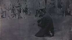
Sigmar Polke, Kölner Bettler III, 1972. Image Source: www.rfc.museum
The second part of your question is easily answered. Dabbling is often necessary if you want to suit your medium to your subject, and every master began as an amateur. Just be sure that you’re not just tinkering with something new every other week in order to avoid the real work of digging into a technique or material. Avoid being superficial, and don’t be afraid to work (and think) all the way through what you’re doing.
Let’s tackle the last question: do all the famous artists really conform to some kind of stylistic homogeneity? Yes and no. Sigmar Polke, for example, produced paintings, photographs, and sculptures over the course of his life. Though Polke’s style is visually recognizable within bodies of work, overall he used a wide range of styles, media and techniques. The consistency in his work comes from his preoccupation with alchemy and transformation. Likewise, John Baldessari is another artist who creates an incredible amount of work, but any two of his works selected at random and placed side by side might not be easily perceived as having the same maker. However, nearly all his works have the same ironic attitude.

Sigmar Polke, Untitled, 1973. Note that this work and the one above were made within a year of each other. Image Source: www.likeyou.com
But these are examples of work by über-famous artists. Why not consider the oeuvres of somewhat lesser-known lights like Paul Chan and Michael Huey? These artists are following paths that have few obvious markers for the casual viewer, but their work is strong and intriguing. I recommend that you spend more time studying artist monographs and catalogs of retrospectives. I think you’ll find that visual uniformity is sometimes tightly controlled through medium or style, and sometimes ignored altogether.
The real question is not whether it is important to be consistent, but what kind of artist you want to be. Is your goal to be good? To be free? To be a household name? I feel that we can’t talk about consistency — visual or otherwise — without shivering under the looming shadow of capitalism and branding, nor can we really divorce it from the myth of the mad-genius artist, obsessed and compulsive, driven to repetition. Are these narratives important to you? In the end, my advice is to make what you want to make. If it’s good, and if there’s enough of it, it will be easy for dealers, critics, and your future biographers to follow the threads of your concerns throughout the work.